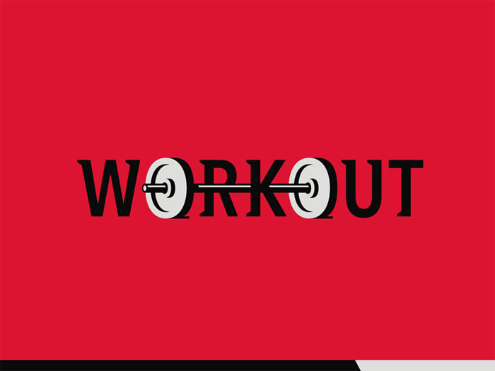
Have you tried designing a fitness logo lately? In this article, you’ll find some tips on how to design fitness logos well. Both professional players and their passionate supporters rely on sports logos to be recognized. Gyms are no exception to this rule, with numerous coaches and trainees looking to create the best gym logos and stand out of the crowd. To help them out, we collected a list of useful tips and fitness logo ideas that will certainly keep their teams on the map. Fitness logo design tipsLess is moreA gym logo should be simple and unobtrusive, and yet convey all important information. To create the perfect piece, you have to think of where that logo is going to appear, including gear, memorabilia, and the compulsory jerseys and uniforms. To ensure the best continuity across all promotional materials, avoid overly detailed sketches. Make it unique
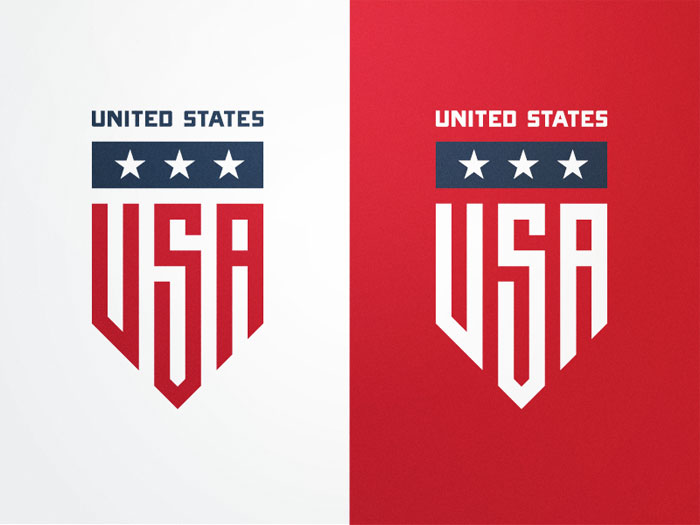
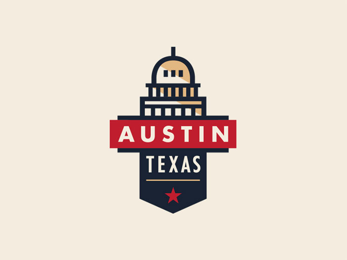
How do great sports and fitness logos look like? To attract attention, you should first identify the main goals of your marketing strategy, and think of designs your audience would be impressed by. Bold colours, striking contrasts, and strong fonts will help you make this happen. Make the sport recognizable at first sightThe icon on your logo has one and only purpose – to show people which your sport is. Be it that you’re creating a football logo, basketball logo, golf logo, or a fitness logo, you need to create a piece that will represent your tram and your activities, instead of making viewers wonder who you are. Choose the appropriate coloursChoosing a colour for your sports logo will be easy, as all popular disciplines are commonly connected to a particular hue. Swimmers’ logos, for instance, often feature a blue theme. When creating a gym logo, however, you need to consider several important factors. In such cases, branding is not explicitly related to a colour, and you need to research the market to come up with the ideal branding strategy. Keep in mind that this logo will be the official face of your brand, and help prospective customers identify with your ideas and values. Familiarize with your target audienceBefore you start sketching your fitness logo, identify your prospective visitors and think of ways to attract them to your venue. In order to succeed, a logo has to be directed towards the target audience, which means you should make it specific and memorable. Be it that you’re targeting professional body builders or women aged between 20 and 30, make that visible on your logo. Convey the right messageYour logo will be the icon of your brand that showcases the values of your business, and shares your message without further explanations. This is why sports logos are simple and make use of limited visual elements instead of textual explanations. Nike is a great example – they have one of the simplest logos used so far, but yet encourage and inspire users to challenge themselves and to succeed. Bring inspiration along the wayWhile designing a logo, choose inspirational emoticons that will enable viewers to identify with your brand. The questions you should ask yourself are: How is your target audience supposed to feel about coming to your gym? How will you create that feeling? Most of the time, people expect a gym logo to inspire them to start exercising. Different logo colours inspire different emotions. In the fitness logo case, the best way to go is to pick hues that motivate your trainees, and create a sense of belonging to your community. Keep an eye on your competitorsIn order to get the full picture of how your brand will fit on the market, do some research on competitors. This will help you craft a better brand positioning strategy in the competitive fitness industry, as you will communicate clearly what makes you different than other gyms and fitness clubs. A good idea is to use text slogans with distinctive fonts and colours that may motivate people to choose you over other providers. Make the fitness logo simple, but don’t exclude essential elementsThink of all the iconic logos you know – the thing they all have in common is simplicity, and the fact people recognize them within seconds. In the fitness industry, however, logos should not be deprived of leading indicators that communicate your offer. For instance, these elements help users understand whether you’re dealing with weightlifting or cross-fit, and build up their exact expectations. Create a result-oriented gym logoWhy do people go to the gym? For most of them, this is a way to make an important change in their lives, be that enhanced appearance, improved health and fitness, or a response to a dangerous disease like diabetes and obesity. Despite of the multiple benefits, jumping on the gym bandwagon is a difficult experience for most beginners, and many of them quit before they’ve experienced actual results. Exercising can be particularly daunting for people trying to lose weight, and they are usually the ones that have the most trouble getting used to the gym. This is why training and fitness logos need to be just as motivational as appealing, and make people believe that they will genuinely experience the change they’re after. If possible, make a logo that promotes and advertises what customers are looking for, ideally the results they wish to achieve. It could be a thinner body layout in an energetic colour, or even a silhouette drawn inside a larger body. On the safe side, you can always get an image of a barbell-lifting client or high-fiving to the trainer to invoke a sense of community. Use welcoming colours on a fitness logoMost of the newcomers you’re targeting have little to no fitness expertise, and will feel intimidated or even embarrassed upon their first encounter with a personal trainer. As strange as it sounds, this is the main reason why gyms struggle to attract their first clients. This is why we’re repeatedly advising designers on creating a motivational logo, in particular one whose colours invoke a pleasant, non-judgemental vibe. We recommend pinks, greens, blues, oranges, and other energetic and festive tones. Do you research before designingPersonal trainers may all have the same tasks and goals, but that doesn’t mean that their modus operandi will be the same. Therefore, the distinct style of a trainer is another important element that should be reflected on the logo. When teaching bare fitness, for example, an image of kickboxing won’t make much sense. Same applies to your individual methods of training – you can always go for a logo where you are cheering up a sweating client, or helping him hold a barbell, and count on the fact that future customers will be ready to rely on you. What are the most common fonts used on gym logos?Branding matters the world to a new fitness studio or even a simple, YouTube-featured training program, as it helps clients wrap up an opinion before they’ve even used your services. Being completely frank, there won’t be anything more important than the logo to reaffirm the success of your brand. This is why designers work side-by-side with fitness professionals to come up with the perfect image and name, but not that many of them give fonts the attention they deserve. Truth is, typography is a critical element of branding, and you should be extremely careful when making your decision. Here are the most commonly used fonts:Modesto Is your plan to capture the attention of clients even when they’re hundreds of feet away? Will your gym be advertised on signs and billboards? If so, you should look at 2000 Modesto to cater to your exact needs. Modesto is large and imperative, but manages to attract attention without making viewers feel overwhelmed. It works perfectly with many different colours, and help convey a helpful and friendly message to clients with all types of fitness goals. Helvetica Helvetica is a classic font, and its use in fitness logos is self-explanatory. It will be ideal for gyms conveying a message of intensive strength training, including weightlifting and kick-boxing. The best way to use it is in black and white combinations. Rockwell For a gym logo that will remind of rugged Americana Olympic logos, Rockwell is the way to go. The bold font is easy to notice and even easier to read, and you can resize it for all types of marketing materials without affecting its impeccable appearance. It will look great with pops of intense red and blue. Bobber Bobber is just cut for creative and out-of-the-box gyms, and the preferred font of the ‘hipster’ clientele in large communities’ millennial markets. Online, you can find some perfect examples of it injecting a personal vibe on the logos of personalized cycling studios, dancing clubs, and similar venues. Custom Typography If you can afford to do so, the best option will always be to have a one-of-a-kind type crafted in the service of your brand. This way, the logo will be unique and protected from plagiarism, and customers will know you’re ready to do whatever it takes to be there for them. Having a font designed exclusively for your brand won’t be a cheap process, but the investment will certainly pay off once you create a product clients will remember. This matters in particular to gyms preparing for online campaigns, as they’re facing an even more competitive market. Ending thoughts on fitness logo designA good gym logo requires a good deal of work, and several hours spent on solid research. Before you hit off with the design proves, evaluate your audience and competitors, and think of combinations that convey your message in a welcoming way. The fitness industry is a sea of unused opportunities, but still competitive enough to make customers’ emotions the only criteria for success. The secret, however, is simple – make a logo people will trust, and let them know they’re welcomed in your community. If you liked this article about fitness logo design, you should check out these as well:
The post Fitness Logo Design: How To Create A Great One appeared first on Design your way. from http://www.designyourway.net/blog/graphic-design/fitness-logo-design/
0 Comments
In order to understand the recent developments in Japanese graphic design, we should examine the unique synthesis between modern Japanese styles and their western equivalents. Then take into account all popular movements such as Rimpa, the Kano School of Painting, and the ukiyo-e woodblock prints; and compare those to the highly influential western Art Nouveau, Bauhaus, Constructivism, Futurism, and Dada. A detailed analysis of the history of Japanese design would be impossible without the teachings and publications of Gendai shogyo bijutsu zenshu (The Complete Commercial Artist) from the period between 1928 and 1930, focused on all efficient techniques that marked this discipline. The Gendai publications were the first attempt to introduce western world’s design rules to Japanese visual communications, which makes their role even more important. Graphic design was first acknowledged as a separate discipline in the late 19th century, and within the ‘dezain’ rubric (the transliterated version of the English ‘design’). This is the word Japanese people used to distinguish graphic art from zuan (design) and shogyo bijutsu (commercial arts). The same as in the western world, Japanese graphic designers questioned the difference between art and design only after the introduction of modern printing technology. At the dawn of the 20th century when mass-produced designs were more or less accessible to everyone, it became extremely difficult to pinpoint pieces that can be qualified as art. The ‘artistic designers’ category emerged more or less at the same time, led by inspired ‘pure art’ (junsei or junsui geijutsu) creators who had nothing against using their virtuosity for the purpose of commerce and advertising. Yet, it is hard to speak of a strict distinction at the time, as artists focused strongly on preserving the merits and artistic values of their work even while practicing commercial art. The period between 1615 and 1868 is known as the Edo period, when ukiyo-e prints were the only forms perceived as commercial art, and targeted towards commoners rather than devote art collectors. Translated, the Japanese graphic designs known as ukiyo-e are ‘pictures of the floating world’, and represent mass-produced and widely distributed images of everyday Japan and highlights of its cultural achievement. As themes, Japanese designers often use well-known celebrities and beauties, worldwide famous landscapes, their folk stories, or their heroic tales. For the purpose, many Kano school artists were hired to decorate the castles of feudal lords (daimyos) with these commercial prints. A high-quality collection of premium surimono prints witnesses to date the poetry and peaceful life during the Edo period, again as a result of the work of popular artists who designed for commercial purposes. The list includes the famous Ogata brothers Korin(1658 -1716) and Keznan (1663-1868) who designed textile, prints, and ceramics in the Rimpa School, and Maruyama Okyo (1733-1795) who crafted the beautiful Echigoya kimono textiles. Rimpa designers were also inspired by the imperial court’s earlier yamato-e pictures collection (the Heain period art, 794-1185), which all illustrate traditional Japanese literature (the tale of Genji, or Tale of Ise, for instance), and can be recognized by their delicate, curved outline that makes them different from the Chinese kara-e angular outline. They also come with fluid forms and opaque colours, and make it possible for kimonos, fans, and pottery look as elegant as they are. The teachings of the Kano schoolToday’s Japanese graphic design was mostly influenced by the Kano school professionals, whose art was mostly patronized by Muromachi’s shogunate (1333-1568). The founder of this school was Kano Masanobu (1434-1530), a trainer and ink painting professional who guided the works done within the Shōkokuji Temple, and for the needs of the Chinese Southern Song and Yuan dynasties in Kyoto. The ink paining style he adopted belonged to Zen painter monks, but underwent serious changes throughout the years due to the dominant patronage and influence of secular experts such as Ashikaga shoguns (1228-1573). They were the official frontrunners of this style for over 400 years, and most of them mastered their own branches and versions. Looking at Kano’s landscapes, we’d notice distinctive and very symbolic content – the animals and the plants are all represented with auspicious and allegorical meaning. The lines are firm, strict, and executed with Chinese ink, and the colors are bright and welcoming. Yet, one can still see the Japanese arrangements and sensibility in all figures. This explains visually how the Kano school influenced today’s art forms, in particular, the woodblock prints. The Kano effects can also be felt in the Japanese rigorous and on-point artistic training, where students are required to copy meticulously and in detail original pictures from Kano books. Once they’ve mastered the copying skill, they’re entitled to call themselves Kano designers, and it is only then that they can develop their own style and make their own books. Students like these in the past used to be chosen by town authorities and wealthy commoners as machi-eshi, namely the artists that will paint genre scenes and decorate public spaces. Other Kano artists chose to deal with woodblock prints, and it was them to export this tradition to the Western world, and possibly to inspire the entire Art Nouveau movement. Another important event in the development of the Kano style is the reinstating of the 15 years old Tennou (Emperor) as a political leader in Edo in 1867. Japan’s Meiji Ishin (Coup d’état) was led by Choushuu (Yamaguchi prefecture) and the Southern Daimyos of Satsuma (Kagoshima), and the name Meiji was selected to give young Tennou Mutsuhito the ‘enlightened rule’ over the state. His 1868 charter oath promised Japanese people freedoms much alike modern democracy, namely direct participation in the administration, political reforms, and dedicated search for wisdom and adoption of worldwide practices. The next year, he unformed domestic administration, and simplified and reduced the high ranks of samurais. The teachings of the Rimpa schoolThe highly decorative style of ‘Rimpa’ painting , which flourished during the Edo period (1600-1868). was named in the nineteenth century after one of its leading artists, Ogata Kôrin (尾形光琳, 1658 – June 2, 1716). It embraces bold, graphic renderings of natural motifs and formalized depictions of fictional characters, poets, and sages with literary connotations—as well as eye-catching compositions that cleverly integrate calligraphy and image. Historically Rimpa originated in 1615, when Hon’ami Koetsu in collaboration with Tawaraya Sotatsu, founded a community of artists and craftsmen in Kyoto, under the patronage of a wealthy merchant of the Nichiren Buddhist sect persuasion. Their aim was to revive the classical courtly tradition and the Yamato-e painting style. Both artists came from families of sword-smiths, who had served the imperial court and the great warlords. Sotatsu, produced commercial paintings, decorative fans, folding screens, and decorated paper with gold or silver backgrounds. Koetsu who did painting in the flamboyant aristocratic style of the Heian period (794 to 1185) as well as calligraphy, lacquerwork, and the Japanese tea ceremony then inscribed poems on Sōtatsu’s decorated papers. In the early Edo period, the western style became popular and consequently, Rimpa were shunned by artists and academic art institutions. However, it was incarnated in the Genroku era (1688-1704) by brothers Ogata; Korin and Kenzan, sons of a prosperous Kyoto textile merchant. Korin’s using a rich color pallet and hue gradations, rendered nature as an abstract phenomenon eccentrically decorated with gold and pearl. The rimpa style was reincarnated once more in the nineteenth century by Sakai Hōitsu (1761-1828) and his students such as Suzuki Kiitsu (1796-1858), staged a Rimpa revival which grew out of copying Kōrin’s works. The later Rimpa artists concentrated on the flower, or kachōga (bird-and-flower) subjects, often influenced by the new naturalistic wash style of the Maruyama and Shijō schools. The effects of Western stylesIt wasn’t long before the Meiji government recognized the power of painting and the arts for its society, and for Japan in its new role as an international unified power. Just as the Tokugawa had set up the Institute for the Study of Barbarian documents (Banshoshirabesho) to understand the colonial enemy which threatened them, the Meiji government had a political and practical rather than aesthetic motive in promoting the arts; this was to gain foreign currency through exports to pay for the huge cost of modernization and to present herself to the world as a cultured and ‘civilized’ nation. The Iwakura Tomomi Mission of 1871 had a huge impact on the arts in Japan. A group of government officials traveled all over the US and Europe with the aim of changing the unfair treaties and studying western administration systems. They brought back over 500 foreigners to assist in the modernization which had come to mean westernization, many of whom taught at Tokyo University. They had studied western tastes and brought back specialists to assist in the arts and crafts. This catering to westerners tastes for the International exhibitions was to shape the face of Japanese crafts, but this adaptation to foreign market demands was not new to the Meiji period. The 1873 Vienna Exposition introduced categories of ‘Fine’ and ‘Industrial’ or technical arts, thus differentiating between arts and crafts, which in the Japanese language were considered the same up to this time. Consequently, the words ‘bijutsu’ and ‘geijustsu’ were created to convey these respective meanings. The use of such terms may have influenced the craftsmen who, feeling the elevated status of ‘bijutsu’, attempted to distinguish their work from the caegory of industrial arts by rendering them elaborately more decorative in accordance with the European tastes prevailing in that time. However, the simpler more understated ‘wabi’ style remained faithful to an authentic Japanese austere aesthetic. To sum up, Meiji crafts morphed into an opulent decorative style rooted in Chinese designs and motifs. In the 1893 exhibition of Columbia Japan for the first time participated in both’Fine’ and ‘Industrial’ art categories. The introduction of Western cultural values led to a dichotomy in Japanese art, as well as in nearly every other aspect of culture, between traditional values and attempts to duplicate and assimilate a variety of clashing new ideas. This split remained evident in the late 20th century, although much synthesis had by then already occurred, and created an international cultural atmosphere and stimulated contemporary Japanese arts toward ever more innovative forms. Two Bostonians, Ernest Francisco Fenollosa (1853–1908) and William Sturgis Bigelow (1850–1926), who came to Japan in quick succession in the late 1870s and 1880s were instrumental in the introduction of Japanese art into the west. They also impacted the Japanese style in a significant way. During their time in Japan, they conducted surveys of Japanese antiquities and acquired art with intense energy. Their Boston Museum of Art collection, encompassed a broad range of periods and genres, from eighth-century Buddhist images to paintings by medieval, early modern, and even Meiji-era artists, as well as ukiyo-e prints, Buddhist sculptures, swords, textiles, and more. At the time when many Buddhist treasures were being discarded or sold in a misinterpretation of the Separation Edict of 1868, where Shinto became the state religion, Fenollosa made a great effort to preserve national treasures during the period of Haibutsu kishaku (廃仏毀釈) (extermination of Buddhism) which peaked in 1871. Fenollosa who served on Japan’s Imperial Art Commission from 1886–89, became a strong advocate and patron of Kano Hogai after meeting him in 1883. With the endorsement of Fenollosa in 1888 Kano Hogai painted Hibo Kannon (The Compassionate Kannon), which unlike traditional Buddhist paintings was intended from the outset for public display in art exhibitions rather than as an object of veneration for a Buddhist temple. Mid-Meiji ExpressionismBy the mid-Meiji era the government’s enthusiasm for its wholehearted adoption of western cultural values was subsiding and in the context of promoting a policy of conservative nationalism, a shift of attitudes towards Japan’s own cultural heritage was encouraged. In 1898 two professors at Tokyo School of Fine Arts (東京美術学校 Tōkyō Bijutsu Gakkō); Yokoyama Taikan (横山 大観, 1868 – 1958)and Okakura Kakuzō (岡倉 覚三,1862 –1913 – also known as 岡倉 天心 Okakura Tenshin)because of their disagreements with the school resigned. Okakura who studied under Ernest Fenollosa was one of the principal founders of the Tokyo School of Fine Arts, the first Japanese fine-arts academy, and a year later became its head. Yokoyama and Okakura founded the Nihon Bijutsuin (日本美術院, Japan Art Institute. Born in Tokyo’s port city of Yokohama in 1862, Okakura was first educated by American missionaries and began reading English before Japanese. But, by age 8, his father moved him to a Buddhist temple where he learned traditional Japanese culture amid the monks’ daily regimen of robes, rituals, and green tea. The Japanese boy raised on The New Testament and Methodist hymns found himself immersed in the sayings of Confucius and playing the 13-string Koto. His great passion was for the art of Japan that was being tossed aside for the Western art and culture. While he wanted to preserve the Japanese traditions and develop a notional Technique, he wanted the Japanese style to become more Expressionist. He wrote: Moreover, as our new position, the following three objectives must be the aims for young painters: we must develop our Technique more and more following traditional rules, we must place importance on order and not make outrageous paintings, and we must represent “Expression”. Taikan agreed with Okakura, and wrote an article to explain his painting Chouhou he wrote: ” When people gather in a temple to listen to the same Buddhist sermon, the meaning is different from person to person. Depicting this was one of my principal objectives when I painted Chouhou, I wanted to show the difference. Even if various People, for example, a woman, a farmer or a samurai, listen to the same preaching, one person will listen with faith, another incredulously and another without understanding. I planned to depict these various states in the guise of contemporary people” Japan’s war printsThe conflict between Japan and China was a result of the parties’ wish to control Korea. It began with the uprising and skirmish of pro-Chinese groups against the Pro-Japanese ones in Seoul and soon resulted in the embarking of armed forces from both sides. The official combats began in Phungtao on July 14, 1894, and it took only a year for the Japanese army to defeat Chinese forces. The official end of the Sino-Japanese war was marked with the Treaty of Shimonoseki, according to which China was supposed to make few territorial concessions (mostly islands with Taiwan included) and to reimburse Japan with large indemnities. One way or another, it was clear that Korea would belong to the Japanese hemisphere, which was a beneficial outcome considering the systematic and massive modernization of this state following the Meiji period. There was no way for Chinese forces to defeat Japan’s strategists and Western armory and technology, nor the particularly strong and nationwide enthusiasm. The main visual communication means of this period were woodcut prints, and their main goal was, as expected, to glorify combat achievements and to underline Japan’s military dominance and aggressive expansionism. Compared to them, Chinese warriors were presented as primitive barbarians, old-fashion fighters equipped with spears, facing in fear the aggression of Japan’s modern rifles. As the Meiji period was arriving at its end (somewhere around 1912), Japan was already dominating Asia in all aspects. Peace, however, didn’t last too long, and it was Russia to interrupt it. They leased Port Arthur from China in 1898, and it took them 2 years to occupy Manchuria using the Boxer Rebellion as an excuse. Their plans now entailed expansion towards Korea, and despite their efforts to arrive at a peaceful solution with Japan, Japanese forces attacked Port Arthur in 1904. The result was a harsh Russo-Japanese war fought both on sea and land, with Japan being the dominant side in most of the land led battles. The final battle, nonetheless, was the one fought at sea, where Japanese forces managed to block Russian ships from entering Port Arthur. To end the war, the rivals signed the Portsmouth Treaty mediated by US President Roosevelt, with Russia agreeing on Japan’s dominance on Korea, and leasing long-term the Liaodong Peninsula. After only ten years, Korea became an official province of Japan. War prints, however, remained popular even after the Sino-Japanese War and the Russo-Japanese conflict. On prints from this period, you will see defeated Russian soldiers littering a battlefield, and strong Japanese men confronting their enemies with swords, bayonets, and rifle butts. This time, however, they’re attacking elegant Russian cavalry with good-looking uniforms, sending a message of respect for a decent enemy, and an enhanced sense of modernity and equality. The basics of Japanese graphic designs as we know them todayThe typical elements of Japanese graphic designs are strong colors, visualized personalities, and overdone character designs, all densely combined on a single outline. They cover more or less all meaningful techniques a designer should consider to get inspired. We did some research and pulled off the leading visual design techniques, and we are ready to examine those with you. Stay tuned for more knowledge, inspiration, and valuable references! A brighter paletteThe first thing that will capture your attention on a Japanese design is the teeming palette that brings it to life. Japanese graphic designers focus on warm reds, gold, and even black, but a deeper look through their archives reveals an even richer spectrum of colors. Japanese culture does rely heavily on the use of color. Waking on the Harajuku streets, for instance, or the vibrant surrounding of Shibuya are the best examples for that. Japanese people are simply in love with warm hues, and they make this obvious in their graphic artwork. The secret of Japanese graphic design’s success is that craftsmen are not afraid to overdo their work. Instead, they’re deliberately making colors clash so that the result would look more vibrant, and so that it would never go unnoticed. Lingual mash-upsJapanese graphic design has another valuable secret to reveal, and that’s the unique combination of Roman and Japanese typography. The two languages may be as different as it gets, but putting them on the same sheet looks intriguing and irresistibly engaging, and not only for bilingual people! Custom typographyJapanese typography is more complex than the western one due to various reasons, but designers out there certainly found a way to turn it to their advantage – a very common practice is to custom-create typography for a design project, and make sure no one will ever create something similar. Brush strokesBrush strokes are also quite common in Japanese graphic designs, and can even be considered as recurring motifs. They are used to resemble a connection to traditional calligraphy practices and united in a separate art discipline known as Shodou. Shodou art can be qualified as crud, streaky, and even messy, but that’s what makes it special. Lines are drawn in a way that helps them flow into each other, and the final products never need corrections. GradientsJapanese designs make heavy use of gradients – you will often see subtle and warm colors bleeding and fading one into the other, helping backgrounds become more lively and intriguing. Floral and organic patternsFloriography, or as Japanese people call it Hanakotoba, is the science branch devoted to studying flowers. Better yet, it is one the most important facets of Japanese culture. The people in these country associate flowers with their feelings, ideas, and symbols, and therefore include them on all types of designs. A pink flower, for instance, stands for the curing of illness and discomfort; white represents elegance and virtue; while red, as expected, indicates love and passion. Circular shapesLooking at the Japanese flag, this one is not that difficult to understand – circles and rounded shapes are everywhere across Japanese graphic designs! This is all because Japanese people think of circles as inherent symbols of harmony and balance. Even their official coat of arms and most common motif – the Mon – has a rounded shape. ‘A culture of cuteness’For many people, the mere mention of Japan invokes a feeling of cuteness, which may as well be connected with their engaging cartoons and soothing colors. The culture of cuteness (kawaii, as they call it) plays a major role in Japanese graphic design, both within the state and everywhere around it. We can see it in their adorable online animations, TV shows, and retail commercials, as well as on all professional branding designs. Japanese designers use cuteness and playfulness to revive their work and to give it a unique, personalized touch regardless of what it represents. Such designs are the exact opposites of Western’s cool, sleek, and sophisticated branding. Information densityLooking at popular Japanese designs (web works, in particular), you will be surprised by the amount and density of informative content they pack on each and every piece. The Japanese design virtue is all about content! So it seems that mainstream Japanese web design has really little to do with Western’s prominent minimalism. One may choose to look at density as a drawback or an advantage – while Western posters, for instance, are the role model of cleanness and neatly conveyed messages; they all look pretty similar to each other and lack the diversity of Japanese designs. Putting things into perspective, we will also understand the difficulty of being a do-it-all Japanese designer – these people need both some domestic and foreign expertise to create products that work for both worlds. Speaking of well-executed Japanese graphic design, 1. The writing methodologya. To write in Japanese means to master several different character systems: Kanji, which derives from Chinese characters; Katakana, the most used of the three; Hiragana; and Romaji (derivates from Western alphabets). Traditionally, Japanese people write from the right to the left, and in a vertical direction. Yet, it is not wrong to write from the left to the right, horizontally. b. Just as it is with Chinese writing, Japanese writers can comprise a sentence with only a few characters. The layout ends up being very different than a Western one, also because of the excess use of spacing. c. The writing system in Japan was completely free from Western influence before WWII, and thus much more traditional. At the time, people wrote only from the right to the left (horizontally), and many of them still do so today 2. The education of a Japanese designera. Japanese culture involves plenty of indirect expressing and ref terms, as it can be seen from classical literature. To be educated in Japanese terms often means being able to understand and use these ref terms and metaphoric meanings, as well as to express idioms and lengthy expressions with as few characters as possible (even a short verse). This helps Japanese publishers bundle a lot of info on their publications without making them look too crowded. b. Japanese writers are also the masters of ‘reading between the lines’, or the ‘manga’ tradition. What this means is that what they say is often not what they actually mean, and you can only understand it from the context. Thinking in such way has influenced irreversibly their graphic design practices. 3. A unique standard and understanding of beautya. In Japan, people perceive beauty in a whole different way. You’d see a serious mismatch in the looks or ideal heights of their models compared to Western ideas, or fail to see that altogether. b. The differences in beauty perceptions depend most of the time on the social standard, which is why certain taboos in Japan are perfectly justified to use in Western publications and the other way around. For instance, Japanese postcards can never have a black frame, as this is only reserved for funeral announcements. c. There are also notable differences in typographic and calligraphic rules. 4. Different demographicsa. Japan is one of the countries where people live the longest and that changes automatically the target audience for graphic designs. The 50+ demographics are highly considered in Japanese commercial art, and just as much ignored in Western marketing. b. Plus, the largest purchasing power in Japan belongs to the baby boomers older than 70, which makes it imperative to design for them. There is a downside to every good story, and Japanese graphic design is no exception1. Activity centered in the corporate worlda. Japan’s graphic design arena is reserved mostly for the big players, and it is almost impossible for a small/medium agency to make it past them. This forces on-budget businesses in need of design services to create their own dedicated graphic design departments, or committee boards comprised of sales managers who now little )or nothing at all) in graphic design. What they do is to wrap up a project, hand it over the PPT to an ad agency, and let it modify it upon need. You will see this in all the logos of government publications, energy companies, phone companies, and so on b. A restricted marketing budget, especially in the case of consumer-oriented businesses that don’t hire creative staff in the first place. Instead, companies prefer to spend on expensive placement, believing it is their main source of income that can’t compare to creative processes. 2. A considerably closed marketa. The clientele that comes from the same industry. A very common practice of leading Largest Japanese ad agencies is to sign contracts with several clients coming from the same industry. The Japanese creators’ community has opposed this practice several times, as it causes smaller and local businesses to remain in the shadow, and entrust marketing to wholesale experts and retailers instead of designers. Their choice is limited, as they can only go to one or two ad agencies to get tips and suggestions. b. Some serious competition on placement. The leading space for ad placement always belongs to the biggest design firm or agency, which makes the hit off of small and independent firms rather difficult. They have to wait for a secondary (or even third) lease from the agency that already signed a 30-year contract for that space, which makes advertising much costlier than creating a beautiful marketing campaign. c. Strict advertisement standards. Designers must follow and comply with a serious deal of industry rules and government regulations. A good example of that is EU’s cigarette packages which look just awful! Of course, it is not designers who made this decision, but the regulatory bodies. 3. A serious workload that is not consistent with the employees’ paymenta. What makes the Japanese market so specific and active is the frequent purchase of printed materials (its printing activity comes second in the world, right after the USA). People there still prefer to read their books on hard copies and to send paper greeting cards, which means there is a lot of work to be dealt with, and notably short deadlines to meet. b. Flyers are often crafted upon popular commercial templates you can purchase for few hundreds of dollars per license, or even get for free. In the Western world, this would equal to accepting a main street business’s flyer designed using MS Publisher. In most cases, such flyers are prepared by junior employees and trainees, considering that most businesses don’t even hire on-payroll design personnel. c. The fees for that flyer will consequently be very cheap, and the designer in charge of preparing it on a deadline (and with a ready template) is paid less. He may be requested to do some tweaks with colors and fonts, but that’s pretty much how far his work can get. 4. A product not worthy of its priceCertain graphic designs, as good as they may look, have a very short lifecycle and represent therefore a useless investment for the business they represent. This is why companies should go for a design that will last, in particular when they’re small, and can’t afford expensive mistakes. 5. A designer with the right skills.Not all designers are trained and prepared for Western typography, as popular as it may be. This is why they need help when fixing and handing over Western typography conventions. In general, designs for the Western and Japanese markets are prepared separately and use entirely different materials. Now, let’s check how that looks from a Western perspective
Ending thoughts on Japanese graphic designThe most valuable lesson we can learn from Japanese graphic design is that experimenting is not a bad thing. Therefore, get rid of the Western ‘less is more’ aesthetic rule, and shake your design up in the service of originality. Work with bold colors and combine them with traditional Japanese motifs. Try to balance your symbols and types, and to collage elements against any rule you’ve ever encountered in Western design. The result may fascinate you! If you liked this article about Japanese graphic design, you should check out these as well:
Negative Space Design: What it is, Logos and Art Use
Graphic Design Resume: Best Practices and 51 Examples Graphic Designer Salary: Junior, Senior and the Average Annual One The post Japanese Graphic Design: Beautiful Artwork and Typography appeared first on Design your way. from http://www.designyourway.net/blog/graphic-design/japanese-graphic-design/ Productivity seems to be a major source of concern for freelancers. The simple reason being that it can be hard to stay focused for hours at a time. No one is looking down your shoulder, and no one is trying to impose an often unnecessary tight work schedule on you. The “productivity hacks” that are out there may work for some. But this is only true for you if they are compatible with your lifestyle, or for those who already have a strong measure of self-discipline. Not to worry. We’ve compiled 3 productivity-boosting techniques you can use without having to turn your lifestyle upside down, and you can start today! Here’s the first one: Productivity Technique #1: Use Be Theme’s pre-built websites to finish your client’s work in 4 hoursBe Theme has more than 300 themes, the largest selection of pre-built websites on the market. You can select a theme that will work for you in minutes, and install it with a single click in less than a second. Time saved – productivity increased. No coding is necessary, nor is wireframing. First, you need to have the pre-built website of your choice installed. Then, you can build a customized website for your client in 4 hours. More time saved – productivity improved even further. Here are a few examples of how Be Theme has helped other freelancers become more productive: Here are 10 Be Theme pre-built designs you can use to create a full website in a few, short hours
Productivity Technique #2: Be more flexible instead of forcing yourself into a strict scheduleThis technique may sound counter-intuitive. Yet, you should try to go against the grain of what some productivity “experts” will recommend. It’s often better to be somewhat flexible in your approach to your work. This is much better than forcing yourself into a “productivity straight jacket”. You don’t necessarily have to make a to-do list, get up before the sun comes up, or break up your day into 15-minutes segments. Those practices may be fine for those who never take time to smell the roses. These people may be even enjoying work in such crisis environment. Here are a couple of examples of how being flexible will increase your productivity: Feel “stuck’ on a task? Take a break. Take a walk (with your dog if you have one). If you’re working a problem, your subconscious mind will continue to do so. This will happen without your placing pressure on it to come up with a solution. Be kind to your brain, and it will reward you. Making a to-do list is fine – but keep it general. List a few things you would like to achieve during a work session, a day, or a week. You don’t need to write down the specific tasks involved in meeting your objectives. Accomplishing general tasks, as opposed to specific tasks, is much more rewarding. It is much easier when you let the specific tasks take care of themselves as part of your workflow. Productivity Technique #3: Calculate how much a lack of productivity costs you every dayWalking the dog is not a waste of time, nor is enjoying a cup of coffee if it helps you relax and clear your mind. Procrastinating, on the other hand, will interfere with your productivity. It is time wasted and does not help to improve your productivity in any way. This third technique involves a little bookkeeping (time tracking, if you prefer). But it’s a simple form of bookkeeping. Do not write down the time it took you to do every workflow activity during the day. Instead, keep a log of the times you spent procrastinating, and for how long. You might be charging an hourly fee or on a per-project basis. Either way, you should be able to calculate your hourly earnings during an average day. Then, it’s simply a matter of multiplying the hours spent procrastinating by your hourly rate. That’s what your wasted time is costing you. Once you’ve calculated your lost earnings, post it in a conspicuous spot as a reminder. Do this whenever you’re beginning to procrastinate. Keep track of your lost earnings, and make every effort to keep the number to a minimum. Those lost earnings may never quite get to zero, after all, you’re only human. However, with just a little effort on your part, you can come quite close. ConclusionTry these 3 techniques to increase your productivity as a freelance web designer. They work.
The good news is that you don’t need to force yourself into a strict schedule. You also don’t have to feel guilty about following a more flexible one. Eventually, you’ll see your productivity increase. These simple, straightforward methods can be used by anyone to make the most of their time. The post How to Increase Your Productivity as a Freelance Web Designer with 3 Simple Techniques appeared first on Design your way. from http://www.designyourway.net/blog/wp/productivity-freelance-web-designer-simple-techniques/ Web safe fonts are something you’ll commonly find on a wide range of computer systems. They’re used by web content authors in order to increase the likelihood that their content will actually display in their chosen font. If your website’s visitor doesn’t have the specified font, the browser will try to choose an alternative, based on the list of fonts the author specified as a failsafe, or it will use a substitute in the visitor’s operating system. There are font embedding services, such as Typekit or Google Fonts, and they’re a great alternative if you want your designs to have something fresh and unexpected. And, they’re also very easy to use. For example, with Google, you can choose any font. Generate the code, and just paste it in the <head> of your document. There, you’re ready to reference it in CSS. And, it takes less than 60 seconds. And, it’s free. Thanks, Google! Why does a web safe font matter?On each device, there’s a list of common fonts and font families. It is usually based on the operating system, but each differs a little bit. For example, a Windows device will have one list of fonts, while a macOS device has another. And, there’s a proprietary list for Google’s Android OS. Just go ahead and open any website. The font you’re seeing might not be the one the author originally intended. What this means is that if the designer chose some obscure font for the site’s design, instead of a standard web font, or any of the other web friendly fonts for that matter, and you don’t have the font installed, the font you see might go back to some basic font, such as Times New Roman. Sure, as a visitor, you won’t know that it happened at all, but it will look plain ugly. Choosing any font from the web safe fonts list will mean that the font is present on any operating system. That’s the small collection of fonts, such as HTML fonts and CSS fonts, that will overlap with Windows, Mac, Google, and even Linux and Unix. These are the best fonts for websites, just because of this fact. They also give designers, as well as website owners, the option to specify which fonts the site should fall back to if necessary. That way, you have control over what will show up, regardless of the device. And you can pick something that’s close to the original font, the one you wanted, and your users won’t see something that’s extremely random. This is a plan B, a system that saves the user from bad font selections. But, why can’t you just use whatever font you want? Or can you? Which ones can you use safely, easily, and reliably? The limited font choices on the Web is a pretty common design challenge. In print, what you see actually is what you get, but it’s different on the Web. If you want the viewers to see what the designer sees, you should either have the viewers have all web-safe fonts, or for the fonts to be accessible from a remote server. If none of these scenarios is true, the fonts will default to something completely else, which often gives you an undesirable result. This is why web designers commonly stick to the web safe fonts that are common for most operating systems. Web safe fontsThese fonts include serif, sans serif, and symbol typefaces. Some of them were originally intended for print, but others are specifically made for the screens.
Sans SerifThe most legible web-safe typeface, Verdana, had its designer pay special attention to making sure that the text is very readable on a screen, even when used in small sizes. It offers a tall x-height, as well as a comfortable width and open letter spacing. The Trebuchet MS typeface is also a typeface that maintains the clarity and readability, and it’s a bit narrower than Verdana, letting you put more copy in the same space. The unusual lowercase ‘g’ and the curved stroke endings give it more distinctiveness than Verdana. The Arial typeface wasn’t originally made for the web, but it does work very well. It’s similar to Helvetica in terms of spacing and width, but it has slight character modifications. SerifsDesigned for the web, the Georgia typeface is an alternative to Times New Roman. It has open letterforms and spacing, and is clean, crisp and easy to read, even at small sizes. In size and stature, it’s similar to Verdana. Even though it’s great for certain situations, avoid pairing it with others like Times New Roman, because they’ll look miniscule when compared to each other. Times New Roman was originally designed for print, and is therefore not the easiest one to read on the web, and it gets worse at smaller sizes. If you like the look, but need something more versatile, use Georgia instead. All of the fonts mentioned above are available both in Regular and Bold, with italics. Symbol fontsYou’ll find Wingdings, Webdings and the ITC Zapf Dingbats included with most of today’s operating systems. They have plenty of useful graphics, from geometric shapes and thought bubbles, to arrows, stars and snowflakes. However, when a font menu is displayed, the font names might show up as symbols, because what you see is what you get. Ending thoughts on web safe fontsA web safe font will give you a plan B, a fallback option when you think your first option might not work. They’ve been available on most devices for quite some time, and are widely accessible. Even though not all of them are popular and look good (I’m looking at you, Comic Sans MS), you’ll find that you have plenty to choose from that are closely related to what you originally wanted. And if you can’t? Just use Helvetica, you can’t go wrong. If you liked this article about web safe fonts, you should check out these as well:
The post Web Safe Fonts To Use In HTML and CSS appeared first on Design your way. from http://www.designyourway.net/blog/web-design/web-safe-fonts/ If you are searching for iPhone adventure games, take a tour of this article with really interesting and engaging apps. They are a good fit for those times when you want to live an adventure in your iPhone’s small screen. You will also find many interesting stories in these apps. Some are focused on travel, some on horror and some on mysteries. From old-school to more modern iPhone apps with great graphics, take a look at some of the best adventure games for iPhone and iPad. iPhone adventure games to check outThe Walking Dead: A New FrontierIf you thrilled to the first two versions of Telltale Games’s take on The Walking Dead, you’ll enjoy this latest installment, too. But even if you’re new to the mobile series, there’s plenty to enjoy with this zombie apocalypse game, which places an emphasis on character interaction and the emotional burden of decisions made. Batman: The Telltale SeriesTelltale Games brings its unique brand of narrative adventure to the Dark Knight in Batman: The Telltale Series. Telltale’s more story-based approach lends itself well to an aspect of the Batman character that is rarely so well-explored in more action-oriented titles: the dual identity and constant tension between Batman and Bruce Wayne. The first episode of the game comes free, with subsequent episodes available as in-app purchases. With the release of episode 5: City of Light, you can now play through the story in its entirety in one go. Her StoryAre you a fan of true crime shows such as Serial and Making a Murderer? Here’s a similarly themed game for you budding Sherlocks out there. Sam Barlow’s Her Story has you doing the detective work and piecing together a mystery surrounding a woman being interviewed about her missing husband. Armed only with a mothballed computer and an antique police database, you must search through the files for short video clips of the woman’s seven police interviews to unravel the whole story. To say more would spoil the experience. Game of ThronesEnter the world of Westeros in Telltale Games’ adventure game based on the hit fantasy TV series Game of Thrones. Players take control of the scions of House Forrester, minor bannermen of House Stark, in the great struggle for the throne of the Seven Kingdoms. Telltale Games’ signature high-stakes, timed decision-making is particularly apt for the Game of Thrones episodic game, with players having to think on their feet as they make tough choices in the battlefield and within the murky politics of the court. With the release of the sixth episode, “The Ice Dragon,” users can play the entire game in one go. RépubliqueWatch your step! République is an episodic stealth adventure by Camoflaj that immerses you in a fictional surveillance state. Armed only with backdoor access to surveillance cameras and security systems, you must help the young girl Hope escape and evade a gauntlet of guards. Intuitive touch controls allow players to easily hack objects and switch among cameras, giving you quick one-tap control for helping Hope evade guards and pick up mission objects and collectibles. With the release of the fifth chapter, Terminus, players can finally play through the entire story, as Hope takes on the repressive Overseer. Mr. Robot: 1.51exfiltrati0n.apkThis tie-in game for the popular TV series takes the same slow-burning formula pioneered by Lifeline and pushes it in interesting directions, even as it intertwines with the events of Mr. Robot’s first season. The game masks itself as a messaging app from in-show corporate titan, E-Corp, sitting in a lost phone that you found and picked up. From there, you start receiving messages from a mysterious hacker’s collective that wants your help to “reset the world.” It’s a slowly unfurling technothriller story that plays out from your smartphone screen. Day of the Tentacle: RemasteredTurn back the clock and experience a point-and-click classic with Double Fine Production’s remastered edition of Day of the Tentacle. This sequel to the original Maniac Mansion, Day of the Tentacle has players guiding a lovable bunch of misfits through a comedic time travel odyssey as they work together to keep a purple mutant tentacle from taking over the world. The new edition features remastered graphics and sound effects (as well as the option to play through in the original low-res mode). You also get commentary from some of the game’s original creators such as Tim Schafer and Dave Grossman. Superbrothers: Sword & Sworcery EPSuperbrothers: Sword & Sworcery EP is an audiovisual experience wrapped around an adventure game. You take control of the Scythian as she explores a pixel-art fantasy world, doing battle against strange creatures with her sword and using the magic of “sworcery” to solve arcane puzzles. The gorgeously rendered world and soundtrack are accompanied by some fun writing for Archetype, the narrator, who is best described as a silly, hipster Conan the Barbarian. This game doesn’t break through the fourth wall, because it never bothers to build one in the first place. Grim Fandango RemasteredStep into the shoes of Manny Calavera, travel agent to the dead in the remastered version of the classic adventure game Grim Fandango. First released in 1998, Grim Fandango melds Mexican folklore, film noir sensitivities, and a healthy dose of humor to create a fun and memorable adventure game. Double Fine’s remastered version features improved graphics, an orchestral score, and a wealth of extras like developer commentary and concept art. About the only thing that hasn’t translated well is the obscure 90s adventure game puzzle design, which can be counterintuitive to modern gamers. 80 DaysInkle Studios’ latest piece of interactive fiction is the remarkable 80 Days, a steampunk adventure based on Jules Verne’s classic novel “Around the World in 80 Days.” As the loyal valet Passepartout, you accompany your master Phileas Fogg in his globe-trotting journey through an alternate Earth filled with automata, artificers and airships. Players must race through the world’s great cities, discovering new routes and stumbling across mysteries while exploring each city through a “choose your path” interface. Discover the fastest routes, balance your finances, pack the right inventory in your limited luggage space, and you just might win Fogg’s epic wager and circumnavigate the world in 80 days. Broken AgeDouble Fine’s adventure Broken Age, the game that helped start gaming’s crowdfunding revolution, goes mobile with the release of Act 1 on the App Store. The first act of Broken Age tells the story of two teens, each struggling against traditions that bind them. Deep in the bowels of a starship, Shay Volta is trying to escape the clutches of a stiflingly maternal AI, while Vella Tartine has been chosen to be sacrificed to a mysterious monster in order to save her village. Gorgeously rendered 2D graphics, a neat soundtrack and a genuinely well-built adventure make Broken Age Act 1 a keeper, and we’re sure many gamers eagerly await the release of Act 2. The Silent AgeArmed with a time travel device and stuck between a dead future and a present that ignores him, it’s up to Joe to save the world in The Silent Age. It’s 1972, an age of free love, Cold War and the blowing winds of social change. Of course, all that seems to have passed by Joe, an average guy scraping by as a janitor living a life of soul-crushing tedium. His life changes, however, when he’s suddenly confronted by a dying man who seemingly appears out of nowhere to hand Joe a time travel device and a dire warning: Unless Joe acts now, humanity will be extinct in 40 years. The Wolf Among UsThe developers behind the wildly successful Walking Dead game have released a new narrative adventure with The Wolf Among Us, based on the critically acclaimed “Fables” comics by Bill Willingham. As Bigby (as in Big Bad) Wolf, the Sheriff of Fabletown, it’s up to you to investigate a bloody murder that has set the hidden fairytale creatures of Fabletown on edge. Hard choices and dark secrets await in the first episode, “Faith,” with further episodes available as in-app purchases or through a Season Pass. Ryan North’s To Be Or Not To BeImagine William Shakespeare’s “Hamlet” as a choose-your-path gamebook, and you get Ryan North’s “To Be or Not To Be”, which has you playing the part of Hamlet, Ophelia or Hamlet Senior on their insane adventures. Powered by Tin Man Games’ Gamebook Adventures engine, the app takes full advantage of the digital format by accompanying the text with music, sound effects, hilarious achievements and an end-game “Haml-o-Meter” and a statistics page that compares your choices with the Bard’s. A particular delight is the wealth of illustrations by a variety of webcomic greats such as Kate Beaton (Hark, A Vagrant), Zach Weinersmith (SMBC), and Matthew Inman (Oatmeal). Incredibly hilarious and brilliantly executed, “To Be or Not To Be” will make sure you’ll never look at Shakespeare the same way again. PanmorphiaAn impressive first entry from Indie developer Lydia Kovalenko, Panmorphia straddles the divide between traditional and casual adventure, providing a leisurely, dream-like journey through a puzzle-dazzled world. A Short TaleAlthough it wastes most of its narrative potential, for anyone who just wants to play a game chock-full of fun and unusual puzzles while exploring a charming and nostalgia-inducing environment, A Short Tale provides plenty of entertainment for a few hours. Dead Synchronicity: Tomorrow Comes TodayEven with a few rough edges, Dead Synchronicity stands as a modern adventure classic, telling a dark, sad and brutal tale that will leave you wanting more, but equally satisfied. The TraceThe Trace is a brief and easy but fun exploration-filled murder mystery that will have you engaged from beginning to end. ContradictionWhilst a lack of gameplay variety and a slightly lacklustre ending limit its appeal, Contradiction manages to provide solid FMV production values and an interesting mystery to solve.
Dream RevenantA pleasant surprise that is both chilling and moving, Dream Revenant is an immersive, surreal narrative experience, although it’s currently marred by its many technical issues. TengamiThis pop-up book isn’t just for children; if you’re looking for a peaceful interlude to while an afternoon away, check Tengami out. Detective GrimoireDetective Grimoire breathes some new life into the investigation/visual novel sub-genre with its compelling setting, characters and humour, undermined only by puzzles that are nowhere as enjoyable as the rest of the game. DEVICE 6If you’re looking for some absurdly fun puzzles and a truly unique storytelling experience, you’ll want to check out DEVICE 6 on iOS, but you’ll wish for a gameplay integration upgrade. BlackbarThe unique Mad Libs-style text presentation of Blackbar’s sci-fi social commentary is certainly engaging, but it works better as an innovative reading experience rather than a fully-realized adventure game. Lost EchoA richly defined, innovative experience, Lost Echo is exactly what an iOS adventure should be, capturing the spirit of traditional adventure gaming with all the potential the platform has to offer. Jacob Jones and the Bigfoot Mystery: Episode 1 – A Bump in the NightWhile the first episode is a little uneven in its story and puzzle pacing at times, Jacob Jones and the Bigfoot Mystery is a delightfully stylish debut that makes me want to come back for more. The Next BIG Thing(Known as Hollywood Monsters on iOS.) Whatever its title, in the hands of Pendulo, the studio behind the popular Runaway series, you could almost call this game “the next sure bet”. As expected, the offbeat comic adventure set in a 1940s Tinseltown filled with real-monster movie stars is creative, bizarre, and superbly produced, though it does get a little hairy at times. The Journey Down: Chapter OneYo, listen mon! Dis HD remake of a delightful point-and-click freeware adventcha is all kinds of island fun. With a reggae and jazz-infused soundtrack, Jamaican accents and character models based on African tribal masks, this first of four parts has a distinctive style all its own, and it’s entertaining as well, patterned after the classic LucasArts titles of old. In other words, somewhere between Elaine Marley and Bob Marley! It gets better with these iPhone adventure games. BlindSideWho says great adventures need good graphics? In fact, who says they need graphics at all? Certainly not indie developer epicycle, who have created a unique audio horror adventure that’s not to be missed. Awakened in the middle of crisis with no eyesight at all, with monsters now lurking in the all-encompassing shadows, can you listen and feel your way to safety? MacGuffin’s CurseTwo words: crate puzzles. Still here? If that prospect doesn’t scare you off, then you should enjoy this lighthearted comic puzzler, which blends an entertaining story about a man cursed to become a werewolf in moonlight with a series of progressively difficult obstacles to overcome, one locked room at a time. You’ll activate switches, operate control panels, and shove lots and lots of crates to make a path in both human and lycanthrope form alike, chuckling all the way. Broken Sword: Director’s CutOne of the best adventure games from the 90s comes to the iPad in style with Broken Sword: Director’s Cut. And Broken Sword does retro gaming right, redesigning the interface for the touchscreen in a way that actually adds to the game. In addition to the classic story, the iPad gets some exclusive content, so even if you are just hoping to relieve the good old days, you’ll find something new. And for those that didn’t play the original, this is a must-have download. SwordigoOn the more hack-and-slash side of things, there is Swordigo. This platformed adventure has fun puzzles, nice action and epic boss battles. You’ll start out with a sword, but you’ll soon add spells to your bag of tricks, which are used both for fighting and interacting with your environment. Swordigo is one of those iPhone adventure games that gets the interface right, so you spend your time fighting enemies in the game rather than the control you have over it. If you love iPhone adventure games like Zelda, you’ll love this one. Perhaps a bit too light on the story side of things, but it is a fun romp. Mirror’s EdgeMirror’s Edge may have the name and story of the console version, but it’s turned the original on its side. Rather than simply port a watered-down version of the game to the iPad, EA redesigned the first-person experience of the console game into a third-person side-scroller and somehow managed to do so without losing the action and excitement of the original. As Faith, you will run and jump your way across the rooftops of the city, all the while evading authorities as she completes her mission. It’s a fun (if somewhat short) thrill ride. The Secret of Monkey Island: Special EditionThe Secret of Monkey Island is one of the most famous and beloved classic adventure games ever released. It was developed and published by Lucasfilm Games in 1990, featuring a young man named Guybrush Threepwood, who has a dream to become a fearsome pirate. Back in the day, The Secret of Monkey Island was one of the first adventure games to completely avoid death as a gameplay mechanic, instead encouraging exploration. And you can be sure that there’s a lot to explore in The Secret of Monkey Island. The game takes place on Mêlée Island, where Guybrush encounters many memorable characters and humorous situations. The lost fountainAn exciting journey in which you will visit an abandoned island in order to find a healing fountain. Explore ruins of the ancient civilization. Complete tasks, apply the found objects. Break temple gates, find secret passes and other secret places. Distraint: Pocket pixel horrorPlay as a young man who has stolen all properties of a poor old woman. He was punished. He got into a gloomy mansion full of traps and weird inhabitants. Explore a strange house, interact with the objects you find and try to escape! Want to see more iPhone adventure games? Keep scrolling. Milkmaid of the Milky WayAdventures of a milkmaid who becomes a member of a galaxy spaceship crew. Travelling among stars the main heroine will face evil alien empress taking energy from people. Cope with aliens and bring back stolen energy! Corpse party: Blood driveTake a girl along gloomy corridors of an abandoned school. Help her avoid traps, hide from evil spirits and other supernatural creatures. Interact with the characters you meet on your way, look for the clues to find and rescue friends. Pick up batteries for a flashlight, medicines and other useful objects in order to survive in that horrible place. Nelly Cootalot: The fowl fleetExciting adventures of a pirate whose name is Nelly. Help the heroine rescue birds stolen by insidious baron called Widebeard. Start a dangerous journey, interact with characters you meet on the way, solve puzzles and find a villain. Don’t leave feathered friends in trouble! The secret of Chimera labsFind out what a secret research laboratory deals with. Move along the corridors carefully, complete tasks and look for evidence. Clear out what kind of research and experiments are done here. Stop a crazy scientist! Mysterium: The board gameExplore a mysterious mansion and find a murderer together with a group of psychics who called a ghost to help them. Play as a ghost living in a mansion and give hints to other players or play as a psychist and decode the messages of the ghost. Special cards will help to examine the scene of murder and find evidence. Beneath a Steel SkyBeneath a Steel Sky offers a very different world: a dystopian vision of an industrial future, where civilisation is confined to skyscraper cities and segregated by class. Abducted by armed police from his home in the wastelands, you play Robert Foster as he attempts to navigate around the dark metropolis and escape back to the wilderness. Despite the fact that death is around every corner (save often), the game has a healthy sense of humour, partly embodied in your robot sidekick, who’s none too pleased at having to make do with a vacuum-cleaner chassis for half the game. Sadly, this ‘remastered edition’ hasn’t had the same love as Monkey Island, keeping its 1994 artwork, with only minor improvements to sound and cutscenes. Flight of the Amazon QueenAs LucasArts has yet to bring its Indiana Jones games to iOS, Flight of the Amazon Queen will have to do: the globetrotting adventure Pepsi to Indie’s Coke. Joe King (yes, really) is the star here, and his adventures take him to jungles, ancient tombs and all the fun holiday locales you could hope for. Sadly, like Simon the Sorcerer, this hasn’t been properly optimised for iOS and also like that game it’s affected by bugs and crashes. That’s a shame, because the action underneath is a fun romp that never takes itself too seriously. MachinariumA beautifully drawn adventure about an adorable robot in search of his metallic other half. It breaks convention by not featuring a single line of dialogue, but that’s not to say it’s without humour; and the puzzles are tough enough to keep the grey matter engaged. Phoenix Wright: Ace AttorneyMore like an interactive story than a game, this anime adventure first found Western success on the Nintendo DS. You spend an awful lot of time tapping through dialogue, but it’s all so charming and silly that it doesn’t seem to matter. Besides that, the memorable characters and satisfaction of pinning the right piece of evidence on a slippery murder suspect make this something everyone should try. Puzzle AgentAnother Telltale game, but moving away from the ‘use hammer on nail’ style of the past towards traditional maths, logic and lateral-thinking brain teasers. The story concerns Nelson Tethers, sole employee of the FBI’s underused Puzzle Solving Division, who is dispatched to investigate missing erasers at the White House. Wonderfully silly. McPixelConcerned all these adventures may be too time-consuming? McPixel has a novel take for you: each scenario gives you 15 seconds before something explodes. You have that brief time to avert disaster. Whether you succeed or blow up the world, you’re presented with another puzzle straight away. To The MoonTo The Moon [$4.99] is an experience that depends almost entirely on the way its story unravels, and the exceptional music backing it. Spoiling the story, any bit of it, beyond the premise would be doing any potential player a tremendous disservice. And while I can offer up all kinds of praise for the audio, it’s not as though that’s easy to convey through text. So what should I write here? Let’s start with this: To The Moon is an amazing journey through the memories of a man who has reached the end of his life, and as long as you don’t mind the fact that the gameplay doesn’t involve much more than walking around and clicking on things, you really ought to play this… FarawayIt’s hard to hear the word Faraway and not think of Eliss [$2.99] developer Steph Thirion’s forever-in-development constellation creating game, but while I’m not sure if that one will ever actually see the light of day in the meantime there’s a new Faraway in town that’s stolen my heart. Officially titled Faraway: Puzzle Escape [Free], the game makes no bones about being a “modern tribute” to the all-time classic Myst. You’ll explore 18 different temple ruins solving various types of puzzles in order to open the path ahead and continue marching onward. There’s also quite a bit to discover, too, including hidden pages from your father’s diary which will help flesh out the story and explain why you’re doing what you’re doing. Or you can just solve puzzles, it’s up to you! Year WalkHello, gentle readers, and welcome to the Classic Reload, the monthly feature where we wander out into the snow to look for horses. Each month, we take a look at a classic game from the App Store’s past to see how it holds up in the here and now. It’s a chance to revisit old favorites, reflect on their place in the overall iOS library, or simply to take a deeper dive than our reviews typically allow. I try to pick a varied selection from month to month, but if there’s a game you’d really like to see featured, don’t be shy. You can let me know by posting a comment below. Since the schedule is planned well in advance, you might not see your suggested game soon, but it will be added to the master list for future consideration Red’s KingdomAs was hinted at last month, our little pal Red has gone to the casino in a new update for Red’s Kingdom [$2.99] which just arrived this morning. Similar to the huge update the game received in early March, this latest update includes two new areas to explore, the fishing port called Roth Ennis and an area called Rath Crom which is home of the famous The Golden Nut casino, and more than 50 new levels to explore and solve. You can also expect to run into several new types of enemies and even some new puzzle mechanics. The Forgotten RoomThe last of these iPhone adventure games is The Forgotten Room. Play as a detective and find a girl who disappeared in the abandoned mansion. You are going to deal with paranormal phenomena. Reveal gloomy secrets and prove that there is something supernatural in this mysterious house. If you liked this article with iPhone adventure games, you should check out these articles as well:
The post Best iPhone adventure games with epic stories behind them appeared first on Design your way. from http://www.designyourway.net/blog/tech/iphone-adventure-games/ So it seems that bold and large badge logo designs are re-conquering commercial and branding design. A few years ago, badge logos found their way back to successful marketing strategies, and the trend has continued since as a stylish and personalized way to convey a brand’s identity. What is a badge logo? Explained broadly, badges are attachable objects that symbolize and represent a brand, and contain the most important information about it. Badge logo designs vary from simple emblems containing the name, location, establishment date, or tag line of a business, to brave and colorful attachments that aim to convey an important messages. For many popular brands, emblems are a core and permanent element of their promotional activity, and an item most designers deem as absolutely necessary. Yet, you’ll come across those who discourage brands from pushing up badge logo ideas, right because their visibility is occasionally compromised upon resizing. Truth is, brand logo design ought to be dealt with care, as this is the only way to get a truly beautiful product. Badge logo shapes and size limitations make it difficult to execute an appealing, unique, and informative logo and make sure that the general public can identify with your business concept. Most badge logos, for example, are oblong or round logos, and employ unique combinations of colors, textures, and vector patterns to make the final product memorable (think of hipster logos, for instance). There is usually an icon placed at the very center of the badge, and a tagline that follows the circumference of the badge. What’s the difference between badges and logos?When looking for badge logo inspiration, your first task will be to understand the difference between badges and logos altogether. As a social media marketer, for instance, you should know that badges are small but highly inviting images that grab peoples’ attention and lead them you your websites and pages, namely tiny portions of content that are easy to share and distribute. Yet, catching the eye is not everything badges can do – they are the perfect area to place your logo, and explain in a nutshell who you are and what you do. All in all, badge logos make memorable first impressions. The best way to go when picking a badge logo size is to offer it in several different variants, and let the visitor choose the formats that would look the best on their blogs/sites. Embedded badges can do miracles for your promotional tactics, as clicking on them will lead each visitor to your website, regardless of where the badge was located. So far, so simple, isn’t it? A useful tip: Beautiful badges also have a role on social media, as you can include them on your Facebook/Twitter pages, and make them an integral part of your event announcements. The best way to go here is to get a badge that is easy to change, or will ideally be useful for a number of different events. Despite of being a popular design figure, a badge is not exclusively devoted to corporate users, and differs significantly from brands and marks. Instead of serving only the advertising industry, the representative, abstract image applies to broader concepts such as allegories, moral truths, or even people. Basically, badges are easily comparable to icons, and touch on standardized and even universal concepts instead of promoting companies on crowded markets. Often, they convey a personal message, or symbolize value, beliefs, lifestyles, and more (think of vintage badge logos, for instance). Turning back to the archives of our robust pop culture, we’d discover a number of great emblems that made it to history, including the one of Superman (DC Comics logo by House of El). Despite of not representing a successful business, this logo is the most recognized and universally appreciated one worldwide. Emblems can, of course, be religious in nature, as shown by St. Catherine’s wheel, or the bell and pig on St. Anthony Abbott’s badges. Looking for badge logo inspiration? Let us help you!Not everything is about detailsThe first problem you’d encounter working on your brand logo design is the estate you have available – on a product like this, a green eye doesn’t have to drown in color, and there shouldn’t necessarily be a flying seagull over a coast scene. Bring your ideas down to mere essentials, and you’ll be surprised by how attractive simplicity can be.. Combine flashy and plain colorsWhile it is good to experiment with brave combinations and contrasts, and make sure viewers will remember your badge, you have to make smart and predefined choices to keep the logo in loop even once the novelty wears off. Saturated and flashy colors are also suitable, as long as you confirmed your audience would like them. The drawing technique is not everything that mattersLet’s face it – most of the beautiful badges designed per day will never make it to an art gallery. Yet, you have to ensure that your audience will enjoy wearing them, and treat them as symbols of habits, likes, and aspirations. That’s what badges are all about! Put this way, the badge art won’t require you to have perfect illustration skills, but rather do some basic, on-point drawings. For artists, this won’t be that much of a challenge. Look outside the boxWho said your badge should always come in the same shape? A round badge may just be the starting point, and you may as well expand your ideas to Eiffel-tower or giraffe-neck shapes if you think that will work. Also, how about a multi-functional badge? A piece that closes a bag or buttons up a kerchief will not only be beautiful, but practical as well! As you see, there much more to a good badge than appearance. You have to be creative and take your design skills to the next level, as this way you will give users a special piece they can’t find elsewhere. Ending thoughts on badge logosBadges, according to some designers, are not equivalent to logos, but represent trendy pieces of graphic art you can easily skip in your marketing strategy. On the opposite, you have those who claim badges are beautiful and very useful, and that their ‘complex simplicity’ and practical application can help every business promote its work. If you liked this article about badge logos, you should check out these as well:
The post Badge Logo Design Ideas To Use As Inspiration appeared first on Design your way. from http://www.designyourway.net/blog/graphic-design/badge-logo-design/ WordPress is great if you enjoy spending time coding rather than designing. Most of us love design and do the coding out of necessity. When it comes to your design website, you need it live quickly, and you want to be able to make changes in minutes rather than hours. Is a website builder the answer? Have you looked at modern site builders recently? You might be surprised at how far they have come in the past two years. Advantages of Website BuildersDrag and drop interfaces and visual design rather than having to code every box and font change make builders a desirable proposition. Creating a website for your business is a task you can do in two hours rather than seven days if you use s site builder like Instasite (Screenshot below) rather than WordPress. This article will focus on just one, Instasite from LCN because there are too many site builders to cover here. Ease of UseLayout is crucial for a designer, but WordPress themes don’t allow your creativity free rein. Instasite and some other site builders use a drag and drop facility to let you place images, text boxes and forms anywhere on the page without any coding. No Hosting NeededHosting costs are included. When you consider that decent hosting will set you back $10 per month, the monthly site builder payment of the same amount becomes a no-brainer when you see what extras you get for the same money. Site Builder Updates are AutomaticIf you use WP, you need to check for theme, WordPress and plugin updates at least every day. You then need to back up your site and complete the update manually. If you use a site builder, all this happens automatically, which means one less item on your daily to-do list. Included TemplatesYou have dozens of templates, all of which you can customise, or you can start with a blank page and drag and drop items around at will. You can create an infinite number of site designs with any site builder. Free ImagesWe all know the power of visuals, but we don’t want to take out subscriptions to stock photo agencies. Many website builders include free photos you can use and edit as you see fit. No Plugins RequiredWebsite builders don’t have or need plugins, which makes them better than WordPress because every plugin slows down your site. Builders have all the functionality you need to be included in the optimised code for the building platform. Built-in SEOSearch engine optimisation usually needs you to pay for tools. Building software includes everything you need for free. Advantages of WordPressWordPress has attractive features, too. WordPress is FreeThe software is free, and you only need to pay for your domain name and hosting. However, it’s not that simple. Free themes are rarely updated, and forum support from fellow users is unlikely to be adequate. You need to pay $100 every year if you want a theme that has a support team to update it with every new WordPress release. PluginsYou could code any desired feature into the custom WordPress theme you use for your website, but code doesn’t rock your boat, so you end up using plugins. Free plugins have similar support issues to free themes, and they are usually only tasters for expensive premium plugins. Website builders have more features built in, and you don’t need plugins. Hosting is CheapYou have to pay for hosting, but you can find hosting for $2 per month that lets you host 200 sites. You can, but what happens when your 200 sites go live? Your sites are all frozen because they need more server resources than your ‘unlimited everything for $1.95 per month’ account includes. It turns out that server resources weren’t unlimited and you have to change hosts or move to a more expensive plan. You only have one site anyway, so you don’t need a hosting plan with unlimited domains. Check out hosting costs in this DesignYourWay post. The Short VersionYou can do more with a website builder more quickly. WordPress may appear to be free, but supported themes, premium plugins and hosting all add up. When you look at the time you save, builders come out the clear winners against WP, especially for designers who don’t love code. The post Sick of WP? There’s an Easier Way to Build Your Website appeared first on Design your way. from http://www.designyourway.net/blog/misc/sick-wp-theres-easier-way-build-website/ What is, in your opinion, a must when it’s time to establish an online presence for your business? We say it is having an attractive website design. An attractive, engaging website will only take you so far, however. These days, more people are using smartphones for their online research and shopping. Thus, “attractive and engaging” won’t take you quite far enough. Your website also needs to be responsive. Creating a responsive website isn’t a problem with WordPress. All you need to do is use the latest responsive WP themes. ThemeForest is the leader in the WordPress theme marketplace. It gives you thousands of responsive themes to choose from. That’s an awful lot of themes to have to pick from. Why not simply narrow your choices down to the top 10 WP themes described below? Having done that, all you need to do is check out their features to find the best possible fit. Be ThemeBe Theme’s more than 300 pre-built websites cover most of the web-building challenges you are ever likely to encounter. Whether you’re working for a client that represents a specific business niche, or you have a diverse clientele to keep happy, Be Theme has you covered. Be’s selection of pre-built websites feature customizable and responsive themes for everything from creative agencies to accountants, fitness clubs to beauty salons, and cafes and bistros to investment services. One-page websites, and websites for bloggers and eCommerce clients are also well represented. Be Theme is easy to use, its pre-built websites can be accessed with a single click, and no coding is required. It’s also great for creating prototypes you can use to demonstrate your capabilities to prospective clients. Be Theme is the largest WordPress theme on the market, and a ThemeForest top 5 best seller. Its 40 core features include the Muffin Builder page builder/editor, an options panel along with multiple header, color, shortcode, and layout choices, and a host of special effects. Kalium – Creative Theme for ProfessionalsKalium is yet another large and highly flexible multipurpose website builder that’s worthy of your consideration. It’s loaded with demo sites, layouts, and all the design elements and shortcodes you’re ever likely to need. You don’t need a ton of experience to use Kalium’s professional page-building features either. With this easy-to-use tool, even a relatively inexperienced website designer can create a striking portfolio, a blog, a successful online shop (multiple shop layouts are provided), or almost any other type of website, in minutes. The demos aren’t limited to home page examples either. There’s a host of layouts you can use for your landing pages. Web-building tools include Revolution and Layer sliders, Visual Composer, and premium fonts and plugins. Kalium is a ThemeForest best-seller, and a recipient of many best-in-industry awards. ProWith its interconnected family of header, content, and footer builders, Pro may well be the most advanced website creator for WordPress. Pro was designed with creative professionals in mind. It was also designed to be the tool of choice for those who are striving to fit into that category. Pro’s Header Builder enables you to easily create anything from the most basic to the most artistic, complex, and even mind-bending header layouts. The Content Builder’s drag and drop and optimized workflow features are definite productivity boosters. With the Footer Builder at your disposal, you’ll be able to show the world that even the lowly footer can be engaging and a thing of beauty. If you prefer, you can work directly from your browser. With its dozens of free extensions, building blocks, and more, Pro is a game changer. If you can imagine it, you can build it! UncodeIf your online success depends on your ability to present a picture-perfect, breathtaking portfolio, Uncode should be your WordPress theme of choice, whether you’re a blogger, a photographer, a marketer, or a web designer having a diverse set of clients to satisfy. Designed to satisfy the needs of creative professionals, Uncode requires no coding, and has always been easy to use. The latest version, Uncode 1.6, is even easier to work with. NewspaperWith 50,000+ purchases, and still counting, Newspaper is the best-selling blog, news, and magazine WordPress theme of all time. Developed by tagDiv, a Power Elite Envato Author, the Newspaper’s responsive and retina ready layouts can be used for any magazine, blog, news, or publishing website you might have in mind. Newspaper comes with 48+ easily-to-install, customizable demos that address a whole host of topics, together with a live editing page builder, multiple design elements, sliders, widgets, ad spaces, and more. TheGem – Creative Multi-Purpose High-Performance WordPress ThemeTheGem by CodexThemes, is a wonderful creative toolkit for crafting modern and powerful websites in minutes. It has just about everything you would expect in a multipurpose theme, including 70+ ready-to-go creative homepage concepts for any business niche! This multipage- and one page-ready gem includes Visual Composer as its page builder, and brings with it a host of creative page templates, unique design concepts, widgets, shortcodes, and design options. There are plenty of portfolio and blog layouts as well. You can freely combine elements, and no coding is required. HouzezThis easy to work with, fully responsive theme is ideal for real estate individuals or agencies in need of websites that not only have the necessary features and functionalities, but fully meet the needs of their users as well. Houzez comes with a complete assortment of industry-standard design tools, plugins, and property search, membership, and payments systems that will allow you to create a site in strict accordance with the realtor’s business model. The CoreThe Core is another WordPress theme that gives you the impression that you own a whole host of WordPress themes instead of one. Its website demos cover key business and corporate niches, non-profit and creative agencies and organizations, and small businesses as well. The Core offers multiple page layouts, header and footer options, and slider, color, and font options. There are plenty of shortcodes as well, so there’s never a need for coding. ListingPro Directory WordPress ThemeListing Pro provides an all-in-one solution to those in need of starting an online directory business. This ThemeForest #1 best-seller is the only end-to-end WordPress Directory all-in-one solution on the market. There’s no need to purchase additional plugins to get the core Directory functionality you need. No Paid Plug-ins needed Everything is included. XStore – Responsive WooCommerce ThemeIf you’re at all worried about whether your launching of an online store will be successful, you can put your fears to rest by using a WordPress theme that’s dedicated toward that purpose. XStore is an elegant, intuitive theme that includes all the pages, tools, and settings you’ll need to create an online shop that’s both trustworthy and professional looking. This minimalist, and responsive theme with 70+ layouts makes creating a fully-functional, engaging online store a piece of cake. Summing UpChoose any of these best-selling WordPress themes. Any of these can get your 2018 website building efforts off to a great start. Not only that! They have the tools you need to maintain your momentum well past the time when 2018 has become history. Do you need a website builder for a specific niche? Or, maybe you need one to help you serve a diverse clientele? Whatever your choice is, you’ll find the right fit here. The post Looking for the Best WordPress Themes of 2018? Read On appeared first on Design your way. from http://www.designyourway.net/blog/wp/best-wordpress-themes-2018/ In this article, we’ll learn about book cover design. It’s an important design project that you’ll surely end up in the future. You wouldn’t be honest if you said that you don’t judge a book by its cover. If a book has good graphics, good quality covers and an eye-catching font, it’s bound to sell more copies. Despite what some might say, book covers aren’t actually in decline. And, with the internet enabling effective and fast exchange of documents, feedback and ideas, people are sharing their favorite book covers across the web. The concept of book cover designBefore you even begin with the book cover ideas, before you get into designing a book cover, you should be aware of the message you’re sending. What’s the book’s value proposition? What will the target audience look for in the book? Success and achievement, passion and romance, revenge and murder? When you’ve got the motivation, emotion and incentive figured out, you can easily generate a lot of book cover ideas, or visual metaphors that will determine the typography, colors, imagery and the book cover layout. If you want to design your own book cover, or if you just want to add a few things to it, below are a few book cover design ideas and things that you should keep an eye out for. Read the content, and understand itThis might seem obvious to some, and pointless to others, but this is actually a crucial part, and many book cover designers will agree. Of course, life might get in the way, and you can’t always get your hands on the manuscript, or you can’t afford to read all 500 pages before the brief is due. In these situations, do your best to try to understand the content. If available, Google synopses, read reviews, and try to figure out what is happening in the novel, as well as the themes, characters etc. You should have as much information as possible, because you can’t go and design a book cover without it. Identify the content’s key areasNow that you are pretty much familiar with the content, you should pick it apart. See what are the key characters, motifs, ideas etc., and see how you can visualise them when you’re figuring out how to make a book cover. Think about it – was the book noir-like? Maybe a monochromatic palette is suitable here. Do you have a recurring symbol or object that you can visualise? A few book cover designs tipsGrabbing attention and generating excitement is the main goal of any cool book covers. The cover is one of the best, if not the best, tools in your arsenal. Therefore, you should create something that will create interest and stop people in their tracks. The cover is the hook which helps you promote your book. The genre is importantWhen you want to create a book cover, it should show the genre of the book. A good book cover will talk to the readers through the choice of book cover fonts, the book cover background, and the metaphor. If the book is a non-fiction, the cover should communicate the tone. The book cover explaining the scope of the book is actually a very cool thing, and it allows the reader to manage his or her time. Minimalism in book cover design – less is often moreThe minimal style is timeless, from an old book cover you may run into, to modern book back cover ideas, it’s everywhere. Put a title that’s big and easy to read. Your cover will usually be seen on a screen first, rather than the shelf. This is a very well-worn cliché of cover design. Review a thumbnail image of the cover as well. Does the book cover size fit here? A lot of people buy books on a Kindle or mobile device, so the cover should be clear no matter where it’s viewed. Anticipate the look in grayscale as well. Don’t use Comic Sans or Papyrus, anywhere. These fonts only work for a humor book, or if your goal is to make a cover that professionals will be laughing at. Avoid special styling and font explosions as well. A cover shouldn’t be using more than two fonts, and you should steer clear of using caps, italic caps etc. Avoid shaping the type as well. Using your own, or your children’s artwork is another major ‘no’. There are only a couple of exceptions here, but you shouldn’t be counting on them, and this will very likely turn out to be a horrible idea. Avoid cheap clip art as well, such as the things that come free with Microsoft Word or other similar programs. Go with quality stock photography if you really have to. And, don’t stick an image inside a box on the book cover, as it looks very amateurish. Gradients are another thing you should avoid, especially if you have a cover with a rainbow gradient. Garish color combinations won’t work either, as they will make everything look freakish instead of capturing people’s attention. Know your reader before designing a book coverAll books are written for a target reader. If it’s a murder mystery, then the reader would be a murder mystery fan. However, in all genres, there are various readers. You should be targeting the reader that is most likely to buy the book, that is what matters. Knowing the demographic of the reader lets you create a cover that has type and graphics that grab the reader’s eye, and sends the message that the book is right for them. This might seem like a no-brainer, but it’s much more difficult to do than say. For example, putting a graphic, instead of a photograph, on a Photoshop book, is a mistake. Amateur Photoshop users will want to work with a photograph, and using a graphic instead might be a mistake with them. Keep that for an Illustrator product. See if you have a central image you can useDo you have an image or symbol that’s recurring? Find a way to incorporate it into the cover. Whatever was profound enough to make it into that many pages, will be profound enough to get on the front of the cover. Look for metaphors when creating the book cover designIf your theme is about failing, then trying again, why not represent that on your book cover design? Your background can be a crumpled piece of paper that is flattened smooth for a fresh start. Your readers can immediately reflect upon the theme before they even open the book. Focus on a single imageIf you have plenty of symbolism, or more themes, don’t get carried away by trying to represent everything. Less is often more, and that will undoubtedly apply to your book cover design. Space should be used wisely, and be cautious with simple imagery. Keep the focus on a single image, as you don’t want to be overwhelming or confusing. Choose colors that fit well with your storyIs your story actually a dramatic thriller? Bold red, deep ocean blues and sinister black are the colors to go. Is it a read that can be taken to the beach? Use jade greens and cool blues to give it a laid-back vibe. There’s actually a whole science behind color psychology, and you can make use of it for your cover design. Use contrast for an eye-catching coverIf you’re having problems with your color scheme, try to take it back to basics and go with black and white. A classic contrast will help your cover pop, and is both classic and timeless. The monochromatic color scheme can result in a great way to keep your words and fonts at the front, and the image will become a part of the background. Text is important, and you shouldn’t forget thatJust like the color that represents the story should be chosen carefully, you should choose a font that matches it as well. Do you have a mostly-female audience? A scripted font with a feminine flair is the way to go. Men prefer a bold, simple text that is easy to read. The biggest factor in the success of your book is actually the audience, so your cover should be tailor made to appeal to them. Reviews matterDo you have a good review from someone who is well-known in your field? Just put it on your cover! Even if it simplifies your book cover design in other aspects, having the popularity of someone who is well known verify that you have a good story or content is well worth it. Their name will lend credibility, especially if you’re a first-time author. Add a teaser or subtitle in the book cover designA good way to attract attention is to give your readers a short glimpse of what they’ll find between the covers, and that is easily done with a teaser or short subtitle. It takes much less time to read than the synopsis, and immediately draws in readers. The text should be smaller than the title, yet clear. It should be easy to read, but shouldn’t jump out at readers. Consider the formatDifferent designs work better for one format than the other, and using the same cover for your print version as the one for your eBook is a mistake. For example, the eBook cover is often viewed in a thumbnail, meaning that the title and image should be clearly visible. One genre might emphasize certain things more than the others, but you should keep a main focus that the browsers can easily spot when they’re looking at a small-scale version of your cover. The print covers, on the other hand, give the viewers an up close view of the design, and thus require a different, more delicate approach. This shouldn’t mean different images for both versions, but you should tweak some elements to better suit the format. Show, don’t tellThis is a piece of advice for writers, meaning that they should show through words, feelings and senses, instead of going with too much exposition. So, how do you apply this to design? Simple, just don’t be too blatant and too literal. The depicting of antagonists, protagonists, faces, etc., is a common thing with old cover designs, as the designers wanted to illustrate the characters in a scene from the book. Your cover should be thought of as a movie trailer. Sometimes you’ll see the trailer and go away, because you saw all the plot points. However, if the trailer is a bit more mysterious, you’ll want to see more. That’s how the cover should look like, without giving away everything. There are a few tips on how to achieve that. Use symbols in the book cover designIf you want to avoid being too literal, experiment with symbols that represent a larger concept or idea. Set the mood and tone for your book. When you walk into the romance section at a book store, how do most of the book covers look like? Now imagine the crime novel section and ask yourself the same. There’s a major shift in the use of typography, imagery and colors. The genre is very important, and it gives the consumers a glimpse of what they should expect when they open the book. Be open minded and generalThe more general your idea is, the more likely you are to create a professional design. If the idea is too detailed, creating a professional design may be difficult. For example, if you want a woman and a man on the beach, that’s pretty general and can be used very well. However, if you want them to be of specific ages, hair color, clothing and ethnicities, things get much more tricky. Manipulating the images to an extent is possible, but keeping things general is a good idea. Try to be open minded too, and come up with more than a single design concept. This keeps your designer’s options open, and lets them go for a design that can suit everything best. Don’t show your character in too much detailShowcasing your main character on the cover is tempting, but it is seldom a good idea. A lot of readers would prefer using their imagination for this, and it might be very difficult for your designer to find a stock image that will match your expectations of your character’s looks. If you think this is actually important, consider using a silhouette, or show them in a small part, or from behind, as this doesn’t reveal the whole character. These are all alternatives that will spark interest, and not limit the readers’ imaginations. Be strong, simple and symbolicA specific scene is often difficult to assemble when you’re using stock images, so refrain from this. The front cover is the first thing most, if not all, readers will see, and without the proper context, it might not make any sense even if you have a specific scene. Being iconic or symbolic is much better, and coming up with a simple idea that is easy to understand is much better. Most people will see your book as a tiny picture, or out the corner of their eye if they’re in the bookstore. Regardless of which one it is, a strong, symbolic cover will grab their attention easily. Browse stock images and research at your local book storeIf you’re finding it hard to come up with an idea, do some research. Go to your local bookstore and take a look at books of the same genre. This may give you ideas or suggestions for your own design. Once you have an idea, browse for stock images on the web. Don’t forget about the technical detailsThere are a few technical things to keep an eye out for. Copyright issues are something you should be aware of. If an image is copyrighted, using it without written permission isn’t something you can do. This may delay the production of your book, and choosing a licensed image, or an image you have taken yourself, is much easier. The images must be in a high resolution as well, usually no less than 300 ppi if you’re using it for the cover, and they must be in a size suitable for their use. If you’re submitting a finalized design, production delays can be easily prevented by submitting it in a layered Photoshop or TIFF file, where the text is on a separate layer from the images. The back cover is informative, pay attention to itEven though the front cover is a great eye candy which tells your reader that the book is worth a second glance, that second glance is at the back cover. It should be an infomercial that validates the excitement the buyer’s feeling, and assures him that the book is well worth the investment. How to do a book cover design wrongLooking at bad designs is a good practice too. There are a lot of them, and you can see what are some of the things you shouldn’t be doing. Overthought and overwrought typography is the main offender here, but using stock imagery is another close contender. Be careful with the fonts and images. Showcase of book coversHarry Potter book coverTo kill a mockingbird book coverTwilight book coverPride and Prejudice book coverThe hobbit book coverFrankenstein book coverThe outsiders book coverThe great Gatsby book coverDivergent book coverThe hunger games book coverLord of the flies book coverAlice in wonderland book cover1984 book coverFahrenheit 451 book coverLord of the rings book coverRomeo and Juliet book coverThe fault in our stars book coverEnding thoughts on book cover designFew people think about how the book covers come into life, most of them just thing you’ll call an artist and he’ll get it done. Authors themselves, or family members or friends may also get it done, but for a successful and effective cover, you need expertise. You’re visually representing the whole book in a single image, which is a hefty job to take on. Keep these things in mind. If you liked this article about book cover design, you should check out these as well:
The post Book Cover Design: Ideas, Layout, Fonts, And How to Create One appeared first on Design your way. from http://www.designyourway.net/blog/graphic-design/book-cover-design/ |
AuthorPleasure to introduce myself I am Jamie 27 years old living in Searcy, AR. I am web developer and have developed over 50 sites for clients. Now a days I am focused on designing as I feel I am lacking it. Archives
April 2019
Categories |