|
You saw the Iron Man logo everywhere in the past years. Yet, do you know how it ended up being this version we all know now? Whenever you see a logo, regardless of whether it’s a movie poster, or a soda can, you’re looking at the result of a lot of hard work. You’re looking at something that wasn’t achieved over night, with a designer, and a company, constantly going back and forth until they get to a final goal. The official Iron Man logo, for example, isn’t the only one – there were dozens, but this one was the best one. None of the other suggestions for the Iron Man movie logo were bad, to be honest, but the one that was selected to be the Iron Man superhero logo that would later on be known worldwide, was a level above everything else. All others were either too generic, or too cartoonish. Rejected Iron Man logo designs
Iron man, the movie
Paramount Pictures and Marvel Studios bring us Iron Man, an action-packed story about a pretty wealthy philanthropist by the name of Tony Stark (played by Robert Downey Jr.), who makes a robotic suit to fight evil. He’s not only incredibly rich, but he’s also a genius inventor. He is kidnapped and forced to build a diabolical weapon, but he instead opts to use his ingenuity and intelligence to make an indestructible armor suit that helps him escape his captors. Once he is free, he discovers a conspiracy that could very well destabilize the whole world, and puts his new suit to good use, on a mission to stop the villains. In the movie, we also have Gwyneth Paltrow as his secretary, Virginia “Pepper” Potts, and Terence Howard as Jim “Rhodey” Rhodes, who is one of Stark’s colleagues with a military background which comes in handy with the formation of the suit. The director is Jon Favreau, and we have Avi Arad and Kevin Feige, both Marvel movie veterans, as producers. The movie turned out to be excellent. In its first weekend, the story of this metal superhero kicked off the blockbuster summer season with a bang. This first solo production by Marvel netted $98.6 million, thus exceeding any expectations, and cementing the plans for a sequel. Even though the audience was around 2/3 male, there was a surprising number of women that came to watch it. Downey said that even though they were going on talk shows that they weren’t really sure they would accept them a few minutes ago, they turned out to be geniuses. The first four months of 2008 saw only “Dr. Seuss’ Horton Hears a Who!” crossing the $100 million threshold, whereas there were four movies with that success the previous year. Favreau said that all that’s around are election debates, as well as bad news regarding economy, and people are looking to find something entertaining. The success may also have something to do with the films whose trailers were screened before Iron Man, such as “Indiana Jones and the Kingdom of the Crystal Skull”, as well as Marvel’s “The Incredible Hulk”. Marvel is aiming to rival Pixar as a blockbuster-loaded studio, and the execs didn’t really waste any time when announcing plans for Iron Man 2, as well as three more films, Thor, The First Avenger: Captain America, as well as The Avengers. These are all movies that have actually done pretty well so far. Considering that Thor, Captain America, The Hulk, and Iron Man were all members of the Avengers team over the years, this selection of projects gives us Marvel’s determination for crossing franchises, and having superheroes pop up in each other’s movies. Downey appears as Stark in The Incredible Hulk, for example, albeit in a minimal role. There are also plenty of crossovers later on, with other movies by Marvel including the Avengers team. The movie begins with Tony, demonstrating what he has built, which is a cluster bomb that can move mountains. On his way back to town, he is ambushed by a band of terrorists led by a warlord, who would like to command an empire from China, to the Mediterranean. However, he needs Stark Industries’ rockets for this, so he locks Tony in a cave where he is to build one from the spare parts he is provided. However, Tony creates a device that protects his damaged heart instead, and makes a suit of armor with guns and flamethrowers, as well as jet engines on the feet that allow him to fly. Therefore, he becomes Iron Man, the fearsome superhero who has a powerful new weapon which helps him escape. The first 45 minutes are pretty violent and exciting. However, since Tony has been given a pretty new perspective on his profession, he decides that everything he does in the future will be dedicated to peace. The company’s shares are dropping significantly, and Obadiah Stane, the senior executive of his company, gets pretty scared. He is a true comic-strip villain, just like Pepper Potts is a true Lois Lane figure, but Stark is a bit more complex, and substantial altogether. The four writers who are credited actually set up a situation they don’t really know how to resolve. The moral confusion reigns are drowned by the special effects and titanic battles, which is a pity, since Iron Man promises to be something more original than most comic-strip adaptations. Ending thoughts on the Iron Man logoEven though a lot of logos don’t really make the cut, the Iron Man logo is something that is known worldwide today. Some of the initial versions were a derivative of previous superhero movies, while others just failed straight away. However, the Iron Man logo that made the cut, is incredible. If you liked this article about the Iron Man logo, you should check out these as well:
The post Iron Man Logo Designs: The Official And Rejected Versions appeared first on Design your way. from http://www.designyourway.net/blog/graphic-design/iron-man-logo/
0 Comments
Over the years, blogging has become an attractive profession that helps people to earn some good income by spending a few hours inside their home. The success stories in the industry have brought many new bloggers into it. While some of them just love sharing their insights and experiences, some others take it seriously as a profession. But, most of the newcomers into blogging miss noting the critical aspects that can tarnish their blog reach. The most important aspect is a professional outlook for the website. If you are a blogger, and your blog looks messy and unprofessional, people do not wish to spend their time reading you. A few tips can help you to make your blog design look professional. Efficient use of Fonts, Line Spacing, and Whitespace
The type of font you use, font size, line spacing, and the overall whitespace in your pages are playing a major role in making your blog looks professional. When it comes to online reading, Sans-Serif font is the ideal choice. The font size should start from at least 16pt, but it produces the best result at 20pt+. While coming to line spacing, you can choose an ideal one from the range of 0.8 to 1.8 based on your font size. Also, you should allow comfortable whitespace to ensure that the text is not looking over-crowded. If you can leave plenty of whitespaces, it helps your readers to focus on the content better. Customized Theme
A customized theme based on your niche is another excellent option to make your blog looking superb. If your blog is a CMS platform like WordPress, you have numerous theme options to choose based on your category of writing. Even if you are designing your blog, you can get theme packages online for purchase. But, if you are planning to make the theme yourself, look at the color palates used by big brands and learn more about it before concluding one for your blog. You can also refer the meaning of different colors before setting something for your blog. Importantly, you should ensure that your blog follows a consistent color scheme. Take care of Excessive Ads
Many people make the mistake of over-monetization attempt through excessive ads. It can be described as an attempt kill the blog. Some bloggers set their primary objective with the blog as revenue generation. If you need to grow your blog and make it popular, you should set quality content generation that engages the readers as your primary goal. It will help you to get more readers, and that translates more revenue on a consistent basis. Therefore, you should follow a strategy of minimal ads, and the ads should be relevant to your content topic. The ad placement in your pages is highly important; pop-up ads and ads between paragraphs can annoy the readers. Create a Logo
An impressive logo is the initial step towards branding as it gives a standout appeal in a crowd. If you want to give uniqueness to your blog, your choice is designing a logo for it. You have to include the logo in your blog to make use of the visual appeal of it. It is also useful when you want to market your blog through social media or other channels. The logo would give you a unique identity for the blog across different platforms. If you are not comfortable with logo designing, you can access an online logo maker and design the logo using the self-guided procedure set by the platform. Informative, Educational, and Engaging ContentsProviding informative, educational, and engaging contents should be your top priority. People sometimes write for the sake blogging, and often blogs are written not in an interesting way. You should ensure that your content is offering something valuable to the readers by providing some key insights, answering some of their queries, addressing their concerns, and prompting them to think in the right direction. Finally, you should not be specific about daily a post or so as your focus would be shifting from quality to quantity, which is suicidal. ConclusionDeveloping a professional and engaging blog is a work of art, and you should dedicate your hours for it with the right passion. Keep in mind that the readers are spending a few minutes in your blog from their busy lives as they need some informative and quality content. You should focus on respecting their needs. The post Top 5 Tips for Making Your Blog Design Look more Professional appeared first on Design your way. from http://www.designyourway.net/blog/misc/top-5-tips-for-making-your-blog-design-look-more-professional/ If you didn’t already know this, I’ll say it. Elegant fonts are trending lately among designers and people who like good typography. You will see them used in lots of logos, social media images and site hero sections. Some of these elegant fonts can be a bit artistic, while other elegant fonts can be used for more sober designs. Nevertheless, they all look good and can be used successfully in modern designs. Below you will find a selection of some of the best typefaces you can currently get. Brayden
Brayden Family is an elegant font that includes 3 weights on script fonts + 1 Sans serif font to create a beautiful combination. It includes initial and terminal forms in all the weights of the script font. Controlling with Contextual Swashes makes it easier to change turning on and off the initial and terminal forms. This font is Great for Logos, Lettering, Clothing Design, Poster, Label, Quotes, etc. Blenda
Blenda Script is a free experimental elegant font inspired by Lobster font, a bold vintage script. It can be used for various purposes. Such as news, posters, logos, badges etc. Distorted Fashion
Roicamonta
Roicamonta font looks very feminine and delicate. Perfect fit for invitations, greeting cards and other printing where soft and elegant writing is required. Bleakerst
Bleakerst is a free version ( Free for Personal / Commercial use ) from Sortdecai Cursive Script with wild style. Banthers
Construthinvism
Valkyrie
Valkyrie is a new type family designed in 2013 mostly for top fashion brands and designers. This is a serif set of fonts based on thick and bold parts with geometrical elements in a modern style. With more than 186 glyphs per font (including punctuation marks and accented glyphs) for a total of 12 elegant fonts, Valkyrie has been created to emphasize all kind of fashionable and luxury projects from photos to videos or branding & visual identity. Badhead
Badhead is a fresh looking elegant font, perfect for branding, greeting cards, logotypes, or any design with a strong and elegant touch. Mix alternate characters to add an attractive message to your work. 246 glyphs and alternate character included with opentype features. Stylistic alternates, Ornament, Swash and more. You can access all those alternate characters by using OpenType savvy programs such as Adobe Illustrator and Adobe InDesign. Break
Break is modern and elegant font family that contains five weights from Bold to ExtraLight, Uppercase, Lowercase, Numerics and symbols, could be use in variety of projects. Ditasweet
Ditasweet contains more than 400 symbols including numbers, glyphs, ligatures and accents. It might be used in any European language and also in Russian, of course. Bear & Loupe
Bear & Loupe is a font family of 3 faces absolutely free for personal and commercial use! Outstanding hand written style will perfectly fit for headlines of all sizes, print graphics, logos, badges, t-shirts and other designs. Glamor
GLAMOR is new chic & modern free type family with a set of 24 elegant fonts, from light to bold, with more than 200 unique characters per font. All fonts are now available in OTF & TTF formats. This type can be used for personal or professional projects such as online/offline magazines and/or books, posters, photography, websites, branding & identity, TV spots and much more. Wisdom
Wisdom Script was originally designed for Woods of Wisdom, a 50 part poster series on bad advice. Metropolis
Metropolis comes from the the industrial movement of the 1920’s where skyscrapers where born. “Using a double line technique, I wanted to create my own Art Deco style font that represented this era. The result is a bold, bumptious typeface with a stolidly calm disposition.” Roselina Script
Roselina Script has a contemporary calligraphy, with a vintage feel, style calligraphy with moving baseline and elegant touch. This elegant font features 417+ glyphs and 183 alternate characters, including initial and terminal letters, alternates, ligatures and multiple language support. Cylburn
Cylburn is a semi-connected script structurally based on Roundhand but written with a pointed brush and restrained tension that separate it from its traditional roots. Clicker Script
Clicker Script finds its inspiration from RCA Records Stereo Action Series from the 1960’s. This signature elegant yet slightly bouncy script truly sings, and lends a happy go lucky flavor to any design. Lavanderia
Based on lettering found on Laundromat windows of San Francisco’s Mission District, Lavanderia features numerous opentype features and three weights. Lovelo
Lovelo free font is remake of the original Lovelo Inline – designed by Renzler Design, Vienna, Austria. Valencia
Monastic
Brotherhood
Braxton
Abrakatebra
Geomanist
geomanist has a contemporary sans design, clean and elegant, with a combination of geometric shapes and humanistic beat. Moon
Akzidenz-Grotesk
First released by the Berthold Type Foundry back in 1896, this may very well be the most beautiful typeface ever designed. After being re-developed in the 1950s with multiple weights and variants, Akzidenz influenced a lot of other fonts, such as the infamous Helvetica, as well as Adrian Frutiger’s Univers. However, neither of the two have the elegance and detail of this one. The strength comes from the neutrality, and the fact that it doesn’t dominate severely over the other elements, thus giving you a lot of freedom, as well as versatility. New Baskerville
This is one of the best serif typefaces you can get. It isn’t particularly showy, but is full of confidence, and it’s known as a transitional serif typeface, originally designed by John Baskerville in 1757 in Birmingham. The transitional typeface sits between the old-styled typefaces by William Caslon, as well as the modern ones from the likes of Bodoni and Didot. Many versions were made since then by a lot of type foundries, and the New Baskerville is one of them. The way that the italic and roman versions are used, both individually and together, is stunning. DIN 1451
Designed for the Deutsches Institut fur Normung (or German Institute for Standardization), back in 1931, the font looks, and behaves, like it has been made today. It has all principles of the Bauhaus, and hasn’t dated a single day. It is a condensed font, which creates a strong mass which may turn into a shape when used as a text, and it also has a beautiful rounded detail, making it feel like it was designed for the modern age. These two things make it a beauty to use. Franklin Gothic
Made by Morris Fuller Benton back in 1902, Franklin Gothic is a reflection of what America would become – bold, confident and expressive. It is simply American, through and through. The bold version comes with a powerful blackness, and the font has more character than other sans serif fonts. It looks stunning, especially next to a more sensitive font. A good example is Fabien Baron’s work for Vogue Italia, back in the late 1980s. HTF Didot
This is a revival font, which is similar to Bodoni. However, the particular cut is something that gets really close to perfection. It was originally created for the Harper’s Bazaar magazine in the 1980s, for the Fabien Baron mentioned earlier. It feels exactly like a fashion font, it is beautiful without any special effort, yet crafted and honed. However, being so delicate makes it tricky to use. You should handle it with care, and if you do, you get a truly beautiful font. Sabon
Jan Tshichold, a pioneer of graphic design, was active in what is possibly the most influential period when graphic design history is concerned. He worked in England between 1947 and 1949, and he looked over hundreds of paperbacks for Penguin Books being redesigned. Even though most graphic designers aren’t exactly good type designers, Jan is an exception. Having created a couple of fonts, the 1966 Sabon serif is his most popular one. It is based on the Garamond typeface, and the roman, italic and bold weights are all the same width, making it unique. Ending thoughts on elegant fontsAll of these elegant fonts are stunning, and you can very well use them to add elegance to any of your designs. Go ahead and work with one of them or go all out and use a combination. If you liked this article with elegant fonts, you should check out these as well:
The post Elegant Fonts That You Should Include in Your Designs appeared first on Design your way. from http://www.designyourway.net/blog/resources/elegant-fonts/ This article with graphic design interview questions will be focused on the employer perspective because that’s the position I’ve been in lately. Still, this can be used by graphic designers as a source material to learn what employers might ask them. This way, you, as a designer, can be prepared for what’s coming and you can make a good impression. Let’s get to the graphic design interview questions. When looking for an in-house graphic designer, establishment will be the decisive factor. Do you expect them to work in-house, or to be employed in a creative agency? In the first case, you will have a designer devoted exclusively to your brand, while the latter would have to include you on a list of clients, and adapt his work to meet your requirements. We prepared graphic design interview questions for both scenarios. Once you’ve settled the establishment issue, you need to review the candidates’ portfolios and shortlist close matches that could deal with your visual branding assignments. The best candidates will be those ready to display an array of great samples, among which printed works and mobile designs. You can use the information provided in these portfolios to initiate a conversation, and learn more on the resources they used to complete their projects. These graphic design interview questions will also expose the candidates’ soft skills, as for instance their readiness to work within a team, handle pressure and short deadlines, or accept feedback. You will also be able to estimate their self-confidence when speaking about their work and presenting it to stakeholders, and gather all necessary information to hire the right person for your project. Graphic design interview questionsHere are the most important graphic design interview questions that can help you hire an A-class performer. Operational questions
For agency graphic designers
For in-house graphic designers
Portfolio questions
Questions per role
Questions and sample answers
Please describe the skills and qualities of the ideal graphic designerThis question reveals in a nutshell how a designer feels about his profession. Most of them will agree that being technically savvy is not enough, and that they need to know how to convey the vision and message of your brand, and how to solve your problems. How do you describe your relationship with developers, project managers, and copy writers? Tell us more concerning the ending hands-off processes.A great designer should be a great team player, and a person who’s not afraid to ask questions, and to solicit help or advice. This also makes designers ready to collaborate with their clients, and to show genuine interest in what they do. They should keep constant contact with their clients, demands specific types of feedback and reviews, look for alternative sources, and deliver their work smoothly and on time. How important is feedback for your designs? Did you ever receive strong criticism, and how did you handle it?A good graphic designer is a problem-solver, not a problem-creator. Your best bet is a designer who knows how to handle and incorporate feedback, rather than one convinced that his work is the best. Tell us more about your creative process? How do you divide your work?This is the ultimate graphic design interview question designers know they’re about to get, and they should have a detailed explanation to give. No good designer jumps on a project as soon as he receives it – instead, he does research and suggests solutions for your problem, and may come up with a whole new concept and course of action. It is very likely that he will suggest several samples before coming up with the final design, just to show that he appreciates clients’ contribution to a project. Is there a brand you admire the most, and did you learn something from it?With this question, you will be checking whether the applicant follows innovations and trends, and whether he has particular interest in the industry you operate in. What you should expect is from him to accentuate the most important aspects of a brand, and discuss a possible correlation with you brand. Let’s assume you’re in charge of designing our new logo. How do you envision it?his will give you first-hand access to the candidate’s creative and thinking process, and a clear picture of whether he can deal with your brand. Would you handle short or tough deadlines? Please discuss a situation where you managed to finalize a project successfully despite of the pressure.
You are after a throughout and thoughtful designer, and you should settle for nothing less than that. You must check whether they can prioritize, and make sure they won’t stumble upon the first obstacle. Did you work remotely before? How did you manage to complete your projects successfully?Thanks to this question, you will familiarize with the designer’s working style, and get a close look on his challenges. Make sure he highlights the importance of organization and communication, and that he knows how to assume responsibility. Was there a case of disagreement between you and your clients, and how did you solve it?A designer is foremost expected to present and defend their work in a respectful and professional manner, and for as long as they avoid direct confrontation with clients on issues that require compromise. Let’s assume you’ve been asked to provide a design without any context. How will you proceed?Not all clients have the best picture of how their designs should look, and may ask a designer to complete works that make absolutely no sense. The best thing a designer can do here is to respect their request and try to solve their issues, regardless of the information they provided. Let’s give your portfolio a closer look. Which works are the best, according to you, and how do they stand out?A great designer won’t be afraid to show his work, or lost navigating through pages to select a piece he likes. When he points out a project, ask him to discuss the problem he solved, and the process of getting there. Can you say that your designs are successful?This is a very honest and tactical question used to distinguish great from good designers. Great designers, on the one hand, will be honest and willing to improve, and care about conversion rates, user feedback, and other critical metrics that matter to their success. Overly proud ones, on the other, will be absolutely positive about their success without means to prove it. Let’s hear something more about you.
The designer will be expected to discuss primarily his professional persona, but a slice of personal information won’t hurt either. Say a word or two on who you are, and why you wanted to become a designer; and mention any experience you believe could be relevant for your future career. At this stage, you won’t be expected to go into details, but to provide a brief and friendly introduction that will take the conversation to a more personal level. At this point, we recommend you to give the employer a business card. The common practice is to hand it over at the very end, but in such case you’ll be missing on the opportunity to create a great first impression. This way, you will be showing employers that you are professional, and that you have many things to share with them. Which are your strong sides?This is the favorite moment of many candidates, as they get to speak of their proudest moment. Yet, you shouldn’t overdo it, and you should mention only the very best professional accomplishments and skills that make you suitable for that workplace. Interestingly enough, people lose focus here quite often, and burn out in their desire to impress the employer. Some of them adopt an overly common approach to this question, and mention things that have little or nothing to do with the position in question. Therefore, try to pick answers that match with the requirements, and assemble your strengths into a logical unit that adds value to that company. If possible, say more on the brand and why you’re interested to work with them, and make sure the hiring team knows you’ve got enough experience to support your thesis. Last but not least – all cliché answers are wrong answer, so avoid describing yourself as the team player or the problem solver. These will all be empty claims you can’t really support with facts, and they certainly won’t impress an experienced recruiter. Instead, you should provide a picture of yourself that really makes you different from all other candidates. Which are your weak sides?So, is it really possible to pull off something positive from discussing your weaknesses? It certainly is, unless you’re playing the ‘I’m too good’ card. Interviewers hear this all the time, and their intention is not to discover something wrong about you. Instead, they’re trying to come up with your mechanism of dealing with challenges and shortcomings, and to define whether you’re capable of improving in future. When trying to mask a weakness that is pretty obvious, the interviewer gets the message that you’re not interested to fix it. The best way to approach this question is to be honest and give several examples instead of ones, but also to mention how you’re trying to deal with your weaknesses. A solid background is once again required, as well as a potential solution – if you’re not time-effective, tell your future employers about the app you downloaded to help you improve scheduling. Which design software did you work on before?
What interviewers are trying to find out here is whether you’re already able to use their in-house programs, or at least whether you will be able to learn it. The best approach here is to familiarize with that software in advance, and provide a straightforward answer on how well you know it. In case you have no idea about that software, you better be honest with them. Let them know which other programs you’re using and that you’d be more than interested to master the new skill. Ask more about it, and mention any tool that is similar or related, as this can be of great help for them to shortlist you as a suitable candidate. If you’re a professional Photoshop user, odds are good that you can handle its alternatives as well. Make sure that the interviewer knows that you’re willing to adopt the new solution, even if you already worked with it. Eventually, the agency may upgrade to a better program, and they may require a flexible designer to adjust to it. Therefore, discuss all cases in which you were required to master a new program in the past. What is specific about your creation process?This answer should be well-prepared and very detailed, so make sure you wrap it up in advance. Don’t ramble too much on the info you provide, and don’t miss on any important detail. Employers’ rationale behind this question is to depict your interests and roadblocks, and to make a realistic estimation of how fast you’d integrate in their working process. For some designers, solutions come intuitively, and they can crank out an incredible piece as soon as they start sketching. For the majority, however, design is a long process of planning solutions and crafting drafts, a thing that is nevertheless often considered an advantage. An experienced employer will be looking for a designer that balances between the two extremes, namely one that treats design as an organized process and accepts critiques, but could come up with a solution independently if required so. If you take time to come up with a solution, be frank about it – it will mean that you devote yourself to your work, and interviewers will know how to appreciate it. What did you learn from your professional mistakes?It is human to make mistakes, and it is very mature to face them. Interviewers know you’ve had your blunders and they can live with that. Better yet, they may sympathize with you if they notice that you’ve learned your lesson, and that your mistakes actually made you a better designer. Keep few relevant bouncing examples in mind, but exclude those that could really have a negative effect on your reputation. How do you prove that you’ve learned from your mistakes? Let them know that you’ve adjusted the way you think to the circumstances, and that you improved your work rather than skipping the mistake and moving on. For instance, you can mention a problem you had when learning to use new software, and how you overcame it with research and practice. What employers see in you is an investment, and they need to know that the investment will generate all value over time. What do you want to achieve in graphic design?The best way to describe this question is as a minefield – you must cross it, but you may burn out while doing so. Unless you’re applying for the position of your dreams and have no intention to move so whatever, you will find it difficult to align your goals with the ones of tour employers. Worry not – all interviewers know that you’ll be after what is best for you, but they must confirm you’ll be committed for the duration of your engagement. The best way to discuss your goals is to shed favorable light over them, speaking foremost of your improvements in that company and how high you expect to get. In plain English, skip all statements related to moving to a larger company and gaining recognition somewhere else. What you can say instead is that you dream of creating a logo as powerful as Nike’s – the goal may be lofty and overambitious, but at least you will signalize your employer that your goals match his. Who wouldn’t like a worldwide famous logo if you’re ready to provide it? Lastly, whatever your goals are, make them known! Associating a starting position with your lifelong goals is probably a desperate attempt to impress your interviewers, so don’t let it happen. They want you to aim higher, and they may as well give you the means to do it! What happened with your last job?Remember – the worst way to mess an interview up is to grieve over your last employer, or to pull out all unpleasant details that marked your experience there. Preserve the professionalism, and keep things clear. As bad as your previous experience was, try to share the details in a positive manner. For instance, many people abandon their jobs because of money issues, and they’re looking for a job that can generate more income. Not doing that would be unreasonable, and the employers are very well familiar with it, but still don’t expect to hear it from you. Sharing your salary concerns will signalize to them that the same may happen to them one day, so go for something that sounds better: a new career opportunity, development and advancement, poor recognition for your work, and so on. A very common scenario is to be interviewed for I job prior to abandoning your current one, in which case you should be prepared for more questions concerning your experience there. A compulsory question that will emerge is why you believe that the position in question will be better, and how long it could take before you transfer to it. Freelance designers, on the other hand, will be asked to discuss their clients and whether their active projects could prevent them from meeting deadlines. Being completely frank, there is no easy way around this question, particularly for designers with bad experiences. If you were fired, for instance, you may find this question annoying and stressful, but that doesn’t mean you can’t answer it. Prepare an interesting comeback story and turn your experience into something positive – employers will love to hear about it! A good piece of advice here is that every experience can be turned into something positive! If your previous employer fired you because you weren’t a close fit, you can say that you’re after a company that needs exactly your talent and skills. If the problem was of a more personal nature, highlight what you’ve done to improve your behavior, and how willing you are to get a chance. Keep up the positive spirit and share only those details that are absolutely necessary to clarify the issue. Don’t blame and badmouth your previous employers regardless of what they did, and present facts in a clear manner, letting people know that you’ve learned from your experience. In the best scenario, you won’t get any more questions related to it. How well do you know our company/brand?
An employer’s favorite thing to hear is that a candidate exhibits genuine interest in the company, particularly if the candidate is a designer with a clearly formed opinion on the brand’s style. Prepare for the interview, and have at least the general idea of who they are and what they do. Facts and details are not that necessary, but you must be acquainted with the overall philosophy, mission, and values of the firm. Only such person will be considered a close match. In order for employers to want to work with you, they must get the same vibe by your side, and depict true interest. What could be better than discussing the things you like about them, and letting them know that you share the same values? In some cases, you won’t have enough information at your disposal. You should use these situations as changes to find out more, pointing out you unsuccessful attempts to pick something out. It will be a pleasure for them to tell you more, especially if they see that you’re a good fit for the industry they operate in. How did your graphic design knowledge improve over the years?It goes without saying that employers prefer experienced workers, but even among those they’ll chose the ones interested to learn more. Stagnating is not a valid option, so make sure they know you’re interested in gaining more experience. You will definitely be asked to discuss your educational background, and point out classes that meant the most to you. Yet, you should also mention the software skills you adopted lately, the seminars you attended, or the books you read. If you participate in a designer forum or you run your own blog, the employer will also love to hear about it. Another thing you should share is your future plans. If planning to attend more classes or to write your own e-book, let them know. They will be impressed to find out that you’re constantly working on improving yourself. At all instances, try to keep goals aligned with the position in question, so that you’d seem worth of hiring. If attempting to get a print design job, for instance, focus on your print design experiences instead of the digital ones. Can we check your portfolio?The only answer to this question is an immediate ‘yes’! Rather than simply handing the portfolio over, say a word or two about it, and invite the employer to check it out. Be ready for follow-up questions on each piece, and think of the designer goals and feedback you received. Certain interviewers won’t waste too much time discussing your works as they’ve already seen them, but have these answers ready in case. It is always better to guide them and tell them what they see, but without going that much into details. A simple, ‘teaser’ line like ‘A local brand’s print campaign where I worked with a single ink color’ will be enough. The portfolio should only contain your very best works, so that you’ll provide immediate access to the pieces you’re most proud of. Therefore, choose only the projects that shed a positive light on your creative work. If you have the chance, combine pieces that matter to the position you’re applying for. If you don’t have any, create them! Novice designers who’ve just graduated from school will have a slightly different portfolio, as they don’t really have completed projects to showcase. Instead, they should pick works that express their artistic identity, and pieces that highlight their ability to work in a particular industry. Which types of printed designs have you created?Assuming that you’re after a print design position, you’ll need to tell your employer which types of printed media you created in the past. The same rule applies for all types of designs, and employers are particularly impressed by candidates that have experience with different mediums. What the interviewer is trying to understand is whether you’re a worthy investment, and whether you’ll require expensive training to get new jobs done. Therefore, mention all media types you can work with, and provide details on your professional training. To support your claims, show samples of printed works you’ve created, and the impression will be much better. Certain employers will even ask you if they can keep the sample, and that’s already a good sign for you. For designers acquiring a print design position with no such experience, we recommend convincing the employer that they do know how to handle such tasks. Ideally, you should be doing some research in advance to understand the basics of print design, but yet admit your limitations. Please describe a challenging situation, and how you dealt with it?Employers know very well how challenging and tense their work can be, and want to make sure that the new employee won’t stumble over the first obstacle. Therefore, you must let them know that you can handle pressure, and define what work under pressure actually means to you. The best way to go here is to come up with a funny anecdote, deadline story, last minute changes, editorial mandates, or similar situations that stressed you out, as all of these will likely appear on the new job as well. Let the employer know you’ve already dealt with it, and that it made you more confident and more experienced. What is your biggest achievement?This question will be fairly easy for designers with academic accomplishments and lofty accolades and awards, and they’ll very likely be chosen for the position in question. Without such achievements, however, the less lucky ones may find this question terribly difficult to answer. Sometimes, their biggest achievement will still be work in progress, or they will only be able to associate it with a personal success that has nothing to do with design. The question, nevertheless, persists in all graphic design interviews, and the reason for that is that interviewers are looking for ambitious and passionate designers. They will also be interested to know what inspires you, and how do you imagine success at the first place. How should you proceed? Your main task is to associate your accomplishment with the position in question, even if the two are not related at all. Turn your achievement into an emotional story, and tell employers what it took to get there, and which challenges you had to deal with. Another thing the interviewer wants to know is why that accomplishment is so important, and whether it motivated you to become a good designer. What should the perfect graphic designer do?Perfect is a widely interpreted term, and that’s exactly why employers ask this question. They will try to dig up how you feel about your qualities and skills, and what you believe you miss in order to reach perfection. The more qualities you discuss here the better, as employers know how much it takes to be a good graphic designer. Don’t be too general, but yet mention that a good designer is supposed to be imaginative, punctual, criticism-tolerant, and more. Lastly, don’t underestimate the fact that you’re neither the first nor the last person that came up with this idea. The interviewer will very likely have heard it before, so list several attributes that will make you stand out from the crowd. Those may be some unique features you were praised for, and which also apply to the new position. The more you manage to surprise the employer, th better your chances to get hired will become. Which are the projects you’re most interested in?No employer will ask you whether you like your job, but the good ones will notice if you do. Designers that love that they do are the most successful designers, and everyone prefers to have them on board. Plus, passionate designers have additional interests and usually specialize in a unique branch, and they’re not afraid to face any challenge coming their way. If not sure how well your interests match the position, look for a more generalized answer that is genuine, but still makes you stand out of the crowd. If there is a set of specific projects you prefer, you can always ask whether you will have the possibility to work on them, or whether there is a similar position that will be more suitable for you. Broader answers are also fine. You can point out projects that require team work, or such you haven’t dealt with before and which are more challenging. The best approach is to be as honest as possible, as the employer needs a genuine picture about you and how you can contribute to his work. Who knows – you may end up leaving the interview with a whole new job you didn’t know existed! Do you meet deadlines?Delivering results is not enough for employers – they will also need you to do so within a provided timeframe. If you don’t meet your deadlines your employer will lose money, but also risk the good image he has in the eyes of clients, partners, and associated. For those who’re not really good with meeting deadlines, we recommend telling the interviewer that they respect deadlines as much as possible, and that they always do their best to have the job done in time. To support this claim, mention a task or two where you didn’t manage to meet a deadline, but also explain how you rectified the issue. Did you ask another designer to assist you? Did you get an extension? Let your future employers know! Remember – what happened before is gone, and you can’t correct it. Employers are not asking you this to remind you of odd deadlines and negative experience, and you can always turn things to your advantage. Another interesting idea is to mention that the cause of your delay were last-minute editorial changes, which will show the employer that you like to have things under control, and that you like to keep to your schedule. This answer will be both positive and realistic. In how much time can you deliver a finalized product?In the graphic design industry time is a precious thing, and no one wants to employ a candidate that wastes time on the long run. Put this way, however, this question can be a serious stepping stone, because you also need to protect your own interests. Some designers will naturally try to ‘undersell’ their time management skills and set unrealistic deadlines, and wonder about it only once they’re told to keep up to them. The first thing you should mention is that design is an artistic and hard-to-predict job, and that you can only provide them with average deadlines with room for sudden exceptions. More than anything else, employers are efficient, and will look for someone that can achieve the most in a shortest lapse of time. If you tell them that what they do can be bundled within an hour instead of three, they will hold on to your promise, and you will be trapped in your own trap. Therefore, don’t use the short deadline trick to overplay other candidates who were realistic. The interviewer will try to get the full picture of how you’re managing time. If you need more time than others to complete a project, your final point should be that that time is useful and helps improve the quality of the project. Regardless of how much time we’re talking about, divide it logical and manageable units, and explain how each of them works. High estimations are a good thing, as they give employers more information, and they can help you get the job. For instance, the fact that you need time to come up with ideas may not be relevant for your job, as it is the creative director’s task to provide them. At the same time, it may happen that the employer has no exact information on how much the project would last, and are in their full right to ask you that in order to build realistic expectations. Meanwhile, they will also think of a role they could assign you in their workflow. How do you find our company?This is the moment when the employer is transferring the spotlight on you. They will ask you to discuss what you know and like about them, and will naturally expect to hear the nicest of things. Yet, keep in mind that not everything here is about flattering, and that they’re actually testing your knowledge on their company ahead of time. As we suggested before, not knowing anything about them is a good way to throw the ball in their court, and to ask the questions. Be as honest as you can, as long as you’re not overly negative. If you didn’t like them, you wouldn’t have applied there at the first place, isn’t that so? Be constructive with your criticism, and try to associate your opinion with your career development possibilities there. If there is something obviously missing in the company, consider it as a gap that you can close. Despite of all potentially negative feelings, try to stay on the kind side and to create a good impression. What do you think about teamwork?The most affected group here will be freelance and in-house designers with no experience in teamwork. For starters, they must make peace with the idea that they are becoming team players, and that they have a common goal with a bunch of other people they don’t really know. Therefore, a plain ‘yes’ won’t suffice to answer this question – you need to provide genuine examples of how you can fit in a particular team. Are you a proven team leader? Do you settle easily for tasks assigned by other people, and do you mind jumping in to get a job done? Can coworkers count on you in complex and last minute situations? The employer wants to know all of this! If you’re a loner and not that much of a ‘colleague of the year’ type, you’ll still have to make concessions to your managers. While it is absolutely fine to work alone because you’re productive, there are other ways in which you can be useful for your team, and employers know them pretty well. For example, you can suggest participating in development researches or sharing opinions in public groups. Keep in mind that employers are in a difficult situation themselves – they have 15-30 minutes to pick a candidate and guarantee that there will be no problems with him if he’s hired. Most of all, they’re trying to confirm that they’ve chosen a team player who won’t be a burden for the company. How does criticism affect you?Let’s face it – design is a creative and pretty individualized major, and artists tend to become self-sufficient divas that can’t handle rules or criticism. While it is absolutely true that guidelines and pressure can damage one’s creativity, criticism is something a professional should know how to handle. Therefore, accept the fact that your employers expect you to listen to them, and to make the changes they suggest. The interviewer should know that you respect your work and you’re proud of it, but that it doesn’t stop you from changing directions and following good ideas of other designers. Make it obvious that you can blend in their organizational hierarchy, and stay ready for follow-up question that will test your reactions in similar cases. If you do tend to respond negatively to criticism, be honest about it, but highlight the fact that you’d still like a chance to be a part of the team. Make it known in a subtle way, such as saying that you happen to be overly passionate about your work, but that you won’t have issues dealing with criticism as it emerges. Would you like to ask us a question?Interviews are accompanied by so much anxiety and pressure that people often forget they go both ways. Interviewers want to know something about you, but so do you; and you should think of the interview process as a comfortable conversation, rather than an interrogation. Still, you should be well-prepared under the seemingly casual mask, and a part of that preparation is to know exactly what you want to ask. A paper or two in hand will only let the interviewer know that you’re a serious candidate, and that you’re genuinely interested to get the job When asked to bring up questions, skip asking on pay rates, sick leaves, and vacation dates (unless there is an important reason for that). The majority of employers don’t reveal payment details to candidates that are not preselected, so think of questions concerning your position or the company itself. Ask about your future team, particular tasks or company engagements, and the interviewers will be more than happy to answer. A very good approach is to discuss the future plans of the company, including upcoming projects that may involve you. This question will in most cases come last, so try to save some time to the interviewer. Ask three to five questions the most, including such you’re genuinely interested in. A good approach is to write the questions down before the interview (or during it), so that you won’t forget about them in the end. Ending thoughts on graphic design interview questionsYou may have an astonishing reputation, but that still doesn’t guarantee that you will be hired. Why so? Just because the interview you’re about to have involves much more than your technical skills. Interviewers are looking for a candidate that can add value to their work, but also their team, and someone suitable to represent their company and help it grow. Do your best to show them that you are the one! If you liked this article about graphic design interview questions, you should check out these as well:
The post Graphic Design Interview Questions You Should Know Answers To appeared first on Design your way. from http://www.designyourway.net/blog/graphic-design/graphic-design-interview-questions/ Character design is challenging. It’s one thing to know how to draw characters, but creating your own is something else. You need to understand the style they’ll fit into, who they are, what they’ll be doing, and what will simply look good. It’s easy to say that you a certain character design from a movie, cartoon, or ad, but it’s another to learn how to design your own character. One of the most important elements of good character design is simplicity. Simple character design means that more time can be spent polishing the entire scene or drawing other frames of animation. Think of Mickey Mouse’s three-fingered hands. That was a decision made to save production time, allowing more cartoons to be produced more quickly. It is now one of the Disney mascot’s most iconic features.
Of course, while simplicity is key, there’s more to designing characters than that. You need to figure out what should be exaggerated, what should be downplayed, what adds a sense of personality, and much more. Good character design is the result of hours of careful thought and multiple design iterations. This is an intimidating task, especially if you’re just getting started. Here are some character design tips to help you create amazing characters for your project. Figure Out Your Target Audience
At the beginning of your character design process, decide on who your character is trying to appeal to. Characters meant to appeal to small children, for instance, often have bright colors and are designed around the use of basic shapes. If you’re designing characters for a client, often many elements are already decided. Understanding who your character’s target audience means that you can figure out how to design a character based on that audience’s tastes. Are You Working in 2D or 3D?
From a technical standpoint, there’s a world of difference between 2D and 3D character design. Many of the principles are the same, but the effect of certain choices can be very, very different. 3D characters can be seen from all angles, so you’ll need to figure out what they look at when viewed from all around. You’ll need to have a very clear sense of the character’s height, weight, and shape. 2D characters can do all sorts of physically impossible things just based on how they’re drawn. 3D characters need to have a more realistic physicality to them. Tiny legs and a huge body are a lot harder to make look right in 3D animation. That character will look like he should fall over if he tries to walk. Every movement of a 3D animated character requires a special rig to be built. Details like hair, fur, and clothing need special consideration since they can be very hard to animate. Pixar considered the fur of Sully in Monsters, INC. to be a special achievement that many thought was impossible.
You should also be aware of the uncanny valley effect in 3D animation. Human faces in 3D animation can be very disturbing if not designed correctly. Horror films have used uncanny valley to great effect, and it can be something you can exploit if you’re trying to create a character that creeps people out. Be careful of over-simplifying these 3D animated faces while trying to still make them look human. It is, in fact, possible to make people shiver when they see a 3D character blink. Look into character design tutorials for 3D animation of human faces if you want to create approachable characters for that medium. Know Where the Character Will Appear
Determine where the character design will show up and in what medium. Cartoon character design is very different from mobile game character design, for instance. Mobile game characters won’t often need to have a lot of details since they will not be viewed that closely. A cartoon character design will need to be more clear and could need more details, depending on the kind of cartoon. Study Other Designs
Take the time to figure out why some character design works and why others don’t work. Just take a look around. You’ll find characters in all sorts of advertising for all sorts of products, company mascots, movie and show characters on clothing…there’s character designs everywhere. Many of them are good, but a quick look at children’s clothing, for instance, reveals some bad character design. Study both the well-designed characters and the poorly designed ones. Figure out why they are appealing or unappealing. What do their physical traits or color choices say about who the character is? Why does that personality appeal to people or leave them cold? This will help you improve your own character design ideas and skills. Make Your Character Unique
Unique characters are actually quite difficult to create. There are thousands (if not millions) of iterations of any kind of character you can imagine. Just think of all the different cartoon dogs, robots, and monsters that you’ve seen. You’ll need to create a strong and interesting character design to have it stand out from the crowd. Offer people something unique. Why do you think the Simpsons have yellow skin? It helps catch viewers’ attention when they’re flipping through channels, prompting them to pause and see what’s going on in the show. You should do some research on the kind of character you’re designing before you finalize it. You may find that you’ve ended up accidentally copying a well-known character design and need to make some tweaks to create a truly unique character. Depending on how close the design is and who owns it, there is also the possibility for legal action. Add Some Personality
While an interesting character design can make for some nice artwork, it isn’t enough. Work out a personality for your character. This is a great place to start, as the character personality often provides some great character design inspiration. Make sure the character’s personality is at least as interesting as their appearance. It doesn’t have to be agreeable, but it does have to be interesting. A lot of the character’s personality will be revealed through reactions and interactions in animations and comic strips. It can also be shown simply in the way the character is drawn if this is a static mascot or something similar.
People connect to personalities even more than they connect to interesting visual designs. An interesting and coherent personality will help make your character matter to people. For instance, do you know someone who loves Eeyore? How about Bugs Bunny? The amount of merchandise featuring these characters that is sold reveals that a lot of people really care about these characters. The personalities of these characters are why they mean so much to these people. Use a Unique Body Shape
One thing you can do to make a unique character is to make sure your design has a distinctive body shape. Your character’s body shape should help convey their personality. You should be able to pick their silhouette out of a lineup. Body shapes, like exaggeration, should help make it clear what a character does. Tall, muscular characters should be strong, and an agile character should be small and wiry. You should also think about the species of your character. Science fictions stories often feature aliens and robots, and talking animals feature a lot in children’s cartoons. If your character is human or not makes a big difference for a lot of character design choices. It might be intimidating, but it can also be a lot of fun. Determine early on what your character’s species is. If you’re having trouble deciding on your character’s species, try and create your own or add in elements to help create a more personality-filled character. Try out both animal-like and human-like features.
Even if you’re drawing a horse, giving it eyebrows may better allow you to express its personality and emotions. That’s what they did for the animated film Spirit: Stallion of the Cimarron. Horses don’t actually have eyebrows, but it was hard to create the right facial expressions with a more realistic looking horse character. This fantastical addition is a great solution if you’re stuck in a rut about how to better express your character. An interesting trick to try is to draw the character’s head separately from their body. Then draw three different body types on another piece of paper. Line up these body types with the original head design. Which one looks like the best fit and why? This can help you better understand what kind of body your character should have to best express their personality. Lines Have Meaning
The kind of line you use to create your character design can say a lot about the kind of character people are looking at. For approachable and cute characters, try using combinations of thicker, softer, round, and even lines. Use more jagged and sharper lines to convey a more erratic and uneasy character. Utilize Exaggeration
A key to learning how to design characters is knowing what you should exaggerate to best convey who that character is an appeal to your audience. Character design is rarely photorealistic but is instead an abstraction of the real (or imagined) thing. Visually conveying a feeling of the character’s personality is more important than completely accurate anatomy. Exaggeration helps emphasize personality traits. If you’re trying to convey that a character is physically strong, give them impossibly muscular arms and very broad shoulders. For a very a character who is genius, give them crazy Einstein hair, large glasses, and white lab coat. These absurd exaggerations allow people to instantly know at least one major trait of the character. Use Color Wisely
Color also does a lot of work in communicating a character’s personality. Normally, people associate darker colors like black, purple, and gray with bad or at least more shadowy types of characters. Lighter colors like pink, white, blue, and yellow are more often associated with good guys and pure intentions. Bold red, yellow, and blue lend themselves to heroism thanks to a lot of use in comic books.
You can use too much color, however. Colors should add to your character’s personality, not distract from it. The most iconic character designs have only a few colors. Think of Scooby Doo or Bugs Bunny. They don’t have a massive color palette, but they are very successful designs that have remained recognizable for decades. Too much color confuses viewers. They won’t know where to look since there’s simply too many points of interest on your character design. Try to use three base colors with value variations on them when needed. Accessorize Your Characters
Clothing and props help make a character’s traits and background clear. Using uniforms or uniform-like clothing will reveal a character has a tie to the profession that uniform is associated with. This is also true for cultural clothing or items, like cowboy hats or katanas. Little touches like a facial scar can help pull together the sense of who the character is nicely. Real people use things. A lot of us have items that mean stuff to us. Why did you choose the keychain that you’re using for your car keys? Why is your favorite shirt your favorite? The things we use are a reflection of our personalities. It will make your characters more believable and relatable if they have things that matter to them and express ho they are, too. Expressions
Don’t forget to add in facial expressions. Even grotesque or very inhuman characters can have facial expressions. Facial expressions depict the character’s attitude about the situation. You can have muted or explosive expressions, depending on the personality you’re dealing with, but a dull neutral face rarely makes for a good character design. If you’re creating a character for animation or comics, you’ll need a sense of their facial expressions in a wide range of situations.
One way to study emotions is to sit in front of a mirror and express different emotions on your own face. Show yourself what being sad, being angry, being thoughtful, and being happy look like on a human face. You can also try to imagine how your character reacts to a certain situation and what their expression would be like. Focus on the brows, eyes, and mouth, since those are the most obvious ways we show emotion. This can be a good way to develop a better understanding of who your character is and how to convey their feelings. Remember to Keep It Simple
As complex as your character design may have gotten, remember that people need to be able to break it down easily. If you can’t get across the shape or your character and their clothing in ten strokes or less, you need to simplify your character design. It’s important to remember that you and other people may end up drawing your character over and over again later on. You may also be drawing them in different poses and doing all sorts of different things. The character design should remain consistent throughout all of this. An over-complicated design makes this very hard to accomplish.
Tattoos and elaborately patterned clothing, while maybe fun to draw and certainly interesting, will be hard to draw correctly from all angles, so you may want to avoid them on a character design that will be drawn over and over again in many different poses. Give Your Character Goals, Dreams, and Wants
A character’s goals are the driving force behind their personality. There should be something missing from your character’s life that provides some thrust behind their actions. Without goals, what would make your character do anything at all? This sense of incompleteness and even the flaws created by it will also make the character design more interesting. Create a Background for the Character
If your character is going to spear in comics and animation, you need to develop their backstory. Some questions you should ask to develop backstory include: Where did this character come from? How did they come to exist? Did anything interesting happen in their past? Where do they live? What is their job? Who are their parents? What is their favorite color? What is their favorite food? The answers to these questions build up the solidity of your characters, making them more believable for your audience. Even the most inane facts, like the character’s favorite color, can help you make the character seem more like a real person. The answers can even affect the character’s personality. A character that grew up in a desert will probably have different preferences and behavior than one who grew up in a jungle. There needs to be a reason for why a character does what they do. Real people have reasons for what they do. If fictional ones do the same, it makes them that much more real to audiences. If they don’t have solid reasons for their decisions, it will be frustrating for people. Look at how many people get annoyed by the nonsensical decisions made by characters on The Walking Dead. On occasion, you’ll find that the backstory is more exciting or interesting than the character’s current adventures. Try not to get too tangled up in building it. It’s a very easy thing to do and the result can sometimes look more like the Star Wars prequels than J.R.R. Tolkien’s Silmarillion. Research Real Subjects
Even if you’re drawing a completely fantastic character, you need to be able to accurately convey their physical traits. Can you really make an animal look furry? What do scales actually look like? For human subjects, how does hair really behave in the wind? So some research into what these subjects actually look like in the real world. Even if you’re drawing a heavily stylized character, understanding the way things behave in the real world can help you better immerse people in your world and believe in your characters. If things look wrong and (not deliberately) unnatural, it will be off-putting for audiences. On the other hand, smooth, correct looking animation of even fantastic things and actions is very impressive. Study anatomy, lighting, animals, anything and everything that you plan to draw to create better character designs. Think Outside the Box
All this said, experiment! Follow a character design tutorial to learn the basics, but as you do, try different things. Create a character who looks soft and approachable but is actually unstable. Have a character whose reaction to all situations is a crazed smile. Sometimes this will create an unexpectedly successful character design. Get Feedback from Other People
Once you have a couple variations on your character design, show it to others and ask them what they think. You should ask more questions than whether or not they like the character design. Ask them what they think this person’s personality is like. See if they can figure out some of their traits. Avoid just asking family and friends. They know you well and will know how you think. You probably told them what you were going for as you were designing the character. Ask people who haven’t been hearing your thoughts throughout your character design. If they’re seeing the design for the first time, you’ll get a better sense of how the character will be viewed by an audience. Fine-Tune Every Aspect of Your Character Design
No matter how simple your character design is, question every choice you’ve made. In fact, this is even more important for simple character designs because these characters already have so few features. Check that all the features are clear and the lines are clean. You should also decide on which parts of the character are correctly exaggerated and which need to be downplayed. Every feature should be thought through, no matter how small it seems. Ending thoughts on character designUnderstanding the fundamentals of good character design is key to successful illustrations. Everything about your character should be planned to have the greatest effect and create the most interest. Great character design is not random or luck, but instead is the end result of good character design processes and a lot of work. If you liked this article about character design, you should check out these as well:
The post Character Design: Tips On How To Design A Character appeared first on Design your way. from http://www.designyourway.net/blog/graphic-design/character-design/ More and more frequently illustrators consider freelance work to be a suitable way of earning money. Individual freelancing is good for those who wish to do a lot of traveling and for those who prefer flexible schedules to routine office hours. But there is always a downside to every advantage. A freelance illustrator is always in search of additional inspiration and motivation, capable to discipline and bring in a reasonable amount of order into the flexible schedule. How to find enough strength to say “no” to one more tiny break, how to avoid arranging yet another day off, the fourth one this week? How to explain to your family members that even though you are home anyway challenging you with all the domestic affairs during your working hours is still not the best idea? These are only a few questions every freelance illustrator faces in the course of their work. Here are seven tips which will certainly help you cope with some of the difficulties and become much more effective in your work. Remain DisconnectedThere is always a great temptation to start browsing the Internet, to look through emails and to share your thoughts and inspirations with your friends and colleagues. However, this is very counterproductive. If all possible, stay disconnected from the Internet during your entire working day. Send out all the correspondence at the end of the day. If your work presupposes your being constantly available through the internet, consider blocking all the unnecessary social media and websites which you do not absolutely need during your working hours. Such a schedule can easily be executed by the majority of modern routers and hotspots. Inform your family that your working hours have to be taken seriously. The argument “you are home anyway” is a taboo and should by no means be appealed to as long as they want you to be effective and successful in your home based business. Arrange a separate room, where nobody will be allowed during your working hours and explain how much you need them to strictly observe this rule. Be clear and precise; illustrate your words with figures and examples. Make sure you reach understanding and do not merely insult your family members with all the restrictions you set. Split Your Working Day into SegmentsSplit your Working Day into smaller sections. Make sure that you assign tasks to every one of these sections. Once and for all decide how much time you need every day in order to check and respond your email. Do it during the first or the last twenty minutes of your working day. Dedicate the larger part of your working day to creating illustrations. If it is hard for you to work long sessions, consider breaking the main section into several ones, interrupted with short coffee breaks. Rest ProductivelySome illustrators are just not capable of drawing for long periods of time without any breaks. But if you want to be productive keep in mind that in order to have rest you do not necessarily have to sit idly. What you need is to do something different for a change. And this something can very well be productive and bring you closer to success. Open your “to do list” and pick something you would not mind doing just now. It can be placing an ad on Facebook, it could be reading a manual for the software you need to familiarize yourself with or anything else you need to but hardly ever manage to do. Avoid Lengthy Emails
Many people waist hours and hours of their productive time on writing good looking and impressive emails. These emails are carefully composed and then carefully checked; larger segments are rewritten over and over again. However, it is important to realize, that in modern time emails are not trendy. Drop a few words in case you absolutely need to write an email, otherwise rather go to chat or make a call. Modern professionals do not have time for idle etiquette. This, however, does not mean that you have to be rude. Never Miss a Chance to Grow Professionally
You can never grow to be too educated. However competent you are in your field you ought to keep track of new technologies and software released, new equipment available and emerging fields in which you can apply your skills. Illustrator’s career certainly belongs to the number of highly technological ones and thus for you as for no one else it is critically important to keep track of the latest news in the field and to obtain new skills and learn about new approaches in the fields in which you have already grown to be an expert. Remember, in the career of an illustrator an expert is not somebody who knows much, but rather somebody, who can quickly obtain new knowledge and new skills. Start by Coping With Easy Tasks
Every project and every order can be broken down into smaller segments, into minor tasks coping with which is not as complicated. Thus, please yourself with small victories. Look at the complicated task and, instead of allowing fear entirely take control over you make your first successful step. Find the easiest thing to do in the project and start by accomplishing this easy task. Success will inspire you and motivate for more effective work. Professional Equipment
When setting up your small home office you should not forget about high-quality equipment. In the work of any illustrator much depends upon high-quality equipment. You certainly need a productive computer, the best ultrawide monitor you can afford, printers, scanners and other graphics related tools. Do not forget about a comfortable mouse. Few people care to choose the right mouse, but an illustrator spends hours and hours clicking the mouse, dragging and dropping objects, and thus for your overall productivity you need to pick a reasonable quality mouse. These are only a few tips which will certainly improve your performance if you take them seriously. There are further improvements to be made. But even with these simple hints in mind, you will be able to open new professional horizons. The post 7 Tips That Can Make the Work of an Illustrator Easier appeared first on Design your way. from http://www.designyourway.net/blog/misc/7-tips-that-can-make-the-work-of-an-illustrator-easier/ There are plenty of situations where you’d be much better of showing someone what’s on your screen, than describing it. No matter if you want to show someone how to use something, or tell someone how to fix something that you’ve fixed before, a screen capture software can do the trick here. There are plenty of video screen capture apps available, and they all let you record your screen and share it afterwards. If you haven’t tried screen recording software, don’t worry – it’s quite simple. To help you decide, we have plenty of free screen recording software for you to take a look at. There are a lot of tools that let you record desktop or other programs, so you’ll find one for you without any problem. Even though desktop recording software differs in price and functionality, there are some common features that they all have. These include, but are not limited to:
Which desktop recorder should you go for? Regardless of whether you’re making a video tutorial, or marketing your business, or even recording a new trick in your favourite video game, here is a list of free video recording software for Windows, as well as other platforms. You might’ve tried a lot of free screen recorder software, only to find out that it was a trial and requires payment after a few days. Getting a good computer screen recorder that is free can be tricky, but the list below should help with that. Filmora scrn
Filmora scrn is a professional screen recorder with built-in video editing tools. It allows you to record the entire screen or a specific area with system audio, microphone or the webcam simultaneously. So you can record your gameplay, webinar, streaming media, Skype calls, demo, tutorial and usability test videos with ease. You can also add Markers to the important point during recording, so you can edit the recorded video with more convenience. Such as you just killed the Boss or made a mistake during a webinar, you can add Markers to remind you in editing. The recorded video will be imported into the Video Editor Tool directly and you can trim, cut, or delete the unwanted parts. What’s more, you can add captions, overlays, bulbs, texts, blurring and cursor effects to your recorded video footage. You can also detach the recorded audio from video or record a new voiceover during editing. You can change the speed of the video and add fade in and fade out effects to your footage with a drag. The main features include: 1. Capture video, system audio, webcam and mic at the same time Ezvid Video Maker
A couple of clicks can let you create a high-resolution recording of your screen with this Windows screen recorder. You can also have on-screen annotations and recording of a specific part of the screen, and you can add meta-info to your recording. As far as a free screen recorder for Windows can go, this is easily among the best screen recorder software out there. Features:
Atomi ActivePresenter
This can very well be the best free screen recorder at the moment. It is very powerful, and the “record my screen” function works with incredible simplicity, as well as superb quality. The free version is somewhat lacking in advanced features, but as a minimalistic recorder, it is amazing. Features include:
Screenpresso
Screenpresso is an easy creator of HD screen recordings. As one of the best premium record screen software available, it comes with a lot of functionality. It has advanced management features that let you manage your recordings easily, and you can capture either the whole screen, or parts of it. Features of Screenpresso: – Capture and record for commercial use, even in the free edition Bandicam Screen Recorder
Another very popular screen recorder, Bandicam lets you capture the whole screen or just a part of it. Streaming videos and recording flash games is done with ease, and there are even modes for you to choose from, such as device recording mode or gaming mode, which will let you nail the recordings without much hassle. Features:
IceCream Screen Recorder
Whether you want to record specific parts of your screen, or the entire screen, IceCream Screen Recorder can do that for you. Record video calls, gameplay videos, shoot webinars, everything is possible using its dead simple user interface. As far as features go, you get:
Open Broadcaster Software
The OBS Project is one of the best, if not the best screen recorder for gameplay. If you’re a gamer, this software is easily the best possible option for you. Unlike FRAPS, which sets some pretty bad limitations, OBS is completely free to use and doesn’t have any restrictions. You can record and stream in HD, and streaming is available on Twitch or YouTube Gaming. Projects can be also saved or encoded in FLV so you can come back to them later. OBS comes with a serious advantage over other screen recorders. Most of them usually record if the game is in windowed mode, but OBS records directly from your graphics card, meaning it can capture full-screen games as well. There are also customizable hotkeys, and the software utilizes multiple-core CPUs if available. Setting it up as you want it can be a bit tricky, but once you’ve got it done, it is very powerful. Flashback Express
The OBS Project is great for gamers, but if your primary use is tutorials or demonstrations, Flashback Express is a completely different beast. You can record a selected area of your screen, or the whole screen, or the webcam. Once you’re done, you get a very simple editor with the basic functionality, and you can export your final video on your PC, or an FTP server, or upload it to YouTube. Even though these are functions that most screen recorders will offer, Flashback Express also has some advanced features. You can have the recorder blur out passwords on your screen, or replace your wallpaper with a plain one, highlight your pointer so it’s easier to follow etc. These are all welcome features when you’re recording tutorials or webinars. There are no limits on the length, and you can break long recordings into smaller files, which can be helpful in avoiding huge files. The recordings aren’t watermarked, which is incredible. Xsplit Broadcaster
This is another gamer-focused option, but it does come with a few restrictions if you want to avoid watermarks. There are two flavours to it, Gamecaster and Broadcaster. They are quite similar, but Gamecaster is more suited to gamers, where Broadcaster is more for general use. You get three tiers, free, personal and premium. The free one has a watermark if you record at more than 60 fps, or at a resolution higher than 720p. Compared to OBS, this is a serious drawback, but the interface can more than make up for it if you want to publish a YouTube video at a regular resolution. The free recorder can capture from your screen, or your video card, or webcam, and there’s a game-detect feature that lets you output results either as a video file, or stream them live via Twitch, YouTube Live or Facebook Live when you’re gaming. DVD VideoSoft’s Free Screen Video Recorder
This is a software that lets you capture absolutely anything that happens on your monitor. This can range from menus and objects to multiple windows and activities. There is an instruction page which will let you figure out how to use the software, and afterwards it’s pretty straightforward. Features:
CamStudio
If you want to create an AVI video that shows the video and audio activities on your screen, you can use CamStudio. It is free and open source, and it can also convert those AVI videos into SWFs. The software is easy to use, and CamStudio’s website claims that you can learn it in a couple of minutes. The file sizes of the resulting videos are smaller, yet the quality is great. Features:
iSpring Free Cam
Dead simple, and with a built-in editor, this would be the best way to describe iSpring Free Cam. The intuitive interface lets you create screencasts that look professional, yet are easy to create. Even though the software is free, there are no signs of any ads or watermarks. Features include:
ShareX
Another open-source tool, ShareX has as many, if not more, features as some of the paid screen recorders. It’s target audience is power users and developers, which unfortunately means that a regular Joe can easily get lost in the sea of editors and advanced options. Features:
MadCap Mimic
MadCap Mimic is great if you want to create interactive simulations and videos. There are three recording modes, and quite a few single-sourcing features, among which you’ll find condition tags and custom frames. There is a 30-day trial, after which you’ll have to opt for a $428 lifetime licence, or a $144 yearly one, if you decide you like it. Features:
Screencast-O-Matic
With the competitive pricing, as well as a simplified, but free version, Screencast-O-Matic is meant to go head to head with free screen recorders for single users. For multiple users, however, there are site licences for either 10 computers ($9/month), or 1000 computers ($250/month). If you want Pro Hosting, you can choose from $10, $29 or $99 per month. There is, fortunately, a 30-day trial for you to test the software first. Features:
Summary:When you consider everything, you will see that there are both free, as well as paid tools, that can get the job done. Regardless of whether you need it for work purposes or entertainment, you can capture your screen with any of the aforementioned options. Which one to go for mostly depends on your personal needs. You should know that a video recording software is essential if you’re a gamer, blogger or some kind of educator. Written reviews or blog posts can only do so much, but a video can be much more explanatory and offer an interactive experience. What are you waiting for?
The post Best Free Screen Recorder Software appeared first on Design your way. from http://www.designyourway.net/blog/resources/best-free-screen-recorder-software/ What is a monogram logo? Monograms are creative motifs crafted by combining overlapping few letters or graphemes into to create a single symbol. In most cases, they are designed to represent the initials of a personal or company names, and afterwards used in professional logos with initials and other brand symbols. Ciphers (or royal ciphers) are different than monogram designs, as they feature rows and series of uncombined initials.
Making monograms is a process of combining and overlapping letters, originating from wedding décor ideas (the last name initials of the groom positioned in the centre of the monogram, with the bride’s first name initial on the left, and the groom’s first name initial on the right).
Nowadays, most couples opt for a more modern monogram design that includes both of their initials. How to create your own monogram? Had you decided to create a monogram logo for your business, you should be thinking of images that illustrate who you are and what your company does.
Looking at the best monograms for inspiration, you will discover that it is simple icons and letters that help represent your company in a unique way, and help customers remember you for a long time. In certain cases, well-crafted monogram logos can also be used as favicon images, watermarks, and letterheads.
Some businesses also use their monogram letters on seals, badges, pins, stamps, and stickers. If good enough, your monogram logo design can become an integral part of you high-budget projects.
How do you launch your monogram logo design? There are a huge number of creation concepts and ideas you can consider, including all sorts of taglines, mascots, and other elements you can associate with your business identity. The advantage of being the one who will make your own monograms is that you’re armed with detailed insights that can help you build a personalized piece of content.
Next, you have to consider how your monogram logo is going to be used. Truth is, the monogram letters don’t necessarily have to be related to your logo. Think of JRR Tolkien’s monogram, for instance – showing it to people who’re not familiar with his work won’t really help them recognize the letter or the seal. Just 20 years ago, the seal meant nothing to wider audiences (excluding fans).
Nowadays, we can all identify it as Tolkien’s monogram and signature, right because we saw it on the movie posters, on the book covers, in the magazines, and all across the media. Everyone interested to learn how to create a monogram should train on combining letters, and turning those combinations into attractive and memorable acronyms.
For many popular fashion brands, for instance, making monograms is a common practice for conveying workmanship, exclusivity, luxury, taste, and originality; and it is exactly beautiful monograms that help them become recognized. This is why monogram logos are so widely used in all industries and niches.
What a monogram does is to tell a story. It reveals to customers who we are, what our views and values are, and how beneficial our work can be to them. Monograms may be simple and involve nothing else than our sole initials, and yet, there are tones of guidelines and tutorials on how to create the perfect monogram etiquette.
To help you learn how to make monograms and ‘tell your story’, we’ve listed several important tips and tricks (including non-conventional ones) The locationIn order to create a beautiful monogram logo, you need to have a clear idea of where that logo is going to appear. At this point, you may question whether monograms can really help convey a personalized message, especially if you’re not sure which initials you should include.
To solve this dilemma, we prepared a cheat-sheet with tips and trick, both such regarding traditional etiquettes and modern, alternative options. Choose in line with your style: Is it an ornate script that you’re looking for, or maybe an art nouveau letter? Should your monogram be elegant or more casual?
Preview the letters. Before you choose a particular font, make use of the multitude of websites that allow you to type text in different fonts to check how it looks. Preview the letters that you will use in the monogram, so that you can choose the best font, and install it. In most cases, you will be able to download the font directly from that website.
Think of where the monogram logo will appear. Are you designing a monogram for a wedding stationary? Will it be used on official events, or a casual party? Is it solely a web-used product or an addition to your printed materials? Will it help you sell your products?
Thinking of how your monogram is going to be used is a very helpful strategy, as it will bring he list of usable fonts down to few suitable samples. It will also make it clear whether you need a paid font or can go with a free one. To stay on the safe side, read the restrictions and files on the font you’ve chosen, so that you’ll abide to all requirements noted down by the author.
Make experiments. Get inspired, and let your creativity loose. Check all appealing frames and fonts, and try them out. Stack and rearrange the letters until you reach the perfect result, and turn towards colors. You’ll be sailing into a sea of unlimited ideas and possibilities, so make sure you enjoy it!
Let’s check how creative monogram logo designs help business and brands from different industries reaffirm their identity. Most monogram logos are created with letters or name acronyms and used as recognizable marks, a process that has been taking place ever since 350BC. You will find monograms on sculptures, paintings, coins, and even postboxes.
Nowadays, monogram designs prevail in the fashion industry, where creative designers use them as logos and pattern motifs, and print them on handbags, shirts, and other products. For most of them, monograms account for as much as 50% of their brand’s instant recognition.
Take LV’s logo as an example – the recognizable mark was inspired by the name of the designer – Louis Vuitton, first promoted in 1896. Today, LV is one of the most valued brands in the fashion industry, and owns that popularity to the LV monogram. Tracing it back to 1896, however we’d conclude it was created with the sole idea of preventing counterfeiting.
The story of Chanel is a similar one – can you really find anyone nowadays who wouldn’t recognize its ubiquitous, interlocking double-C? This is, in fact, a monogram for Coco Chanel’s name, the popular designer whose real name is Gabrielle Bonheur Chanel.
At first, this monogram was used to create the logo of Château de Crémat (a famous winery and wedding castle in Nice), but the company entrusted it to Coco for the launching of her first perfume. As soon as her first store was opened, she trademarked it, and turned it into a symbol of elitism and impeccable intelligence.
Last, but not least, we have the Gucci logo, an original 1993 design by Aldo Gucci who established the company in Florence. Nowadays, the Gucci logo is one of the most popular marks in the fashion world, and a strong, authoritative symbol of authenticity and grandeur.
It consists of an interlocking double-G, and honors the initials of Aldo’s father who patented the cotton canvases Aldo converted into the world’s most wanted bags. Ending thoughts on monogram logo designsMonogram logos are supposed to tell a story. They reveal who we are or how we want the world to see us, and put forward our values and understanding of tradition, commitment, and identity. Their role is to make you brand recognizable, and to beautify our products with their unique appearance. If you liked this article with monogram logos, you should check out these articles as well:
The post Monogram Logo Designs: How To Create A Monogram appeared first on Design your way. from http://www.designyourway.net/blog/graphic-design/monogram-logo-designs/ Crafting an awesome portfolio website is no easy task. But it’s a necessity for creatives who want to share their work, land jobs, and get their name out in Google. If you’re not sure how to design a great portfolio then this guide will help. Even if you already know how to create websites from scratch, this post should still have valuable suggestions and practical advice that you can follow and apply to improve your site’s experience. Usability is absolutely crucial to any great website. That’s why you need to think about the user first and start designing from there. These tips will set you on the right track no matter what kind of work you do. Organizing Work ClearlyWhen you design a portfolio gallery you want to showcase your best work. But you also want to show off your work in an easy-to-browse manner. This means adding features like tags to sort your work, or labels to help visitors skim your work and find what they want. Let’s say a designer specializes in mobile apps, landing pages, and corporate sites. That person should arrange their portfolio with labels so visitors can sort by one of those areas. If a potential client just wants to hire you for landing page work then they probably don’t need to see your mobile design work. Yet portfolio organization goes beyond just tags & labels. Have a look at the portfolio site of Merijn Hos. This uses a strong grid layout to help draw the eye to each piece as you scroll through the page.
I always recommend grid-style designs because they help to frame visual work so nicely. And they work especially well with responsive techniques if you’re designing for mobile too(which you should be). Now how about creative writers or coders. How do they show off work that has no visuals? A few suggestions:
It can be harder to sell your services without a visual medium. But that doesn’t mean it’s impossible. I think the best option for a writer/coder is to use the project’s logo, or some photo representing the project. That way you can still have thumbnails that grab attention.
Graphic designer Heather Shaw has a really nice site with a brilliant example of labeled portfolio work. As you scroll through each piece in the grid you’ll find a project name along with a small label of the work done. That helps visitors tell at a glance what you can do for them and what sort of work you’ve done for others in the past. Launch On A Trusted PlatformThis is probably an ovestated piece of advice but it’s overstated for a reason. How you launch your portfolio plays a huge role in the final output of your site. Many people like to run with free services like Tumblr. And generally that’s okay. But really, if you do professional work you want to launch a professional site. I can’t think of any better platform to run than WordPress.
With WordPress you can find a bunch of free themes and plugins to customize your site. Not to mention WordPress is totally free and managed by a massive team. All you’d need to figure out is the technical side like the domain, hosting, and initial setup. A web designer or web developer would have no trouble doing that. But a photographer or digital artist may struggle. Thankfully there are free setup guides to help non-techie artists launching their WordPress portfolio for the first time. And truthfully that’s the hardest part: just getting online. Once you get a website up you can usually let it run on its own. Maybe log into the admin panel to update every so often. If you’re dead set against managing your own WordPress setup(or paying for hosting) then you can try other free options. Most website builders you’ll read about actually cost money. And that’s okay if you want to spend money, but many creatives just want to get their portfolio online & hosted securely. In that case try Portfoliobox. It’s an awesome tool that’s totally free for all users forever to host their portfolio items.
Naturally they do have a “pro” option if you want to upgrade for more themes and custom features. But that’s not necessary if you want to run it all through the Portfoliobox system. I haven’t found much else out there with so many great features like Portfoliobox offers (again, free for life). It’s certainly not the perfect choice for every scenario and it comes with a learning curve. But that learning curve should be easier than WordPress if you’re not familiar with any website management tools. Ultimately you can’t go wrong with either one. Just try to stick with a trusted platform and veer away from the more experimental CMS’. Brand YourselfWhen you’re first launching your site it’s important to add a pinch of branding into the mix. This isn’t easy and very few creatives think about a personal branding strategy. But at some point you’ll really need to consider how you want to brand your site. It can be through imagery, through type, through colors or artwork or anything similar. You just want a design that says “this is me and this is my site”.
Take a look at the portfolio of Hardy Klahold. It’s a pretty clean site with a fullpage hero header that immediately grabs your attention. But that photo isn’t of Hardy. It’s an example of Hardy’s work. You’ll notice the main branding is the typography on the page. And that’s perfectly fine! People will recognize that type and think to themselves “oh, it’s a personal site”. That’s one of the best things you can do with branding: clarify your site’s purpose. The homepage of Tobias van Schneider does this as well, but using a fullscreen photo of himself.
Tobias has a large portfolio of work and many people already know his name. But for anyone new to his site they’ll get to see what he looks like and get a clear indicator that this is definitely his personal portfolio. I really like this with more creative jobs like artists, musicians, and writers, because people don’t always see their faces. Clients love to know what you look like and it’s a great way to digitally “introduce yourself” to potential clients before a phone call or meeting.
Grant Burke takes a different approach with his header featuring a bunch of extra content. He uses a bunch of icons to show off the different services he offers through his portfolio. Plus the main header includes a small writeup about himself which is a nice personal way to connect your name to the digital world. Not to mention he also includes full contact details at the very top of the page. That is a solid technique to land clients fast which makes a nice segue into the next section. Offer Clear Contact DetailsIf a person wants to hire you then make sure they know how. You can show off the best quality work in the world and have the most usable site in existence. But none of that matters if people can’t send you a simple email or reach out with ease. Take a look at the Oana Foto contact page which loads dynamically from the menu.
This uses animated effects to transitions between different page sections. It’s actually a really neat effect and I don’t see it too often. But the contact form itself should be the main focus. From that page you should know exactly how to send an email. It also includes listed phone numbers and the email address itself if you don’t want to go through the somewhat lengthy contact form.
For a simpler example check out the contact section for Jordy Alblas. This uses darker inputs along with only 3 fields. That’s much less intimidating for new visitors who want to send a quick message. To the left you’ll notice Jordy’s Skype, LinkedIn page, and the full email address. There is no direct phone number like the Oana Foto page above, but adding a phone number to your page is a debatable topic anyways. Now if you want to go even simpler try this page on for size.
If you click the “contact” link it’ll scroll you all the way down to the bottom email section. And there you’ll find… just an email address. Nothing more. May seem a little basic but this works wonders. Not everyone needs a full contact form on their website. However I do recommend protecting your address to hide it from scrapers. Nothing worse than getting a bunch of spam messages. Look Into Single Page DesignI’m a big fan of single page design for its simplicity and usability. It’s hard for a user to get confused if they only have one page to look at. So if you can design around a single page layout I highly recommend it. That doesn’t mean it’s the absolute best choice for every portfolio. But I do think it’s a good choice for creatives who prefer minimalism over detailed & complex websites.
The portfolio of Rogie King is one nice example. As you scroll down through the page you find a ton of works organized into sections. But there is no navigation because there’s no need for one. This is the beauty of a single page design: everything gets organized together and feels cohesive by default.
Take a look at Matt Regan’s page to see another fine example. This page uses a sticky navigation that follows you along. It also has an auto-scroll feature where you can click the links in the nav to jump to that particular section. It’s one example of single page design done right. And I have to say this is probably one of the better layouts you could study to design a clean & usable portfolio on your own. Place A Focus On The WorkThis advice really can’t be repeated enough. Make sure your homepage clearly shows exactly what kind of work you do and the type of jobs you’re looking for. While it is true that “people hire people”, you want to show off your work and yourself whenever possible. This should be evident right from your homepage and I always encourage creatives to add a simple gallery into the homepage, ideally above the fold.
Have a look at the main site for Amy Deputy. Her portfolio work filters through a slideshow with huge arrows and supersized photo samples. Those are really easy to skim through and the entire portfolio is incredibly user-friendly. Based on the corner logo you can also tell what she does at a glance. That’s the kind of clarity you should be going for. You’ll find a very similar design style on the portfolio of Justin M Maller.
Dark backgrounds grab attention and place focus right on the colorful work samples. Visitors can quickly skim through the grid-style portfolio and see if Justin’s work can be useful on any future projects. And this is just one example of how you could design your portfolio homepage. The actual specifics don’t matter so long as the page is clear, easy to use, and demonstrates exactly what you can offer. Wrapping UpI certainly hope these tips can help every creative person launch their own portfolio site. Doesn’t matter whether you design custom lamps on Etsy, paint commissioned work in acrylics, or design incredible mobile app interfaces from scratch. All of those skills are uniquely valuable and deserve a showcase online. But take these tips with a grain of salt and always try to add your own ideas into the mix. If you toy around with design techniques while focusing on the user experience you can craft a magnificent portfolio website every single time. The post A Guide To Usable Portfolio Websites For Digital Designers & Creatives appeared first on Design your way. from http://www.designyourway.net/blog/web-design/usable-portfolio-digital-designers-creatives/ Creating a great layout design should be your objective when you are given a print project. Balance is the key aspect of every design project, be that a website or a printing layout. All page layout designs, including the ones of mobile apps and modern printed brochures have the same objective – to deliver your message in an effective and clear way. The best way to achieve that is to please users with a balanced graphic design layout, where they won’t have to ‘wander’ to locate important details. A balanced and well-composed page will be both appealing and functional, and attract the attention of target audiences. To support your page layout design efforts, we’ve listed the best tips and practices from recent years. If you abide to them, you will be able to produce a structured layout design regardless of your mediums and resources. Work with gridGrid systems are layout designs’ best friends. They are in charge of balancing the page, both when used traditionally on printed materials, and migrated to the digital world to help complete some online work. Grid is used to inform viewers where different elements stand on a page, and to connect them visually so that there is an understandable hierarchy. Grid introduces a sense of order and thoughtful arrangement, and helps viewers get a grasp on how that layer works. Why is grid so important? Without it, the page will miss the feeling of connectivity between elements, look less appealing and less effective, and make the user less comfortable with the content being provided to him. The most effective designs in history are those that are easy to access, in particular in terms of content. Focus on a single point
Another trick that can help you create a balanced page is to focus on a single point on the layout design, as for instance a large heading or a high quality image. Basically, the focal point will be the first thing viewers notice when looking at your design. Impactful visuals will guide the user on your page, and work as powerful structural elements when it comes to arranging remaining pieces of content. The process will be more difficult with more content to display, but you can always turn to Gestalt Theory’s proximity principle and align elements in the same way to arrive to a balanced result. In the same way, you can pull quotes and use headlines to attract more visual interest to the image, and do so without disturbing the balanced structure of your layout design. Consider the rule of thirds
Printing layouts have a lot to teach to prospective digital designers. The rule of thirds is a core lecture, also known as the Golden ration. Used to balance layout designs, this rule indicates that you should divide pages in three parts (both horizontally and vertically), and depict the natural focal points of your composition in the points where the grid lines intersect. Next, you will need to align the main elements to these four points, and you will have a much more appealing composition that one where all elements are perfectly centred. Yet, you can’t expense the rule of thirds to do its own magic bringing your layout design to work. Instead, you can tweak it and extend it any way you want, until you locate the natural focal point, and let users know what your design is all about. The easiest way to adopt the rule of thirds is to choose the main elements on the page, and place them in the upper/lower third of the page. The main focal point, meanwhile, should be aligned in a way that matches the intersections. Make use of white spacesThe common misconception of novice designers is that they should make use of every single inch of page estate, and stuff in as much content as possible. Experience designers, on the other hand, will agree that the best designs are those that leave elements out, and manage properly the blank space they have available. Printed mediums are the role models of white space usage. Thanks to the space they’ve left unfilled, they manage to enlarge the page gutters and margins. Negative spaces are just perfect for designers with a clear structure looking to anchor content together (as done with grid), having in mind that white spaces can create a disconnection between elements if not used the right way. Repeating design elements
A useful Gestalt principle is also repetition, thanks to which your composition will look more balanced and connected. What you’re supposed to do is to identify an appealing motif for your design, and re-use it throughout the entire layout so that readers can turn it into their reference. The same technique helps with identifying a focal point, as you can break the similarity pattern without disturbing the balance. Adhere to hierarchy
For an even clearer sense of hierarchy and structure, you should approach your layout in a way which showcases the level of importance of different content portions. Headlines, for instance, are always more meaningful than the body text, and certainly made to look like that. Give the elements on your page a look, and choose the leader. Once done, give this element the role of a structural hook and arrange the rest of your elements accordingly. Remember harmony, scale, and contrast
Scale queues up as another efficient method that could give your layout design a nice visual balance. The same sense of hierarchy and order we discussed can be achieved also by making certain elements larger than the others. Such page layout designs are often perceived by viewers as more comfortable, as they eye is naturally attracted to the larger elements of the layout, and naturally led to the smaller ones as they read.
A similar principle is contrast, as contrast helps hide and isolate less important elements to the advantage of the main ones, and represents a great starting point for designers not sure how to structure their pages. When applied on a single element, contrast and scale help meaningful elements stand out. Harmony, in the meanwhile, ensures that other elements are connected as well, while accentuating even more the focal point you’ve chosen. The multiples-of-fours ruleAs we all know, saddle-stitched booklets consist of several folded sheets. Basically, each of the folded sheets inside the booklet corresponds to four regular pages in the booklet. What this tells us is that a regular booklet’s page count should always consist of multiples of fours, and that you can’t create a 10-page or a 30-page saddle-stitched booklet instead. This is an important thing to keep in mind when planning a booklet, together with the fact that blank pages also count as regular ones. . As expected, the next thing to worry about is to design the booklet’s layout properly, so that you will optimize its press run and marketing power. With adequate planning, you will save effort, time, and expenses, in particular when you’re using an appropriate software solution. We suggest Printer Spreads or Reader Spreads, as both tools provide a number of layout choices. The production methods, of course, will depend on the print shop you’ve chosen, so choose wisely – don’t pick a specific configuration or spread before you’ve informed the printer on the booklet’s intended use. Layout design tipsThe minimalism treat
Look at today’s newspapers – do any of them look too busy? Crowded is no longer an option in print design, and we see many layouts relying big time on the use of white space. Unlike traditional newspapers where the idea was to stuff content and save estate, modern samples accentuate way more on images and shorter text sections. Here is a good example – picture a page with a single word on it, ideally placed in the middle. Let’s say the word is ‘Desire’, and that the designer’s intention is to capture attention on it, and all related connotations. The example is pretty extreme, but it showcases clearly why the concept of working with white spaces is valid and successful. There should always be enough space between the images and the text. Ideally, you should be using white spaces to distinguish between paragraphs, columns, or other types of text boxes. Work with the right color palette
In page layout design, less is more. Too many colors will look too messy, especially if you didn’t pick the right combinations. You should inform yourself on the best colour matches and clashes, and follow the basic rules – the print in newspapers is always darker than the colors you see on a computer screen, so keep it a bit lighter. A flat look
As tempting as they seem, try to avoid overdone shadowing, bevels, or 3D effects. These styles are already in the past and their novelty is long worn off, and all readers are looking for now is cleanness and elegance. Geometric patterns
Grids, images, and geometric patterns are also quite frequent in modern newspaper designs, again used to refresh and clean the look, and to help readers understand your content. Fonts that are easy-on-the-eyes
It is always a good idea to align your layout design with your stories and articles. This also entails choosing an easy-to-read and recognizable font that attract immediate attention, ideally a single one or two of them. With too many fonts in your design you can confuse your readers, so make sure each text grouping has a font of its own (the titles, the subtitles, the body text, and the headings). Consistent font size
While the possibility to use different font sizes is not excluded, you should keep your work consistent. Texts whose size boosts out of the blue don’t have such a pleasant impact on the reader – in most cases, they look messy, and cause a visual detraction. Nothing matters more than alignment
Alignment may not bother you much at the beginning of your design, but it is certainly worth of your time. If you get it right, it will help your newspaper stand out, and ideally count as the better alternative to messy and unorganized competitors. Here are the alignments points you should be considering:
Free space managementAs we already mentioned in several occasions, blank spaces matter just as much as the space you actually use. Of course, this doesn’t mean you should leave the website half-empty, but stuffing it up won’t help either. The secret is to position white spaces in an elegant and organized manner, so that important elements will stand out. Preparing and printing content – a guide for beginners
Truth is a tip-top layout with the perfect typography and imagery is nowhere close to an absolute guarantee for a pitch-perfect print. In fact, there may not be such guarantee altogether. Yet, leave panic aside. The next part of our article will guide you through the basics and main checklists of proper artwork print design. Read them, try your skill out, and you will definitely feel more confident to create beautiful and functional documents. Prepare yourself
The printed version of your documents is an idea you should have in mind at the beginning of the design process, and keep it there all along regardless of how much time it takes to complete it. Work with the right software
To start with, you need a software application tailored to your needs. The choices of such applications are endless, but you should narrow them down to few reliable samples with the right features and reputation. We suggest the timeless CorelDRAW, Adobe InDesign, and Illustrator. They are all perfectly equipped to create flexible page layout designs, and to have them ready for printing against minimal effort. Don’t forget the bleed
Did it happen to you to have a file ready for printing, and notice only then that there is no bleed? Well, it happened to all to us. Give the printer a head, and include the bleed as you’re setting up the document for printing. By bleed, we have in mind the additional space around the layout’s perimeter that goes beyond the edges of the page. Bleed should always be included on layouts where the elements (coloured backgrounds, images, and so on) cross the trim edges, so that trimming errors won’t be visible once the page is printed. What about the folds? Got any?In case you’re preparing documents that will be folded upon printing (booklets, brochures, leaflets, and so on), choose an exact position for the fold (mark them by dragging out the guides on your digital layer). Here’s some additional advice: Tri-fold brochures and booklets (the ones that have a pair of folds per page and split the brochure in 3 parts) should come with doubled margin space on the fold. Applying the usual margin space may cause the fold to slice the margin in half, and make the overall layout look uneven and cramped. How will you bind them?
Booklets, brochures, and similar multi-page compositions will also require you to think of methods for binding pages together once you’ve printed them. Consult experts to check which type of binding works the best for your product – most of the time, it will depend on the paper weight, number of pages, available budget, and desired appearance, according to which the expert will suggest the best options. There are plenty of binding services to choose from, among which saddle-stitch, fastback, velo, perfect, sewn, glued, case, side-stitch, Wir-O, and lay-flat. You may as well be referred to a binding specialist in case your product is more complex, and can’t be bound in-house. Go for Reader’s Spreads, not Printer’s Spreads
Before you print a product with several pages, a good idea would be to check the actual looks of the product in advance, and get a hard-copy example. An interesting thing you will notice is that there is a physical connection between a page from the first chapter and one from the last chapter, and that in such way they form a single spread. Yet, it doesn’t have to mean that you have to take this road (the printer’s spread). Both you and your printer will find it easier to set up the document as ‘reader’s spread’, namely in the way it will be displayed to the end reader (page 1, page 2, page 3, and so on). In all cases, the best way to go is to let printers do their job. Their experience will help them make the right choice for your products, and prevent you from explaining why page 15 comes right after page 2. Remember to include blank pagesAnother common feature of multi-page compositions is blank pages. They are usually displayed at the beginning, but one can also encounter them as dividers between chapters, or on the reverse side of reports. Why does your booklet need blank pages? Including few of them will help your readers get acknowledged with the structure of your work, so feel free to add as many of them as you deem necessary. Learn a thing or two on colours
Colours can make or break a print design. This is why it is important for every designer to learn how to combine them, and to understand the message each of them conveys. With a balanced colour scheme, you will create an attractive layout and become more confident for your future projects. The mantra to repeat is as follows: CMYK Not RGBAll colours in print layouts should be set in CMYK mod. This mode stands for 4 inks present in 4-colour printing, namely Magenta, Cyan, Yellow, and Key (black). What this means is that every colour you will use in the printed design will be produced combining these four inks. Print documents should never be set in RGB colour mode (in case it is, make sure to export the final sample as CMYK). This is because RGB (rendered by combining red, green, and blue) works only for online layouts that will be displayed on digital screens. Use spot colours wisely
Spot, or solid colours, are the ones made of either pure or mixed ink, and printed within a single run of the printer. Basically, had you decided to use a spot colour (Pantonecolor, for instance, or fluorescent or metallic inks), you will need a specially prepared plate to print them. There are many advantages to using spot colours in printed artwork. One of them is arriving to a more accurate result with not-that-subtle variations, or even cutting expenses on larger print runs as you’re using fewer than three colours. With shorter runs, nevertheless, spot colours happen become the more expensive alternative, which is why you need to get a quote before you’ve made a commitment. Learn to distinguish between tints and transparencies
It gets difficult at times to distinguish between tints and transparencies, so let us explain how that works: tint refers to the percentage of colour being combined with white to arrive to a slightly paler shade without affecting its opacity. In such way, the opacity of the coloured element placed below a transparent element helps it become more visible. What you should know when working on your printable document is that tinted colours turn out opaque and solid on the paper, and block all colours positioned below them. If you overlap shapes (the so-called atomic regions), you may get a semi-transparent colour. At that point, the colour of the atomic region is rendered from the colours of the overlapping elements, and helps maximize the graphic’s resolution. With graphics to include in the final product, your first and only concern is to get such that have high quality. Images with low resolutions look pixelated and blurry on paper, while their high-tier counterparts have the opposite crystal-clear effect. Forecast the result of different image formats
There is no such thing that can make a print layer as miserable as poor imagery. This happens due to photos being created as bitmap graphics rather than vectors, and comprised out of multiple tiny pixels. When you try to resize TIFF, PNG, JPEG, or any other bitmap graphic, the original image loses its quality, and turns into a pixelated mess. This is why the images should be given the highest DPI possible before they’re included in a print design. The smarter options are, of course, vector graphics, such as EPS files and Illustrator formats. They are comprised of fully scalable objects; which mean that resizing won’t affect their quality. Using vector and bitmap graphics in the same layout is possible as long as both come with high quality. Understand the meaning of different image sizes and quality considerations
Let’s say you just received a decently sized JPEG image from your colleague (3 to 5 MB), and it looks like a perfect option for your printing design. Next thing you know, the image looks burry and completely pixelated and it makes no sense to proceed with it. What can you do? Size is (most of the time) a decent quality indicator, but we can’t always follow it blindsided. The appearance of a printed bitmap image doesn’t depend much on the file’s original size, often not even from its dimensions. What defines quality is DPI (dots-per-inch) – a metric used to describe the resolution number of dots that create all colours and tones to appear on that image. The DPI count in printed designs should always be as high as possible, in particular for beautiful images that will have a central position in your design. Choose a legible fontYour work doesn’t finish with resolving technical issues! Even with all colours and image resolutions brought to order, you may still encounter problems choosing the right typeface, and planning the impact and appearance of text once the layout is printed. The challenge here is that typeface errors may only become visible once the layout abandons the screen. Recheck the sizing
Regardless of how hard you worked to adjust sizing before sending the layout for printing, you may face a situation where the size of your type is just not adequate. If you don’t correct it, you will get an illegible document that may look pretty, but doesn’t really do the work for your reader. What should you do? Apply the right font sizes that suit your document and your audience, and try to walk a bit in your reader’s shoes – would you devote time to read that document, or will you rather give it an uninterested glance? For books, on the one hand, you are perfectly justified to use smaller fonts; but for flyers, on the other, you will be expected to amp the size of the typeface, and ensure readers are captured and engaged. To leave confusion aside, make a layout sample in the planned size, and consult your friends on it. As good as the 10 pt font size looks to you, not everyone will find it easy to read. The weight of the typeface is another important aspect you have to consider. Different formatting help different portions of your text stand our (such as Bold or Semi-bold), as for instance with headers which should never be too faint or thin-looking. Another good example of proper text formatting is making clarifications or explaining matters with an Italic weight. Recheck the margins
The margins of your layout have the same role as a frame does on a picture – it accentuates its content, and provides it some breathing space. Are the margins as generous as they should be? Working with margins is that part of the design process when you make the core judgement, and that’s why you will need a printed proof of the current state of your layout. Have the layout printed, and leave it like that for a while. Give it a look afterwards, and you will have a pretty good picture of whether there is room to increase the margins. If the space affords it, make them more generous, and your layout will look dramatically improved and easier on the reader’s eye. Leave some room for error…and corrections!
Regardless of how hard we try, the trimming of our printed documents will hardly ever be perfect. This is not a disaster though, since trimming errors can easily be corrected by narrowing the margins of the layout. What matters is to give your document a detailed look and examination before you submit it for printing. Your best bet to avoiding trimming mistakes is to be more generous with margins, as all margin widths lower than 12.7mm (the standard set by Adobe InDesign) will be very narrow for accurate trimming. Choose the best paper
Choosing paper is a very important decision, and you must keep it in mind from the very first draft of the final product. The effects of different weights and finishes are dramatic to the printed results, and dictate more or less how readers will feel about your product. Weight considerations
Paper weight is a fairly wide category. Experts measure it in GSMs (grams per m2), and take into consideration the effect it has on the way the paper feels. If it is thicker, for instance, it weights more and it has better quality, which is obviously reflected in its price. The weight of your paper will depend on the type of document you’re preparing, and the budget you have at your disposal. Newspapers, for example, work well with low GSM (somewhere between35 and 55 GSMs). If it is a magazine, you have to remember to include a heavier cover of approximately 180 GSMs, or even a high-gloss one with 250 GSMs. Compared to them, flyers need a thicker choice of at least 110 GSMs (up to 160). Same goes for business cards, which sometimes use 350 GSM paper to create a sturdy and luxurious feel. Suitable finishes for your print designs
Once the weight of the paper is all set up, you have to think of a suitable finish. Your main choices are: coated or uncoated paper. Uncoated paper works well for almost all types of documents, including stationery, flyers, leaflets or letterheads. Yet, depending on your design, you may be expected to use pages that are stronger and smoother than standard copy paper. Coated paper, on the other hand, has two subcategories: gloss-coated and matte-coated. Matte-coated is the more common option, as it is used for pared-back and modern documents, and gives them a smoother appearance. The king of paper smoothness, namely gloss-coated paper has a reflective, high-end finish. This is because the ink on its surface has not been absorbed by the paper, and colours seem (at least visually) richer and more vibrant. Additional folds considerations
We discussed fold accommodation several times (check the first section), but we didn’t share much on the differences in fold rendering for diverse paper weights and finishes. If the paper you’re using is heavy and gloss-coated, for instance, folding will not be as hassle-free as with standard, uncoated pages. This is why the designers of fold-out maps and booklets usually pick a lighter option, and ensure their product remains compact even after it has been folded. Still, there are cases in which folds benefit from heavy paper solutions, as when you’re preparing a greeting card or a calendar to look nice on someone’s desk. As you already imagine, this task is not that simple with light-weight paper. How to get print files exporting right from the first attempt
Once sure that your work is error-free, you can export the pages as print-ready files. You can do that in several different ways, depending on the nature of your work. Ending thoughts on layout designWhen working on a page layout, you have to think of formatting, placement, and rearrangement of all your elements. For most talented designers this is an organic process where they only follow their own train of thoughts, and still get to a breathtaking final result. Yet, design is rarely a game of chance, and the free-form methodology won’t always work – you may be expected to give your ideas a second look until you arrive to the long-awaited balanced page. If you liked this article about layout design, you should check out these as well:
The post Layout Design for A Magazine Page and Printing Tips appeared first on Design your way. from http://www.designyourway.net/blog/graphic-design/layout-design/ |

AuthorPleasure to introduce myself I am Jamie 27 years old living in Searcy, AR. I am web developer and have developed over 50 sites for clients. Now a days I am focused on designing as I feel I am lacking it. Archives
April 2019
Categories |
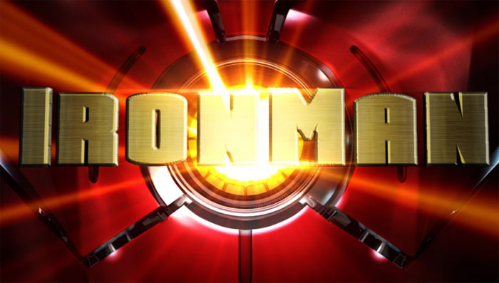
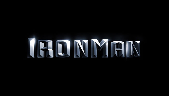
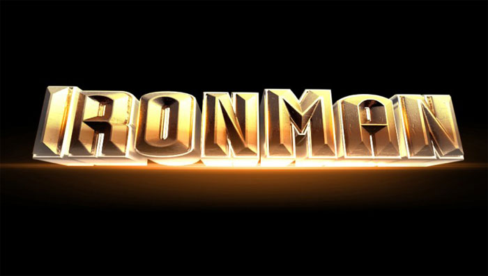
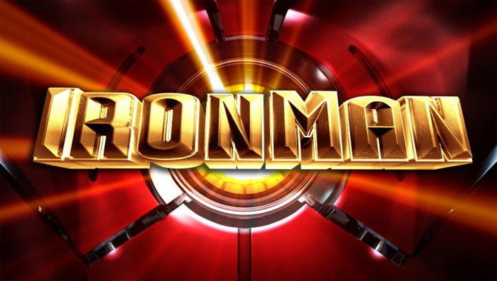
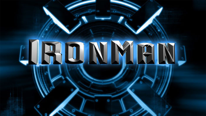
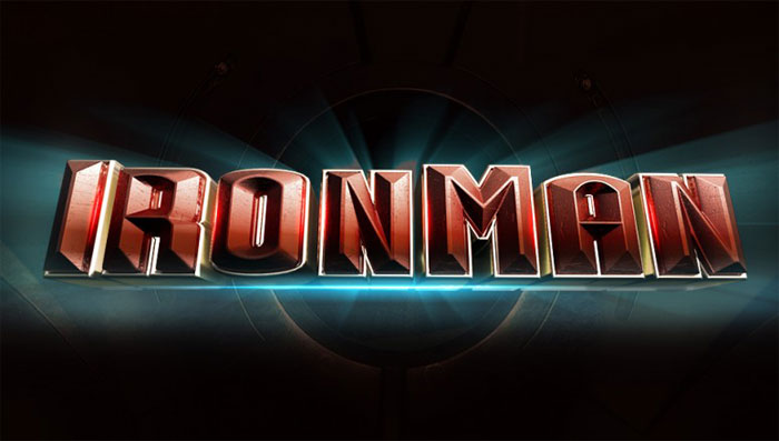
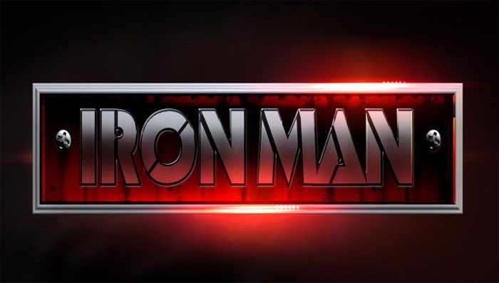
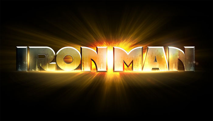
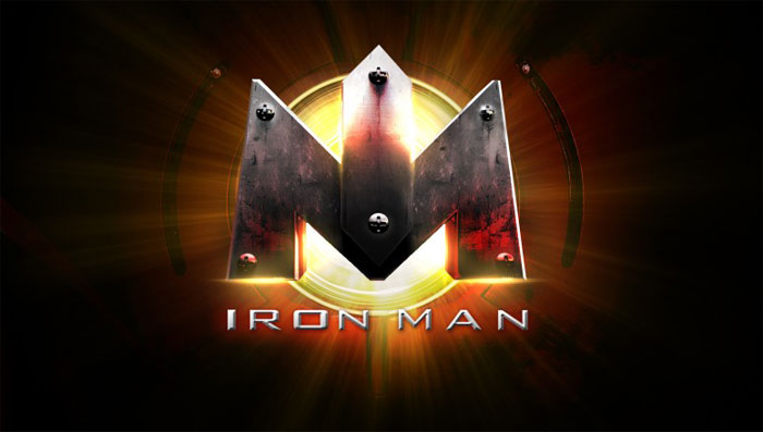
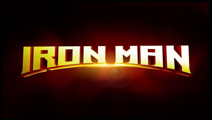
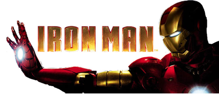
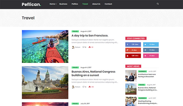

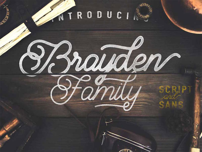
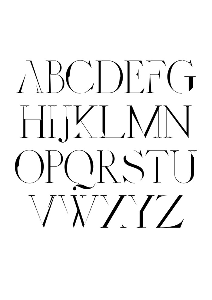
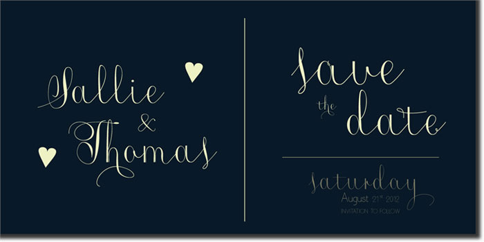
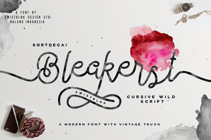
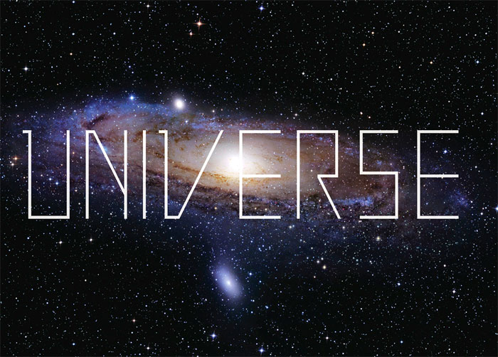
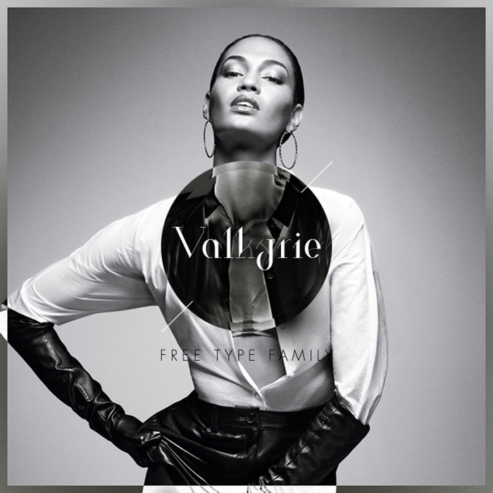
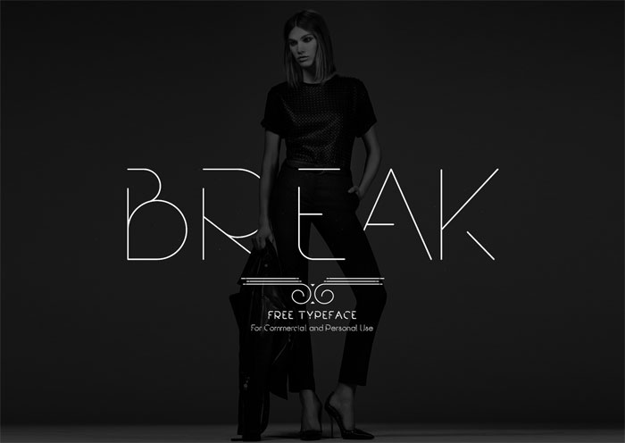
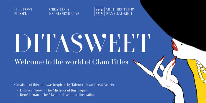
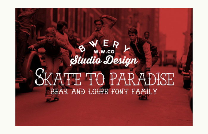
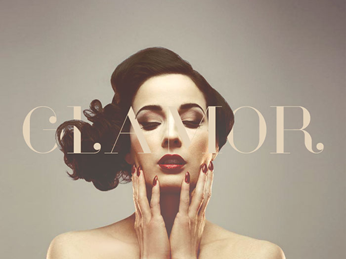
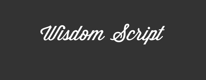
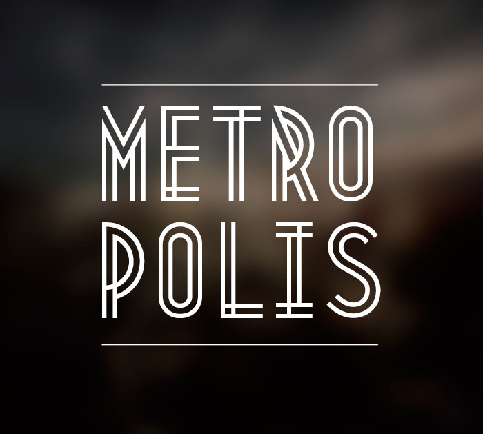
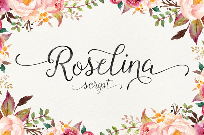
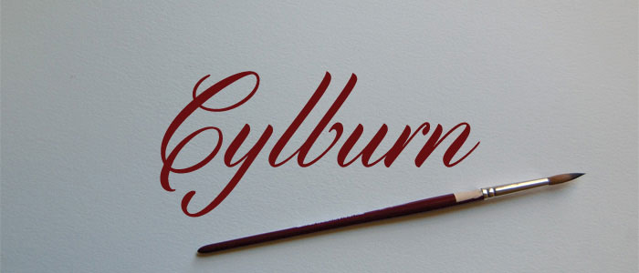
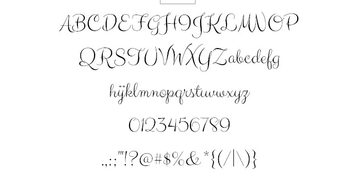
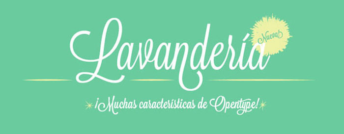
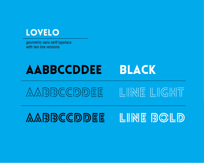
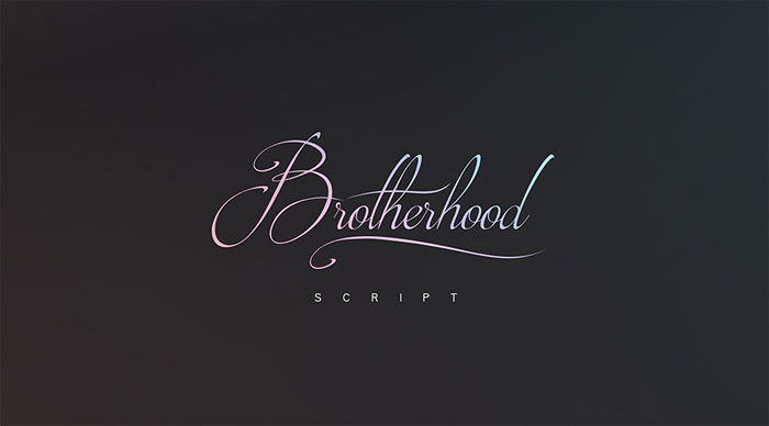
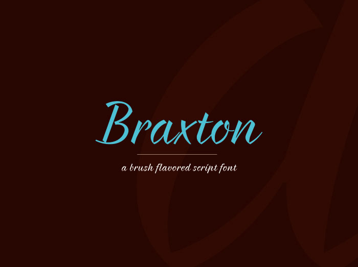
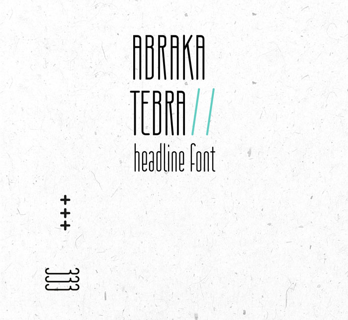
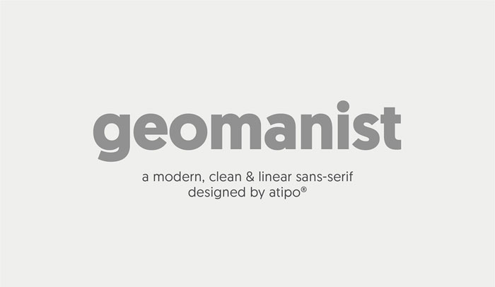
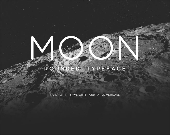
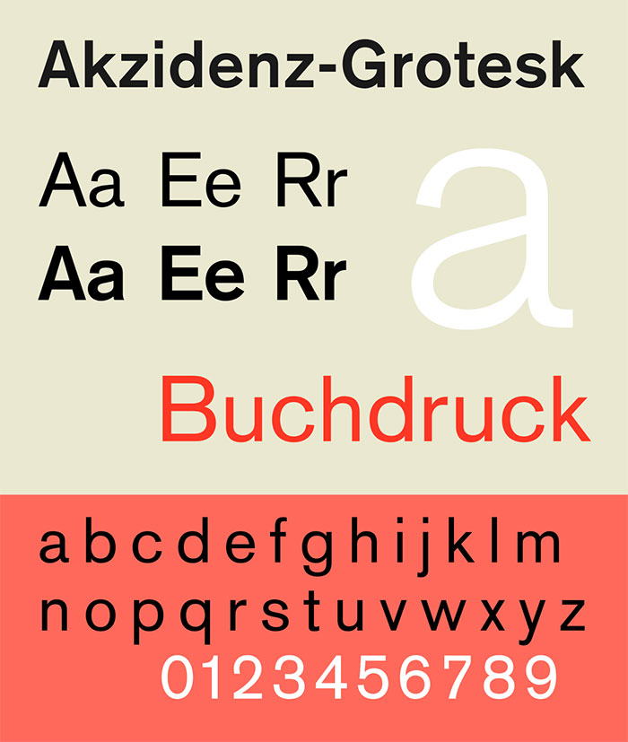
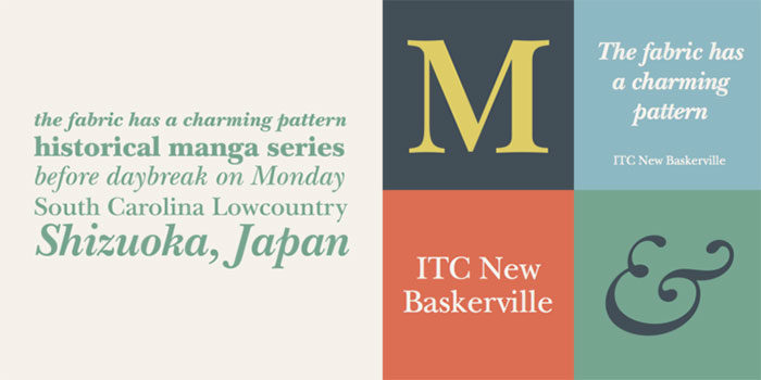
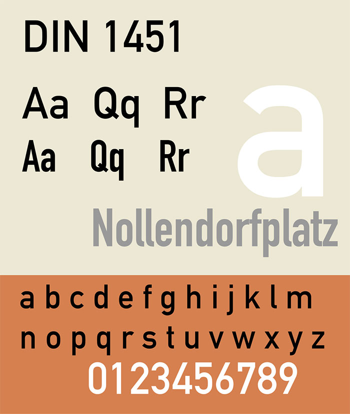
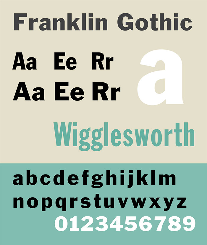


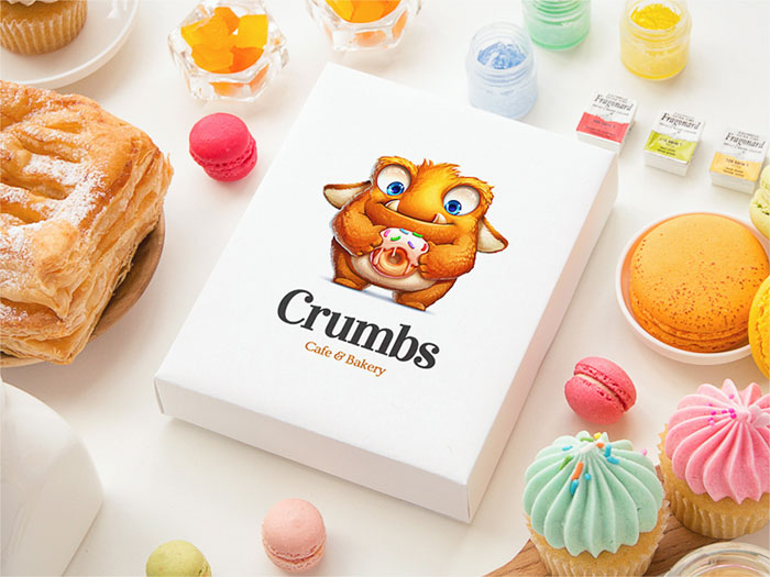
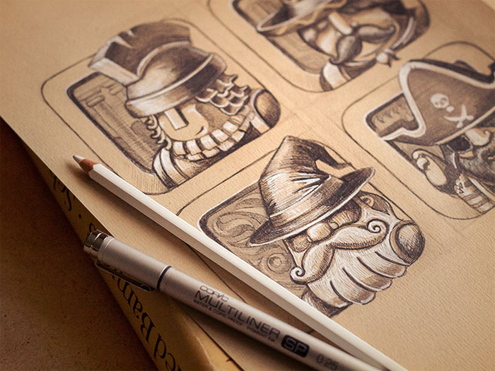
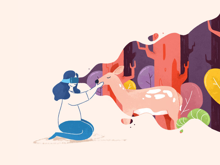
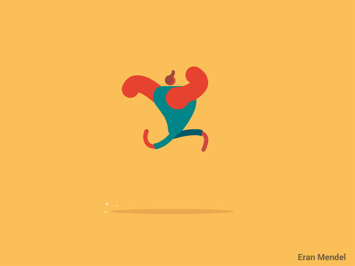
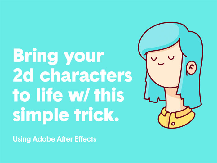
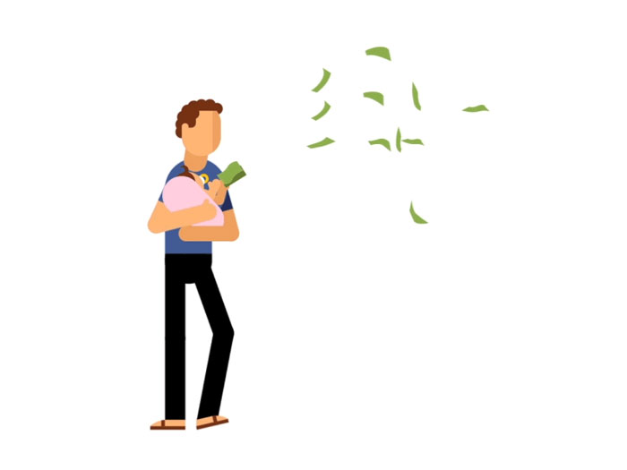
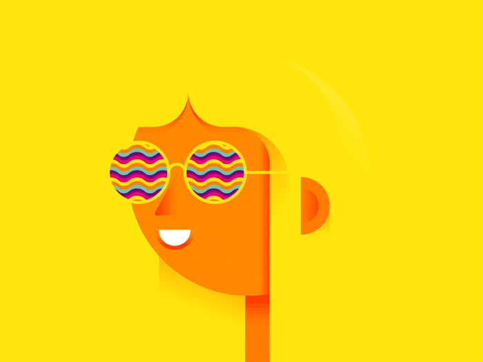


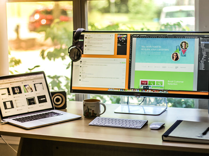

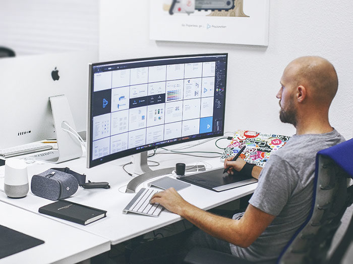
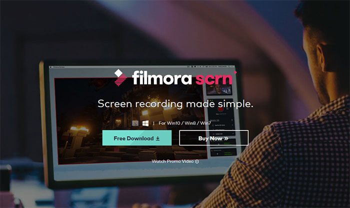
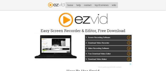
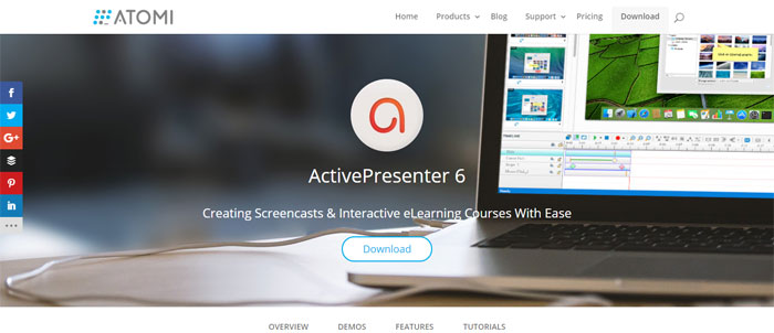
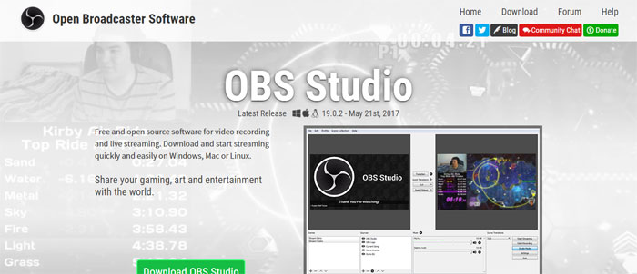
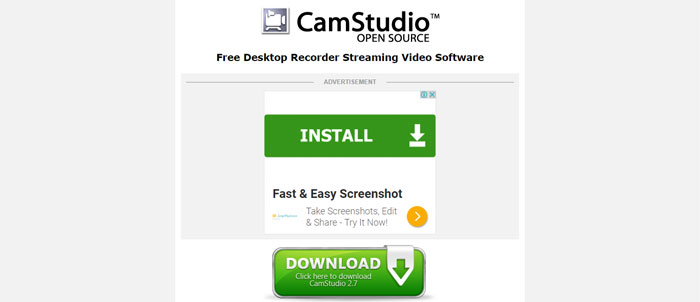
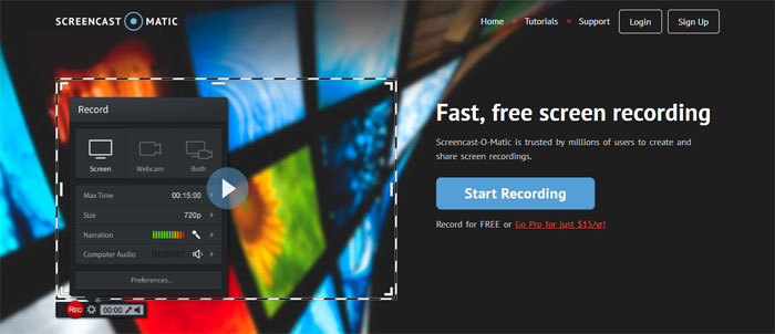
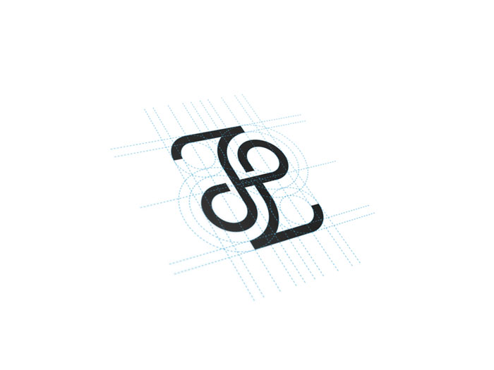
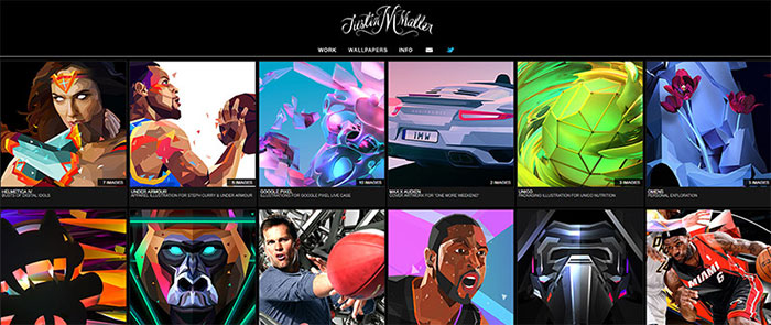
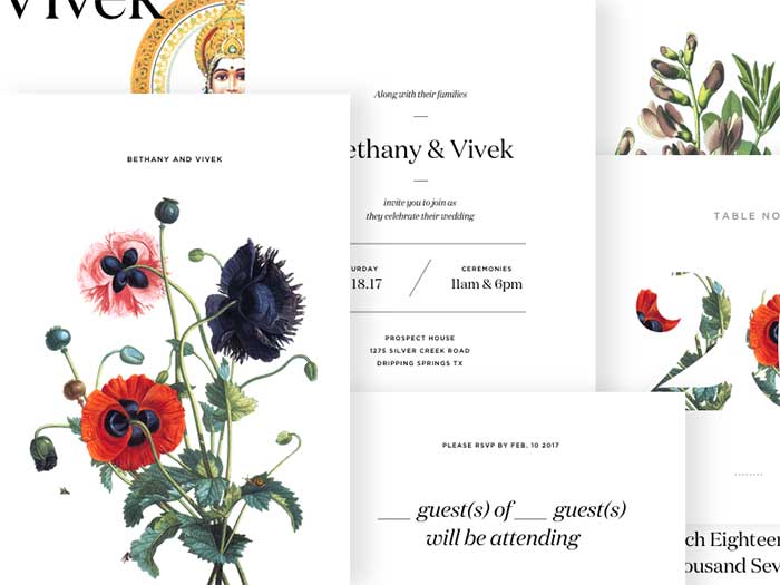
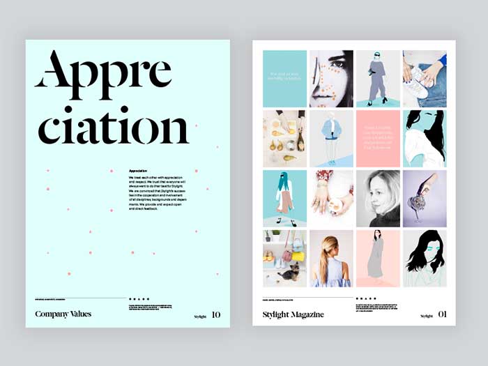
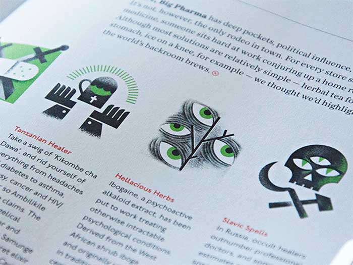
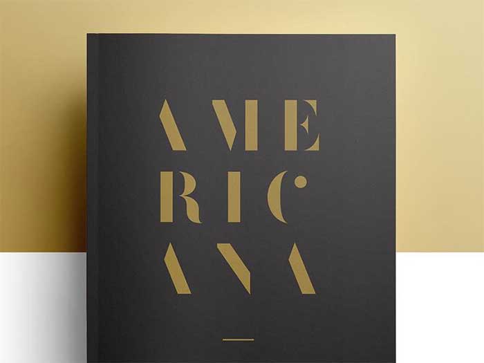
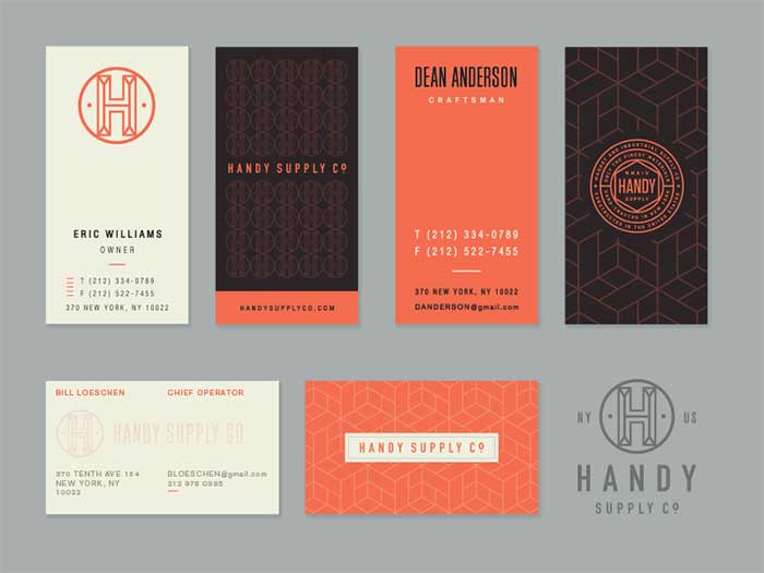

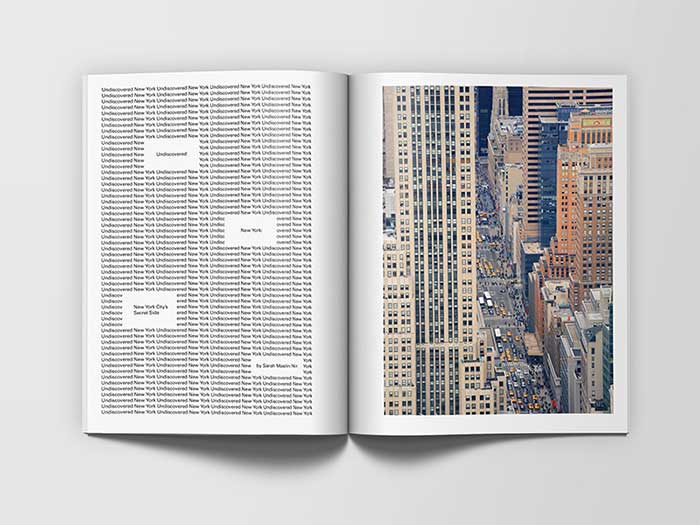
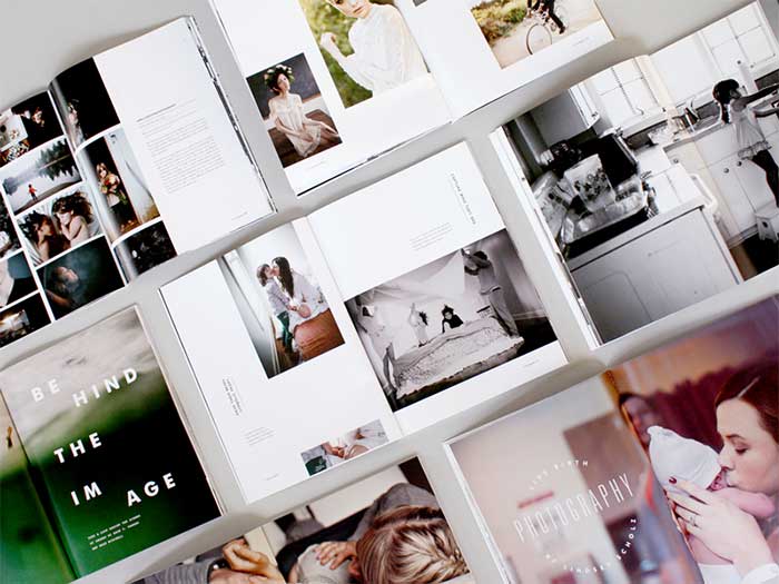
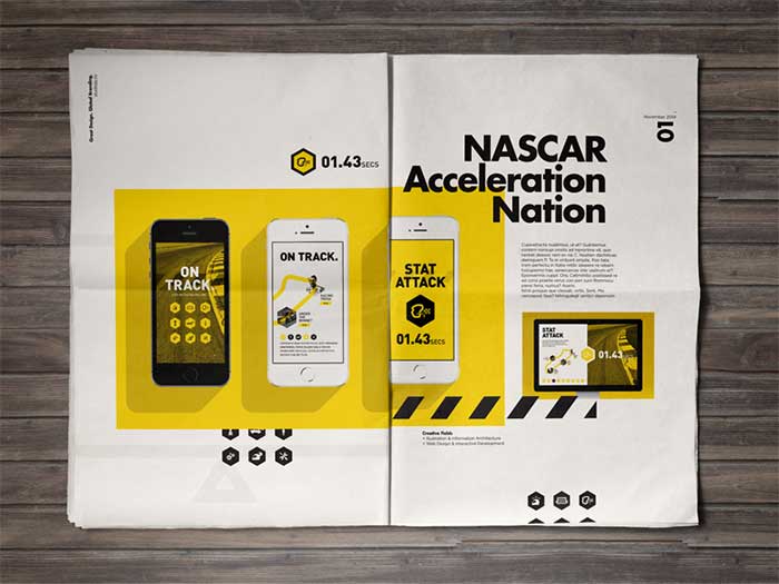
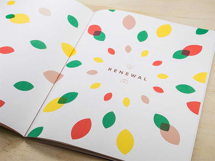
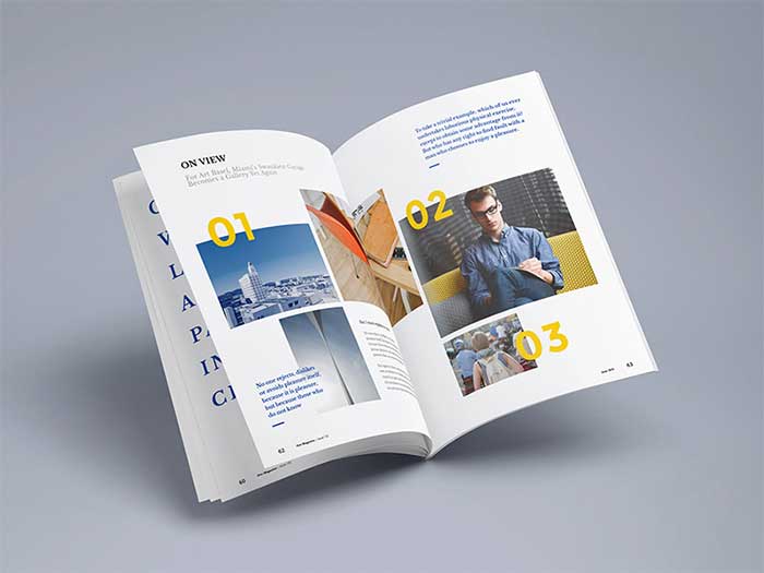
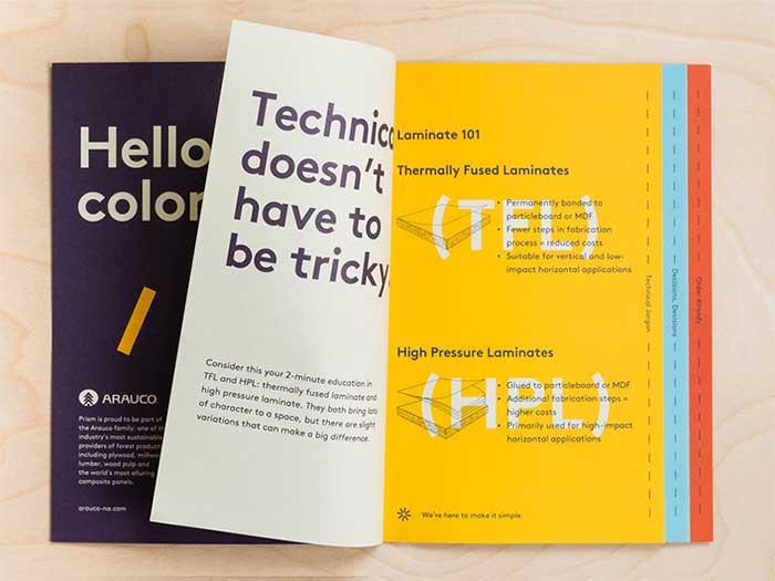
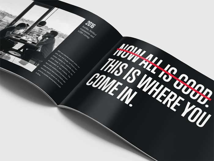
 RSS Feed
