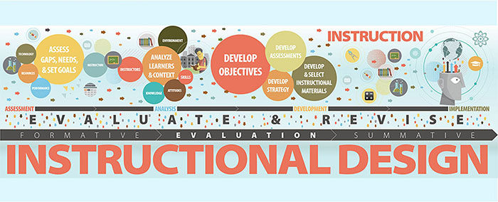
Having been in the field for some years, experience dictates that strong communication skills are paramount for success. Therefore, as an Instructional designer, one must always acknowledge that the audience is more important than the topic. When a project seems too complex, focusing on creating a sense of clarity goes a long way. This often starts by connecting with the learners on an emotional level, understand how people learn and also, have the ability to imagine oneself as being a part of the crowd. The main goal of instructional designers is to communicate effectively with the audience, both verbally and visually. They should also have a commitment and passion for learning to be able to design a course on any particular subject based on the expected outcomes, main budget and time. One should know how to create assessment methods designed to help students in their development. Academic writing in many cases is considered an important aspect of education. Instructional designers can now have access to a professional writing service so that the teaching material is perfect containing any unforeseen last minute modifications. They may provide relevant materials or submit a draft with the specific with detailed information about the topic of study. Let’s see how effective communication will help an Instructional designer socialize and forge meaningful connections with their target audience. Top Secrets to Effective Communication as an Instructional designer One of the most valuable skills in life that one could ever learn, if you plan on being a successful Instructional Designer, is how to communicate effectively with other people. This will surely help out in all aspects of life, both personal and professional, making it much easier to be understood and listened to. The following tips are tailored to assist an Instructional designer to get their message across as intended, without it losing its meaning:
Effective communication is crucial when designing any course’s curriculum and activities. Thus, the instructional designer’s role is to ensure that all communication with the parties involved is well-planned and does not end up confusing everyone instead. It is important to find the perfect balance when delivering the information as too much at a time will become a burden while too little could bore the audience. Engaging the learner at their own pace is essential to having an effective course, as well as using a variety of item types, images, and other delivery methods. All these elements put together in a interactive way keep them interested in the task at hand. Instructional designers need to ensure learners are excited to learn the content and not just memorize the material only to forget it in a weeks time. Skills that every Instructional Designer should have
Every job requires individuals to have certain characteristics which will determine how they interact and communicate with others. Have you ever wondered how effective communication makes a good instructional designer? Well, let me show you the characteristics that help to improve instructional designer communication effectively helping the learners accelerate their job performances. Below are the examples of the best characteristics of an instructional designer:
Using the tips above will help you make the material stand out, thus increasing the odds of getting hired for a project. It is important that you learn to communicate effectively as that is the cornerstone to develop the previously mentioned skills. Remember to focus on your audience, read their body languages and consider their response.
The post The secrets to communicating effectively as an Instructional designer appeared first on Design your way. from https://www.designyourway.net/blog/misc/the-secrets-to-communicating-effectively-as-an-instructional-designer/
0 Comments
If you’re designing a logo, it can be hard to know where to start. Getting some logo design ideas can be a big challenge. It is all too easy to try and cheat by doing something almost frighteningly easy, like drawing a circle, then just typing in the company’s name in the middle. There are designers out there who think the process is that easy and doesn’t; need to be any harder, but it results in logo design ideas that look all the same. It also cheats your clients out of what they’re paying you. They are looking for original, thoughtful work, not something you do just to get it done. It’s easy to get stuck in a rut even after you’ve started, too. Creativity can seem to run dry, or you can start relying too much on old ideas or someone else’s logo design ideas. Life can certainly get in the way. You can end up feeling like you have too many clients, not enough time, and no new ideas to work with. The client’s concept can seem ridiculous or boring. There are many, many reasons you can get blocked and none of them are fun. As a serious design professional, your logo designs need to be smart, thought out, and original. This is all in tall order. Too many designers just start tossing out bad logo designs in bulk to be featured on crowdsourcing websites. How do you avoid becoming one of those designers? Here are some tips and tricks for creating a logo that makes your clients and your professional pride happy! Use a Visual Double EntendreA lot of truly great modern logos use something that is best called a visual double entendre. This means that a logo uses two pictures wrapped into one through a clever understanding of an idea or a concept. It is clever and cool when it’s done well. It may even seem playful or profound depending on how you pull it off and what your subject is. It will make sure your logo stands out to any potential clients as well. Try looking at some of your client’s branding and identity in a new way that may make it much easier to pull off this visual double entendre technique. It’s often much simpler to do than it seems! Color is Incredibly ImportantColor is much of the way we perceive the world. Colors communicate moods, locations, themes, and even ideas. You should think through the colors you want to use in your logo design ideas very carefully. Consider creating your logo in several different variations of a color palette if your client hasn’t been too specific, or even several entirely different color palettes altogether. Be bold with colors and experiment with a new direction where you can. Colors say a lot about a brand. Even a minor change in color can create a very large difference in the impression the brand logo makes. Take the time to play with different color combinations in thoughtful and different ways. Avoid Using Clichés and FadsNew fads come along in logo designs every few years. While keeping up with these trends in logo design ideas is a good idea and can also be quite interesting and fun, don’t let them rule your logo creation process. Avoid jumping on any bandwagons. If you do, you’ll find yourself using the same ideas over and over again, looking much the same as many other designers out there on top of that. Make note of logo design trends and why they are popular. If they are a good fit to your custom logo design, include them, but not because they’re popular—but because they work. If you stick too closely to the fads of a time, your logo design will quickly become dated, and not in a fun retro way, but just in a way that seems old. This is a major risk these days because our world moves incredibly quickly due to technological and societal change. What is in today quickly becomes dated tomorrow. Make It OwnableThis is a concept that is commonly found in marketing. “Ownable” may very well be a made up word (spellcheck certainly does not recognize it), but marketers like to make up words a lot. Regardless, this is a very important concept. It means that you make your logo design ideas something uniquely recognizable. It is tied quite closely with the tip above. Your custom logo design needs to look like its own thing. It needs to offer your client a distinctive mark they can use to build their brand without being mistaken for anyone else or getting lost in the crowd. Everyone Likes Custom TypeCustom logos look really good with custom typefaces. It really helps cement the originality of the design. It’s very common to see a logo that fails to do this. Don’t look at a logo’s typeface as something you’re choosing just to make the company name look good. It is much more than that. Your clients are expecting more and will pay you for it. Rather, the typeface you use in a custom logo is a way to make sure a unique logo stays that way. Custom, hand-drawn type is quite hard for someone to rip-off easily—though if your logo design idea is successful and good enough, people will try to rip it off anyway. The KISS Principle: Keep It Simple StupidAll that said, it’s hard to just break out custom hand-drawn script right away. Not all designers are also great typographers or amazing illustrators, though those two skillsets will certainly be a big help. If you have challenges in this area, there is no need to worry. You can still create amazing logos. In the end, while design skills are very important, ideas and thought are going to matter a lot more. The key idea in this situation is to remember the old KISS principle: keep it simple stupid! These are four powerful words when it comes to logo design. Your logo design ideas should be simple but powerful. These kind of simple but powerful logos are everywhere in the world if you look and have endured for decades, sometimes even centuries. With this idea in mind, logo creation just got much easier. Keep Proportion and Symmetry in MindProportion and symmetry are very basic design principles. It is very easy to get carried away with them, sometimes even to the point of seeming like a complete lunatic (take a look at the new Pepsi logo pitch). However, they are enduring principles of art for good reason. Strip away the crazy of things seen in the Pepsi logo pitch and you’ll find some good logo design ideas there. Smart use of symmetry can bring a lot of sense to a logo, while proper proportions are key to making sure any logo design is just right to the human eye. Remember to Think about Negative SpaceNegative space is very important to any element of design, from text layout to logo design (of course). N egative space is an organizing tool. It allows the eye some visual relief and helps people know what o actually focus on. Forgetting about negative space is easy because it is the area where there isn’t anything, after all. You need to combat this tendency, however, and make sure you take the time to think about the negative space in your logo design. It will help you keep the logo from becoming cluttered and could result in some clever new ideas that really make the logo you’re creating unique. Passive vs. ActiveIt’s become increasingly common to try to instill a sense of movement or activity into a logo design. This is not always a good fit. The Apple logo, for instance, works very well and is very passive and static. However, in some cases, it provides your logo design ideas with just the boost that they need in both visual and conceptual terms. There are a lot of ways to do this, including through smart use of color and asymmetry. While it’s not the best idea for all logo concepts, it can work well if the brand is one that focuses a lot on something dynamic, like a sports apparel company. Understand What the Logo MeansThe best logo designs have a story. They’re not just pretty sketches. A good strong logo design is filled with meaning, some of which is obvious, other parts of which are hidden. The FedEx logo, for instance, has an arrow indicating forward motion and the making of deliveries. The Apple logo has a “byte” missing out of the apple. The Twitter bird is flying upwards. These aren’t just designed for the sake of design, but designs meant to signify something important about their brand and its values. You aren’t looking to just make pretty and unique liens on paper, but give the company a logo that means something special to them. Rules for Brainstorming a Logo
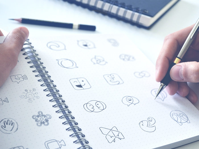
Generating logo design ideas can be hard, especially if your client doesn’t have the most thrilling name, mascot, or business. However, there’s a process you can use that makes it much easier to take your custom logo from a contract and some vague outlines of ideas to a concept that can be fully and beautifully realized. It’s quite similar to the process of brainstorming a business plan, article outline, or even a great new brand name. It basically uses rules to create a channel for your natural creative tendencies to flow through and navigate any challenges. Here are some great rules to get going on that logo design! Don’t Hold BackIf you’ve got an idea, put it out there. This is not the point in the creative process to censor yourself. It’s the time to get all the ideas out of your head where they can be looked at more closely and maybe even developed more thoroughly. Let it all flow. The truth is that you won’t be able to really give your ideas a fair shake if you don’t get them out there for you (and even your team, if you have one) to really see their potential. Write Every Idea DownPut your ideas down on paper no matter how silly, terrible, or ridiculous they seem. You’re brainstorming! You want to make a comprehensive list of all your ideas on the topic. Even “the worst idea ever” can spark a great conversation. You might find yourself coming back to them when you get into a rut and pulling some good concepts out of some terrible ideas. On that note, by writing everything down, you’ll have a record you can go back to if you need it. This can be really useful if you hit a block or a problem you can’t seem to resolve using just the concept you decided to go with. Choose the Right TimeBrainstorming is something that’s best done when you’re at your creative peak. This is different for every person. Some people find they are at their creative best after breakfast, while others think more creatively just before they go to bed. The best time to brainstorm new logo design ideas is whenever you are at your most alert, creative, and focused. Don’t try to brainstorm when you’re not in this creative sweet spot. If you’re dead on your feet early in the morning or if your brain slows down after a large lunch, those are not the times when you should plan on brainstorming. Allow Ideas to SimmerAfter you have your ideas written down from your brainstorming session, sleep on them for a little while. Walk away from your list and don’t lay eyes on it again for at least 24 hours. This allows you to come back to it with a fresh set of eyes. You might be surprised by what you see. Ideas you thought were great might really be silly, and ideas that seemed stupid might actually be the right ones to go with. Depending on the timeline you’re working with, it can be hard to pull this off. However, it is a really helpful habit to get into when creating a logo. It can make a big difference in how your design process goes and what concept you end up using. Get Clarity about Your BrandingYour final logo design really needs to feel true to your brand. You need to get very clear about what the brand you’re working with actually is, what it stands for, and what its values are. What is the story of the brand? What is the brand’s mission? What are the brand’s goals? The answers will provide you with a sense of direction for your logo and allow you to make it a success that stands out from the crowd. Now knowing the answers to these question right away is just fine. There are several ways to find them Make a list of adjectives that describe the brand Is this brand edgy, cool, and sophisticated? Is the brand approachable, energetic, and friendly? A list of these kinds of adjectives can help accurately define and capture who the brand is. You should start off with 25 to 30 ideas. From there, narrow it down tot eh top five that seem to be the most fitting and prominent in the brand’s identity. Make a list of words that describe how you want the brand to be perceived Do you want people to think of this brand as cutting-edge and innovative? Should they be viewing the brand as reliable and trustworthy? Should they look at the brand and think of it as fun and playful? Decide on the ideal picture of how you want the brand to be seen in the market. This will tell you a lot about the brand. Make a list of how you want people to feel when they see your logo design What do you want someone to feel when they spot your logo? Do you want them to get excited and energized? Do you want someone to see your logo and feel a sense of calm and start relaxing? Determine the emotions you want to elicit in the target audience. This will allow you to get a clear picture of the brand’s mission and goals. Decide on the Logo Elements That Will Tell Your Brand StoryAfter you’ve clarified your brand identity, it’s time to start pulling together your logo design. You need to figure out the best way to bring that brand story to life for all to see. There are a lot of elements to any logo design and knowing which ones to select (or even leave out) is a formidable challenge, even armed with your brainstorming list and your idea of the brand identity. There’s a lot of options out there and you clearly have a lot of ideas in your head. So how do you decide which design elements are the right ones for your custom logo design. Consider making a design inspiration board It’s always a good idea to make a design inspiration board when starting out on a new design product. A design inspiration board will allow you to collect all the things you find inspiring for the design in one place whether it’s a color swatch, a painting, or an existing logo design. Look for patterns in what inspires you. You might see a lot of a particular color, like blue or green. That probably means you should include a lot of that color in your logo design. If you notice a lot of other kinds of patterns, like a lot of retro design, think about looking into focusing on that kind of design. As you put together your design inspiration board, feel free to pull inspiration from everywhere and anywhere you can find it. Take pictures of things that strike you with your phone as you go about your life, for instance, and stick them on the inspiration board. Use the things on the board to pick out patterns and use those patterns to help you decide on what design elements are important to you. These can include: Logotype- You might find a particular kind of graphic or logo shows up a lot on your design inspiration board. This is a good sign of the direction you should go with your logo design. Typography (fonts) – Font is really important for reinforcing proper branding. Look closely at the typography that shows up on the design inspiration board. You’ll likely notice font choices that are tied to the theme and tone of the source material. Use those ideas to select fonts that fit the brand. Rounded fonts, for instance, have a nice friendly feel, while whimsical fonts are very playful and bold fonts offers a more serious tone. Color- It’s hard to overstate the importance of color. It’s one of the most important things your design inspiration board can offer guidance on. You’ll probably notice that a few colors are very common. Pay close attention to these. Color selection is incredibly influential and can make or break the whole logo design. Style- You’ll notice a lot of commonality in the style on your design inspiration board. If you notice a lot of photos from the 50s and 60s, it’s clear that a vintage logo design is the way to go. Likewise with more modern flat stylings or minimalist ones. Ending thoughts on this logo design ideas articleWhenever you’re brainstorming logo design ideas, remember that your end goal is. You need to keep in mind what you want to use your logo for. Make (or ask for from your client) a list of any place where the logo will be used. This includes websites, menus, flyers, merchandise, packaging, and much more. Your final logo design needs to work in all these places, not just a few of them. This should be the driving idea behind your whole design process and all your logo design ideas. Logo design is not just an academic creative exercise, but a thoughtful one meant to communicate a particular set of ideas for a certain purpose. If you enjoyed reading this article about Logo design ideas, you should read these as well:
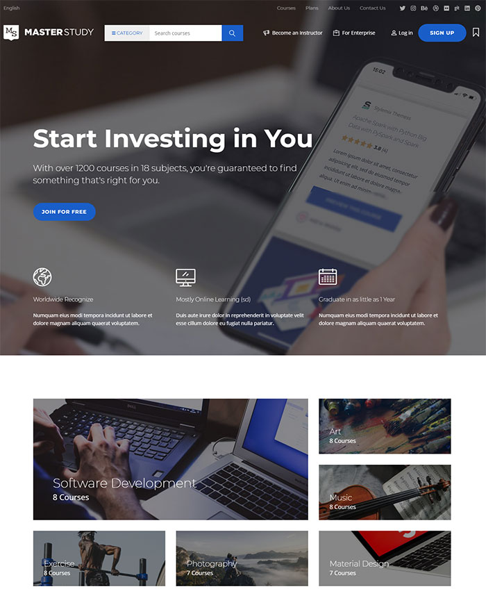
The post Logo design ideas that you should use for branding projects appeared first on Design your way. from https://www.designyourway.net/blog/graphic-design/logo-design-ideas/ What is MasterStudy?MasterStudy is an elegant WordPress theme for educational needs. It is complete with premium plug-ins that are integrated professionally in order to save your money and build the best online learning website both for teachers and students. This WordPress theme is one of the best in the educational domain, it is extremely useful and was created based on the deep study of the niche, its goals and needs. It allowed us to develop a wide range of functions to save your time. You can launch your website fast and easy, and there is no need to think about complex functions! Who is MasterStudy suited forMasterStudy mainly focuses on online courses. It is best suited for private tutors and can also become a fully functional solution for any educational establishment (be it a college or a research university). Thanks to it you will be able to create a bright and effective learning centre and achieve the best results. 
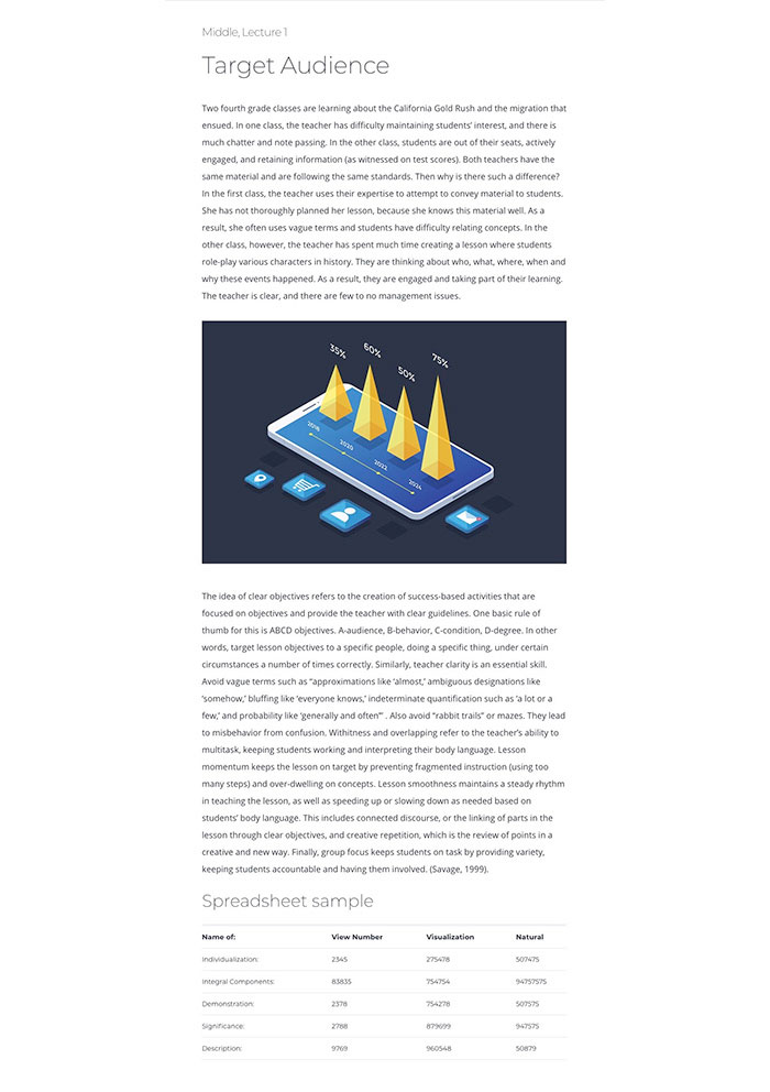
The integration with the WooCommerce plug-in will allow you to organize a number of free and paid courses in different categories. Thanks to the plug-in you gain control over the number of students and available places in each course. If your objective is creating a superb educational website, MasterStudy theme can become your most important ally. MasterStudy features a practical design that will undoubtedly draw private tutors and students. No need to know coding, no need to hire web-developers. MasterStudy by a Power Elite author at ThemeForest includes an impressive range of premium functions that were integrated for free for your convenience. What’ new in the updated MasterStudyStylemixThemes developer team decided to abandon traditional LMS plug-ins and presented an exclusive solution, their own educational management system, to the world. In order to create it, we investigated the best practices of international web-learning projects, as well as the needs of teachers and students. Based on the benchmark, we decided to implement important functions that are not present in other solutions of the kind. Convenient and effective online learning has just become even closer and more available! There are 3 types of online lessons offered. The first one is a text lesson suitable for the students who absorb textual information and infographics well. This is how it looks: It describes lecture thesis and references and provides detailed information in tables. The second type of online lectures is represented as slides. It is aimed at students with well-developed visual perception and makes it easier to process the educational materials for visual learners. An example of a lesson of the kind: 
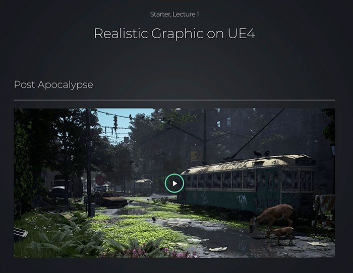
The third type of online courses is based on videos. According to scientific research, this is the most effective learning format that works equally well with all types of human perception. Learn more about how it works below: 
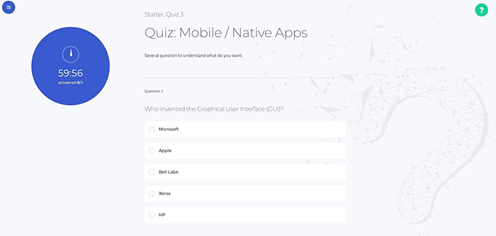
Upon the completion of online courses, the system allows to perform progress tracking of students and to determine their results. The time-testing function is implemented, the index of correct answers is displayed in percent: 
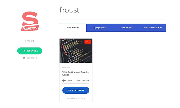
There is a personal dashboard developed for each student. Here, you can find all important information about all courses a student is attending, it’s possible to send and receive personal messages, to see test results, and to review one’s orders: 
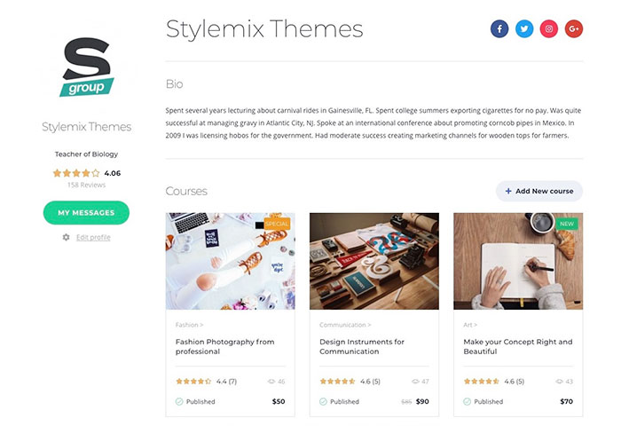
MasterStudy offers an extended tutor account that includes his or her qualification and rating based on the student reviews: 
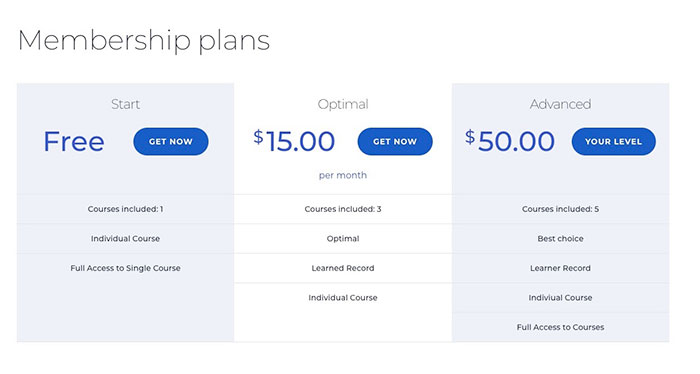
Paid Memberships Pro plug-in is used for planning, it allows to create integrations of favourite courses and form subscription plans: 
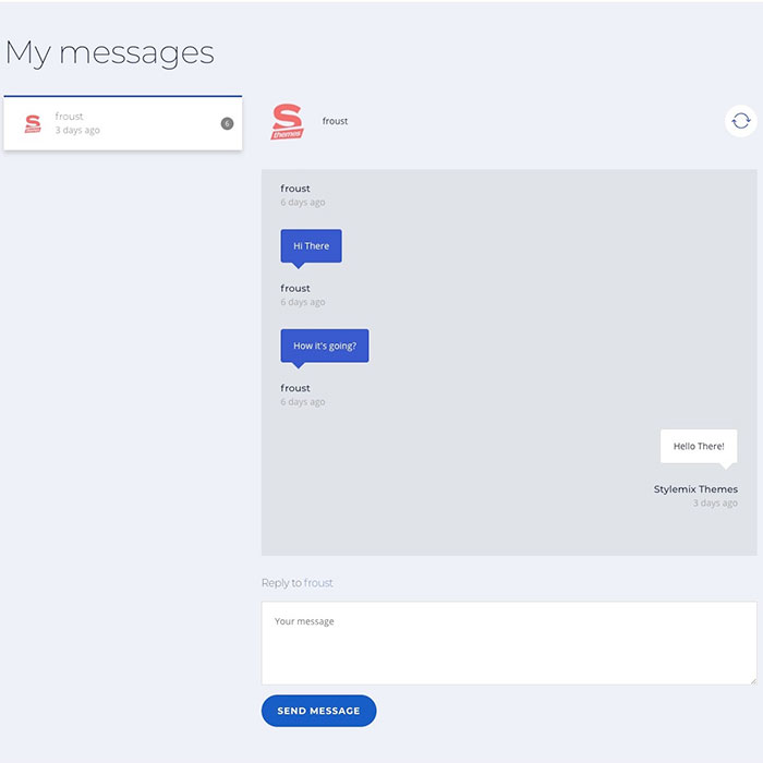
An inbuilt chat makes it possible for students to communicate with each other and their teachers. It ensures a better involvement into the learning process and a more effective absorption of the material: 
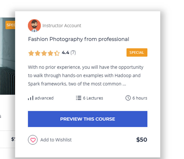
On the main page, users can see the details of the most popular courses. It’s enough to hover over the course you are interested in to do it. 
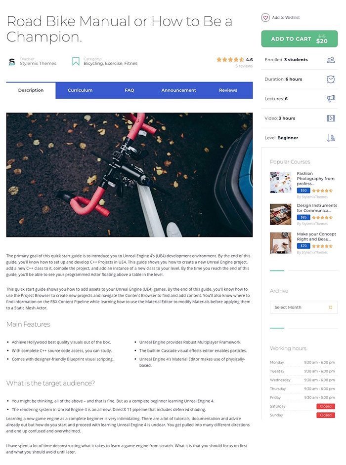
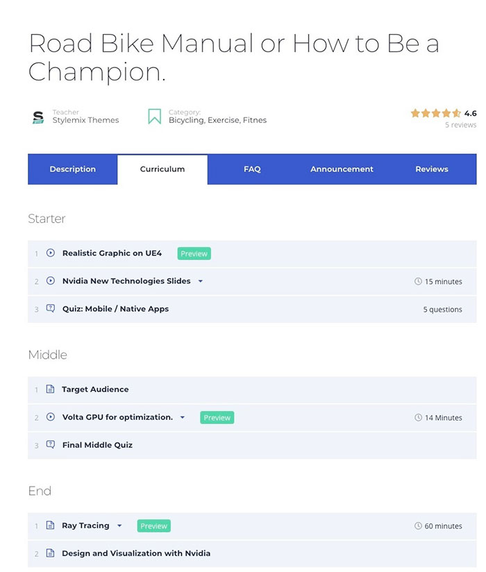
A course page contains the details about its price, the number of lectures, and the level of students required for the educational materials. Here, you will find course rating and announcements. Here’s how the page looks: As you can see, the page contains course description, frequently asked questions, level requirements, course length, schedule, and the number of students in one group. In the Curriculum tab the contents of lectures, seminars, and practical lessons are displayed, along with their order and the amount of time required to accomplish them. The curriculum management tool allows to organize contents by drag-and-dropping separate elements: 
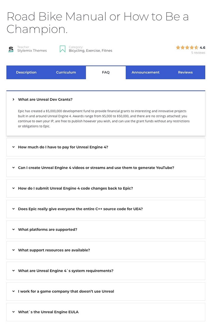
The Frequently Asked Questions tab contains the most demanded information on the student course: 
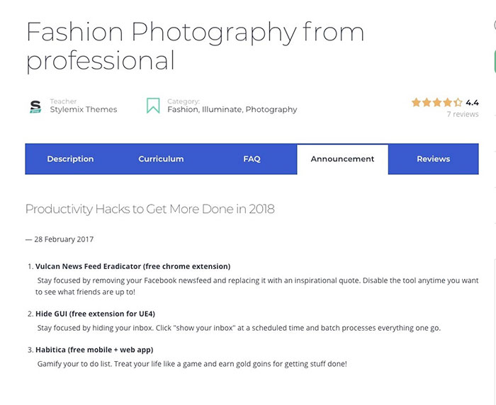
News, announcements, and all the important information about the course is displayed in the Announcement tab: 
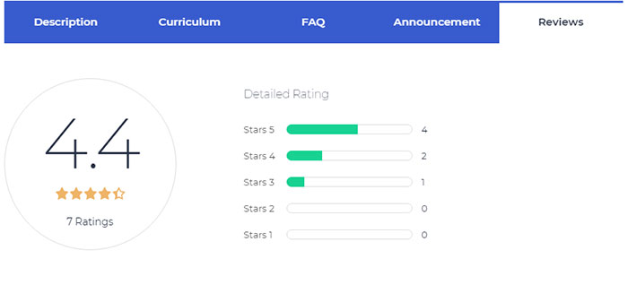
The last tab of the course page contains student reviews. The feedback function allows students to leave their reviews for all courses they attended. This simplifies making the right choice for those who are searching for the course that suits them the most. MasterStudy Design: What’s New?Learning is a pleasant and attractive experience for many people, while others feel like fleeing and staying away from educational materials upon hearing the word ‘study’. This is why it is important to choose the right WordPress theme for the online courses you are offering. MasterStudy is not just visually attractive, it also contains the functionality students and teachers need thanks to the own LMS. All demo-versions can be imported in 1 click, but any layout can be complemented and changed by the means of Visual Composer, a page builder. If you need to add content or create a new page for your educational website, you can do much more with MasterStudy than with any other educational WordPress theme. It is ensured by the Premium Visual Composer plug-in. This tool simplifies the creation of content templates on your website thanks to drag-and-dropping. Once your page templates are ready, just fill them effortlessly with useful elements and functions. Students may get access to their courses from any device, be it a smartphone, a tablet, a laptop, or a desktop computer. As long as a student has a screen and the Internet connection is working, he or she can use all advantages of your educational website. Extended Functionality of MasterStudy
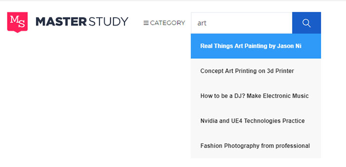
Thanks to MasterStudy, modern search fields for quick and effective search of blog posts and courses will be implemented to your website. 
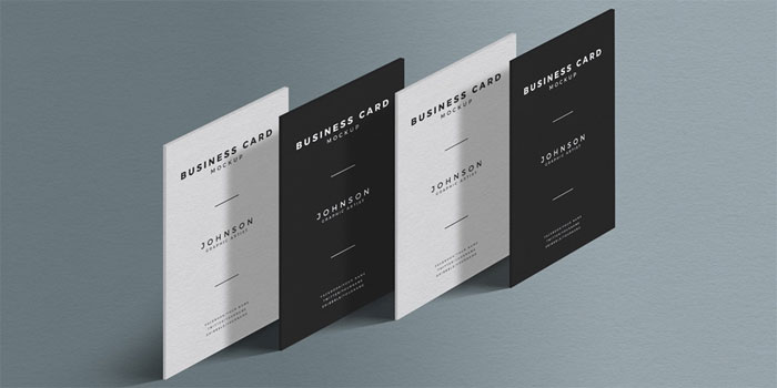
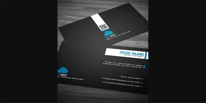
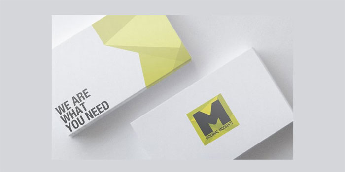
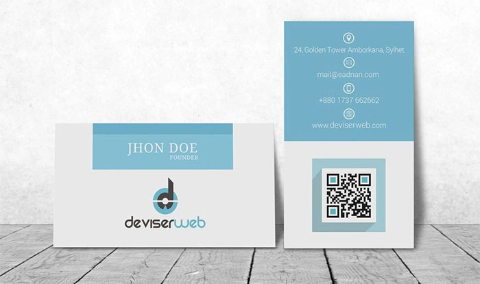
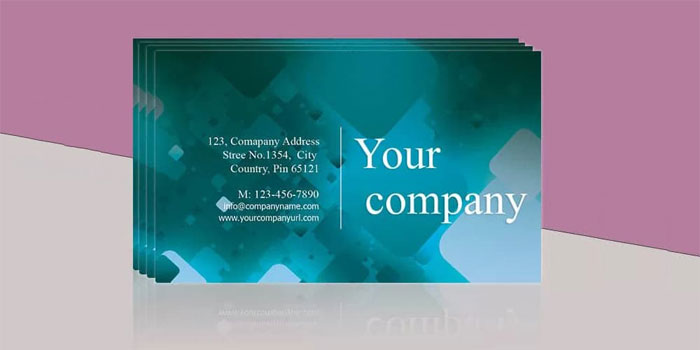
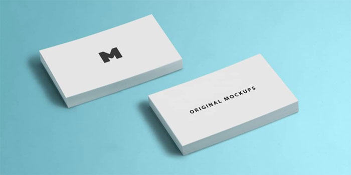
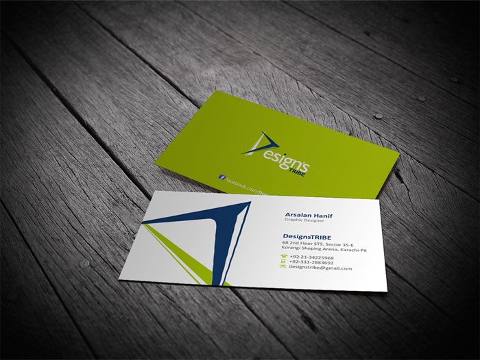
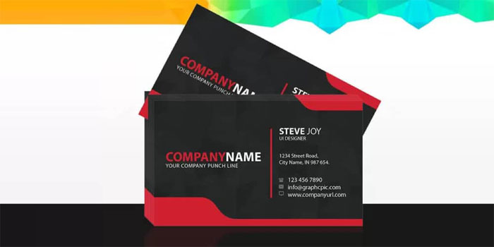
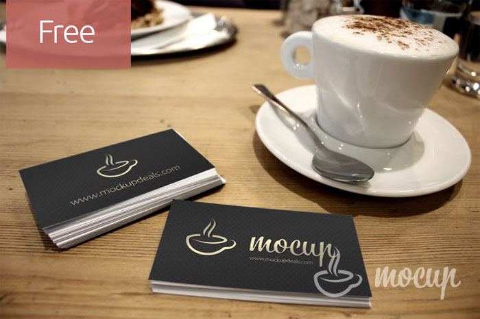
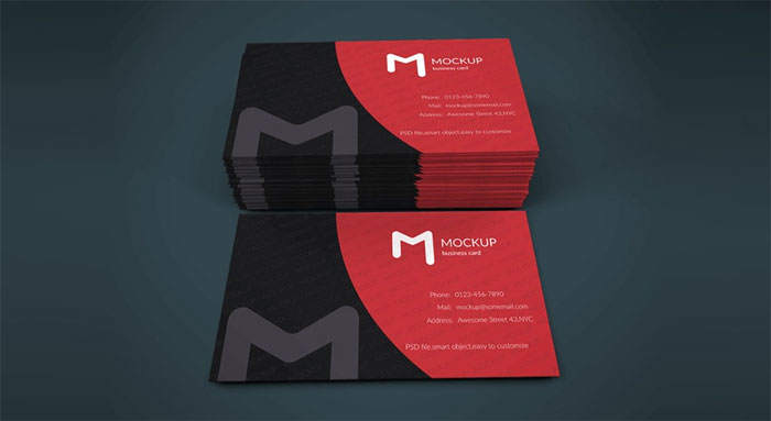
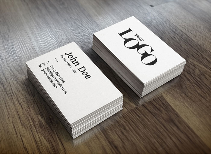
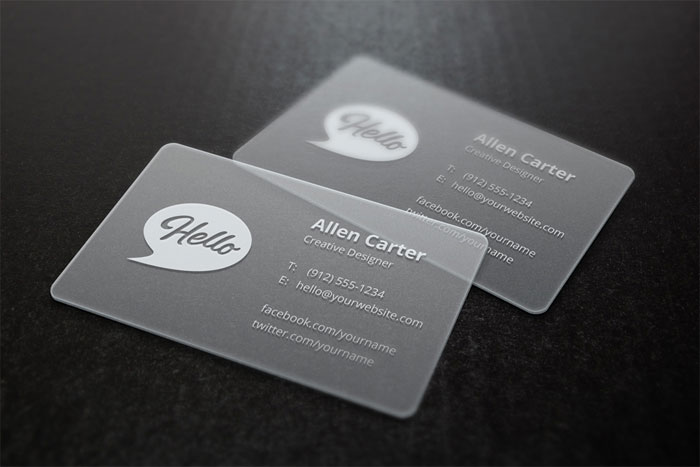
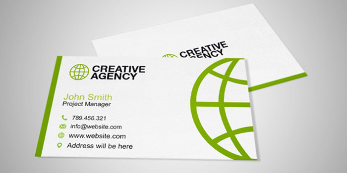
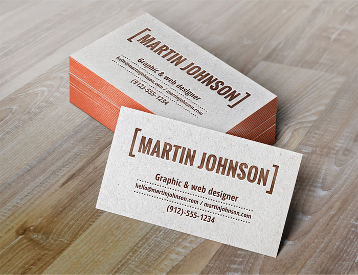
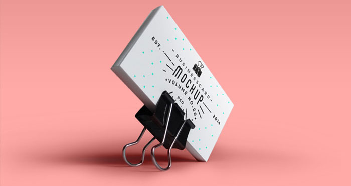
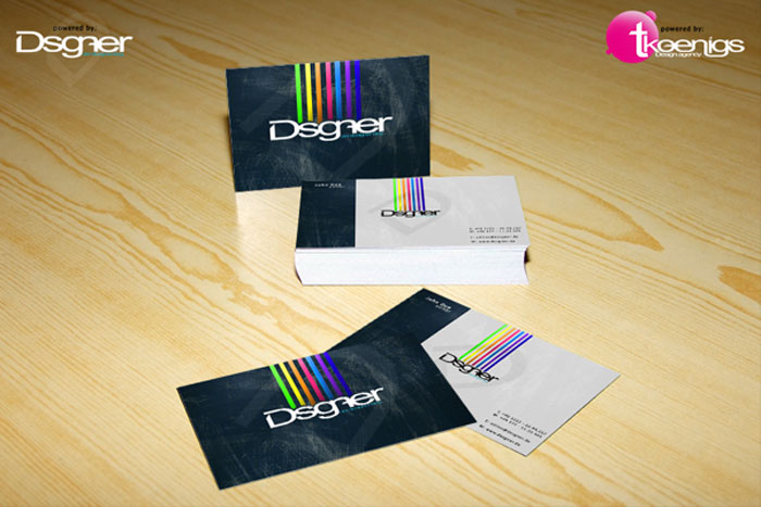
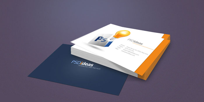
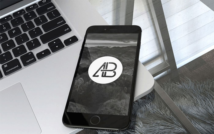
If you are an independent online tutor or a large educational establishment (be it a college or a research university), the combination of the flawless design of MasterStudy and the great choice of integrated premium plug-ins makes this product a perfect solution for your website. MasterStudy WordPress theme occupies the topmost position in the list of educational products thanks to the impressive number of its functions and definitely is worth of your attention. This well-documented and user-friendly WordPress theme will help you to successfully promote your online courses and educational services. The post Revolutionary Learning Management System (LMS) for WordPress appeared first on Design your way. from https://www.designyourway.net/blog/wp/masterstudy/ Having a business card mockup when presenting your work to your client should be a must. It gives the client an idea of how the business card will look in a real environment, not just in a flat PNG that they see via mail. Business cards are becoming increasingly popular even as the world moves into the digital realm. An effective business card will help you stand out from the competition. You as a designer understand the importance of effective presentation in order to make a significant impact. A unique and well presented business card will make a great first impression. As a designer, you know how vital it is that a card is able to share instant and effective information about your client. No matter your client’s profession, make the most of these great business card mockups for your next project. Each of these business card mockups comes in PSD format, which means you will be able to make changes as needed, while creating your own unique designs. These mock-ups are available for both commercial and personal use. Free Standing Presentation Business Card Mockup PSDFree Standing Presentation Business Card Mockup that will suit your personality and makes you able to freely and handsomely presentable in front of the world. They have made it with the full-fledged understanding of the specifications and features of a business card and prepare in a creative way. You will surely love this creation and stay attached with us for more creative updates. Free Textured Business Card Mockup PSD
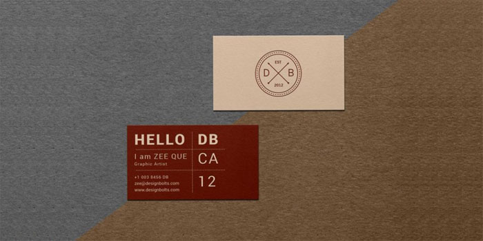
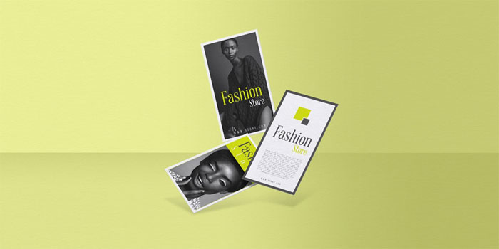
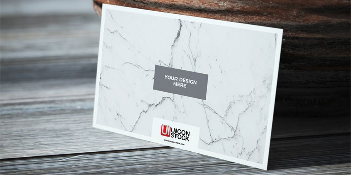
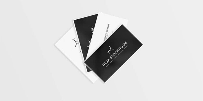
Free vintage business card mockup in which you can place your own design elements and make a presentation out of it. Your clients will get it approved if once you show them how the business card will look in its printable form. Free Floating in Air Business Cards Mockup PSD
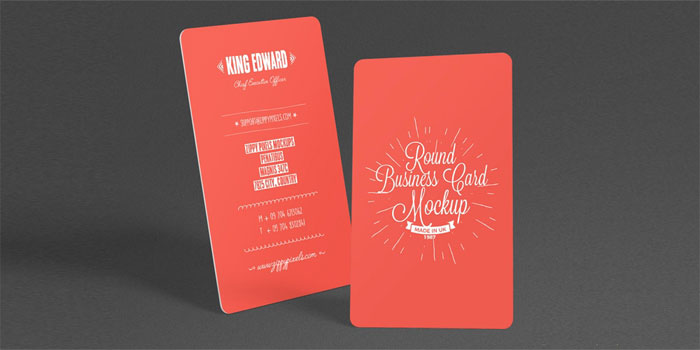
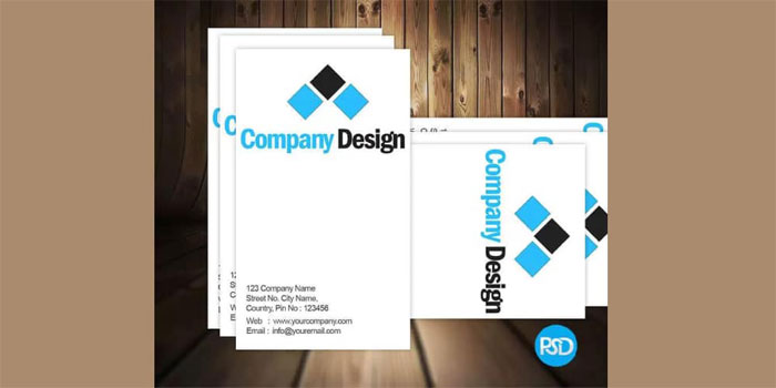
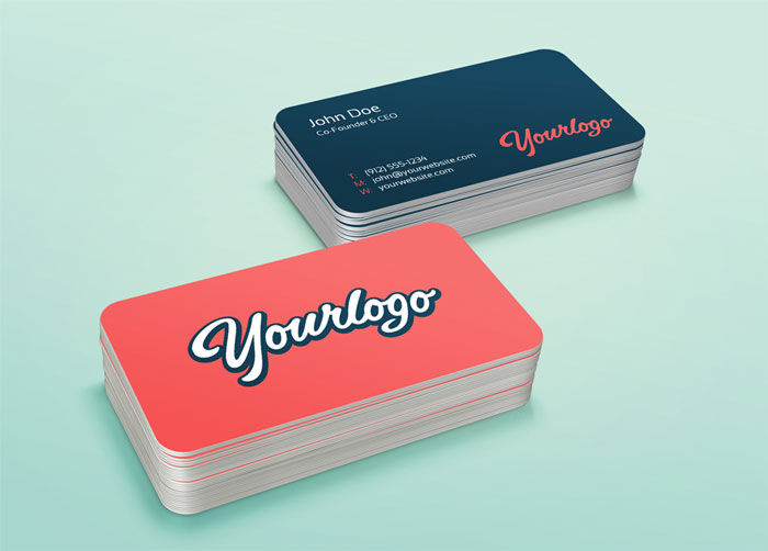
The most professional and elegant Free Floating Business Cards Presentation Mockup, which is designed in PSD format. The editable format allow you to make changes easily and via smart-object layer you can get the desire presentation. Free Stylish Round Business Card Mockup PSD
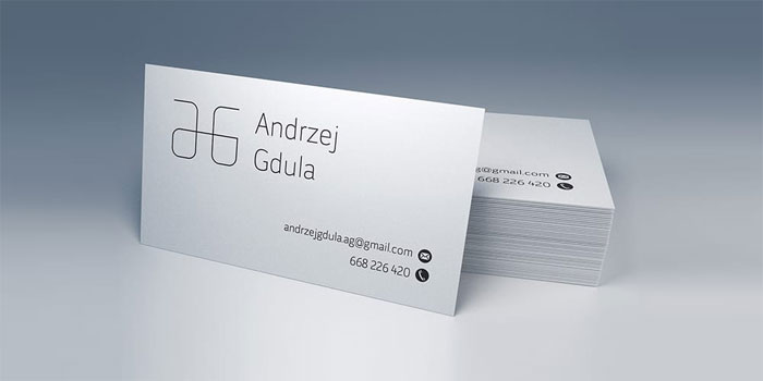
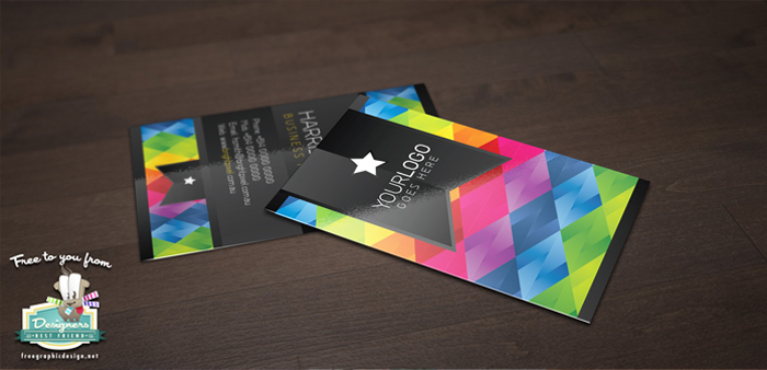
An elegant free round business card mockup of 4.25″ x 6.74″ size featuring various customizations to take your presentation to the next level. This high resolution mockup provides you with the ability to change the background color and adjustment the shadows to suit your design presentation.This mockup is the winning combination your design needs. Simply access the ‘Smart Object’ option to insert in your design. Free Texture Paper Business Card on Wooden Table Mockup
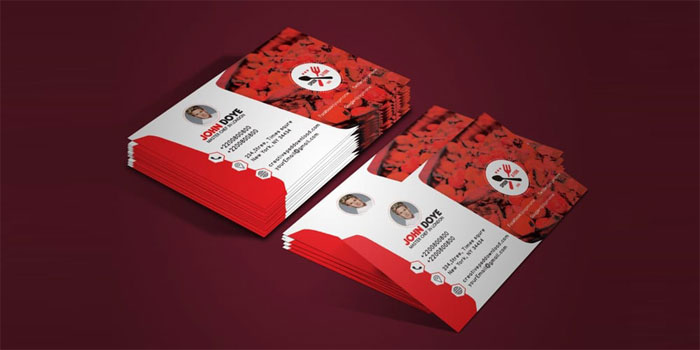
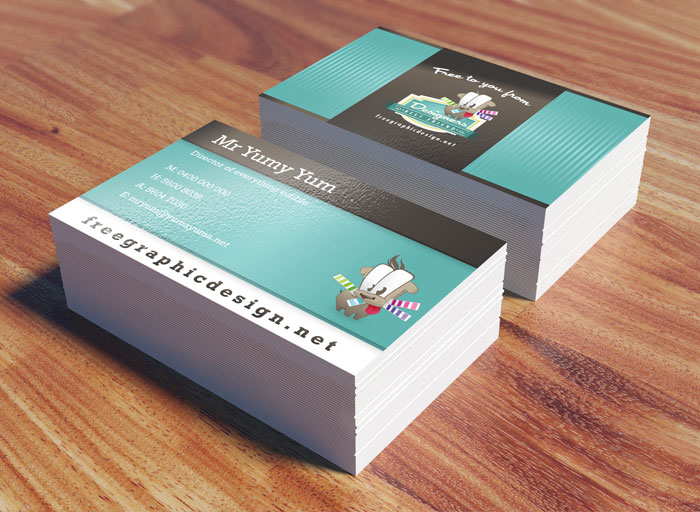
Free Texture Paper Business Card on Wooden Table Mockup, which is really awesome and ready to use. By using this awesome mockup you can easily give your business card designs a fabulous look. Simply drag and drop your business card designs in smart-object layer and finally get the flawless presentation. Chef Business Card Mockup PSDAnyone who enjoys cooking has probably thought about what it might be like to work as a high-end chef. And let’s be honest – more than a few of us have pretended our kitchen was a studio and we were the latest Food Network star. Cafe Vertical Business Card Mockup PSDThis corporate vertical visiting card mockup is simple but creative which can be used for chef business card, food business card, restaurant business card, cafe business card and all type of food industry. Free Corporate Business Card Mockup PSDProfessionally design business card mockup with PSD. All text layers can be changed with one click. All objects are in vector shape, can be resized without any quality loss. Free Clean Business Card Mockups PSDThey have created these business card mockups by photographing real white business cards in a light tent. Most of the shadows are extracted from real hi-res photos to bring that smooth real shadow. Free Simple Business Card Mockup PSDSimple Business Card PSD Free Dowload for you, like business card, corporate card, personal card etc.. you can change image, text what you want. Business Card Mockup PSDSimple to use and crisp look – that was their goal, when they were creating this one. Business Card MockupThis Free PSD Mockup help you to display your business card design in a great photo-realistic presentation, with a simple double click and drag and drop into the smart object, your design will be presented in a stunning way. Free Business Card Mock-up PSDThis Business Card Mock up can be use to show Horizontal and Vertical Business Card. Photo realistic Shadow and white color background and Easily can change the card with smart object. Modern Business Card Mockup PSDModern Business Card PSD Free Dowload for you, like business card, corporate card, personal card etc.. you can change image, text what you want. Business Card Mockup PSDThis Business Card mockup helps you to promote your stylish card designs, is a PSD Mockup fully editable and you can change the color of what you want. Free Business Card MockupUI Designer Business Card Mockup PSDThe PSD includes all customizable layers, so you can change your personal information, background, logo and what you want. Free Business Card MockupA photorealistic PSD mockup business card. Realy easy to edit. Use the smart layers to place your design. Business Card MockupShowcase your work with this simple yet modern business card mock-up. PSD file is fully layered, grouped and include smart objects, change easy your design. Free Business Card Mock Up PSDRealistic Business Card Mock UpThis business card mock-up is fully customizable. You can add your design or simply edit the template information very easy, via smart object. The shadows, reflections, depth of field and background texture are on separate layers, so you can play around with all the details. Free Business Card PSD Mock UpWhen presenting your new business card design in either your portfolio or to a client, it’s a great idea to use a mock up. It adds an extra element to your design, and helps whoever is viewing it to visualise a final printed product. Stack Business Card Mock UpThis is a clean photoshop business card mock-up based on smart objects. You can easily place your design, change colors or reposition the stacks. Your design will be visible on the top as well as inside the stack. Free Business Card Mock UpThis free business card mock up is a great way to present your business card designs to your clients in a realistic setting. Its completely free for both personal and commercial use. Translucent Business Cards Mock UpA high detailed business cards mock-up to showcase your business card design as printed on translucent plastic. The PSD file is fully editable, including the depth-of-field effect and you can easily add your designs using the smart objects. Free Business Card Mock UpUsing mock-up is a great way to show your design presentation. They created a simple business card mock-up for their users, so they can use it to present the business card in a better look. It is very easy to use, just double click the Smart Layer, copy & paste your artwork and that’s all! Letterpress Business Cards Mock UpA photorealistic PSD business card mock-up to present your business card design with the unique, tactile feel of letterpress printing. Use the smart layers to place your design and change the business cards side color via adjustment layer. Business Card Mock Up PSDA paper clipped psd business card mock-up template to showcase your business card designs in a different and original way. Business Card Mock UpBusiness Card Free MockupIf you enjoyed reading this article about business card mockup templates, you should read these as well:
The post Business card mockup templates to use for presenting your designs appeared first on Design your way. from https://www.designyourway.net/blog/resources/business-card-mockup/ You can find plenty of JavaScript-based slider plugins on the web for free. These work great and support all modern browsers, but nowadays you can replicate most of these features with pure CSS. Every carousel has its own style, so there is no best method for building one. But I’ve collected some of the best open source snippets from CodePen that you can use as templates for your own carousels. These designs range in style and behavior, but they all run on raw CSS code. Full Page SlideshowFull page slide show based off of Jonathan Snook’s tutorial. Greensock animated slideshow [wip]A fullscreen, sort of responsive, slideshow animated with Greensocks TweenLite/Tweenmax. Nautilus SlideshowNautilus slideshow with HTML, CSS and JavaScript. Tweenmax slideshowA customizable slideshow TweenMax. CSS FadeshowThis is an extended version of a pure CSS slideshow gallery which comes with more and easier customization and previous/next buttons. Slick Slideshow with blur effectSlideshow with blur effect in HTML, CSS and JavaScript. Ken Burns effect CSS onlyKen Burns slideshow effect CSS only. Split-screen SlideshowHTML, CSS and JavaScript split-screen slideshow. Slideshow Parallax with TweenMaxBubble Slideshow ComponentThis is a Vue component that uses Geometrical Birds – slideshow83 triangles morphing and changing color into different birds. Silhouette zoom slideshowSlideshow where the person in the current frame is used to zoom into the next frame. A slideshow with a blinds transitionThe transition treats each part of the photo as a blind, closes them all together, and when they are open again, a new photo is revealed underneath. Dual Slideshow DemoJust playing around with a dual pane slideshow concept. Slideshow presentationNavigate using the up and down arrow keys. Split Slick SlideshowVertical slideshow in split screen. Parallax SlideshowHTML, CSS and JS slideshow with parallax effect. Untitled SliderA small experiment which quickly turned into something more. Slideshow Vanilla JS w/ CSS TransitionCustom slideshow with staggered transitions. Built in vanilla JS. If you enjoyed reading this article about CSS slideshows, you should read these as well:
The post CSS slideshow examples that you can use in your websites appeared first on Design your way. from https://www.designyourway.net/blog/resources/css-slideshow/ Are you a web designer or a creative designer looking for great iPhone mockups? If you’re looking for PSD mockups of the new iPhone 8/ 8 Plus or iPhone X, you’ve come to the right place. These mockups will save you time and come in a range of designs. So if you’re looking for a template which is as effective as the new iPhone ranges, we’ve got one for you. We’ve searched the web for the PSD mockups with the most impact. So search our selections to find one to suit you. We understand that designing in the digital world is a dynamic process. With Smartphone technology or design changing so rapidly, there is always a need for new digital mockups. If you’re a digital or web designer, working on a start up company or upgrading your website, these iPhone digital mockups will be a great opportunity to add an aesthetic element to your site. So whether you would like to show off your application as it would look on a phone, or simply showcase your work in the best light, our iPhone mockups will provide you with what you need. Sort through our (free selection) of iPhone mockup templates, choose the one which best suits your purposes, and insert your design. You’ll be ready to promote your product or services on social media in no time at all. Quick jump to the article’s sections: iPhone 8 Mockup templatesiPhone 8 Front & Back Premium MockupModern iPhone 8 MockupUse this iPhone PSD to showcase your IOS app designs or any branding work you might have. This scene was created in Cinema 4D and rendered using Otoy’s Octane Render. Free for both personal and commercial use. Link back to this page if you would like to feature this mockup. Use #anthonyboydgraphics if you post it anywhere on social media so I can see them. Thanks, and enjoy. If you’d like to see how I created this mockup I included a speedart below. iPhone 8 Plus Screen Showcase MockupiPhone 8 Mockup PSDIn order to add your design, just replace the smart object with your desired project. Free iPhone 8 PSD MockupiPhone 8 Mockup Free PSDiPhone 8 PSD MockupiPhone 8 Mockup Free PSDApple iPhone 8 Mockup TemplateFree Apple iPhone 8 App Screen Mockup PSDiPhone X Mockup templatesFree Apple iPhone X Mockup PSDThis Free Apple iPhone X Mockup PSD for showcasing your apps and ui design on apple charging dock in a photo realistic environment. You can easily apply your own graphics on the screen with the use of smart layers inside Photoshop. You may easily change the background or placement of table elements according of your needs. iPhone X PSD Mockup
iPhone X Free Mockup PSD
iPhone X Minimal Dark & Light Template
Iphone X – Flat Mockup Free
iPhone X MockupiPhone X Mockup Gratis PSD
Vector iPhone X Free Sketch Mockup
Animated Floating iPhone X MockupPhone X in Hand Mockup PSDIPhone 7 Mockup templatesiPhone 7 Case Mockup Free PSDIphone 7 Mockup Concept
Realistic Jet Black iPhone 7 Plus Mockup Vol.2This mockup features a realistic shot of the new jet iPhone 7 plus sitting on an apple MacBook Pro. Check out other free apple device mockups on my homepage. Iphone 7 (NEW) FREE MockupiPhone 7 Black – Free PSD MockupiPhone 7 Mockup Free PsdIPhone 7 Free Mockup for PhotoshopiPhone 7 Sketch MockupsiPhone 7 Psd Jet Black MockupFree iPhone 7 UI Mockup PSDIPhone 6 Mockup templatesApple Iphone 6 MockupiPhone6 Flat MockupiPhone 6 PSD MockupsiPhone 6 – Scalable Mockups 4.7iPhone 6 PSD MockupiPhone 6 Mockup PSDiPhone 6 Mockup PSDiPhone 6 Mock Up PSDiPhone 6 Free angled PSD MockupThis is a full vector mock-up that you can easily adapt to your needs by freely rotating or scaling it. iPhone 6 – Scalable Mockups 3/4If you enjoyed reading this article about iPhone mockup templates, you should read these as well:
The post iPhone mockup templates to download for presenting your designs appeared first on Design your way. from https://www.designyourway.net/blog/resources/iphone-mockup-templates/ Making an excellent website header is very important. That’s because it is the first place that your visitors will probably look in order to decide if your site can really be useful for their needs. Having this in mind, the header design needs to be very appealing during enabling the visitor to operate your website easily. Jumping the step of creating a pro header that is representing your brand can result in not bothering to examine your content or even worse, not returning to your website again. If designing a website or blog, this article will reveal three main elements to contemplate when creating a header picture that gives the best impact. Read more! LabelingStart by designing graphic, picture, and different visual ideas that enclose the structure of your unique service or product. Make sure that the header designs are truly characteristic of your industry and your story. To fix label awareness, insert your business logo in the header also. Because the header is the primary component that you need to consider in the website header design, give yourself some time to make it right since this model will usually speak the method and colour design of your website. Labeling a Person:If labeling a person as spokesperson or celebrity for the label, the header needs to focus on creating a relationship between the guest and the person immediately. The quickest way to accomplish this sense of connectedness, to stimulate the connection building method, and to produce identification is to utilize a light, smiling picture of that person in the website headers. Maybe the guest has never met you before, but just seeing your picture frequently will make him/her feel like he/she previously met you. When creating a website header that is labeling a person, examine incorporating your photo, logo, name, and headline. Labeling a Business:If labeling a business, know that the header of the website isn’t gonna to perform or break your internet success. As a matter of fact, in several cases the beneficial approach is to reduce the header to make the content above up on the web page, or not use header at all since, your logo isn’t something that is going to convince your visitors to hire you, purchase from you, or acquire from you. When composing a website header that is labeling a business, examine running it simple and just adding your tagline and logo as to keep the header field small and nice. If attaching a description to the header scheme, be cautious not to overwork it, instead, think to stick with one principal hero picture, and be certain it is appropriate and that is telling what your website is about. Labeling a Thing, Product, Event, Service etc:If labeling a thing, product, event, service or program examine designing a logo for the center offering. In case that it is given by a label, state that the proposal is “provided to you from…” or “given from…” to attach immediate credibility. Attaching a small statement of privileges can likewise help guests figure out whether they are in the desired website faster. If designing a header that is labeling a product or thing, examine containing the logo of the matter, a brief description describing what it is, and if required a picture of the matter. If designing a header for an event site or program site, make sure that the imagery is utilized to communicate the power of the program or the event. DimensionYour header picture doesn’t need to be prominent and a small, short header will serve for content-heavy sites. For product-cantered websites, larger headers will allow you to retain your guests visually and attract them to test run or take a tour. But sometimes, content requires being held in the header to describe the service or product. SubjectThe header is the place where your website guests will want to quickly discover the purpose of your site. For instance, if you are offering a particular service, clients are going to require seeing evidence of your previous work. This normally indicates containing the work in your site header for simple approachability. There are many methods of organizing your previous work in a more appealing way. An image carousel is a much recommended alternative if you want to provide many images into your site header. If your bite has multiple features, or you want to show your portfolio, this can be your best chance. Be simpleThe primary feature that hit me as significant is the good-known concept of holding it simple. Your website header is apparently the primary thing visitors will notice when arriving at your website. By making it simple, you can be sure you not to ask much from your guests. People like to instantly find their way. A simplistic header enables people to understand the structure of your website in a second and it also helps not to get lost and never return to your page again. AccuracyAn accurate header knows to be really helpful to guide visitor’s awareness. There is practically no way for people to withdraw reading their directions. SupportA single header can send support. This offering of visual details or different content sets the company on a stand. Just their name and maybe two lines of writing are required to build identification and convince the people of your high-quality goods. Deliver a messageYour site header can likewise carry an information and introduction about your business. This visual detail is an excellent way to deliver a message. For people, who require knowing more, there is a small text, describing their marketing idea. Sometimes you need some artWhile many sites are profiting from a minimal header design, another can manage a lot more. Certainly, people need to still be capable of finding their way throughout your website quickly, yet your header may be simply the spot to step out of the usual for a bit and offer extra than everyday information. NoticeCertainly, an elegant and exceptional design brings attention. On the Internet, notice is quite important as to provide visitors a reason to open your website and want to take an extra look throughout. InterestAdditionally, elegant and beautiful designs interest to us. Visitors like to stare at beautiful things and normally they likewise have a certain approach towards businessmen that make beautiful things. The same interest your site. Make it ActiveThrough activities, your guests are no more passive users, but they convert to active users. This is not only giving them a luxurious adventure on your website, but it additionally enables you to relate with them and develop a relationship. To sum up:There are various ways to go regarding your website header examples. All of what will point to distinct results, or the equivalent outcomes but in distinct ways. You can hold it simple and manage your visitor’s notice, make an observation, or send trust. You can further add some decorative details and draw attention, interest to people, and resemble professional. Or you can likewise include some active components to build your header in a more engaging, enjoyable, and personal way. Don’t forget to examine the purpose and the type of your web page before you choose on how you need to go regarding your personal header design.
The post Website Header Design: 44 Cool Examples and What Makes Them Good appeared first on Design your way. from https://www.designyourway.net/drb/30-interesting-examples-of-headers-in-web-design/ The face of business has changed dramatically with the tech revolution of the past two decades. It’s not about brick-and-mortar storefronts attracting customers anymore. Neither do folks have to rely on print media, radio or television for their advertising needs. A big chunk of commerce has now shifted online, with behemoths such as Amazon, Apple, and Facebook processing payments worth hundreds of thousands of dollars every second. Online outreach has created new revenue streams for SMEs and made business possible for millions through reduced running costs. While this has its advantages in terms of decreasing overheads, it also means that competition is quite stiff and standing out in the infinite virtual space is near impossible if you don’t have a solid strategy. Your blog can go stale, and your website can be relegated to a memorial stone of a dream that once was. Nevertheless, with a few proven success strategies that this article will delve into, you can turn your site into a powerful tool to engage new customers, grow your brand and most importantly, make money. The Importance of Content OptimizationOld methods of inundating your content with unnecessary keywords to improve your search rankings on Google just don’t work anymore. Web Content Optimization and SEO go beyond tricking search engine algorithms into pulling your web/blog URL first when queries are typed-in on the search bar. Once a user clicks on your pulled results, you need to keep them on your website if you are to close a sale. If it does happen that the actual results don’t match the expectations of the user who queried your website, they will feel duped or click-baited, and you can say goodbye to them forever. It’s also important to know that SEO competition is quite heated in the virtual space. The contentmarketinginstitute.com gives a good description of what most folks do wrong when it comes to creating riveting content. Therefore the content that you provide has to be unique and authentic. It’s no longer about packing keywords which have no meaning or add little value to your audience. Network! Fresh Conversations are of a High ImportanceNetworking can mean anything from hosting a guest blog or podcast on your own website, promoting your content on platforms such as Quuu, or becoming a frequent contributor on industry-specific forums. Keywords and tailored content might get you far, but syndication, especially from your industry peers and bigger websites, might open new doors that you never thought possible. Your own writing might eventually get old and boring. A reliable essay writing service might come in handy if you need fresh and riveting content written from a different perspective. You should never underestimate the importance of the issue and pay attention to the Specify Your AudienceContent should always be targeted. Tailoring your material to a specific demographic is one of the most important ways of attracting and retaining customers. Your website or blog should be renowned as a home of value, which effectively positions you as a provider of solutions and increases organic searches to your site. Those wild fluctuations on your Google Analytics dashboard might be a cue to how much value you are or aren’t providing. A more consistent and stable number shows that you have amassed a faithful following which you should strive to keep and build upon. If you are offering a specific service, say a fashion brand, you may want to do thorough research on the particular group that your product is geared towards and target your content directly towards this market segment. Naturally, you wouldn’t expect products aimed at executive CEOs to resonate with teenagers (or vice-versa), even though both have considerable purchasing power. Carve your niche and gain the trust and loyalty of your audience. Integrate a Social Media StrategyOne of the biggest mistakes that bloggers and website owners make is publishing content online and leaving it there in the hopes that people will find it. If you have already built a considerable following, this might work. If you’re just starting out, however, you need to use exhaustive channels to build on those clicks. Social media is the best place to get free advertising and a push on numbers. Having handles on Facebook, Twitter, and LinkedIn where you can share links to your blog where the really good stuff is can prove a great success strategy, especially if you have thousands of followers (not bots) already. If you don’t, there are influencers with the numbers which may be willing to share your content with their followers if it resonates with them. The ripple of social media can have one of the best effects on your blog or website. Engage Your AudienceIf you are using platforms such as Medium and WordPress, there are comment sections which enable you to interact with your readers. For other sites, you can create your own web-hosted bullet boards, chat forums and online message boards from where you can moderate, curate or respond to feedback. Answer as many questions as possible, as this will endear you to your audience. Gradually, the queries might start getting repetitive, in which case you can create an FAQ section for your website. Whatever you choose, give and receive feedback and your audience will appreciate you for it. Go Viral!When you think about viral content, the first thing that comes to mind is probably funny internet videos, gifs or memes that have little sense to them. But viral doesn’t have to be nonsensical, and neither does it have to be on YouTube! You can go viral on the web by simply creating amazing headlines. Now, you might be tempted to think of this as click baiting (which this article doesn’t advocate for), but if you have the content and the truth to back it up, it’s not. If you have the budget to create videos or podcasts for your brand which you can then share across your social media channels, you might just find yourself, your product or your brand is the next internet sensation. So, it is possible to turn that stale blog into a popular website and draw a loyal audience with a minimal to zero budget. All you need to is to be a little creative and open your eyes to opportunities around you! The post Want to Draw New Users to Your Website or Blog? Check out These 5 Tips appeared first on Design your way. from https://www.designyourway.net/blog/misc/want-to-draw-new-users-to-your-website-or-blog-check-out-these-5-tips/ You came here for some really cool CSS text effects that will help you make amazing web typography for your websites. In order to successfully give a website a look that is more visually impressive, designers always concentrate on placing more emphasis upon typography that is both stylish and neat in nature. These same designers used to depend upon programs such as Photoshop to accomplish this; however, since CSS3 was implemented and supported by most browsers, things changed a lot. You should already be seeing advanced CSS font effects on various modern websites. These kinds of effects are becoming very popular very quickly in terms of becoming a great trend in web design. These can also be achieved with pure CSS, which is perhaps the greatest thing about these kinds of web typography effects. CSS3 is considered to be a true revolution when it comes to web development. The new properties contained in CSS3 allow developers to visually enhance their designs in such a way that is not only impressive in a visual sense, but is also quick and easy. Web typography is one major thing that has dramatically changed with CSS3. You can make your design look attractive with typography and make everything visually appealing. When it comes to web design, CSS will help you to obtain many different font effects, including using such effects as animation and clipping to spice things up a bit. To help further illustrate this, we’ve put together a list of effects that are visually stunning and beautiful, all of which are made possible through CSS, and some of them with a little bit of Javascript as well. Table of contents
CSS animated text effectsText animationThe second one of these CSS text effects is from Yoann Helin. He created in CSS this effect that you may have seen on a lot of portfolio and presentation websites. Line text.Animated text with HTML, CSS and JavaScript. COSMOSWhile this CSS text effect isn’t the most useful one, it still is impressive. Here’s what the author used:
[webkit] Animated “text-shadow” patternUses -webkit-background-clip: text & linear-gradient to simulate striped text shadow. Animated signing of signature (SVG paths)Use this pen to animate writing a signature with SVG stroke-dashoffset/stroke-dasharray and CSS transitions. SVG Path animated TextAnimated the text “Design” based on one SVG path. Click to toggle animation. Animated text fill with svg text practiceAnimated text fill with HTML(Pug), CSS(SCSS) and SVG. Animated text with SnapsvgWork with this feels like an old good Flash :) Vertically rotating text css [FORK] w/ browser prefixesVertically rotating text with HTML and CSS. Rotating textHTML, CSS and JavaScript rotating text. #Codevember 3D Quote RotatorUsing GreenSock and the SplitText plugin to create a 3D text effect. Impossibly TipsyInteresting effect for text. Foggy text effectCinematic intro text effect (Webkit only – text mask). This is experimental, but still had to include it among these CSS effects. webdev series – Colorful text animation #updatedFluid and configurable colorful text animation module made with SCSS. CSS Text filling with waterThe next one of these CSS text effects is a text filling with water animation, for preloaders and such. GSAP Text AnimationText effect using Greensock. Wave text effect (with SVG/blend mode)Wave text effect with HTML and CSS. Shattering Text AnimationGSAP text animation. SVG path shattering. Slow motion on hover. Squiggly TextSquiggly text experiment with SVG filters. Animated HeadlinesA collection of animated headlines, with interchangeable words that replace one another through CSS transitions. Text Animation: MontserratHTML and CSS text animation. Shaded TextShaded text, a SVG + CSS3 experiment about animated shadows. It isn’t optimized for mobile devices… yet. Animating SVG textHTML, CSS and SVG animating text. text color drawPath drawing of text using greensock’s drawSVG plugin. Pure CSS Text AnimationHTML and CSS text animation. Animated text fillFill your text with animated background images – no JavaScript required. Bubbling Text EffectA jQuery powered example of how you can create a bubbling effect on a HTML heading. The bubbles appear as though they’re coming from behind the text, and then fade out and are removed. Smoky TextCombining text-shadow and CSS transforms (especially skew) for a smoky (or smokey?) effect. jquery break/animate warping text paragraph exampleHTML, CSS and JavaScript break/animate warping text paragraph example. Animated wave clipped by textAnimated wave inside text with svg. Image in the background and gradient filling the wave. (cool) text effectAnimated text with GIF image. UntitledAnimated text with HTML, CSS and JS. Splitted text revealHTML, CSS and JavaScript splitted text reveal. Onion Skinning Text MorphingOnion skinning text morphing in HTML/CSS/JS. Text-Shadow AnimateText-Shadow animate with HTML and CSS. SVG video mask on textSVG video mask on text. GSAP text reveal animationGSAP text reveal animation. SVG text animationNice SVG text animation. CSS Only Random Text Transform (Animated)Generate random text transformation using CSS only. Silent Movie Text EffectMovie text effect with CSS TEXT REVEALING ANIMATIONPure CSS text revealing animation. Letter AnimationAnimating letters with CSS. Text Line AnimationNice text line animation with TweenMax.js. Helo!Click to re-draw! Mapping sprites to text is always fun. CSS only Frozen textCSS only frozen text effect with letters effectLetters effect on scroll. Masking Path AnimationSometimes simple is just as effective as complex. Handwriting Animation (SVG + CSS)SVG and CSS handwriting animation. In order to optimize the SVG for animation, the graphic was chopped up into smaller pieces. This was done primarily to prevent path elements from overlapping with unrelated Animated Text GradientNice animated text with gradient. CSS Shadow text effectsCSS Dashed ShadowPure css hipster-ish typographic dashed shadow. Hit The Floor Text EffectCSS3 text-shadow effectsHTML and CSS3 text-shadow effects. Long Shadow Gradient MixinA Sass (Scss) Mixin to quickly generate long shadow gradients. Suitable for both ‘text-shadow’ and ‘box-shadow’. CSS Text ShadowTaking a stab at a Lynda.com tutorial. CSS: Advanced Typographic Techniques using lettering.js Text-ShadowHTML and CSS text-shadow. Awesome Text-ShadowAwesome text-shadow with CSS3. Shadow Parallax • ReactjsMove your Mouse and Play words. Written by React, ES6, Babel transpiler. Neon text-shadow effect9 neon CSS Styling Text with SVG (Second Shadow)Styling text with SVG. Pretty shadowPretty shadow with HTML and CSS. Text-shadowPure CSS text shadow. Fancy text shadowFancy text shadow. Groovy CSS Effect1960’s font effect using CSS 3D CSS text effects3d Text effect – mousemoveNice 3D Text effect with jQuery mousemove. 3D extrude text effect- CSS onlyHTML and CSS 3D extrude text effect. CSS Text Stroke | CSS Text Border – Infinite effect only with #CSS #html5Change the text to see the animation again. 3D CSS TypographySingle element, multi coloured 3d text effectSingle element with multi coloured text and 3D text shadow effects. Just playing around with different CSS properties to create fun text effects. Only SS: Text WaveOnly CSS text wave. Skewed and Rotated TextText with CSS 3d text marquee effects3D text marquee effects. CSS text background-webkit-background-clip:text CSS effectUse -webkit-background-clip: text and -webkit-fill-text-color : transparent to apply a background to a text on webkit browser. Set a color fallback for other browser. Background clippingText background clipping. SVG Knockout Text with Video BackgroundThis demo explores creating knockout text/paths in SVG and looping a YouTube video as the fill. SVG text maskGooey text background with SVG filtersExample of using a gooey SVG filter to create smooth edges around inline text with a background. Moving Cloud Text | HTML + CSSMoving cloud text with HTML and CSS. CSS Attempts at text with inline skewed backgroundUsing skew is only rendered if the item is CSS hover text effectsOpening typeEfek Typography Text Neon part 1Text design (typography) with neon effect. Text-mask background moving on MouseMove – v2Trying the new feature “background-clip: text”, with background moving. Peeled Text TransformsThis pen shows text that looks like it is peeled of the page. It has a smooth animation when hovered. Happy TextHTML and CSS happy text effect. Animated highlighted textThe idea is simple, it make used of linear gradient and transition. 3d hover text effectHTML, CSS and JavaScript 3d hover text effect. CSS Perspective Text HoverAn experiment using webfonts in combination with CSS 3D transform tools. Focus Text Hover Effect | HTML+ CSS + jQueryHover CSS effect for text. Animated underlinesDemo of an animated underline effect. Pure CSS animation. How do I get a custom colored underline that will span multiple lines?Pretty underline hover effect. Simple CSS Hover Effect using Sass LoopsSimple little hover animation. Sass loops make staggering animation delays really easy to do…you can get a lot of mileage out of them. Spring Text Hover EffectJust playing around with effects for buttons and thought this was pretty cool. Blended text layersContent generated with JS. CSS glitch textColorful Glitchy 404CSS glitched text by skewHTML and CSS glitched text by skew. CSS-Only Glitch EffectGlitch sort of effect with CSS animation. GlitchGlitch text with HTML and CSS. Glitchy TextGlitchy text with HTML and CSS(SCSS). Glitch TextHTML(Pug) and CSS(SCSS) glitch text. Glitched Text (study of The Verge)HTML, CSS and JavaScript glitched text. SVG GlitchVHS textVHS text with HTML, CSS and JavaScript. Psycho Glitch (CSS variables & @keyframes)The “glitch” effect, recreated with animated CSS custom properties. Pure CSS. Simple text glitchPure CSS simple text glitch. Cool CSS text effectsSlashed CSS EffectElastic stroke CSS + SVGThe first one of these cool CSS text effects comes from Yoksel. She chose an amazing color scheme for this beautiful CSS text animation. SVG Text: Animated TypingHTML, CSS and SVG animated typing. Text typing thingamyHTML, CSS and JavaScript text typing thingamy. Futuristic Resolving/Typing Text Effect feat. GLaDOSFuturistic resolving/typing text effect usually found in game or movie cut scenes to reveal text on screen. Transmission: Glowing Text AnimationA little glowing text animation. First, some JS to wrap each letter in a span. Then a keyframe animation, with animation-delay mixin, lights up each letter in succession. Text Scramble EffectA little text decoding/scramble effect. Kinetic Type with GreensockKinetic Type with HTML, CSS and JavaScript (Greensock). LOVE Text EffectScrambled text effect inspired by the award winning Science Fiction film “LOVE”. Auto Typing Text (function)Auto typing text with HTML, CSS and JavaScript. Typing TextHTML, CSS and JavaScript typed text. Typing EffectTyping effect for text made with a simple JQuery function. Simply call the function with the element you wish to animate as the first argument and the animation speed as the second argument. If you liked this article with CSS text effects, you should also check out these articles:
The post CSS Text Effects: 116 Cool Examples That You Can Download appeared first on Design your way. from https://www.designyourway.net/blog/web-and-mobile-design/yes-you-can-actually-make-these-text-effects-in-css/ It’s rewarding to be able to take on and complete the building of a connected IoT solution. Yet, this is except when someone is breathing down your neck and pushing you to do more and in less time. However, that person might understand the complexity of the problem you are working on. In this case, he should either be offering assistance or leave you alone. There is one type of assistance you would probably welcome. It is having an access to a tool or service that could help you through the more difficult parts of a project. These tools could take on tasks that otherwise consume an inordinate amount of your time. We’ve gathered together several tools that will make your life easier. They can take on project management tasks that are time-consuming, but still have to be done. In addition, we’ve selected a developer’s tool that’s a huge time saver. monday.comA quality team management tool like monday.com is helpful in so many ways. It’s ability to track and manage repetitive tasks can save you a ton of time, it can save you the time and expense of having to deal with tasks that might have fallen through the cracks, and its team-building potential, while often underestimated, is very real. monday.com is also colorful and intuitive, two features that also tend to be overlooked until you try it for yourself. You’ll like the flexibility and overall performance this team management tool offers as well as the lack of bothersome limitations or restrictions. The size of your team certainly won’t be a restriction. Whether your team consists of yourself and one other person or involves hundreds or even thousands of developers, stakeholders, and other contributors doesn’t matter. You can also adjust monday.com to fit your workflow; instead of the other way around. Maybe it’s time to invest in a tool that makes its users feel empowered, encourages transparency, and boosts collective productivity. WaypointsWaypoints is a software library that developers can use when seeking more efficient ways to add certain functionalities like scrolling animations and other features to their website layouts. Waypoints offers an easy way to trigger a particular function when scrolling to an element on a page. Waypoints is free. The only action you need to take is to download it. Once you do that, it’s a simple matter to access the library and select a build that will best suit the task at hand. The Shortcut section is particularly useful in that it features scripts for commonly accessed Waypoint uses such as Infinite Scroll, Sticky Elements, and Inview. These scripts can then be packaged into ready-made extensions. Waypoints is not only a handy developer’s tool, it’s a genuine time saver serving a variety of purposes. AND CO from FiverrFirst off: AND CO is completely FREE. But the size of its user base can be an excellent indicator of the performance you can expect from a project management product or service. AND CO’s user base consists of more than 100 thousand businesses, agencies, freelancers, and studios scattered around the globe. Whether the platform of your choice is Android, iOS, the Web, or all three, you can use this software solution to run your entire business. The list of features is more than impressive. Suffice it to say, the more of them you take advantage of, the more extra time you’ll have to devote to what’s important to you. AND CO performs a variety of task management services including time tracking, invoicing, expense tracking, and payments management. It will also help you design customized proposals and set up a recurring payment system. TMS-OutsourceThis service-oriented agency serves as a hub for developing web applications. The TMS-Outsource staff is well-versed in a host of programming languages and will select the language or combination of languages best suited for your application. Their development methodology is based on years of experience working with Agile SCRUM methods and processes. NutcacheThe Nutcache app handles Agile/Scrum development and manages story backlogs throughout the project lifecycle, from inception through testing to final billing. You can also link your GitHub commits to your Nutcache stories and keep track of code changes made to every iteration. Nutcache will keep your project data safe and secure by storing it in a safe place until its needed, at which time it’s available to you on demand. Tips on How to Become a Better DeveloperBecoming a “kick-ass programmer” is a worthy goal, but it’s something you have to really work at. Fortunately, there are three key guidelines you can follow. They will make the journey much easier. These three guidelines are not all that complicated or hard to follow, and here they are:
ConclusionThe only downside to putting one of these tools in practice is wondering why you didn’t do so earlier. Life as a developer is like that sometimes. The upside is, when you do come across a promising new solution or resource, it can be a very rewarding feeling. We hope you’ll find something here that will give you that feeling. The post Are you a developer? Check out these Tools and Services appeared first on Design your way. from https://www.designyourway.net/blog/resources/developer-tools-services/ |
AuthorPleasure to introduce myself I am Jamie 27 years old living in Searcy, AR. I am web developer and have developed over 50 sites for clients. Now a days I am focused on designing as I feel I am lacking it. Archives
April 2019
Categories |