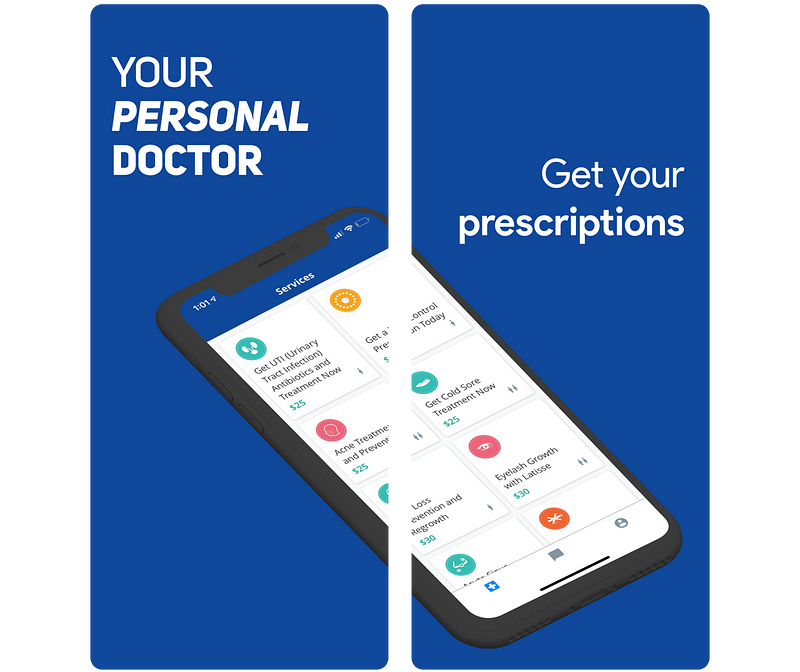
Drop is a Canadian fintech company who is rewarding its users when they make everyday purchases at their favourite stores. At the time I am writing this post, Drop is in the Top 10 Free Downloads for Lifestyle Apps in Canada. I first learned about Drop when I stumbled on this fascinating article by its CEO. Drop’s CEO outlines how it recruited one of the most sought after engineers in Canada. After reading the article, I had to download Drop myself to see what the team was working on. To my surprise, I stumbled on a great product which I have been a fan of ever since. To build on the work that the Drop team recently released, my focus will be on improving the user experience of version 1.25/1.26. The Design ProcessThe structure of the case study will be the following:
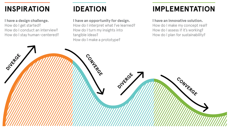
Inspiration
Ideation
Implementation
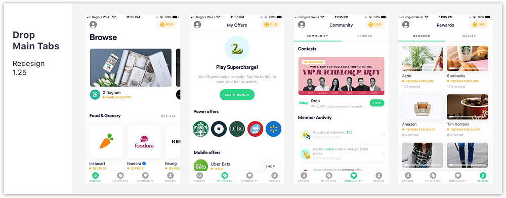
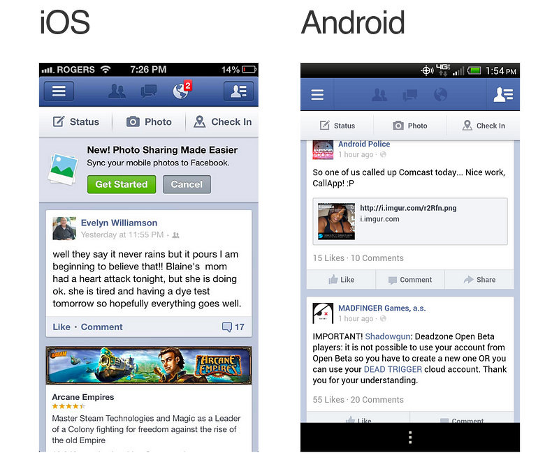
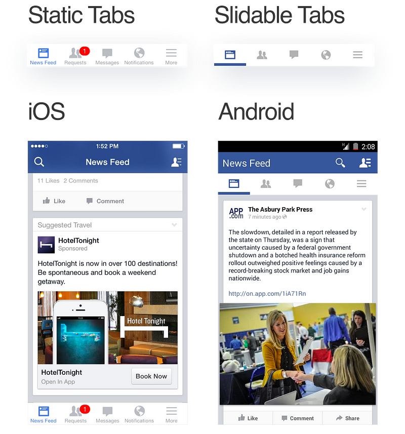
Current State AnalysisBefore diving into the redesign, I wanted to understand Drop as a business so I dissected the app’s main features. In the following analysis and throughout the Case Study, I will be primarily focusing on the user experience through the iOS app. 
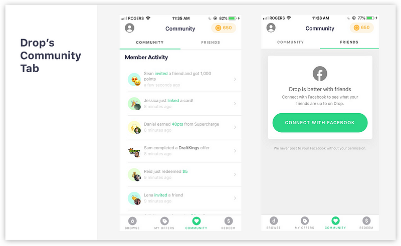
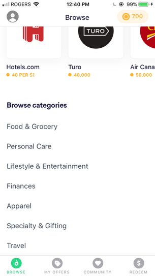
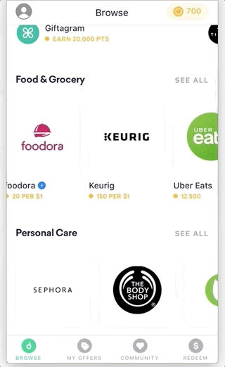
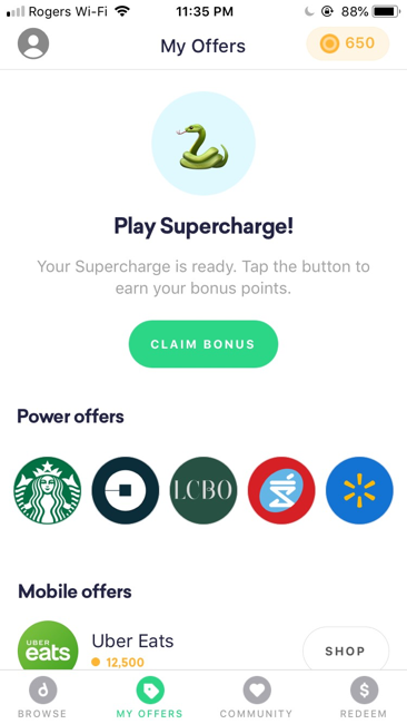
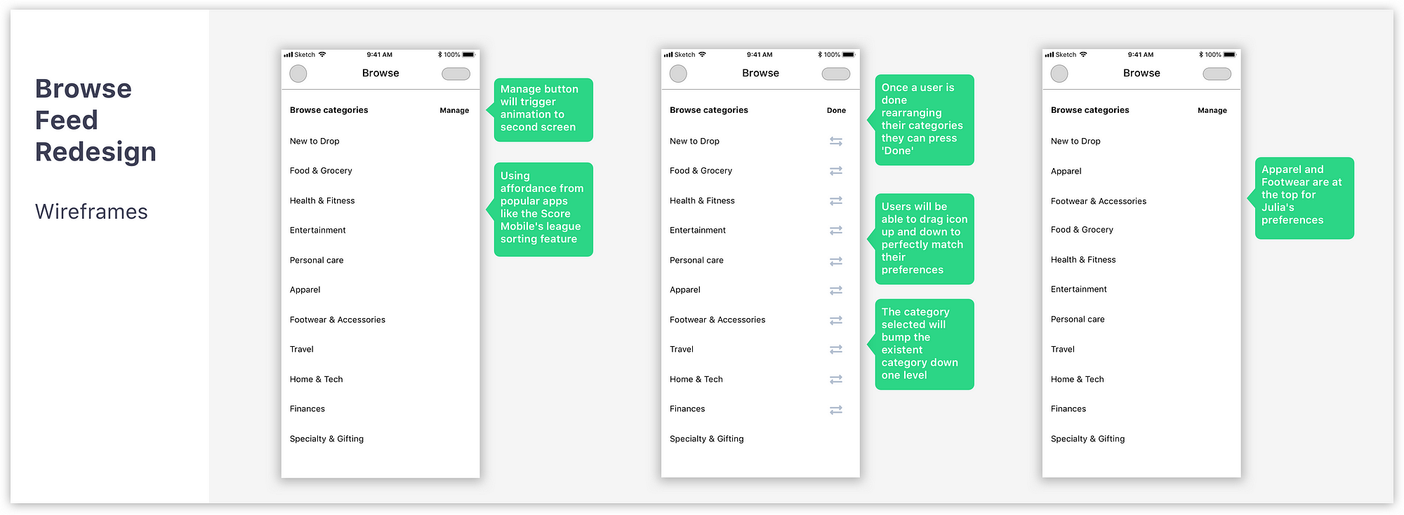
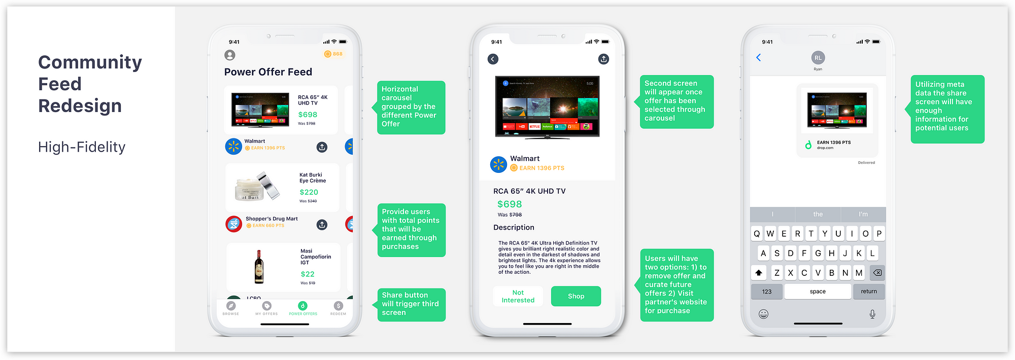
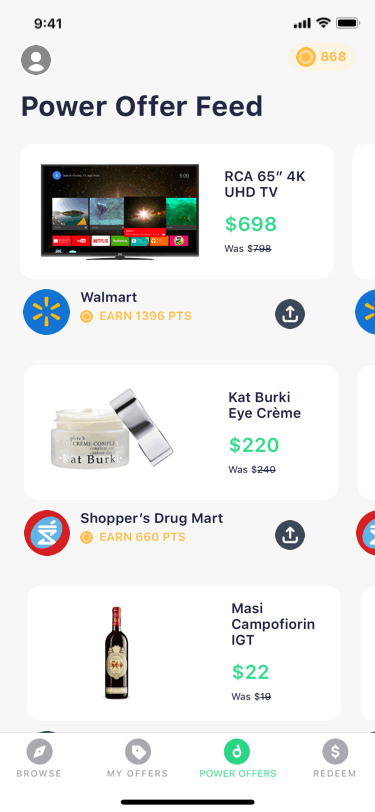
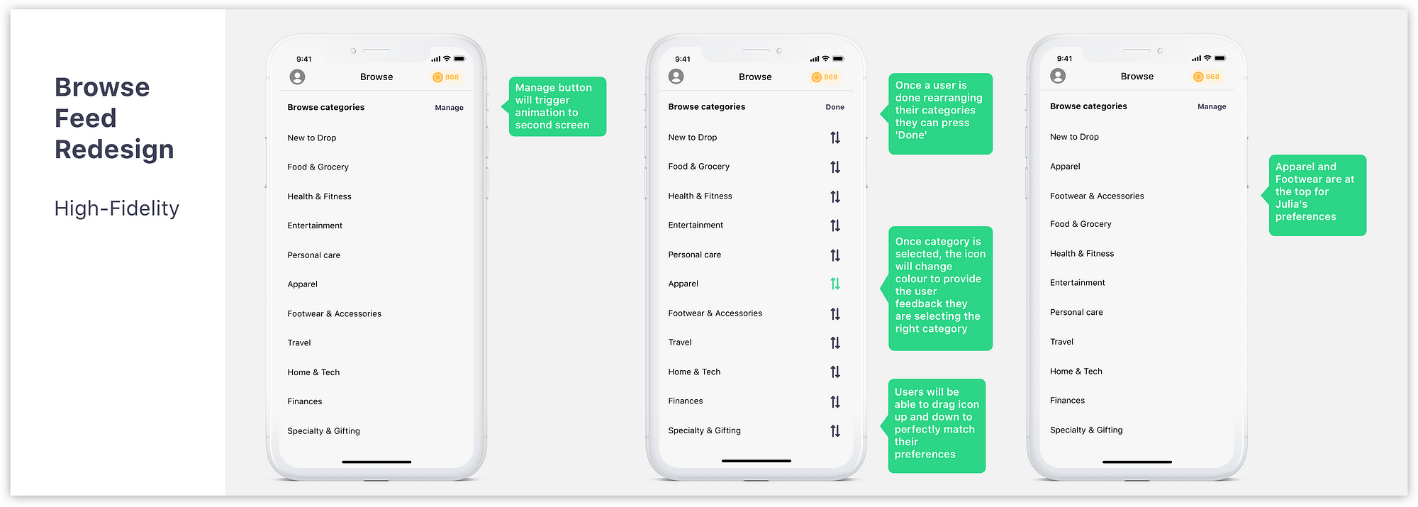
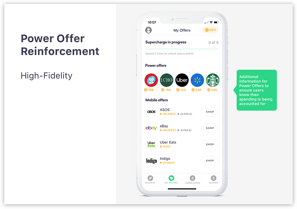
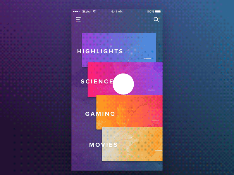
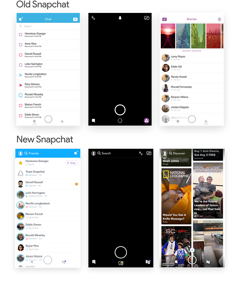
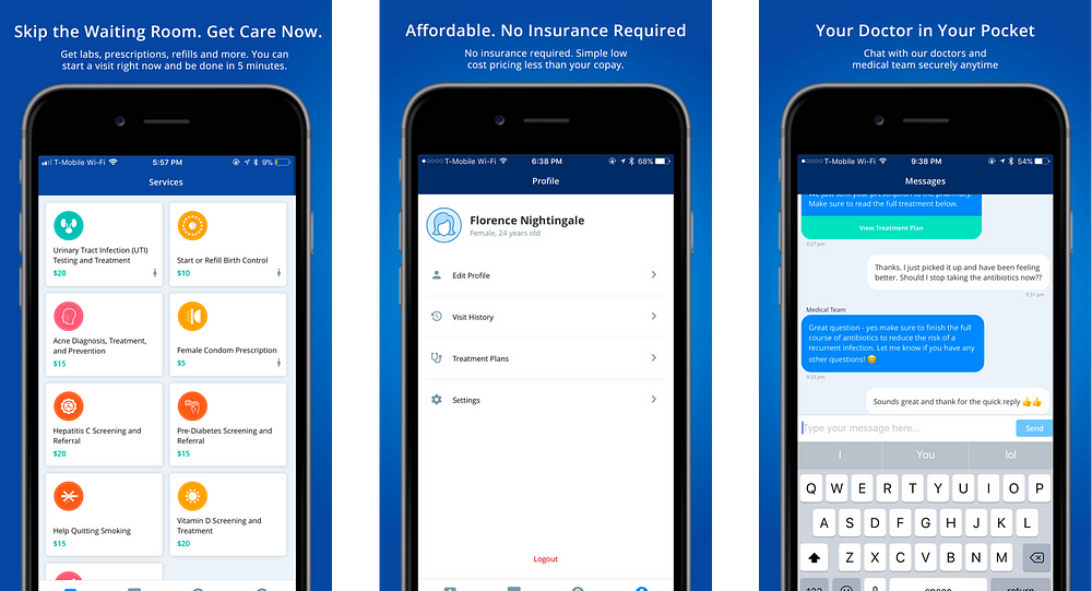
BrowseStarting with the first tab, this tab’s main purpose is to provide users with a categorized section of all the retail partner offers. One can assume that the Design team made the Browse tab the first tab a user sees in order to incentivize its users to utilize in-app offers. Drop’s main selling point to marketers is offering them data on how users spend their money. With in-app purchases Drop can also boast to marketers about their ability to positively influence the top line. My OffersThis screen’s main highlight is the Mobile Offers which remind users to use Offers before they expire. CommunityThe Community Tab has three main parts:
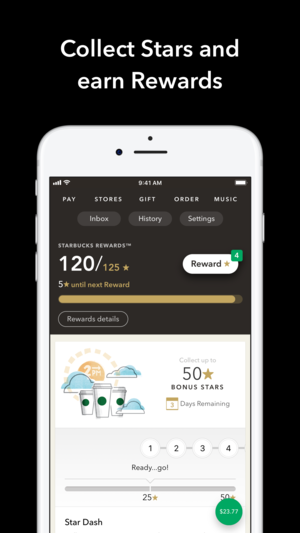
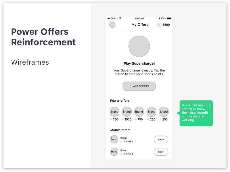
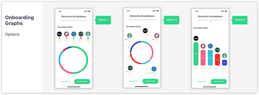
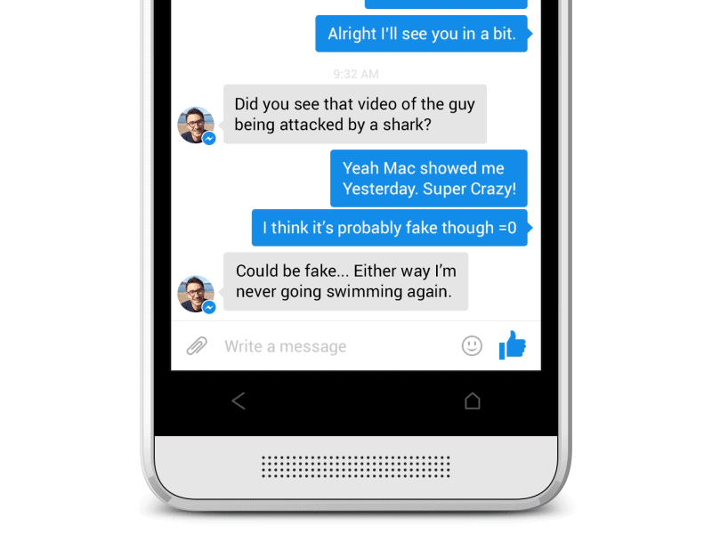
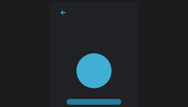
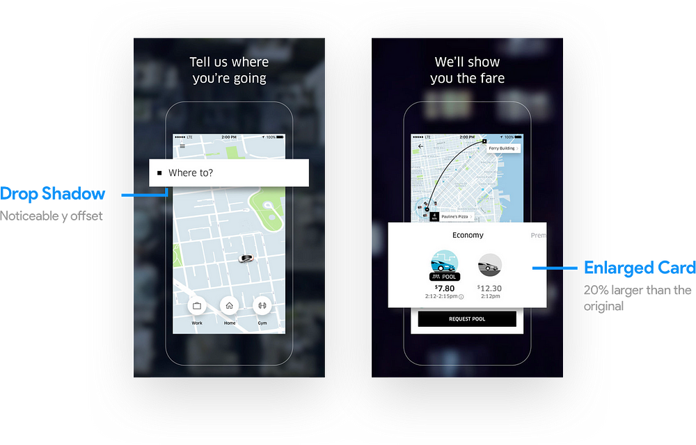
Contests are a unique way Drop users can utilize their points to sign up for cool events. Member Activity is a live feed of Drop Users interacting with the product. Friend’s Activity is similar to Member Activity but instead it utilizes a Facebook API to connect you with your friends using the app. RewardsThe Rewards tab is by far my favourite aspect of the latest redesign. Prior to this redesign, I thought that the app lacked a gamification aspect that would encourage its users to spend more to redeem rewards. My favourite app that has perfected this is the Starbucks app below. By providing users with a visual map of where they stand and how close they are to redeeming a reward, Starbucks has mastered gamification. An interesting note is how Starbucks has made this visual map their main screen, whereas Drop has this as the fourth and last tab on its app. 
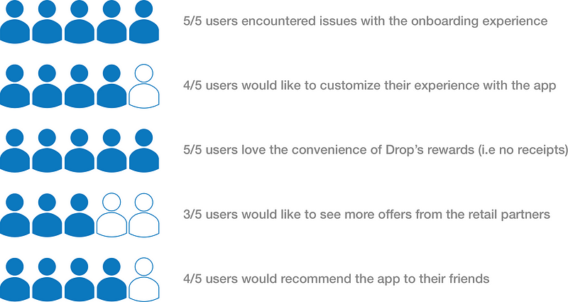
Research InsightsUser InterviewsIn order to identify potential design opportunities, I wanted to interview active users of the app. In my experience, it is best to focus on experienced users. Experienced users are more likely to encounter issues with the interface due to their frequent use of the app. 
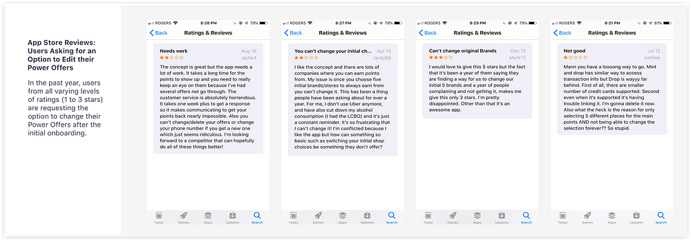
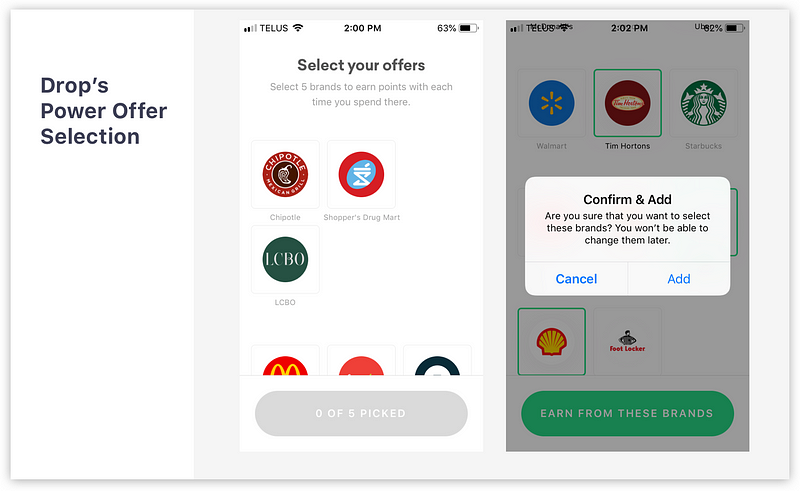
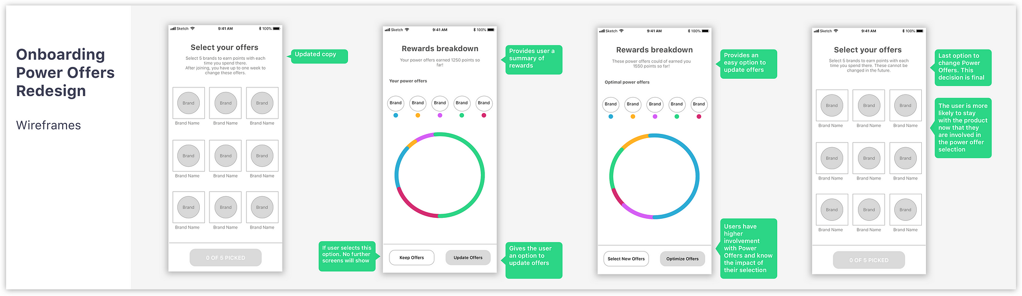
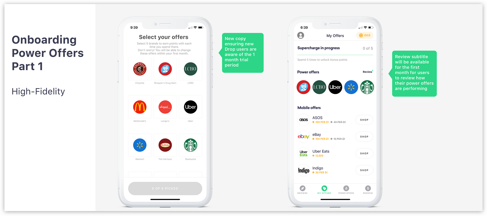
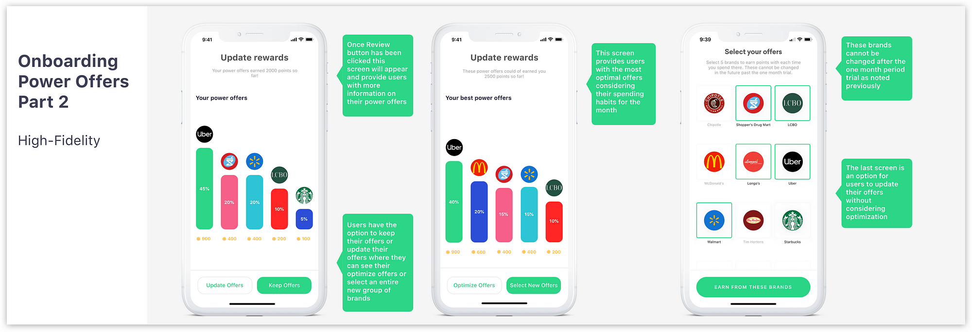
App Store ReviewsTo complement the user interviews, I wanted to look through some of Drop’s most critical App Store reviews in the past year or so. Users noted that they were frustrated that they could not change their Power Offers. 
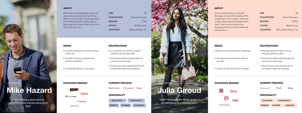
PersonasI wanted to set the User Personas around the two major use cases I identified when interviewing users.
Pain PointsTo organize all the feedback received from user interviews and App Store reviews, I summarized the main pain points below:
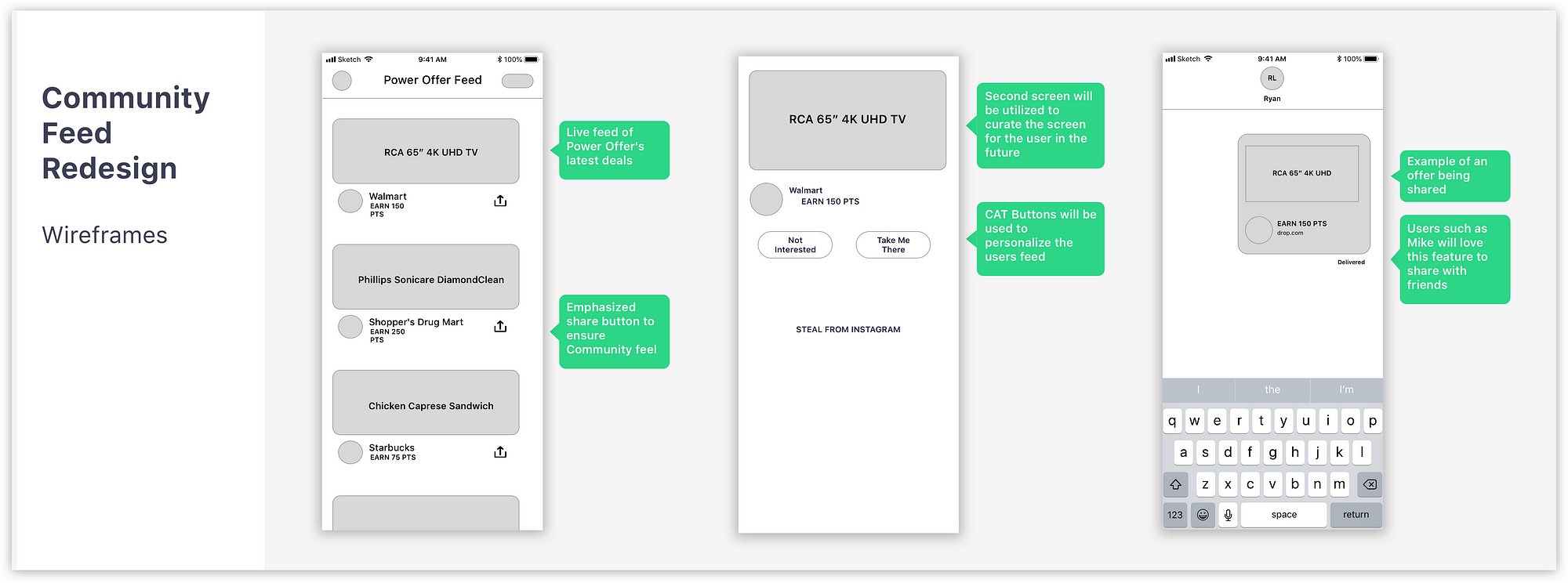
Design OpportunitiesCommunity RevampingProblems or concerns with the Community/Friends feed are the following:
Assumption: Presumably this section is a feature to counter criticism from users that Drop, as a service, does not work. By actively showing that users are redeeming offers and collecting points. Drop is signalling to their users that both the point collection and redemption process is working. Browsing OffersCurrently, a user does not have the capability to customize their feed to better match their preferences. Categories are preset in the following order: See below how long it may take a user to find their favourite apparel brand. OnboardingThe main onboarding pain point is the following:
Using Luke Wroblewski’s On-boarding piece as a reference point — users will often delete an app altogether if they encounter a poor onboarding experience. As Drop’s service is dependent on a network effect, in other words, the larger its customer base the more attractive they are to marketers. It is crucial for Drop to ensure that a majority of its users complete the onboarding process and began utilizing the service. Assumption: There are three potential reasons why Drop has not fixed this user complaint. From a cost benefit analysis, it may be a sound business decision to hold off on this user complaint.
By allowing users to change their Power Offer brands on the go, the amount of data that the user would have to handle would drastically increase. In addition, engineers would have to spend more time ensuring that users are receiving their rewards based on their updated brands. Lastly, marketers paying for the insights related to user’s financial data may not be in favour of volatile user data (eg. Users constantly changing their Power Offers). Marketers may not be able to draw a clear picture of a user who is constantly changing their preferences. Power OffersPresumably a user’s Power Offer selections are brands they purchase frequently from. Due to their frequent nature and lack of communication, users on the App Store complain they are missing Power Offer rewards. WireframingCommunity RevampingI am proposing that Drop partner with its Power Offer brands (Walmart, Shoppers Drug Mart, etc) to provide its users with a up to date list of its latestoffers. These offers will have an option to share with someone, which will reintroduce the Friends activity in a more practical way. Browse FeedThe only pain point from the Browse Feed is the lack of customization in the categories a user sees. The following wireframes will address that complaint with a simple sorting feature. Onboarding Power OffersThe proposed changes will increase user involvement by allowing a review of the user’s selection in one week’s time. Power Offer ReinforcementI want to propose Drop provide their users with positive reinforcement from their frequent and smaller purchases. These small ticket rewards are the lifeline of the service and should be a highlight of this screen. Wireframe FeedbackCommunity Feed
Browse Feed
Onboarding Power Offers
High-Fidelity DesignsCommunity RevampingDrop’s Design team is constantly iterating their designs and when I began this redesign shortly after versions 1.25/1.26 the Community tab was still functional. Late this week, Drop announced version 1.27 where they have removed the Community tab — which is in line with my analysis above. The Drop team did not roll out a feature similar to the Power Offer feed below instead they emphasized the Points Tab. Browse FeedA small tweak that will allow users to personalize the Browse tab to suit their needs. Onboarding Power OffersThe wireframes for the Rewards breakdown screen were difficult to understand when I showed it to family and friends. In order to perfect this vital screen, I designed multiple options. Option 3 was seen as the best iteration because it was the easiest graph to read for users and the easiest to develop as well. Power Offer ReinforcementLastly, a small tweak to the My Offers tab that will allow its users to know how each of their Power Offers is performing. ConclusionThe four redesign ideas were made without access to any Drop internal information and thus will be limited in their potential impact. However, by basing the redesigns on current users input and App Store Reviews I was able to tackle real human issues with the product. I also wanted to say thanks to Kody Melo for providing guidance throughout the entire case study! The post Redesigning a Canadian lifestyle app — a UX case study appeared first on Design your way. from https://www.designyourway.net/blog/user-experience/redesigning-a-canadian-lifestyle-app/
0 Comments
What are micro-interactions?Micro-interactions are events which have one main task — a single purpose — and they’re found all over your device and within apps. Their purpose is to delight the user; to create a moment that is engaging, welcoming and, dare we say it — human. For Example take a look at the below interaction This animation is a good example of micro-interaction, because it fulfills three important functions:
Breaking it downMicro interactions have four parts:
Why do they matter ? Motion for Emotion :)If microinteractions are only tiny design elements, why to care about them at all?
Well-designed microinteractions are a clear sign of a care of a user. That’s why they value so much. A user gets what to do and whether or not their action was correct and approved by the system — an app or website provide an immediate visual feedback and teach a user to work with the system. When microinteractions are done right, they can give positive feelings about your brand and influence users’ actions, often without people even realizing why. If you like or dislike one aspect of a product, you have a positive or negative predisposition toward the product in general. This so-called Hallo Effect can play both for and against you. In wise hands, this knowledge can help to improve a user’s feedback from your website — by paying proper attention to details, it is possible to leave your users satisfied. When to use them ?Few examplesIn the UX/UI world, although tiny, microinteractions are touted as the powerhouse when it comes with communicating with the user. Below are top seven microinteractions and their impact on user experience: Swipe The Swipe action eliminates tapping and is much more interactive and smooth. It helps the user quickly switch between the tabs and acquire more information about the product. Furthermore swiping is a very common gesture and guides the users subconsciously without making them think; just like we have been reading ‘Don’t make your users think’. What more? It’s insanely fun and addictive. Data Input All of us know the frustrations of setting up password or creating an account. This action can easily raise hackles. While proactive suggestions on password strength and usage makes it easy for user to proceed ahead, some interactive interactions at the time of data input also keep users engaged with the process and help accomplish the goal. Animations Animation simply enables and improves micro-interactions. They personify good design; their presence might not be noticed but absence takes a toll on everyone. They act like a glue that helps designers make the simplest of processes interesting and addictive. But be very careful as they are meant to engage the users and not distract or frustrate them; delayed processing or introducing new style in website might cause confusion. Current System Status It is essential to keep the user informed about the current status happening on a site or app. If the users are not informed chances are that they will get annoyed and close the site or app. Micro interactions lets the user know exactly what is going on, how long it will take the process to complete etc. Even failure messages can be humorous yet effective to retain trust of user. Call to Action Microinteractions essentially nudges the user to interact with an application or website. Call to action instills a feeling of achievement and also empathy factor in user behavior and the best way to make your user interact with CTA is to make it engaging to entice interest of user. Animated Buttons They play the role of information manager by letting the user know their way through your app or site. We need to pay attention to color, shape, special effects, animations, placement and texture to make the user experience seamless. We humans are hardwired to seek instant gratification. And it is a common tendency to overlook microinteractions in the greater scheme of things, but these are very important to get your users hooked.Devil is in the detail- as everyone say. Small experiences and design features, like toggling between screens or highlighting a feature or popping of a new notification can make a huge difference in enhancing users experience. How to design micro-interactions?Making micro-interactions is exciting for designers, because it is possible to experiment new design solutions and look for new ways to surprise the users. But for doing it you must keep in mind a few things :
Tools to design Micro InteractionsSo, what kinds of prototyping tools should designers familiarize themselves with? There are many tools out there but not everyone knows what works best for specific micro-interaction tasks. Here are my recommendations based on my personal experience designing these elements. If you’re familiar with coding:
If you want to design an interaction between a screen-like push and a module:
If you want to create more detailed interactions:
If you want to create detailed interactions + animation:
Few interactions which I made ❤To set your micro-interactions up for success, make sure your team possesses these above mentioned characteristics and engages well with the UX process. And good luck with your own micro-interaction journey! Here are few of my articles on User Experience (UX): The post Micro-interactions: why, when and how to use them to improve the user experience appeared first on Design your way. from https://www.designyourway.net/blog/user-experience/micro-interactions-why-when-and-how/ If you are a programmer who is looking for great coding wallpaper, you’ll be happy to know we have a great selection of examples. When you turn your PC on, the very first thing you will see will be code wallpaper. If you are a web developer or coder you’ll know how awesome it feels to find a professional programming wallpaper design when your computer flickers to life. If you’re looking for coding wallpaper to make your computer look great, you’ll be pleased to know that we’ve hunted through the web for the best developer wallpaper out there. These are code wallpapers which will make you smile. They will also inspire you while you work on your own creative coding projects. Here are some great coding wallpaper choices Programming World Map WallpaperA world map made out of code? What could possibly be more exiting? If you’re looking for an excellent coding wallpaper to inspire you to make a difference, this is a great choice. Programming Wallpapers for DesktopThis clean, simple and very elegant coding wallpaper comes in black and red. Download this great programming wallpaper free and feel inspired. Programming Life HD BackgroundThis great developer wallpaper is simple and easy on the eye to add to your laptop or desktop right away. If you’re looking for coding wallpaper which is clean and clutter free, this is a great choice. Technology Programming WallpaperA playful computer coding wallpaper that features a cup of espresso on a burnt orange background and an iconic image. Do you need a cup of coffee to get your cogs working? Remind yourself with this interesting coders wallpaper. Binary Code Abstract WallpaperEnter a new dimension with this futuristic coding wallpaper. Remind yourself of the interesting shapes and designs open to you as you work on new designs. This is a great choice in computer programmer wallpaper. Programmer King Desktop WallpaperAre you feeling stressed while working on a tight deadline? Are you the king of computer coding? This great coder’s wallpaper will remind you to keep calm and carry on while you work on your codes. Zen of Python WallpaperA very attractive coding wallpaper which will take you into another realm. If you’re looking for great inspiration, this is one of the best coding backgrounds for you. C Is Sometimes For CoffeeThis is a unique programmer’s wallpaper with a funky blue background and a reminder to enjoy a cup of coffee. If you are looking at coding wallpaper to make you smile, this is a great choice. Programming Syntax WallpaperAn attractive purple and blue coder’s wallpaper with an attractive, blurred font. If you are looking for coding wallpaper which is bright and attractive, this download is a great option. Amazing Programming PicturesThis is computer coding wallpaper with a coded image and an attractive marbled background. This inspiring image is free to download for all computer programmers. Man holds the program code #1A luminous man holds a board filled with computer code. This one would make a great choice from the coding backgrounds available to computer coders and web developers. Code # 2This exciting coding wallpaper shows green code written upon a dark grey background. It makes a great coding background hd download for coders and programmers. Information technology big data collection complexComplex data displayed in an organic image. This is a great coding wallpaper choice for any great web developer or coder. Code Wallpaper # 3This subtle dark grey coder’s wallpaper includes game code. With light grey code on a dark grey background, this coding wallpaper is an excellent choice for all gamers and developers. Binary Code WallpapersWith a blue and yellow background and a binary code, this interesting code wallpaper is every developer’s dream. Programming Computer WallpapersThis coding background hd image includes grumpy cat, frustrated with the number of bugs in a code. This is humorous code wallpaper that every developer could relate to. The Time is Now Computer WallpaperWith its inspiring approach to deadlines and job completion this coder’s wallpaper encourages you to keep working. An excellent choice for all those aiming to complete a project. Ending thoughts on using a programming wallpaper for your desktop With so many great options for a coding wallpaper you’re sure to find something which appeals to you. Remember to save your favorite and use it on your laptop or desktop PC to add a smile to your day. If you enjoyed reading this article about using a programming wallpaper for your desktop, you should read these as well:
The post Programming wallpaper examples for your desktop background appeared first on Design your way. from https://www.designyourway.net/blog/inspiration/wallpapers/programming-wallpaper/ Animated movies (or cartoon movies, if you prefer so) take us in a different world, and help us escape a mundane reality with highly exhilarating emotional and intellectual experiences. The best thing about them – they’re not made only for children! Adults love watching them too, and they certainly have a few favorites among them. Now, nobody implies that Bambi would be an adult person’s first choice, and even if it is – what the hack? If you’re a fan yourself, we have a delectable list of best animated movies for adults that may be marketed right towards you. Here are the best animated movies for adults you shouldn’t miss: Chico and Rita (2010)Here’s a magnificent member of the list of best animated movies for adults –an evergreen romantic tale that will touch your heart! Chico and Rita is a smoky love story from Cuba that feels incredibly real, despite of the fact its characters are fictional. Their messy and roiling passion that sustains their even messier and broken jazz musician lives got nominated for an Oscar, and will stay remembered for decades to come. With so many ups and downs, this romantic and thrilling story brings us to a conclusion – There’s a bit of Chico and Rita in all of us! ‘Persepolis’ (2007)Rather than another romance, we present you a dead-serious animation for adults that doesn’t exactly show the most pleasant story. Producers adapted Marjane Satrapi’s 2003 graphic novel that describes life in Iran before, during, and after its Islamic Revolution (1979), bringing to life a number of involving line-drawn images. The tale was pictured with incredible clarity, and shed light of this important historical moment people in the US don’t really know much about. The story is very well-animated, and supported by Satrapi’s bold cartoon expressionism that helps understand it. Belladonna of Sadness (1973)Jules Michelet’s book La Sorciere inspired many great cinematic pieces, including top quality adult animation movies. The topic is, as you recall, Middle Age witchcraft, and this movie helps us experience this period rather than simply analyzing it. When you read the book, you get sad and involved into the tragic destiny of new wed Jeanne, and who was raped violently (yet lawfully in this period) by the feudal lord and his minions. The tormenting experience inspired her to make a pact with the devil, and to try hurting those that hurt her. While it is difficult to depict her hatred and revenge with words, this hallucinatory and occult masterpiece does that just fine – at times, it is so explicit and severe that people misunderstand it. Following its first release in 193, Belladonna of Sadness was restored in 4K, and promoted again. We’d say – it finally got the acknowledgement it deserves! Fantastic Planet (1973)Fantastic Planet is another great animated movie for adults that appeared on 1973. We get a unique opportunity to find out how it would be when humans would live on a giant plant, and be considered as animals. Our opinion is that this is one of the best Sci-Fi movies made so far, with a recognizable visual style and stop-motion animation. Deep under the imaginative and superficial story of people being sub-leveled, this movie tackles important social questions such as racism and genocide. Renaissance (2006)Renaissance’s story takes place in Paris, several years from now. A brave cop is looking for the kidnapped scientist who holds the secret for an eternal life. The use of specific techniques such as motion capture animation is what makes this animated adult movie a visual delight – it mixes up genres in a crafty way, and depicts our dystopian future in black and white. You wouldn’t believe how well that worked out! ‘My Neighbor Totoro’ (1988)Hayao Miyazaki can safely be put on top of any animation creators’ list, and this is his masterpiece. My Neighbor Totoro is a nostalgically innocent story of a unique friendship between a kid and a giant, and the side effect is invoking pleasant memories of our childhood. At the same time, it is an adult cartoon movie that the entire family can watch. FRITZ THE CAT (1972)Here’s the debut and subversively successful animation of Ralph Bakshi, the man we today call the Father of modern American animation for adults. The movie is a total opposite to common, Disney-imposed views on animation – its visuals and its story aim to overcome political incorrectness, rather than simply providing an hour of entertainment. Unlike most 70’s animated movies, this piece is slightly offensive and crudely satirical, which made it a common object of controversy. One couldn’t expect less from a movie tacking the unused potential of letting anthropomorphic cats explore drugs, radical politics, and love. And yet, of course, it is not about cats, but about people. No wonder this movie has such historical significance! Sita Sings the BluesThere are many reasons for Nina Paley’s Sita Sings the Blues to be considered and unique. To start with, the animation was distributed for free due to disputable music rights. Secondly, Paley used Flash to create almost all animations herself. Last but not least, there’s the distinctive style – Paley combines scenes from her own life with renowned Ramayana tales, and delivers them with beautiful Indian shadow puppetry visuals. Now imagine that paired with some Annette Hanshaw’s 1930s jazz! Beowulf (2007)Beowulf is among the oldest and most legendary English epic manuscripts, which means that not every movie can bear its weighty legacy. Roger Avary and Neil Gaiman made the brave attempt to imaginatively adapt it, and created a fantastic adventure for adult viewers. The cast was all-star (Anthony Hopkins, John Malkovich, Robin Wright, Angelina Jolie, and Ray Winston), which means we get to enjoy both amazing visuals and starring performances. The piece is vastly entertaining and exhilarating, especially when you watch it in 3D cinemas. Watership Down (1978)Watership Down is one of the dark cartoon movies you don’t want your children to see, as it could create a very traumatic experience. At first sight, the animation looks like a family saga full of animals and adventure, but nothing in there is family-friendly. The highly-nuanced piece features devastating war scenes and societal conflict, and it is emotional enough to make everyone cry. Paprika (2006)Paprika is a fantastic Sci-Fi movie by Satoshi Kon with the most incredible story – the world where scientists don’t only analyze patients’ dreams, but also navigate through them. You’ll see lots of menacing dolls, marching appliances, collapsing cities, and disturbing sex scenes; and you’ll have to figure out the logic of such dreams yourself! Heavy Metal (1981)The animation flick shows us how a glowing green orb threatens a young girl with horrible, yet sensual fantasy stories. It follows the original concept adopted by Heavy Metal magazine – there are several stories instead of one, and each brings us a different entertaining affair. Beware – Movies like Heavy Metal are pretty explicit in how they depict violence and sex. ‘The Nightmare Before Christmas’ (1993)We’d call this animation the best Christmas film ever, and we’d recommend you to watch it even before the season’s on. Filmmaker Tim Burton blended in a unique way the charm of Halloween and Christmas, and introduced us to the pumpkin king who discovers the fun of celebrating Santa’s big day. Pretty awesome, isn’t it? Grave of the Fireflies (1988)Although kids play the main roles in Grave of the Fireflies, this movie goes nowhere close to a kids’ animation. Isao Takahata wants to share the shocking experiences of a brother and a sister who try to survive the WWII bombing in their hometown in Japan. To soften the scary moments in the movie, Studio Ghibli’s experts employed some seriously accumulated artistry. Rather than fancy, this piece is low-key and non-sensational, and it is exactly the scenes of deceptive reality that make it that devastating. American Pop (1981)American Pop chronicles how a Russian-Jewish musician’s family lived throughout four generations. Their stories are being brought to us with subtle narratives, only to provide the most profound experience possible. The reviews and ratings for this movie are mixed, but we believe there is nothing that can hamper the beauty of such a fine musical drama. In fact, American Pop has become more and more popular over the years, only to become Bakshi’s most praised animation work ever. ‘Fantasia’ (1940)We all watched Fantasia as children, but how much of it did we really understood? The experience of watching it as an adult is something else, so give it a try! Tower (2016)Animated sequences are used in innumerous documentaries, but Keith Maitland developed a fresh approach to them. His relatively new piece Tower aired at SXSW in 2016, praised for its unique structure and meaningful message to our society. Maitland worked with original materials; rot scoped reenactments, and animated interviews – a brave, but totally effective step in the animation world. This organizational structure was the best deal he had for drawing attention towards mass shootings in the States. Heavy Traffic (1973)In Heavy Traffic, we meet a young and eccentric cartoonist with bizarre fantasies… and a whole army of his imaginary and weird characters that inspire his art. The piece is once again signed by incredible and wildly original Ralph Bashi, whose authoritative control can be observed in every single scene. The movie doesn’t go as far as becoming uncomfortable or self-indulgent, but still features incredibly personal and intimate sequences. MPAA rated it with an X because of its explicit nature, but critics called it ‘the best work Ralph Bakshi ever did’. ‘Fantastic Mr. Fox’ (2009)There’s a bit of an inner hipster in all of us. If you don’t believe it, check whether you will like Fantastic Mr. Fox. We bet you will! The animation debut of Wes Anderson goes around an idiosyncratic fox and its adventures. The well-dress and socially acquainted protagonist leads a pleasing life, but can’t resist the urge to go back to wildness and cause a retaliation against all animals. We’ll see it rescue its community, and help it come to peace with the idea of not being immortal. A Scanner Darkly (2006)Richard Linklater chose the works of Philip K. Dick to create this amazingly inventive movie show. He confirmed in such way that this author did not only predict technological development, but also criticized American mores. Sad and funny at the same time, this story used Sci-Fi elements to recreate the 1977 War on Drugs, and featured a number of iconic counterculture protagonists with all their good and bad sides. Aqua Teen Hunger Force Colon Movie Film for Theaters (2007)This movie offers an unexpected mix of surrealism and humor, and belongs to the very few Adult Swim series that actually got a movie. Many critics, however, disapproved of the movie’s silly storyline and shallow approach. Note that the movie also has an R rating for violent images, strong language, and adult humor. ‘The Triplets of Belleville’ (2003)If a tour de France accompanied by typical French ladies and their cute dogs qualifies as a movie you’d watch, go for this one. The picture is pleasure-stuffed and yet dialogue-free, an excellent attempt of Sylvain Chomet to embrace the technique of silent storytelling. The adventure of these adorable ladies features multiple references to modern pop culture, as presented by novice cartoonist Max Fleischer. You will find it easily understandable, relaxing, and truly charming. Akira (1988)Some viewers claim that Akira is monotonous to that end of becoming interminable, but that doesn’t decrease Katsuhiro Otomo’s great contribution to the anime world. His cyberpunk zeitgeist and violent dystopian saga set the standards for many movies to come, even if the piece has little in common with classics such as Blade Runner. Waking Life (2001)Once again, it is astonishing how Richard Linklater looks at life, consciousness, unconsciousness, and the mere purpose of our existence. This time, he introduces us to a man who dreams constantly, and who’s struggling to find genuine answers about life. The atmosphere in the movie is almost surreal – it pulls us right next to the dreamer, and it hypnotizes us with astonishing images we will remember for a long time to come. There is nothing comparable to Waking Life – the piece never got an Oscar nomination, and we believe that’s where Academy members made a serious mistake. Yet, we should be aware that the movie contains some harsh language, and was therefore rated R. ‘Wallace &Gromit: The Curse of the Were-Rabbit’ (2005)There is no Wallace & Gromit movie that you shouldn’t watch, but the Curse of the Were-Rabbit is the one you mustn’t miss! A feature-length and brilliant piece of visual delight, in particular for British movie fans ready to pack for an adventure. It is one of the very few movies on this list we recommend both for adults and for children. South Park: Bigger, Longer and Uncut (1999)Do you remember the iconic sitcom ‘South Park’? Here’s a great movie based on it, and a story nothing less hilarious than you’d expect. Four underage boys got caught watching an R movie which happened to be Canadian. As a result, their mothers decided to initiate a war against Canada for trying to corrupt their kids. As you can guess, the movie boosts with improper language and explicit scenes, and it therefore got an R rating shortly before it was released. Despite of the censorship issues, it has an incredible artistic value, and it is the only South park movie created so far. ‘The Lego Batman Movie’ (2017)The Lego Batman Movie is way more about humor than it is about action and superheroes. We’ve got comedy legend Will Arnett playing the very self-involved and ultra-ego Batman – a combination that will make us laugh for hours. Pink Floyd – The Wall (1982)If you’re a fan of rock music, put this movie on your list right now! The cult classic focuses on a young and lost rocker, the world he’s created for himself, and the emotional dangers he’s afraid of. Here, we can see paranoia and self-destruction at their best animated versions, but as disturbing as this protagonist’s character is, we still find him fascinating and unforgettable. This is another movie whose raw and intense depiction of violence and sexuality led to an R rating – yet, it is qualified as one of the best adult animations ever. ‘A Scanner Darkly’ (2006)The original, life-like animation of Scanner Darkly was a staggering success, in part because of the excellent acting crew behind it. What is really specific is it being shot with actual live action footages that took a year to animate. In 2018, the movie may seem a bit outdated, but it still deserves a look. Waltz With Bashir (2008)Member of the specific genre of animated documentaries, Waltz with Bashir brought memories of Lebanon’s 1982 war, and did so better than many live scene movies. It is a masterpiece of director Ari Folman, the guy who used his own memories to portrait the deadly conflict, and to remind us of the cruel reality of war. This movie is not only psychologically effective, but even damaging – the viewing experience is so dark and provocative, and explores such devastating themes that you will never be able to forget it. At the same time, its disturbingly violent and sexual content, and the number of disturbing graphic images brought it an R rating. Well, we all expected that. Fire and Ice (1983)There are two distinctive paths in Ralph Bakshi’s career: his pioneer animations from the 70s that were edgy and explicit; and the early 80s when he created epic and influential, but generally underappreciated fantasies. Among those was also Sorcery cult Fire and Ice, following the intriguing adaptation of The Lord of the Rings. Bakshi had one of the best fantasy painters Frank Frazetta working on the case. He made the heroic and archetypical tale even more attractive, and took us on a joyful ride to the medieval age of good kings, dark lords, and brave warriors. We’d put this animation work right next to Conan the Barbarian, and name it one of the best animations the world has ever seen. Team America: World Police (2004)The classic mixes up politics with pop culture – the protagonists are a commando unit whose headquarters are secret and hidden. They look as glorified versions of Barbie and Ken dolls, as they have loping bodies and fragile marble eyes. You wouldn’t really picture them using a ‘xenophobic bluster’ in their administration, but well…they do! The movie revives the stoicism of 60s Thunderbirds, which makes it even more intricate and explicit. For instance, there are enough montage puppet sex scenes to consider them as the focal point of the movie; as well as excellent showbiz satire brough to us by Janeane Garofalo and Sean Penn. ‘Yellow Submarine’ (1968)A play of postmodern puns and surrealist conceits – that’s the best description of this brilliant Beatles movie. Get yourself a bottle of wine, and devote an evening to this pop art splendor and miracle of animation. Anomalisa (2015)What if you were a bored customer service agent whose life never seems to become more interesting? That’s the very story of Anomalisa, where the protagonist falls in love with a beautiful woman, and changes his life completely. The piece is touching and romantic and it inspires all of us to look for our soul mates. Just like other Charlie Kaufman movies, it stays under the skin and makes us want to watch it over and over again. It’s Such a Beautiful Day (2012)This movie was completely hand-made by Don Hertzfeldt’s, and it may not be the most visually exciting anime on this list. Yet, the piece is intellectually and emotionally involving, as it questions the meaning of life as observed by disordered protagonist Bill. The fun and the thrill are way bigger than the synopsis would indicate, so give this masterpiece a try! Ghost in the Shell (1995)Ghost in the Shell is another awesome attempt to use alternative anime for political goals. It focuses on conspiracy and sexual exploration paired with awesome Sci-Fi actions, a one-of-a-kind mash up with great influence on modern Sci-Fi. Perfect Blue (1997)The list of best adult animated movies wouldn’t be complete without this masterpiece of Japanese Animation. Perfect Blue follows the path of a singer who wants to become an artist, but descends instead in the dark and compromised world of her own expectations and ambitions. Practically, Darren Aronofsky recreated the timeless Black Swan piece, but with even more psychodrama and trilling experiences. Ending thoughts on the best animated movies for adultsNow that we presented the best animation movies for adults, go ahead and have some fun! Both adult cartoon movies and dark animated movies guarantee some serious fun, and they’re all that good that you’ll find it hard to pick a favorite! If you enjoyed reading this article about the best animated movies for adults, you should read these as well:
The post The Best Animated Movies For Adults: The ones to put on your list appeared first on Design your way. from https://www.designyourway.net/blog/inspiration/motion-graphics/best-animated-movies-adults/ Do you know the famous graphic designers who contributed to the field of graphic design? Would you like to understand how the design world has shaped and evolved as well as the top designers who created these changes? By exploring the work of famous designers we can understand new trends. We know you’ll love exploring the biggies. There are many graphic design artists who have helped to expand the field. Many are known in the world of professional graphic design. You’ll need to know popular graphic designers by name so that you can discuss them in conversation. When you understand how a top graphic designer has added to the field, you can share aspects of his work with future clients. When you understand the history of contemporary graphic design, you’ll have a greater range of skills and techniques to draw upon. This will make you a more competent and skilled graphic designer. Famous graphic designers with influenceThese top graphic designers have each added a unique and innovative element to the world of graphic design, changing and transforming the field. They are the geniuses, the ones who pushed the boundaries, and the statement makers. Each has made a difference to the world of professional graphic design. Eddie OparaEddie Opara is one of the contemporary graphic designers who have made a massive impact on the field. Eddie was born in London in 1972 and began studying graphic design at the London College of printing. He later moved to Yale University, where he achieved his MFA. He began working at ATG and Imaginary Forces. He later worked at 2×4 as an art director before creating his own studio, Map Office in 2005. Motivated by the urge to give back, Eddie Opara was also inspired by his Nigerian mother’s head wraps. He is a part of Platform, which aims to encourage underrepresented designers to work as entrepreneurs and in the field of technology. He has created works of art for Prada, JWT, Studio Museum in Harlem, NYU, UCLA, Morgan Stanley and Princeton University Press. In 2010, he joined Pentagram New York, where he is joined by his MAP design team. Here he has created works of art for Opera Winfrey, CFDA, the Andy Warhol Foundation, The Museum Tower and SCAD Museum Of Art. He has made a major contribution to American graphic design. Eddie Opera believes that design is spiritual, and encourages designers to sketch their creative ideas in an art journal. Stefan SagmeisterStefan Sagmeister started leading graphic design firm Sagmeister Inc in New York in 1993. Sagmeister moved to NYC in 1987. After attending Pratt on Fullbright scholarship, he set out to create controversy by mixing sexuality with humour. His work pushes social boundaries and challenges conceptions of indecency. Sagmeister has worked with the Rolling Stones, HBO and the Guggenheim Museum. Perhaps his most notable work was a poster designed for AIGA where he employed an assistant to carve the text from the event into his skin. He then photographed the final image, questioning what can be done in the name of design. This designer explores new and innovative ideas every 7 years. Paula ScherPaula Scher is one of the prominent graphic design people in the world. One of the famous media designers, she made a name for herself at CBS records as an art director in the 1970’s and 1980’s, where she worked on album covers, poster designs and adverts. It was during this time that her unique approach to typography was recognised. In 1991 Scher moved to Pentagram. Here she has assisted clients with developing brand identity, packaging, and signage and has more recently worked with architectural collaborations and urban graphic design. Her work for Citibank and Tiffany & Co has been used as examples of great contemporary graphic design. Some of her major clients include The New York Times Magazine, Madison Square Park, Perry Ellis, Bloomberg and Coca – Cola. In 1996, the identity she created for The Public Theatre won the Beacon Award for corporate design strategy. She was included into the Art Directors Hall of Fame in 1998, and in 200 won the Chrysler Award for Innovation in Design. Chip KiddChip Kidd is a ‘rock star’ in American graphic design. Focusing on book covers, he has produced exceptional book covers for Knopf, where he started working in 1986. He has produced book covers for great writers like Neil Gaimon, John Updike, Dean Koontz, Haruki Murakami and James Elory, amongst many others. One of his more famous designs is the tyrannosaurus rex design on the cover of Jurrasic Park. Not only did this design make a great image for the book cover, but was included in the movie, where it was used as the logo for the theme park. Kidd shared that as we only know the bare bones about dinosaurs and that seemed to be the best place to start when designing the book cover. He humbly declared that it was not the cover which sold the book, but the content inside. Nevertheless, the design became one of the most iconic symbols of 1990s graphic design. Rob JanoffIf you are looking for a professional graphic designer who has made a famous mark, look no further than Rob Janoff. Janoff was the designer behind the famous apple logo. The design process took place during 1977 and was only two weeks long. Janoff drew on images as an apple, including the bite as it draws on computer terminology. The original rainbow design included in the apple acknowledged that this computer had a coloured monitor and was capable of plugging into a coloured television. It was also a tribute to hippie culture. Janoff shows how the simplicity and beauty present in 70’s graphic design was able to create a timeless presence. After recreating the most recognisable brand design in history, Janoff continues to establish corporate design identities for his clients and remains one of the most influential graphic designers in the world. Peter SavillePeter Saville is one of the best graphic artists in the record industry. An English graphic artist, he began working for Factory Records where he created designs for bands such as Joy Division and New Order and was paid a large amount for designing the cover of Peter Gabriel’s album ‘So’. Other clients include Orchestral Manoeuvres in the Dark King Crimson, Pulp and Ultravox. He is known as one of the most prolific designers in the record industry. However, Saville’s work is not limited to record cover designs. More recently he has been collaborating with fashion designers such as Stella McCartney. In 2010, he designed the football strip for the British football team. In collaboration with Burberry’s CEO Ricardo Tisci, he created a new design logo and identity for Burberry, TB, named after the company’s founder, Thomas Burberry. He remains a cool name designer who has pushed the boundaries of graphic design. Michael BierutBeirut is an artist at prestigious design firm Pentagram and not only this, but a partner as well. Before working with Pentagram, Bierut was vice president of graphic design at Vignelli. He is also a senior critic at Yale’s School of Art and a lecturer in the Practice of Design and management. At Pentagram, Michael Bierut has worked for clients such as Disney, Benneton, the Robin Hood foundation and The New York Jets. He has also done design work on Billboard Magazine. Bierut shares that when it comes to new designers, he values those who have interesting art in their portfolios. He explains that the very best are both talented and articulate, and are able to speak eloquently about their work. Bierut shares that he could listen to them all day. He declares that although it is more difficult to work with designers who struggle with language, he still sees people who have a great portfolio as worthy of the time and effort to develop a talent. Bierut has released a book titled How to use graphic design to sell things, explain things, make things look better, make people laugh, make people cry and (every once in a while) change the world. He also has a series of essays called Now You See It. He is one of the great graphic designers of our times. Massimo VignelliMassimo Vignelli was a master of iconic graphic design. Vignelli died in 2014, and is one of the great graphic designers who extended the design field. Vignelli worked in a range of different design fields including advertising, branding identity and packaging design. Always precise, his work added simplicity and eloquence to the graphic design field. Vignelli worked with IBM, Bloomingdale’s, Saks, Ford and American Airlines amongst other prestigious clients. His work forms part of collections in the Museum of Modern Art, the Metropolitan Museum of Art and the Cooper Hewitt Museum. He was a mentor to Michael Bierut. His work lives on through his famous graphic design work, including the signage and subway map he designed for New York City in 1972. After his death in 2014, web designer Justin Reynolds wrote about the contribution Vignelli has made to the design field. Reynolds explained that although web design emerged too late in Viganelli’s life for him to make a true contribution, the simple elegance of his designs makes a significant contribution to both digital and traditional design. Jonathan BarnbrookJonathan Barnbrook is a British graphic designer, film maker and typographer. His most famous graphic design work is probably the covers he did for David Bowie’s albums, beginning with Heathen in 2002. He has created a range of different typefaces, including Tourette, Exocet, Bastard, Priori and Mason. Mason which he created in 2010 was included in the Museum of Modern Art. Priori was included in the design for David Bowie’s album Heathen. Other fonts include False Idol, Moron, Newspeak, Awe, Infidel and Shock. Most of the fonts have emotional titles. Barnbrook explained with Tourette that it is symbolic of moving beyond standard ways of speaking or using language. Although one of the most famous typography designers, Barnbrook also expressed a love of album cover design and his work on Bowie’s cover album Blackstar was considered as good as the album itself. Kate MorossKate Moross is a top designer name in London graphic design. She is the art director for Studio Moross. She has a great colour range, fluid and vibrant graphic art styles and typography techniques. Moross is one of the best graphic artists of her time, working on branding, videos, magazine and album covers. She has even created live visuals for super band One Direction. Her work is very much in the public sphere as she has designed bus and tube pass holders for Transport for London. Moross explains that she does not draw on traditional art or even contemporary graphic design as inspiration. Instead of searching through the past, this cool name designer gets her inspiration from her day to day life. Not the type to look through magazines or take inspiration from organised culture, Moross enjoys letting life happen. Moments on television, a conversation with a bus driver, shopping, mood or life circumstances inspire her designs. Moross shares that we cannot ever escape culture. As a result of finding inspiration everywhere, her creativity is unbounded. Carolyn DavidsonThe Nike swoosh is a famous graphic design artwork which has become an iconic graphic design logo. Carolyn Davidson designed the swoosh while still a student. Although the swoosh looks like a tick, it is actually the wing of the Greek goddess of victory, which the company is named after. Carolyn Davidson designed the swoosh before the ‘Just Do It’ slogan was formed. Her brief was to create a logo which seemed to be in motion. Her design needed to be unique enough to stand out from competitors such as Adidas and Puma. At the time, Davidson was paid $35 for a design the company did not love. The swoosh has become so identifiable that the company no needs to place the brand name in advertisements or advertising campaigns. As the brand grew, Davidson was given Nike stock. Hopefully this made up for her lack of initial payment. Davidson is certainly a designer with a great influence on classic graphic design. George LoisIf you are interested in a designer who impacted on 60’s graphic design, you need look no further than George Lois. Lois was a designer at Esquire Magazine in the US from 1962 to 1972. While Lois has had a successful career in the advertising industry he is most recognised for his often controversial Esquire magazine covers. He is well known for the Mohamed Ali cover as well as the I want my MTV campaign. In an interview, Lois shared that his ideas always aim to stun the viewer, capturing attention and pointing to the interesting content within the magazine. Roth urges new creatives to trust their gut and go for an iconic design. If this design works out, and Lois believes it often will, then it will stand the test of time. Memorable design inspires Lois, whose clients include MTV, Tommy Hilfiger, ESPN and VH1. Saul BassSaul Bass is probably one of the most famous designers in graphic design. His work went beyond logo design, poster design, and advertising. His work gained the attention of midcentury graphic design after he designed a poster for the 1954 film Carmen Jones. His work was so impressive that he was invited to produce film credits. It was from there that Saul Bass made his way into film making. His most iconic work as a professional graphic designer was his opening scene for Hitchcock. He would later produce credits for four Martin Scorsese films Casino, The Age of Innocence, Cape Fear and Goodfellas. Saul Bass’s credits stood out but didn’t distract from the film itself. Instead, his work would draw the viewer into the movie, enticing them to enter into this exciting realm. He will be remembered not only for his movie credits, however, but for his logos. Minolta, United Airlines, Kleenex, AT&T and many more prestigious brands owe their identities to Saul Bass. Morag MyerscoughMorag Myerscough is famous for her bright and colourful design structures and installations. She concentrates on urban graphic design and shares that if those who are near feel happy, those who are far will come too. She lives in London and owns a company called Studio Myerscough. Clients include Royal London Hospital, London’s Barbican and the Stockholm Kulturfestival. Morag Myerscough explains that she is motivated by the joy and happiness her work brings to others. When people feel a sense of happiness, this brings value to both communities and Myerscough herself. Jacqueline CaseyJacqueline Casey is a famous graphic designer most noted for her poster design while at MIT. She was recruited to join MIT in 1955 and office director in 1972. She remained at MIT until her death in 1992. While at MIT she pioneered the Institute of Design Services. The posters she created were distinctive and elegant. Inspired by the International Typographic Style, she used bold colours and striking images. She would play with words and often used puns in her work. Casey would depict concept through the use of creative typography. Her posters remain an inspiration in professional graphic design. Herbert MatterHerbet Matter was a Swiss born American graphic designer. Matter began his graphic design work in Paris, where he soon developed a distinctive style. However, he was forced to move back to Switzerland as he did not have proper papers. Here he worked for the Swiss Travel Office. He travelled to America with a Swiss ballet company and remained in New York once the troupe returned home. Matter became a well known American photographer who has produced excellent work. He has made a significant contribution to the graphic design field. He has taught photography in a graphic design program, taught at Yale and a brilliant graphic designer. As a photographer he worked for Harper’s Bazaar and Saks Fifth Avenue. Alvin LustigAlvin Lustig is a famous graphic artist who is also one of the first graphic art pioneers. He worked as a book designer, typographer and magazine designer. He also worked with textile design and interiors. His work has had a long term impact in the field of graphic design. Lustig was born in Denver but his family moved to Los Angeles when he was a boy. Here he learned poster design, sculpture and modern art. He started out working in printing and typography but soon began to focus his talents in the art field. He began designing book covers for a company called New Directions. In 1944 he moved to New York to work on his classic graphic designs. Here he worked for the Magazine Look for 2 years. He was a creative artist who took a holistic approach to his work. While in New York he began to explore interior designs. He later worked on shopping centre signage as well as cartoon characters. His work was revolutionary, changing the face of graphic design while holding on to his identity as a Modernist designer. Lillian BassmanLillian Bassman was an inspiring woman and one of the great graphic designers. She was a child of free thinking immigrant parents. She began working as an illustrator and textile designer. She was then mentored by Alexey Brodocitch while working with Harpers Bazaar. She began working as a photographer, capturing unique images which added an elegant sophistication to the field of graphic design. She later became an art director for young girl’s magazine Junior Bazaar. Here developed classic graphic designs which combined images with poetry. The result was highly effective. Her photography work focused largely on models in lingerie or cosmetics. She is definitely one of the number 1 graphic design influencers of the 20th Century. Paul RandPaul Rand was born in Brooklyn, New York. He attended both Pratt and Parsons School of graphic design in New York City. Ultimately, he remained uninspired and ended up teaching himself the fundamentals of graphic design. He studied the works of famous graphic designers A.M. Cassandre and Lazlo Moholy – Nagy through European magazines. Rand began his career designing covers for Direction magazine. He later pioneered iconic corporate logo designs for companies such as IBM, ABC, Yale University and Enron. He has worked with GQ magazine, managed fashion pages for Esquire and written books on graphic design. He remains one of the most famous graphic design artists in the world. Ending thoughts on these famous graphic designersBy following the work histories of these graphic designers you can learn a range of different styles and techniques. You will be able to come up with work which is both unique and breath taking. You will also learn different ways of working in design which you will be able to use to produce a range of inspiring designs which can be used to produce some wonderful concepts. If you enjoyed reading this article about these famous graphic designers, you should read these as well:
The post Famous graphic designers whose work you should know appeared first on Design your way. from https://www.designyourway.net/blog/graphic-design/famous-graphic-designers/ Christmas is coming and you might be looking for a free Christmas background. If so, you’ll be pleased to know that I have put together a wonderful list of free Christmas backgrounds. You can use these Christmas background images in Photoshop (or other graphic design software). You’ll find Christmas background wallpaper, headers and templates that you can use to create unique Christmas cards. Use these free Christmas backgrounds to embrace the spirit of the festive season. Warm your heart and feel the glow of the Christmas season while you work on your computer. If you love the Christmas season, you’ll be pleased to know that this list embraces all your old favorites. You may even find some new favorites in this festive background list. They’ll make a great festive addition to your Photoshop projects. SnowmanIf you are looking for a gorgeous Christmas snowman, this background Christmas scene will leave you feeling completely charmed! Christmas LightsIf you love snowflakes combined with festive lights you’ll adore this Christmas background. Bring on the Christmas cheer with coloured lights of red, purple and gold. Festive SnowmanWhat could feel more like Christmas than a snowman out and about on Christmas day? Bring the magic of Christmas home with this very special festive background. Blue GlobeChristmas is all about ornaments and this background Christmas scene shows a blue globe in a blanket. Add to the spirit of Christmas with this simple Christmas background. Candy ChristmasCandy Christmas backgrounds and a sweet penguin will fill you with warmth this Christmas. If you’re looking for decorative backgrounds which give you sweet cheer, look no further. Holiday LightsHoliday lights provide gorgeous decorative backgrounds filled with warmth and cheer. This background of rainbow lights will fill you with celebration. Santa ClausSanta Claus must be a favourite in all Christmas backgrounds. Enjoy the warmth of Christmas with this heart warming scene. Santa FlyingIt is every child’s dream to see Santa flying in the glow of the moon. Embrace that old dream with this Christmas background pic. Sweet Christmas OrnamentsDon’t you just love decorative backgrounds with festive treats? Enjoy the festive season with this sweet Christmas background. Merry ChristmasPretty Christmas backgrounds are always a favourite. This warm hearted Christmas wish comes with a single evergreen. Christmas BulbThis cute Christmas background shows a Christmas ornament hanging out in the snow. White Christmas backgrounds are always a favourite. Choose this one for festive Christmas cheer. Giraffe TreeThis cute kids Christmas background shows an elephant decorating a giraffe to make a beautiful Christmas tree. Totally charming, this Christmas background is a sure winner. Christmas TrainIf you adore pretty Christmas backgrounds, you’ll adore this Christmas train. Watch as it travels through an enchanted landscape to deliver presents to the children of the world. Cubie ChristmasThis extra special Christmas background features cubie motions of all your favourite Christmas characters. FireplaceWhat can be better than a rustic Christmas background? Watch this fireplace send Christmas spirit around the room as it makes the ornaments (and your heart) glow. ChristmasThis snowy yet green Christmas background features evergreen trees and snowy hills. The moonlit sky adds extra magic. Extra Backgrounds:Waiting for the MiracleChristmas CelebrationChristmas VolcanoHoliday SpiritChristmas TreeChristmas Star Ice CrystalSeamless Christmas Sweater BackgroundStar Sky Night Background For ChristmasSnow December Background ChristmasBackground Abstract Red StarsEnding thoughts on these Christmas backgroundsThere are many great Christmas backgrounds out there to fill you with warmth and cheer this Christmas. From traditional evergreens to something for the kids, you have a range of choices. Explore these great options and add festivity to your life. If you enjoyed reading this article about Christmas backgrounds, you should read these as well:
The post Free Christmas Backgrounds to Use in Photoshop appeared first on Design your way. from https://www.designyourway.net/blog/resources/christmas-backgrounds/ Are you looking for the best Google fonts for your website? Do you struggle to find Google font pairings which will create the right impact? You’ll be relieved to know that typography has become far less complicated in modern times. In the past, designers were often limited in their font choices. Fonts often had to be purchased and downloaded. As a result, many websites looked very similar. This changed in 2010 when Google released Google Fonts. Suddenly there were a range of open source fonts and font pairs. Now, all designers need to do is look for the best font combinations in order to create a unique and interesting site. As a designer, you can install Google fonts on your computer quickly and easily. You can then pick the best Google fonts for each new site design. Google font pairings will need careful consideration though. Not all Google font combinations work well together. The best Google font pairings will give your site designs a fresh, attractive and creative appearance. Even better, the best Google fonts will give your site a professional appearance without the need for expensive custom font designs. In this article, we’ll show you how to create good font combinations for accomplished site designs. How should you begin?There are so many different Google fonts to choose from. On one hand, this is completely liberating. No more limited options or standard choices. On the other hand, it can be hard to find the best Google fonts for your site. This will be particularly true if you are unfamiliar with the best Google font for a brand or a blog. How do you know the best Google font for your blog? How do you know which font combos will share the message behind a brand? Which are the top Google fonts? How do you pare popular Google fonts to create an attractive site? There are a lot of different options. Let’s begin with font superfamilies. What is a font superfamily?You might be wondering what a font superfamily actually is? Let’s get the jargon out of the way quickly. A font family offers you a number of different fonts which all fit into different categories or classifications. This means that in a single font family you may have fonts which are both serif and sans serif. The number of different font categories can range, but as long as you have more than two, you have a font superfamily. Why is it helpful to look for a superfamily?Compatibility: these are the best Google fonts when it comes to compatibility because they were designed to go together. No matter which of the cool Google fonts you choose to combine, they will work well together. Flexibility: You’ll have a large number of Google font combinations open to you. With this large selection, you won’t have to worry about restricting yourself when it comes to making choices. Ease: With the best Google fonts at your fingertips you won’t have to worry about searching for fonts which combine well. This will save you time and help you to move forward in your project. Some quick tips for combining fontsIt’s always easier to create the best font pairs when you know what to look for. There are no hard or fast rules. However, these tips will help you to get started with great font combos. Use font familiesFont families have been designed to work together. When you draw on font families you’ll create great Google font pairings. This is because your fonts will never clash with each other. Work with contrastGood font combinations often contrast. This is because they are different enough to make an impact. When you combine fonts which are too similar, your combinations can look slightly mismatched. However, a bold font combined with a delicate one, or a clean, strong sans serif combined with a delicate serif are intentionally placed together. Strong contrasts make a clear statement. Likewise, you could contrast simple fonts with creative ones. The best Google font pairings will always stand apart from one another. Stick to your limitsGoogle font combos are best when they are limited in number. Font pairs are great and there are times when you can combine three different fonts. Too many font combos will clutter up your page. Font pairs for headings and subheadings add hierarchy but too many fonts will prevent a viewer from understanding where to begin or how to categorize the information on your page. If you can stick to two Google font combinations do this. Otherwise, keep your limit to three different fonts. This will keep your page simple and uncluttered. Think about the message you want to communicateThe best Google fonts will always add to or enhance your brand. If you’re going for a traditional and trustworthy message, a creative and extremely modern font won’t give the correct message. Likewise, a traditional calligraphic font won’t give the correct message for children’s parties. Elegant Google fonts are great for a luxury fashion brand while modern Google fonts suit tech companies. By matching your font to your brand you’ll send a strong message to your viewers. Here is a list of Google font pairings you can useAlegreya and LatoWhen viewed separately both of these font pairs are unique and have character. It is when paired together though that they create a great font combination. Alegreya is friendly, down to earth and organic. Alegreya is natural and approachable. What you see is what you get and there are no pretences at all. Lato is one of the best Google fonts there is. As a great all purpose font, Lato is incredibly popular and easy to use. The combination of these two great Google font pairings creates a result which is friendly, easy to read and very practical. Using Alegreya and Lato as font pairs creates a result which is very natural and easy to read. The combination appears very natural. These are the best Google fonts for a very practical website. Fjalla One and Noto SansFajella One is one of the best Google fonts for grabbing attention. This font is sans serif and not always the most versatile choice. However it holds a widely held appeal and is a popular Google font. The font can be used in regular, with caps and in lower case. Noto Sans is a highly versatile font which has been used around the world. Noto Sans is a harmonious font which has a great aesthetic. This is the best Google font combination to use if you are aiming to reach an international market. This paring makes a great choice for blogs or websites which benefit from headings and subheadings. This highly legible Google font pairs enable you to provide a clear hierarchy on the site while keeping information legible. Your viewers will be able to grasp your site content quickly and efficiently. This is a great font for websites or blogs which benefit from headings, subheadings and broken text. A universal audience will be able to grasp your site content quickly. This is a great font combination for use on website landing pages. PT Sans and PT Sans NarrowPT Sans and PT sans narrow make great Google font combinations for a site filled with old world charm. This font family make great font pairs that add an elegant touch to any blog or website. These two very popular Google fonts will give aesthetic appeal to your website. They also make good font combinations for websites which are modern or trendy. With these free font pairings you can use either font as a header or body font. Both are highly legible and effective for drawing attention to your site. PT Sans Narrow makes an attractive heading, however, and has a great aesthetic when used in short sentences. The clean aesthetic of PT Sans and PT Sans Narrow is a great font combination for technology companies, digital start ups and software companies. Both fonts can be used for body or headers. Depending on the message you wish to communicate using your brand, you will be able to choose between two different body text options. Josefin Sans and Amatic SCJosefin Sans is an elegant font which is vintage and light hearted. Amatic is a playful, whimsical and hand drawn font which makes it a great option for a creative site. When combining these Google font pairs it helps to be cautious. The effect can be phenomenal as long as you are cautious. Although this combination will be unique and even attention grabbing, you could only use this combination for creative or playful sites. If you are looking to build a website in the entertainment field, art, fashion or design world, this font combo will give your site a lot of personality. It could also work well for a niche blog which appeals to a unique and interesting audience. When using this combination, use Josefin Sans as your body text. This elegant font is easy to read. Amatic SC makes a great header and will add a handwritten touch to your site. It is not suitable as a body text though it may be hard to read. This is a highly creative free font pairing which will give a unique touch to a creative blog or website. This combo works very well for niche blogs because the fonts are unique and whimsical. Merriweather and MontserratMontserrat is a liberating urban font which is practical and easy to use. As a result it is a popular Google font which is a favourite amongst web designers because it is highly legible and gives a simple and uncluttered feel to a webpage. If you are looking for fonts that go with Montserrat, Merriweather is a great choice. The contrasting styles of these font pairs work well together. Both can be used as either headers or body text fonts. When you use these two typography combinations you’ll create a great balance between classic sophistication and a modern flair. These fonts are therefore highly versatile when combined and make a great pair. This great Google fonts combination is excellent for online news sites as well as publishing agencies. This font combination is great for internet publishing sites. The font combo also makes a great choice for business web pages. As a font combination, Merriweather and Montserrat create a great balance between classic and modern design. Oswald and EB GaramondOswald and EB Garamond make one of the best font pairs. Oswald stands out as a great header font as it has an outstanding quality which will draw attention. However, Oswald also makes a great body font as well, making it a versatile choice for your web page. EB Garamond is a classic font which has been updated. Easily recognizable, it adds a professional look to your website. These pairs are the best Google fonts to use when working with sophisticated or high-end website designs. The overall atmosphere will be one of quality. Legal firms, high-end fashion boutiques or professional consultants would benefit from this Oswald font pairing. Estate Agents, high-end fashion boutiques, attorneys and other professionals would benefit from a site with these Google font pairs. This font combination also works well when describing high end products. The professional aesthetic created by this font combination gives an impression of quality. Open Sans and Open Sans CondensedOne of the best font combinations is seen in Open Sans and Opens Sans Condenses. Open Sans is considered one of the top Google fonts when it comes to versatility. When Combined with Open Sans condensed, the two fonts offer a freedom and beauty which is hard to compare. These font pairs can be used in a wide range of different websites. They are both suitable as headers or texts and are legible and easy to read. When combined, these fonts give a simple yet very elegant appearance to a website. It is no surprise then that this is one of the most popular font combinations available. This is a great, very flexible font combination which will be a sure winner every time. You can use this elegant combination on almost any blog or website for an effective result. Raleway and Roboto SlabIf you are interested in serif and sans serif pairings, you will love the Raleway and Roboto Slab combination. Roboto Slab is a highly versatile font which is classic in style. When it is combined with the bold Raleway font it creates a look which is striking in contrast. A site which uses this font pairing will be both sophisticated and clean looking. Raleway is an elegant font which gives a very professional aesthetic to a site. It makes a great choice when marketing luxury items such as jewelry and high fashion products. It will make a great heading choice with Roboto Slab used in the body text. Both fonts can be used as headers or in the body text, however. You can use combined weights or font sizes to add hierarchy to your site while working with this great Google font combination. By experimenting with balance you’ll come up with a combination which best suits your site and the products you have on offer. Whatever the combinations you use, you’ll end up with a very elegant and highly professional site which will have great appeal. These are the best Google font pairs for e-Commerce sites with luxury products or brands. Both fonts are suitable for use as either headlines or text fonts. You can experiment with different font weights until you come up with the perfect choice for your website. Roboto and Roboto CondensedRoboto and Roboto Condensed are one of the best Google font pairs when it comes to versatility. This popular font combination has a large variety of font weights which can be used to add impact to your website. New start ups often feature this Google font combination on their websites but it is a highly versatile option which would appeal to a broad market. This combination offers a modern font style which is both geometric and very friendly. It offers a great aesthetic appeal which adds a striking impact to any blog or website. While this combination is highly versatile, it is also combines the best Google fonts for tech companies, start ups, modern businesses and any other company with an eye for future development. This is a very versatile Google font combination which will appeal to a very wide audience. Using this popular fonts combination will appeal to tech companies, modern businesses and people with an eye on future development. The highly modern appeal of this font combination will make a great choice for a business which is forward reaching. Playfair Display and Source Sans ProPlayfair Display is a font which exudes old world charm. Based on old calligraphic fonts, it offers a modern interpretation. With a nod to the past, this great font also has a contemporary touch. Source Sans Pro looks towards the future. It is a simple, legible and highly elegant font which is both ornate and practical. These Google font pairs can be used in combination on e-commerce sites to add a personal and creative touch to product descriptions. Source Sans Pro can be used as a header or body text, while Playfair Display makes great body text which is particularly suited for luxury items. The combination of modern and classic style fonts will always add an attractive contrast to any website, making this one of the great Google font pairs. This font combination adds a unique and personal touch to websites. It is a great font pair for luxury brands and products. The overall appearance is clean, elegant and modern. Dancing Script & Josefin SansGoogle font pairs are not always easy when script fonts are used. This font combination uses Dancing Script, one of the better script fonts in the Google fonts catalog. Dancing Script is a very feminine font and has been paired with Josefin Sans. This font combination will add a very feminine touch to any website or blog. As a result, it is not as versatile as many other Google font combinations but makes a great font pair nevertheless. Allan & CardoAllan is a bold font with a creative touch and an italic appearance. Cardo is an old world font with a classic aesthetic. These two fonts make great Google font pairings which contrast time periods in an eye-catching way. Ending thoughts on these Google font pairingsThe best Google fonts create a great opportunity to use interesting typography on your website. Effective typography will always add a special touch to your site, creating a sense of authenticity for your brand. With these great Google font combinations, you can ensure your website is a winner. Remember to combine your fonts carefully, ensuring your typography puts across an effective message. Limit your use of fonts and keep your site legible. We hope this guide offers you all the information you need to capture the character of your brand. If you enjoyed reading this article about these Google font pairings, you should read these as well:
The post Google font pairings: Font combinations that look good appeared first on Design your way. from https://www.designyourway.net/blog/typography/google-font-pairings/ I loved Lego blocks. They were by far my favorite toys — had loads of ‘em! See, I’m a designer, son of a designer. Lego blocks were our first creativity sandbox: they allowed us to assemble all sorts of crazy things. I didn’t know why I loved them so much back then. But now I do. It wasn’t their colors, or their 7K pieces Millennium Falcon. Nope. It was how perfectly each piece fit together, in every possible way. This would speed up our frontend development, making it more robust, more organized. Our HTML would get smaller, and our CSS would get MUCH more manageable. In this article, I’ll show you how to organize your CSS architecture into HTML/CSS blocks that behave more like Lego blocks. To do so, I’ll introduce three important modular CSS methodologies. These will help us create interface components that are easier to understand, maintain and reuse. I’m betting these will become part of your workflow, regardless of the frontend framework you’re using. If you’re using one, that is. Know thy acronyms (OOCSS, BEM, SMACSS)
What is OOCSS?Object Oriented CSS (OOCSS) — and everything that comes with this paradigm shift — is the conceptual foundation for better interface design and development. It states that interfaces are made of multiple components, which should be re-used as much as possible. Similar to object-oriented programming, OOCSS focuses on flexible and reusable components, each doing one thing well. This alone encompasses basic programming principles such as single responsibility principle, separation of concerns and DRY. It also checks one essential UX and Graphic Design box: Consistency. By re-using a similar button design throughout the interface, users get familiar with it, and the app feels more intuitive each new session. With OOCSS, we’re merely re-using code, making it faster and easier to create more things, without adding significant overhead to the codebase. DRY CSS, people! Nicole Sullivan wrote this post back in 2010 (never too late to catch up ?♂️), explaining the power of OOCSS in the media object. The main takeaway from that article is the ability to isolate and abstract interface patterns into self-contained code blocks for both HTML and CSS. Here is an example of Nicole’s Media Object:
The idea here? Encapsulate the component so it won’t require styles from anywhere else in your CSS to work properly. Once you have that, you can start putting the Media component everywhere in your interface, and it should behave consistently in every instance. What is BEM?
BEM is a concrete application of the OOCSS principles, created by Yandex. It stands for Block, Element and Modifier, and is a crazy complicated framework. Nicolas Gallagher simplified BEM’s naming convention, which was then made famous by Harry Roberts. IMO, the simplified version is already powerful enough for most needs. I personally never used the original one. Here is the previous code example, using BEM namespaces.
One great thing about BEM is specificity control. By using the naming convention stated above, we are automatically flattening our specificity to ALWAYS USE For the next few paragraphs, I assume you understand what Specificity is hard, but once you understand it, you can leverage it pretty quickly. By following BEM’s naming convention, we’ll already have 90% of our styles at By switching to a semi-strict regime of only using single CSS selectors, you’ll be able to tame specificity fairly easily. Assuming you have your components at Quick note: If you use the same override in two different pages, it probably makes sense to abstract that into a Again, these overrides should be pretty minimal. This technique I use is based on concepts I took from SMACSS and Atomic Design by Brad Frost. What is SMACSS?SMACSS is the acronym for Scalable and Modular Architecture for CSS, created by Jonathan Snook with large projects CSS codebases and teams in mind — he used to work at Yahoo and Spotify. Jonathan came up with several neat ideas and CSS file structure best practices, which he compiled in the SMACSS book. SMACSS 2nd edition is from 2012, long before the components & React craze. To me, the most exciting part in SMACSS is the clever use of wrappers and containers to make components fit perfectly everywhere. These techniques are fundamental to the component approach — remember the Lego blocks. However, these techniques require a lot of discipline when writing CSS properties so they don’t interfere with how components interact together. CSS Component Modularity Theory
Another best SMACSS practice I find useful is the concept of the container or These two CSS architecture best practices will already make our CSS pretty modular and “well-behaved.” As you can see, we’re only applying a component approach to the creation of HTML and CSS that’s independent of the framework we’re using. So SMACSS is about more than how to organize CSS properties: its main advantage is modularity. If you follow these guidelines, your HTML/CSS can be easily implemented in any of the major JS frameworks, since it already follows the conceptual structure. Framework-agnostic, modular CSS for the winMy goal is simple: organized, maintainable CSS. I study these methodologies to be a better interface designer and developer. Being able to effectively build isolated components is absolutely necessary for modern interfaces. Because of the multitude of frameworks, I tried to step back and see what the minimum requirements to develop “framework agnostic” interface components were. Currently, I use a Jekyll boilerplate: it provides me with the tools I need to create interfaces and styleguides, and isn’t locked into any specific framework. The concept of OOCSS and web components are pretty much the same thing when it comes to styling. Creating independent interface components is the best solution we came up with so far, and there are hundreds of articles on it. BEM is especially useful when working on a more traditional setup, where it serves the double purpose of scoping the styles for that component and adding the context information to the elements. But now that I got used to it, I end up using BEM classnames even in React or Vue. SMACSS’ clever use of containers and wrappers makes sure components work well with each other and fit anywhere. Also, its excellent CSS file organization can be used somewhat like Atomic Design, but simpler. For smaller projects, this works like a charm. OOCSS coupled with BEM & SMACSS will help you kiss spaghetti code goodbye, regardless of your stack or framework! (Don’t) Follow the white rabbit
You know one thing I realized? We humans have a tendency to go down rabbit holes and, once inside, get our judgment distorted. What does this have to do with CSS? The methodologies I explained here are fairly simple and already powerful enough for most of our projects. However, the people that created them were trying to solve bigger problems than ours — think styling for Yahoo, or Yandex. They were dealing with huge codebases and millions of pageviews, so maintenance was really tricky. From there, theories were created and then perfected, turning into very strict frameworks. This, in my opinion, is where things get unnecessarily complex for the rest of us. Since most of us are not dealing with this level of complexity, one could even argue that OOCSS is not necessary. Maybe. But it helps, a lot. Implementing a full BEM modular system on a small website is definitely killing a mosquito with a bazooka. Still, understanding OOCSS concepts and applying them lightly on a small project will help you get up to speed with these theories. One step at a time, you will see the benefits to your workflow. The critical part of OOCSS is the paradigm shift, not which tool or methodology you use. Learning to think in components, identifying them, and coding them independently will drastically improve your work. The learning curve is not steep at all. I was able to teach these basic concepts to an intern here at my studio throughout a few conversations. Of course, she didn’t become a ninja on the next morning, but the concepts started to sink in, and a few weeks later, she was already writing pretty decent components. In my opinion, identifying CSS architecture patterns is the most important skill, while the hardest one to learn is the Modularity one from SMACSS. The latter requires lots of discipline to carefully evaluate which CSS rules will interfere where, especially with the “slots.” Once the BEM naming kicks in, you’ll start to read the patterns in many Codepen and StackOverflow posts, and you will really understand the value of the extra context information they carry. Resources to help organize your CSS architectureThese are the official theories for BEM. I recommend starting with the simplified version. It already contains more than most of us need. This is the official documentation for this methodology. I also recommend this CSS architecture course at Frontend Masters. Now for similar concepts that will make sense once you start to get involved in the whole component way of designing interfaces: Closing thoughtsI stumbled upon SMACSS and BEM a few years ago, while looking for better ways to write CSS. I rejected BEM at first, thinking it was overkill and that the classnames were too weird. A few months later I was working on a Styleguide project, in which I used the naming convention from SMACSS. That worked reasonably well, but once other developers started to use it, some issues began to pop. Specifically, issues with nesting and conflicting styles. These were my cues to switch to BEM classnames. No need to mention the pain of re-writing the whole styleguide in a different naming system. Now, this styleguide is being used by developers all over the world, and it seems to me that nothing is breaking. (Sorry for not sharing the styleguide link, it’s a private one.) Nowadays, I have roughly 10 projects running simultaneously, and an archive of about 30 projects designed and developed using the component mindset. I can’t say how many times I just opened up a folder from 2016 with an elegant component, like a table or card, and only imported that SASS partial into my new project. Once you use modular CSS, it becomes a no-brainer to use your past projects as a decently organized archive of interface components. After getting the hang of it, there is almost no effort to understand the HTML and CSS structure: it is so nicely organized, following a very straight-forward concept with most of its pieces isolated. Have you ever spent a few hours trying to understand WTH you did in that project two years ago? That stopped happening in my team. So I strongly invite you to experiment with the methodologies I discussed. Who knows, it might just future-proof your CSS architecture for 2018 and beyond! If you’ve enjoyed this post, please take a second to share it on Twitter.
The post How to better organize your CSS architecture with OOCSS, BEM, & SMACSS appeared first on Design your way. from https://www.designyourway.net/blog/css-html/how-to-better-organize-your-css-architecture-with-oocss-bem-smacss/ A product manager walks into a design department and orders a website redesign. “Our website looks so old! All our competitors have flashier websites. Let’s redesign it. Buttons with colorful shadows are the future!” Designer: “Ok, let’s start by conducting a usability test — ” This is how you murder your conversion rate. While the above scenario might be a wild exaggeration, the number of companies radically redesigning their brand every year is certainly not. Just look at Facebook, which seems like a new website almost every time I open it. There’s an entire group on Facebook consisting of 3k members who track every minute detail the company changes. Any user facing product must inevitably stay current and fresh in the ever-changing market. Redesigns are vital for websites, apps or any product that interacts with any kind of users or stakeholders. If done correctly with a data-driven process and clearly defined design KPIs, a redesigned product can increase conversions, get more sales and make your users happy. But more often than not, redesigns feel pretty unwelcome with dip in conversions, angry users and negative app reviews. Be it small players like Snapchat or bigwigs like Microsoft with Windows 8 and Skype — it seems that no one is safe from a redesign failure. Why does a redesign fail?A redesign, be it visual or functional, is a change in how a user remembers your product. People don’t like changes. When you change how a user accesses the settings page on your app, you are asking them to break a habit. Users who were previously able to navigate to the settings page on your app without thinking about it twice are now fumbling to find it. This results in a microaggression. Your job as a designer is to minimize these microaggressions and motivate them to build new habits. Snapchat’s Navigation RedesignLet’s analyze how snapchat redesigned one of their core user stories — viewing stories from friends. The older version of snapchat had set up the following structure for navigation: swipe left to view stories and swipe right to chat with friends. To view stories from your friends you had to swipe left from the main camera screen and then click on your friend’s story. Promoted stories from celebrities and media outlets were a part of the stories page. They appeared alongside your friends’ stories. In the redesign, friends’ stories were moved to the left and combined with chat. Promoted stories got their own page. This redesign saw Snapchat move away from its previous split between “chat” and “stories”. It focused on the division between friends and publishers. Snapchat could promote paid content while grouping everything from friends in one place. The primary area to click for viewing the story was also shrunk in the redesign. Previously, users had a rectangle bar which they could click to view their friend’s story. After the redesign, it was shrunk down to a much smaller circle which was shoved all the way to the left to the screen. At least two rules-of-thumb were changed: the navigation structure and the area to tap to view a story. Needless to say, users didn’t like these changes very much. Within a week Snapchat’s average rating dropped from 3.1 to 2.4. I did a sentient analysis of user reviews using Appbot. We can clearly see the spike in negative reviews after the redesign was rolled out to users.
Snapchat’s redesign was a disaster. It dropped its daily users by 2% to 188 million users from 193 million. Ad views and revenue went down by 36%. Many publishers switched platforms and started calling Instagram their new home. 6 months after the redesign rollout, Snapchat made amends and announced a reversal. Friend’s stories would be moved back to the right alongside publisher stories. In a direct quote:
Windows 8 Start Menu RedesignNow let’s look at how Microsoft redesigned their start menu in Windows 8. Let’s try to open the control panel in Windows 7 and 8. To open control panel in Windows 7, you need to click on the Start button to list all the applications. And then you click on the control panel. In Windows 8, you already start at the Start menu. A good head start, right? Wrong. There is no control panel to be found in the apps listed. Nor is any option to list all programs. To get to the panel, you need to open the Charms menu. The menu can be opened by hovering your mouse on the top-right or the bottom-right portion of the screen. After you have managed to open the Charms menu, you click on Settings and then on Control panel. This gesture-based process to access panels was completely alien to users when Windows 8 launched. Windows didn’t provide any onboarding to help users discover the charms menu. Even after users discovered the charms menu by googling or from their friends, they were still not comfortable with it. Gestures and hovering both were new concepts to the OS. Are all redesigns bad?Redesigns are changes and people don’t like changes. It’s easy to think from the above examples that putting time in a redesign to change how a product works might not be a good investment for your product. But products that don’t evolve and keep the same design to ‘play it safe’ are inevitably phased out by faster moving competitors. Lightweight and progressive changes that users are able to pick up easily makes a redesign bearable. Sometimes that might translate to skipping flashy animations, gestures or navigation structures to using simpler alternatives that the user is already comfortable with. Facebook’s Navigation RedesignIn 2012, Facebook was gearing up for a major redesign how people navigated on its apps. Up until now the way to navigate to your friend requests, messages and notifications was through the iconic blue action bar on the top. This action bar was meant to emulate how users navigated on the website. It was made to look and feel like what the website header looked like. Both the Android and the iOS implemented navigation in similar fashion with identical action bars. But the mobile user base was catching up and mobile-first users were about to shadow desktop-first users. Mobile only social networks like Instagram, Snapchat and Vine (rip) were gaining popularity. It was pretty evident that people were going to be spending more time on their phones than on their computers in the coming future. So when Facebook decided to simplify their navigation structure for mobile, they decided to ditch consistency and treat Android and iOS as two different products. Facebook introduced two different navigation structures for respective apps. The Android app got the slidable tab bar that stuck to the top while iOS got the static tab bar that stuck to the bottom. These changes were new to the app but not to the users. While the redesign did require users to break their habit of heading to the blue action bar to navigate, users were already familiar with their platform specific tab bars. Slidable tab bars had been in the Android ecosystem for a couple of years. It didn’t take a lot of time for users to switch from the action bar to the tab bar. Similarly, the iOS tab bar had been present since the platform’s inception, and didn’t feel alien to their users. Facebook’s separation of tabs in Android and iOS played out really well for them. They became an industry standard shortly after. Most apps implement navigation. LearningsThe most effective redesigns are usually not the prettiestRedesign is not a process of beautifying things. The visual aspect is a part of the redesign but it’s not the redesign. If you are redesigning your product just for the sake of better-looking visuals, drawing inspiration from retina-ready mockups from Dribble, and implementing design trends without any research to back it, your redesign is bound to fail. Sometimes the problem might be that your outdated design language is diluting your brand’s value. Your customers are moving to a competitor with a better-looking design system. And it’s perfectly fine to redesign your design system to look better. But blindly following design trends without any strategy or research to back it up will lead to unfavorable results. Redesigns are meant to solve problems with specific business constraints and requirements.
This Google redesign concept from Dribbble uses bold colors and heavy shadows to draw your attention. While it does look fly, this redesign has some major flaws and would not ever see the light of the day at Google. First off, Google’s iconic colorful branding that the brand has stuck to since the last 20 years is missing. Secondly, all Google websites have the profile avatar to the right while here it is on the left. I could go on but hopefully, you get the gist of what I’m trying to convey. Redesign is a process, not a destinationProduct design is a cyclic process of prototyping, testing, analyzing, and refining a product or process. A redesign doesn’t mean that the product is completed. It just means that it’s “completed enough” to satisfy any current requirements. No product or user interface is ever “finished”. Focus on micro conversionsIt is important to read between the lines to help you paint a better picture of your users and their activities. Typically, when we talk about conversions in the tech vertical, we focus on the number of app installs, users signed up or sales generated. Micro conversions are often forgotten and sometimes not tracked. Micro conversions are the low-hanging fruits, precisely, actions that lead users to the end goal, that is, macro conversions. Examples of micro conversions could be number of users using the search feature, number of users updating their profile pictures or number of users confirming their phone number. Micro conversion acts as a process milestone in the conversion funnel and impacts the ultimate step, or macro conversion. How are these micro conversions doing? Do you see a dip in a particular micro conversion metric? Are users not able to add their buddies because the new search bar is hard to find? Did your call-to-action to sign up for the free trial got buried behind a new layout and users are not able to find it anymore? Defining precise micro conversion goals and tracking them will help you assess points of friction in your redesigned platform’s user journey. ConclusionThanks for reading! This analysis was part of my internship application which I didn’t end up applying to. Hopefully, this post helped you better understand some redesigns and what we could learn from them. The post Why most redesigns fail appeared first on Design your way. from https://www.designyourway.net/blog/design/why-most-redesigns-fail/ Let’s play a game. Pick an app on your phone that you really like. You are the creator of this app and are looking to raise money from investors. You have a minute to pitch your app to VCs. Money is up for grabs but only if you can convince them in 60 seconds. How do you do it? Do you describe what the app does? Do you tell how the app is unique compared to its competitors? Do you show how good the user experience is? It takes an average of 7 seconds for a user on the App Store to make up their mind whether they want to download your app or not. A research study on download decisions involving 25,000 visitors and 10,000 installs rated screenshots as the second most reason to install, with rating taking the top spot.
Screenshots are a mirror of your app’s user stories and are reflective of its user experience. I studied the top 100 apps and their screenshots using the data gathered by the good people over at Incipia. I will be referencing key findings from multiple studies here. App in focus: HeyDoctorHeyDoctor is an app that allows users to get medical prescriptions online without the need to visit a primary care doctor. HeyDoctor can prescribe and refill prescriptions for medicines ranging from birth control, hair growth to urinary tract infection treatments, lab reports and more. You can also get treatment for primary care cases like acne treatment, UTI, cold sore treatment and more. HeyDoctor’s mobile app has been well received in the App Store with 122 reviews rating it at 4.7 stars. We will be redesigning HeyDoctor’s screenshots and learning about scannable screenshots. DisclaimerPlease note that I don’t work at HeyDoctor and views expressed in this case study are strictly my own. Unlike designers, product managers and everyone responsible for making key decisions involving design working at HeyDoctor, I do not have access to analytics on its user base and may not be looking at the complete picture. Design decisions can be based off on business objectives, resource prioritization or technical constraints. Hence any unsolicited case study is not exhaustive, and I am certainly not suggesting that HeyDoctor abandon their current screenshots and adopt my redesign. The Current DesignWe are going to be working on HeyDoctor’s iOS app. Here’s what the existing screenshots look like: It follows the standard title and subtitle setup which does a good job of explaining the app’s user stories. We are not interested in redesigning the brand or the UI, so we will try to keep them consistent in our redesign. User StoriesBefore we dig in and start making visual changes, we need to learn what users install HeyDoctor for and what they are searching for when they discover this app.
Screenshots or Thumbnails?Screen sizes have grown by 72% since the original iPhone launched with the 3.5-inch screen. The average screen size of smartphones sold in the US in 2018 is 5.5 inch. Screens are bigger than ever and product designers are constantly evolving to make use of this extra available space. One would think that bigger screens would entice designers to put more text captions on screenshots. But what we are observing is quite the opposite.
Less than 4% of people coming to your app page tap on your screenshots. Designers have started to pay heed to this metric with a lot of apps treating their screenshots as thumbnails to peek at instead of something to tap into. Users in 2016 could be expected to tap the screenshot to read text in it. But with the new app store layout and bigger screens, users are not tapping on your screenshots anymore. Let’s look at some screenshots redesign from 2016 to 2018. Notice how almost every one of them have fewer words and bigger fonts. The Magic Number 278 of the top 100 apps have five screenshots, 13 apps have four screenshots, 6 apps have three screenshots and 3 only have two. As a developer, you would think to go for five screenshots because more content is better, right? Wrong. Only 9% of users scroll past the first two screenshots. Landscape screenshots perform worse at 5%. This makes it imperative to lure the user in the first two screenshots itself. Tell your users what your app does in the first screen and expand upon that in the corresponding screenshots.
Let’s examine the first two screenshots of some popular apps. Highlighted UI ElementsUsers glancing at your screenshots are trying to gauge the functionalities of your app. Text captions help them understand the context behind the screens. Designers are making it even easier for users by highlighting UI elements that the text caption is trying to explain. Let us look at some examples. Learnings
Now that we know a little about how to make screenshots more readable, let’s start applying our key findings to HeyDoctor’s screenshots. Step 1: Update the iPhone to the newer generationsHeyDoctor’s screenshots is using the older generation of iPhones. While not a deal breaker, I like my iPhones like my apps. Updated and on fleek (sorry). Step 2: Cut down on text and make it more readableWe will try making the captions a bit more readable by stating the user stories in a concise format. We will also be doing away with the subtitle and descriptions to accommodate the bigger titles. The third screenshot shows the app’s settings page while its caption is talking about how the app doesn’t require an insurance policy. Let’s replace it with a more relevant screen. I’m going to replace it with the first screen you see when you try to get prescription in the app, indirectly implying that you don’t need an insurance to get started. Step 3: Highlight relevant UI ElementsAs we learned above, highlighting relevant UI elements that references the captions makes them more glanceable and readable. It also helps the user to scan the screenshot more easily. Chat UILet us see how Tinder highlights their chat UI: It cleverly uses profile pictures and chat bubbles with brand elements like colors to mimic its real chat UI. Let us try doing something similar: Let us insert this asset into the screenshot: I tried to integrate HeyDoctor’s brand into the chat bubbles. I did not feel the need to include profile pictures because doctors that you talk to in the app don’t have a profile picture. Cards and Drop ShadowLet us have a look at how Uber highlights their UI Elements. I love this minimal way of highlighting UI elements with cards and drop shadows. We are going to use this style to emphasize some elements in our screenshots. I decided to shift captions below the phone so the user sees the highlighted UI element before they read the caption. Step 4: Cosmetic ChangesWe have made multiple changes to our screenshots to optimize for scannability. Now let us make it look better. Good visual design can be an incredible lure for users and it shouldn’t be ignored while redesigning screenshots. Add Perspective ScreensIsometric screens look modern and polished. You can see isometric phones almost everywhere from Apple’s perfectly rendered product commercials to highly polished mockups on Dribble (crazy to think that Dribble was originally started as a website to share low level WIP design prototypes!) I made a couple of perspectives from the screens available to us. I will choose the first perspective mockup and split it into two screenshots because we only have 3 screenshots at the moment and we can add up to 5 in the App Store. I added a caption to the first page — “Your personal doctor”. Easy to read, summarizes what the app does, and concise. Change Background GradientThe contrast between the background and the foreground is a bit too harsh for me right now. Let us change it to a lighter shade of blue. We will be making a gradient with the new colors that we choose. Let’s see how this looks in our screenshots. I’m going to add some ridges just below the text so it acts as a differentiator between the text and the phone.
I was able to snag a cool isometric vector from the web. Let’s use it to make the last screenshot. Final DesignsBeforeAfterConclusionAll in all, we made just over four small, iterative tweaks. But the final result are screenshots that are easy to glance over and feel modern. Moreover, none of these tweaks required an innate artistic skill. Studying a handful apps in the App Store helped us to know what issues to look for. Thanks for reading! This was a fun weekend project for me and I enjoyed writing about it here. Hopefully, this post gave you an insight on the state of screenshots in the app store. The post How to Design Scannable App Screenshots appeared first on Design your way. from https://www.designyourway.net/blog/user-interface-design/scannable-app-screenshots/ |
AuthorPleasure to introduce myself I am Jamie 27 years old living in Searcy, AR. I am web developer and have developed over 50 sites for clients. Now a days I am focused on designing as I feel I am lacking it. Archives
April 2019
Categories |