|
Being a designer isn’t easy. But you can make your workflow better. How? With great resources created by other designers. In this article I made a round-up of tools and resources that help you improve your project delivery time and also the quality of your work. I’ve split these into categories, so you can find them easier, if you’re interested in only a certain type of tool or resource.
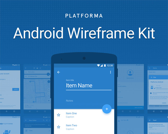
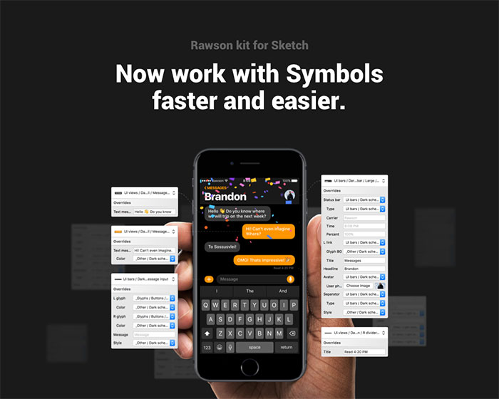
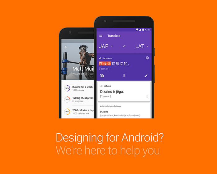
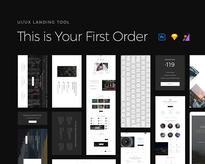
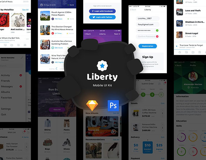
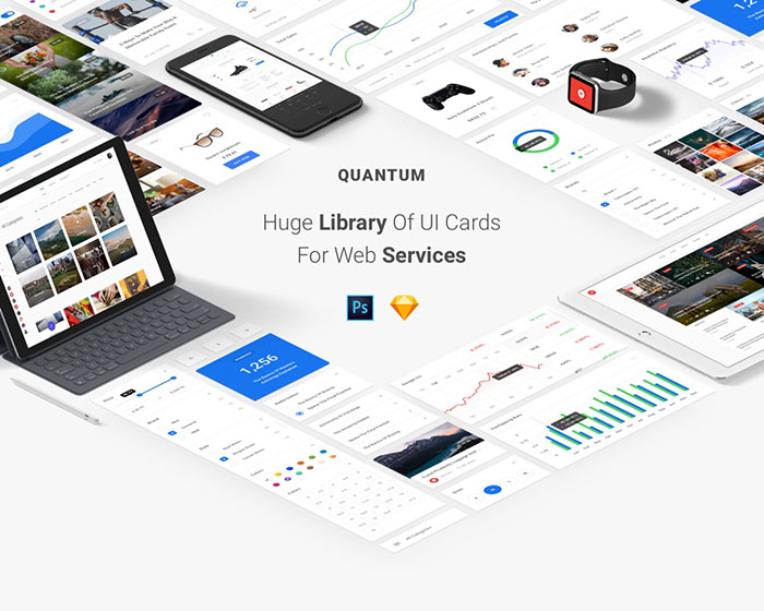
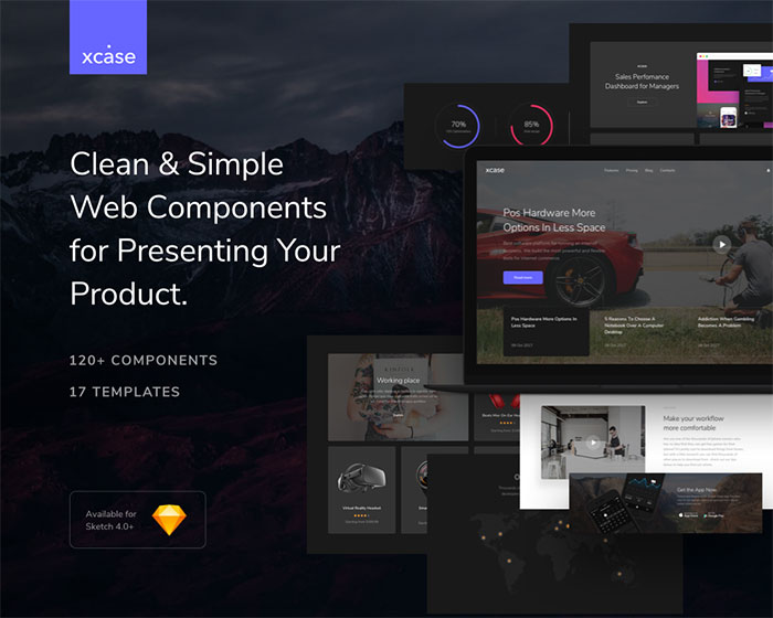
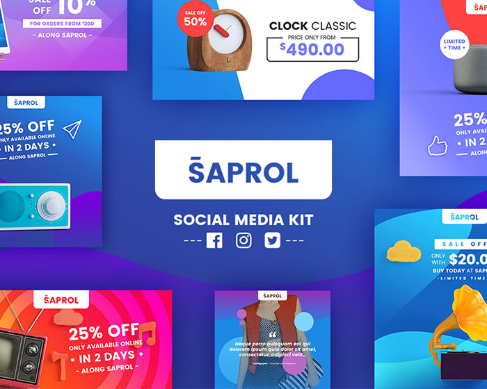
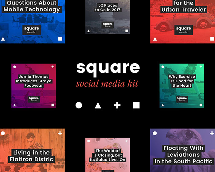
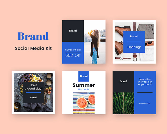
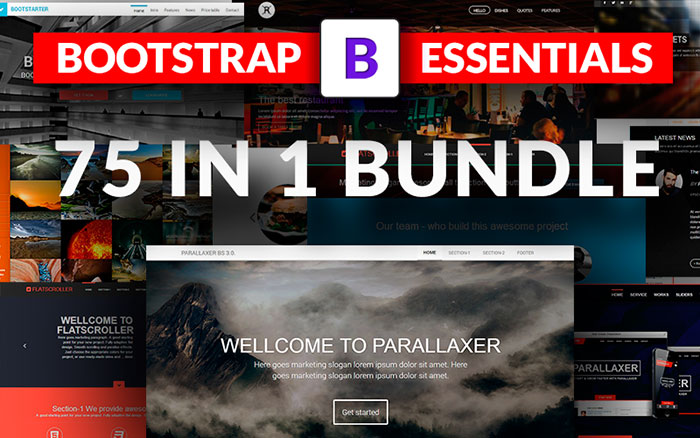
UI KitsPlatforma Android Wireframe Kit is a collection of 300+ screens based on Material Design Guidelines, divided into 28 popular content categories and carefully assembled for Sketch 41+ and later. Platforma Android Wireframe Kit is a perfect instrument for creating an interactive prototype using many popular online tools. The huge and renewable elements library of IOS interface for fast prototyping and apps design. Rawson kit is fully created with using Nested Symbols. Material Design Kit is the ultimate library of UI elements, app templates, and style guides combined into high-quality source files for the sketch. Everything you need for a faster workflow and better results when designing for Android. Meet “First Order” – the new UI Kit from Craftwork Team – simple, elegant and strict, with its own clean style. This is UI Kit designed to create ultralight Landing Pages. It offers over 120 universal blocks compatible with Photoshop, Sketch, and Figma. So you can be both creative and flexible in your work. All components are spread across 10 categories (headers, features, call to action, showcase, pricing tables, contacts, team, forms, navigation, UI kits packs). Say hello to Liberty UI Kit! This is perfect choice for create a stylish mobile apps. Liberty UI Kit includes 125 screens and wide range of elements to work. All elements are fully customizable and easy editable. This pack comes with 9 categories: Login, Sign Up, Walkthrough, Menu, E-commerce Reader, Profile, Social, Multimedia. Liberty UI Kit compatible with Sketch and Photoshop. 600+ UI Cards and 100+ Pages in 7 categories to make your design process super easy and fast. Drag and drop cards, customise, replace images and texts. Clean & simple web components designed in Sketch for presenting your product. All elements are created for Light & Dark colors. Social media kitsSaprol Social Media Kit a handy tool that would turn your artwork into engaging promo images for social media. Create stunning posts in a few clicks and stand out with ease using social media templates Your company needs to look perfectly on the social networks. Square Social Media Kit was created specifically for this. Bright and concise style make your publications recognizable. Your company needs to look perfectly on the social networks. Brand Social Media Kit was created specifically for this. Just replace the text and images, and share with your followers. It is so simple! You can change the color, text, images and make any changes to the design. Cool dealsWeb-based E-invoicing software that helps you craft beautiful invoices, automatically send payment reminders & get paid faster online. 1600+ Background Images with Extended License One of the tested ways to ensure visitor’s interest in your website is to incorporate large & beautiful background images on the site pages. We bring you an impressive mega bundle of 1600+ background images to set the tone of your business. A Unique Bundle of 75 Bootstrap Templates Today’s deal is a delight for all the Bootstrap addicts. Top 4 reasons to grab these Bootstrap website templates
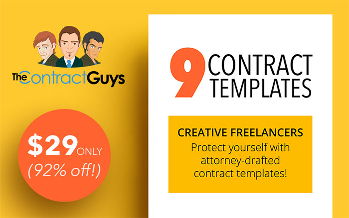
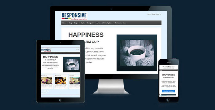
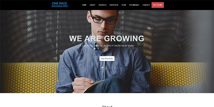
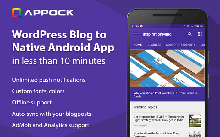
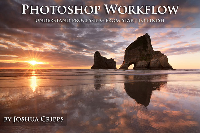
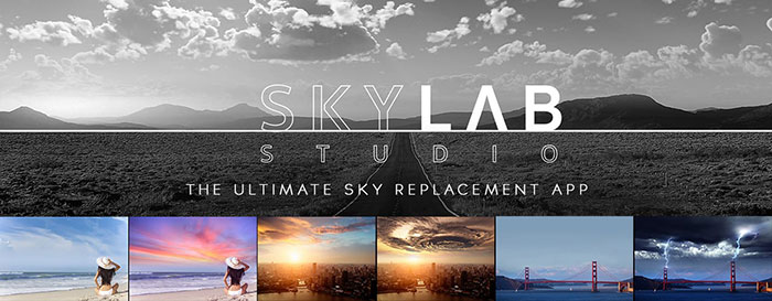
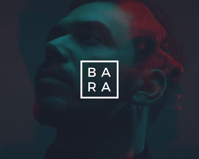
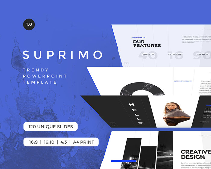
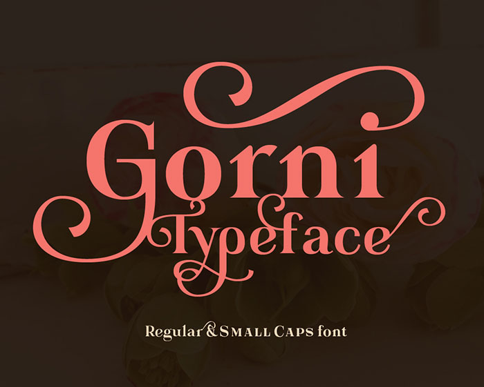
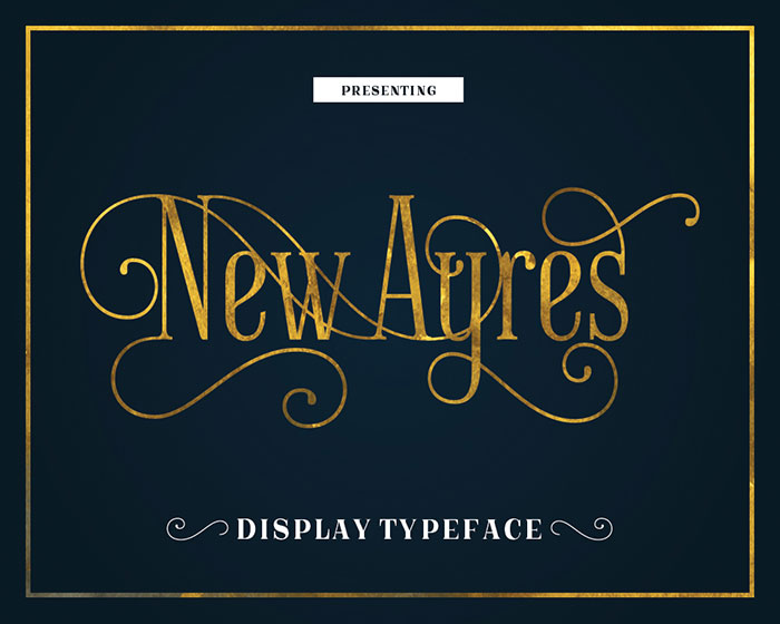
9 Professionally Drafted Contracts For Creative Freelancers Today’s deal gets you 9 attorney-drafted freelance contract templates to save you from being fleeced. WordPress themesFREE Responsive WordPress Theme Responsive, as the theme is called, is based on an intuitive foundation with a fluid grid system that automatically adapts your website to mobile devices including smartphones, tablets and desktops so your website looks incredible on any device. One Page Business Pro is a beautiful, appealing and engaging responsive single page WordPress theme. This theme is perfect for showcasing various websites like corporate, business, portfolio, agency, or any other creative website. AppsCreate your own app in 3 steps Take advantage of the mobile revolution by complementing your web presence with an easily accessible app with Appock. With Appock, you can create your own app for your WordPress blog in 3 simple steps. Rocket App Builder – Create Unlimited Android & iOS Apps (DIY) Rocket App Builder has created a DIY mobile app making platform. It lets you build Android or iOS apps quickly through a simple drag-n-drop interface. PhotographyMovavi Photo Editor For Win & Mac I don’t shy away from work but spending hours and hours in front of Photoshop kinda makes my brain go sore. But then I know I can’t just skip it. I need my photos to look top class. However, every problem has a solution and I found mine in Movavi’s Photo Editor. Master Lighting Guide To Flash Photography In this guide you’ll learn how to bend light to your will by using flashes. You’ll learn how to add a WOW factor to your photography with intense, dramatic lighting. You’ll learn how to combat harsh sunlight by using flash. Master Photoshop Workflow With Joshua Cripps There’s nothing quite like that first look through your memory card after returning home from vacation. It’s both exciting and nerve-wracking. Sitting down at your computer, waiting for the memory card to finish uploading the photographs, you can’t help but think about one sunrise in particular that you shot. The Ultimate Sky Replacement App A outdoor photographer’s needs are simple – A good view. A good camera. A good tripod and A good filter. But sometimes your best outdoor photos just don’t happen. Mother natures decides to be pissed with you and you’re left with a flat cloudless sky. And knowing when the sky will be a beauty again isn’t your game. Powerpoint and Keynote templatesMake a strong positive impression with these clean Powerpoint & Keynote presentation templates. With Bara, you have everything you need for a powerful and convincing presentation. SUPRIMO is a stunning multipurpose template that meets the latest design trends to suit your needs. Included are 110+ trending slides, 100+ master slides, 650+ font icons, one click settings and much more! SUPRIMO is easy to customize and use no matter your previous Powerpoint skill set. FontsGorni typeface is a display serif font with a romantic vibe. Includes: New Ayres keeps the same feel, but raised to high-quality level. Its long clean lines and soft curves merge old style and modern, giving a new meaning to timeless elegance. from http://www.designyourway.net/blog/misc/check-out-these-neat-resources-for-designers/
0 Comments
Not a long time ago LEGO commemorated the 55th anniversary of the LEGO brick and for this occasion the company has issued 55 riddles where LEGO bricks represent various characters and scenes from movies, songs and cultural highlights that occurred over the last 55 years. To achieve a viral effect LEGO had the wonderful idea of releasing minimalist vector illustrations as puzzles and my God, viral it went. A lot of communities were enthusiastic about these designs and everyone wanted to get them all correct. I don’t know why they didn’t have the idea of selling them as posters. There are a lot of people who are into minimalist posters and a lot more who are into LEGO and both these categories of people would want at least on of these posters on their walls. Reservoir dogs
The Rolling Stones
Braveheart
A Clockwork Orange
The Tortoise and the Hare
Shrek
Inception
The Matrix
Men in black
Gulliver’s travels
Kill Bill
The Beatles
The White Stripes
Peter Pan
Bob Marley & The Wailers
Spiderman
The Green Mile
2001 A space Odyssey
The Police
Nirvana
Alice in Wonderland
Ali Baba and 40 thieves
Jurassic Park
Stairway to heaven
Under pressure
The color purple
Strawberry fields forever
King Kong
Jaws
Tron
Paint it black
Titanic
Three little pigs
Monsters Inc.
Purple rain
Hansel and Gretel
Maroon 5
Black or white
Big Fish
Goldilocks and the three bears
Robin Hood
Snow White and the seven dwarfs
Little red Corvette
300
Walk the line
Red riding hood
New kids on the block
Four weddings and a funeral
Black sun
Moby Dick
Pinocchio
Yellow submarine
The big blue
Simply red
The thin red line
from http://www.designyourway.net/blog/inspiration/minimalist-vector-designs-of-stories-created-with-lego/ Good digital painting tutorials are scattered all over the internet and it’s pretty annoying to find each one of them and then follow the instructions to learn the techniques that were part if its creation. Luckily, I like to gather similar resources in a single place to make it easier for me and others to use them, so I made this article with probably all the best digital painting tutorials on the net that will help make you a better digital painter. from http://www.designyourway.net/drb/the-best-and-most-appealing-51-digital-painting-tutorials/ If you are a web designer who finds himself in an inspiration crisis then you have to free up some time to check out what other designers have done recently. You can subscribe on Dribble or Behance to various web designers who are always adapting their methods and techniques to the current trends and you’ll have a fresh dose of inspiration when you need it the most. Another way of keeping yourself inspired is checking out articles like this one, for example, where new and interesting web designs with cool layouts are featured. from http://www.designyourway.net/drb/modern-website-layout-designs-for-inspiration-22-examples/ If you’ve been a designer for some time then you have met all kinds of clients and all kinds of requests, some entertaining, a few normal and a lot really absurd and insane ones. The good part about this is that you can laugh with your fellow designers by telling the craziest stories you happen to get yourself into. Yet, a better idea that Ireland’s creative community came up with was to make posters out of the client’s silliest requests and sell them for charity. From what I understand, the posters were a blast and that’s not at all surprising. Polar Bear
I like it, but can you make it a little warmer? Target
The target audience is makes and females, aged zero and up. Actual Logo
Could you do an actual logo instead of a font? Vikings
You’re portraying the vikings in a negative light. Travel
I’m just not sure that a globe and a passport represents travel. Target market
I’m the target market and I don’t like it. Zebra
That horse looks like a zebra. White space
Too much white space. Less is more. Colours
I really like the colour, but can you change it? When I see it
I’ll know what I want when I see it. Animated TV ad
I know you said the TV ad would be “animated” but that’s a cartoon. Baby’s Ear
We need to remove the baby’s ear. Or at least move it round the side of his head a bit. Latin
Looks great, however the copy seems to be in Latin, but could be Italian or Spanish. Too blocky
Fitzer
We want it to look like this, but don’t copy it. Just make it different enough, but keep it the same! Jazz
Jazz it up a little. Cowboy
Could we make the cowboy a little less camp? Redxmas
We feel that red just isn’t right for Christmas. Premium
That just doesn’t look premium. Non-specific
We need mre images of groups of people having non-specific types of fun. Chill factor
Can we dial back the chill factor? Less chill. And then dial up the fun factor, by around 25%. Breaknet
I want you to break the internet. Pop
Make it pop! More fonts
Can you use more fonts? Italian or Spanish
Warm handshake
The flyer should feel like a warm handshake. Bigger logo
Can we not make the logo bigger? Screen
Lo res? But I don’t understand… If you can’t make it any bigger, how are you able to enlarge it on the screen? Elephant
Can you turn it around in Photoshop so we can see more of the front…? Another Room
Have the end line spoken so people not watching the ad in another room can hear it? Germs
Could you make the invisible germs more visible? Animated Gif
I have printed it out, but the animated gif is not moving. Monkey
I did this at home with Microsoft Paint. Can you make it look like this? Sexy Pig
Can we make the pig sexier? Awards
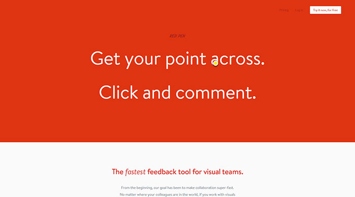
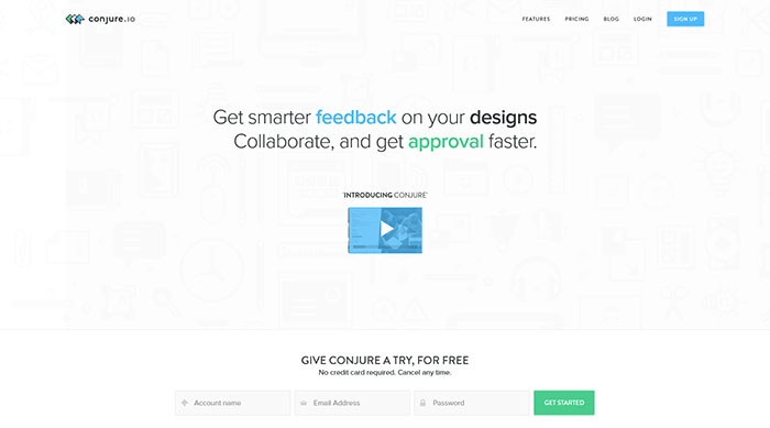
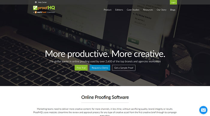
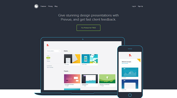
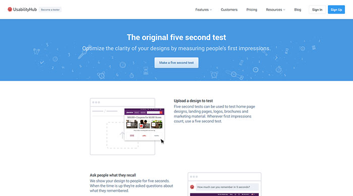
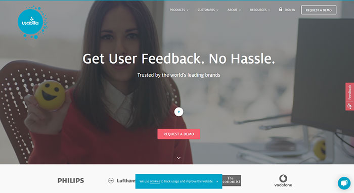
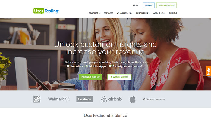
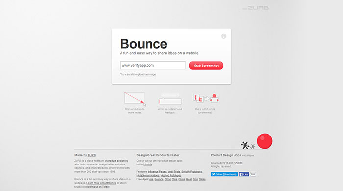
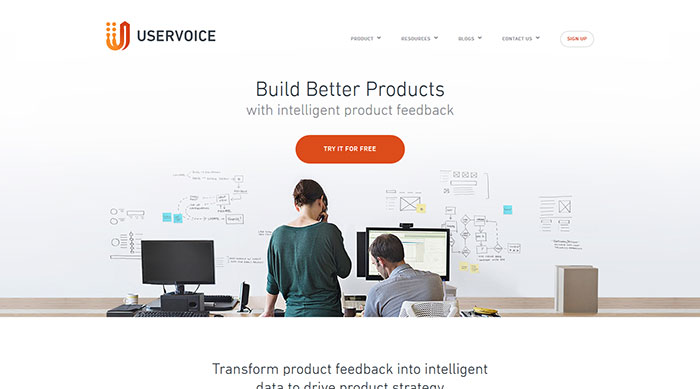
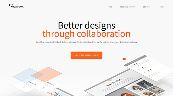
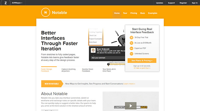
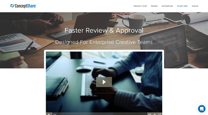
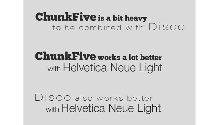
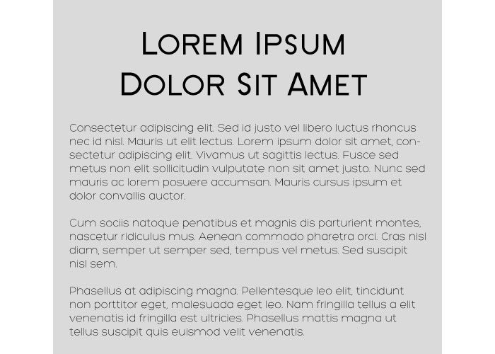
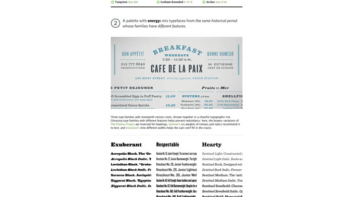
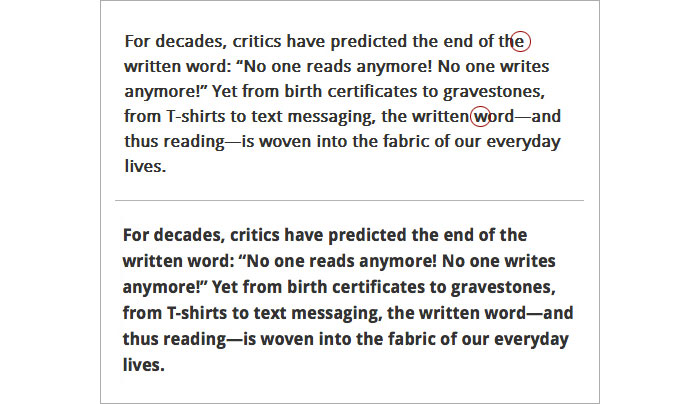
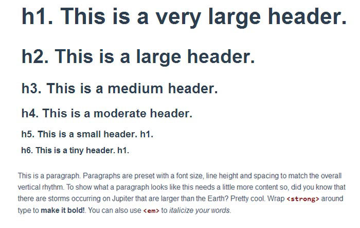
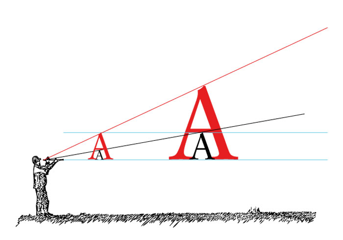
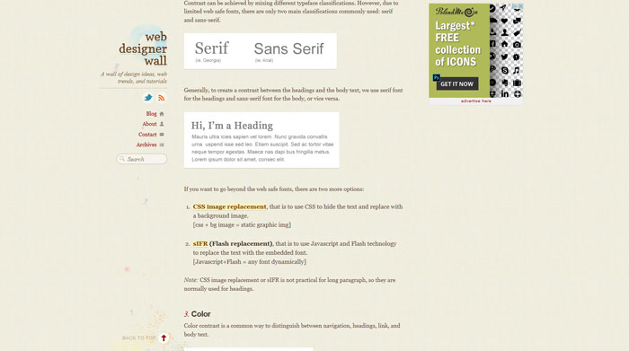
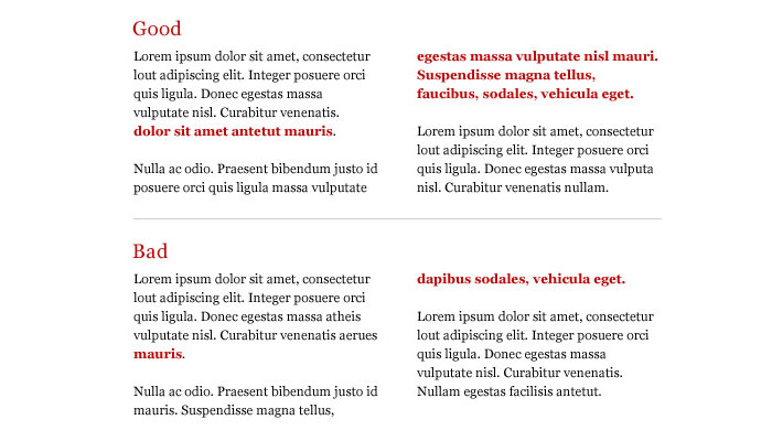
Will this win me an award? from http://www.designyourway.net/blog/inspiration/a-series-of-posters-with-silly-design-requests-from-clients/ The lifeblood of any artistic endeavor is obtaining a detailed summary of the clients’ appreciation of your designs. You should be looking more at the negatives than the points which your clients find to be acceptable or surpassing their required standards. While it is agreeable to receive positive feedback you will learn more from the negatives expressed by the users. An overall view of the project with fresh eyes can be a great help in solidifying those unspoken points that you felt you could improve but didn’t or even unexpected criticisms of details which you were unaware of. Now with access to a global audience that is a mere click away by using the power of the internet, obtaining thoughts and appreciations from your peer group has never been easier. The internet has aided the process of creative criticism with sites of like minded designers such as Behance and Dribbble. As these are used by artistic users who mostly look the same way at a design project and besides this, it is possible for them to lack something in producing meaningful criticism. Most users are far too nice to be brutal and while it does help the ego, inane comments such as good work and well done don’t really help at all. If you search the internet highway it is possible to find sites whose sole reason for existence is supplying unbiased and meaningful observations on the quality of your work. It is possible to analyze their comments to arrive at the standard that you wish to set for your design work in the international marketplace. The importance of feedbackConsidering that all the minor details can steal away the time that you need to dedicate to pure design, any assistance with helpful observations relating to the pure design aspects of each project is welcomed. It doesn’t matter if the feedback is coming from a colleague of yours or from your aunt. As long as it helps with your project, it is good. This applies the same whether you are a web designer or an artistic one. Whichever way you look at this, it becomes more obvious that any critique, positive, neutral or negative feedback should be, is welcomed. You should be making use of all social media platforms for gathering observations from users, seeing feedback and paying attention to the comments section as well as taking full notice of website analytics and any other data or observations that can be gathered. The entire process should be channeled towards the ultimate improvement of design practices and needs to be part of the learning curve necessary to improve the quality of your designs. It improves your skills The problem with a project is that once finished and accepted by the client all of our energy is channeled into the next task with little or no interest being shown on the previous completed job. This attitude surely needs revisiting as it is necessary to learn from the previous task, even if what you learn doesn’t change the project that you delivered and although client was willing to accept the last project, you should do better next time. It makes you see things differently Of all the analysis carried out by a mixture of views from clients, peers users and viewers, all have valid points for you to consider. It is possible that they may highlight details that you haven’t thought of when designing a product, whether it is a website, vector illustration or a business card. This is an important part of getting feedback, the fact that you can see your product through other people’s eyes and acknowledge issues that you thought to be perfect. It makes it easier for you to deliver a better user experience There is absolutely no point in gathering all the feedback, comments and observations without making some attempt to understand them from the contributors point of view and how they came to form that opinion. It is necessary to break down each comment to its smallest component parts and analyze each one separately to understand how visitors interact with your design, if the design project is a website or an app. Also, remember the old adage a broken clock is still right twice a day, there is no such thing as useless criticism, be aware that just because you don’t agree does not mean it is wrong. This process is all about other viewers’ perceptions. ResourcesRed Pen Everything in Red Pen is designed for maximum efficiency— you don’t need to signup to try the product; designs load instantly; notifications appear live; and there’s clever keyboard navigation. Conjure Conjure allows you to manage your creative workflow simply and in context. No more searching through email chains or long phone calls. With Conjure you can share your work with ease and gather feedback logically — right on the work itself. ProofHQ Marketing teams need to deliver more creative content, for more channels, in less time, without sacrificing quality, brand integrity or results. ProofHQ’s core modules streamline the review and approval process for any type of creative asset from the first creative brief through to campaign execution. Prevue Drag & drop your work into your library — then view each image in stunning fullscreen, with fully editable styling. Easily manage your inspiration and work-in-progress by dragging images into projects and sharable client groups. Fivesecondtest Five second tests can be used to test home page designs, landing pages, logos, brochures and marketing material. Wherever first impressions count, use a five second test. Usabilla Usabilla helps brands like HP, Philips, Booking.com, Lufthansa, KLM, Transavia and The Economist to improve the performance of their websites, apps and emails with live user feedback. Our clients utilize our software to stop guessing what users want, and start listening to what they need. UserTesting Bad experiences on websites and apps, and in the real world, aren’t just frustrating for customers, they’re costing companies millions of dollars a year. At UserTesting, they make it easy for you to get on-demand feedback from your target market —wherever they are— so you can protect your brand, boost conversions, and provide amazing experiences. Bounce Uservoice UserVoice develops product feedback management software that transforms the way businesses gather and analyze customer feedback and prioritize feature requests to drive strategic product decisions. Viewflux Create interactive prototypes from static designs with just a few clicks. Delight your clients with their soon to be built website or app, directly in their browser. It’s like using the real thing before it’s actually finished! Notable Notable lets you take any interface screenshot, sketch or wireframe and exchange notes on specific details with your team. You can quickly reply or suggest a better idea. Our goal is to help you arrive at the best solution in the shortest amount of time. ConceptShare ConceptShare can be used on its own as a stand alone online proofing & approvals solution or integrated with one of their partners. ConclusionBy listening to your clients and to the people that are giving feedback to your projects, not only will you improve the project, but you will also improve your skills which on the long term is the biggest win. If you consider yourself a good designer, you need to know when to listen to the feedback that is given to you, cause this is a good way to deliver the best product for your client and his audience. Feedback isn’t a thing that you can ignore. This should be an important part of the design and development process and everyone should know it. from http://www.designyourway.net/blog/resources/the-importance-of-getting-feedback-on-your-designs/ Typography forms a large part of any designer’s learning curve. Thanks to the internet all available information is at your fingertips. There are a lot of tutorials available that are easy to follow and relevant to learning typography skills. Learning from these tutorials can make almost any student to produce high quality pieces of typographical art. Whatever your field of expertise is, the skill of typeface design is a challenge. The tutorials here represent an easy and enjoyable way to use and improve your typographical skills. Below you will see that the tutorials are split in four categories: Things that you should read first (the basics of typography), web typography, Photoshop typography tutorials and Illustrator typography tutorials. You need this before anything elseMaking Sense Of Type Classification Everyone knows their serifs and sans, slabs and scripts, but most classifications go much deeper than that. Type classification, while helpful, is often convoluted, confusing and even controversial. This article, distilling some of the complexities into a more understandable format, lands somewhere in the middle between the basics and genuine type nerdery — the perfect level for a practicing designer. The Basics of Type Typography could be considered the most important part of any design. It’s definitely among the most important elements of any design project. And yet it’s often the part of a design that’s left for last, or barely considered at all. Designers are often intimidated by typography, which can result in bland typographical design or a designer always using one or two “reliable” typefaces in their designs. Paragraphs and Special Characters Body copy makes up the majority of many websites. Headlines and other bits of typography are often considered more fun to design, or more artistic, but without a good design for your body copy, your overall project will suffer. Principles for Combining Typefaces When combining typefaces, there are a couple of important principles you’ll need to keep in mind, namely contrast and mood. Effectively combining typefaces is a skill best learned through practice, and trial-and-error. Once you’ve mastered the principles covered here, you’ll have the tools you need to try out combinations while making educated guesses about what will and won’t work together. Pulling It All Together In this article, there are guidelines for combining fonts for paragraphs and headlines, as well as for other common type elements, like pull quotes and by-lines.
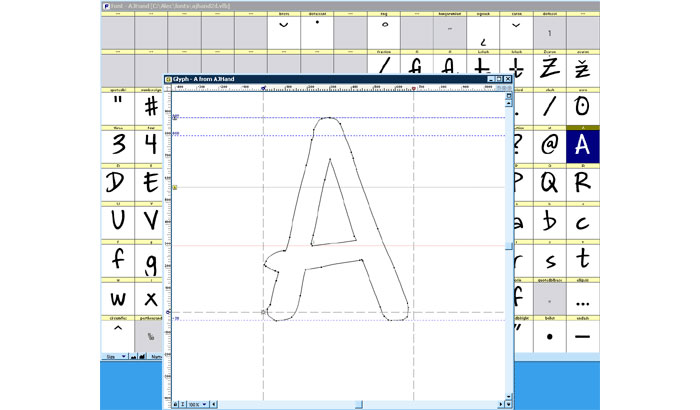
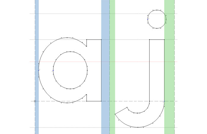
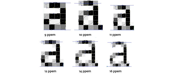
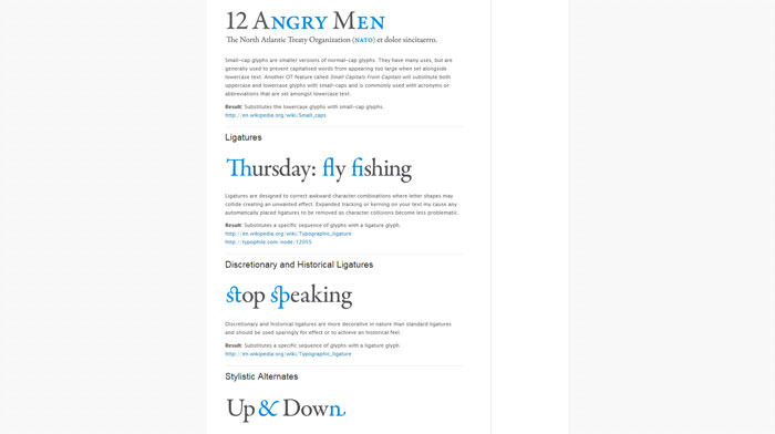
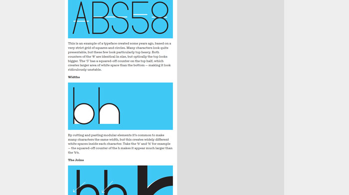
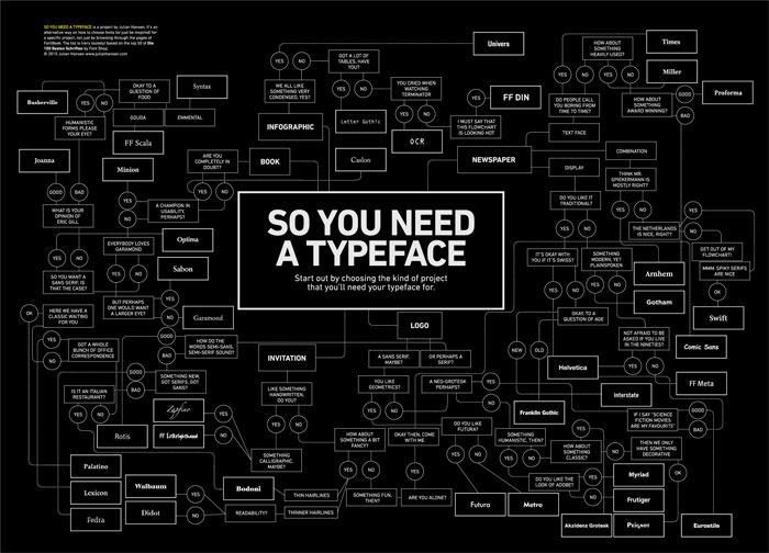
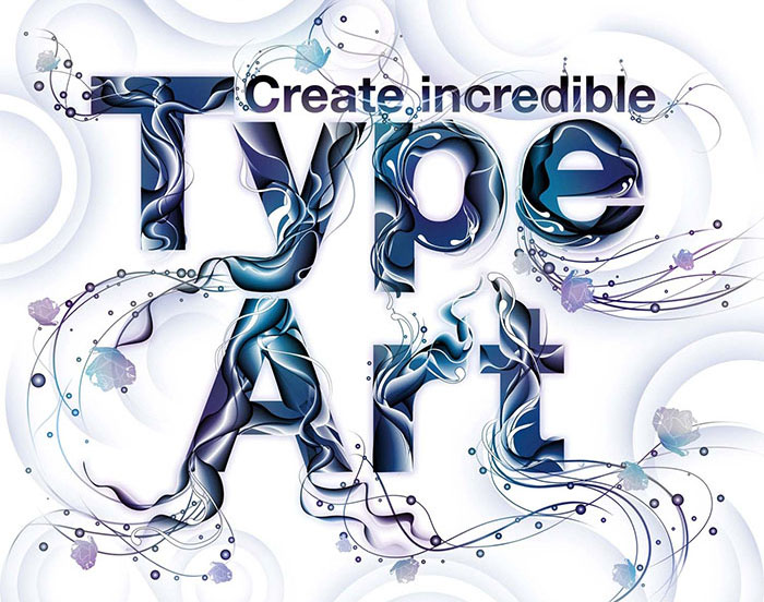
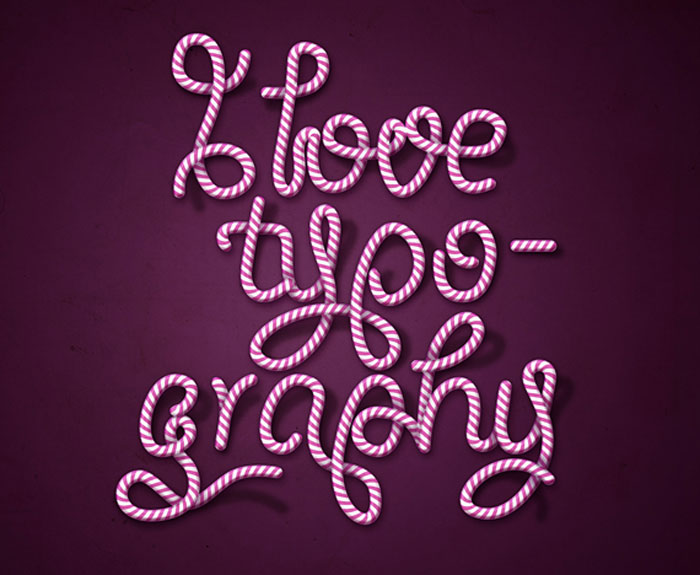
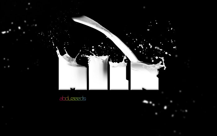
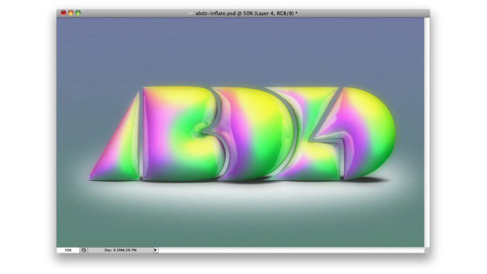
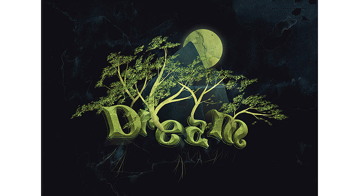
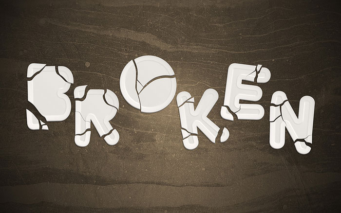
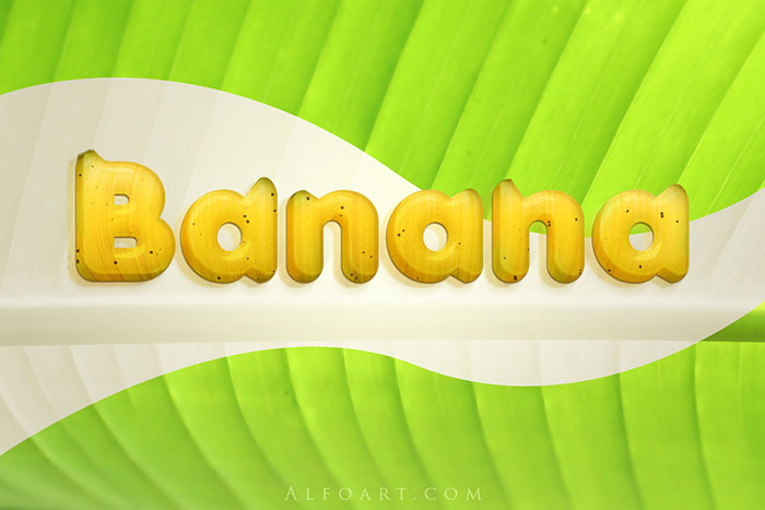
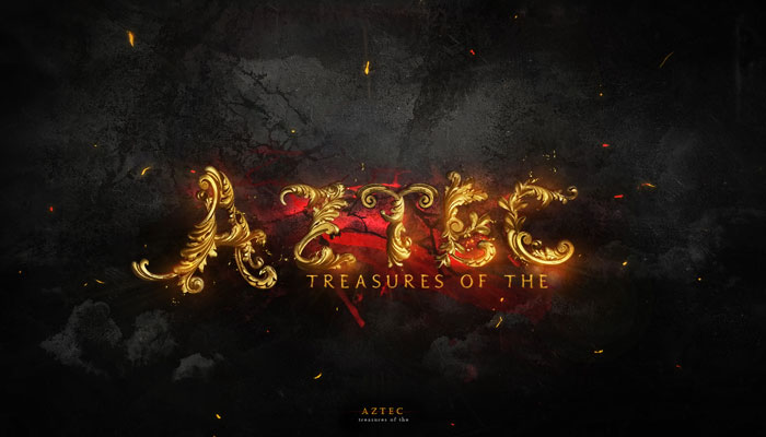
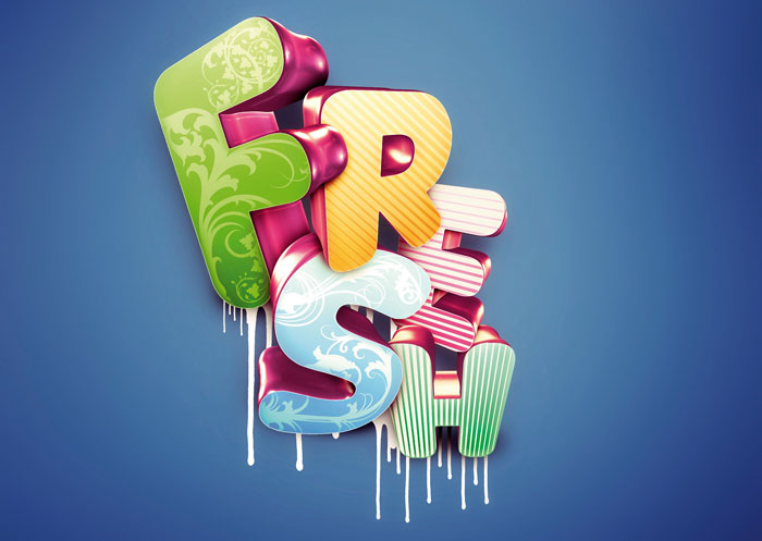
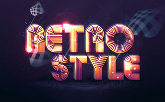
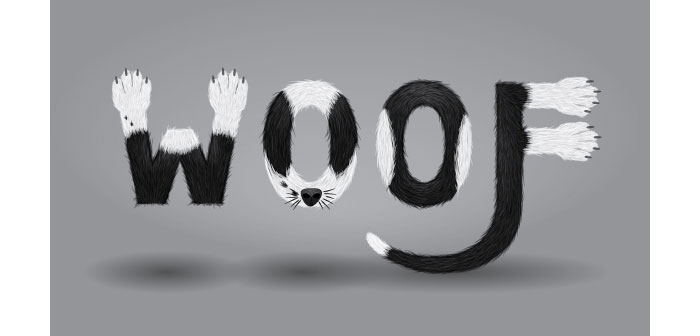
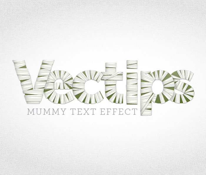
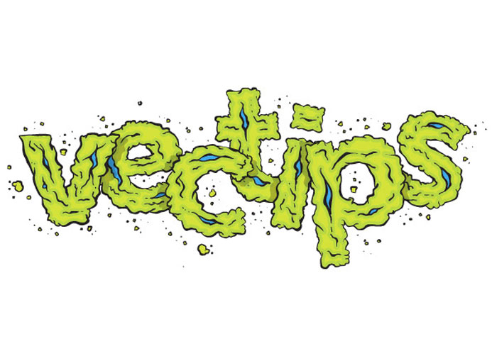
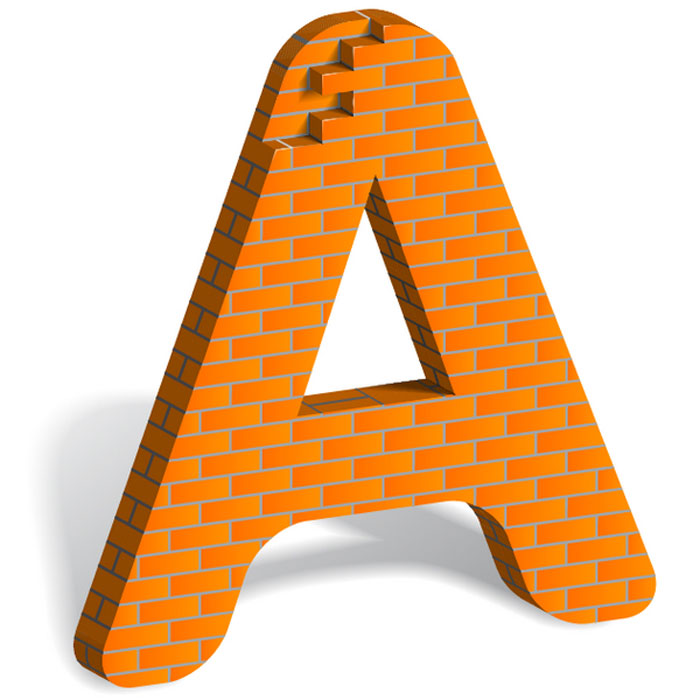
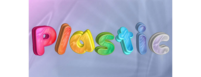
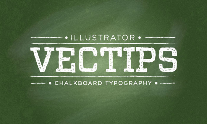
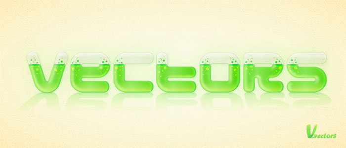
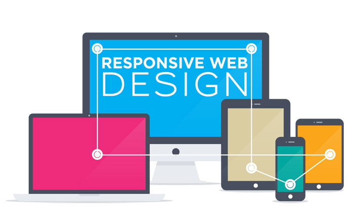
Font creation has become incredibly popular in recent times and has become more accessible to those who wish to get involved with the creation process. This is thanks to a number of font creation programs which are now available across many desktop computer systems. So you want to create a font. Part 1 So you’re a brilliant designer, a master calligrapher, and you’ve learned all about serifs, side-bearings, and kerning. Now you want to create your own font. So you want to create a font. Part 2 The sheer number of fonts out there is a testament to the fact that there are nearly an infinitude of creative choices that can be made when designing a font. Understanding The Difference Between Type And Lettering Unfortunately, as with any popularity surge, there have come with it a lot of misunderstandings of some of the terms and concepts that we use. This article will help you gain a clearer understanding of what typography is and isn’t, and why. Font hinting Hinting, or screen optimising, is the process by which TrueType or PostScript fonts are adjusted for maximum readability on computer monitors. This text compares different ways of hinting (black & white, grey-scale, ClearType, DirectWrite), and explains the behaviour of fonts under different rasterisers. Four techniques for combining fonts Is there a way to know what fonts will work together? Building a palette is an intuitive process, but expanding a typographic duet to three, four, or even five voices can be daunting. Here are four tips for navigating the typographic ocean, all built around H&FJ’s Highly Scientific First Principle of Combining Fonts: keep one thing consistent, and let one thing vary. Beginners Guide to OpenType OpenType (OT) is a cross-platform type format that includes expert layout features to provide richer linguistic support and advanced typographic control. Using OT technology you can substitute your characters for different glyphs1 using many different methods; Ligatures, Small Caps, Oldstyle Figures, Fractions, Superscript/Subscript, Ordinals, Alternates, Titling Characters and many more. Making Geometric Type Work For graphic designers beginning to experiment in type design, a geometric or modular typeface is a natural starting point. Illustrator and other programs offer a simple collection of elements such as circles, squares, and triangles which can be combined to create a passable alphabet. This is the same route the author took when dissatisfied with the limits of commercial fonts at the time. Ian twisted and distorted each character to fit into a few simple, incredibly strict rules of construction. Invariably this produced a wide range of exotic letterforms, some more legible that others. Web typographyA guide to Web typography Typography for the Web has come a long way since Tim Berners-Lee flipped the switch in 1991. Back in the days of IE 1.0, good web typography was something of an oxymoron. Today things are different. Not only do we have browsers that support images (gasp!), but we have the opportunity to make our web pages come to life through great typography. Avoiding Faux Weights And Styles With Google Web Fonts If you’re using Google Web Fonts on your websites, then there’s a very good chance that 1 in 5 visitors are seeing faux bold and italic versions of your fonts — even if you correctly selected and used all of the weights and styles. That’s because the implementation method recommended by Google Web Fonts doesn’t work with Internet Explorer 7 or 8. Legibility And Readability – Principles That Shouldn’t Be Ignored When Designing Readability is an important aspect of web design usability and that is not a secret. If readability is done correctly, it will allow the users to assimilate easier the information given in the text. This will depend on a few factors like the content structure, style and design. Legibility, on the other hand, is a measure of how easy you can distinguish a letter from another in a typeface. While making a text readable is doable, making every font legible is impossible, because not all fonts are designed to be legible. How To Pick The Right Font For Your Design Typography continues to be overlooked by many designers yet it is a very important aspect of the design process as choosing the right typeface can make a real difference to the effectiveness of the design. Typefaces are just as important to the visual effect of the webpage as images. Responsive Typography: The Basics The body text definition dictates how wide your main column is, the rest used to follow almost by itself. Used to. Until recently, screen resolution was more or less homogeneous. Today we deal with a variety of screen sizes and resolutions. This makes things much more complicated. Typographic Contrast and Flow Designers create typographic contrast and flow by emphasizing certain text. Contrast is important because not all the content within a page have the same value, some have greater significance than the others. By creating contrast, you can direct the reader’s attention to the important messages and at the same time enhance the visual appearance. Here are seven basic methods on how you can create typographic contrast. 8 Simple Ways to Improve Typography In Your Designs Many people, designers included, think that typography consists of only selecting a typeface, choosing a font size and whether it should be regular or bold. For most people it ends there. But there is much more to achieving good typography and it’s in the details that designers often neglect. Photoshop tutorialsAn Awesome Collection Of 80 Photoshop Typography Tutorials Finding them all in one place is a little bit tricky… unless you find this article where you have almost all the cool and interesting Photoshop typography tutorials. How to Create Candy Cane Typography with Photoshop and Illustrator Awesome Milk Typography Effect in Photoshop Playing with Inflate in Repoussé in Photoshop CS5 Extended Create an Ice Cream Type Treatment in Photoshop Create Awesome Particle Flame Text Effect in Photoshop Create a Dream Design with 3D Typography Create an awesome broken plate typography effect Banana style text effect Create Gold Ornamental Text in Photoshop Honey leaking effect on the delicious pancake Cool Text Effect with the Puppet Warp Tool in Photoshop CS5 3D Ribbon Wrapped Text Effect Master 3D type effects Create a Tasty 3D Typographic Illustration in Photoshop Dramatic Text on Fire Effect in Photoshop Create Abstract Shining Text Effect with Groovy Font in Photoshop Add Fantastic Color to 3D Text – Part II Honey bubbles text effect Create Stunning 3D Text in a Grungy Landscape Creating Retro Folded Typography Using Photoshop Smoke Type in Photoshop in 10 Steps Create a Spectacular Grass Text Effect in Photoshop Glossy Snow Globe Text Effect Design Soft Stylized 3D Type Super Easy Pewter Style Metal Text Effect in Photoshop Create Cool Typography Using Paths in Photoshop Illustrator typography tutorialsUseful Typography Tips For Adobe Illustrator Old School Type – Line Gradients Create a Furry Calligram in Illustrator Create a Variety of 3D Lettering Effects for Poster Design Getting Carried Away with Balloon Lettering Create a Mummy Text Effect Create a Grimy Text Treatment with a Pen Tablet How to Build Letter Art From Bricks In Illustrator How to Create a Neon Text Effect in Adobe Illustrator How to Create a Fun 3D Plastic Text Effect Create a Chalkboard Type Treatment Create a Glassy Text Effect Filled with a Green, Acidic Substance Create a Zombie Style Typo using the Blob Brush in Illustrator from http://www.designyourway.net/blog/resources/tutorials-to-learn-how-to-create-typography-based-designs/ Tablets, mobile phones, and even lighter, easy-to-carry laptops are in the hands of more and more people as time passes and technology advances. Additionally, it’s imperative that companies design their platforms to work across all types of devices, no matter the screen size or shape, through the use of responsive design. So, what is responsive web design? By definition, responsive web design is a system whereby the desired website responds to the particular device on which it is being displayed in order to show the site with full visible content. From small mobile smartphones to tablets and laptops, responsive web design allows optimal viewing on any device. By using flexible grids and creative styling, it is possible to display the website’s content in a format that suits the width and configuration of any user device.
To help determine how the layout of a website will appear, breakpoints are used in conjunction with the design process. Generally speaking, breakpoints are the specific points where the site’s content begins to provide the best visual layout in the way the users wish to use the content. There are two design configurations: one design is used above the breakpoint and the other is used below the breakpoint. Although many elements come into play, breakpoints are usually based on the browsers width. Responsive web design and user experienceMuch like solving a jigsaw puzzle, responsive web design requires movement of various elements around the page somewhat changing the initial design. Organizing elements to fit can be a great challenge with responsive design as larger pages and their elements will need to essentially shrink to fit on the more narrow platform of a mobile device. There are times when the opposite is true and smaller pages will need to expand to fit on larger desktops so that the page isn’t lost on a huge, empty screen. It’s increasingly important for design and development teams to work together so there is a usable experience across all devices and resolution characteristics.
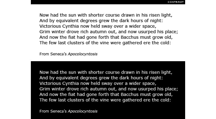
Moving elements around the page can cause a very different effect for the user. Elements may look completely different from one device to the other. Therefore, it’s crucial for design and development teams to ensure an optimal experience for the user by making sure all elements work in conjunction with each other and that they transpose across devices. Responsive design systems, such as Bootstrap or Foundation, are often very helpful when designing a website for optimal responsive design. However, site and user functionality are more important than how it works in general. It’s important to make sure the framework is best for the particular website design. The best way to perfect the design and guarantee success is through usability testing across various platforms. What works and looks prefect on a desktop may not translate to a small smartphone. On the other hand, designing for the smaller platforms like a smartphone or tablet may not bode well with regard to a huge desktop. It’s ultimately best to test the elements with all available platforms to ensure the highest quality and end result for all users. RWD websites don’t automatically deliver rich UX, you can still screw upResponsive web design goes hand in hand with adequate accessibility. Without a doubt, having a website that is built around responsive design does not guarantee that all points are fully accessible to the user. Color contrast and readability are two areas of concern with regard to accessibility since neither of these elements have anything to do with a successful responsive web design. However, these elements are extremely important to the user and, therefore, should be of concern during design and development. It’s no secret that visual effects of any website are important for user satisfaction. The site must be visually appealing and give the user a desire to work with it. Even if the site is one of the most responsively designed out there it can still have accessibility issues if the data is not visually appealing and workable. Additionally, if proper color techniques and contrasts are not employed, the many users out there with color-deficient vision will be greatly affected. Without the use of ARIA to define interactions, vital support may not be allowed and access to the site will be interrupted. Ultimately, responsive design is about how the content of the site looks and feels to the user, and the ability to interact and access all information on the site plays a vital role in its success. No matter the device used to access it, users should have a good experience with regard to the ability to access all elements of the site. Always think about your users
In the end, the most important element for the development team to consider is the user. It’s very easy to lose site of the user when writing code and getting caught up in the technical elements. However, development teams must remember for whom their work is actually being performed. It’s extremely important for all data that has been gathered throughout the process to be passed on to the development team so that they have the ability to make decisions about users and their needs. It’s important for teams to have the flexibility to make changes, and having background on the users will aid them in this process.
One example is the decision to disable pinch zoom for devices with this capability. Without proper information and user background, developers may decide to exclude this feature. However, there may be a market for pinch zoom and not having it would exclude visually impaired users from interacting with the final product. It’s important for developers to have all information on the target user group and then to take a giant leap back in order to get a good, broad-scale look at user requirements. Reduce load time
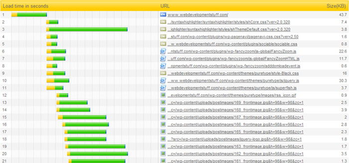
Several things can slow down response time for sites and it’s important with responsive web design to reduce load time as much as possible. Every single HTTP request and server response represents one round-trip on the network which can take several seconds to complete from start to finish. A website can require multiple HTTP requests before any content is viewed by the user. However, there are several ways to reduce unnecessary requests such as consolidating CSS and JavaScript files, in-lining small images, leveraging caching features, and using CDNs. It’s important to remember, the bigger the website the longer it will take to render a result for the user. For responsive web design sites, images are a definite problem.
Therefore, it’s important to use methods to eliminate issues images can cause by adjusting image size and format, managing cache more effectively, compressing files when appropriate, and removing obstacles such as white space, comments, and image metadata. In addition, there are automated solutions to aid in managing image resolution that will help to deliver images that are appropriate for the website. Remove a certain type of social media buttonsSocial media buttons may likely be the reason for slow response times when loading responsive design sites on mobile devices particularly when there is a slower cellular connection. Since bandwidth and latency are typically at a premium on smaller, mobile-type devices, response can build up over cellular connections and cause serious problems. Therefore, it’s important to remove excessive fluff on a site such as those pesky TWEET and LIKE buttons in an effort to decrease the number of obstacles the data much run through before producing an end result for the user. As always: Test and then test some more
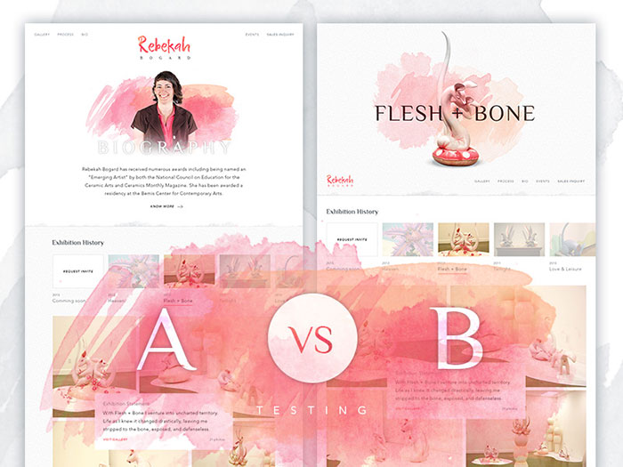
Once the newly developed site is up and running, it would be a huge mistake to just let the site sit without further testing. It’s crucial to continue to analyze and test the site on a regular basis keeping a sharp eye out for issues that may arise. A/B and user testing is a great idea to make sure that any issues are handled in a timely manner and that they don’t linger on the site for too long. Website modifications do not have to be huge changes. Some of the most successful websites have made small, seemingly unimportant changes over the course of several months or even years that, on a whole, add up to be huge in the end. It’s vital with regard to website management to insure continuous testing so that proper data may be used to determine when changes are required. Likewise, keeping up with current technology is crucial and will only increase the site’s usability over time. As new and improved devices enter the marketplace, responsive web design will make keeping up with future technology easier, but it’s imperative that continual testing take place in order to make sure users are enjoying their experience on the site. Tools For Testing Responsive WebsitesEven though many people are stating that responsive web design is taking more time and money to implement it isn’t at all true. It may be a statement of frustration to try to minimize the importance of RWD and start a movement against it. Designing for various viewport sizes does take time only when you do it for the first time. After that, it is easier than riding a bicycle. You’ll notice that everything will seem normal and not outrageously new and hard to implement. A problem that a web designer has always faced is testing the websites that he or she creates and this part of the process has always annoyed us, because we had to make a website for various browsers. Guess what, with responsive web design, now you have to design for various screen sizes too. Can you handle the pressure? Yes, you can. It’s simple. You just need to have a tool that you can use in these situations. In this article you will find tools to test responsive websites from which you can choose the one that you consider best. The Responsinator Responsinator helps website makers quickly get an indication of how their responsive site will look on the most popular devices. It does not precisely replicate how it will look, for accurate testing always test on the real devices. Viewport resizer Viewport resizer is a browser-based tool to test any website’s responsiveness. Just save the bookmarklet, go to the page you want to test, click on your created bookmarklet and check all kinds of screen resolutions of the page. resizeMyBrowser RWDdy Should pop a little div at the top of any page that shows what the site looks like at 320, 640, 980 and 1280px wide. Won’t work on local files, or pages that bust frames. Responsive Design Bookmarklet ish Responsive Design View Am I Responsive Responsive Web Design Best PracticesThe mobile web has taken off with a boom. It is important for web owners to take this into consideration when designing their websites. Their site must be applicable and easy to use for a myriad of devices. With the help of responsive web design, web designers are able to create an adaptable viewing from one device to another. There are a variety of grids, layouts, images and CSS media queries that make this possible. Responsive web design culminates in allowing easy to use navigation, a minimum of browser resizing, scrolling, and panning. Responsive web design is still in the stages of a new technological advance. There are a few rules you need to pay attention to in order for it to work according to plan.
They include a mobile first design, using breakpoints properly, responsive typography, good navigation, quality and responsiveness of images, attention to content, and frameworks. Mobile first design
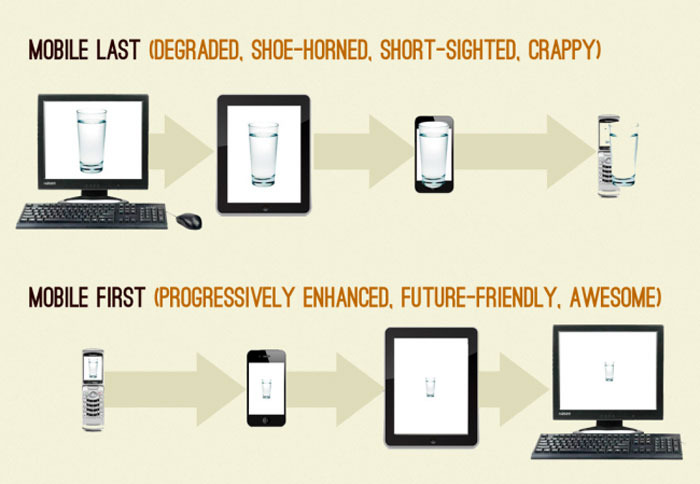
If the designer comes from a mobile first perspective then it allows for a viewing experience that is more universal across the board. It allows for even those from all background to interact with a website. Those with high-quality devices are on an equal footing with everyone else. A website designer wants to design a website that is applicable to the masses. The designer works hard to make sure that a website runs in such a way to allow even phones with outdated technology to be able to access the website easily and have a good viewing experience.
This design strategy starts from how a website would look on a low technologically advanced phone. Thus, the foundation of the website is made simple and users are able to browse through the site easily and without much hassle. Once this foundation has been built on a mobile first level, more advanced interfaces and media can be added for those with more technologically advanced equipment. The idea is to take into account the browsing experience of the low-tech mobile phone and work the way up. It is not necessarily leaving out the more complex media and viewing experiences but having a responsive design that allows for more than one viewing experience. Most designers work the opposite way by creating an advanced website and thinking about how it will look on a low technologically advanced phone is an after thought and not much time is put into making it easy to use. Using breakpoints properly
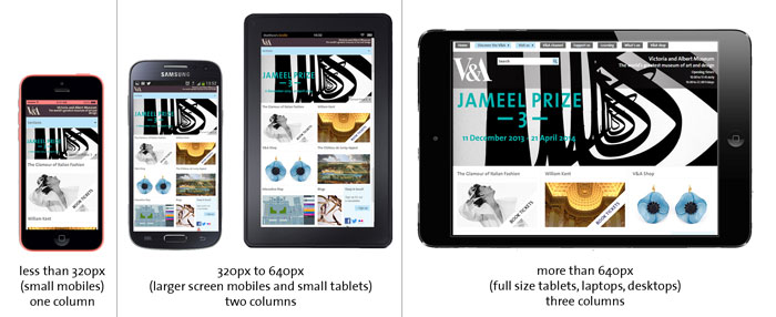
The practice of using breakpoints enhances each user’s experience of viewing a website’s layout. One is forced to realize what the most important information for the viewer to see and start with a simple design. When looking through different interfaces, a point will come in which the website does not look good. A breakpoint should be added there. Responsive typography
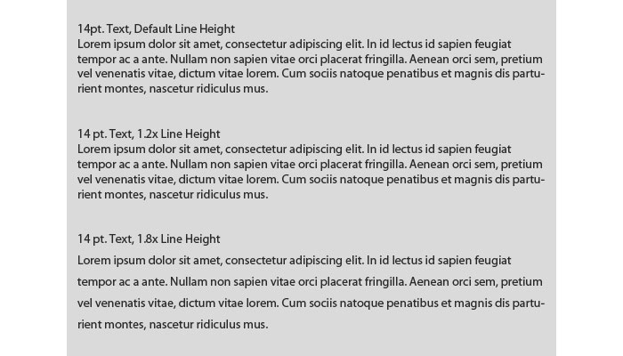
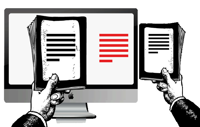
The fonts of different resolutions must also be accounted for in order to allow the best viewing experience. It needs to be a font that works well when zooming in or out depending on the screen from which it is being viewed. Without a doubt, it must be easy to read, clean, appealing and have no overlapping. Thus, it must be looked at from a variety of perspectives. Typography is in the same ballpark as responsive web design. One would not want to choose a font that varies it look from one device to another. In order to have a universal readability, the width of the viewing screen must be taken into consideration. For example, a desktop computer’s best viewing experience will be at 50-75 characters per line. However on mobile devices, it is only 35-50 characters. A simplistic font that looks good on a variety of interfaces would be the best choice. Good navigation
Web designers are careful to put in the time into making sure that the navigation of a website is up to par. The browser’s width is important to this process. The experience should not be dumbed down for those with a larger screen yet it cannot be too wide for those with a smaller screen. The navigation of a website is a priority for all web designers especially in terms of responsive web design. The ability of ease of navigation and an experience which smooth. Otherwise will get frustrated and may leave the site quickly. A website’s navigation capabilities must be ideal across the board so that an enjoyable experience is had by the visitors to the website. Images – Quality and responsiveness
The quality of an image is vital. Whether a low technological device is being used or a state of the art computer, quality matters. For an image of low-quality will not be impressive on either one. However, the time it takes to download said image must be accounted for and the bandwidth capability of a mobile phone. Thus, a combination of high quality and a low download time will be important. Images can be the bane of a developer’s design. Due to all the different dimensions the image may be viewed in, making it possible for an image to look good in all of them is a difficult task. True responsive images are becoming a reality on the web — in pure HTML, without any of the numerous hacks that we’ve gotten used to. The element and a couple of new attributes for the element will be included in the new versions of the top browsers. Think about your content too
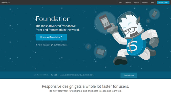
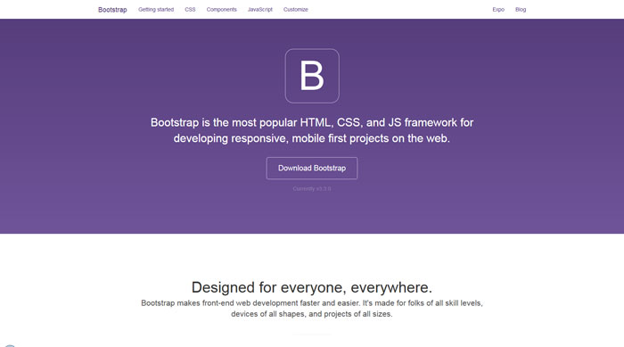
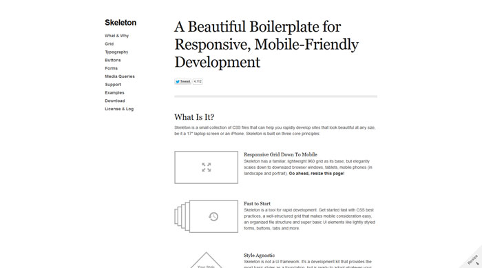
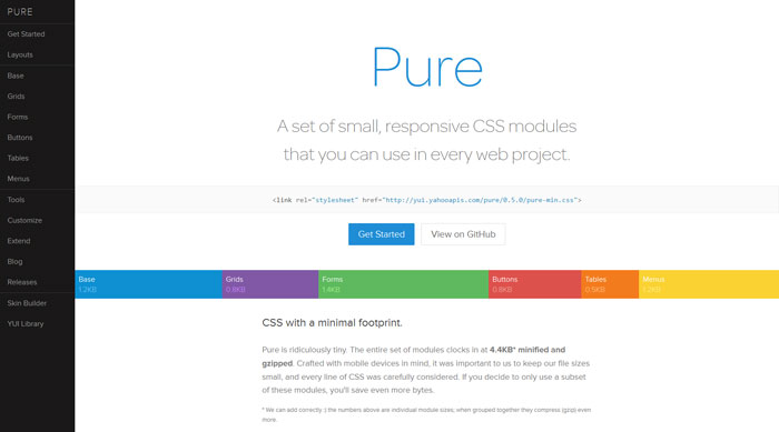
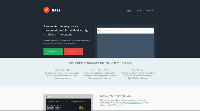
The design of a responsive website always comes back to the user’s experience. The content should also be thought of in terms of accessibility and ease of reading. What is the most important information that needs to be seen on the homepage? Is it clearly written and easy to understand? The goal and purpose of the website should be attended to right away. This is what the viewer should see the minute the website downloads. Frameworks can save you a lot of troubleA CSS framework will depend on the creative capabilities and desires of the website designer. It can save time in terms of developing the website and eliminate some problems before they occur. For example, less debugging is needed since the framework has already been tested and eliminated many across a wide variety of interfaces. However, learning how to use the framework must be thought of as well. Will the designer be able to understand how to use it easily? Have other desigenrs used this framework and had positive experiences? Is there the possibility to talk to and ask questions if needed? What are the features of this framework? Finally, do these preferences indeed make the development process quicker and do they serve the purpose of the designer? There is not one framework that will solve all of your problems. The designer may be able to save some time and avoid some issues that have already been solved by using a framework in which the bugs have already been worked out and other problems have already been eliminated. This allows for more time to be spent on a responsive web design and making sure that the website looks exactly the way the owner desires it to look on a wide variety of interfaces Foundation A Framework for any device, medium, and accessibility. Foundation is a family of responsive front-end frameworks that make it easy to design beautiful responsive websites, apps and emails that look amazing on any device. Foundation is semantic, readable, flexible, and completely customizable. Bootstrap Bootstrap makes front-end web development faster and easier. It’s made for folks of all skill levels, devices of all shapes, and projects of all sizes. Skeleton You should use Skeleton if you’re embarking on a smaller project or just don’t feel like you need all the utility of larger frameworks. Skeleton only styles a handful of standard HTML elements and includes a grid, but that’s often more than enough to get started. Pure Pure is ridiculously tiny. The entire set of modules clocks in at 3.8KB* minified and gzipped. Crafted with mobile devices in mind, it was important to us to keep our file sizes small, and every line of CSS was carefully considered. Base Lightweight and minimal code. Spend less time overriding styles and focus more time on creating beautiful website applications. Responsive web design inspirationThings are changing in the tech world and the migration of users from PC to tablets or phones adds modifications to the way web sites are designed because web sites have to be optimized for these new platforms. In the old days, which are not that old, designers would complain about having to make a website compatible with desktop browsers, which is child’s play comparing to the times we are living now. Nowadays, almost each client you are getting asks for a mobile version of his site and that’s not a simple task either. Consider that you need to have a version for iPhone, iPad, Blackberry, Kindle and for who knows what other product will be launched in the following years. To handle all these products and how websites are viewed on them, responsive web design has been created, a concept that means the design and development should respond to the user’s environment and behavior based on screen size, platform and orientation.
And if you come to think about it, this is a magnificent idea. We shouldn’t build a design just for a certain group. Instead, we should make it for everybody and have it adapt to the needs and platform of each individual. I don’t know if you remember how fluid web design worked a few years ago, but it wasn’t at all similar to the responsive design that we are using at the moment. We used to have only the text and the columns flexible, while images would cause a lot of problems and headaches. Responsive web design makes a serious change to that, making the images responsive also, not just the other elements of the site. Layouts don’t break in RWB, instead the images are adjusted according to the screen size.
Even though the main problems have been solved by RWB, there are still issues that must be worked on and hopefully soon we will have an easier and a complete web designing experience which will not include headaches and stress. Till then get yourself loaded with inspiration by checking out these responsive website designs examples and see for yourself on various platforms the benefits of having such a responsive website. You can use some of the tools mentioned earlier to check these responsive examples in various sizes and platforms. Inspire yourself from these website layout ideas and let me know if you created a website with the help of this article’s info. Tilde They’re a small team of developers who are passionate about crafting great software. They’re some of the faces behind Ember.js, Ruby on Rails, jQuery and more. Treehouse The Treehouse Techdegree is a comprehensive program that will teach you the solid foundation you need to master coding skills and prepare for a career as a certified developer. Their extensive library of content taught by their expert teaching team covers topics like web design, web and mobile development, game development, and more. The Onion The Onion is an American digital media company and news satire organization that publishes articles on international, national, and local news. The Onion’s articles cover current events, both real and fictional, satirizing the tone and format of traditional news organizations with stories, editorials, op-ed pieces, and man-in-the-street interviews using a traditional news website layout and an editorial voice modeled after that of the Associated Press. Greenbelt Greenbelt is a temporary home for those of all tastes. Why not simply find a place for your own tent and join the 95% of the festival population who camp onsite over the weekend. Bukwild Bukwild is a responsive design example that you’ll like. Bukwild was started back in 2001 as a web design company. They mainly serviced the music industry and major national advertising agencies as a digital production partner. In 2010, they decided to bank on their own point of view, and shifted their offering from a digital production company to digital creative agency. LightHouse LightHouse has always strived to meet creative and production challenges. Their ingenuity, honesty, and work ethic has led them to be one of the most exciting production companies in the Northeast. They offer multiple services under one roof, including separate departments for pre-production, production, equipment rentals, and post services. Top Hat Stoli St. Louis Brewers Guild The St. Louis Brewers Guild is a 501(c)3 non-profit organization whose civic and educational mission is to support and promote every brewery who calls the Greater St. Louis metropolitan area home. By supporting these breweries, the Guild in turn supports the vibrant local communities and economies that they serve. Mustache They organize meetings, workshops, and sessions, focusing on good, long lasting relationship with their customers. Your knowledge becomes our insight. From there, good ideas arise. Ideas, which they transform into user-friendly apps that add value to your business. P & Co P&co is a rebellious lifestyle brand created for the thrill seekers, the risk takers & the wild ones. Through their original designs inspired by flash tattoos they create clothing and accessories that are now becoming more known and recognised around the world. BureauVA They are a digital agency focussed on delivering content and utility driven user-experiences. Make Make is a technology company helping brands drive innovation and creativity through powerful digital platforms and emerging technologies. Techstyle Neo Rig They are a privately owned joint venture backed by two industry-leading global brands who have a 60-year legacy in research and development in the manufacturing and land drilling rig industry. Squidex Squidex is an open source headless CMS and content management hub. In contrast to a traditional CMS Squidex provides a rich API with OData filter and Swagger definitions. Their responsive website is modern and amazingly looking. It is up to you to build your UI on top of it. It can be website, a native app or just another server. We built it on top of ASP.NET Core and CQRS and is tested for Windows and Linux on modern Browsers. Yumler Ghost Robot Ghost Robot was founded in 2005 by independent film producers Zachary Mortensen and Mark De Pace. Driven by the desire to create a stable foundation for creative storytelling, they designed a content studio based around a slate of young, innovative directors, utilizing short form media as a means to grow a brand and create content with a distinct creative voice. EXERON The beauty of EXERON – the modular structure and the hot pluggable modules make the installation like child’s play. Exchange of modules or power upgrade is easily done within a few seconds without any tools or special skills. The X remains powered and operational during module exchange or upgrade. Ilya Flarin REX REX is disrupting the property industry, in the same way Netflix, Amazon and Uber have irreversibly transformed their respective markets. REX is the next big thing in global real estate. Premiere Classe For 25 years Premiere Classe has been the prestigious meeting point for fashion accessories designers, showcasing leading and emerging brands. The Premiere Classe range responds to your requirements using the market trends. Acclaimed for its exclusive selection, the trade show showcases 900 brands and designers in jewellery, shoes, leather goods as well as other types of accessories, especially chosen for their creativity, originality and style. Anchour They believe the best brands tell stories, which is why they partner with their clients to create impactful work that not only represents their business, but also connects them with people emotionally. Through strategy, design, content, and technology, they bring brands to life. from http://www.designyourway.net/blog/inspiration/creating-a-great-user-experience-with-responsive-web-design/ Means of buying various goods have evolved greatly in recent years, namely with the advent of e-commerce. The concepts underlying that specific type of commerce are basically the same as those of a traditional commerce: the owner plans to make profit on goods sold. However, to be successful in that specific and new type of business, it is imperative to be able to attract online customers and convince them to buy your products. In order to do so, some basic rules have to be followed. Basically, this means that your ecommerce website design must be created in such a way to be focused on the clients’ specific needs when buying online. Everything should be designed to make it as easy as possible to find the products they are looking for and to buy it. Every step of the shopping and buying process should be designed to give customers a great experience. Show visitors what products you are selling
Since e-commerce is a business with low entry costs and it lowers geographical boundaries significantly, competition on the Internet is fierce. If a customer gets frustrated with any aspect of your website ecommerce design, it is easy for him to choose another website to buy from. Therefore, once a potential buyer has landed on your website rather than a competitor’s, he decides within a few seconds whether he’s made the right choice or not.
Most people who buy on the Internet do it because it is easier than going to shopping in real store. Make sure you make the experience as easy as possible for them. The first goal of any customer is to be able to easily find the product he is looking for. Therefore, it is essential to make it easy for visitors to see your catalog of products. Customers also want to be able to have all the information they need to make an informed decision before buying. So in order to convert potential customers into buying customers, provide as much information as you can on the product you are selling.
Describe adequately every product you are selling to ensure that the client knows everything he would know if he was shopping in a store. Psychologically, it is better to use descriptive words when doing so than technical terms, since they unconsciously make the customer more likely to buy. Showcasing the products properly
It can be good to try to differentiate yourself from competition through an innovate website. However, some basic components should be present on any e-commerce website. Use quality photos
Photos are the only way for online customers to see the products they are buying. They are an essential part of e-commerce. It is worth investing in high-quality photos for every product displayed of your website. Clients like when they can take a closer look at the product you are selling, in order to see every detail.
It is also a good idea to display more than one picture for a product. In any case, the pictures displayed have to place the product in front display: use a neutral background and keep the picture simple. Add reviews Adding reviews to your website is a great way to gain credibility amongst your potential customers. If they can read what other independent clients really think about the products you are selling or about your customer service, they will believe it more than anything else you can say on your website. So any positive review you get will help convert potential customers into actual buyers. If you get negative reviews, they can be used to either improve your product or service or to give your point of view on the subject at hand. So either way, reviews can be helpful for your e-commerce. Design and usability
A good design for your e-commerce website is not necessarily a design that will amaze the customers, but rather one that focuses on usability. The main feature you want your website to have is to be easy for the customers to find what they want and to showcase your products properly.
The website should be built for the clients, to ensure they get the information they want as smoothly as possible. This includes relevant photos of the products as well as detailed descriptions providing every detail they might need. Layout
Some basics tools should be easy to find by the customer, no matter where he is on your website: the shopping cart, the information regarding shipping as well as the help they can get if desired. A FAQ page answering the most common questions should be easy to find and to consult by your potential customers. Your contact page should also be easy to find and to use. Showing that you can truly be there for your clients’ questions will comfort them that even though they are buying through the web, they can receive a personalized service.
Standards exist as to where that crucial information can be found on websites; following them can help your customers find them more easily. The shopping cart as well as the FAQ page and your contact information are often located at the top or right side of the page. Links to the FAQ and contact pages can also regularly be found at the bottom of the page. Overall, the important thing is the client should not have to search for them; so make sure they are easy to locate. Navigation
Usually, potential clients need to check everything out before making their decision; that means browsing to many pages of your website. You need to make that experience as enjoyable as possible for them, by making navigation easy and smooth. Customers should always be able to locate where they are on the website, which means your website must have a highly functional navigation menu.
They should also be able to find anything they are looking for quickly, so your website needs a good search engine that works properly, as well as tabs and categories of items that can be chosen for navigation. Give your customers a good shopping experience and they are more likely to buy from you once they have made up their minds. Search
Your website should allow your potential clients to search by keywords what they are looking for, as well as through categories and by combining those two types of research to get more precise results. Therefore, your ecommerce web design should have a good built-in search engine and you should consider using plugins to make it more efficient if required. Once they get results from a search, customers should be allowed to sort them the way they like: by price, popularity, date, etc.
For a search to provide good results, it means that your catalog of products has to be well thought of. Before creating categories to display on your website, it is useful to carefully think about which ones are the most significant for the type of products you are selling. Once the best categories have been established, ensure that every product is associated with the right category and that none is at the wrong place. Getting results that are really distant from what they are looking for can discourage customers and they will turn to another website in the blink of an eye if they feel it will be hard to find what they are looking for on yours. The shopping cart
A well-built shopping cart should give some basics functionalities. Have you ever lost everything you had set aside while shopping because you used the “Back” of “Forward” button on your navigator? If you have, you already know that it creates a frustration that can repel a potential client forever. Your website should allow your customers to go back and forth without losing anything they have chosen. It should also keep track of the different tabs a customer can be using while he shops. Ideally, do not leave the page your client is on when he decides to use the shopping cart; it is better to have a pop up window with the shopping cart functionalities so that he can always know where he was and move from there. An easy-to-use shopping cart makes it easy to modify quantities of the products your potential customers have chosen, including removing a product if desired. Your shopping cart should remain transparent so that your customer does not feel like you hid fees or something else from him while he was shopping.
For example, your shopping cart should allow viewing an estimate of the total price, including shipping and taxes, before beginning the check-out. If they have a registered account in your website, your clients should be able to leave your website and come back at a later time to find all their preferences saved. Make it easy for the user Buying through the Internet is less complicated than going to a store to make a purchase. For your e-commerce to be successful, you need to keep things as easy as possible for your client. Add related products
If some products are related to one a client is considering buying, they should be suggested to him and easy to choose from to add to the cart. The checkout process
The check-out process should be easy to go through and give as little possibility for the client to change his mind. Ideally, it should be composed of only two pages: the first one displaying the items chosen and the price and allowing the customer to enter the required information to proceed to the purchase, and the second allowing him to review and approve the purchase. Contact information
Contact information should be easy to find no matter what page your customer is on. Ideally provide more than one way a customer can ask their questions. This is even more important if you are selling high-value or highly technical items. Make sure the ecommerce websites that you design respect this feature. Customer support
Any problems should be easily solved for your clients. Make it easy for them to know where to ask for any type of question they might have, including about returning items. A structured help request form provided on your website can be more reassuring for your customers, showing that you are a serious business. Quickly send an e-mail ensuring your client that you have received his enquiry and that it will be answered shortly. Make your FAQ as comprehensive as possible. Include all the details about your return policy, as well as replacing parts for your products if applicable. Disclose shipping rates
It is important for your clients to be able to know at all times what their total cost will be, so that they do not feel like you are hiding fees from them. If you are using a major shipping company, it can most likely provide you with a tool that allows you to know how much shipping will cost. If not, you can use a fixed shipping charge that is high enough to ship any of your items. Whatever you do, ensure the information is always available to your customers. An account shouldn’t be necessary to buy a product Some customers might be reluctant to register a formal account with your company in order to buy something. It is recommended to make registering optional so that it will not discourage anyone from buying. Make available several payment options The more payment options you have, the more likely your clients are going to trust at least one of them. Accept all major credit cards and make an instantaneous electronic check for their validity. Conclusion
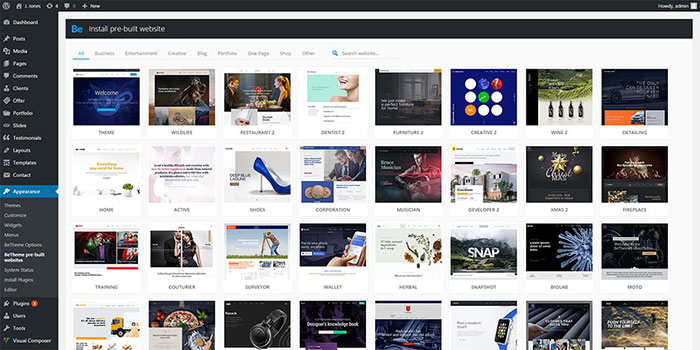
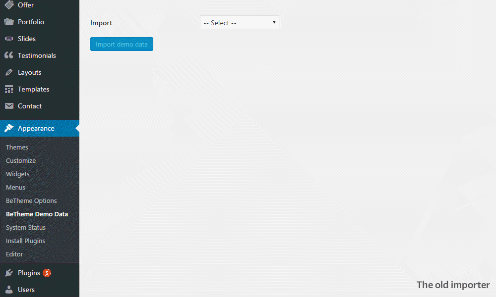
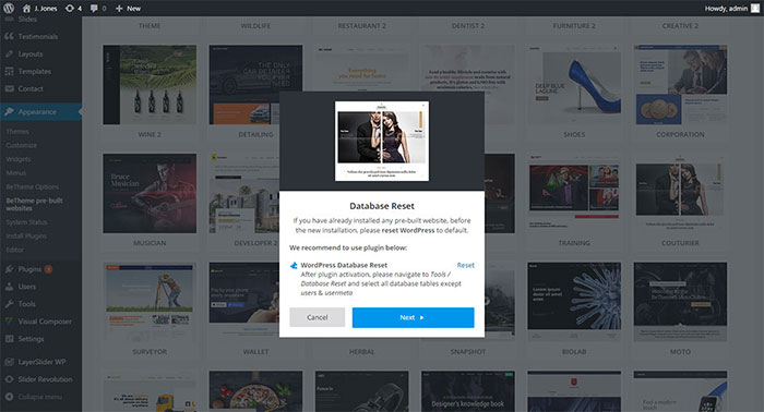
To have a successful e-commerce business, you clients’ experience on your website should be your main preoccupation. You want them to have a great shopping experience and to find it easy to make their purchase once they have their heart set on a product. The easier it is for them to go through all that process on your website, the most likely they will buy and become loyal customers. from http://www.designyourway.net/blog/inspiration/designing-e-commerce-websites-properly/ If you’re familiar with the previous Be Theme pre-built website installer, you’ll remember having to work your way through Be’s large pre-built website library until you came upon the one you wanted. Although the installation was easy, you couldn’t do a search, or filter to locate a pre-built website. The overall UX was admittedly not the best. Muffin Group, Be Theme’s developers, have created a new installer, and it’s a charm.
This is a great improvement. With the old installer, you could only see the pre-built websites on Be’s presentation landing page. To get the pre-built that you wanted, you had to move back and forth between the admin area and the landing page.
As the number of different pre-built websites continues to grow, this new filter and search feature truly make a difference.
It verifies if the needed plugins are installed; and it gives you the option to install them if they are not. You’ll no longer spend extra time trying to figure out what plugins you need to install.
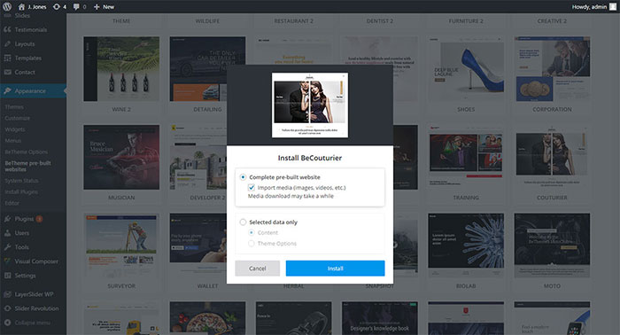
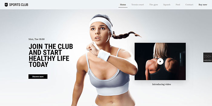
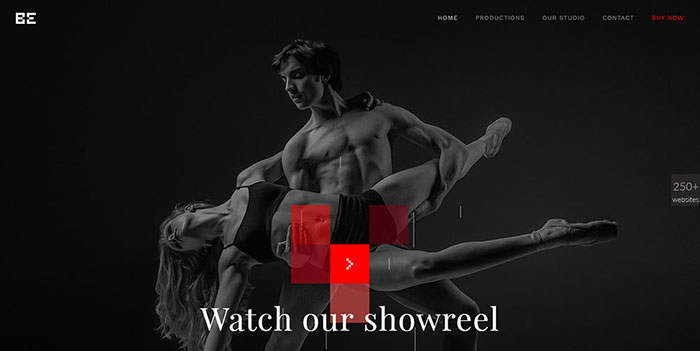
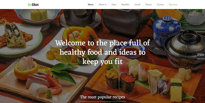
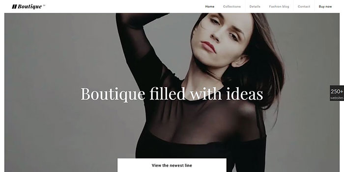
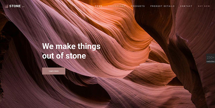
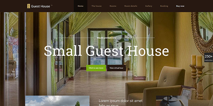
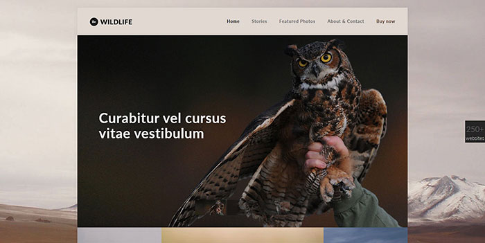
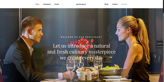
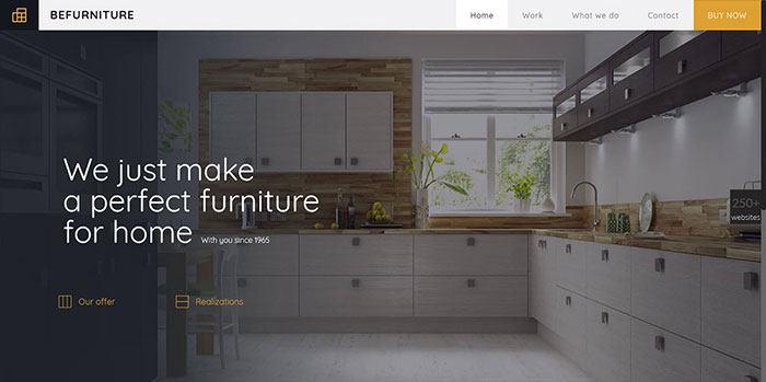
Check out this video to see the new installer in action: And here are 8 Latest Be Pre-Built Websites These releases continue Be’s practice of providing the widest possible range of website styles and niches. Any gym, sports club, or fitness studio likes to advertise itself as being modern and up-to-date. This is why they prefer a modern design like Be Sports Club. Features include neat fade-in animations, and a smart use of parallax effects. Be Productions showcases an amazingly smooth and attractive parallax scroll effect. A special effect like this is excellent for a motion graphics or advertising studio. Note how the dark colors permit your brand’s main colors to stand out. They serve to emphasize various elements on the page. To showcase great food, you need large, high-quality images. As you can see, Muffin Group has gone out of its way to create a pre-built website with images that look good enough to eat. They didn’t stop there. You’ll also experience parallax effects and other neat and subtle effects. Perhaps you’ve been hesitant to try using a background video in the hero section of a website. It’s easy to do so with Be Boutique. The structure of this pre-built website is easy to work with, and you can present an amazing portfolio, without the need of being flashy. Be Stone provides an excellent example of why there’s really no excuse for creating a bad-looking company website. This pre-built website will make your company look the way you want it to – modern and innovative. Neat animations give it the look and feel you’re looking for. There are plenty of pre-built website choices for a real estate agency, or for anyone wanting to rent or sell a cabin or condo. This pre-built website, designed with small quarters in mind, like a guest house; gives you a great go-to website design option. This is a great pre-built website for a wildlife rescue agency, a wildlife photographer, or for any photographer. A slider effect with its images draws the visitor in, and upon scrolling down there is a nice parallax effect. Be Wildlife illustrates how fixed layouts can be made to look good. A dashing restaurant design like this can make eating out a must do. As was the case with Be Wildlife, Be Restaurant offers a pleasant, dynamic slider effect. This is a good choice if you want your website to look like no other restaurant’s website. If you have a client that sells furniture, Be has created a pre-built website just for you. It features large images and a great looking slider to showcase your client’s products. A Quick Overview of Some Be Theme’s Key Features
There’s More Also, when you buy a Be Theme license, you’re buying into a Themeforest Top Seller that is already serving more than 62,000 happy licensees. You can learn more about Be Theme here. from http://www.designyourway.net/blog/misc/awesome-pre-built-website-installer/ |

AuthorPleasure to introduce myself I am Jamie 27 years old living in Searcy, AR. I am web developer and have developed over 50 sites for clients. Now a days I am focused on designing as I feel I am lacking it. Archives
April 2019
Categories |


 RSS Feed
