|
In the design industry, being just creative is not enough. Over the last few years, the design industry has undergone major changes and the importance of creativity is something that you should know about. You must now do your best to not just be creative but also keep whatever you are creating relevant to the users. This is a key to making a successful app or website. Professionals are now required to be more responsible and understand that there are creative ideals. There are also effective, practical practices that must be exercised in the applied creativity professions. They must then follow these practices and apply them in their work.
I believe that changing your ideas and understanding on where you place creativity in our work and professional communication is important as it affects the quality of design a professional makes. It also features prominently in the outcome of our professional prospects. I also respect the fact that we all have our differing ideas on these issues and it is therefore worth exploring them. So, why is creativity important? Learning to be creativeCreativity is something that you can learn. The only difference is many people must realize it take patience. The creative profession must also choose his or her thoughts carefully. There are scientific methods that have been tested and proven to help you learn to be creative. Below are some of these techniques along with quotes from those who have shown great talent in their works.
There are important yet simple lessons all over we can learn-have a different color palette and take time off from your work-preparing yourself mentally to receive new experiences as well as training yourself to perceive thematic patterns-however the greatest lesson for all people and experiences, is one, that we can always learn to be more creative. Many perceive creativity to a talent for the chosen few. Others see it as something external that is mostly out of our control. Creativity is not an exclusive right to a selective group of people. It is true that there are those who are gifted with a greater aptitude for literal creative thinking but thinking and idea generation are skill that one can learn easily. According to the teaching of Garard Puccio of the Buffalo State College in New York, creativity is a four stage process. It starts from clarifying, ideating, developing and finally implementing. To clarify is to ask the right question; while ideating is the exploration of many ideas as possible. The final steps are making sure your ideas are convincing and practical for other people. This is what he refers to as developing and implementing. A less focused mind is likely to make connections faster and realize a novel solution to a problem than a focused mind. Puccio suggests making yourself less focused to anything else to be able to get to the stage where you can easily brainstorm. This will give you the chance to be more innovative as you focus your mind away from just one option. This is not always possible with the mind being in an analytical state it is normally in.
Puccio’s ideating technique involves asking his students to brainstorm on a particular problem and after the discussion he presents them with a random object and asks them to come up with a connection. The connection has to be made to between the discussion they just had and the object. It must be a practical connection as well as convincing.
Be curious
I have learned that the best way to learn from original ideas is to read books. This is how I found out why creativity is important. I do spend much time online but from my experience, reading books get you to the source that is pure and unpolluted. It is the way to learn from the thought leaders firsthand. The internet is a huge source of ideas, some are duplicate other are very original. The challenge is to find the right material in all the noise on the internet. It is therefore smarter to get the information offline, internalize it and then share it by being original on the internet. Your mind is easily creatively stimulated by the culture in the real world. It is important that you make sure it is getting the right stimulation by choosing the exposure of the right content only.
Invest in your own life to get ahead in life. Consider attending as many conferences as you can and getting the high end information from industry experts and making your notes of any new stuff you observe. Find a way to apply it in your own life.
Remember useful information is usually scattered around in nuggets. Visit museums, markets, galleries and even retro junk shops. This is the way to fire up your synapses and stimulate creative thinking and ideas in your work. Imitate
If you think about it really well, a creative idea that you might have could not be a new idea at all. We’re bombarded daily with lots of information and inspiration and what we’re really doing when we’re creating something new could be something that has been done before and we unconsciously replicated. This has been common with artists. They produce a piece of art thinking that they have come up with an original masterpiece. It is later that it is realized it is a copy of a piece they had been exposed to earlier on and forgotten about it. The process of learning and expansion of thought begins by copying. A young child learning starts by copying what is availed by the teacher, and then they build on that. It is like being shown a mathematical formula then applying it to solve a problem.
A good way to start is look at what looks inspiring to you from respected piece for work. After going through a good number of them, making sure you make your own personal references of course, try to replicate them randomly. Try and see if you can come up with similar works or close copies later own. This is a good way to stimulate your brain to learn to recognize quality work. Your brain will then start to come up with its own unique yet good ideas worth presenting to the world. Have no fear of failure cause you will fail anyway eventually
We have had that moment when we have to put forward a new idea to a client. This moment is always followed by fear of what might happen. This is the moment you have to put your ego to a great risk of ridicule if your idea does not meet expectations.
The only way to grow our confidence is to push through this fear. Even for those with the thickest skin to withhold ideas for fear of speaking them out, this is a wall that has to be overcome if you have to come to a point where they eventually get recognized. We need to instill this new aspect taken by many emerging young startups in our education system. These young start-ups have taken up a fail-fast culture. They try new ideas as fast as they conceive them without wasting time so as to learn and succeed or fail without fear. This is an important technique if you are to make any head way soon. Be tenaciousThe brain is a muscle that becomes better the more it is used. There is scientific evidence that show synapses for physical channels that become more deeply ingrained the more a subject repeats an action. It is a way the brain helps as to live life by strengthening our strengths and doing away with what we do not need. Hard work is the solution
There greatest advertising agency of its time on Madison Avenue was created by David Ogilvy. He used to work extra-ordinarily long and when coming up with headlines, he used to insist on coming up with multiple of them and all their variations before settling on one. It is this kind of devotion to his work that contributed to the success of his work. To get yourself to a state where you can be creative, you need to fine a quiet place. Once you have found a place where you are undisturbed, set a time length of less than 90 minutes and not more. Our brains need rest after such a period of time. Now take time to allow your thought process to work on a problem. The way to go about it is to come up with many solutions as you may manage. Even after coming up with one that you think might be the answer, keep working on more of them that are applicable form a different dimension. Acknowledge that is an uncomfortable way of doing it without letting it affect you negatively. Be Disciplined
In life you have learned that it takes a tremendous amount of effort to learn something new. This could be driving a car, riding a bike or playing a piano. But as you apply the skill daily it becomes an effortless act that you do not have to think about. This is because your brain’s synapses physically curve a channel in the brain for that particular skill. Then your subconscious takes over making it feel like a normal task to you. You need to set up a disciplined and routine culture to make creativity flow within you. Have time lines and follow them religiously.
I wanted to make this article for over a year about why creativity is important and postponed it because up until now I haven’t read enough materials on what is creativity and the importance of having creative thinking skills. I hope you enjoyed the article and excuse some typos and (hopefully not) the eventual nonsense that might appear in some sentences due to a combination of enthusiasm and lack of sleep. In any case, I hope this article inspired you. Stay humble and be creative! The post What Is Creativity And The Importance Of Creative Thinking appeared first on Design your way. from https://www.designyourway.net/blog/design/what-is-creativity-and-the-importance-of-creative-thinking/
0 Comments
Getting started as a freelance web designer is full of challenges, not the least of which is figuring out how to create a portfolio website. You need a way to build your web presence, whether you’re a student, unemployed, or a part of a design studio. Not only will a portfolio page offer you a chance to showcase your work, it offers a platform for blogging about your design life and current projects. So, how to build a portfolio website? How do you display your work? How do you show your potential customers what you’re capable of doing for them? It can be hard to figure out how you’re going to start building a portfolio website. A simple Google search will show you plenty of independent freelancers and studios with good portfolio websites, but they can all seem so different. You can start by sticking to some key points and goals for your portfolio. What makes a good portfolio website?Logo
When making a portfolio site, remember that it is all about presenting things to the customer. The first thing he or she will usually see is your logo. Place your logo where customers will automatically look first, so you can start associating all the work in the web design portfolio with you and/or your studio. In the Western World, the best location is usually on the top left of the page, as we read left to right, top to bottom. Be sure to link your logo to your homepage, as that is expected by most customers, especially from a professional website, especially from a professional website about a web designer’s work. As for what makes a good logo, that’s up to you. Remember that you’re trying to build an online presence. For freelancers especially, this is the gateway to success. Your name is a good option for a logo when creating a portfolio website. Tagline
Now that your potential customer has seen who owns the website, one of the most important things you need to do is let everyone know what exactly you do. You need to have a tagline. It should be a snappy, quick summary of what you do and what you can offer. When creating a tagline, ask yourself:
Contact
While often neglected, this is one of the most important things you need to have on your portfolio website. It doesn’t matter if a client is impressed with your work if they can’t figure out how to get in contact with you. You will not be hired without making your contact information available. Your contact information needs to be presented in a clear and obvious manner. It should be very easy to find and access. Offer a way for customers to contact you for a chat or a quote. You could even have a form available to make it even easier, allowing them to email you right from their email manager without needing to write down your email address. You can use that form to ask for particular information you need, including email address, name, website, or even the details of the customer’s proposed project. Blog
A blog is a great way to keep your portfolio website active. Blog about your expertise, new projects, old projects, or relevant news. Offer the chance for potential customers to subscribe to an RSS feed to follow you. Show off your most popular posts. Your blog is another way of building your web presence. Allow visitors to post comments. As tempting as it is for security purposes, don’t force commenters to register or add Captcha software. This discourages people from commenting and providing you with feedback. There are a lot of anti-spam plugins out there that are much less off-putting. Social media
Encourage people to follow you on social media websites if they like your work. Let them know that following your Facebook, Twitter, or Instagram (or any of a million other options) can offer the most up-to-date updates. Make the most of social media on your portfolio site. Use it as a way to network and market your skills. Principles for creating an online portfolioOnce you have the basics of logo and tagline down, your website design is up to you, based on your needs goals. Here are some major guiding principles for creating an online portfolio: Make yourself available
Availability will make or break you. If it’s not clear how interested people can reach you, they will not work at it. There are plenty of other freelancers out there with many of the same skills as you have. If it’s easier to reach them than you, they will get the jobs and you will not. Ease of contact can’t be emphasized enough. Ensure your site loads quicklyTime is money, especially for anyone working a project or a business. Most people wait less than 3 seconds for a page to load before moving on. You need to invest (time, effort, or even money) in creating a functional website. Choose a solid hosting package to ensure fast load speeds. Look carefully at what a web hosting service has to offer and do your due diligence in reading reviews while you’re in the early stages of making a portfolio website. A slow website will lose customers. Be yourself
While it’s a good idea to take a look at some of the well-made websites out there already created by successful freelancers, don’t treat them as the perfect “how to make a portfolio website” guide. You are selling your work and your creativity. While you do need to market yourself, it won’t do to pretend to be someone else or copy their way of doing things. Show your personality
In that vein, add a bit of a personal touch. Let potential customers see who you are. Add a nice headshot of yourself or your team, if you’re a part of a group. Let them know you’re a real person. Part of the reason people go to freelancers and small studios is because they know they’ll be dealing with real people who can customize projects to order. Emphasize that fact on your portfolio site. Tell a tale
As with any other kind of communication, your pieces should tell a story. Aesthetics should match the ideas they’re trying to communicate. A web site designed for a locally owned, mom-and-pop restaurant known for recipes from two generations ago should look the part. Your work should be communicating something, telling some tale to give people a reason to be interested. That’s what your customers want to see. You might want to turn each piece on your portfolio into a case study. Explain the needs that the clients for that piece had, or the particular problems they needed addressing. Detail the solutions and components of the project. Highlight your processes and your ability to creatively overcome challenges. Turn them into a kind of short story that can hold the interest and catch the attention of potential customers. Brag creatively and reap the rewards. Let your work speak for itself
Have you ever seen a good painting or photo be ruined by its ridiculous and distracting frame? Try to avoid that same scenario on your portfolio site. Make your work the focus and don’t clutter up the site with loud little additions. Keep it simple and elegantly professional. Let the skills you’re trying to sell take center stage. Quality over quantity
Anyone visiting your portfolio website will probably only view two or three of your pieces before deciding if they want to use your services. In light of that fact you should only display your best work. Try to stick to displaying only newer pieces, not things you did years ago unless they are high profile in which case you should highlight those pieces in particular. While your full personal portfolio can show off the full breadth of what you can do, stick with only a few to show off on your portfolio site. Any interested potential customer will probably not look through all of it. Remember that as you organize your portfolio site’s layout and presentation. Show your real workAnyone looking to buy your services is looking for you to show off your actual services. If they want to see redesigns of existing products, they can just as easily find them on a design student’s Instagram as your portfolio website. Show them what you’ve actually done as much as possible, so they can see that you can offer up original and successful results. Include personal and pro bono projectsEven if you didn’t get paid for a project, you did make it. Clients won’t care. Demonstrate the personal projects you’ve done to show that you enjoy what you do and are a real self-starter. Feel free to add in work you’ve done for friends or even charities, as well. Don’t let these overwhelm your portfolio though. Make sure you balance out the professional and the professional, so that your services don’t just look like a hobby. Include appropriate project covers
It’s a common practice to see projects presented with thumbnail images, also known as covers. These are used to draw potential customers into clicking and give them an idea of what to expect. Choose a clean image that shows off something unique about the project and you’ll be off to a great start with your project covers. Share your process
Show off what goes into your work. End results aren’t everything and every project is its own story. Show interested people how you do what you do. It demonstrates that you value your craft. It catches the eye and means that clients aren’t just hiring a freelancer off the internet, but something of a craftsman who brings real thought to their work. Other creative people might see what you’re doing and be struck by how you solve problems or create solutions. There are a lot of different ways to showcase your processes:
Give credit where it’s dueDesigners surprisingly rarely extend credit to others. You really should do this. Others will appreciate the respectfulness of it. Potential customers will understand exactly what you do, which isn’t always very obvious. Most in-house or agency projects involve anywhere from a few to more than dozen people. If you really did do it all yourself, go ahead and brag, because that’s not easy. If you didn’t, make sure you credit them for all their parts in the project. Give others credit for their art, copywriting, branding…whatever they did, let viewers of your portfolio now. Implying you did everything is both dishonest and misleading. If a customer has skewed expectations, it can be easy to embarrass yourself or even lose the job. Think about your real contributions and showcase those. You wouldn’t want anyone else to take credit for what you’ve done, so don’t do it to others. Give them credit for work displayed on your portfolio website. Think about what you include
Be professional and calculating about what you include on your portfolio website. Take the time to go through your pieces. Don’t display anything that embarrasses you or doesn’t look like your best work. Like with anything else, you get out what you put in. You will get more of the kind of work that you show in your portfolio. If you didn’t enjoy a certain kind of project or working with a certain kind of customer, don’t show those pieces. Again, when deciding on what on display, also remember that people will look at fairly few pieces. People have short attention spans. They will only click through a gallery a few times. Remember to go for quality, not quantity. A good rule of thumb to start with is displaying 10 to 20 pieces, each carefully chosen to show off your talents. Keep it cohesive
Your portfolio site’s design is just like any other project. It will function much like your resume. This site will be the way you begin building (or continuing) your online presence. Take the time and care to craft it right. A good website will let your potential customers see what you can bring to the table and make you stand out among the many other freelancers on the web.
You should avoid being boring, but you should also remember that unnecessary flash and gimmicks can sometimes drive away your customers. To seem professional, your portfolio site should have a coherent aesthetic, with consistent layouts, image sizes, and writing styles. Colors should fit together and not clash. Pages should look like they belong on the same website, with all the same principles underlying their design. Note that typography sets the tone just as much as anything else. It should fit the feel you want to give (playful, elegant, professional) and complement your design samples. Make sure it never steals the spotlight from them, as they should be the central focus of your portfolio. Keep the typography as consistent as everything else. Provide detailed case studies
Showcasing your work is just one use for a portfolio website. Potential clients will also be looking for the results of your work. Did your designs help your past customers? Did you create something that made their business more successful, or help them achieve their goals? Use case studies to answer these questions. Explain your reasoning behind your designs, what you saw the end goals as and how your choices contributed to them. This is mandatory if you are a UX designer. A business case for your work will help your potential customers see that you have the right sort of thinking. They can see that your products can help them succeed down the line. A case study should include the following:
Stay professional
At all times, in all aspects of your portfolio site, stay professional. Keep your language concise and clean. Don’t ramble. Always edit all your text and make sure it does not go on forever but says only what it needs to say. You don’t need to sound like a robot, but you should come across as a professional selling service to other professionals. How to make a good portfolio websiteDesigning a great portfolio, whether it is a web design portfolio or a graphic design portfolio, is a challenging task for every designer. Designing a project for ourselves, such that could meet our highest requirements can be tough. Still, it doesn’t mean that we cannot create an online portfolio which is entertaining, accurate, and focuses on our strongest design qualities. Long before Internet arrived on the scene, designers used to ‘pack’ their work in paper portfolios and to deliver printed copies to employers. Nowadays, they create advanced online portfolios which are accessible to everyone who has access to the internet.
Still, designers should be aware that sharing portfolios on social platforms is not going to be enough. They need to push their way to the front lines and to stand out of the crowd. Sometimes, a breathtaking portfolio design is the biggest challenge of a designer. It is the visual story of his personality, the definition of his work passion, and a showcase of his masterpieces. It is very likely that someone will neglect the importance of the portfolio and would say that interested parties will take no more than a glance at it.
That’s exactly why its quality is so important. The first expression must be stunning and mark each following interaction with that designer. The competition is huge. And designers need to ensure they have a well-made portfolio, capable of attracting attention and delight.
A great portfolio is a must for active and creative freelancers. Rather than a set which can showcase successful project and expertise to prospective employers, a good portfolio is a designer’s best option for building a recognizable name in the web world. The fact that portfolios need to be digitalized and available is very helpful. The internet opens an entirely new horizon where designers can target audiences and expand their professional circles. A few great portfolio design tipsThink what you want to share Before you’re able to summarize the projects you want to display, you need to be aware of users’ expectations about your work.
Even if online portfolios offer more space to share work than a resume does, careful selection is not a choice. Remember that people have limited time. They wouldn’t waste it on samples that don’t really prove creativity and expertise. The truth is, the success of your job application depends entirely on the quality of your portfolio. Select nothing but the ‘killing’ pieces
By killing pieces, we mean best possible examples of your work. They prove your talent and that you’ve been successful and well-rated. This is the essential information you should include about every project:
Adjust your portfolio to the situation
You could use a little research on optimal presentation methods. For instance, if you’re a user interaction designer, you have to present a digital platform and to disperse it on the web. On the other hand, if you’re a print designer who delivers the portfolio in person, you are supposed to bring a paper-based version to non-tech clients. In both of the cases, you should think about the audience that is going to see it. And you should tailor the content according to their specific requirements.
Applying the ‘less is more’ rule could motivate a user to click the thumbnail and to look for more details. Thus, choose a sudden crop to focus on the strongest, most attractive parts of your project. Patterns and larger – scale branding can enjoy this method. Also, you could introduce interesting and informative photographs or creative logos displayed on a filled background. Facilitating navigation
The ultimate target is to create a portfolio, where viewers will have no navigation troubles, so whatever. Don’t place all the information on one page because you could mislead your users and you could cause some of your best pieces to be overlooked. Besides, it is human nature to underestimate the skills of a person who offered one rich page, instead of several more modest ones. Variety is fun
A single illustration or a design form will appear boring. Still, if brave enough to incorporate more of them, make sure you combine them in a way that looks nice and functions perfectly. Your portfolio should look like a compact package made by a single person. Portfolios tell a long story
It’s true – the essential parts of your portfolio are your outstanding project. But you should not underestimate the interest employers have in you as a person. Great portfolios should also include well-made personal websites. A portfolio where an employer could read something more about you, your background, likes and dislikes or preferred coworkers. Explain your case studies
You’re a designer and your design capacity is the first thing you need to show to your employers. Yet, spicing a bit with business skills can not harm the result. In fact, employers enjoy reading about case studies. They estimate your career-building opportunities in their company.
Quote source: Liz Danzico Making case studies or possessing business skills, in general, is important for a designer to explain the purpose of his project. A business case shows that the designer is able to calculate and prove the cost/value of his project. Case studies should contain the following elements:
Nothing but high resolution
Even if you think you’re never going to deliver a paper-based portfolio. Make sure it will preserve its quality when you print it. Don’t take chances-make a folder and save high-resolution images of each page. Put contact information is a strategic place It’s not exaggerated to say that in a portfolio, contact information is equally important as your projects. Employers could use little detail on who you are, what you’ve done, and of course, your credentials. But, be careful with the amount of information you are including. At the end of the day, your work will be more decisive than your words. The process should be simple. Once employers are captivated by the quality of your work, they scroll down and get straight to your contact information. You could include basic information on every page, or create a separate one for the purpose. Don’t lose focus Unless it is an extraordinary achievement, exclude everything older than three years. As you know, technology improves first, and you don’t want to work to look outdated. Cohesion matters An online crafting show application, requiring decisive images, could benefit from the appropriately chosen pictures. Portfolios showcaseSviiter Creative Agency Sviiter is an ambitious and creative design agency with a great looking portfolio website. Their passion is to create solutions which could give that extra value to your product, service or to your business in general. Their main focus is branding and what comes with it, but mainly they offer full service where you can find also print, package, web and even e-books. Anthony Goodwin Daniel Portuga Natie Natie is a branding agency and has a cool looking portfolio website. If it involves how a company presents itself to the world, they do it with sophistication, smarts and a smile. Their multi-talented international team has been telling brand stories in every medium for years. They work together virtually because they all share the same values, the same aesthetic and marketing sensibilities and most important, the same commitment to making great work for their clients. Just about the only thing they don’t share is physical proximity. PLATFORM A Growth-Oriented Design Agency with a neat looking portfolio website. They’re helping startups and well-run businesses increase sales, leads or profits through a data-driven design. Prototype Prototype is a full-service interactive agency helping brands to design and develop online marketing strategies, web experiences and mobile solutions. Prototype is creating bespoke digital solutions by detecting, mentoring and supporting exceptional young minds. It’s about fresh thinking, big ideas, and experiences that stick to tackle your brand’s specific challenges in a growing digital world. 3magine They are a team that develops websites, web applications, and social networks. They design for both the web and mobile devices, taking you from the first stages of planning, design, and development all the way through a successful launch. Since 2001, 3magine has been creating experiences that define brands, build businesses and make the Internet a better, more usable place. 3magine is led by Evan Cancelliere, Karl Schellenberg, and Krystian Frencel. With over 30 years of combined experience, 3magine can be a key and critical partner for your design and development projects. Kai Brueckers Kai is currently working as the Design Lead at JTL-Software where we build tools that enable people to start their own retail business. ZoCo Design What sets them apart is their ability to get to know their clients while taking the time to understand all of their business challenges and opportunities. They work with brands that seek change, and we are passionate about creating innovative design solutions to actualize these objectives. Their team is small and close knit to foster long term relationships with the people we work with, who are always at the heart of each design solution and the ideas they manifest. ZoCo brings a strong and versatile design experience to the table, working with industry leaders and local entrepreneurs alike, including Royal Bank of Scotland, Cardinal Health, and EY as well as numerous local clients like Nexosis and Footclicks. They apply their craft to branding, print, web, digital prototypes, innovation strategy, video production, environments, signage, and experiences. And that can be seen even in their portfolio website. Tomer Lerner Tomer Lerner is an award winning designer, front-end developer, and animator. Former head of UX at Wikiwand and Webydo, co-founder of Zest.is and currently leading the product at Wisdo. Apparently, he has a mysterious tendency to work with companies that start with W. How To Make A Great Portfolio That Stands OutA great portfolio website will showcase your work, skills, and potential. Future employers can weigh a portfolio more than your resume. You need to put time and effort into creating a doable and chic designed portfolio. The more effort you put in equals a better account balance in the future. Do you have the time, but do not know where you should put the effort to make your portfolio better than your competition? How do you floor future employers with your brilliant work? Do not panic over making the perfect portfolio website. Creating a successful portfolio is not that difficult. There is no need for complexity. Your portfolio’s main job is to hit your objectives so make sure your portfolio is simple and easy to use.
Many people are turning to personal portfolio websites. Whether you are a freelancer, student or part of a studio, you need a design that will showcase your portfolio in the best light. A personal portfolio website’s job is to promote you and your masterpieces. Treat yourself as a brand, because you are on. Your portfolio should reflect that. If you want to avoid or minimize the trial and error phase of conduction a portfolio. Here are some useful hints to avoid the five pitfalls that can tarnish a portfolio design. What you need to doMake a good logo and a nice tagline along it Creating a brand starts with the logo. It is the first thing users see, and it will be the image associated with you and your work. Logos should be placed in the top left corner of your portfolio website because in the Western world, people’s eyes are trained to read that area first.
Your logo will immediately let users identify who owns the website, and it will engage their interest. They’ll want to know what it is you have to offer. This is why you need a tagline to explain your purpose. Taglines are short and snappy summaries of what you do. Show only the best of your work and make sure it’s the type of work you want to be doing in the future. Hide all the second fiddle work. Only your best work will do. It has to be the most impressive and representative work you have to offer. Your portfolio has to instantly impress and draw the interest of potential clients. Make sure you have a clear statement about what type of work you do. Your goal with your portfolio is to entice prospective clients with what they see and get them to ask you what you can do for them. Therefore, portfolios should contain high-quality images that are clearly accessible to the user. Always include a link to the live version of the website you have worked on and link your screenshot to the live version. Always include a short description of each project and the skills you had to use to do them. Add info about the showcased work Your portfolio needs to answer these questions. Who was the client? What was the design? What was the purpose of the website? Did the design complement the purpose? You need to give information about a portfolio piece to fill prospective clients in on the details. These details are your chance to shine. Some details will allow the employer to appreciate it on an aesthetic level and on a practical client project level. Also, you should answer what part you played in the project. Did you handle it all or just a portion? Did you build the website as well as design it? Humanize your website Everything is virtual in your business. Make a prospective client at ease by adding some info about yourself. Business is personal. Just because it is online does not mean you do not have to be personable.
An About page is a great solution to tell people about yourself. The page should have a description of you as a person. Include your likes and dislikes. You can add your social network links if they are a great representation of you as a person and will not compromise getting clients. Your About page should unveil you to the public. Share your background. Tell where you are from, your years of experiences, etc. The more details you give the more prospective clients will form a bond and build trust with you. Do not be camera shy. Provide a picture. A good picture will give clients peace of mind by allowing them to see who they’re dealing with, and it adds trust. Make everything as easy as possible for the visitors Do not make your website hard to navigate. It will frustrate clients. Keep it simple. If you do not have your work samples in an easy to access format, you will lose potential clients.
Your portfolio should be simplified, have streamlined menu items, have reduced and consolidated pages with a simple navigation style. Make sure your contact info is visible. The main point of your portfolio is to gain access to potential clients. You should not make it hard for a prospective client to find your contact information. You can use a form to make it easier for visitors to contact you. ShowcaseThere are literally thousands of awe-inspiring design portfolios on the internet. You have to make your online portfolio as impressive as you possibly can. Presentation of your work is the key to standing out in the crowded internet. A touch of creativity and innovation can take you a long way. good-morning.no Good Morning is a full-service digital agency that specializes in design, creativity, strategy and technical services. They were founded in 2010 by three Norwegians and one Swede with the shared goal of creating outstanding digital communication. snowflakecreative.co.uk Snowflake is not just another graphic or web design agency. Sure, they spend hours each week keeping up with latest trends and experimenting with new CSS tricks, but they don’t design for their own portfolio or awards – they design for their customers. What matters more than anything to them and their customers are real, measurable results. hellomichael.com Though he is a front-end developer by day, he has put pen to paper during a design process, been completely lost in a full stack environment, and has even worn the entrepreneurship hat. jcsuzanne.com Se believes it is essential in the development, not only to respect the client’s vision but also to surpass it by bringing an interactive and lively personal touch. weareadaptable.com Co-founded by designers, adaptable, is a digital studio based in Birmingham, UK. Solving problems with clarity, simplicity & honesty, they combine digital craftsmanship with innovative thinking to deliver beautifully built solutions on a global scale. madebyvadim.com weblounge.be Weblounge, founded in 2002 by Kristof Van Rentergem is a creative agency that produces lasting results for their clients. Weblounge stands for style and class. Many national and international websites are in the Weblounge portfolio. Because the language of quality design is universal, right? hugeinc.com humaan.com Humaan is an award winning digital agency focused on user-driven outcomes. They strive to create meaningful connections for users through considered strategy and innovation in the digital space. Above all, they believe in beautiful design, attention to detail, interaction, experimentation, collaboration, and exploration. They deliver intelligent products, engaging experiences and exceptional outcomes for incredible clients all over the world. tokyo.uk Most clients don’t care whether they build in HTML5, Ruby or PHP as long as it works, well. They keep an eye on trends, they don’t always follow them. They like clarity and long term thinking. They like minimal fuss. They work as a digital production partner with some of ad land’s most recognizable names on their most valuable accounts. They keep abreast of every new technology so you don’t have to. Their team of skilled developers is capable of making even the sketchiest scamp a reality. brianhoffdesign.com Expect to learn something new. They love to be challenged and they’ll certainly challenge you. And by doing so, they’ll all learn from each other. At the end of the day, when it’s all out on the table, they love what they do and have fun while doing it. focuslabllc.com They value people over profits, quality over quantity, and keeping it real. As such, they deliver an unmatched working relationship with their clients. Their team is intentionally small, eclectic, and skilled; with their in-house expertise, they provide sharp and high-functioning products on both the design and development side. codecomputerlove.com They establish digital platforms and touch points that deliver performance from day one, then work in partnership with their clients to support them in achieving continual improvement and growth over time. storehouseagency.com They are a creative agency who work closely with brands to convey their message through engaging print and digital projects. With a team of talented individuals, they look to keep things simple, focused and honest. fuzzco.com A creative agency specializing in branding, web design and development, photography, video and original content development. fcinq.com serious-studio.com They are a boutique brand design group dedicated to turning good ideas into great experiences. They help brands make connections through great design and turn it up to 11. fhoke.com They’re honest folk that believe in hard work and building lasting relationships. They enjoy making companies look better with great design, going above and beyond to please our clients. builtbybuffalo.com Founded in 2006, Buffalo is a small web design & development agency based in Brighton, UK and has a neat portfolio website design. Over the last few years, they’ve made a reputation for building websites that look great and are easy-to-use. playgroundinc.com They believe in creating lasting value for brands rather than disposable digital marketing. That means they focus on building products, experiences, and platforms that have the power to transform a brand and the web. smallstudio.com.au designzillas.com janfinnesand.com stereocreative.com bradleyhaynes.com abbyputinski.com hihayk.com carboncrayon.com ollygibbs.com madebyfieldwork.com notcomplex.com miagui.cc sprawsm.com bjoernmeier.com carlosousa.net salleedesign.com steff.me wootten.ca redape.com.au toasteddigital.com diplomatic-cover.com newdealdesign.com pavelhuza.com welfordmedia.co.uk alexsign.de ConclusionThe above tips are a great starter for learning how to make a portfolio on the net. If you’re looking for ways to get started using them, there are a lot of options out there. If you already have a website, go ahead and start creating an online portfolio to add to it. A lot of existing hosting services, like WordPress, offer themes specifically set up for portfolios. If you’re brand new to freelancing or just don’t have a website yet, take a look at Dribble or Behance. These are free global creative communities where you can show off your work and network with others, maybe even find a job. Flickr has been growing into a portfolio site, as well, and functions much like a regular portfolio, allowing you to group your work into categories. A lot of people also use Instagram as the unofficial portfolio, as well, though usually on work-focused accounts (you don’t want to be mixing your work and your selfies). Hopefully, now you have some ideas on how to build a portfolio website! The post Portfolio Website Examples And Tips To Create Them appeared first on Design your way. from https://www.designyourway.net/blog/web-design/portfolio-website/ Quality visual design elements, layout/arrangement, color, spacing are few of major keys to efficient information sharing, and to achieve this, one must utilize resources that are quality, people judge by what they can see, and every little details matter. The task of getting a standard visual resource that matches the concept of one’s project sometimes prove tedious and sometimes cost a huge sum of money. Oftentimes, the most daunting task is to recognize the type of visual to use in a project or where to find such visual elements. Below are details of three most used visual elements when delivering information in visuals; Stock photos
Stock photos are still images licensed for specific uses; you can find stock photos on the web and use it as long as the user follows the agreement of using the photo. A stock photo is a key component in branding; advertising and media communication as a whole, the mere concept, color theme or mood of the photo pass a lot of information in a single glance. It is a ready-made resource; the photo has been taken, edited and published to a secure web server, and generally it cost less than a commissioned photo. Vectors
A little graphics look amazing on the screen until you need to enlarge it or print it, that where vector file comes in, unlike other image types, a vector retains it quality as it enlarges or shrinks, vector is a resolution independent format and will always result in better quality when used i.e the computer calculates the color per pixel and re-proportion it as the image is enlarged or shrink. Vectors image can have same color profiles as other formats; it can be interlaced like PNG. A vector is an ideal format for a printing project. Videos
A video conveys more information in less time than still images and texts, with videos you tend to reach more people through social media and also improve your SEO rankings. High Definition videos capture and keep the attention of people with similar interest as yours, if video hosting websites like YouTube can get more traffic than blogging websites, this should speak about the importance of videos. One-stop – Shop for all the visual design elements
Finding suitable visual design elements is not always easy. Even if found, factors like license, pricing or buying options may hinder full utilization of the elements. And most times all the elements cannot be found in one place. Deposiphotos is an agency that can provide you with the entire collection of the visual design element you may need. Deposiphotos offers a large catalog of stock photos, vectors, videos and more, at convenient prices and with easy buying options. Deposiphotos has been around since 2009 and is highly consistent in providing quality visual design elements. Deposiphotos can boast of over 60 million catalogs and still adds more every week. Deposiphotos possess a state of the art search tool that helps you locate elements quicker, reverse image search let you find a similar image by uploading the one you have. You can only utilize the full resources offered by Deposiphotos when you register an account with them, https://depositphotos.com now to sign up. The post How to find suitable Stock images on Depositphotos appeared first on Design your way. from https://www.designyourway.net/blog/misc/how-to-find-suitable-stock-images-on-depositphotos/ You have probably heard of focus groups before. If not, what is a focus group anyway? They’re a common marketing research technique, used in the development of many, many things we see and use every day. As you work on your project, no matter how large and small, the idea of a focus group may be just what you need to make sure it truly appeals to your target audience. Of course, knowing that focus group exists and knowing what focus group testing actually is are two different things. Here is our guide to what a focus group is, how focus group testing works, and how you can use the data you get from a focus group. What is a Focus Group?A focus group is a research method that is used to gather feedback and opinions from your target audience. Every person in the selected focus group is encouraged to participate in a discussion that has been planned in advance by the research team and is run by a facilitator. Focus group testing is often used to gauge options and gather more information from users and target audience on products, services, and features before the project has been completed. What are Focus Groups Made Up Of?Focus groups typically consist of anywhere between six and ten participants. Every participant is chosen after filling out a private questionnaire. This allows the researcher to make sure there is a good mix of people in the focus group who truly represent the target audience for the product or service. There’s also a team of researchers involved. Depending on what your project is and how you want to run the focus group, sometimes the group will be observed by researchers and/or members of the project team through a one-way mirror. How Long Do Focus Groups Typically Last?Focus group testing lasts around an hour and a half in most cases. It can be longer or shorter depending on the context, but the time is generally kept to a minimum so that people won’t feel participating will eat up their whole day. Why Use Focus Groups?What’s a focus group good for, anyway? Focus group testing is used in traditional market research. It collects the opinions of the target audience for a product, service, or concept. It can be used to garner customer feedback on new products or services before the project moves into development. A focus group will allow a company to test out ideas to see if they are liked or not by their target audience for those ideas. Focus group testing is a very widespread and accepted method of research. It’s used early on in the product development lifecycle to explore options and new ideas. It is also used later on in the development process to validate some of the concepts, or even choose between different designs and prototypes before a product launches. There are many advantages to focus groups. They’re great for getting customer feedback and opinions on various concepts and ideas. You can, to a degree, replicate the format of a focus group session in assorted geographical locations. This allows you to get a larger number of participants as well as a decent spread of demographics. If sessions are observed by members of a client organization, they allow them to get a feel for who their audience really is. This is something that is easily lost when reading reports. Focus group testing is considered a good way to generate innovative thinking and new ideas. The thought behind this is that listening to the insights and thoughts of other people makes an individual start thinking of fresh ideas. Because of this, focus groups have seen a lot of use in the UX (user interface) industry to generate new concepts for new products and services like apps and websites. It’s also thought that focus groups offer a direct insight into the voice and opinions of the customers. They’re often used to make sure ideas and concepts are valid before carrying them into full development. For the UX industry, in particular, focus groups are used to garner feedback and responses to new prototypes and designs. Focus groups are even used to choose between different design directions. However, there are disadvantages to focus group testing. You can’t really ever remove the potential for “group think” from focus group testing. This kind of “group think” is when participants’ opinions are swayed by more dominant members of the group because they feel under pressure to conform. Research has shown that what people do and what they say they will do are often very different. Purely relying on focus group testing can produce misleading results. If you’re trying to learn what the true behavior of your customers is, focus group testing is a useful tool but it should not be your only one. Use the results together with other reports to make adjustments to your project. Focus Group MethodsA focus group needs an experienced moderator. This person will guide the discussions and encourage participant involvement. Your moderator(s) should be skilled at managing and guiding groups of people without influencing the course of the discussion too much. Sometimes, focus group moderators need to use projective techniques and role play to learn what the focus group’s deeper attitudes are. The focus group testing session should feel relatively unstructured and free-flowing. However, the moderator is actually following a script that contains set goals for the information that needs to be gathered from the session and particular issues that need to be discussed. The moderator needs to keep the discussion on the right track without inhibiting the flow of comments from the participants. The moderator also needs to makes sure that everyone in the focus group contributes to the discussion. They need to prevent letting one person’s opinions dominate the whole discussion. This will skew the results quite a bit and prevent the company from getting the actual info they need. After the focus group testing session is done, then you move onto data analysis. This can be as simple as a report written by the moderator that sums up the prevailing mood of the focus group participants, typically demonstrated using a few of the group’s more colorful quotes. You may want to do a more detailed set of analysis, but this can be hard with the unstructured flow of focus group testing. You should run more than one focus group with more than one group of people. The group you select should all be representative of your target audience, but the outcome of a single focus group testing session is not necessarily representative. Do’s and Don’ts for Focus Group TestingDo Use Focus Groups Early On to Identify Vital Research Questions
Focus group testing can be a good way to start a project. Getting together a group of potential target audience members together when you’re starting to explore a product idea can be incredibly helpful. These focus groups can be a very cost-effective way to test out your initial assumptions, identify important market segments, explore product concepts, and get the data you need to create a research plan that will guide product development. Don’t Try to Do Too Much With What You Find in Focus Groups
Focus groups are undeniably useful, but you shouldn’t rely too much on the findings you get from them. They are subject to a number of confounds, including participants’ speculation about the session, the relatively small number of participants, and influence of the opinions of others can have on the participants of the group (which can be quite significant). These are the reasons that research very rarely use focus group testing in rigorous scientific research. Focus groups will provide you high-level feedback that can help you make strategic decisions, but they are not very helpful for making specific tactical design decisions. In those instances, turn to more reliable research methods. Do Recruit Participants from a Diverse Array of Backgrounds
One of the major reasons for doing early discovery research is to identify important and relevant market segments. A way to do this is put together a focus group from various market segments. You can find that certain ideas resonate more strongly with some participants than others. Exploring the reasons for these different responses can be a big help in identifying different products that might go well together in a product line. Don’t recruit Participants Who are Either Too Similar or Too Different
Focus group participants need to have something in common for you to get any useful information about the topic you’re trying to get data about. If you’re developing a product for fishing, for example, you want all the participants of the focus group to have an interest in fishing to some degree. However, you also need to make sure that the participants aren’t too similar for you to get a variety of perspectives on the topic at hand and create discussion. In the fishing example, you’ll find that fly fishermen and boat fishermen all have different needs and wants. You’ll still likely find common themes across these subgroups. When you find the differences, make sure you explore why the subgroups’ needs are different. This will allow you to understand why certain concepts appeal to certain sets of people. Having different groups of users in the room together can be very illuminating as they speak with each other about what they share and what they differ on. Do Make Sure There are More Than two People in a Focus Group SessionA good focus group offers a number of perspectives and encourages communication between people with varying backgrounds. Participants will comment on what others in the focus group say, expanding on the topic or expressing a different point of view. With just two people in a focus group, you’ll end up with a very different sort of session. It will be more like two separate interviews that you’re conducting at the same time. It’s harder to establish a lively exchange of opinions and ideas. Don’t Include More than Six People in One Focus Group Session
Making sure you get thoughtful comments from a group can take a significant amount of time. The more people you have in the focus group, the more time it will take. A session should not last more than two hours. Participants tend to tire out after this amount of time and begin to pull back from the discussion. Try to stick to six participants per focus group testing session. This also helps you maintain control of the session as the discussion becomes more energetic. Do Prepare a Research PlanA good focus group testing session should walk very close to the line of complete chaos. This means it can be hard to maintain the session’s focus and make sure it covers everything you plan on it to cover. When making your research plan, start out with the business goals of your planned research, then identify the research goals that would support these business goals. From there, you should be able to easily put together some helpful and specific research questions. These willed n up being the main topics that the focus groups will discuss. You need to make sure you can work each of these topics into every session without disrupting the flow of conversation. Don’t Use Your Research Plan as a ScriptA focus group needs to strike the right tone to be helpful. It’s vital for facilitating the free flow of ideas and encouraging open discussion. It’s very hard for a moderator to control the discussion’s tone if they’re reading from a script instead of responding to ideas and comments as they come up. Focus groups also tend to be unpredictable. You can’t be sure what new concepts and ideas will emerge. Your moderator needs to be able to respond to these new ideas as they come up. It’s hard to do that if they are just following a script. Do Give the Moderator an Assistant Moderator
Focus groups are highly dynamic. The moderator can have a tough time maintain a free-flowing discussion, responding to comments, and keeping the focus group on track. Having a partner in the room can be a big help in keeping everything balanced during the focus group testing. This assistant moderator can help by taking notes, keeping track of notes, and helping to enforce the structure of the discussion when it starts to get out of hand. This assistant moderator does not have to be quiet. They can jump in and ask questions if it seems like the focus group is missing an important point. Don’t Rely on the Assistant Moderator to Control the Focus Group Testing SessionThis is especially important if you are the moderator. The assistant moderator should be introduced as someone who is helping out by taking notes. They should not become a coach. The only way to truly control a focus group session is if one person runs it. Control through multiple moderators causes the session to disintegrate into true chaos. Do Invite People to Observe Focus Group Testing Sessions
Focus groups, especially good and useful ones, are hard to distill into a report. This is true even if you use audio or video to help you out. The dynamic exchange of opinions and ideas is the main takeaway. The best way for people on your team to get a sense of this dynamic exchange is by allowing them to observe the focus group sessions. You can easily set up cameras and allow them to watch the live feed over a secure connection. This works especially well if the interested parties are too far to observe a session in person. It also allows you to stage the focus group in a more relaxed setting without a conspicuous two-way mirror. Microsoft Round-Table is a very useful tool for streaming and recording focus group testing sessions. Don’t Allow Observers to Interfere with the Focus Group Testing SessionsThe moderator is the only one who should be in control of the sessions. Participants who see someone else step in to start directing the discussion, they may begin to feel like they can also influence the direction. Things can quickly spiral out of control. Do Encourage Conversation Between Participants
Talking in a group can be quite intimidating. It can take a little coaxing to get people to open up. Make sure the moderator encourages discussion by setting the tight tone of the session. Chat with every participant before you head into the planned discussion. Introduce yourself and offer some info about your personal experiences to let the participants get a feel for who you are and relax. Do a round of introductions and pay real attention to what every person days. Ask thoughtful questions after each introduction to let the participants know that you really do care about them and what they have to say. If there’s one person who is more open to communication, start by talking with that person to show an example of the kind of communication you want for the session, then move to another participant who may not be as chatty. This way you can show the more reserved of the group that their ideas and opinions are just as important to you as those of the more talkative people. You will also be letting them know they can talk with you and the group just as easily. Don’t Lose Control of the Focus Group Testing Session
A discussion with too much momentum takes on a life of its own. You can end up wasting time and discussing something entirely unrelated to your research goals. In order to avoid this, the moderator should exercise strict control over the session. You should stop people is they go too far off the topic or take too long talking. Do so gently, however. Say “I’m really interested in what you’re saying, but I need to get us back to the main topic of our discussion because our time is limited.” This will prevent the participant from feeling shut down or invalidated. The more often you do this, the better you will get at steering the discussion back on track more subtly. Take the time to identify anyone who likes to control a conversation and direct its topics. They can do this on purpose or by accident. They tend to have forceful personalities. They’ll promote their thoughts and opinions to such an extent that they influence the ideas of others. If you have one or more of this personality in your focus group, try to get their responses as you near the end of every topic. This way you can mitigate their influence. You should be ready to redirect the discussion if they start gaining too much momentum and seem to want to keep talking. If there’s two or more in the room, you should try to keep them from talking one after the other. Get a buffer between them. If they start speaking to one another, they are likely to completely dominate the session. Do Discuss Every One of Your Topics and Respond to New Ideas
Work through your topics. As new ideas arise, which they will, explore them to see what their meaning is and if you can get multiple perspectives on it. When people first introduce their ideas, they are brainstorming. It isn’t fully formed. They may have trouble communicating it effectively. Asking questions or getting responses from others in the room can lead to you getting a much better understanding of the idea. Don’t Dig Too Deep into Any TopicYour goal as a moderator is to frame questions in the right way instead of trying to get definitive answers. You are likely to learn that some of your questions are not really as important as you thought they would be. Others that you didn’t; think were very relevant might actually be very important. You shouldn’t feel like you need to leave the focus group with all of the data you need to guide your company’s decisions. Try to leave the session with a good understanding your information needs instead. This is very valuable because it means you can spend time, energy, and money in areas you really need to. It allows you to prioritize properly. Ending thoughts on what is a focus groupFocus groups are great tools. Planning and managing them can be difficult, but getting a window into your target audience’s opinions is very valuable for any project’s development. If you enjoyed reading this article about what is a focus group, you should read these as well:
The post What is a focus group and what it’s good for appeared first on Design your way. from https://www.designyourway.net/blog/user-experience/what-is-a-focus-group/ In this article, you’ll watch some of the best short animated films that were created. Most of them were awarded or at least nominated for the Academy Awards for best animated short film. A lot of-of these animated short films have a funny approach to the situations presented but you will also see some dramatic short videos. It will take you some time to watch them all so I’m suggesting you to bookmark the article. I’ve watched all of these animated shorts and I was astonished by their authors’ creativity and exemplary execution. This article has two main parts. If you want to jump to a specific section, click on one of the links below: A look at the best short animated filmsSam | The Short Animated MovieIn one of the best-animated shorts you’ll see, Sam, a shy young man, finds himself in a slow-motion world. Trying to restore time, he fails. The circumstances bring him to rescue his co-workers, and Nathalie, the girl he secretly loves. Directed by Payetaprod Studio, a French team composed of Mickael Bonfill, Romain Protect, and Emmanuel Aurengo. “Spellbound Short Film” by Ying Wu & Lizzia Xu“Spell Bound” is a short animation about a lonely girl, Rene, who is jealous of her perfect sister Sunny but must save her after writing negative thoughts in her diary that unexpectedly transform into monsters. CGI Animated Short Film “Wakan Short Film” by ISART DIGITALThis animated short film begins at dusk. When the sun sets on a small native American village in the middle of a forest, two children, Aiyanna and her brother, Tawa, are playing hide and seek. From the edge of the village, the young girl is lured away by a furtive blue light into the mystical forest. To save his sister, Tawa must venture deep into the heart of the spirit world. “A Fox And A Mouse” – by ESMAWatch this beautiful and touching award-winning 3D short animated film called “A Fox And A Mouse” as a lonesome fox hunts a mouse – and their relationship evolves as two owls begin to interfere with the hunt! “Dustin” – by The Dustin TeamEnjoy this cute award-winning CGI 3D Animated short film – “Dustin” is an animated comedy about a pug who, much to his chagrin, has to arrange with an automatic cleaning robot as his new roommate. Created by the talented hands and minds of Michael Fritzsche, Kristina Jaeger, Andreas Tetz & Nadine Utz Produced in Germany 2014! One of the best short animated films available. “Take Me Home” – by Nair ArchawattanaWatch one of the most moving short animations about hope. In a cold, dark dog shelter, a young beagle is waiting for the right one to take him home. Time passes by, the beagle is getting desperate. Until one day, when hope finally shines upon him. He has to do everything he can to leave the place! For more information, please see the details and links below. “Take Me Home” is an animated short film created and directed by Nair Archawattana, with a collaboration of talented students at Academy of Arts University. Dust Buddies Short Film” by Beth Tomashek & Sam WadeCGI Animated Dust Buddies Short Film by Beth Tomashek & Sam Wade from Ringling college of art and design. Dust Buddies is a story about the friendship between two dust bunnies, Fuzz and Lint, who live peacefully under a couch. When an evil maid comes to clean the house and sucks Fuzz into her vacuum, Lint must overcome his fears and set out to rescue his friend. An excellent animation short about courage. “The Controller Short Film” by Bob Yong, Kang Yung Ho, Ian IeCGI Animated The Controller Short Film by Bob Yong, Kang Yung Ho, Ian Ie from Ringling college of art and design. Roles are reversed when a controlling mom is trapped in her son’s video game. Helpless, she now has to listen to him if she hopes to escape the unfamiliar game world. A great short movie for kids. “Last Shot Short Film” by Aemilia WidodoCGI 3d Animated Last Shot Animated Short Film by Aemilia Widodo from Ringling College of Art and Design. In this short animated film, a girl just discovering the joys of photography ends up breaking her camera by accident. LogoramaLogorama is a 16-minute animation short film written and directed by H5/ François Alaux, Hervé de Crécy, and Ludovic Houplain, and produced by Autour de Minuit. The film depicts events in a stylized Los Angeles and is told entirely through the use of more than 2,500 contemporary and historical logos and mascots. The film won the Prix Kodak at the 2009 Cannes Film Festival and the Academy Award for Best Animated Short Film at the 82nd Academy Awards. PrestoPresto is one 2008 American Pixar computer-animated short stories shown in theaters before their main feature-length film. This one was shown before WALL-E. The short is about a magician trying to perform a show with his uncooperative rabbit and is a gag-filled homage to classic cartoons such as Tom and Jerry and Looney Tunes. Presto was directed by veteran Pixar animator Doug Sweetland, in his directorial debut. OktapodiOktapodi is a 2007 French animated short film that won a short film, Oscar. It was created as a Graduate Student Project from Gobelins L’Ecole de L’Image. The short is about a pair of love-struck octopuses who through a series of comical events are separated and find each other. Oktapodi was directed by Julien Bocabeille, François-Xavier Chanioux, Olivier Delabarre, Thierry Marchand, Quentin Marmier, and Emud Mokhberi. Music was composed by Kenny Wood. Oktapodi was well received, winning a number of awards, as well as an Oscar nomination for Best Short Film (Animated) for the 81st Academy Awards. InvasionsThey may steal our cows and take over our cats, but Clement Morin’s animated short film animation, Invasions, shows that alien dudes do things for the exact same reason that human dudes do. The lady and the reaperThe Lady and the Reaper is a 3D imaging animated short film created by Javier Recio Gracia and produced by Kandor Graphics. It was one of the short animation movies nominated for an Academy Award for Best Animated Short Film and won the Goya Award for Best Animated Short of 2009. ReplayIn a destroyed world, the only glimpse of hope is the memory of a forgotten past. But be careful not to let your dreams control your mind. This is Replay an amazing animated short animated video. The setting is an apocalyptic world caused by who knows what where two siblings are surviving in some underground cabin. Outside, there is doom and destruction everywhere – they even have to wear oxygen masks while going out because of the polluted air! One day, the older of the two siblings, Lana finds something that’s going to change their lives forever! And now I shall shut up about the story – you will have to watch it yourselves :). French RoastFrench Roast is a short animation video created by Fabrice O. Joubert. It is Joubert’s first short film. In a fancy Parisian Café c. 1960, an uptight businessman discovers he forgot to bring his wallet and bides his time by ordering more coffee. He constantly turns away a homeless man who asks him for money, but in the end, due to a curious turn of events, it is the homeless man who is unselfish enough to pay the businessman’s bill thus saving him from embarrassment. CathedralThe Cathedral is the title of an award-winning animation by Jacek Dukaj, winner of the Janusz A. Zajdel Award in 2000; and of a 2002 short animated movie by Tomasz Bagiński, based on the story. The film was nominated in 2002 for the Academy Award for Animated Short Film for the 75th Academy Awards. The movie won the title of Best Animated Short at Siggraph 2002 in San Antonio as well as several other awards. Granny O’Grimm’s Sleeping BeautyIn this animation, old lady Granny Grim is a storyteller of note. Granny O’Grimm’s Sleeping Beauty is a six-minute-long CG/flash animated socially satirical black comedy short film, directed by Nicky Phelan and produced by Darragh O’Connell of Brown Bag Films in 2008. It was written by Kathleen O’Rourke. The plot centers on Granny O’Grimm, a seemingly sweet old lady, who loses the plotline as she tells her own version of Sleeping Beauty to her terrified granddaughter. This Way UpLaying the dead to rest has never been so much trouble. This Oscar Nominated short is directed by Smith & Foulkes and written by Foulkes, Smith, and Christopher O’Reilly, and produced at Nexus by Charlotte Bavasso and Christopher O’Reilly, the film follows two dour unfortunates as they battle a series of misadventures while trying to deliver a coffin to the graveyard. The animated caper is a series of emotional and literal pitfalls for the pall-bearing team, as their journey and relationship unravel on an epic scale culminating in the pair joining the old lady in a trip through the underworld. ‘This Way Up’, was nominated for an Oscar® for best animated short at the 81st annual Academy Awards. Before its Oscar win, “This Way Up” won numerous awards at film festivals around the world, including an Official Selection at the Sundance Film Festival, the Public Prize for Best Short Film at the 2008 Ottawa Animation Festival, the Audience Award for Animated Short at both the Palm Springs International Film Festival, and the Mundos Digitales in Spain. This is proof that is one of the amazing Oscar animated short films of our time. Even Pigeons Go To HeavenEven Pigeons Go To Heaven is a short animation movie directed by Samuel Tourneux and released in 2007. It was nominated for the 2007 Academy Award for the best animated short film. Madame Tutli-PutliMadame Tutli-Putli is a 2007 Academy Award nominated stop motion-animated short film by Montreal filmmakers Chris Lavis and Maciek Szczerbowski, produced by the National Film Board of Canada (NFB). It is available on the Cinema16: World Short Films DVD as well as from the NFB. An excellent academy awards animated short film to add to your collection. LiftedLifted is a 2006 Pixar computer-animated short film directed by Gary Rydstrom. This is the first film directed by Rydstrom, a seven-time Academy Award winning sound editor and mixer. It is one of the best short films for kids and adults alike. No Time for NutsNo Time for Nuts is a computer animated short movie from Blue Sky Studios (20th Century Fox Animation), starring Scrat of Ice Age fame, premiering on the DVD release of Ice Age: The Meltdown, much in the same vein as Gone Nutty on the previous movie’s DVD release. It was nominated for an Oscar “Best Short Film, Animated” in 2007, though it never received a billing with a Fox feature film. It also won “Best Animated Short Subject” at the Annie Awards. One Man BandOne Man Band is a 2005 Pixar animation who45 movie. The film made its world premiere at the 29th Annecy International Animated Film Festival in Annecy, France, and won the Platinum Grand Prize at the Future Film Festival in Bologna, Italy. It was shown with the theatrical release of Cars. The short was written and directed by Andrew Jimenez and Mark Andrews and produced by Osnat Shurer, head of Pixar’s Shorts group. The score for the short was written by Michael Giacchino, who also composed the scores for Pixar’s animated feature films The Incredibles, Ratatouille, and Up. Artificial Paradise, IncArtificial Paradise, Inc is an experimental animated short story anticipating a future where a major corporation has developed a unique software, based on organic virtual reality, which holds all the lost memories of humankind. A user connects to this database of the forgotten…what is he searching for? The Monk & The MonkeyIn this animation short story, a determined young boy, Ragu, is sent by his master on his final quest to become a monk. A seemingly simple task becomes an unexpected challenge for Ragu as he discovers the real value of his quest. Created by Brendan Carroll & Francesco Giroldini Something Left, Something TakenThis short story animation is a dark comedy about a vacationing couple’s encounter with a man they believe to be the Zodiac Killer. Based on a true story. Techniques and tools: After Effects, Stop-Motion, Pixilation, Drawn on Paper, Flash, Live Action puppets Direction/Animation/Design/Writing: Max Porter & Ru Kuwahata The RavenThis partly animated movie is an exception for this article. I’ve included it because it has some damn good effects. Chris Black possesses a power that could lead to the destruction of the current regime, and they will stop at nothing to destroy him. The chase is on as Chris runs for his life in this sci-fi thriller set in an alternate and futuristic Los Angeles. Director: Ricardo de Montreuil DescendantsHeiko van der Scherm – Writer, Director, Design, Modeling How to Create an Animated Short MovieCreating animated short movies isn’t at all easy, nor is it cheap. Even if you keep your best-animated shorts on youtube or your website, when they are produced by a professional studio, they might cost thousands to produce. There are, however, free, or low-cost alternatives that any web user can master. One of the options is a self-made cartoon short film. You will find animation ideas anywhere on the internet, especially if you’re looking for short animation ideas. There are a few things to know about animation short films, let’s take a look. Figure out the story you’re tellingShort cartoon movies tell a story and a good one at that. Coming up with a story idea for a short animated movie when you’re looking at how to make an animated movie might be hard, but there are ways to make it easier. The problem is that when you’re looking at an empty, white page, you often freak out and go blank. This is because the thought of being able to do anything is a bit scary, and may push you into not doing anything. This is where the Restriction Method comes into play. The Restriction MethodThe Restriction Method is exactly how it sounds like. People love restrictions and need them. This is, in a nutshell, “draw a tree, but use only triangles”. This leads to more creativity on your side than just “draw a tree”. When you restrict yourself, you’ll come up with things you would never have come up with otherwise. Turn an idea into wordsSo, you have an idea for your short anime movie, but until you write it down in a script form, you have no way of knowing whether it works. Actually transferring what you think, into a story on paper, is one of the absolutely hardest steps in the movie-making process. People often avoid writing the script for as long as possible. However, writing the script early on will help you spot issues like:
And, you also have a physical form of the story, which you can share with people. This gives you feedback, which, as you’ll come to learn, is priceless. You’ll gain insight into your good animation ideas and those which may need work. The script formatA script actually has three main elements:
The location Cool short films have a location. The location is usually declared at the beginning of each scene. This is done in the following format:
The action Short animation clips need a lot of action. In the script, you will describe what action precedes, or follows the dialogue. It is usually written without indentation, at the script’s body. The dialogue Indented to the page’s center, you should write the character’s name with capital letters, and put the dialogue’s lines under it, also indented. In the best movie shorts, the dialogue will always appear natural. What is an animatic?
Great animated shorts begin with an animatic. An animatic is actually an animated storyboard, commonly used for animation stories. You put them in an animation software, or video creation software, and cut together with the pace of the film and correct timing. They come with dialogue recordings, basic sound effects, and scratch soundtrack. What is an animatic used for?Just like a storyboard, you use an animatic to pre-visualize the film before you begin the production and the short film’s animation process. They’re very important for making short animated movies, as you can see how the movie might look like for the first time, and get a good sense of the rhythm, pacing, and the progression of your film. And, it’s the last step before you go into the 3D animation pipeline, so you want to make sure that you no longer have any story changes to make. What software to use to create short animated films?The most popular software for animatics is Adobe After Effects. It’s great for:
Layouts and model sheetsWhen creating short cartoons movies, you will need to send your approved storyboard to the layout department. They, in turn, work closely with the director in order to design the costumes and locations. When this is done, staging the scenes begin, and the various characters’ positions are shown throughout the course of each shot. Model sheets are actually very precisely drawn groups of pictures that will show you the poses and expressions a character could make. They’re made in order to maintain the detail of the character, and keep the character’s design uniform while animators are working on them across the shots. It is during this stage that the character’s designs are finalized, and their blueprints can be sent to the modeling department when the production starts. That department then creates the final character models. It is time for the next step in creating your short animated story. Creating the background layout
Short animated stories need an excellent background layout. This is an essential part of how to make an animated video and begins when you have a story and good animatics. Let’s begin. You can start withdrawing them in the correct field size, based on your field guides. And, since you know what the background looks like already, draw only what is in the shot. For example, if you’re only using a piece of table, you don’t have to draw an entire room. And, if you’re going to be re-using the background later on in a different field size, just use a bigger-sized background when you’re drawing, so you don’t lose pixels and still get to use it for both. A quick tip: If you decided you want a close-up in the beginning, but change your mind to a mid-shot later on, you will need to move the camera in order to get the shot you want when making an animated movie. This is when car keys come in very handy, as they show the field size you’re using for each scene. Modelling
When you’re looking at how to make animated short videos, you’ll find that modelers tend to be split into two, or more, departments. For example, organic modelers come with a sculpture background and specialize in building characters and other freeform surfaces. However, hard-surface modelers will come from an architectural background and can model vehicles, props, buildings etc. Modelers will turn the 2D concept art and maquettes into a high-detail 3D model which is topologically sound. This is done in cooperation with the art directors, animation supervisors, and visual effects supervisors. The modelers afterward also assist the technical animator and enveloper as the skeleton and skin are developed for the model. When all this is done, the model is usually given back to the modeler for finishing touches, such as facial expressions or any muscle tension or jiggle shapes that might be necessary. Once the model is done and approved, it’s made available to the rigging and the texture paint departments, who prepare the model for animation and rendering, passing it through the final stages. If all things are well, the model will move through the pipeline without coming back for fixes, although some fixes are usually inevitable, such as the problems that come up when the light gets his hand on the model. Texturing
Regardless of whether you’re making a texture from scratch, or through simply editing an existing image, a texturing artist is the one responsible for writing shaders and painting the textures according to the scene’s requirements. In the best short cartoons, textures are painted in order to match the approved designs, working hand in hand with both the surfacing and the shading departments. These textures are usually created in the form of maps, and they’re then assigned to the model. Lighting in short animated films
A lighting artist doesn’t only have to think about lighting all the individual scenes in short animated clips, but they should also consider how all of the elements that the other departments created will come together. Lighting TDs usually combine the latest version of the animation, camera moves, effects, textures, and shaders, and render an updated version on a daily basis. Lighters actually have a lot of responsibilities, such as defining light properties, placing lights, as well as defining how the light will interact with the different materials and textures, and color theory and harmony. They will need to establish lighting and shadows, both direct and reflected, for each shot, making sure it fits within the sequence’s continuity, and all of that while making sure they fulfill the vision of the production designers, VFX supervisors, art directors, and most importantly, the director. RiggingThe process of adding bones to the characters, and defining the mechanical objects’ movements, is known as rigging and is essential to the animation process in cartoon short films. A character TD makes test animations that show how a character or creature will appear when deformed into various poses and based on those results, there are often corrective adjustments. The rigging department usually is also involved in developing the cloth simulation as well, so they won’t only need to make the character clench his or her fist, or rotate an arm, but their costume should follow suit as well, in a believable manner. AnimationIn short animated cartoons, the practice of planning a character’s performance, frame by frame, is usually applied in 3D with the same basic aesthetic judgments and basic principles that were originally developed for stop-motion animation and 2D. If you have motion capture in order to digitize a real actor’s movements, a lot of the animator’s time will go in cleaning up the motion-captured performance, as well as completing the portions that maybe weren’t digitized during the process. Elements such as dust, water, smoke, and explosions are also produced by the effects team, but the development on these aspects doesn’t really start until the final lighting and animation has been approved, since they’re actually integral to the final shot, as well as being computationally heavy pretty often. Sound editingThis is the department that’s responsible for selecting, as well as assembling the sound recordings when preparing for the final sound mix, making sure that lip sync is okay, and adding all sound effects that are required for the final short animation story. Compositing a short animated filmThis department brings together all those 3D elements that the previous departments produced, and creates the final rendered image, ready for the new animated short film. Compositors will take the rendered images from lighters, and may also start with compositing scripts that are developed by TDs, in order to get a daily working version of the shot. General tasks include painting fixes, rendering passes that are delivered by the lighting department to form the final shot, as well as rotoscoping (although the compositors often rely on matters that are made by a separate, dedicated rotoscoping department), and compositing FX elements and color grading. Video editing a short animated filmVideo editing is actually the process where all shots are manipulated and rearranged, and you get a seamless animated short video. This is where any unwanted scenes or footage are removed. This is a crucial step in making sure that the video and its flow actually achieve the initial goal. There are other tasks that may also include titling, as well as adding effects to the final video or text. Post-productionThis refers to things that have to be made after shooting or filming ends. These things include editing the raw footage to cut the scenes together, as well as inserting transitional effects, and working with voice and sound actors and dubbing, just to name a few. However, overall, the three main phases of post-production are compositing, sound editing, and editing the mini animated film. Animated video makers: pros and consAnimated videos, as described above, are illustrations that exist in a purely fictional world. There are no actors, no set, and no stages. However, the best short animations always tell a great story. From touching cartoon encounters to the best-animated love stories, top animated shorts have emotional resonance. Animated cartoons are also pretty frequent on YouTube because anyone can make them with a design template and online tools, and these templates often come with characters, voices, music and sound effects, as well as some much-needed scenery. And, you can even cartoonize yourself. Anyone can just tailor the styles available for their own needs. So, you don’t really have to get a professional studio to do all the things we discussed above, but you can do things with an online cartoon maker. They’re easy to use, and will undoubtedly save you a lot of time, as well as money. Here are some of the advantages they provide:
However, there are a few disadvantages as well:
Now, there’s also plenty of software you can choose from, but let’s take a look at Animation Mentor, and a few tips for it. The “>” and “<” keys make a flipbookThese are tips for animated short movies that will become obvious over time, but the ability to use the < and > keys in order to flip the animation like a flipbook is one of the essentials. Sure, one of the lessons will undoubtedly mention this, but once you start to view your animation like that, you’ll find that going from blocking to splined, is a lot more predictable. And, you should make sure you put in all your breakdowns, things such as ease ins and outs. To ease the transition from blocking to splined you can use overshoots and settles within the blocking. You can quickly scrub through your footageIn order to get your main poses, as well as identify what is important from the reference quicker, this helps a lot. You may be framing through the reference, or scrubbing slowly because you think that slower lets you understand better. However, scrubbing quickly won’t let your eye pick up on all the subtle stuff, letting you focus on important things, such as which poses are more clear, and where the main change of weight is. Sometimes too many shots can be a good thingThis isn’t that much of a tip, but instead something that you will notice. When you have a lot of shots to go through, you can’t get hung up on animations that aren’t great. Base your rule of thumb on two questions:
If you can answer these with a yes, it’s good enough. This might not be the best thing to do when working to the highest standard, but if you have a schedule to stick to, this will let you create plenty of animations while sticking to it. And, your animation will get a lot better, a lot quicker, than if you spend ages trying to get that one shot and make it perfect. Taking a break does helpTaking a break is a great thing to do. However, as deadlines approach, you’ll find yourself getting frustrated, either with how you’re going to achieve the shot or just getting that animation to look right. You may be tempted to keep at it, and just take that break later on. However, if you just sit back, relax, and actually do take that our break, you’ll find that when you come back to work, you’ll be much more open-minded, and you’ll be able to tackle your problem much faster, instead of just sitting there and sweating it out. One more thing: Don’t just don’t give upYou’ll find that a lot of times, you just can’t see that light at the end of the tunnel, you can’t get the shot right like you want it. Just keep pushing at it, try breaking it into chunks, and tackling each bit on its own. Animation software for short animated filmsOftentimes, people wonder what kind of software others use for 3D animation. There are a couple of options, we’ll take a look at them below. However, it is important to know that good skills will actually get you pretty far regardless of the software you use. Tools will always be just that, tools. And, we won’t be including every software out there, just the best of the best. 3D animationAutodesk Maya
Maya is what is used in most studios, the industry standard. It, along with the discontinued Softimage, as well as 3D Max, all belong to Autodesk, and 3D Max and Maya work very similarly. Choose one according to personal preference. 3ds Max
3ds Max will give you a comprehensive solution for 3D modeling, as well as animation and rendering, for anything from films, motion graphics and games. Creating massive worlds and scenes in a quick and efficient manner is now very easy, and you have the most robust rendering and animation tools at your disposal. Cinema 4D
Cinema 4D is the best friend of a motion graphics artist. It is a 3D program ideal for an AfterEffects user, and works with it directly, without needing to render first. For a serious 3D film production, it isn’t the most obvious choice, since it’s made with motion graphics in mind, but it is actually amazing, and quite versatile as well. Blender
Blender is free and open source. It gives you a lot of functionality, from texturing, modeling, animation, lighting, and even video post-processing, in a single package. You also get cross-platform operability, as well as a very small footprint and a workflow that’s tightly integrated. 2D animationAdobe Animate
Most likely the most popular choice, it has a long lineage of animations, from the early days of internet video publishing. It is vector based, and, just like most Adobes’ programs, very intuitive to use, as well as inexpensive. For getting started with 2D animation, is great, but unlike other tools such as Toon Boom Harmony (more on it below), it isn’t all that good for professional animation production, although you could get amazing results with it. Adobe After Effects
This is an interesting choice for 2D, but you do get a lot of control when you want to create rigs for 2D, and the built-in puppet tool is actually very intuitive and convenient. If you’re already comfortable with Adobe and the environment, it’s a great choice. And, since it is an editing software, you can also edit, and color correct, in the same place you animate. Sure, this isn’t the traditional way a pipeline works, but it will save some time. Toon Boom Harmony
Toon Boom actually has a very friendly set of animation programs that have a lot of advanced effects, rigging systems, and camera tools. It’s vector based, but you also get an option for bitmap drawing in the advanced version. For different prices, there are different packages. You can choose between Harmony Essentials, Harmony Advanced, and Harmony Premium, but for a hobbyist, the Essentials package should get the job done at a decent price. TVPaint
TVPaint is an all-in-one 2D software, the only one you’ll ever need. Much more complex, and much more robust than Photoshop, but it is also priced higher. This is a good choice for studios and professional animators working on new animated short films. Photoshop
Often overlooked when you’re after an animation software, Photoshop is actually a great choice if you want to go Disney-style, and animated frame by frame. The timeline functionality will let you animate frame by frame with onion skinning, and it’s pretty robust and versatile. A great option for your short animation stories. Moho (Anime Studio)
This is a complete 2D package that can get you anything from a traditional animation to a cutout animation and an anime style animation. You get a complex bone system you can use for rigging, and there’s also support for the Unity engine. The Debut is more than enough for beginners and hobbyists, but professionals will benefit from the advanced tools offered in the Pro package while working on animation short videos. Stop-motion softwareDragonframe
If you want to make professional motion graphics in movies, Dragonframe is the tool for the job. You can use the comprehensive software with a lot of different attachments, like a camera controlling device, pull focus, and lights. You get complete control over the shot’s lighting, and an option to program the lights’ dimming over a period of time. You also get a keypad controller to make the whole photo taking, and frame flipping process very easy. This is the industry standard as far as stop-motion animation goes, and films such as Shaun the Sheep, and Kubo and the Two Strings made very good use of it. iStopMotion
If you’d rather keep stop-motion as a hobby, and don’t want to spend a lot, this is the right thing for you. It, however, also has a few pro features such as onion skinning, DSLR support, and using an iPhone or iPad for a remote, as well as chroma keying. Ending thoughts on creating short animated filmsWhat you’ll find above, from the detailed production pipeline to the tips and software available, is not what you’ll find everywhere. Even though the pipeline is pretty common, studios are very likely to determine a custom pipeline according to their current project. A 2D production pipeline will start with a workbook, and get to final checking and film output, while a 3D project will emphasize design, modeling, rigging, and animation. The whole animation process is actually a very coordinated process, and you have a lot of teams of artists that all work together in order to make use of optimum resources, and achieve the initial goal in the available time. If you liked this article with the best animated short films, you should check out these as well:
The post 30 Of The Best Short Animated Films appeared first on Design your way. from http://www.designyourway.net/blog/inspiration/motion-graphics/22-of-the-best-short-animated-films/ Using a poster mockup can be a great way to try out different designs without spending all the money and effort required to get a physical draft printed up. While you can certainly get an idea of your poster design without a mockup, a PSD poster mockup can help you get an even clearer picture by creating a photorealistic image to display for your customers, add to your portfolio, or use to try out different ideas before you start printing. Many other designers have found that they need good digital poster mockups, too, and so they’ve made them. Many of them have even put them online! Several of them depict posters on realistic background textures. Some even allow you to import your own textures into the file, so you can customize the poster mockup to reflect the planned location for your poster design. If you’re designing posters for clients, these poster mockups are great tools for putting together presentations. Clients can have a hard time envisioning the digital art you’re showing them in a real environment. With a poster mockup, you can give them a much clearer idea of how the design will look in almost any kind of location under a variety of lighting conditions. They also are great for portfolios, allowing potential customers and employers to see that you can make posters that look great off the screen. With these ready-made Photoshop PSD poster mockups, you can quickly place your art in a realistic setting without having to go through all the trouble of getting it printed out. Take a look at these poser mockups to see if any of them are right for your projects! Free poster mockupsBig Poster Frame In Museum by GraphicTwister
Wall Photo Poster Mockup PSD by GraphicsFuel
Free Psd Poster Frame Mockup by Themeraid
Poster Frame Mockup (Psd) by Themeraid
Potser Mockup Template by MNGraphics
Poster Frame with Chair by GraphicTwister
Wall Photo Frame Mockup Template by GraphicsFuel
Double Right Poster Frame Mockup by GraphicTwister
Realistic Poster Free Mockup by Traint Andrew
Photo Frames PSD Mockups by GraphicsFuel
Free Man Holding (Horizontal) Paper PSD Mockup by Yeahthemes
FREE PSD BILLBOARD AD MOCKUP BUSSTOP by Free Goodies for Designers
PSD Poster Mockups by Vincent Wielders
Free A3 and A4 Poster Mockup by Aline Jorge
FREE A3 Poster Mockup by Lukasz Szmigiel
FREE Frame Poster PSD Mockup by Sandra Rueda
A4 Poster MockUp & Frame MockUp PSD by Tech&All
Poster at bus stop mockup by Andrew Pons
Artwork Frame PSD Mockup Vol.4 by Graphberry
Artwork Frame PSD Mockup Vol.3 by Graphberry
Artwork Frame PSD Mockup Vol.2 by Graphberry
Artwork Frame PSD Mockup by Graphbery
A0 PSD Poster Mockup by Graphberry
iMac Mockup With Two Wall Frames by Blue Monkey Lab
Free Poster Mock-Up by Lazar Momcilovic
psd Poster Frame Mockup Vol6 by Pixeden
FLYER / POSTER PSD MOCKUP 02 by Original Mockups
Free Flyer / Poster Mock-up by Blue Monkey Lab
Free Frame Mock-Up by Trappist Monk
Poster Frame PSD MockUp by GraphicBurger
Premium poster mockupsPoster Holding Mock-up
This set of poster mockups are a great way to show off your posters with a human touch. There are nine variations of the photo with different sized and shaped posters. The PSD poster mockups come with six photo background and four background posters. It’s easy to use and makes a great way to showcase your designs. These mockups work with CS4 or high and exports at a size of 3700 pixels by 5000 pixels at 300 dpi at high resolution. This set of poster mockups is available under the regular license for $9 and under the extended license for $135. Art Wall and Poster Mock-up
If you’re looking to display your poster indoors as a piece of art, this is the poster mockup for you. You can place one poster mockup or several in a verity of modern indoor scenes to see how they look. You can mix and match them to see how they look together. You can adjust the sizes of the poster quite easily. You can also insert wall art to see how it will look under realistic conditions. All of these objects are separate layers, allowing for easy adjustment. The pack comes with 30 different options for compositions in different kinds of rooms, including living rooms, bedrooms, and offices, as well as five color correction preset options. Under a regular license, it runs $10. Under an extended license, it costs $130. Poster Mock-up
This set of poster mockups contains a lot of variety. There are a few domestic home scenes that are perfect for art poster mockups, while there are also several that work well for an outdoors poster mockup or workplace poster mockup. The pack comes with 10 editable scenes that allow you to edit almost every aspect thanks to their highly organized smart object layers. The results are very photorealistic and great for just about any use. This poster mockup pack is available under a regular license at $9 and under the extended license at $90. Urban Poster/Billboard Mock-ups – Night Edition
If you want to create a great movie poster mockup, this pack has got you covered. Perfect for displaying how a poster will work at nighttime in bus stops, billboards, and kiosks, this poster mockup pack offers seven images for you to place your design on. Thanks to very well organized layers and a detailed user guide, this set can demonstrate results in seconds. It is $9 under the regular license and is $135 under the extended license. Free Poster Mockup
Good free poster mockups are hard to find, but if you are working on a tight budget, this is a great option. Simple, smart, photorealistic, and easy to use, this poster mockup has been featured in the Adobe Creative Cloud. It doesn’t offer as nay options as the paid poster mockups, but it still gives you a good understanding of what your poster design will look like in the real world. Every layer comes named and organized, meaning you can start using this template as soon as you download it—for free! Framed Poster Mock-up Bundle
Framed posters are common in a lot of situations from movie posters to art to ads at shopping centers. This poster mockup pack comes with eight different mockups. The smart object layers come already named, ready for editing. You can display your poster in frames on a variety of different walls. This pack of poster mockups is available under the regular license for $9 and under the extended license for $100. Poster Mockup / 12 Different Images
This poster mockup set comes with 12 images featuring a poster held by a person. It’s a great way to get a sense of scale for your poster design, especially if you plan on printing it in different sizes for wall display, handouts, and placement on local corkboards. All objects are separated by smart layer and there is a user guide included. Under the regular license, it is available for $9. It is available for $120 under the extended license. Poster Frame Mock-Up
If you’re looking to display your work from a different angle, this is a great poster mockup. It offers 10 different angles, three different frame sizes, six different frame styles, four background textures, and five different FX. It’s amazingly versatile set of poster mockups. It is very easy to use and include an illustrated user guide to help you out. If you enjoyed reading this article about poster mockup, you should read these as well:
The post Free poster mockup examples to download in PSD format appeared first on Design your way. from http://www.designyourway.net/blog/resources/free-poster-mockup-psd/ So, what are B2B websites? B2B websites are business-to-business websites. They are designed to sell a company’s products and services to business customers instead of retail customers. They are actually quite common, though naturally your average customer sees very little of them. A typical site is focused on selling products and services to customers like you and me, while a B2B website is focused on selling products and services to businesses. B2B websites typically have medium-to-long selling cycles. The best B2B websites have a sales team that engages with the site’s customers in order to facilitate sales. Here is a quick guide to making some great B2B website designs. Important Elements of B2B Website DesignMost consumers engage with a B2B website by finding the B2B website using a search engine. Good search engine optimization are key for smart B2B website design. You’ll need to develop a keyword strategy and work on some on-page search engine optimization techniques.
The best B2B websites are built on a content management system. Drupal and WordPress are two of the most common. A content management system helps to tie all the elements of the B2B website together. B2b websites are often optimized to have full e-commerce capabilities or to capture sales leads. Those optimized to capture leads frequently use landing pages that integrate with CRM as well as marketing automation systems.
Those B2B websites with full e-commerce capability give customers the opportunity to purchase products and services online without involving sales. These also tend to integrate with order fulfillment, backend inventory, and accounting systems. It’s important to remember that 94% of buyers on B2B buyers conduct online research before they make any purchases. It is vital for your B2B website to make a good first impression. This is the best way to make sure the site can generate leads and sales. The best way to hook site visitors and keep them in tested is through clean B2B website design and intuitive functionality. Think about some of the following stats:
In light of this information and the key elements of B2B website design, here are some tips and tricks to help you make an effect B2B website. Tips and Tricks for Good B2B Website DesignKeep a Professional Tone and Appearance
Many business websites, whether they’re trying to appeal to consumers or other businesses, are becoming more creative and casual. This offers a lot of flexibility and design freedom, but you shouldn’t take it too far. You need to make sure your B2B website includes a high and consistent level of professional, including site organization, language, image quality, and just about every element of the website design. Keep Navigation Simple
Every website has a very specific user goal. Users typically expect to solve a problem, learn some new info, or make purchases. Make it easy for site visitors to find what they are looking for to accomplish their goal. 76% of website users say the most important part of website design is how easy it is for them to find what they want. Your navigation design should highlight your products or services, your contact info, and a clear call to action. You should get rid of unnecessary links that distract visitors from the B2B website’s main goal, which could be lead generation, sales, or brand awareness. Every other piece of relevant info should be organized within a clear hierarchy that makes the most sense for your company. Use High-Quality Product Images
Most companies use their website to either sell a product or service or use it to generate interest in their brand. This means that you should showcase what you have to offer on the B2B website with high-quality images. If users can’t see clearly what you’re offering, they will not trust either the company or your products, meaning that you will lose potential customers. Take the time, effort, and resources to make sure every image of your product is high-quality and professional. Use Clear Language
Avoid using marketing talk. B2B website buyers want you to get your point out quickly. They understand and expect technical and industry terms. Your target audience are subject matter experts. They won’t fall for gimmicks. Make sure no element of your design detracts from your proposition. Visitors need to know what you do within the span of a few seconds. Otherwise, they’ll leave to find a B2B website that does communicate clearly and quickly. Use Parallax Scroll
Parallax is a visual tool that creates a 3D effect on a website. The foreground moves at a faster pace than the background. It is more engaging than normal scrolling and no other design tools have offered the same level of engagement to date. While some people believe that using parallax design causes issues with search engine optimization, the actual cause of those issues is overuse and misuse of the design. Also, parallax design is compatible with mobile in spite of rumors to the contrary. Just make sure you have a good developer who can set up the parallax design properly. Create Quality Gated Top-of-the-Content
A good way to provide lead-nurturing details is to only allow visitors access to premium content after they fill out a form. You need to make high-quality gated content for these prospects early on in their exploration of the B2B website. This content needs to be consistent and authoritative. It should aim to educate your target audience. This kind of content can help your B2B website get quality inbound links and organic traffic. This will boost the website search engine ranking, increasing brand exposure. Showcase of B2B websitesGrammarly
Grammarly is great site for a lot of reasons, some of which I’ve already discussed (long scrolling, functional minimalism, and animation). But the biggest reason is the use of flat design. Not just flat design, but design that fills up the entire screen. The laptop on their site uses flat design, which helps with load time and responsiveness for mobile devices. Yapstone
Why we love it: Captivating photography. Site is due to its screen-sized, beautiful photography. But it’s not just the content, it is how the photo was composed. It truly is incredible what quality photography can do for visits and conversions. Dstillery
Why we love it: Long scrolling (to the next level) .It is a complete and total myth that users don’t scroll, and with mobile usage surpassing desktop, long-scrolling pages are one of the most popular design trends today. Long scrolling helps to increase the user experience on both desktop and mobile while giving the company a chance to tell a story, their story. Pulse 220
Why we love it: Card layout. Popularized by the mobile movement, card layouts are a great way to concisely present content in an organized and user-friendly way. Pulse 220 uses the card layout a couple different ways: to present case studies and their team. Quid
Why we love it: Functional minimalis. In 2015, we saw trend toward minimalism–in other words, using only the essential elements on-page. Minimalist design is particularly helpful in decreasing load time and increasing readability–in Quid’s case, it also helps you scan through the site and still leave with an understanding of their product. Zendesk
Why we love it: Advanced animation. Motion attracts attention and Zendesk has done a phenomenal job adding in subtle, yet advanced, animations across their site. Aiia
Aiia offers branded promotional products for corporations. This website is excellent in showing that gadgets don’t have to be ordinary. The catalog is showcased right on the front page, each product accompanied by a short description prompted by a mouseover. When you click on a product, a full screen promo clip is triggered. It’s intuitive and informative! Future Water City
If you’ve ever played SimCity this website design will look familiar. FWC provides water infrastructure solutions. The site is basically an interactive map of a city block which explains how water circulation works. By following the stages of water flow, you are brought to individual landing pages that explain in a game like manner, each step of the process and how FWC solutions factor in. Dropbox Business User Guide
Dropbox is a well established brand. Their business user guide is set up as a separate B2B website. The website is a great example of a material design approach. It reads like an interactive book with screen turning animations and sections that are easily accessible from the table of contents. It’s incredibly interactive and user friendly. This is an excellent FAQ solution for a business service! MUV Interactive
This website is designed to sell a product that’s used to control visuals during group presentations on various types of displays. When you first enter the site you encounter an animation that changes it’s view angle depending on your cursor. Danish Shipowners Association
DSA is an eco-friendly certification service for sea going vessels. This website offers a great use of illustration and animation telling visitors a story while revealing eco-data on ships that travel popular marine routes around the world. This site uses excellent design elements to bring users through 6 distinct “chapters.” It’s design is intriguing, yet tells their story well. Asana
Asana’s site is excellent because it directs visitors exactly where they want them to go. It’s clean, simple to navigate and offers no distractions. Prominently displayed on their homepage is a giant call-to-action waiting to convert visitors into consumers of their products. Reputation Squad
Reputation Squad is an online business monitoring solution for medium and large-scale companies. They use several mouse sensitive animations and while decorative, offer visitors a sense of control, which is exactly what you’d expect from a monitoring service. Interamark
It’s critical to show your user all the services you have as quickly and efficiently as you can, so users don’t have to scroll down the page searching for it. Interamark managed to do this by laying out icons and small headers with all their services above the fold so users know exactly what to expect as they scroll down to read more. Cart2Cart
Before going into the variety of services they offer, Cart2Cart put a section which visually shows you what their software has the ability to do – migrate your store from one platform to another. This initial CTA gives users an exact idea of what they can expect and whether or not the store options they’re looking for are available. WaveOC
Unlike the previous two examples, WaveOC took a much more visual approach to their services page by adding in graphics for each service option to add context to each option, before you even start reading. Salesforce Marketing Cloud
Salesforce Marketing Cloud services overview page does a clean job of showing their service categories without overwhelming the user with too much information. iVision
Sometimes you’ll find yourself overwhelmed with the amount of services you offer and you may struggle to know how to outline them for your users to understand. iVision knew exactly what to do when they were assembling their services. Domo
For some, your services page could be a great place to segment the visitors by their role, industry, platform, job title, etc. Domo did just that on its solutions page (which I still consider being a variation of a services page). Hootsuite
Many of us talk about how our services can impact the present without acknowledging how they will continuously ensure your customer’s success in the future. Hootsuite made sure this strategy did not go missing on their services page. Ending thoughts on a b2b websites companyB2B websites are well worth the effort to design well if your target audience is other businesses. The expectation re different than they are for other consumers, but these companies are very serious about finding the best use of their money. If you enjoyed reading this article about b2b websites, you should read these as well:
The post Creating B2B Websites: Tips and showcase of B2B website design appeared first on Design your way. from http://www.designyourway.net/blog/web-design/b2b-websites/ It’s becoming usual again to use a leather texture in web & graphic design. Leather is a tough material that has seen a lot of uses during the course of human civilization, from rugged to luxurious. A leather texture adds a distinct touch to your design, from weathered and grunge-y to elegant and suave. It’s quickly becoming one of the major trends of the design world, though it’s still just starting to get its wings. Get ahead of the curve and start using leather textures now. Think of all the places you’ve seen leather used. Leather is used for high-end couches and well-used horse saddles. Leather jackets and leather gloves are luxury items that make great gifts since they’re almost guaranteed to make the receiver smile in joy. Work boots are made from carefully treated leather. There’s an iconic look to the weathered and cracked leather of a long-used saddle, jacket, or pair of boots. Leather texture is interesting and evocative. It can be used on websites with all sorts of tones and themes. Leather doesn’t just have to be the cowhide we see so often. Leather textures include crocodile skin. This texture, which is made from copying crocodile scale patterns onto leather, has a distinctive feel and has become very popular on the international market. You can also find leather textures with unique and elegant patterns embossed into them. These patterns can be derived from the natural world, like wood grain or tiger stripes, or entirely artificial, like geometric patterns or repeated logos. Double tone leather textures are also very popular. They’re intriguing as they maintain the same grain and pattern across different patterns. It can occur naturally for a number of reasons, ranging from an animal staining its hide to scaring or skin patterns. Dye is also used to create the same effect for many products. In graphic design, these dual tone leather textures are done by combining two different tones in the same frame. Because there are so many crazy color options available to a digital artist, that means you can create some really amazing double tone leather textures. Leather textures of all kinds are easily found online. There are many very good free versions as well as some truly excellent paid leather textures. Some are created or altered digitally, while others are high-resolution photos. However, you can create a custom leather texture fairly easily in Photoshop or other graphic design programs. The only thing you’ll need to pay is time and effort—and a bit of a learning curve. Our guide below can help you create leather textures on your own. All you’ll need is a good graphics program and a bit of patience. First, let’s take a look at the different kinds of leather and the textures associated with them. Full Grain Leather
Full grain leather hasn’t been touched up. You can see the imperfections in it very well. It can be and is often dyed. It’s got that distinctive leathery smell and look, making it a popular choice for a wide number of things, especially furniture. The texture is strong and it’s a very durable material. Items made from full grain leather can last for generations. They can even look better over time and with use than they did new. It is usually treated to prevent staining and is typically the most expensive kind of leather. This is the kind of leather you want for your smooth leather texture background. Suede Leather
Suede is made by the buffing of both sides of split leather. It has a soft and fuzzy surface. It’s much cheaper than full grain leather and more common since it can be made from many splits in the leather. Its soft texture means it sees a lot of use in apparel. Ever heard of blue suede shoes? That suede would be leather suede. The material is quite common for shoes. It is more vulnerable to stains and damage from liquids than full grain leather. It also does not tend to last as long. Regenerated Leather
This is some tough stuff. Regenerated leather undergoes a process that compresses it. It’s very strong and can take quite a bit of abuse. It increases the usability of the hide, even if it’s low grade. Regenerated leather tends to be cheaper than other kinds. It has a smooth matte finish that means it gets used a lot in bars and restaurants. There’s often a polyurethane layer added to the top of regenerated leather to help it last longer and better resist stains. This tends to make it seem plastic-like. Faux Leather
Faux leather is made from synthetic materials that give the fabric a leather-like texture and durability. It can be hard to tell well-made faux leather from the real thing. It has a much lower cost than real leather of any kind. It sees a lot of use in a wide variety of areas. It’s great for purses and other items that are meant to look good, take some wear, and be inexpensive. Colors and Leather Texture
The color you use for your leather texture can set the tone very well. Black leather texture works well as a neutral and can be used for communicating class and nightlife. A brown leather texture is excellent for any outdoors or western theme. Colors can be fun, but it can be hard to tell what the texture is sometimes. White leather textures are more feminine and chic. You can also get different levels of degradation and polish in your leather texture. A polished or suede leather texture is great if you want your site to seem luxurious. If you want a more rustic feel, choose a worn leather texture. Showcase of leather texturesLeather: Texture Pack
Taketone Fabric
Leather Textures
Red Leather Texture
Leather 1
Texture-Quilet Pearly
Black Leather Texture Stock
Leather Jacket Texture
Seamless Leather Texture
Brown Leather Texture
Old Leather Book
Texture Leather
Leather Brown
Leather Texture
Black Leather Abstract Texture
Leather
Leather Texture
Leather Texture Pack
Leather
Brown Leather Texture
Avatar Movie Leather Texture
Dark Brown Leather
Distressed Leather Textures
Free Tileable Leather Patterns
Free Hi-Res Leather Textures + Seamless
Leather Texture Pack
Free Leather Patterns
Leather Texture with 2 Colors
Leather Texture
Plush Leather Upholstery
How to Create Leather Textures Using Filters
If you enjoyed reading this article about leather texture, you should read these as well:
The post Free leather texture examples to download for your design projects appeared first on Design your way. from http://www.designyourway.net/blog/resources/leather-textures/ You see brochure design examples everywhere, airports, metro stations, on the street corner or, targeted, in a doctor’s office, a hotel or a restaurant. A lot of effort goes into making quality brochure designs, starting from a sketch that leads to a design and ending with the text that goes in it and has to be very carefully written to transmit the proper message. We’re leaving the text part to copywriters to do their best with, but the brochure layout is left to us and we must make a pretty damn good job to attract the possible clients that get to see the creative pamphlet design. For us to have made a good job means producing an excellent, creative brochure which will be one of the best on the market.
A small but very informative leaflet, mainly called a brochure design usually aims to promote or advertise services and products, companies and events. Brochure design is one of the best possible ways to cram a small piece of paper with all the necessary information about the subject being advertised.
Creative brochure design and felicitous text will easily catch attention and give a hint to some actions, desirable by the person or company, depicted on the brochure cover itself. Promotion of goods and services cannot be restricted to only one tool. Most of the famous companies and organizations usually deliver core information about themselves in all the possible ways. They employ internet resources like advertising, billboards, letters, and brochure designs, of course. An attractive brochure or catalog design, along with other marketing tools, can communicate a message to potential clients, assisting them to identify with a brand or product.
This is why many companies distribute marketing brochures almost everywhere and it really works. If you want to succeed in selling something, you should take into consideration the fact that some people have different prejudices. Some of them will never consider online shopping and are sure that all the advertisements on the internet simply spam. Others would think that radio advertising is not reliable. Things get better when it comes to creative design ideas such as brochures or even booklets, especially well-designed ones.
Paper is something most of the population on the planet are comfortable with, and so most people usually don’t consider it to be something suspicious and unreliable. This makes brochure designs an excellent way to communicate with clients. So you want to know how to create a brochure design? Tips for learning how to create a brochure design that rocksKnow What Your Reader Wants
There’s one famous quote: if you want to catch a thief think like a thief. The situation with potential customers is very similar. If you want a customer to come to your office, to buy your goods, to use your service, the first thing you should think of is the information your customer will be interested in. You can be the best in your city in your field, the best in your country, but all the benefits you can offer are risking to remain unnoticed unless you represent them in the right way. Your pamphlet designs should, therefore, begin with looking at your business through your clients’ eyes.
Once you have taken your clients’ perspective into account, fill your brochure layout with the information your customer is most likely to be interested in. That is to think thoroughly about all the key points concerning your goods and services and provide answers to the most crucial questions in the logical sequence of thoughts which may arise in mind of potential customers. This is an important step in creative pamphlet design. Visuals in a marketing brochure
Recent studies have shown, that we perceive 80% percent of information around us only visually. This fact leads to the conclusion that one of the most important parts of your brochure layout is a photo or illustration. Your brochure cover design should be attractive and be inviting, able to grab attention at a glance and to make the customer interested in reading the information you want to deliver. It goes without saying that quality and resolution of graphic materials should be as high as it’s possible nowadays. One more tip: if you want to promote your company on the whole or to launch the brand it’s worth placing the emblem of company or motto where it can be easily noticed. Colors should be bright and eye-catching, but should also correspond with the ones used in the brochure images, to make your pamphlet designing look more organic.
Bear in mind that in marketing different colors deliver different messages. So make sure the shades you choose to correspond with the aims you pursue. Violet usually implies luxury and opulence, while blue and all its hues represent intelligence. One more important thing is the brochure graphic design and format. If you want to advertise a funeral service, it’s better to create a modest leaflet, while promoting spa services implies luxurious look that will invite you to indulge yourself with pleasant relaxation you deserve. Your booklet design would, therefore, be linked to your business goals and the services you offer. Think of simple statements Everything is good in moderation. In your attempts to make the marketing brochure as noticeable and eye-catching as possible it’s important not to overdo your design and clutter your brochure. Bear in mind that your corporate brochure should be created for the average person who may need a simple explanation of your services. Your business brochure should, therefore, be simple and easy to understand.
Brochure layout and fonts also matter. Although many people often try to stand out so much that a simple design often gains more attention. Many designers and agencies often use the same design strategies for a huge amount of projects while making creative brochures. Go for a unique design and ask for a pamphlet sample from your printers to ensure you’re happy with your choices. Designers often use a standard approach because professionals notice objective laws common for all the brochures and other types of advertisement they produced. One type of font attracts attention at a glance and another is so blatant that it rather distracts. However, even while using frequently used layouts or fonts, you can still offer up a unique product if you brainstorm brochure ideas with your designer. Readability in a brochure design The leaflet shouldn’t simply be good-looking and bright; it also should be readable and informative. The brochure template is supposed to cover the most important and relevant information. Brochure backgrounds should contrast to your print to ensure legibility. Keep your choice of fonts to a minimal when brochure designing to keep your page clean and legible.
It sometimes happens that a brochure is quite big. In this case, it’s better to include a list of contents in your catalog designs. This will simplify navigation when making a brochure. Motivate your reader to look inside your creative brochures The leaflet should be inviting and understandable. Keep your catalog cover design simple. If you scare away the customers with complicated and alien terms from the very first page, you’ll fail to promote the product. Try to invent a statement or a phrase that will make even an average man interested in the thing you advertise through your professional brochure. People are always looking for some benefits, so try to introduce some discount or special offer on the front page so that the reader has at least slight interested in looking inside the brochure. As soon as you’ve attracted their attention, they’re on the hook. Now you can familiarize them with everything you considered to be important concerning your product. Describe your product in the marketing brochure
While describing your product it’s necessary to outline obvious benefits of your products in your company brochure design. For example, if you describe a hairdryer, it’s not enough to tell that you can dry your hair with it. You need to explain what it is that sets your product apart from the competition. This is as true for a travel brochure design as it is for a college brochure design. Well designed brochures should always include this aspect. Make it Personal when making a brochure While delivering a speech to the huge audience eye contact is inevitable. But printed advertisement doesn’t include personal interactions. Best brochure design practices will communicate your message on your behalf. While considering different brochure ideas, it’s more effective to address your audience with warmth. If people are addressed this way they feel some sort of their uniqueness, individuality and perceive it as a friendly conversation rather than intrusive, irritating advertisement. Talk about your reader’s needs in your creative brochure
No matter how much you like your business and your company, professional pamphlet designs will should speak to your audience. People want their problems to be solved and solutions found. You could collect pamphlet samples or explore catalog design ideas to explore successful brochures. A creative pamphlet which is well constructed will keep your audience interested. Brochure design inspiration There are times when every designer feels uninspired but there are more than enough brochure design examples to draw inspiration from. As professionals, we all appreciate professional flyer design ideas that are completed to perfection. Enjoy this great collection of product catalog design inspirations! 3rock Corporate Brochure
adidas Creative Brochure
Anchure modern brochure design
Attitude Brochure
British High School of Art and Design Brochure
Cool brochure
Cultural events tri-fold brochure
Tri-fold brochure
CHP modern brochure design
Contemporary Slovenian Writers
Creative Brochure Genesi
Deep Funk Records Tri-Fold Brochure
Elmwood Spa – cool brochure
Entre Elles Tri-Fold Brochure
Fabriquem Emocions modern brochure design
Festival event brochure
Farmers Market Tri-Fold Brochure
Water Company Brochure
Hardware Store Brochure
hopefulvoyeur.com Brochure
Hotel Jetta modern brochure design
IamExpat creative brochure
IdeoLab Brochure
IKEA Tri-Fold Brochure
Iride professional brochure
Kung Fusion creative brochure
Leporello Street Art modern brochure design
Lifestyles modern brochure
LifeSynch Capabilities Brochure
Martial Arts Academy Brochure
MCA – A5 Brochure Design
MineralKat creative brochure
Moma modern brochure
moreYELLOW creative brochure
MV Teachers modern brochure design
Nick Cave
North Star Fund professional brochure
Rebrand – modern brochure
Retro Barbershop Brochure
Reynolda Village
Segna Libri modern brochure
Simpson’s Brochure Pack
Suikerbosrand brochure design
Tessuto Fashion modern brochure design
THSC professional brochure
TVNZ 7 creative brochure
TWHP 2010 EPIC Awards
Unicer Corporate Brochure
Vertex professional brochure
Vespa brochure
Volkswagen creative brochure
Xceed professional brochure
Yahoo Search Marketing Brochure
If you liked this article about creative brochure design, you should check out these articles as well:
The post Brochure Design Inspiration (64 Modern Brochure Examples) appeared first on Design your way. from http://www.designyourway.net/blog/inspiration/print-inspiration-from-55-splendid-brochure-designs/ In this article, you will find 500 of the most creative advertisement ideas that were used in the past years to promote various brands. Advertising is all around us day by day, be it in print, online, on billboards or on TV. According to some recent research, we’re running across 362 ads per day (brand exposures excluded), but we are not aware of it because only 3% of the ads manage to leave an impression. That makes about 12 advertisement ideas that keep us engaged. Swimming out of this advertising clutter is not as difficult for us as it is for advertisers, who struggle to come up with creative ads for the target audience. In order to make their ad attractive, creative advertising needs a solid concept and a unique design, so that people will actually pay attention to their layouts and how they present them. In fact, what matters the most for us as viewers, is to remember that a creative ad existed.
To be completely honest, we all approach creative advertising ideas with a certain dose of prejudice, which is the reason why we sometimes underestimate the effort of marketing professionals to connect with us in an entertaining way. The other reason for such approach is that we’re overwhelmed by advertising ideas which have raised the threshold of expectations, and, as a result,an advertisement needs to be really good to impress us. There are many clever, text-free advertisement ideas that have a joking tone and make us laugh, others that pose a question to make us think, but the most successful ones are those that cause an instant emotional reaction. Companies are using this smart strategy of respecting our sense of humor/intellect, instead of coming up with cheap advertisement ideas with flashy images and low-cut necklines to catch attention.
Most of the time, these uninspiring ads are not even ‘speaking’ about the company and what they do, but they make an actual point on how their product is going to improve our lives. This draws our attention to products we wouldn’t think of otherwise. Nobody wants to hear how long a company exists before he’s actually liked their products, and so it is more interesting, then, to focus on the sophistication of those products instead, and why they are necessary to him. An attractive advertisement, therefore, catches the viewer’s attention.
Both conventional and online commercial ad design have to attract us in a few seconds, if not; it has failed to complete its mission. The ‘cool advertisements’ factor is long overcome by big corporations, and they’ve understood that they have to ‘touch our souls’ in order to make us look at something twice. Creative advertisement ideas
Creativity means the world to advertising, and this can be confirmed by almost any professional out there. According to Stephan Vogel, Ogilvy & Mather Germany’s chief creative officer, creativity is the key to successful advertisement ideas, because it helps commercials last longer, and companies spend less on them.
But what does creative advertising actually stand for? Is it an interesting attribute prescribed to a product, or a fancy catalog exposing its benefits? There are many experiments claiming that creativity sends a stronger message and creates a positive impression of the product. Research confirms that innovative adds boast sales and improve purchases overall.
However, there is not enough empirical evidence to confirm that creative messages increase sales, but not because there is no straightforward connection, but rather because companies don’t have a systematic approach for calculating the effectiveness of their ads. We do know, however, that when it comes to the advertisement of any product, from creative publicity ads to clothing advertisements or even college advertisement ideas, an advertisement which transcends the product will have a wider impact. This is why branding has proven itself so successful. Creative ad design ideas work. Finally, what does creative mean when it comes to advertisement ideas?
While looking for measurable dimensions and factors that influence creativity, we focused on social/educational psychology and defined creative as divergent thinking, directed towards the discovery of uncommon and non-obvious problem solutions. This means that creative advertisements are unique. When searching for advertising campaign ideas, it, therefore, helps to search for a range of innovative perspectives, building upon ideas so that innovation may thrive.
The founder of this definition, Ellis Paul Torrance (an American psychologist who developed the TTCT creative thinking test), introduced a battery of measures that can estimate the capacity of individuals to think creatively and to make a contribution to their environment. His test works on the basis of four dimensions (originality, fluency, elaboration, and abstractness).
This is how the test works: firstly, it poses a question and evaluates the capacity of the tested individual to develop relevant ideas to answer it (fluency). The second step is to compare the answers to previous ones and see how many of them are actually unique (originality).
Finally, the test pays attention to the amount of detail provided in the answers (elaboration) and whether they actually refer to something concrete or go beyond the boundaries (abstractness). The test also pays attention to so-called ‘premature closure measures’, taking into account the factors an individual uses to answer the questions and to process the information. This process was first used in the 2000s, by an Indiana University researcher Robert Smith, who was dealing with creative communication at the time and established a straightforward connection between creative brands and execution elements, and the success of advertised content. He developed five dimensions of creativity instead, and we’ve based our today’s survey on them: Originality in advertisement ideas
When an ad is original, that means that it contains rare/unexpected elements, and moves away from advertising as we know it. A creative ad concept brings something new and intriguing in order to capture attention. Advertisement ideas have to be unique, meaning that the creator is free to diverge from common visual experiences and verbal solutions. Creative ads, therefore, push the boundaries.
For example, a prototype detergent commercial highlights customer satisfaction with his clothes being white after washing, while perfumes draw attention with good-looking models and amazing traffic-free landscapes. However, as an advertiser, you can push the boundaries when it comes to ad ideas. From creative newspaper ads to television advertising examples, you can offer creative advertise ideas. We can draw inspiration from the successful and unique commercial that is Coca-Cola’s ‘Happiness Factory’ which provides an excellent example of creative commercials. Flexibility in cool advertisements When an ad is more flexible than usual, it reaches a larger range of audiences with a larger range of ideas. Take Kraft Foods, for instance, and their 2011 Jacobs Krönung commercial, which showed men struggling to complete household activities while women were enjoying their coffee. Challenging social norms provide innovative advertising ideas which appeal to a diverse audience. Synthesis Synthesis refers to building a connection between supposedly unrelated ideas and objects. Wrigley’s chewing gum advert provides a good example: They used to have a commercial with cattle-corralled rabbits eating berries, bananas and melon, while their buckteeth were growing as with the Juicy Fruit chewing gums. Rabbits and chewing gums have little in common, but the divergent story was very successful. This proves that interesting ads grab attention. The artistic value in interesting advertisements In order for creative campaign ideas to be artistically valuable, they have to contain many appealing elements (visual, verbal, and sound). The production has to be the highest quality possible, using clever dialogues, smart color schemes, and memorable music, which would make a consumer perceive it as a piece of art rather than a common sales pitch.
More creative advertisement ideasCreative advertising ideas are a sure catch if they are attractive or funny. Humor appeals to all audiences. From advertisement ideas for kids to summer ads sharing holiday ideas. If advertisements have these qualities they’ve accomplished the basis of interesting ads. If they’re also well thought they’ll surely get the customers’ attention. Some print advertisements will make you smile and you will like others just because of their bright ideas. Enjoy! Hawaiian Tropic: Extreme waterproof
Sargam: For better digestion
Durex Performa: Delays your climax so you can last longer
Perrier
Travel Studio
Hot Wheels: Kids! Do try this at home
New Straits Times
Sundek: Unplug yourself
Insurance ETB
Sensodyne Protects
Baygon: Fight your worst fear. Use Baygon
Axe: Emergency Exit Sign
Lovemachine condoms: Bed
Banco Financiero
Bob Martin: Imagine what it could do for your dog
Durex “O”: The Power of pleasure
Viking: Nothing cuts grass better
Breathe Right: Get rid of the Snore
See Further
Dulcolax Laxative: It works
Reveal Your Dark Side
Axe shower gel: Wash me
Parodontax: Rescue gums
Decathlon
NaturaSi Organic Shops
ENO: Make heavy meal light
Maglite
Stihl: Think bigger
Stroy Master Soundproof Windows
Autan: Gotta love the outdoors, the view, the people
Betili
Soviet Jeans
For beautiful city. Clean after your dog
Miracles happen only on Sky Sport
Mozambique Music Awards
Rubbermaid
Stella Artois: Perfection has its price
Don’t Drink & Drive
Bose
Yin-Yang Martial Arts School
Suplicy Cafe: Awaken the post lunch PhD that lives inside you
Arkade. A survival guide
Sony: Theatre atmosphere
Meio e Mensagem
Olympus: Image stabilization
Ultje Crispers
Zoo Safari
Earpick Groom: Only you can’t see how the creature is growing
Mazda 6. The road is the best gift you can give it
SnapTax.ca: Paper is evil
Dacia: Service 24/7
Juicy Fruit
Staff Jeans
Harvey Nichols: Fashion statement
Children for a Better World: Fashion for Food
Fresh Step
Available for careless drivers, at all intersections
Cobra Car Alarms
Fedex
CNN: Stories with the full background
Bioblas: No escape for hair
Old Spice: Fiji
McDonald’s: The Real Milkshake. Now With Double Flavor
Sensodyne Protects
Stihl: Think bigger
No reason is a good reason to harm the nature
OHL Highway Concessions: Making Road
Volkswagen Tiguan. Off-road has never been so exciting
It’s time to change for fiber optics
Reporters Without Borders
Shortcut to the story
Mercedes-Benz Attention Assist. Keeps you awake
Without tomato sauce there’s no pasta
Google Maps Street View: Know before you go
Awesome Rags: In Lust We Trust
FedEx: Within walking distance
Jooooy Finally Has Meaning
Axe Excite: Even angels will fall
RATP
Bröker Security Systems: Security Systems Perfectly Integrated
Envision Financial: The right plan can bring your goals to life
Calgary Food Bank: Yes we also accept fresh food donations
A tree never dies alone
Jeep: Take It Outside
Fiat: Drinking and driving can be tricky
Allied Pickfords: Deliver the impossible
The bad guys are still on the top floors
Axion Oxi: One less headache
Traffic accidents start long before they happen. If you drink, don’t drive
DDBAxe Excite: Even angels will fall Volkswagen Commercial Vehicles Juicy Fruit Fedex Toronto Crime Stoppers: Your tips help expose criminals Do you still want to see creative advertising ideas? There are plenty more in this article. Read on. Fresh Step Cobra Car Alarms Art Directors Club DraftFCBPledge: Furniture polish Miracel Whip: only 4.9% fat KIT Gold Series: Perfectly shiny Cruzeiro do Sul University: Distance learning Canon PowerShot S90: With optical image stabilizer Bob Martin: Imagine what it could do for your dog Baygon: Fight your worst fear. Use Baygon Euro RSCGControl Extra Lube Nikon S60: Detects up to 12 faces Sony: Theathe atmosphere Peugeot: Standard Parking Assistance Control Ogilvy & MatherAllied Pickfords: Deliver the impossible Available for careless drivers, at all intersections Hot Wheels: Speeding ticket Sargam: For better digestion JWTCorona Extra: Drink responsibly Olympus: Image stabilization SHS: Fight sleep PublicisRATP Rowenta Vacuum Cleaner Durex Performa: Delays your climax so you can last longer Omax: Wide Angle Lenses LoweStella Artois: Perfection has its price Stella Artois: Perfection has its price 2 Saatchi & SaatchiMazda 6. The road is the best gift you can give it Carlsberg Weather Smoking kills 14,000 people every day Carlsberg: Camouflage Ariel: Don’t be afraid SPCA: It’s time to neuter your dog The first 3D smartphone is a LG
I see dead people
Anticipate the road
Land Rover Defender
Free calls between midnight and 5am
American Apparel: Fall-Winter 2011/2012
DHL: No matter what, we know how to protect
Mitsubishi L200 Triton: No photoshop
Disconnect, enjoy Rio
Don’t wait for a job to fall on you. Find your vacancy at job.ru
USA with a higher IQ
SBS: The Seven Billionth story
Jobgroup. Agency for permanent or temporary work
Free your joints. Life Nutrition
Be One With The Wild
Aljazeera Network: Gaddafi is Dead
Elite Paintball
Grand Casino: Queen of spades
Grand Casino: Full house
French Mushrooms
Solgar multivitamins: Encourages multitasking
Be conscious. Disconnect.
Catch your breath. Terra Travel
Siemens: Keep Your Kitchen Fresh
A learning experience beyond the ordinary
Shopping Total
Begendik Supermarket
Words create worlds
Now give your fries the perfect tan
Sunlight dishwashing liquid
Sony noise cancelling headphones
We send to heaven all the mice of your home
That’s why we don’t have front wheel drives
BKS 2620 vacuum cleaner. Very quiet. BEKO
Romantic FM. Throughout the country
Help mother nature to fight back
Pepsi
With Vitamin D to make kids strong
Stronger Roots with TopRain Fertilizer
Next time you will use DHL
Chupa Chups
Vegetarian cuisine Café Kopel
Cernobyl. Causes and consequences
Fitness Company
Stop motion sickness with Bonamine
Tortoise. Mosquito repellent
Mir
Indicate the places you’ve visited. You lose 1/3 of your life sleeping. Time to wake up
Arbor Day. Respect
The alarm clock ruins everything. Folgers. Tolerate mornings.
If you can’t have it, build it
The 12th Annual Women’s Golf Classic: Priceless
Ram Trucks
Clark&Kent
Getty Images Editorial. Images In Real-Time from the Olympics
If it’s not Goodyear, good luck
LG Car Audio
Awkward
The definitive Diamond Jubilee coverage
Easy to assemble furniture
The boneless chicken by Perdigão
Ruff Haus Pets
Stains have evolved
Money makes you look younger
We’re for the real thing
Piano Media
Etisalat: Global Voice Roaming
Save your patterns
Airsana dehumidifiers by Henkel
Whatever life breaks up
Every headache has the same solution
Escape to nature
Live to cheer
OMO dirt is good
For those things you were too busy at school to learn
Stop trying
CO-OP Financial Services
Kills germs and whitens teeth
Speed up your mind
If you drive on drugs, you’re out of your mind
Anti acne cleansing cream
Waterloo Gin
Coming early?
The best photos for the best ideas
Nothing replaces a trip
Boss Insecticide
Animals can only scream. You can prevent
Hotwheels Vintage Collection
The largest trade partner of the European Union is now another country. The world is a hard place to understand
Lenor fabric softener
Make your English clear
Bake big moments
Don’t coffee-block your smile
IMAX is believing
The Big Ideas Brush Pack
Small Cakes. Big Occasions
Soft mattresses for sound sleep
The social media for the married ones
86 percent of sex workers are mothers
You don’t need it but you’ll buy it
Adopt a pet. The stories will follow
These are our models
Fiat 500
Suspense in more detail. 13th Street now in HD
For extra tough stains
Smoking is dangerous
Nothing happens without a soundtrack
Show your hidden beauty
70% of abused children turn into abusive adults
For a kid a toy is never just a toy
MASP Art School. Open enrollment
Videos get old really quick
Noraver: From a zombie to a tenor
Banana flavored milk
Skoda Superb with automatic DSG gearbox
Images that tell everything
Every side of the sound
What will we worship next?
Come with a story and leave with another
Advanced Whitening
A legend can never be brought down
Care for your most precious treasure: your skin
MNB. Many want in, Few can get in
Car Cleaning
Behind beggars there are people making fortunes
BMW with Backup Sensors
Mobility for Everyone
Toku-Chan Korean BBQ House
Make Christmas more cinematic
Hello, Mozart
Hankook Tire
Everyday, the work of too many photographers is used without their consent
Give your fingers a better use. Examine yourself for testicular cancer
As the varieties of corn disappear, the peasants disappear too
Personal lubricant Aleolub. Make it possible
Creative Imagery
We play any sound
Your father-in-law’s approval is not easy. But it doesn’t need to be expensive
Living Christmas Trees
Get out of web affairs. Have a real date
No logistic challenge is big enough
Fine Cut Knives
When your eyes are on the phone, they are not on the road
Make your CV stronger
Things are about to get interesting
Budweiser Budvar non-alcoholic
Visit the Tour D’Amour at Valentine’s Day
Winter coffee Forest Fairytale
Treat Yourself Better
Jam Packed with Japanese Engineering
What they see is what you are
New wife, new rules
Sales up to 40%. You can get more
Bad luck never misses
Tossing and Turning all night?
Only protects you from the sun
Photo retouching – CGI
Coffee Inn
Adam Teva V’Din
The sea can’t take no more
You’re the key
India’s most trusted Nilkamal Plastic Chairs
Our Business is motorcycles
Cockroaches pretend to be dead. Kill their careers
And you, why do you read?
METH
Just like you’ve been there
LG: Time Machine
Beijing Sports Radio
Leave your problems behind
Unleash the chaos
Bill Johnson and 19 others were here
Not that you would, but you could
Karate for kids
The world loses 1.598 astronauts everyday
125 years at the movies
Get to us before he gets to you
Leave your inner singer out of the shower
Happy Valentine’s Week
Here’s to the After Hours Athlete
HAWAII 5-0, Fridays at 8 p.m.
Called. Fished.
Happy Valentine’s Day
Happy Australia Day
Wide-angle Lenses For Lumix G
Biothymus F Anti Hair Loss Scalp Serum
Parisian Purple and a further 2015 colors
Hunting season begins
Organized tours to hectic destinations
Does your bank dislike you?
Much more than trees
Don’t let your home become their nation
Become David and fight against Goliath
Hotwheels
The great anteater is coming
Chevrolet Volt: 150 electric HP
Neostik Glue
Bringing the world to the classroom
Kawasaki Ultra 300. Power developed for the sea
McDonald’s McCafe
Audi: Passion leaves its mark again
Nobody’s immune to breast cancer
You are what you read
Exciting conversations don’t come out of your schoolbook
We have a hurricane on the ice, and a tidal wave right behind it
Are you sure your career choice is the best fit?
More advertisement ideas in this article. Keep scrolling. Smile! You’re in camera!
Volkswagen Side Assist
Arrive in better shape
Detecting pedestrians before you do
Vogele Shoes
Pfizer Viagra: Unleash the beast
Aspirin
Braun: Precision trimmer
Because your hair is your most beautiful accessory
Carrying too much weight?
Multiple Sclerosis sabotages your central nervous system
Bank Forum: Hysteria. German style
Text messaging while driving is equal to a blood alcohol content of 0.15 percent
Desertification destroys 6.000 species every year
Back seat belts: they’re there for a reason
We create. Your kid imagines
Whatever the road brings it keeps on going
Even on your most stressful day
Take a five minute holiday
Valspar Paints
Ray-ban
Tropical Sno
Lasikvision Corrective Surgery
MLK Dream Weekend
US Preventive Medicine / The Prevention Plan
Moen
Turtle Wax
Shiner Beer
Take control of your finances
Discovery Channel: Dirty Jobs
novopelle
Learn the world’s original contact sport.
Extend hope
Real hats for real men
Drink tap
AT&T Wireless International Roaming
Margarita Mayhem
Ugly Mug Coffee
CO-OP Financial Services
Glyde
Sports Comeback Movie Recipe
Bottled water: 98% melted icecap. 2% polar bear tears
Zippo
Gain Detergent with Febreze Odor Removal. Your clothes were never there.
A world divided. A journey uncharted. aiononline.com
Where will amazing happen this year?
Fast and fuel efficient. Introducing the Forte. The first of its kind
Cats everywhere are having a hard time smelling their litter boxes
Miller Lite
Max Magazine
Manix lubricant
Whatever life breaks up
Evian
Magnum
Missed your CSI episode?
Don’t let osteoporosis destroy your bones.
Café BonoGrão
From Manchester to the world
The Real Milkshake.
You have no idea where 99,9% of bacteria comes from
Bravery isn’t learnt in front of the telly
Spots the danger before you do.
Bench Fix Hairstyling Products
With built-in projector. Create and share instantly.
Brain injuries pull families apart
Audio Books
Switch off illegal downloads
Next time, try it with a fresh breath
Welcome to a front row
Milk
Let it Out
Go for Sporting Gold. A winning blend of British Hops
Free to move
The German Crafts
An Alcoholics never drink alone
Hopefully these days make up for all others.
Cancer can also be hidden and you just don’t know
The Sea level is increasing. We are all in danger
Fox Movies
Paper Mate Liquid Paper
Poly-Brite
Choose Later – Up to 130 consecutive shots
Rejected script?
Closer to the classical
More than just a centerfold
Lego: Imagine
Smells like you’re being an idiot
Brazilian Red Cross
When you drink there are some boundaries you don´t want to cross
New panoramic 360°
Who’s driving you home tonight
Get 15% more concrete from every bag
Get 15% more concrete from every bag 2
Don’t throw out your books. Donate them
Don’t throw out your books. Donate them 2
Captures everything
Whoomm! MaxxLux highlighter
This year, OREO turns 100 years young
No more fat excuses
Blow it out of proportion
An early pregnancy is no fairy tale
Handmade Masterpiece. Italian long lasting quality belts
So spicy, you’ll run out of tears
What seems like a great idea today, sticks with you for 50 years
The youth academy chooses them
The fine art of being a man
SPIT, extra strong fixings
Air Show in Salvador
Dogs have issues too
Utah Department of Highway Safety
ComFree Real Estate Service
Eliminates 99,9% of bacterias
Cabernet sauvignon goes well with red meat. Marcus james goes well with you.
World Water Day
Take care of your heart. One day you might need it.
Do not be apart from who you love. Always wear your seatbelt
Senac Rio Photoshop Workshop
Make your English clear
Not even that missing ear gets more attention than mouth without care
Senac Rio Photoshop Workshop
Get rid of grease
Paper Mate Liquid Paper
A small faulty screw once crashed an airliner taking 219 lives. Your body is machine 10X more complex. Smoking can damage any single part of it.
We’re almost near the end of this advertisement ideas article. Choose Your Story
Sometimes it’s not easy to stop. Efficient grip tyres
Pleasure in your hands. Playboy Magazine
Goodyear Ultra Grip Tyres
Face your fear.
Kills germs and whitens teeth
Your son imagines much more than you imagine.
Hot Park Water Park
Knowing the origin is everything. Unida used cars you can trust
Horror Nights. Really scary
Newsweek
Nothing happens without a soundtrack.
Show your hidden beauty.
For a kid a toy is never just a toy
One letter is all it takes. Don’t text and drive
Home theater 3D sound LG. Every side of the sound
Just one non-original part changes the whole story
Don’t let the stains tell the wrong story
No logistic challenge is big enough
I hope these cool ads have inspired you, churning up creative work ideas so that you can work towards interesting advertisements for your audience. If you liked this article with advertisement ideas, you should also check out these print ads articles:
The post Advertisement Ideas: 500 Creative And Cool Advertisements appeared first on Design your way. from http://www.designyourway.net/blog/inspiration/30-creative-advertising-ideas-that-youll-surely-like/ |

AuthorPleasure to introduce myself I am Jamie 27 years old living in Searcy, AR. I am web developer and have developed over 50 sites for clients. Now a days I am focused on designing as I feel I am lacking it. Archives
April 2019
Categories |


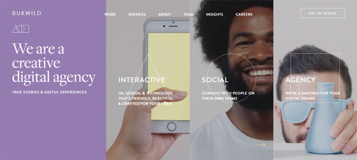


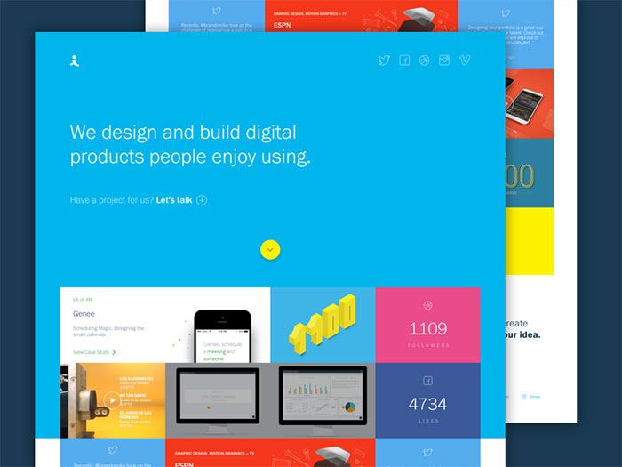
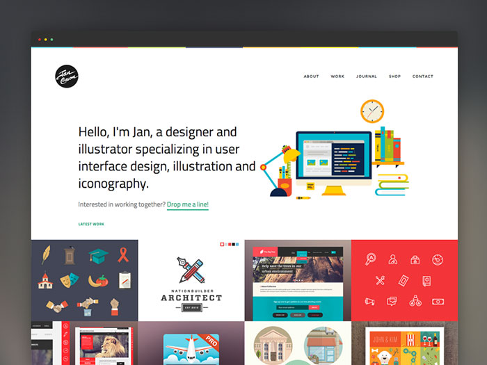
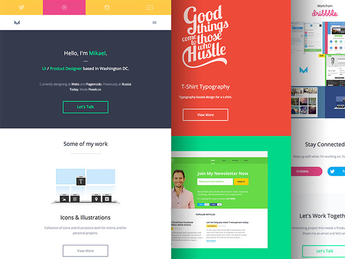
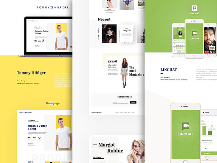
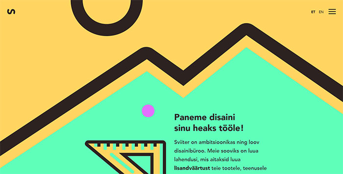
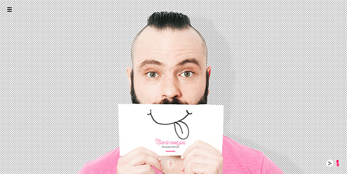
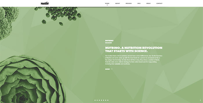
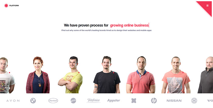

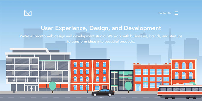


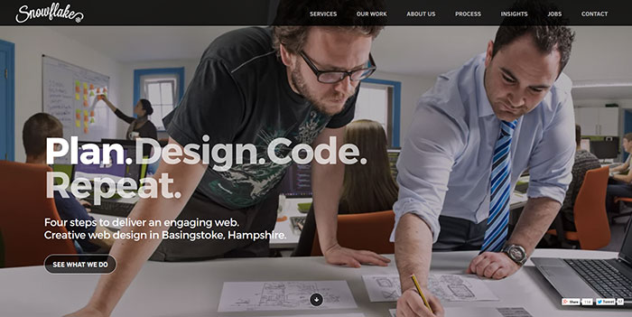
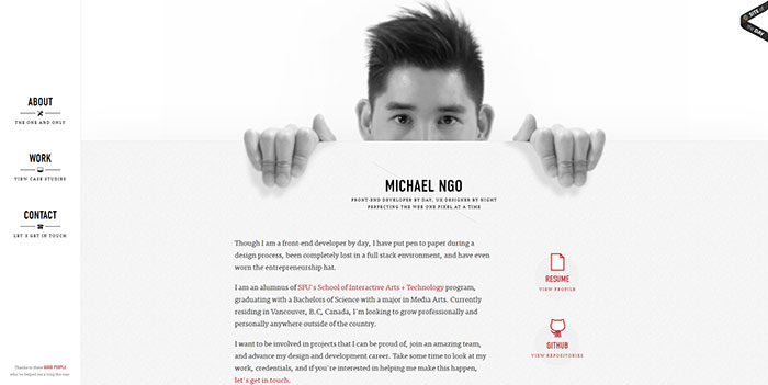
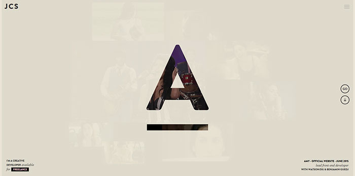
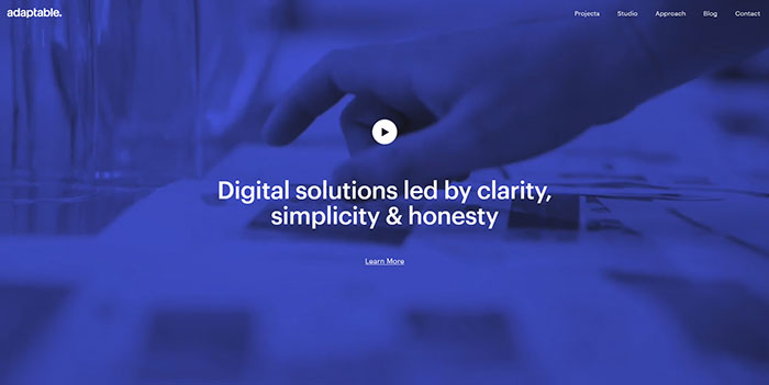
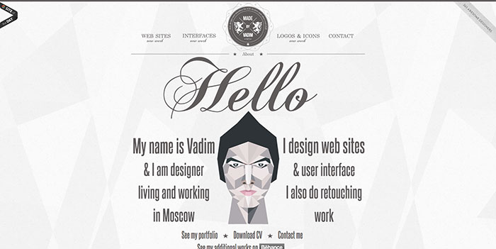
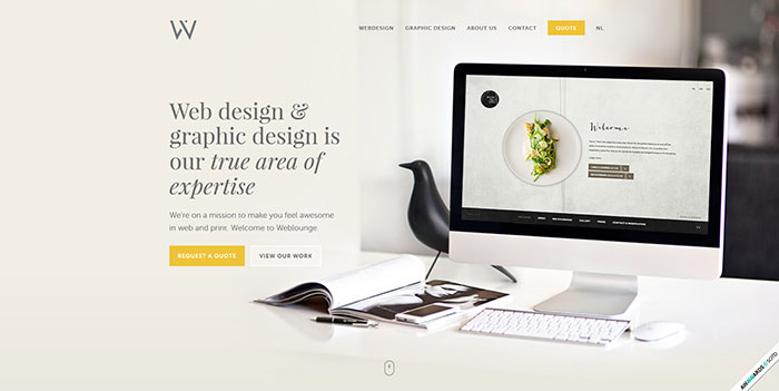
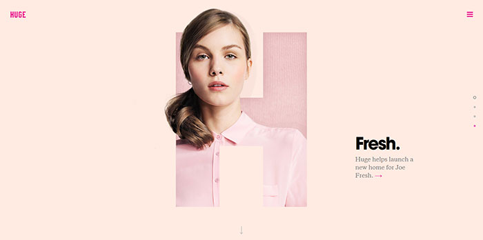
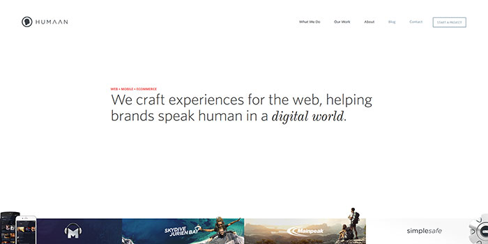
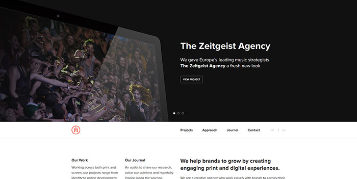
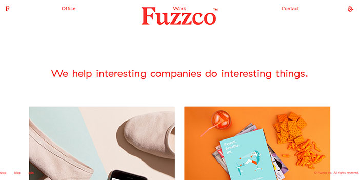
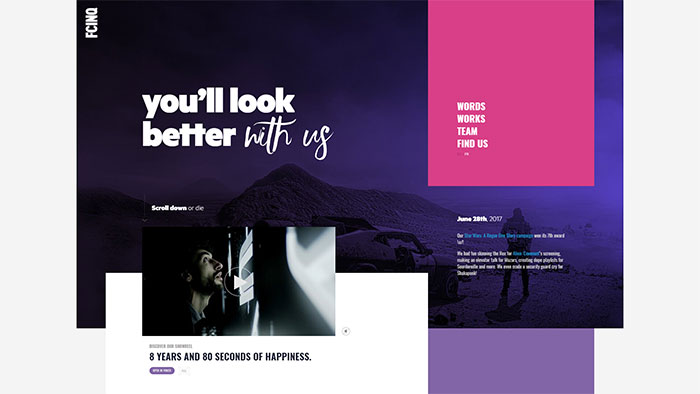
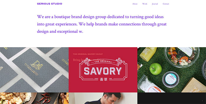


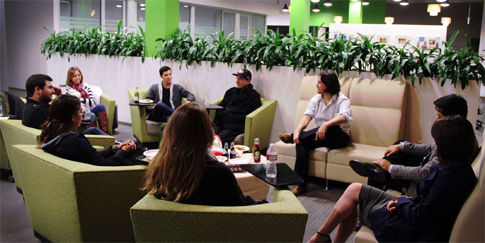

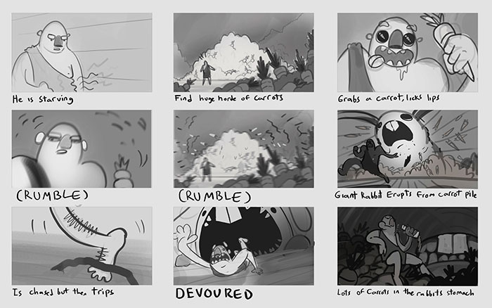

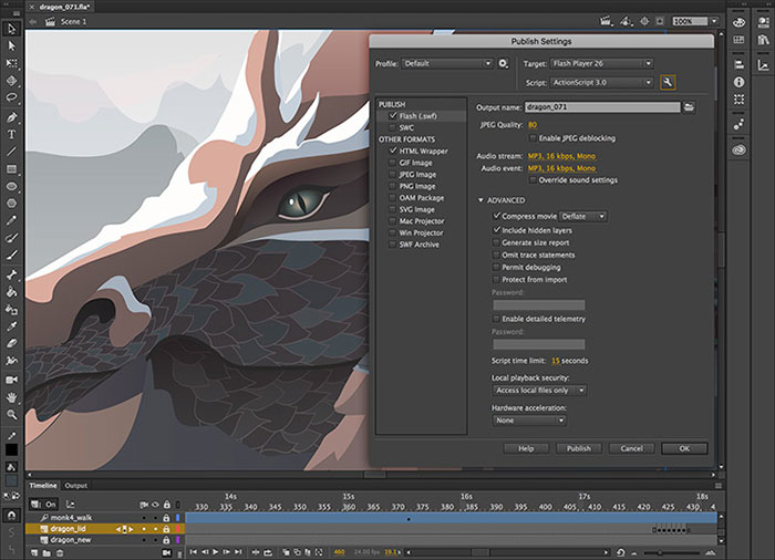

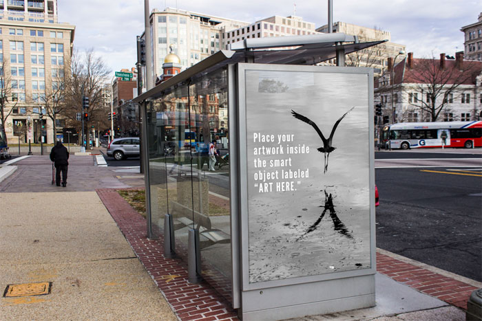


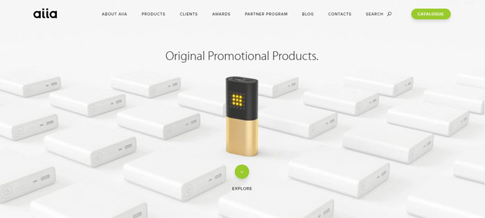
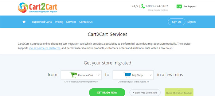

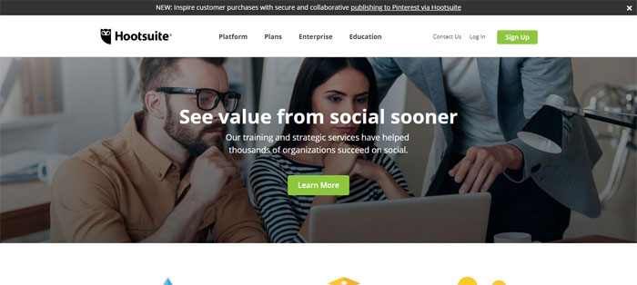


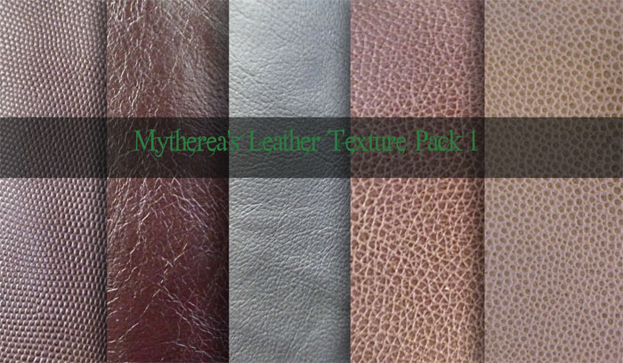


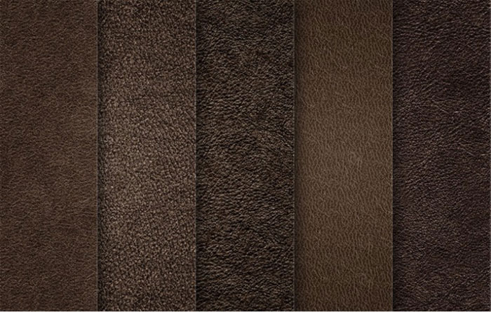


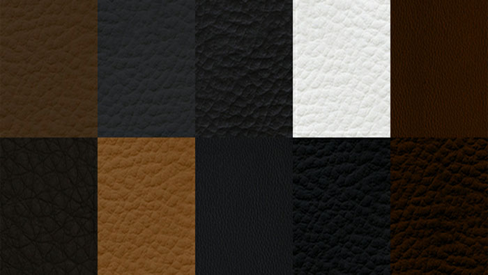

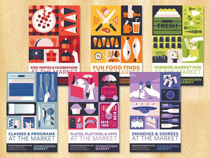
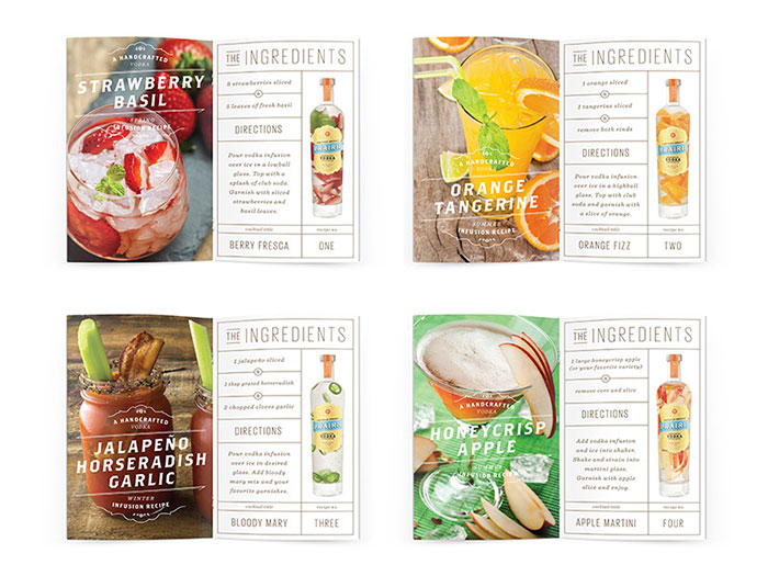
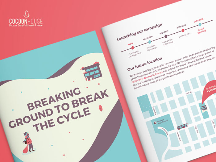

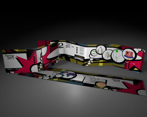
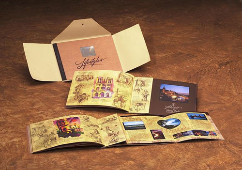
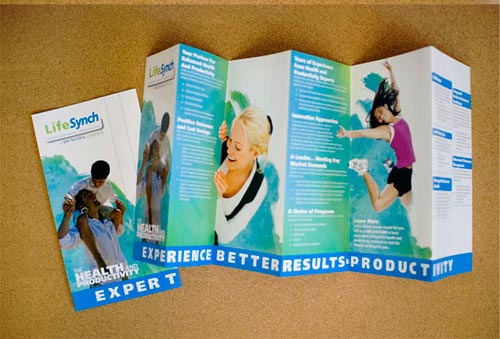
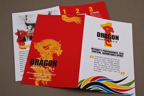
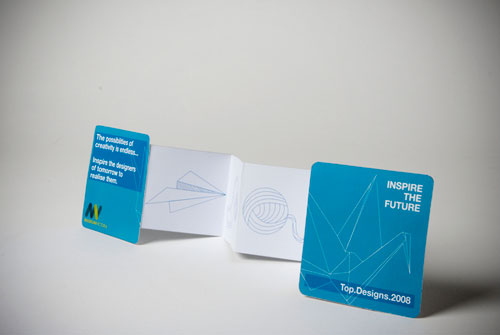
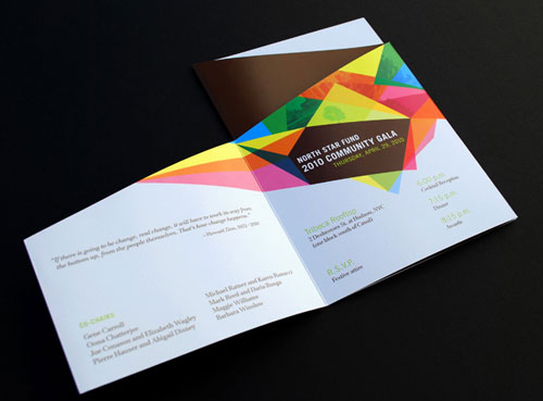
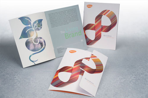


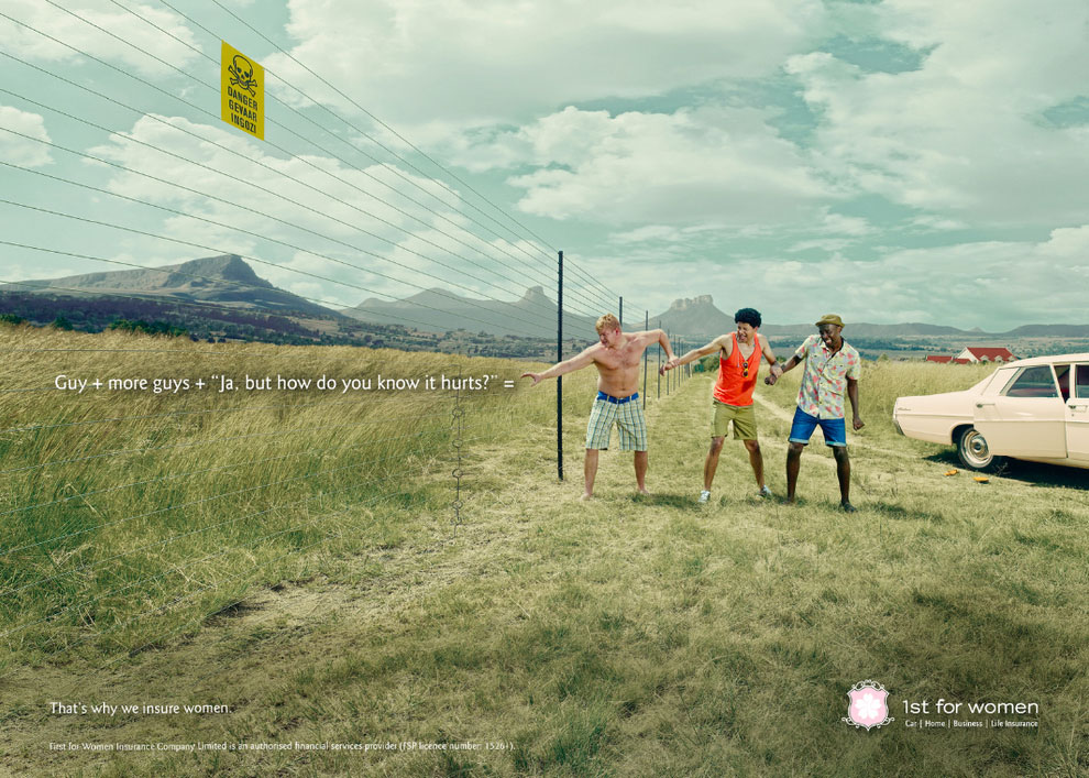


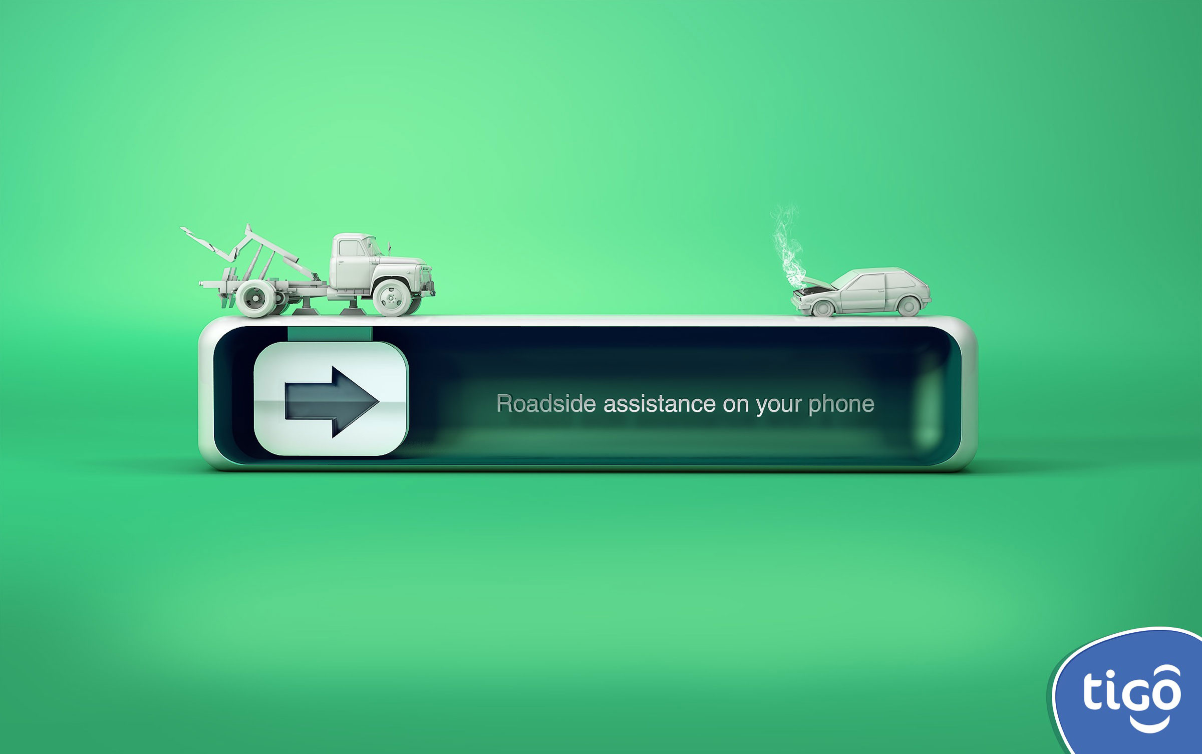
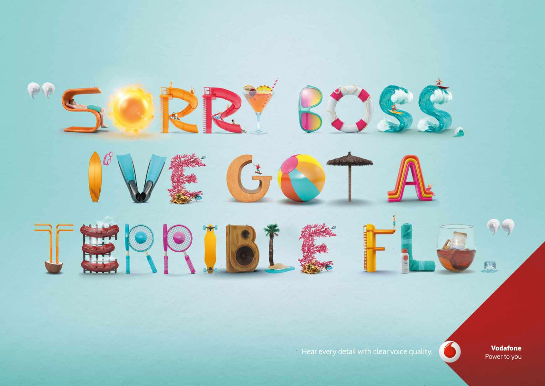


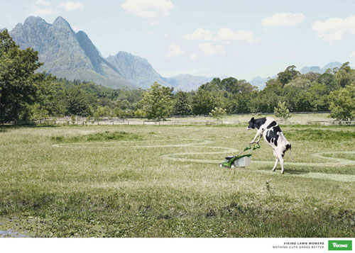


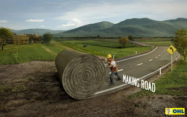
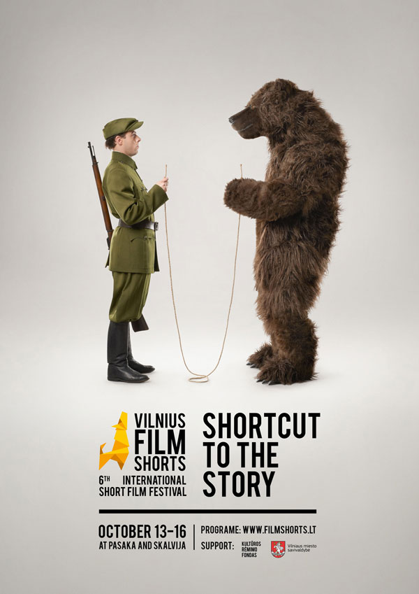


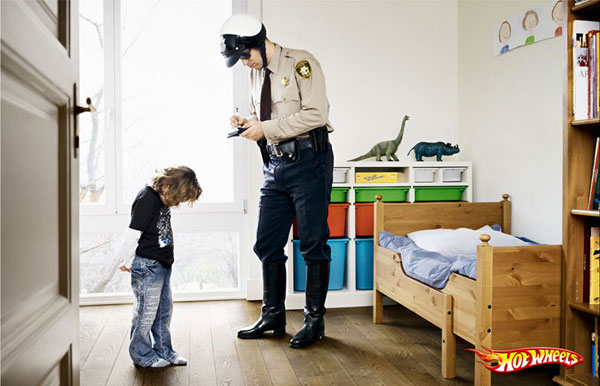


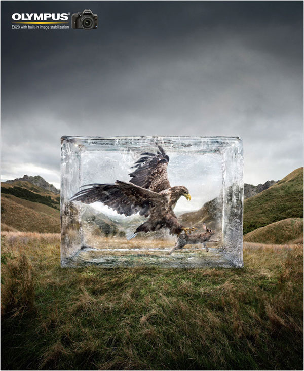
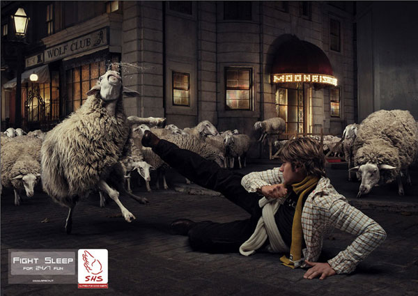
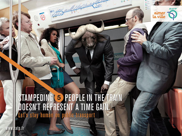


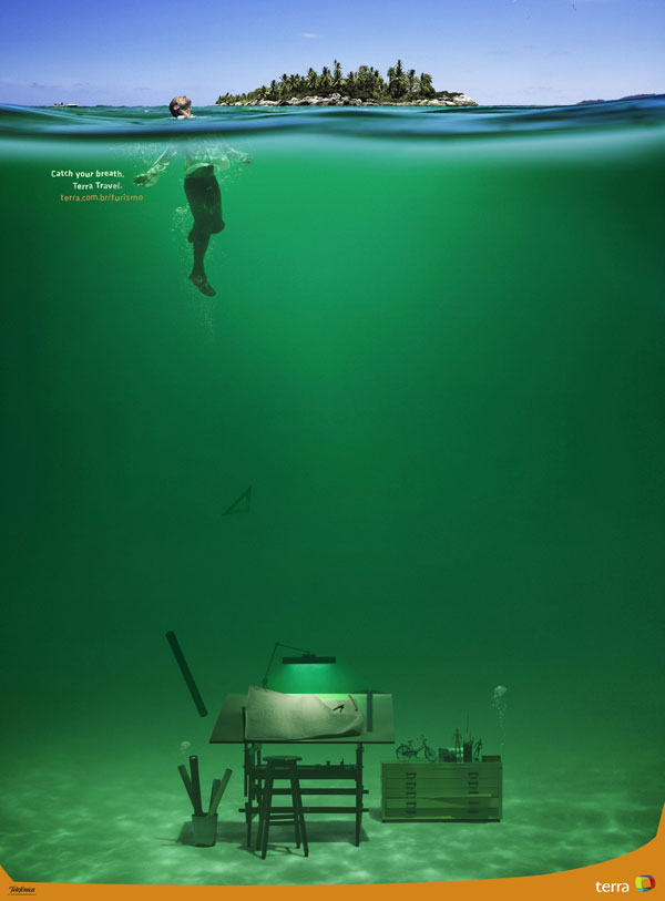

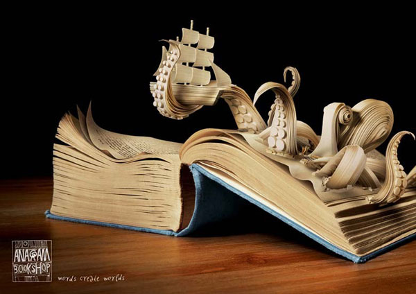


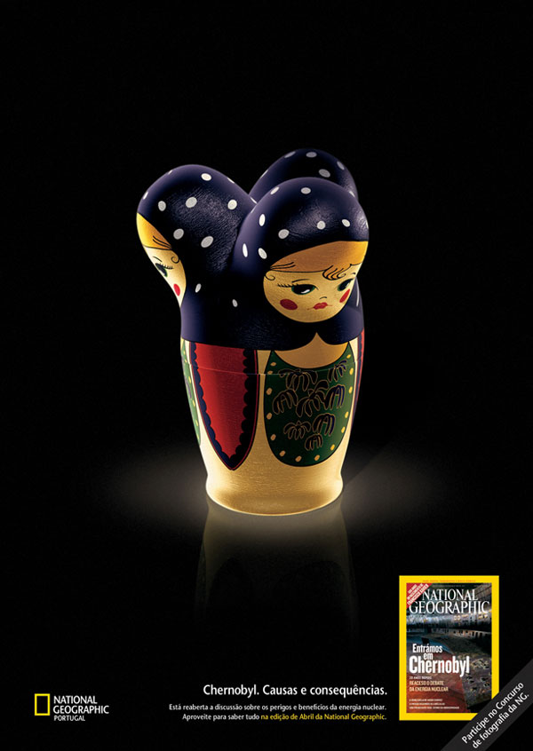


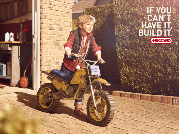


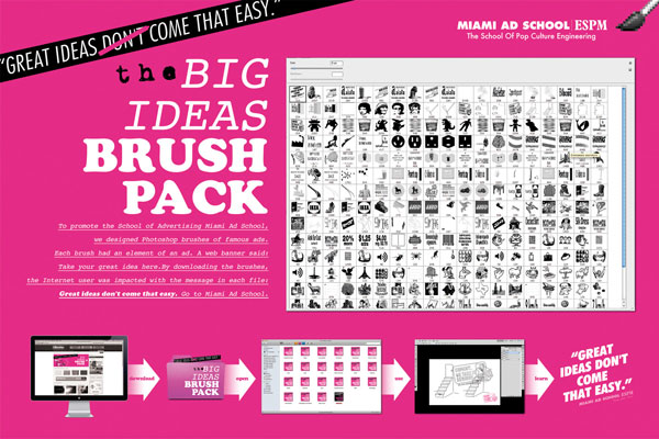


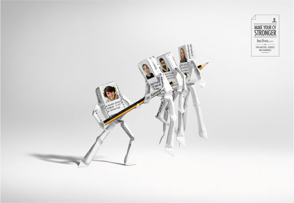


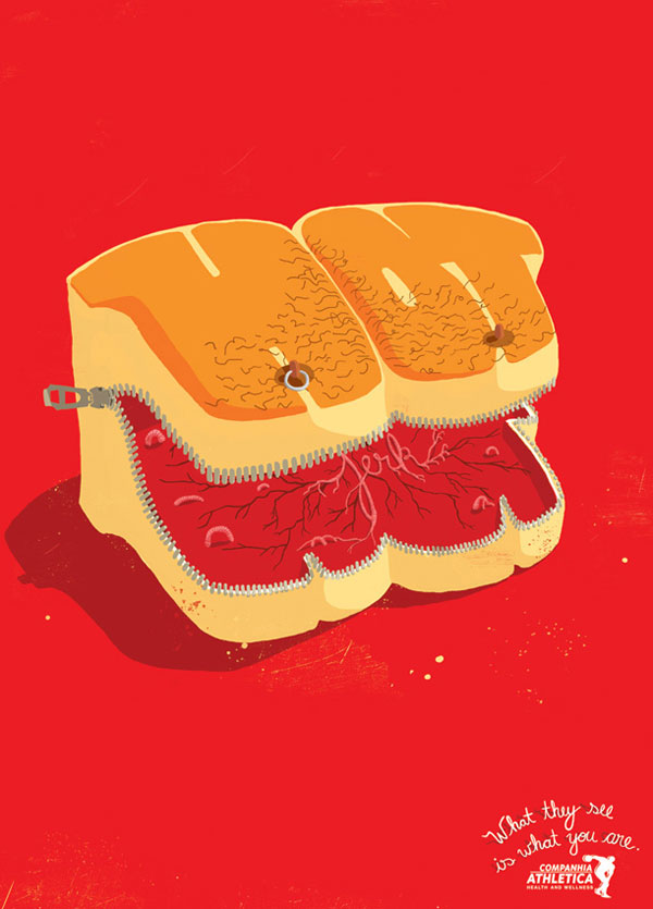


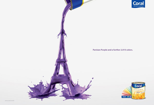
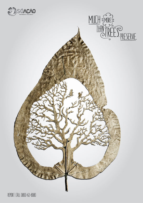

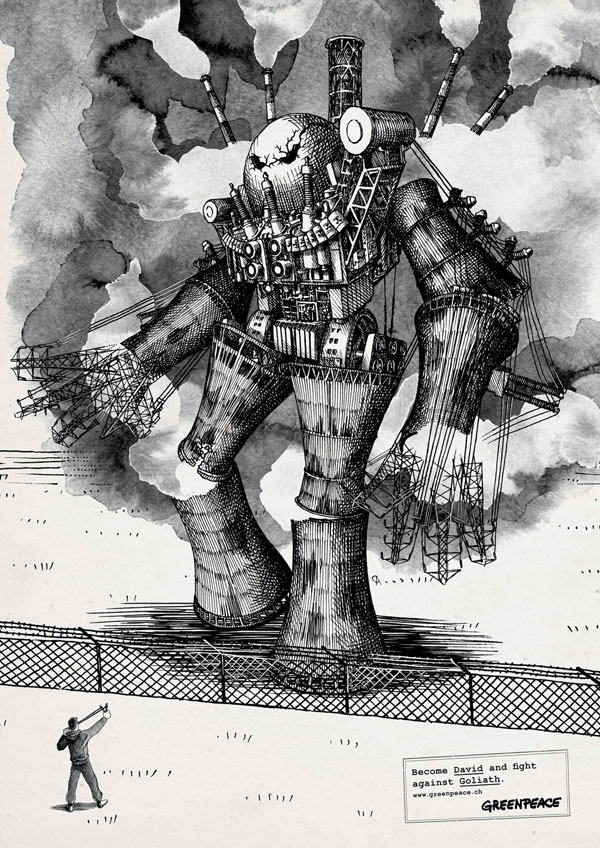

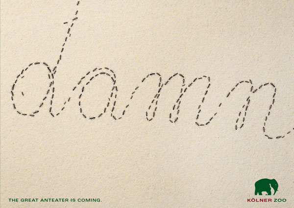
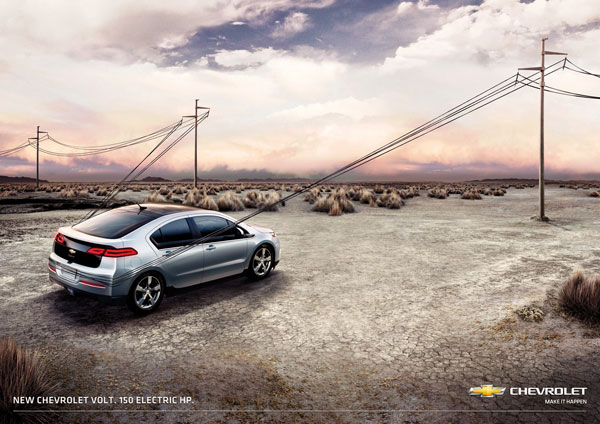
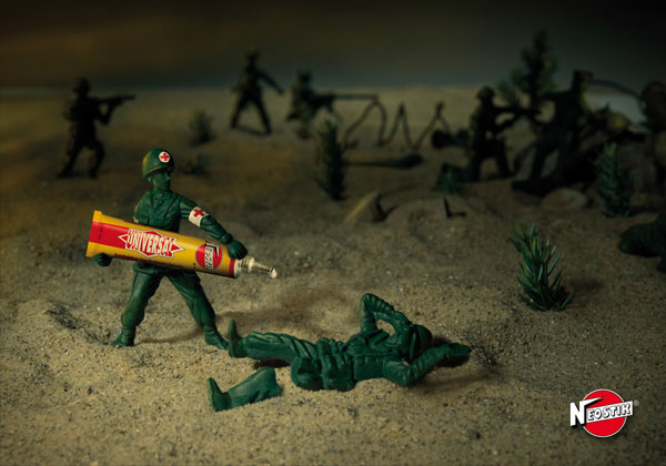


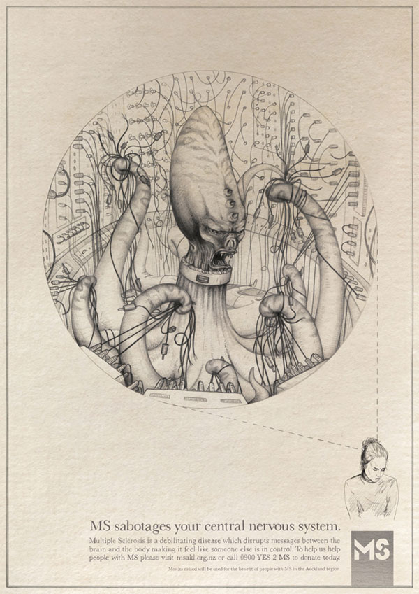
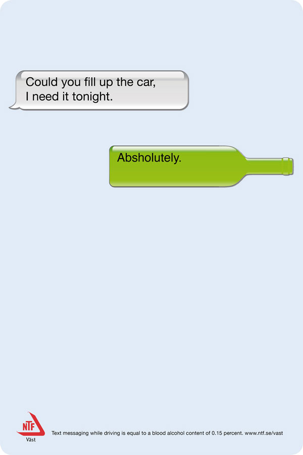
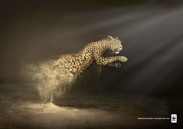


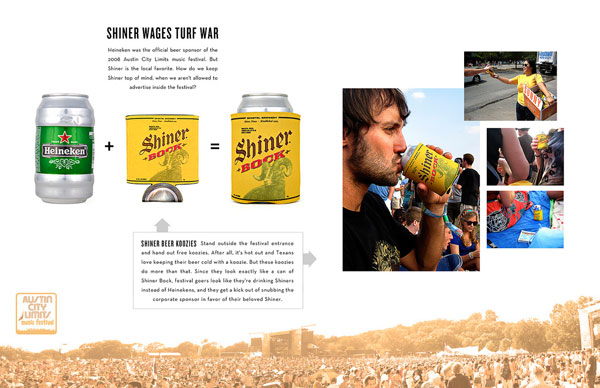
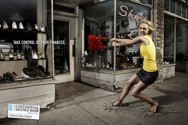
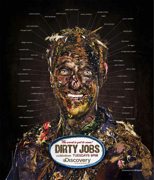
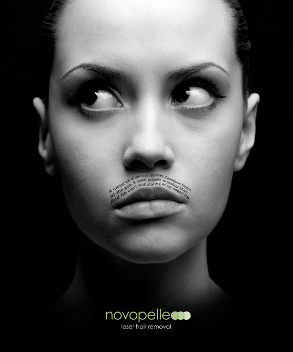

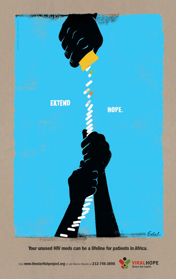
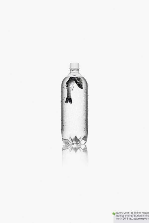
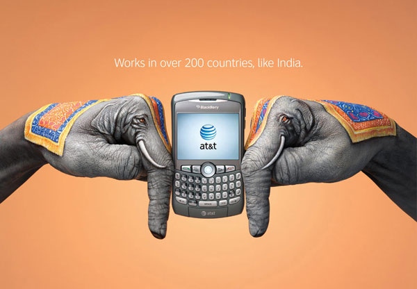

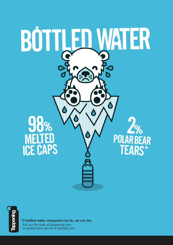


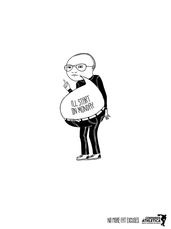

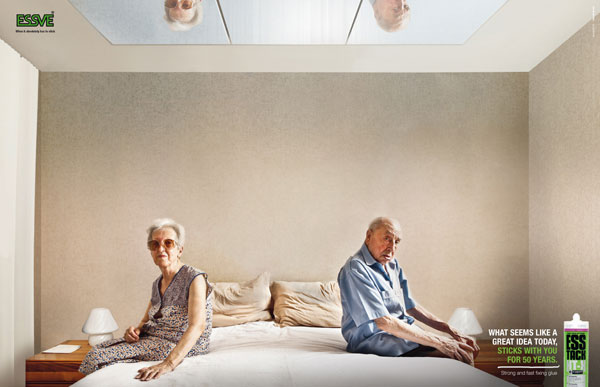

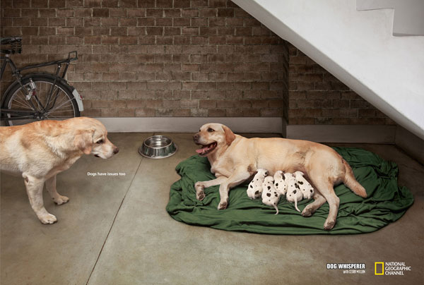


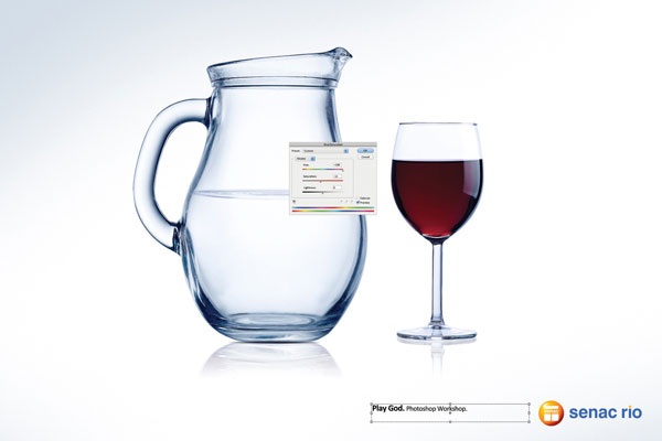


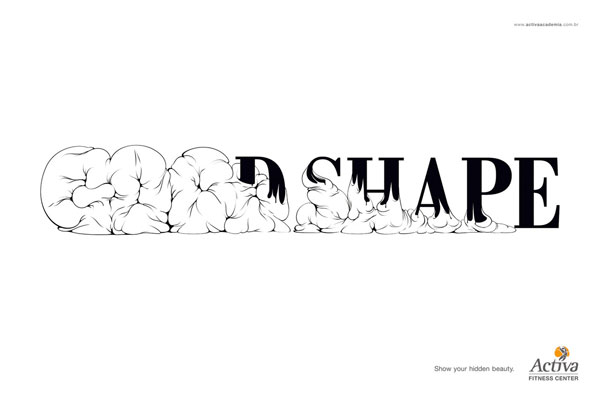


 RSS Feed
