|
High tech gadgets are becoming a part of our everyday life. Like with the mobile phone, we are starting to be addicted, depending on them for our daily actions. As this cool technology advances, so do these gadgets that we are fond of. We are constantly amazed by the new concepts created by young and ambitious designers. These innovations appear from a necessity of solving the problems that old products have. Besides new and improved functions, they also come with a beautiful design. Withings Thermo – Smart Thermometer
Thermos is a temporal thermometer with 16 infrared sensors that provides a medically-approved measurement in 2 seconds while also synchronizing with a dedicated smartphone app to help manage fever episodes. It is a game changer. Now a fast, simple, no-contact gesture yields the most precise temperature possible, and automatic sync with the dedicated app also allows you to track temperature readings, get reminders, and input related symptoms/medications right on your smartphone.
Want free collections of gadgets, apps and more? Simply subscribe and get free tech articles straight to your inbox.
Thermo is CE-cleared, making it compliant to the highest health device standards in the world. It measures from the temporal artery, considered the best place to detect temperature changes. As Thermo sweeps across the forehead, 16 infrared sensors take over 4,000 measurements to find the hottest point. This is the revolutionary advance, and is what we call HotSpot Sensor Technology. Unlike traditional methods, Thermo avoids any contact with saliva, earwax or other body fluids — making it the most sanitary way to take anyone’s temperature. Yunmai Color Smart Scale
Yunmai FDA-Listed Bluetooth 4.0 Smart Scale & Body Fat Monitor – 10 Precision Body Composition Measurements – Body Fat, BMI & More. Step on the scale, and within seconds it takes 10 dierent essential health measurements, giving you comprehensive data about your health. Body measurements are sent instantly to your smartphone each time you step on, making it easy to track weight loss and health progress. Yunmai precisely measures Weight, Body Fat, Muscle Rate, Water, Bone Mass, Visceral Fat, BMR,BMI, Protein, Body Age. Bio-impedance sensors give you precise results, every time. Yunmai uses BIA (bioelectric impedance analysis), which is a commonly used technology. Check with your doctor if you are preganent, or have a pacemaker, electrocardiographs and/or other medical devices before use Yunmai. The YUNMAI 2. 0 App connects your real-time body metrics to a world of data charts, social sharing, and fitness tracking. Simply step on the scale to instantly connect your profile and begin pushing data to your app. No additional setup is required, so you can begin tracking instantly. Withings Wireless Blood Pressure Monitor for Apple and Android
The Withings Wireless Blood Pressure Monitor simplifies the process of monitoring your blood pressure and accessing your data. Measures systolic and diastolic blood pressure as well as heart rate. Readings automatically compared to World Health Organization blood pressure standards for an easy understanding of your data. Syncs wirelessly via Bluetooth technology with iOS and Android devices. Multi-user capabilities with personalized monitoring and data for each user. The free Withings Health Mate application offers comprehensive and streamlined data tracking. Easily share data with doctors. Netatmo Weather Station for Smartphone
Made for iPhone & Android, made for you. The Personal Weather Station with Air Quality sensors, for iPhone & Android. The new standard of design and technology for the Personal Weather Station. Attune your senses, and get new onesWeather and Air Quality monitoring, indoor and outdoor .Measure CO2 concentration and monitor confinement. Get local Air Quality Index report, real-time. Improve your indoor wellness. The Netatmo Station measures indoor temperature, CO2 concentration, noise pollution and humidity in the home. Your Netatmo station also indicates the best moment to ventilate. Get relevant info, take appropriate steps Your Netatmo Weather Station helps you decide about your activities.Receive real-time alerts. Monitor over time, get the big picture. Discover weather patterns and cycles. A comprehensive and powerful tool to understand your living environment. Arlo Pro Security Camera
Arlo Pro is a 100% wire-free indoor/outdoor security camera with rechargeable batteries and audio and can be added to any Arlo base station system. Arlo Pro includes rechargeable batteries, motion and sound-activated alerts, 2-way audio, a 100+ decibel siren, and 7 days of free cloud HD video recordings. Arlo covers every angle to help keep you safe and protected. Stay in total control all the time. Whether you’re using a smartphone, tablet, TV, or computer, a click or two is all you’ll ever need to check in. The free Arlo app is available for iOS, Android, AppleTV, and web browsers. Stop crime before it happens with 100+ decibel siren that can be controlled remotely, or when motion or sound is detected. Listen in and talk back through the built-in speaker and mic straight from your smartphone. Secure your recordings with an USB drive local backup storage option. Aeotec by Aeon Labs ZW089 Recessed Door Sensor
The Aeotec by Aeon Labs recessed door sensor is a battery powered, Z-Wave powered, magnetic door sensor with an extremely small form factor. Unlike existing Z-Wave door/window sensors, the recessed door sensor offers a unique, invisible installation – it’s easily installed within a doorframe meaning it avoids altering a room’s aesthetics without ever compromising on functionality. The recessed door sensor can send Z-Wave signals to up to 5 associated devices within its own network, and does so simply when the door it’s installed within open or closes. The Aeon labs door sensor also has low-battery alerts and offers a simple method of replacing the battery. Smart Home LED Light Bulb
Control your lights from almost anywhere in the world from the palm of your hand. The Sylvania Lightify Tunable White Bulb produces beautiful high quality light that you can tune, dim, and control from your smartphone or tablet. Easy to setup, just download the Lightify app, bulbs fit into your standard household sockets – no need for installation by an electrician. A wireless network is required to operate bulbs. Lightify bulbs use 84% less energy than traditional incandescent bulbs and last up to 20,000 hours making them a smart choice for energy conscious homes. Create and store scenes. For example you can schedule to turn on the lights so you don’t come home to a dark house. You can even set automated timers, or program the bulb to gradually increase brightness in the the morning like the sunrise for a more pleasant, natural alarm.Tunable White can make you feel better and more productive- select a natural daylight color for reading and concentration, or a soft white when it is time to relax. All-New Echo Dot
Echo Dot (2nd Generation) is a hands-free, voice-controlled device that uses Alexa to play music, control smart home devices, provide information, read the news, set alarms, and more. Connects to speakers or headphones through Bluetooth or 3.5 mm stereo cable to play music from Amazon Music, Spotify, Pandora, iHeartRadio, and TuneIn. Controls lights, fans, switches, thermostats, garage doors, sprinklers, and more with compatible connected devices from WeMo, Philips Hue, Samsung SmartThings, Nest, ecobee, and others. Hears you from across the room with 7 far-field microphones for hands-free control, even in noisy environments or while playing music. Includes a built-in speaker so it can work on its own as a smart alarm clock in the bedroom, an assistant in the kitchen, or anywhere you might want a voice-controlled computer. Always getting smarter and adding new features, plus thousands of skills like Uber, Domino’s, and more. Amazon Echo is not required to use Echo Dot. Robotic Vacuum Cleaner
Experience a deeper, multi-room clean every day with the Roomba 880 Vacuuming Robot. Featuring the revolutionary AeroForce Cleaning System, Roomba 880 delivers up to 5x the air power and requires less maintenance. Guided, room to room cleaning allows Roomba to tackle more of your home in one job. Just press clean or schedule Roomba to run up to 7x per week. Roomba works on all floor types, and at just 3.6 inch tall, is specifically designed to fit under most furniture, beds and kickboards. The Roomba 880 comes with two Virtual Wall Lighthouse Devices. In Lighthouse mode, the devices keep your Roomba cleaning in one room, then send it off to tackle the next room for guided cleaning in up to 3 rooms. In Virtual Wall mode, keep Roomba in the room you want to clean, and out of the ones you don’t. Navigates in your unique home, cleaning around clutter and avoiding stairs. Designed to clean under sofas, beds and kickboards. Robotic Mop
Designed to mop floors quickly and efficiently, the iRobot Braava Floor Mopping Robot systematically covers your entire floor in a single pass. It uses disposable or microfiber cleaning cloths to pick up dirt, hair and dust from all your hardsurface floors including tile, vinyl, hardwood and laminate. Just attach a cloth, set Braava down, press a button and off it goes, using advanced robotic technology to track where it’s been and where it needs to go. It’s whisper-quiet too, so you can go about your daily activities without disruption. The included Turbo Charge Cradle is a convenient, one-stop charging and storage space, charging Braava 380t in as fast as two hours. Braava has two cleaning modes to choose from depending on the job you need done. In sweep mode, Braava dry mops your floors moving in straight lines using dry cleaning cloths. In mop mode, Braava uses a special back-and-forth mopping action and damp cleaning cloths to lift surface dirt and grime off your floors. Essential Oil Diffuser
Create a romantic ambience, wake yourself up, or relax, it is all up to you! Enjoy your favorite essential oils with the ISELECTOR aromatherapy essential oil diffuser for improved mental and physical health and pleasure. Releases your favorite fragrance by ionizing essential oil and producing negative ions, lifts your mood, reduces stress with scented fresh air. Turns water and essential oil into micro-particles improving air quality. Helps to alleviate colds/flu congestion and moisturizes dry sinuses. Moisturize dry chapped skin, eyes, and lips naturally. Keypad Deadbolt
Say goodbye to lost, stolen and just plain forgotten keys. With an easy-to-install Schlage keypad, coming and going is keyless, effortless – and painless. Plus, our variety of electronic finish and style options pair effortlessly with our most popular trim styles, allowing you to expertly tie together the perfect style inside and out. Share access more securely — no more hiding spare keys or keeping track of copies. Pre-programmed with 2 access codes for immediate use. Schlage door hardware offers an easy way to enhance the style of a home, keep it safe, and even make it smarter. Create and delete access codes for trusted friends and family (up to 19). Installs in minutes – no wiring needed. Fit on standard doors. Automatic Sensor Touchless Trash Can
Don’t just mask smelly garbage odors with fragrances and messy baking soda; eliminate them. The upgraded DZT13 is now equipped with a Carbon Filter Gate (CFG) that uses activated carbon to effectively eliminate and neutralize the toughest odors. Smelly and oversized garbage doesn’t stand a chance with the upgraded 13 gallon Touchless Trash Can. Its extra wide opening (11.75 diagonal) allows disposal of larger debris and comes equipped with the most advanced infrared sensor technology on the market; opening the lid automatically when you approach within 6 inches, and closing it when you walk away. Thanks to the automatic lid closing system, the built-in carbon filter can work its magic; eliminating and neutralize nasty odors effectively. The pre-installed Carbon Filter Gate (CFG) has a 3-dimensional surface area, maximizing the deodorizer’s odor-absorption capabilities. The deodorizer is non-scented and environmental friendly, making it safe for use around children and pets, providing you with a cleaner and fresher home. The deodorizer can fight odors for 3 months before needing replacement. LED Shower-Head
DreamSpa® All-Chrome Water Temperature Color-Changing LED Shower Head is the World’s Most Advanced LED Shower Head! LED lights are powered by running water, no batteries ever needed. Extra-large 5.25″ Chrome Face with Reflective Perimeter Rim. 5 Settings include Power Rain, Pulsating Massage, Hydro-Mist, Economy Rain & Water-Saving Pause. High-power 3-zone Dial with Rub-clean Jets & Click-action Lever. Designer Beveled Rim Accent. Color of LED lights changes automatically according to water temperature. 3-color-changing Water Temperature Sensor. Long life LED lights are designed for years of heavy daily use! LED Toilet Light
One of the most advanced toilet lights on the market, the Lumilux toilet light uses state-of the-art technology to create the perfect way to light up your toilet! Select from 16 colors or create a rainbow in your bathroom using the carousel mode. The built in infrared motion sensor will detect body heat upon entry and will shut off upon exit. What also makes the Lumilux toilet light so advanced is the light detection sensor that will make sure the toilet light does not come while the bathroom light is on. Simply bend the arm to secure the toilet light to any size toilet bowl. The unit will store your settings (unless batteries are removed). Push the button to activate the LED light at any time. Water shadeThis project is a gate of water. The project goes by the name of “Water Shade” and keeps a shield of H2O around the fruit it is sworn to protect. It’s both a dish and a cover, working with water to keep freshness in and everything larger than O2 out! Designer Yitu Wang doesn’t want to keep you from your delicious apples. This is why in this cool gadget there’s a built in detector that sees your hand in approach, and thus is does desist. Moisture and freshness are locked in, while dust is locked out. And when you come up and decide you’d love to have a strawberry, as soon as your hand gets near, the streams in that area stop.
At home Clothing Printer by Joshua Harris
This is another one of the cool tech gadgets and I’m sure soon a lot of homes will have it. Not so long ago, having a photo-copier in your house seemed trivial. Nowadays, one of those is not only affordable, but also small. The Pattern Door LockHas it ever crossed your mind that someone can steal your electronic door passcode? More often than not, gullible people end up as victims and the wicked score another win. The Pattern Door Lock is designed in a way that the code combination is not easily visible. With Braille integrated, the locking system adds a layer of security and functionality to the whole setup.
Bio Tank, Robotic ‘FishWasher’ by Akifusa NakazawaThe Bio Tank not only does the dishes, but it also makes compost. The Robotic fish cleans up the dish while turning the food and grime into bio fuel. It filters to clean the water, meaning no replacing the dirty water either.
The Drum Washing Machine by Andras SutoThis is a communal laundry system that allows people to share the washing facilities. It features an extractable washing machine drum that doubles up as a laundry basket. With it you can transport laundry between home and the washing area.
The Mystica DeskThe Mystica Desk is a beautiful office workspace that is a must have if you love futuristic technology and furniture. The table’s ‘L’ design makes it a great table for one person, or a comfortable fit for a team too.
The Smart Touch RefrigeratorThe Smart Touch refrigerator may seem like it’s a long shot, but it captures what a smart fridge is required to be like. The fridge is definitely a class apart with its half-swirl handle. The handle hosts an inbuilt biometric sensor that knows who’s opening the fridge door. Food kept inside the fridge is thus tagged to the people who put them there in the first place. Projectors on each food tray project ‘time stamps’ n the food when you open the door. These stamps show who the food belongs to, and by what time it must be consumed. The designer HaiMeng Fang wants to drop the possibility of stocking one’s refrigerator, but forgetting about perishable food items kept within the fridge.
The Dividing PrinterWhile most printers allow you to ‘collate’ prints, there’s always a slight chance that one rogue paper finds itself in the wrong pile. The Dividing Printer, as its name suggests does something simple yet smart. It mounts the printer on a rail and allows the printer to move left or right while printing documents. What this does is that it allows the printer to create actual, physical piles of paper that have been segregated from the get go. The elegance of this solution lies in the fact that it doesn’t change what the printer does. It just adds a small bit of innovation elsewhere to solve the problem.
The Pavati TapWe never get a chance to see how the hot and cold water blend together within the faucet, before it cascades out like a stream. The Pavati Tap builds upon this element. The result is a showcase of how the two streams of water can create drama whilst you wash your hands. A Y-shaped waterfall effect mixes the cold and hot water into a single mutual waterfall.
Transparent TVThe transparent tv designed by Michael Friebe of Loewe AG is a marvelous piece of technology that combines conventional LCD and the latest TOLED display technology. This allows to create non-transparent / solid moving pictures with rich color reproduction and full contrast range from solid black to pristine white.
Floor Plan Light switchHave you ever had a problem with forgetting which light switch stands for what light? Taewon Hwang came with the great idea of creating a master light switch with a simple design that shows you what lights you are turning on or off.
The AURA LampLooking almost alien like, the AURA lamp lights up a room with a certain texture and that is because it’s a woven lamp hand made in France.
Dimensional Wall PanelsPeople aren’t familiar with 3D wall panels. I don’t know why, cause they surely bring a nice feel to a room, with their interesting shapes that create a beautiful arrangement of light and shadows. They can also be put in shops, restaurants, offices and because of their different that usual look they transmit a nice futuristic look.
The RIMA lampThe RIMA lamp is one like no other because of its interesting feature that allows you to control the light via four controller rings that you can slide. This beautiful lamp created by Matthias Pinkert has a processor which controls the heat, intensity, angle of the beam and color.
Sony EclipseThis Sony Eclipse concept created by Hoang M Nguyen and Anh Nguyen is a media player that uses photovoltaic cells situated on its backside to draw in solar power. With this player you have a slight change of seeing the battery low warning very very rare.
Pouring Light LampA strange but interesting lamp that will surely be sold really fast if it would be put in stores is this one created by Yeongwoo Kim. The lamp uses LED lights that are situated in the bucket and with the help of phosphorescence in the “water” it lights in a marvelous way. This is one of the cool gadgets that you need to have.
Door Handle With Self-sterilization System
Senzo NightlightIt’s really annoying during the night when you wake up and not find the light switch. The solution is provided by Soledad Clavell and Marcos Madia who created this wonderful home technology that lights up the room when touching it. If you always wanted a example cool lights for your bedroom, this is it.
Electrolux FireplaceThis fireplace created by Camillo Vanacore for Electrolux is one of the home gadgets presented here that looks almost magical because of its transformation from off to on, from an opaque ceramic column to a transparent one.
Eco CleanerWithout using regular dish detergents, the Eco Cleaner makes the plates bright and fresh using ultrasonic waves to ionize food particles on the dishes, converting the food into reusable compost for plants. Less waste and more nutrients for plants are a good idea for the future and a solution for enriching the soil. Of course, we’re talking about the soil for the plants that you keep in your apartment.
Document Extractor – Combi MonitorSaving space on the desk has always been a problem for some and to solve this issue Byeong Min Choe has come up with a marvelous idea of combining a printer and a monitor.
On SwitchMinimalistic and elegant. That’s how you define this light switch created by Burakov Denis. This is one of the cool things to put in your room to make it better.
Green Smart GlassThe Green Smart Glass has an interesting technology that harnesses the heat energy from the hot beverage and stores it to be used later.
iQ Alarm clockInstead of the snooze button which you unwillingly press in the morning, this alarm clock has questions that need your lucidity to solve them. This way, you will surely get up fast in the morning.
Change It! WallThis wall has been passed around on the internet for some time and has become a neat attraction. It’s not LED or anything digital. It’s actually made of turning triangles with different colors on them, white, black and a rainbow color. It is limited at these three options for now, but I’m sure we’ll see in the future various patterns and images.
Orbital Washing MachineWashing clothes has never been so easy. With the incorporated basket you can load and unload the clothes in the washing machine as easy as 1, 2, 3. This isn’t the only innovative feature. The spherical drum is moving on two axes washing your clothes better than the old washing machines that use only one axe.
BediatorHaving a warm bed underneath you is a cool thing, especially if you’re in a place where winters are incredibly cold. Now I don’t know how much weight this bed radiator-bed supports but if it can take two medium people it is awesome.
LED CeilingThis is an interesting concept created by Seo Dong-Hun that allows you to create on the ceiling the light shapes you want. Literally, you can paint the ceiling with light. Imagine the artworks that would result from some people’s imagination.
LULA Lung LampLULA is a product that collects data and indicates the air quality in your room. If it’s connected to the internet, it can process the data and tell you the health issues that you are facing in that situation and how you can avoid having problems caused by the quality of air.
WAT LampThe WAT lamp has the interesting ability to generate light if you fuel it with water. Yeah, it sounds outrageously futuristic, but the system is actually not that strange. The water combines with a hydroelectric battery to generate an electrochemical reaction that lights it up.
MirandaThis surface tile is not for everyone but it is fun for sure, having the ability to morph the way you want it and create shapes and basic drawings on it. More info can be found on Giles Miller’s site.
WAVE Ultra Sonic Wine Ager And RefrigeratorEver wanted to age your wine so that it will be of a higher quality? Now you can, it’s not only a movie idea. Designer Mika Yamamoto has created this device that does this incredible thing. The Wave uses magnetic cooling system that is based on the magnetocaloric effect, which is the ability of some materials to heat up when magnetized and cool when removed from the magnetic field. It reduces carbon emissions and increases energy efficiency. It can possibly cut energy consumption by 40%. It also reduces the cost of electricity.
The Wave Dish WasherThis dishwasher beautifully designed by Guilherme Parolin makes the action of washing dishes a piece of cake thanks to its user friendly control panel.
Swan Umbrella DryerDrying up a wet umbrella has always been a problem. Till Noh Seon Mi designed the Swan Umbrella Dryer, of course.
+- Water Meter
1limit FaucetUnlike the +- water faucet which only tells you how much you consume and doesn’t technically help you to reduce your costs, the 1litre limited faucet helps you to consume only the water that you need.
iChef+ OvenFrom what I’ve seen on the market, the ovens are not user friendly at all, having changed over the years only at an aesthetic level without modifying the process in which you actually cook the meal. The iChef Oven has an innovative and powerful computer behind it’s technology and I believe it can be considered a milestone in its niche.
The Book LightThis product with integrated LEDs in a plastic body is an interesting product for the people who read a lot and need a discreet light over their pages. Don’t worry about the light being to powerful, cause you can adjust it as you please.
The Tulip Bath/ShowerIn a small bathroom there’s always a problem with space and the Tulip Bath/Shower designed by Piotr Pyrtek provides the solution. Saving space is not its only feature, having a number of characteristics that qualifies it as a luxury item, like underwater jets or massage programs.
from http://www.designyourway.net/blog/inspiration/30-cool-high-tech-gadgets-to-give-your-home-a-futuristic-look/
0 Comments
Whether you’re a web designer, a project manager, or a small business owner, you naturally look for ways to do things better and/or faster. Any increase in productivity can positively impact your bottom line. Whether it means more customers, happier clients, or increased sales and company growth. To make productivity gains happen, you’ve learned to take advantage of certain tips and techniques (as you will see below). You also look for tools that will automate manage certain aspects of your work. This way you can work more efficiently, or free up time to work at what you do best. The productivity apps described here are the best in their class for the functions they perform. Whether those functions involve prototype building, program management, time tracking, sales management, or team collaboration. Active Collab
If your team is using separate software programs for task management, time tracking, and invoicing, and/or you are communicating and reporting status to clients via e-mail, consider trying Active Collab. This simple, yet powerful project management tool, allows these tasks to be performed from a single platform, and it will manage your team’s collaboration activities as well. With its many integrations, Active Collab can accept input from multiple sources. You don’t constantly need to hand feed it data, nor does it place restrictions on the types of tools your team members use as sources of that data. Like most browser applications, Active Collab runs on the cloud. There is nothing to install, nor is there any setup procedure involved. The only thing you have to do is subscribe. Active Collab currently has a user base of over 200,000 designers and project managers who use it on a regular basis. You can try it for free for 30 days, which should allow you enough time to check out its features and pricing plans, and familiarize yourself with its functions. Wake
Wake provides the fastest way to get your ideas, and your work, in front of your team. Capture and share anything that comes across your screen. With Wake, you can share without ever leaving Sketch, Photoshop or Illustrator; simply by using a handy keyboard shortcut. For example, if you want to share sketches from your notebook, or a flow chart you’ve created on the whiteboard, you can use Wake’s iOS app to snap a photo and immediately send it off to your team. The iOS app also allows you to keep in touch with team members, your project’s status, and other happenings while you are out of the office. Check out the Starter or Pro Custom plans, or try Wake for 30 days for free. Proto.io
Building an awesome prototype is often the first step toward building an awesome product. That’s precisely what Proto.io lets you do. A prototype built using Proto.io can be used to preview and test web and mobile apps on real devices, or used to solicit feedback. It’s easy to see why the time invested in building a prototype (it’s typically not a lot), is time well spent. You can use Proto.io’s superbly crafted iOS and Android components to design and build a prototype directly in the Proto.io editor, or you can import your own Photoshop or Sketch files. It’s not at all difficult to turn your static designs into interactive prototypes that feature stunning animations, commonly-used gestures, and touch and mouse events. When you’ve completed a prototype, you can view it in your browser or a real device and share it with key stakeholders with just a single click. Try Proto.io for 15 days for free! MeisterTask
MeisterTask users like this agile task management app because of the way its flexible project boards can be adjusted to fit their workflows. They also like the way its customizable dashboard lets them see what’s happening, and what needs to happen, with minimal effort on their part. Another feature they like, and you will as well, is how MeisterTask seamlessly integrates with Google Drive, GitHub, Zendesk, and many other popular apps. Salesmate
Salesmate gives small companies the sales management, process automation, and business acceleration solution they look for to grow their business. This customer relationship management app makes it easy to assign and track deals, and sales team and individual progress. Having an app like Salesmate that can give you a real-time view of your sales funnel will help you turn your team into a top selling troop. Minterapp
Minterapp provides a great solution to a small business looking for a better way to track time and use the information to generate invoices or provide estimates to clients. Individuals can also use this app to learn more about their work habits, so they can be more efficient and productive. For businesses, time tracked can automatically be converted to customized invoices, which can be delivered online to clients. Minterapp ties in with Mailchimp, PayPal, and Basecamp. Productivity Tricks and Tips Failing to plan is planning to fail. This sage bit of advice is worth paying attention to. Without a plan to follow, multiple tasks and deadlines can easily overwhelm you; and when you’re trying to play catchup all the time, it’s easy to make mistakes, or let things fall through the cracks. You find yourself worrying about providing a solution before a deadline hits; before you even understand the problem. Having the right tools can be a definite help; but there are things you can do yourself to avoid stress and become more productive. Use Keyboard Shortcuts. When you can replace locating and clicking on a series of icons with a keyboard shortcut, you’ll accomplish the same task in less time; time that adds up if you perform the task regularly. Why reach for the mouse or touchscreen, when you can accomplish what you want much more efficiently by keeping your hands on the keyboard? Small process improvements like this add up. Standardize Naming Conventions and Assign Tags Organizing your assets will be easier if you standardize your file names. Standardizing names, and color conventions, also makes things much easier for those you collaborate with. Think of search time as time wasted; unless you’re doing research. Use Time Tracking Tracking your time is an excellent way to find out more about yourself, specifically how you go about your daily work. If you tend to procrastinate, or if you are easily distracted (e.g., checking out the latest happenings on Facebook), time tracking will show you how much longer it is taking you to work a task than is necessary. Time tracking also helps you organize your work, as well as provide more accurate estimates to bosses or clients. There are plenty of time tracking apps on the market, including an excellent one that is described here. Customize Your Workspace for Speed When we get a new app, we tend to keep using it just as it came out of the box; especially when it makes certain tasks easier or faster to perform. It is often possible however, to customize an app’s workspace to make it even faster to work with. Customizing your workspace is similar in some respects to using keyboard shortcuts. When an app uses presets, its usually to help you to use it more easily. Shortcuts can often be simplified. You should find it worth your time to check out the possibilities. from http://www.designyourway.net/blog/misc/six-awesome-apps-that-will-increase-your-productivity/ How does the ideal mobile navigation look like? To start with, it has to be easily accessible, discoverable, and occupy as little screen space as possible. There are good and bad sides to each navigation concept, but the general rule is that you have to balance your mobile menu design, making sure it is not too exposed or completely hidden in another hamburger menu. The final decision you will make will depend on the site/app you’re running, based on which you will narrow down choices to several solid mobile-navigation quandaries.
The challenge is that when designing mobile navigation, you also need to embed a searching functionality, and they both take their toll. You will have to devote both enough screen space and make them attractive for users, especially when designing a universal piece for all mobile devices, and this may lead you to the concept of hamburger navigation. Menu examples where designers really needed to save screen space usually go for search boxes and short navigation links that don’t interfere with users’ capacity to find the information they need. When designing your mobile interface, try to deal with navigation and search first, and make sure they are accessible and discoverable. Keep in mind the main tenet of mobile usability: content matters more than chrome! This is exactly what makes mobile navigation difficult, as most of the time you have to sacrifice either accessible navigation or content prioritization. Top navigation bars
Top navigation bars are among the few original remains of traditional desktop designs, which simply enumerate the main menu options on top of the mobile screen. The option is efficient and doesn’t consume that much space, but it has 2 important disadvantages to keep in mind: It will only work for limited navigation options; it will take away a lot of valuable estate right over the fold. Tab bars
Tab bars are quite similar to top navigation bars, but they only appear on mobile-exclusive apps. They are usually placed on the top of the screen (Android ones), or in the bottom area (iOS devices). What is specific about them is that they appear on every page of the app, which is why you may find them just as inconvenient as top navigation bar. What is more, they will persistently appear on the screen regardless of whether the user is scrolling or not, unlike top navigation bars that disappear as the user moves downwards.
Which are the good sides of top navigation bars then? We’d say they communicate neatly and accurately the location of the user, and offer icons and labels as visual cues to avoid any confusion. Tab bars, on the other hand, appear on the screen all the time, and often compromise the user’s ability to see information or access it with a single click. When it comes to downsides, both top navigation bars and tab bars limit the options you can offer to users (up to 5) as adding too many fields would make the menu look cluttered and decrease the optimum touch-target size. Can you think of something that could be more frustrating to users? So what is Android’s and iOS’s rationale behind these bars? First of all, both platforms have a different set of guidelines and rules regarding usability, and those must be taken into consideration for your app to be accepted in future.
You should design a top tab bar for Android, and a bottom one for iOS, but also remember to enable view switching for the later. In the Android case, top placement ensures full view control, while all additional actions are displayed as separate bars on the bottom. The best course of action according to us would be to use both icons and labels, as icons are not submitted to severe size restrictions, and labels can communicate the meaning on their behalf. In order to guarantee conversions, you must ensure users understand where clicking on the icon will take them. Basically, top navigation bars and tab bars are perfect for websites that offer a limited number of navigation options. With more than 5 fields each they’d risk affecting the menu’s optimal touch-target size, and they should definitely avoid these so-called carousel navigation options. A Hamburger Menu and its alternatives
Each menu that has few main categories that hide new lists of detailed options can be considered a hamburger menu. The popularity of the hamburger navigation concept is growing, but it still has alternatives such as icons and labels that will do just as good. If you read a bit about it on the net, you may as well discover that users prefer the term ‘menu’ to ‘hamburger icon’, and appreciate the large number of option it contains. That, however, depends on how much experience with similar sites they’ve got.
The ‘magic’ of hamburger menus is that they assemble a vast number of navigation options in a tiny piece of your real estate, and include comprehensive submenus that give them even more accumulation power. The disadvantage, as we mentioned before, is the difficulty of discovering information that is not placed directly in front of users. We recommend this option to browse-sites and complex apps that have plenty of content to display.
For some sites, the navigation challenge will be a bit easier: If you’ve just launched your website, for instance, users won’t have to navigate to specific fields, but will rather ‘consume’ whatever data you’ve presented to them as important. In such cases, the best choice is a standard navigation menu that occupies minimal space, and still makes it possible for users to find what they need. Nevertheless, bear in mind that despite of menus being salient enough, content will still be hidden inside, and it will be up to the user to decide whether he wants to open it or not. Therefore, you must make it look relevant, and yet organize it in a standard manner users have already seen elsewhere. If you confuse them with uncommon patterns, they won’t feel confident to browse your content. How possible do you think it is that they will come back and check it later? With a standardized navigation bar, on the other hand, navigation will require additional methods and techniques, including the presence of an IA site structure where information can be discovered clicking on cross-selection links. Ending thoughts
Designers of mobile sites and apps are facing the challenge of maing navigation easily accessible, and yet preserving enough screen space to display all UI elements and to prioritize content. There are several navigation patterns developed to deal with this problem, and which one you will choose depends on your own usability needs. They all have their downsides, and the best scenario is to choose one where those inevitable disadvantages won’t interfere too much with users’ quality experience.
This means that the navigation pattern you’ve chosen shouldn’t stop users from doing the following: Discover information. Hamburger menus, for instance, can accommodate as many options as you want, but it is questionable whether users will be experienced enough to find them. Access that information easily. Top navigation bars and tab bars do a good job here, but only if you have a limited number of options that won’t affect optimum touch-target sizes. Understand what that information is about. The truth is that all navigation patterns occupy real estate, but that shouldn’t make the app look cluttered with a limited number of options and UI elements. Mobile navigation inspirationNavigation is an important part of every user interface, whether it is for a website or for a mobile app. This may come in many forms and styles, horizontal, vertical, maybe minimalistic or highly detailed and graphical. Probably more importantly than having a navigation that looks good is to have one that is intuitive and easily accessible. Mobile navigation combines the usability idea with the aesthetic one and delivers really spectacular results, making you want to use and appreciate a menu user interface, not just make it a means to an end. This article features a lot of mobile menu UI examples that I’m presenting to you for inspiration and which I hope will help you develop a menu interface easier and better when you’re facing an idea crisis. Swiiish app
Thumbnail Navigation Pebltree
Collaboration on mobile
Piart
Bright and modern iOS menus
Profile Animation
Ink Project: Stats widget
Home & Side Menu Screen
Porsche Game and Leaderboard concept
Book selecting – concept animation transition
from http://www.designyourway.net/blog/inspiration/navigation-inspiration-for-mobile-user-interfaces-57-designs/ Email marketing design has never been more important than today. In order to expand their reach to new audiences, and keep current users satisfied, businesses nowadays rely on email newsletters to promote their events and upcoming projects, share company info, or any additional news relevant to their followers. Email newsletter design, however, is more technical than it is creative, which is why we could all use some extra tips and email campaigns best practices when working on our projects. Email design best practices and examples of newsletters can help us cope with the growing importance of branding in the corporate environment. The core of this process is in fact very simple – the best newsletter design is the one that communicates a clear message potential customers can understand, it is placed in a strong and memorable framework, and attracts attention with striking appearance. While it sounds impossible to combine the three into a single product, experts offer just the right tools and resources to help you professionalize in email blast design. Why is email template design so important?
It is because recipients are by far more likely to open a beautiful message than the rest of them in their cluttered inbox. When reaching out to new audiences, great newsletter ideas help you leave a positive first impression, and motivate viewers to become buyers and subscribers. How does the perfect email design look?Just as it is usually in the design world, there is no magical formula to apply and let the miracle happen. Nevertheless, there are few critical factors you should consider to distinguish solid newsletter examples from average ones:
Responsive email newsletter design is becoming more and more popular, and the reasons are pretty obvious: Almost 50% of all emails are opened using mobile devices, while for certain prominent brands the percentage goes up to 70%. This makes it essential for an online business to look for responsiveness techniques that can make their subscribers’ experience easy and enjoyable, and secure in such way the engagement they need.
The first question you must answer is: What kind of emails are you about to design?
Defining the layout in advance will help you implement the best newsletters design: For personal messages: Use plain layouts and simple colors, and keep branding minimal in order not to distract users from the content. Branded marketing emails: Attach extra pieced of branded contents (images, videos, etc.). Make sure that the color scheme matches the branding style. Logos and other essential branding principles must be included, so that the content is credible and professional. Newsletters: Generally, newsletters tolerate more content pieces than regular branded email, so feel free to add images, videos, or articles neatly placed in a sidebar from where users can access them. Keep in mind that it is exactly newsletters that convince users you care about them, so put them in the focus of your campaign. Tips for becoming a great email designer
As long as you have the idea of how your email is going to look, you can make it happen easily by rearranging snippets. Give our tips some time, as they will for sure add value to your marketing campaigns. How does a successful email template look like? Most of the time, it is uncluttered and easy to read, and shares just the right message your customers need to see. What emails like these do for you is to give our brand confidence and credibility, and save you the time invested in several campaigns at once.
As tempted as you feel to write long and novelist messages in your emails, remember that this is not what users expect you to do. The strategy did well a decade ago, but people of today have no time to navigate through lengthy emails. Instead, make your point crispy clear, and include a link to a relevant post for those who wish to read more. The best email design templates
Start with the basics. Choose a simple template that resembles the layout you imagined, and work with the drag-and-drop editor to add your content, or change styles and colors. Once done, save the template and apply it each time you send a similar email, and keep the editing option activated just in case. The need to test your designs
The reason why you’re reading this post now is that you weren’t really blown off your shoes with previous campaigns, and we bet this wouldn’t have happened if there was someone to warn you of your mistakes. The way things are today, you can test all of the segments displayed on the email templates to ensure you get the best response marketing. Again, there is no unified approach to determine what works and what doesn’t, so just check the template through a customer’s prism. Labeling & Branding
Label your emails. Ensure that customers know it was you who sent it, by adding the logo and the name of your company on top of it. Attach links
Links may seem obtrusive while you’re adding them, but the truth is they are very practical. Refer the email’s content to your website more than once, so that people can easily take action. Do the same with images, as they are large and appealing, and customers will very likely click on them. Use the right colors
Pick the palette in advance. Ideally, use two colors, because the fewer shades there are the cleaner the email will look, and recipients won’t get distracted from reading your main message. Obviously, those should be the colors recognizable for your brand. Next, clearly divide the header and the footer, and use color to separate them visually from the part of the email. The 80/20 rule, and why you should follow it The 80/20 rule is probably the most famous rule of thumb which also applies to email design. In the case, it tells you should limit text to 80%, and imagery to 20%, or at least roughly estimate how to divide content in a smart way. Use the right fonts
Legibility is imperative, and the ideal measures are 14px body text size for longer emails, and 16px for shorter ones (a couple of sentences). Then, use some basic marketing psychology to choose a font that corresponds to your message. Serifs, for instance, unites small lines font with extended letter strokes, and looks more professional and sophisticated, unlike sans serif that may appear too casual for your needs. Mixing is allowed if you know how to do it, but use no more than three fonts per email. Add short blocks of copy
Instead of dividing content in large and unreadable paragraphs, structure it in short ones with plenty of bullet points. In case you have to use long content sections, highlight the words that are essential, so that the reader can scan quickly and decide whether he wants to take action or not. Ending thoughts
It doesn’t matter what you do – marketers, first-time creators, and even experienced designers find it difficult to design the right email. At least until they’ve learned what it takes to do so! As basic as they are, newsletter design principles and rules do exist, and most of them come back to keeping things simple and motivating uses to undertake the desired action. Ideally, your email design should be responsive on all devices, include some clean code, and allow users to maneuver content easily. We bet you’ve already received an email that looks like that! Do you remember how that story ended up? Email design inspiration
from http://www.designyourway.net/blog/web-design/email-newsletter-design-best-practices-ideas/ Most web designers lack development skills. Even those who have those skills, generally prefer to stick to the aesthetics, and leave the coding and testing up to the developers. Working with a tool like Photoshop makes life easier for both parties, since transferring PSD files is often all that’s involved. Designers like to be kept in the loop however. And developers often have questions needing answers. Or they have suggestions on how certain aspects of a design might be modified to produce a better product. Finding the right developer involves more than looking for one having the expertise. Transparency is important; as is choosing a developer who treats you as a partner. This is true whether you work for a web design agency that has numerous projects underway at the same time, or if you’re a freelancer who typically works on one project at a time. Where then, do you find the best design to code services? Look no further. PSD to Many Things
PSD to Manythings will take your PSD files, and convert them into almost anything you want; HTML5/CSS3, Bootstrap, WordPress – etc. If your project is a website, you’re obviously covered. The same is true for mobile devices including standard Android phones, iPhones, or even a large iMac display. If you know a designer who uses Sketch instead of Photoshop, PSD to Manythings serves Sketch users as well. As you have a right to expect, the code you receive will be responsive and W3C validated, and the team takes special care to maintain the sematic code structure required to achieve an optimized SEO score. Once coding is completed, the development team cross checks the resulting website on all the major Android and iOS powered devices. The team takes pride in delivering high-performing websites, and guarantees a page speed score that will keep the users, and the search engines, happy. They don’t work to a rigid set of standards either. Recognizing that the technology is ever-changing, they constantly search for the best coding standards available. Direct Basing
Working with Direct Basing is about as easy as it gets. A visit to their website is all it takes to get a rough cost estimate. Having done that, simply upload your files to Direct Basing. The team will take a look, and give you a quote; and they guarantee there will be no surprises. Direct Basing is transparent about their pricing. Once you give them your go-ahead, you can expect to receive your code online at or before the agreed-upon deadline. Direct Basing can save you money by allowing you to take on more design work during the time you might otherwise spend coding. They can save design agencies money as well, by eliminating any need for them to hire a full-time developer. If converting PSD to HTML5 or responsive HTML5 is what you need, you’re set. The Direct Basing team’s services also include slicing and coding PSD to WordPress. Xfive – Developers Who Care
Xfive, formerly XHTMLized, is a joy to work with. If the percentage of return customers (83%) means anything, their customers must be a highly-satisfied lot. You won’t see it of course, but when they finish your project, there’ll be high fives all around. The Xfive team enjoys celebrating success, which happens to be a constant occurrence. Xfive is very much a team of developers who care. Whether you work with Photoshop, Sketch, or AI, members of the Xfive team will convert your design to a modern, fully functional frontend. You’ll be working with a team that’s been involved in frontend and backend development for 10 years. When you submit your design, you’ll be treated like a partner, and not like just another paying customer. Whether you’re a member of a large design team, or a team of one, Xfive likes to think of themselves as being a natural extension of your team. In addition to their offices in U.S. (San Francisco, Seattle), Poland, and Australia, Xfive has a global network of developers, so time zone difference is never a problem. Design to Code by Netlings
Netlings is an India-based web development studio that is well known for its expertise in frontend development and WordPress integration. Their focus is on PSD to HTML, Email, Shopify, WordPress, and Ruby on Rails. They will however, accept your design in any of the common formats, and convert it to semantic, SEO-friendly and W3C compatible, responsive code. Netlings takes on everything from ultra-large projects to any of your small stuff that needs attending to. Things to Check Before Submitting Your PSD FilesWeb design pros take great care to make certain the PSD files they submit will be complete from the developer’s point of view. In spite of their best intentions, mistakes or omissions can sometimes occur. When something is missing or incorrect, it inevitably adds to the development time; and consequently, the cost. Common sources of errors or omissions include working in a hurry-up mode, the re-emergence of a bad habit, or even a bit of laziness. These situations can happen to anyone, which makes it important to check how you are organizing the elements of your design as you go, and giving your files a final check before handing them over. Even if mistakes are inevitable, they can be caught in time and eliminated if you follow these simple practices: Make certain that everything needing a name, has a name. Layers, for example, must be named. A new Adobe CS6 Photoshop feature provides search functionality for your design layers. There is therefore, no reason to neglect naming each one. By doing so, you’ll make the developer’s job just that much easier. You also should check to see that changed states in your Photoshop design have been appropriately named and highlighted. It’s mostly a matter of establishing a simple naming and color convention; and sticking to it. This is especially important when your design contains multiple states, such as can occur during the hover state of a button. Check to make sure you’ve properly defined and identified rollover states; action states of call to action elements and links. It’s better to do this early, instead of doing it as an afterthought. Are blend modes present in your files? They can be useful to shorten image processing times, but they need to be eliminated. Blend modes cannot be recreated in CSS. If you neglect them, or leave them in on purpose, you can expect some unintended results, since the affected website images will not display as intended. Content flexibility should be checked. In the course of development or subsequent maintenance, you may wish to add text, or change an image. Make sure you’ve left room to do so, and you haven’t boxed yourself, or your developer, in. It’s rather commonplace for a developer to have to adjust content in one place or another. Include special elements such as special fonts, logos, and supporting content, in an assets folder that accompanies your PSD file. It will prove to be a time-saver, and the developer will appreciate it. from http://www.designyourway.net/blog/misc/which-one-of-these-design-to-code-services-do-you-use/ Great dashboard designs are developed daily to remind us of the unlimited possibilities we have to present data in a creative way. Rather than getting heaped with information we can’t understand, dashboard UX designs help us understand what is really important, and open up a data wonderland where we can understand everything, interpret everything, and make use of the story it is telling us. Dashboards are becoming increasingly important as the digital age showers us with more and more data. They help to prevent us from drowning in that sea of data, or at least the good ones do. Great dashboards are like windows into a data wonder land. They help users to navigate data, to interpret it, and to unravel the story the data is trying to tell us. The best user dashboards out there organize data in a way which makes it easy to understand where information is coming for.
The best dashboards also make it possible to monitor the progress of data, and reflect each change that has happened to it, as minor as it may be. In the ideal scenario, a dashboard UI would divide all info in bars and sections, but screen estate will rarely allow this in real terms. What are more important in UI design is visual order, and whether the viewer understands how elements are correlated, and depend on each other. Dashboard design may be the hottest trend right now, but your web designing experience won’t necessarily make you good at it. The process is fairly challenging, which is why we recommend you to look at our digital dashboard tips and best dashboards samples. Get to know your users
Who said dashboards were all about data? What matters the most in dashboard design is whether it provides enough information for users to have their questions answered. Basically, dashboard provide valuable knowledge that must be cut to cater to different needs, but that doesn’t mean you should simply throw all data you can think of on the screen in order to meet them. And well, that’s the challenging part about UI design. You must have a clear idea of who your audience will be, and build a dashboard that will indeed be useful to them. Try to discover their objectives, and think of questions they might want to answer. This will give you at least the basic idea of how the dashboard should look. Don’t overwhelm users with data
When choosing information to present on the dashboard, try to answer one essential question – Do users need that information? If yes, find a way to bundle all of it on the screen. If not sure, simply skip it. Users don’t like being burdened with useless and unprocessed data, but are rather looking for ‘digestible chops’ that won’t take too much time to understand. Start with a basic overview, but make sure interested users can drill into details
Think of your prospective dashboard as a popular newspaper – you pick it up, glance quickly at the front page, and decide what is important for you to see. Then you only return to the important section of the paper, unless the overview is so good that you don’t need to find out more. This is how your front page is supposed to work – users will see all important info, and then read more on data that is relevant to them. All of this is possible only with visual hierarchy and quality design. Design helpful visualizations
Data visualizations are priceless in UI design, including plots, charts, and graphs that help users understand and analyze your data. Try to keep things simple, as too much visualization may look less attractive to users. Basically, this is the moment when you decide how you’re going to tell your data story, and that depends entirely on the nature of that data. In some cases, pie charts may be better than regular ones, while complex graphics and top visualizations should be avoided almost in all cases. Add interesting and functional animationsSurprising transactions, as cool as they seem, won’t work everywhere. Therefore, try to restrict their usage. There is nothing wrong with a static image looking to share some really important information. When and how can animations help users?Before you decide to bring your dashboard design to live, you have to decide which type of animations would be most interesting to your users. As you know, dashboards consist of several data portions coming from a variety of sources, and will therefore take time to upload. This is exactly the gap animations fill to ensure users won’t notice the loading delay. The choices and solutions are simply endless – preloader icons, custom waiting messages, percentage loading bars, and many more. Another cool idea is to leave the dashboard empty and then show data step by step as it is uploaded. Think of this as starting the engine in the car – you wait for it to pick up pace, and start driving only after it. Provide intuitive orientation and navigation
Most dashboards are in fact a set of pages rather than a single one, and hide more details than what is visible on first sight. This is why you must ensure users can find their way easily, and navigate from one dashboard to the other without hassle. What this means is that you should work with familiar patterns (tabs on the top, left-handed menus, etc.) users have already seen somewhere else, or at least tag items with clear signposts and labels that would let them know what they are doing. The options you have are once again overwhelming, so make sure you test in advance the breadcrumb train and dashboard hierarchy you’re planning to apply. Keep the dashboard clear and uncluttered
How do you recognize a good dashboard? The first indicator that you’re working in an organized environment is that there is nothing that could compromise your experience, be that extra text, imagery, or confusing graphics. Use the best design practice you can find, make sure related information is visually united, and all elements are aligned to exhibit the connection between them. In this case, you will end up having an uncluttered dashboard users like to work on. Focus on legibilityIn order to make sure users can extract and process information and visual stimuli without problems, use fonts that are easy to read. After all, your interface is supposed to guide users and motivate them to take action, not the other way around. Color can also help you
Colors have plenty to do with how users perceive and analyze information. A basic research of color psychology will tell you which shades work the best for all types of information, as for instance that red, green, and amber communicate statuses and low/high value indicators. Keep the scheme simple and consistent, as this makes your information more credible. Guidance and help should be available at any momentIn the best of all worlds, a dashboard would speak on its behalf, and there will be no need to explain whatever. However, odds are good not every user will understand what you were trying to say, and the poorer your design is, the longer this list will be. This is why you must secure additional assistance and guidance, especially for users landing on the page for the first time. Access to contextual help should also be provided for more specific questions. Go no further than design patterns users have already seenUse only the design patterns, icons, language, and visualizations you think users are familiar with, as your novel story telling ideas don’t have an effect equivalent to their looks. Generally, the best approach is to use popular and standardized patters you may not really like, but which can help your users navigate the dashboard without any problems. Dashboard design inspiration
A dashboard is a set of graphical menus and interfaces that give the user quick access to data and information as well as simplify any editing processes they might need for a website or even an application. In most cases, dashboards will contain information such as stats, analytics, schedules, messages and much more. Essentially, a dashboard is a user interface designed to interact with the back-end of a website or application that makes it easier for the user to make changes and access information. Think of it as a control panel or admin panel that gives users access to all the necessary data to perform virtually all the functions of a site or application. Data visualization can be a difficult task for even the best designers and not all designers are suitable for dashboard design. When done correctly, UI dashboards will truly stand out to a user and the applications or websites using them will receive praise and even increased usage because of the fantastic design. These dashboard designs are often colorful with a fantastic layout that make it easy for anybody to control the site or application and make intuitive decisions. Dashboard design is not a typical element that designers often focus on. But, they are extremely important to the user experience. Proper research and planning is a must before designing a dashboard and when developing a dashboard, one must consider perfect design to create a user experience that is both intuitive and useful to anyone who will use it. Dashboard Design Code Exam Dashboard Administrator: Dashboard Design Pack Material Dashboard Smart Admin Dashboard Dashboard for Employee fitness app Dashboard from http://www.designyourway.net/blog/inspiration/showcase-of-beautiful-dashboard-ui-designs/ When you’re a graphic designer, promoting your service depends solely on your effort and creativity. Branding and marketing what you do in a professional way can reach the career heights you aspire for, be it an Art Director of an in-house company or the owner of lucrative design business. Graphic design resumes are more complicated to make than regular ones, because employers use them to glance at your previous work. This is why web designers are always looking to build the most captivating and beautiful resume to display to clients. Resume designs exhibit both your talents and the nature of what you do, and help you build a brand even when working independently. As simple as that – resumes make you unique. To create the best resume design means to establish an identity out of scratch, and emphasize the breadth of skills and abilities that make you perfect for a job.
Modern resume designs are, in fact, a product of a lasting research of creative resume examples to find the ones that underline the advantages of designers. Treat the resume as you treat yourself before going to an interview – polish it, present it, and let it speak for you. Read on our collection of resume design ideas and tips, and remember those you believe could help you create well designed resumes. Most of all, pay attention to curriculum vitae design that lets you focus on important information, and create the visual order you need. Good resume design begins with contact information
It is imperative to write your contact details first, including names, phone numbers, valid emails and relevant URLs (to your website or online portfolio). Most graphic designer resumes also include social media links, or indicate which live chat portals they’re using for easier contact. Make it brief and clearWe all have an array of personal and professional achievements we would like to share with our employers, but that doesn’t mean we should include all of them on a single piece of paper. Cool resume designs include only what is important, and help recruiters devote time to other resumes as well. If they come across a dense or endless resume, the impression it will make is not exactly positive. Creative resume design works like a snapshot – it tells viewers a vivid and detailed story without paying attention to detail, and that’s exactly what awesome resumes are supposed to do. If possible, structure all information on a single page (or two tops), unless the employer requires something different. Make it personal
Where would you speak of who you genuinely are if not in your resume? Both employers and clients want to meet you personally and professionally, so make sure you reveal the details they need to confirm you belong to their culture. Obviously, this process is not risk-free. It may happen you don’t meet their criteria for an ideal employee, but that’s only one of the many shots you’ll have in future. What is better is that a strategy like this will help you discover people you genuinely can work with, as it is always smarter to be rejected for what you are than be accepted for what someone thinks of you. Although personalized, a good resume should also be professional enough to convince recruiters that your style matches their brand. What you’re doing here is selling skills just as you would sell products, so discover strategies that work, and put them in the front plan Share what you’ve doneThe lengthiest and most detailed part of each resume is work experience, where you need to showcase samples and discuss experiences with previous clients. Instead of simply bundling tasks you caught by here and there, make a neat list that speaks of all that effort you invested. Remember: mentioning you helped or assisted a designer is not going to leave recruiters jaw-dropped, but explaining exactly how you contributed a print business drive up conversions will certainly push a button. In the ideal scenario, you will back up this information with numbers and statistics, and there’s no employer who won’t be impressed by it. The importance of your layer structure
A successful resume doesn’t own that success only to content, but also the way that content has been exhibited and organized. Therefore, plan the layout in advance, and leave no room for confusion. What we have in mind here is editing content down to one page, and dividing it in easily digestible chunk that won’t bore readers. Put yourself in the recruiter’s position – which is the type of resumes you’d like to look at? Is it the organized one, or the one that explains an internship on three pages? Adopt a grid layer structure including rows and columns, and even add customizable visual dividers to let the reader know what each section is about. This way, you will also allow recruiting teams exchange your information, and make a common decision. Write in a reader-friendly yet professional manner, and let them know you indeed believe you’re perfect for the position. Choose colors well
Graphic designers tend to get over-creative and all personal about their resumes. This often affects their color choices, which as emotional and effective as they seem, don’t have the same effect on every person coming across them. There is a lot to learn from color psychology on how recruiters perceive different color schemes, as for example the fact that blue is calm and stable, and automatically puts them on top of the list. This, however, doesn’t mean you should exaggerate with shades, as this makes your CV look less professional. As we already mentioned, you’re building yourself a brand, and brands don’t use that many colors to make an impression. Another complication you’d impose yourself with this scheme is limited printing (check PMS and CMYK), and the senseless look your resume would have when printed black and white. Make use of whitespaceWhat recruiters also like about professional resumes is the ample use of whitespace, which also applies to cover letters and other application documents. Why is whitespace so important? It is because they allow the reader to scan for information immediately, and find the key points right away. This is your guarantee that no important information will be missed, so use paragraphs to break up your data. With a single wall of text, the recruiter won’t have a clue of what is genuinely important about you. Bring creativity and professionalism together
More than anything else make sure professionalism and creativity is well balanced on the document. Posters and flyers, for instance, may benefit from completely casual and artistic details, but that’s not the case with resumes. In order to understand this, think of how the employer would judge your personality and skills based on what you’ve showcased in the resume. First impressions are very important, and the better they are, the more likely you will be to get an interview date. Speaking of sophisticated resumes, choose an easily legible yet elegant type set, as novelty fonts, uncommon color combinations and sudden gradients reject the eye right away. Sneak creativity here and there, letting the employer see that you know how to experiment, but wouldn’t do unless asked to. There is no such thing as final resumeNow that we’ve put all things into perspective and empowered you to apply for the hob of your dream, it would be normal for you to roll sleeves up, and work on the completion of your CV. But is such thing actually possible? With time, there will always be something to edit, add, or remove from the resume, so make sure you keep it fresh for sudden opportunities. This is your key to success in competitive industries where most jobs are assigned on the basis of impressions. If you’re satisfied with it, don’t change the layout or the color. Rather, add a page as your career is developing, so that all important accomplishments are there. If you are creative and have enough time, on the other hand, you can always update the design to consider all details. It may take a while, but it will certainly impress recruiters and potential employers. Resume design inspirationHaving a creative resume design as a designer of any sort is a must. As well as your portfolio, it shows that you are creative, full of wonderful ideas and equipped with a ton of imagination. While these graphic design resumes won’t work for a lawyer, an economist or anything in that job spectrum, for designers they are ideal. In this article there are over 50 examples of creative curriculum vitae for inspiration from graphic designers created in Photoshop or Illustrator, but the idea can be adapted to various types of designers. For example, a web designer can create his CV with the help of CSS, HTML and some jQuery to make it dynamic and attractive, whereas a graphic designer could use… well, a graphic design resume. Errol Veloso Alexis Petitprez Ong Xi Ru from http://www.designyourway.net/blog/inspiration/creative-graphic-resume-designs-which-will-amaze-you-53-examples/ Last year was quite hectic when it came to the amount of rising trends in web and app design. Digital landscape is fairly unpredictable. But with the number of mobile applications growing at a staggering rate, web designers are looking for ways to find out what the future has in store for them. In this way, they will always be at least two steps ahead of the competition. For the following article, we have listed 10 of the most popular trends that are bound to dominate 2017. 1.VR/AR (Virtual Reality/Augmented Reality) focus
It’s highly probable that back in 2012, when Lucky and Carmak launched the Rift campaign, they didn’t envision VR to become so widespread. Not only did it reach PC’s and consoles, it shifted to mobile as well. Same goes for AR; Nintendo as well probably didn’t expect Pokemon GO to achieve such success, and it wasn’t able to predict it would influence other developers to go for AR as well. Although we’re only in the initial stage of exploring these technologies, it seems 2017 is going to be the year both VR and AR manage to capture the attention of wider masses. This phenomenon is definitely creating a multitude of new opportunities for product designers who are looking to upgrade what they currently have. 2. UX over UI
Developer Adham Dannaway said that 2017 will be the year in which UI may be overlooked in favor of UX. Aesthetics will be secondary, and we’re about to see UI pattern libraries becoming the norm in order to make UX more practical, usable and consistent. Dannaway himself claims to be a great advocate for user experience, however, he expresses concern regarding certain digital products which could lose their character in the process. 3. Simplicity and comfort
Amazon and Twitter show us that even though we have gone quite far in terms of UX/UI, there is still the need for simple and comfortable design and usability. According to Envato, we are experiencing a great push towards minimalism on mobile and web interfaces, since clarity and user intention are of essence for great user experience. It simple, really: if you don’t distract users with over-the-top graphics and extremely detailed typography, they will pay more attention to the content, what should be everyone’s top priority. For designers, this means they will not have to master custom text effects, detailed icons or repeating textures to create a simple interface. Regardless of the designer’s skillset, they will be able to make outstanding interfaces users will gladly interact with. 4. Cross-platform design
Microsoft may have failed with its mobile operating system, but it did bring some fresh and innovative things other manufacturers already have, and will surely implement. One such novelty is Continuum, and while we wait for the phantom Surface phone, rumour has it Samsung will implement a version of its own “continuum” into one of the upcoming devices. If you haven’t seen it yet, the idea behind the Continuum is to use one device as a phone and computer. You just place the phone in the Continuum dock, connect the monitor or TV, mouse and keyboard and use it as a computer. In order for this to work well you need to have apps that will scale properly – just like with responsive web design. Though a bit stagnant at the moment, Microsoft is pushing towards the development of Universal Windows Platform (UWP) apps that are same for desktops, phones and Xbox. 5. Material design
Though it’s not one of the latest trends on the market, material design, which was introduced with Google’s Android KitKat back in 2013, will continue to prevail as a design of choice, because of its simplicity and lightness. By now, we have all heard of Google Material Design, right? Let us inform you that thanks to the update, it’s not simple flat anymore; more and more users describe it as quite appealing, and as such is here to stay strong, increasing its influence in 2017. 6. Calm colors
Have you heard of color theory? Yes, there is a whole science behind colors, and this year, we will see the continuation of calm, pastel ones and gradients prevailing in app design. Remember Windows XP? Its desktop was a green hill. You know why? Green has somewhat calming/resting effect on our eyes, since 45% of our eye cell types are for perceiving green color. 7. Hamburger might be eaten
We all know what hamburger menu is, and we are all aware of the fact that it doesn’t work that well. However, in lack of a better solution, up until now, we were simply stuck with it. Fortunately, 2017 may be the year when we finally say goodbye to it. The hamburger menu is simply not functional, and we’re really looking forward to the responsive web design and app to catch up. By the end of the year, we are hoping to see it replaced with Priority+ menus and tab bars, as well as other more attractive forms of navigation. 8. Wearables in focus
Predictions are that by 2019, more than 200 million wearable devices will be sold. With mobile screen sizes reaching over 6”, developers again have to go smaller and adapt their apps to tiny screens of wearable devices. Internet of Things has been a hot industry topic, and with the number of connected devices constantly rising, many are those who are already investing most of their time into programming devices which communicate to the physical world. IoT has already contributed to great changes when it comes to music, fitness and health apps, and we are bound to see it spread to other domain as well this year. 9. Content in focus
Google’s AMP project and Facebook’s Instant Articles tell us they are shifting their focus from UI to UX in regards to content display. How many times did you leave an article on a website simply because it took too long to load? Both Google and Facebook took notice of this problem, and with two seemingly different approaches, achieved the same thing. Slowly but surely, content and immediate value are going to become the core of everything we do. 10. Uniformed gesturesA great way of performing actions or navigating through pages, the only reason gestures haven’t been more present than they should be is the lack of uniformity. The problem is that the two-finger swipe in one app can do something completely different in another one. 2017 and beyond may be the time when we see the forming of uniformity in gesture implementation, just like with laptop touchpads. Are there any design trends that caught your eye? Share your experiences with us and help us expand the list! from http://www.designyourway.net/blog/user-interface-design/10-app-design-trends-for-2017/ The success of your application depends on a variety of factors, but the most important among them is smart mobile user experience (UX). As practice shows, the best rated apps in all stores are exactly the ones with a memorable UX. Obviously, this is not all you have to consider – there is a variety of elements that need to be included and optimally combined, so that the UX would be perfect in all aspects. The best course of action for your UX is to follow the best samples and practices in the industry. You should apply common and familiar patterns, and study your audience to see what could have the best effect on them.
The process is not exactly easy, and involves a concrete understanding of a variety of psychological underpinnings for each practice you choose. At the end, you should produce an interface that excites users, rather than one that frustrates them. To make matters easier for you, we prepared a guide with several UX stardom strategies you should put into action: Include text input fields
If uses have to login in order to use your services, information fields are the primary features you have to work on. Make those fields visible and clear, and don’t force users to navigate around and take additional steps to enter the app. Once they launch the app, login fields are the first things they should see. Bonus tip: Instead of going with the traditional ‘Login’ or Sign in’ buttons, be more creative, and include direct input fields. Make sure the app will memorize their data so that they won’t always have to insert their information. ‘Sign Up’ and ‘Sign In’ should not be put in the same sectionMost of the time, we see Sign Up and Sign In buttons positioned close to each other, but this can have a reverse effect on users. Both actions contain the same verb and look similar to each other, so they may confuse users to choose the wrong option over the right one. With limited time and entry problems, they may get frustrated and leave the app. Basically, no element embedded on the app’s interface should make users pause and think. If you want their experience to be spotless, divide these fields, and make the difference clearly visible. Additionally, you can use different verbs or explain in brief what each field is about. Add different input fields in the Login and Registration sections
Another thing that confuses users except of the verb ‘Sign’ is the fact that both login and registration sections usually have the same number of input fields (usernames, passwords, and email addresses). In order to distinguish them entirely, and to minimize the chance for new users to try to log in directly, use different input fields. Make the password visible
Another problem users frequently have is mistyping their password, as most of the password input fields are masked due to security reasons. It happens even to the most experienced typists, especially when they’re logging in from mobile devices. What you can do to prevent this is to include a ‘show password’ checkbox or icon next to the password field. Once users click on it, they’ll have the password unmasked and see where they got wrong. Mobile login pages with small keyboards are the perfect setting for such options. Let them know what’s wrongIf the app detects a wrong combination of passwords and usernames, but doesn’t report exactly what the problem is, user may try numerous time and get angry enough to quit. This is why you should consider generic responses (for instance ‘Your password or email doesn’t match), and give them instant feedback on how to fix this problem. Ask for email addresses or phone numbers instead of unique usernames
Why complicating logins with usernames people barely remember? In cases like these, you will face many avoidable difficulties: The username must be a unique one, which means people will repeatedly try to insert one the system doesn’t already have, or end up using their real name. After a while, the user comes up with a unique login name, but forgets it only after a while because it doesn’t mean anything to him. Another thing that can facilitate access is providing users with several login options, and giving them the chance to choose and try usernames without getting frustrated. A compulsory part of the process is to allow them to register using their email address or password. Include a ‘Forgot Your Password?’ flow
Forgetting passwords happens to all of us, which is why it is imperative for you to give users the chance to restore them, and do so directly from the login page. What it takes is to add a ‘Forgot Your Password’ link right under the input fields, and enable the system to send recovery codes to users’ emails or phone numbers. Don’t lock users’ accounts without warning themIn order to avoid forced entry and brute attacks, many websites and apps lock out accounts after a series of mistyped attempts. Security comes first, but you should at least try to warn uses how many attempts they’ve got left before locking them out. You can also share extra details, such as the fact that it will take 10 minutes after the attempt to try again. Login form inspirationIf in the past the apps were using the same login form with no style and customization. Nowadays creating a unique login design for your app is something that is really important especially if you want to create a brand around your app and its services. Designers and developers as well are aware are acknowledging the importance of login forms. This is true, especially for mobile environments where the user interface plays a much bigger role than on regular ‘desktop’ websites. Designers are paying a lot of attention when designing this element for an app or mobile site, making it both useful and aesthetically pleasing. In this article you will see examples of mobile user interface design inspiration to give you a hint on how a login form must be designed for mobile design. Roostio Login Screen DailyUI Day001 Ending thoughtsLogins are already difficult enough for users, so making them even more complex is not the smartest decision for your mobile app. Avoid extra large and unfamiliar forms, and make input fields clearly visible. These are only some of the techniques to consider to save users time, and help them enjoy the service you provide. from http://www.designyourway.net/blog/inspiration/mobile-user-interface-login-form-design-inspiration-41-examples/ All experienced WordPress users have at least once encountered the famous WordPress white screen of death, as this is one of the most common database connection errors related to this platform. Aside from being common and frustrating, WordPress blank pages are not irreparable or too dangerous, and can be solved in a very simple way. What does a WordPress white screen mean? In a nutshell, it means that there is a WordPress error that locks users out of the admin panel. Most of the time, there is no output to explain WordPress not working anymore, and the user is left clueless to guess what the problem may be. In the worst scenario, there will be a blank white screen on all pages, means that your entire website has been affected, but it can also happen only on the admin page while everything else runs fine. To make things easier for you, we’ve collected some of the easiest solutions for you to consider when dealing with WordPress white screens of death. Why do white screens of death appear?
As we already mentioned, the tricky part about WP Screens of death is that the user receives no information explaining why such have appeared. The WP community, nevertheless, explored the problem to narrow potential causes down to few problematic issues:
Incompatible plugins
When unable to access your admin panel in WordPress, the first thing you should consider is whether you’ve installed an incompatible plugin, or modified/activated an old one. The problem here is that the plugin may not correspond to the active theme you’re using, or is experiencing a conflict with another plugin you didn’t even think of. Obviously, the solution here would be to delete or disable that plugin, but with a dysfunctional dashboard that would be almost impossible. How to proceed? You need to disable the new plugin via FTP, which is in fact a really simple operation. What it takes is to ensure you do have FTP access, which is also easy to complete by going to your WP directory and correcting the permissions. The process goes like this:
Once your plugin is renamed, it will be permanently disabled. Once done, fire up the browser and check whether the website is loading. Another handy possibility is to deactivate all WP plugins at once. WP offers such possibility, as deactivating add-ons one by one could be a very time-consuming process. How does it go? Rename the entire folder containing your plugins (For instance, ‘Plugins’ to ‘Deactivated Plugins), and add a new, empty one that carries the old name. This way, all of your plugins will be disabled with one click, and you can move them and activate them in the folder upon need. If not really sure which plugin is causing the trouble, test those you’ve modified on the backup site. Memory limit issuesMemory limits are causing white screens of death to appear even more often than incompatible plugins. It happens frequently to owners of multiple sites on a single domain, but if you’re absolutely sure it is none of your screens that is causing the issue, you should contact the hosting provider and figure out what’s wrong. Another common scenario is for white screens to appear on only one of your sites, even if then you should check whether there is a problem with the theme/plugin you’re running. The good thing is that you will at least know which the page you need to fix is. Fixing memory issues in WordPress
This is also a simple process, so open your FTP manager, and get down to work. Remember that in the case of certain hosting types/providers, the user is not allowed to increase PHP memory directly, and has to contact tech support to consult them. In all other cases, use your credentials to connect to the FTP server, look for the public_html folder, and open it. Inside, you will find the wp-config.php file. Click on it, and then select the View/Edit option. By this point, you should already have set the default text for the action in question, but you can also do that now by adding this code to the main PHP tags: define(‘WP_MEMORY_LIMIT’, ‘64M’); 64MB should suffice for shared hosting, but in case you completed the operation and the problem is still there, you need to turn to your hosting provider to deal with the issue. The limit will also depend on the server’s traffic and content, so if you’re running a regularly updated site with many visitors, 64MB won’t do. Save the file, close it, and check whether the error is still there. Poorly coded and incompatible themesOnce you’ve confirmed that it is not the PHP limit or an incompatible plugin that is causing your white pages of death, it is time to check the theme, and see whether the problem is there. The process of ruling out a theme is a fairly simple to the one of deactivating plugins, which means that you have to use the FTP manager to open the public_html content and to modify the themes folder. Once you’ve found it, click on it and edit its name. Doing so will ensure that the theme is disabled, and that WordPress is reverted to the latest default theme instead. After this, the white screen will most probably have disappeared, and the compatibility error will be eliminated. More suggestionsAssuming you’ve tried all of the operations and none of them worked, it is probably time to reinstall WordPress and use a fresher copy. It doesn’t happen often, but white screens of death can be related to corrupted core files, and that can compromise the functionality of your entire website. WordPress also offers a debug function to help users understand errors and problems. In order to do this, copy this code in the wp-config.php file:
error_reporting(E_ALL); ini_set('display_errors', 1);

define( 'WP_DEBUG', true);
Doing this helps the white screen transform into a detailed list of warnings, notices, and errors, and helps you understand the cause of the problem before trying out tenths of different solutions. Most issues can be solved with backend access, but there are such that will simply expect you to empty the cache and to refresh. Clearing the cache is a useful practice when white screens appear only on long post pages. The problem can also be eliminated by increasing your backtrack or recursion limit. To do so, copy-paste this code in the wp-config.php files (or the PHP.INI file depending on our server):
/** Trick for long posts */
ini_set('pcre.recursion_limit',20000000);
ini_set('pcre.backtrack_limit',10000000);
Final thoughtsRegardless of how much WP experience you have, white screens of death will still manage to scare you. This is why it is good to know what causes them, and which short and handy troubleshooting practices can help you deal with them. from http://www.designyourway.net/blog/wp/how-to-fix-white-screen-of-death-blank-white-screen-in-wordpress/ |

AuthorPleasure to introduce myself I am Jamie 27 years old living in Searcy, AR. I am web developer and have developed over 50 sites for clients. Now a days I am focused on designing as I feel I am lacking it. Archives
April 2019
Categories |
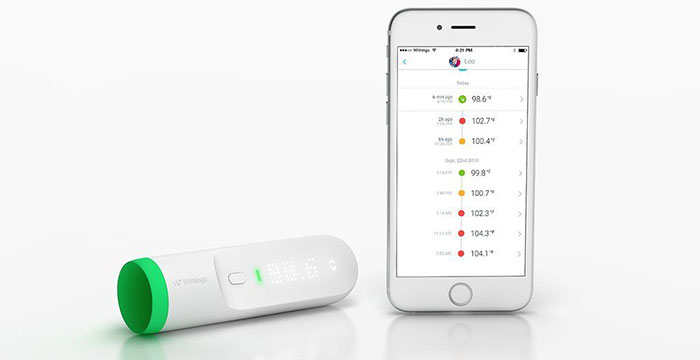
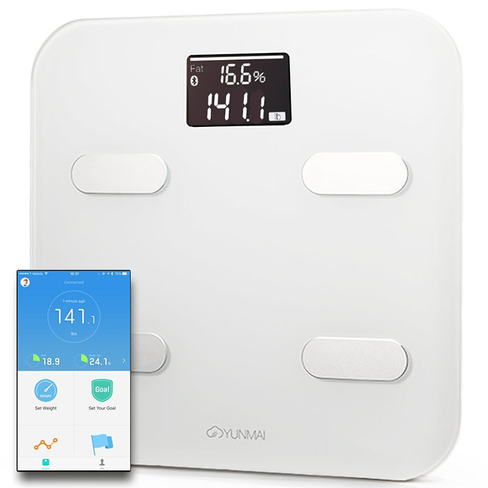
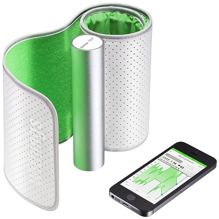
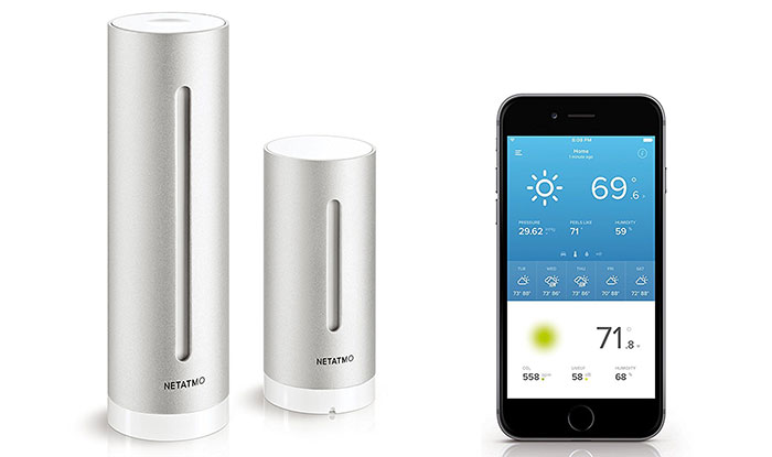
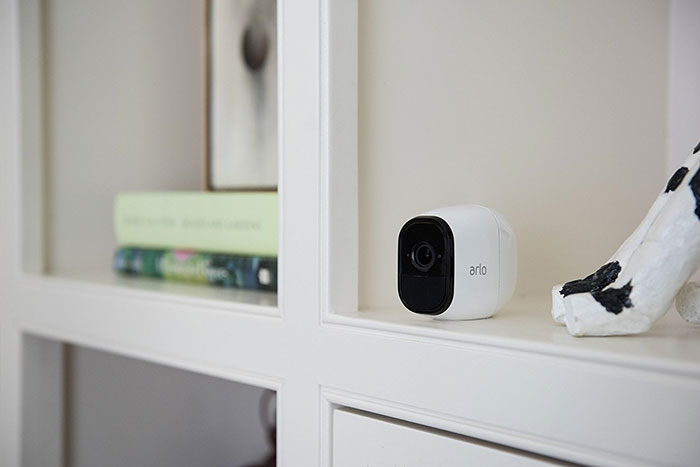

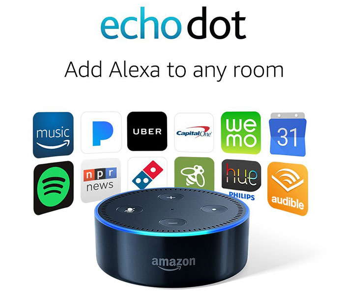
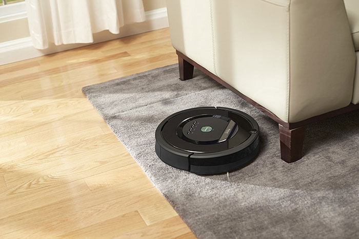
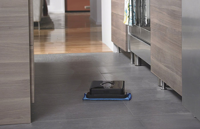
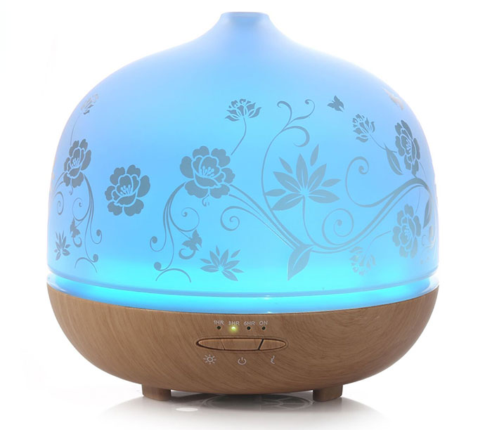

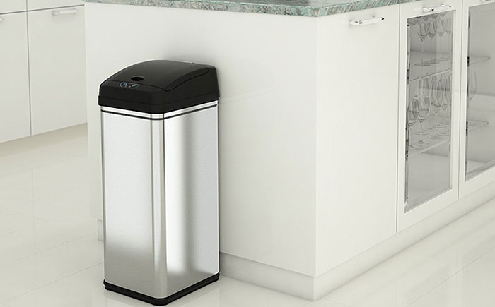
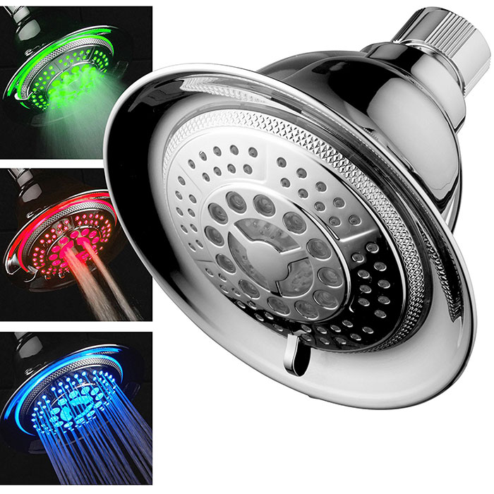
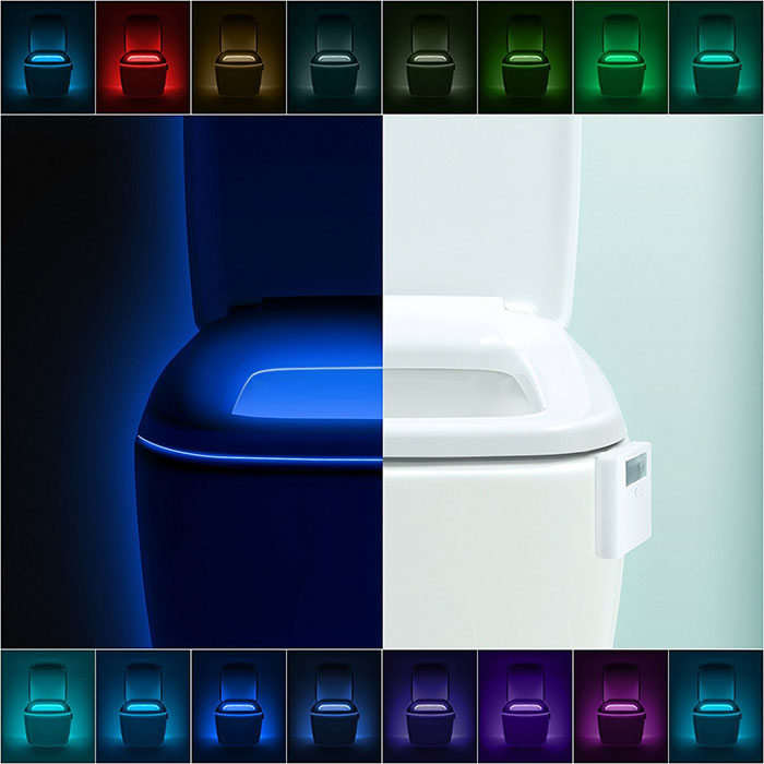
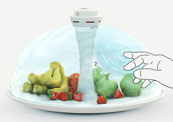
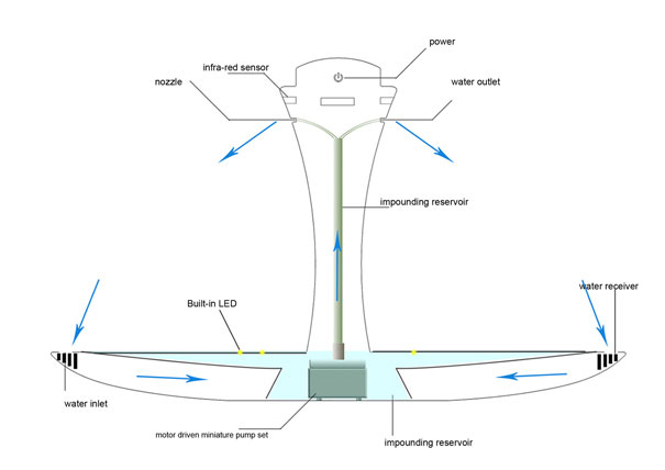
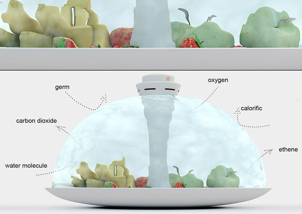

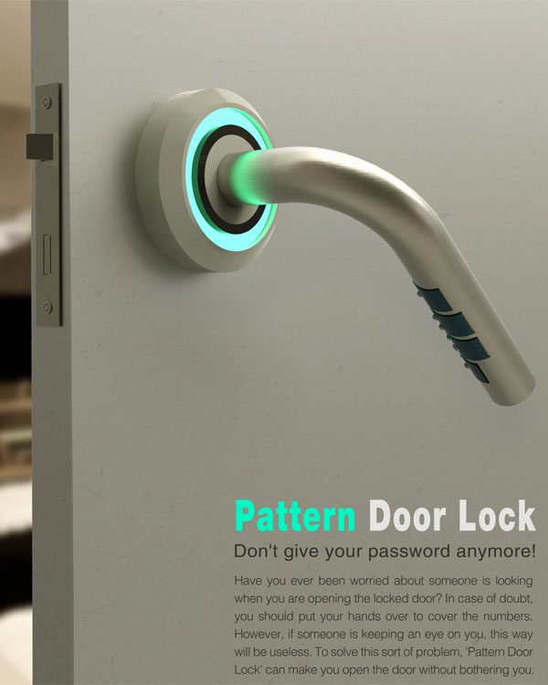
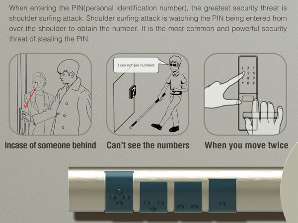
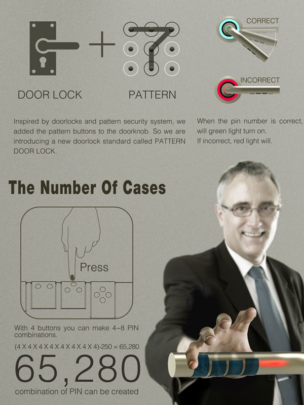
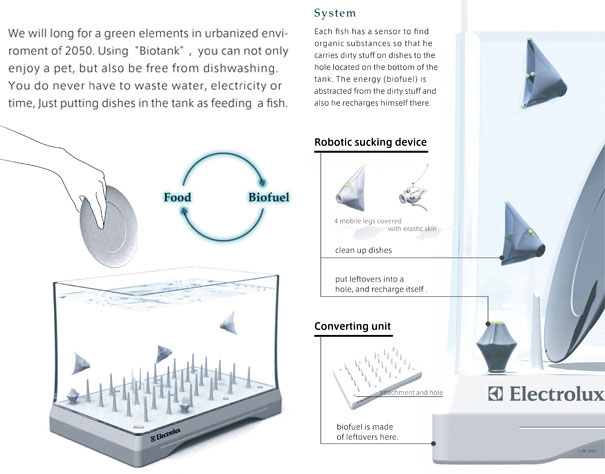
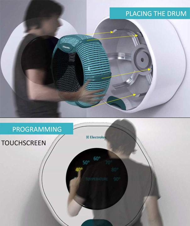
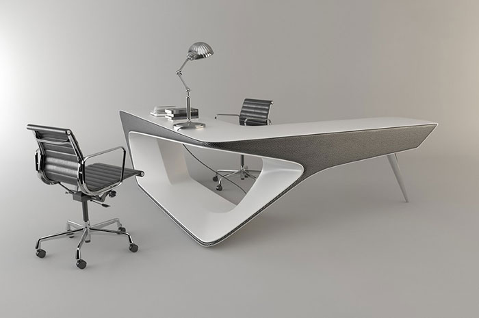
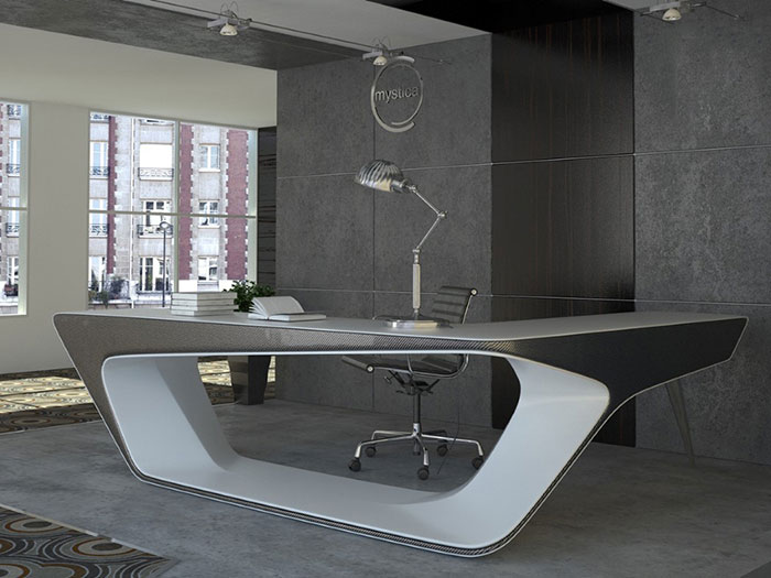
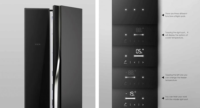
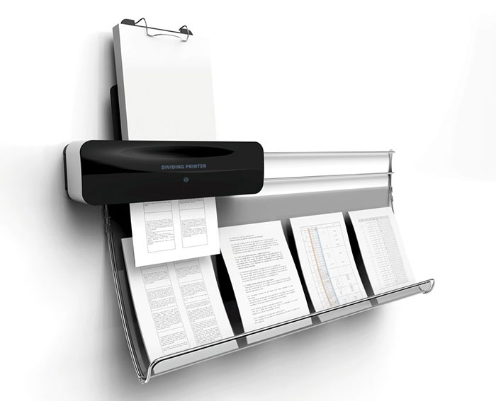
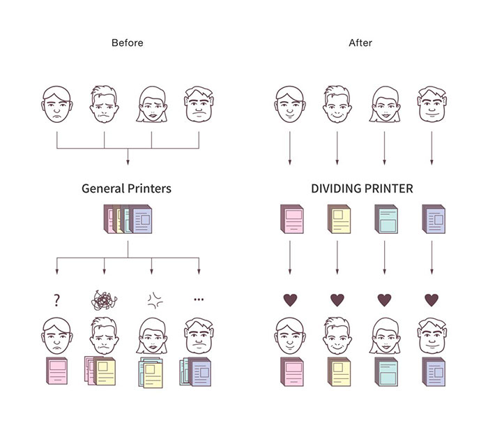
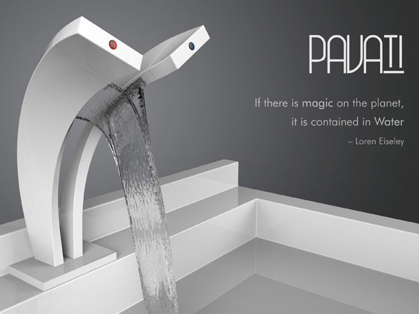
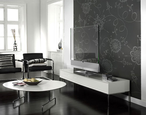
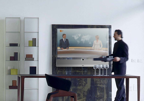
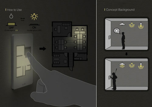
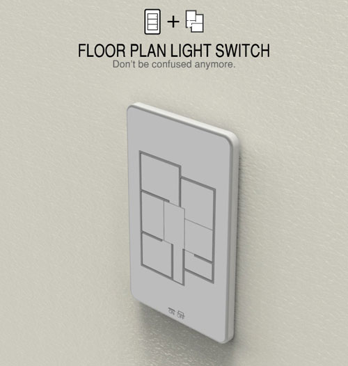
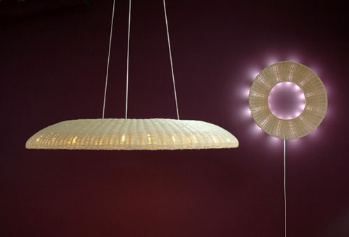
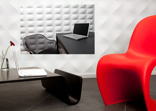
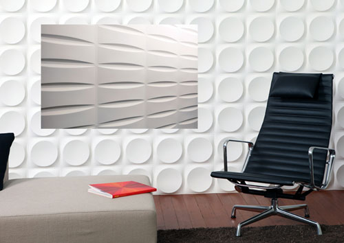
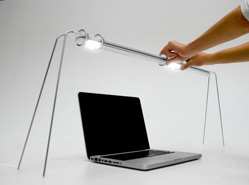
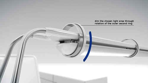
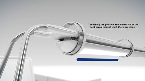
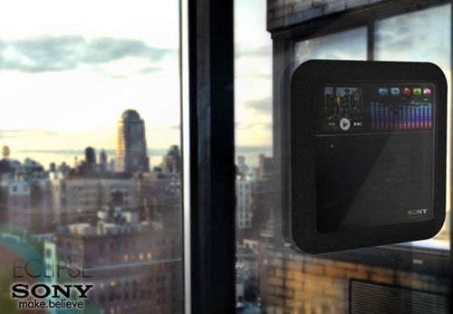
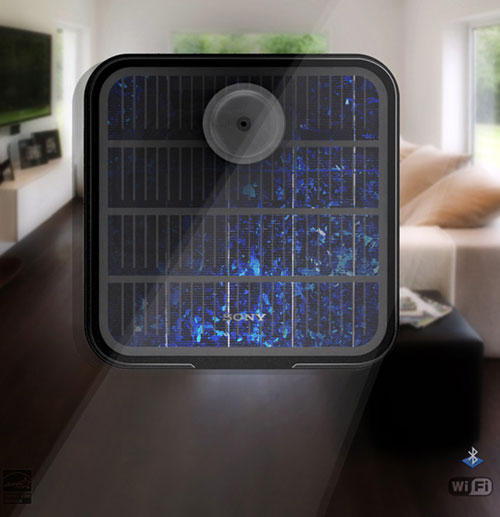
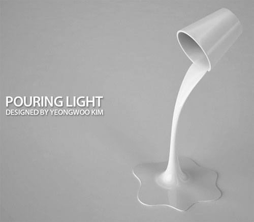
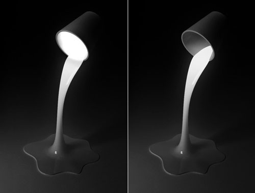
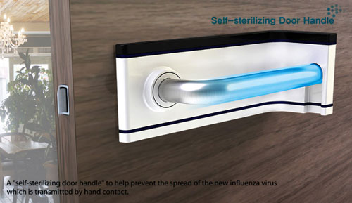
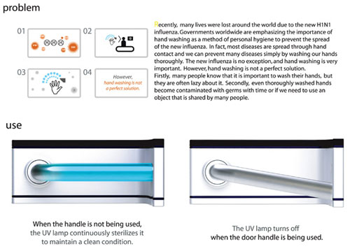
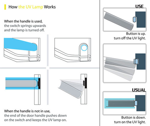
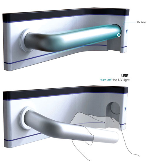

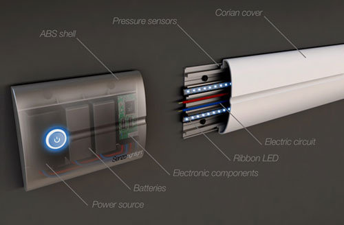
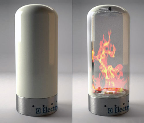
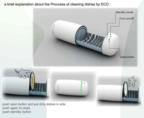
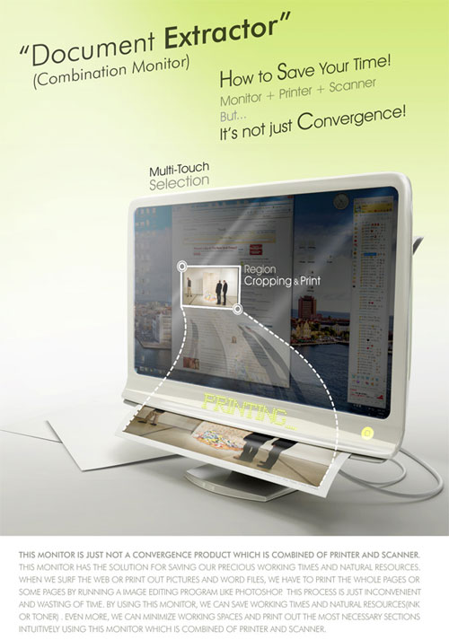
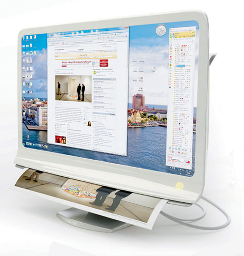
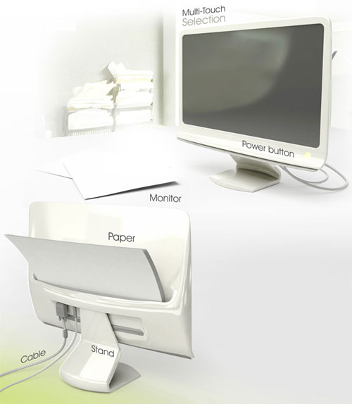
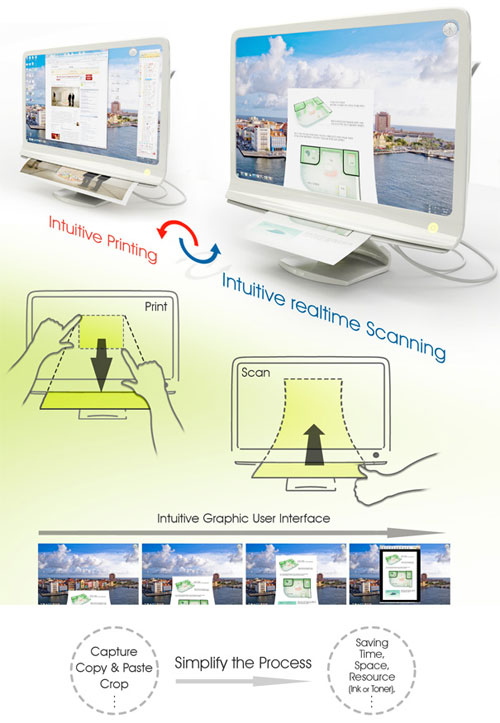
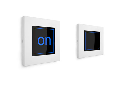
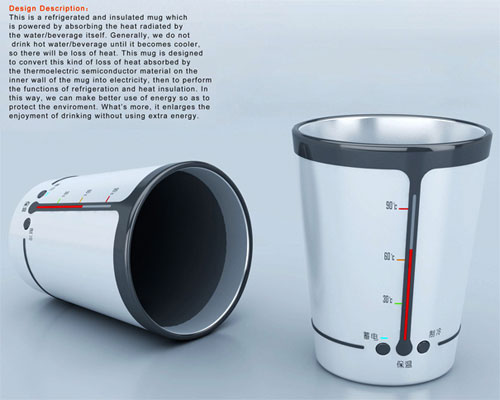
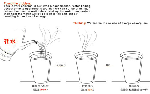
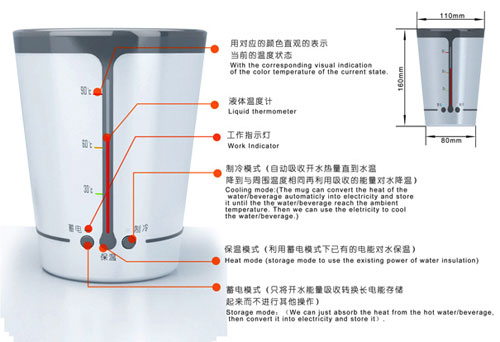
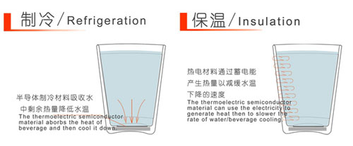
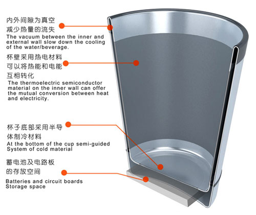
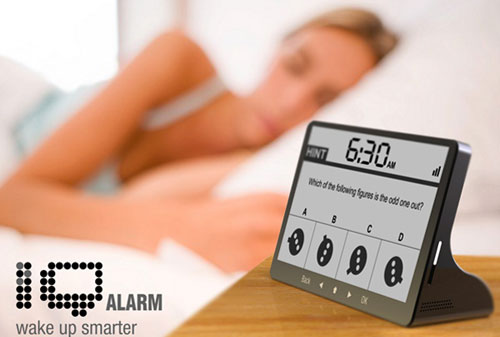
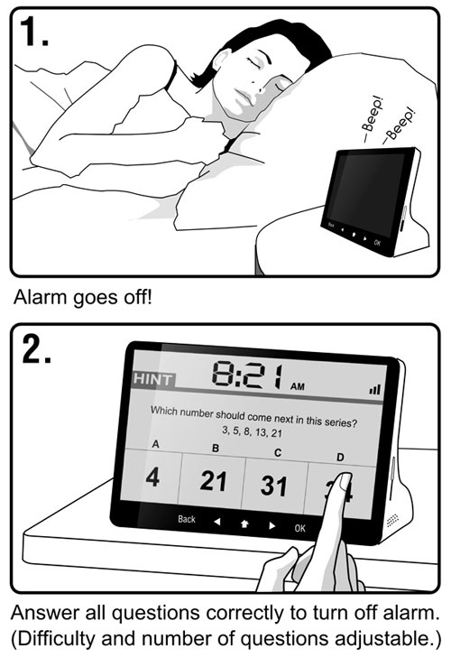
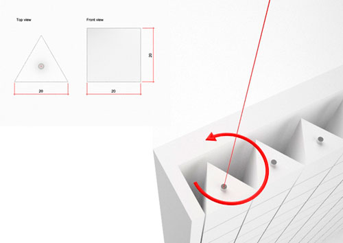
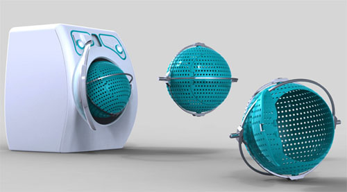
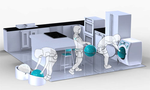
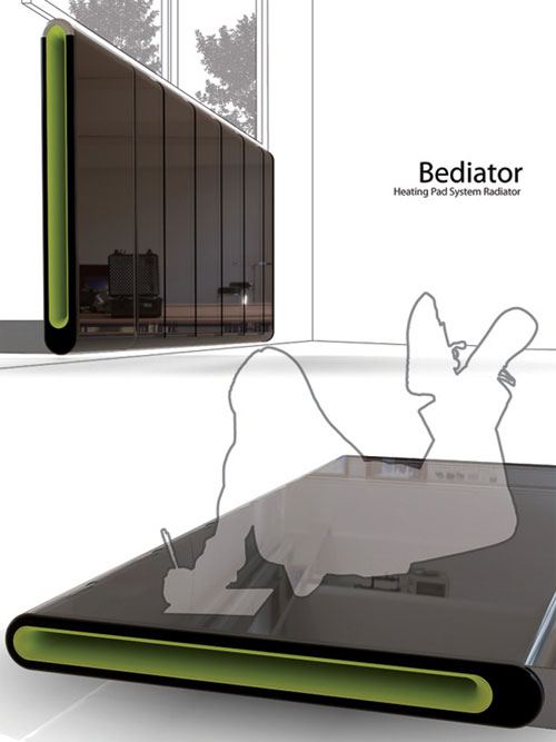
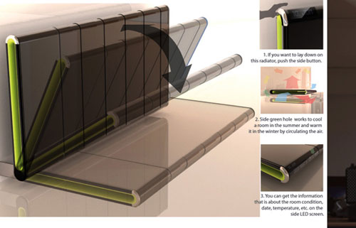
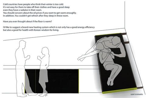
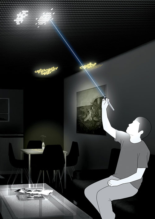
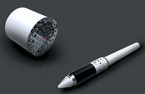
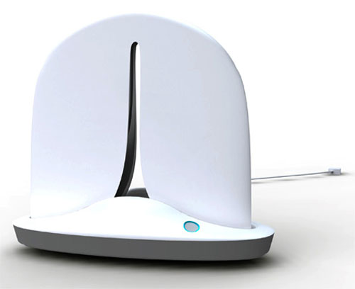
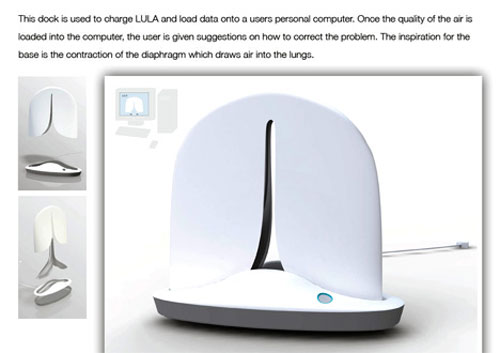
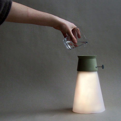
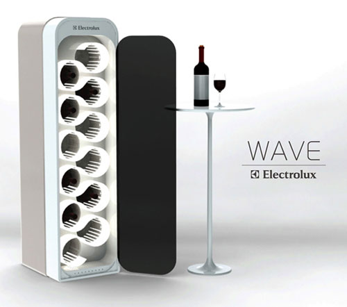
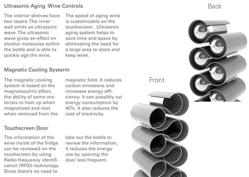
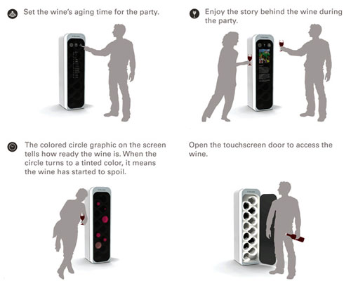
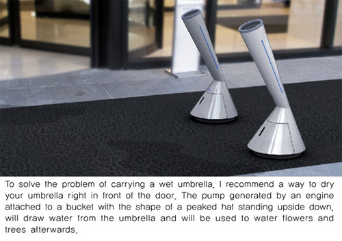
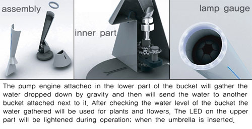
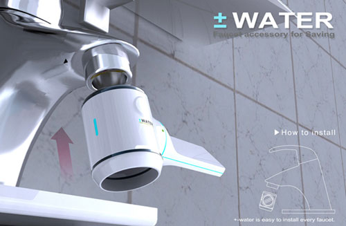
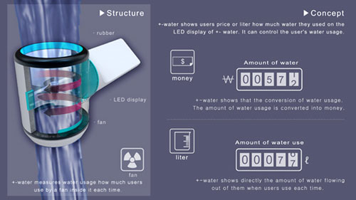

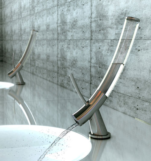
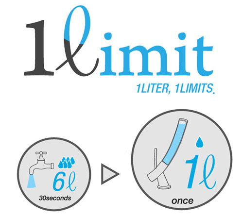
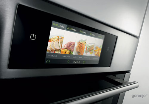
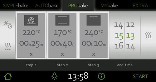
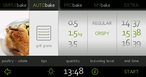
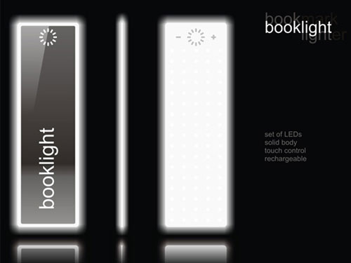
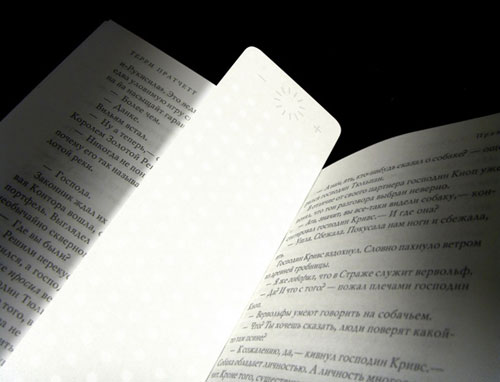
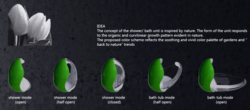
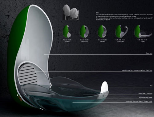
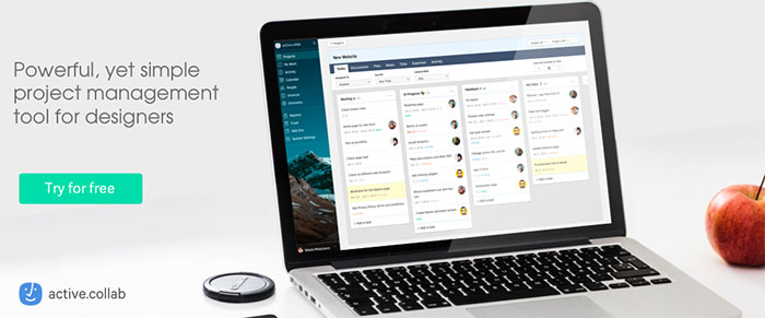
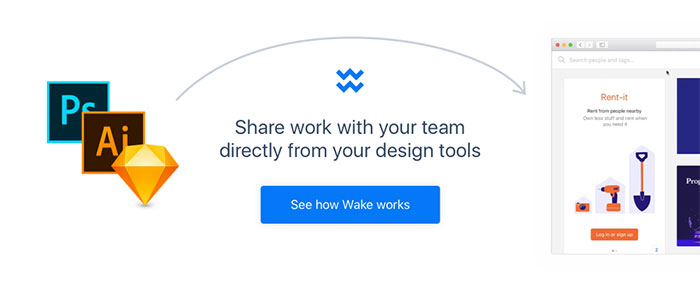

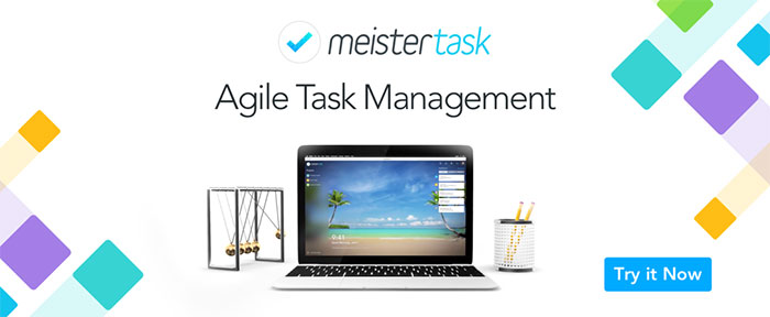


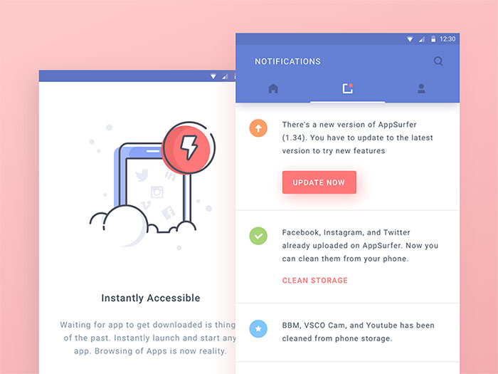
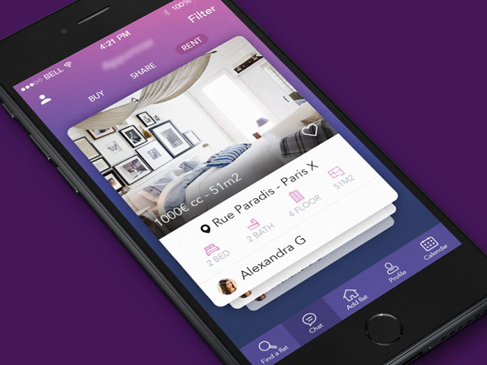
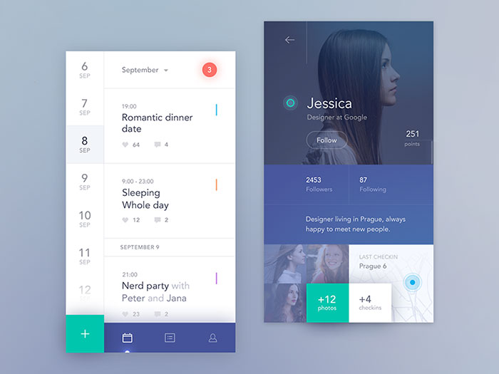
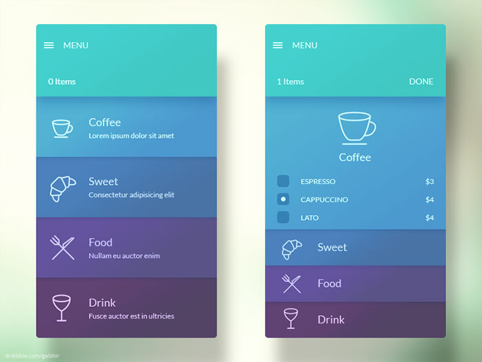
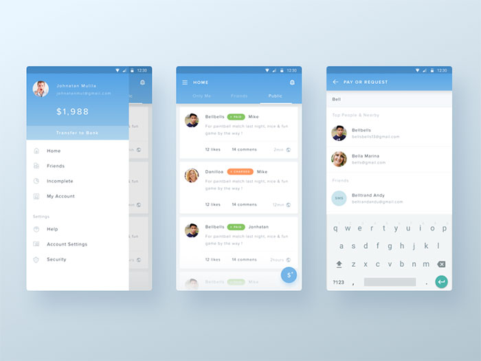
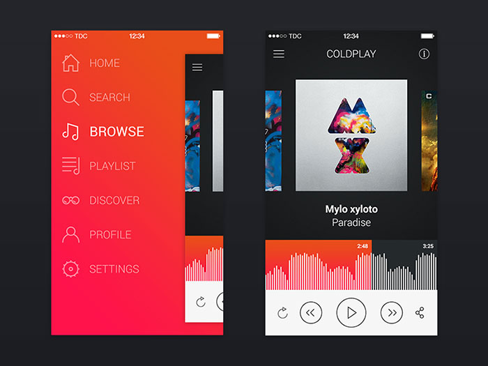
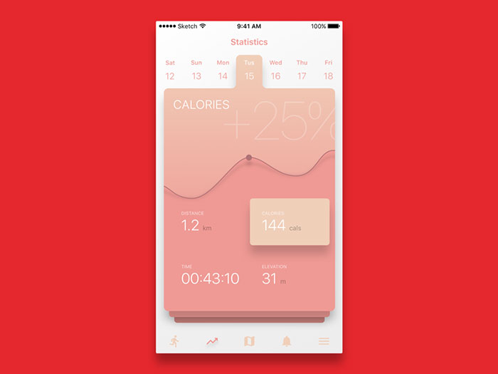
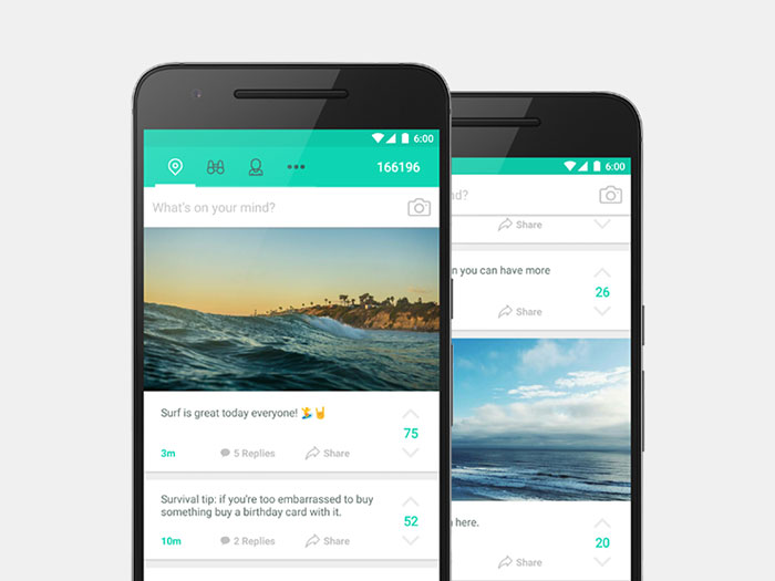
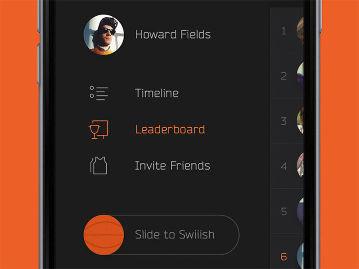
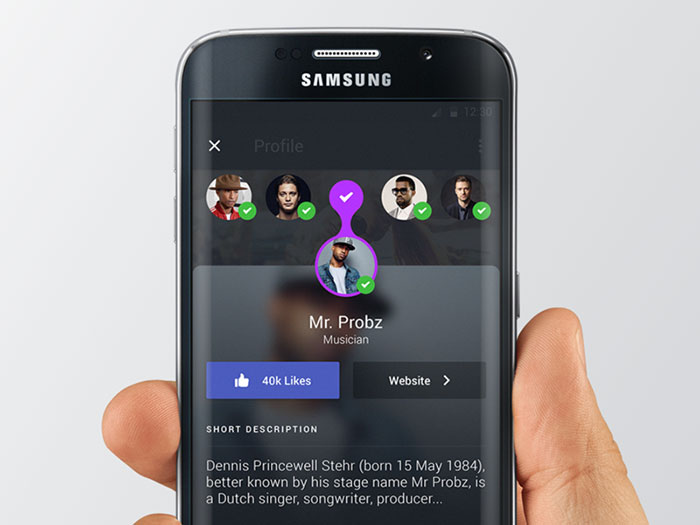
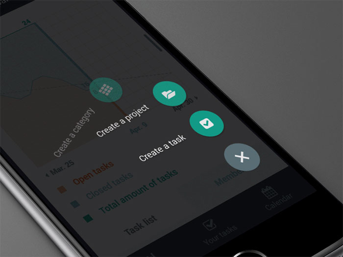
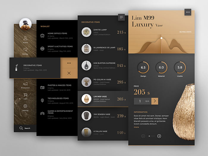
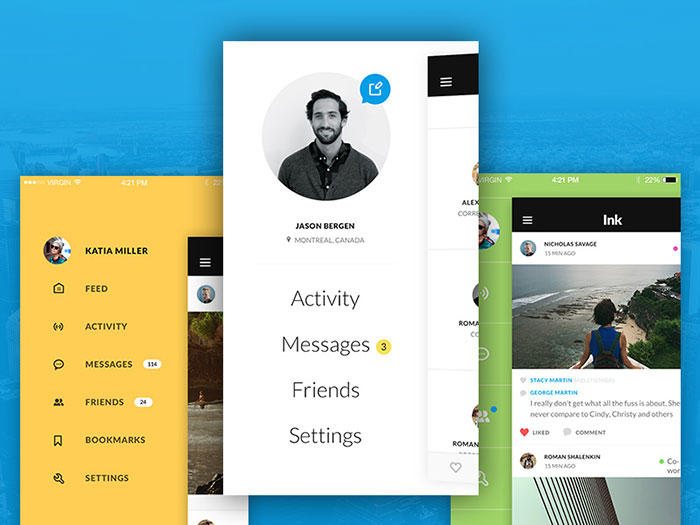
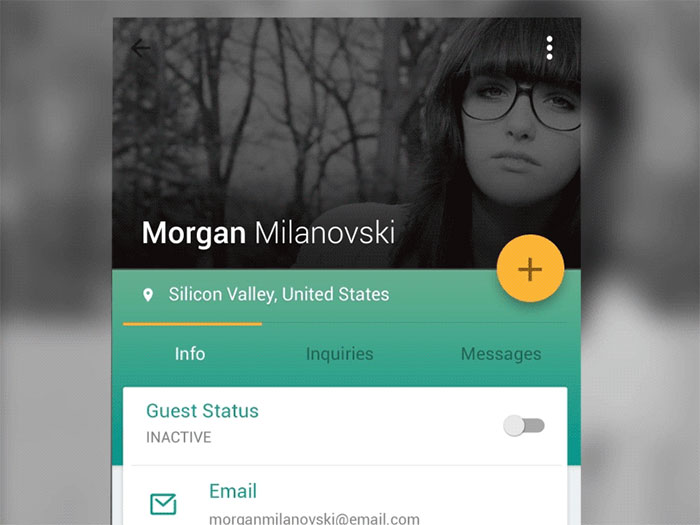
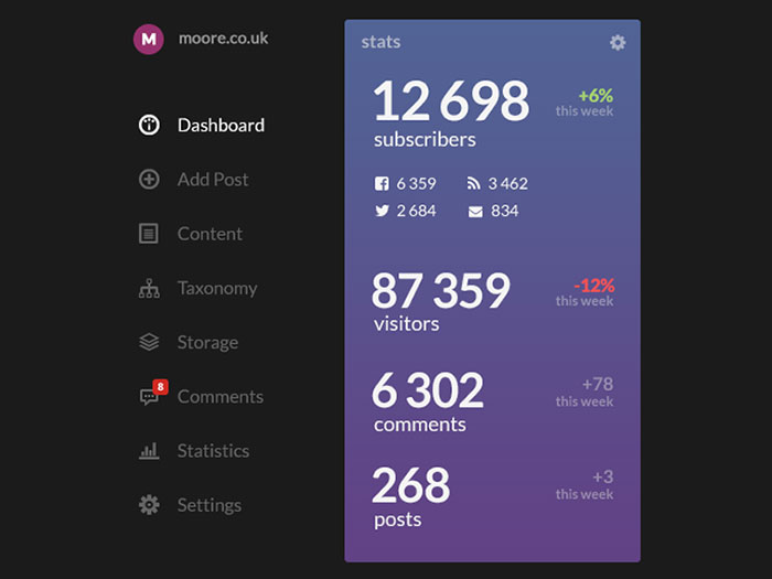
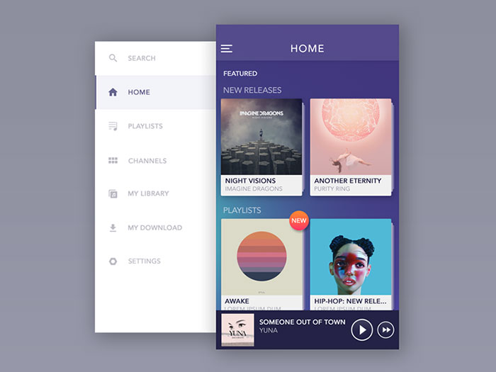
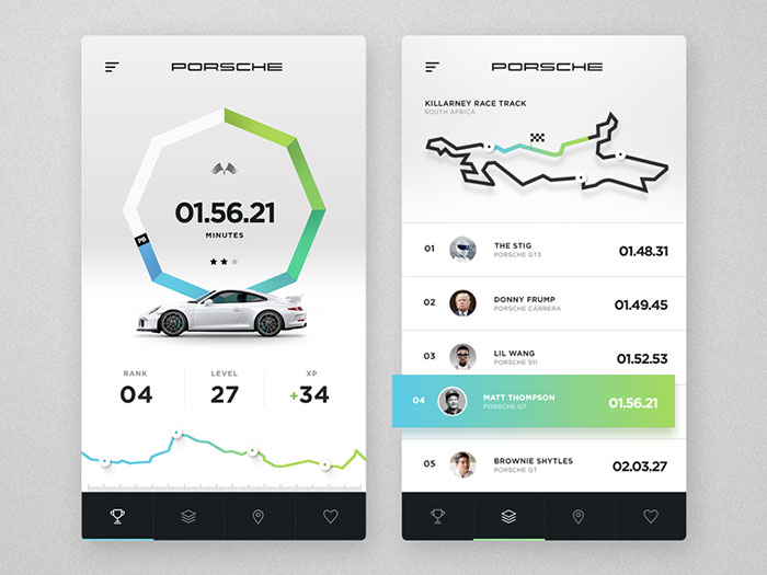
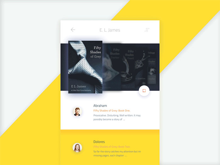
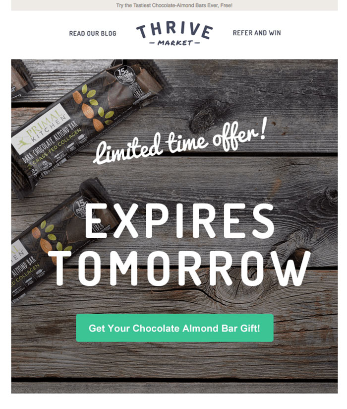

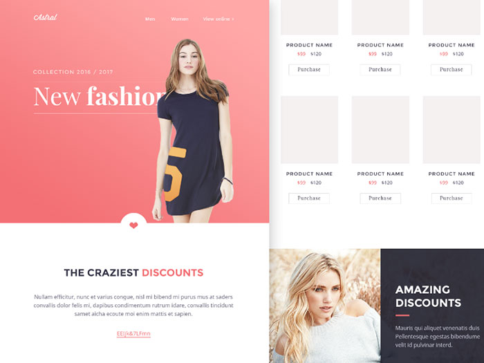
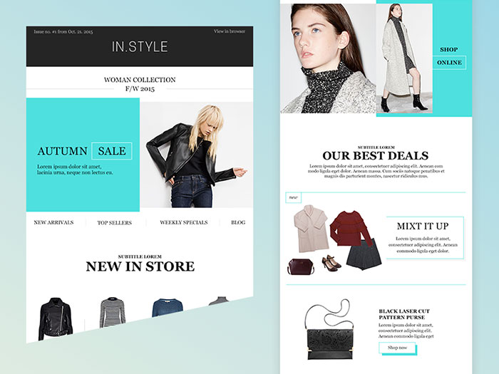
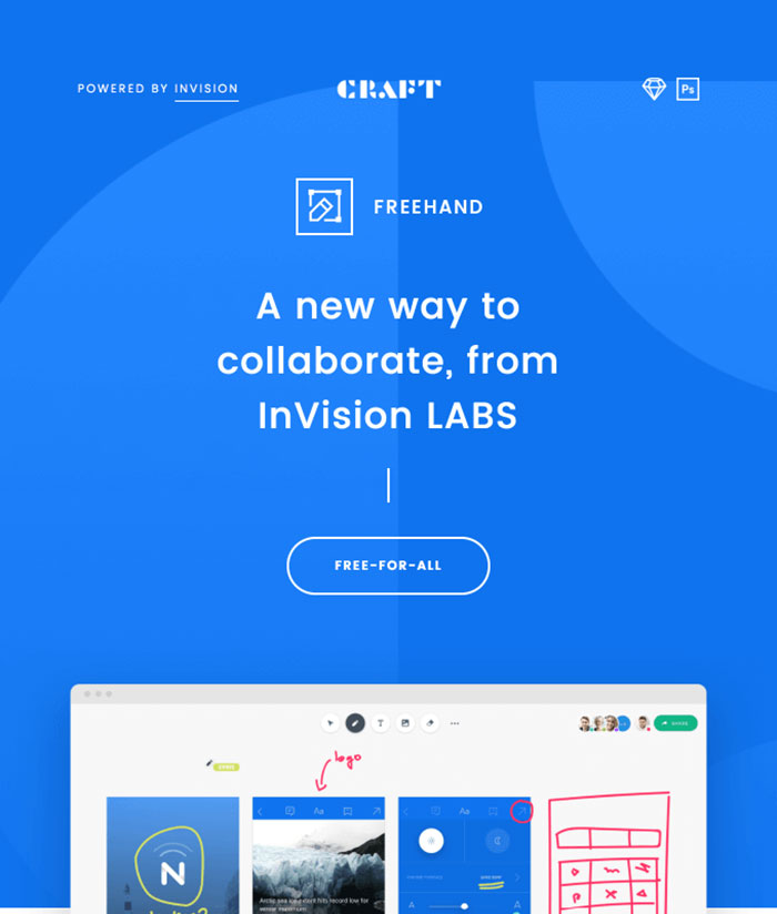
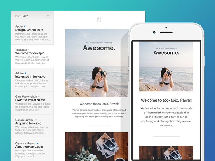
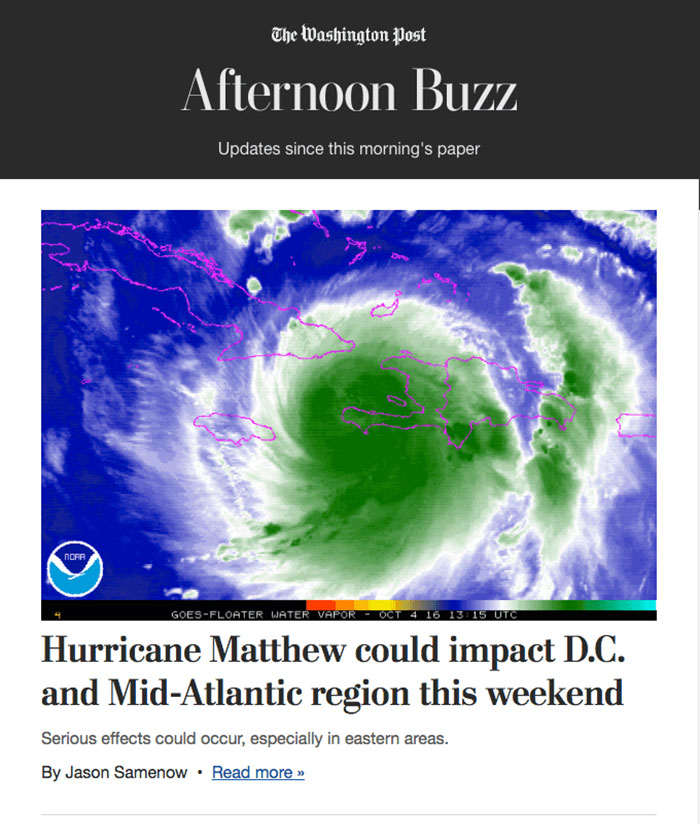
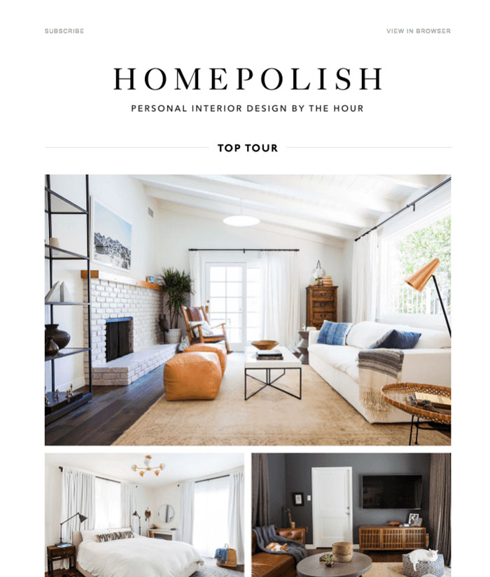
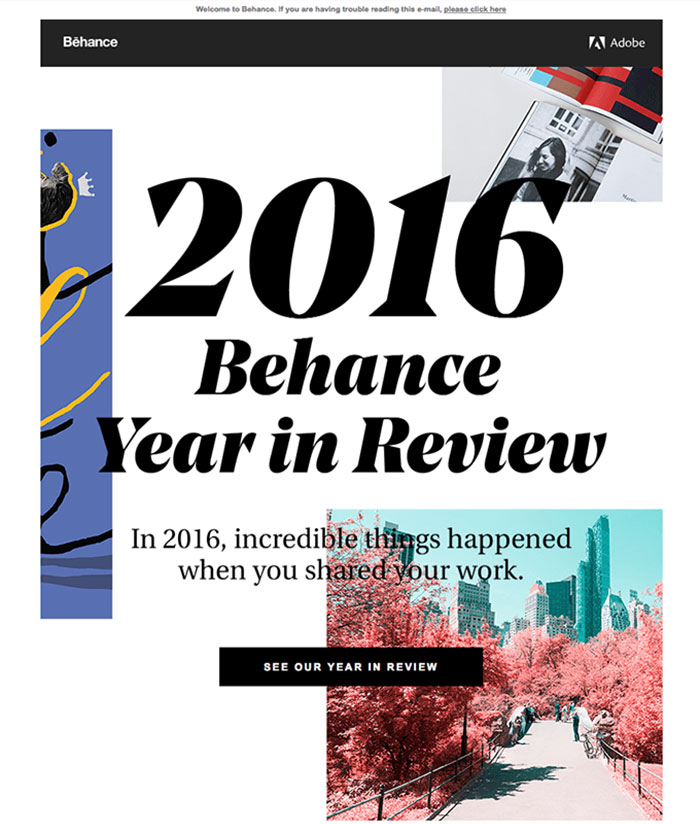
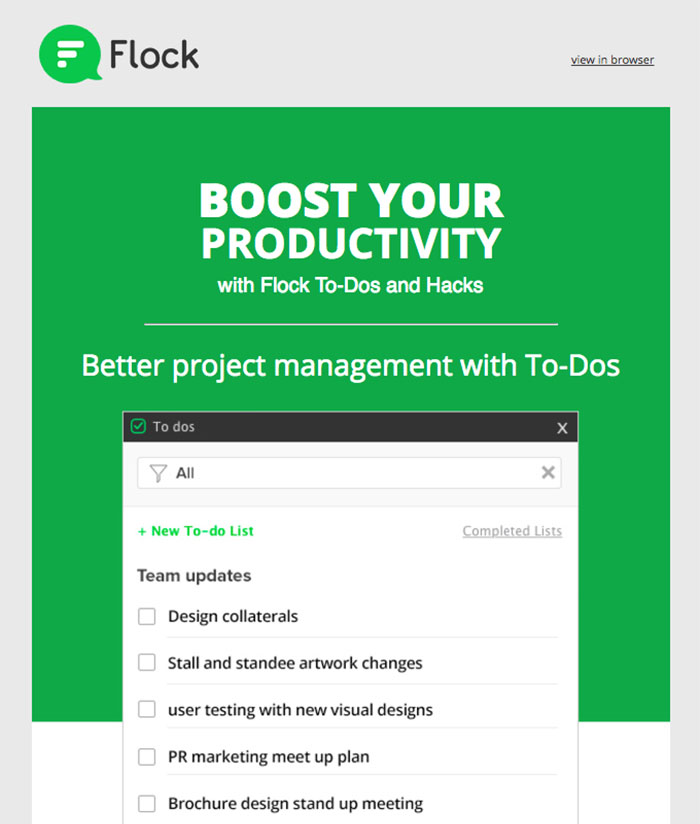
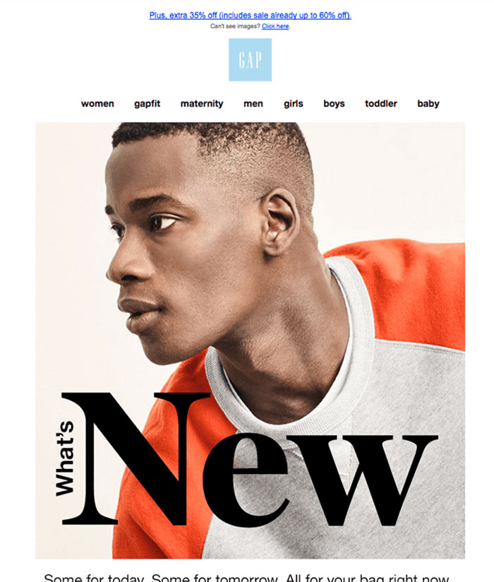
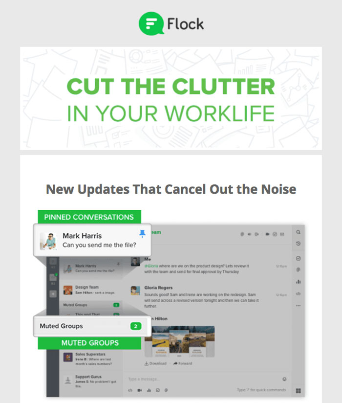
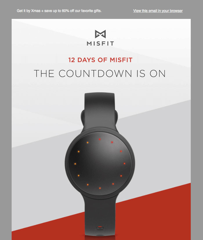
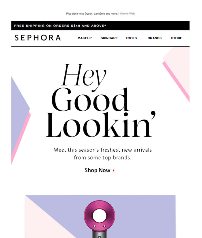
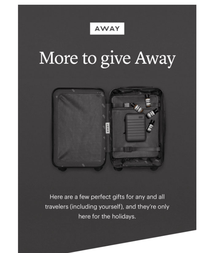
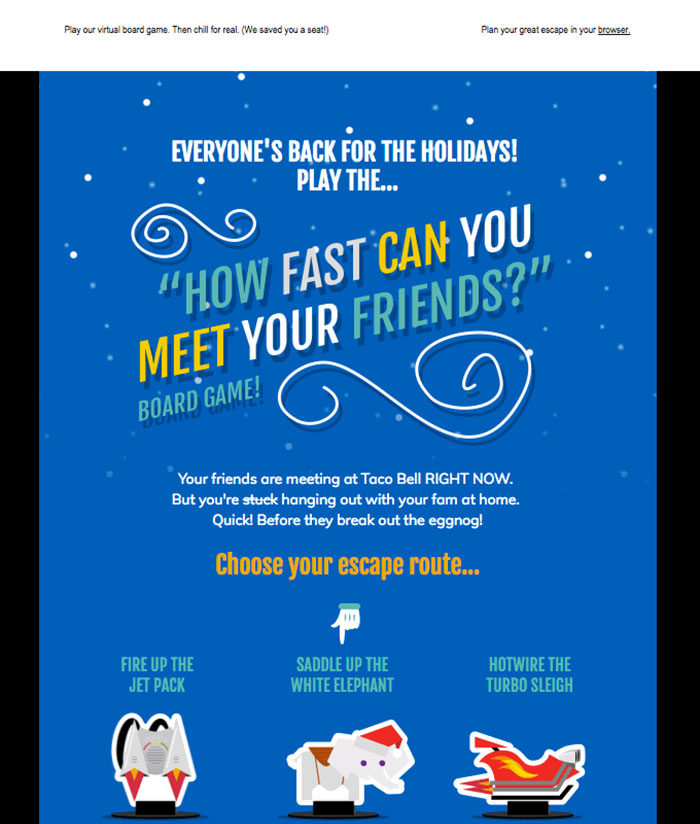
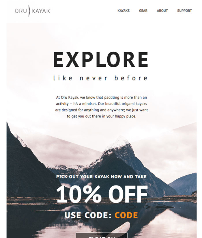
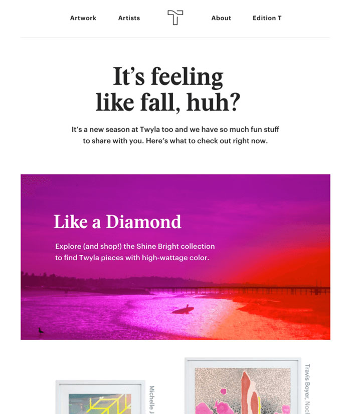
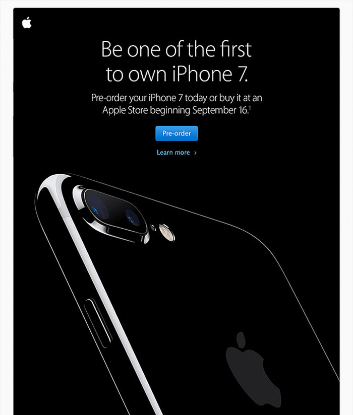
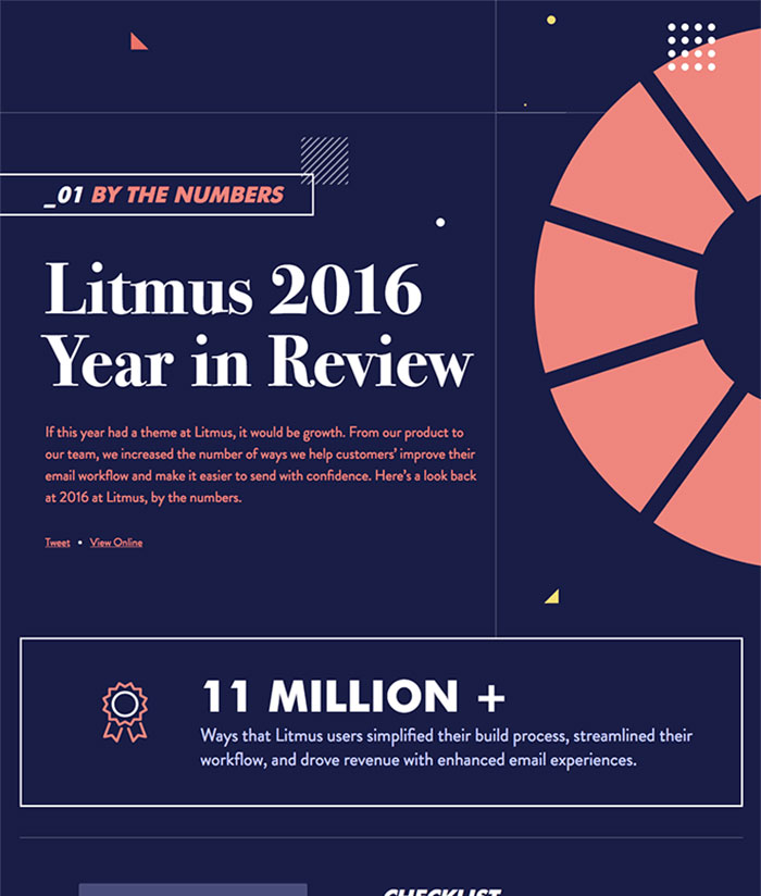
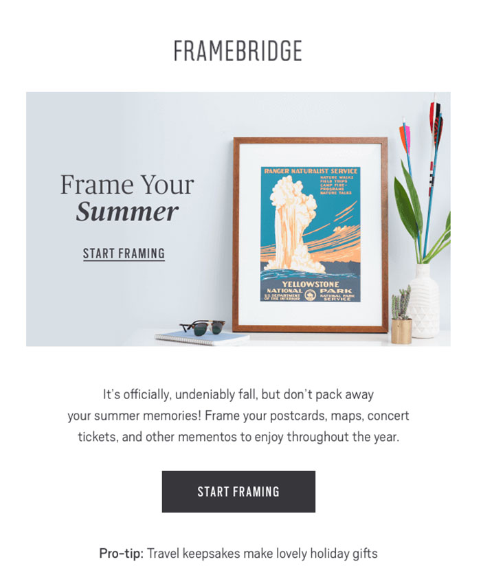

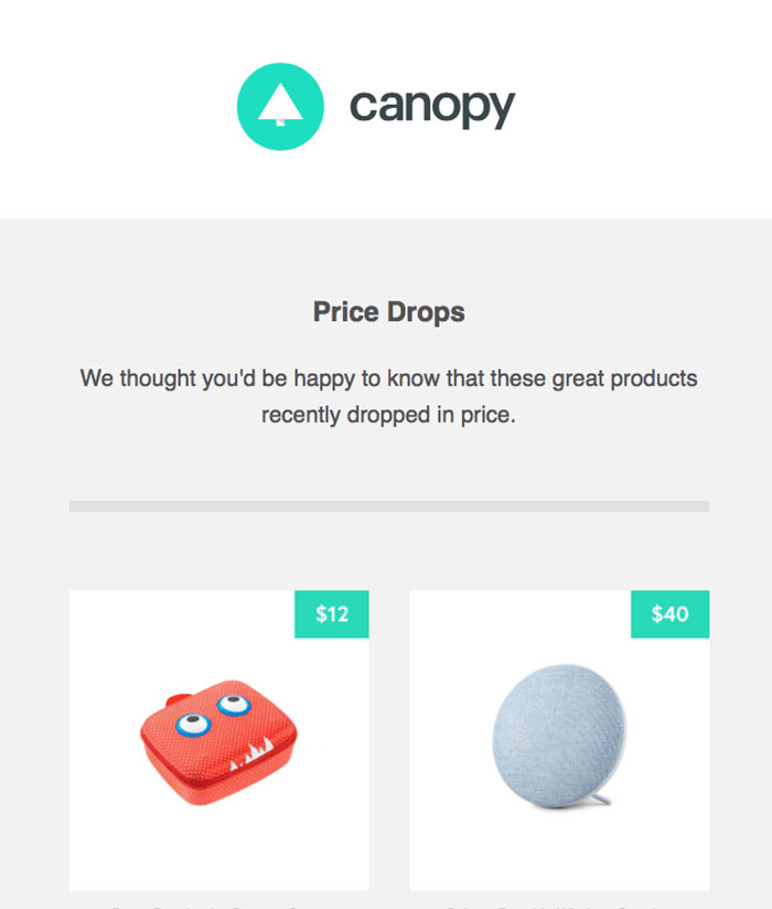
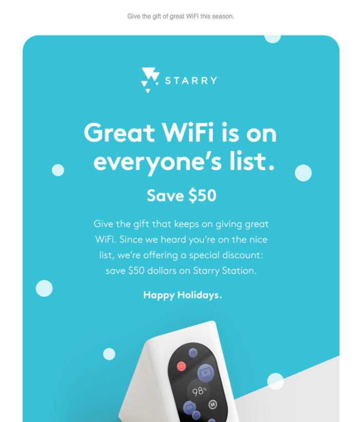
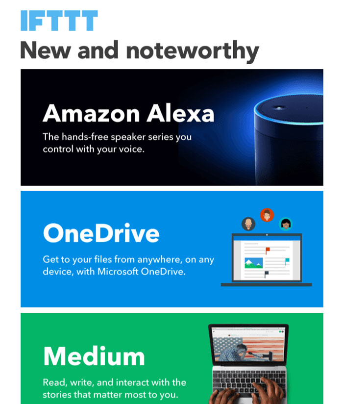
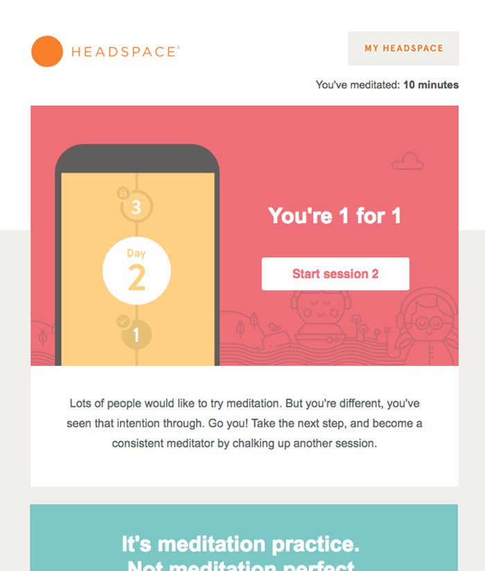
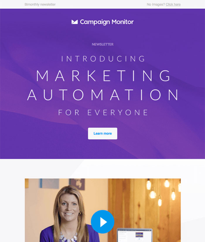
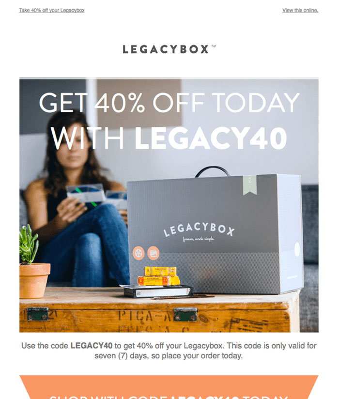
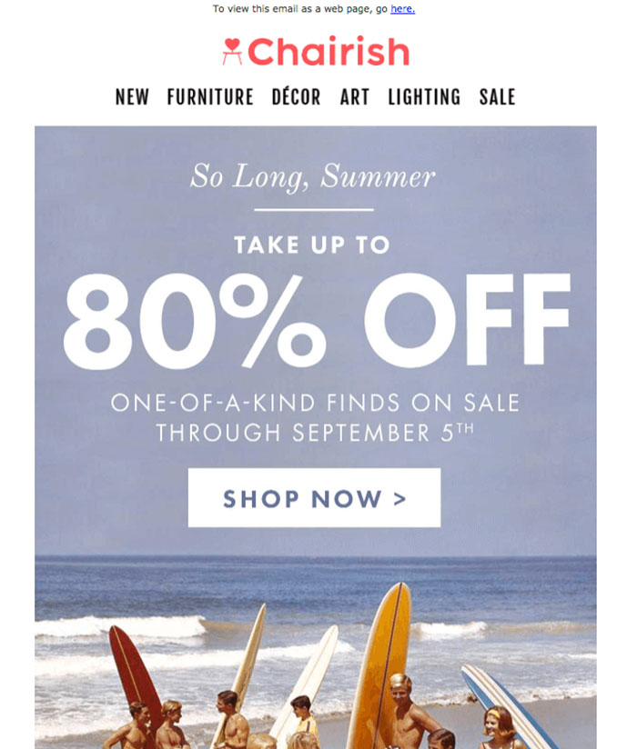

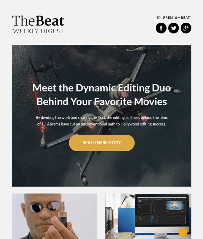
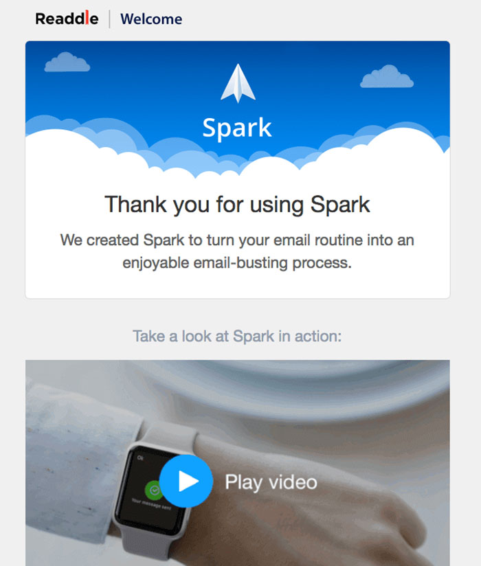
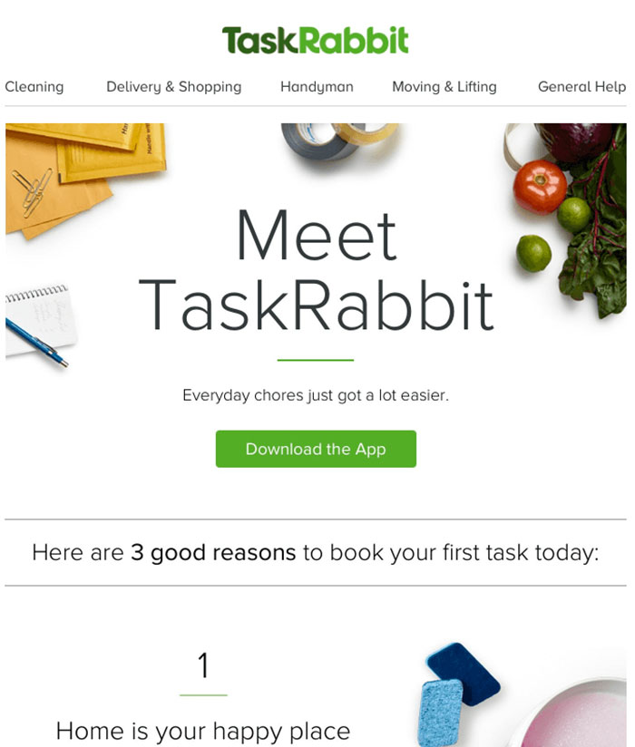
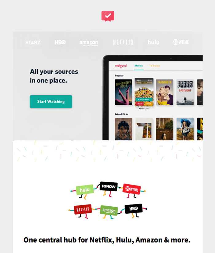
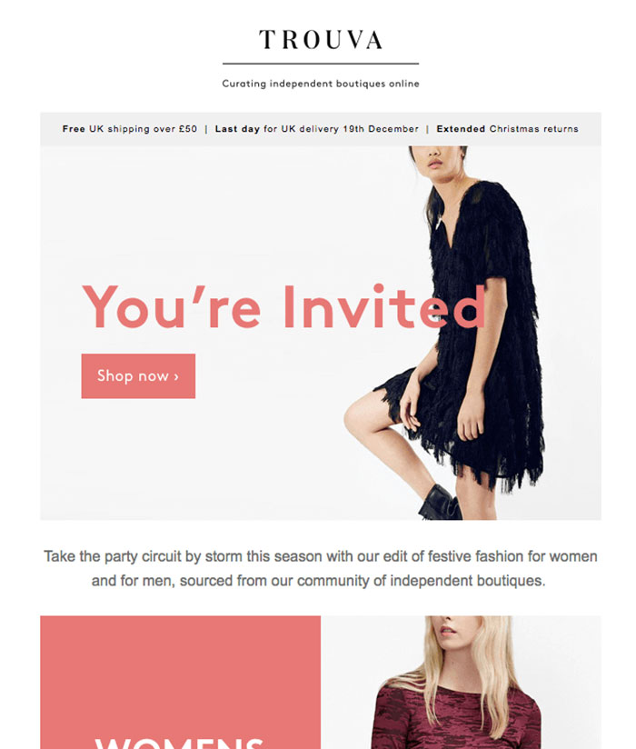
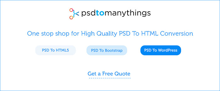


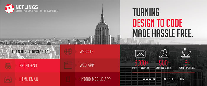
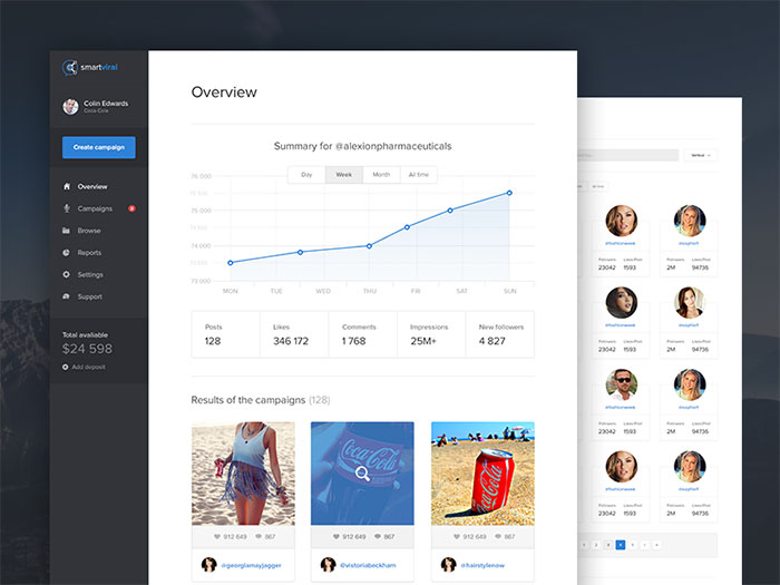
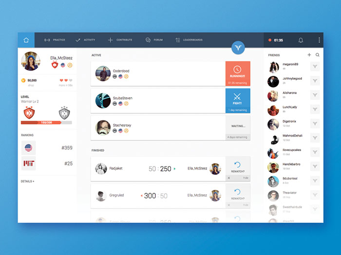
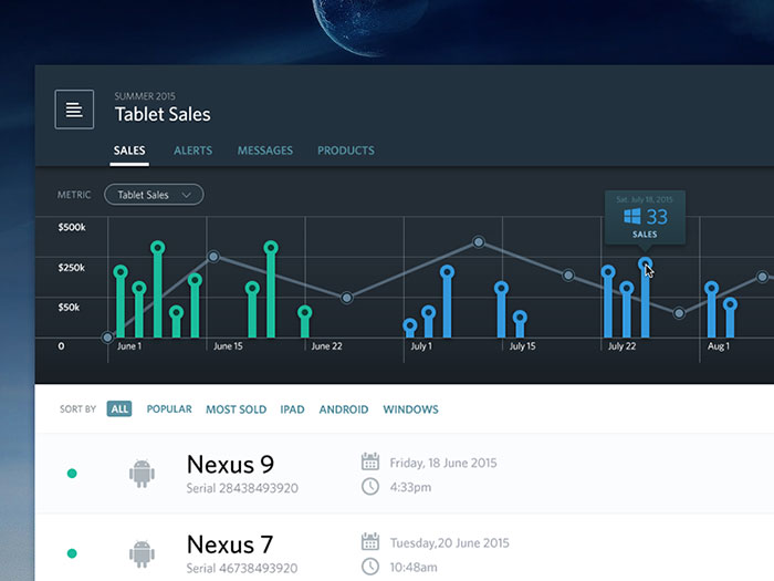
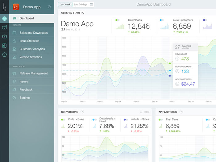
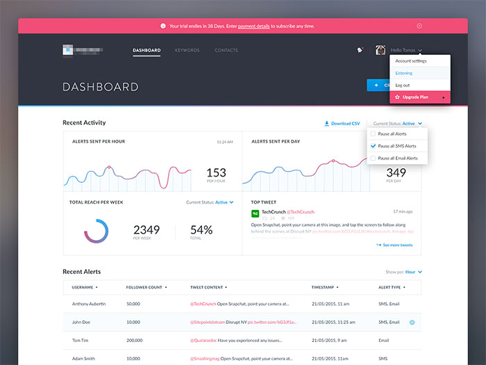
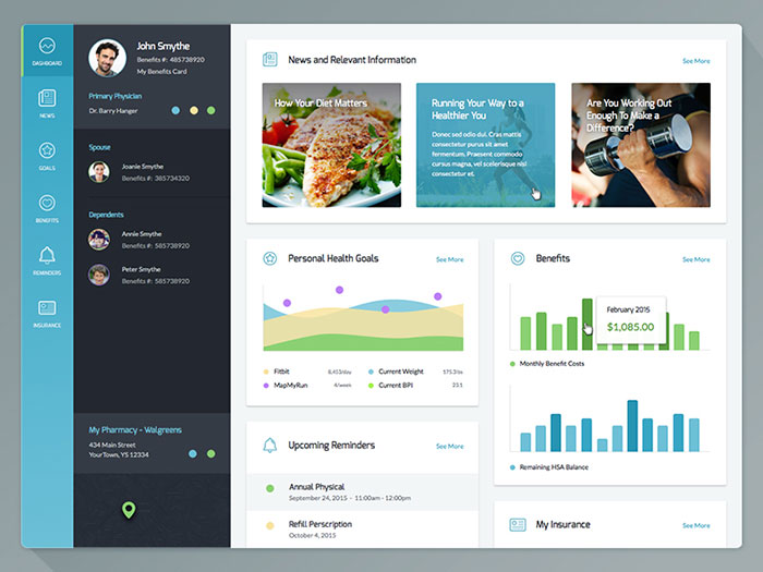
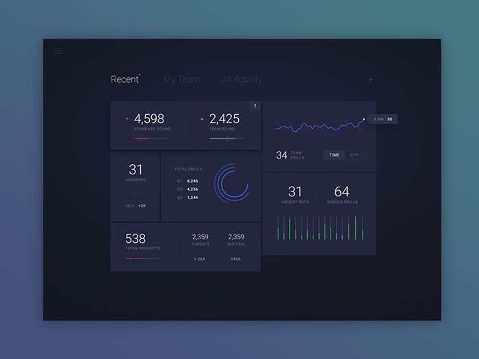
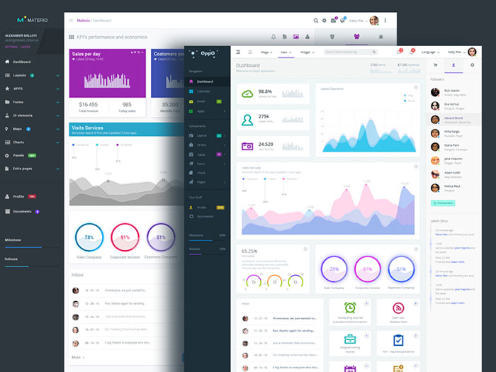
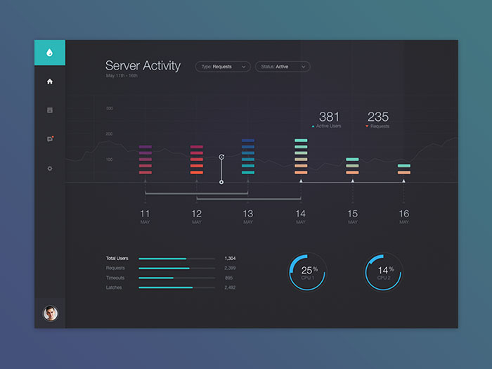
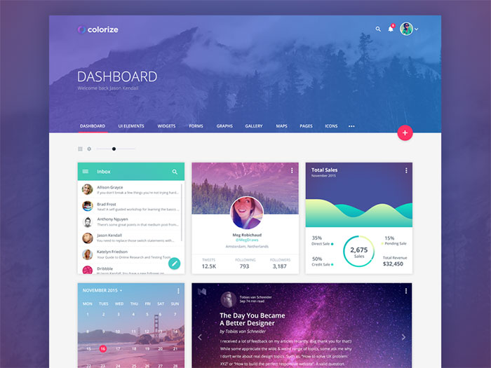
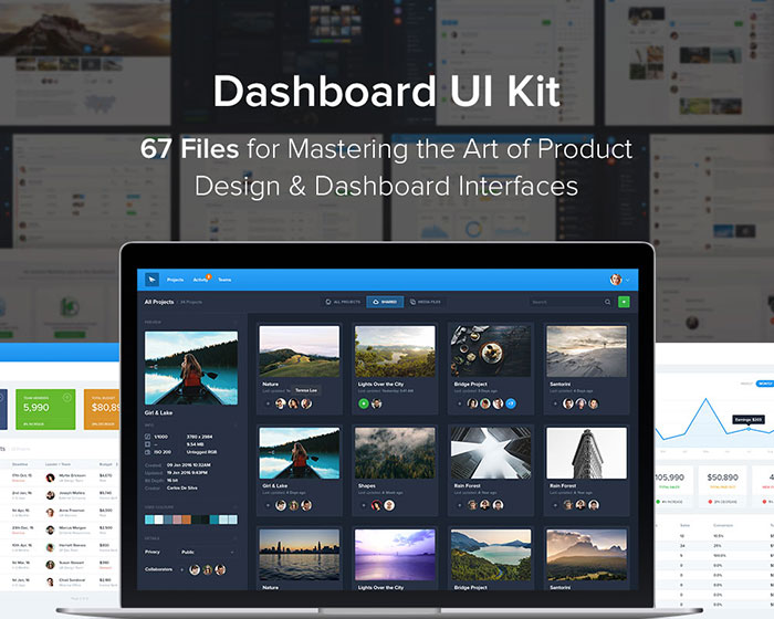
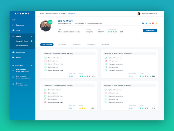
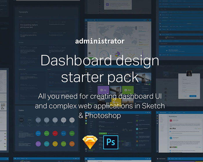
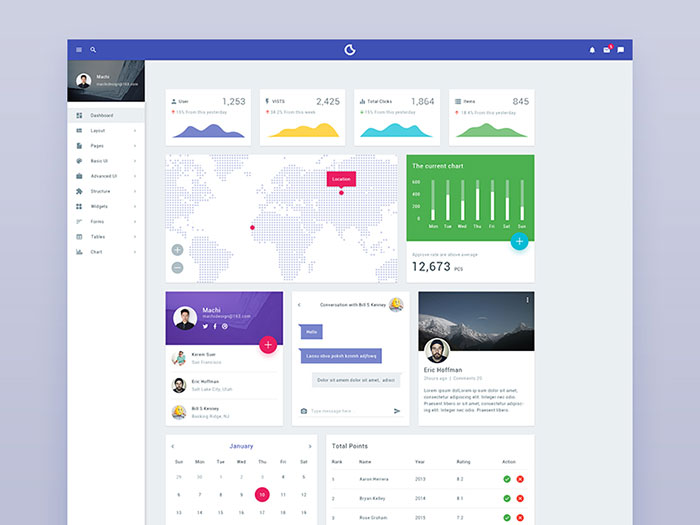
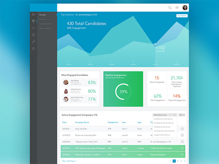
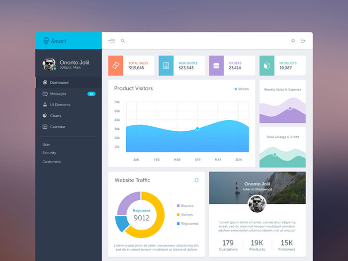
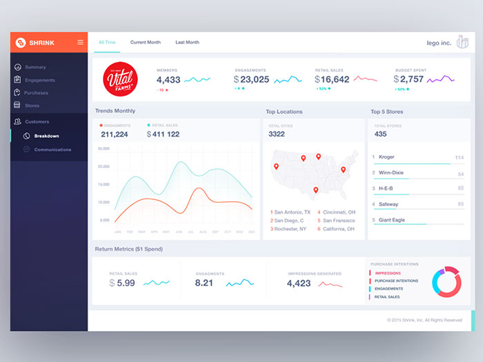
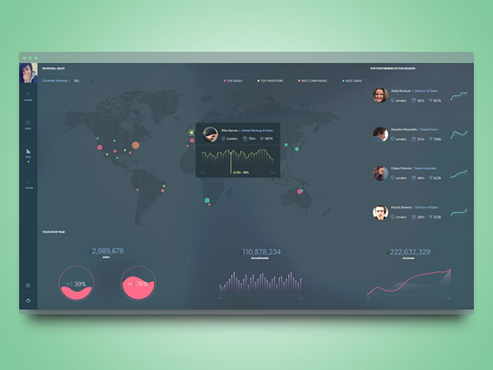
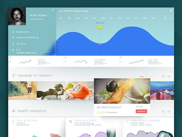
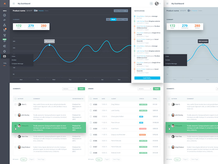
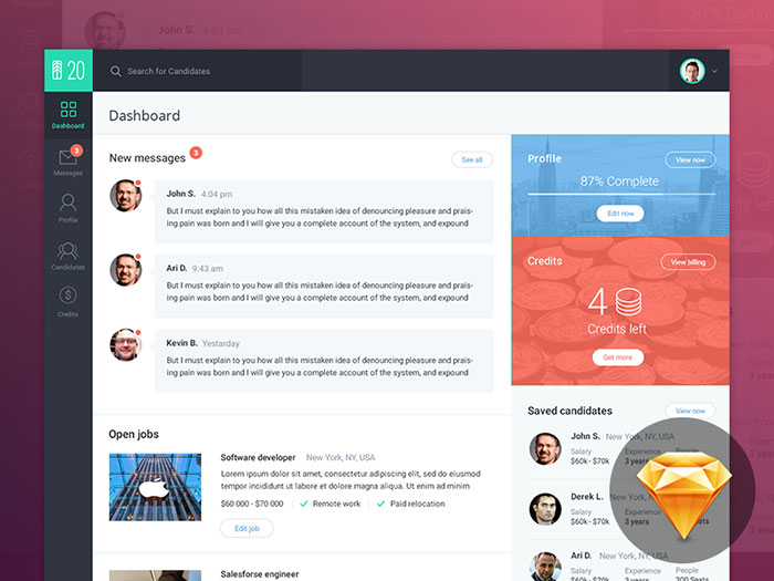
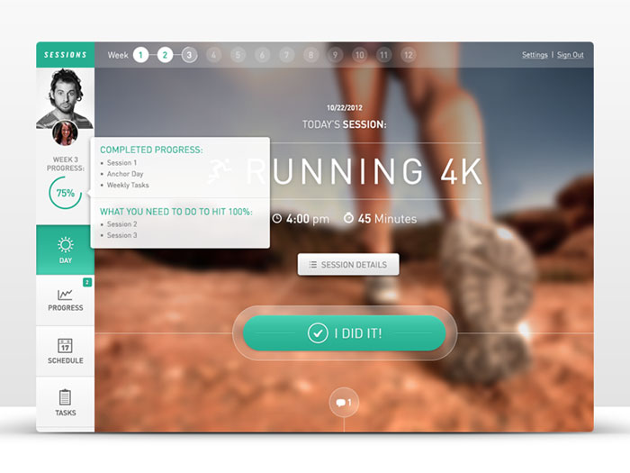
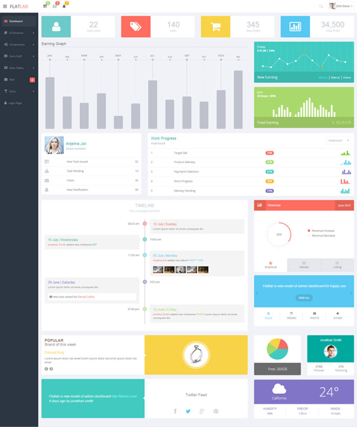
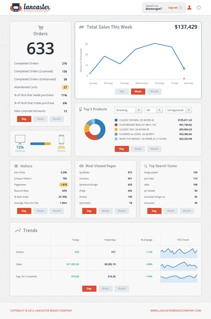
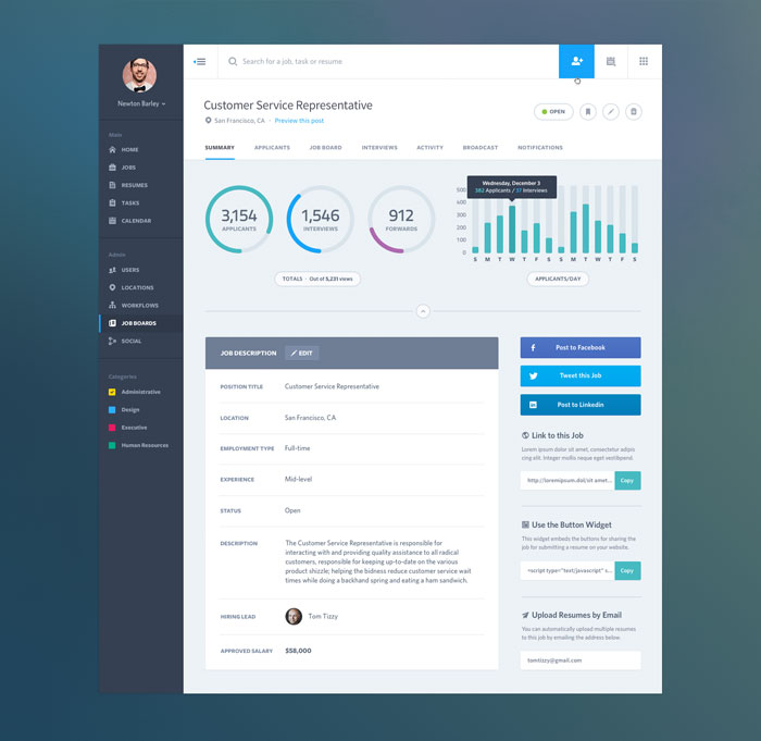
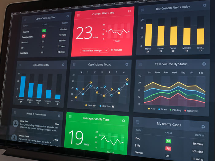
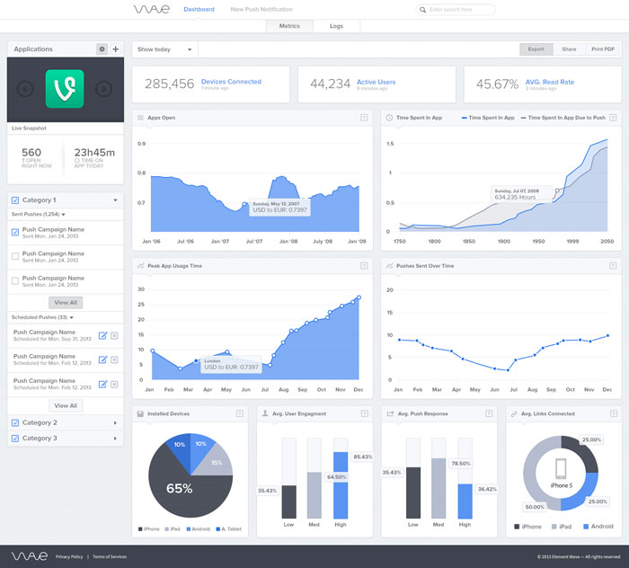
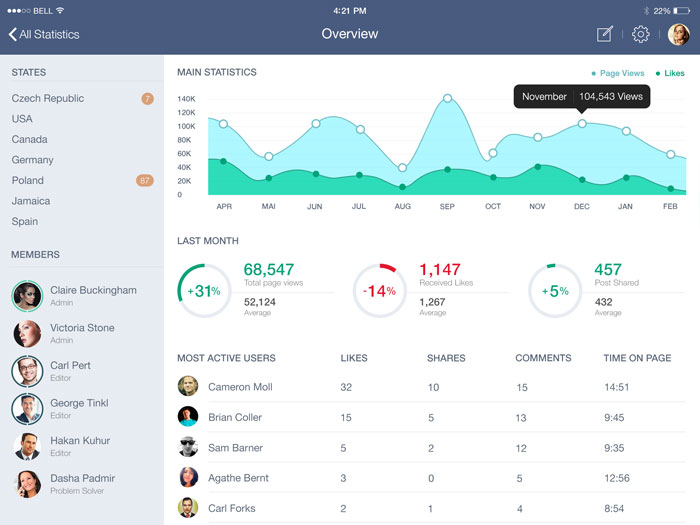
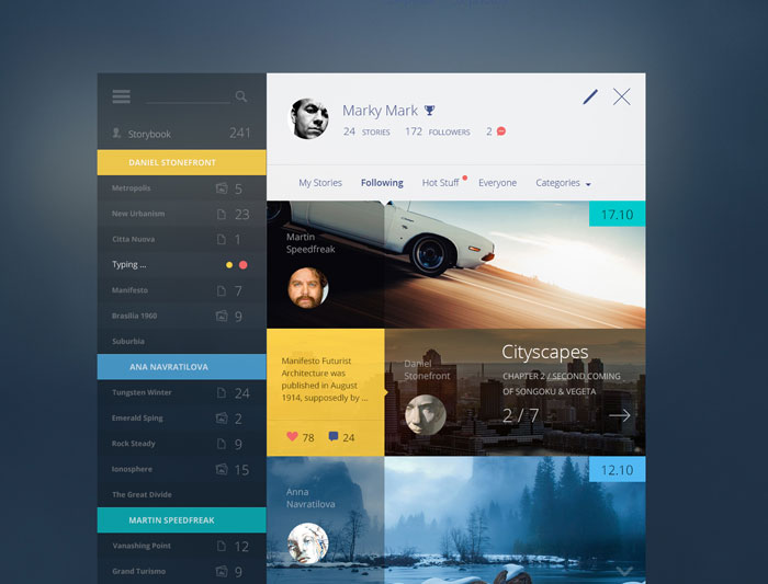
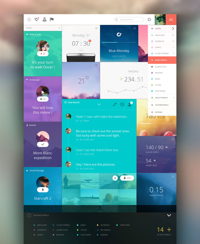
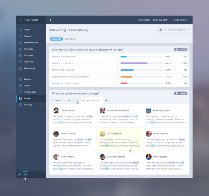
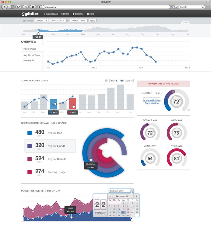
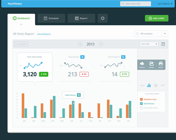
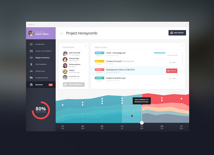
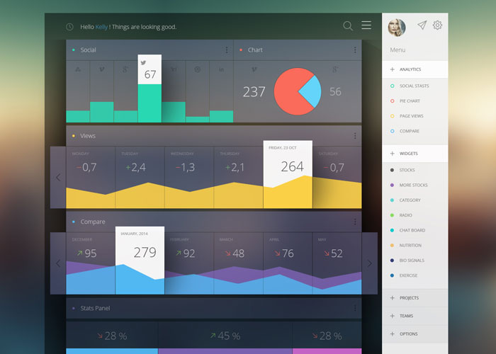
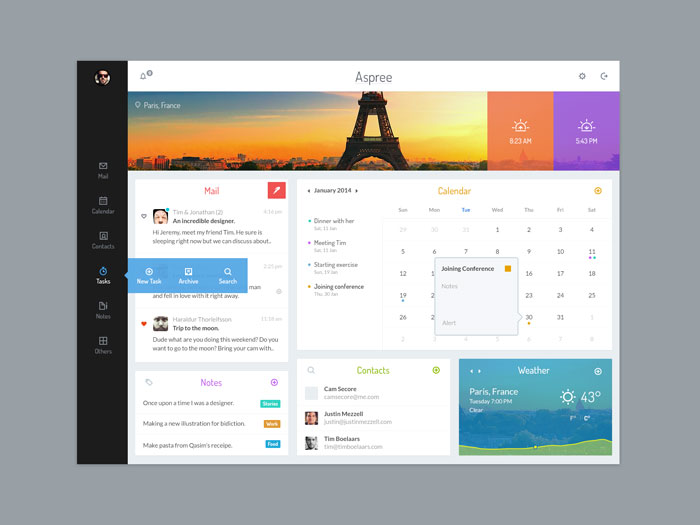
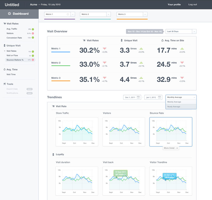
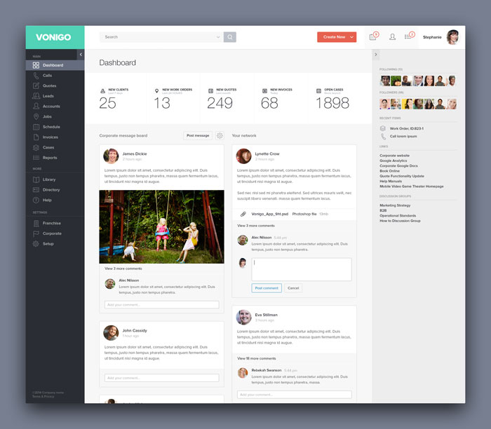
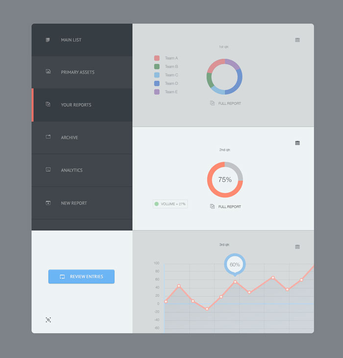
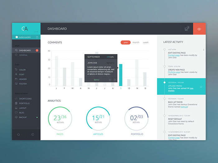
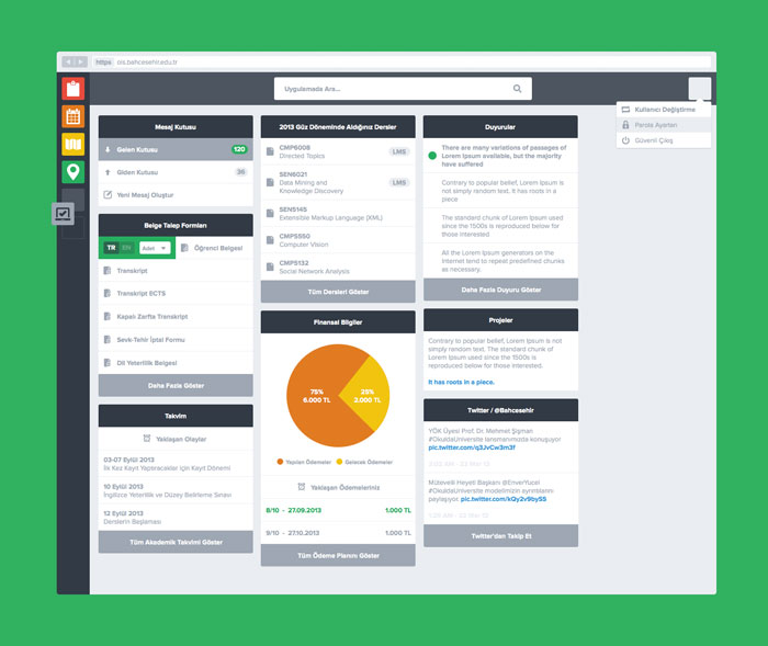
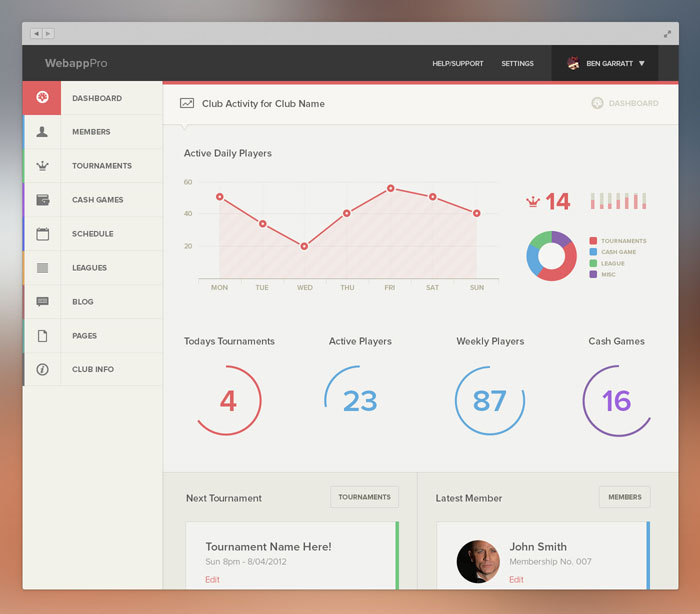
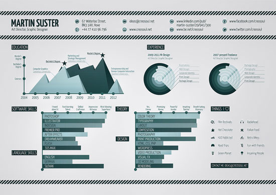
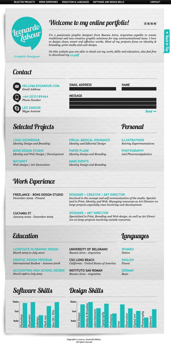

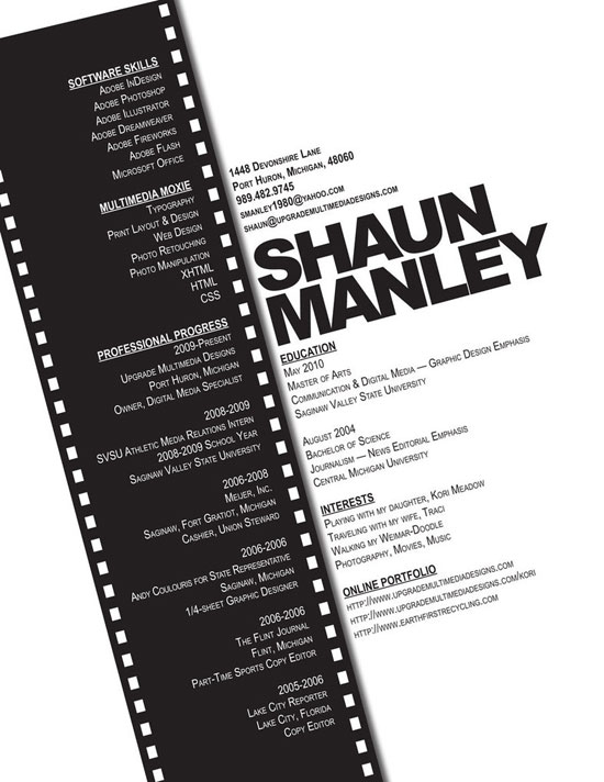
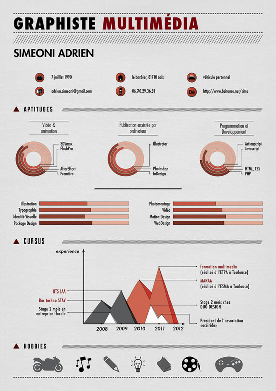
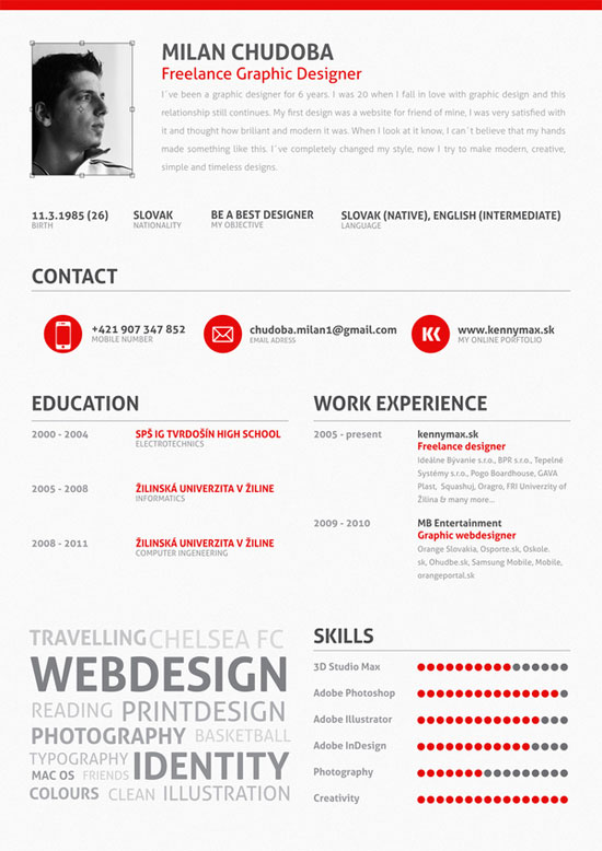


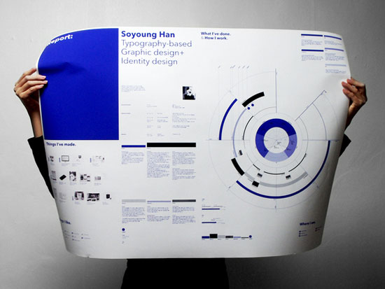
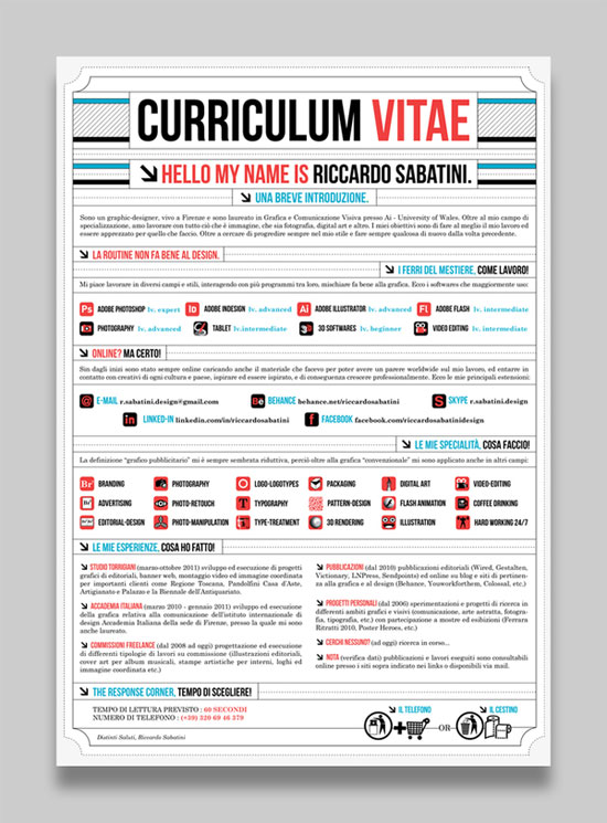
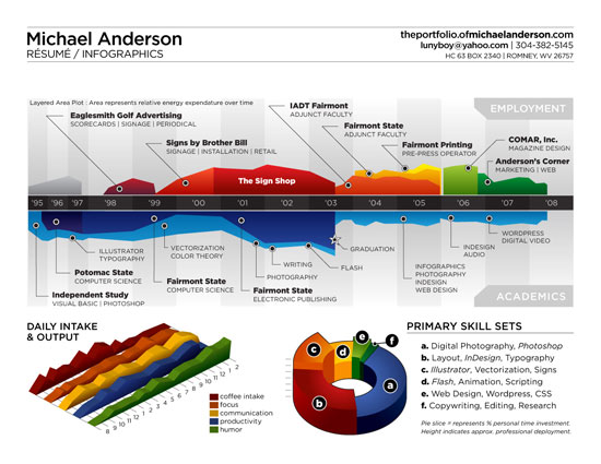
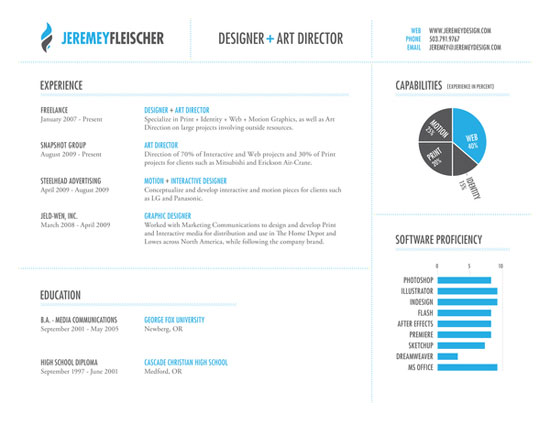

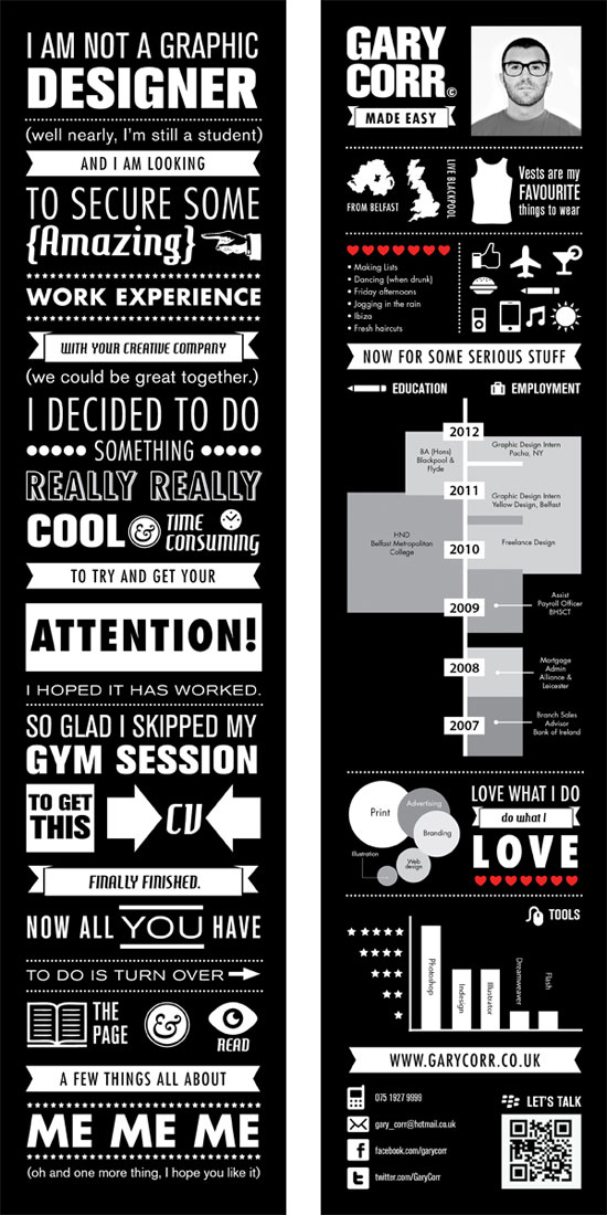
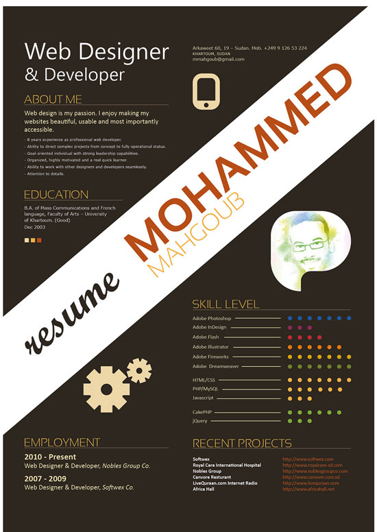
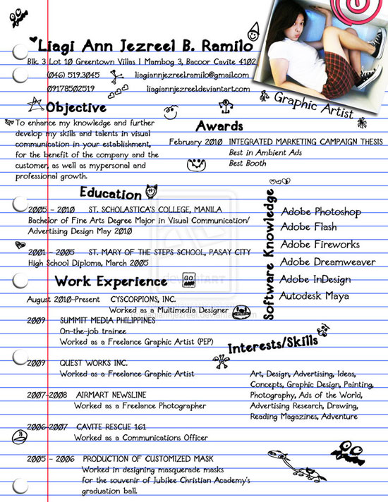
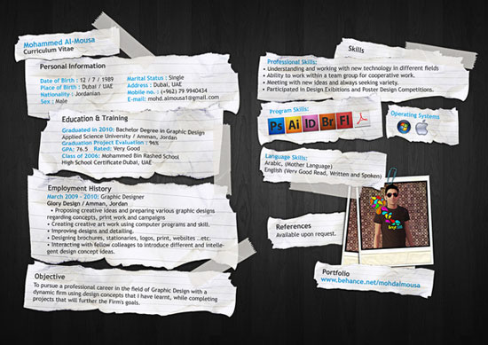
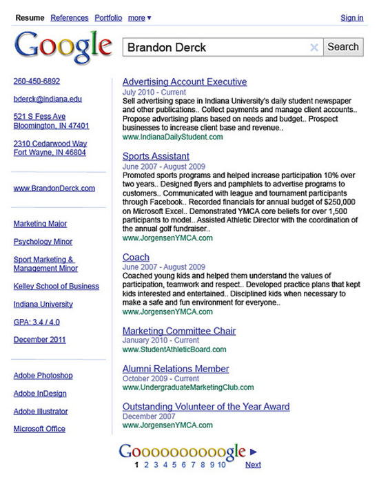
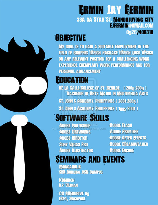
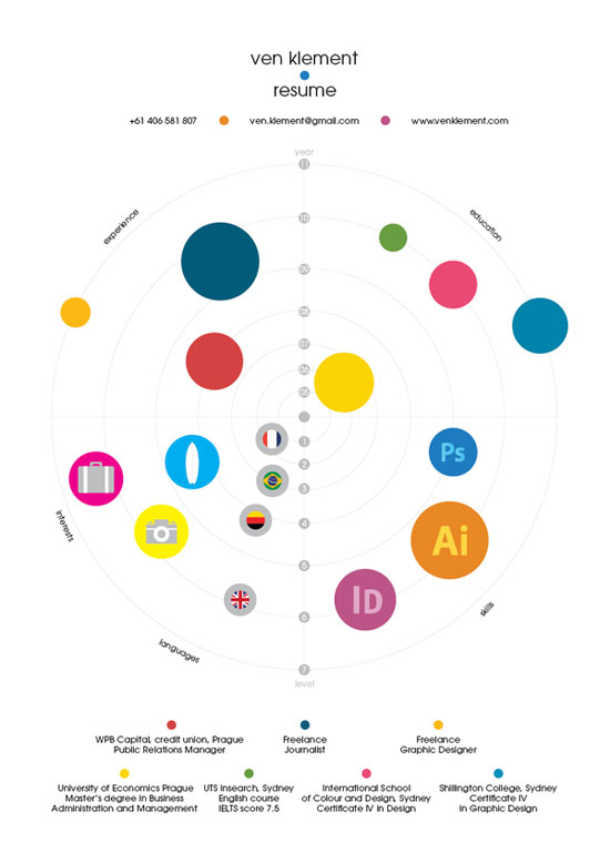
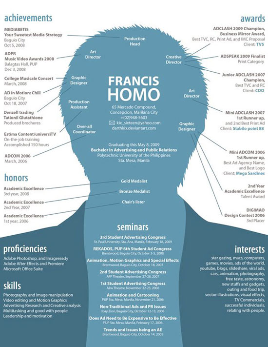
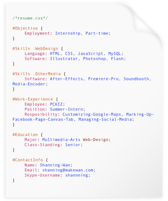
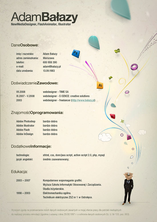
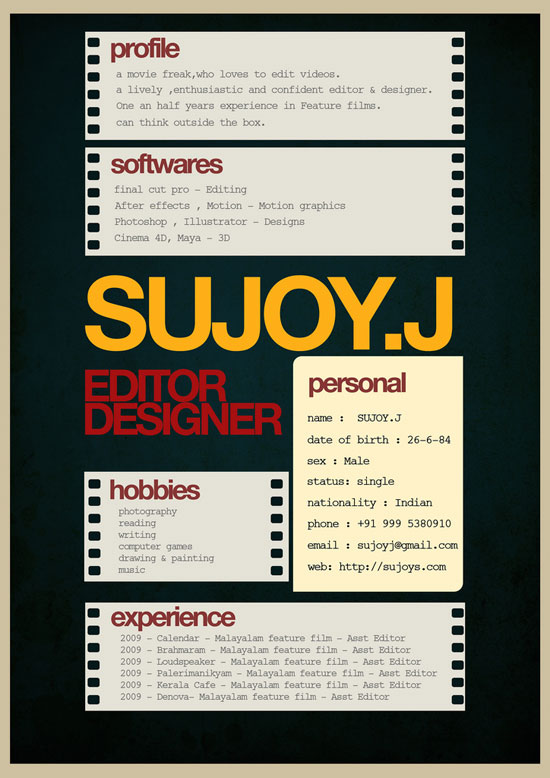
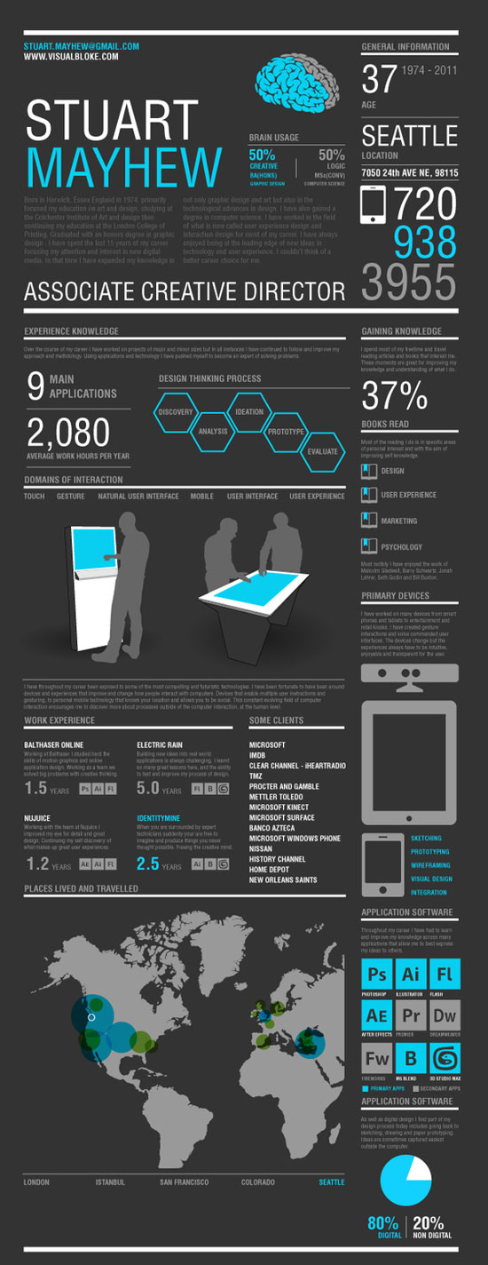
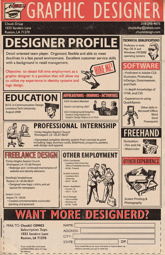
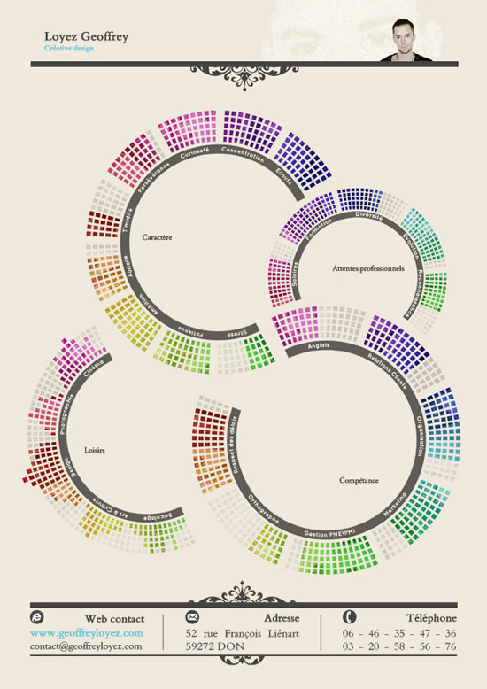
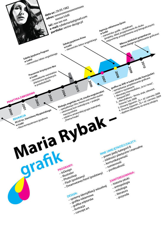
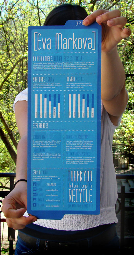

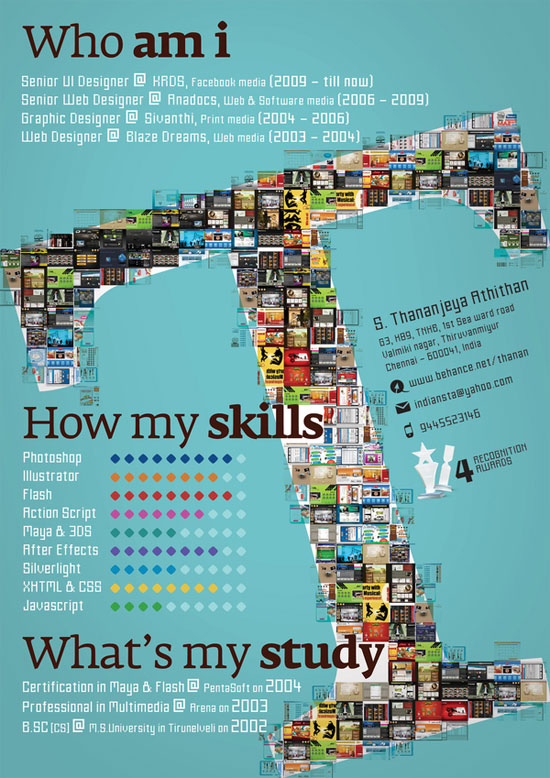
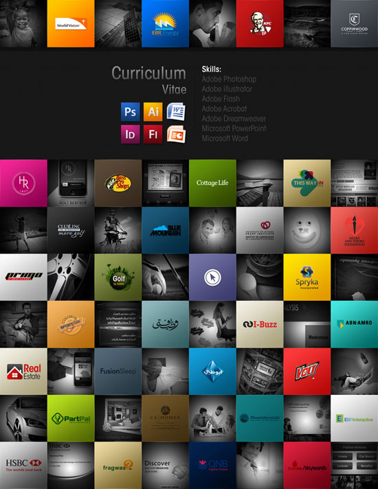
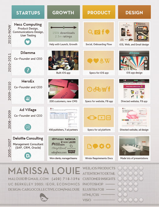
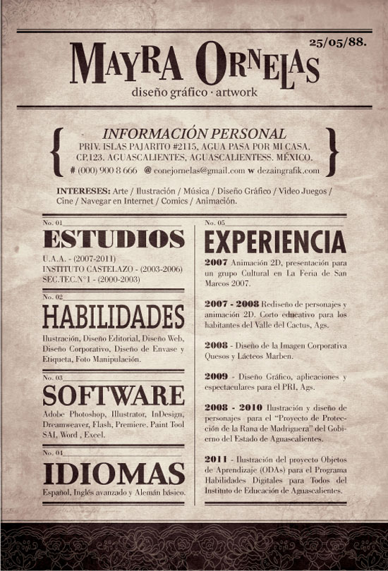
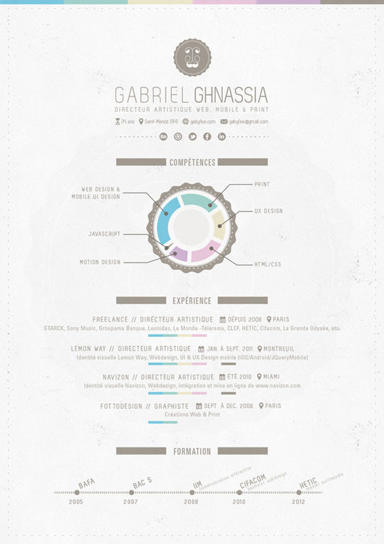
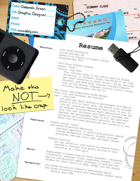
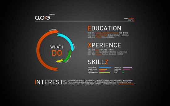
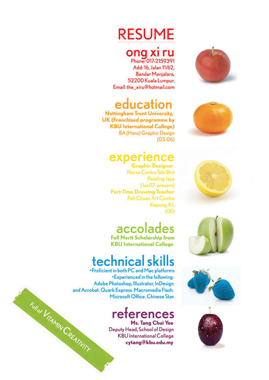
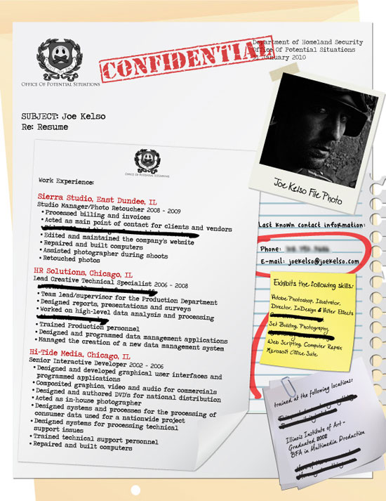
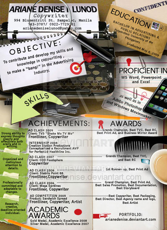
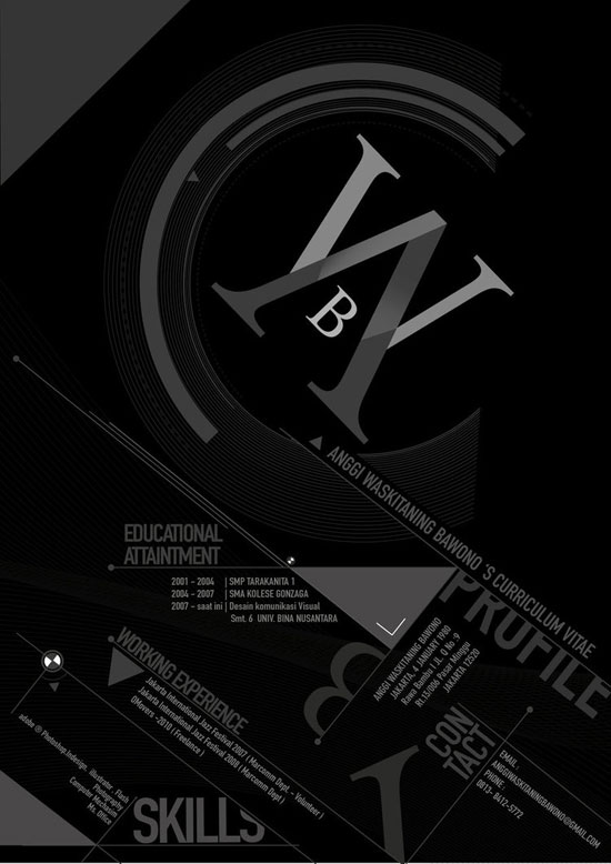
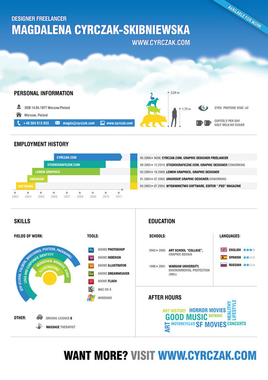
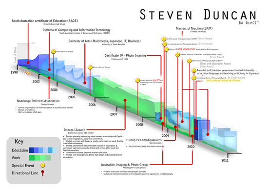
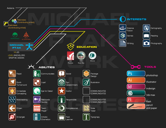
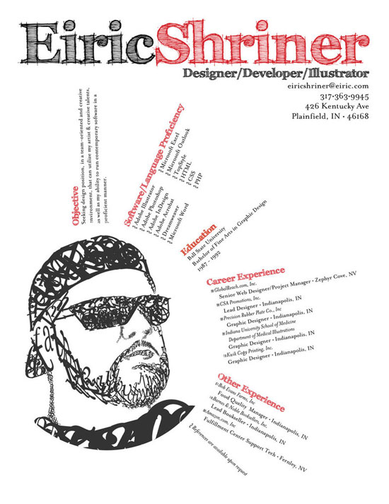
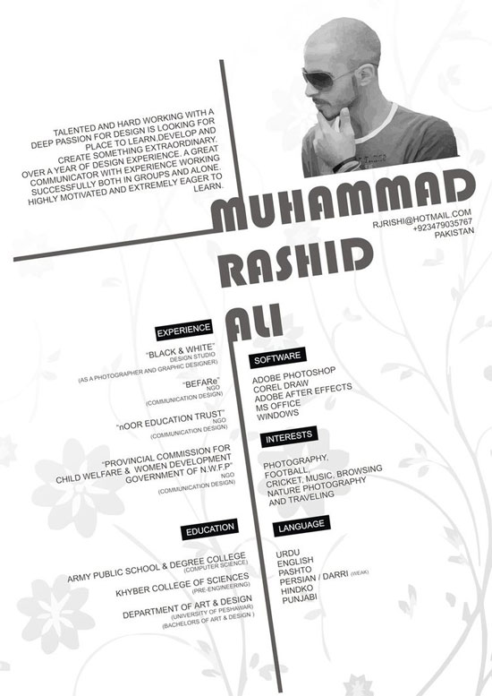
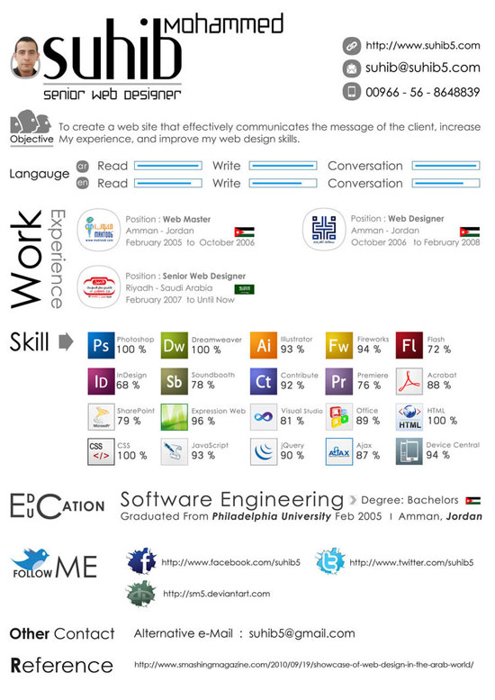
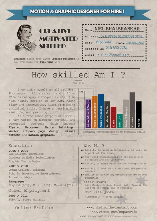
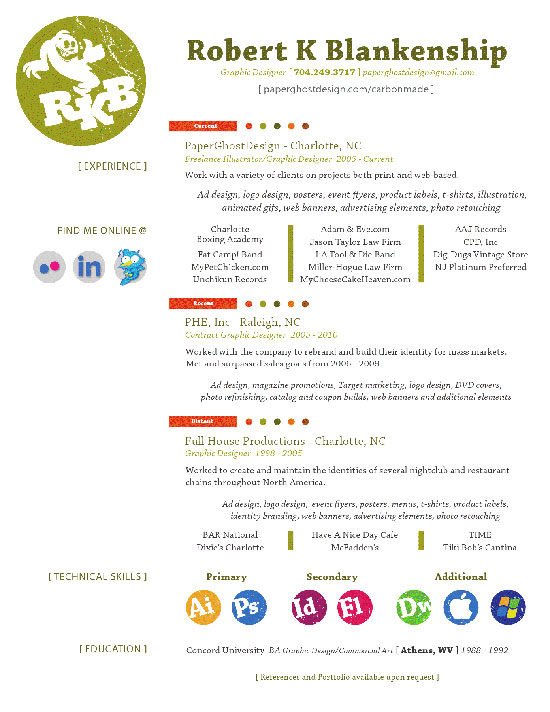
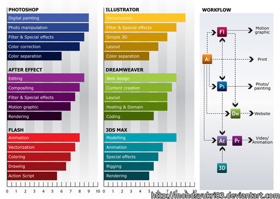
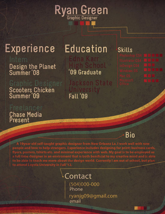

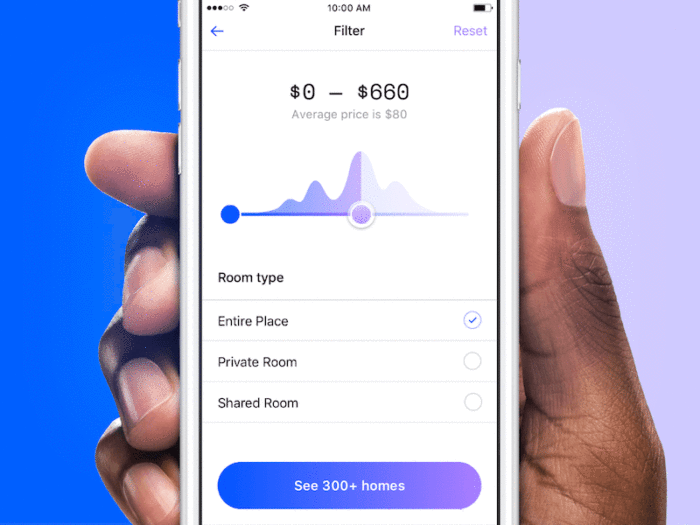
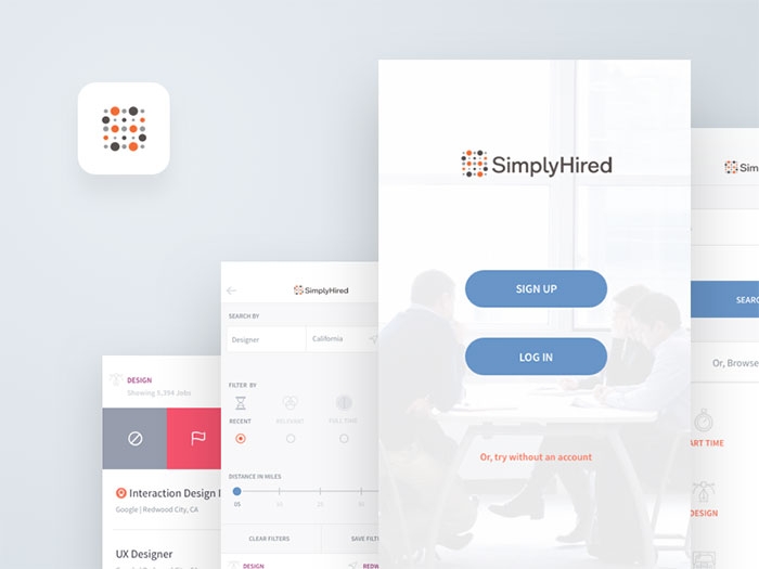
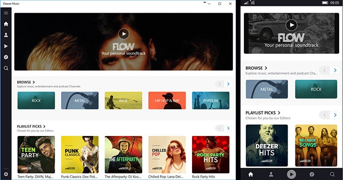
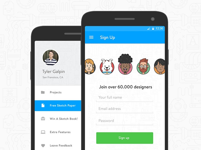
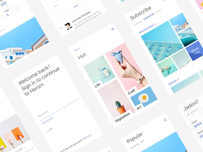
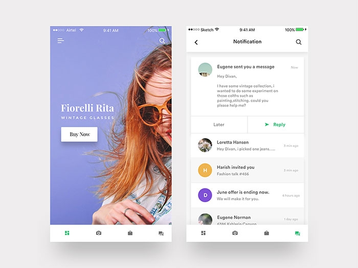

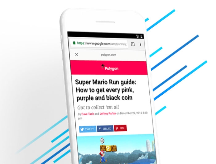
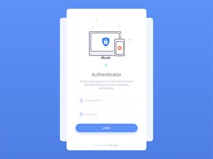
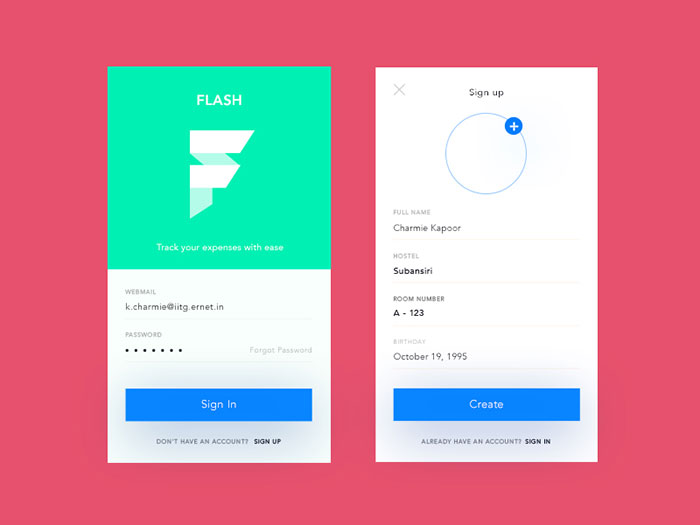
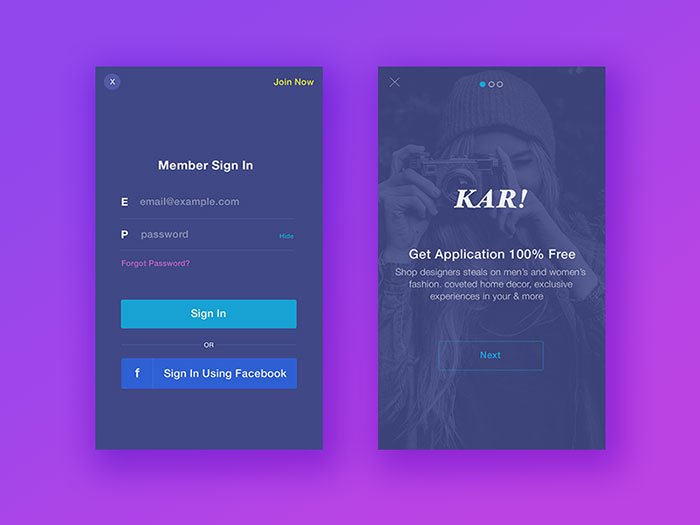
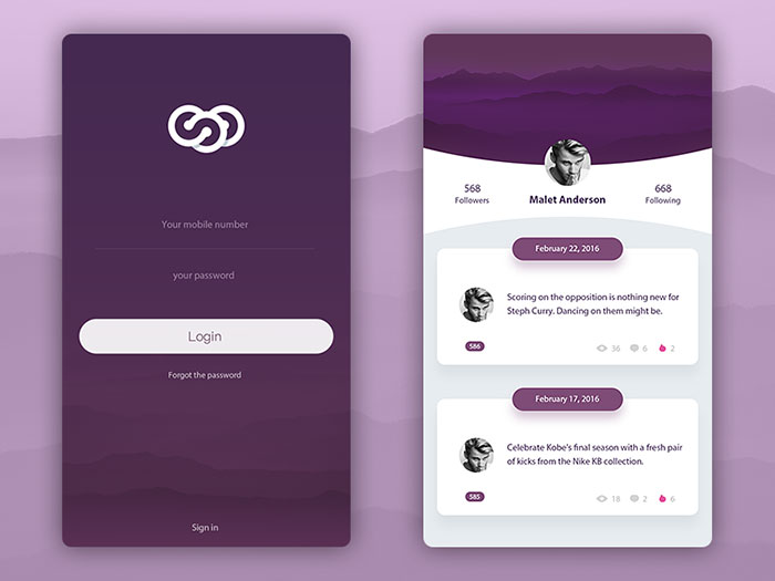
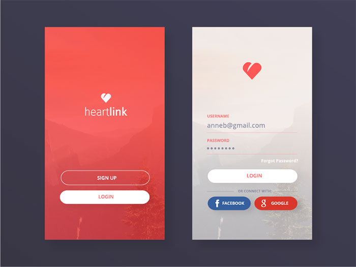
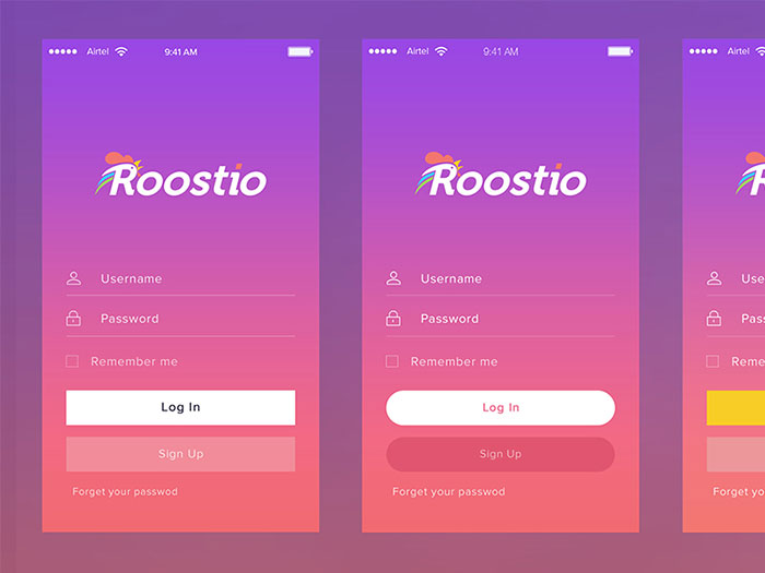
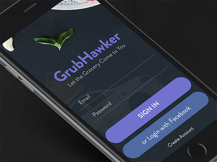
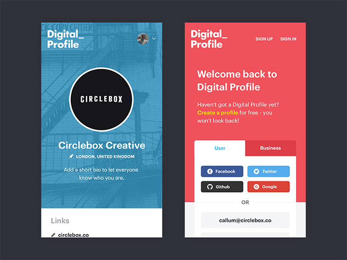
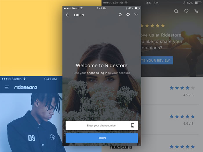
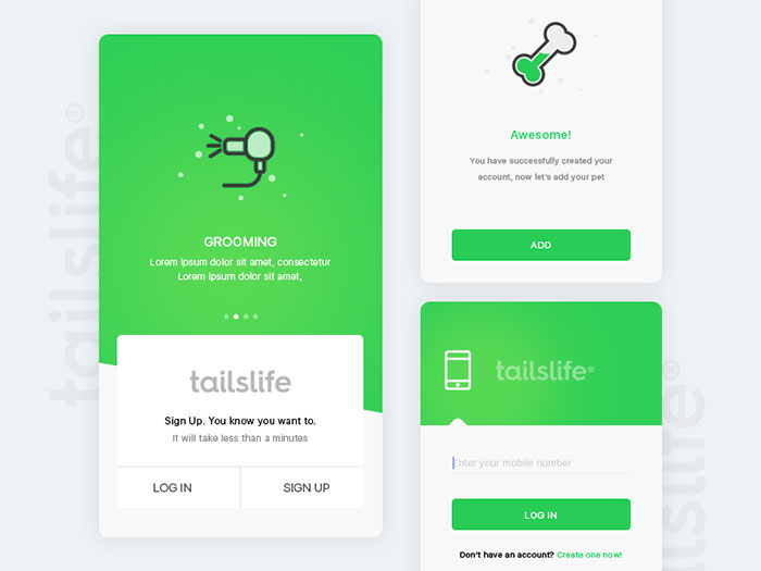
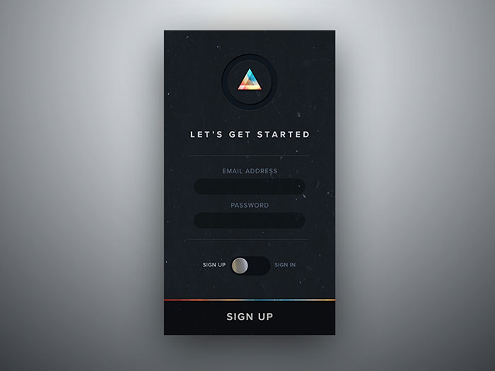
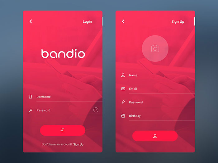
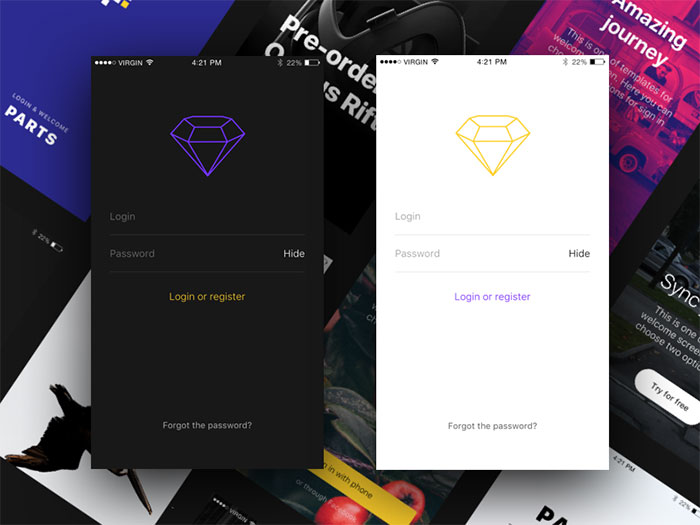
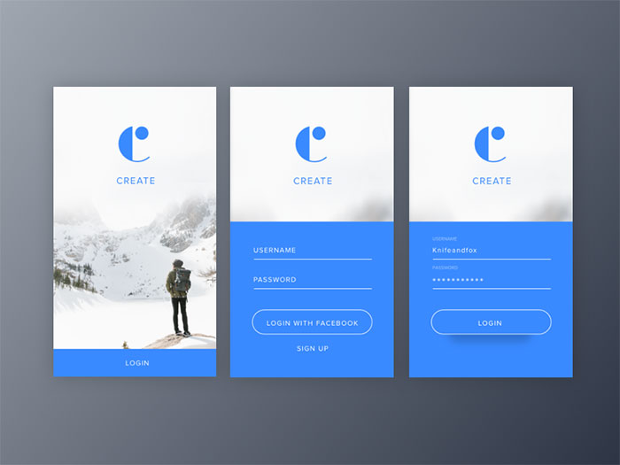
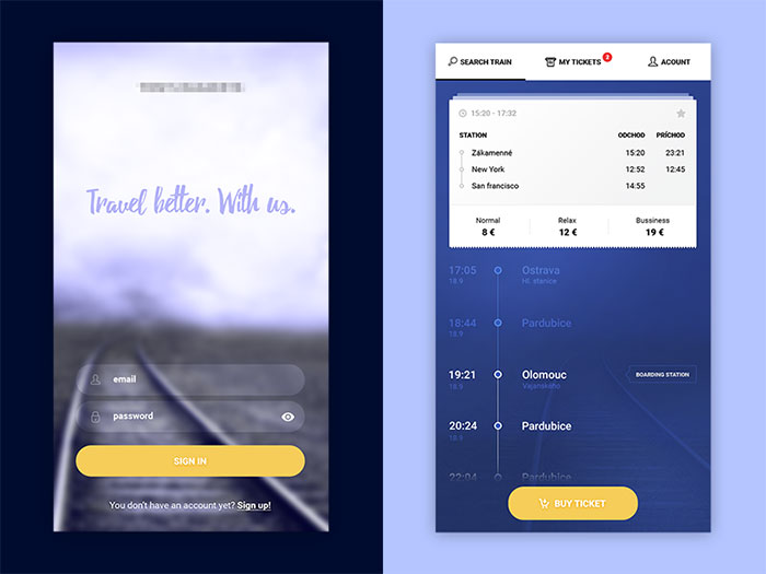
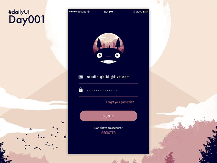
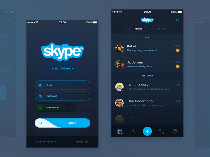
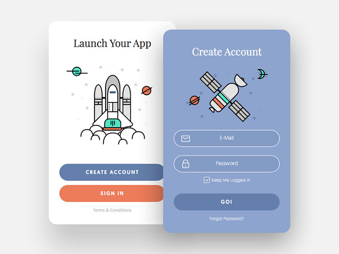


 RSS Feed
