|
Designing a coffee logo seems easy. At least that’s what you want to tell yourself. In reality, there are quite a few things to know when designing coffee logos. Have you ever wondered how exactly does that coffee shop logo or coffee house logo stand out? The answer lies in the coffee shop itself, as well as the kind of people it’s attracting. Some coffee houses stick to the traditional motifs and logo colors, but others tend to break every rule. Regardless of which one it is, there is a logo which is unique and perfect for them.
If you want your coffee logo to be amazing, make sure you read the tips below. And, this applies for everything from a coffee house logo, to a coffee brand logo, and even other kinds of coffee logos.
Resist brown. Using some kind of brown is pretty tempting when you have a coffee logo design to do, and your client might be asking for that as well. However, everyone else, from coffee shop logos to coffee brand logos are doing it. If you want your coffee logo design to be unique, you should go with something that isn’t that coffee related, like a smooth blue color. Shake things up and end up with a completely unique experience.
Avoid beans. Images that can be directly translated to drinking coffee, such as mugs, beans or anything similar, should be avoided. There are a lot of combinations of them out there, and you won’t be unique and original if you opt for those as well. What you need instead is some kind of image or mascot that is associated with the specific retailer or shop. For example, Starbucks doesn’t have coffee items anywhere. This is incredible, as instead of “coffee”, people see “Starbucks” in the logo. In this way, you can increase sales, as well as brand recognition.
Be quirky. The people who consume coffee on a regular basis are often quirky people. Therefore, producing a design that is beyond the average box size shouldn’t be out of the question. Go where you thought you would never go, and just to see what happens, push things even further. Reap the benefits of testing your limits. Coffee logo types
There are a few coffee logo types that are popular, and if you’re a designer, you’ll end up with a client from a coffee company eventually. And, if you’re a client, you should know what kind of things to expect from your designer.
Using the commonly found features isn’t all that bad, but only if done wisely, and if your end goal is uniqueness. Let’s take a look at some of the coffee logo types.
How to work with ideas and clientsEven before you start the sketching process, you ought to discuss things with your client and gather some information. The more information you have, the better you’re prepared when you need to design a logo that conveys their product to the world.
You will find plenty of articles online which talk about which questions to ask, and how to charge for your talent, so that won’t be covered here. However, you should know that you’re designing for your client, and their brand.
Therefore, their wishes are to be respected, but you should also know when you should stand your ground in order to sell your design. If they chose you to design for them, your opinion as an artist is pretty respected, and you need to show them why they should trust you.
When you’re working with the sketches, providing options is important. Depending on how your workflow is organized, this can go from a handful of sketches, to a vast variety of them. A good rule of thumb would be to offer about 10 different options for an initial design.
You should have your client choose two or three, and tell you why they chose them. You should get feedback as to where you should continue with the design of the chosen logos.
It is usually pretty easy to guess which version they like the most, and that is exactly where you should start. Choose the options they selected, and give them a few variations, but not more than two or three of each logo.
This is the point where you should start selling yourself. As a designer, you may think you know what’s best, and having that rejected makes not taking it personally a bit hard. However, there is no cure for this, and you need to be prepared for that. Just shake it off and keep on moving.
Consider the client’s suggestions, but if you think they’re out of line, try to explain that in a way that is as humane as possible. Don’t be snarky or condescending, design is a word of mouth, as well as a repeat customer business. This may hurt your reputation and cost you in the long run.
Ending thoughts on coffee logo designsEven though there are a lot of companies that specialize in coffee, there are very few common logo themes. To begin with, if you have a graphic in the logo, it’s usually related to the company or the coffee industry.
Next, the coffee shops opt for colors, either to stir up images of the traditional, or to stand out as new and unique. Last but not least, a lot of companies have values that differ from the mainstream, and their logos is what they use to express the differences. Whether the logo suits the business and the target audience is much more important than whether it obeys certain rules, or just breaks them. If you liked this article about coffee logo design, you should check out these as well:
The post Coffee Logo Design: How To Create The Best Coffee Brand appeared first on Design your way. from http://www.designyourway.net/blog/inspiration/coffee-logo-design/
0 Comments
Are you looking for a signature font? The style of signature fonts is one of the most important typography choices you will ever make. While it is true that computers nowadays have the ability to produce a number of unique fonts, many designers share the opinion of random letter arrangements and handwriting styles being a leading autograph font option. This is why there are many computer programs that let you create handwriting-inspired signature fonts, and use those in a variety of design projects. Signature fonts resemble closely the structure of any other font, but they look more ornate and fit better in headlines and tags. They won’t be suitable for larger text portions and paragraph boxes, as they’re not exactly legible and easy to understand. Handwritten-like autograph fonts can be downloaded for both personal and commercial use, and access is usually administered with a font license offered for Windows and Mac users. They come with a preview link you can use to check how the font looks applied on custom text. Which are the best signature fonts? Let’s check: Noelan
Noelan is a free-course ornate font provided by Pixel Surplus that is also free to use by private and commercial clients. It is clean, modern, and very international, so you should consider it for mixing and matching styles. King Basil
King Basil and Mats Peter Fors and Missy Meyer’s flagship cursive font that caters well to a number of digital and print projects, among which posters, logos, stationery, and more. You can also get this font for free. La Sonnambula
La Sonnambula is commonly referred to as the best font for signatures, and for a good reason. The masterpiece font created by freelance designer Fernando Caro is handwritten and extended, and uses calligraphic text units to meet the needs of elegant and attractive titles. Webmaster Haro, who is also known as an eclectic typographer, named the font after a Vincenzo Bellini opera from 1957, and inspired many creative designers to contribute to it with fresh ideas. As a result, the font has expanded significantly, and even features a Bitcoin symbol. Lily of the Valley
Lily of the Valley is only one of famous Gregory Medina (Dcoxy)’s attractive signature fonts. I is free of charge for personal use, and comes with few adorable letterforms for lower and upper case characters. It is also enriched with symbols and special accents, and offers a suite of numbers for premium users. The Woodlands
The Woodlands is another beautifully designed signature font. It was crafted by Jeremy Vessey who praises its calligraphy aesthetics as the leading reason for its popularity, and claims his work gives designers the freedom to create a lettering feel they will love. The Woodlands is free of charge for personal and commercial users, and is available to download on Behance. Milkshake
The credit for a font as substantial and appealing as Milkshake ought to be given to typographer Laura Worthington. As she reveals, it was exactly the roundness and thickness of this font that makes it sturdy, and moreover able to hold up against overwhelming and bold backgrounds. She shared the font on Fair Goods, and recommends it for titling and headlining treatments. Variane Script
The elegant Variane script was drafted by Boy Moch Tomi, and reminds viewers of luxurious, stunning scripts from the classic design era that work perfectly in a variety of scenarios. According to Tomi, complex fonts like Variane are difficult to find and afford, and that’s what inspired him to offer his work for free. He hopes that his fonts will be useful for everyone, and reminds prospective users to consider their vintage charm for a 20th century, truly American signage. Lavanderia
Lavanderia is entirely James Edmondson product, and a charming typography solution influenced by San Francisco’s Mission District Laundromat windows. Its features are mostly open type (including the three weights), which means you can use it as a script font for al kinds of headings, but also body text. Fabfelt Script
The signature font Fabfelt was designed by Frech artist Fabien Despinoy, whose main intention was to inject an industrial vibe. As he describes it, the Fabfelt script is retro and natural, and has no graininess. Black Jack
As indicated by the name, Black Jack is an elegant and sophisticated signature logo solution executed by Ronna Penner. The font is cursive, and offered in one style only, but it nevertheless comprises of 177 characters, including lower case, upper case letters, and numbers. Allura
Allura is a very stylish, yet easily readable autograph font, and leading script format offered by the Allura Pro Family. It is notably cursive, and often used as a display/invitation template. Dancing Script
The name says it all – Dancing Script isn’t posh at all, but designer Pablo Impallari certainly worked his ways on making the script lively. You will have the impression that letters are changing and bouncing around, in particular the capitals whose size often goes below the baseline. It is commonly related to popular 50s scripts, and offers an informal and friendly look for your designs. Anke Calligraphic FG Regular
Anke Arnold (www.anke-art.de) designed what is today one of the best open source font projects, and did so including Fontgrube Media Deisgn’s popular international characters. However, this font can only be found in TrueType with 100+ built in kerning pairs hat offer more or less the same benefits. You can use this font for free. Oleo Script
Oleo Script is often described as a flowing, legible, and slightly disconnected signature typeface. The font is very cursive, and thus perfect to use for a display typeface. You can find it within Google’s Webfonts library, and choose between bold and regular weights. If you wish to combine both, get the Swash Caps version. Honey Script
Honey Script is a whimsical, very easy to spot font that can be ascribed to the experienced typesetter Dieter Steffmann. The work is distributed entirely for free on all approved website, as Steffmann considers typefont to be an integrate part of his cultural heritage. On the user’s side of the axis, this font has just the right cursive lines to appear personal and handwritten. Marketing Script
Speaking of the works of Dieter Steffmann, we could not skip Marketing Script. This font proves that Steffmann, despite of being an amateur designer, promises plenty when it comes to versatility. This time, he offers us a flowing and well-connected signature font with perfectly balanced spacing, which is available in three separate styles (even a shadow one) to meet the needs of different users. Pacifico Regular
Vernon Adams is the person behind Pacifico Regular, another cursive font you can find on newtypography.co.uk, and use it for advertising purposes. It is also available in the Google Web Fonts library, and free to use online. Little Days
Little Days was produced by West Wind Fonts, and aims to inject a childish and naivety vibe in informal designs, unlike the rest of the company’s offerings. Aguafina Script Regular
Aguafina is Sudtipos’ most eye-catchy and professional signature font, lavished with clean and precise lines and excellent use of space. It drafts and assembles letterforms in a very economical way, as it reduces the capital A, for instance, and transforms it into a normal up/down stroke that looks extremely stylish. It will look amazing applied on a bold headline. Freebooter Script
Freebooter is a product of Canada’s popular designer Graham Meade, who wished to offer the world an extravagant, curvy font with plenty of bold lines, trills, and swishes. It will suit perfectly current Edwardian or Chopin script users who are looking for something more personalized. Wisdom Script
Wisdom Script is the role model of how a truly retro script should look like. Signed by James Edmondson (the creator of Lavanderia), this font accommodates easily in display and headline scenarios, and has a nod towards a musical treble clef depicted in the letter S. Personal users can get it for free, while commercial ones have to pay a modest fee of only $30. 5th Grade Cursive
5th Grade Cursive is Lee Batchelor’s leading handwritten font with a retro look and feel, and one that is commonly applied in different vintage designs. For a more natural look, you can consider using its Open Type features. Christopher Hand
El Stinger is the designer of Christopher Hand, a signature font that may not be the ‘miracle of technicality’, but offers some of the easiest letterforms and kern pairs. You may feel a bit challenged combining its letterforms, but the effort will certainly pay off! League Script
League Script is built and distributed by The League of Moveable Type, offering a cute alternative to otherwise dull and boring body texts. The best way to depict how it looks is to think of a creative girl’s diary, as it is exactly such ligatures that designer Haley Fiege considered to come up with this masterpiece. So far, it has been downloaded more than 216,000, which we believe says enough on how popular it really is. Grand Hotel
Grand Hotel is presented to you by designers Jim Lyles and Brian J Bonislawsky (Astigmatic). To create it, they got inspired by the popular 1937 movie Cafe Metropole and its title, thinking of a solution that would have a classic subtlety and weight, but yet inspire an artisan, craft signage feel with cursive lowercase letters. Consequently, Grand Hotel is believed to meet pretty much the needs of all users. Hermes
Hermes can be used for a number of different designs, including letterheads, logos, badges, posters, invitations, and so on. It is cursive, mono-line handmade fonts whose lines are simply gorgeous, and can match multiple calligraphy styles. Hanni Script
Hanni Script is a Petra Burger product, and an exclusive signature font crafted in a handwritten manner. It is exactly its simplicity that makes it look sophisticated, and many people are using it for their birthday and wedding invitations. Brisk Wondering
Brisk Wondering is actually a suite of well-matched and elegant fonts that work seamlessly with one another, and has beautiful swishes and curls that make it appear truly handwritten. Its best use is for highly personalized projects, as for instance letter signature fonts and greeting cards. Cityallir Script
Cityallir helps foremost artisans and designers make their projects more beautiful. It is handwritten, and yet very modern, and features amazing letter strokes for all types of labels and signage. Garlic
It may be difficult to conclude by the name, but Garlic also has a lot at stake to captivate viewers’ attention. It is developed as an up-to-date brush script font, which means it is cursive, vivid, and bouncy, and applies pretty much on any design project. Gullami Rice Script
Gullami Rice Script is a premium signature font intended for official and formal application. You will see it quite often on customized event invitations, printed quotes, magazine titles, packaged products, and so on. Redheads Script
Redheads Script is a great calligraphic solution with cursive lines and stylish swirls, and works the best within feminine projects like birthday parties and fashionable greeting cards. Jolies Typeface
Jolies Typeface was brought to us by Maulana Creative, as their main cursive and handwritten typeface. It brings the best of the contemporary and classic writing, and looks very simple and hassle-free. Yusuf Kral Artistica Font
This signature font is best known for its thick brush feature, and looks crisp and organized. The best places to use it are printed quotes, T-shirts and similar clothing, totes, and more. Harley Quinzel
Design Dukkan created Harley Quinzel using a thick marker, and provided it with a unique and recognizable style that plays along designs like badges, logos, and rustic-themed invitations. Stylish Script
Stylish Script is a gorgeous solution for posters, greeting cards, and similar branding materials. It is handmade and very contemporise, and packs as many as 402 glyphs, decorative characters, and a charming baseline. William Kidmon
William Kidmon is often referred to as the most modern and leading signature font. You will recognize it easily for its pretty swirls and large lines, which give it a central role in signage, letterheads, and similar personalized projects. Janesville Script
Janesville Script comes with an elegant, yet casual look that is just cut for authentic and handwritten designs. You will adore the retro swirls dancing on a simple baseline, and certainly recognize the strong vintage feel it inspires. Bounderas Script
Bounders Script is a great example of what the designers’ community likes to call a ‘romantic signature font’, namely a very cursive and modern script that looks gorgeous on greeting cards, invitations, printed quotes, and even graffiti. Paris 1920
For most of us, the first association of Paris is vintage, and that’s exactly why this font is given such a name. It is classic and handwritten, comprised of both sans serifs and scripts, and fits perfectly retro themed designs. Mastura
Mastura is another appreciable attempt to combine modern and traditional typefaces. This signature font does an excellent job showcasing embellished calligraphy in up-to-date projects, and injects a classy and romantic vibe with its pointy-edge, yet smooth pen styles. Asfrogas Typeface
Asfrogas is the ultimate signature font based on a design-friendly concept. It is entirely handwritten, and highly recommended for personal blogs, menus, and pamphlets. Lotte signature font
Lotte was inspired by the tiny fruit-bearing tree Widara, and its out-of-the-box cursive style works the best on product packages. It is also very urban, which makes it suitable for fashion branding. Heart Signal Typeface
Heart Signal is an easy-to-use typeface that requires literally few strokes to create an amazing personal signage style. Autograf
Autograf is an autograph font delivered by Mans Greback, perceived to be a top-quality signature solution with round and bold strokes. It is best suited to use on official and formal correspondence. The Valleys Script
The Valley Script is Zerowork Studio’s most elegant signature font that features mainly mono-line shapes. Designers recommend it for all types of design works.. Sansa Dior Font
Sansa Dior, as it can be revealed by its name, targets users from the fashion, appeal, and beauty industry. Designers agree that it is a charming brush script based on genuine handwriting, and recommend it because of its carefree, feminine vibe. Night Flight Marker Font Family
Night Flight is relatively new in the typeface industry, offered as a pack of diverse and contemporary fonts that can be combined for all sorts of projects. Hello Neighbor Script
Hello Neighbor will help you design beautiful posters, printed quotes, and greeting cards. You will be particularly impressed by the modern signature tone, and the number of alternative letterforms that can make your projects unique. Mon Voir
If looking for a signature font that can beautify your wedding or another important moment in your life, look no further than Mon Voir! This beautiful typeface offers a unique and elegant lettering style, and can be used in all romance and charm concepts. Its designer is Mon Voir Studio’s artist Jenna Rainey. Sakura
Sakura will captivate attention with its cursive letters that look inspiring without overwhelming the viewer. The bouncy baseline and slightly exaggerated strokes give it a long lasting charm one just can’t neglect. Befindisa
Befindisa is a meticulously designed font with a variety of romantic and girlish letters. Yet, it is more modern than traditional, and looks breathtaking on stationery and invitations. Drama Queen Script
In this case, plenty has already been revealed by the name. As suggested by it, Drama Queen cherishes foremost contemporary handwriting, and brings elegance and flare under the same roof. As you will see, it is an absolutely irreplaceable choice for printed posters. Proudly Signature Script
Proudly Signature Script is the ideal choice for any contemporary design project, in particular because of its intricate strokes and extended lines. For some observers, it may even be reminiscent of classic manly penmanship. Sbastian Signature Clean Typeface
Sbastian features long stokes and lines, and supports predominantly urban-looking projects. We would suggest it also for stationery materials, quotes, and business logos. Katastrope Font
Katastrope goes as far as possible from a catastrophe, as it is beautiful, modern, and carefree, and works great for all branding and printing purposes. 83 Script
83 Script is a relatively new arrival on the market, and combines even 83 regular scripts (lower and upper case) with just as many sans (upper case only). In such way, 83 Script helps make posters, invitations, and other branding materials look more professional. Bammantoe Typeface
Bammantoe is an irregular handwritten style, and a cursive font for modern homeware and packaging design. On the other hand, it can be used as a sophisticated text overlay on virtually any background image. Taken by Vultures
Vultures’ Taken is another leader among modern handwritten fonts, and works amazingly well for branding and photography. Birdhouse Script
Birdhouse Script was created with markers, and features a number of flowing letters and beautiful, elegant swirls. The best way to make use of it is to include it in food and fashion branding projects. Colatin Script
Colatin Script features some of the most stunning characters in this design branch. It is also packed with gorgeous twirls that will tempt you to use it for handwritten quotes, name tags, and different social media designs. Pattersonville Script Font
Pattersonville Script has recently introduced a new kit of international characters, which further confirmed its role of a modern and universally applicable calligraphic font. Rinstonia
Ristonia’s flowing characters and gracious continuity are just stunning. This signature font is therefore perfect for all types of artistic design, but also business cards and branding materials. Saffron Handwritten Font
Saffron enables real refreshment in the cursive font landscape. Handwritten and simple, Saffron works for any design project. Murtics
Murtics is the master of simple, clean lines brought to life with extra swirls. You will certainly remember it when you see it, which is why so many popular brands rely on it. Pretty Pen Handwritten Font
Pretty Pen delivers crisp and unique features, which helps us compare it to distinct penmanship from many different aspects. The font is very cursive and modern, and looks its best when applied on blog headlines. Everlasting Script
Everlasting Scripts have both a romantic name and a romantic overlay. Packed with flourishes and swirls, they look the best on save-the-date and wedding invitations, but yet come with an easy-to-spot contemporary tone that matches different typography fonts. Gloriant Signature Script
Gloriant is, in fact, a suite of a clean and a brush font that can be brought together in graceful and cursive combinations. The vibe is mostly vintage and girlish, and space is adjusted properly for a balanced amount of sophistication. Twin Oaks Signature Script
Twin Oaks is a Greg Nicholls product used for quick and simplified writing, and yet very legible one. You will meet it often with artistic signatures, posters, watermarks, and image overlays. Blesing Signature Style
The Blesing suite features neatly arranged and natural lines, and counts as one of the most modern styling fonts. To impress users, Blesing combines both alternate and regular characters, which, by the way, secures it a place in almost any design project.. De Novembre
Skyla Design is the company behind De Novembre, an elegant and sleek font where style and class are instantly visible. You should consider it primarily for high-end branding. Astronout Signature
The strongest side of Astronout Signature is its handcrafted and authentic vibe. Businesses benefit from it for more personalized branding, which is why this font appears on book covers, website headers, and a number of great packaging designs. Arion Signature
Arion brings the charm of old-world writing and contemporary posting under the same roof, and that is its main competitive edge. You can see it quite often on T-Shirt and logo designs by popular brands. Otella Signature
Otella is handmade and refreshing, and thereof used to beautify a number of otherwise dull designs. You should consider this signature font for layout designs, logos, and taglines. Ending thoughts on these signature font examplesBeautiful cursive and script fonts are all over the web, often representing a truly digitized form of professional handwriting that makes it easy for non-professionals to create attractive fonts. For the purpose, they won’t need any special knowledge on how to map and scan artwork, or how to manage complex font-generating programs. If you liked this article with signature font examples, you should check out these as well:
The post Signature Font Examples: Pick The Best Autograph Font appeared first on Design your way. from http://www.designyourway.net/blog/typography/signature-font-autograph/ Digital painting has a lot of nuances and challenges. Now that tablets are more common, there are now a ton of options for digital painting apps and tools. These developments have made it a lot easier to learn how to create a digital painting. There are so many options out there to help you out and allow you to express yourself artistically, many of them things that haven’t been seen before. Even if you haven’t picked up a pencil or a brush before, you can learn the digital painting process. Of course, as with all artistic endeavors, digital painting techniques take time and practice to master. The first thing you need to do is select your digital painting software. It can be a program on a computer or a tablet app. A quick search on the Apple or Google App store shows that there are a ton of apps available. Take a look at the features, the user reviews, and the screenshots. Different apps have different setups which may or may not work for you. Some offer more elaborate brush sets or extensive customer support. If you want to record your digital painting process, pick an app that supports that capability. Be careful if you choose to spend money, as there are a lot of good free apps out there. Please note that many free apps sell extra brush sets and other options. For the desktop, you may want to learn to create a digital painting in Photoshop. Photoshop has been the go to for desktop digital painting. Its controls are very simple to learn and there are a lot of digital painting tutorials online for it. You can also find a lot free plugins and fonts for Photoshop very easily. Photoshop is a good choice to invest in if you’re looking to start doing digital painting on a regular basis. It’s been around so long that there are nearly limitless options for digital painting with Photoshop. With your digital painting software selected, it’s time to figure out how to use it. We’ve prepared a guide to digital painting. Whether you want to try your hand at digital painting concept art, or are just looking for a way to express yourself, these digital painting tips should help you out. The Usefulness of a Pen Tablet
It’s going to be much easier to create a digital painting if you have a pen tablet, even if you are using Photoshop on a computer. What a pen tablet (or a tablet app with a stylus) does is allow you to draw and/or paint as if you were using a brush or pen on a piece of paper or canvas. This ia much easier than using a mouse or using your finger. If you’re doing your digital painting on Photoshop, there will be some unique features with using a pen tablet. You’ll be able to access additional settings in the Brush Panel if you connect your pen tablet to Photoshop. Even if the pen tablet is designed to work with Photoshop, it will not be the most intuitive, cooperative, or easiest thing to use. You will get frustrated. There are a lot of options for different pen tablets. They vary pretty widely in size and cost. Whatever one you choose, make sure it has Pen Pressure, as that will make it much easier to use. There are just as many options for styluses if you opt to use a regular tablet. The Apple Pencil is designed to work with the IPad, but there are a lot of other Bluetooth compatible styluses and even some that don’t require any connection. Check reviews and see if you can try them out to see how they feel. Using Brushes
You’ll quickly find that there are a lot of brushes you can use when creating a digital painting. Figuring out these brushes is perhaps the most important of the digital painting basics. You should learn which brush you want to use for what effect, the size and settings you will need, and what sort of pressure to use. There’s no brush or brush setting that will make your painting better if you do not know how to use them correctly. No brush will guarantee a particular look, regardless of its title or the title of the brush set. The only way to get better digital paintings is to practice.
Throughout the course of digital painting, you will probably use a brush for all these things. The wide variety of brushes means that you can typically find the right one for the job. If you can’t, good digital painting software will allow you to modify existing brushes. Sometimes you can change the whole look of the brush by tweaking these settings. Brushes are really, really great for adding realistic and interesting textures to your digital painting. Photo texture brushes are easy to find. It’s hard to convey a texture like denim with a normal brush and consumes a lot of time. Use texture brushes to make your digital painting look like a real photo. If you want a texture brush you can’t find, look online for digital painting classes that teach how to make these brushes yourself. The most common brush used is the Standard Round Brush. If you hear someone tell you they use the ‘round brush’, they mean this brush. By tweaking this brush’s settings and size, you can achieve a lot of different effects and textures. Even by doing something as simple as changing the Hardness of the brush from 0% to 100% creates noticeable differences. Hardness, Size, and Opacity
You hear these terms a lot when looking at various digital painting classes and tutorials. They are the simplest settings to change and also the ones that make the best difference. For a soft feel, go for a soft brush, while crisp edges are best done with harder brush setting. Play with the settings if you feel stuck or frustrated. If you stay with only one brush setting, your digital painting will probably look very boring and one dimensional. You should be changing your brush settings often as you progress through the digital painting process. Specialty and Texture Brushes
Texture and specialty brushes can make your life easier. Instead of requiring you to paint fur or fabric textures out by hand, you can just find a brush to paint the pattern in for you, achieving the effect you want in seconds. Trying to do it by hand might take you hours, if you can pull it off at all. As tempting as it might be to use this kinds of brushes at all times on your digital paintings, try not to rely on them too much. It can reduce the variety and visual interest of your work. The Eraser Brush
In many respects, the eraser tool is just another brush. Don’t think of it just as way of getting rid of mistakes. It can also be used to do a lot of other things on your digital painting. Erasers can be used to create highlights, much in the same way they are used to create highlights on charcoal or pencil artwork. What’s amazing about the eraser in digital painting software is that it can have its opacity, size, softness, and shape changed much like any other brush. You can use it to create all sorts of effects. It can be used to clean up edges or overspills of color, but it can also be used to soften edges. All you have to do is play with the settings to see what effect you get. Layers
Layers are one of the key elements of digital painting. You can create an outline of your painting on one layers, then color it in freely on a layer below that. This will make sure you can consistently see your guidelines throughout the digital painting process. Background details can be their own layer so you can make adjustments to the foreground without having to everything else. Layers not only make it easier to organize and edit your artwork, but also allow you a chance to try out different looks. Want to see which colors or which different shades of one color work better? Make a layer with each one. You can switch the visibility of each layer on and off so you can see what each one looks like. The Undo Button
The undo button is a great feature in digital painting. You should not rely on it too much, and it does have its limits, but it can help you out. If your hands slips and ruins a brushstroke, you can just get rid of it with a click. As you learn how to create digital paintings, don’t let the undo button’s easiness turn you into a perfectionist. For one thing, the undo button will only go back so far. Second, you might be surprised how well something that isn’t quite perfect turns out. Sketching
Sketching is a great exercise to improve your skills as a digital artist. It allows you to learn the different brushes and get a feel for how to create different weights of lines with your pen tablet or stylus. It’s also a great way to try out ideas for different digital paintings. You can use your sketch as the base for a new painting. When sketching, you should avoid soft edges. You don’t want a blurry sketch. Here are some fo the best brush settings for sketching:
These settings make for some nice clean line art. Shape Dynamics will also make your sketches look more traditional, but don’t start thinking of it as a necessity. Colors in digital paintings
Learning how to color a digital painting can be a lot of fun. First start out filling in the base colors of the digital painting, then move onto carving out shadows, highlight, and mid tones. Your goal is to get the paint on canvas, so don’t worry if the different colors are a bit too hard against each other or a bit sloppier than you like. Here’s some brush settings to help you out with this basic coloring stage:
As rough as the end result of this stage may appear, you will be smoothing it out when you begin blending. A Recommendation when drawing digital paintingsIt’s tempting to start painting in vivid colors, especially because the digital color palette offers such a vast range of colors to choose from with a click or tap. However, this can make your digital painting look like a cartoon or painful to look at. Bright, vivid colors work very well for a few styles, but anything more realistic than certain styles of cartoon will not look great in those unnatural colors. Instead, paint with more natural tones. Take color samples (easy to do on almost any digital painting software) from photos to get a good naturalistic color palette. Using these kinds of colors will make a big difference in the realism of even the most fantastic digital painting concept art. If you want to paint people, look at natural color palettes for skin tones. Skin is more complex in color than you might think. Realistic depiction of skin tone requires more than using varying shades of brown. Blending
Blending is when you start using your soft brushes. Hard brushes are very hard to use for blending. Gauge how useful your brush settings are by setting them at the lowest level of Hardness. If that doesn’t work, steadily increase it until it works perfectly for your digital painting. Your chosen style will determine which brush settings are best, but here are some digital painting brush guidelines to help you get started on blending:
Detailing a digital painting
Detailing becomes more important with higher resolutions. Overall, painting will be much easier when working at high resolutions, but the detailing typically becomes harder. The larger file size simply creates more brush lag (especially on Photoshop). Be patient and keep working through the brush lag for best results. Some brush setting guidelines to help you out:
As always, feel free to experiment and see what works best for your piece. You may end up using very different brush settings from those described here. Using Photo Textures in digital paintings
The addition of photo textures can add an extra layer of realism to your digital painting. What we mean by photo textures is taking parts of photographs that you manipulate to blend into your digital painting. It’s a good digital painting technique to use to get perfect textures for all sorts of things from clothes and skin to a general gritty texture. It’s a technique that takes a bit of experimentation and practice to get to work right, but it can be great for those times when you can’t find a brush for the texture you want to use. Applying Ambient Occlusion
Ambient Occlusion is a shading technique used to figure how exposed each point in a painting would be to ambient lighting. For grayscale painting, using it breaks down quite simply: One grayscale base + colors set to different blend modes = a nearly completed digital painting. Getting your lighting right can turn an okay digital painting into something amazing. Photoshop’s Ambient Occlusion capability will apply a universal lighting scenario to your image. This will save you a lot of time and effort. By painting in grayscale, using Ambient Occlusion, then converting your grayscale image to color, you are nearly done with your artwork. You don’t have tweak and fix the digital painting until it drives you insane with frustration. Painting Additional Light Sources
One of the most important elements in any composition is the lighting. Understanding lighting is one of the most important things you can do for digital painting or any other kind of visual artwork. Lighting effects so many elements of the image, including mood, color, and the poses you will use for figures. The best way to learn about lighting is to study photos, since they capture the way real light works. A quick internet search can yield up a lot of different photos showcasing a lot of different lighting effects. Some good lighting terms to look up and study are:
Adding Noise Filters
If you aren’t going to use different brushes in your digital painting, you can fix the sense of visual dullness quickly by using a Noise Filter. It’s very simple to apply a Noise Filter. Add a new layer to your digital painting and fill it in with some shade of gray. Go to your digital painting software’s filter settings and Add Noise. Set the Amount to 1%. Set the Opacity level to 30%. This will add a sense of grit and texture to the image in a handful of seconds. Don’t add too much noise, however. It can easily ruin the entire digital painting, obscuring the outlines of the images you’ve painted. You need to make sure that the Noise Filter adds a bit of interest to the brush strokes, but does not obscure them. Common Mistakes and How to Fix Them
Digital painting might seem quite simple now that you’ve read out guide, but it’s all too easy to get into bad habits. It can be frustrating to see your digital paintings turn out badly time after time and not be able to figure out what is going wrong. Digital painting software gives you the illusion that everything is simpler than it is. The various tools and filters make fixes to problems seem easy. If you want a particular effect, there’s a brush out there that can make it happen. The Undo button seems like it can simply make problems go away. The thing is that relying on all these tools can essentially allow Photoshop or whatever program you are using to paint for you. It makes a digital painting look better than you would normally be able to pull off on your own. You can create lots of images fairly quickly at decent quality without ever realizing that you have a lot of elements to improve on.
Professional digital painters use digital painting effects in a different way than amateurs do, and it does produce higher quality images. These pros imagine their effects before they start, then they get the program to produce that effect. Most amateur digital artists toy with the program until they see an effect they like. This mindset creates a lot of the problems we discuss below. Changing it is going to take time and work. As with any new skill, especially artistic ones, be patient with yourself and continue to make effort to improve, even when it seems like you can’t make progression fixing a problem. Please note that what seem like mistakes in one style of digital painting might be a desirable effect in another style. If it isn’t a mistake, but rather a planned effect, don’t fix it. It doesn’t need it.
1. Using the Wrong Canvas SizeIt’s so easy to start a new digital painting. All it takes it creating new file, which is so simple hat most desktop programs have a keyboard shortcut and most mobile apps have a simple button to tap. However, this can lead to a problem with three aspects.
All digital paintings are made of pixels, and measured that way, too—200×200, 400×1000, 9999×9999, etc. It’s a typical beginner mistake to use a canvas that is smaller than your screen resolution. The problem with doing this is that you don’t know what resolution the people who view your digital painting will use.
More resolution means more pixels. In a smaller resolution, an image might take 20 pixels to depict, but in higher resolution it can easily be ten times that all on its own. This means you can include a lot of interesting details in the larger area. If you paint a smaller detail in a larger resolution, you’ll find that—no matter how rough or sloppy it seems up close—it will look better from a distance. If often looks like an intentional detail and will probably add more visual interest to the digital painting.
The opposite problem of a canvas that is too small occurs, too. Sometimes a canvas that is too big causes its own kind of issues. With a bigger resolution, your brushstrokes will have more pixels. More pixels in the stroke means it’s harder for the computer to process it. Pressure levels with variable Flow have a particular problem. To use larger resolutions, you’ll need a more powerful computer.
Larger resolutions are meant to be used for very detailed artwork. Not every digital painting requires this level of detail. There are a lot styles that don’t work with more detail. Even very realistic digital paintings don’t need those sort of details. It can easily turn the image too busy and too hard to look at. Using a larger resolution canvas size than you need, you might be tempting to add a lot more detail than you should because it’s so much easier to do. You can’t really switch it back, either. For faster, more painterly results, you shouldn’t be spending hours on details in only portion of the digital painting.
You may choose the perfect resolution of your digital painting but still end up with canvas size issues. The resolution you originally chose was your working size. You might have wanted more pixels to get higher levels of detail, but the finalized version of that detail will be visible from further out.
Before you save your digital file painting for its final review, you should resize it. There’s no set optimal resolution. More detailed artwork is best presented in a larger resolution. Sketchier, less detailed pieces will look fine as smaller files (which will also load faster when emailed or as a part of a webpage). Make sure you check to see which resample algorithm works best. Some will sharpen the image, which may not be something you want. Take a look at the works of your favorite artists and see what resolutions they use. This can be a great way to learn more about how to adjust your finalized file size. 2. Starting Off With a White BackgroundA lot people envision a blank canvas as a white background, perfect for starting a new digital painting. The neutral color helps you see your colors and shapes really well, right? It’s just like a sheet of paper!
The truth of the matter is that there is no such thing as a neutral color. A transparent is as close as you can get, but it’s also impossible to paint. A color is a color is a color. Where any combination of colors meet, their relationship appears and affects how your eye sees things. Against white, every other color looks dark. Even if you want to paint something bright, it won’t look right, because you’ve started with the brightest possible background. Traditional painting is done on white backgrounds for several reasons. For one, that’s just eh color of paper and canvas. For another, it is easier to put dark colors on a white background than the other way around. Digital painting does not have these limitations. It’s possible to paint bright colors on black backgrounds perfectly well.
That does not make a black background a better choice than a white one. It has the opposite effect of a white background, making all colors appear bright. The most neutral color you can find for your digital painting background is going to be 50% bright gray (#808080). Background colors change the way you understand the other colors of the digital painting. You want colors to appear neither too bright (as they do on black backgrounds) or too dark (as they do on white backgrounds). Black backgrounds will also make darker colors seem too dark, while white backgrounds will make brighter colors look too bright. Any attempt at contrast will be hobbled once you try to add some other background.
More practiced artists can work with any background color and get some pretty good results. Years or even decades of practice with color theory allow these artists to understand how to use the background color to their best advantage. Unless you are very confident in your understanding of color theory, stick with a neutral background that is neither too bright nor too dark for a while. 3. Avoiding The Use of Strong ContrastA poor quality screen can cause issues of your perception of bright and dark. Anyone who has sued a laptop has probably noted that the contrast changes depending on the angle of your screen; a lot of us use it to our advantage when reading or viewing certain things. With digital painting, it can be hard to figure out how to use contrast properly for every viewer, regardless of the kind of screen they are using.
Even on good screens, focusing on a picture for while throws off your perception. If you are going to change shades slightly with as your progress, the contrast might seem better because it’s better than it was a few moments ago. It might not actually be that way, however.
Photoshop in particular has a tool that can help with this issue. This tool is called Levels. It’s a histogram and can show you how much of each shade there is in an image. Other digital painting programs also have a similar feature, thought it tends to go by different names. 4. Using Complex Brushes Too OftenDigital painting brushes are not like physical ones. Physical brushes allow for a finally limited number of kinds of strokes, while the ones you use in digital painting programs can be much more complex. Some of them are small bits of artwork unto themselves.
Every time you use that sort of very complex brush, you’re giving up a bit of control over your own digital painting. Simpler strokes are considered more professional because they allow you to show off your own skills much better. Complex brushes should be used to support the simpler ones. Using them too often will make you lazy and slow (or even stop) the development of your own artistic skills.
It’s easy to look for ways to get the effect you desire in the easiest, quickest way possible, especially when you are just starting to create digital paintings. You’ll get results immediately with some of the complicated brushes, after all. This can be useful, of course, nut they should not replace your own skills. Sometimes the complex brushes might not be as good at creating an effect as you would be with simple strokes. For things like fur or hair, the brush may not be able to communicate the way movement or lighting effects them quite right.
Spend some time pretending these sorts of brushes don’t exist. Learn how to create textures and effect with more simple brushes instead. This will not only make you a batter artist, but may also look better as well. Your digital painting will often have a more handcrafted feel, and the details will be more accurate for the environment and lighting. 5. Using Too Many ColorsYou don’t need to mix paint with digital painting, unlike with traditional painting. You just select the color you think you need from a gradient or grid. This is much, much easier, but it is also a hindrance to developing a proper understanding of color theory.
Color theory is not something people know intuitively. Studying it can help an artist’s work immensely. Colors can’t just be what they were before you started doing digital painting. You need to understand them through the concepts of Hue, Saturation, Brightness, and Value.
Colors exist not only on their own, but also in their relations to other colors. Background and adjacent colors can change the way a color is perceived, making it bright or darker. Every aspect of color can change due to its surroundings. Warm colors can even look cool depending on the colors around them. Professional artists understand these complex relationships and know how to manipulate them to get the results they want. It’s well worth your time to look into and will make you better.
6. Choosing Colors Directly from ReferencesThe Eyedropper Tool is a tempting cheat. It means you can get the right color for skin or hair, right? Yes, but it’s also not as useful as you might think. The hue and saturation of your digital painting will change the effect of those colors, as will the light source.
Picking your colors from references is also little better than tracing. You can’t claim credit for those color choices. It doesn’t help you develop your understanding of color theory. You don’t progress by doing this. Understanding why certain colors work is more worthwhile than using the same ones directly.
7. Using Dodge and Burn Tools For ShadingThe Dodge tool does not add light to image and the Bun tool does not add shadow. It’s a fairly rudimentary way to add shading and highlights. The tools are fine in themselves, but using them this way is not effective, either visually or for your one artistic understanding.
Shadows are more complex than a mere darkening of the base color. That sort of thinking works very simple styles, like cartoons and cell-shading, though it is a kind of cheap shortcut even there. For more complex styles, this sort of shading flattens the objects and no amount of added texture can really help.
Using Dodge and Burn like this is another shortcut that stops you from progressing. Shading is much more complex than that. Actually take the time to study the way shadow and light play on objects. You will steadily be able to learn how o bring those nuances to your own digital painting.
8. Blending with a Soft BrushBlending with a soft brush is a very quick way to do your color blending. If you use larger strokes, you will quickly find you have flattened the object and made it unnaturally smooth. This is another one that adding textures will not make better. This digital painting technique can be useful for starting the painting. For a nicer, more subtle kind of texture, use a harder brush setting with Pen Pressure controlling the Flow.
Digital art examplesThe games digital art that people can get today are all truly impressive. There was a time in which games rarely produced anything that could truly be considered art. The graphics were very crude. Stills from games were not going to be interesting to look at, and they certainly couldn’t rival the other visual arts of the day. This games digital art is both breathtaking and powerful, and these are the sorts of games illustrations that would inspire anyone to get involved with expanding the art form. These games illustrations depict dramatic military scenes. The scenes are quite realistic. From a slight distance, people might easily mistake them for photographs. However, there’s enough exaggeration in the color scheme that their artistic aspects become that much more apparent to anyone that is really paying attention when it comes to the work. The color saturation is strong enough that these military scenes almost seem more real than actual military photographs, as if they better match the mind’s idea of what these kinds of military actions really are, in terms of the emotional effect. Some of these games digital art feature more stylized images of people fighting back in action scenes that feature women and demonstrate female power in only one brief image. The triumph of these characters over the vaguely futuristic soldiers has a certain power to it in its own right. Juxtaposed against many of the more modern military scenes, this image and images like it seem to make an even more powerful statement. League Of Legends – Zed
DOTA 2 – Mirana
VI
Imperius – Storm Of Light
WoW Fanart – Illidan
Diablo 3 Monk
Illidan
Retribution
Headhunter Caitlyn Splash
Mordekaiser
STRIFE – Rook
Samus Tribute
Thief
Demon Hunter
Barbarian
Lunar Revel Diana
Val, Queen Of Thieves
Ending thoughts on digital paintingDigital painting may seem simple, but doing it well is more complex. Use your tools wisely. They’re there to help you improve your skills and add details, but not to replace your own skills. Be patient, apply your digital painting basics, and you will find yourself steadily improving. If you liked this article filled with digital paintings and useful info, you should check out these as well:
The post Digital Painting: Concept Art, Techniques, Tips, and Tutorials appeared first on Design your way. from http://www.designyourway.net/blog/inspiration/digital-painting/ The concept of using muted colors in your design certainly isn’t new. When you are comparing it to the vivid colors trend that we have almost everywhere, it surely seems something new. Any modern UX designer knows that the minimalist, flat trend has been picking up steam over the past few years. There are companies from the likes of Microsoft, Apple and Twitter, and they’re all taking advantage of this emerging style when they’re designing their digital products. The flat design goes hand in hand with the minimalist approach. The flat design will eliminate depth by not using shading and gradient, and favors one-dimensional geometry.
The minimalist design will eschew unnecessary features and content, replacing it with a clean, sleek monochromatic approach. Together, the two approaches will give you legibility and clarity, and reject ornamentation and excess.
However, even though these two practices make the UI interface very simple, their intersection has created some usability issues for certain users. Making things too simple has actually had the opposite effect to what was required, and users find it more difficult to figure out where they can click, and why. Thankfully, there’s a third trend to help this. Muted colors have picked up some steam as well.
Muted color schemes are everywhere in print advertising. However, in a print campaign, you don’t need a minimalist design or a flat effect, because the user isn’t interacting with a piece of paper, but instead they only need to look. However, the muted color palette has actually taken on a new role aside from its primary one in the functional UX practices.
If you try to find a muted colors definition, you’ll find that the best answer to the “What are muted colors” question lies in the fact that these colors represent the modern, efficiency and progressiveness. They convey to the viewer that whatever substance they’re looking at, is relevant, and not out of date. For example, you can see muted color in Drake’s “Hotline Bling” video.
These colors and muted pastels were very intentional, and they speak to the modern day culture and the masses. They also signify something of the moment. Being much easier to look at than harsh, sharp colors, they’re very conceptually fashionable too.
Nowadays, UX designers should know that their color choices are actually their design choices, and color can indicate a lot, just like flow, content, usability and function. Choosing between a vibrant green or muted tones of green can make the difference between the user staying on the site, and leaving instantly. Just like the way a clunky UI can seem a bit analog, those bright, vibrant colors may look like a blast from the past. Muted colors appear like they do because of:
There are variations of the flat colors palette that you’ve seen thousands of times, and oftentimes they just don’t fit with the design aesthetic you’re aiming for. Even when everything else appeals to it. This is where a muted color option can do wonders, as when you use it with a flat aesthetic, it’s a classic, polished look that is different enough for it to stand out from all other flat projects.
But, what is a muted color palette? For the purposes of this conversation, it’s any hue that is highly saturated and adding a tone, tint or shade to make it subdued and less bright. You often get a softer, calmer color as a result that is easier to work with, as well as match to the overall design.
“Color” is actually a very imprecise term that we use daily. It consists of three main components, namely hue, saturation and value. If you have a balloon where the equator is the hue on a 360-degrees, the vertical axis is the value, and the horizontal is the saturation, the colors can be visualized on the inside volume.
There are some other concepts that can help with this question, such as “shading” and “tinting”. For example, mixing any color with black is known as “shading”, and results in a bit more muted color. However, adding white to a color is known as “tinting”, and results in a brighter color. However, not all colors can get bright or dark, such as yellow for example. Making it darker will turn it into brown. Tints in muted colors
Adding white to a color, or tinting, gives you a color that is significantly lighter than the original, and usually known as a pastel. They can range from almost white, to a bit lighter than the fully saturated color.
Their feel is lighter, softer, and gives you a more soothing aesthetic compared to the bolder, brighter options. They’re very popular with illustrations and also work wonders on photos. They will fall away from the main aesthetic, and they’re most commonly used when you have another focal point as opposed to the main aesthetic. Shades in muted colors
Shades, on the other hand, make the color appear heavier to the eye, and range from an almost black color, to a touch darker than the original one. They work well in a variety of environments, especially when used with less black.
There are projects that are really dark and have a lot of black which come with readability problems unless you execute them exceptionally well. People often incorrectly assume that shades must look black, but when you’re evolving one of the traditional flat design schemes’ colors, this is not the case. Tones in muted colors
Combining black and white with a color to make it appear softer gives you tones. Most colors are actually made using tones, as they’re complex colors with an almost universal appeal. This is due to the fact that they pull from a few different parts of the color spectrum, and this is why tones are the first choice of artists and designers for most of their projects.
Ending thoughts on muted colorsRegardless of whether you’re branching out from some traditional flat design colors, picking one of the color techniques above isn’t your only choice. You can combine shades, tints and tones to create something that is different and absolutely engaging. The lesson with these simple studies is that you can’t be caught up having to use a “by the book” trend. Use a different kind of technique to make your own trend. The color palette and changing it can be wonderful, and you can still get a flat design. If you liked this article about muted colors, you should check out these as well:
The post Muted Colors: Definition and How to Use Them In Websites and Apps appeared first on Design your way. from http://www.designyourway.net/blog/web-design/muted-colors/ Modern high-speed Internet has really made us spoiled. These days, if a website takes more than 4 seconds to load, we tend to not even bother waiting; we simply close the page and find something else. That is exactly why designers are taking the time to come up with creative preloaders like this fun little bouncing ball. What’s a preloader?Essentially, preloaders (also known as loaders) are what you see on the screen while the rest of the page’s content is still loading. See the Pen Loading Bouncy ball (provisional) by kota shimura (@wabeshew) on CodePen. Preloaders are often simple or complex animations that are used to keep visitors entertained while server operations finish processing. Unfortunately, they are also frequently overlooked in the development process of most projects. Why is a preloader important?Preloaders are important interface elements that let visitors know that the website hasn’t crashed, it’s just processing data. They are usually designed as moving stripes or blinking circles that represent the time necessary for loading, which, although functional, aren’t entertaining at all. Interesting animations can keep your users engaged while they’re waiting for the page to load. Designers work really hard to make the waiting time less of a hassle for site visitors, but this can be a very difficult task if the right inspiration (and latest knowledge) isn’t there. What should a great preloader be?In recent years, most projects have been developed with simplified loaders as the recommended best practice. Complex loader animations haven’t been popular for a while because they used to take up a lot of resources to work, slowing down the page’s loading process even more. However, with processing power increasing, the era of simple loaders is coming to an end. Today, a well-designed, creative animation provides an opportunity to enliven your interface. This small, but important detail contributes to the individuality and branding of any product. For this reason, we’ve compiled and curated the following list of bright, funny, and unique preloader examples (including some of SteelKiwi’s very own designs) to help you and your design team find some inspiration! 30 of the best preloader design out thereThis sliding square loader makes the waiting a bit less frustrating as it keeps your eye moving along with the squares. A great solution for businesses who sell electronics or games online to keep their visitors engaged with the website.
The bouncing black balls that appear out of nowhere and disappear serve as an entertaining element and could be used for websites that want to look presentable yet with a pinch of playfulness.
This is a perfect example of a drum-like preloader which resembles a spinning lottery wheel. If a business owner wants to make a logical connection between this loader and the application which may imply opportunities, luck, or excitement, then this loading screen should serve its needs.
These simple geometric shapes remind a birdy turning its head to the left or right as if talking to somebody. This animation can make a good preloader for sites featuring businesses in the TV-, radio-, or social media industry.
Applications featuring travel or location-based services could make loading much more appealing using the little colorful geopin which flips back and forth.
An exciting animation with different kinds of balls in motion makes visitors forget that this is just a loader. This loader could complement any website featuring sports events, activities, or sports inventory.
Love animals? Here is a loader in disguise — a swinging monkey. Being fun and entertaining, it can entice users while they are waiting for the page to load. Businesses that are in the entertainment industry, such as magazines, movies, marketing, advertising, or those who simply want to stand out among the crowd and draw a smile on visitors’ faces can use it.
The copper preloader in the shape of the eternity loop moves smoothly like a mesmerizing wave. The loader with its neat, minimalistic design and soothing animation is applicable for almost any business.
Here is the drop that never drops. The white and subdued blue colors contrast well together, and this preloader will never make the visitor bored or frustrated with the loading. Businesses who would like to appeal to younger generations could use this loading screen.
The ping-pong loader, with its rubber feel animation featuring a paddles and a ball, can’t help get one’s eyes off it. It is supposed to warm visitors up before they actually access the content of a website. This loader is good for sports sites or any other sites that offer anything from sports activities to inventory.
The turquoise planet with a white rocket orbiting it keeps visitors’ attention on the preloading screen. This planet loader can be used for entertainment apps, or any other organizations which do research or make various discoveries known to the public.
A blurred gearwheel loader with the three spinning gearwheels embodies movement and complexity and could be appropriate for businesses who market machinery or mechanic parts. See the Pen Blurred Gear Loader by Joni Trythall (@jonitrythall) on CodePen. The descending and ascending stairs loader with a white ball jumping on top has a minimalistic design yet it is very straightforward. It could make sense for business who want to present themselves as serious and trustworthy. See the Pen CSS Stairs Loader by Irko Palenius (@ispal) on CodePen. With a light touch of simplicity, the caterpillar-like colorful circles that move to the left or right and come as one at each side make loading less boring to visitors. The loader is appropriate for almost any kind of businesses with it’s universal animation, and it should keep visitors amused while waiting to land on the homepage. See the Pen ZbVVwa by Dave McCarthy (@AsLittleDesign) on CodePen. A simple “attention getter” loader like this rolling cube that gets bigger when moving forward and returns to its initial shape when going back, is a reserved solution for business that want to appear smart and sophisticated to the visitor. See the Pen Loader css3 by Mathieu Richard (@MathieuRichard) on CodePen. The vivid spinner loader with the rotating rainbow that rolls into a sort of geometric flower-like shape can cheer the visitors up and help them get ready for something fun and exciting. Such loader could be used for businesses who market their products or services to kids. It should work well for children’s education sites. See the Pen Vivid CSS3 Spinner by Kevin Jannis (@kevinjannis) on CodePen. The prism loading screen should remind one of the LinkedIn’s background for photos. The loader remotely looks like constellations which are moving in space with the main element in the middle which could potentially feature a corporate logo. The loader could be used for businesses that work with international clients, for example in the B2B sector. See the Pen Prism Loading Screen by Ken Chen (@kenchen) on CodePen. Like variety? Here is the loader which keeps a visitor entertained, letting them see a countdown accompanied by changing animation of different pictures. Keep in mind, that this loader can have any pictures rotating so it can cater to fit any business’s needs. See the Pen Loader by Alex Rutherford (@Ruddy) on CodePen. Here is a silhouette of man with a jetpack on his back flying as as fast as he can. Such loader which redirects a user to the next page can be used by almost any business, especially the ones that would like to highlight the speed element of their service. See the Pen Redirecting Loader by Mr Alien (@mr_alien) on CodePen. Having a minimalistic and succinct design, this dot preloader could be used by artistic people or designers for their online portfolios for instance. See the Pen Codepen Loading Dots by White Wolf Wizard (@WhiteWolfWizard) on CodePen. Shouldn’t this preloader remind one of the snake game? This energy icon animation with a plug can make sense for internet providers or any other agencies who help businesses and clients collaborate. See the Pen Preloader SVG animation by Jason Miller (@imjasonmiller) on CodePen. Pancakes right from the stove! The loader with a flipping pancake on the frying pan should make a visitor’s mouth water. It can be a good start for websites dedicated to cooking or baking. See the Pen ‘Making pancake’ loader by Pawel (@pawelqcm) on CodePen. If a business owner is not picky about their preloader and would like to keep it simple, here is a straightforward one with a splitting rectangle that splits. See the Pen Loader by Maroš Horniak (@majci23) on CodePen. Here is a collection of custom animated SVG-powered loaders featuring different shapes and basic geometric forms. Businesses owners who want to maintain seriousness can exploit the neatness of these loaders in various design purposes. See the Pen SVG Loader Animation by Nikhil Krishnan (@nikhil8krishnan) on CodePen. This hand animation seems to never stop tapping its fingers as if always waiting for something. It sort of conveys the feeling people may experience while waiting and could be used by businesses that strive to maintain a great sense of humor about themselves. See the Pen Hand animation – loading by r4ms3s (@r4ms3s) on CodePen. The SVG and CSS-powered tree preloader is a neat animation to appear on family or medical applications. The tree gradually spreads its branches which seem to be breathing in, making the animation pleasant to look at. See the Pen Tree Preloader by Jürgen Genser (@juergengenser) on CodePen. Here is a preloader applicable for travel and transportation rentals businesses. The loading screen changes the type of vehicle accompanied by the text to enhance the overall impression. See the Pen Travel Preloader by Matthew Nahmias (@mnahmias) on CodePen. This SVG-powered car drift loader is another unconventional solution for websites that market vehicles. However, if taken figuratively, the preloader can be used for websites or apps related to various social events which bring people excitement and make a lasting impression. See the Pen SVG Car Drift Loader by Chris Gannon (@chrisgannon) on CodePen. And a cherry on top! Here is a preloader with a pinch of humor — no matter how hard the bubble gum character is running around his head, it is too heavy and big to move, and he seems to enjoy it.
Greatest examples of page preloading animationsHere are 5 websites with eloquent preloaders for you to enjoy! 1. W. Brett WilsonAnother creative loading screen can be found on W. Brett Wilson’s website. A silhouette of a man running in a hamster wheel and text appearing like a slideshow keep the visitor entertained and engaged with the website, while also complementing its design.
2. Сreative СruiseCreative Cruise website was built to invite people to celebrate Amsterdam’s creative vibe. To emphasize the atmosphere before a visitor even lands on the homepage, a hilarious looking man who is dancing breakdance appears on the loading screen. The character used in the preloader makes perfect sense since the homepage is full of alike characters dancing and partying.
3. OpencontinentsHere is a website built for cinematic exploration in global storytelling. Open Continents’ animation is a well-disguised preloader featuring dancing stars in a merry-go-round circle. The animation is alluring with its interactive element where a user can direct their cursor on the circle and see how the stars spread along. This preloader complements the Earth that appears on the homepage. The idea is to embody movement and mystery, motivating visitors to explore the site, keeping them interested in the meantime.
4. KokopakoWebsites like Kokopako (created in a form of a portfolio) can make good use of preloaders, adding personal touch and meaning to the content on a site. The year of 1987 is a countdown preloader which deepens the narrative of the website, while also being well-integrated into the homepage.
5. McWhopper.comMcWhopper’s website was created to market a special proposal from McDonald’s and Burger King. The website’s preloader is very appealing to first-time visitors with its animated burger that jumps as if it were on a trampoline, giving an opportunity to see all the ingredients and making the waiting experience more enjoyable. In addition, the preloader makes use of text and fits well with the overall design of the site.
More loader resourcesWe hope this list will inspire you to develop a great preloader design for your project! For even more examples of creative loaders, you can also explore this showcase of the best website preloaders made with animated Gifs, CSS3, Canvas, or other Javascript-based techniques, learn from this post about creating animated loaders using nothing but CSS, and read through this post about creating custom animations to decrease your bounce rates. Don’t have time to build your own? There are lots of preloaders that can be used for free (or for a small price). Check out preloaders.net or browse through this list of free preloaders and spinners for web designers and developers. If you have any other questions about preloader design, or you need a truly unique and original design for a preloader of your own, contact our team and we will come up with the perfect loader which will turn your project into something really unforgettable! The post Top 30 Most Captivating Preloaders for Your Website appeared first on Design your way. from http://www.designyourway.net/blog/web-design/30-captivating-preloaders/ Useful is better than delightful. If you’ve read my previous article you’ve probably already figured out that I’m quite fond of animation (aka motion design). Besides giving life to a static image, animation can help you tell a story much more effectively. Just look at the millions of people glued to their screens watching animated series (myself included…wubba lubba dub dub!). However, that’s not all animation can do, that’s precisely why I decided to write this article. Before I start, a little bit of context. In the beginning of 2015 I gave a presentation where I framed animation as an essential discipline to design a good user experience, I talked about the 12 basic principles of animation, underlining which ones make sense in UI animations and all that shebang.
More than two years later I’m more than aware that this is not exactly breaking news or is it going to shatter any ceilings. Companies like Apple & Google really made the effort to integrate animation in their products and by consequence facilitating and encouraging Developers & Designers across the world to do the same, and so they did. This was definitely a step in the right direction but along the way I think we’ve accidentally stepped on something brown, and it stinks a little. Let’s go back in time to 2003. I was just getting started in graphic design and had little to no knowledge about it. I remember the first tool I learned how to use was Macromedia Freehand, and it was mind blowing. The possibilities were endless. Gradients, drop shadows, comic sans, you name it and I was using it all together. The result? Well, as you probably can imagine it looked like a mess. But don’t give the young me a hard time, I was an unsupervised kid in a candy store, so I ate all the candy that I wanted and ended up with a belly ache. Just like John Snow, I knew nothing. Back to the present. You’re probably asking: What does this have to do with animation? I think, EVERYTHING. Developers and Designers are the young me in this story, and in many apps and websites they’re using animation recklessly, defeating the whole point of improving the user experience with animation. Now, I could go through a series of examples and point out what they’re doing wrong but, honestly, that sounds kind of lazy. Instead I thought it could be more useful for you, reading this article, if I point out how (in my humble opinion, of course) animation can be integrated in a way that is not superfluous but rather an essential piece of a good user experience. So, after some time thinking and researching I came up with a list of 6 guidelines that I hope can be helpful for your animation endeavours. Let’s start with the obvious one. 1. Animation shouldn’t be an afterthoughtYou have all your interactions defined and visual design locked down to the pixel but you feel like something is missing. Then you might think “time to flair it up with some animation”. Big mistake and one of the reasons why animation is being so misused. It’s been considered at the end of the design process with the same consideration you would put into a transition effect in PowerPoint, and that’s just wrong. Think of the user experience as a cake. In most cases animation is being thought as the cherry on top of the cake but I completely disagree with that approach. I think animation should be just another ingredient that you need to mix into the cake batter. 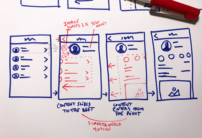
This to say that animation should already be in your head when you are sketching your wireframes. It can be as simple as an arrow indicating where a certain object is going to go after a button is pressed or a simple note. Keep it simple, this will help you find a purpose for the motion (or a motion for a certain purpose) without focusing too much how it looks. This also helps you not to become too attached, because animation won’t always be the solution to your problem. Just discard it if it’s not helping you accomplish something, unnecessary animation will just be an obstacle for the end user. This takes us straight to the next guideline. 2. Animation must serve a purposeGratuitous animation will just take your user’s precious time and after the first initial delight the user will get tired of it, that’s why animation needs to be functional. If you’re wondering what animation can help you with, here are some examples. Soften harsh cuts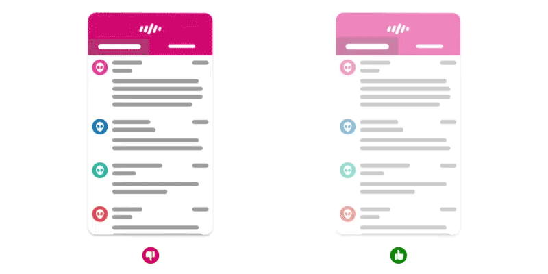
Designer or not, we’re all familiar with this. You are in screen A, you press a button and BAM! A completely different screen (B) suddenly appears. Then you’re left wondering, where did you come from? Did I press the right button? What now? What if “B” is visually similar to A? The user might even think that nothing happened. This shows one of the most suitable candidates for animation, moments of change. Consider the time that takes to make the «journey” from screen A to B, what objects are kept in the screen and show your users how they got there. Don’t overdo it though, as you’ll discover further down, animation is better served “invisible”. Provide context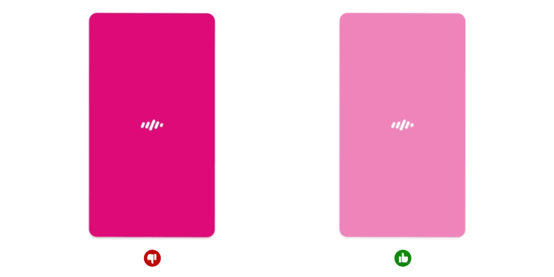
Sometimes you land on a screen and you’re not quite sure how to interact with it straight away. A good way to help the user is to provide a clue of the proprieties of a certain object when it is introduced. If you have a list of posts, for instance, sliding them could help the user understand that he can keep swiping to see more. You can even add another layer to this by timing their appearance in a way they slide one after the other, this will reinforce that these items are separate and you can interact with each one individually. Let’s say that you decide to tap one of them and it opens to display the entire content for a specific post. Now the information that was previously at the same level of others is now the principal. To animate this transition is a good way to reinforce the user’s selection and also to show that you’re still interacting with the same object but in a focused state, which also gives you more screen real-estate. Provide OrientationWhen all the obstacles between the UI and the user are removed from the equation the UI becomes more physical, therefore it’s important to give the user a sense of spatial orientation. You can accomplish this by being consistent with your animations and keep your app structure simple to digest. Consider an object that moves out of the screen to the left, if it reappears, logically, it should come from where it exited. This will help your users understand the app physiognomy and by consequence make them feel more comfortable when interacting with it. If you do it otherwise it will just create confusion and your users might even think that they’re looking at a different object. 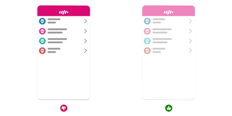
The same applies to the visual hints present in the screen. Imagine that you pressed a list item with an arrow pointing to the right, the logical transition should be a slide from right to left, as if the user view port was moving right, reinforcing the visual clue in the UI. Provide instant feedbackHave you ever asked yourself, did I press that button? Did it do anything? Should I press it again? The answer probably is yes and you probably pressed it again just to realise that you actually pressed it in the first place. That’s why providing instant feedback is important, even if the app doesn’t respond instantaneously. In a world where your finger often covers the button you’re pressing, animation plays a huge roll in providing the user the reassurance they need. 
In some cases, you can even take it one step further and jazz it up a bit. Let’s say you have a “star” button in your app which is one of your “hero” actions (never seen before, I know). This is exactly when you can be playful and delight your user. Make it feel rewarding and the user will want to repeat the action. Be mindful with time, the animation needs to feel instantaneous or it will become old and annoying soon. Also, don’t jazz it up too much. Make the content feel alive
If your app or website has live content, like pictures, comments or some sort of counter, animation can help you accomplish two things. Smooth the addition of new elements and cushion the possible delay of loading such elements. StorytellingIn almost every application, there’s a place where we need to explain something that went wrong or introduce a new feature. Illustrations play a huge roll here, providing a more visual and immediate way to understand a problem and how to fix it. 
This type of screen is really the time and place where animation can shine, be memorable and bring a smile to the user’s face, especially if something went wrong. However, if your app is constantly showing an error screen, then you might want to ignore this point. The last thing you need is for your user to remember all the times that error came up. Now that you have some clues on when and where animation can be used we must proceed to the how. 3. Animation must reflect the brandConsider a simple motion of an object from left to right. There are virtually endless ways to make this motion just by tweaking it’s easing curve. With this you can add a personality to your animation. See the example below, all use the same animation and timing, the only difference is the easing curve. 
The possibilities are endless but, before going crazy and make all your transitions bounce like gelatine, consider your brand, your user and the tone you want to transmit. If the animation doesn’t fit the tone your users might feel out of place and lose their trust in your brand. Imagine if your banking app had the same bouncy style of animation you find in a game. Would you trust it? It’s important that your animation reflects the brand but something you must keep in mind when designing your animation is the next guideline. 4. Animation shouldn’t be the heroAnimation is here to save the day, not like a standalone hero but more like the Ninja Turtles, fighting as a team playing on each other’s strengths. If your animation takes the centre stage, you’re not designing an experience, you’re just forcing the user to watch a movie. 
Animation needs to be part of the whole experience, complementing the visual design and a supporting the interactions, to achieve this restraint is key. In most cases a good animation is the one that users don’t even notice. If you’re designing, your job is not to entertain the user but rather help him accomplish something in the easiest, most intuitive and natural way possible, and the next guideline comes to help with that. 5. Animation must feel natural
I know that the word “feel” might be ambiguous, but bear with me. However, this doesn’t mean that all the apps should react the same way. In the real world if you kick a ball they don’t react the same way. A football will fly away but a bowling ball will probably just hurt your foot. As I mentioned in the previous guideline, it’s all about the tone and the weight you want your brand to transmit. You have to define what’s your app’s “material” and weight, and make it behave accordingly, but remember to always adjust it if necessary so it doesn’t go against the next guideline. 6. Animation must not waste time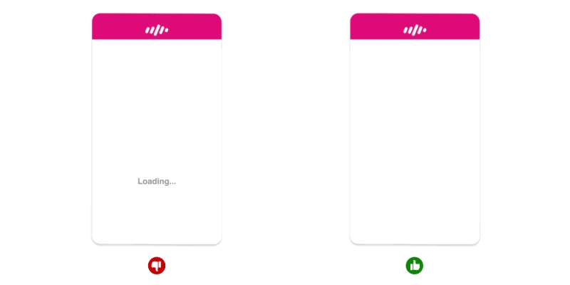
Animation can be used to tweak the user’s perception of time, so use this in your favour. For the human brain, anything below 0.1 seconds will seem instantaneous and below 1 second will seem seamless. So, if you have a process that takes 6 seconds for instance, you can break it down in a few separate animations. This trick should make the process feel a lot faster and keep your user engaged. You can also use animation to fake an instant action that will actually take bit longer in the background. This will make the app feel more responsive even though the process still takes longer than what the user sees. You can’t mimic everything in the real world, you need to take into account the user’s expectations. If you press a button in the UI you expect an instant feedback, thus it’s not the best place to apply physics, so don’t ease-in an animation in cases like this. Ok, if you made it this far I truly believe that, if you apply these guidelines, you’re in a good path to make the best of animation and improve not only how your UI looks and feels but also how your user experiences it. Now that you know the guidelines, you still need to go over a few more jumps. The last hurdles
If you want your user engaged you need to provide a seamless experience and, if used right, animation can definitely help you to accomplish that. It’s not going to be an easy journey though, as with anything design related you need to be prepared for an iterative process. You also need to know how to prototype and collect feedback, if your colleagues lack the vocabulary it’s going to be hard to communicate. They won’t be able to comment on your animation without using an onomatopoeia (e.g. “That button could go more like swoosh and then kablam, you know?”), for that reason I think it’s good to introduce people to the 12 basic principles of animation, so they get familiar with the terms allowing them to express themselves in a way that you can understand. One last hurdle to go, the effort that your development team can/wants to put into animation. You really need to push through and show them that in a world where animation is becoming an intrinsic part of a good user experience the question is not if, but when are you going to have to catch up with the herd? The sooner you do it the better. Your user will appreciate it and you will reap the benefits. There you have it, my 6 Animation Guidelines for UX Design. If this sparked your interest and you want to dive deeper in this subject I can recommend a few other articles and authors that inspired me to write this. Transitional Interfaces by Pasquale D’Silva I really hope that you find this article useful, I know that I’m not the first (or will be the last) to talk about animation in the UI, but I tried to take a slightly different approach, not focusing so much on how the animations looks like but rather how they can help the end user. I invite you to participate in the discussion in the comments below, I’m always interested to know your thoughts and happy to answer any questions you might have in your mind. Thanks for reading! :) The post 6 Animation Guidelines for UX Design appeared first on Design your way. from http://www.designyourway.net/blog/user-experience/animation-guidelines-ux-design/ Personal logo design may seem the easiest thing at first, but you may soon discover that you are your most difficult client. When you’re a designer, crafting branding masterpieces for clients leaves little time to think of your own promotion. Yet, a good personal brand logo is something you can’t dismiss if you want people to know about you. Personal logos are, in fact, the key elements of your brand identity. As someone who’s mastered this art, you have the ability to manipulate all important building blocks, and bring those together in a unique piece that reflects who you truly are. With a personal logo design, you can proudly share your work with potential clients, colleagues, and employers.
Give your personal brand an identity
Personal logo designs help professionals build up their reputation, and showcase the personality of their work. They use logos to let customers know the niche in which they operate, the specific design trends they follows, and the unique aspects of their work. Consider how you want to be perceived as a designer. Once you’ve chosen the style of your logo, you’ve determined the branding direction for all other promotional materials, including your business card, resume, portfolios, social media pages, and even user icons. In a single tiny visual package you’ll be showing the world who you are, and what you’re doing the best.
You should of course look at the work of other designers and get inspired, but once you get down to your work, you must think of designing a personal logo different from anything customers have ever seen. While creating a personal logo, start by making your name (or initials) clearly visible, and memorable for both clients and employers. Next, think of a way to associate them with the unique set of skills you’re trying to sell to your audience.
Speaking of skills, you need to select a limited number and emphasize them in the right way, as for instance your ability to work with industrial equipment, or the experience serving a particular industry. You can also include an image in your personal logo, and add the text afterwards, as long as the image gets down to the point (do your customers really care about your personal hobbies, and how do hobbies show them you’re qualified for the job?).
With personal logos, less is more. Personal logos designs should be understandable and simple, and get the job done without excess wording and detailing. You don’t need too many colours or fonts put up together, as this may hide the message you’re conveying, and make customers struggle to understand it. One or two colors will suffice for an intricate logo design, and will make it much easier to replicate the work on other promotional materials.
So, how to design a personal logo? To make the process easier for you, we collated some of the best tips, tricks, and personal logo ideas from around the world, and listed them in a handy guide. Check it out: Make your personal logo design unique
Looking at the best personal logo designs, we’d all arrive to the same conclusion – these masterworks are unique! Even when working with their bare initials (which, of course, happen to be many people’s initials), talented designers found a way to inject their creative personality, and the market appreciated that in no time. To do the same, you have to think out of the box, and focus on the things that make your brand memorable. Doodle
A heads-up: It will take to prepare and dismiss multiple personal logo examples before you scratch on the final product. In the meanwhile, all ideas and suggestions are welcomed, while the pressure of reinventing the wheel is not. Doodling is a great way to launch your creative journey, as this way you’ll have all ideas documented on paper, and you’ll be a step closer to the ideal logo with every sketch you make. Stay flexible
A good designer knows there’s always room for improvement. This means you should give your logo a try on different backgrounds and in different settings, and scale it up and down for maximal visibility. It may turn out that a simple black and white logo is the best option you’ve got!
Another challenge for a designer in charge will be to create a logo that looks equally well wherever it appears, which means the designs should be adaptable, and look nicely on all sorts of branding materials. We remind you once again: The simplest ideas often turn out to be the best ones! Build up your own reputation
Personal logo designs are very individualized pieces of work, and have the sole task of conveying what a designer stands for. Rather than rethinking the entire purpose of life and figuring out your values, you should build up a picture of yourself customers would like to see.
The process comes quite close to adjusting your clothing to your personality: you will either opt for a relaxed and casual combination, or a sophisticated piece that will make your look elegant and formal. It all comes down to collecting visual, written, and verbal adjustments, and combining them in a distinct perception. Familiarize with your audience and your competitors
Launching a design career is pretty much the same as starting up any type of business – you have to target an audience for your services, and get to know what they want so that you can provide it. While there is nothing wrong with working on your own ideas and developing unique concepts, you should always keep track of who’s going to see them, and how they’d feel about them.
Collect information and craft the profile of an ideal consumer – who he is, what he likes or dislikes, what he stands for, and which brands he’s already associated with. This will help you put a face to your prospective customers, and respond to their exact requirements. Don’t forget that your competitors also have a role in building up this profile. Which are the best brands in your surroundings, and how do customers usually associate with them?
Are there any designers whose style and skills are similar to yours, and which are the weaknesses you could use to your advantage? Quite often, a competitor’s analysis will reveal the answer of which market gap you’re supposed to close. Double-meaning logos
This won’t be easy to explain with words, but the best personal logo designs are the ones that have double, or even triple meaning. To give you he clear picture, we will use an example: a logo that contains the word ‘pause’ written in plain letters could get a whole new meaning by using two parallel lines instead of the letter ‘u’ (the video-player symbol for a pause). These clever inventions are quite common in successful logos, and you should be thinking of one of your own. Use it as much as you can
A properly designed personal logo will underline your reputation of a professional designer, which is why you need it showcased on all your working assets and materials.
Place it on top of the resume, feature it on each page in your portfolio, and print business cards with it. Better yet, make sure employers spot it easily on social media, and this will help you make a lasting impression. Start with a creative brief
When creating a personal logo, think of yourself as any other client you’ve worked with. Don’t jump headfirst into your task, but think of the brand identity first, and set the town in line with your audiences’ needs. Research your competitors, and keep track of your budget so that your project won’t go out of control. Getting inspired
You can find logo inspiration literally everywhere, starting with competing brands in the industry and moving to all types of web collections you come across. Yet, the best shot you’ve got is to look at yourself and what you stand for, and try to depict that hidden meaning you wish customers would know about. Ending thoughts on personal logo designComing up with an attractive logo is the ultimate task of every professional designer. Personal logos are critical parts of every branding strategy, and are used to communicate both the skills and the quality of work that designer has to offer. If you liked this article about personal logo design, you should check out these as well:
The post Personal Logo Design Ideas: How to Create Your Own appeared first on Design your way. from http://www.designyourway.net/blog/inspiration/personal-logo-design/ When you’re a student and a bit short on cash, a free CAD software solution is everything you need to make things moving. If you’re in an industry that requires you to do any kind of 3D modelling, especially with CAD tools, you are undoubtedly aware that these tools are essential if you want to reduce potentially fatal flaws that may appear during production. However, getting this kind of tool can be pretty expensive. Even though larger companies might look at this as a justifiable cost, others, such as students, will see this as a big problem. However, there’s a solution for those users. There are plenty of alternatives for anyone who needs a CAD software, and many of them are even free. To save you the trouble of going through each and every one of those free CAD programs, we have assembled a list of free drafting software that can help you get started. Sculptris
Made by industry leaders, Pixologic, Sculptris is a free CAD software, yet excellent and professional option. There is a rich sculpting toolset that will let you design anything you could possibly want, with ease. However, if you’re bad with geometry and find creating your own surface tricky, there are options that automatically build your surface to make things even easier. SketchUp Make
This is a free CAD software that is primarily used for architectural purposes and projects. It is by far one of the most popular free 3D drafting software, and you can use it as a complete tool to advance in your 3D modelling career. As far as free CAD software goes, this one has everything, minus the price tag of the other competitors. You can take a look at the SketchUp 3D Warehouse, where you’ll find plenty of incredible content that is created by other users. This way, you’ll have an overview of what the software is capable of, and you can also download the models found there. AutoCAD (Student Version)
I know, I know. Nobody thought that they could ever get AutoCAD, the ultimate CAD software, for free. However, there is the possibility of getting it, and with that, it is potentially the best free CAD software currently on the market. The free version is fully functional, and available to students and faculties. The only downside to the free CAD program is that you get a watermark on any plot you generate. Another interesting thing to know is that Autodesk also offers free licences for other software it has in its suite, such as AutoCAD Architecture, Civil 3D and even AutoCAD Electrical. This is an incredible way to get your hands on some free 3D CAD software if you want to learn or progress in your career. DraftSight
DraftSight is a very good free CAD drawing software for individual use. You don’t have any limitations in terms of plotting or usage, and the only thing you need to do is activate the program with your valid e-mail address. This is a 2D drafting software, which comes with all the bells and whistles you need to generate professional looking plans. The files are also in the .DWG format, meaning you have compatibility with Autodesk’s line up of products. FreeCAD
FreeCAD is actually a very serious option, even though its free. It is open-source, and has support for parametric 3D modelling, which lets you modify your parameters when you scroll through your model history, thus modifying your design. People who will benefit most are product designers and mechanical engineers, but the power that this software comes with will be attractive to anyone. There is a pretty wide developer base, and they have given the software enough functionality for it to be able to go head to head with some of the heavy hitters of the industry. It is also available on plenty of platforms, and it’s very customizable. LibreCAD
If you want a high-quality 2D modelling platform, LibreCAD is a great open source option for you. It came out of QCAD, and has a pretty big following of both customers and designers. There are powerful tools such as measurements, layers, snap to grid etc. The concept of work and UI are fairly similar to AutoCAD, which is good news if you want something free to test yourself and learn, and later on upgrade to AutoCAD. OpenSCAD
If you think that you could wrap your head around using a textual description language for 3D modelling and creating objects, OpenSCAD could be an alternative suitable for you. When you’re modelling, especially in a professional scenario, you want to be specific, and OpenSCAD can help you here. There is a document that lets you know of all parameters you need to keep an eye on, and the documentation itself is impressive. It can prove to be very helpful, especially for newcomers. There is no menu, no shortcuts, but only pure code, which is great if you’re a developer and need a designing tool. TinkerCAD
TinkerCAD is vastly different from the other tools on this list. To begin with, it is usable and accessible anywhere, since it is online based. It doesn’t require any previous experience, and it is very easy to use, especially for newcomers to the industry. Therefore, it doesn’t really have a lot of professional features. It is also part of the same Autodesk initiative that gave us Autodesk 123D Design, and is available on a few platforms. There is also a gallery where you can see what others have made. It has a powerful geometry kernel, as well as support for HTML5 and integration with 3D printing services. KiCAD
Do you want to begin with designing your own printed circuit boards? KiCAD is a great place to start, as it is an open source tool that gives you a PCB editor, schematic editor, GERBER file viewer, as well as a footprint selector for component association. This is pretty much all you need to get started, and the software is pretty easy to use, meaning even entry level users will be able to find their way around it. QCAD
If your goal is to create technical drawings, whether for mechanical parts, or buildings, or diagrams and schematics, QCAD is a great free CAD software options to help you get that job done. The focus of QCAD is heavily shifted towards portability and modularity, and it comes with a pretty powerful 2D CAD platform that is very easy to use. Even beginners will have no problem finding their way around this tool, which is excellent. 3DCrafter
If you want something that makes 3D modelling as simple as dragging and dropping, 3DCrafter is the tool for you. It’s a real-time animation and 3D modelling app that comes with shape building tools and 3D primitives, which lets you create complicated models with ease. Once you’ve created them, you have some modelling tools that can help you perfect the models. You can also place your subject at various points in time, and let the software animate everything in between. NanoCAD
If you need, or want, .DWG support, NanoCAD is one of the options that can provide that. You can use it for free, but most of the advanced features and benefits will require that you pay some sort of premium. However, this is purely up to you, and you’re the only one who knows whether you need tools such as ONSAP, SNAP, a command line etc. No matter if you’re a beginner, or a power user, it is a great alternative for 3D. SolidEdge
As far as computer aided design goes, SolidEdge is one of the most popular tools for that platform. The layout is extremely professional, and lets you get into the flow with ease and without wasting much time. From common designs, to complex machinery, you can use SolidEdge for anything, and the job will be done quite neatly. Given that it is an exclusive piece of software, the price is extremely high. This is where the student edition comes in, which lets you skip that. The software is a very powerful competitor to the best and most popular CAD tools on the market. Whether you need something dead simple, or a professional model, SolidEdge can do everything, and the synchronous technology will lead to a faster design process overall. Cinema 4D
Even though we don’t really have four dimensions, Cinema 4D gives you plenty of 2D and 3D modelling tools to work with. You also get rendering and simulating, as well as animating your models. Plenty of animators use it as it has all the necessary tools to create a complete storyboard, and it works on both Mac and Windows. Since its packages are free, and the user interface is pretty easy to use, it is an ideal tool for students. Blender
Blender is pretty much a great and extremely simple alternative for people who might think that the user interface of 3DMax or Maya is too complicated for them. It is true that these pieces of software can be overwhelming, especially for things such as school projects, and this is where Blender saves the day with its simple user interface. It is available for Mac, Windows and Linux, and you can take advantage of its 2D and 3D modelling tools anywhere. Formats such as .DWG, .DXF and even Microstation’s .3DS are supported, and the tool can handle advanced simulation and renders. The best part? It costs absolutely nothing. ZBrush
If you’re a beginner animator or graphic designer, this free CAD software should be one of the first pieces of software that you should lay your hands on. The learning curve is suited to beginners, and the time needed to be able to master the software is minimal. There are, however, plenty of tools on the platform, which puts it on par with some of the paid (and usually expensive) alternatives on the market. It has a scripting technology that develops 3D models with ease, and the fact that it is completely free makes it a great option for anyone. Ending thoughts on free CAD softwareIn the list above you have quite a few free CAD software options. Beginners can take a look at a few, and decide for themselves which ones they want to try. Some are easier to learn and master, some more difficult, but most, if not all, offer everything you need to get started. You should be versatile when deciding, though, as your career later on might require that you use certain software you’re not really used to. Regardless, whichever you choose, you will be creating 3D models with ease. if you liked this article about free CAD software, you should check out these as well:
The post Free CAD Software To Create 3D Models With appeared first on Design your way. from http://www.designyourway.net/blog/resources/free-cad-software/ Picking the right tools for a better design workflow The purpose of this article is to bring to light the lesser known (well, at least some are less known) gems that exist that makes the design process easier. We all know the design process is messy and very convoluted, but there are tools that can alleviate some pain points and no one ever complained about organized research material or well-maintained symbols and layouts. This article will not be going deep into how these different tools work, but just highlight what are the biggest perks of using them and how it makes a designer’s life easier. This article will go through a designer process cycle starting from research, research synthesis, interaction design, prototyping to validation, and highlight tools in each phase that help designing and collaboration easier. ResearchBear App for notesThere have been multiple notes app that I have used in the recent past ranging from Google Keep, Apple Notes to Google Docs but none have been as handy as Bear. The flexibility the app provides in helping us organize notes is amazing. Use hashtags as a means to structure our navigation is a great idea. This app is extremely well-designed, minimal and provides great formatting capabilities. Taking notes has never felt this good before.
The best functionality of this app is the seamless sync between the different devices. Using the Apple Pencil on the iPad to draw and take hand-notes makes this app even more useful in meetings, interviews, conferences etc.
Research SynthesisMilanoteThis application is easily the top find in 2017, thanks to Katy Jimenez for introducing me to this. A perfect visual note-taking app that allows designers to arrange their content from various sources. The process of design is messy, unstructured, nonlinear, and nothing like the perfect design videos one sees on marketing pages of products. This app tames the madness that the design process is, and helps designers organize their content better. I primarily use it for organizing my research findings, and the ability to create columns with a title mimics how I create affinity diagrams with post-its. Creating sections with quotes from user-interviews, consolidating the critical information from such sessions can be done easily on this tool. The components of this tool have great visual hierarchy and hence makes scanning very easy. For example, this article was completely structured and written on Milanote as you can see below.
This serves multiple purposes such as using it as a mood board, collecting research, outlining articles, to even synthesizing research.
Interaction DesignSketchThis is a no brainer. Sketch is probably the most widely used tool by designers as of today. Yes, there are other tools that are catching up, but quite honestly, designers have become so used to Sketch by now that a jump to another tool might not be evident in the near future. There are abundant tutorials out there for perfect Sketch workflows, and here, I am going to try to talk more about some of the plugins that make this workflow seamless. Sketch Runner — Spotlight of SketchThis makes designing on Sketch way faster than one can imagine. Launching sketch runner can be done with ⌘ + ‘. The plugin has six different tabs and pretty much any action one wants to perform on Sketch can be done on it. Think of this as the Spotlight Search of Sketch.
Inserting symbols is made easy and fast where it reduces the need to use the mouse to go click on the Symbol icon, search for it on the dropdown and add it. The action that I use the most is inserting symbols and Sketch Runner provides with an option to have any tab on focus when launching. I usually set this to the “insert” mode.
|

AuthorPleasure to introduce myself I am Jamie 27 years old living in Searcy, AR. I am web developer and have developed over 50 sites for clients. Now a days I am focused on designing as I feel I am lacking it. Archives
April 2019
Categories |
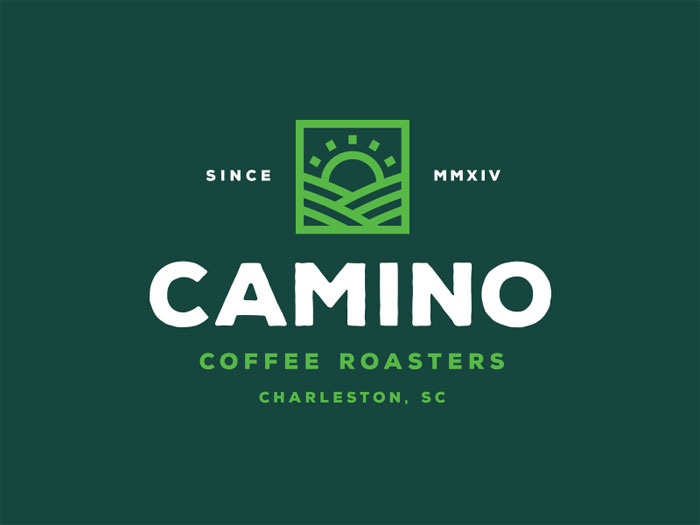
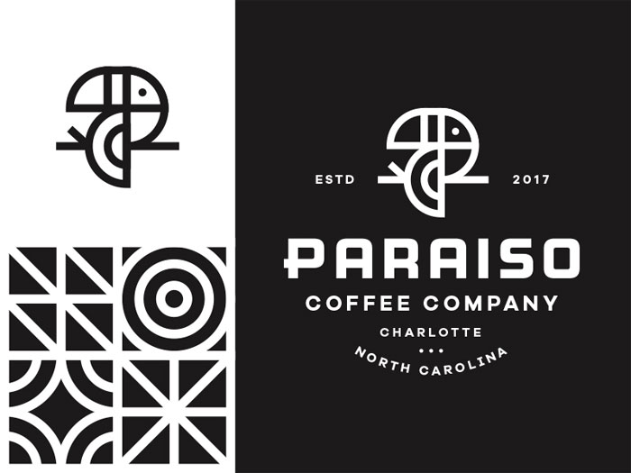
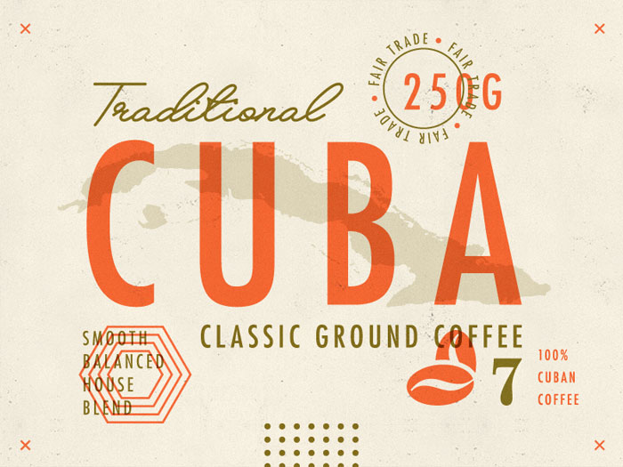
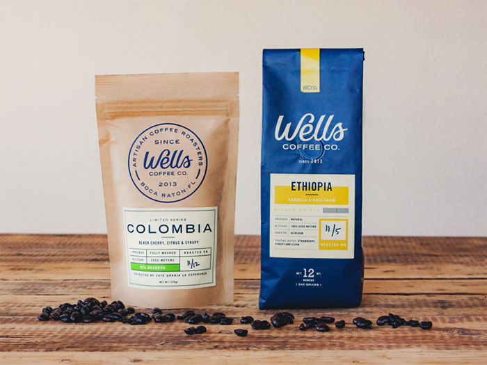
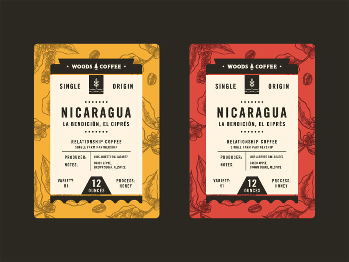
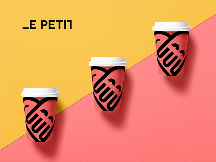
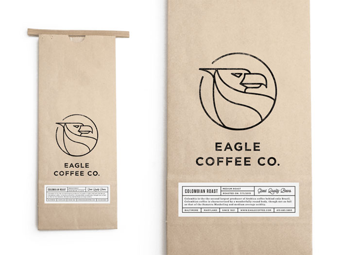
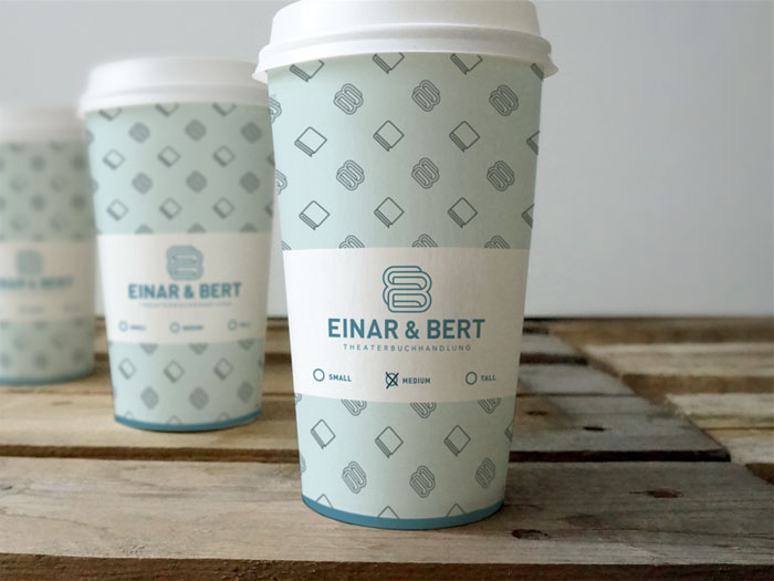
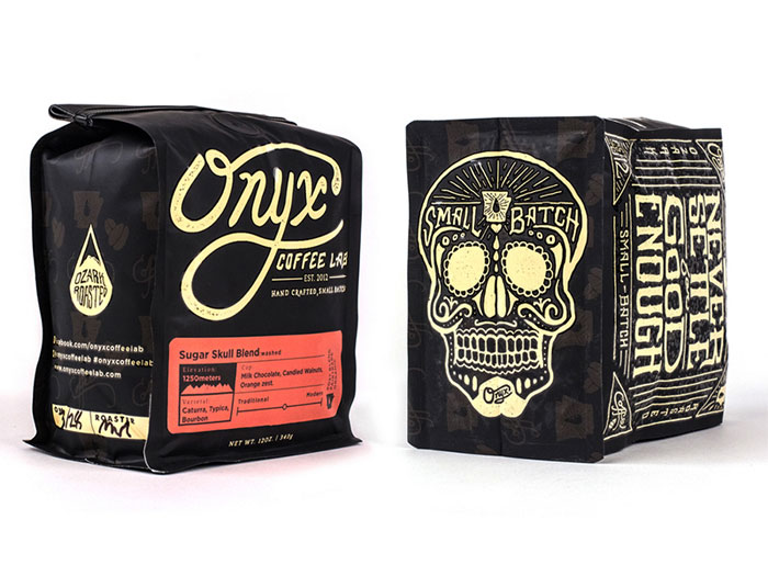

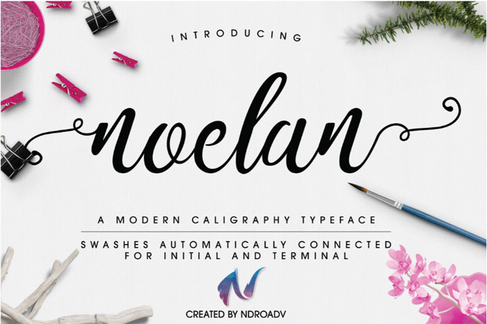
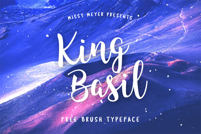
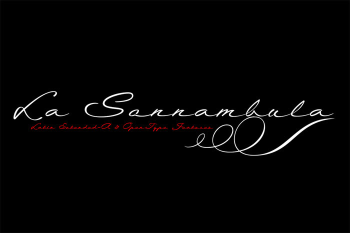
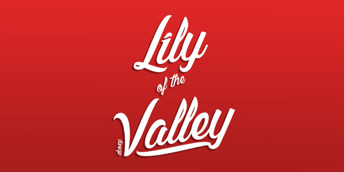
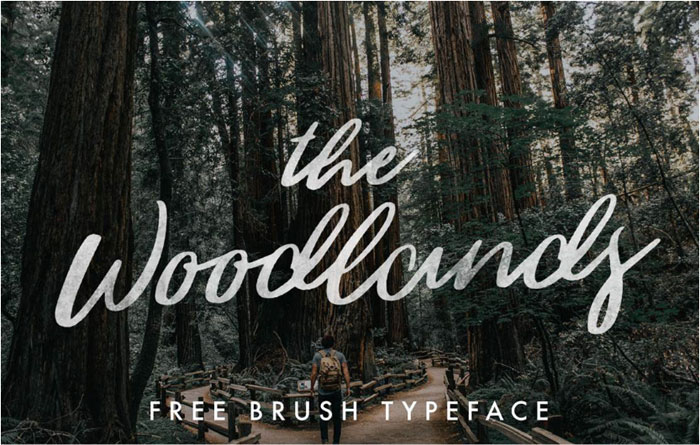
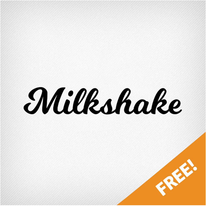
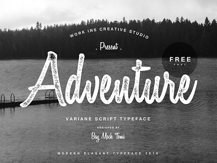
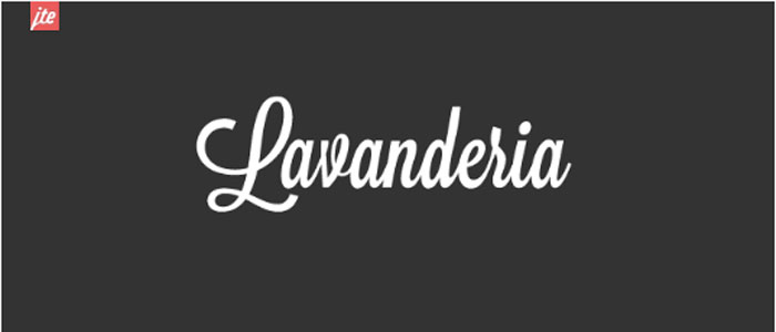
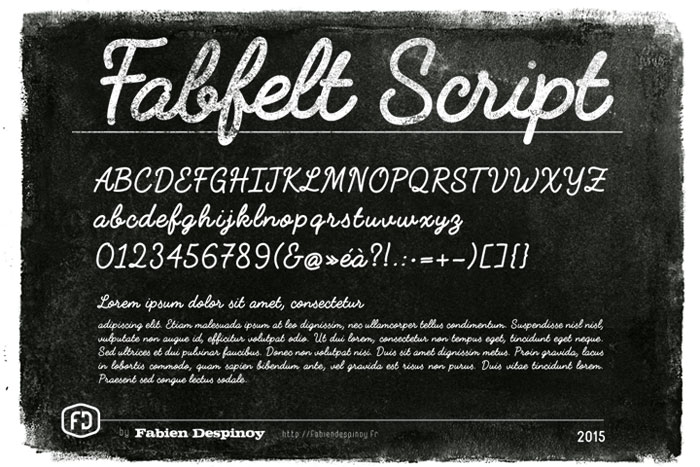
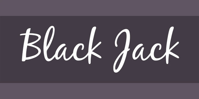
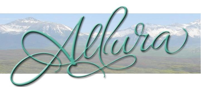
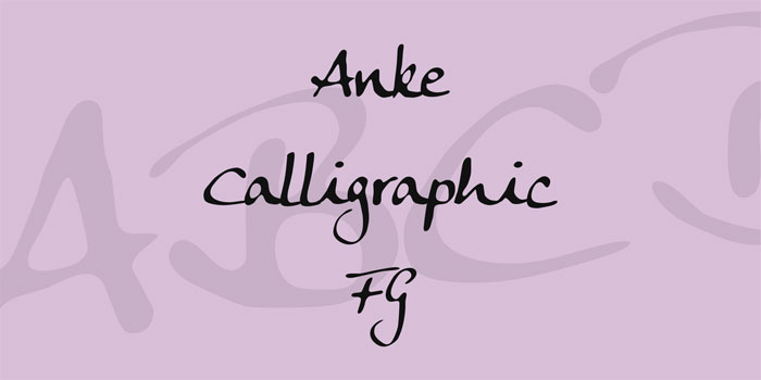
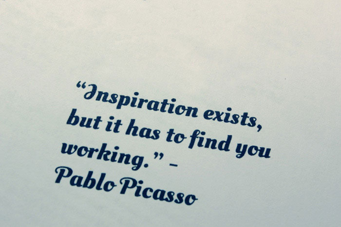
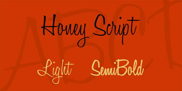
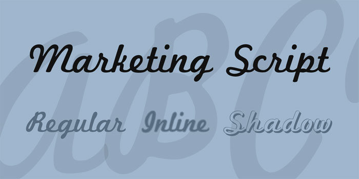
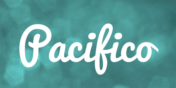
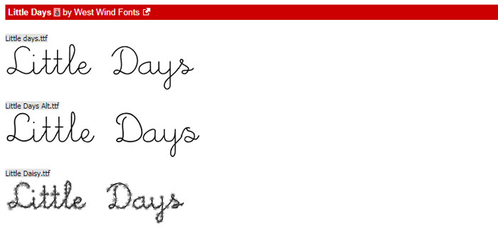
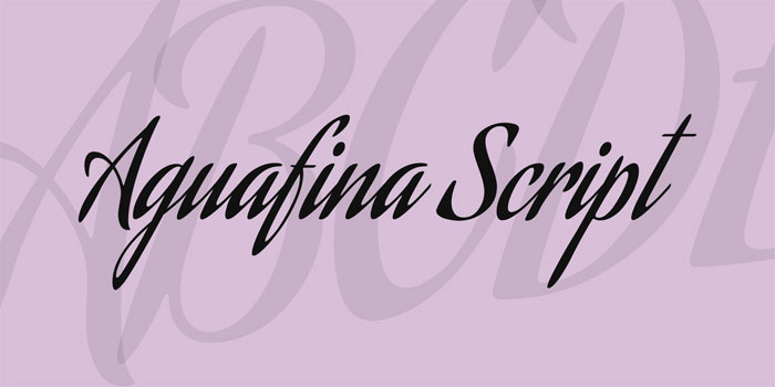
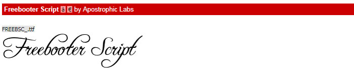

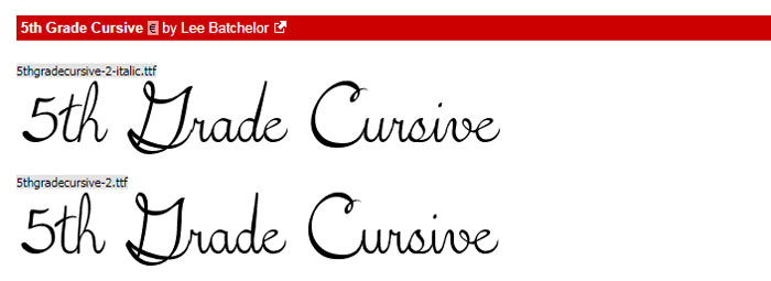
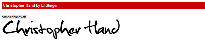
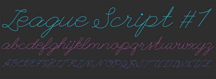

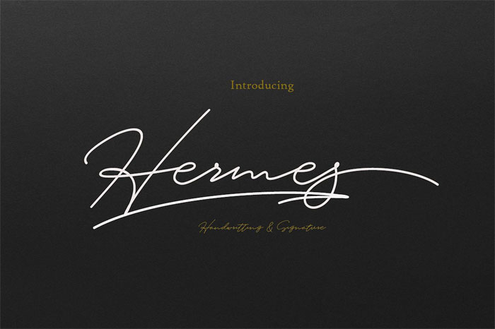
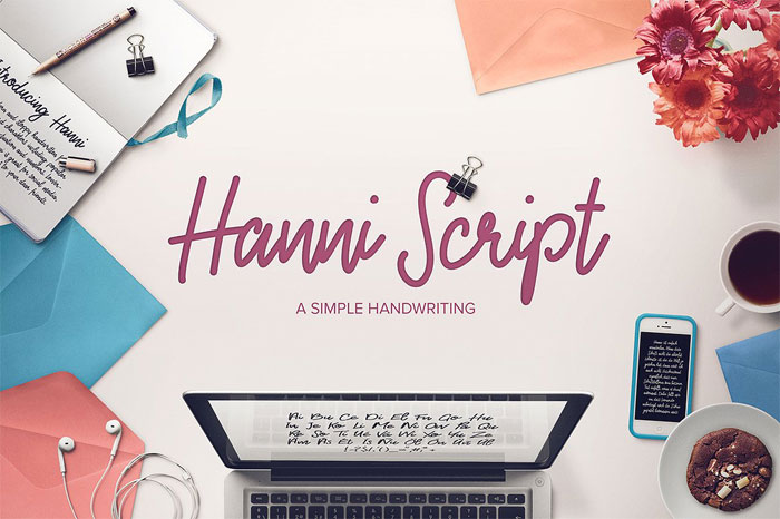
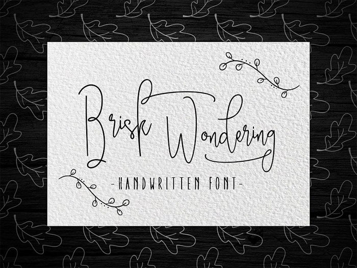
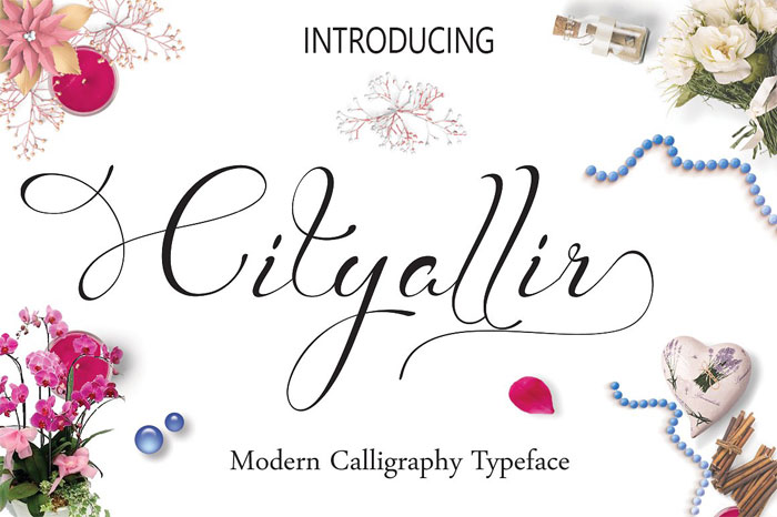
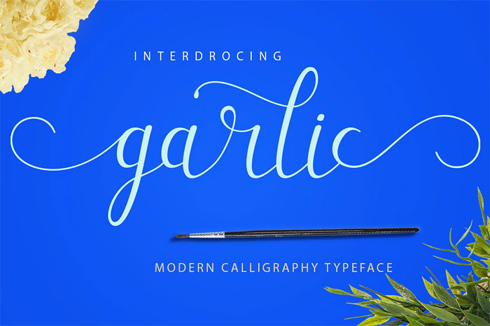
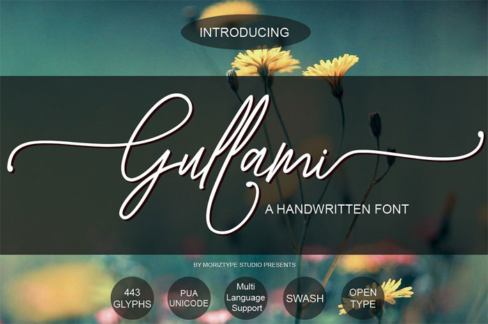

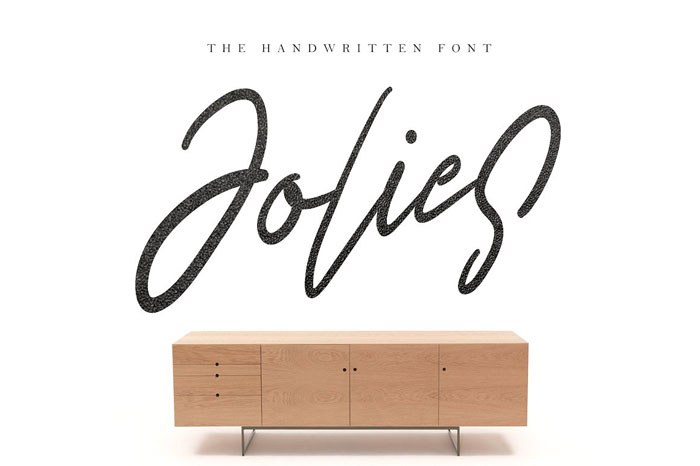
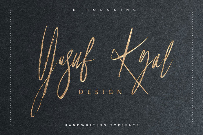
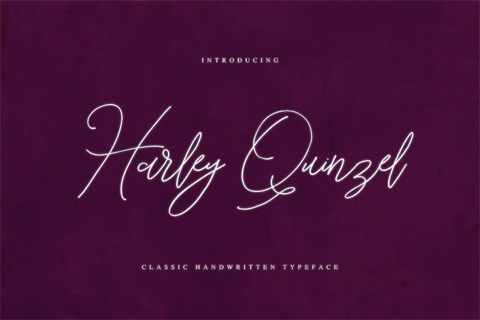
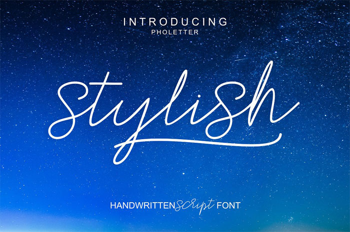
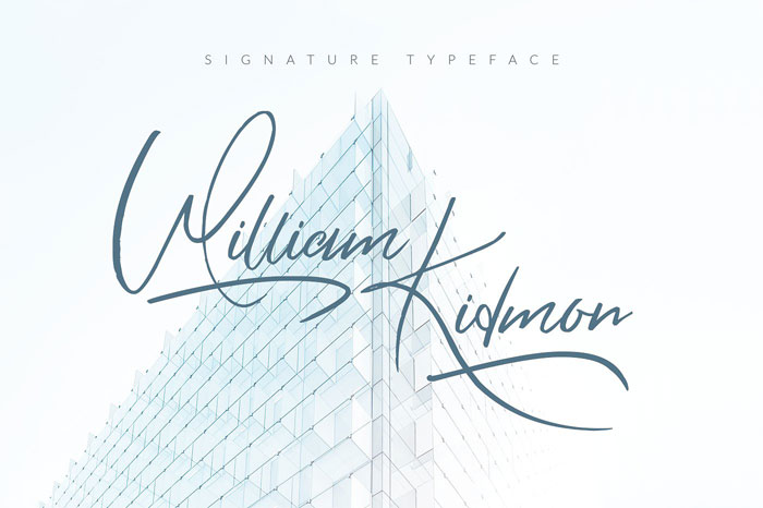
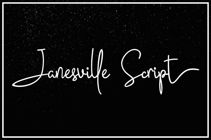
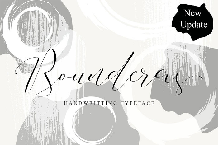
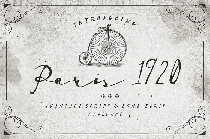
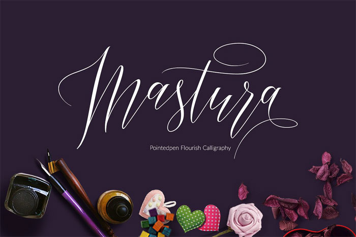
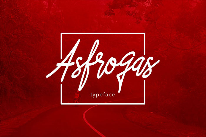
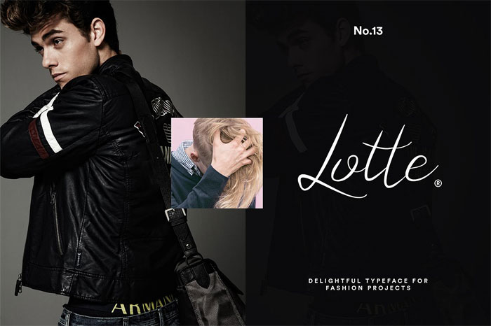
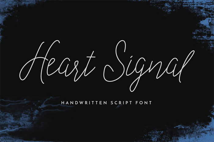
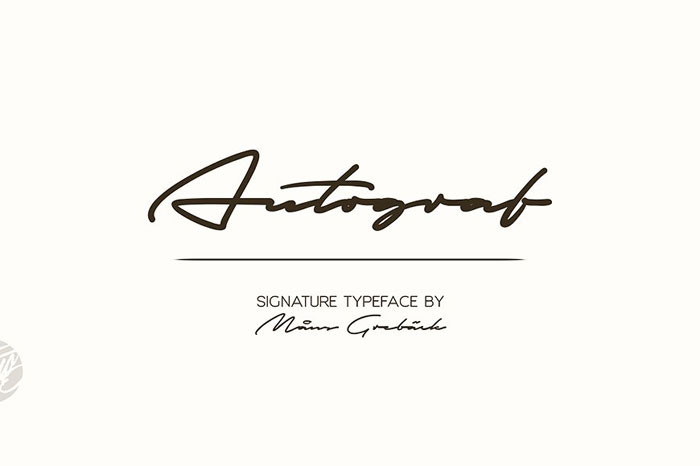

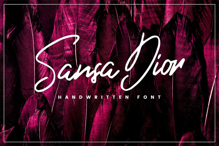

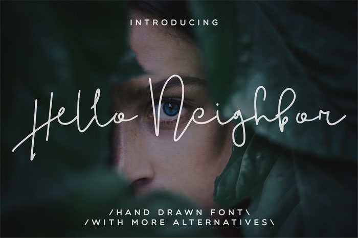
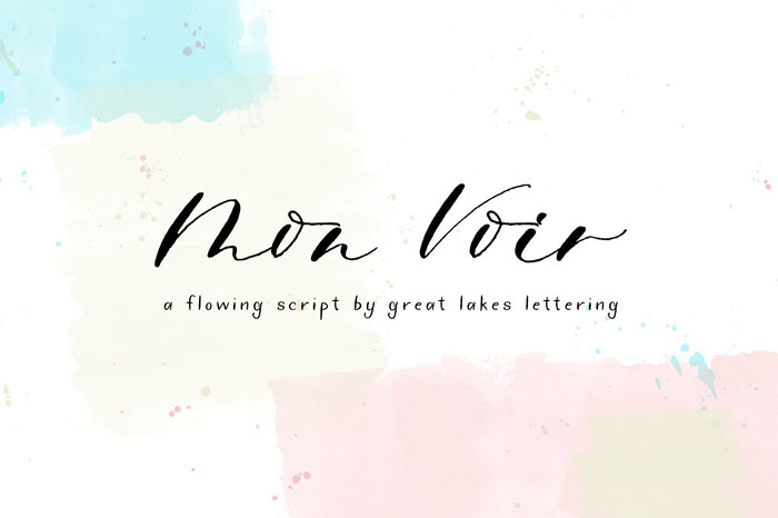
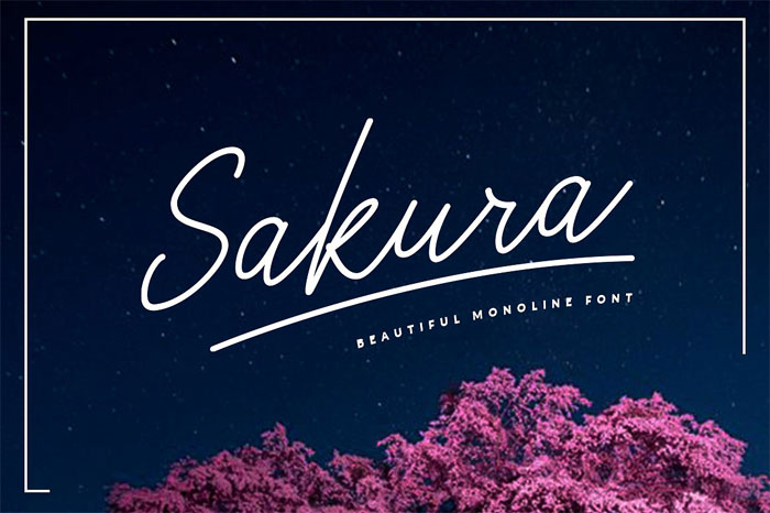
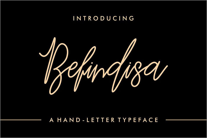
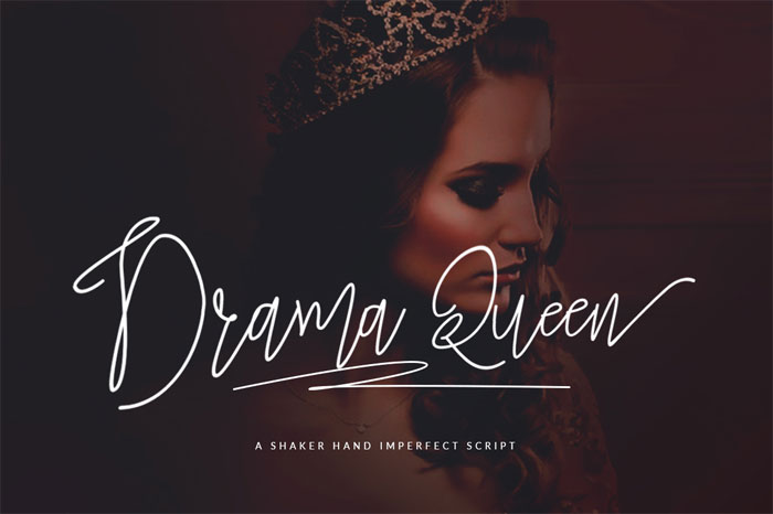
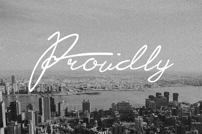
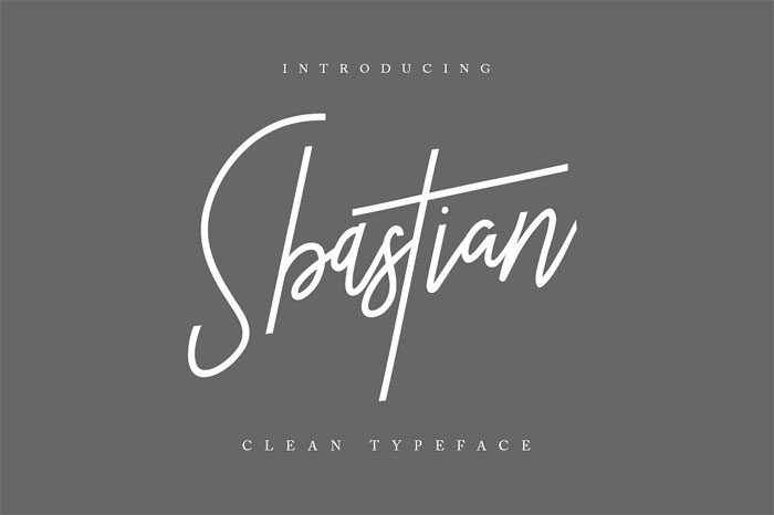
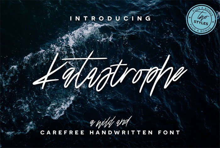
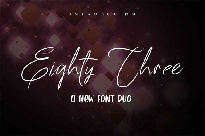
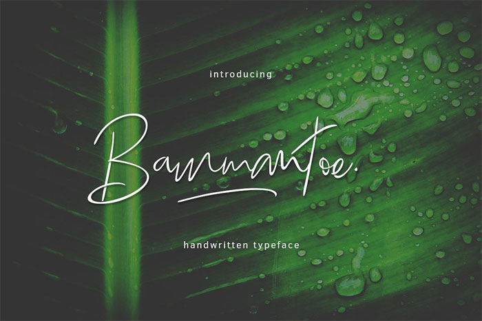
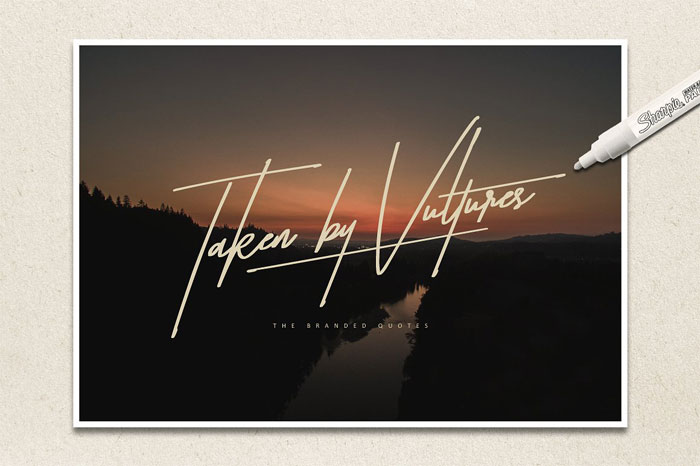
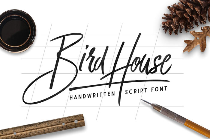
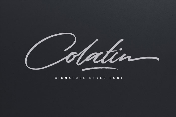
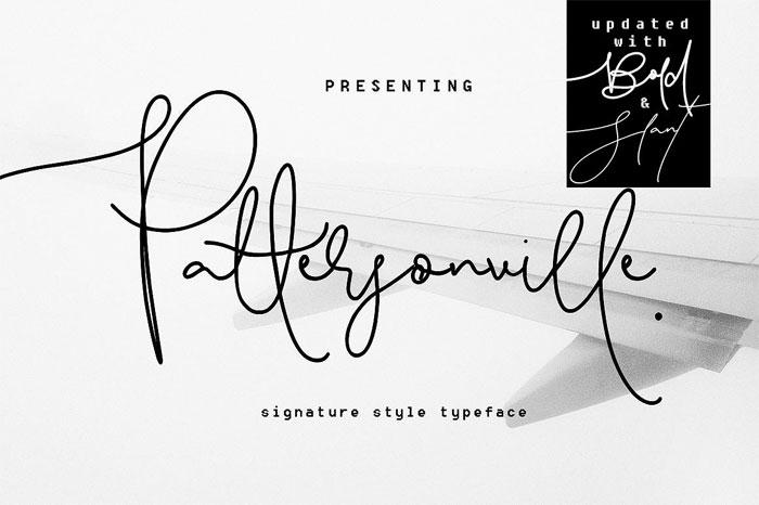
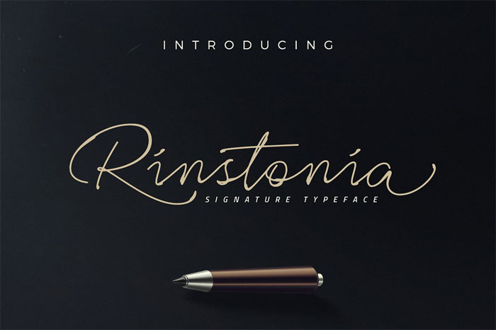
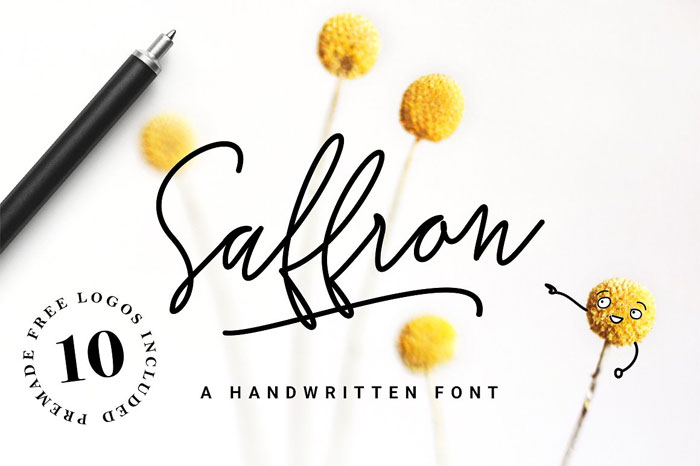
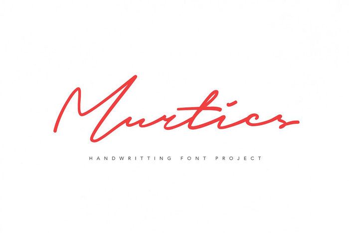
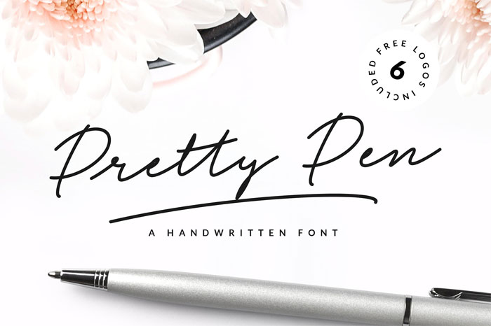
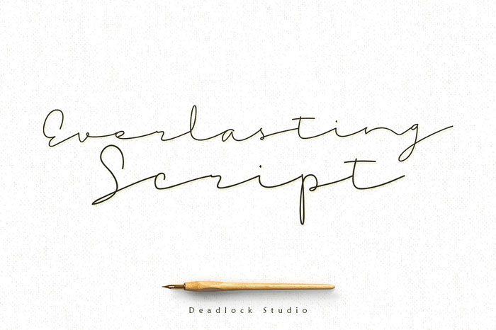
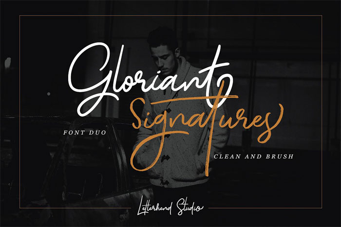
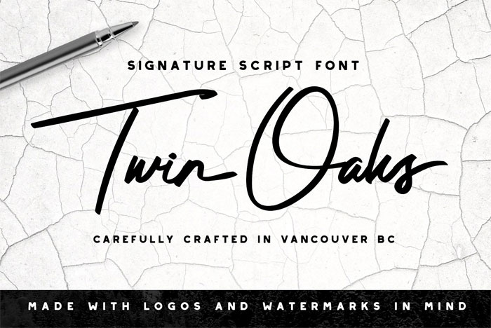
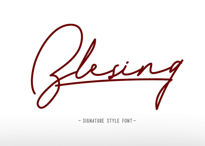
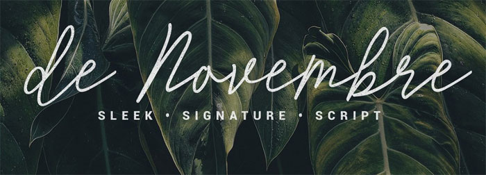
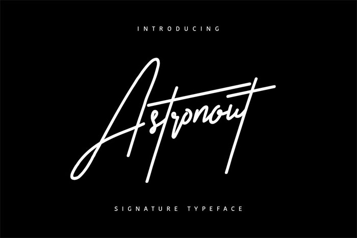
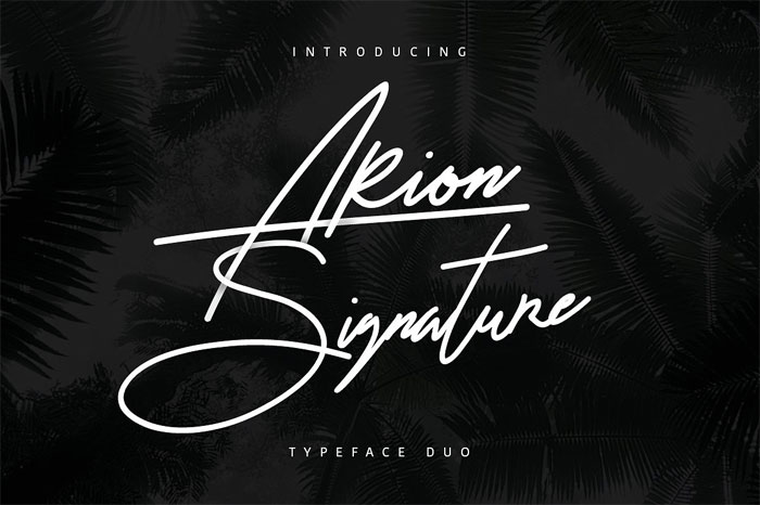
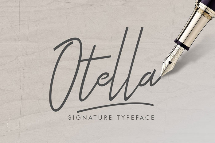
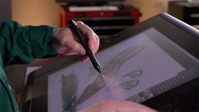
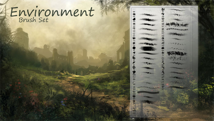
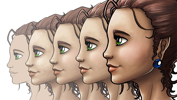
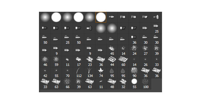
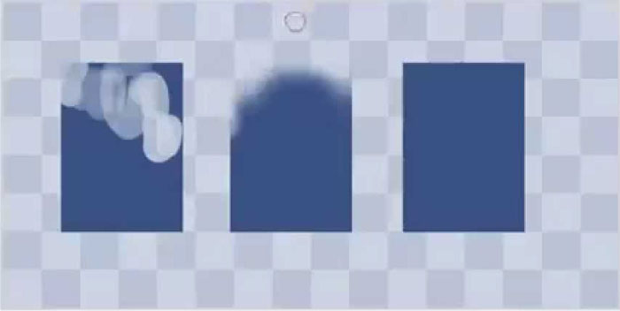
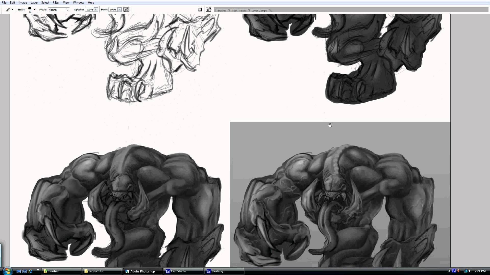
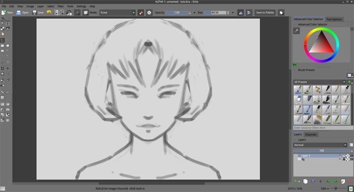
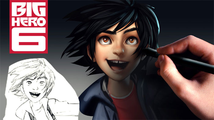
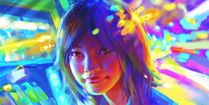
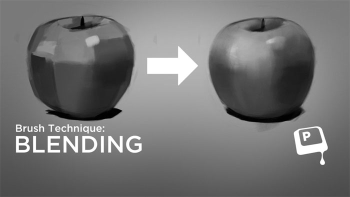
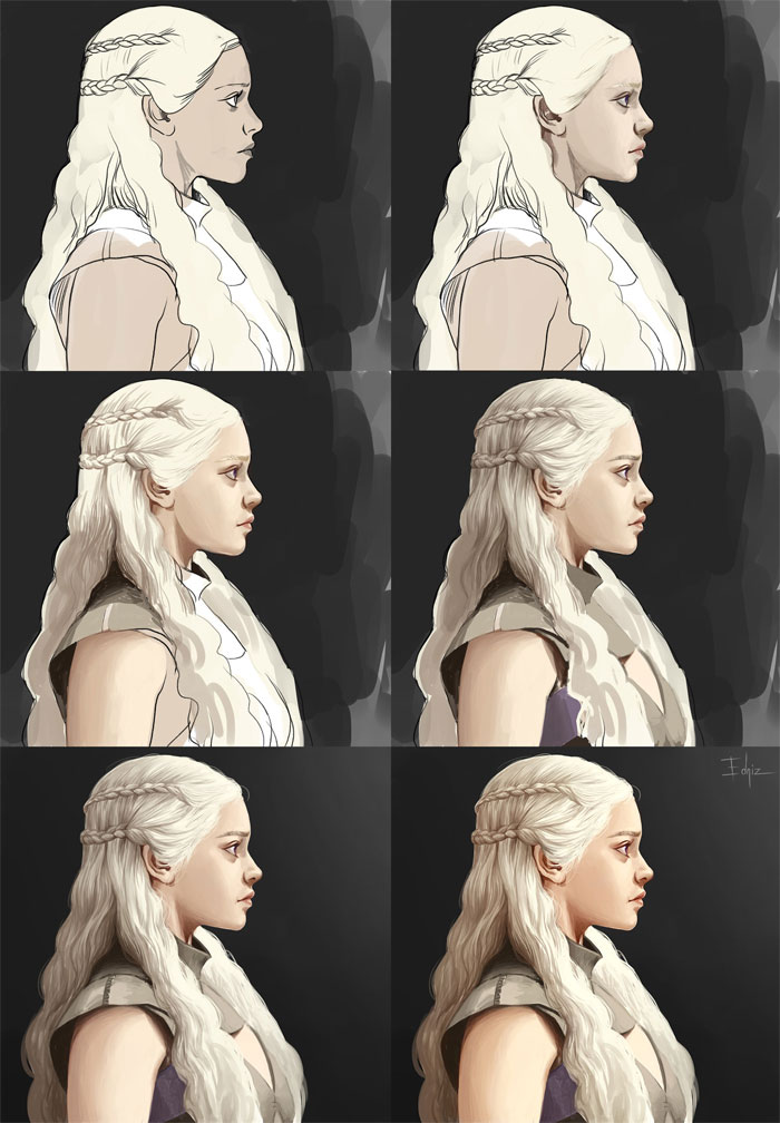
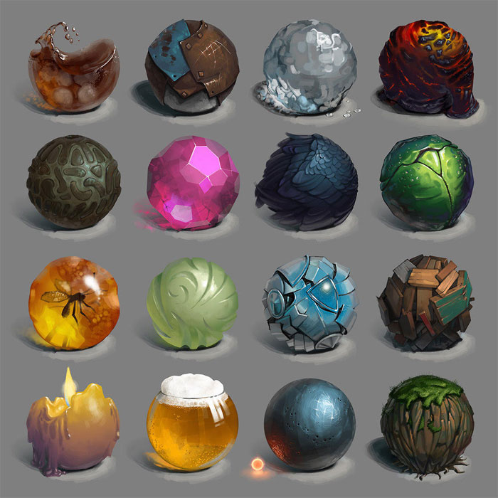
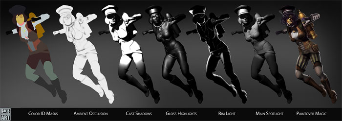

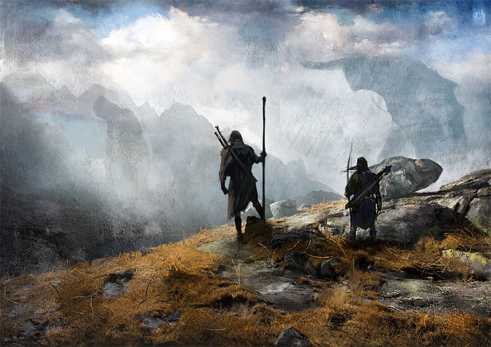
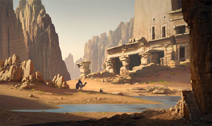
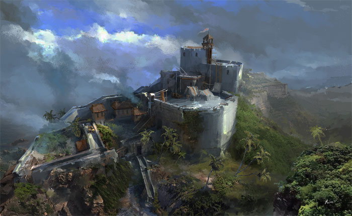
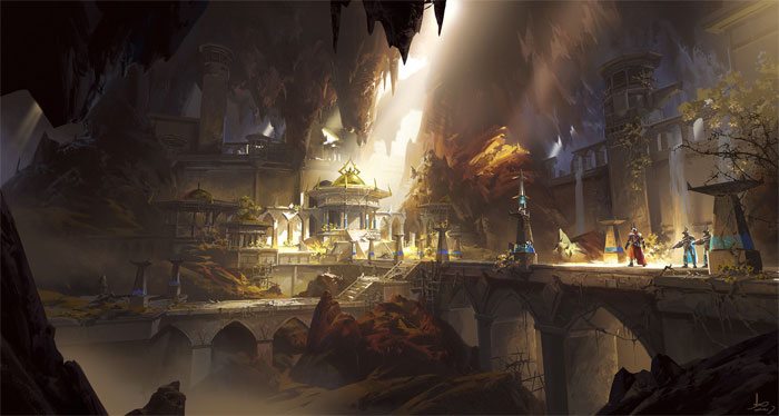
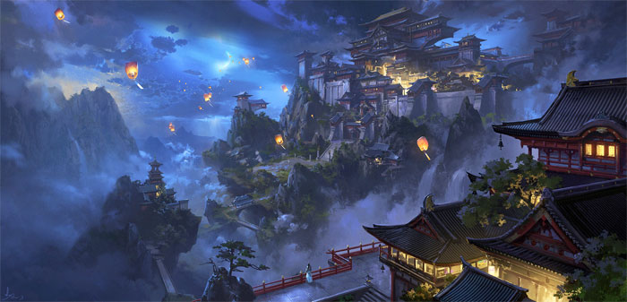
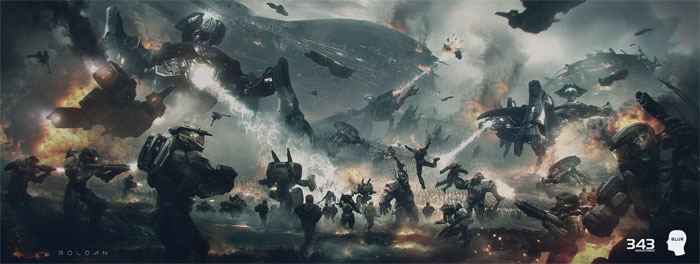
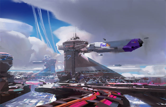
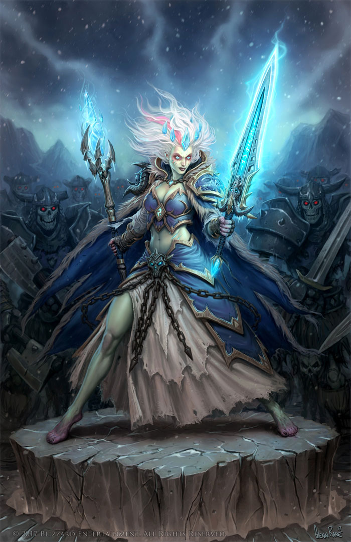
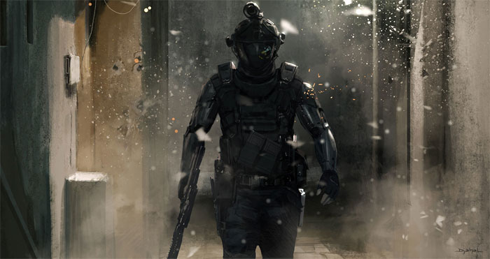
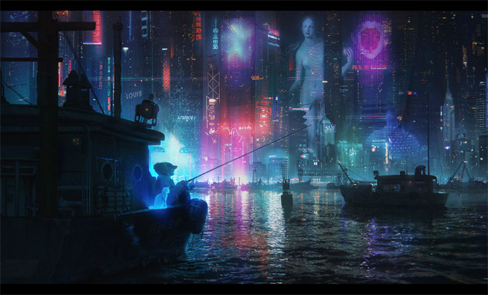
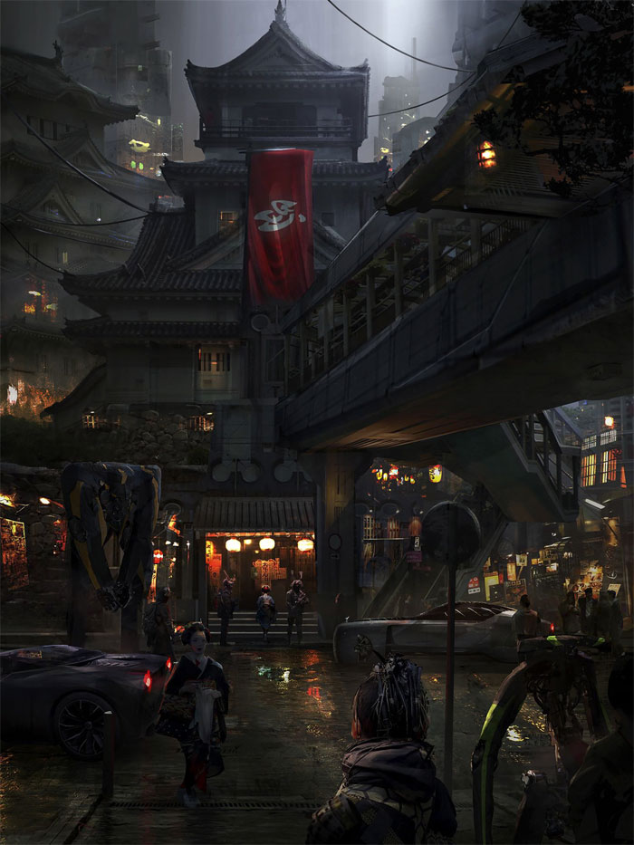
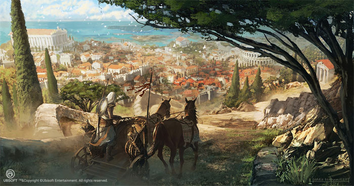
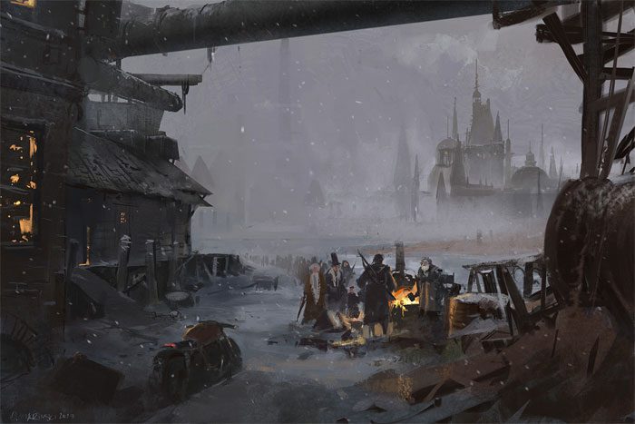
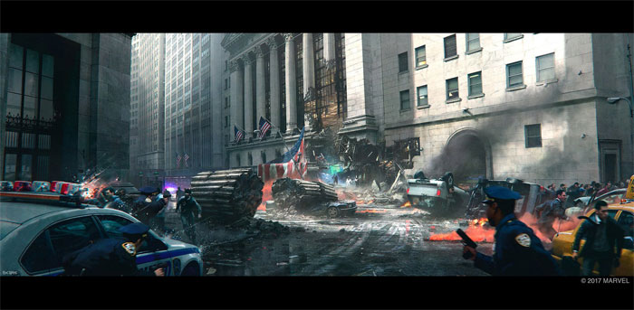
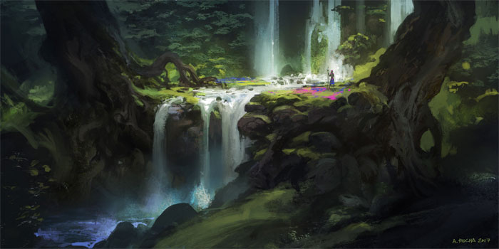
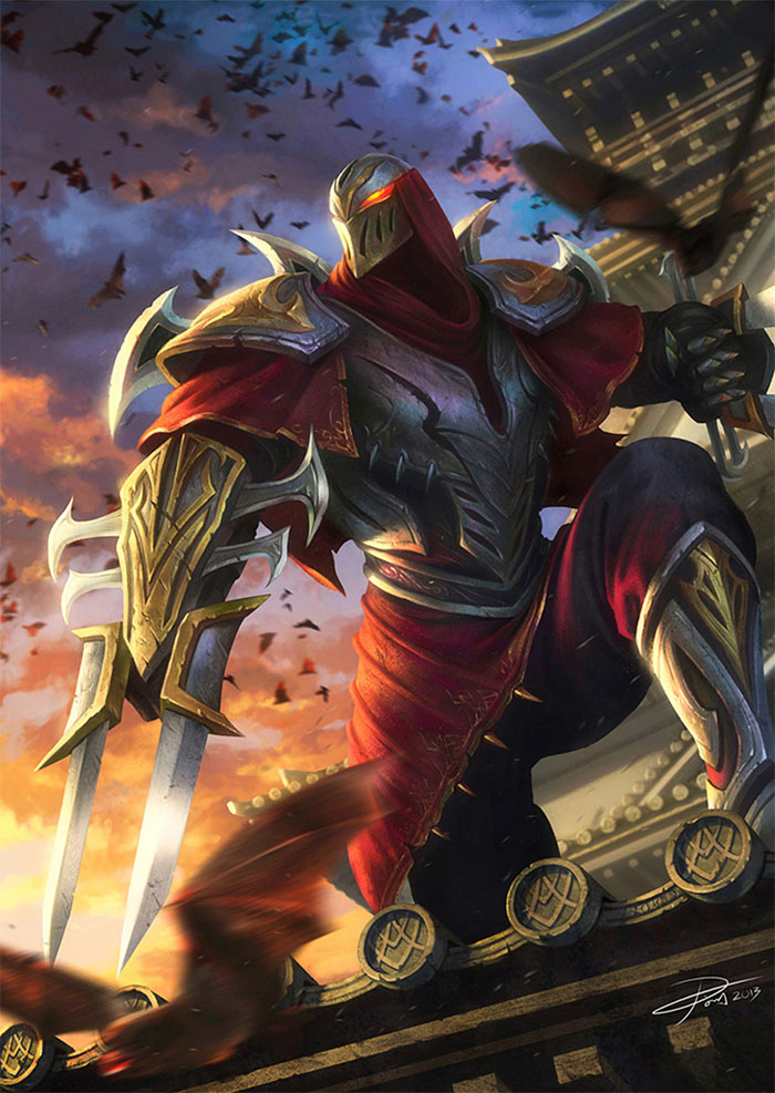
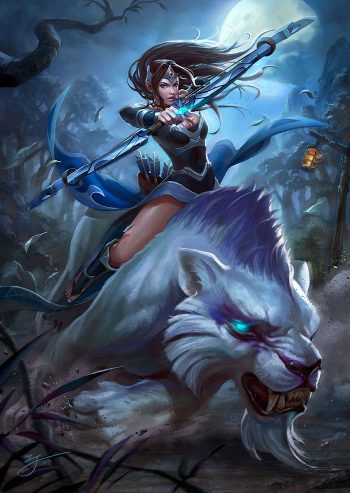
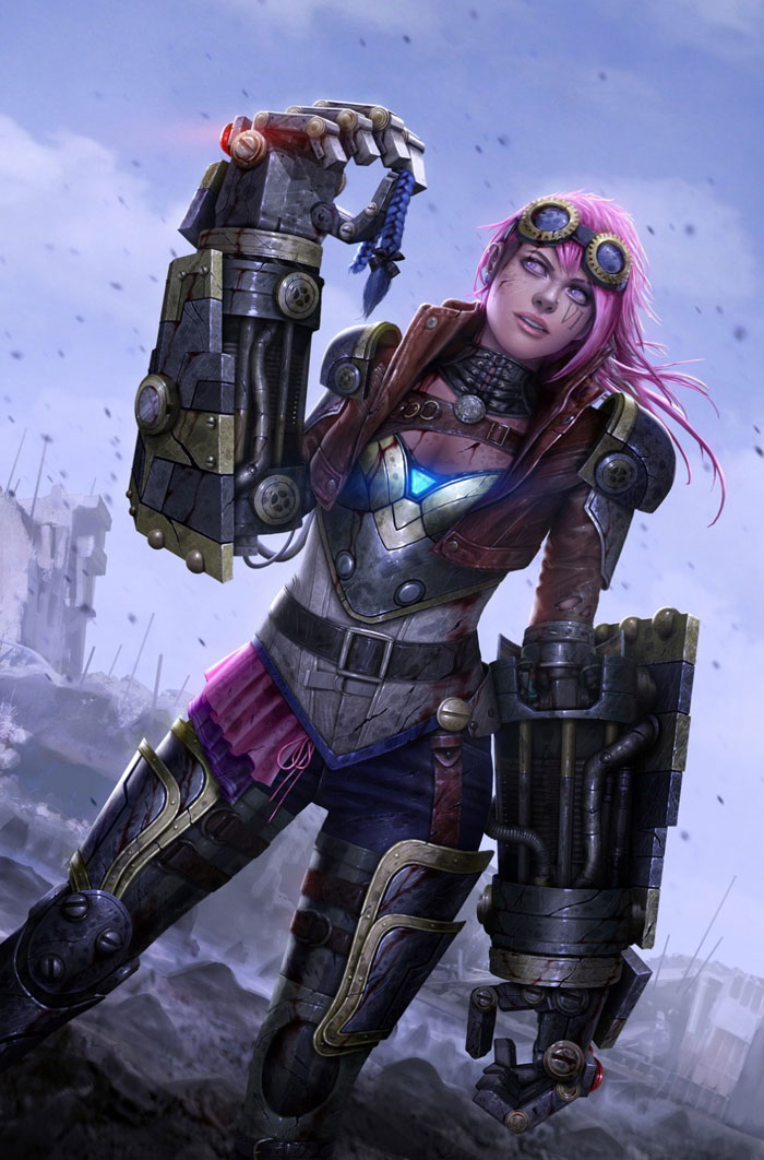
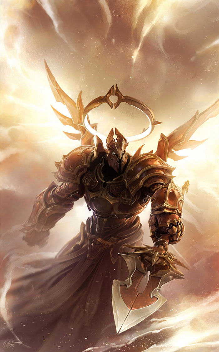
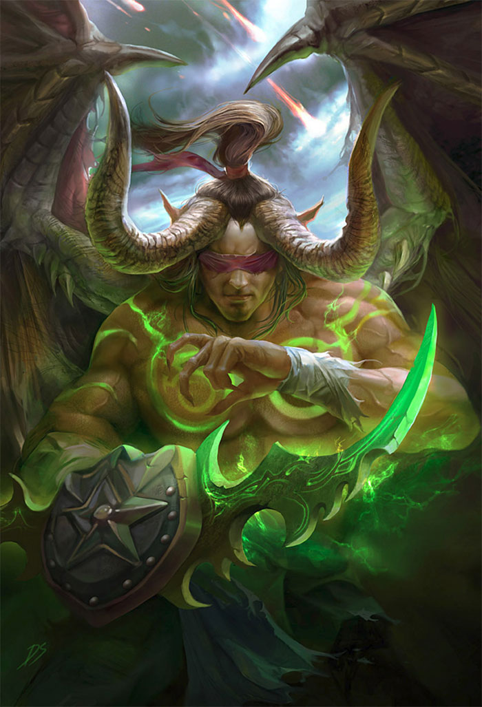
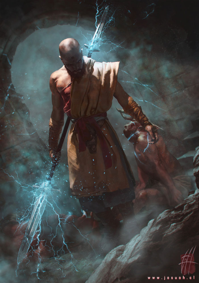
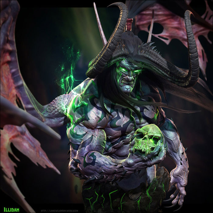
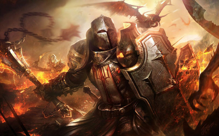
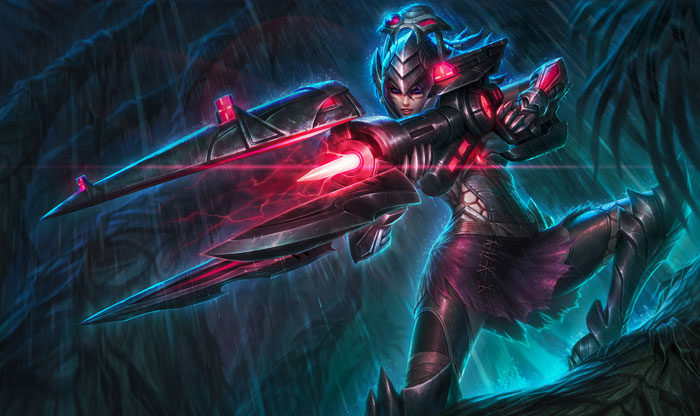
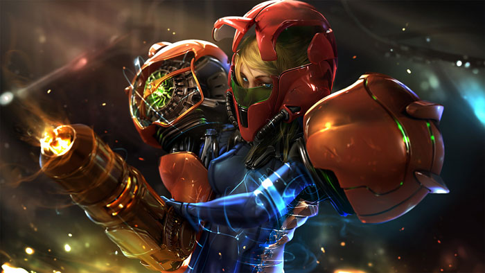
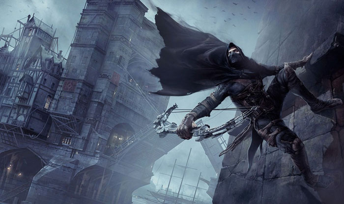
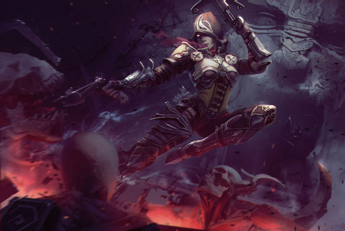
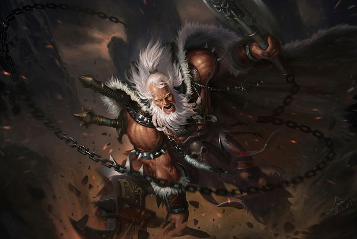

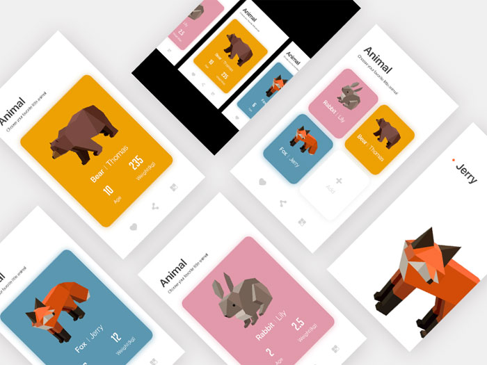
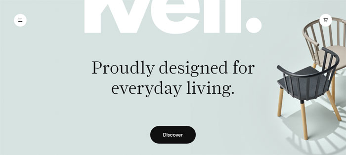


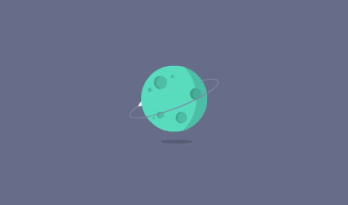
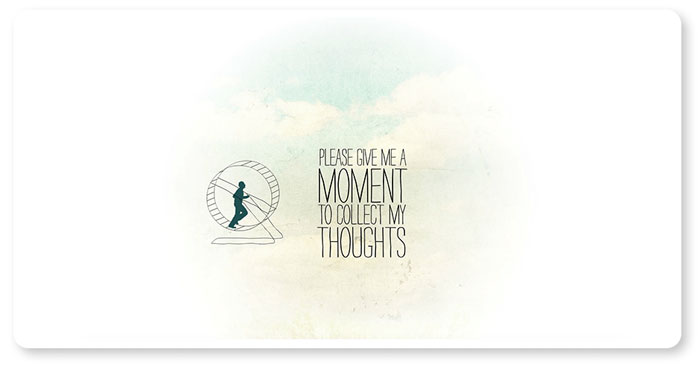
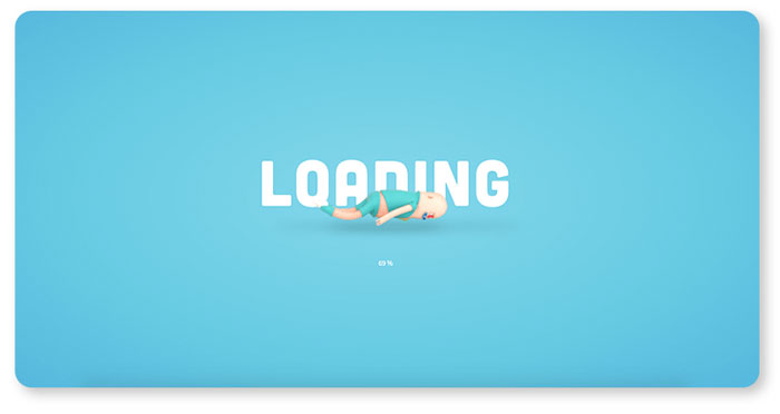
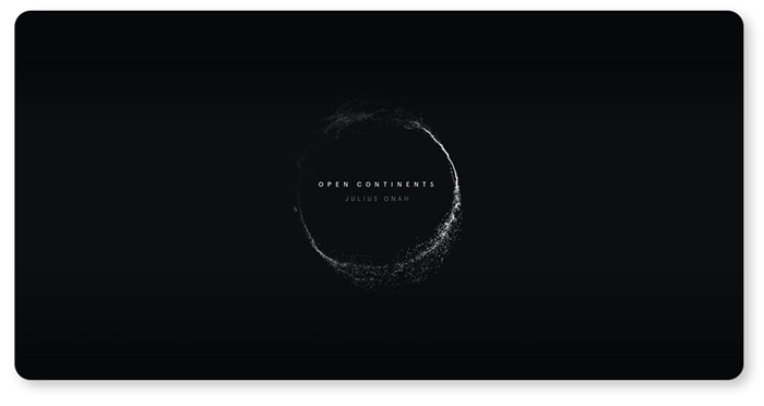
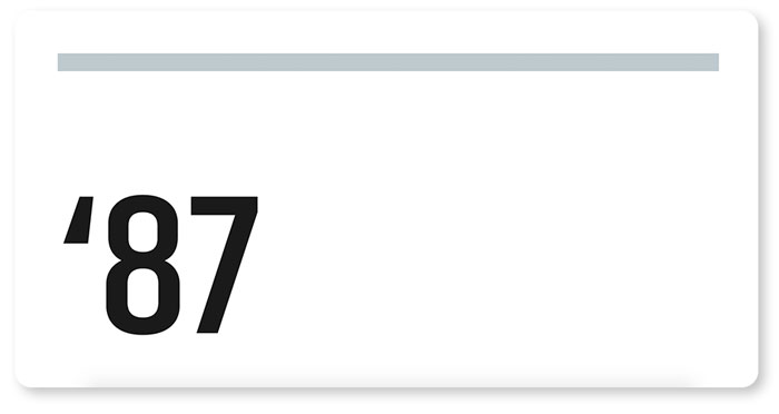
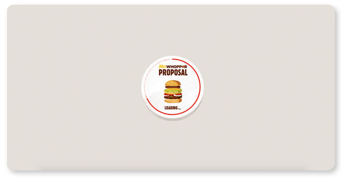


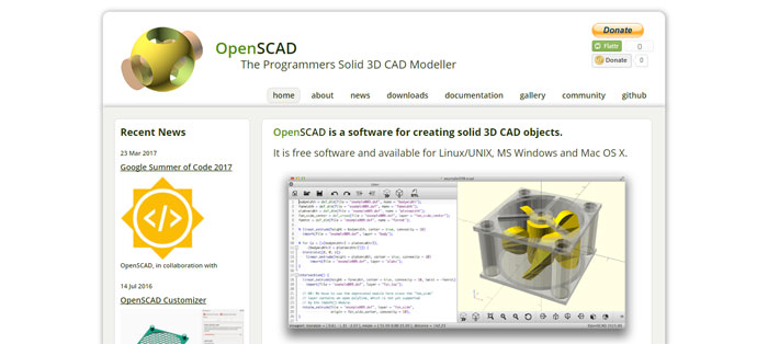
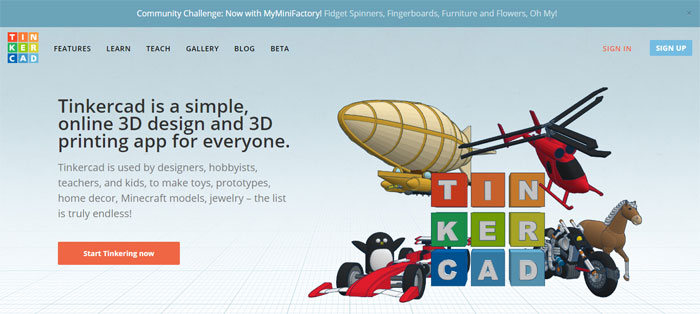
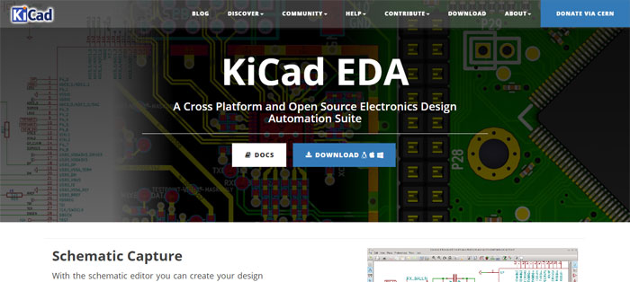

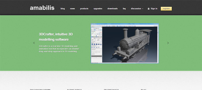
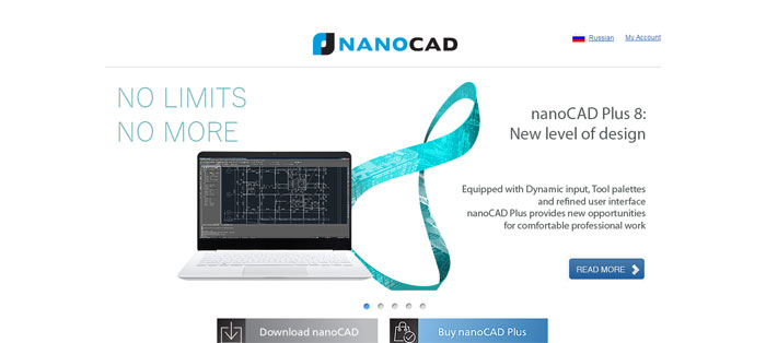
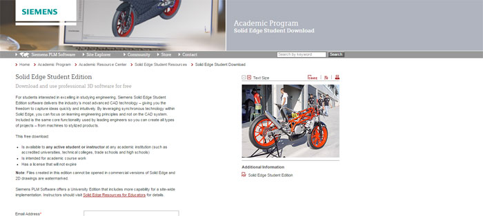

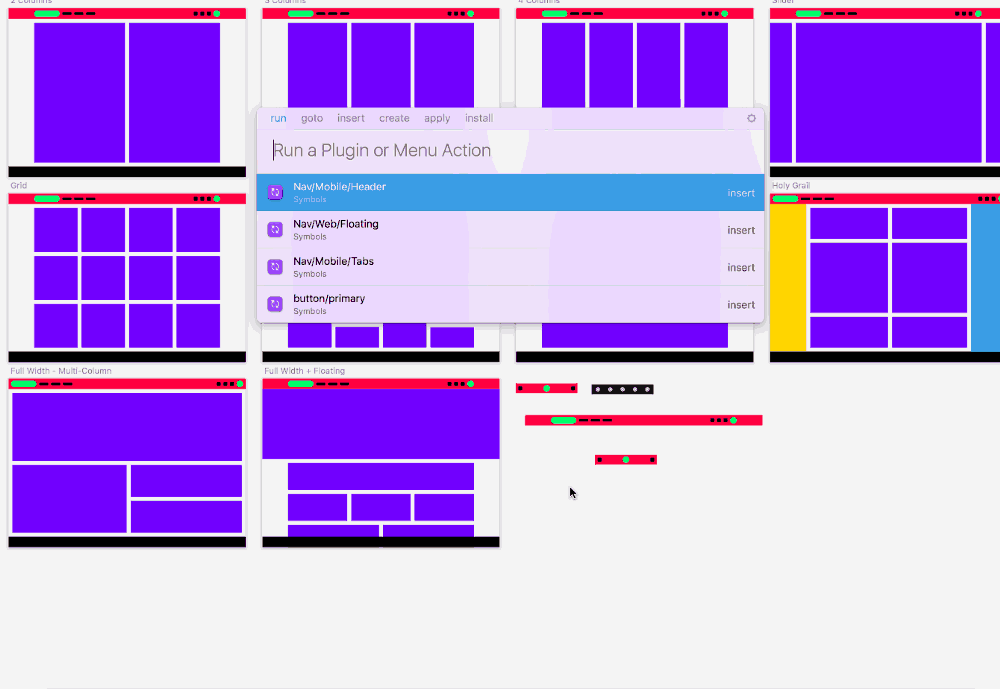
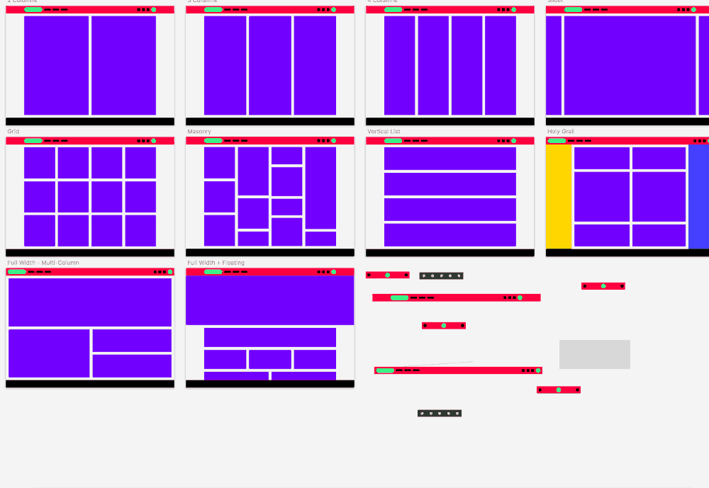
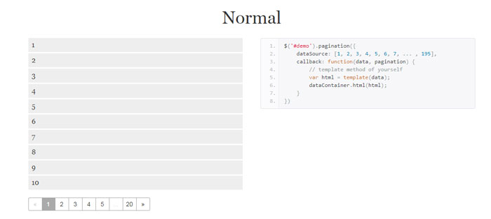
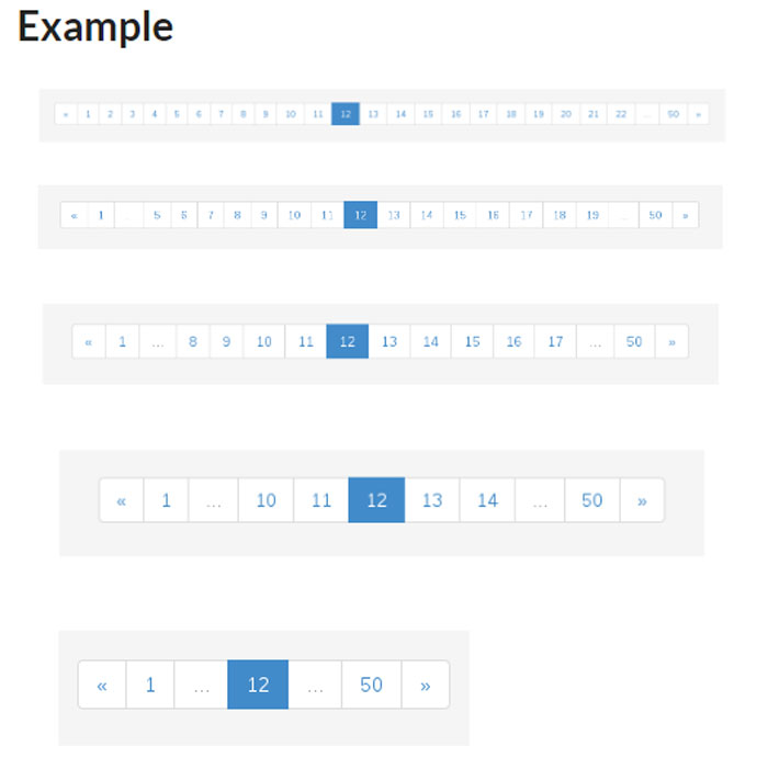

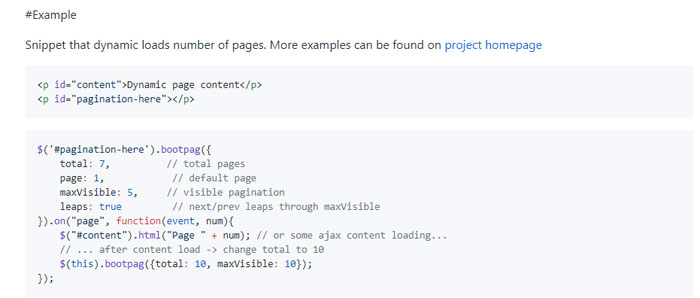
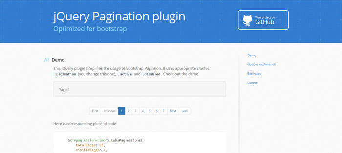
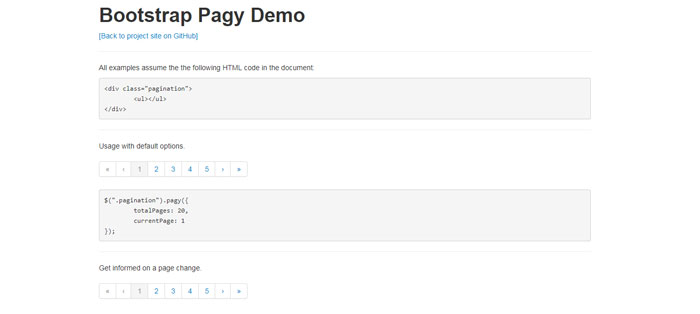
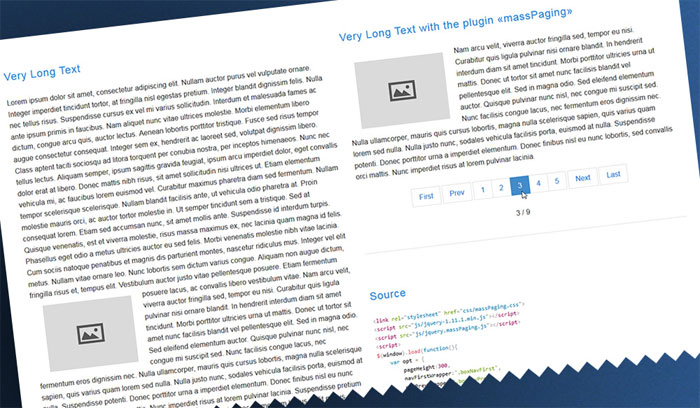
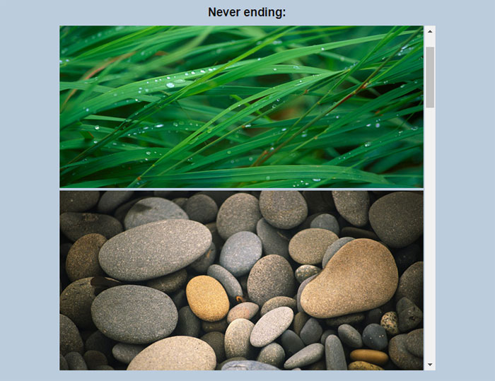
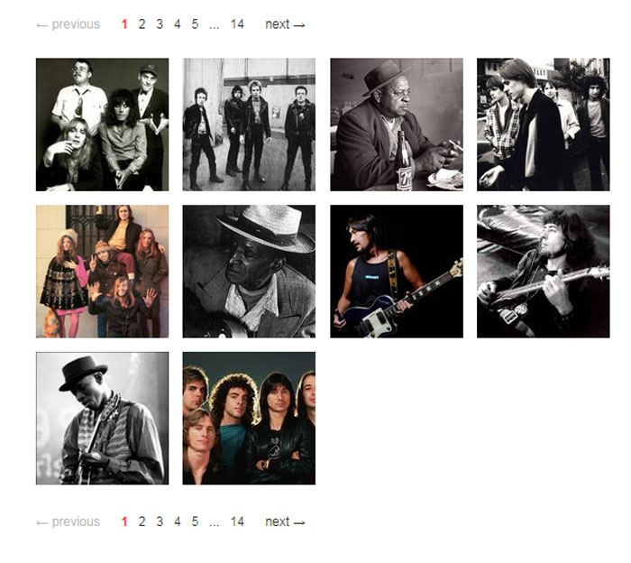
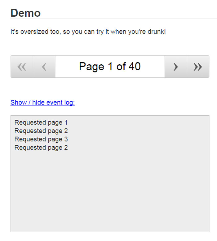
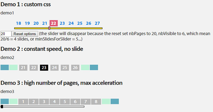
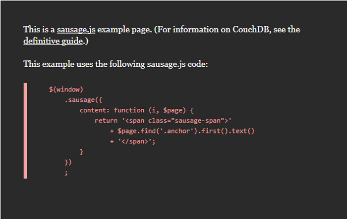
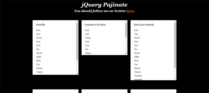
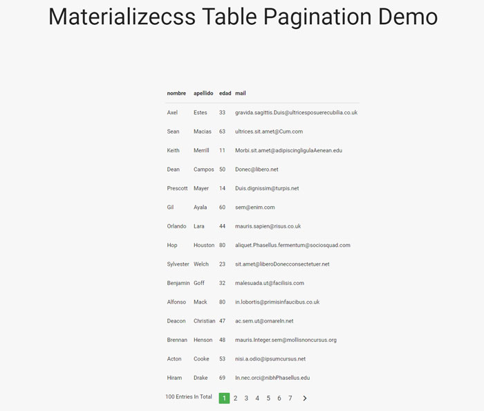

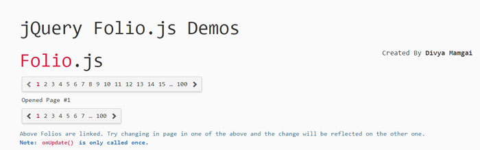
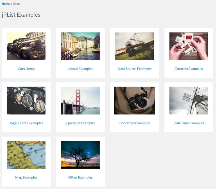
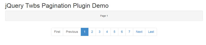
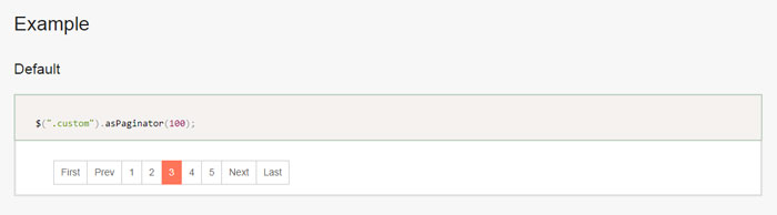
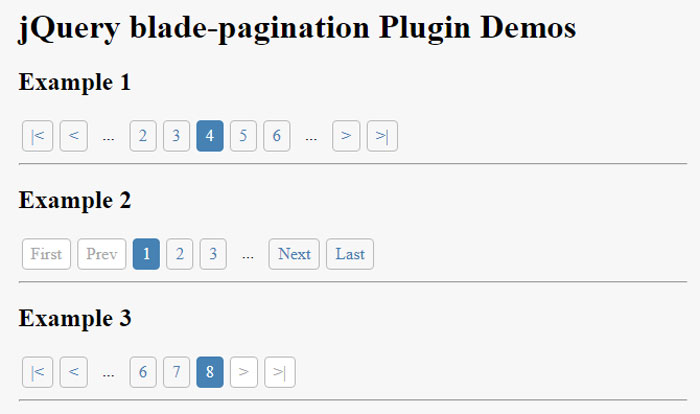
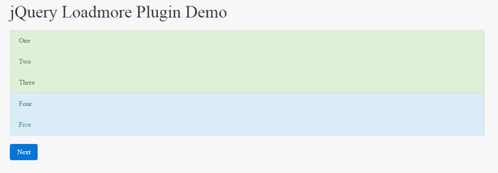
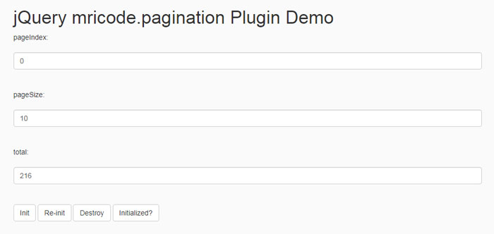
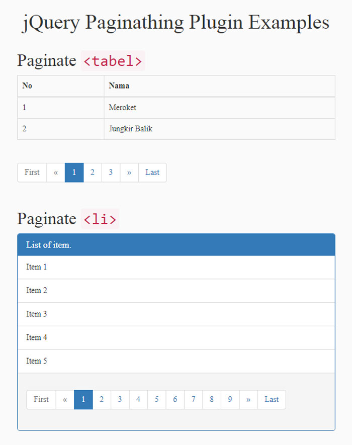
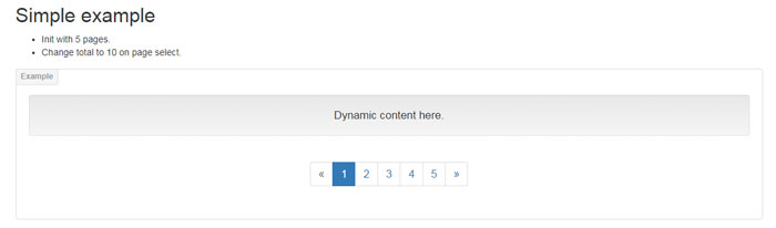
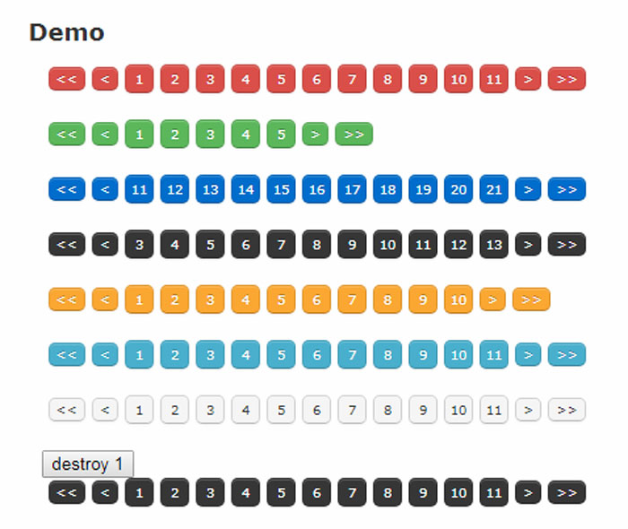
 RSS Feed
