|
How easy would things turn out to be if you would have the internet take the obvious decisions on your behalf like the way humans do? Gone are those days when the users had to keep clicking till frustration seeped in. Anticipatory design brings a revolution in UX design by giving users everything in a way they want to – speedily and easily. With the technology racing forward, businesses will suffer if they don’t reduce consumer work by taking up the obvious decisions on behalf of the consumers. And that’s where Anticipatory design comes to the rescue. The term anticipatory design was coined in the year of 2015 by Aaron Shapiro, the CEO of Huge. And then, anticipatory design has managed to bring a revolution in the world of UX. Read on to know what anticipatory design is and how you can implement it in your web design to increase conversions. What is Anticipatory Design?Anticipatory design has been around longer than you have known. It works on the logic – If users do X, show them Y. Just like the way Google works – It anticipates a couple of possible options based on the search queries you are using and shows various search options related to the keywords you just typed in. Imagine yourself booking a cab through the Uber Mobile Application. Now, if you would have your location turned on, you would notice that the application immediately takes your current location as the starting point of your journey. Now, all that you would have to do is to select the destination. This is a clear example of how the clicks made by a user is reduced because of anticipatory design. When it comes to hardware, Amazon Dash Button and Google Nest are clear examples of anticipatory design.
Amazon Dash Button lets you hit the button to automatically place an order for the respective product when it gets exhausting. And you don’t even have to worry about accidentally placing an order because you would get a text on your registered number to cancel the order if placed by mistake.
Google Nest Thermostat – A modern-day thermostat that mugs up your schedule and adjusts itself according to the temperature you had set it to, previously, based on the different timings. You get to control it with your cell phone and other than that, it realizes when you are at home and when you are not, through sensors and your phone’s location and then it adjusts itself to the eco temperature to save energy. Netflix has used the concept of anticipatory design very well.
When you look up a particular series on Netflix, your choices are being analyzed and your user behavior is being tracked. So the next time you look up a new series, a list of similar and relevant content is being recommended to you. This reduces your effort to find similar content and this also shows you a list of series that you might have intended to watch later. Anticipatory aids in simplification of UX by narrowing down the clicks or decisions a user has to make. Now that you know what anticipatory design is, know what it is commonly mistaken as to be. The miles between Personalization and Anticipatory DesignPersonalization and Anticipatory Design can easily be confused for being the same. While both work towards the same goal of customer satisfaction, anticipatory design and personalization stand a mile apart. Anticipatory design is built on the base of intelligent personalization. Companies use various tools like Google Analytics, Kissmetrics, CrazyEgg etc. to track user behavior on their website. They use the browsing history of the particular user to show them a list of the products that are similar to what they had browsed through before. They also show a list of recommended items that would be in accordance with the browsing history of individual users. This is known as personalization where the list of recommendations varies from person to person, leaving the decision in the hands of the user i.e. whether he wants to choose from the list. Anticipatory Design walks yet another mile to create a better user experience. While personalization shows a user what he wants, anticipatory design takes the decisions on the behalf of the user. Why Anticipatory DesignChoosing on behalf of the users does seem like a big step forward. But in the world of choice overload, anticipatory design is actually a blessing in disguise. Anticipatory design is all about relieving the user of decision fatigue, which is closely related to the Paradox of Choice. A famous study conducted by two psychologists – Sheena Iyengar and Mark Lepper revealed that consumers were 10x more likely to purchase a jar of jam when they were asked to choose from a variety of 6 over a variety of 24. More customers were attracted to the variety of 24, no doubt. But they found it mentally tiring to choose one from the 24. On the other hand, more people bought jam when they were asked to choose one from 6. This is known as the Paradox of Choice.
The more the options, the tougher it becomes to land on a decision. An average adult makes about 35000 decisions a day and instead of making the wrong decision from too many options, he is going to procrastinate on making the decision. And the deteriorating quality of decisions made by an individual after a long session of decision making is known as decision fatigue. How to use Anticipatory Design for a better user experienceAnticipatory design can be implemented in web design to boost user experience. But it needs an easy user interface because people won’t get to the decision-making stage if the design is not understood. And that requires a responsive web design. After you create a responsive web design, you should track user behavior to figure out if the decision-making elements in your web design i.e. CTAs, forms etc. are fueling the fire of decision fatigue. Now, let’s say you own a Web Development Outsourcing firm and a customer is filling out the Ballpark Cost Estimation form on your website. When he finally ends up on the layout field where he has to make a choice between Fixed and Responsive, he sees that the option for Responsive Design has been already chosen by default. The user now moves forward to the next form field. This is anticipatory design. You, as a Web Development Outsourcing firm, know that Responsive Web Design is in trend. And since you know that, you anticipated that most of your clients would also be interested in having a responsive layout for their website. So you made Responsive Design as the default option in the Layout form field. Now, this may seem like too tiny a step to you. But you actually reduced a click for the user by anticipating the needs of the user. And it is the addition of several of such small steps that sum up to be a clever anticipatory design. But to get in-depth information for each step, you need to gain customer intelligence i.e. do a smart analysis of all the customer data that you have accumulated. Although, one thing to be taken care of while creating an anticipatory design is that you must not cross the subtle line between the decisions allowed to be taken and the decisions that you must not be taking. Users won’t appreciate if you go ahead and automatically order a product they have been checking out frequently on your website. But the one thing that must be taken care of while creating an anticipatory design is that you must be sure of the decisions that the customers would be okay with you taking them. They wouldn’t appreciate it if you anticipate what card they would be willing to pay from without asking them. You can also give users the option to prefill certain fields the way Google Chrome does every time you have to fill up any random form that consists of similar fields like name, email i.d. etc. To get started, here’s what you should do.
These tips will make decision-making design elements time saving, which will, in turn, enhance the user experience by reducing the number of clicks they would have to make. Key TakeawaysAnticipatory design is the future of the web because it promises more output through less input. We are swiftly moving into the world of AI and Machine Learning and anticipatory design is just a part of it. And one of the main reasons why it sounds so promising is because users are subconsciously looking forward to faster and better results through fewer choices. Thus, anticipatory design is bound to be the turning point in your business if you make the appropriate decisions on behalf of your users. The post Anticipatory Design: Revolution of the User Experience appeared first on Design your way. from http://www.designyourway.net/blog/misc/anticipatory-design-revolution-user-experience/
0 Comments
Looking for the best sports apps for iPhone to watch news and various info about your favorite sports team? This article has what you are looking for. Having a smart phone means that you never have to think how your favorite team is doing, or who’s winning the game. Sports news apps are putting the latest schedules, news and statistics with only one click, together with podcasts, hi-res photos and sometimes live-streamed video of the play. Take a look at the best sports apps and have a fun of a lifetime. Here are the best sports apps for every kind of fan. Best sports apps for iPhoneESPN
Formerly known as SportsCenter, the ESPN app (Android, iOS) brings users the latest and greatest sporting news and information worldwide. Whether you’re looking for updated scoring information, breaking news for various teams and leagues, or professional analysis, the ESPN app has got your back. Users can easily customize a list of favorite teams, allowing the app to provide a personalized sports news experience for all the franchises and athletes you care about. Cable subscribers can also tune in to the WatchESPN app (Android, iOS) for a variety of live-streamed games and shows as well as on-demand videos. CBS Sports
CBS Sports is one of the best sports app for iPhone that you can find. It offers personalized score updates, stats, news and analysis for your favorite sports teams and leagues. The app also provides live streaming for a variety of events, such as NCAA Basketball and the PGA Tour, as well as access to on-demand video of game highlights, expert analysis and original video programs. Users can also listen in on live broadcasts of CBS Sports Radio. theScore
theScore (Android, iOS) shines in delivering up-to-the-second game updates and statistics, as well as breaking sports news. An event calendar lets you easily look up upcoming games, statistics for past matches, as well as the latest scores and most important plays. Matches include detailed statistical breakdowns to warm the hearts of stat junkies, as well as play-by-play breakdowns. The app allows users to follow teams and individual players, giving you notifications of related news or big plays. Social features make stories, stats and game summaries easy to share with your friends and followers. Yahoo Sports
Yahoo rebranded Sportacular into the new Yahoo Sports (Android, iOS) app, designed to sync across the website and mobile apps. The goal is to provide all the best and latest news, scores and statistics for your favorite sports. Particular standouts in the app are the extremely detailed player, team and game statistics. We also like the highly customizable notifications that alert you to game starts, scoring plays and close game situations. Team Stream
The Bleacher Report’s Team Stream (Android, iOS) app shies away from the generalist approach of other sports news apps in exchange for a laser-like focus on your favorite team or franchise. Simply designate your favorite teams, and Team Stream delivers relevant, real-time notifications taken from numerous sources across the Web. You’ll get scores, stories, pictures and videos featuring your chosen clubs. Get the latest breaking sports news from newspapers, blogs, websites and Bleacher Report, too. Thuuz Sports
Thuuz Sports (Android, iOS) makes sure you never miss your team’s most exciting games, combining the ability to follow your favorite sports, teams, and players, with a clever system that follows news and online buzz in order to create an excitement rating of 0 to 100 for upcoming games. Users can then easily look up game schedules and find out where they can watch the upcoming big game, whether on cable channels, streaming, or your nearest sports bar. In addition to the game scheduling, Thuuz also provides extras like personalized sports news, on-the-go alerts and fantasy sports tracking. Yahoo Fantasy Sports
The internet and mobile apps have been a great help to the growth of popularity of fantasy sports, and one of the best all-in-one apps out there is the Yahoo Fantasy Sports app (Android, iOS), which covers fantasy football, baseball, basketball and hockey. Players can create or join fantasy leagues, set up drafts, quickly set up team lineups and track scores and performance, as well as check out analysis by Yahoo Sports and Rotoworld experts. In addition to custom leagues, users can also participate in weekly and daily fantasy games with a chance to win real money. StubHub
Looking for tickets to the big game, or suddenly unable to make it? StubHub (Android, iOS) is an online service that allows users to buy and sell tickets to games, concerts and other nearby events, complete with a “FanProtect” guarantee. Users can look up game schedules, seat layouts, as well as follow their favorite sports teams or artists to get info about upcoming games and concerts. T!ckets
Another option for mobile ticket purchasing is RateYourSeats.com’s new mobile app, T!ckets (Android, iOS), which brings RateYourSeats’ price comparison and SeatScore tools right to mobile devices. Users can quickly look up events for their favorite sports teams and artists, compare seat prices, view interactive maps of available seating, complete with photos to give you an impression of the view from the stands, as well as a Deal Rating metric to show you whether you’re getting a good price or not. Forza Football
If you’re looking for an all-in-one football app for sports news, match schedules and online community, then look no further than Forza Football (Android, iOS). It brings you up-to-the-minute match updates for your favorite teams on your Android or iOS device, as well as providing a forum for fan polls and opinions. Users can select their favorite teams and upcoming matches to receive notifications for goals and cards, as well as pre-match lineups, formations and other information. In addition to the live scores, users can participate in online polls on the performance of a team’s squad, manager and chairman. NFL Mobile
If you’re looking for the latest in pro football news, then the official NFL Mobile app (Android, iOS) is the app to get, with up-to-the-minute game updates and customizable team notifications. Read breaking news, watch post-game video highlights and even manage your own fantasy football team from within the app. Verizon subscribers, as well as users logging in with select cable providers, can enjoy NFL Red Zone and live game streaming. MLB.com At Bat
The official MLB.com At Bat (Android, iOS) mobile app is your go-to source for the latest Major League Baseball news, game schedules, stats, standings and rosters, as well as selected videos and analysis. Users can follow their favorite teams for personalized notifications and news feeds. Premium unlocks provide users with live audio and game look-ins, access to the MLB.TV Game of the Day, in-game highlights, and a wealth of other features. NHL GameCenter
NHL GameCenter (Android, iOS) delivers live scores and player stats for your favorite teams, as well as season schedules, game alerts, in-game and post-game highlight videos, as well as live game audio for every game. Users can also catch up on the latest news, analysis and schedules for their favorite teams, as well as receive customizable notifications. Subscription to GameCenter LIVE unlocks live streaming video of out-of-market games, full-length match replays, multiple camera angles and cross-device access. NCAA Sports
If collegiate sports are what you’re after, you can’t go wrong with the official NCAA Sports app (Android, iOS). The app lets you view live video coverage of more than 65 championship events, as well as look up scores and schedules for multiple championships. In addition, users can pull up regular season scores and standings. Users can follow specific schools for custom scoring notifications, as well as view team hubs for the latest scores, news and social media feeds. Fancred
Fancred is a sports news apps that combines the latest sports news with social media. It is by far the most interactive of all the sport apps you will find on the iPhone at present, allowing you to upload photos, write comments and add articles about your favorite teams. You would typically need a laptop or desktop computer to do all this, but here you can do it through the app itself. You can begin by creatig a profile, using your email or Facebook account, then pull those people from your contacts list to see which people are using the app. You will then have a feed that is full of the latest sports news, not so much from biased news sources but from likeminded fans. Players will also get involved in order to bring teams and fans closer together, which is great. Want to see more of the best sports apps for iPhone? Read on. The Sports Feed
The Sports Feed app is another one of the best sports apps for iPhone. It is very similar to the ESPN app, only without all the clutter. Again, you sign in and pick your favorite teams, then turn on notifications to receive up to the moment info. There are two main pages to toggle between here, which is a setup that I believe works very well. There is the main page with sports news that is pulled from around the web, and then a live scores page that you can refresh to get instant updates. The great thing about this app is that when you do pull web articles, it will give you a version of the article that is tet only, and without the all those pesky ads. The schedule feature is also neat, taking your favorite team and then showing the next times they are playing. BreakingSports
We’ll be honest here: the sport apps market right now is full with average products, though there are one or two apps that stand out as worth noting. Most of these at this point are third party sport apps, one of which is Breaking Sports. This app does exactly what the name suggests, delivering to you all the latest news, scores, injury reports and a whole lot more. You can follow not only your favorite teams but also your favorite players, so you never again miss out on that important piece of news. The app has also been updated to work with the Apple Watch, so that you can get all the latest breaking sports news on your wrist, too. NBA
No matter what grumpy has-been old-timers such as TNT’s Charles Barkley say, the National Basketball Association is better than it ever was. Despite a healthy dose of top-heaviness (which has always been a strong characteristic of the league, just look at how many teams have won a championship during the NBA’s 70-year history), the league is bursting with amazing young talent, TV ratings records are broken left and right, so all in all, the future looks brighter than ever. FOX Sports Mobile
As opposed to NBA Mobile, Fox Sports Mobile is at the other end of the sports app spectrum in terms of ratings, features, design, functionality, customizability, user-friendliness, and versatility. FOX Sports Mobile can also cook tasty meals worthy of a fine-dining restaurant, does not wear brown shoes with black socks (and vice versa), writes beautiful poetry, and calls his (her?) mom every single day. Jokes aside, FOX Sports is, in several ways, different from all other sports apps, putting its own innovative twist on run-of-the-mill features. The most recognizable of these sports app innovations is an enormous scoreboard that provides instant access to an abundance of game-related information, saving you from the hassle of having to leave the scoreboard to check out, for instance, detailed stats. WWE
The official app of the WWE network is the best way to watch wrestling if you’re a subscriber. The app brings you streams of wrestling events live across your Internet connection, both as they’re happening and from the WWE archive, as well as the ability to use your iPhone or iPad as a second screen when you watch live. WWE also provides event schedule information and information about wrestlers whenever you want it. Coach’s Eye
While I’m not a golfer, I thought last year’s Tiger Woods: My Swing was a brilliant idea for an app. It essentially allowed users to record video of their golf swings and match them up to Tiger’s own swing. Coach’s Eyeoffers similar micro-editing techniques, but employs them over a wider net so players in numerous sports can really look at their own technique. The main difference between is that there’s no professional expert to model yourself after in each sport that Coach’s Eye helps you analyze. Still, things like swing plane and adding virtual lines to look at posture are retained, and it’s a promising step in the right direction for the future of video analysis of athletes. Rotoworld
The last one of the best sports apps for iPhone present in this article is Rotoworld. Rotoworld is your one stop for all fantasy news. Sort by sport for a big overview or find a specific player’s injury report. The main page is broken up into News, Top Stories and My News. The main newsfeed is broken up into one sentence updates that you can easily scroll through or tap on one to learn more. Share certain updates on Facebook, email or Twitter. The My News section is made up of all the teams or players you follow. Set up notifications so you know exactly who to bench or trade on your fantasy team. Summary:There are lots of different sport apps out there these days, but most are designed with one thing in mind: getting information to you, the sports fan, and getting it there fast. This is why so many of these sport apps and news apps pride themselves in up to the minute info, not only news stories and breaking info but also things like scores and even statistics. If you liked this article with the best sports apps for iPhone, you should check out these as well:
The post Best Sports Apps for iPhone appeared first on Design your way. from http://www.designyourway.net/blog/tech/best-sports-apps-for-iphone/ There are different types of Javascript testing frameworks among which include unit, acceptance and coverage tools. Although, this is a list of almost all the Javascript test frameworks that can be found online, you will notice that you will be tempted to use just a few of them. This article doesn’t have the purpose to make you use all of them, because that would be pointless. Instead the article wants is an overview of the Javascript testing frameworks that developers use now. Javascript testing frameworks to check outJasmine
Jasmine is a behavior-driven development framework for testing JavaScript code. It does not depend on any other JavaScript frameworks. It does not require a DOM. And it has a clean, obvious syntax so that you can easily write tests. Mocha
Mocha is a feature-rich JavaScript test framework running on Node.js and in the browser, making asynchronous testing simple and fun. Mocha tests run serially, allowing for flexible and accurate reporting, while mapping uncaught exceptions to the correct test cases. PhantomJS
PhantomJS is a headless WebKit scriptable with a JavaScript API. It has fast and native support for various web standards: DOM handling, CSS selector, JSON, Canvas, and SVG. Jest
Jest is used by Facebook to test all JavaScript code including React applications. One of Jest’s philosophies is to provide an integrated “zero-configuration” experience. We observed that when engineers are provided with ready-to-use tools, they end up writing more tests, which in turn results in more stable and healthy code bases. Karma
The main goal for Karma is to bring a productive testing environment to developers. The environment being one where they don’t have to set up loads of configurations, but rather a place where developers can just write the code and get instant feedback from their tests. Because getting quick feedback is what makes you productive and creative. FuncUnit
FuncUnit enhances assertion libraries like QUnit and Jasmine, enabling them to simulate user actions, easily test asynchronous behavior, and support black box testing. Use its terse jQuery-like syntax to superpower your functional or unit tests. Intern
Intern is a complete test system for JavaScript designed to help you write and run consistent, high-quality test cases for your JavaScript libraries and applications. It can be used to test any JavaScript code. Intern is minimally prescriptive and enforces only a basic set of best practices designed to ensure your tests stay maintainable over time. Its extensible architecture allows you to write custom test interfaces, executors, and reporters to influence how your tests run & easily integrate with your existing coding environment. Intern also comes with Grunt tasks so it can be quickly added to existing Grunt-based workflows, and is designed to work out-of-the-box with popular continuous integration services like Jenkins and Travis CI. Watir
An open source Ruby library for automating tests. Watir interacts with a browser the same way people do: clicking links, filling out forms and validating text. Istanbul
Istanbul instruments your ES5 and ES2015+ JavaScript code with line counters, so that you can track how well your unit-tests exercise your codebase. Enzyme
Enzyme is a JavaScript Testing utility for React that makes it easier to assert, manipulate, and traverse your React Components’ output. Enzyme’s API is meant to be intuitive and flexible by mimicking jQuery’s API for DOM manipulation and traversal. Enzyme is unopinionated regarding which test runner or assertion library you use, and should be compatible with all major test runners and assertion libraries out there. The documentation and examples for enzyme use mocha and chai, but you should be able to extrapolate to your framework of choice. Chai
Chai is a BDD / TDD assertion library for node and the browser that can be delightfully paired with any javascript testing framework. testdouble.js
Are you writing JavaScript tests and in the market for a mocking library to fake out real things for you? testdouble.js is an opinionated, carefully-designed test double library maintained by, oddly enough, a software agency that’s also named Test Double. If you practice test-driven development, testdouble.js was designed to promote terse, clear, and easy-to-understand tests. There’s an awful lot to cover, so please take some time and enjoy our documentation, which itself is designed to show you how to make the most out of test doubles in your tests. Ava
Even though JavaScript is single-threaded, IO in Node.js can happen in parallel due to its async nature. AVA takes advantage of this and runs your tests concurrently, which is especially beneficial for IO heavy tests. In addition, test files are run in parallel as separate processes, giving you even better performance and an isolated environment for each test file. Switching from Mocha to AVA in Pageres brought the test time down from 31 to 11 seconds. Having tests run concurrently forces you to write atomic tests, meaning tests don’t depend on global state or the state of other tests, which is a great thing! Nightwatch.js
Nightwatch.js is an easy to use Node.js based End-to-End (E2E) testing solution for browser based apps and websites. It uses the powerful W3C WebDriver API to perform commands and assertions on DOM elements. Protractor
Protractor is an end-to-end test framework for Angular and AngularJS applications. Protractor runs tests against your application running in a real browser, interacting with it as a user would. Cucumber
Cucumber supports over a dozen different software platforms. Every Cucumber implementation provides the same overall functionality, but they also have their own installation procedure and platform-specific functionality. Cucumber is one of the Javascript testing frameworks that people often recommend. Wallaby.js
Wallaby.js runs your JavaScript tests immediately as you type and displays execution results in your code editor. It also provides beautiful test and code coverage reports updated in realtime. TestCafe
TestCafe is a pure node.js end-to-end solution for testing web apps. This Javascript testing framework takes care of all the stages: starting browsers, running tests, gathering test results and generating reports. TestCafe doesn’t need browser plugins – it works in all popular modern browsers out-of-the-box. QUnit
QUnit is a powerful, easy-to-use JavaScript unit test suite. It’s used by the jQuery, jQuery UI and jQuery Mobile projects and is capable of testing any generic JavaScript code, including itself Cypress
Cypress is a test engine that runs unit and integration tests in your browser. Drive your application with automated tests instead of manually verifying that your app works. Don’t spend days setting up a test environment. Just download our desktop app, add your project and start testing! Seriously. You don’t need to change your code and Cypress doesn’t need to modify your code. Test in any major language or framework. Does your app run in a browser? Yes? You can test it in Cypress. Chai
Chai is a BDD / TDD assertion library for node and the browser that can be delightfully paired with any Javascript testing framework. CasperJS
CasperJS is an open source navigation scripting & testing utility written in Javascript and based on PhantomJS — the scriptable headless WebKit engine. It eases the process of defining a full navigation scenario and provides useful high-level functions, methods & syntactic sugar for doing common tasks Sinon.JS
Sinon is another one of these Javascript testing frameworks. Standalone and test framework agnostic JavaScript test spies, stubs and mocks (pronounced “sigh-non”, named after Sinon, the warrior). Zombie.js
If you’re going to write an insanely fast, headless browser, how can you not call it Zombie? Zombie it is. Zombie.js is a lightweight framework for testing client-side JavaScript code in a simulated environment. No browser required. Should
should is an expressive, readable, framework-agnostic assertion library. The main goals of this library are to be expressive and to be helpful. It keeps your test code clean, and your error messages helpful. By default (when you require(‘should’)) should extends the Object.prototype with a single non-enumerable getter that allows you to express how that object should behave. It also returns itself when required with require. It is also possible to use should.js without getter (it will not even try to extend Object.prototype), just require(‘should/as-function’). Or if you already use version that auto add getter, you can call .noConflict function. Selenium
Selenium is the last of the Javascript testing frameworks included in this article. It automates browsers. That’s it! What you do with that power is entirely up to you. Primarily, it is for automating web applications for testing purposes, but is certainly not limited to just that. Boring web-based administration tasks can (and should!) be automated as well. If you liked this article about Javascript testing frameworks, you should check out these articles as well:
The post Javascript Testing Frameworks: The Best to Test JS Code appeared first on Design your way. from http://www.designyourway.net/blog/resources/javascript-testing-frameworks/ You’d be surprised how many sites use maps APIs to generate the maps that you see when visiting their sites. It’s always easier to use a maps API. Digital maps and automated mapping tools are constantly growing in popularity, and this trend doesn’t seem to go down any time soon. With Google Maps API holding the leadership on this list, companies are competing harshly to become the best-of-breed, leading product in the industry. This doesn’t come as a surprise, as maps are very informative, useful, interesting, and engaging, and there is no one who’d disapprove of them. Map fans lately have no troubles enjoying both static and interactive maps on almost any app or website. The reason is that map data is now open to use by third-party developers and aficionados, and made flexible enough to blend in different data sets and to display a wide range of species and specie lists wherever in the world they are needed. The Map of Life, for instance, is both useful and fun, and so is the Zombie Apocalypse Survival Map which actually locates hospitals, grocery stores, warehouses, and similar ‘danger zones’. Basically, the point is to make information maps accessible to all users in real-time, and from the comfort of their favorite websites and applications. Let’s give a look to several popular maps APIsGoogle Maps
The leader of interactive mapping is without doubt Google Maps, which also makes its API data publicly available for interested developers. Therefore, it is not surprising that most websites and apps nowadays with a simple JavaScript/Flash interface have these apps embedded on their interface. Google Maps APIs work perfectly on desktop and mobile devices, providing point-to-point localizations in more than 50 languages. You will also be offered with some advanced services and mechanisms, such as intranet mapping, and secure HTTP connections for Premier customers. Amazon Maps API
Amazon Maps APIs are developers best alternative for the creation of Fire phone and Fire tablet applications. The current version of these APIs (2.0) enables support for interactive and 3D maps, enriched with top-quality landmarks, location data, satellite tiles, highlighted areas, and best-of-breed vector mapping. In order to apply for these APIs, submit a direct request to the vendor, or download the Amazon Mobile SDK to ensure that the languages are compatible. Bing Maps
Microsoft Bing Maps is another extremely popular and powerful mapping tool, still working its way to get a share of Google Maps users. Microsoft is doing a great job following trends and adding innovations, which is why it recently introduced the Streetside city addition with high-resolution aerial images on all Bing maps. Another new feature you should keep n the loop is 3-D city previews. Carto
Carto was designed for open-source mapping, visualization, and analysis of different maps. Its powerful engine gives developers the possibility to launch geospatial maps and applications for wide web usage. Despite of being on the market for only 5 years, Carto already has a large list of prominent users, among which NASA, National Geographic, Twitter, and The Guardian UK. Another distinctive advantage of this engine is flexible pricing, as plans go all the way from free and basic to premium and enterprise-friendly. Carto comes equipped with a rich JavaScript library, and gives developers great API sets to include its engaging geospatial visualizations on their sites and apps. Inside, you will also find a no-brainer drag-and-drop editor to choose the way in which you will use and visualize data. Public information and documentation is available on their website. DigitalGlobe
DigitalGlobe is a cloud-hosted solution for high-resolution maps that uses API to embed its beautiful and scalable content to any web and mobile application. Developers appreciate the access to terrain, satellite, and vector content, and the possibility to build their own location-based and attractive map applications. Leaflet
Leaflet is a suite of modern vector layers and maps which you can add to any web service. The very same suite is used to monitor map events alike zoom and pan, and fetches these features automatically for each event. It is best used for large and interactive data sets that you don’t want to load at once. The service offers PostGIS APIs for developers to access its features with REST calls. Mapbox
Mapbox offers a variety of open-source and free aping features. Its APIs are best suited for creative developers looking to combine multiple databases and file formats. Premade, Android and iOS-compatible maps will be available to embed on any website and to share with wider audiences. Naver Maps
Naver Maps is a Korean mapping service that offers JavaScript APIs. At the moment, these APIs are in their beta stage of development, which means that geocoding is still not available. Another drawback is that assistance materials are all distributed in Korean, but some of them, as class references, for instance, are fairly easy to understand. Scribble Maps
Scribble Maps is a creative platform used for sharing and drawing maps. All maps created with it can be shared with external users, and all functionality can be easily embedded on developers’ websites and applications. The platform uses interesting API methods and techniques, as for instance retrieving map images, sharing and displaying apps, and more. Yahoo! Maps
Despite of Yahoo being a leading search engine for years, its BOSS PlaceFinder flagship API service was launched only in July 2010. These APIs make it possible for programmers to access its geocoding web services and attach them to their applications, as well as to build ‘location-aware’ apps with their names and addresses neatly translated to geographic coordinates. PlaceFinder is also one of the best alternatives to transform these coordinates back into place names and addresses. As expected, BOSS PlaceFinder provides users with adequate and well-organized documentation, and makes it incredibly easy to launch its API services. The price will depend on the number of queries you wish to provide on daily basis, keeping in mind that Yahoo will also supply you with some ads to monetize your content. Yandex
Yandex is Russia’s leading search engine. In a Google-reminiscent manner, this search engine supplies developers with an array of internet products and services, including the possibility to use its functions on their websites, apps, and blogs. Given that it serves a large market, Yandex offers one of the largest Direct API suites for developers to access its contextual advertising service, and run it on their apps for direct interactions. If you own an advertising agency, for instance, this will make even more sense, as Yandex lets you organize and run large-scale and complex campaigns. For the purpose, it employs a SOAP protocol, and returns responses in JSON format. Mapwize
Mapwize is an indoor mapping platform with APIs that allow developers to enable similar services on their apps and websites. The platform can serve a multitude of purposes, among which building maps for offices, healthcare facilities, retail stores, and educational institutions. The price you’d pay to get these APIs depends on the size of the building you’re mapping and the number of occupants or visitors that are expected to use it. US County Boundary
The US County Boundary APIs, as suggested by the name, are used to display the boundaries between all US counties. The RESTful APIs are built using NodeJS language, and work with requests and responses formatted as JSON. The service is offered by an independent developer, and can therefore only be used for non-commercial and non-proprietary purposes. Carto Data
CartoData’s APIs pair isoline and geocoding services deriving from CARTO Editor. They rely on a PostgreSQL database, and make it possible to geocode data arranged in complete datasets, rows, and manually inputted lists. With authenticated requests, you can also use these APIs to perform programmatic analyses of trade areas (computing isochrones and isodistances). CartoData’s APIs are built using CARTO SQL APIs, and will thereof provide enough SQL documentation to make debugging errors easier for developers. The tool is an open-source one, and provides unlimited access to scalable maps and dynamic geospatial databases for your websites and application. Its interface is intuitive and predictive, and drafts some of the best location insights worldwide. TomTom
TomTom is another popular set of online map APIs, and a powerful portal for digital navigation that consists of different web map tile services (WMTS and WMS). For each set of APIs there will be separate training & documentation, as TomTom enables you to transform even high-volume location data into high resolution images, and make it accessible for thousands of users at the same time. The Online Maps Tiles use grid to divide your maps into separate tiles, and zoom those at even 19 levels to make each feature clearly visible. The reason why TomTom is so powerful is that it was designed primarily for GIS software clients (Quantum GIS an ArcGIS, for instance), which needed an end-to-end WMS API platform that will interact with their entire web mapping service. The operational infrastructure of these APIs evolved significantly throughout the years, and is now equipped with GetCapabilities functions to retrieve service metadata and create maps within defined set boundaries. WMTS APIs, on the other hand, will work better for conveying metadata map resources. Want to see more maps APIs? Read on. Spatial
Spatial is a REST API suite developers use to access and embed Spatial functions on their new and existent applications. A great example of how Spatial APIs work is embedding ready-to-use maps with points of interests, and retrieving listing points and events on each map. Spatial is also integrated with social networks, and makes it possible to enrich your profiles with beautiful maps. FINOU
FINOU is a very interactive mapping platform developed in (and for the needs) of the Moroccan market. Its APIs are used to integrate the service on different websites and applications. Developers will obtain tools such as location search, geocoding, map tiles, and more. AirMap
AirMap consists of tools used to create GIS and a variety of drone management application. Using its APIs, you will have access to notice requirements, advisory information, airspace interaction rules, and much more. Responses are generated in JSON format, for developers who possess the right API key. An interesting fact is that AirMap sources individual data, and won’t require drone developers and manufacturers to come up with such form their airspace databases. The product belongs to a popular Californian airspace technology company. ViaMichelin
ViaMichelin’s Web Services & Maps also make their API public and available to developers who use JavaScript. They offer a static library using 4 mapping styles: the native ViaMichelin, hybrid, satellite, and Methods that let users control their layers, polygons, markers, and other elements. NASA Earth
NASA Earth also provides APIs to make Earth observation data available to all users. The sercie is powered and managed by Google’s Earth Engine, and combines a Landsat 8 image gallery with NASA satellite data being updated in a period of 16 days. Basically, the user can browse through this database for an image of every specific place, taken at a specific day. Mapme
Mapme API is a RESTful-moderated map builder. At the moment, this service is mounted on Google Maps API, in order to ease the creation, configuration, and distribution of map content. Its custom made apps will include multiple tags, layers, crowdsourcing moderations, privacy settings, activity feeds, mobile compatibility, and many other advanced features. Detailed documentation and hands-on support for HTTP/HTTPS will also be provided, with responses arriving in JSON formats. NavVis
If interested to integrate NavVis’s services on your app/website, check out their open APIs. Unfortunately, there is no public info or documentation provided, and you have to create an account in order to obtain a personal key. NavVis can be used both as an indoor navigator and an indoor mapping tool. One Map
One Map is a Singapore geolocation system that also offers open API to integrate its services on other applications. It works with API key authentication and REST protocols, and invites developers to mash-up its APIs with JavaScript ones, and put in action services such as Agency Data, Address Search, Static Maps, and other advanced mashups. UKMap
UKMap is the best-known provider of large-scale London maps, which is why many developers want to see its services embedded on their applications. At the moment, UKMap displays more than 100 million info points, among which roads, buildings, pavements, land use and land cover, retail locations, trees, fences, digital terrains, and much more. The service was developed and belongs to The GeoInformation Group, UK. Mapzen
Mapzen’s Search APIs are devoted to developers who’d like to see this service embedded on their applications. The service will later on become available to visitors and end users, with a free API key that can be obtained by simply contacting the vendor. This makes Mapzen a highly-preferred open-source mapping tool, especially because its search engine operates worldwide, and turns all names and addresses in actual geographic locations (and vice versa). Pointpin
Pointpin APIs are applied by developers to embed Pointpin services on their sites and applications, and to enable some IP geolocation info for their end users. In order to use these APIs you need a special key, as Pointpin functions as a hosted IP geolocation. AboutPLACE
AboutPLACE’s RESTful API help developers turn place-based information into an interactive map. Built in Beta, these APIs are available for Miami, Austin, and Boston, and provide all users with unique access keys obtained upon registration. Developers use these APIs to access local maps, but also metrics, analytics, visualizations, and similar insights on the specified cities. With information like this, they can enhance their own datasets and make results hyper-localized. If you liked this article with maps APIs, you should check out these articles as well:
The post Maps APIs To Use In Your Projects appeared first on Design your way. from http://www.designyourway.net/blog/resources/maps-apis/ If you’re a whiz at coding and you enjoy doing it, you might feel confident to complete the project by yourself. However, you might feel that the above is not about you. No worries in this case, as well. You can hand your design over to a professional design to WordPress developer. In this way, you can be sure your project will be of the highest quality. Since you’re in the web design business, you’ll probably make more money sticking to what you do best. This is better than putting clients’ projects on hold, while you immerse yourself in code. The development services described here, are not only good at what they do, they’re the best. These teams are seasoned and talented. They work closely with their customers and clients to ensure every job gets done right. Design to WordPress – PSD Gator
PSDgator will take your designs and convert them into pixel-perfect HTML5/CSS3 code faster than most development agencies are capable of. It’s not however, a matter of tossing your design and requirements over the fence, and crossing your fingers in hopes of getting something in return that meets your expectations. The green gator team doesn’t work that way. They will take your PSD, AI, Sketch, or PDF design files, review them, consult with you, and provide you with a quote before starting work. Your website will be hand-coded, and it will be W3C compliant and SEO and speed optimized. It will also be tested on all browsers and be mobile friendly. The PSDgator team can also create any kind of WordPress theme for you, re-design old WordPress themes, or make needed improvements to your existing WordPress sites. They can also convert you design information to HTML e-mail templates, or code e-mail templates for Mailchimp and Campaign Monitor. Let the green gator show you what it can do for you. PSD to Manythings
If there’s one thing that can be said about PSD to Manythings, it’s that this conversion service lives up to its name. There are many more things that can be said of course, and all of them are good. PSD to Manythings is comprised of a team of experienced and highly skilled and talented professional developers, dedicated to finding front-end solutions for agencies, design teams, and individual web designers. Working with this design to WordPress service will be a rewarding experience. With some development services, what goes on behind the curtain is anybody’s guess. The PSD to Manythings team will invite you to work with them during the development process to ensure your requirements are understood, and any questions they may have are answered. You’ll always be able to track your project’s status, and request changes should a need for them arise. Xfive
Xfive has been providing startups, digital agencies, and companies from a variety of industry sectors with front-end, back-end, WordPress, and e-commerce development services for more than 10 years. Besides modern front-end development to create amazing website and UX solutions, they do JavaScript development, back-end Ruby on Rails and PHP development, and WordPress, CMS, and E-Commerce development. Although they are headquartered in Australia, and operate out of offices in Europe and the United States, you’ll find working with Xfive not much different than working with an extremely talented and highly professional neighborhood developer. The reason for this is they care about your project, and they will want to treat you more like a partner than like a customer. Xfive will be more than happy to give you a quote for a package of hours, team rentals, or fixed-price estimation. Goodie
Goodie will be a good choice for anyone who has a client that runs or represents a small business that needs a simple website. They also specialize in performing the development work for one-page websites and e-mail template designs. Unlike most development agencies, Goodie lets you pick your own developer to work with if you wish. Goodie has been busy launching websites for over 10 years. The Advantages of Using a Design to WordPress Service are ManyIt’s best to seek the services of a Design to WordPress service or agency if:
You’ll often get excellent results using Bootstrap or WordPress frameworks. Yet, they often tend to have an “I’ve seen something like this before” look. Choose a design to WP service and your layouts will have a one-of-kind appearance.
Professional design to WP conversion teams usually try to eliminate useless code. Thus, the pages load faster, and overall website performance is generally superior.
Work done by professionals is usually done better. While they work quickly and efficiently, they know what they’re doing. Moreover, they take time to get things done right.
Since professionals use semantic HTML code, they can produce error-free websites every time. This is not necessarily true for systems that rely on automated coding techniques.
An automated tool or system help you build an extremely attractive website. However, creating an outstanding UX requires a personal touch. As a designer, you can contribute a lot to the UX, but a qualified professional developer can make it even better. ConclusionIn many cases, just having the right tool will get the job done. Yet, when it comes to meeting your design to WordPress needs, professionals do it better. Are you looking for faster load times, error-free software, and a top-notch UX? Just let one of these qualified conversion services do the work. It is an excellent investment. The post Need a Design to WordPress Service? Here are the Best Options appeared first on Design your way. from http://www.designyourway.net/blog/misc/need-design-wordpress-service-best-options/ Below, you’ll find a list of some of the best architecture WordPress themes currently available. You can use them for corporate use, or for a personal portfolio website or blog. Regardless, there’s an architecture WordPress theme for everyone. Architecture has always been somewhat of a niche service, mostly due to the high cost and the specifications. You can only get a few leads, but making millions out of them isn’t all that difficult here. Every lead is important, and a website as a communication channel can mean a lot for your business. There are plenty of architecture WP themes on the market nowadays, and they’re all made so you can showcase your portfolio and work, and promote your website. All of the WordPress architecture themes below are great, and are highly customizable so you can make them suit your specific needs. Architecture WordPress themes to check outHaus – Get hosting
Haus is a clean, modern and minimalist theme made for Architects. It’s a ready portfolio out-of the-box perfect for showing your projects, whether you’re a freelancer architect or a large architecture office. Haus is 100% responsive, retina ready and is built on Bootstrap Framework, with easy customization. It Also have Smooth Scroll, improving the user experience on all devices. Architect – Get hosting
Architect is a minimal Architecture WordPress theme with clean and elegant design, made for architects, designers, and all-around creatives to showcase their work. Architect is designed in Bootstrap GRID 1170px, it is Responsive Ready, and it has Retina Ready icons. Great coded and structured to make easy to use. Melville – Get hosting
Melville is a responsive WordPress theme that is the ideal fit for an architect, construction company, interior designer, home builder or any other visual creative. Melville comes with one click install, demo data, hundreds of options to choose from, Visual Composer and more so you can create a website in minutes. Firenze – Get hosting
A Firenze Responsive Architecture Theme is perfect if you like a clean and modern design. This template is ideal for architects, furniture designers, photographers, and those who need an easy, attractive and effective way to share their work with clients. . Cobalt – Get hosting
Cobalt is an Responsive WordPress Theme for Architects & Creatives, it has been designed specially in a minimal & simple design concept, to make it easier for the customers to navigate within your website. Cobalt is fully responsive and it has Retina Ready icons thanks to Font Awesome. It comes with a big options of Homepages, Blog Pages, About us Pages and other pages. Construction – Get hosting
Constructioner is one of these modern architecture WordPress themes. It is a modern, unique and clean responsive WordPress template. It could be a perfect choice for construction and architecture companies as it provides the contemporary design reflecting the nature of their business. It has a design submission form as well. ARD – Get hosting
ARD is a modern and minimalist WordPress theme for an architect. ARD has a unique design for your agency or architecture studio. ARD Theme works perfectly in all mobile, tablet and desktop devices thanks to the flawlessly calculated Bootstrap 3.2 , you don’t meet with slipping or image disorder on any browser. Quintus – Get hosting
Want to create and incredible Industry / Factory / Engineering WordPress website? Sick of testing and evaluating themes? Choose the ONE completely versatile theme you can use to create the website you need. Prague – Get hosting
Prague specially made for Interior Design services, Dining Room, Exterior Design, Kitchen Design, Living Room Design, Master Bedroom Design, Cottage, etc. Prague help you to build beauty and modern website in no time. Prague has beauty design and bunch of features to make your website stand out of crowd. Powered by Visual Composer and Rev slider. Grand Portfolio – Get hosting
Grand Portfolio is an architecture portfolio focus design tool. It provides responsive clean and minimal WordPress theme for creative architecture portfolio website. Using the latest WordPress technology and support various of popular WordPress plugins. Grand Portfolio support responsive layout so it looks great on all devices. It has predefined styling for architect, creative agency, photographer, creative designer, musician & band, publisher and many more which can be imported with one click. Go.arch – Get hosting
go.arch is a luxury, elegant and trendy theme designed in two color styles: Dark & Light. You can be use it for a lot of websites, like architecture buerau, interior design, constructions, photographers and other corporate or creative websites. Interio – Get hosting
Creative company, agency, studio must have creative website, with unique and modern design. We attracted high level UI/UX designers, marketing specialists and developers to produce this awesome theme for you. We have put our heart, soul, experience and about 1000 hours to produce this premium WordPress theme. QOON – Get hosting
Powerful WP Theme designed in a clean and minimalistic style. This theme is very flexible, easy for customizing and well documented, approaches for personal and professional use. QOON has been coded in HTML5 & CSS3 and jQuery. It has a solid flexible responsive layout that scales from 320px to 1260px width all Bootstrap features. Follow me to be notified for future updates! Interior Design – Get hosting
Interior Design – Architecture & Design WordPress Portfolio Theme is clean, minimal and powerful, it is a best solution for a interior design studio, furniture design bureau, architect office or a modern renovation team. The theme features a clean, minimal and stylish design, perfect for all sorts of architect and interior design studio websites. Domik – Get hosting
A Domik Creative Responsive Architecture WordPress Theme is perfect if you like a clean and modern design. This theme is ideal for architects, furniture designers, photographers, and those who need an easy, attractive and effective way to share their work with clients. Dogma – Get hosting
A Dogma Creative Responsive Architecture Theme is perfect if you like a clean and modern design. This template is ideal for architects, furniture designers, photographers, and those who need an easy, attractive and effective way to share their work with clients. . Ad Hoc Portfolio – Get hosting
Ad Hoc Portfolio is a creative portfolio WordPress theme with focus on creative freelancers, photographers, architects and creative agencies. It is fully Responsive, Retina Ready and Easy to customize. Ad Hoc Portfolio offers unlimited portfolio layouts based on grid pattern, three different tile / grid blog layouts, unique transitions and animations and distinctive typography. Bauhaus – Get hosting
Bauhaus is another one of these architecture WordPress themes. It is a nicely looking portfolio WordPress theme, focused on minimalism, elegance and simplicity. The theme featured with three templates for portfolio page. You can choose among amazing masonry grid, classic view or modern elegant view. This theme offers the best solution for architecture and portfolio websites. Parker – Get hosting
This is Parker, a creative wordpress showcase which can be used for different types of use. It’s good to be used for a company, but also for freelancers, for an architecture studio, design boutique, fashion photographer, but even a construction company. Parker is built in such a simple way, that even beginner on WordPress would find it easily to build their sites with it. Stoken – Get hosting
Show off your work with this easy-to-customize and fully featured WordPress Theme. When purchasing this theme, you will receive a detailed help file along with additional features like Unlimited Color Schemes and Responsive Layout. Kedavra – Get hosting
Kedavra is a clean and modern WordPress business theme that is perfect to promote your work in a very professional and pleasant way. It can be used to promote your own business or company, from agency, photographer, until your legal business. Even Kedavra is made for you who needs to promote your charity organization. HnK – Get hosting
You’re in search of a theme for your architecture, interior & decoration design company. H&K definitely will be a worth choice which will bring a fresh and modern look to your business with its stunning beauty. Arkeytect – Get hosting
Arkeytect is a perfect Architecture WordPress theme for architecture firms, interior designing companies, construction companies & similar sites. Arkeytect comes with 4 demonstrations for 4 homepages but you can also create your own unique homepage by using the visual composer elements, re-arranging existing elements and create a homepage from scratch by using Visual Composer. Broadside – Get hosting
Show off your work with this easy-to-customize and fully featured WordPress Theme. When purchasing this theme, you will receive a detailed help file along with additional options like choosing between Unlimited color schemes and 2 unique live previews. 456Industry – Get hosting
456Industry is a WooCommerce theme, built on Bootstrap grid system for eCommerce, corporate websites. Theme is fully translation ready, compatible with WPML Multilingual CMS plugin. Craft Portfolio – Get hosting
Craft Portfolio is a WordPress Theme exclusively built for architecture, design and interior design portfolio websites. It is fully Responsive, Retina Ready and Easy to customize. Teclus – Get hosting
Teclus specially made for Interior Design services, Dining Room, Exterior Design, Kitchen Design, Living Room Design, Master Bedroom Design, Cottage, etc. Teclus help you to build beauty and modern website in no time. Teclus has beauty design and bunch of features to make your website stand out of crowd. Powered by HTML 5, CSS 3, jQuery with flexibility of Bootstrap 3. Greenwich Village – Get hosting
Greenwich village is a theme born from the success of MyFolio, one of my best selling themes to date. Greenwich Village is super easy to use, massively flexible and a truly unique theme experience. Perfect for freelancers and agencies, Greenwich Village uses Isotope 2.0 for enhances site speed and stability. Invento – Get hosting
You will be amazed by the modern design and functionality of our Invento Architectural Theme and plus it could be easily edited and modified according to your needs. You wouldn’t believe to all these great features we have implemented with the theme. You can use the variety of menus, Fullscreen and Carousel sliders, create different gallery layouts, portfolios and blog pages and with all this being added your website will look holistically and modern. Galaxy – Get hosting
Show off your work with this easy-to-customize and fully featured WordPress Theme. When purchasing this theme, you will receive a detailed help file along with additional features like Unlimited color schemes and a Responsive Layout. Dysania – Get hosting
Dysania WordPress Theme can be used for any business purpose; interior design, decoration services, agencies, architects, medical and health related companies, beauty centers etc. It is a flat, creative, modern, unique and responsive business / corporate WordPress Theme. The Contractor – Get hosting
The Contractor is a WordPress theme built specifically for construction companies and architecture firms. This theme utilizes built-in features of WordPress, making it really easy to use. ARKFIELD – Get hosting
ARKFIELD is an elegant WordPress theme conceived for people who enjoy spreading around the world their work. The only thing that matters is the passion for what you love most – whether you are a traveler, photographer, designer or architect. Barch – Get hosting
Barch is another one of these clean Architecture WordPress Themes. It is handcrafted for architecture companies. It’s fully responsive & retina ready. Compatible with latest WordPress versions. We have included Premium Plugins with total value of $71, when you buy Barch you will get this plugins for free! Arche – Get hostingArche is a premium WordPress theme especially for ‘Architecture’ and ‘Graphic Design’ industry. This theme comes with a powerful admin panel and page builder. It allows you to control every aspect of the theme from its control panel. This theme is based on Bootstrap and scales beautifully from displays larger then 1200px & up to 480px & below. Camera – Get hosting
Camera is a theme born from the success of MyFolio, one of my best selling themes to date. Camera is super easy to use, massively flexible and a truly unique theme experience. Perfect for freelancers and agencies, Camera uses Isotope 2.0 for enhances site speed and stability. Yonkers – Get hosting
Yonkers is a responsive and retina-ready WordPress theme with grid system layout. It is built with the new packery extension for isotope, which practically rearranges your tiles to fill empty spaces. Momento – Get hosting
Show off your work with this easy-to-customize and fully featured WordPress Theme. When purchasing this theme, you will receive a detailed help file along with additional options like choosing between Unlimited color schemes and 2 unique featured slider options. DeKor – Get hosting
deKor – Interior WordPress Theme is created as a wonderful solution for any Interior Decoration and Design websites, event Architecture websites that require special shopping functionality and product presentation. Dolphin – Get hosting
Show off your work with this easy-to-customize and fully featured WordPress Theme. When purchasing this theme, you will receive a detailed help file along with additional features like Unlimited color schemes and a Responsive Layout. Adora – Get hosting
Show off your work with this easy-to-customize and fully featured WordPress Theme. When purchasing this theme, you will receive a detailed help file along with additional options like choosing between Unlimited color schemes and 3 unique featured slider options. Mechanico – Get hosting
Mechanico is a clean and modern fully responsive WordPress theme specifically designed for car mechanics but could also be a good choice for plumbers, architects and carpenters. It also includes carefully designed inner pages required for these professions. Each page is designed keeping in view the features required for this profession and at the same time giving it a creative and modern look making it attractive. Avanter – Get hosting
Show off your work with this easy-to-customize and fully featured WordPress Theme. When purchasing this theme, you will receive a detailed help file along with additional features like Unlimited Color Schemes and Responsive Layout. The theme will help you create an architecture website. Steakhouse – Get hosting
Steakhouse is a responsive and retina-ready WordPress website with grid system layout. Mobile Touch optimized. Template contain many tools, integrated with WordPress administration interface to allow easy website building and content management. Hudson – Get hosting
This is the WordPress version of our popular Hudson HTML5 template, which is based on a tile grid system, that allows for creating responsive websites with ease. White Noise – Get hosting
Show off your work with this easy-to-customize and full featured WordPress Theme. When purchasing this theme, you will receive a detailed help file along with additional features like Unlimited color schemes and a Responsive Layout. Want to see more architecture WordPress themes? Read on. Anchro – Get hosting
Anchro is well designed and minimal style WordPress Theme. This theme suits well and is the complete solution for creative agencies and architecture purpose use. Anchro uses bootstrap 3 and it is compatible with the Latest WordPress Version. Fully responsive and flexibile layout boxed and wide versions. Yokohama – Get hosting
Show off your work with this easy-to-customize and fully featured WordPress Theme. When purchasing this theme, you will receive a detailed help file along with additional features like Unlimited Color Schemes and Responsive Layout. Engic – Get hosting
Engic is a lightweight WordPress theme which uses a powerful and user-friendly framework in order to create corporate sites. Engic’s style is best suited for the websites of architectural firms, designers and freelance architects. Mainly, its framed layout is just impressive to showcase your designs. Construction – Get hosting
Construction is a fully responsive WordPress theme that is professionally designed and developed for the websites of architectural firms, engineering, construction and building companies, and freelance architects. No coding or advanced programming knowledge is required, with only one click you will be able to import the demo content and initiate the installation. Vase – Get hosting
Vase is a premium architecture WordPress Theme with a clean and minimal style touch. Vase is suitable for freelancers, agencies, photographers, architects and other creative people that may find this a great way to showcase their portfolio or as an alternative to their existing sites. Vase is responsive with all devices and supports popular plugins like Visual Composer, Revolution Slider, Layer Slider, Contact Form 7 etc. Photonic – Get hosting
No need for an architecture website builder. Photonic is a feature rich theme for professionals, enthusiast, visual artist, architects and a solution for anyone who needs to create a photo-centric website. The theme can be used to create a simple startup photographer website to a complete business solution for freelancers, wedding photographers or creative companies. Deca – Get hosting
The idea & inspiration behind Deca is to create a design, free of elements not highly required to portray the content or ideas. Thereby removing the unnecessary elements & leaving only important points to focus. The Bold, minimal & simple design approach ensures maximum attention to your work. Deca is a Portfolio template designed to work for all creatives & agencies including Graphic & Web Designers, Architects, Illustrators, Digital Agencies, Industrial Designers, Photography & 3D / Animation Artists Stephens – Get hosting
Stephens Portfolio is a portfolio focus WordPress architecture Theme. It provides responsive clean and minimal WordPress Theme for your creative portfolio web site. You can use this portfolio theme for: agency, personal portfolio, architect agency, photography studios, sound and music, musican, painter portfolio, artworks, art, artist portfolio, web design works, illustrators, trainer, projects, freelance designer. You can find this WordPress Theme suitable for their needs. Recover – Get hosting
Meet Recover – construction wordpress theme designed specially for construction / building busines and those that offer building services. The theme comes pre-packed with a drag and drop page builder to ensure you can easily design your website just how you like it. It is fully Responsive, Retina Ready and Easy to customize. Monolit – Get hosting
A Monolit Responsive Architecture WordPress Theme is perfect if you like a clean and modern architecture website design. This theme is ideal for architects, furniture designers, photographers, and those who need an easy, attractive and effective way to share their work with clients. Photojax – Get hosting
Photojax is a clean and minial, yet unique, WordPress photography theme. This sleek and modern theme features two color skins, beautiful galleries, an audio player, and a minimal blog (all you’ll need for a great photography portfolio). Although designed for photographers it can be a great theme for graphic designers, architects, and anyone else with an image based portfolio. Suarez – Get hosting
SUAREZ is truly one of the cleanest and most well designed minimal themes on the marketplace today! Built for the latest web trends, suarez gives you the power to create designs and pages for your wordpress projects. Perfect for any skill level and any industry we have developed the theme from the ground up, making sure that no matter what your design or coding skill level Suarez will allow you to create stunning websites with ease. Inverto – Get hosting
Inverto is a black & white architecture WordPress Theme with a minimal and clean design perfectly suitable for designers, architects, freelancers, agencies and photographers who want to focus their presentation on the content and make it stand out. Modernist – Get hosting
Modernist is a beautiful architecture WordPress theme made for people who need a great presentation of their work/company. We tried to bring something different on the market. High quality theme, that can be adapted easily for lot of work fields. Essu – Get hosting
Essu is a creative minimal and modern portfolio theme. Handcrafted design with attention to details built by professionals for professionals: freelancers, agencies, creatives, architects, photographers, video makers and other individual creative folks. Essu portfolio supports responsive layout so it looks great on mobiles and tablets. Built with best web-development practice. Waldo – Get hosting
Waldo is one of these creative architecture WordPress themes. It is designed specifically for portfolio and creative studio sites. This theme made for designers, photographers, illustrators, video producers , architects and other who need an easy, attractive and effective way to share their work with clients. Tons of customization are possible with is theme that’ll help you redefine your websites brand value. It’s Me – Get hosting
It’s Me is a creative WordPress portfolio theme which is focused on designer, developer, freelancer, photographer, architects, artists and many more individual who want to showcase his/her work. All shortcodes has their own styling options so that you can turn design in different look. And also with clean and easy theme options can be done amazing things. Matisse – Get hosting
Show off your portfolio, present your best artwork on a creative way which still holds a corporate touch on itself. Plenty page templates that make Matisse great for both agencies and freelancers. The project page offers you both case study for bigger projects and slider for larger high resolution images. Organic – Get hosting
Organic Architecture theme is contemporary minimalist theme. It is the last of these architecture WordPress themes and it has plenty of opportunities with very authentic design, adjustable for every architecture studio, its very easy to understand the detailed nature, purpose and function of the product by just by simple scan. Seemingly simple it has outstanding functionality. Now that we’re architects, it’s finally our turn and technology has smiled upon us, giving us a tool that is destined to impress. I hope you liked this collection of architecture WordPress themes. Maybe one day, I’ll browse ArchDaily and see one of your clients in there using one of these architecture WP themes. If you liked this article about architecture WordPress Themes, check out these articles as well:
The post Architecture WordPress Themes To Design An Architect’s Website appeared first on Design your way. from http://www.designyourway.net/blog/wp/architecture-wordpress-themes/ While UX designers are trying to come up with the most amusing micro-interaction or the most striking CTA-animation, what users value most, is a design that is easy to use and saves their time. That is why it is a good idea to nail the basics before you delve into advanced stuff. There are some features that are so basic, you might accidentally overlook them. But if you don’t, these are the features that will delight your users and make them stick. Features that make your app easy to use, let your users find their way around the app easily and not have to learn too much just to use the app. Here are 7 very basic looking details that sound like no-brainers and seem to not warrant too much attention from the designer, but really, are the central prerequisites of good user experience. Big Buttons for the Win
Sure there are folks who have fingers as thin as a stylus. But for the rest of us, make sure buttons are big enough for fat fingers. There are few things in the world more annoying than tiny buttons that are impossible to isolate. If a button is too small for the pad of an average finger, or if the buttons are packed in too tightly, you end up with a seriously flustered user who will click ‘uninstall’ once and be done with your app.
Keeping your buttons fairly sizable and spaced apart can put an end to these frustrations and make clicking buttons a delight. Apple recommends a size of 44 points by 44 points so that is a good reference point to begin with. Also, be sure to have some buffer area around the visible button to accommodate minor deviations. Keep Forms Short And SweetFrom the days of hating paperwork at their boring desk job to the times of renewing their insurance online, one thing that really tests people’s patience is long, never ending forms to fill. Long forms are confusing, time-taking and intimidating. Be sure to keep your forms short and efficient. Here are a few ways to do that –
Load Up QuicklyYes, you want that edge-to-edge immersive background photo of a calming lake to greet your users, but the damn thing takes forever to load! And nothing kills an app experience like long load times. The good news is, there are ways to bring down load times.
Make Sure Your Slider Menus… Well, SlideSliding menus are a tad debatable in UX circles. If you wish to use one, do make sure they slide smoothly. Unresponsive, sometimes choppy movements are a put-off. While slider menus do help save screen real estate and let you keep less important but sometimes useful navigation links. However, when tucked in out of sight, they can sometimes be overlooked, leaving users searching for that link. Design your slider menus to be easily accessible and smoothly sliding. Let Them Just Use the App First
By asking a user to create an account and sign in, you can greatly improve and personalize their experience no doubt. However, a user who has just downloaded your app may not be very keen on giving you an email id yet. Let users get straight to the best features and get comfortable first. They downloaded your app for a specific purpose, like buying something or viewing some information. Make sure they get what they want first. They can always sign in later. Simple, Conventional Navigation Patterns Are Comfortable
As a designer, your creative pursuit makes you want to create new, innovative and surprising experiences that will make users go wow. In most cases though, they only make your designer mind go wow. The users would rather have a simple, easy interface that they are familiar with. There are certain patterns that users are simply more comfortable with. Restrain your urge to reinvent the wheel and just keep the user’s comfort in mind when designing navigation. Be There To Help
Users need help. Not all your users are digitally fluent. There will be those who like to have someone assist them through complicated steps. Make sure your users can ask for help easily, and receive it promptly. You can integrate chat support to answer immediate questions, or have your email address easily visible on the app, so users can reach out easily. Be sure to display your phone number prominently too, so that it’s easier to call customer service. Include functionalities like search, auto-suggest, FAQs section, guides, and tutorials so that there are plenty of resources to help users. Wrapping Up
Even though UX design is continually evolving and innovative elements are raising the bar every passing minute, there are some basic elements of UX design that have deep roots in the human psyche and work best when designed keeping the human senses in mind. The above 7 pointers will help you keep your UX design rooted, relevant and more human, so that all your users can enjoy your app comfortably and delightfully. The post 7 UX Quick-Fixes that Will Delight Your Users Every Time appeared first on Design your way. from http://www.designyourway.net/blog/user-experience/7-ux-quick-fixes-will-delight-users-every-time/ Learn how to design a successful home page for your website using 10 proven tips that will boost your conversion rate & business credibility. The design of your website’s home page is more important than you may think. It’s a reflection of your business and of your core work values. Your home page is the first impression your visitors (and potential customers) will have of you and your brand. You have a split second to visually show them what your business is all about and entice them to take some sort of action. In today’s competitive world, it is crucial to carefully put some thought and effort into designing your home page. Design Features Every Home Page Should HaveIf you’re looking for some great, easy-to-implement homepage design tips, read on as we share 2017’s best practices. 1. Make It Clear What It Is Your Website OffersAs soon as people land on your homepage, they should have an immediate impression of what it is you do. Whether you sell a product or a service, make sure that it’s front and center. Put your best seller (or your top service) right up front. Don’t make them dig for it. 2. Add a Call-to-Action Above the FoldTell your site visitors what you want them to do with a good call-to-action (CTA). Putting your CTA above the fold (in the top half of the page) means they can see it without scrolling – and doing so will lead to more sales. Use split testing to play around with the wording of your CTA to see what gets the most action. 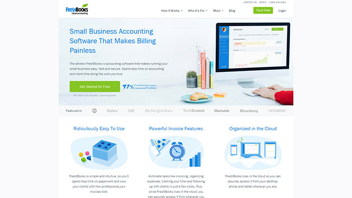
Use phrases like “Call Now”, “Order Today”, “Sign up for a Free Trial”, “Join Now”, “Book an Appointment”, or “Find Out More” to encourage site visitors to take action. It should be simple, memorable, and unmissable. 3. Use Relevant, High-Quality Images (That Are Still Compressed)The images used on your home page should be big, bold, and relevant to your business. Use photos or illustrations that help to describe what your website is all about. High-resolution images are great, but often large files, so be sure to optimize your images for the web so they load quickly. Compressed images will also help your SEO. 
It’s best to use pictures of your own product, but if you have no images of your own or it does not apply to your business, choose stock photos. You can find thousands of relevant stock photos from sites like Adobe Stock, Dreamstime, or Shutterstock. Always use an image editor to enhance them to fit your brand’s color and style. 4. Choose Effective Fonts That Match Your Brand & MessageChoosing a look for your website and brand is important. You want to deliver a consistent design and brand message across all of your digital outlets – including social media. Choose a font family that best supports your brand and use it consistently. It should reflect your brand’s personality: bold, purposeful, whimsical, artsy, or retro – the best fonts for your brand are the ones that speak for you. The bulk of your site content should be crisp, clean, and easy to read, so it’s always best to stay away from fancy fonts or non-web fonts that display as images in some browsers. Web standard is Helvetica Neue, but Arial, Times, Courier, or Calibri are all good choices. 5. Choose Effective Colors That Match Your Brand & MessageSimilar to #4, the colors you choose to represent your brand are also important. Try to choose eye-catching, pleasing 3-color themes that are harmonious and won’t distract attention away from the key features of your site. If you are unsure about what colors will work best for you, experiment a little until you find the right color combinations for your theme. Choose three colors: a neutral palette is best, one that contains a strong or bold accent color, along with a darker/contrasting color for your text. Backgrounds should be white or very light to help your content stand out. Steer away from using too many colors and choose a background color that won’t detract from your homepage content. 6. Have Your Logo Prominently Displayed on Top
Your logo’s purpose is, in part, brand recognition. It should reflect your brand’s personality, and it should resonate with, or speak to, your target audience through its design. If you are not particularly design-savvy, hire a graphic designer to assist you with some ideas. When a visitor lands on your homepage, there should be absolutely no question as to where they are. Ideally, they will see your logo and realize that they are in the right place. Display your logo in the header navigation. It should be clearly visible on each page and its design should be responsive – meaning it will look exactly the same, no matter what computer or device your site visitors are using. 7. Use Directional Queues to Guide Visitors Where to Go
Much like a CTA, guiding your site visitors to the pages you want them to land on is key to your success. If you have a range of services, for instance, your homepage should give just a teaser (25-30 words) to the full content, followed by a CTA/link to ‘read more’. This will guide them to your service page, where they will find out about your service or product in more detail. Futuramo uses excellent directional queues to guide users down the path of the page. 8. Remove Any SidebarsSidebars in websites are distracting and they clutter up the streamlined design you are ideally going for. They also make your site design look outdated, delivering a negative appearance before your site visitors have even had the chance to give you a spin. Lastly, it takes up valuable real estate on the homepage that can be used to display products or awesome images. Your navigation should be anchored at the top (it should be in the same place on all pages) and homepage content should be scrollable. There are many reasons for this – the most important one being that our natural tendency is to want to read something like a magazine or a book with titles at the top. 9. Make Sure it is Mobile Friendly
As the bulk of your visitors are going to be checking out your home page on a mobile device, you need to also keep responsive web design in mind. Ensure that your home page (and entire website) is fully responsive – meaning it will look great, no matter what device it is being viewed on. Test your site before launching to make sure your home page design efforts are being displayed the way they ought to. 10. Keep It Up-to-DateLastly, and this should go without saying, ensure that your home page content is up-to-date in terms of what you are doing right now. Keeping it current with periodic updates and fresh products trending for your business. This will contribute positively to your SEO efforts and assures your site visitors that you are active and open for business. ConclusionYour home page is your calling card. It’s the sum total of the impression your site visitors have of you and of your company, product, or service. It is a clear arbiter of your success on the web. A great home page design will lead your business to success and encourage your site visitors to become true brand evangelists. The post 10 Design Tips for Building a Successful Home Page appeared first on Design your way. from http://www.designyourway.net/blog/web-design/10-design-tips-building-successful-home-page/ It’s quite impressive that we have Android launcher apps, so we can change the interface. But, why change the old Android launcher? You’ve probably seen this before happening, the old launcher gets boring and slow. At this point, you’ll want to download one of the Android launcher apps that are on the Google Play Store. There are lots of Android launcher apps on the Google Play Store, each one of these having a unique style. I’ve compiled a list of the best Android launcher apps. Check them out below. The best Android launcher appsAction Launcher 3
The Action Launcher is the preferred launcher of many people, numbering among the best launchers for Android by anyone’s measure. It looks right for Android, fitting in with the UI’s normal aesthetic, but has a few features unique to itself. Quickpage is a hidden homescreen you can access from just about anywhere. You can use the Quicktheme option to pick out theme accents. The Covers option offers a different take on folders. Action Launcher 3 is updated regularly and frequently. It has a well-earned reputation or stability, as well. ADW Launcher 2
ADW Launcher is one of the older ones on this list, though ADW Launcher 2 is a recent update to this old top launcher for Android. It has been modernized and is entirely up-to-date with modern features and conveniences. The ADW Launcher offers a lot of customization options and allows for many adjustments to themes, so it can be personalized easily. It now has launcher shortcuts from Android 1.7 Nougat. There is a unique and impressive make-your-own-widget feature. This updated version of the ADW Launcher app is very original, with a lot of ideas you won’t find among other Android launcher apps. The free version can be downloaded off the Google Play Store, but you can also upgrade it from within the app to the pro version for #3.49. Apex Launcher
The Apex Launcher is among the most iconic, oldest, and best Android launchers out there. Its appearance looks to fit in with the traditional Android UI, though it adds in a few extra things. You can alter a lot of features at will, including scrolling habits and transition animations. There is a scrolling dock with room for a lot of icons. It supports icon packs and many of the themes found on the Google Play Store. As old as the Apex Launcher is, it has been updated regularly and is among the more stable launcher applications, working well for almost every Android device. APUS
APUs does a bit to change the normal Android UI. It removes the app drawer and moves all your apps to the desktop in a manner similar to iOS or MIUI. If you’re going to use this app, try to download the APUS Notifier. The APUS Notifier is a popular plugin for the launcher that offers notifications on the apps, SMS/MMS, and emails, among other services. APUS is particularly unique in that it doesn’t use as much power as Google Now, resulting in the much coveted goal of longer battery life. Atom Launcher
The Atom Launcher tries to bring your device back to the old school— the very, very old school. The Atom Launcher turns your wallpaper totally black. Your icons are converted into white images that may only slightly resemble their original icons. It replicates the feel of black-and-white photos and movies, making it an oddball standout in a genre of apps that tend to do more or less the same thing. BlackBerry Launcher
Remember when BlackBerry was the wave if the future? BlackBerry’s hardware heyday has come and gone, but they are still gaining ground by making Android software. This launcher app was developed around the BlackBerry Hub+. The BlackBerry Hub+ consolidates all notifications, emails, and text messages into one location for ease of access and reply. The launcher and hub should be downloaded together, as they work very, very well together and integration is seamless. Buzz Launcher
Buzz Launcher looks to latch onto people’s affinity for social media communities and harness the creativity you can find there. It is what could be called a “participatory” alternative application launcher. Community users are connected via a dedicated portal. On this portal, they can create and share themes with one another. This is a rare and unique option among Android Launcher applications and is worth a close look. C Launcher
C Launcher is one of the more simplistic Android Launcher apps you can find. It has been designed to offer fast searches and a clean look. It offers universal search to quickly search through your apps. In a lot of respects, its interface works more like the iOS UI, with a similar lock screen and an unread app notification count. There are many different themes available, as well. C Launcher is a nice option for anyone who recently started using Android after using iOS devices and misses that interface. Catapult
Catapult is essentially a renamed version the Trebuchet launcher. Trebuchet was introduced with CyanogenMod (open source) and CyanogenOS(commercial). So the Catapult launcher has some history. It is a stable launcher and is updated regularly to keep it that way, which works out very well for its multiple customization features. Catapult is all about customization. It offers a lot of features that aren’t found among other launcher apps. It looks very like the Google Now launcher app, but it definitely isn’t a copy. It’s far more interesting than that. Hold your finger on the empty space on the homescreen and whole new options will unfold. You’ll be offered a choice to modify the screen background, settings, and widgets. Tap any of these and then slide your finger upwards to access all the things this app has to offer. It has a great many of those options for you to explore. Catapult is definitely worth trying out if you’re looking for a more customizable experience with your Android device. Everything Me
As you can tell from the name, Everything Me strives to offer up the best customization options available for Android devices. Compared to most of the other launcher apps, there are a maddening number of options available to modify with this app. Everything Me offers all the tools possible to make your device’s launcher perfect for you. It is continually being updated, with new features like Quick contact and a prediction bar on the way. Evie Launcher
The Evie Launcher is more minimalist than most. It looks and feels very similar to the regular Android launcher. It offers a slide-out bar on the left part of the screen for quick access to your apps. A nice universal search also makes your apps even more accessible, allowing you to just start typing the name you’re looking for to begin a search. This is a nice, simple launcher designed for easy app accessibility and it is a nice choice for anyone wanting to change things up just a touch. Go Launcher EX
Go Launcher EX adds a lot of free themes for your Android device. You can change contextual menus with gestures, such as pinching the welcome screen. The same thing can be done to modify widgets. It does, however, have a potentially annoying limitation. Go Launcher installs applications after its first use, in a rather “freemium” move. If you can deal with that, it is an interesting launcher app to try out. Google Now Launcher
This is the Android Launcher Google intended. It offers a simple, clean Google designed and tested interface. This is the launcher that is already installed on Nexus phones. It’s meant to give you easy access to your widgets and apps for a quick but basic experience. It does not offer a lot of choices for customization, with no advanced options for themes or gestures. A lot of people just want a functional interface for their devices with no complications, which this launcher provides in spades. It is probably the most stable launcher application there is for Android and Google updates it regularly. It’s not clear if Google Now is the way of the future for official Android launchers, as Pixel phones are shipping with their own launcher, but as of this writing it is the official launcher of Google. Hexy Launcher
The Hexy Launcher was developed by the team behind the Swiftkey keyboard app, as a part of an event organized by the Swiftkey editor. It advertises itself as simple but revolutionarily efficient. The Swiftkey keyboard, which allows for typing by sliding your finger between characters, is included with it. It also places all your apps on a single screen. Hexy generally just un-complicates your device’s layout for better efficiency. Apps are grouped by genre and are color coordinated. Groups are based on functions, like Messages, Calls, or Games. You can add, resize, and reposition whatever widgets you would like. Hexy is not very customizable, offering no themes or special settings. This is a launcher designed for efficiency, not personalization. Hola Launcher
Hola is a very lightweight launcher. It does everything it can to minimize its impact on your phone’s systems. The whole launcher application is only 3 MB. It includes a memory boost feature to keep your phone running right along. This launcher app works great for older or slow phones. Switching to Hola won’t kill and older phone and it opens up some customization options not available on older launchers. KK Launcher
KK Launcher is a repackaged version of the Android v5.0 UI, with a different set of icons, colors, and transition effects. It’s very easy to customize, with all the changes only taking a few simple clicks. It offers a lot of different themes, including a few Android familiars like Lollipop and KitKat. There is a free version available. Launcher 8
Launcher 8 is essentially the Windows Phone launcher for Android. It arranges everything in the tile menus used by Windows devices. The homescreen, icon sizes, icon styles, and transition effects are all changed to resemble their Windows version. If you’re looking to try out the Windows Phone interface, or if you’re coming to Android from a Windows device, it might be worth a try. Lens Launcher
The Lens Launcher does things differently. The launcher will put every last app on your device onto the homescreen. If you have a lot of apps installed, they’ll get very small. You can, however, zoom in and out to find the app you are looking for. This is a very different take on managing an Android interface and worth a try if you’re sick of the same old UI or anything like it. Lightning Launcher
The Lightning Launcher is an app focused on precise customization. You can make very detailed changes and tweaks to the interface, perfecting it according to your needs and preferences. You can create custom swipe commands, add in new icon packs, and change the grid lines. Line
This app was formerly known as Dodol. Line is related to the messenger apps Whataspp. This is the company’s first Android launcher app. It has some nice features, but it is very graphically intensive. However, using it is a far from slow experience. It is known as the fastest Android launcher as of the time of this writing. Lollipop Launcher
The Lollipop Launcher is the Android v5.0 UI experience. It is a very standard launcher app and does not break from convention in any particular way. As an official Android UI, it offers the same look and customization features as any other official UI. Mostly it’s just a way for Android users to get the newer version for older phones. It’s a good option for those who have not yet received an official announcement for an upgrade. Next Launcher
Next Launcher offers a very original way to navigate your device’s functions: via a 3d interface! It is fully customizable. There are a lot of available themes, apps and widgets that come with it for a coherent interface design. It’s worth a try just for its originality. People tend to either love it or hate it, with nothing in between. You can download a trial version that allowed for you to use Next Launcher for a limited time. If you like it, consider paying for the permanent version. Nova Launcher
Nova Launcher is regarded by many to be the best Android launchers application, with over 50 million download and an average Google Play Store user rating of 4.6. It runs incredibly smoothly on just about any device. There is a full range of customization options, allowing for you to use any icon pack you can find. The initial style is the AOSP launcher with a range of modifications available. It uses approximately 15 MB of RAM. Worth a look if you want to try the top alternative launcher for Android. A lot of people out there swear by the Nova Launcher. Smart Launcher Pro 3
Smart Launcher Pro 3 is very unique. It starts out with a setup procedure, asking for your preferred photo app, music app, and dialer app from among any you already have installed. Once you select those, hit the start button, and you’ll find yourself at a homescreen with six apps, including those you just selected. Swiping left will bring up your app drawer, organized and locked in that organization (seriously, you can’t change it), while a right swipe brings up a few screens for any widgets you might want. You can’t add on more homescreens, though you can modify the apps on the one you do have, wither adding, taking away, or altering their function. This is exceedingly minimalist. It creates one single manageable space and reduces overall clutter. If you’re looking to simplify your device’s interface, this might be the launcher app for you. Themer
Themer offers a wide selection of pre-made themes with a click. It offers a wide array of skins of all kinds, simple, serene, bold, colorful, anything you can imagine. The ease of swapping these looks out means you can try different ones with ease and change your device themes as often as you like, for whatever reason you’d like. Turbo Launcher
Turbo Launcher’s interface is clean and sleek. You can change your phone’s homescreen around in a few different ways, altering the look of folders and icons. The dock can be customized as well, and scroll effects are easily altered according to your preferences. Turbo Launcher claims it lives up to its name by helping improve up your device’s performance, but reviews are mixed on that front. You might need to try it for yourself on your device and see if it helps with the speed. Yahoo Aviate Launcher
The Yahoo Aviate Launcher starts off with a simplistic home screen and automatically organizes your app drawer. As you use your device throughout your day, it adjusts the display to give you want you need when you need it. It’s easy to check the weather, get driving directions, check the traffic, and learn the news on the go with this launcher. You can have it set to automatically pull up music apps and artist details when you plug in your headphones. Very different than most apps, Aviate offers an entirely new kind of customization. Z Launcher
Z Launcher offers a different kind of app search. All you have to do is draw letters on your homescreen. Want to watch a video? Draw a Y to search your apps for Youtube. T can pull up Twitter, and U can bring up your Uber app. This launcher has very slick modern design, with backgrounds that change depending on time of day. An interesting app for people on the go. Zeam
Zeam is a speed demon. It doesn’t have any other features, no customization options or themes. It just runs smoothly and fast with very striped-down code base. It’s the Formula One car of Android Launcher applications, with absolutely no bells and whistles to get in the way of its speed. Because of that, even the oldest phones run it really well. It’s free and can work great for even the oldest Android devices. Zen UI
The last of these Android launcher apps is ZenU. Developed by ASUS, looks to offer the features of both the ad-heavy amateurish launchers and sleeker, more professional launchers used by enthusiasts. It offers a lot of themes, both high quality ones and less quality ones, but it also offers more detailed personalization features. There is an awkward search menu created by default with tending search suggestions and accessed by an upward swipe. It can be easily removed as a part of customization. You can adjust the home screen grid size, transition animations, and add themes to the folders. ZenUI also includes a security tool, CM Applock for ASUS (provided by Cheetah Mobile, the makers of Clean Master. This prevents unwanted users from accessing certain content. Ending thoughts on Android launcher appsThe best launcher for Android can be hard to pick out. It really depends on what you want, and as you can see from the list above, there are a lot of different kinds of launcher applications available. Take a look at them on the Google Play Store, read the reviews, and download a couple. Interact with the UIs and see what feels right. If you liked this article about Android launcher apps, you should check out these articles as well:
The post Android launcher apps: The best that you should try appeared first on Design your way. from http://www.designyourway.net/blog/tech/android-launcher-apps/ If you are an experienced designer, you probably agree that being inspired by others is not stealing in UI design. It’s best practice research. It’s using design patterns. It’s following the guidelines. It’s making sure to use patterns that your users are familiar with to create usable interfaces. Some might say that sticking to the guidelines and following others will kill creativity and, at the end of the day, all apps will look the same. From a UX perspective I see a different problem. Getting used to adapting best practices might make you believe that Google / Facebook / Instagram / [your favorite app here] is always right, their design goals are the same as yours and you fail to question them. Here are a few patterns that are (or used to be) considered best practices and yet might not be as good as you’d think at first sight.
At least half million posts have been written about the hamburger menu, mostly by designers, arguing against it. If you missed all, read one or two, but in a nutshell, it’s not about the icon itself but rather about hiding the navigation behind an icon. 
This solution is pretty tempting and convenient for a designer: you don’t have to worry about the limited screen estate, just squeeze your whole navigation into a scrollable overlay that is hidden by default. Experiments show, however, that exposing menu options in a more visible way increases engagement, user satisfaction and even revenue. That’s why now all the big players are shifting from hamburger menus towards making the most relevant navigation options always visible. 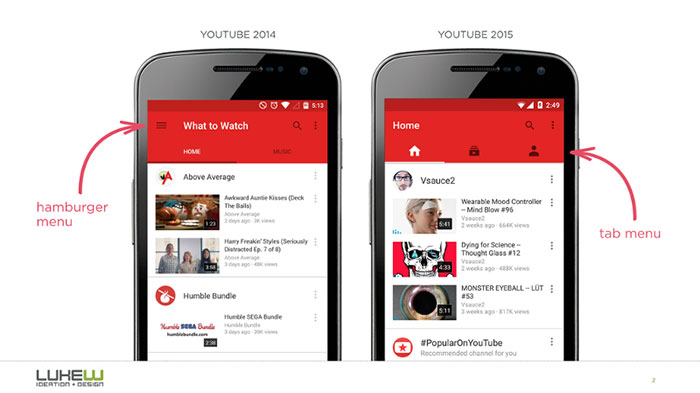
If your navigation is complex, hiding it does not make it mobile friendly. Prioritization does. See some Hamburger menu alternatives
Due to the limited screen estate, it also seems a no brainer to save space by replacing text labels with icons wherever possible. Pictograms take less space, they don’t have to be translated, and people are familiar with these after all, right? And every other app does that. With this assumption in mind, app designers sometimes hide functionality behind icons that are actually pretty hard to recognize. Would you guess, for example, that you can send direct messages behind this icon in Instagram?
Or, assuming that you never used Google Translate before, what functionality would you expect to access by tapping the pictogram below?
It’s a common mistake to assume that your users are either familiar with abstract pictograms or they’re willing to spend extra time exploring and learning them. 
If you have designed an icon and you feel that a popover label is required to make it usable, you’re doing it wrong. Even if you’re Foursquare and your users will learn it anyway. 
This doesn’t mean that you should not use icons at all. There are plenty of icons that your users know pretty well, mostly those representing common functionality like search, video play, email, settings and so on. (But the users can still be unsure, for instance, what exactly happens when they tap on a heart icon.) 
Complex and abstract features, however, should always be displayed with a proper text label. In such cases, icons are still useful as they can enhance the discoverability of the menu items and they can also add a nice touch and personality to your app. 
Basic functionality can be effectively represented by icons but for complex features, text labels should be used. (And if you use icons, always have them usability tested.)
When Apple introduced the iPhone in 2007, multi-touch technology got mainstream attention and users learned that they could not only point and tap on the interface but also zoom, pinch and swipe it. Gestures became popular among designers and there were many apps that were designed around experimenting with gesture controls. 
Just like hiding the navigation and using icons instead of text labels, gestures seem sometimes tempting for designers looking to save some screen estate. (“There should not be a delete button, people will just swipe left. Or right. We’ll decide.”) The first thing to know about gestures is that they are always hidden. People need to remember them. Just like in case of the hamburger menu: if you hide an option, less people will use it. In addition, gestures have the same problem as icons do: there are common ones that most users understand like tapping, zooming and scrolling, and there are those that need to be discovered and learned for each app. Unfortunately, most gestures are not standard and consistent across apps yet— it’s still a pretty new area of touch interface design. Even a simple gesture like swiping over an email might work differently in various mail apps. 
Or, consider that shaking your device might mean both Undo (in iOS) and Send feedback (Google Maps), too. Never forget that gestures are hidden controls and have to be memorized which needs tons of effort on your users’ end. If you’re Tinder, you might be able to teach the whole world what swiping right means -- but only if it’s an essential ingredient of your app’s concept.
Onboarding, a recently hot UX topic, refers to the first encounter between the user and the app. In many cases, this simply means showing some overlay tutorials to the user to explain the interface: 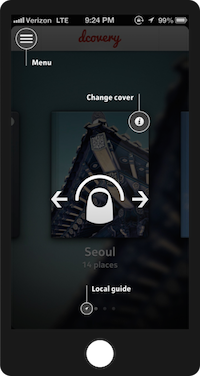
Why is it a bad solution? Because many users will skip your intro; they just want to get started with the app. And even if they notice your tutorial, they usually forget everything as soon as they close the overlay. (Especially if the screen is stuffed with information.) And last but not least: adding coach marks to your interface does not make it more intuitive. Remember this: 
The onboarding flow can be designed in many other ways that might be more useful to your users. Slack, for instance, uses the first screen to create some context. They simply introduce themselves, focusing on benefits instead of screens and features.
A more interactive way to engage first time users is progressive onboarding. Duolingo does not explain how the app works: users are encouraged to jump in and do a quick test in the selected language (even without signing up) because people learn best by doing. Also, it’s a much more engaging way to show the value of the app.
Remember how swipe gestures were different in Mailbox than in Apple Mail? This is how their progressive onboarding works: users get a walkthrough where they have to try each gestures before actually starting to use the app:
Before designing your coach marks on a semi-transparent overlay, stop and think about what the experience of the first time users should be. Focus on the context. In most of the cases, there is a better way to welcome your users.
An empty state is something that is easily overlooked by inexperienced designers, however, they can be an important factor when it comes to an app’s overall user experience. Sometimes designers see error messages and empty states as blank canvases where there’s a good opportunity to do something creative. Take this empty state screen from Google Photos: 
At first sight, it seems great, right? Well composed layout following the guidelines, with a beautiful graphics on it. At a second glance, though, there are some strange things here:
This empty state screen above simply doesn’t help users understand the context:
When it comes to creativity, less is sometimes more. The empty state below does an excellent job when it comes to being useful. (Let’s ignore the “Now tap the button below” instruction for now.) 
Don’t forget that empty states (similar to 404 pages on the web) are not only about visual aesthetics and brand personality. They have a more important role in usability, too. Make them intuitive. Question everything Don’t get me wrong: design patterns and best practices are still your friends. Keep in mind though that apps and users are different: one solution might work for well in an app and fail in yours. It’s not a one-size-fits-all thing. Plus, you never know why an app was designed in a certain way. Do your own thinking. Do your own design. Do your own research. Measure, test, validate — and don’t be afraid to unfollow the guidelines if that makes more sense. If you enjoyed this article, make sure to read my latest post, Hamburger menu alternatives for mobile navigation.
The post Misused mobile UX patterns appeared first on Design your way. from http://www.designyourway.net/blog/user-experience/misused-mobile-ux-patterns/ |

AuthorPleasure to introduce myself I am Jamie 27 years old living in Searcy, AR. I am web developer and have developed over 50 sites for clients. Now a days I am focused on designing as I feel I am lacking it. Archives
April 2019
Categories |
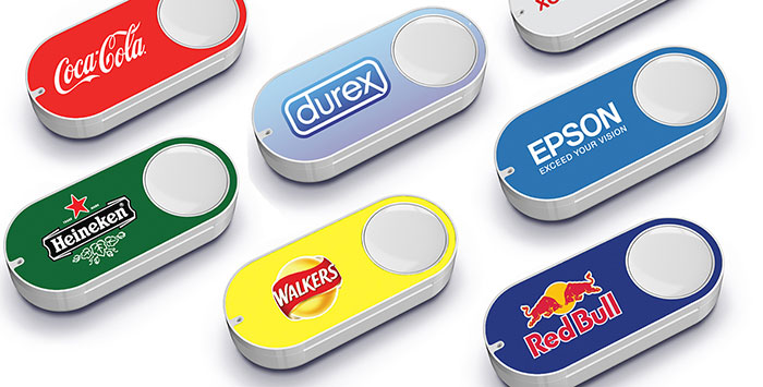
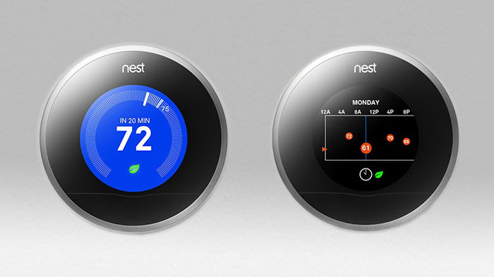


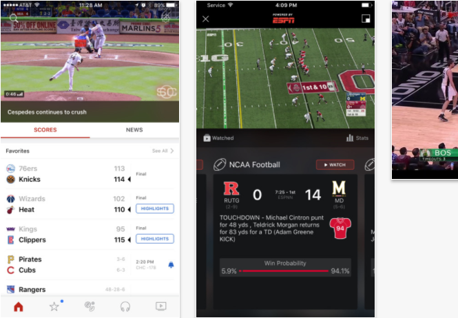
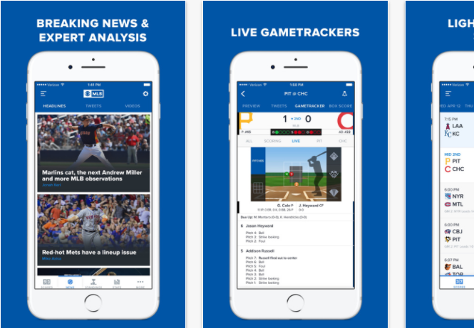
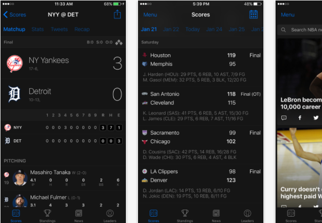
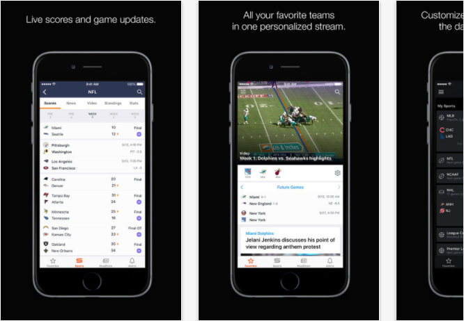
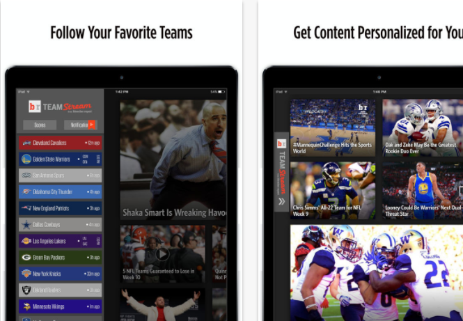
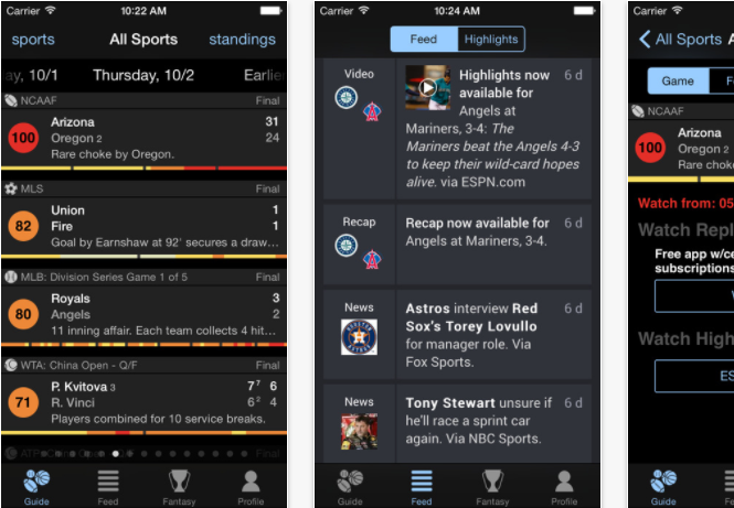
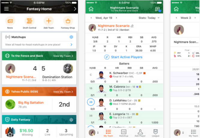
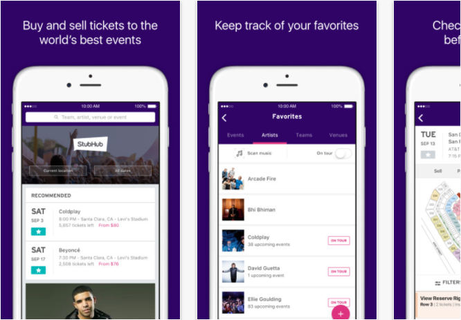
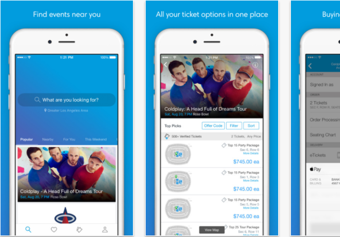
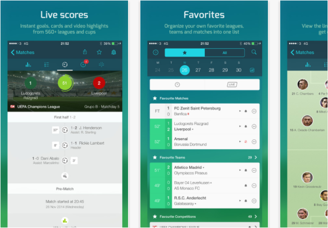
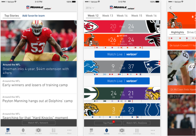
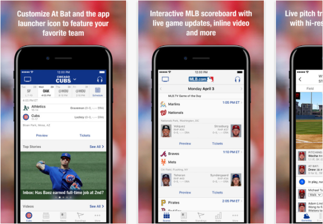
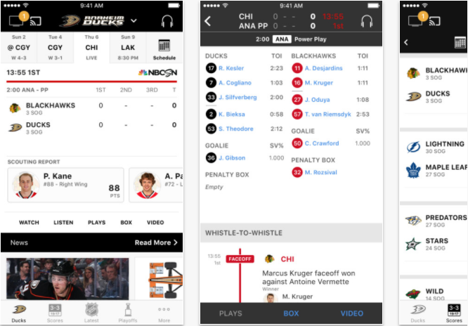
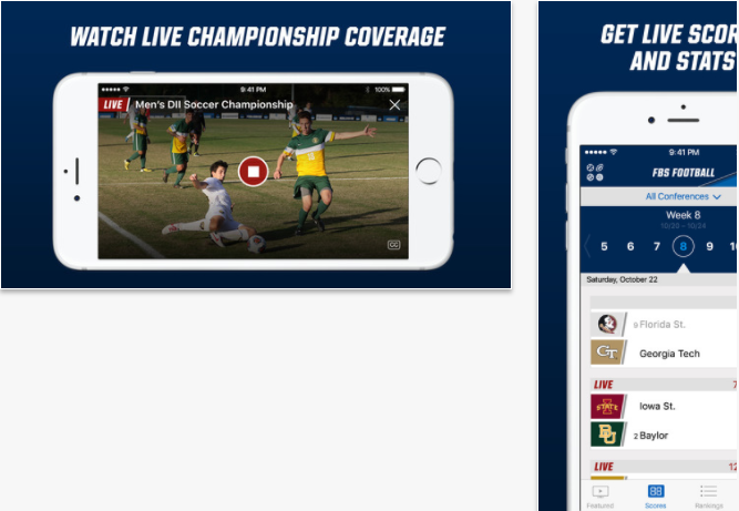
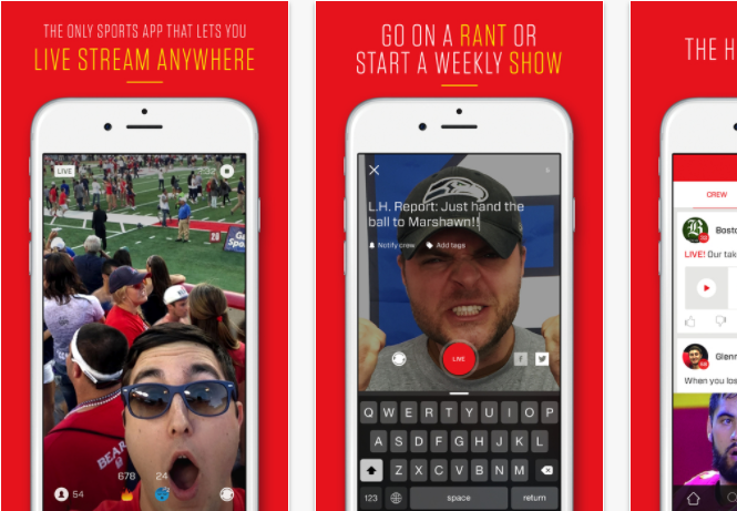
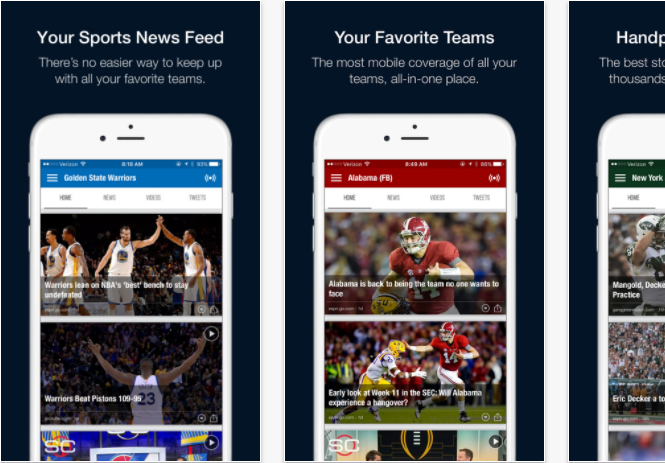
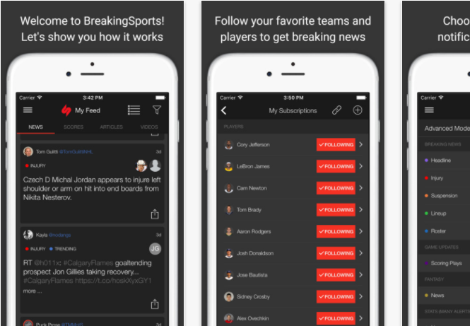
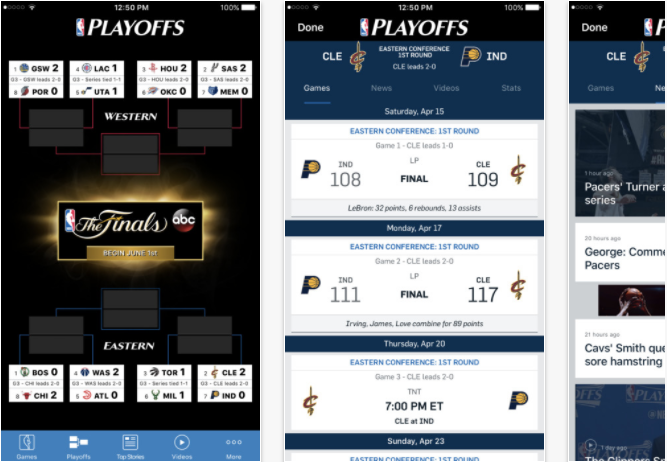
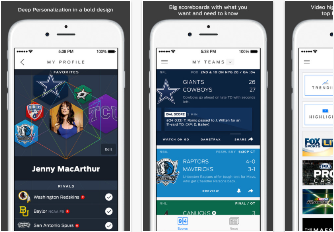
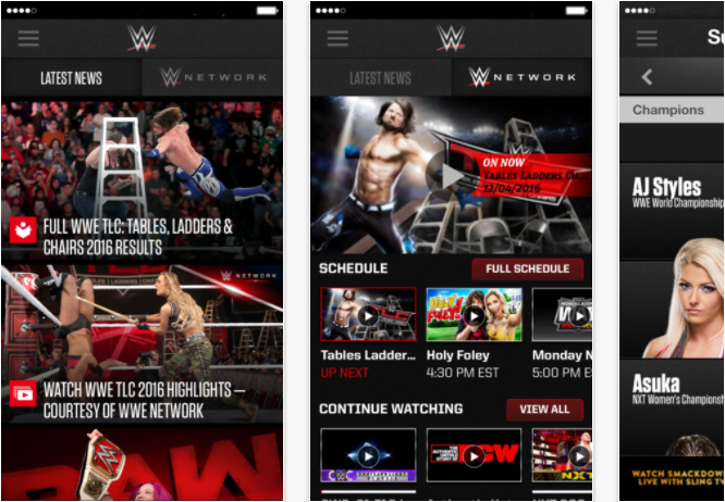
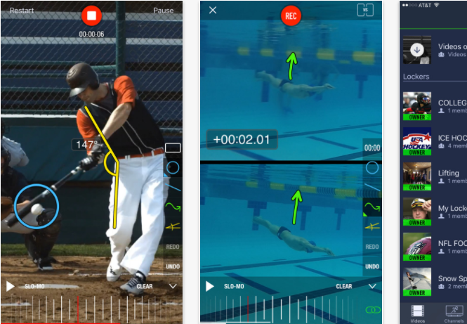
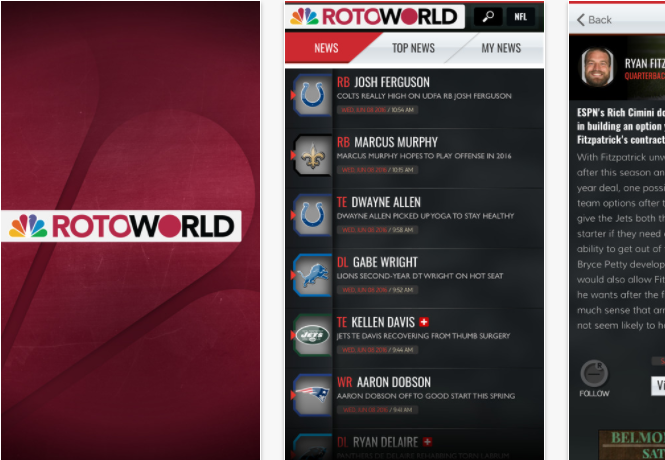
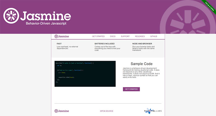
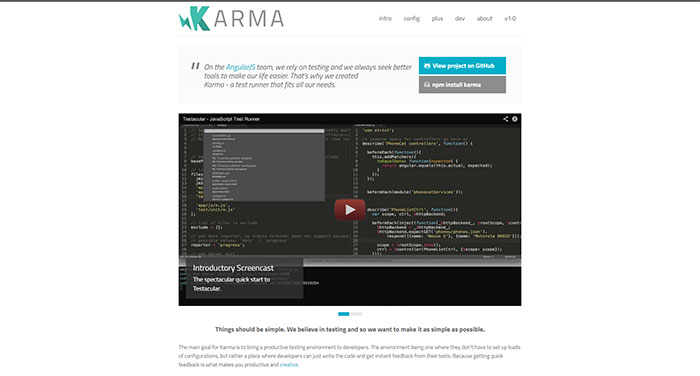
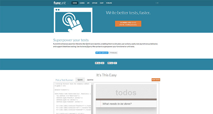
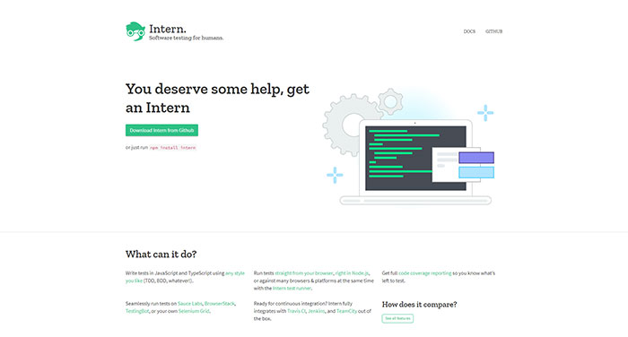
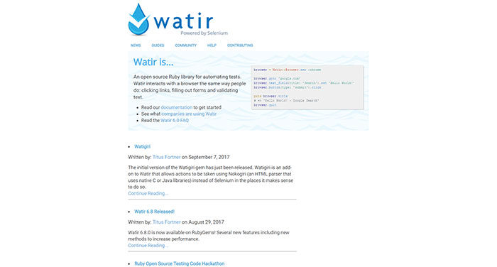
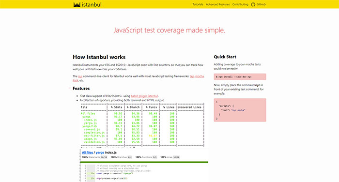
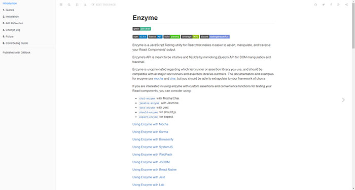
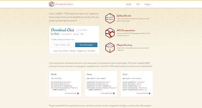


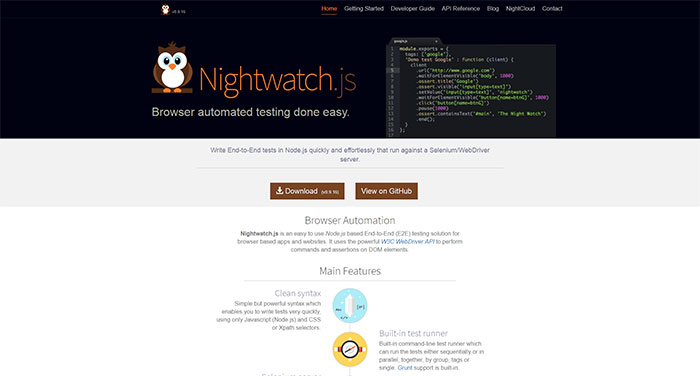
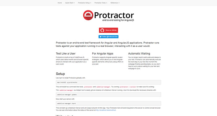
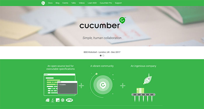
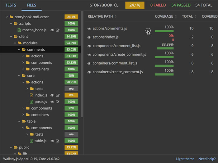
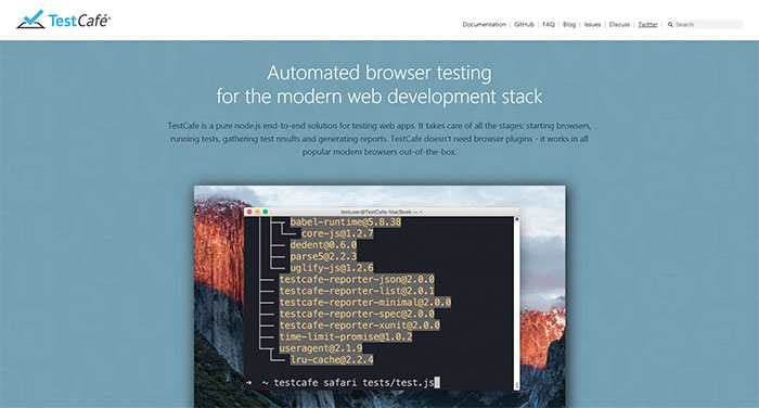
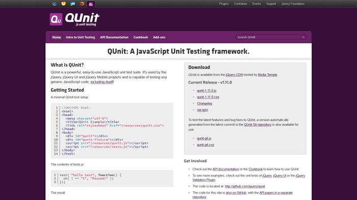
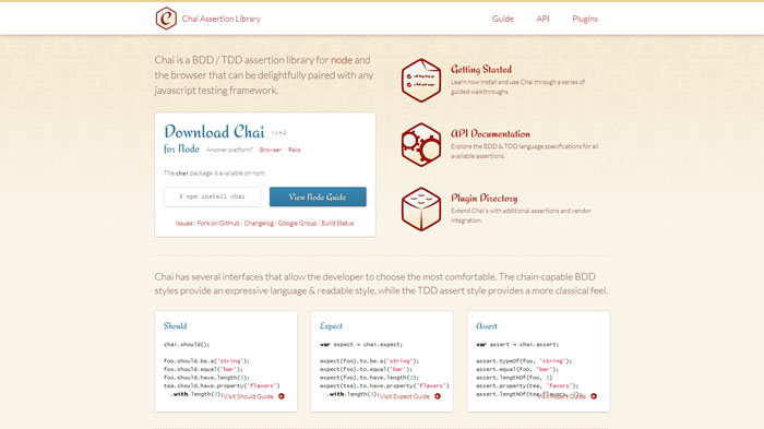
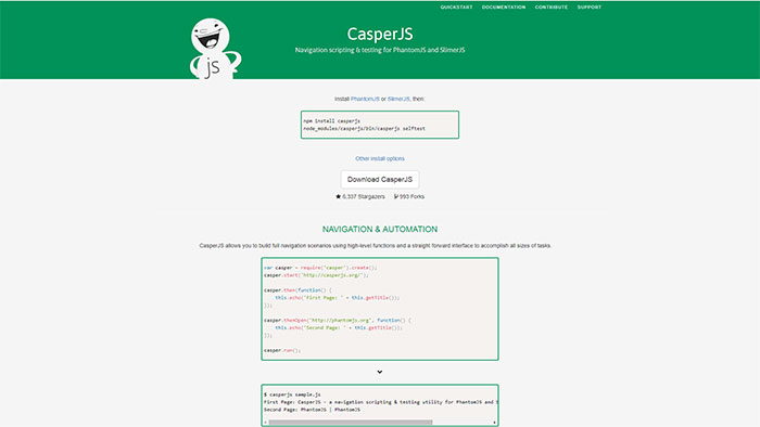
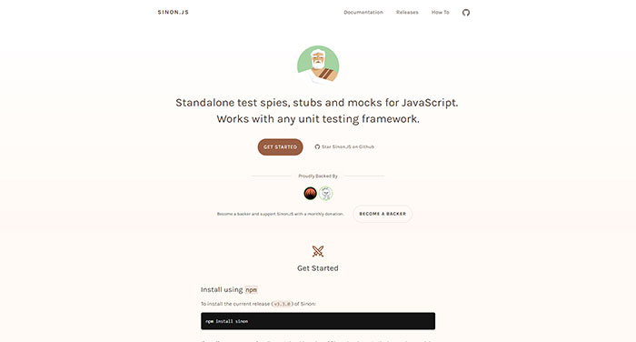
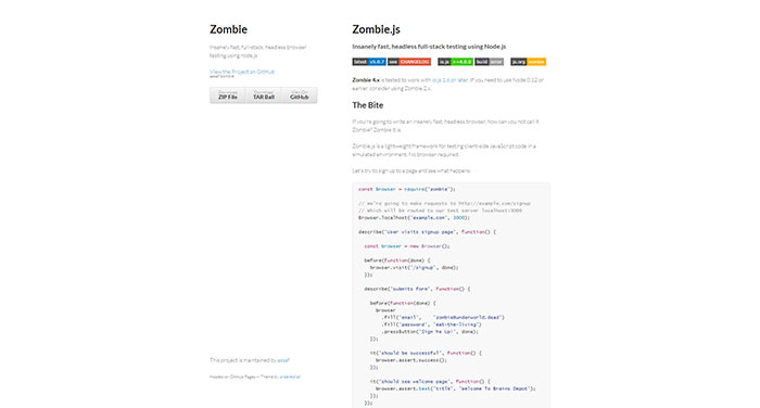
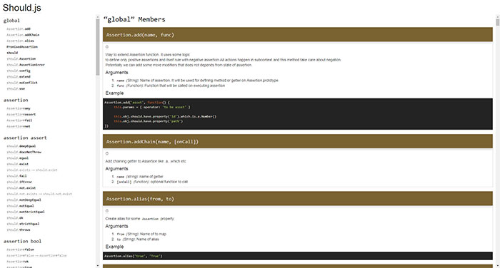
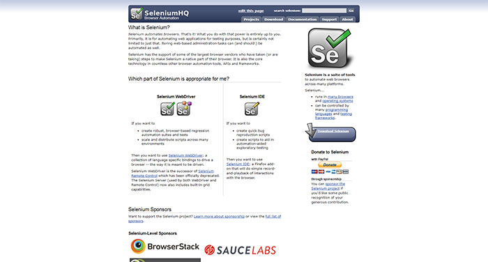
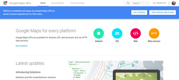
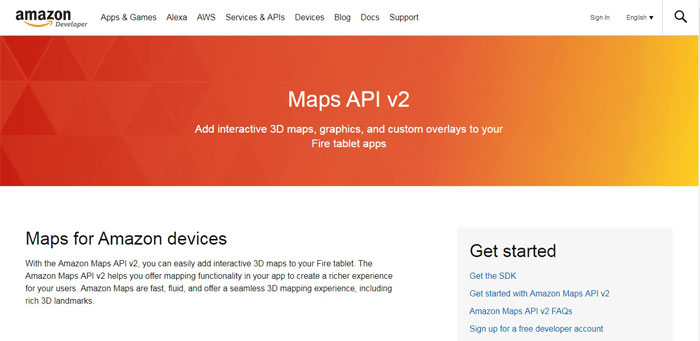
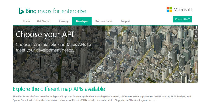
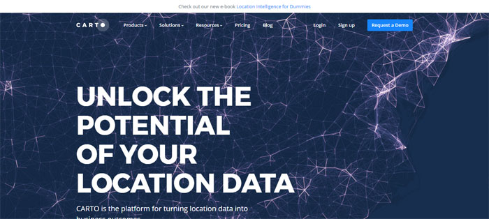
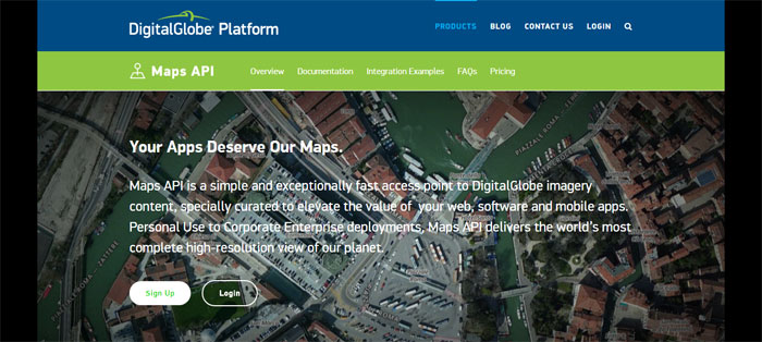
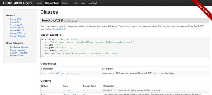
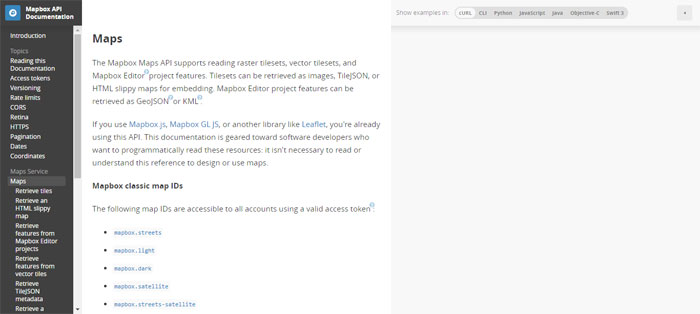
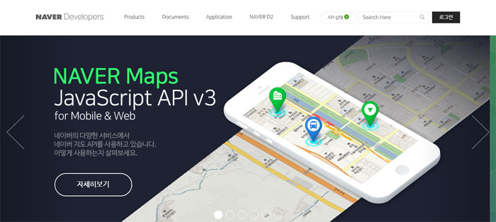
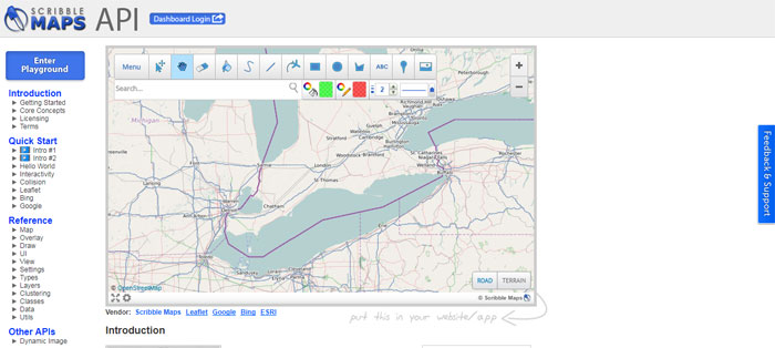
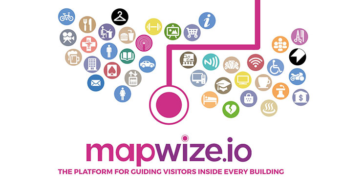
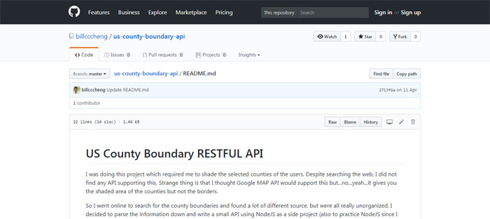
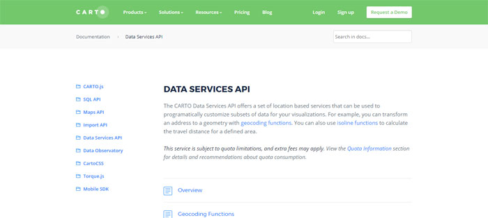
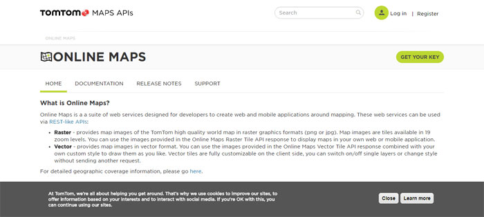
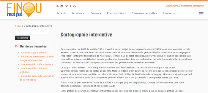
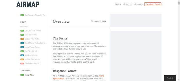
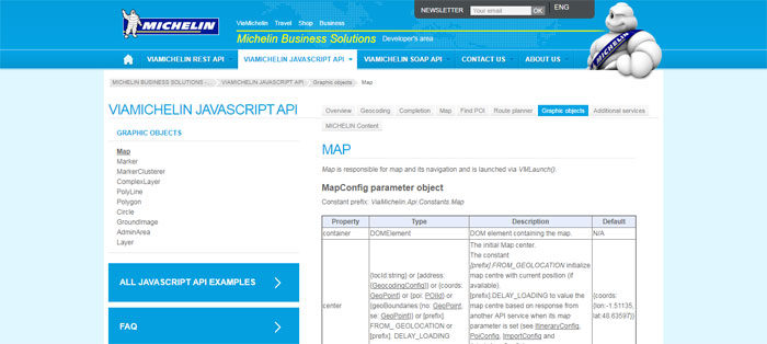
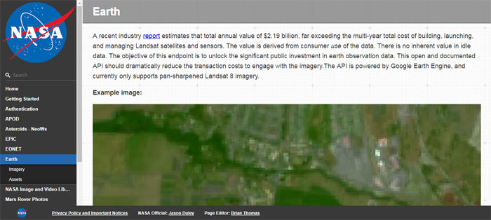
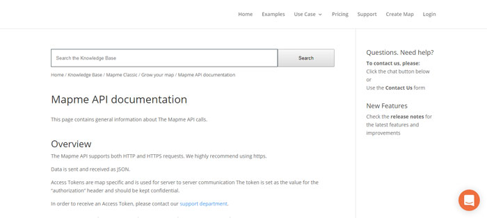
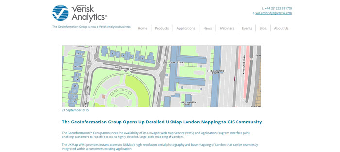
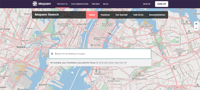
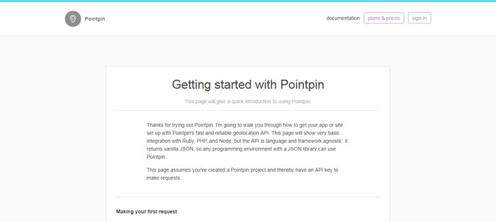
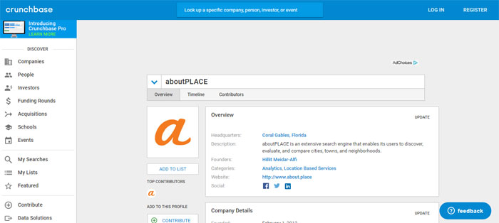
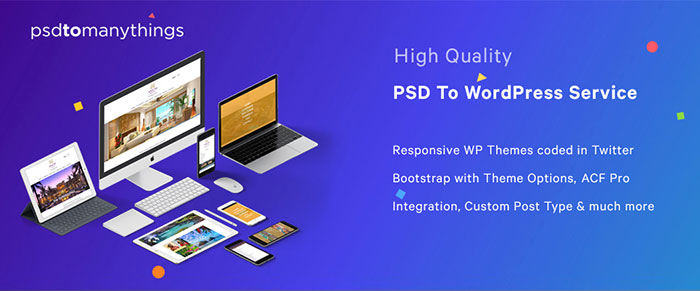


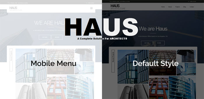
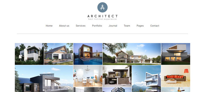
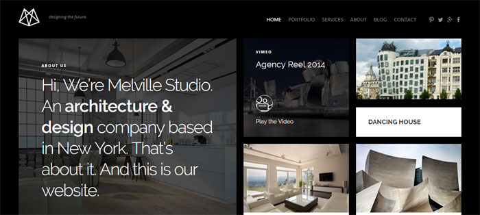
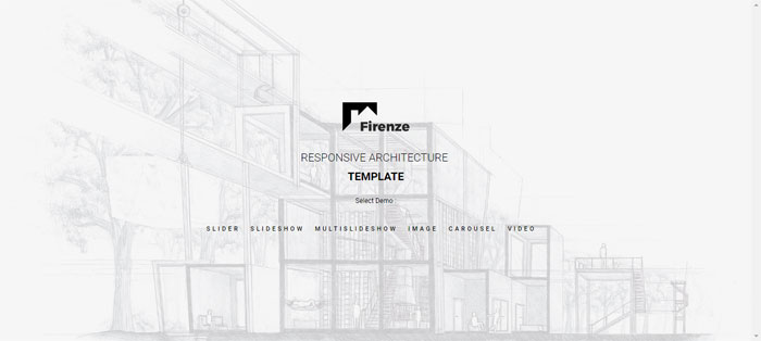
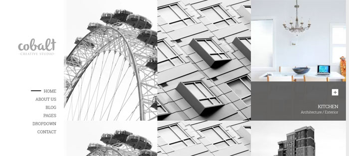
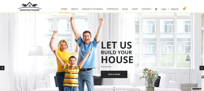
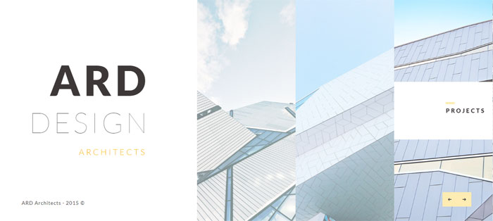
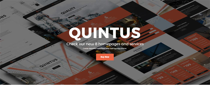
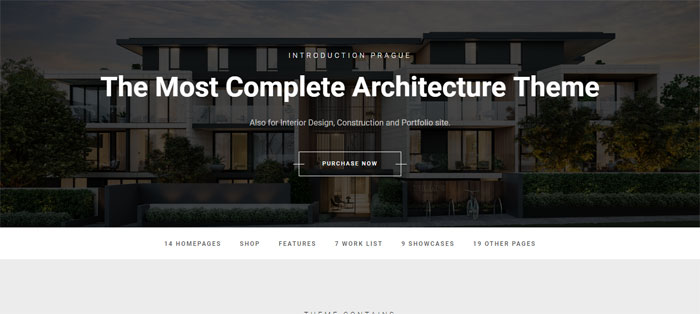
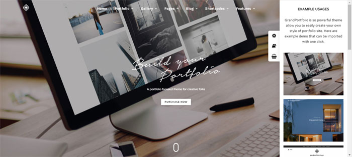
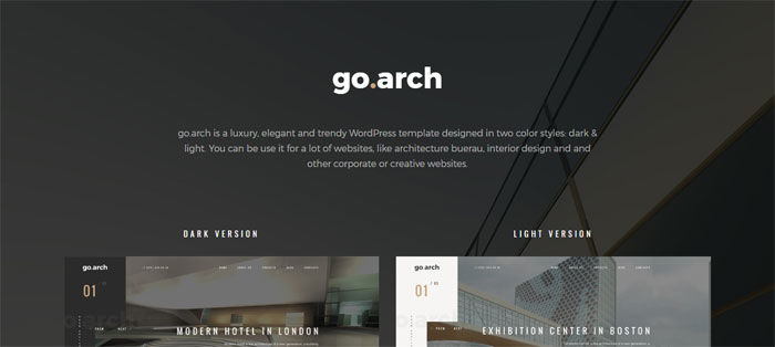
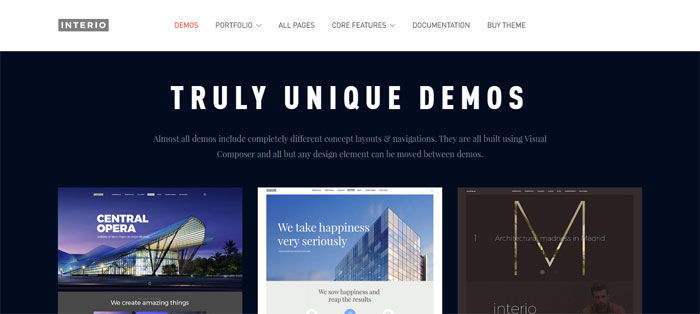
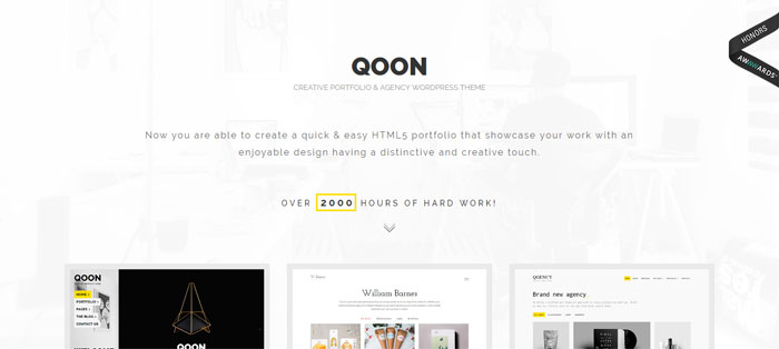
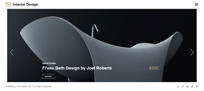
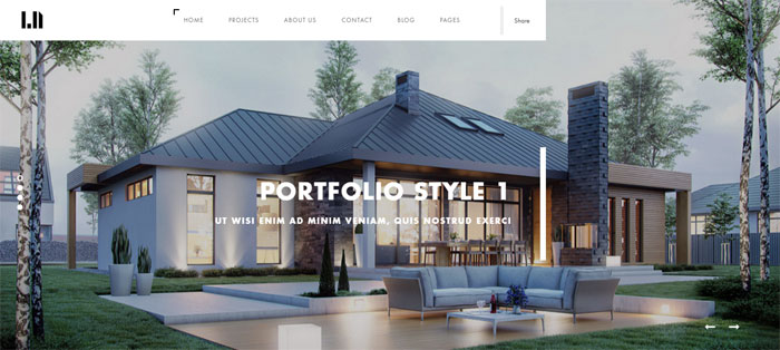
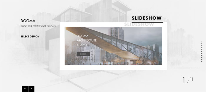

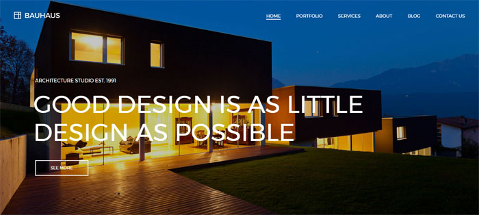
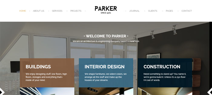
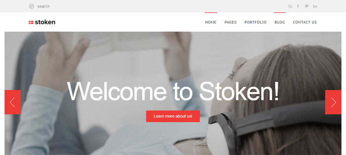
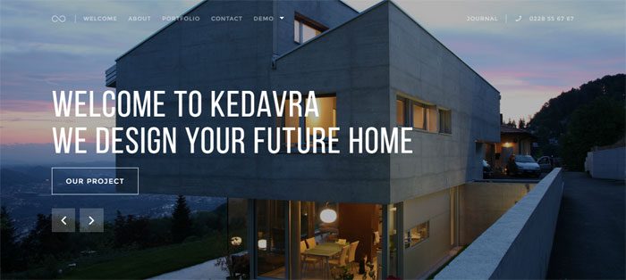
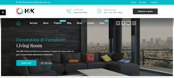
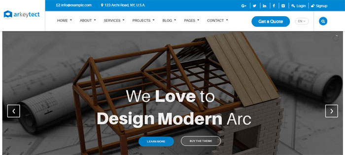


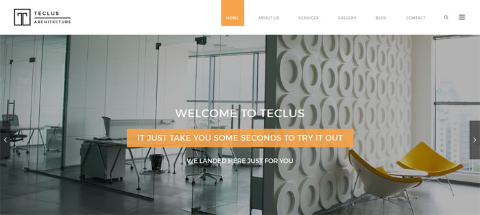
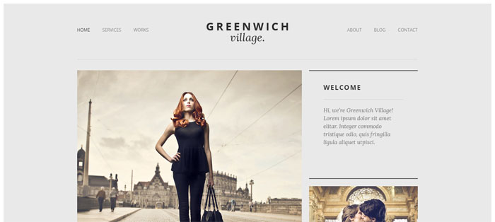

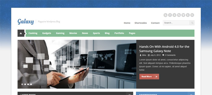
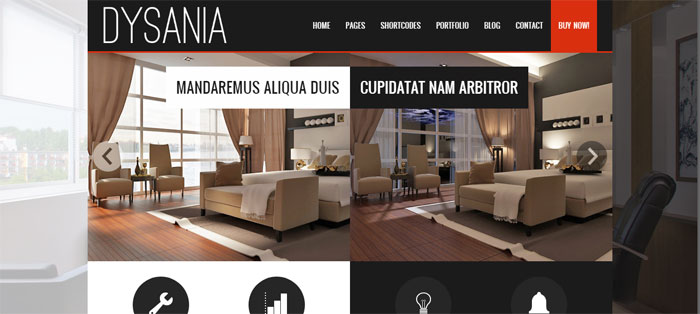
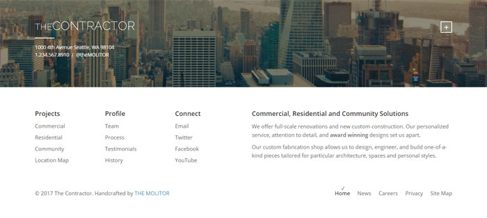
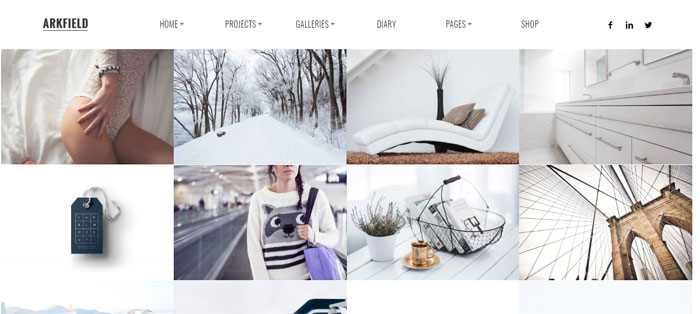
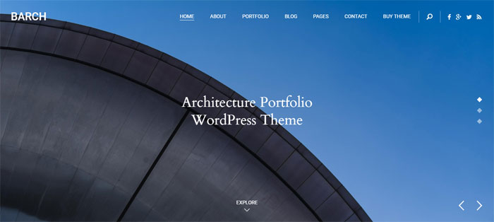

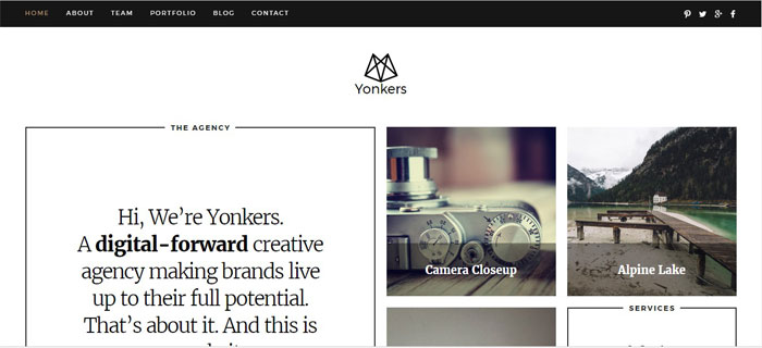

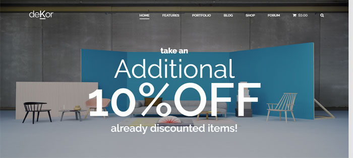

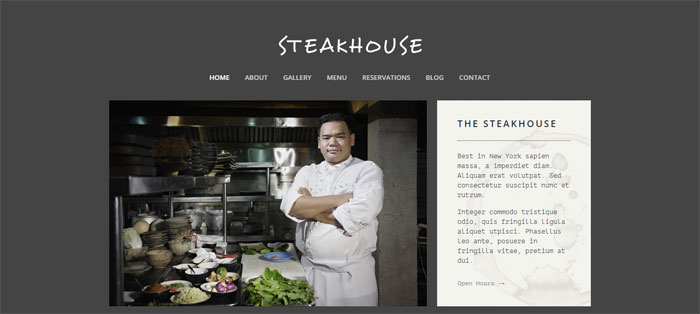
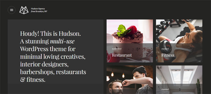
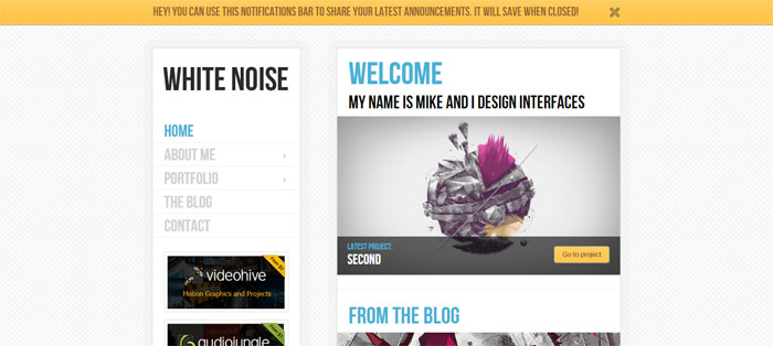
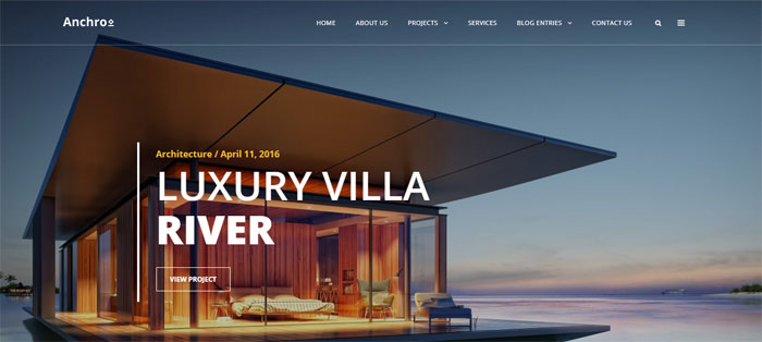

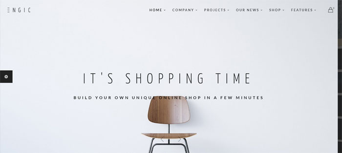
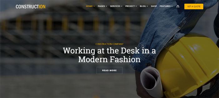
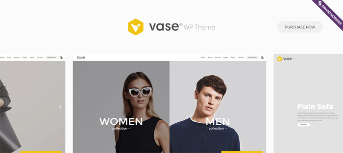
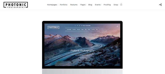
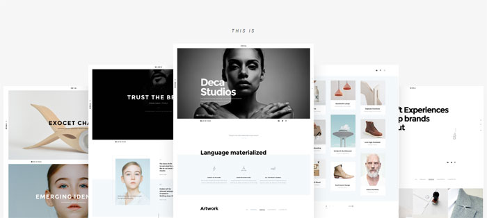

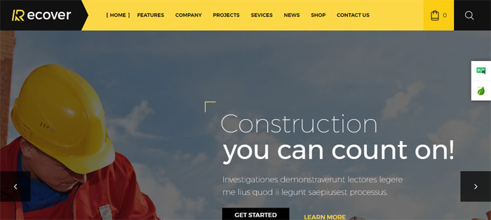
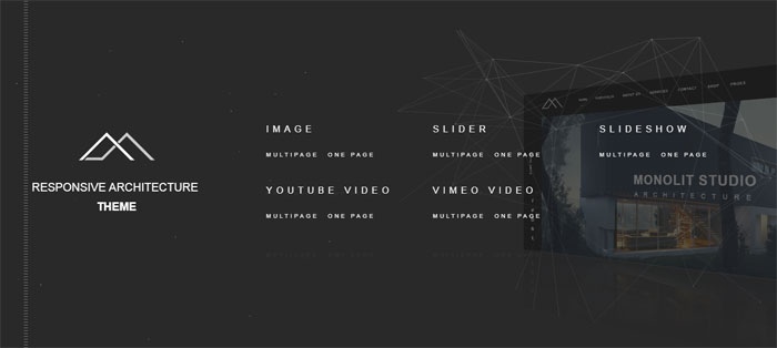
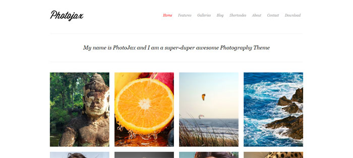
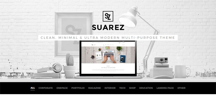
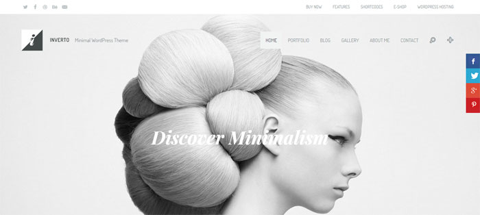
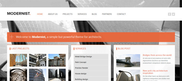
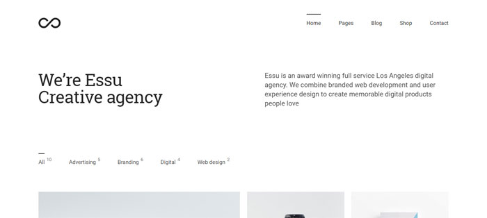


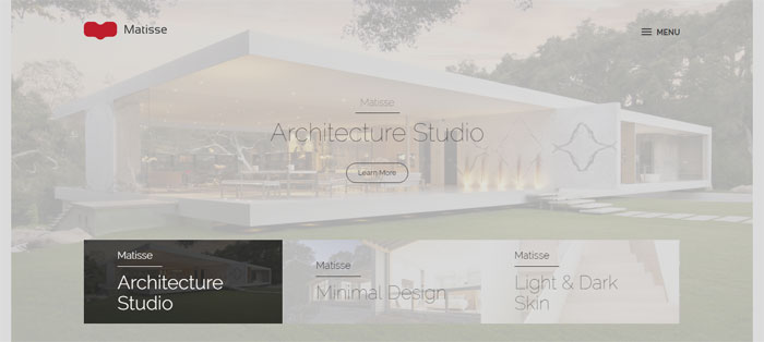

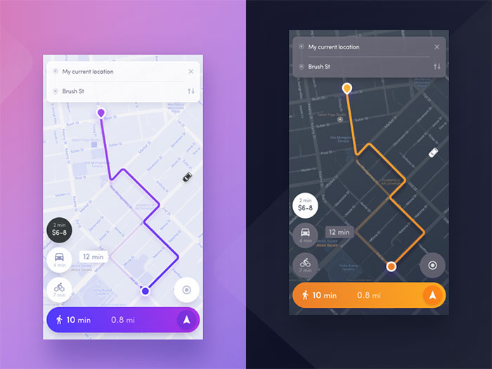
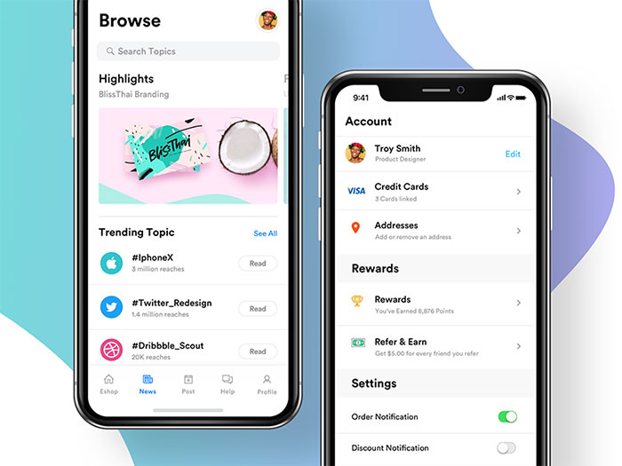
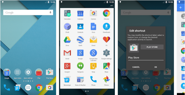
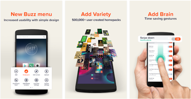


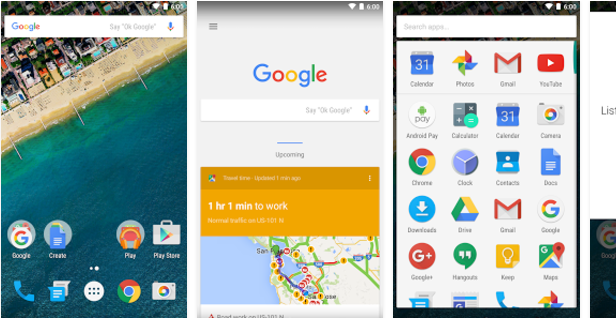


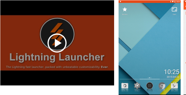

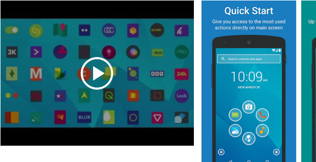
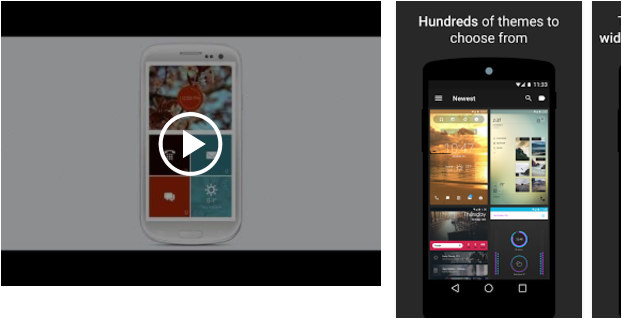

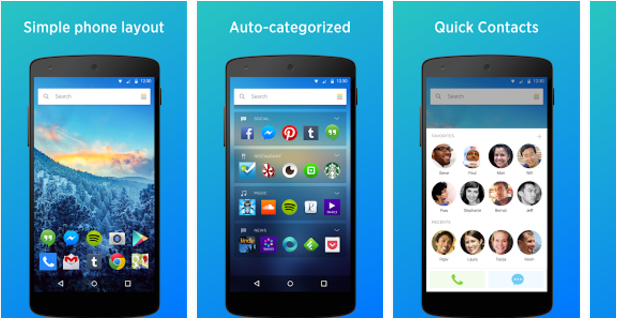


 RSS Feed
