|
You’ll find yourself more than often in the situation when you’ll need some Android photo editor apps to make your photos look the way you want. If you take a look at what people commonly do with their smartphones nowadays, you’ll find that snapping a photo and sending it to your loved ones is a pretty common occurrence. However, adding a filter, effect, or just a frame to your picture may make it even better and more fascinating. Editing a picture on your phone has never been easier, and the quest for the best Android photo editor is on. The best apps will make everything an easy, seamless and fun experience, and you can get your photo from an unedited version, to one with a completely different tone and theme, with nothing more than a few clicks. Then, it’s just a matter of sharing it on social media. Even though none of the apps can give you the full power of Photoshop or Lightroom on a computer, having the best photo editor for Android might make you forget about them, as often that level of retouching isn’t even necessary. Let’s take a look at some of the best contenders. Android photo editor apps to check outAdobe Apps
As one of the best android photo editor Adobe has been releasing plenty of tools in the last few years. Here you can find Adobe Photoshop Mix, Adobe Photoshop Express and Adobe Lightroom. Every of these editing tools have plenty of features that will assist you in editing your photos especially Adobe Lightroom as is frequently updated with new features. You can start from doing easy things like is removing the red eye and also edit RAE files taken from your DSLR camera or smart phone. Some of these tools are requiring an Adobe Creative Cloud subscription as to use all of their features. If you already have the Adobe Creative Cloud you should get these tools as they are included in the subscription in any case. Aviary
Aviary is another android photo editor that contains a great set of reliability and features. If you are feeling a little lazy today, you can use the one-touch mode but you can also choose from many manual adjustments like changing the colour, temperature, brightness, saturation, contrast and many more. You can also find filters, stickers, cosmetic tools like blemish remover, red eye fixer and teeth whitener. AirBrush
If you are a big selfie fan, you should go for the best photo editing app for android known as AirBrush. It is well known for its quick edits and fixes on skin and face such as teeth whitening, blemish remover, bright eye function, many reshaping tools and various filters to choose from. It has already 4.8 rates on Google Play Store and it is very easy to use app. You will definitely want this photo editing app because it contains one-click tool. Its professional type is nearly less expensive compared to the other photo editing applications. Bonfire Photo Editor Pro
This android picture editor is becoming more and more popular nowadays. Here you can find basic filters and editing tools. What is interesting in Bonfire Photo editor Pro is that you can find a huge number of filters including usual editing filters like HDR, black and white etc and also many unique cool filters like the so-called Fancy filter that can turn your images into a water colour. Also it contains some more basic editing tools such as blemish removal and skin smoothing tool. Cupslice Photo Editor
In this list of photo editing apps you can also find Cupslice Photo Editor where you can find awesome filters. Aside from the filters, in this app you can likewise find a huge number of stickers as the developers are trying to follow the latest trends which mean that the stickers here are up to date. You can also customize the filters so you can get the look that you desire. Also in Cupslice app you can find some basic editing tools like frames, crop, saturation and hue adjustment, collages, contrast and brightness settings and black and white filters. Although it is not very complicated for use, it is one of the few photo editing apps that are totally free to use. Fotor Photo Editor
There are a huge number of lists and blogs that are listing Fotor as the best photo editor app for android. This photo editor has much more editing tools than the most apps and it also includes the chance to enhance images with the one-click tool for your assistance. Here you can also find other tools including rotate, crop, contrast, exposure, saturation, shadow, brightness, vignetting, temperature, highlights, RGB, tint and in addition you can choose from more the one hundred filters. The only not so good thing about this editor is that it makes you to login as to use it and it is also one of the more expensive photo editing apps. Still, you should definitely try this photo editor app. The only not so good thing about this editor is that it makes you to login as to use it and it is also one of the more expensive photo editing apps. Still, you should definitely try this photo editor app. Pixlr
The best photo editor for android that comes from Pixlr-O-Matic is the Pixlr photo editor. The app is particularly created for editing photos, enabling you to instantly make sharp and attractive photos which you can share on your social media networks and with your loved ones. The good thing here is that you don’t have to be a pro to create great pictures. On the Pixlr app you can find various cosmetic treatments such as red eye fixer, smoothing and whitening; many effects and connections to the social media networks that are all added. You can also make quick access buttons for your more routinely used settings. Also, you can choose your favourite photos and combine them into one single image using the collage mode. Snapseed
Snapseed is Google’s own best photo editing app and here you can find all that you really need. You can find this app for free and it offers you many types of optimization options and filters. If you choose Snapseed, you will have very good photo editor whether you’re trimming, correcting colours or applying filters. You can make a focus effect or just adjust the colouring of your image. What is good of this photo editor is that it saves your edited images in a different folder as to avoid editing your original picture.
This photo editor app is focusing on modifying the perspective of your image. It will modify the perspective right away when you upload the photo. Here you have many choices available and this app is allowing you to modify the vertical and horizontal lines of the photos. You will not regret having this app in your smart phone even if it only contains some basic photo editing tools. Vignette
Vignette is more like a standalone cam app than a purely photo editor app. It has time-lapse, self- timer and a digital zoom. If you are a vintage style fan, than Vignette is the best photo editor app for you. You can easily make your images to look as they were shot with a Diana, Lomo, Polaroid or Holga. You can also find picture booth modes and double-exposure but here the camera effect are limited and some things like rotating and cropping are not included. The best thing about this photo editor is that you can use it without a data connection and the images are saved in your android phone unless you choose to share them on social media networks. Google Photos
Whit this photo editor tool you can either use it to edit your images or to save them to the free up space cloud on your android phone. Also, you can find various filters which you can use for editing your photos such as saturation, contrast or other filters. What is not so good of this app is when you save the modifications directly in this photo editor app, the original image is overwritten and that is not much desirable. All things considered, Google Photos is quite good as it sorts image materials by places, important features and people. In this way, you can find your holiday or selfie images faster without scrolling through the whole photo gallery. Also, you have unlimited image storage on Google Cloud that is available for images with a resolution up to 16 megapixels. PicsArt Photo Studio
This photo editing app is for filters, collages, mashups, shape overlays, frames and for pretty much everything that you can do with an image. PicsArt it is very easy to use and cool app. Also, it supports the raw photos so you don’t need the in-app purchases. Cymera
Besides the fact that this app is more like selfie app, here you can find some options like stable shooting mode or spot metering so you can make your images better looking. It also contains all the retouching tools and filters that you will simply adore. Open Camera
This is a free full-featured, open source manual camera that makes the images with good quality and 4k video. It is pretty basic app and it is not the best one out here but it is very easy to use. PicSay
In PicSay you can find some primary picture editing features such as distortion effect, colour correction, graphic and text effects. This photo editing app allows you to edit your images in the easiest way without being confused by various choices. Camera360
As the photo editing app with more than 700 million users worldwide you should definitely give a chance to this app. It is popular between celebrities and mostly in Asia. You can choose from more than 200 filters on this app and also add some creativity to your images by utilizing the live face effects and also stickers. FaceTune
This app is absolutely one of the best photo editing apps on this list. It is especially designed to assist you in improving your portraits and selfies. Here you can find many filters including teeth whitening and tool for widen smiles. You can additionally brighten and blemish the dark circles under the eyes and also remove the pimples. It also includes red-eye and white-eye effects. You can use FaceTune for filling the bald patches and replacing the grey hairs with some other colours. You can also reshape the nose, refine the jaw lines, apply blush and eye shadows and add some colour to your lips. Flickr
Flickr is one of the best photo editor app or android since 2004. Until now, there are more than 12 billion images shared via Flickr. What is really awesome here is that this photo editor app is offering 1TB free storage for all of it users. Here you can edit your photos; crop photos from the camera roll and also choose from the numerous numbers of filters. You can also find the pro version of this app that offers you many advanced stats for your images, a desktop auto uploading tool, an ad-free browsing participation, one year of free subscription for Adobe Lightroom CC and Adobe Photoshop CC and many more small benefits. You can purchase the pro version of this photo editor for $5.99 for one month of $49.99 for one year. Prisma
With this editing app you can easily turn out your images and videos into an art inspired by the technique of Munk, Levitam, Van Gogh and Picasso. What you should do here is take your image or video from your camera roll or while using the app and choose the filter that it is best for you. This app uses learning algorithms as to apply all exsisting filters on the images and videos. This editor is downloaded over 10 million times since it was released so it is worth a try. Repix
As the photo editing app that is downloaded more than 15 million times, Repix offers you 16 filters and more than 25 effects. You will also have more than 10 frames to pick from and many editing tools like saturation controls and brightness. You can also find some creative effects such as posterize and flares. VSCO
With this photo editing app you can easily publish photos and journals and also curate content on your profile. Here you can find huge number of tools, presets and filters to choose from. This photo editing app supports photo editing community and advanced camera options. The only difference between this editing app and Instagram is that here you don’t have some social components like “comments” and “likes” for your shared images. This app has been more preferred as the go-to app for the professional photo portfolios. Polarr
If you’re looking for some photo editing app that is someplace among the Adobe and Snapseed offerings, Polarr is the perfect photo editor for you. Here you can find tools for creating fast adjustments and also proves the feature-rich when you search deeper. You can find plenty of settings here, you just need to tap the tool and wait for the configuration buttons to slide out. Polarr is a very usable photo editing app even on your smart phone. Although you have something that is not free in this app, you can find many things for free. Photo Director
This photo editing app for android is pretty newer as compared to the other apps on this list, but it is very good actually. If you are searching for an app similar to Fotor, Photo Director is the perfect photo editor for you. This app focuses on manual enhancements more than on filters and you have also access to RGB colour channels, HSL sliders, and white balance and many more tools as to edit your images properly. You can also find sliders for brightness, tone, exposure, darkness and contrast. If you want something more than just filters, you should try this photo editing app. Photo Editor Pro
If you want a photo editor app that is somewhere between a modern editor and a normal filter editor and that has many features that are supporting both sorts of editing, then the Photo Editor Pro is the perfect match for your needs. Here you will find things such as temperature controls, blur and sharpen modes, contrast, hue, saturation as well as brightness controls. Also, you will find many filters, frames and stickers and also you can add some text to the photos as to make your own memes. Since it is a totally free photo editing apps, you should definitely download it on your smart phone. Mextures
Nowadays, as we all use smart phones with really good cameras, we can make the cleanest images imaginable, but we also want to add some effects and filters to the photos as to look more pro. Mextures is providing you with the limitless layers which you can use while editing your images. You can add many sorts of grain, grit, light and grunge leaks and play with the rotation of the images. It has also one-tap tool in case that you’re feeling a little bit lazy to manual edit the images. Fragment
Instead of turning the smart phone shots into an art, Fragment is rethinking the nature of what that king of art might be when you have a seriously competent technology to use. This photo editing app is working with patterns of the reflective surfaces instead of working with inks and paints. Here you can also find many effects such as blur and bled and you can also show off your creative side while editing your images. So, in case that you are a creative person and want to experiment, this photo editing app will be perfect for you. Photo Lab
Even if it is not as famous editing app as the others in this list, Photo Lab surely knows how to set in the features. Here you can find more than 600 frames, filters as well as effects from which you can choose while editing your images. You can also use Photo Lab to lightly edit the images, create montages, combine some effects to make unique images and share them with your friends. Before buying the pro version of Photo Lab, you can try the free one first and see how it fits with your needs. Photo Mate R3
This app is the upgraded version of the latest Photo Mate R2 which was definitely one of the best picture editors for a very long time. You should expect to become better over the time as it is really new app by now. Here you can find all the basic options and editing tools. It also supports raw files which makes this app very good for photographers. You can also fix the lens problems including the distortion, vignetting and chromatic aberration as this photo editing app comes with its own Lens Collection. Maybe it has very similar features with the other photo editing apps on this list, but it will be soon becoming a pro on Android platform. Ending thoughts on Android photo editor appsAfter going through all the Android photo editor apps included in this list, you should probably know by now that if you are not very satisfied with your images taken from your smart phone, there are a great number of photo editing apps that will help you to edit your picture like a professional designer. You can retouch your images with these Android photo editor apps and some will even help you will help you to create quick collages and montages. If you liked this article with Android photo editor apps, you should check out these as well:
The post Best Android photo editor apps to modify your photos with appeared first on Design your way. from http://www.designyourway.net/blog/tech/android-photo-editor-apps/
0 Comments
An animal logo (or a bird logo in this case) has many design conveniences. Animals are easy to identify with, and will help your brand be instantly recognized by billions of users. And while it is true that bird symbolism is overwhelming nowadays, it still caters to the main mission – creating a business identity each customer can easily remember. A bird logo is always a good idea, thanks to the beauty and gentleness of these creatures. Designers find it easy to choose between the versatile colours and shapes. In a nutshell, there is much creative people can do with a simple graphic bird symbol in hands (think of the Twitter bird logo, for instance). Companies with bird logos – what message are they trying to share?
Birds are not only symbols of freedom and flying, but also a visual representation of communicativeness. Even the simplest logos with birds (including those drawn with a single line) are instantly related to the service they promote.
If it is a cartoon bird, it clearly stands for a children brand (penguins and ducks in particular), while an illustration of a glorious peacock is almost always the bird logo of expensive and luxurious brands. As a part of your bird symbolism strategy, you should first decide which message you want to convey, and then let the cute animal ‘speak’ it up. Choose colours that tell your story
What is really cool about logos with birds is that they offer almost unlimited design possibilities, letting us choose between all sizes, shapes, and colours. To make a bird logo more personal, you can always use a pop of unexpected colours, or make a cartoon/caricature of the animal in question.
Green doves or purple ducks, for instance, would look very intriguing, especially if you add a hat or a monocle to make your logo unforgettable.
Bird logos are not a recent trend. These cute animals impressed people since the beginning of time, often attached a specific meaning and conveying an important message. Asian people, for instance, associate birds to immortality, in particular East Indians who have a myth relating birds with the souls of the department.
In the Christian culture and art, on the other hand, birds are considered the embodiment of the Holy Spirit, and often symbolize peace and safety.
At the same time, birds are used to share human moods, urges, and emotions, most of the time the positive ones. With a gentle dove you can represent divine and devotion, with a flirtatious Partridge or a proud Cockerel an amorous and polite gentlemen, and with a Rooster the heritage and tradition of a country. An image of a vulture may remind the observer of a strong and masculine boy, while a conjugal bliss would often remind them of a lifetime friend. To express affection, you can also consider a tiny Mexican parrot or a hummingbird logo, which are both considered love birds, and pinpoint closeness and affection.
Yet, the meaning of a bird symbol will likely depend on your location – if you’re in rural Africa, for instance, a hen would remind you of maternity, and the very same symbol in Great Britain would stand for beauty and love.
Nautical Tattooing uses parrots as main symbols, while sailors prefer bluebirds and swallows. The feathers, beaks, and wings of birds remind designers of the development of the human body and soul, depicting visually a person’s entire journey, from birth to departure to the ancestral lands. A bird was also chosen to be the symbol of creation of Egyptian’s God Atum, and a victory association for the Goths and the Vikings. The Odin and Norse Gods’ favorite bird was the raven, commonly related to wisdom and transformation. North America’s shamans consider them to be tricksters and shape-sifters.
Had you asked the people from Hilda (Pacific Northwest) what ravens meant to them, you’d discover that these birds are a symbol of creation and the creatures that stole the sun to let it shine.
The Rooster was even mentioned in the Bible, praised for the ability to call his flock to eat. The Bluebird (or Swallow) is the traditional symbol of Chinese sailors who believe it is their mysterious good omen, and a sign of hope. The meaning of birds throughout history
– Cranes symbolize health, longevity, wisdom, good luck, and happiness – Eagles stand for power, courage, and resurrection; they are always related to sun and heaven, and often used to symbolize rebirth – Owls represent wisdom, virtue, experience, but also darkness and death – The dove has always been related to peace, purity, and gentleness. It is also a recognized symbol of the Holy Spirit. – Peacocks herald new growth, birth, longevity, spring, and love. You will also find them visualizing royalty, compassion, prosperity, peace, and luxury. In China, they are considered to be sacred, while in India people recognize them as national birds – Ducks look protective, and create emotional comfort for the viewer. – Swans are very loyal birds that symbolize friendship and family. People perceive them as protective, yet tender creatures with a healing and prosperous energy.
Translated to commercial values, the meanings of bids give us plenty to think of before we launch a logo design. The traditional beliefs and perceptions may get lost along the way, and the result may turn out even better.
What matters is to depict the exact connection between a bird’s meaning, and the identity of a business. Different companies will, of course, approach the matter in a different context, but you will still be able to identify their personal message in a seemingly common bird image.
Regardless of how you’ve chosen to use them, bird logos will always be associated predominantly to positive things, including the joy, goodness, and intelligence of the human soul. Western art movements work with birds to symbolize a person’s journey towards the future, and associate them with beauty, hope, and transcendence.
Ending thoughts on bird logo design
Companies with bird logos are everywhere around us, and for a good reason. From old and wise owls to peaceful doves, bird symbols can have an incredible number of meanings, and are thus suitable to promote any type of brand, cause, or idea. In the sports world, for example, you will often see majestic eagles and competitive falcons, both used as symbols of power and strength. In most cases, birds are used to symbolize flying and freedom, excluding, of course, the penguins and the ducks. If you liked this article with bird logos, you should check out these as well:
The post Bird Logo Design: Examples and Bird Symbolism appeared first on Design your way. from http://www.designyourway.net/blog/graphic-design/bird-logo-design-symbolism/ The rumors are true. Banner ads are in decline. However, that does not mean they are a dead medium for advertising. Creative banner ads can still bring a lot to a website. Seeing online banner ads can help increase a user’s awareness of a product or service. Awareness of your product is half your battle and a banner ad can still help you with that very well, even if you are not likely to see that many clicks. A lot of website banner design is annoying, loud, and intrusive. Visitors to sites do not like them and, if they are intrusive enough, will leave the site before they get very far. They certainly will not think fondly of the product the banner is advertising. There is a good reason people don’t care for this kind of banner ad design. However, this does not have to be the case. The best banner ads work very well to get the word out about your product or service. Here are some ways you can make a banner ad that promotes your product to viewers rather than drive them away from it. Banner Ads: A DefinitionBanner ads have been one of the primary forms of advertising for many sites and even the primary sources of revenue for a number of them. The owners of a site will allow for advertisers to use space on their site for a small fee, rather like billboard or other kinds of physical advertising space. How well this form of advertising works depends on the web banner design. Poorly designed banners are detriments rather than aids, while a well-designed advertisements can be a big help.
A web banner is a different design project than a webpage. You have limited control over how much space it will take or where it will be placed. Create a banner correctly, however, and this will not be an issue. Keep the Standard Size
Banner ads tend to keep in the same, essentially standardized dimensions. You will have to create banner as that fit within the specifications of the advertising site. Most of these sites use a suite of common banner sizes. E-mail newsletters also do this, so you will not have to go out of your way when creating a banner ad for one of those. A good place to look for banner ads examples, as well as banner design inspiration, is AdWords. AdWords is among the biggest servers of banner ads on the internet. They stay up-to-date on the most popular sizes for banner ads. Wider ads have a tendency to perform better than taller ones. The reasoning behind this is that their placement above the scroll makes for more likely reading, while their left-to-right format makes them easier to read, as well.
The most common sizes for banner ads are as follows:
Reduce the Number of Distractions
A creative banner does not have to be a busy banner. It is easy to think you need to include every amount of information possible on the banner ad because you want to do as much as possible with the smalls pace you have. However, this often works in the opposite manner, flooding the viewer with a crowded bustle of information and coming to mean nothing at all. It essentially just becomes visual noise. Web visitors will take only moments to determine if something is worth their time or not. You only have an instant to catch someone’s attention and make your first (and possibly only) impression. Banner ads provide an extremely tight space and crowding it with small text is probably the only way to try and communicate all you think you need to say.
This will not work; a wall of unreadable words does not make for a cool banner and is only eye-catching in an annoying sense. The same goes for adding in too many graphics or images. The best banners make a lasting impression. Pair eye-catching backgrounds with brief taglines that explain the core ideas behind you product or service. Make your website banner idea bold and simple to get the most out of the limited space. Only Use Photos When It is Appropriate
It’s another common thought that banner ads with photos of people will do a better job than ads that do not feature a photo. Sometimes ads like that do work, but they can also be worse. In all aspects of your banner ad design, you need to make sure the content is topical. Haphazard photos that do not necessarily have anything to do with the purpose of the ad are not going to make it more appealing. An ad without a photo will not necessarily be overlooked by viewers. Do some web surfing on your own and note the website banners ideas you see. Often, they use vibrant colors and simple artwork. This often works better than a photo, as they can be more eye-catching and stand out from the page itself better.
Well-chosen photos can be a benefit, however. A good photo can add a more human connection to your banner ad. It works best when the photo in question shows someone using your product and/or service. This is not always the best option for a banner ad, however, considering that space is limited. An insurance company might have a hard time trying to make a picture of a person smiling on the phone while calling their insurance agent seem anything but generic. With some careful design work, you can use a photo to show the benefits of your product, such as convenience or saving money. This can eb a very effective advertising tactic. Strong, careful design is key. Use Simple Tests
Do you’re A/B testing steadily and without haste. Only change one aspect of the banner at a time. You want to avoid noise and inconclusive results, so avoid having too many variables. Experiment and compare variations of one element at a time. For instance, just change tag lines while keeping the rest of the banner ad the same, or try doing another test where only the background changes. This will allow you to get a better comparison of each respective element to create a winning combination. If you change too much at once, you will not know why some things work while others don’t.
The only time to alter this approach is when you have a high number of impressions and a large amount of data. At that point, you can run multivariate tests to compare different variations on the design at the same time. This is much more complex, however, and will require more work. Use Attention-Grabbing Images and Copy
People do not going looking for banner ads. Your ad is just an additional element on a page full of the content they came to the site for. You need to make sure the ad can catch someone’s eye as they’re looking at other content. Clear, attention-catching copy and images are key. Ads should neither be super-modern and minimalistic, nor should they be a replacement for an entire website. Your website banner ideas need to be designed with just enough content to catch someone’s eye and rouse their interest. A list of benefits, such as a specific savings amount or a limited time deal, work well in this. Features and images quickly become crowded or generic. You want to give a site visitor a reason and reward for clicking through. This does not require paragraphs of marketing copy or photo albums full of product images.
Because every product and service is different, there is no instruction manual for the creation of an effective banner ad. Cool banner designs are not created via a step-by-step process. As you develop your design, try to understand what you want someone to do when they see the banner ad. Build you design based around prompting them to do that. Be clear about and stay away from annoying them into action. You want an end product that is simple, clear, and makes people want to learn more. Create a Strong Call to Action
A Call to Action is your banner ad’s primary purpose. The Call to Action is the first element of a Conversion Funnel, which is the process from the initial ad impression to registering a sale (or succeeding at some other final goal). When designing your banner ad, remember that the Call to Action is the reason you are creating the banner in the first place. This Call to Action can take on a lot of forms, from the regular button to click to a QR code that sends the user to a website when scanned.
The ad needs to provide the viewer some kind of direction. Without this direction, he or she will not do anything to interact with your banner ad. ‘Find out more’ or ‘buy it now’ are great examples, and a good starting point for some banner inspiration if you need it. Your Call to Action should make sense in the overall design of the banner ad. It needs to be clear on what to do. Can you imagine how frustrating it is to want to do something a banner is asking you how to do and having no clue of how to do it? That is something a good banner ad will avoid. Unity of DesignUnity is vital to the design of cool banners, as it is with all web design, large or small. An ad should visually match the website it is connected to. It can be jarring to click through to a website that has no resemblance to the original ad, and often makes the whole company seem unprofessional. This will degrade the overall experience for a web visitor and make them less likely to buy or use the product or service you are advertising.
The colors, typography, and images used in the banner ad should be similar, or ideally identical, to those used on the product’s site. This will give used a chance to become partly accustomed to the site before they even visit it. Doing this means that people will not wonder where they have ended up after clicking on ad. The dissonance can be confusing and lead them to think the link they used through the ad is broken; they will likely click away without looking for clarification. Watch Your File Size
This is a very simple and very important element of a banner ad. If site visitors cannot see your ad, they cannot interact with it. Hardly anyone is going to wait for a large ad to load in. If someone has deliberately started a video, audio, or other interactive feature on the ad, there is a little bit more leeway with time before he or she runs out of patience. There is still a limit to that patience, however, and you should strive to keep the file size to a minimum.
Files that are too large lose out on multiple counts. Viewers will leave the page without seeing the ad, especially if they have slower web connections. They might crate frustrating connection problems for the entire page. With enough complaints about that, your ad may be pulled. Watch the size of your ads’ files. Try to limit yourself to the max load sizes that the IAB sets out for standard ad units. This is a simple task, but that does not make it any less important. Using Animation and Motion
Motion and animation can bring a lot to a banner ad, if used well. Too much can quickly become annoying and become detrimental, however. You’re looking for a happy medium. Use subtle motion effects and smooth transitions to catch people’s attention. Remember to limit it to 15-30 seconds and do not loop it. The length will of course depend on the size of the ad unit. Subtle animations can run automatically upon page load and will not degrade the user experience. Longer, more intensive sequences requiring some degree of viewer focus should be triggered by a button press. This minimizes the annoyance and any possible performance issues.
Some technologies for animation, like Flash, rely on plugins. This was once a near-universal way of including animation (particularly with Flash), but they should now be avoided in favor of more modern and now common options. Remember this especially if the banner ad is a part of a mobile ad campaign. As always, watch your file size. Animation and motion content can increase it significantly. Use Clear Language
A banner ad only has a few seconds to sell itself to viewers. You should try to avoid being too clever with your ad copy. If someone has to think about the ad too long, the chances are small he or she will click it. You need to make it clear that there is a value to clicking the ad. Use clear and understandable language designed for your audience. Convince People That Your Ad is RelevantBanner ads are generally viewed with a lot of skepticism. Give them a good reason to care and click through instantly. A useful strategy for this is to make your banner ad relevant. Make it look like it isn’t an ad! If you can, integrate your banner ads into your content strategy. If you are advertising for an event, for instance, offer ad widgets that help book hotels or buy other things relevant to the event. Test Your Banner Ad
You will not really know how customers will react unless you test your ad. Create a number of banner ad test variations. See how they work. Continue creating variations until you have something that hits the right standards. The goal is to have metrics keep improving throughout the tests. The Three Bs: Brand, Buzz, and Badger
These Three Bs are the hierarchy of the ad, and a great way to figure out what to do with your banner ad design. The first B is Brand. Incorporate the brand’s logo into the banner ad, which is vital for the brand’s ongoing ad campaign. It needs to be one of the first things seen in a banner ad. Next is Buzz. Include words that stand out and grab attention. ‘Free’ works well, or course, but so do ‘limited time offer’ or ‘free trial’. Last is Badger. This is the verb, not the mammal that does not care. You should be pushing people to clicking the ad through your Call to Action. Buzz reinforces the badgering and gives the viwer a sense of urgency. Try to Dodge Banner Blindness
Banner ads these days are often overlooked. They are simply so prevalent that they have come to blend into a site’s background. Why? A host of reasons: fear of spam, lack of relevance, fear of a virus, annoyance with popups, annoyance with other reactions, and general lack of engaging content. One AdKeeper survey showed that 43% of respondents did not find banner ads engaging or at interesting. 31% of the respondents answered that they would only click ads if they were in the mood or the particular ad was interesting to them. Banner ads are hard to use successfully. However, if done well, they are very successful, which shows why they are still used as a common form of advertising. Choose Your Ad Buys Well
You cannot control your banner ad’s placement, but you can still choose the location of the ad to great effect. 55% of respondents to that AdKeeper survey said that banner ads don’t mean anything to them, which decreases the probability of engagement. Cookies and other behavior-based marketing have done a lot to make it easier to offer viewers relevant ads. This does not solve all the problems, however, and you can create banners that appeal to all the visitors to a page, regardless of browsing history or demographic. You need to be consistent across all channels. Strive to build brand awareness, because many viewers need to see an ad more than once before they engage. Site visitors need to remember the brand.
The look and feel of your banner ad designs need to be consistent, though a bit of variety is a good idea. Always include your logo! This will build your overall brand awareness and help makes sure users begin to get a sense of your product and brand. Use imagery well. Whimsy and quaintness, while occasionally effective, should be avoided. Your imagery needs to apply to what you are selling with your banner ad. It should appeal to your target audience and their geography. Use stock photography wisely and it will go a long way. Choose Good Fonts
With such a small space as a banner ad provides, you need to pick good fonts. You need to use distinctive fonts that are easy to read in tight space. Generally, two typefaces should almost be more than enough, considering the limits of banners. Make the headline big. You want bold, unusual, and/or colorful letters that instantly stand out to a viewer. For everything else, keep it simple. Sans Serif is a reliable choice. Use bolding or two sizes, one for the main text and another for buttons or any phrases you want to draw attention to, like your Call to Action. You should always keep it easy to read. Save in the Correct Format and Use the Right Links
After all the hard work of design, make sure the technical details are correct. The usual file types for banners are PNG and JPG (for static banners), or GIF (for animated banners). SVG is also becoming more popular. Make sure your links work correctly, as well. They need to direct to the right and useful landing page. Imagery should match. You do not want to confuse users or leave them feeling as if they have been duped. Ending thoughts on creative banner adsBanner ads require a lot more care and effort than you might imagine for such a small advertising format. However, if done well, they can make a serious difference and help out your product or service quite a bit. If you liked this this article about banner ads that your AdBlocker extension will block, you should check out these articles as well:
The post Banner Ads: Creative Web Banner Design Ideas to Inspire You appeared first on Design your way. from http://www.designyourway.net/blog/design/banner-ads-creative/ A lot of designers are looking for typewriter fonts to use in their designs and this shouldn’t surprise us. The variety of clients that we come in contact with generate a multitude and mixed type of projects. But let’s take it from the basics. Typography defines typefaces as combined font families where each member comes with glyphs that have common design properties. Each of the typeface’s fonts is distinguished by style, weight, width, condensation, italicization, slant, ornamentation, and foundry (commonly referred to as size for motel fonts). To give you an example – ‘ITC Garamond Bold Condensed Italic’ stands for the bold, italic, and condensed-width version of the standard ITC Garamond font, and its features make it different that other ITC Garamond fonts such as Bold Condensed or Condensed Italic. ITC Garamond, on its own behalf, looks differently that Monotype Garamond or Adobe Garamond, as these are its alternative updates created for digitalisation purposes, while the font itself can be traced to the early 16th century. At the moment, there are countless different typefaces and typewriter fonts available, and newer ones are emerging as we speak. Designing typefaces is a separate craft and art in the creative world, usually referred to as type design. The artists in charge of it are known as type designers, and their role is to support the work of type foundries. In the age of fully digitized typography, these professionals are also required to design typewriter fonts. Obviously, the best way to make text look typewritten is to actually use a typewriter. Once your document is ready, you can scan it, and still get to use it in a digital version. Yet, isn’t that a bit exaggerated? Isn’t there a way to create old typewriter fonts from the comfort of your computer? Sure there is! And that’s where typewriter fonts take over!
As we mentioned before, typefaces consist of glyphs, and each glyph is used to represent a different letter, number, symbol, or punctuation mark. These glyphs can then be made to work for all sorts of characters in diverse scripts – the Roman uppercase A, for instance, is identical to the Greek uppercase alpha, and the Cyrillic uppercase A. There are also unique typefaces that were created to serve special purposes, as for instance astrology, mathematics, map-making, and so on. Typefaces were often confused for fonts, but in the era of digital typography and online publishing people find it much easier to distinguish between them and to understand their meaning. Scrapbook pages are the most common users of typewriter fonts, thanks to the fact that these fonts are very legible and come in different styles and versions, among which messy, clean, grungy, modern, aged, or even ‘hand-written’. The tips & tricks you should know about
In the work of real typewriters, one uses a machine to press letters onto paper sheets. The same process can be mimicked digitally in a very simple way, namely by using Photoshop’s pillow emboss style. The effects of your work will be more subtle than harsh, and inject a realistic vibe that the font was pressed onto the paper instead of being brought to float over it. You can make it less or more prominent, depending on the nature of your work and your personal preferences. What font looks like a typewriter font? To help answer this question, we conducted an online research on the best paid and free typewriter fonts, and preselected those that have the potential to make your design look more retro! What font looks like a typewriter font? Let’s find out together! Here is our list of the best typewriter fonts you should consider for your design: FF Trixie
Designers who’re after a grungy typewriting feeling should definitely look at FF Trixie, an old and popular typeface whose origin was a mystery for many years. The classic typewriter font and one of world’s oldest typefaces was created by Erik van Blokland in the Hague, and first unveiled in the ‘Made with FontFont’ book which mentions Nuremberg’s 1930s Triumph Durabel font as its original version. Letter Gothic
Letter Gothic is a Roger Roberson product designed for needs of IBM at the beginning of the 1960s. The lettering is flat, clean, and appealing, and consists of monospaced sans serifs types with different weights. Olivetti Typewriter
Olivetti Typewriter was created by Iza W, a classic fonts’ designer trying to mimic the effect of slopping ink on old machines. You can get in 5 separate weights, including thick and traditional styles Smith-Premier Typewriter
Smith-Premier Typewriter is a family of playful, warmly-toned fonts that suit the needs of artistic projects and creative designs. It makes use of slim and lightweight serifs, and it beautifies them with unique curls. Old Typewriter Font
If looking for the perfect hand-drawn font, Old Typewriter is a self-explanatory choice. It is in fact a kit of rough and old-fashioned fonts, and helps turn even the simplest project into a masterpiece of vintage aesthetics. Grandpas Typewriter
Grandpas Typewriter relies on both its name and looks to inspire a retro feeling, and helps make any type of content look aged and valuable. Its secret is that it was originally created on a genuine Olivetti Typewriter machine, and has preserved much of its amazing, lightly distressed regular version. Another thing that makes it extremely popular nowadays is that it features an X version with tests, stains, and mistakes. Baltimore Typewriter – Basic Pack
Baltimore Typewriter is the perfect alternative for those interested in a bold font, as it puts even four distinct font styles on the table. You can choose anything from a classic version to custom typewriter keys, or even use its extra bold variations. Four Hours ‘Til Dawn
Four Hours ‘Til Dawn is the right choice for minimalist designers, best known for its clean and sleek letters. It is commonly applied and conserved appropriate for professional and academic content, but you can also consider it for creative work. Lettre
Lettre will attract you with its geometric serif letters, but also notable imperfections that make it reminiscent of hand-writing. It is trendy and appealing, and suits well all types of content. Special Elite Pro
Those of you familiar with the Special Elite Type No.NR6 will easily recognize Special Elie Pro, an elegant and vintage typewriter font that inject a warm vibe, and provides users with an extensive set of symbols and figures. Noodlerz
Noodlerz is, in a nutshell, a friendly and playful font. As you can conclude by its name, the font features curvy serif letters (the cross between a Sharpie and a typewriter, as the creator fancies calling it), and prides itself with admirable versatility. Font + Textures Pack #1
Font+Textures Pack #1 is an Ana’s fonts &c. Product based on the company’s most popular Rusty typewriter font. It aims to invoke a vintage vibe with its rough edges, and it offers even 15 grunge textures to support its beautiful appearance. Mayonez Extralight
Mayonez Extralight is another popular typewriter font than strikes the perfect balance between friendliness and seriousness. In its core, it is a rationally structured serif product, but its contours are rounded to make it more approachable. Gabriele
Gabriele received its name after post-war Germany’s most popular typewriters, at a time no one could imagine how well it would be embraced by modern web users. It comes with a distinctive texture and kerning-free monospaced fonts, fully reminiscent of old-fashioned typewriter ribbons. It is free to use both for personal and commercial purposes. Xerography Font
Xerography was completed with wonky, rectangular edges, and represents the perfect alternative for typewriters nostalgic for old-fashioned hammers. The font’s creators certainly knew how to work with negative spacing, and created a product that can comply with any background colour. Happy Days
Happy Days can be easily recognized by its glitchy, fuzzy finish that lets you set a targeted audience with solely visual means. The whole alphabet is made available in lower and upper cases, while there is also a limited library of numbers, symbols, and accented words. Kingthings Trypewriter
Kingthings Trypewriter is without doubt a role model of typeface versatility, and it is dedicated to those looking to combine lower and upper case letters, symbols, numbers, and punctuation. Love Letter
How about inspiring some romantic feelings? Love Letter is a font that brings us back in the days where typewriters wrote about love and feelings, and beautifies our work with some old school passion. Believe it or not – it is available absolutely for free! Ending thoughts on typewriter fontsRetro and vintage designs have much at stake to gain from smartly chosen typewriter fonts. The leader among these typewriter fonts is probably Courier, but that shouldn’t stop you from exploring your options and browsing among the best typewriter-inspired designs. In the best case, you will get the perfect font without spending a penny on it. If you liked this article about typewriter fonts, you should check out these as well:
The post Typewriter Fonts You Need To Create Classic Designs appeared first on Design your way. from http://www.designyourway.net/blog/typography/typewriter-fonts/ What does a graphic designer do, and at what level is a graphic designer salary? A graphic designer works hard for a salary. In an aesthetic or visual society, a graphic designer holds important skills. Designers help create brands, giving value to products. Using computer technology, a designer creates a visual image, which will be easily recognizable, attract attention and express meaning. Once these images have been created, they may be used to create templates for magazine adverts, brochures, products, business reports or websites.
Design work can be carried out both by computer and by hand. A graphic designer often works from an office, using a computer or drafting table. Work is often fast-paced and deadline driven, and designers work long hours. Most specialize in a couple of areas such as web design, print, poster design or logo design and branding. What skills does a graphic designer need to have?
A graphic designer does not necessarily need to have a specific education, although many hold undergraduate degrees from an arts institution. Graphic designers need knowledge of colour, balance, and composition, as well as an aesthetic eye in order to implement these processes. Good communication skills assist the designer to negotiate with clients, as well as transform a client’s ideas into imagery that an audience will relate to. A graphic designer will also need to have technical skills to be able to use computer-related software such as Adobe Illustrator or InDesign. Average salary for a graphic designer based on figures from May 2011
With all the skills a graphic designer needs, what is the average annual salary a graphic designer makes? Graphic designers salaries have changed over the last few year, but according to data from the Bureau of Labour Statistics, recorded in May 2011, a computer graphics designer earned an average salary of $48, 690. The median or midpoint of a graphic designer’s salary was $44,010 per year, or $21,16 per hour. A senior graphic designer’s salary was $77,370 per year, on average, while a junior graphic designer’s salary was $26,210 per year. This salary was for those in the lowest 10%, and therefore represents a graphic designer’s starting salary. Figures have changed over the last six year, with salaries showing positive growth. However, a graphic designer salary does not simply depend on seniority or experience. There are various criteria which impact on how much a graphic designer makes. These criteria include: Industry
What a graphic designer does, or the industry he works in often determines the salary he will earn. Graphic designers employed to do computer work by the Federal Executive Branch often earned an annual wage of $75,750, according to the BLS. This was the highest paying industry. Other industries in which graphic designers earn top annual salaries include amusement parks and arcades ($65,980 per year), the finance industry (65,650) aerospace products and parts manufacturing ($64,800), and film and video industries ($64,350). Area or Location
Area or position is another factor which impacts on graphic designer’s salaries. Designers who work in urban areas often make more than their suburban colleagues. In 2011, the District of Columbia offered the highest average salary for graphic designers ($66,030 per year). Other areas which paid a higher than average graphic designer salary include New York ($59,580 per year), California ($57,140 per year), Connecticut ($54,530 per year), and Virginia ($53,950 per year). When exploring a graphic designer salary, however, it is important to take into consideration how this relates to the cost of living in a specific location. A designer who earns a lower salary in a more affordable area may still be considered to be earning a salary that provides a good quality of life. This is, therefore, an important consideration when considering graphic designer’s salaries. Experience in determining a graphic designer salary
When looking at how much a graphic designer makes, experience has to be taken into account. In the graphic design industry, experience pays, as this helps a designer to build up a portfolio. However, it is not only developing skills that assist with earning a higher income. A junior graphic designer salary will be lower than an experienced designer because the more clients you work with, the greater the number of recommendations you will receive. This assists designers with building a reputation. This is particularly true for freelance graphic designers. Future Outlook for Graphic Designers
With increased access to the internet, the need for content, and the move to an information age, where there is an increase in fast internet and electronic communication devices such as computers or tablets, the number of jobs for graphic designers was estimated to grow by 61% between 2010 and 2020. This is a higher than average job growth. Job increases are still industry dependent, however. Jobs in computer systems design will have the fastest growth rate, while jobs in the advertising industry will show the lowest increases. How much does a graphic designer make in the United States?
Although some graphic designers are able to work well, and with high profile clients, others spend a great deal of time working but do not necessarily earn well. Income depends on industry, location, education and years of experience. However, there are general estimates which help to create a guideline for how much a graphic designer should be making, based on experience. According to the starting salary survey published by the Creative Group, junior graphic designers who are just out of college, and who have a degree in art, design, computer design or a related subject, often have starting salaries ranging from $37,250 to $63,000 per year, while graphic designers with three to five years experience are making $48,750 to $68,000 per year. Designers with over five years of experience often make over $83,250 per year. PayScale.com showed designers earnings as follows: junior designers with less than five years experience earned $24,652 – $52,205. Designers who had between five and ten years experience earned $29,315-$61,718. Designers with ten to twenty years of experience earned $30,609- $71,995 and those with twenty years of experience or more earned $31,093-$85,024. How does employment impact on how much a graphic designer makes?
Designers who worked in-house earned the most, with salaries as high as $84,000. Freelancers often earned around $73,000. Those who work for advertising agencies or education companies earned $20,000 less than the rest, with $60,611 – $63,900 on average. Designers working for the government earned the least, reaching $56,000 per year. Working with high profile clients
Designers who work with high profile clients enable them to request higher rates. In addition, high-end brands often want excellent designers and are willing to pay for the experience. Designers who work for prestigious companies are able to develop an excellent reputation. Ending thoughts on a graphic designer’s salarySalaries have shown a positive increase for graphic designers over recent years. A graphic designer salary varies according to industry, location, and experience. Junior graphic designers earn a lower salary than senior graphic designers. This means that with experience, there is space to expand and to improve quality of life. In most locations, graphic designers are offered salaries which provide a living wage, offering the opportunity for a satisfying career, without financial stress. This is good news for those considering a career in design. If you liked this article about a graphic designer’s salary, you should check out these as well:
The post Graphic Designer Salary: Junior, Senior and the Average Annual One appeared first on Design your way. from http://www.designyourway.net/blog/graphic-design/graphic-designer-salary/ Sometimes you just want to play cool iPhone action games. These are games that are keeping your reflexes while fighting the evil forces. When you play one of these top free action games, you can be whatever you want. Even a hero! Still, for the action game apps to be considered as really good, you need to feel the console-quality graphics and also the controls. Take a look at the best action game list. Implosion: Never Lose Hope
Fight for humanity’s future in Rayark’s sci-fi hack-and-slasher Implosion: Never Lose Hope. Piloting an agile Warmech, players do battle against the alien XADA, engaging in intense melee combat and gunplay. Implosion’s slick graphics, responsive controls and adrenaline-pumping combat are all wonderfully satisfying, evoking the spirit of console greats in a remarkably nimble mobile title. Super Mario Run
Mario’s mobile debut is an endless running delight. Super Mario Run is a delightfully colorful game with precise controls that give it the feel of a true Mario experience. Nintendo also offers a lot of replayability in Super Mario Run, with hidden coins on each of the 24 courses and hidden characters you can unlock. The standard World Tour mode is complemented by the multiplayer Toad Rally and Kingdom Builder, in which you can decorate your very own Mushroom Kingdom. Unkilled
Blast away at the zombie hordes overrunning New York City in Unkilled, Madfinger’s latest zombie hunting shooter. As a soldier of Wolfpack, it’s up to you to take down undead and human threats as you get to the bottom of the outbreak. The game features 300 story missions and a variety of weapons and enemies to encounter and unlock across the campaign. In addition to story mode, the game also includes multiplayer where you shoot it out against other human players, and an asynchronous multiplayer mode where you and your opponent design custom zombie hordes and unleash them on each other. Vector 2
Parkour sidescroller Vector 2 drops the Mirror’s Edge-esque near future stylings for a more solidly science fiction feel. Vector 2 sees players race through a high-tech research installation, but now, instead of being chased by guards and enemies, players must dodge traps, mines, guns and energy barriers through the skillful use of a variety of parkour moves. Procedurally generated levels make gameplay more about reaction and reading the flow of the map, rather than memorizing each level’s layout, adding a lot of replayability. Grand Theft Auto: San Andreas
Explore the crime-ridden cities of San Andreas in the mobile port of Rockstar Games’ open world shooting classic. Players step into the shoes of Carl Johnson, a man framed for murder and forced into an odyssey through the underworld of the cities of Los Santos, San Fierro, and Las Venturas. Along the way, you’ll engage in a lot of crazy driving, gunplay, and open world exploration. The mobile port remaps things to a virtual buttons scheme, but there’s support for physical controllers as well. Lost in Harmony
Another one of these iPhone action games is a fast-paced blend of obstacle running and rhythm gaming. Lost in Harmony has players guiding friends Kaito and Aya through a series of dream-like obstacle courses that mirror their relationship as Aya deals with illness. Players slide left and right across lanes to gather stardust and avoid obstacles, while tapping the screen to score points, all timed to the rhythm of the game’s soundtrack. In addition to the game’s built-in story levels, users can take advantage of a built-in level designer, allowing you to build your own custom levels keyed to a track of your choosing, which you can share to other players worldwide. Don’t Starve
An action-survival game that’s made its way over to iOS, Don’t Starve challenges you to…well…not starve. Stranded in the wilderness and armed only with your wits and what you can gather and craft, Don’t Starve owes much to games like Minecraft, but refines it all and combines it with a creepy aesthetic. Starting with next to nothing, you’ll soon be carving out a home for yourself in the wilderness while evading wild animals and other stranger threats. Alto’s Adventure
A relaxing infinite runner in the vein of Canabalt, Velocity and Ski Free, Alto’s Adventure has you chasing down escaped llamas by snowboarding through the mountainside. Along the way, you have to avoid perils like rocks, fires, and chasms, while picking up coins and scoring points for tricks. While it’s standard infinite runner fare, the game’s clean, simple design and low stress presentation that makes it so endearing and almost oxymoronic: a relaxing action game. Transistor
Supergiant Games returns to prove that Bastion wasn’t just a one-off success with its latest game: Transistor. Dive into an Art Deco cyberpunk metropolis gone mad as you untangle the mystery of a girl named Red, her sword the Transistor, and the strange cataclysm that has befallen the two of them. Players can configure the Transistor with an incredible variety of combat functions, providing diverse ways to play. The game mixes classic top-down beat ’em up gameplay with a “planning mode” that allows you to plot out a set of moves that Red executes once you unpause the game. RunGunJumpGun
Gambitious’s RunGunJumpGun is a simple but fiendishly difficult post-apocaliptic science fiction platformer. RunGunJumpGun has only two controls: one button fires your weapon forward, and the other fires it downward, sending your avatar flying in a blast of energy. Players must carefully navigate trap-filled platformer mazes while dodging energy blasts and enemies, all while trying to collect as many “atomiks” as possible in each level. Simple-to-learn but hard-to-master gameplay and fiendish level design make RunGunJumpGun an entertaining addition to for platformer fans. Crashlands
The latest product from wacky mobile game developer ButterScotch Shenanigans, Crashlands is perhaps best described as a friendlier and funnier take on crafting action RPGs like Don’t Starve. As the stranded galactic trucker Flux Dabes, you’ve got to piece together parts to fix your crashed ship, and that’ll require some crafting. And dodging monsters. And dealing with the locals. Featuring some neat, pattern-based action RPG combat, tons of crafting, base construction, pets and exploration, Crashlands has a ton of content for you to blast through. Marvel: Contest of Champions
Marvel: Contest of Champions allows you to unleash your inner comic geek and collect and battle your favorite Marvel Comics superheroes and villains in a simplified touch-screen brawler. Swipe and tap controls make for a responsive 1-v-1 fighting game battler, with players needing to keep a good rhythm and a combination of basic attacks and super moves to win. Players can engage in a lengthy campaign mode or engage in multiplayer battles against others, with your play time limited by a stamina system. Users can unlock heroes by completing in-game quests, winning matches or in-app purchases. Pinout
This is not your parents’ pinball machine. Instead of racking up points, PinOut wants you to go the distance, trying to advance the ball further and further through a Tron-like landscape as the clock ticks down. You can pick up pellets that add precious time and a few handy power-ups can also keep your ball in play. PinOut also makes great use of your iPhone’s touch interface, letting you control different flippers by which side of the screen you press. You can download the game for free, but a $2.99 purchase lets you restart at the last checkpoint you’ve cleared instead of starting from the beginning. Injustice: Gods Among Us
A mobile version of the hit console fighting game, Injustice: Gods Among Us lets players take control of DC Comics’ most iconic superheroes as they battle it out in a dark, alternate universe. With its fusion of fighting and collectible card-game mechanics, Injustice has you forming teams of three superheroes pitted against rival teams of heroes and villains. Tap-and-swipe touch-screen battles ensue as your heroes duke it out, with the tempo broken up by substitutions and special abilities. As you advance, you can use earned credits to unlock new hero cards or upgrade your existing roster of heroes and villains. Badland
Badland is a beautiful physics platformer with one-touch controls. Usually, it’s game over as soon as you hit anything in a standard platformer game, but that’s not the case here. In Badland, you control this odd little creature trying to flap its way through a treacherous forest. Debris falls in your path, and odd machinery peaks through the brush and occasionally knocks you around, but when you throw in the multiple power ups available throughout the game things get really interesting. You can play local multiplayer and try to nudge opponents off the edge of the screen, which moves gradually forward as you progress. The art style is certainly dark, but a little whimsical too. Dumb Ways to Die
In Dumb Ways to Die, players have to successfully get through a gauntlet of simple mini-games for as long as possible, though they become progressively more difficult the longer you go. These can range from shooing piranhas away from your crotch, swatting bugs, and holding on to balloons so you don’t dive onto the train tracks. The art style fantastically morbid – cute little characters are constantly getting maimed in new and exciting ways. As you play, you unlock more of them for your collection. Fruit Ninja
There’s an indescribable sense of satisfaction from slicing open juicy fruit with ninja-like precision – a satisfaction that has stood the test of time and remains highly accessible. Halfbrick has remained extremely diligent in keeping their original fruit-slicing game up-to-date with new content. Yes, in-app purchases have been implemented for certain power ups, but the starfruit you earn through normal gameplay can be also used to buy these bomb deflectors, bonus fruit, and new blades. Icycle
At its core, Icycle is a simple platform game with a series of unlockables earned by gathering currency scattered throughout each stage. You earn up to four stars depending on how much of that currency you collect, how many times you die, and meeting other specific challenge goals for each stage. That’s all pretty standard. What makes Icycle truly amazing is its absolutely bizarre premise and art style. With only an umbrella and a miniature bicycle, players must guide the hapless (and nude) Denis through a frozen nightmare in order to find a lost love. Infinity Blade 3
Infinity Blade 3 follows closely in the footsteps of its predecessors: players face off against imposing opponents in fantastic one-on-one duels in a lush fantasy world. Swipes, taps, and gestures translate to slashes, thrusts, dodges, and supernatural abilities. As players meander from encounter to encounter, they uncover more and more of an evolving storyline that spans back into the previous games. Into the Dead
If you ever needed a good reason to run, it’s zombies. Into the Dead currently ranks among the top endless runners out there right now. Players adopt a first-person perspective of someone dodging the undead while running at breakneck speeds through fields, forests, and even more treacherous terrain. Along the way you’ll occasionally have a firearm or a canine companion to help you out, but ultimately, the zombies always get too thick, and drag you kicking and screaming to an untimely end. Osmos
At first blush, Osmos might seem a little too slow and ponderous to be called an “action” game, but its unique physics gameplay demands a lot of intuition. Players control a small cell that drifts through organic soup, absorbing other, smaller cells. The catch is that propelling yourself in a given direction ejects mass in the process. Also, if you make contact with larger cells, they’ll absorb you instead. Things get particularly interesting when you try your hand at multiplayer mode. Spaceteam
Spaceteam is a decidedly unique local multiplayer game. Players gather together with their various iOS devices and connect over either Bluetooth or Wi-Fi. They’re then presented with ridiculously-labeled spaceship consoles, replete with all manner of sliders, knobs, switches, and buttons. Each player then has a message flashing telling them which control needs to be tweaked in order to save their ship from exploding. The thing is, that control could be on anybody’s device, so what ends up happening is everybody starts barking ludicrous orders at one another with straight-faced urgency. Super Hexagon
Super Hexagon is an insanely difficult, abstract twitch game where players have to navigate through a maze that’s continually collapsing in on a central shape. The pulsing rhythm and constant spinning of the play area make Super Hexagon really, really hard, plus the fast-paced soundtrack isn’t likely to calm your nerves. There are three difficulties to start, and as you beat each stage, a new version of the level unlocks that has the same track go at what feels like twice the regular speed. It doesn’t take long before things get a little ridiculous. Tiny Wings
Tiny Wings remains one of the most charming iPhone action games on mobile. With simple one-touch controls, players dive bomb a hapless little bird into gulleys so that he may slingshot out the opposing ridge and fling him further into the skies than his own little wings could possibly allow. Players are racing against the clock, trying get as far as possible before daylight runs out – keep up a good pace, and you can out-fly the sun. Metal Gear Solid Touch
When Metal Gear Solid 4: Guns of the Patriots was released on the PS3 last year it was as if Hideo Kojima wanted to give something back to the perennially loyal MGS fan base. It was a gift-wrapped present of epic storylines, surprise cameos and behemoth, film-like cutscenes that quickly placed it for many as a favourite in the series. Car Jack Streets
It’s hard to look at screenshots of Car Jack Streets (CJS) and not draw comparisons with the original Grand Theft Auto title. Thankfully, rather than just selling CJS as ‘GTA for the iPhone’, developer TAG has incorporated a real-time game mechanic that does a fine job of propelling CJS far enough away from the unrelenting GTA gravity well and sets it apart as one of the most individual titles for Apple’s handheld to date. Zenonia 5
Long ago, a great war was fought to restore peace and harmony to mankind. But as the years passed, greed and selfishness corrupted the hearts of man. The elite rich began to exploit the poor and great darkness came over the kingdom. Immerse yourself once again in the best action RPG for mobile. Defeat impossible bosses and unravel the mysteries in stunning HD! Wipeout
It is a crazy 3D Physics based game. However, you don’t need to implement tough formula or even consult your Old books but still, this Game needs a very intelligent mind. In Wipeout, your player is tasked for weaving your character through three platform-based obstacle courses under a certain time limit. You need to go ahead very wisely. Each and every course is having weird, rubber-y machines which are meant to knock you off. Looking for more iPhone action games? Read on. Modern Combat 5
Gameloft’s Modern Combat 5: Blackout is a realistic version in the first person shooter iOS series. Although it may have striking similarities to Call of Duty, it vastly contains novel ideas that can contribute great entertainment to the users. This installment of Modern Combat has splendid graphics, a thrilling plot along with multiplayer mode. Designed with a new class system that comes with highly customizable options, the Modern Combat 5 is one of the best first-person shooter iPhone action games. Zombieville USA 2
Zombieville USA 2 is a shooter game containing 2-D level graphics and a good share of animated blood that’s vivid, but not violent. You have to combat hordes of zombies to terminate them using an astounding armory at your disposal. Due to this reason it is better if you don’t allow children at your house to play this game. You can buy most of the weapons with the in-game cash as you advance. But, there is no option within the app to buy cash within the game in exchange for the real money. It is integrated with the game center to share your high scores. Brothers in Arms 3: Sons of War
Of the various settings for shooting genre video games, the World War II is always a popular one. With a simple premise set during the 1940s, Brothers in Arms 3: Sons of War involves shooting, stabbing and exploding your way against large numbers of Nazis and destroying the Axis powers. You will find many familiar settings and characters in the game with top-notch graphics. Brothers in Arms 3 is an entertaining game which will take you to the times of World War II. BattleLore: Command
BattleLore: Command by Fantasy Flight Games is a turn-based strategy game. The game is staged upon a battlefield laid out in grid structure. The turns are divided into three parts with which you need to accomplish your objectives. Taking turns you must tactically assemble troops, plan their movements, align them into battle positions and finally attack. You must either destroy the rival force or meet the map’s objective to win. If you don’t achieve any one of the above-mentioned tasks, then the victory is your enemy’s. Infinity Field
Infinity Field is one of those common iPhone action games where you need to survive the attacks from your enemies to make high scores, except, it comes with a slight twist. As the name of the game suggests, your primary goal is to stay alive without succumbing to an incoming onslaught from an infinite number of enemies. The entire action takes place in a small space bordered by a neon fence. You must dodge the attacks and fire back using the virtual, dual-sticks to survive long enough. As long as you keep surviving you will reach higher scores and unlock various upgrades and weapons. Wars and Battles
A turn-based strategy game, Wars and Battles depicts the historic World War II. You get to choose to be alongside either with the Axis powers or the Allies. You need to pick your side, play and finish an extensive campaign that will involve bloodshed and sacrifices, just like in a real war. Wars and Battles offers sophisticated graphics and an insightful gameplay that can engage you for longer hours. It is a game with intense plot and rich details that will entertain all the war, strategy and military game lovers. VainGlory
If you are a fan of multiplayer online battle arena, then Super Evil Megacorp’s Vainglory should not skip your attention. It is a beautifully designed multiplayer strategy game with heaps of lively characters to play with. It consists of eye-catching graphics and presents a brilliant gameplay. You must confront your enemy in a 3-on-3 battle, working through war horses, miserable cronies and tanks to destroy their center of operations. Blue Defense: Second Wave
In this game, players try to protect a planet from circling invaders. There are endless modes for obtaining high scores: fixed individual levels can be played either for high scores or as starting points for the endless mode. In Gauntlet mode players try to survive fixed waves of enemies. During each stage, players work toward medals that add replay value to the game. Tailor the controls to work better on both the iPhone (where you can use tilt controls for firing) and the iPad (where you can employ multitouch for firing multiple waves of bullets) Super Mega Worm
Most games sympathize with the human, especially when ancient creatures are trying to eat that human. Not this one. Players control a giant worm that eats animals for sustenance, spits acid and a deploys a screen-clearing EMP bomb. Armies of soldiers and tanks try to stop the giant worm’s rampage, so be careful. Bonus: in an additional set of levels, players try to devour Santa Claus. League of Evil
Players rush through devious traps, devilishly-placed platforms and dangerous enemies, struggling toward the end – where they get to punch an evil scientist in the face. The game awards stars for completing levels quickly, and for picking up an out-of-the-way briefcase. Over 160 levels require lightning-fast reflexes. One level includes a set inspired by The Blocks Cometh. Robot Wants Kitty
Fans of Metroid will like this game, in which players control a robot trying to rescue his beloved kitty. Throughout the levels, collect powerups for jumping, shooting and other enhanced abilities, which makes each level progress like a full-fledged game, only in shorter bursts. Six levels are available by default, but in-app purchase opens five additional levels and a level creation community. Army of Darkness Defense
In this game, based on the classic Evil Dead series, players control Ash Williams as he tries to protect the Necronomicon from invading Deadite hordes. Players summon troops and use special attacks to help fend off advancing enemies. Gold collected during the levels goes toward Ash’s upgrades and castle improvements, like archers and a death pit to trap enemies. The game is very easy to control, allowing players to get into the rhythm they need to succeed. Zombie Gunship
Many zombie survival games rely on scrapping by with one’s wits and limited weapons. Not this game. Players control an airborn gunship that takes out incoming zombies with heavy ordinance. The goal is to keep zombies at bay while survivors make their way to the bunker. There’s something very satisfying about firing huge bullets from the sky that take out entire groups of zombies at once, though the best weapons can only be purchased with gold earned or bought in-game. Walking Dead: The Game
Like the popular AMC television series, there’s only one word to describe Walking Dead: The Game. Awesome. The game brings the survival horror and psychological thriller theme of the series into the game in an all new story told in five separate episodes. If you love the TV series — or just love zombie games — you’ll love this one. Punch Quest
What do you get when you combine a side-scrolling game like Golden Axe with an endless runner like Temple Run? Punch Quest. It takes the endless running action and flips it on its side as you run and punch your way through the game, collecting currency and buying new abilities along the way. A great buy for anyone who loves the endless runner genre but thinks the last few games have just repeated the same old-same old. LEGO Harry Potter
This one could really be LEGO Whatever. All of the Lego games are worth having, so it is really up to you to choose which one matches your interest. If you aren’t a Harry Potter fan, you can go with the Star Warssaga or go fantasy with the Lord of the Rings. You can even be a superhero in LEGO Batman. No matter your choice, it’s hard to go wrong with one of these games. What are the Best LEGO Games on the iPad? Find Out! Grand Theft Auto: Vice City
The Grand Theft Auto series breathed new life into the sandbox game. While the game isn’t without a story, the beauty of the Grand Theft Auto series is how much freedom you have to go out and do whatever you want in the game. Vice City is one of the better ports for the iPad, which has recently seen a lot of big name games like Baldur’s Gate and Star Wars: Knights of the Old Republic ported to the platform. Unfortunately, this can have a negative impact as well, such as when you have a long drive back when failing a mission. If you like some freedom in your games, or you just want to take a trip down memory lane, Grand Theft Auto is a good choice. Wild Blood
If you like your iPhone action games to have a bit more RPG element to them, Gameloft’s Wild Blood might be more to your liking. As Lancelot, you had a hand in the danger facing the land. After betraying King Arthur, Morgana was able to open a Hell Gate while Arthur is too distraught to care. It’s up to you to beat back the demon hordes. Not exactly a spellbinding story, but enough of one to get you started. A beautiful game weighed down at times by not-always-smooth controls, this is still one of the better action adventure games on iOS. Temple Run
Temple Run is the perfect throwback to old-fashioned arcade games. As a 3D platformer, it is simple to pick up and play, and yet it has an addictive factor that keeps you coming back for more. It’s easy to learn, difficult to master, and it really pushes you to beat your highest score each time you play. Best of all, you can unlock power-ups in the store and they stay unlocked for future games. It’s no wonder the game has been downloaded so many times since it’s release in mid-2011. Death Rally
The type of game that is easy to pick up and hard to put down, Death Rally is for everyone that has ever wished Twisted Metal would come to the iPad. A vehicular combat game, Death Rally will have you racing around tracks and firing off missiles, machine guns and laying down mines in order to blow your way to the top of the race. And in between races, you’ll use your hard-earned dough to purchase new cars, customize your ride and slap on some new weaponry. Monster Dash
Meet Barry Steakfires. He likes to run. He doesn’t like monsters. And therein likes the making for a great survival-horror-platformer action game from Halfbrick Studios, who also brought us Fruit Ninja. If you liked Pitfall Harry, but you wish it had a lot less swinging over swamp pits and a lot more shooting mummies with a shotgun, Monster Dash is the game for you. Pizza VS Skeletons
Easily one of the funniest (and most unique) ideas on the App Store, Pizza vs Skeletons puts you in the shoes (if it had any shoes) of (you guessed it) a pizza. You’ll go up against all kinds of skeletons as you battle through multiple mini games, customizing your pizza along the way with different types of toppings. Rage HD
Having brought us such names as Castle Wolfenstein, Doom, and Quake, iD Software is something of a legend in the gaming world. Their upcoming game, Rage, is a console game with FPS and RPG elements. But we don’t have to wait for its release to get a feel for the Rage world. Rage HD is an on-rails shooter that takes place in a post-apocalyptic game show where blowing away members of the mutant horde is a great way to rack up points. One of the most beautiful iPhone action games, Rage also has a non-HD version available. Pinball HD
Pinball HD has just the right mix of cool tables, smooth design and nice controls to make you think you are playing a real pinball game. Sure, you can’t pick up your iPad and shake it a little to get the ball to do what you want — maybe they’ll add that as a feature in the future — but you can rack up a cool score on a very pinball-like scoreboard and then post it to online leaderboards for all your friends to see. The game comes with three different pinball tables with a Slayer-branded (yes, Slayer the heavy metal band) table available as downloadable content. Rayman Jungle Run
Do you love platformers? While not quite as famous as Mario, the Rayman series is one of the most iconic series in gaming history. And Ubisoft has done a great job making the transition to the touch screen. Rayman Jungle Run features smaller levels strung together in a way that allows you to consume the content at a brisk pace, but for those who love to post perfect scores for each level, there is a ton of challenge hiding under the surface. MetalStorm: Online
MetalStorm: Online puts you in the cockpit of your very own (and quite customizable) aircraft. And once in the skies, you’ll go up against the best opponent a computer can offer: another player. As the name suggests, MetalStorm: Online features online play, which means you can go into a co-op survival mode with your friends or simply challenge them to a duel and shoot them out of the air. The game has intuitive controls and good graphics, and best of all, it is a free-to-play game, so you can test it out before investing in it through microtransactions. Stupid Zombies
For the casual game fan, there are Stupid Zombies. A puzzle game passed out in bite-sized chunks, you’ll be facing off against the zombie apocalypse by gunning down the undead hordes. Unfortunately, there are a lot of obstacles that want to get in your way, so you’ll need to use that noggin on the top of your head to ricochet those bullets into undead flesh. Let’s just hope you are smarter than the zombies coming after you. BlocksClassic
If your early-80s were spent playing Breakout on your Atari 2600, you’ll get a real kick out of BlocksClassic. A re-imagining of the Breakout style of play, BlocksClassic lets you smash through blocks and unlock multiple balls and bonuses in the form of bananas and stars. The game includes a lot of variety in level design, and for those who like to try before you buy, you can give it a test run on the free version. Conclusion on iPhone action gamesAre you ready to test your reflexes on your iPhone? These great iPhone action games will see just how well you can dodge, fire, pivot, and twitch. If you liked this article with iPhone action games, you should check out these as well:
The post Best iPhone Action Games To Pass Time appeared first on Design your way. from http://www.designyourway.net/blog/tech/iphone-action-games/ There is more to creating typography logos than simply thinking of a way to visually identify the brand and the business. Therefore, your job won’t be done by arranging the business’s name inside a rectangular box. If you ask an experienced designer or entrepreneur you will always get the same answer – logos have both a visual and a substantial aspect, and they bear the responsibility of shading positive light on your brand and crafting the perception of your customers. The most successful logos so far have balanced accurately between business and art, a task which may be a bit overwhelming for an inexperienced designer. One of the best ways to strike a balance like that is to master the use of typography. Typographic logos are usually simple and easy on the eye, which may lead you to think that they’re not creative enough for your needs. Rather than a fact, this is a very common misconception among aspiring designers who seem to underestimate the memorable and beautiful effect of typography logo designs. As simple as they may be, typography logos look very professional and attractive, and they often help businesses build a trustworthy and reliable reputation. This article will discuss the benefits of good-looking typography logos, and help interested designers get inspired. Speak on behalf of your brand
When it comes to creating logos, your opportunities will be almost unlimited, but you shouldn’t get stuck on any idea without being completely acquainted with your business’s essence. You need to know and understand your brand, and show both your customers and competitors how it could be useful to them. Which message do you intend to convey? Why should customers reach out to you? What type of emotions is the logo supposed to invoke? If you have the answers to all these questions, you are half way through with creating your ideal logo. If considering a typography logo, you should focus on the brand’s name as your main asset. Arrange it in a self-explanatory way, so that customers won’t have to wonder who you are and what you do. Meet your audience
Next, you need to familiarize with the needs and expectations of your audience. Surprisingly enough, your logo ideas and the ones of your customers may turn out to be two different worlds. In order to create a typographic logo customers will adore, answer the following questions:
Learn the visual basics of typographic logos
Once you’ve gathered all information and familiarized in detail with the potential of your brand, it is time to make the most important choices that will make or break your logo. First in the line will be fonts, so make sure you know a thing or two about them. The bustling number of available fonts will make it difficult to choose an appropriate one, so spend some time evaluating their effect on your design. The good news is that all fonts can be categorized in groups, and each of these groups has a different emotional tone:
|

AuthorPleasure to introduce myself I am Jamie 27 years old living in Searcy, AR. I am web developer and have developed over 50 sites for clients. Now a days I am focused on designing as I feel I am lacking it. Archives
April 2019
Categories |
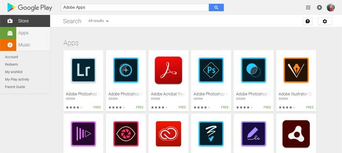
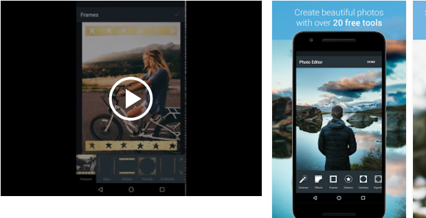
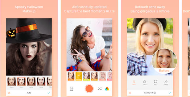
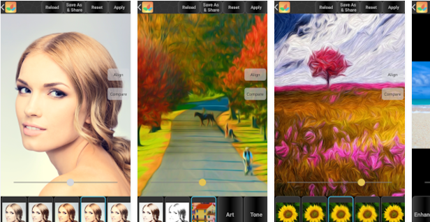
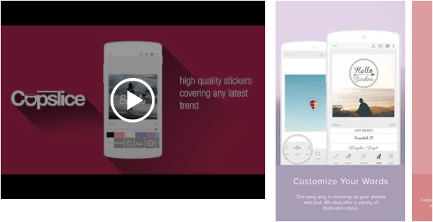
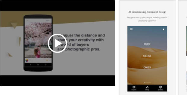
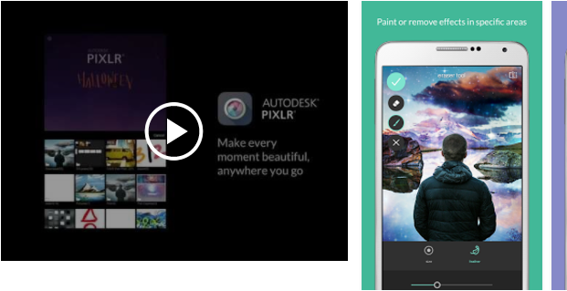
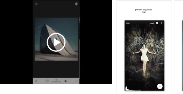
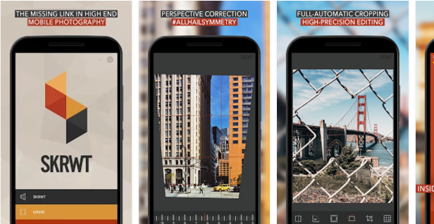
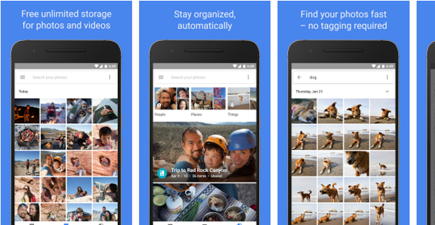
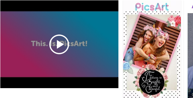
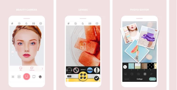
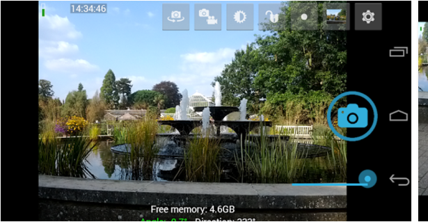
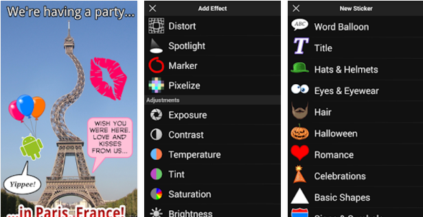
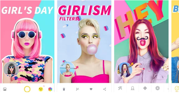
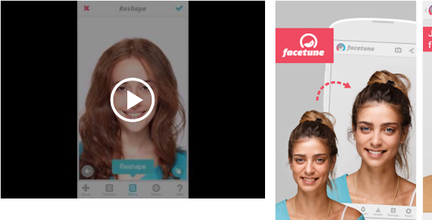
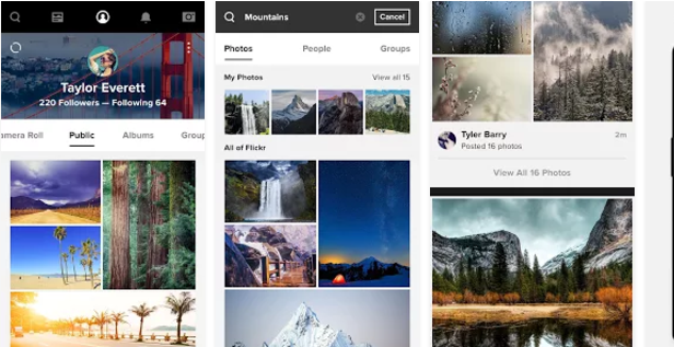
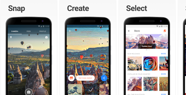
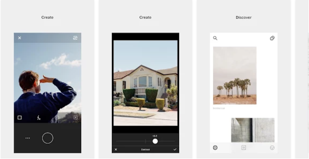
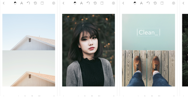
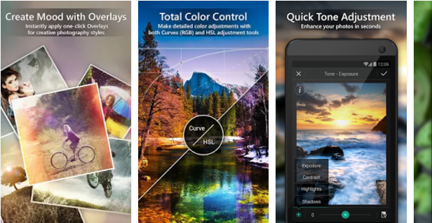
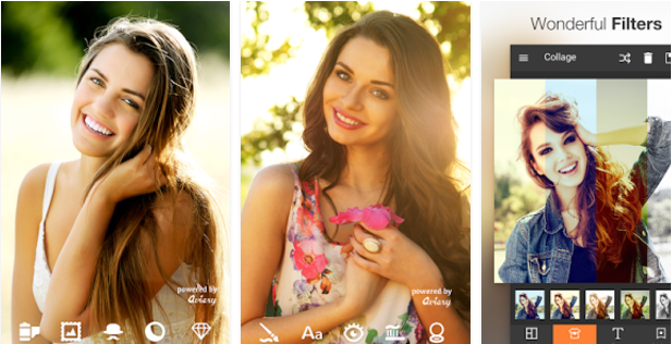
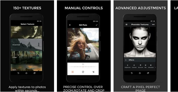
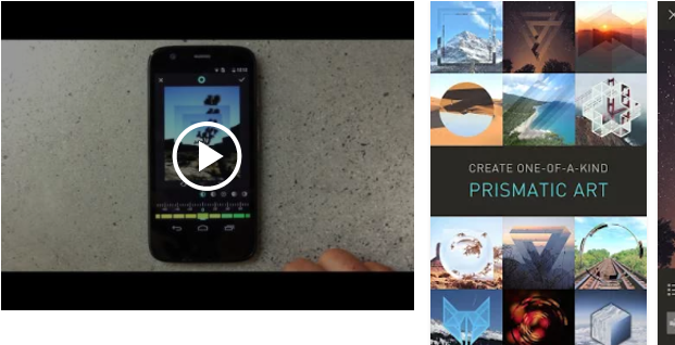
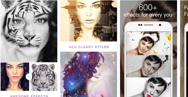
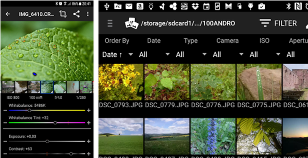
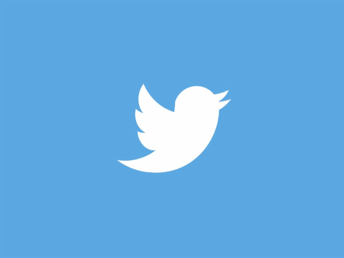
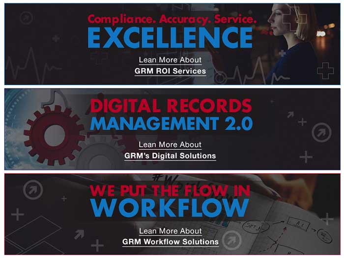
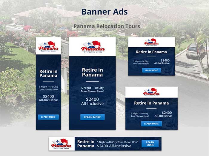
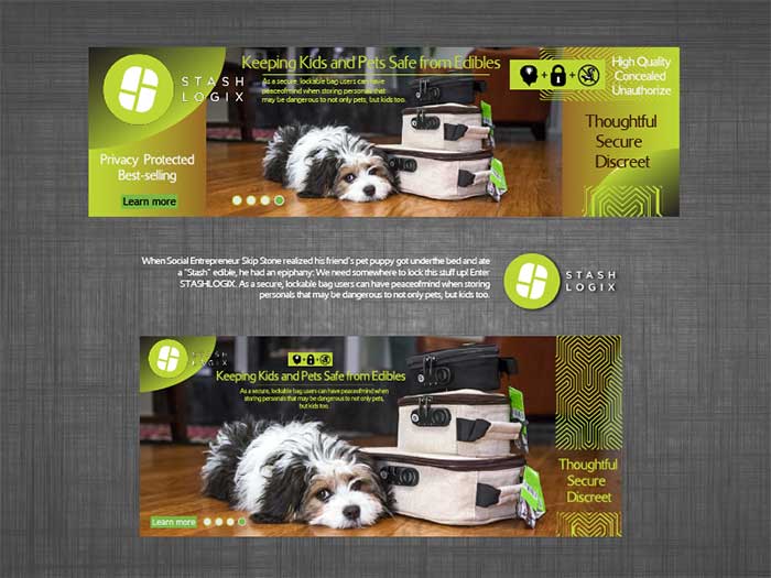
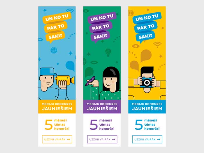
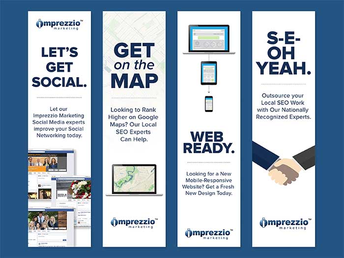
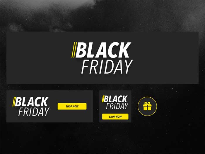
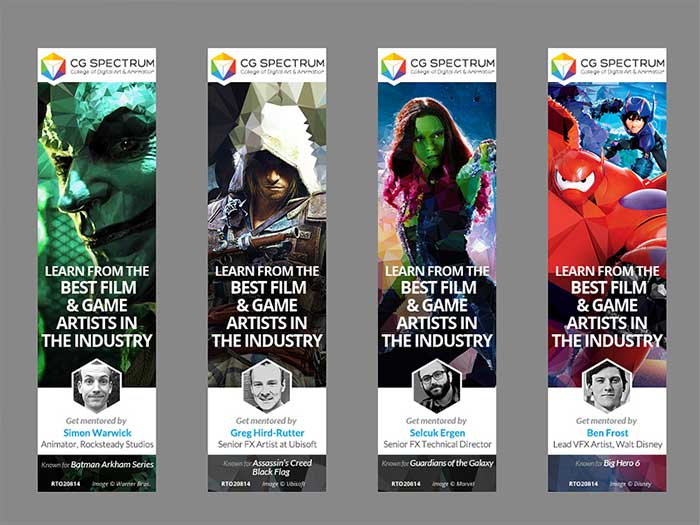
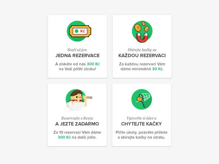
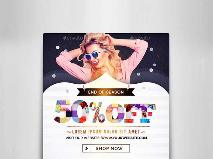
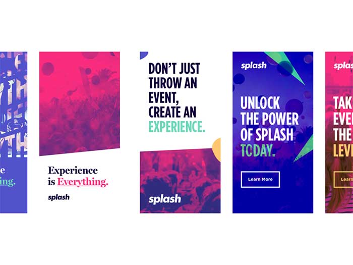
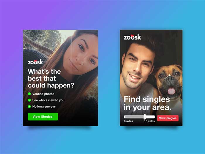
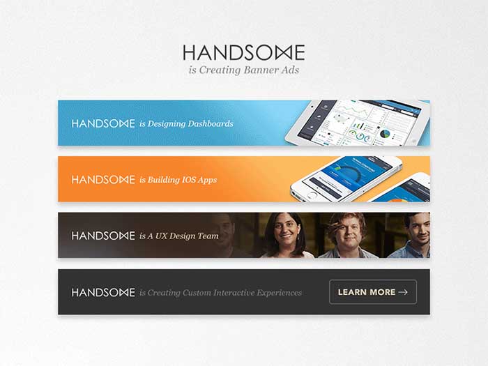
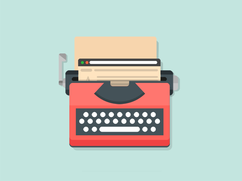
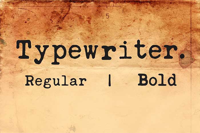
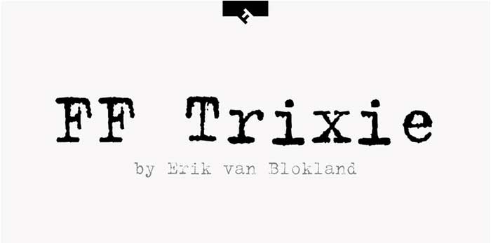
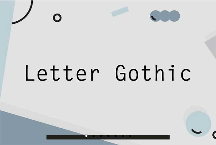
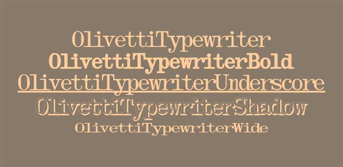
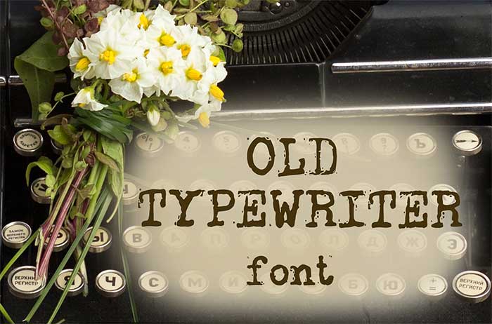
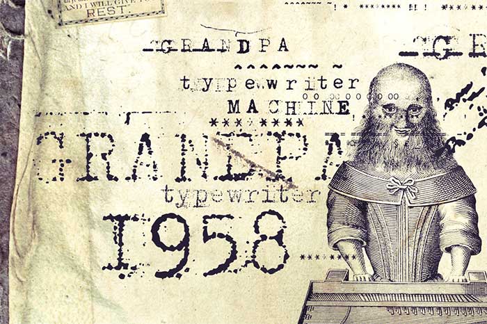
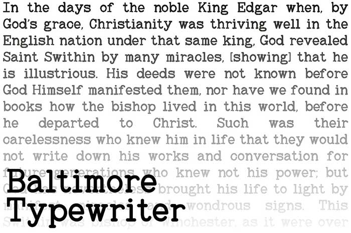
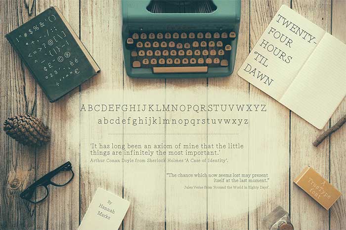
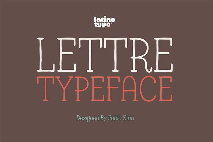
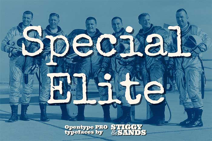
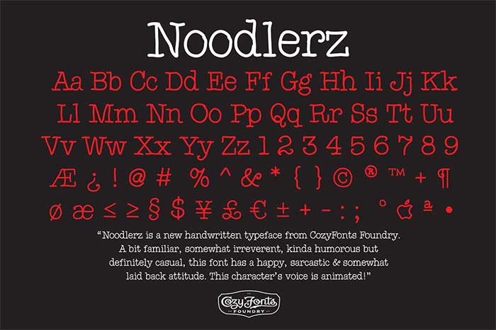
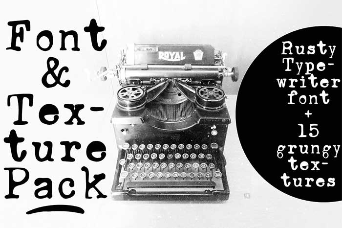
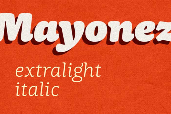
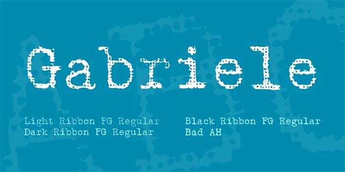
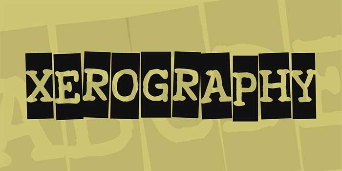
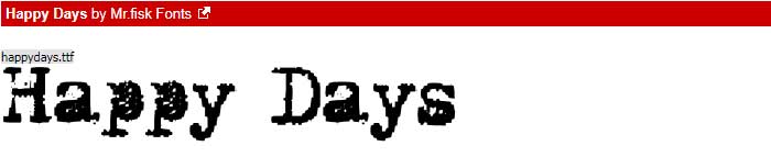
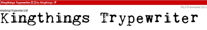
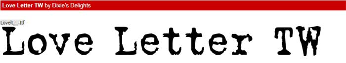
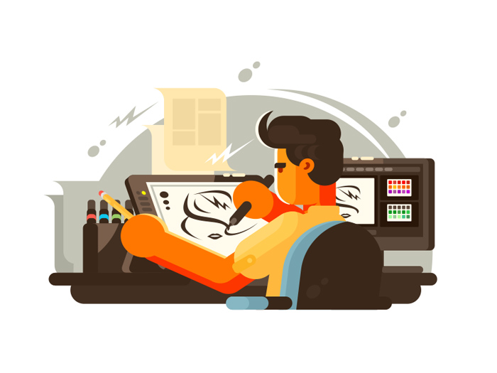
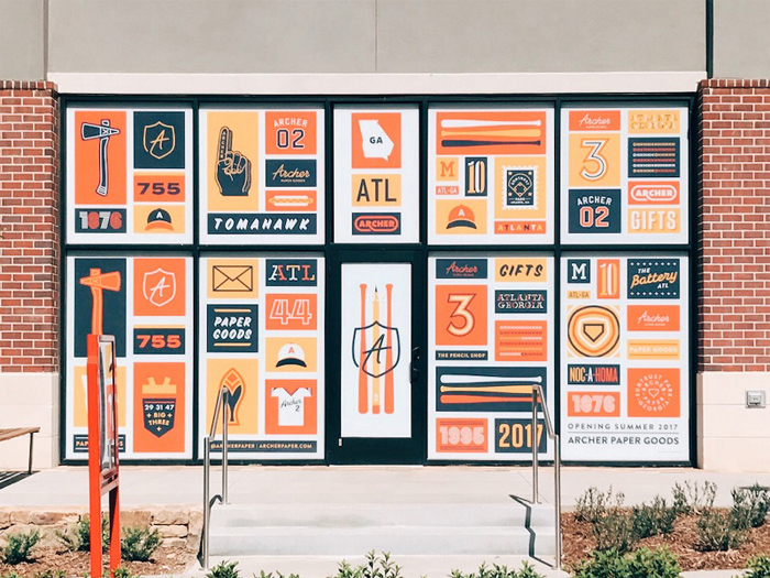
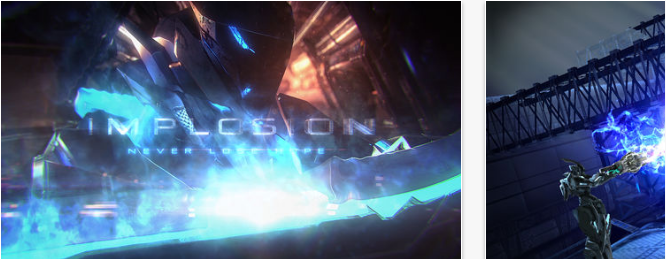
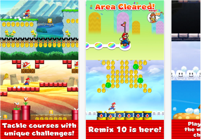
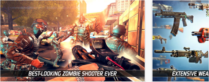
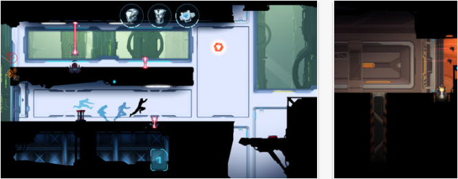
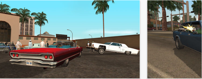
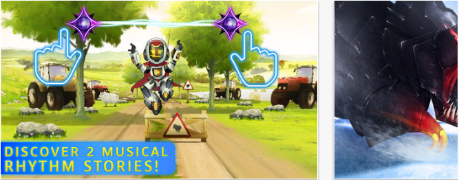
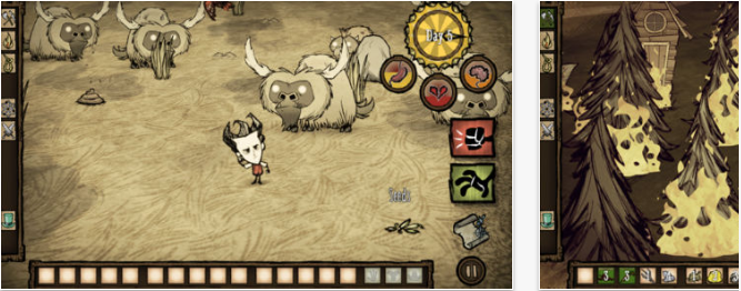
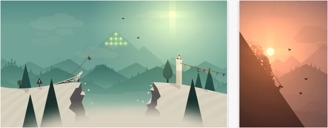
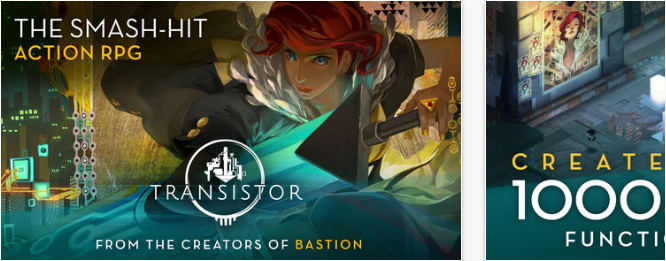
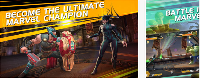
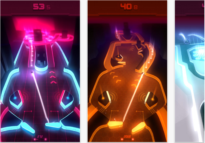
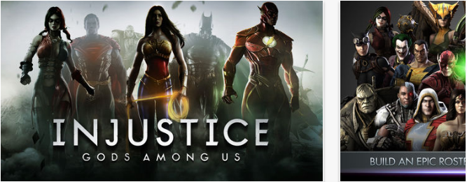
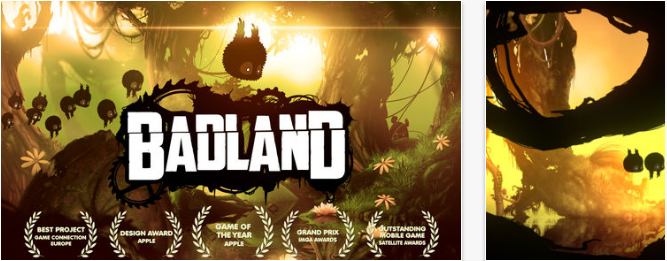
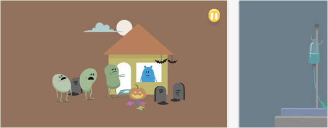
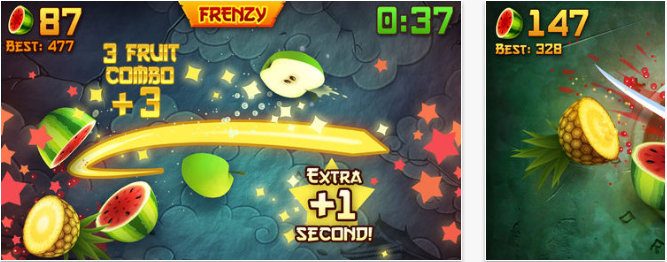
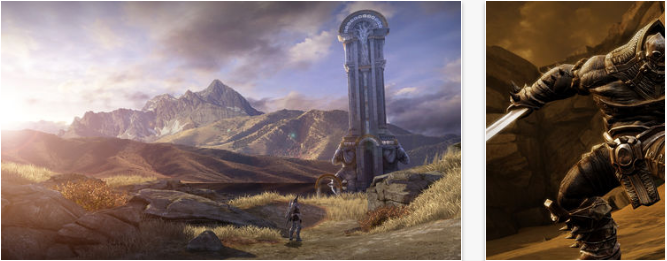
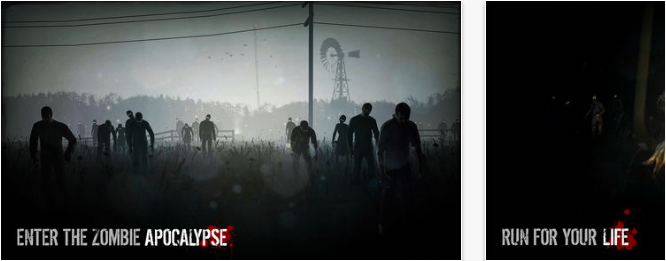
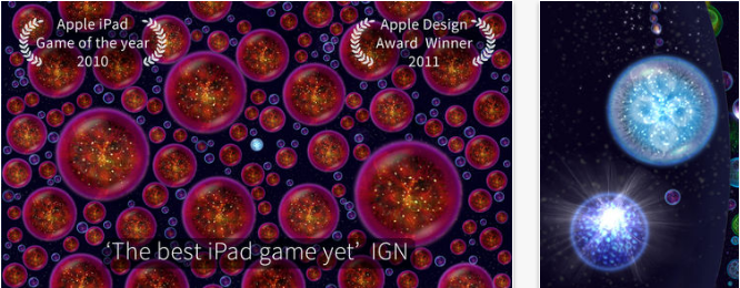
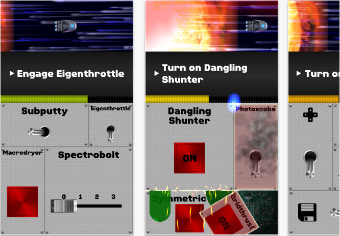
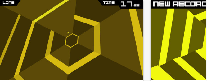
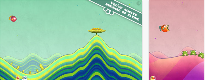
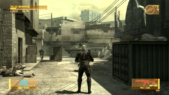
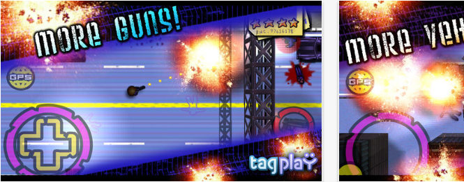
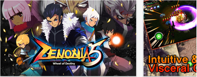
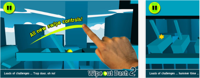
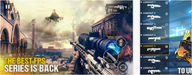
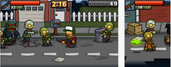
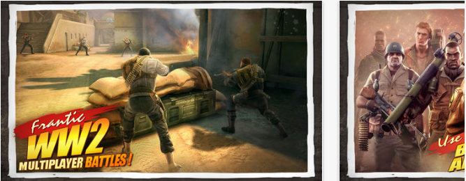
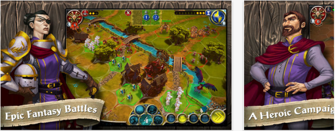
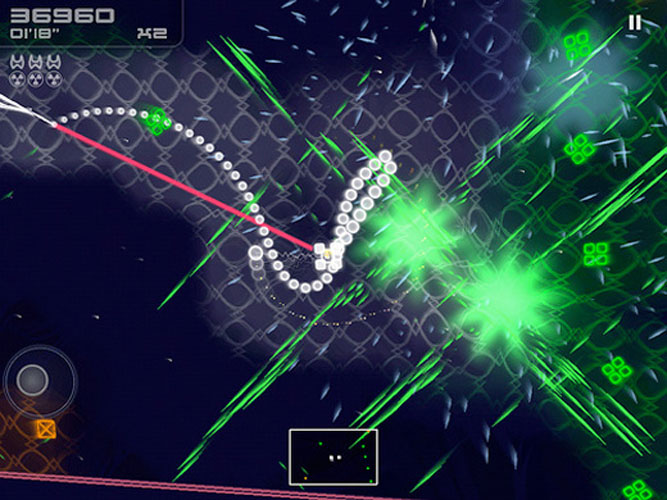
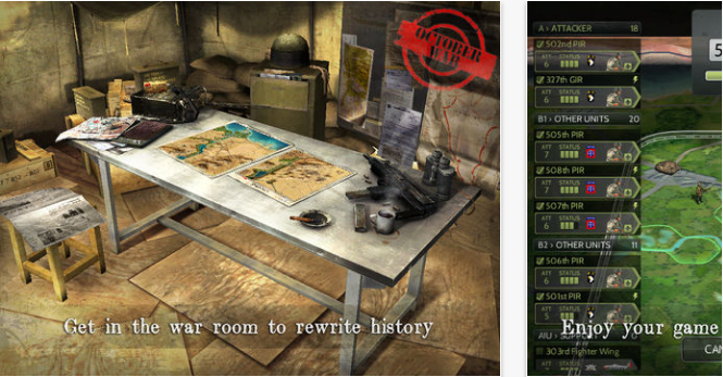
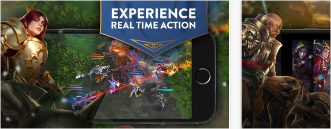
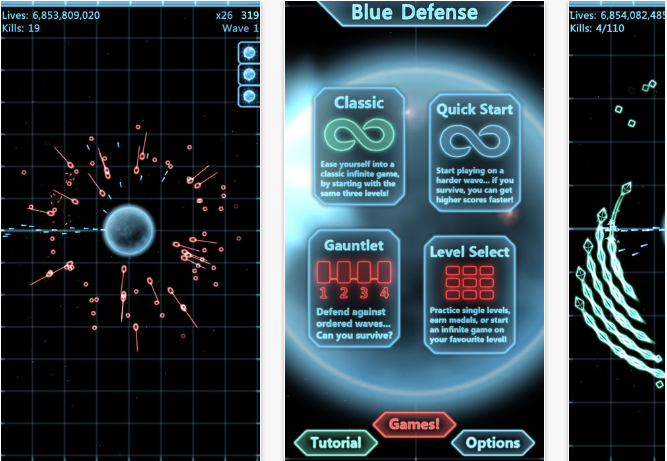
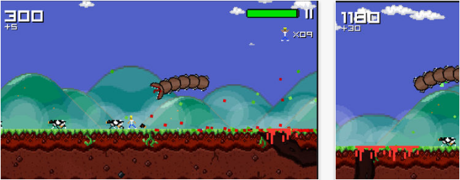
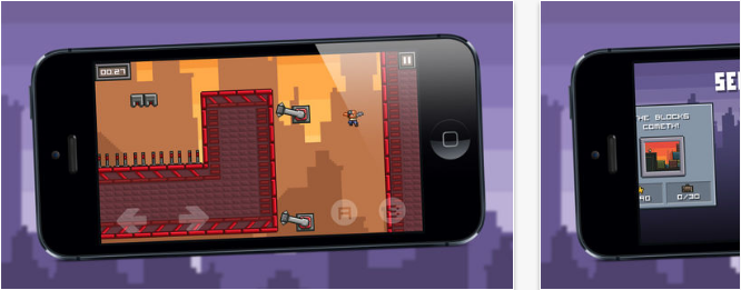
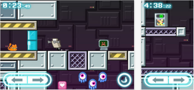
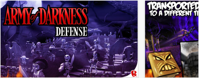
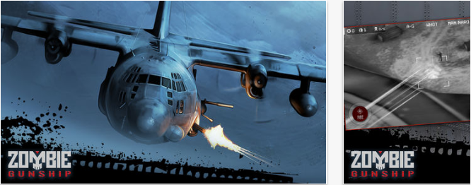
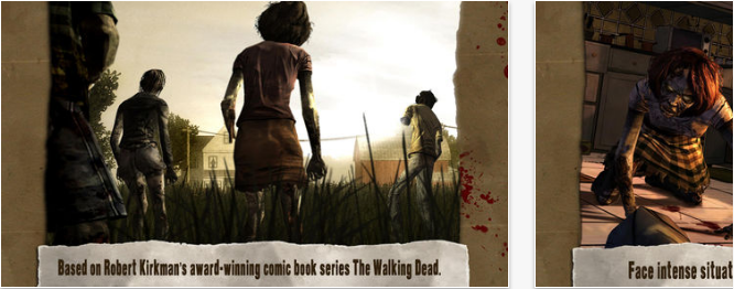
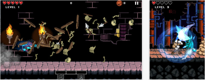
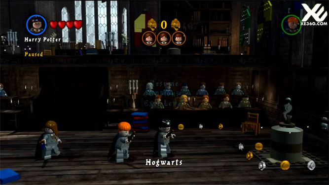
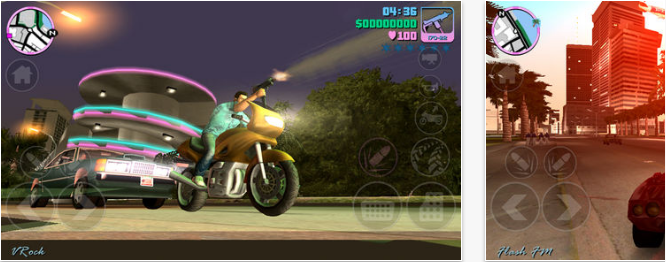
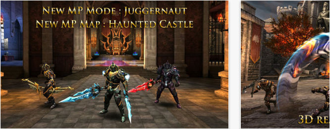
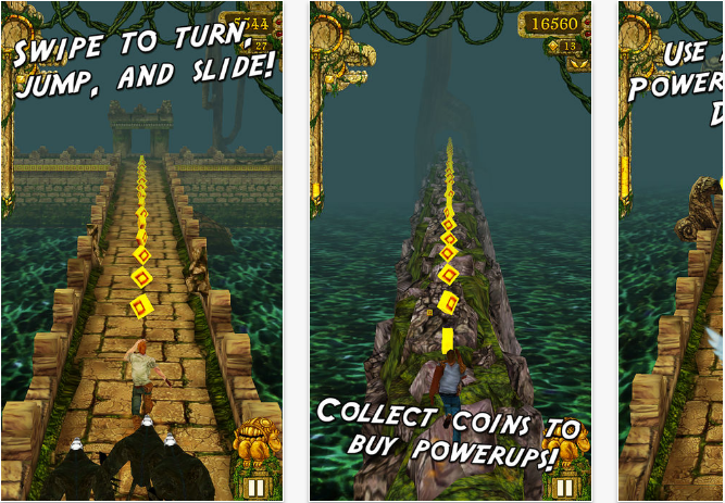
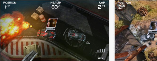
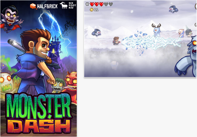
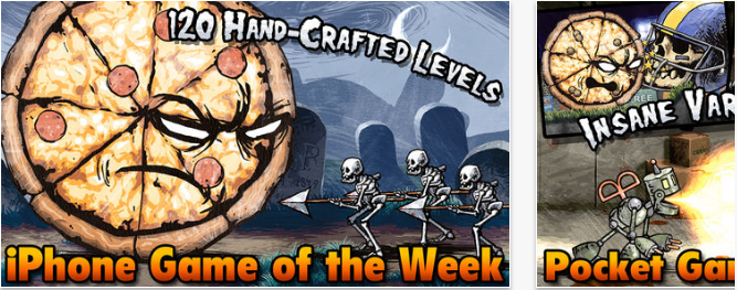
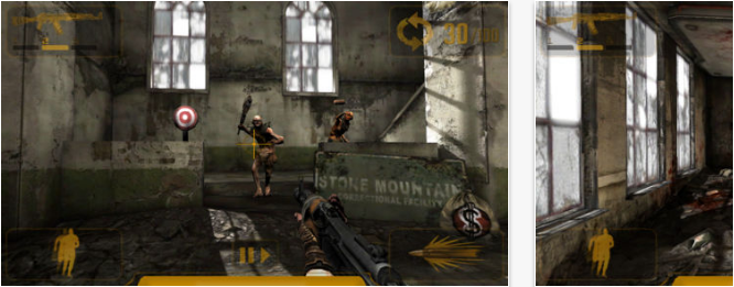
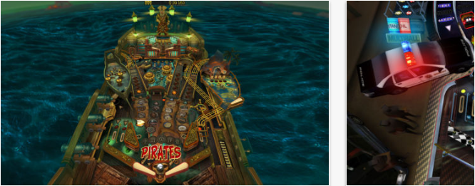
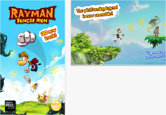
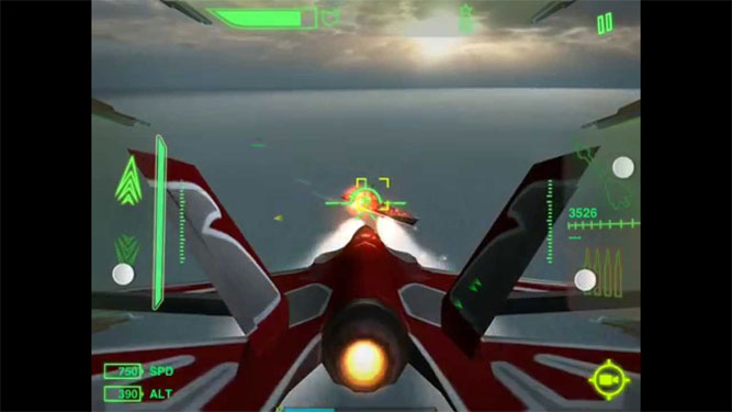
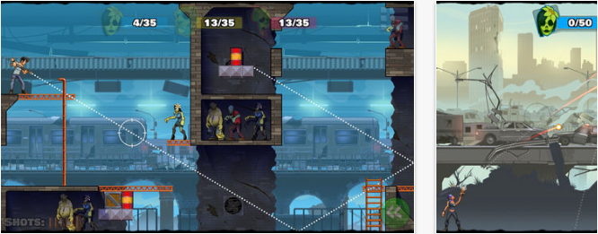
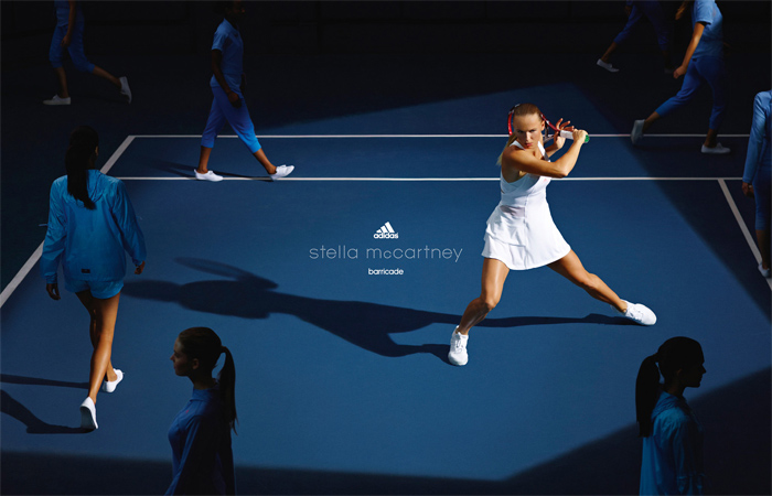
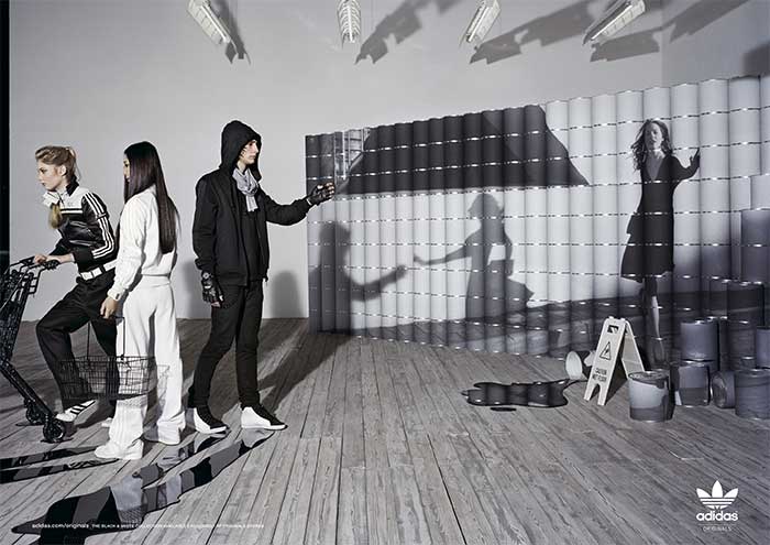
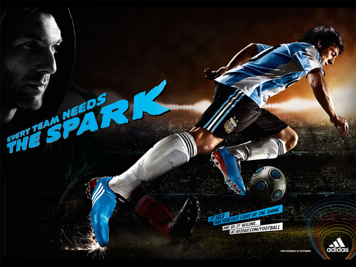
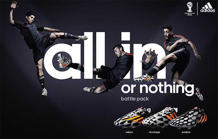
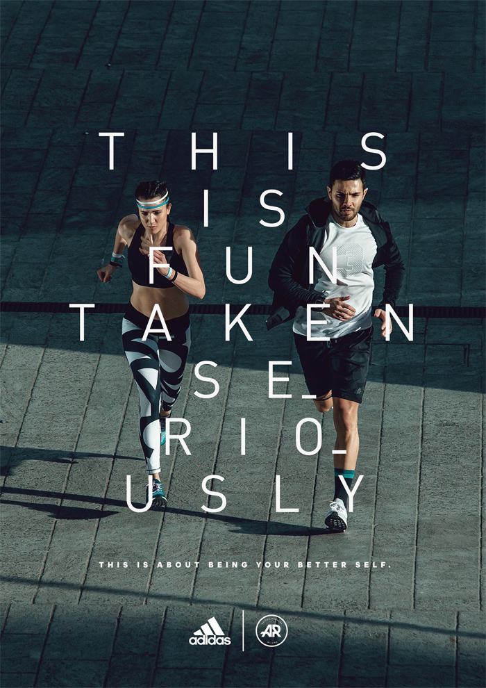
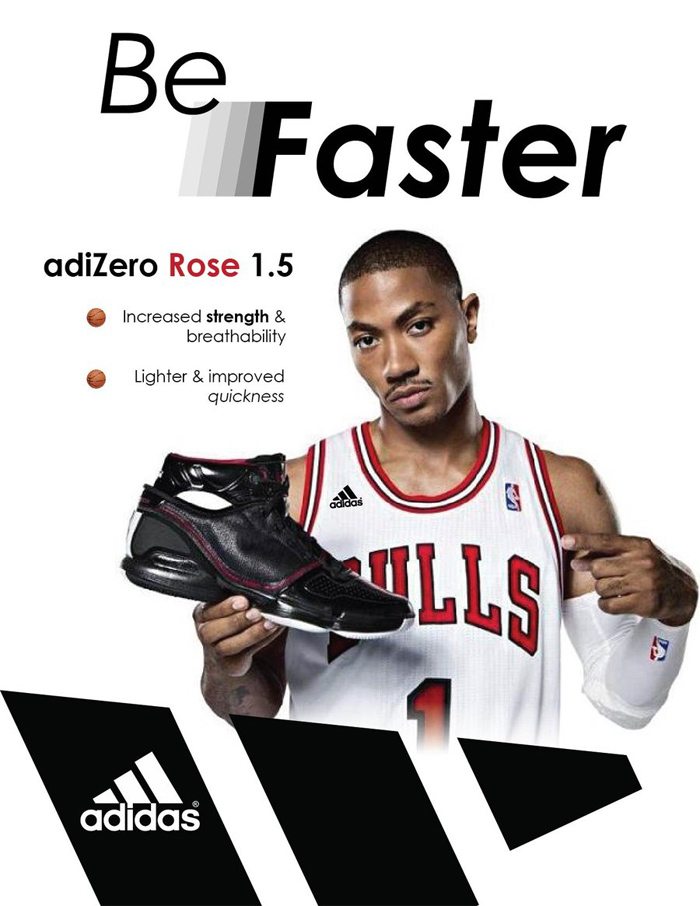
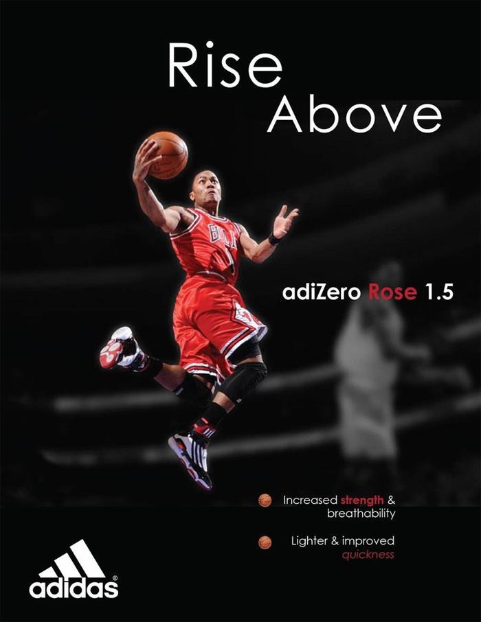
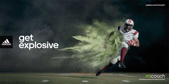
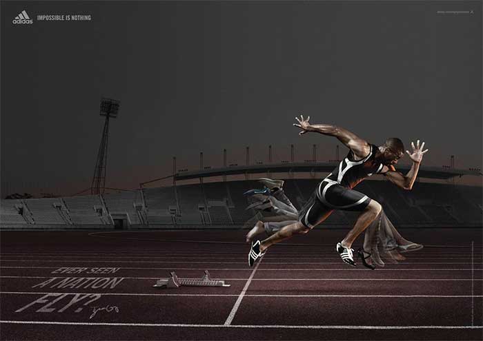
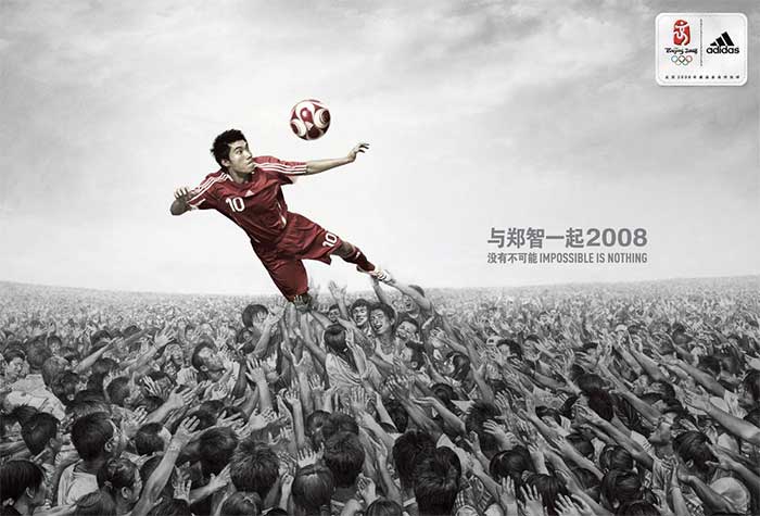
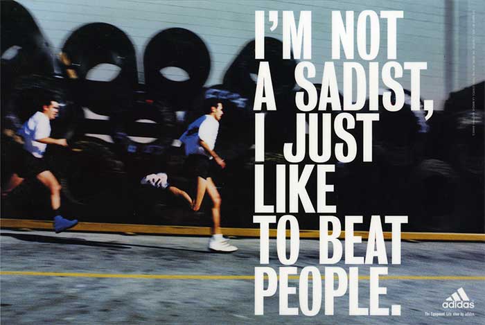
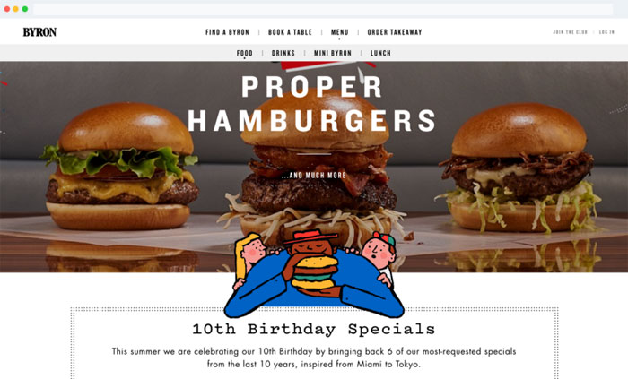
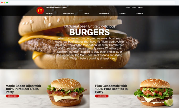
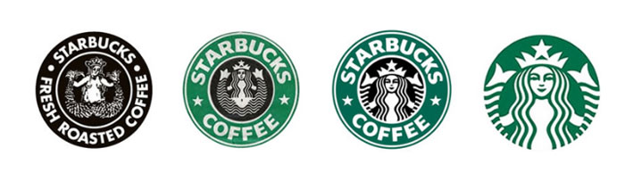
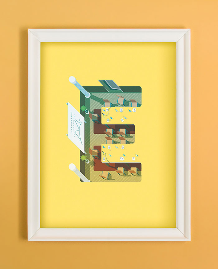
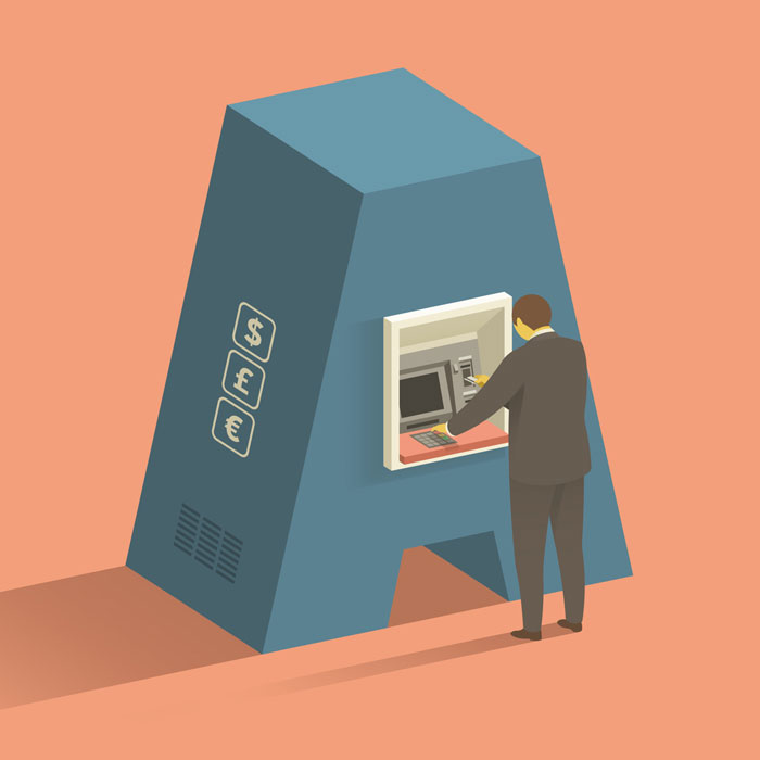
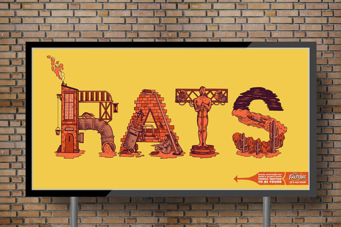

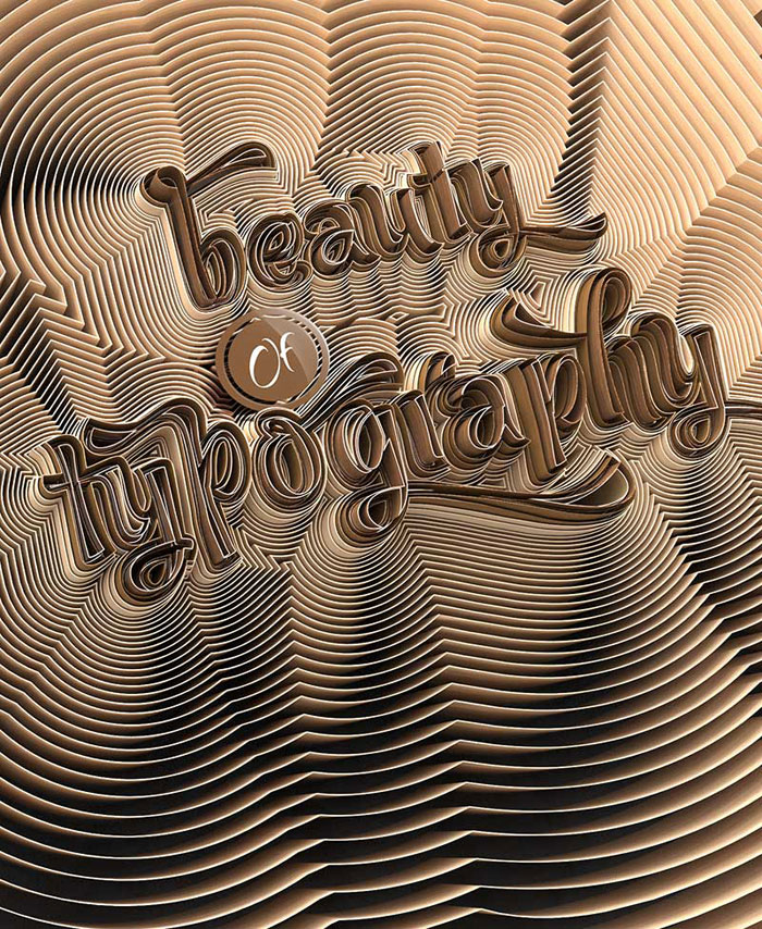
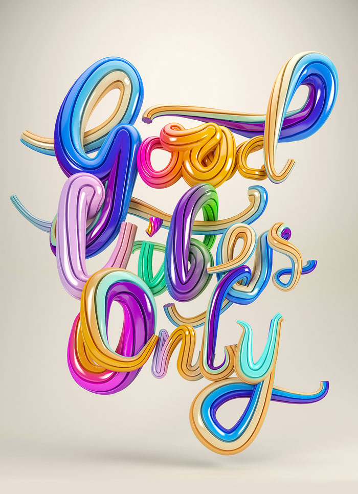
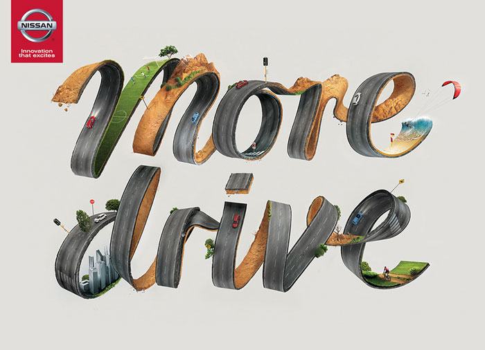
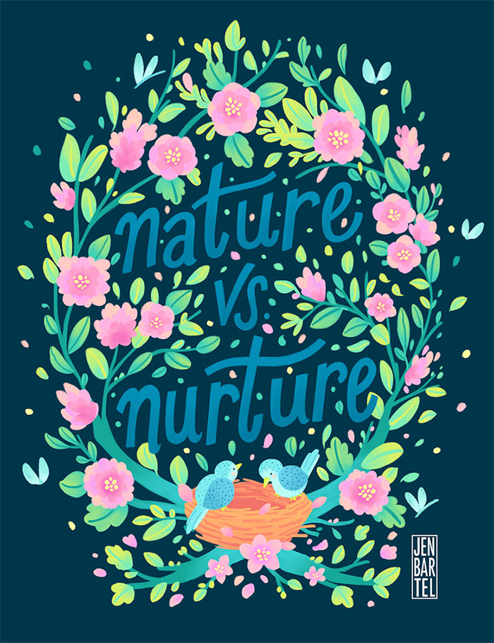
 RSS Feed
