|
If you want your online business to be successful, thenyou must make your website easily accessible and widely visible. This is especially important when your primary source of revenue comes from advertisements published on your website, or products/services sold on the same. If you are unhappy with the kind of traction your website is generating today, then you can benefit from the following 5 tips on improving a website’s presence:
Since smartphones have become ubiquitous today, more Internet users go online on their smartphones than other devices such as laptops or computers. This has had a huge impact on how the websites are ranked on the search engines. For instance, Google updated its search engine algorithm to make it more“Mobile-Friendly” and it’s believed to have impacted over 40% Of Fortune 500 websites. Now websites that aren’t optimized for mobile devices are provided with lower ranks than those who are. Optimizing your website for small-screen devices viz. mobiles and tablets will not only improve your search engine rankings but also help the customers to access the content easily.
One of the biggest mistakes that business owners make is to forget about their website after publishinga certain number of blogs. They believe that a hundred blogs or so are enough to keep the website visible in the blogosphere. However, that’s not true. Google loves fresh content. Thus, websites that are updated frequently are more likely to retain or even improve their rankings compared to those that are updated only occasionally. In fact, the following takes place on the Internet in just one minute:
That’s how your competition increases per minute. More than that, that’s how your ranking can take a hit if you don’t keep up with the online space that’s ever-expanding and making what’s fresh now, “not so fresh” quickly.
A VPN service can greatly improve your website’s presence on the Internet. However, what is it really? VPN or Virtual Private Network is a web service that allows you to mask your IP address which is why you can easily access blocked content online. For instance, you can watch the American Netflix if it’s blocked in your region. You can also watch BBC which is only available for the UK viewers. Although VPN is often used to access geo-restricted content and surf the Internet under anonymity, it’s readily used by marketers to promote their websites. With a good VPN service, you increase your website visibility by:
A good website not only has quality content, its presentation of the same is top-notch as well. In other words, your website should look premium in appearance as well in terms of user experience (UX). After all, a good design isn’t just for aesthetic reasons. There are various ways to make your website more appealing and professional, such as:
Search Engine Optimization is extremely important for online visibility. This is because it alone attracts the majority of your organic traffic through popular search engines such as Google, Yahoo, and Bing. Although SEO is powerful and almost indispensable, it’s rules changefrequently. Thus, you must keep yourself up to date and make appropriate changes in your website so that it’s able to secure the best ranking on the SERPs (Search Engine Results Pages). The following are some of the things to keep in mind regarding SEO in 2018: Loading Time Your website should offer smooth navigation and shorter load time. Besides, the average attention span of your visitor is 8 seconds. So, if your website takes longer than that to load, chances are that they would switch the tab before that. You should also minify your CSS and JS files, and optimize the images which can greatly impact the overhead when used in high-resolution. Optimized Content
User Experience Users should be able to use your website as easily as possible and find the content they are looking for without a hassle. In that regard, take note of the following:
Conclusion Gone are the days when all you needed to do was launch a website and visitors came on their own. Today, the competition has gone through the roof as millions of websites are vying for the top spots in the SERPs. Thus, website visibility requires continuous efforts from your end. In that regard, the tips above should help. Good luck! The post Top 5 Tips to Improve Your Website’s Presence appeared first on Design your way. from https://www.designyourway.net/blog/misc/top-5-tips-to-improve-your-websites-presence/
0 Comments
WordPress is a comprehensive CMS (Content Management System) used by millions of websites and blogs in the world including top companies such as TechCrunch, BBC America, Sony Music, MTV News, etc. However, such a widespread reach also means that it’s always on the target of the cybercriminals. So, how can you protect your WordPress website from hackers? The following are some of the most effective methods to safeguard your WP website from all kinds of online attacks:
If you are like most WP users, then chances are that your current admin login page is either wp-admin or wp-login.php. Since these are the default login pages which many users don’t change even after using their website for a long time, they serve as an exploit for a brute force attack. In this, a hacker tries to feed a variety of usernames and passwords in an attempt to find the right combination of the credentials. To protect your WP website from a brute force attack, it’s important that you change the admin login page. You can do it easily by using an appropriate plugin. For instance, you can install the WPS Hide Login plugin which adds the option to configure the Login URL in Settings > General.
By setting up a two-factor authentication system, you can add a second layer of security to your website apart from the standard credentials-based service. Once the system is activated, the website authenticates a user not just by the combination of username and password provided by them, but also by an additional factor which could be an OTP sent to the registered mobile number, or a security question as set up by the authorized user. WP Google Authentication plugin is a simple yet powerful two-factor authentication plugin that you can install in your WordPress website to enjoy this feature.
Even if you are using some of the best WordPress themes and plugins, you must update them frequently. Developers release updates for these every once in a while, which improve upon a number of things including the visuals, additional features, and most importantly- enhanced security. You should especially update whichever CMS you are using- WordPress or Joomla on a regular basis because it’s backbone of your entire website and cannot be compromised with at any cost.
A reputed and trusted VPN (Virtual Private Network) service can alone go a long way in protecting not just your WordPress data but also various other services that you access online. This is because a VPN conceals your true IP address and lets you access the Internet indirectly through a server that’s located overseas. When your true identity is hidden, then it’s extra challenging for the hackers to break into your security barriers. A VPN service is also beneficial when you want to access US and UK geo-restricted websites and platforms like BBC’s iPlayer, Hulu, CBS, etc. So, you can just find a suitable VPN that fits you budget and requirements and access all the blocked content across the Internet easily and anonymously. You can also compare the top VPN services to pick the one that offers the best value for your money.
When you send data across the Internet, then it’s vulnerable to tampering or eavesdropping. If a hacker is able to tap into the connection, they can access your private information. However, by switching to the HTTPS protocol from HTTP protocol, you can make the connection cryptic and thus secure. It also helps to protect your users’ data from data thefts. To take your website to HTTPS format, you need an SSL certificate first which stands for Secure Sockets Layer, a security technology that encrypts the data sent across a web server and a browser. You can easily get the certificate from your web hosting service provider and install it on your server as per their instructions. In most cases, you will be able to do it easily and in just a few steps.
There are a lot of people who use the same password for all their accounts viz. WordPress, cPanel, Facebook, etc. This is a poor practice that puts your privacy and security at stake. This is because if a cybercriminal is able to get their hands on any of these accounts, then they can easily access the remaining accounts too. Security professionals recommend using unique and strong passwords for all your online accounts. These passwords are a combination of both uppercase and lowercase characters, symbols (#, $, %, etc.) and numbers. Since it can be quite difficult to memorize these cryptic passwords, you can use a good password manager software that can create and store all your passwords and lock them with a single “master password”.
Hackers are getting smarter and smarter. Thus, you have to be prepared for the worst-case scenario. What are you to do when despite your security measures your WP website gets compromised and you lose all the data? To call it a nightmare would be an understatement especially if your website is years old and has hundreds of posts. However, this disaster can be easily prevented by backing up your data on a regular basis. If your website is infected or locked by a ransomware, then you can simply delete all the files and restore the data from the backup file to start afresh. There are many ways to backup WordPress data. However, the simplest way to do it is to use plugins like Backup Buddy or Vaultpress. Conclusion So many people put an incredible amount of work and time into their WordPress website only to lose it all in just one cyber attack. Don’t let that happen to you. Take every possible measure to safeguard your blog/website, and if you notice any suspicious activity, look into it immediately and take appropriate action. The post How to Make Your WordPress Site Secure Against Hackers appeared first on Design your way. from https://www.designyourway.net/blog/wp/how-to-make-your-wordpress-site-secure-against-hackers/ Logos are a vital part of any branding campaign, and a logo mockup is an important part of creating a logo. It is how a designer presents their work to their clients, no matter how large or small the project or the client/ A good mockup will enhance the design presentation as well as save time. It makes the whole design process more efficient and streamlined. Coming up with your own logo mockup can be time consuming. Fortunately, there is the internet. There are a large number of logo mockup templates out there. They will help you streamline your design process in no time without going through the hassle of creating your own logo mockup from scratch. Enjoy this massive list of logo mockups! Hanging Wall Sign
This is a great mockup PSD for displaying your logo as a sign. It is very high quality. Sue smart objects to replace the shop’s name with your own and place your logo into the design. It is quick and looks great. The file and art can be used for both commercial and personal use. Shop Façade
This PSD mockup is ready for editing and use as soon as you download it. It is a great way to display your mockup on a shop. It has a truly unique presentation and is also a free mockup. Letterpress MockUp
This is the perfect logo mockup for anyone designing a logo for legal consulting or writing. It looks just like embossed paper with a letterpress design on it. It has a great feel to it. Download this free mockup in a PSD file format and get started using it right away on stationary, presentation, and branding design. CardBoard
This mockup will place your logo on a business card or flyer template. It’s an easy to use PSD, great for any consulting or management firm. It looks professional and will capture just the feeling you are looking for. 50 Hip Overlay Logo Mock-UpsThis gigantic pack of logo mockups includes 50 stylish overlay photos that allow you to showcase your logo designs at their best. Every logo mockup template in this bundle includes a mix of vintage and modern design. It also features smart object so you can easily place the logos within the mockup design. Close-Up Logo Mock-Ups
This a free logo mockup. It looks great despite having no price tag. All the images are professional and high-quality. There are two different free mockups that allow your logos to be showcased close-up and personal. Logo and Label MockUp Set
This is a great logo mockup if you are creating a logo for a product or brand. It allows you to place your logo on a variety of label mockups. It comes with 7 different PSD mockups. Gold LetterPress Logo Mockup
This is a really amazing quality letterpress logo mockup. It allows you to showcase your logo design in a realistic and stylish way. This is a free letterpress mockup that is available for download for your personal projects. Realistic Paper Logo Mockups
This set of logo mockups allows you to present your logo as if it just came off the printing press. It’s great as a way to test out your logo for feature on flyers and posters. The realistic look makes these mockups a great way to present your logos during design briefings, as well. Logo Mockups-Paper Edition
This free logo mockup allows you to show off your logo in a photorealistic fashion. It includes 2 PSD mockups with different perspectives. 50 Shop Signs Mockups
This is a great mockup pack to use if you’re working on the logo for a shop or a large brand. You can choose any of the included sign mockups to show off your logo design in a realistic, professional, and useful way. This pack of sign mockups includes 50 high-quality designs in a number of different sizes and in a number of lovely settings. Embroidered Logo MockUp
This is a free mockup template that makes fashion-related logo designs look great and professional. It allows you to place your logo so that it looks realistically embroidered on clothing. Craft and Cardboard Edition Logo Mockups
Place your logo design on a number of realistic cardboard labels, paper rolls, and more similar items with this logo mockup pack. It includes 12 unique and crafty mockup templates that you can use to create professional logo design presentation. Leather Stamping Logo MockUp
This free logo mockup is a high-quality piece of work. It offers you the ability to show off your logo in the form of stamped leather. It’s great for use with logos that are going to be featured on handbag, shoe, or other fashion branding work. Business Logo Mockups Collection
This set of 8 logo mockups allows you to show off your logo design in a number of professional ways. It allows you to place your logo on a number of commonly used professional items, including business cards, packaging, product tags, and much more. 3D Wall Logo MockUp
This is a great way to place your logo design on a realistic wall to see what it would look like in real life. It is a fully layered PSD mockup with smart objects that you can easily edit to replace the black slate with your own logo design. Creative Logo Mockup Collection
This is a pack of 6 beautiful logo mockups. It allows you to showcase your logo designs in a truly creative manner. These mockups are great for demonstrating what the logo of a design agency or a startup company would look like before it is finalized. Vintage Logo MockUp PSD
If you’re looking for a vintage logo PSD mockup, this is it. It has a minimalistic design that looks perfectly vintage. It allows you to showcase your logo design in a natural and classic way. The PSD is available for free. Hand Lettering Logo Mockups
ue designs you can use for your logo mockup. They are truly excellent for showing off any hand-lettered logo designs you have created. They have a natural and creative look. These logo mockup backgrounds are going to make your logo designs look great and add significantly to their value. Coaster Mockup PSD
This free mockup allows you to place your logo design on a coaster. You can also use it for signage and sticker designs. It is a great free logo mockup if you ware creating a logo for a bar, pub, or even a coffee shop. 50 Facades Mockups
This is a pack of 50 PSD mockups. You can use them to show your logo designs on real shops facades. It includes a wide array of shop facades, including but not limited to shops, restaurants, bars, stores, and lets you showcase logos on windows, doors, entrances, and much more. Alternative Logo Mockups
These logo mockup PSDs are beautiful, unique, and alternative. It gives you some more original ways to showcase your logo. This set of logo mockups includes 6 different mockup PSD files. Beer Glass Logo Mockup
Use this great photorealistic logo mockup to show off logo and sign designs on a beer glass. You can easily change out the glass, logo, and even the background of the template as you please. 3D Logo Signage Façade Wall Mock-Up
This is a wonderful 3D mockup template for placing a logo design or signage design on a building façade. It Is fully layered and comes with separated shadows as well as editable colors, all of which make for very easy customization. 14 Photorealistic Logo Mockups
This a set of 14 diverse logo mockup templates. You can use them to present your logos in a number of different and interesting ways. Downtown Logo Mockups
This set of logo mockups includes templates designed to look like a coffee shop, a fashion store, and even two restaurant mockup templates. This is great for showcasing store or shop logo designs. Create Your Own Mockups
This is a truly amazing bundle. It includes over 200 items and 11 total backgrounds. You can use it to make your own logo mockup templates. It also includes 16 already made logo mockup templates as well if you need to save time. Sketch & Hand Drawn Mockup Set
This set of mockup templates allows you to give your logo a creative hand-drawn look. It comes with 11 different mockup templates and also includes 5 special color FX filters that allow you to add more style options as well. Office Interior Branding Mockups
If you want to place your logo in the professional setting it will be most often sued in, this office interior mockup set is perfect for you. It includes 10 pre-made PSD files. You can easily edit them to show off your logo design as well as any other branding design you may have for an office environment. 50 Logo Mock-Ups and 50 Logo Templates
This is a two-in-1 bundle. It comes with 50 logo mockup templates and 50 logo mockup templates. You can use both of them to design and showcase your logo design. This means you don’t have to go out and buy separate templates for each! 3D Logo Signage Wall Mock Up
These logo mockup templates include 7 different backgrounds. You can use this pack of logo mockups to quickly test and showcase various logo designs. Photorealistic Logo Mock-Ups
This is a set of 9 different photorealistic logo mockup templates. They work great for showcasing your logo design on many things, including signage and badges. Vintage Logo Mock Up Set Volume 2
This is a pack of 18 handcrafted and unique mockup templates. Use them to show off your logo designs in a classically vintage environment. Store Sign Board Logo Mockup
This mockup template is easy to use. It is a high-resolution image. Use it for presenting your logo wherever you need to. It works best for logo designs meant for shops, restaurants, and small business stores. Stitched Logo Mockups
This is a set of 3 photorealistic mockups. They work great for clothing and fashion logos, since they make your logo look embroidered onto a cloth. Authentic Logo Mix Mockups
This set of logo mockup templates includes 4 different designs. They work well for just about anything you want to showcase in a more realistic environment. Storefront, Window Logo Mockup
This is a simple and effective logo mockup template. It will give you an opportunity to showcase your logo in a beautiful manner. It comes in fully layered PSD file that is very easily customizable. 10 Logo/Badge Mock-Ups Vol.2
This is a pack of 10 unique and creative mockup templates you can use to display any number of badge and logo designs. 80 Logo Mockups Bundle
This is a truly huge bundle of 80 mockups. It includes just about every way to display your logo design you can imagine. It includes fabric logo mockups, metal logo mockups, leather logo mockups, paper logo mockups, and many more. Typography, Logo, Invitation Mockups
This is a multipurpose set of logo mockup templates. It includes templates for the logo designs themselves, wedding invitations, badges, and much more. Vintage Logo Mock-ups
This is a set of 12 logo mockup templates. It includes a number of vintage designs, all of which have an aged effect and classical backgrounds. Hand Drawn Sketch Mock Up Pack
Show off your logo designs so that they look like they’ve been drawn by hand. This set of logo mockup templates include 20 different designs with sketch effects. Restaurant or Bar Mockup on Tent
If you’re making a logo design for a bar or restaurant, this is a great choice of a logo mockup template for you. This will make any presentation of your design look great. It comes in three different versions. 10 Logo Badge Mock-Ups Vol. 5
This is a set of 10 photorealistic and unique logo mockups that use various backgrounds. They also work for showing off badge, insignia, label, monogram, and lettering designs. 54 Logo Mock Ups-Bundle
This is yet another gigantic bundle of logo mockup templates. This one includes 54 loco mockup templates. It offers a wide variety of styles, including natural, authentic, corporate, fabric, and more. Use it to present your logo in a number of new and different ways. Cap With Realistic Embroidered Logo Mockup
This is a truly unique logo mockup. It is a photorealistic cap that allows you to showcase your logo as if it were embroidered on it. All you need to do to place your logo on the cap is click the “Add Your Own Logo” smart layer and save the file. You can also freely change to color of the cap and logo as you please. Branding Logo Mockup PSD
This is a realistic Mockup PSD on a paper template. It comes with smart layers that you can use to easily place your logo on the template. You can also change the color of the background texture by using the Color Balance option. This is a great way to showcase your logo for your brand. S Wood and Metal Cut Logo Mockups
This is a nice set of metal and wood cut 3D logo mockups that allow you to nicely showcase your brand identity. Every PSD logo mockup included in this pack is designed to look very realistic. You can easily ass your own logo, monogram, symbol, icon or slogan. All you need to do is double-click the smart object layer and add in your own design, then save. Feel free to change the color of the wall as well by adjusting the Color Balance layer option. Brick Wall Logo
This is a realistic mockup of a brick wall that you can use to showcase your logo and other elements of branding. You can also use this mockup template for typographic slogans and other text. It’s very easy to use. The download contains one PSD file with smart object layers to help you replace the existing design. Then all you need to do is save. You can also change the brick background to black and white if you unhide the black and white effect layer inside the layers folder of the PSD mockup file. Close-up Logo Mockup
This is a great way to showcase your logo from a close-up perspective. It looks like it has been printed on a business card. Just use the smart object layer to place your own logo on the mockup, then save it. Feel free to change the color of either your design or the card background by using the “Solid Color” layers in the PSD mockup file. Wood Paint Logo Mockup
This logo mockup template offers a unique and new wood painted effect. It works great with just about any logo, text, or shape. Feel free to insert your own elements into the high quality wood texture. They will look great and come across as realistic paint on a wood background. It’s a great way to present your logo. Free PSD Logo Mockup
This logo mockup allows you to create an amazing embossed effect for your logo design. It comes in a PSD file with smart layers. You can edit the texture of the paper as well as the background color quite easily. 3D Wall Logo MockUp #3
This is a great modern display for your logo design. It is a wonderful billboard template for any logo mockup. Your mockup will look like a very realistic 3D wall mounted sign. It is very easy to customize this PSD mockup file. Pick between either the light or dark versions, then pace your logo inside the smart layer, and finally save the changes. Paper Cutout Logo Mockup
This is a clean and realistic paper cutout logo mockup. It’s great for showcasing brand identity. It only takes a few seconds for you to add in your logo design. Just drag and drop, or copy and paste, your logo design into the smart object layer and save the file. Free Debossed Color Logo Design Mockup PSD
You can fully customize this PSD mockup to display your logo, as well as any typography or symbol you desire. Change the background color as you like by pressing CTRL + U. No matter what kind of logo you are adding, it will look great in this photorealistic mockup template. Metallic Silver Logo Mock-Up
This is a very high-quality logo mockup. It offers an elegant metallic silver effect that will make your logo look very classy. Use it for shapes, text, and even vector logo designs. All you have to do is place your logo design using the file’s smart object. Just double-click the smart layer, copy and paste your logo design, then save! Ending thoughts on using logo mockup templatesWith so many great logo mockup options out there, it should be easy to find the right one to present your logo, no matter what kind of logo or what kind of client you have. Many of these mockups are free, but the premium ones are well worth a consideration as well. Remember, with logo designs, presentation is key! If you enjoyed reading this article about Logo mockup, you should read these as well:
The post Logo mockup templates to download and use to present your logos appeared first on Design your way. from https://www.designyourway.net/blog/graphic-design/logo-mockup-templates/ An ‘about us page’ is critical for any website. It serves the same purpose as an introduction, an ‘elevator speech’, and allows you to lay out your company’s foundational values for all to see. Of course, about pages are quite tricky to write. You can sit staring at a blank screen for hours, trying to figure out just what you want to say on the about page and how you want to say it. You don’t want to give too much or too little information. You want to be professional and charming, hitting just the right tone for your target audience and your product or service. All of this is in tall order, especially if you aren’t used to writing about yourself. Even professional writers have a very difficult time doing it.
This is true for B2B or B2C companies alike. You need to use your about us page to build an understanding and trusting relationship with your customers. Unfortunately, there is no exact formula that creates the best about pages. There are, however, some crucial points to focus on and some guidelines you can use to make sure you hit all the points you need to in order for your customers to know who you, what you do, and what you are all about. What an ‘About Us’ Page that Converts Should Actually Include:
With all these core principles in mind, you should know that every business and buyer persona is still different. The best about us pages are more than just giving site visitors a bio and a selfie photo of your face. It requires a lot more thought and care than that. Here is our step-by-step guide to creating an about page. This walkthrough provides an overview of how the page should look, what it should include, and covers some major considerations that you should think about. Writing about yourself is very hard. This guide will make it much easier to put together an about page that not only fills up that ‘about’ tab on your website but also draws customers in and helps converts leads into sales. Highlight the Value You Bring to Your Potential Buyers
This can’t be emphasized enough. The About page on your website should be all about what value you bring to those interested in your product or service. People do want to learn about you, which we’ll cover later, but they also really need to know how you are going to help them. Take the time to think over what the value you bring is before you start writing your about us page. Make it clear what you are bringing to the table and why site visitors should pay attention to you. It can help to write these ideas down in crude bullet point format first. You don’t need to make it look all nice, you just need to understand what you’re trying to convey with your about page about your value. Grab Readers’ Attention
There are many ways to go about making sure you have site visitors’ attention when they read your about page. These are only a few tips and tricks you can use. Look at other successful websites to find even more. Try opening with a punchy statement that conveys your style and attitude. It should communicate what about you makes you who you are. It should be quick and to the point for maximum impact. Use a bold and benefit-driven headline. Site visitors already know this is your About page since they clicked the link. Don’t waste their time and your effort by repeating info they already know in your headline. Instead, open with a really interesting or unexpected statement.
Include videos and pictures. Photos always add a pleasant personal touch and make you seem more human and relatable. There are all kinds of great ways videos can be used for similar purposes, as well. Prescriptive videos can be used to describe your process. Snapshots of the ‘behind the scenes’ of how a product is made or a service is done can help increase the trust of potential customers. Make sure you’re not always pushing your sales pitch. This is quite likely to drive customers away. People respond better to other people who are looking to reach out in human ways, not a machine that is just looking for the next sale and only cares about the bottom line. Make sure site visitors know that there is a human being running the site and that this person is worth paying attention to. Keep a Narrow and Relevant Scope
The about page of your website is emphatically not your autobiography. It’s also not the place to share the long and storied history of your company, either. Occasionally there are companies that make good use of their long lineage, like whiskey distilleries or upscale fashion companies. That is good for them and can work very effectively for sales. However, detailed histories do not always add to a company’s image and instead just bore almost everyone who reads them. Laying out your company’s history in excruciating detail is quite a common mistake on about us pages. It can cause a company to fail to address a customer’s actual problems or interests. They often also fail to include any kind of call to action because they’re so absorbed in telling their tale. Only tell your history if it builds up to an interesting and intriguing story of where you are now, or is something that your target audience can relate to. If it doesn’t do these things, don’t bother.
Two important factors to help you out here: know your audience and emphasize your selling points. You selling points should be unique to you and will be what help drive leads. These selling points are small details that set you apart from competitors. They are the reason you are the best solution your site visitors can find out there. They should be highlighted extensively. They are what visitors to your website want to hear. Knowing your audience means that you’ll know how to present your selling points effectively to them as well as what those selling points are. Your about us page should be addressing your audience and explaining why your mission is so important to them. If you don’t know who they are, this becomes much harder. Your Website’s Bio
Now you should be getting enough of the idea to write down a few sentences that are geared toward your target audience. Where to go from here? A lot of about us pages start off by talking about themselves, but this is not what site visitors are really interested in. As we’ve discussed, they want to know what you can offer them. How do you know how to do that, though? This is a challenge because you need to start thinking like your target customer and answering any questions they might have before they ask them. This can be much harder for some people than others, especially if you know all about your product, service, or topic, because it’s hard to separate all the information out. Use these questions as an ‘about us’ template to really get the ball rolling: Why should someone read your blog/visit your website/browse through your catalog? Use a sentence structured like “If you love X, X, and X, you’ll love it here!”
What will they get from your site? Is it going to be artistic inspiration? Business advice? An encouraging community? Solutions to their problems? Make it clear for site visitors to know what to expect. What types of posts do you have? What kinds of products are you selling? Is there an amazing series of blog posts that visitors should know about? Do you have a particular product or service that’s won a lot of awards or garnered a lot of praise? What’s a good starting point? Why is your business credible? There are a lot of ways you can communicate this. List big-name sites that have shared your content or praised what you’re selling. Discuss how you have years of experience in a particular field. Also feel free to let readers know that you’re still learning and growing, especially if your site is a blog or otherwise informationally focused. Let them know that you love to share things as you discover them. How did your site get started? Feel free to be personable in this story. Let site visitors know how this website came into existence. Was it inspired by a certain event? Did you start having a passion for something as a kid? Did you stumble upon a great idea one day? Tell a story. Keep it relevant, keep it brief, and keep it interesting. Your Personal Bio
Here’s your chance to talk all about you. It will seem really hard when you start writing it but don’t worry, soon enough it will become very easy. All too easy, usually. The trick with personal bios is learning to keep the information relevant. You should limit it to facts about yourself that relate to your business. It shouldn’t be a collection of 30 random facts and little else. Think of your about page as an interview. You don’t; go into a job interview and start babbling random facts about yourself. You focus on the subject at hand and make sure your potential employers know how you are the best fit for the position. The same is true for your about us page. Think of it in terms of answers to relevant questions: Why did you start doing this? When did your love for X all being? What great and unique idea do you have to offer? Write the answers down like you would if you were preparing for an interview. In many ways, your about us page is an interview with your potential customers to see if what you offer is the right fit for them.
Of course, you can and should include random and relatable information in this section of the about page, too. What city you live in, what your hobbies are, and other facts that make you who you are helpful in making you look more relatable. Just be careful. The about page should not only contain this kind of information. Try to limit it and keep it simple, quick, and witty. The addition of these kinds of personal facts will help site visitors understand that they’re dealing with an actual human being, but they can quickly grow bored if you’re regurgitating every detail about your hobbies for them. Remember, Even Though it is Called “About Me’, It is Really About Them
The most important thing about your about us or about me page is that it should be building empathy with your customer. Customers really are looking to see themselves in your mission statement. They want to know what kind of problems you offer solutions for and how they fit into those solutions. People are rarely stumbling onto your site blindly. They’re coming to you for a reason. They have problems they need to be solved. You need to make it clear in your about us page that you have solutions to offer. People do not spend very long on websites that don’t offer them what they’re looking for. You have only seconds to make clear that you have something to offer a site visitor. You need to carefully think through your about us page and make sure it communicates what it needs to in an interesting and clear way. Read it over several times yourself and have other people read it as well. Make sure they understand the kind of audience you’re looking to reach and what you have to offer them. Some Important ConsiderationsInclude a Call to Action
A call to action is one of the most important things on any commercial website. It is what you spend the entire page design leading readers towards. Just like with your landing page or any informational page on the site, you should make sure your about us page includes a clear and effective call to action. You don’t; want someone to read the about page, enjoy it, and then forget it exists. You want to make sure they do something because of what they read on the about page. Be sure to include your call to action! Use Facts and Avoid Hype
Your about us page is a great place to brag. Show off what you’ve done. Demonstrate why you are the best at what you do. Make it clear that you really live up to your principles and ideals. Do all this but avoid going too far. Hype turns people off. Don’t offer what you can’t deliver. Avoid using superlatives. Present facts in a good light, but don’t skew them. Hard data and real events are really good for this. Case studies are even better. Quantify benefits, i.e. say a product increases productivity by 10%. Explain exactly what problems you solve. Why are you uniquely qualified to offer a product or service? What exactly makes it better than your competitors? Explain exactly how long you’ve been in business and what experience you bring to the table. Make mention of key milestones. Have you moved to larger and/or more upgraded facilities? Do you shift your focus to make better use of your skills? This kind of info is very helpful for showing that you are the top solution to your site visitor’s problems. Be Interesting
While your about us page resembles a resume in many respects, it should not read like one. It should not be a long list of dry, boring facts that have been stripped down the most minimal core details. You want to present potential customers with something more interesting. You need to capture and hold their attention. For example, why is your company named what it is? Tell the story and what the name means to you today. If your logo has a particular meaning, do the same. These stories are often very revealing, explaining that your company has a human touch and what your core principles really are, as well as how you put them into action. Consider drawing analogies to your hobbies, like marathon running or flying. By doing this, it makes it clear just how dedicated you are to your business and the kind of mentality you bring to it. It also humanizes everything, making you more relatable and even inspiring. Use images to add credibility and increase interest even more. Make sure they are relevant and interesting, as well as featured in the appropriate area. Stock photos are really not what you want for this sort of thing, as people can usually start spotting those pretty quick, especially if they’ve been visiting lots of websites on the same subject. Get candid or professional photos to use instead. Use Subheaders, Bullets, and Other Graphical Elements
Use graphical elements to keep your about us page from becoming one long wall of text. This will make it more interesting, add more personality, and also help keep the whole thing organized. Numbers and bullets are a great way to highlight items you want to make sure that people see and take away from your about page. They convey a lot of information very quickly but do not overwhelm readers. Charts, logos, and infographics can generate interest and also communicate important data. You need to make sure that they support whatever your text is saying and that appropriate explanation and/or captions are included. Include relevant links where you can. If you make reference to some specific product or service, link to their pages where viewers can get more detail. At the end of the about us page, include a link to your contact page so people can get more info if they want or take the next step in the buying process. Ending thoughts on designing an about us pageAn about us page is a useful tool for helping you promote what your company is all about and what it had to offer. Use this guide to develop one that can help your business grow into what you’ve always dreamed it would be. If you enjoyed reading this article about About us page, you should read these as well:
The post About us page design: Tips and best practices to create one appeared first on Design your way. from https://www.designyourway.net/blog/web-design/about-us-page-design/ A common mistake made by a lot of rookie web designers is not giving SEO a serious thought while designing the site. As a result of that, ranking high on those SERPs becomes tougher than it should be. When you are trying to build a website for business, here are a few points that should be kept in mind to better integrate the SEO with the design itself.
Hire a ProfessionalFirst and foremost, you need to consider hiring an SEO agency right from the beginning because it’s an essential part of the planning process. If the designer works side-by-side with an expert SEO team, the necessary elements will be incorporated right within the design of the website from the very beginning. As a result of that, your future SEO efforts will never clash with the design and you won’t have to skip some useful trick just because the site wasn’t built to support that. The CMS is All Important
CMS stands for content management system and it is without a doubt one of the most important aspects of building any website. The web developers/designers must choose a CMS that’s appropriate for the kind of business model which the owner aims to have. Choosing the right CMS is crucial to successful SEO campaigns because depending on the nature of the site, some content management systems are extremely Google-friendly while others are not. For example, WordPress is the most popular CMS of all time and it’s also one of the most SEO-friendly blogging software available, but if you have something large in mind with multiple pages and blogs, Textpattern could be a better option. On the other hand, Magento and PrestaShop are both perfect for building an eCommerce website, but they are definitely not the only ones either. Using the right CMS enables the designer to find and use more relevant SEO tools on the site to boost the page rankings. Crawlable Link BuildingYour website’s Homepage is very important, but it is definitely not the only important page there (or at least it shouldn’t be anyway). To make sure that the crawlers from search engines are able to crawl your internal links as well, you need to make them easily discoverable for the crawlers with the help of tools such as XML Sitemaps and Screaming Frog. However, your primary navigation system and search engine directives need to be built in an SEO-friendly manner, right from the start. Sensible URLsEvery word in an URL needs to make sense and while clever integration of keywords is ideal, the keyword/keywords in question need to be relevant to the concerned page as well. Random numbers and letters are not liked by crawlers or visitors. A good example of a well-designed link would be, www.sensibleseo.com/service/seo-optimization, while www.sensibleseo.co/125aag/b2 is an example of poor URL design. Consider this to be just an introduction because there are plenty of other aspects to take note of, such as the site’s mobile compatibility, page speed, visual appeal, navigation and information architecture. To take care of everything and make sure that the web pages end up being SEO-friendly, we will need to come back to the very first point; the SEO expert and the designer must work together from scratch. The post SEO and Web Design: Making One Work with the Other appeared first on Design your way. from https://www.designyourway.net/blog/misc/seo-and-web-design-making-one-work-with-the-other/ A metal texture background might be the perfect fit for your design project. High quality metal textures can fit right for all kinds of tones, from professional and sleek, to industrial and tough, to futuristic and hi-tech. There is such a wide range of metal textures out there that it is easy to become overwhelmed with the options you can find. We have a list here of both paid and free metal textures for you to use in your website designs. All of them are excellent quality metal textures, ranging from rough industrial looks to shiny polished ones. Take a look at some of the best metal textures you can find on the web! Metal Texture Pack
This is set of free metal textures. It contains 8 high-resolution metal textures for use on your website. They are in JPG formats (4252x2835px). They are free to use for both commercial and personal projects. Free Gold Foil Textures
This is a set of 4 reflective and shimmering gold foil textures. They are high res JPG images (1200×1200 px). They resemble hot foils stamping, adding a flashy or classy effect to your website design. 8 Tileable Metal Textures
This is an expansive set of 8 tileable free metal textures. It includes brushed metal, carbon fiber, scratched metal, corrugated metal, and more. This pack of metal textures comes from Web Treats ETC. it includes a Photoshop pattern (.PAT) file with 16 patterns in two resolutions, 512×512 px and 1024×1024 px. It also has PSD files as well as all 16 patterns saved in JPG format. 10 High Resolution Rusty Metal Textures
This is a good set of hi res rusty metal textures in 2500px x 1600px. They are available for free from Premium Pixels. Free Silver Grey Brushed Metal Textures
This metal texture pack that’s free for commercial use. It comes from GraphicFlip. This metal texture pack comes with 4 shiny metal textures designed to resemble brushed silver grey metal. They are available as 3000×2000 px, 300 DPI resolution JPG images. They look great in web designs and can even work for print designs. Grunge Metal Red Grunge Texture
This is a free metal texture from Freepik. It is a simple yet striking grunge metal textures. You can download it as a 4000×4000 px JPG image. Metal Textures by Lost and Taken
This is a really large collection of metal textures. It includes grungy, rusty, copper, silver, and many more kinds of metal textures. Individual metal textures in this pack can be downloaded for free. You can also buy the entire collection of metal textures from the site. They are really great for adding some texture and a bit of a grungy feel to a site design. 5 High Quality Tileable Metal Textures (PSD)
This metal texture pack is available from Graphics Fuel. It is a set of 5 tileable metal textures. They come in layered PSD files and 600×400 px JPGs that allow you to create repetitive patterns. Black Metal Grill Texture Vector
This is a set of dark metal grill metal backgrounds that come in AI and EPS formats. They are available for free download in two sizes, 800×800 px and 8—x1200 px. 5 Rusted Metal Sign Textures
All of these metal textures from BittBox have been captured from a rusted metal sign, making them very realistic. 9 High-Res Rust and Metal Textures
This set of 9 textures provides you with a high resolution rusted metal look. They come to us from Lost and Taken and are perfect for adding some grungy flair to your designs. Scratch Metal Textures
This set of 2 metal textures comes in 5 colors. It is designed by graphicriders. They are available at GraphicRiver in the form of 2500×1875 px JPG files. Dark Metal Pattern Pack
There are 10 seamless patterns and 3 seamless metal textures in this pack. They come in layered PSD files and Photoshop pattern files (PAT) in the download. Rust Textures
This pack is available for purchase at Creative Market. It comes with 34 high-resolution textures. They will add a grungy and distressed look to any design you use them with. 8 Hi-Res Metal Textures
This is a set of 8 high-resolution grunge metal textures. They come from graphcoder and are available on GraphicRiver in the form of 3000×2000 JPG images. 16 Ultimate Metal Textures
This pack comes with of steel, silver, iron, rusty iron, old metal, grid metal, and screw iron metal textures. It was made by Photobus. All 16 textures are 5760X3840 px. You can purchase the collection from Creative Market. Brushed Metal Texture
These brushed metal textures are by Background Store. They come in layered PSD templates. They are great for many uses, including presentations, digital art, photography, print, and web design. They are available on Creative Market. The pack includes 6 JPG files, each of which is 3000×2500 px at 300dpi. 10 Tileable Metal Texture Patterns
This pack of 10 tileable metal textures was designed by muzikizum. They are available from GraphicRiver in PSD, JPG, and Photoshop pattern (.PAT) formats. Metal Textures Pack
This pack of 9 high-resolution metal textures was created by Design Panoply. They are great for both print and web design use. They are available on Creative Market. Scratched Dirty Metal
This background is perfect for wherever you want a tough, grungy look. It was made by Nik Sorl. It is available on Creative Market in JPG format. 20 Corrugated Metal Textures
This set of 20 high-resolution corrugated metal textures comes in 4272×2848 px JPG images. They are from iSource Textures on GraphicRiver. Metal Textures Pack
This pack of metal textures is by Starnetblog and is available on GraphicRiver. It includes layered PSD files with 4 textures and 2 separate gradient layers. All of them are in 2592×3888 px JPG images. Sourcing Your Own Metal TexturesIf none of the above metal textures work for you, it is actually very simple to source your own. Here’s a step by step guide. In our example, we are trying to create a design with a gold metal texture effect. There are a number of ways to create this gold metal texture effect:
With some preparation and careful selection, any of these can result in a great looking gold metal texture. However, creating your own can be the perfect way to get the perfect metal texture for your design. Here is a step-by-step guide to creating your own gold metal texture: How to Create a Gold Metal Texture Using PhotoshopWhat’s going to make or break you here is the filter feature. It makes the creation of metal textures (or any kind of textures, really) much, much easier. It only takes a few adjustments to make a new and different unique texture. Of course, the first thing you need to do is fire up Photoshop. Double click your background layer so that it is unlocked and you can start making changes. 1.The baseSelect the foreground color #eddf87 and the background color #7f6623. Then, select Filter > Render > Clouds from the menu. The result is not very realistic yet, but it’s only the beginning. 2.The filter galleryOpen the filter gallery from the filter menu. The filter gallery window is separated into three parts: you have a preview on the left, you can select the filter in the middle, and you can make the adjustments for the selected filter on the right. Select the brush strokes group in the middle section and select the Sprayed Stokes filter from there. You can mess around with the settings in the filter to customize the filer. A small stroke length of 1 and a radius of 25 is a good middle selection if you’re not comfortable making your own selections quite yet. While still in the filter gallery, add a second filter. Click the New Icon on the right bottom side of the filter gallery window. Add a Glass Filter from the Distort Group. A useful set of settings are: distortion at 18, Smoothness at 1, Texture at Frosted, and Scaling at 117%. These settings are a good start. Feel free to make adjustments until the result looks good to you. 3.The final adjustmentsSelect the gold layer. Press CTRL+J (or CMD+J) to duplicate it. Go into Layer Palette to change the blend mode to Soft Light and bring the Opacity down to 70%. And there you go! You’ve created your very first metal texture. It likely took you less than 5 minutes. You can now freely use it in as many designs as you like. How to Create a Brushed Metal Texture in 3 StepsFor this tutorial, you’ll be using Adobe Illustrator. 1.Create a rectangle with a metallic gradientUse the Rectangle Tool (M). click and drag while holding down SHIFT to create a square. Make sure the square doesn’t; contain any fills or strokes. Select the gradient box at the bottom of the Tools panel. From there, select the Gradient Tool (G). Select the square shape in the Layers panel. Open the Gradient panel to select the Linear gradient type. Drag your Gradient Tool from the top of the square to the bottom to create a vertical gradient. There are likely two color boxes in your Gradient panel, the start and end boxes. If you want to create a third color box, click on the slider and drag it to the middle. From there, click on the left color box and change the color to R=159 G=159 B=159 in the color panel. Apply the same color settings to the right color box. Have the middle color box set to R=255G=255 B=255 for white. 2.Add linesSelect the Line Segment Tool. Drag it horizontally from left to right. In the Appearance panel, make the line segment a fill of solid black and no stroke. In the Tools panel, select the Direct Selection Tool (A) then click on the line segment while pressing the ALT button on the keyboard. This will make a copy of the line segment. Drag this line segment down. Continue doing this until the entire square is filled with horizontal lines. 28 copies is a good number for your first brushed metal texture, but it’s up to you. Select all of your line segments in the Layers panel and then Group them together. Duplicate this set of lines. From there, drag the duplicate group of lines above the original lines. Repeat this around five times, until all of the lines are quite close together. After that, Group all of these line sets together to create one large collection of lines. The spaces between the lines do not have to be equal because variation creates a natural texture. Select the Free Transform Tool (E). Move the line segments so that they are inside the square that you made earlier. This will stretch the lines so there will be no blank spaces at the top and bottom. 3.RoughenSelect the group of lines in the Layers panel. Then choose Effect > Distort & Transform > Roughen with these settings: Size=1 px, Absolute, Detail= 1/in, and Points= Corner. From there, choose Object > Expand Appearance. Change the color of the lines to R=158 G=158B=158 for a gray color. And you’re done! You’ve made a brushed metal texture. Once you understand this technique, you can use it for a variety of metal textures. If you enjoyed reading this article about Metal Texture, you should read these as well:
The post Metal texture examples that you should check out appeared first on Design your way. from https://www.designyourway.net/blog/resources/metal-texture/ Travel agencies help those who want to go see the world get to do so. There are hundreds, if not thousands of these travel agencies, and every one of them has a unique travel logo. In that group of travel agencies, there are a wide variety of budgets, specializations, and even focuses. How to stand out from this varied crowd? A good travel agency logo is key. We live in a world where a quick Google search will yield up many, many travel agencies, every one claiming to offer customers exactly what they want. Competition is fierce and you only have moments to catch and hold a viewer’s attention. Your travel logo needs to quickly and pleasingly indicate who you are, what you do, and how you can help would-be travelers get to their destination and enjoy their time there. You need to build their faith and confidence in your company right from the first glance. So how can you design a travel logo that helps you do that? What Goes into a Good Tours and Travel Logo?
First of all, lots of careful thought and consideration. What are you trying to sell? You might be focused on booking flights to and accommodations on Pacific islands, which would affect your travel logo significantly. What is your focus? You might offer historically focused tours of Europe, or plan exotic vacations to largely unknown places. You could even be a travel agency that is there to help people on a budget go to faraway places with breaking the bank. What you’re doing with your travel logo design is helping build your brand in the mind of potential customers. You’re communicating at a glance what you’re all about. Second, a dash of inspiration never hurts. Your logo should be unique, recognizable, and even pleasant to look at. When considering possible travel agency logos, remember that it needs to be appealing and eye-catching. An annoying or even repulsive image will not help you out. What Kind of Images are Featured in Successful Travel Logo Design?
Images are the core of travel logo design. A lot of travel logos make potential clients think about movement. For instance, Orbitz, which has become one of the most popular companies to offer online travel deals, uses a logo that replaces the letter O in their name with a pair of arrows moving in a circular pattern.
Those two arrows remind customers that the company offers a chance to travel to far-off destinations and return home afterwards. It also lends itself to the idea that life itself is a journey. The circle shape implies that everyone is always on some kind of journey, whether that journey is a vacation like Orbitz sells or a journey through life’s many changes. All the creativity on display from all the many existing travel agencies and related companies can make it very hard to design new original travel logos. It is very helpful to find talented designers to design your travel company’s logo and take the ideas in new directions. What is Successful Travel Logo Typography?Travel agencies tend to use very conservative typography. For example, the Condé Nast Traveler logo makes use of plain but bold typography. It’s quite obviously designed for use on the cover of a magazine instead of the title of a website. It’s simple text that makes no use of additional graphics. This helps build the whole idea of the Condé Nast brand. They publish hundreds of magazines about subjects other than travel, meaning that they have a broader reach and popularity they would be foolish not to make use of. This means that using simple and bold typography is better for them than using an unusual typography that doesn’t draw upon the company’s sense of authority and past achievements. Many newer companies take a different approach. They have to stand out since they don’t; have a long history or a record of success to stand on. It’s more important to make a mark. If people wanted the old and tried, they’d use it after all.
Kayak is a good example. They are an online travel company that is focused on offering low prices to travelers. They make very creative use of typography in their travel logo. When you first look at it, Kayak’s logo seems very plain. It uses blocky black letters on a yellow background. If you look closer, however, the logo is more interesting. It links the company to the whole history of travel. The letters look very similar to those used in often in train stations schedules. It makes use of a line drawn horizontally across the logo, a way of showing where letters would fall over to reveal any updated info about arriving and leaving trains. What Kind of Colors Work Well for a Travel Agency Logo?
It’s important to remember that travel logos are all about communicating the benefits of taking journeys. Green and blue see a lot of use because they remind people of a globe and what the planet looks like from outer space. This makes people think of all the places and things they could visit. Many travel related companies have used blue and green very prominently in their logos, including Travel Planet, Happy Holidays, Globus, and LifeMountain. Blue and green get results. While green and blue are very prominent in the travel industry’s logos, some older companies make use of black and white. Black and white is undeniably simple and classic, dating back to when that’s all anything was printed in, after all.
Newer companies in the industry, however, try to buck these trends and offer something new, though many do still take advantage of green and blue. It’s hard to argue with the results of this classic color combination and the emotions, connotations, and associations it evokes in the average person. There are many color combinations that can get people excited about travel. Flyography, for instance, uses just about every color you can think of. They wrap these diverse colors around like the liens of yarn in a yarn ball, reminding people of all the airplanes flying all over the world. This travel logo design concept would simply not work as well if it used fewer colors. By using dozens of colors, it allows people to imagine all the very many places they could travel. It’s different, too, allowing this travel logo to stand out from the crowd of blue and green logos. Choosing the Right Travel Logo for Your Company
While all these design elements are very important, the most important thing to do when designing a travel logo for your company is that it is a good fit for you and your business. These design guidelines are just that—guidelines. It’s important to make sure that your travel logo is a good fit for what your company does, what it offers, and what your principles are. If your logo doesn’t communicate at a glance who your company is and what you are about, then it isn’t really going to be much help to you no matter how much effort you put into it. Some Travel Logo Tips and Tricks
Here are some key considerations to take into account when designs a travel logo. Much like the basic principles discussed above, they are guidelines, though a bit more specific and detailed ones. Use them to help decide on where to start with your travel logo. Also be sure to take a look at famous travel logos from successful companies that already exist, including travel agencies, travel websites, airlines, and other aspects of the travel industry. While imitating them directly is not as good idea, you can figure out why they work so well and use those ideas in your own travel logo design. Communicate, Leisure, Fun, and Enjoyment
A travel logo should be appealing and should evoke feelings of enjoyment. Because people going on vacation are looking for fun and want to avoid a hassle, which should be clear in your travel logo that you are offering just that. Have the travel logo design express joy, playfulness fun, and leisure. Make sure people look at it feel a bit happier when they see your logo. Also be sure that your logo targets specific groups of people. Every travel business has a niche. Some focus on leisure vacationers, while others look to market to business travelers.
Every different group of travelers has a different thing they want out of a travel company, whether it is ease of use or help in finding fun things to do on vacation. Tailor the happy and helpful mood of your travel logo to their preferences. Make sure it is associated with your target audience’s enjoyment and travel goals. This will help you appeal to them more thoroughly and help make your travel company’s logo stand out even better. Location is Important
Every truly great travel logo displays some destination. Often, people have a destination in mind when planning a vacation. They can easily identify a place by a distinctive image. Your travel logo should make good use of this tendency. If you focus on a specific destination, like Hawaii, incorporate iconic elements of that destination into your travel logo, like Hawaiian palm trees, waves, or even volcanoes if you’re feeling really bold. This use of imagery will help make it much clearer what you are all about and opens up a lot of creative possibilities for your logo.
If you do not focus on a specific kind or set of destinations, you can still make good use of imagery in this way. Wide open horizons, maps, airplanes and airplane imagery, even vehicles can help communicate that you are there to help travelers find their way to where they want to go and back home again. These kinds of symbols are something you should use. Don’t just stick to boring generic shapes. If you offer help for travelers to a variety of destinations across the world, consider creating a logo that features some iconic imagery associated with key locales like Paris, New York, or Shanghai. Using imagery effectively will help build customer confidence in your travel company. Make Good Use of Color
Color plays a key role in how we live our lives. It evokes all kinds of emotion, depending on context and look, and holds associations with a variety of real world objects at just a glance. Brighter colors tend to create a more joyful mood. Blue and green, as discussed above, are traditional colors that make people think of a globe, and thus make them think of travel. Many travel logos make use of yellow and red as well because they are bright and playful. They help them catch people’s eye. Make sure any set of colors you choose fit for your company’s overall branding scheme and mood.
With rare exception (as discussed above), try to keep a limited color palette. This will make branding easier and will also help prevent customer confusion. Too many colors can quickly become an eyesore. Remember, your logo will be everywhere on a customer’s travel info, and you don’t want them frowning as they look at it. The colors should be appealing when put together and not a mess. Use Fonts Well
Font conveys a message as easily as color. While older travel logos tend to make conservative and bold use of font, newer ones often use fun and clever fonts. They tend to be quite casual, even for those travel agencies that have a higher end or business focus. Like the imagery and colors you use, the font you choose should communicate a sense of joy and relaxation. People want travel to be easy and hassle-free. They want their vacations to be fun memories. Your font should evoke that feeling. If your focus is more professional, more professional (but still relaxed) fonts should be used. If your company is geared to travel to a specific area, consider using fonts that evoke the feel of the local culture in that area. Try to avoid standard fonts that see a lot of use in everyday life. This will inevitably make your logo look chap and your entire operation will seem slapdash and unserious. You want a professional look, not a look that makes it seem like the company is run out of a dingy basement. Remember, logos are fairly simple designs, even when they seem complex, and every element can lend itself to the mood they evoke in customers and potential customers. Convey Your Company’s Message
Above all, your logo is conveying a message. What is your travel company’s chief aim? Before you even start considering the specific elements of your travel logo, write this message down. Do this whether you are trying to design your own travel logo or whether you are hiring a designer to do it. It is going to be your guiding star, the thing that sets the tone for every element of your travel logo. It’s vital to know what it is.
With this message on hand, you or your logo designer can pick the right imagery, colors, and fonts for your logo to appeal to your target audience. You’ll be able to better communicate what you offer and evoke the sense of happiness and ease that you want. You can also figure out a way to use your logo to communicate what makes you the better choice for a service than all your many, many competitors that are out there. No matter what your focus is, it’s important to know what your message is as you start to go into designing your travel agency logo. Appeal to Your Target Audience
Knowing your message means you’ll be more able to identify your target audience, too. You’ll be able to do some research and see what kind of look appeals to them, what draws them to a travel service, and what their travel goals are. Once you know these things, you can incorporate them into your logo to make it much more appealing. Luxury travelers have different ants than budget travelers who have different needs than business travelers. Knowing your target audience is key to building a truly stand-out and successful travel logo for your company. More Travel Logo IdeasUse the outline of a city—if your travel company is focused on one particular city with a distinctive skyline, think about using a modern and sleek outline of that city in your logo. It will instantly evoke the idea of the location you focused on and have a certain timeless appeal, as well. Use fun or particular evocative colors to make it clear you offer something different and pleasant. You can also do this if you are creating a hotel logo for a hotel with a distinctive shape or even feature. It’s an easy way to demonstrate what makes your business unique. Make nature prominent- If you are focused on nature tours or other ecologically focused travel, use natural images to evoke the right feel. Flowers, birds, waves, mountains, animals, just about anything will work provided it is the right fit. You can be as specific or general as you like depending on your focus and target audience.
Whatever you use, make sure it communicates joy (and maybe thrills, or relaxation, depending) and not danger; a snarling wolf might not get many travelers to use your services. People do not want to feel like they are at real risk when traveling. Appeal to families—if your company wants to specialize in selling family travel, have your logo focus on kid-friendliness. Feature beach toys and a sandcastle, or have it be a cute and cuddly mascot. Use fun and kiddy fonts. Travel is hard for families, both in terms of budget and logistics. If your logo makes it clear right away that your business is family focused, it will make them much more likely to choose your business without doing too much looking elsewhere. To them, it is clear that you are focused on their major concerns right away. Make generic images appealing—if you cover a broad array of travel plans, don’t hesitate to keep your logo generic, using vehicles like airplanes or general images of travel like distant horizons. Just because these images are not specific does not mean they have to be boring or plain. Smart use of color, font, and design principles can make them as evocative as an image of the Taj Mahal for a travel company focused on India. You just need to think about it a bit more. Ending thoughts on travel logo designA travel logo is a key part of your company’s branding. Take a look at these principles and think it over carefully as you begin your design (or hire your designer). With some thought, it can become a standout logo that helps drive business your way! If you enjoyed reading this article about Travel logo, you should read these as well:
The post Travel logo design ideas that you should use in your next project appeared first on Design your way. from https://www.designyourway.net/blog/graphic-design/travel-logo-design/
Are you looking to land a job as a designer, or perhaps get more clients on the side? Maybe you simply want a place to show the world the design projects you’ve worked on recently? One easy step you can take is to get a .design domain name. You can get a FREE .design domain name by clicking the link below and searching for a name that you want. .design reflects what you do as a designer and helps give you better branding. Unlike .com, or .net, .design is more relevant and resonates with your audience. By seeing .design in your website URL, customers, clients, and employers instantly rank you as a serious designer in their minds. You can’t get an offer anywhere else like this… Your free .design domain name comes with:
This is the best bundle anywhere. Plus you get trustworthy, free support. You also get free content to help you get your website set up, depending on how you’d like to build it. Whether you built your website (or plan to build it) with other services like WIX, SquareSpace, or Weebly, you can easily connect your .design domain to your website platform. Let’s face it. It is easy for your resume or your portfolio website to get forgotten. Owning a .design domain name for your website is a simple, easy way to help combat that. .design helps you stay in people’s minds. It’s a novel way of identifying yourself and connecting subconsciously with your target market. It serves the dual purpose of telling people what you do, and giving them a name to remember. Take me to my FREE .design domain name! *this offer does not apply to premium names.
The post Claim Your Free .design Domain Name Today! appeared first on Design your way. from https://www.designyourway.net/blog/misc/claim-your-free-design-domain-name-today/ There is a large number of app development companies operating in New York, San Francisco, London, as well as other major cities around the world. App developers are in high demand across the globe for a vast number of clients. Because there are so many app developers, it can be hard to know if they are actually as good as they’re going to claim. You need to know whether these app building companies are committed, what their past work has been like, if they can deliver a project on time, and if they have reasonable prices, among many other important factors. You should know all of these details in advance, as well as find that they will mesh well with your team when you finally do meet. This list is composed of some of the best app development companies. They are the pick of the field, the cream of the crop, and that is really saying something. Take a look and see if any of these app developers are right for your project! MojoTech
MojoTech offers full-service software design and development services. They were founded in 2008 and are headquartered in Providence, RI with offices in New York City, and Boulder, CO. This app development company works on both web and mobile applications as well as augments existing corporate development teams. They are truly a global company, with clients around the world that range from young start-ups to Fortune 100 companies. They have an award-winning team of engineers, designers, and strategists that are led by their CEO Nick Kishfy. Their services have been recognized by a number of important publications, including The New York Times, The Wall Street Journal, and TechCrunch. They have recently been ranked as the 42nd fastest growing software company in the United States by Inc Magazine. In 2015, they were listed as one of the Best Places to Work for the second year running by Providence Business Network. Specializes in: Web App Development, Ruby on Rails, Mobile Development, Node.js, User Experience Design, iOS Dogtown Media
This mobile app development company was founded by a highly passionate team of engineers, designers, and inventor. They work with start-up founders and many global companies like CitiBank, Google, and even the United Nations to make purpose-driven projects. They focus on allowing companies to innovate, grow, and bring new ideas to the market quickly. They have been recognized as one of the world’s Top Mobile App Developers by Clutch Research. They are also ranked #271 on the INC 500 list of the Fastest Growing Companies in the United States. Some of their projects have received millions of downloads. Many of them have been featured on international television programs and have gone on to transform the relationship many millions of people have with brands they know and trust. Specializes in: Product Strategy, iPhone App Development, Android App Development, User Experience Design, Robotics, Artificial Intelligence, Internet of Things, mHealth, Wearable Technology, FinTech, Big Data, Responsive Mobile Web, A/R App Development Fueled
Fueled is one of those app development companies whose primary focus is on quality. Their team is dedicated to producing work of unwavering quality. They are a passionate team of designers, developers, and strategists that tirelessly pursue the very bleeding edge of mobile app development. They work to build the best apps for the best clients in the world. This is at the core of their principles and informs everything they do. About half of their activity is in mobile app development, with the other half in-app UX/UI design. They focus their business on consumer products and services as well as Media, Retail, Arts Entertainment & Music, Advertising and Marketing. Their clients are largely small business, though they do work with a number of larger companies, including Porsche, Ducati, and Discovery Communications. Their average hourly rate is between $150 to $199. Specializes in: iPhone Apps, Android Apps, product design, Product development, Web Design, venture capital, Digital Product, UI/UX, UI, UX, Technology, Startup, Enterprise, Consumer products, Co-working Small Planet Digital
This app development company operates out of Brooklyn, NY. They design and development world-class Android and iOS apps. They have created over 60 apps since their founding in 2009. They have had many major clients, including General Motors, Paramount, Disney, Design Observer, UNC, Oakley, The NPD Group, Fujifilm, Hearst, Time, Discovery Communications, Smithsonian, and many others. They have had 25 category #1 apps, 2 Apple Apps of the Year, and won many other awards and accolades. They are also famous for being a great place to work. Specializes in: app development, game development, iPhone apps, iPad apps, Android apps, mobile, IoT apps, enterprise apps OpenXcell
This company consists of a closely nurtured and wisely led team of great designers, artists, software developers and technical experts. They focus on delivering the most cutting-edge edge iPhone, iPad, Android, Blackberry and Web-based apps. They have a lot of experience in delivering high-quality apps and software products to respected clients around the globe. Specializes in: iPhone app development, iPad app development, Android app development, Blackberry app development, Mobile game development, Cross-platform mobile app development, Enterprise CMS, E-commerce development, Website development, and Customer relationship management SFCD
This mobile app development company is based in New York. They create everything from mobile apps and websites to enterprise-grade system. They are happy to apply their expertise and experience across many different platforms and screen. They focus their skills in product strategy, branding and identity, user experience and user interface design, prototyping, mobile and web development, motion graphics. They approach every project with a small and focused team that will work directly with you, striving to provide unparalleled quality for every last detail of project for its entire duration. Specializes in: Interaction Design, User Interface Design, Identity & Branding, Iconography, Visual Design, Mobile App Development, Web Development Swarm
This app development company works to conceptualize, design, and develop a wide range of apps for start-ups, growth companies, and enterprises. Their entire mobile development process is focused around customer service and looks to create value for all the stakeholders in the project. They create products for a number of platforms, including iPhone, iPad, Android, Wearable, as well as Web and Smart TV applications. Their work has been featured often in the media and has won many awards. They believe it is important to understand how people behave, what their customers believe, and how users feel about projects. All of this is key to their human-focused method of creating great and memorable digital interactions/ From the very first conceptualization to the very last bit of execution, Swarm looks to combine art, psychology, & data to create high performing and quality technology. Specializes in: iPhone Apps, Mobile Apps, User Experience Design, Android Apps, Apple TV Apps, Software Development, Product Development, Wearable Technology, Web Apps, Digital Strategy, Emerging Technology, Internet of Things, Smart TV Apps, Second Screen Y Media Labs
Y Media Labs is an app development company that strives to help their clients see what they cannot normally see themselves. They work beside elite and highly recognized brands to create mobile solutions for many different platforms. They believe that limitations are nothing but an illusion and that everyone should dream bigger. They want to prove to all of their clients that they have been underestimating how great mobile experiences can revolutionize the way they interact with their customers. Specializes in: iOS Development, Android Development, Product Strategy, Cross-Platform Development, Mobile User Experience Design, Mobile Quality Assurance (QA), Testing & Deployment, Mobile Roadmap Consulting, Responsive Mobile Web, Consumer & Enterprise Apps, digital strategy Applico
This mobile app development company believes first and foremost that it is a client services firm. They have been in operation for five years. They have become one of the largest and most successful app developers in the world. They have no plans on resting now, however. They look to help companies proactively transform their business models to leverage new developments in mobile technology. They have every plan for keeping up with the ever-changing digital world. Specializes in: Product Strategy, Platform Innovation, Business Transformation, Digital Transformation, Android Development, iOS Development Tendigi
This app development company is based out of DUMBO Brooklyn, NY. They work closely with their business clients on a large number of mobile apps. They were founded in 2009 by former Apple Inc. engineers when the Apple App Store was just starting out. They have since become one for the very best app development companies in New York City. Their apps have been featured by Apple and also covered by many different major news organizations and publications, including Wired, MSNBC, The Verge, Mashable, and TechCrunch. Tendigi’s team together have more than 30+ years of experience in native Objective-C and Java programming knowledge for multiple platforms including iOS, Mac OS, Android, and the web. Specializes in: Digital Experience, Technology, Product Design, iOS, Strategy, Android, Mobile Design, User Experience, Mobile Development Fuzz
This is a full-service mobile app development company. They design, develop, and deliver an amazing digital experience for web and mobile. Since their founding in 2001, they have created more than 100 web projects, 170 iPhone & iPad apps, and 60 Android apps, with a total of more than 70 million downloads. They work from offices located in Brooklyn, NY and Northampton, MA. They keep their focus on mobile apps and websites, utilizing creative thought process and system to demonstrate their expertise in apps, web and digital strategy. They have worked with a wide range for clients over the years, from Fortune 100 companies to small new start-ups. They make sure to implement digital solutions that both meet and exceed their clients’ expectations. Fuzz prides itself on making sure clients always have real-time access to them. They are a close-knit app company that makes sure to always be listening and adapting to whatever comes their way. Their main focus is on mobile software development, though they also do enterprise software development. They concentrate on consumer products and services as well as retail. Clients range from enterprise-size to midmarket. Some of their key clients include the New York Post, L’Oreal Paris, Xbox, and Conde Nast. Their average hourly rate ranges between $150 and $199. Specializes in: mobile app development, web development, iOS apps, Android apps, iPhone apps, iPad apps, eCommerce, Healthcare/Pharma, mCommerce, Emerging Technologies, native mobile apps, design, enterprise apps, responsive web, cross-platform architecture, UX, digital strategy, UI HappyFunCorp
As known as HFC, this mobile app development company is headquartered in Brooklyn, New York. They are a small team of 52 very smart, talented (and they’d like to remind you, humble) engineers, designers, and product architects. HFC is driven by quality engineering and always has been. They believe in holistically creating cutting-edge products. They will create software for mobile, web, and just about anything else. They are happy to work with any size of business, from small start-ups looking to make the next best thing to established Fortune 500 companies that need a new way of looking at solutions to their problems. They are always happy to work with their clients to fulfill their needs in smart and innovative ways that make the best of the newest tech out there. Specializes in: Mobile Development (IOS, Android, Windows other), Rails, Java, C, JS, Mongo, Python, SQL, Parse, PHP, CSS Amber, Node, Angular Other.., User experience design, AI, Wire framing, Illustrator, Photoshop other, Apache, Perl, Heroku, Other Lotus Technologies
This company is one of the top app development companies in New York City. They focus on developing, consulting and managing start-up technologies. They were found in 2016 when they CEO, Dossey Richards, decided that good, effective software was going to become as necessary to the world as clean water. They look to be one of the companies that helps jumpstart the tech revolution across the globe. Specializes in: mobile app design, iOS app design, android app development, mobile app development, iOS app development Blue Label Labs
This app company is a 40-person team that creates apps for mobile, tablet, watch, TV, IoT and AR/VR, as well as does marketing for the same. They are based in both New York City and Seattle. For the past 6 years, this app development company has partnered with a number of enterprises, entrepreneurs, and digital/full-service agencies to create more than 150 Android and iOS apps. They can help you with a wide range of projects related to app design, from initial app design and development right on through app marketing/PR and post-launch maintenance. Specializes in: mobile app design, iOS app design, android app design, AR/VR app design, TV app design, mobile app development, iOS app development, AR/VR app development, TV app development, android app development, iOS app marketing & PR, app marketing & PR, android app design Five
This app development company was founded in New York City and has stayed there for its ten-year lifespan. They have expanded to a nearly 150 developer team since their founding. They focus on both native Android and iOS development, as well as using React Native to create hybrid solutions. They will take charge of the entire app development process for their clients, from UX/UI to testing to server maintenance. Their primary activity is mobile app development. They are also one of the gaming companies in NYC and do also focus on retail development. They primarily work with midmarket clients, including Rosetta, and Ministry of Sound. Their average hourly rate is $125. Apptraction
This mobile app development company is based in the very heart of New York City. They offer a wide range of services, including mobile app creation, tablet and mobile web/HTML5 development, mobile solutions for B2B and enterprises, back-end development, and mobile marketing and strategy. They have demonstrated exceptional competence with iOS, Android, Blackberry and Windows Phone. Their past work includes a video messaging app, a video streaming and TV application, and a best-in-class GPS tracker which has been featured by Apple. Their main focus is on enterprise software development and mobile app development. They often work with the transportation industry. They usually work with enterprise-sized clients, though many are midmarket-sized. Major clients include Disney, Mary Kay, Reuters Worry Free Labs
This is a Pointclear company with a lot of experience in making apps for healthcare and education markets, though that is not their only area of operation. They provide mobile strategy, UX/UI design, integration and deployment, and development for all major platforms. Their past project includes geolocation based running companions, games, and digital keychains. They work from their central New York City offices and focus on mobile app development as well as doing some app UX/UI work. Besides healthcare and education, they have done a lot of work with media. Most of their clients are enterprises or midmarket level, including Bank of America, RSA, and FitBit. Their average hourly rate is between $100 and $149. This is a truly excellent app developer from New York City and well worth looking into if their rate and past work appeal to you. Dom and Tom
This is one of the smaller app development companies on this list, but they have a lot of staying power. They work in several clear stages. First, they identify the problem the app is trying to address. They work from there with their team of design experts and engineers to create an app that does so. This has been a very successful method, allowing them to punch well above their weight and deliver great apps for companies like General Electric, Ashoka, and CitiBank. Their average hourly rate is between $150 to $199. They tend to work with the food, publishing, and transportation industries. If you enjoyed reading this article about App development companies, you should read these as well:
The post Some of the best app development companies that you can find appeared first on Design your way. from https://www.designyourway.net/blog/resources/app-development-companies/ The Pepsi logo has not gone through much change over the years — or has it? Many brands have to change their logo design, and as iconic as the Pepsi logo is, it actually has gone through several changes throughout the company’s history. Pepsi is an instantly recognizable brand and has been for decades, but changing times and new trends have caused shifts in the Pepsi symbol so it is a better fit for the company’s culture, attitude, and goals. In fact, Pepsi has not just changed their logo, but also their name and ingredients. This ‘Pepsi evolution’ has had a profound impact on the company’s logo. We’re going to go over the history of the Pepsi logos, which is a history of the Pepsi brand as well. It’s a good lesson for anyone looking at logo design. The Pepsi logo has lasted years in one form or another, at least in part because it could adapt and remain recognizable over time. Let’s see what we can learn from the story of the ever-recognizable Pepsi logo. Pepsi Logo History
“Brad’s Drink”Originally, Pepsi was called “Brad’s Drink”. It took the name of its inventory, Caleb Bradham, after he invented in 1893. The name was swapped out for Pepsi only a few years later in 1898, a name that was not trademarked for another five years. Meanwhile, Coca-Cola, Pepsi’s great rival, was evolving as well. Pepsi attempted to mimic Coca-Cola’s swirly script logo originally and a look back at the original Pepsi logo is strikingly similar to the Coke script. The old Pepsi Cola logo resembled the Coca-Cola one quite a bit. With Pepsi, a long swirly line connected the P of ‘Pepsi’ with the ‘C’ of Cola. Now, they were not directly trying to mimic Coca-Cola, thought it was a more successful brand at the time. Instead, this elegant script logo was the trend among many brands at the time. The old Pepsi logo was a white script on red and they stuck with that color scheme from 1898 to 1940. This changed over time to the familiar Pepsi colors we all know now, but white and red have remained a major element of the design for 40 years. A Major Pepsi Logo ChangeIn 1940, Pepsi decided to start using a cleaner and more fundamental logo. This was the origin of the now-familiar circular Pepsi logo, as well as the beginning of the Pepsi logo’s inclusion of the color blue. The choice of the circular design was because the company wanted to be able to incorporate the slogan of Caleb Bradham’s original group, the Original Pure Food Drink. As for the colors, they maintained the red and white color scheme, but added in blue.
This had less to do with Pepsi’s history and more to do with World War II. Pepsi wanted to show its support for the troops fighting in the way and these three colors were a way to do it. These two colors would never leave the design, though there have been variations on the shades of red, white, and blue that the company has used. In 1943, Pepsi added design to the bottle cap design, including “Bigger Drink, Better Taste”. Red was the top part of the circle, with blue on the bottom and with white detailing. The bottle cap element of the design was included through the 1960s. It was during this period that the Pepsi logo we all know today began to come into being. 1960s Pepsi Logo and Bottle DesignThe Pepsi logo went through another major change in the 1960s. The new bottle design began to feature a serrated bottle cap. The colors remained as red and blue, with an entirely white background. This was the beginning of the company’s “Pepsi Generation” ad campaign. As a part of this, in 1960, Pepsi dropped the word ‘Cola’ from the logo. It was never used again as a part of the Pepsi logo. In 1962, two bull’s eyes were added to the word Pepsi, which were added to express the company’s domination of the global soft drink market. Pepsi Logo Changes in the 1970s
In the 1970s, the Pepsi logo became more minimalistic and much closer to the Pepsi logo we know of today. The company got rid of the swirling script and all curlicues. The word Cola remained dropped from the logo (and is rarely referred to today in any media). Instead, there was the red and blue circular design that is so very familiar today. The new Pepsi logo placed the word Pepsi at the center of the circle, with red and blue flares above and below the word respectively. Outside this minimalistic, smartly designed circle were two trapezoids that could be either red or blue. These could be placed either on the left or on the right. The white that had been one of Pepsi’s original colors was now kept as a tertiary color relegated to the border area, including the circle around the name Pepsi. In many ways, this was Pepsi’s nod to its own history. What prompted this dramatic break from the more traditional design? The company felt that popular culture was changing substantially. Technology and minimalistic design were taking root. The old swirly logo and the frills of the bottle cap logo were starting to look painfully dated. They simply did not fit with the times. Simple shapes and clean lines were in, frills and curls were out. Additional details, like the bull’s eyes, were too much and hard to notice. A cleaner design had other benefits, as well. This more pure and simple design, with its basic shapes and forms, was easier to place on more different kinds of things. It was also more recognizable in the increasingly crowded market. These benefits became more and more important on the global market. Modernizing the Pepsi Logo
The next major change to the Pepsi logo came in 1991. The company decided that the incorporation of the Pepsi text and the circle was no longer viable. They opted instead to split them apart into different sections of their branding graphics. They didn’t get rid of them, of course. Instead, they placed the Pepsi name on the top of the label in the familiar trapezoid shape. The red and blue circle was placed to the right side of this trapezoid. This was a significant departure, emphasizing text more than the iconic and simpler circle. With the word Pepsi no longer a part of the circular element, they needed something else to put in the center to balance out the contrasting red and blue halves. They opted to place a wavy white line, speaking back to their heritage as well as balancing the contrast with a neutral color. It was a refreshing change to see white as more than just a tertiary border color. Because of this change, a lot of new things became possible for the Pepsi logo. In recent years, Pepsi has made even more changes based upon this separated logo design layout. Changes to the Pepsi Logo Circle in the Modern Era
Pepsi celebrated its 100th anniversary in 1998. To commemorate this achievement, they changed their logo. The background was changed to blue. White was used once again to the name Pepsi. This new Pepsi logo was meant to have a more refreshing look with a three-dimensional appearance that was better fit for the times. This design remained like this for ten years until it was changed again in 2008, again quite dramatic. The circle again became dominant in the Pepsi logo, getting placed on top of the company’s name. The swirling white lien that separated the red and blue halves of the circle tilted upward and became much more wave-like, resembling a smiley face and having a very cheerful feel. There were also variations in the coloring at the top of the circle. This made the logo look more like a sphere, with a 3D quality that made it seem more modern. It seems to pop out at onlookers. Modern audiences expect up-to-date logos to make good use of perspective and proportionality. This update was done by Arnell group for one million dollars. It was not originally received very well by the public. However, logo designers should note that logo updates are rarely received well at first. It will take time to get a real picture of how the new logo design is doing with your target audience. The Pepsi logo has gone through many changes since the company’s founding in 1898. It changed with trends, technology, and audience expectations, but it maintained ties to its past and held onto its key iconic points in the face of them, never completely changing into something different. Pepsi knew that it still needed to keep brand recognition. If it changed entirely, its audience would turn away. What is the Pepsi Logo Meaning?
The Pepsi logo is simple and always has been, even when it incorporated elaborate swirling text. It was never heavy on the details. The most detailed and subtle element it ever used was its two bull’s eyes which were meant to show that they were the best in the market. Or so you think. There is actually a lot of meaning in the simple Pepsi logo. Let’s take a closer look at the company’s origins. Caleb Bradham, Pepsi’s inventor, made the drink at his pharmacy where he first sold it as well. The word ‘pharmacy’ is derived from the Greek word pharmakia, which means sorcerer. All of this seems very obscure, but we’re getting there. Bradham originally planned—and more or less succeeded- at inventing the modern era’s first energy drink. He was a sorcerer in his own right. At the time of Pepsi’s invention, modern chemistry was starting to work its magic in many areas of life. When Pepsi switched to the circular logo, they paid millions of dollars to get a logo with secret occult meaning. They hired the eccentric (and debatably insane) designer Peter Arnell of the Arnell Group to make it. As crazy as this sounds, there is symbolism in all the major elements of the simple Pepsi logo. The three-part logo, with a red top half, a blue bottom half, separated by a wavy white line, represent the American flag, but they also have other meanings. The colors are meant to represent earth’s magnetic field, feng shui, Pythagoras geodynamics, the theory of relativity, and the golden ratio. As ridiculous as this seems, these meanings are definitely present, a least in the original conception. Peter Arnell wrote a 27-page memo for PepsiCo, which was leaked to Newsweek. The Pepsi logo apparently contains references to the Parthenon, the Mona Lisa, the golden ratio, the relativity of space and time, and magnetic fields. The logo is meant to emphasize the “perimeter oscillations” of the Pepsi logo, the “gravitational pull” of a can of Pepsi on a supermarket shelf. It is intended to be tied to the rate of expansion of the universe. Many thought this memo was a hoax. It sounds insane. Design is a catty and small world. This was a huge stumble for Peter Arnell. Many other designers and design firms celebrated and mocked him. Arnell’s expensive lunatic design was no doubt a failure. Or so it seemed. The new Pepsi logo was a major benefit for Pepsi. Customers liked it. Bottlers liked it. It seemed to help change the momentum of the company. Whatever bizarre rationale was behind the design of the Pepsi logo, it is clearly a well-designed logo. It is found on cans, bottles, ads, race cars, t-shirts, trucks, and just about anything with any tie to Pepsi. It’s worked so well that people have been known to mistake the South Korean flag for the Pepsi logo, most notably in the 2018 Winter Olympics. Ending thoughts on the Pepsi logo designThe Pepsi logo has been through several iterations. You can see how market and cultural trends made their mark on it, yet there were core visual and design principals the brand stuck despite those changes. If you enjoyed reading this article about the Pepsi logo, you should read these as well:
The post The Pepsi Logo: The old, the new, its meaning and history appeared first on Design your way. from https://www.designyourway.net/blog/graphic-design/pepsi-logo/ |

AuthorPleasure to introduce myself I am Jamie 27 years old living in Searcy, AR. I am web developer and have developed over 50 sites for clients. Now a days I am focused on designing as I feel I am lacking it. Archives
April 2019
Categories |

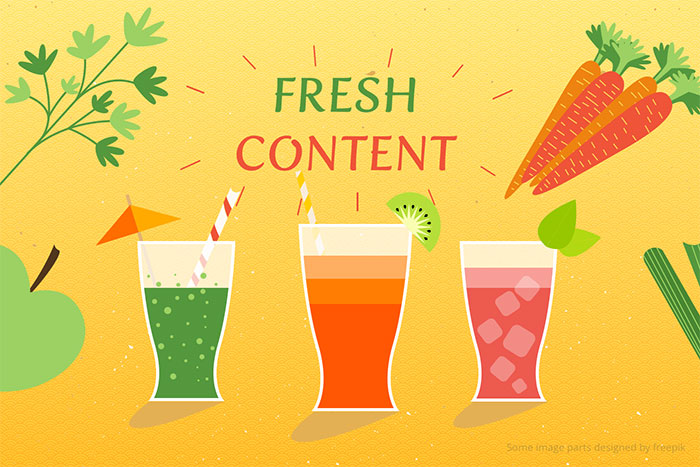


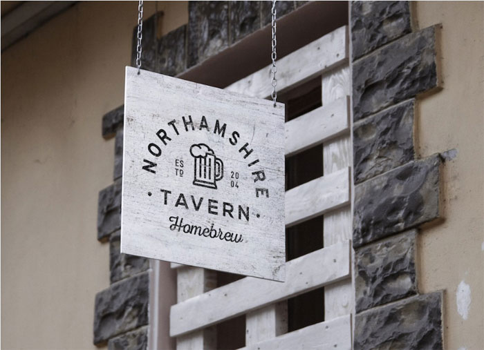
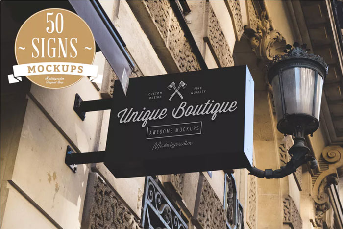
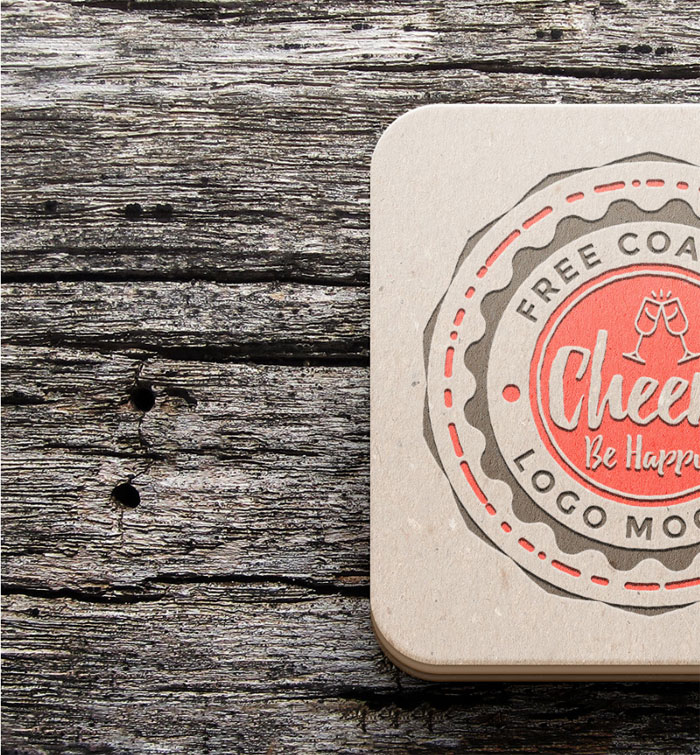
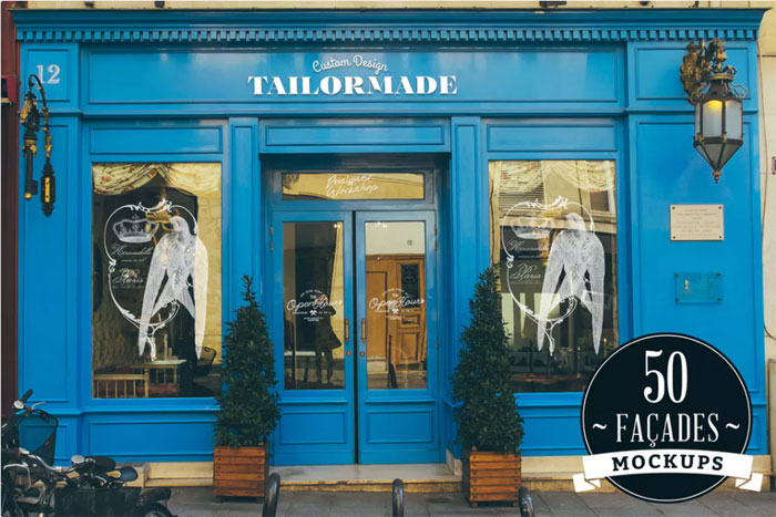
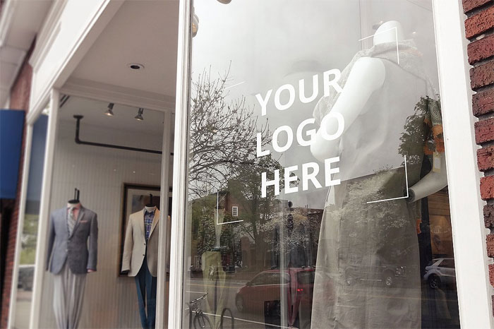
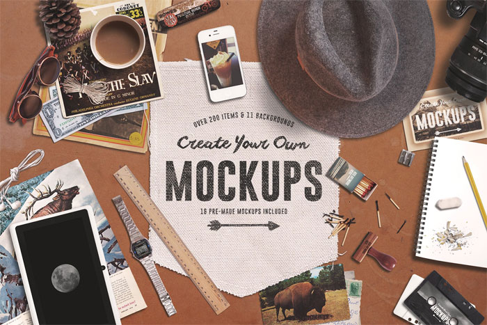
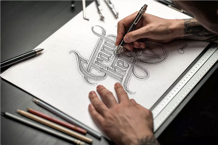
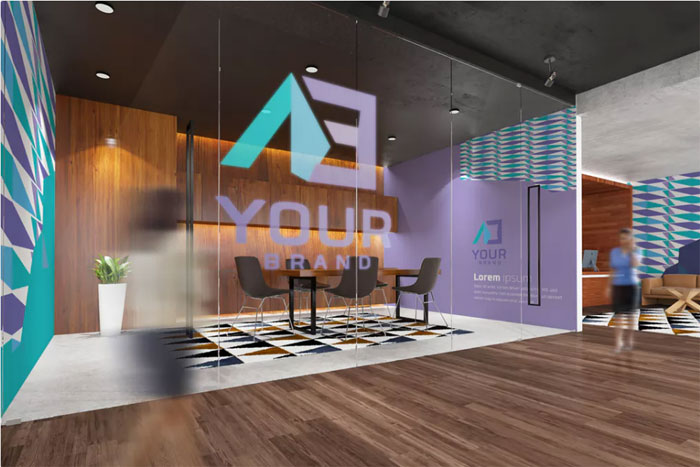
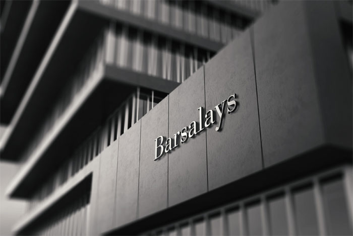
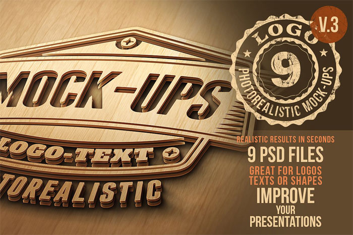
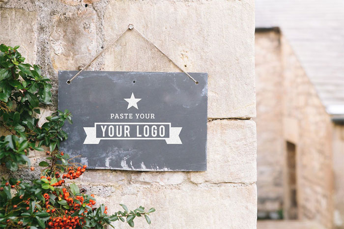
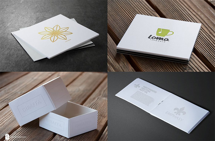
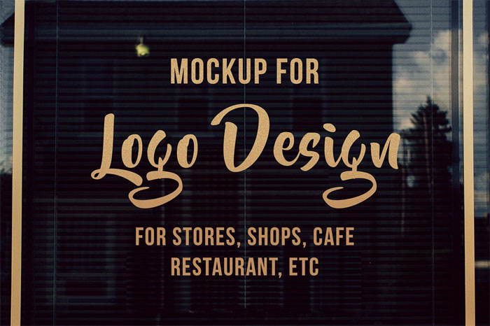
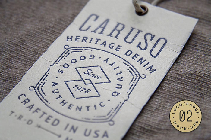
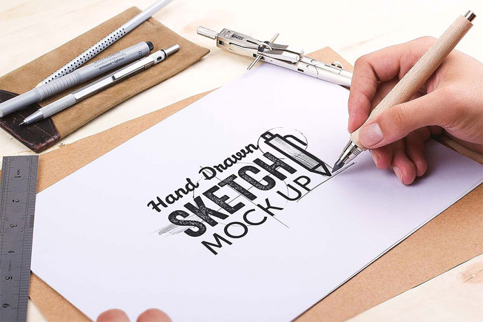
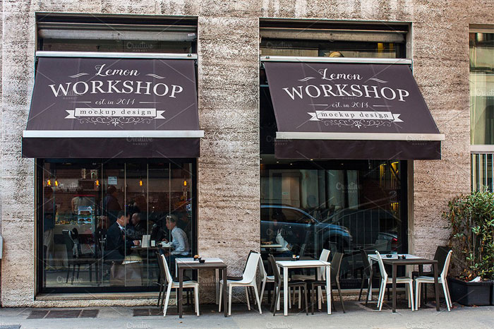
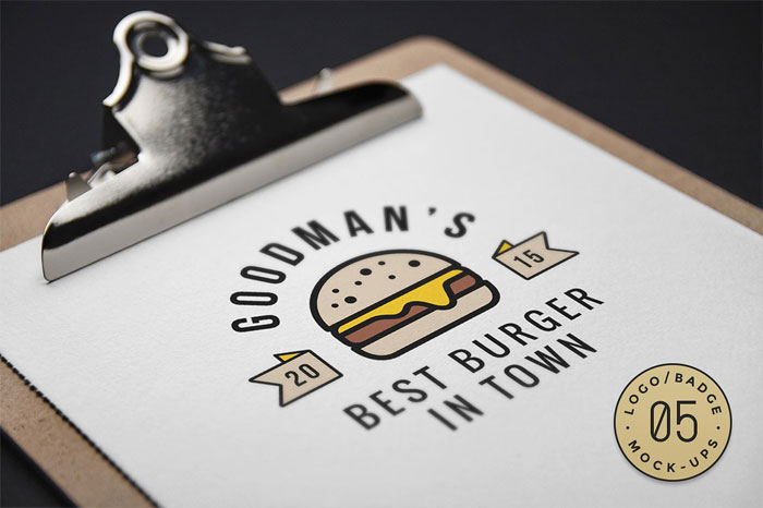
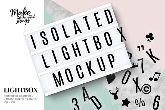
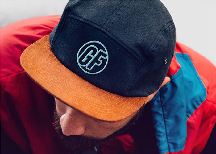
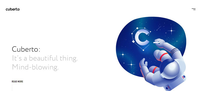
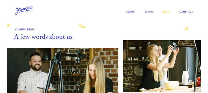

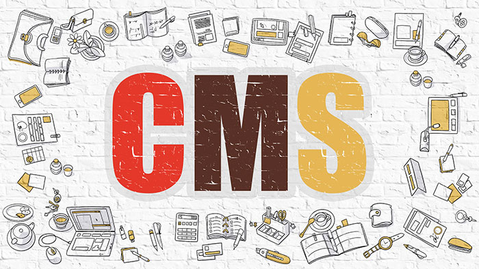
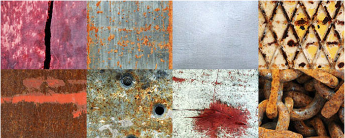
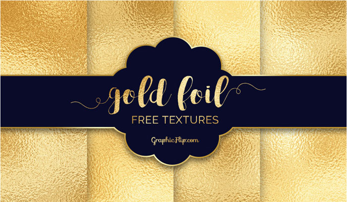
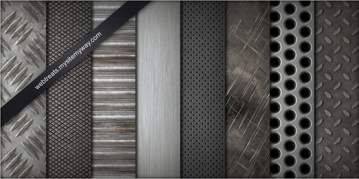
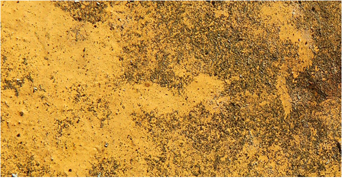
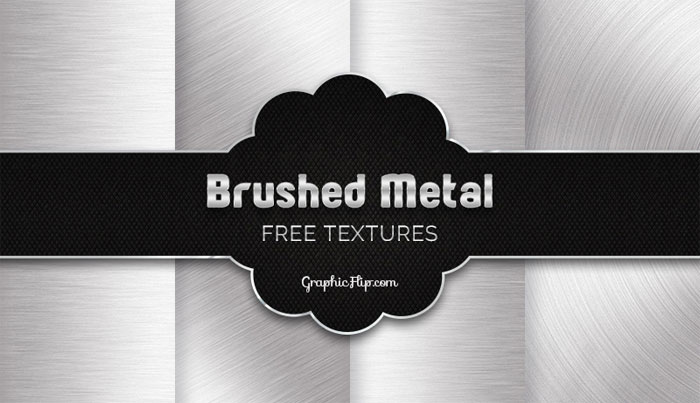

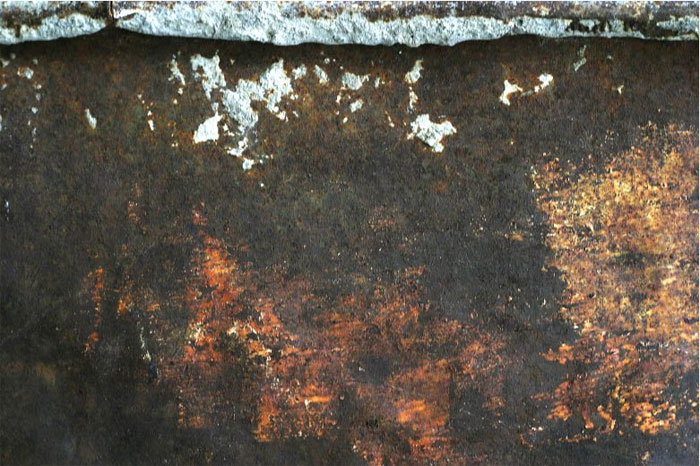
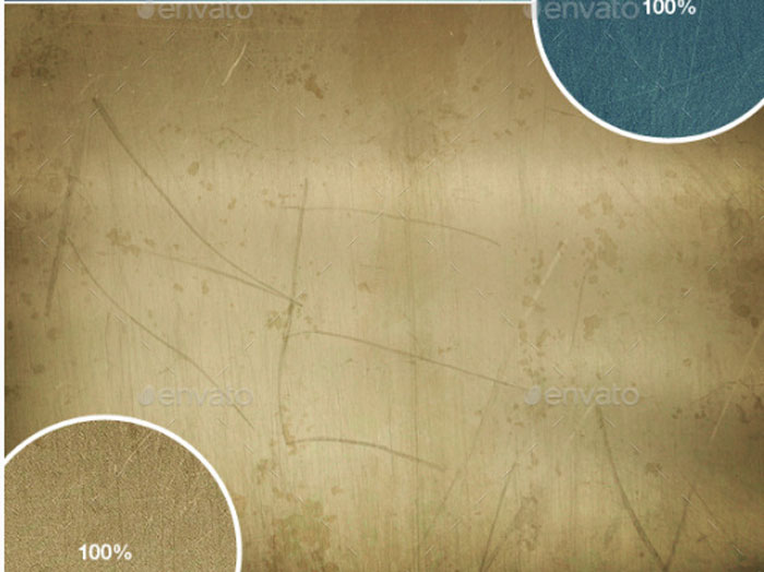
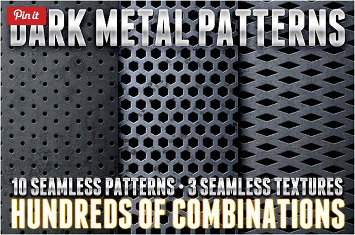
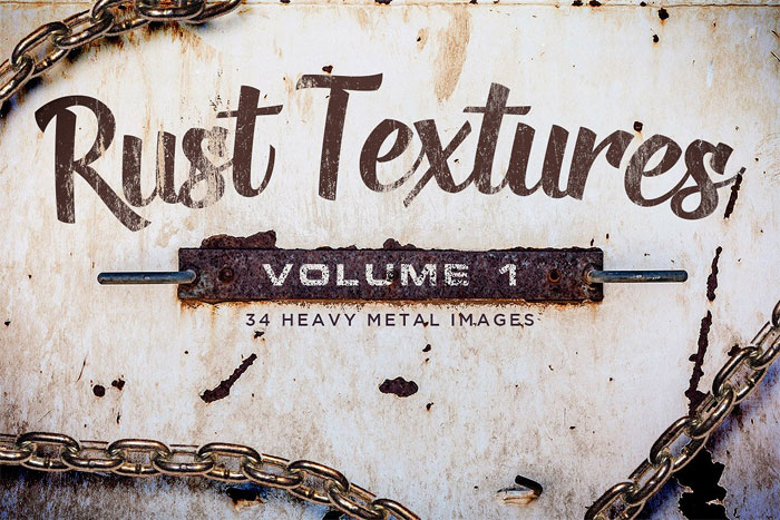
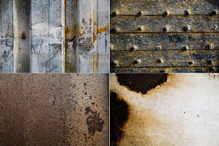
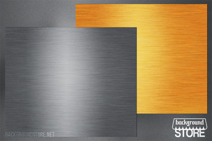
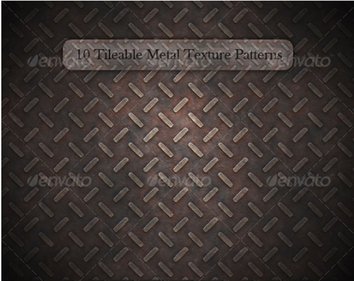
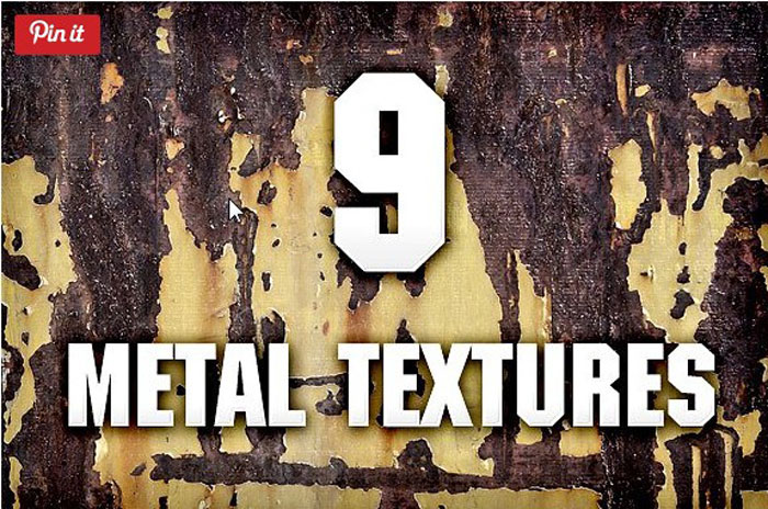

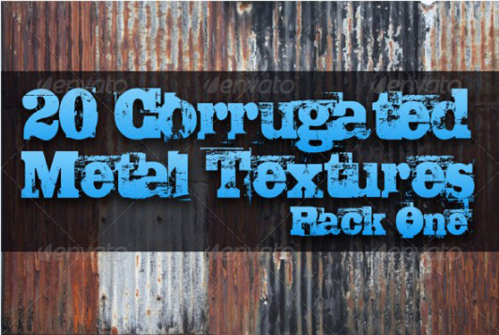
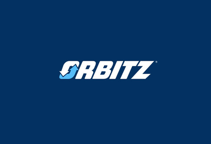

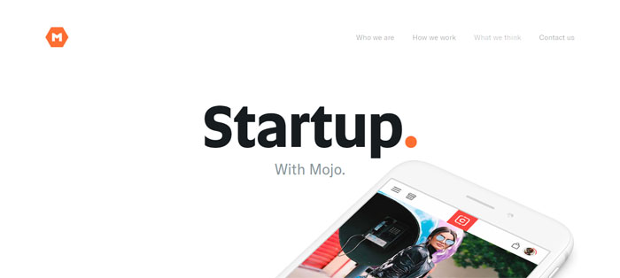
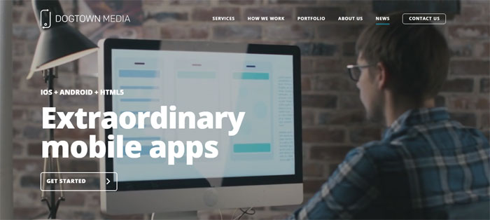
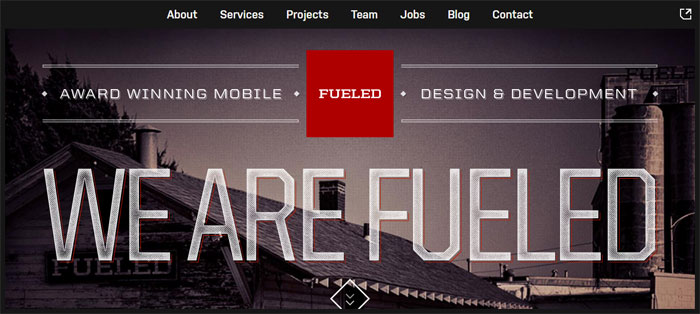
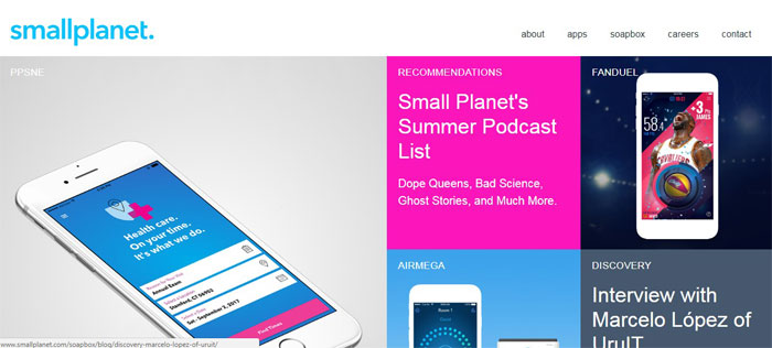
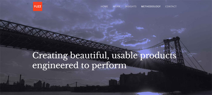
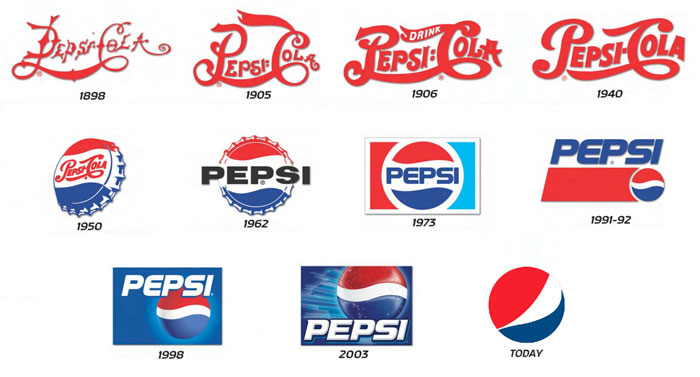
 RSS Feed
