We all love to spot our favorite ice cream logo on a hot day. When you run to the shop and see your favorite ice cream logos on a hot day, nothing could be better. Ice cream freezers are full of exciting treats. You need a catchy ice cream design to help your product stand out from the competition. A logo means your customers will easily identify your product. Your design should be as appealing as the treat itself. Frozen juices, chocolate ice cream pies, frozen yogurts or ice cream custards are all better with a delicious ice cream brand logo to accompany them. If you are looking at creating an ice cream cone logo or even at ice cream parlor names, think of what you’d like your logo to say. Which colors would you use? How would your typography set your product apart? Your logo should make your brand instantly recognizable. Your company’s history or story could even be incorporated into your designs. We have some tasty logos to explore. So whether your logo would be in classic style, modern, child-friendly or minimalist, there will be an ice cream logo design to inspire you. Speak to your customers as you prepare to indulge their sweet tooth. And with that, let’s explore some logo designs. Types of ice cream logosClassic ice cream logosDo you run a traditional ice cream company? Do you need an ice cream shop logo which shows a long history of seaside treats? A classic ice cream cone logo will create a sense of nostalgia while sharing a proud history. Classic ice cream designs share a story which has been created over time. Keep your logo traditional but modernize it so that you appeal to a wide customer base. Retro logos in classic pastel colors provide great examples. With a classic logo, you will be able to appeal to both young and old while you share the proud tradition of ice cream making. A classic logo will share the value of quality and tradition while sharing your company’s story.If you are an old business who has been around for a long time, a classic logo will be just right for you. You will be able to share a proud history of ice cream manufacturing while appealing to younger customers too. A younger ice cream manufacturer would also benefit from a classic logo. This is because you’ll give the impression of a proud tradition and a time tested reputation for quality. Modern ice cream logosA modern ice cream logo is a way to set your brand apart. With so many ice cream designs drawing on a traditional design, you will be able to show that you are a young, innovative and creative company. If you have been in the industry for a while and still want to tell your story, you can use a modern logo to revamp your design and appeal to a whole new audience. A modern ice cream brand logo will grab attention using colorful fonts and funky typography. The image will be innovative, creative and totally on trend. Modern designs make great ice cream shop logos. They are also a great choice for ice cream brand logos which appeal to those who live in the moment. Family-focused ice cream logo designsA family-focused logo is made to appeal to kids. It’s all about that great smile when they recognise their favourite characters or mascots. Your ice cream logo design will need to entice kids enough to get parents to pay for your product. Friendly mascots who scream out flavour will appeal to small children.Add personality to your mascots so that they don’t only grab a child’s attention but their imaginations too. Children enjoy fantasy characters as much as they enjoy the flavour of their favourite ice cream treat. Incorporate character or personality into your ice cream brand logo and you’ll capture kids’ hearts for sure. Simple ice cream logosMinimalist designs are great because they use simplicity to sell a product. With great use of negative space and a logo which gets straight to the point, you will sell your products in an instant. With a focus on quality rather than quantity, a minimalist design displays the integrity of your ingredients. If you have a long company name, you could always use abbreviations or initials for your logo. You can use great typography or dramatic juxtapositions to gain attention. A minimalist design which radiates personality makes a great addition to any ice cream brand logo. Use negative space and simplicity to create a great minimalist ice cream logo design. Creativity combined with a precise design will create tasty logos which add instant appeal. The examplesThere are some great ice cream shop logo design examples available at the moment. By browsing through ice cream company logos, you’ll be able to see how designers have used their creativity to produce yummy designs to identify tasty treats. Be inspired by them, but don’t copy them. Using your own creativity will create a unique ice cream logo design for your clients. 
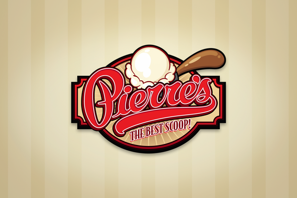
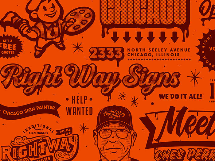
Inspiration allows designers to flourish in the field of graphic art. This is true with ice cream logos as well. Check out what some of the logo designers have been doing more recently and add pizzazz to your designs. Here are some recent examples: Pierre’s Ice CreamPierre’s Ice Cream has been delivering tasty treats for over 75 years. They offer a great example of traditional ice cream logo designs. Over time, their product has retained its quality – as has their logo. Cream
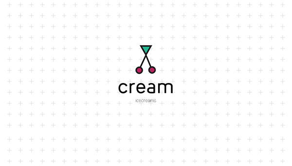
Ice cream with a cherry on tops anyone? Cream’s logo design shows us the tasty toppings we have with ice cream. The logo is a fun and very creative take on the treats available at an ice cream parlor. What better result could any ice logo design give? IglooIgloo is an Israeli ice cream brand which shares costume ice cream delights. The brand focuses on fun and their ice cream company logo is no different. Drawing on a traditional ice cream shape, the logo uses a retro style design. The graphic language is colorful and playful to share the joy behind the product. The logo designs were set to appeal to the whole family and shares the brand’s message which is included on all packaging, logos, websites, and signs. Carpe DiemCarpe Diem has a logo design which shows the joy of toppings. This ice cream shop is located in a seaside resort and the logo shows a person relaxing or reclining. This logo design appeals to the fun and relaxation which comes while sharing tasty treats. Joe’s Ice cream
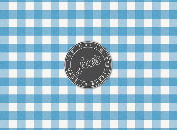
This logo was commissioned by an old ice cream shop who wanted to update their design. The designer kept the shop’s history alive by using a retro logo design but added a minimalist element. This great ice cream logo appeals to a wide audience, sharing a history of quality and integrity through a great logo design. Ending thoughtsA great logo encourages you to identify and then enjoy your favorite tasty treat. Share your passion for your product with a great ice cream logo design. You’ll communicate your shop’s history and goals with your customers while you stand out from the competition. If you enjoyed reading this article, you should read these as well:
The post Ice Cream Logo Design Examples for Inspiration appeared first on Design your way. from https://www.designyourway.net/blog/graphic-design/ice-cream-logo-design-examples-for-inspiration/
0 Comments
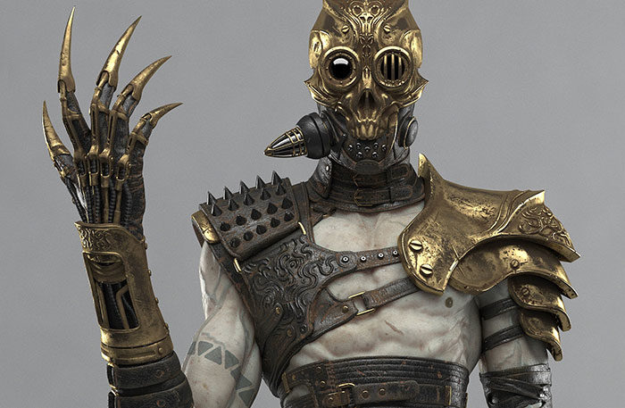
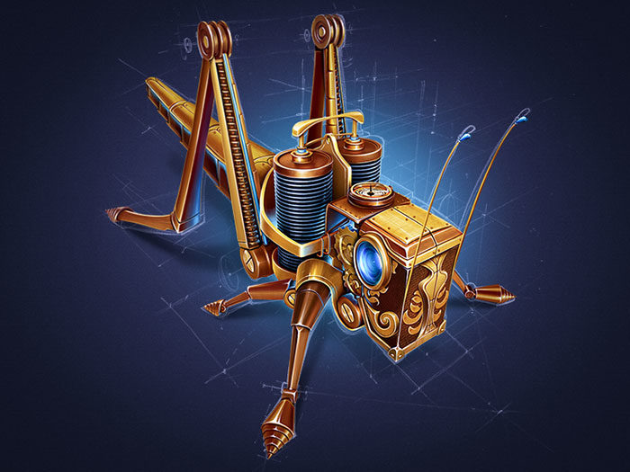
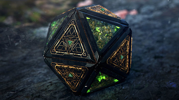
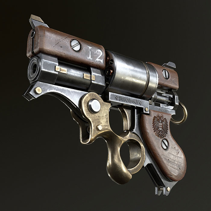
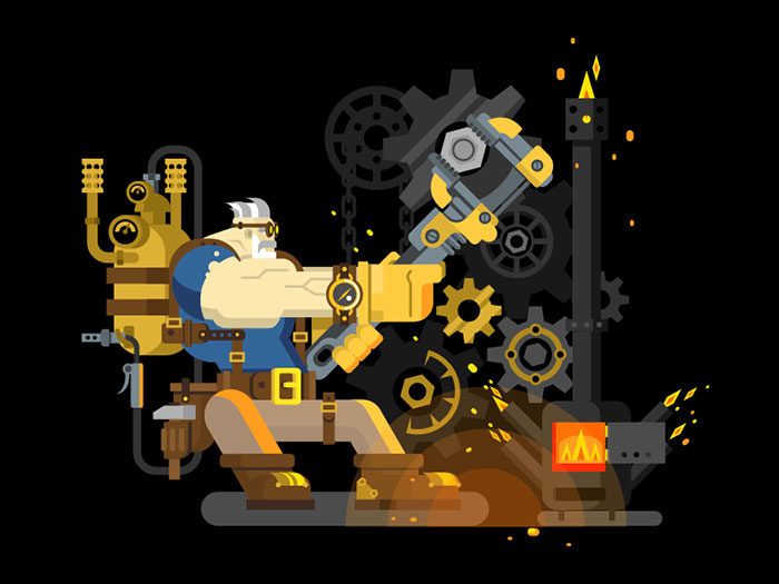
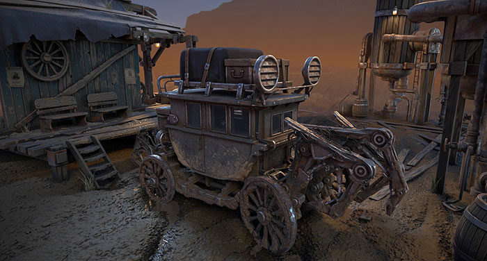
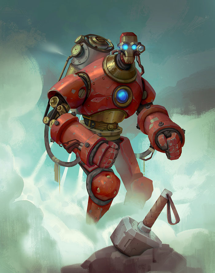
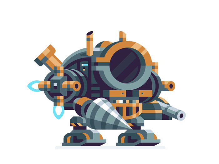
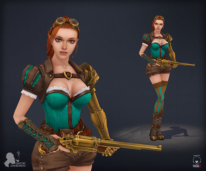
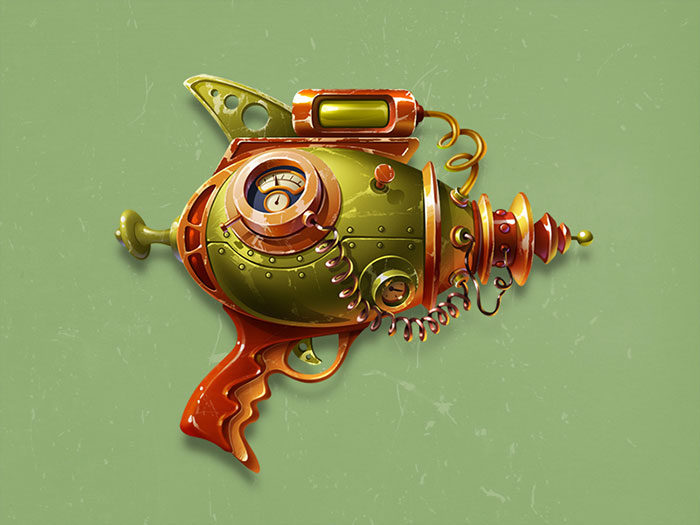
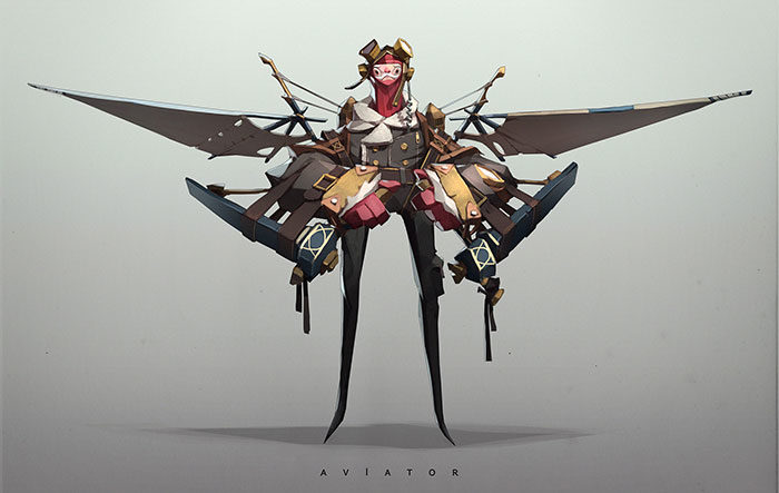
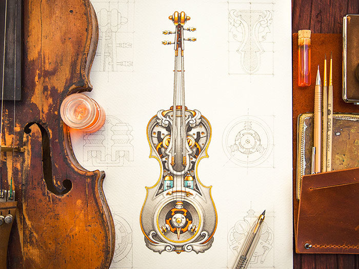
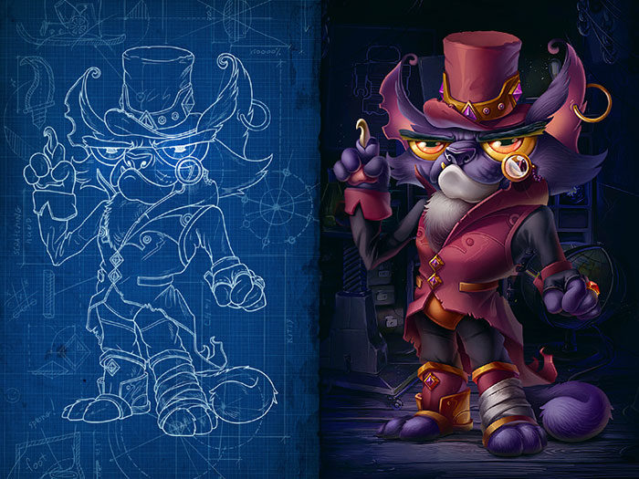
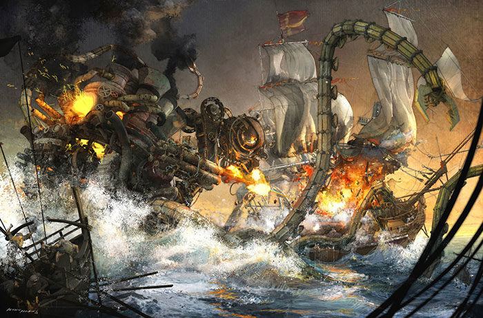
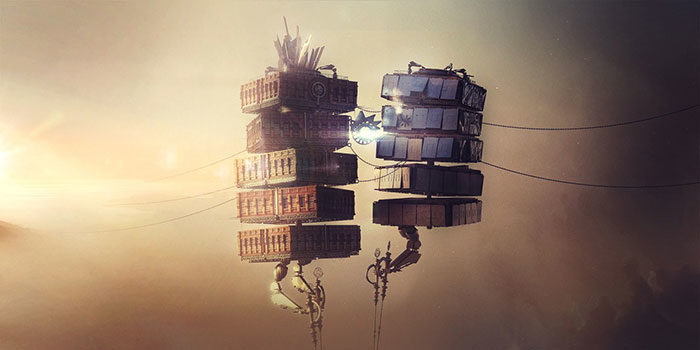
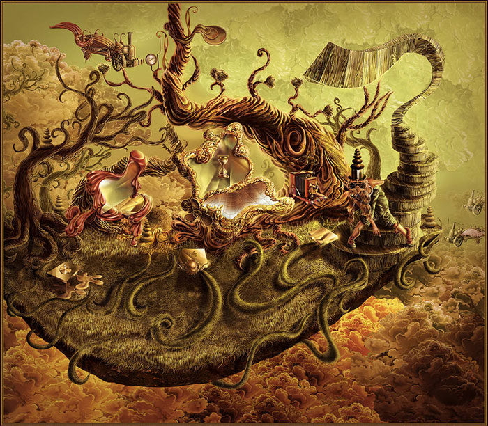
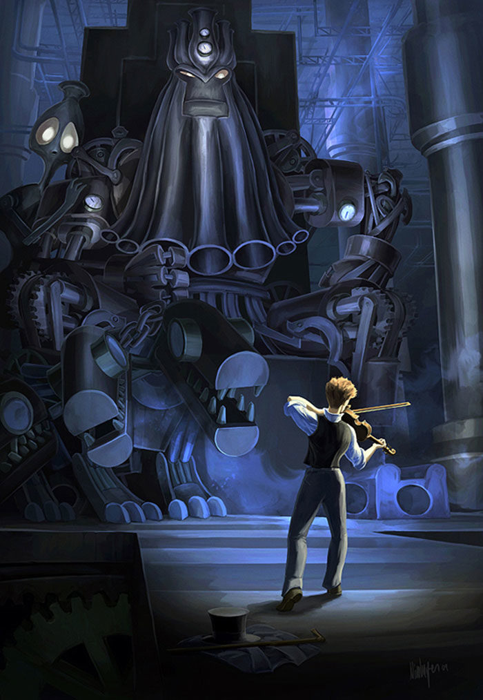
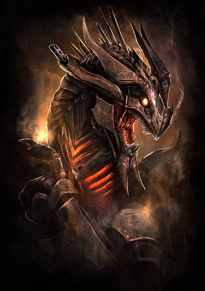
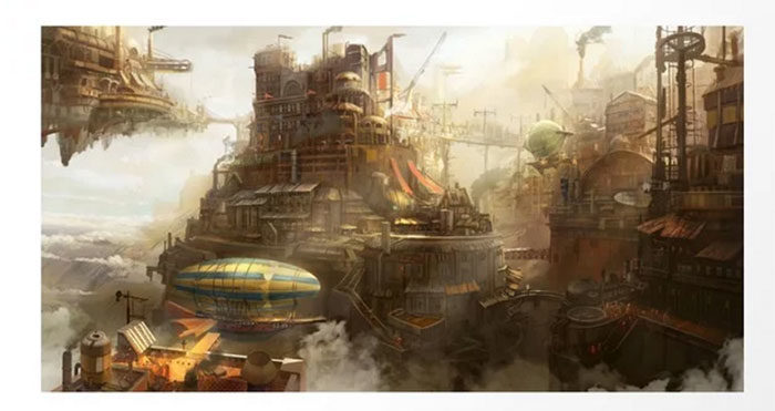
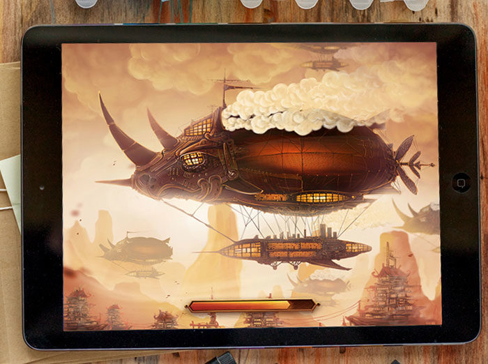
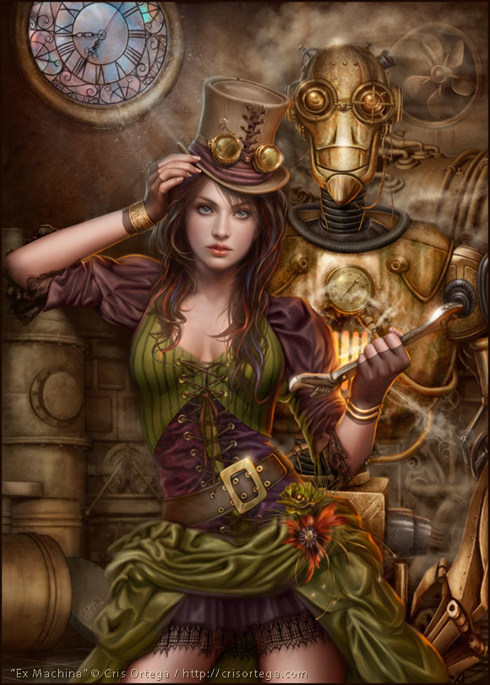
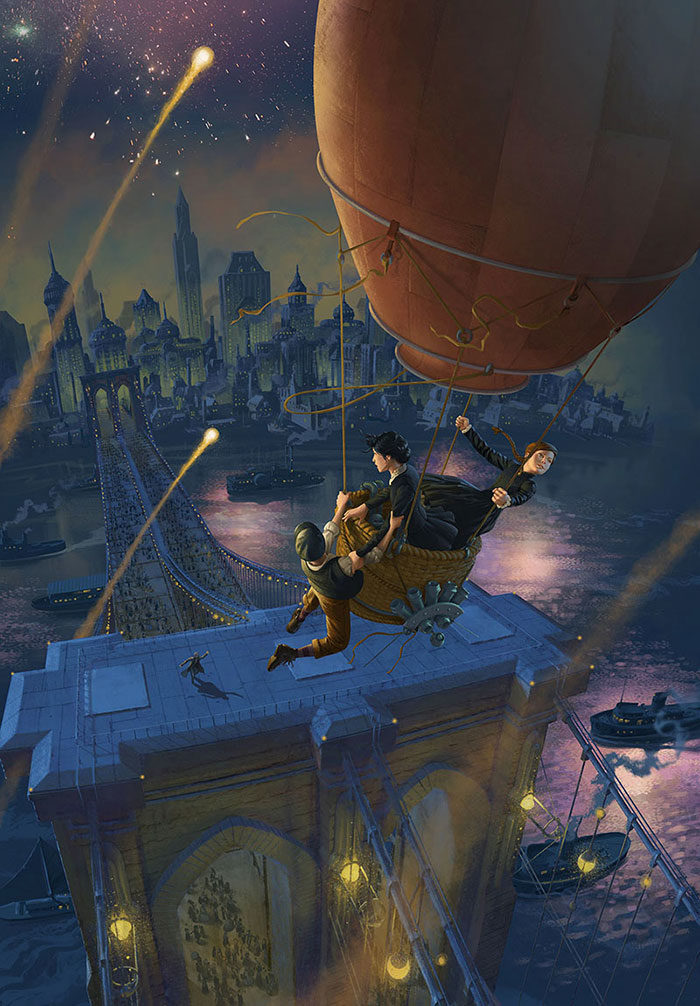
Are you a fan of steampunk art? Do you love the way the combination of fantasy and technology produces something unique? Steampunk drawings combine fantasy with science to create realms of possibility, where advanced machinery exists within a fantasy realm. We’ve put together a collection of Steampunk art at its very best, to inspire you with your Steampunk drawings. You’ll love our collection of Steampunk illustration ideas. So step into the fantasy realm to see artwork at its best. What is steampunk art?Before we step into the art realm, you might be looking for a precise definition of Steampunk art. What is it exactly? Well, steam punk art is actually a hybrid, where science fiction combines with another genre of art altogether. This can include fantasy, horror or even history. This combination has extended into mainstream culture, introducing new literature or fashion choices. Steampunk literature shows alternate worlds. Howl’s moving castle provides an example of a mechanized castle which moves though a fantasy landscape. This castle is lit up by a fire demon. Other steampunk novels are set in the American West, in the Victorian era, or even a post-apocalyptic era. Steampunk fashion is often inspired by the Victorian era, and you will find gowns, corsets and petticoats, top hats and suits. Each item is designed with a modern twist. Sophie, in Howl’s Moving Castle wore petticoats and owned a hat shop. However, steampunk art or fashion is only inspired by days gone by. Each item has a modern twist which makes it truly unique. Accessories often include timepieces and flying goggles. You will also find items from the post-apocalyptic era. Howl’s Moving Castle shows imagery of war such as ragged clothing and fighter planes. Steampunk is highly creative, and the culture of literature and fashion offers up inspiration for great art. The movie Howl’s Moving Castle was originally written as a book. Steampunk art is a very visual and highly attractive part of the Steampunk culture. Examples of Steampunk artSteampunk Starwars – Kylo Ren
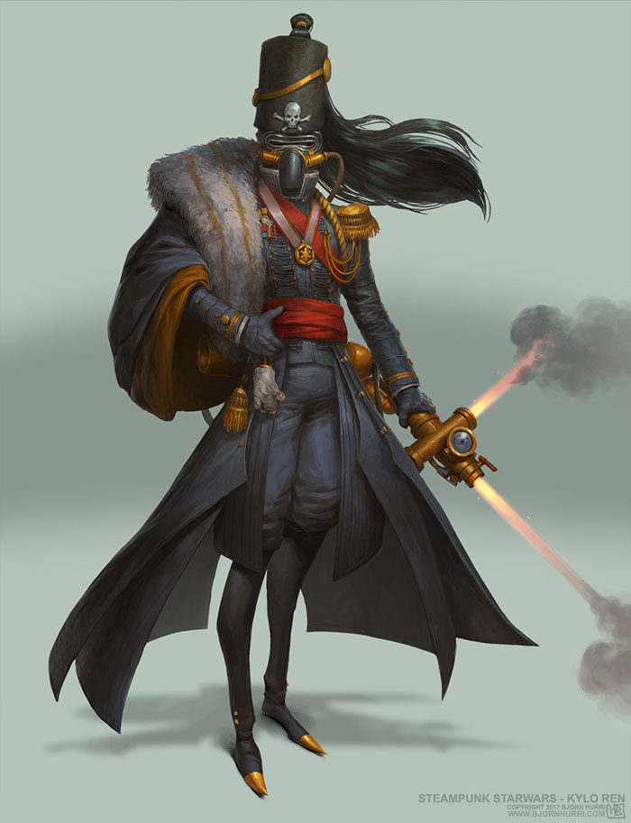
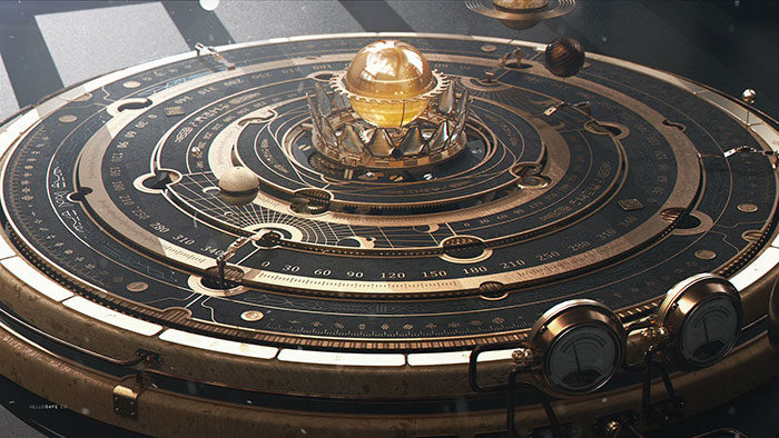
Steampunk Astrolabe Table with Ui
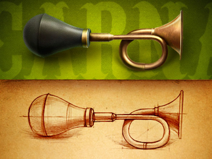
Antique HornClockSteampunk CyborgMechanical Grasshopper3D steampunk magic thingySteampunk buttonLumen SoftwareSteampunk revolverSteampunk engineerWild West Challenge – Coach
Ironman Steampunk
Mech ArmorSteampunk GirlJust a gunAviatorSteampunk violinSpike | Twist the GearSteampunk logosThere are many different styles of steampunk drawings. The main criteria is the mixture of technology and fantasy or science fiction. Steampunk art is often inspired by the Victorian era, making Steampunk drawings truly creative and highly attractive. Here are some great examples of Steampunk artists. STEAMPUNK WEAPONRYIf you love steampunk artwork, you’ll also love Steampunk weaponry. These weapons are often dramatic and highly adorned, making them favorites amongst artists and fans alike. If you are looking for some awesome and very gritty Steampunk weapons, you’ll love this selection. You’ll also find these images inspiring while creating your own Steampunk artwork. STEAMPUNK TRACTORDo you love the way old and new combine in Steampunk art? If you love the uniqueness of hi-tech machinery and rural settings, you will love this one of a kind Steampunk tractor. By combining mechanical world with organic landscapes, you’ll find a striking juxtaposition in Steampunk illustrations which can be truly inspiring. This work of art includes all of the mechanical workings within the tractor, including gears and instruments. Like all striking Steampunk artwork, this one has visual impact! STEAMPUNK COMPUTERWhat could be more interesting than a Steampunk computer? By combining retro Victorian styles with futuristic designs, these Steampunk examples are highly effective and very appealing. Have a look at the details on this computer. Brass finishes, a traditional timepiece and a fabulous keyboard create the striking visual impact only Steampunk art can. And while you’re admiring this great steampunk artwork, don’t forget that this computer can also send out Morse Code messages! STEAMPUNK GUITARWhat could be more fabulous in a steam punk drawing than a great electric guitar! A great electric guitar with all the Steampunk modifications gives you truly excellent results. This is steampunk concept art at its very, very best and is set to become a firm favourite amongst all Steampunk art fans! STEAMPUNK FLIP PHONECan you imagine taking a modern flip phone and turning it into a Steampunk graphic? Technology is a firm favorite amongst Steampunk artists. Recreating technology in Steampunk art has become very popular. This Steampunk artwork turns a flip phone into an ornate metal design. This one is set to be a firm favourite amongst Steampunk fans. STEAMPUNK SPIDERSteampunk artwork loves mechanics, and spiders and other organic creatures make great conversions. Many steampunk artists give insects or other creatures a technological twist. By shaping technological components into an organic shape, you too can create awesome Steampunk art. We hope you’ll feel inspired by this Steampunk Spider. STEAMPUNK R2-D2Steampunk artists and fans absolutely love Star Wars! What could be more futuristic than Jedi Knights in a futuristic realm? R2-D2 is one of the most popular droids in the world today, and he’s had a great makeover, turning him into Steampunk art. His classic body has been recreated, giving him a silver finish. His different parts are held together by metal chains. I’m sure you will agree that R2-D2 looks absolutely awesome as a Steampunk artwork! Other Steampunk artwork examplesThe Devils CauldronDead cities by Maxim GoudinSteampunk PioneerOrpheusSteampunk Dragon by TapwingSteampunk city by Tyler Edlin ArtSteampunk CrayonAirship by InkrationEx MachinaVictorian Interfase by Antonio CaparoEnding thoughts of the steampunk artSteampunk art is a very popular blend of high technology and fantasy. It has become embedded into popular culture, with Steampunk artwork, literature and fashion combining to inspire artists and designers around the world. Steampunk art styles can vary, with some focusing more on fantasy landscapes, including Steampunk city art. Others focus more on technology. All seek to explore the role of steam in creating movement. Steampunk animals, cars, homes and jetpacks have all been invented. Steampunk art is influenced by the Victorian era, when steam trains ruled. As a result, Victorian aesthetics often dominates Steampunk art. We hope you enjoyed this article, and that it has provided you with a range of different Steampunk artwork examples to inspire your own style. If you enjoyed reading this article about these steampunk art, you should read these as well:
The post Steampunk art and drawing examples that will blow your mind appeared first on Design your way. from https://www.designyourway.net/blog/inspiration/steampunk-art/ Did you know that your annual report design plays an important role in communicating your brand’s message? It’s true, your annual report covers add a great deal to your company’s image. Great annual report covers can communicate a message about your company’s culture. They can also help to showcase your work to create a great impression. It is surprising then that report designs are often neglected by many businesses. Examples of Annual Report DesignsToronto International Film FestivalIf you really want to create an eye-catching annual report design, you’ll love this example. Created for the Toronto International Film Festival, this report design is on trend. It uses a limited colour palette and shows a deep appreciation of cinema. Blok Design created this annual report design and used great typography with letters sharing the magic of cinema. By capturing the spirit of the festival as well as a love of cinema, this reports design shared an important message. Well Done 2006 Annual Report by Bruketa & ŽinićThis great report design has a tiny hidden booklet which needs reader participation in order to work. This booklet was printed in thermo-reactive ink. Readers would have to wrap it in foil and bake it in the oven in order to read the report. This task required great care though. If the report were to be heated too much it would burn up and readers would be left with nothing. This is a great annual report design which shows design work at its most creative. L-BankGerman graphic designers Jung von Matt created an excellent annual report design for L-Bank. This report cover design is so compelling that it makes a great example to many other companies. Instead of focusing on figures, this report interpreted the segments of the bank’s business as various installations, arranged in clusters to represent projects assisted. By using creative design and excellent photography, the bank was able to share their work over the past year in visual language. ZumtobelZumtobel is an Australian lighting company which has worked towards creating great annual report covers. The Corners created an annual report which showed both hard data, as well as an artwork by Anish Kapoor. The company was determined that they were not going to produce a report filled with grey facts as well as drab imagery. Instead, they used ten different colours of neon ink to create a vibrant, double volume report. One volume of the report covered hard data, challenges and achievements. The second showed solar flares and neon spots which leapt up from the page. Adris GroupIn 2014, the Adris group expanded, creating three successful companies and purchasing shares in Croatia. This growth and success was reflected in their 2015 annual report, created by Bruketa & Zinic, an advertising agency working to communicate their message of growth and future expansion. This report was made up of 4 different books, each one representing a successful company the business had developed, as well as one for Adris. The books were linked by Croatia insurance, which was shown as a box, slotted into the four books and tying together the company as well as its assets. This box opens up to reveal a future insured by Croatia. Banquesalimentaires QuébecBanquesalimentaires Quebec wanted to create an interesting annual report for 2012 and 2013. As the report was based on a food bank, its annual report took the shape of a tin can – symbolic of food donated. This can was surrounded by a label which contained data. This data was printed in both black and yellow. This great annual report concept was created in order to communicate a visual message about the organization and the goals it has achieved. Craft VictoriaAnders Bakken created an impressive annual report design for Craft Victoria, an Australian arts organization. This annual report design uses texture to show an appreciation of print materials as well as textured paper stock. What better way to represent an arts and crafting company in an annual report design? KuoniKuoni is a large Swiss travel agency who always go to great effort to produce an excellent report design. Travel themes are always exciting and Noord Design used these great themes to show the highlights achieved by the company in 2014. This annual report design was set to stun, and it did, winning the iF design award for Communication. Austria SolarSolar companies show how the sun’s energy can light up the world. What better way for Jung von Matt to show the power of solar designs, than by working on a report design which comes to life after being exposed to the sun! This report was designed to stay blank until it was taken outside. When exposed to the sun, it became flooded with life-like designs which were both inspiring and aesthetically appealing. There are a range of different papers which can be used to create an annual report design. Just remember, if you wish to share a company’s message, that pee-responsive paper designs may not be appealing to your clients. SegurosPelayoIf you are looking for an innovative annual report design, you will love this one, created by Biografica. The report presented important company information in the form of cutouts presented in stop motion animation. This included a football match. Great presentation can make data far more interesting. Vrijwilligersacademie Amsterdam 2011 Annual Report by Da Costa Design, Studio Pino, and Veenman+You may have a great annual report design, but what do you do with your report after you have read it? This great report has the answer. It gives you instructions on how to create origami designs, giving you a great way of creating paper forms once you’ve finished with your reading. FlywheelFlywheel hosts WordPress sites as well as management platforms. 2015 was celebrated by one of the company’s founders tattooing the company logo onto his arm. The company responded by giving out temporary tattoos which summed up the successes of 2015. If you think this was original, however, you’ll love the 2016 designs, where the 2016 annual report page, a parallax scrolling webpage, created the opportunity to win fantastic designer t-shirts. What more could a company ask for when it comes to original report designs? Prometey Bank 2012 Annual Report by Backbone BrandingPrometey Bank wanted to create a report which showed the company’s commitment to sustainability. This annual report example showed animals within its pages in order to remind readers about the dangers of extinction. Animal life cycles were used to bring data to life. All in all, an inspiring reports design which sent out a clear message to its readers. MailChimpMail Chimp is a highly creative and playful company, and its annual report design was no different. This report was shown in a single page responsive site. Illustrations and easy to absorb facts shared data about the year gone by. This is certainly one of the best annual report design concepts for an upbeat company to use. Clear MediaClear Media produced a 2015 laser cut report design which clearly communicates insights into this advertising company’s company culture as well as visions for the future. This report design was created by Phoenix Communications and focused on how the company created a stage or platform for clients to market their businesses. The report was made of multiple panels, which, when combined, formed one complete image. An acrylic annual report cover meant that readers could look at the gorgeous image when the report was closed. Anthon B Nilsen 2009 Annual Report by HeydaysWe’ve all looked at annual report samples where we see photos of company staff. Anthon B Nilsen decided to shake up this feature in their regular report design. Instead of showing us images of staff, they showed images of staff belongings instead. This helped readers to gain insight into the lives of the company’s employees, showing what was valuable to each. Informe 2009 Annual Report by Huaman Studio and Petit ComitèDo you love annual report designs with stunning covers? If so, you will love the elegant black – on – black design created by this company. This annual report cover also includes geometric shapes. These combine to create a slick and very modern annual report design. KickstarterKickstarter shares its annual report digitally, using an interactive website for its annual report design. Creative headlines and attractive figures are represented visually. This annual report design includes animation, hand drawn illustrations and links which encourage site visitors to find out more information. This is a great report design which is positive and interactive. Krochet Kids 2013 Annual Report by Column FiveKrochet Kids is a non – profit organization which supports women in poverty. This organization assists women by helping them to knit or sew clothing. The brand has created a very attractive annual report design which uses thread to represent the organization’s mission. Total Specific Solution 2011 Annual Report by Total IdentityThis company has created an annual report design which has been printed. However, viewers can relate to the information from a digital perspective because the report uses QR code technology. When readers interact with information presented on the report design, they gain access to a video which explains the material used in this creative annual report. Pirelli 2013 Annual Report by Cacao DesignWheel company Pirelli have report designs that are equivalent to art. Their 2013 report appeared to be a spinning wheel, with the report itself seeming to roll. What an excellent annual report idea. Vimeo 2013 Timeline by VimeoIf you’re looking for a great creative annual report, you’ll love this one from Vimeo. Vimeo is all about videos, and their annual report design creates a great animated experience when encourages users to engage. AEGIS 2016 Annual Review by SVP PartnersIf you love beautiful report designs which have beautiful visuals and strong lettering, you will adore this report from AEGIS. It is a pleasure to explore. Human Rights Campaign 2012 Annual Report by Column FiveThe human rights campaign has an annual report idea which clearly explains the goals and culture behind the organization. Their annual report design has great packaging as well as data visualizations. ERGO Hestia Group 2016 Annual Report by Hanna DyrczThis annual report idea contains great data visualization as well as black – on – black print. The result is a great annual report design set to impress. Artsy 2014 Year in Review by ArtsyArtsy has great annual report ideas which share the company’s goal of making art accessible to all people. Viewers are invited to share in visual treats as they learn more about the company’s goals and visions. This is one of the most creative reports for an art company. Best Report Design TemplatesIf you would like to create unique annual reports, you can add creativity and interest to your brand by using a great template. A template can help you to create attractive annual report designs while ensuring that your information is clearly expressed. By using a template, you will be able to communicate what your organization has achieved over the last year. You’ll also inspire confidence with your professional presentation. Annual Report Keynote PresentationZaconmic Studios has created a very professional report presentation so that you can present your year using an Annual Report Keynote presentation. You’ll have 56 slides, 500 free fonts, icons, a calendar template, maps and more to use while creating your annual report designs. Elite Standard’s Annual ReportElite_Standard has created a great annual report design. You’ll get a 28 page template which can be easily customized. This great package comes with guidance to assist you with creating a great report. Modern Annual Report 20 PagesModern Annual Report 20 Pages was created by Brochures Factory and will give you a great simple annual report design to impress readers. You’ll have paragraph styles, block quotes as well as character styles and swatches to choose from while working with this great annual report design. Dark Business Brochure TemplateWould you like to create a great annual report design? This short template will assist you to create the best report designs using attractive colours and a selection of free fonts. Work with up to 12 pages of data. The Annual Report 16 PagesBrochuresFactory also created a larger annual report design which uses up to 16 pages. Your result will be a clean and simple short annual report with a great template. Simply add your information to the template for great results. Annual Report TemplateAndre28’s Annual Report Template allows you to add images in order to create an innovative annual report. This is a great choice for design or visual companies who would like to use a visual portfolio. This annual report layout has 24 pages and can be customized to suit your brand. Modern Corporate Annual Report TemplateWould you like to work with an annual report format sample which would suit a corporate company? If you need to show your sales and marketing results, this great annual report design gives you 30 pages which can be easily customized. Corporate Landscape Annual ReportCreate a stylish annual report with this great InDesign template. You can create cool reports using a landscape format. You’ll have 30 pages which are customizable to suit your brand. Business Report Brochure TemplateIf you are looking for a well designed report with a simple, minimalist aesthetic, this report makes a great choice. It is easily customized, and will give you 12 different pages to work with. You’ll get free fonts and automatic page numbers for easy use. Minimal Annual Report TemplateWould you like a creative report template which is minimalist in design? This report is visually appealing, and will give you 18 pages to work with. You can use a grid, enabling you to expand your information without affecting your page layout. NeedOn BrochureThis excellent 20 page annual report design will enable you to show off your work for the year. You’ll be able to insert your brand colours as well as use free fonts to create a great report. This template was created by Rinatyassari for NeedOn. Victorio Annual Report TemplateIf you are looking for a sophisticated annual report design template with a professional aesthetic, you will love this one. You can customize your page layout. You’ll also be able to create 30 pages of reports to show your performance over the past year. This report is compatible with InDesign CS4 or higher. Creative Annual Report TemplateIf you are looking for the best report design for marketing or sales reports, you’ll enjoy this report. It comes with 16 pages. You’ll also be able to customize your colours to suit your brand. Annual Report TemplateAre you looking for the best report design for simple and effective presentations? This great report from GreenDesign will enable you to share your information with ease. You’ll get 24 pages to choose from as well as automatic page numbering for a professional appearance. This report has CMYK colours, making it easy to print. Swiss Annual Report TemplateIf you want a professional looking annual report design which will suit a corporate brand, you will love this one. You’ll get fonts, placeholders for images as well as organized layers for a highly professional report. ThemeDevisers’ Annual ReportThemeDevisers have created a sophisticated annual report sample which will enable you to share your results over the last year. You’ll be able to share information about employees, projects you have worked on, services and pricing. The result will be a sleek annual report design which will benefit your brand. Annual Report Template InDesignIf you are looking for the best annual report for NGOs, nature and environmental businesses, you’ll find this report an attractive option. You’ll get a colourful report filled with lots of images. You’ll also get 30 pages to work with to show your progress over the last year. Annual Report by KovalskiAnnual Report by Kovalski is the best report design for a clean, sophisticated and very straightforward report. You’ll be able to share your most important information with this short annual report. This template is 16 pages long and compatible with InDesign. Modern Annual Report TemplateIf you are looking for an annual report design which will give you 30 pages to work with, and which can be used for different businesses, this is the choice for you. This template can be used in A4 or US Letter sizes to create great results. You can also edit easily using InDesign. Annual ReportThemeDevisers created this great annual report design which is great for a travel company or an international organization. You’ll get featured maps as well as 24 pages to share your progress over the past year. Citizen Annual Report Business TemplateWould you like a sleek graphic design report which will give you a modern look? This highly professional report will give you 30 pages to create a unique annual report that will impress your readers. Clean & Modern Annual ReportsilukEight has created a sleek and modern annual report design for a professional and sophisticated look. You’ll have 24 pages to work with and your report is editable using InDesign. Annual Report: PowerPoint + A4 PrintWith Annual Report, Zaconmic Studios has created an annual report design for financial companies. Numbers and data will be easily understood using this design. You’ll also be able to use graphs and charts to share your information. Studio Style ReportStudio Standard created Studio Style Report, which is a great way to produce creative reports. Your report will be interesting and fresh, with a magazine style appeal. It is a great choice if you want to create image filled reports. Creative industries as well as those who focus on fashion, lifestyle or design will benefit from this 32 page annual report design. Annual Report RealstarIf you are looking for an annual report design which can also be used as a brochure or portfolio, you will love this great template. It has 32 pages which can be easily edited using well organized layers. The result will be creative reports or brochures which will enhance your corporate identity. Annual Report from World PrintAnnual Report from World Print is a best annual report for sharing financial information. You can share numbers, graphs and data in simple and easy ways. Annual Report by MoriscoThis Annual Report design has 24 easily editable pages. You will be able to add your brand colours to this report as well as make use of the free fonts. This template is easily editable using InDesign. Annual Report PowerPoint TemplateCreativeSlides has created a comprehensive annual report design which will give you a wide range of corporate options, including space for a letter from the director, financial overviews, business models, investment information and an investment information template. Annual Report by BrochuresFactoryBrochuresFactory has created a short, 16 page long annual report design which can be edited to include your corporate colours. You will be able to add free fonts as well as photo images to this template. Kreatype Annual ReportIf you are looking for creative reports which are simple and effective, you will love this template from Kreatype Studio. You will easily be able to add your corporate colours to this 24 pages long, print ready annual report design. Ending thoughts on these annual report design examplesWhen running a business, an annual report will enable you to show the progress you have made over the year. Presenting this information in a creative and interesting way will enhance your brand. We hope this article has inspired you to create effective and innovative annual report designs which will add value to your brand. If you enjoyed reading this article about annual report design, you should read these as well: Learn About The Apple Logo: The Tech Giant’s Branding Nike Print Magazine Ads That Boosted The Brand’s Popularity Coca-Cola Advertising Campaigns
The post Great looking annual report design examples and templates appeared first on Design your way. from https://www.designyourway.net/blog/graphic-design/annual-report-design/ When creating one of the best nonprofit websites, you’ll want to create a website which is easy to navigate, and which clearly communicates the goals or mission of the organization. Great websites use typography, color and other design websites to put across a clear message. However, charity websites are often different from corporate brands. The best charity websites will be designed with this difference in mind. A non profit website will need to:
As a designer, you might wonder how to create one of the best nonprofit websites for your organization. You might want to know what a nonprofit website design should include. How do you create a non profit website design which will encourage users to engage with a charity or organization? The best nonprofit websites enable their organizations to generate enthusiasm and the support associated with this. This article has created a list of design practices which will help you to create your nonprofit website. Whether this is a design for your own nonprofit website, or one you will be creating for a client, we hope you will find inspiration. By following these steps, you will end up with a highly attractive website design which will engage your viewers. Share your missionWhen creating charity websites, the mission or goal of the organization is very important. Whether it is working for ecological awareness or animals in need, every nonprofit organization has a clear mission. When viewers know and understand that mission, they will be clear about the value offered. You could also share experiences, testimonials or reflections from people who have interacted with the organization. Are you creating awareness about climate change? If so, it might help you to include reflections from people who have participated in this process. You could take photos to include of participants sharing anxieties or concerns. The best nonprofit websites don’t enforce their missions. Instead, they share them gently in order to share their values, belief systems and impact. Create a donor friendly siteIf your organization relies on external funding, make it easy for your donors to make contributions. Great websites keep their donation button only a single click away from viewers – no matter where viewers are on a site. It should also be very simple and easy to make a donation.
Make it easy to recruit volunteersCharity websites often attract volunteers who wish to make a contribution. If your site relies on attracting volunteers, you will need to show them how to get involved. Many people would like to make a difference in the lives of others even if unable to make donations. People passionate about your organization’s cause may wish to donate time or skills into enhancing the organization. Work with social mediaSocial media has become an increasingly popular way to share information and encourage engagement. The best nonprofit websites are social media friendly. Include information about important people playing a role in your organization and include contact information for important people within your organization. Add social media tags to your site and share downloadable information about your organization. Images and photos can be shared online to share your mission and encourage a following. Create a clear CTA buttonFrom donors to volunteers, charity websites attract people who wish to offer support. Creating a CTA button for different types of supporters will encourage people to offer up what they can. Here are a few helpful tips:
The best nonprofit websites have multiple CTA buttons. This will keep supporters engaged no matter why they decided to visit your site. Use images to convey important informationWhen you design websites for nonprofits, use visual imagery to tell your story. Very often, complex information can be easily digested when it is visually displayed. Create a clear and identifiable logo to go with your site so that when views see your logo, they will easily be able to recognize your organization and mission in the future. Here are some ways philanthropists use visual information:
Create a responsive websiteTop nonprofit websites are always responsive. This is because viewers are using mobile devices more and more frequently. When viewers are able to easily absorb your message, view images as well as navigate your site, you’ll keep their attention. Stick to essential information so that your viewer does not have to navigate a ton of content using a mobile phone. Include space for a blog or news sectionWhen you keep your viewers informed, you increase the opportunity for exposure. Blogs are often quoted by news sites, as well as shared via social media. The more word gets out about your organization and its goals and achievements, the more visitors your ngo website will attract. Remember to make connections through social mediaAs we shared earlier, social media is a great place to share information, and charity sites will benefit from being social media friendly. Give your site visitors easy access to your social media sites such as Twitter, Facebook or Instagram. The best nonprofit websites also enable sharing. By following you on social media, your viewers will be able to interact with you and learn more about the everyday events taking place within your organization. Create a speedy siteEnsure your nonprofit website design is quick to download. You often have 6 – 8 sessions to capture a viewer’s attention and a site which is slow to load may mean your viewer will bounce off your site. Here are some tips to create a faster site:
By working to create a fast and effective site, you will improve your website’s SEO, improving your search engine rankings. You’ll also keep your viewers interested and engaged. Highlight a matching gifts optionThe best nonprofit websites often use matching gifts. Matching gifts enable your viewers to offer up a donation as well as encourage others (such as an employer) to do the same. Many matching gifts are offered up on a 1:1 basis, but some matching gifts can even be as high as 4:1. When you use matching gifts tools for nonprofit website design, it will assist a charity or NGO to raise more money during fundraising campaigns. Leave your donors feeling safe and secureDonors who wish to make a contribution online are often required to offer up credit card or bank account details. This can often feel anxiety provoking for some donors, who are afraid of their information being misused. Show your donors that your site is trustworthy by placing security logos on your donation forms. If you use a PCI certified logo, your viewers will know that your site is secure (and PCI compliant). Use SEO strategies to increase your traffic ratesGreat websites use SEO to boost traffic to their sites. When you use SEO for your nonprofit website, it’s important to remember that SEO takes time. By using SEO as an ongoing activity, you’ll be able to create one of the best nonprofit websites in your niche. Here are some tips for great SEO:
When you follow these trends, you will create one of the best nonprofit websites in your field. Showcase of the best non profit websitesSlavery FootprintThe Rockstar FoundationSmoking Takes LivesIf you liked this article about non-profit websites, you should check out these as well:
The post Showcase of the best nonprofit websites and tips to design one appeared first on Design your way. from https://www.designyourway.net/blog/web-design/best-nonprofit-websites/ When you use an orange color palette in your designs, you’ll create a warm and vibrant mood. The color orange isn’t always easy to use in design. Some people may see it as attention-grabbing, warm and engaging while others dislike it and find it overbearing. Working with different shades of orange can often give nuance to your designs. As a result this article shares the different shades available in the orange color palette. Shades of orange: exploring the orange color paletteOrange was named after the bright and popular citrus fruit but it is not only associated with fruitiness. The orange color reminds people of fire, beautiful sunsets, flowers, warmth and even foods such as jams or carrots. The orange color is also associated with the pumpkin color of Halloween costumes or lanterns, life jackets, and even traffic cones. Orange is a vital color which symbolizes warmth and excitement. It has been associated with health and vitality. As a mixture of red and yellow, orange combines the action of red with the warmth of yellow, bringing a feeling of happiness. Pure orange may sometimes feel loud and overpowering and some people may associate it with ‘brassiness’ or a lack of sophistication. Orange was very popular in the 1970’s but faded away. During the 1990’s Forbes magazine associated orange with value or cheapness. Although orange was associated with value for money, the connotation stuck and some people may believe that orange lacks sophistication. Lately, however the orange color has started to become more popular and is even considered trendy. Meanings associated with the color orangeOrange colors represent warmth and creativity. Like the fruit, orange represents wellness and good health. On an emotional level orange is symbolic of compassion and care. Not as passionate as red, orange has a sunny passion and vitality. Colors of orange are seen to help people recover from emotional pain, disappointment or loss of pride. The color orange is a warm color. As a combination of red and yellow and the color of flame, it offers up heat. The summer sun may often appear to be an orange color. Likewise, orange reminds us of autumn leaves, harvest fields and pumpkins. Images of food are associated with the orange color. Carrot cake or butternut soup comes in shades of orange. It is no wonder that orange stimulates the appetite. Painting a kitchen or dining room in a shade of orange will keep friends and family eating and chatting for a long time. Restaurants often use shades of orange to attract and keep their clientele. Terracotta, burnt orange, peach and apricot are all popular choices for restaurants and coffee shop interiors. Shades of orange are not as dramatic as reds and yet, like red, they increase the appetite. The orange color is also social which means that people will enjoy interacting or chatting while at a restaurant. This keeps them ordering food and drink while they enjoy an evening together. If you’re on a diet, avoid using orange in your kitchen or dining room! Alternate meanings shared by the color orange
The effects of using an orange color scheme
Global meanings of orangeOrange color shades have similar meanings around the globe.
How the orange color affects visionThe color orange contrasts very brightly with the blue of sea or sky. This is why orange has often been used in safety features such as road hazard cones. Orange will always be able to catch attention. Very bright shades of orange have therefore sometimes been called safety colors. Shades of orangeThere are many different colors of orange. Each color will have a different meaning or send a different message. For those who dislike bright orange, subtle shades of peach or dusty terracotta will add a softer touch. Shades of orange may range from deep colors such as cayenne to lighter shades such as melon. As a mixture of red and yellow, orange also ranges from red shades such as persimmon, to pure, pumpkin shades, through to yellow-orange shades such as mango. Pink shades of orange such as salmon are also very popular. Peach: is the best orange color for social interactions. As a soft shade of orange, peach is relaxing and gentle. When a room is painted peach, people will feel at ease and will enjoy one another’s company. Golden orange: A bright, golden orange color which makes people feel warm, vital and in control. Amber: Amber is a brown orange color which often encourages confidence. If pushed too far, however, self-esteem can turn to arrogance. Use amber in subtle ways. Burnt orange: this deep orange color has often been associated with assertiveness, pride and aggression. A burnt orange color scheme can sometimes be associated with tension. Dark orange: dark orange colors have been associated with heavy doses of ambition. This orange color scheme has been associated with driving ambition. Dark orange color schemes have been associated with opportunism and selfishness. All the shades of orangeThe basic orange colorHex #FC6600 Royal Orange ColorHex #F9812A Rust Color
Hex #8B4000 Golden Orange ColorHex #F9A602 Tiger ColorHex #FD6A02 Dark Amber ColorHex #883000 Honey ColorHex #EB9605 Spice ColorHex #793802 Pumpkin Color
Hex #FF7417 Burnt Orange Color
Hex #964000 Carrot ColorHex #EF7215 Fire ColorHex #FDA50F Ochre ColorHex #CC7722 Bright Amber ColorHex #FFBF00 Apricot ColorHex #EF820D Clay ColorHex #813F0B Bronze Color
Hex #B1560F Cider Color
Hex #B3672B Squash ColorHex #CB5C0D Sandstone ColorHex #D7722C Ginger ColorHex #BE5504 Salamander ColorHex #F05E23 Melon ColorHex #F79862 Ending thoughts on using an orange color paletteOrange has been linked to health, vitality, and happiness, and combines passionate red with sunny yellow. However, orange needs to be used carefully to ensure you send out the message you desire. From safety to budget buys and from socialization to arrogance, orange has multiple meanings. Combining orange with other colors can enhance designs and create a lively contrast. We hope this article helps you to explore how to use orange to appeal to a wider range of viewers as well as the subtle meanings behind each shade.
The post Using an orange color palette and the various shades of orange appeared first on Design your way. from https://www.designyourway.net/blog/graphic-design/orange-color-palette-shades/ One view to rule them allDashboard design is a frequent request those days. Businesses dream about a simple view to present all information, show trends, risky areas, update them on what happened, a view that will guide them into a bright financial future. For me, dashboard — is an at a glance preview of crucial information important for the user at the moment he is looking at it, and an easy way to navigate directly to various areas of the application that require users attention. The term “dashboard” is a metaphor for a car dashboard, sometimes also called cockpit — area, usually near the front of an aircraft or spacecraft, from which a pilot controls the aircraft. Working on enterprise project for years I designed countless dashboards. And every new one is the next challenge for me. A good dashboard can be a daunting thing to design. Based on my experience i put together a list of useful suggestions to help you in the future. Eather you just starting, or a seasoned designer I’m sure you will find something interesting for you. 1.Define the purpose of the dashboardLike any other view in your product, the dashboard has a specific purpose that it’s undertaken to serve. Getting this wrong renders your further efforts meaningless. There are multiple popular ways to categorize dashboard based on their purpose(Analytical, Strategic, Operational, Tactical etc). To keep things simple I will divide them into 2 more general forms: Operational dashboardOperational dashboards aim to impart critical information quickly to users as they are engaged in time-sensitive tasks. Main goals of the operational dashboard are to present data deviations to the user quickly and clearly, show current resources, their status. View support actions, its a digital control room designed to help users be quick, proactive, and efficient. Analytical dashboardIn contrast to Operational, Analytical dashboards provide the user with at-a-glance information used for analysis and decision making, and are less time sensitive and not focused on immediate action. A primary goal is to help users make the best sense of the data, analyze trends and drive decision making. Deciding what type of dashboard you need should be driven by the user roles and need you to try to satisfy. Your product may have multiple roles which should get a unique dashboard. Lower tear managers may require operation dashboard, while higher management is a need of analytical. Often designers mix those, providing the user that suppose to react fast and take action, with a ton of analytics and vise versa. 2. Chose the right representation for the dataWhen we talk dashboards, we talk charts). Data representation is a complex task, especially as on dashboard you will usually try to show multiple types of information, be it static or dynamic changes over time. This can be quite challenging. Choosing the wrong chart type, or defaulting to the most common type of data visualization could confuse users or lead to data misinterpretation. Before you start, take a look into internal documents and reports to get some inspiration. If you starting from scratch here are some visualization suggestions that are based on what users need to see: Scatter charts are primarily used for correlation and distribution analysis. Bubble chart helps introduce the third dimension into the chart. A network diagram is handy when even the most connection between data points are very important. Using visualization to compare one or many values sets is so much easier than looking at numbers in the grid. Column and line charts are probably the most used ones. Some recommendations: Pie and Donut charts have a bad reputation for data visualization. These charts are among the most frequently used and also misused charts. They are quite bad to read when, — there are too many components, very similar values. Its hard for humans to different values when it comes to angles and areas. Distribution charts help you to understand outliers, the normal tendency, and the range of information in your values. But certain chart types you need to avoid at all. Gauges were a big deal for dashboards in the past, trying to replicate physical object digitally is a bad idea. 3D charts and overstyled charts have lover readability, distract the viewer from data and even harder to develop, so little reason to go there. To help you choose the right representation type for the chart. Ask yourself this questions: 3. Clear and consistent naming convention, Consistent date formatting, Truncate large valuesAs the main goal of the dashboard is to get the message at a glance, every little thing counts. The biggest benefit of using a clear framework is data consistency. If your data is named the same way in each tool, it’s easier for you to use those tools. One framework. No questions. 4. Define the layout. Flow. PrioritizeGrids help you to achieve effective alignment and consistency with little effort, create a basic structure, a skeleton for your design. They consist of “invisible” lines upon which your design elements can be placed. Doing so ties them together in an overall “system” and supports your composition — rationally. That’s is crucial for dashboard design as you will need to organize a ton of information in a seamless way. When making decisions on what information should go were, keep this in mind: And when they will finish with the first row, they move down to the next one. 5. Use building blocks with consistent structureAfter we defined the grid, we can start work with multiple “widgets” that will hold the info, charts, and controls. Cards sweet and tasty, easy to arrange. The most important thing about cards is that they are almost infinitely manipulatable. They are a good choice for responsive design since cards act as content containers that easily scale up or down. An important characteristic of cards is the consistent layout of controls and data inside. Put the name in the top left corner, align view controls or actions to in the top right corner of the card, leave the rest for the content. When all have a consistent structure, it’s easier for the user to work with the interface, he finds everything where he expects it. Using the suggested above layout has additional benefits of flexibility when it comes to responsive, or user customization. While the card is getting larger or smaller all main components remain anchored to specific locations. This is also beneficial for developers, and the overall scalability of your designs in the future. 6. Double your marginsWhite space, also known as negative space, is the area between elements in a design composition. Readers aren’t usually aware of the great role of the space, but designers pay a lot of attention to it. In case the white space is not balanced, a copy will be hard to read. That’s why negative space matters as much as any other typography element. 7. Don’t hide information. or rely on interactions too muchAs one of the primary goals of the dashboard is to surface information at a glance, relying on scrolling or many interactions dilutes the whole purpose. Designing long scrollable dashboards is one of the most frequent mistakes designers make. They try to display more information in a clear way, positioning it one under another to not overwhelm the user. This leads to only information visible above the screen fold to be discovered. Everything below gets little attention from users. So what’s the point? The solution is prioritization, after doing more research and interviews you should e able to identify core information, work only with space above the fold to display it. Don’t tell the full story, instead summarize, surface only key info. You can use additional interactions as a way to fit more content, and not overwhelm the user with data. Interactions help surface secondary information. Fully relying on them as the main way to work with the dashboard is a big mistake. In the example above we see how a user will have to painfully switch between multiple tabs to get the full picture. This renders information on all other tabs hidden from user same way like content below the fold. Trying to truly make your dashboard informative may lead to extreme cases. We should always remember that humans are bad when it comes to keeping track of multiple things in mind. Don’t demand too much for your users, don’t overwhelm them with data. Use max 5–7 different widgets to create a view. Otherwise, it will be hard for a user to focus and get a clear overview. 8. Personalization rather than CustomizationUsers expect that the content they see will be relevant to their individual needs. Personalization and customization are techniques that can help you ensure that users see what matters to them. System id set to identify users and deliver to them the content, experience, or functionality that matches their role. Customization is done by the user. A system may enable users to customize or make changes to the experience to meet their specific needs by configuring layout, content, or system functionality. Giving users more power to customize his dashboard is a good initiative, as long the view was already personalized. Designing more ways to customize is often an excuse, to not go into a tedious process of truly finding out what each user role truly needs to see. In the end, user is left on his own, to build a view himself. 9. When integrating data tables or list, make sure they are interactive and data is aligned correctlyA data table is a great solution when you need to show a lot of information for a big number of items. For example list of clients with their I’d, status, contacts, last activity etc… would be best displayed as a data table. There are many other benefits, like a great use of space, easy scalability, easy in development, user comfortable working with grids (majority already working with Excel for many years). The easy way to find and change something. You can find out more about data tables in this article. 10. Design the dashboard in the endAs the dashboard is one of the most visually exciting views, it’s often a first thing that is being designed. I would recommend the opposite. A dashboard is a summary view of everything else, display a key info from various part of the application, it’s just more practical to design it the end. Otherwise, you will need to constantly go back and update your dashboard designs while you are working on all other pages. Also once a majority of the views is designed, you have a ton of components to work with when putting together a dashboard. Hope this was useful for you. Thanks for reading through. The post 10 rules for better dashboard design appeared first on Design your way. from https://www.designyourway.net/blog/user-interface-design/10-rules-for-better-dashboard-design/ I want to preface this case study by stating that I have the utmost respect for the designers and engineers at Tesla, and this redesign is born out of a desire to further my own education as a designer. There are only a few tech companies in the world, at least in my mind, that really, really, truly care about design and innovation. Companies that dare to ask the crazy questions. To push the envelope further. And in recent years, nobody is better at this to me than Tesla. And when it comes to disrupting an industry, few can boast quite like Tesla. They have disrupted a market that has been happily uninterrupted for the good part of a century. And they have achieved this because of their almost zealous commitment to asking questions, and answering them just as fearlessly. The questions can be small such as “Why can’t a car key be a card?” Or grander such as “Why have a dashboard and tactile controls, when you’ve got a 15-inch behemoth of a display in front of you?” And of course, the question that started it all: “Why can’t cars be electric?” However, my purpose in this article is not to discuss why Tesla is such a great company, because you already know that. Rather, my goal here is to examine one aspect that I feel has always been lacking that certain sense of polish — Tesla’s mobile application. For a company that has worked on interfaces as inspired as the one in the Model 3, I feel that their mobile app, by contrast, is far removed from the company’s ideals and philosophy. On top of this, the Model 3 key fob is a whopping $150 extra, making the mobile application the primary way for an owner to interact with their car.
And so about two months ago, I embarked on probably my most extensive personal project yet. What you’ll find below is a case study detailing my thought process, and the potential solutions to the issues I see with Tesla’s mobile app. The ProblemBefore outlining my solution, I want to first dive deeper into why I think the Tesla app deserves a redesign in the first place. I mentioned briefly that I feel it does not adhere to the standard of which I hold Tesla to. You see, when you sit in a Tesla, you have the sudden feeling that you have without a doubt just stepped into the future. It’s as though Elon himself had loaned the car from the year 2050 using the same time machine he probably uses to run all of his companies. The first thing that struck me when I looked at their mobile app was just the pure visual language. Most of the icons are inconsistent with those in the car, and the layout is little more than a glorified table view; far less inspiring than the car’s own interface. However, the visual language is far from what drove me to redesign the application, as my intention was not to create an “Unsolicited Redesign”. What really drove me to pursue this redesign was the fundamental core app experience. As I’ve mentioned above, the application is structured in what is essentially a table view. In the right circumstances, this is an effective solution. However, what it means for this app is that most of the controls are hidden behind doors, sacrificing time and more importantly screen real estate. For example, opening the trunk remotely requires two taps, once inside the app. And the climate control page has three buttons taking up the entirety of a single page.
It matters, as this is the primary way many Tesla owners are interfacing with their car, due to the lack of a key fob. The application should not only be easy to use but also, more importantly, as quick as a key fob. And so I ask, why not bring all the buttons and interactions to the forefront of the experience? However, I didn’t just want to make a glorified key fob, I felt that this app could be so much more. This app should be the application for your car. The ultimate, no holds barred, go-to app that you use each and every time before you drive. The mobile application that makes your neighbors just as jealous of your app as they are of your car. The SolutionInitial ResearchI didn’t want to limit my initial research to just Tesla users and owners. If I was to create the ultimate driver experience, I also needed to consider valuable insights from all types of car owners. What I quickly found out through my extensive survey’s and interviews, was that there are three things that most users do or want to do before entering their car, and these are:
Besides audio control (as Tesla automatically connects your music options through Bluetooth), these use cases are sorely missing or plainly underdeveloped in Tesla’s current build of their application. And so, I made sure to bring these core use cases to the forefront of my redesign. Wireframes, Ideation, ProcessJust like any other design project, I first took to pen and paper to ideate, experiment, and really just get everything that’s in my head out in the real world. I found it especially difficult with this project, because I was trying to restructure so much of the current nine pages into as much little space as possible. Compounding this fact was that early on I had ruled out structuring this app with a conventional tab view, since this would put me back where I started, as it required many of the functions to take two or more taps to complete. Whenever I design, I like to look at many different sources of inspiration, and not just solely the pure competition in the market that it resides in. Throughout the years, I’ve found that:
And when it comes to design, that is no different. So I looked not only into car applications, but also TV remotes, Apple’s Control Center, smart homes, camera apps, health apps, map apps, and, weirdly, a really cool application about bugs. And finally, through many iterations, critiques, reviews, a change from light to dark mode, two separate Sketch documents, and a lot of pixel pushing, I finally came to the screens that are presented today. Core ExperiencesMaps and NavigationAlthough the Tesla app has a location page, this does no more than show you where you are in relation to your car. And users currently need to either enter the address they are going to once inside the car or turn to other map applications to navigate. This obviously creates some friction to the overall experience of driving a Tesla. Sure the big touch screen is nice and fun to use, but that novelty runs out quick, and tapping away hunched over a big screen to enter in directions soon becomes clunky and annoying. Users come from a place where entering information into Google Maps is not only the norm, but just so much faster and easier. Looking for a place on Yelp? You can immediately link out to maps, press “start”, and you’re done in no less than two taps. Keeping in line with my principles, I chose to include the search bar in the middle of the application, so that it’s right at the user’s fingertips. This, of course, would sync with the navigation in your car, so anything entered into your phone would be immediately displayed in your car. Now, users will not only experience the same convenience as they would from entering addresses in Google Maps, but more importantly experience a seamless transition from their phone to their car. Augmented Reality WayfindingI want to bring your attention to an icon that you may have noticed on the right side of the search bar. Through my various iterations, one feature that I wanted to add was a better way of finding your car. It’s honestly slightly embarrassing just how many times I’ve forgotten where I’ve parked my car. Although the map does help it’s not always the best tell of where it actually is. To solve this problem, I designed an Augmented Reality Wayfinder. I have limited experience when it comes to engineering, but I thought that it would be possible for your phone to save the car’s elevation and location when you parked. This information could then be used to locate the car later. From a user’s perspective it makes finding your car an easy and enjoyable experience. With a map, you first have to figure out how to orient yourself to it, and the compass can often be inaccurate. With this feature you don’t even have to think about where you’re going; you just point and go. Climate ControlAs mentioned above, I found that one of the fundamental steps of a user’s journey before starting their trip was setting all the climate controls in their car. Currently, all the Tesla app can do is change the air temperature.
By bringing users their entire suite of climate controls in a familiar package, it not only gives users more control than what they’ve previously had, but also makes interfacing between the car and the app a seamless and cohesive experience. With my redesign, I have put more climate functionality into the same space as one of Tesla’s own table cells than they had included in their entire app. And because I have been able to remove the entire climate page, your most important controls are now just a single tap away. Borrowing a pattern from iOS’s Control Center, I went a step further and added 3D touch capabilities to reveal more advanced options, so that users can access the same controls that are available inside their car. General ImprovementsUnlockingIn addition to these core use cases, I aimed to also add some quality of life improvements as well as a visual overhaul to the app. To start, I came back to the key fob. One of the sacrifices of giving up a standard key fob for a purely digital one is the loss of tactile feedback; drivers today are used to being able to access a variety of functions just through touch and feel. To accomplish this same effect, I designed a system that uses gestures and haptics, so now all a user has to do is swipe down anywhere and they will know exactly what they are doing, without ever having to look at it. This may seem slightly less intuitive at first than simply having buttons on the screen, but I think the tradeoff is worth it because it gives you back that sense of place that you get with a key fob. Driver SettingsThe icon in the top left corner accesses the hamburger menu. This is mostly a cleaned up version of the current application, but there are a few notable changes. A great feature of Tesla vehicles is their ability to remember driver profiles — positioning of mirrors, seat, and steering wheel specific to each user. Currently, this can only be controlled through the car’s main interface. I wanted to be sure that these unique profiles were added to the app, enabling the car to know exactly who you are, and adjust these settings automatically when you approach the car. Two other changes I’ve made are to move the valet mode and the charge limit to the driver settings. I moved the valet mode because I felt it made more sense if this option was under account settings, as it is essentially an extension of the ability to sign in and out of different user accounts. I also felt the battery charge limit could live as an account setting since its purpose is just to limit the maximum charge on the battery. As this is something that is modified rarely, it seems wasteful for this feature to take up the real estate of an entire page. In contrast, I moved the charge port button to the row of icons at the bottom of the main screen, since this is accessed frequently. SummonIn the current application, Tesla chooses to occupy the top right corner of the screen with their loot box, and places their “Summon” feature in the table view below. To me, the only reason why Tesla would choose to prominently display their loot box icon is to use it as a marketing tool. Although I can see how this may be a justification, I feel it’s effect on your ability to refer a friend to buy a $35,000+ car is pretty negligible, and apparently so did the many Tesla owners I interviewed. So, I have decided to leave it only in the settings menu. I have decided to use this new found space for the summon remote, because, unlike the controls at the bottom of the screen, its function is more complex than simply changing a state or toggling a feature. Instead, it requires a full page with its own controls. Besides a visual refresh, the summon remote page stays mostly the same as the one on the current application. Although I have experimented with different interactions, I felt that the current model was effective at its job, and was probably backed by countless hours of research on what would feel the safest to pilot your $35,000 car from your phone. Status SnapshotThe next area of improvement is what I call the “status snapshot”. As the name implies, this is simply an overview of how your car is doing. This information is kind of all over the place with the current application. For example, interior temperature is a caption underneath the climate table cell, and ‘parked’ just appears awkwardly underneath the battery. In my model, these status indicators all reside in the same place, making it easy to assess your car at a glance. I felt that keeping the car as it is in the current application was also necessary as it provides the ability for visual indicators of the car status; such as whether or not a door has been left open. The Bottom RowBy reorganizing the entire structure of the application, I was able to populate a second row of icons with additional necessary remote functions. This row is the closest extension of the key fob metaphor, as these are all functions you’d find on a typical key fob. As mentioned before, I took the open charge port button from the current app’s “Charging Page” and placed it here. And, while I do have my gesture-based opening method for the frunk and trunk, I still wanted to include standard buttons for these actions as a secondary option. I also added an option to vent the windows and/or sunroof. Lastly, I combined flashing the lights and honking the horn into one “panic” button. Frankly, I don’t like the name, but looking at the many different key fobs on the market, the designation of “panic” for this kind of feature seemed to be an industry standard. ReflectionI started this redesign really as a challenge. A challenge for me to start a personal project, and to see it through to the end. And I’m so glad I did. Throughout school, I’ve done projects I’ve been assigned to do. In my internships and client work, I have worked on products the businesses needed. However, this was an opportunity to do something for it and my own sake; to fully explore my own sense of creativity and passion for design. And well maybe it’s because it’s my last year in college, but that existentialism really has started to hit me. I remember in high school, I’d stay up long nights, working tirelessly on creative projects and passions. I’d grind until to 2 or 3 AM forgoing sleep and studies, because that was the only time in the day that I could work on it. I’d zone out in school, not because I was bored, but because to focus on anything else would be remiss. I’m lucky and grateful that I’ve been able to study a creative field, and even more lucky to pursue it as a career. And although creative work is my life now, I think I’ve forgotten just how important it is to still get away from it all and do something by myself, for myself. Thanks for ReadingThank you so much for reading through this case study! I really didn’t expect to write this much, but honestly I’d quite like to try it again sometime. Hope you enjoyed learning about my design and thought process, and I’d love to hear your feedback and learn from you! Sketch, Principle, Photoshop, and After Effects were used in combination for this project. Hi, my name is Matthew Farmer. The post Redesigning the mobile app that Tesla deserves - a UX case study appeared first on Design your way. from https://www.designyourway.net/blog/user-experience/redesigning-the-mobile-app-that-tesla-deserves/ Superhero logos are as interesting and important as a logo design for Apple. Superhero symbols instantly identify a hero. A superhero logo is used at the scene of a crime and many hero symbols are drawn into the sky to show that a city is being protected by a powerful being. Superhero logos are also used to promote a movie or sell merchandise. Fans who identify with a superhero wear hero symbols to show their appreciation. Whatever a superhero stands for, logos need to be bright enough, bold enough or cool enough for fans to identify. Fans who wear hero logos want to it to represent the power and awe of the character. How does a crime fighter choose a superhero symbol? Should hero symbols represent the animal a hero has a deep connection with, like the Batman logo? Or should superhero emblems use the letters of a character’s name as a form of easy identification? When superheroes get their logos right, they become easily identifiable throughout the world. When companies are paid large amounts of money to create great iconic logos, how is it that superhero symbols are created by the supers themselves? ExamplesIs it their superhuman skills which enable our heroes to design superhero emblems which stand out from the crowd? And why are their outfits just so awesome? If you want to create a great superhero logo to express your own superpowers here are some cool superhero logos to draw inspiration from. Batman Logo DesignBatman is a mysterious character and his logo shares as much. Although the logo has changed and transformed over time and the media used, the overall concept remains consistent. Batman’s logo is simple and easy to identify. He has a silhouette with pointed ears and outstretched wings. Batman’s logo is as mysterious as our hero himself. When Tim Burton released his Batman film in 1989, the logo was loved by fans that wore it on their clothing or displayed it on their coffee cups or stationary. Batman’s logo is sometimes displayed in a yellow oval, often against a dark background. Batman appeals to the fashionable and the cool. His super hero symbol has been used on cars and gadgets and shines from the sky as a warning to criminals. The Batman story has undergone changes as his story has changed and developed. Nevertheless, he is one of the most loved and adored of the comic book heroes. Like all superheroes, he wears a costume, with his superhero logo shining out from his chest. Like many comic book heroes he does this to divert his enemies. While enemies fire bullets at the hero logos, the bullets are wasted and the hero emerges as strong, whole and able to disarm his enemies. Batman has a dark logo which expresses his mystery. Encased in attention-grabbing yellow he also appears to be warm. Our dark hero identifies with the bat in his logo but he does not possess any powers. His logo, a dark symbol in a bright, oval shape, shares his mystique as a man emerging from the darkness to combat crime. Superman Logo DesignSuperman is one of the greatest and most memorable superheroes, and what would he be without his super hero logo. Superman’s super hero emblem has certainly evolved since its first introduction back in 1938. At this time, the “S” was not representative of a super status at all. Instead it was small and no more than a squiggle. But was it ever meant to be an S? The symbol comes from Krypton and symbolises superman’s original family. If it looked like an “S” on earth, it may have been a coincidence. The symbol was vague and comic artist John Byrne shared that he believed it was two small fishes who were travelling towards one another. The “S” has changed in this superhero’s logo. The “S” now stands for the name Superman. Placing Superman’s symbol in a shield showed that he had warrior or super hero qualities which would protect him from evil. Superman’s logo is so easily identifiable that when Bizarro reversed the logo it was easy to spot. Fans knew that any reversal of hero symbols indicated a move towards evil. Like many effective logos Superman’s super hero logo showed simplicity and an easily identifiable and iconic design. However, this logo was created with a great deal of thought. Strength is shown through the upside down triangular shape but the logo also represents the diamond, the strongest mineral in the world. Superman’s superhero symbol, placed upon a tight fitting suit which reveals a strong physique, is symbolic of strength and masculinity. The red and yellow colours used in the logo are strong and bold enough to attract attention while displaying passion and vitality. Captain America Logo DesignCaptain America displays the national red, white and blue colours which symbolise glory. These are the perfect colours for a hero committed to fighting an evil regime. Captain America was designed by the US government as a super hero or solider who would fight the Nazis. His super hero symbol displays his patriotism as a part of his badge. His shield contains a star which references the American flag. Circles (which bear the colours of the flag) refer to deeper meanings such as power, infinity and energy. Although many would identify Captain America’s shield as a part of his logo, his shield may not be considered to be a hero logo. Instead, the A featured on his head, like a cowl may be considered to be an alternate logo. Viewers however may relate to both (or either of the) hero symbols. Both have been carefully thought through and designed to create superhero logos that an audience can identify immediately. The Flash Logo DesignThe Flash has a bright red and yellow costume which has a lightning bolt super hero logo placed upon the chest. The bold colours and lightening speed give a clear indication of The Flash’s identity. The Flash is so speedy that he might not even need a superhero logo. After all, he moves as quickly as lightening moves. Would we be able to see it? Without his logo, however, he wouldn’t be as easily identifiable. Creating a simple logo which stands out against the background of his chest is a great way to go. A bolt of lightning surrounded by a bright circle gives a quick flash of the character in the midst of the action. By using a letter to identify Flash, the symbol would not have as much impact. It may take too long to read. Criminals (and viewers) would no longer understand who had come to the scene of a crime. The flash has a bold personality which is expressed by the bright red and yellow colours shaping his logo. As a bold bright and passionate superhero, The Flash fights against injustice at a speed which is hard to match. He is as warm and passionate about his community as the colours in his logo. As a result his super hero symbol describes him perfectly. Green Lantern Logo DesignThe Green Lantern is easily identified by his green colour. As a unique superhero, The Green Lantern has a super hero logo which is as interesting as he is. A unique looking lantern is featured inside of a white circle. In some ways, this lantern appears to be a bulls-eye. The Green Lantern has rings present in many super hero logos. However they apply to Green Lantern in particular as he uses a power ring as his main tool. His logo is easily identifiable, simple and iconic, making it one of the perfect superhero logos for fans to relate to. There are many different Green Lanterns who are on patrol throughout the universe. Using the name ‘The Magic Ring Extension Cords Corps’ all wear the same hero symbols. The logo is very literal and speaks directly to the characters identities. The Green Lantern corps uses this lantern as a symbol of willpower. Each has a black, white and green costume to identify them. The simple design of the Green Lantern superhero logo has always been appreciated by comic book fans. As superheroes reach a broader audience and appeal to more and more people, Green Lantern has become a valued superhero logo amongst fans. Punisher Logo DesignThe Punisher goes to war against crime, using a skull as his superhero logo. This interesting character was seen to be an angel of vengeance, a stitched together Frankenstein style monster and a normal man with a large range of weapons at his disposal. Regardless of the range of different skills this vigilante possesses or how he has been defined, he is identified by the skull which is symbolic of his fight against crime. Like many Superhero logos, the Punisher’s iconic skull is placed on his chest. The Punisher has placed his superhero insignia upon his black body armour to give criminals a target to aim at. Many criminals would naturally aim their weapons at the chest, seeing it as a vulnerable spot. However, by being forced to face the image of a skull, these wrongdoers are now forced to look death in the face. The Punisher with his deadly super hero’s logo has been around since the 70s. Over time he has grown stronger as both a vigilante and a hero amongst his fans. His skull logo has made a great choice. Unlike some superheroes, The Punisher is not out to create a bright and friendly image. Instead, he is an unorthodox superhero who has set out to fight organised crime. He is also seeking vengeance for the death of his family. As a result, the superheroes logo is unfriendly and threatening. Long teeth combined with the deadly skull aim to give a threatening and intimidating impression. Spiderman Logo DesignSpiderman’s suits have changed over time as the superhero has evolved. We have learned more about his back story as well as his dark side. And yet his superhero logo, the slender and iconic spider, has remained consistent. The spider motif symbolises the venom which gave our superhero his powers. The Spider superheroes logo has been used by other heroes of the Marvel world, including as a female superhero logo used by Spider Woman. Spiderman has one of the coolest superhero logos and one of the most symbolic. Spiderman is depicted by a very simple spider. The spider is black and stands out against a red background. Neutral and strong colours combine to give this classic superhero logo its visual appeal. The logo appears in simple silhouette form which gives it an easily identifiable appearance. Why did Peter Parker design his Spiderman costume in the way he did? He has a spider in the middle of a blue and green costume embossed with a webbed design. He costume is as intricate as the logo is simple. Perhaps this is why his costume has changed while his logo has been retained over time. Spiderman has one of the most easily identifiable superhero logos and has retained his popularity. Spiderman’s logo has become increasingly popular with fans. The simplicity of the logo has given it a universal appeal. Catwoman Logo DesignIf you are looking for great female superheroes logos, Catwoman’s logo design will appeal to you. This logo combines the sleek and graceful appearance of a cat alongside simplicity of design. This superheroes logo design is black and silver and gives the appearance of a cat’s eye. The different shapes created in off centre position give this logo a great aesthetic appeal. Like many superhero logos, this one is attention grabbing. Sharp edges, a 3D appearance and sleek colours depict our heroine as graceful and unusual. Wonder Woman Logo DesignWonder Woman uses a double W in her logo and is one of those characters where hero logos and names combine. Her logo has a double meaning however. The double W does not only represent our hero’s name but also a bird with wings spread out. This is a great example of hero’s symbols sharing the superpower behind their characters. Wonder Woman’s greatest power is her ability to fly. Wonder Woman reveals herself to be a patriotic character with the red white and blue colouring of her costume along with her stars representing her nationality. X-men Logo Design
The X-Men are a group who fight crime and these superhero logos are made up of a large X which is surrounded by a circle. This X is symbolic in many ways. Firstly, a mutant X gene is what gives powers to these superheroes. Secondly, Professor Charles Xavier or Professor X is known for his humanitarianism towards mutant beings. Lastly, many mutant teams have incorporated the letter X into their names including Generation X, the Exiles, Excalibur, and X Factor and X force. Like many superhero logos, this one is highly symbolic. The light in the middle of the X men logo represents knowledge as the group has created an institute to extend humanity towards mutants. The logo is simple, memorable and easy to identify, making it one of the coolest superhero logos available. Fantastic FourThe Fantastic Four logo has been one of the most changeable of the superhero symbols. Yet even though it has been changed or updated throughout the years, it has kept the same simple core. The Fantastic Four team is dynamic, changing over the years with characters like She Hulk and Wolverine joining the family. The Fantastic Four represent one of Marvel’s first superhero families. With the death of The Human Torch, the Fantastic Four comics have gone silent. However, when all members of the fantastic four formed part of a group, they were symbolised by a 4. This 4 formed part of the group’s identity from the very first comic book. The identifiable 4 logo was important for the Fantastic Four because at one time the team wore civilian clothes. This simple and easy shared superheroes logo was shared between team members to symbolise belonging. DeadpoolDeadpool has a superheroes logo which appears to be a road sign circled in red, with a straight red line running through the centre. The logo is filled with black and shows two evil eyes shining out from the darkness. The logo became world famous because of the Deadpool film. Deadpool is otherwise known as Wade Wilson and is considered to be an anti-hero, as shown by his logo. No list of superhero logos would be complete without Deadpool. DaredevilDaredevil’s superhero logo design has changed over time. When he was first introduced by Marvel, his logo contained the simple letter D. With the double D sound as a part of his name however, the logo soon increased to a double D. The Daredevil logo is an example of cool superhero symbols which make use of a character’s name. RobinRobin is Batman’s side kick, but the superhero’s logo could not have been more different from that of the mysterious Dark Knight. Robin has always had a bright costume while Batman has lurked in the shadows. While Batman got a logo symbolising mystery and intrigue, Robin got a simple yellow R in a black circle. The most cool superhero symbols were not available to Robin. Robin’s logo is nevertheless simple and easily recognisable. While its lack of intrigue may show that Robin is the brighter and simpler of the pair, it does identify him. Robin’s logo may not look cool on the side of a car but as second place, his does stand out as a super hero symbol. ShazamThe Flash and Shazam both represent stormy weather within their superhero logos, there is a difference. While The Flash has a sleeker design that gives a rapid glimpse of a lightning bolt, Shazam has a bolder styled thunderclap for him. Shazam’s transformation process is macho and noisy, as whenever he claps his hands and shouts “Shazam!” young Billy Batson changes into Captain Marvel. At one stage, Captain Marvel was more popular than Superman. This great logo symbolises his transformation process and makes a great super hero symbol. Agents of S.H.I.E.L.D.and HydraAgents of S.H.I.E.L.D. represent Marvel’s elite crime fighting agencies. Hydra is a devious terrorist organisation which is on the other side of the law. Both rival each other and their superhero logos, like their ideals, are at complete opposites. S.H.I.E.L.D. uses an eagle as part of its logo. Eagles are associated with bravery, freedom, strength of character and with masculinity. Eagles rise above the earth as vigilant watchers and it is no wonder they represent S.H.I.E.L.D. when it comes to tracking predators. Hydra is portrayed as sinister and uses the serpentine hydra, an underwater monster from Greek mythology, to symbolise its organisation. The flexible serpentine arms symbolise the terrorism and damage Hydra is capable of, as well as the cracks it seeks out in the Agents of S.H.I.E.L.D. team. These logos and symbols give excellent representation of the values of their organisations. As superhero logos they are also easily identifiable and simple in design. The AvengersThe Avengers superhero logo is a team symbol which is also representative of excellence, or a call to action. This very cool superhero logo is easy to reproduce, colour and add texture too, depending on where it will be displayed. It is very easy to identify and popular with fans. Ending thoughts on these superhero logosIf you are passionate about superhero logos, and would love to be viewed as a superhero yourself, take inspiration. The simplicity and meaning behind these great logos makes them both aesthetic and appealing. Better yet, they are easy to identify. If you view your company as a superhero with an ability to fight on your clients’ behalf, why not design a superhero logo which represents your brand? The simplicity and beauty of the logos offered up by both Marvel and DC Comics makes them easily identifiable and popular with fans. Explore more logos for further inspiration. This list is simply the tip of the iceberg. If you enjoyed reading this article about these superhero logos, you should read these as well:
The post Superhero logos: The symbols of the comic book universe appeared first on Design your way. from https://www.designyourway.net/blog/graphic-design/superhero-logos/ Free illustrator brushes can seem hard to come by. This is because many bloggers or graphic designers focus on Photoshop brushes. So if you’re looking for Adobe Illustrator brushes which are freely available online, you’ve come to the right place. We’re here to show you where to find great illustrator brushes so that you can create an appealing vector brush stroke, adding texture to your designs. The Types of Illustrator brushesYou will be able to find three different sets of free Illustrator brushes online. You’ll get Art Brushes, Pattern Brushes and finally Scatter Brushes. You will be able to use each type with the Brush tool. However, each has a specific purpose. Illustrator brushes for art are used most frequently. You can use them as Illustrator line art brushes, or even as Illustrator ink brushes. They are there to make your art feel hand created. As the name suggests, Pattern Brushes enable you to repeat patterns for intricate designs. You can create shading, rough paint textures and grungy designs using Scatter Brushes. The best free brushes for illustratorIllustrator is a great program with many unique features. The Paintbrush tool allows you to use great Illustrator brushes to create a variety of different strokes. Vector brushes will add to your designs, taking away the flat effect and creating texture within a short time space. You can also change and adjust your brushes for Illustrator, adding new effects, weights or widths to your brush strokes. Here are some excellent Illustrator brushes free for your collection. Free Stipple Shading Brushes For Adobe IllustratorWould you like to add a stipple effect to your vector designs? Chris Spooner has created a set of eight Illustrator brushes to add instant texture to your artwork. Stippling will add a grungy effect to your work, creating dots of different densities. Your designs will appear to be shaded, adding retro appeal to your vector designs. Free Chinese Calligraphy Vector BrushesIf you love calligraphy, then you will love these brushes for Illustrator. You’ll be able to create Chinese calligraphy with each of these thick Illustrator ink brushes offering a new form or texture. Free Watercolor Brushes For IllustratorIf you are looking for free Illustrator watercolor brushes, this set has six free brushes which have been inspired by traditional watercolor painting. 64 Free Marker Pen Illustrator BrushesWould you like a great pack of free Illustrator brushes? This great collection from Fudgegraphics’ Franz Jeitz has been created to imitate pen marks and scribbles. You’ll be able to add a retro, hand created appeal to your vector designs using this great bumper pack. Free Sparkly Stars Brushes VectorsWould you like vector brushes which enable your designs to sparkle? This great pack of free illustrator brushes has nine sparkly star brushes which will add life to your dark designs. Free Dry Vector BrushesIf you want to add vector brushes which will give a retro or vintage appeal to your designs, consider these brush collection by Kirk Wallace. These dry brushes make great vector brushes as they will add textures to your designs. Free Halftone Vector BrushesUI/UX designer Rob Brink has created a great set of free Illustrator brushes that you can use to create halftones in your designs. Rough up your vector brush stroke designs to create a retro style. If you find these brushes are not enough, you can also download a more complete pack from VectorTone (link above). You’ll get a large selection of brushes in different styles. Use these Vector brushes to add crosshatching or halftones to your work Rodeo: Hand Drawn Rope BrushRay Dombroski has created a great set of free brushes for Illustrator which can be used to add a rope design to your work. As an additional benefit, you can use these free rope brush Illustrator tools on any Illustrator program. Free Greek Key Brushes VectorIf you are a fan of Greek shapes, you will love these great free Illustrator brushes created in ornamental Greek designs. Brushes come in EPS format. Paper Tooth Line BrushesHow about a free set of Illustrator brushes which will give your vector drawings a great handmade feel? You’ll get brushes for Illustrator which gives the appearance of ink which has bled into the grain of a paper drawing. Each brush has its own unique style. These free brushes for illustrator come in 1, 2, 3 and 5 points. You can also change their point size to add drama to your designs. Pastel Color Rainbow Brush Vector PackWould you like to use Illustrator brushes to add rainbows or flowers to your vector designs? This fun vector brush pack will give you a selection of pastel designs. Free Japan Brushes For IllustratorIf you are a fan of Japanese designs, you will love this textured set of free Illustrator brushes. Create Japanese calligraphy with ease by adding this brush set to your collection. Free Floral Pattern Brushes For IllustratorIf you are a big fan of floral designs, you will love this brush pack which will give you 20 different free Illustrator brushes, each with its own floral design. Mycanthus Brush PackIf you are looking for leaf brush Illustrator designs, this pack has swirly acanthus leaves. These free illustrator brushes will give you an ornamental design which is excellent for documents or ornamentation. Grunge Illustrator Brush PackIf you would like a grunge brush Illustrator set, you could benefit from downloading this free sample. This set contains eight free Illustrator brushes and comes from a larger set of 60 brushes. The pack was created by Sergey Kandakov, and will give a grungy appeal to your vectors. Fizz Brush VectorAdd fizzes to your underwater vector designs with this great free Illustrator brush set. Designs come in various sizes and make a great choice for water themed designs. Woodcut: Free Illustrator BrushesDeviantArt recommends this great set of wood cut vector brushes. You will be able to add a great set of designs to your vectors as well as play with the shapes. Have fun while you design using this great set of free Illustrator brushes. Retrosupply Sample Illustrator BrushesIf you are absolutely mad about art brushes for Illustrator, you will love this sample pack. Von Glitschka has created this free set of Illustrator brushes and includes pen and ink brushes, a charcoal pencil brush, watercolor brushes and a wax crayon brush. You can add halftones to your designs as well as explore other free bonus items. Free Stars Brushes VectorsWould you like vector brushes which will add stars to your designs? This set of free Illustrator brushes will add star patterns to your designs. You can also use it to add borders or even create patterned wreaths. Emperor PenguinsDon’t you love penguins? Imagine being able to create them using a vector brush stroke? You can with this great set of brushes. One simple stroke and you will have an Emperor penguin to add to your designs! Cute Hand Drawn Style Border CollectionIf you’re a fan of heart borders and precisely created arrows, you will love this collection of Illustrator brushes. You’ll get a range of hand-drawn borders with this collection of cool Illustrator brushes. Add charm to your designs by downloading this collection for your toolkit. Rope Ladder Free VectorHow about using a free rope brush for Illustrator to create ladders on your vectors? There are six different brushes to create realistic rope ladders for your illustrations. Final thoughts on using these Illustrator brushesYou can use these Illustrator brushes to add art strokes, create texture and even add patterns or illustrations to your design. Brushes come in a range of different styles, and there are a great many free choices to add to your toolkit. You can spice up your designs, create a handmade appeal or add texture while using Illustrator brushes. You can use these Illustrator brushes to add magic to your art, or even boost your vectors by adding texture. Get creative by playing with fun-filled pattern. There is something for everybody in this collection of Illustrator brushes. As an additional benefit, these free brushes will enable you to work quickly, saving you time as you build up your design practice. Remember to take your overall design into consideration, selecting brushes which are perfect for your goals. This will help you to add interesting and creative elements to your designs. If you enjoyed reading this article about using these Illustrator brushes, you should read these as well:
The post Free illustrator brushes to download and use for vector designs appeared first on Design your way. from https://www.designyourway.net/blog/resources/illustrator-brushes/ When you use a yellow color palette, you’ll be drawing on one of the brightest of all colors. Yellow is attention-grabbing, warm and alive. Nature shows us many different shades of yellow. We are familiar with the deep orange-yellow of egg yolks, bright yellow daffodils, soft yellow lemons or the deep yellow color of bees. Yellow plays a big part in our contemporary world. It’s the color of happy faces, Brazilian football shirts, and yellow has also been used in danger signs. Using a yellow color palette and the universal meanings of yellow
The color yellow in nature and cultureUsing a yellow color will always feel warm and sunny. However, like red, yellow has two different meanings. From one perspective yellow is about sunny warmth, enjoyment and celebration. From a different perspective cowards are described as being ‘yellow’. Yellow is also the color of deceit. The color yellow is very bright and highly visible. Despite some negative connotations, it remains a very warm color. It is because yellow is so visible that it is often used to symbolize danger as well as for emergency vehicles. Throughout time, yellow has been used as a symbol of hope – a symbol that the sun will return out of the darkness. Women wore yellow ribbons in the hope that their men would return from war, and yellow ribbons are still a sign used as a welcome for loved ones who have gone away. However, although yellow is soft and welcoming, there is no doubt that it may also signal danger or caution (although yellow is not as threatening as red). Using shades of yellow in digital and print designUsing a yellow color palette can help you to create exciting designs. Although shades of yellow can be used alone in digital and print media, yellow works best when combined with other colors. Yellow will give your designs a fresh, sunny and even fruity atmosphere. If you are looking for a warm color without the intensity or darkness of red and orange, yellow makes a great substitute. You can also use a bright shade of golden yellow to substitute for a gold color palette. Yellow color combinations you can use:
How to create yellow color palettesWhen you create a yellow color palette, you’ll be able to combine the color yellow with other colors (obviously). You’ll be able to mix shades of yellow with neutrals, or shades of reds, greens and blues. The result can be earthy, sophisticated, fresh, psychedelic or rich. Here are some attractive color combinations using the color yellow:
Some familiar phrases associated with yellowPositive phrasesA yellow ribbon symbolizes the hope of a love returning, as in the song “Tie a yellow ribbon round the old oak tree.” The phrase ‘mellow yellow’ refers to feeling completely at ease and relaxed. Negative phrases:Yellow-bellied refers to cowardliness. Cowards are considered to be yellow, and are sometimes called ‘cowardly custard’ after the yellow pudding. Yellow journalism is seen to be unethical or irresponsible journalism which is used for drama or sensationalism rather than a sharing of stories or information. Using a yellow color palette in your designsWhen you use shades of yellow in your graphic design projects it’s worth noticing the subtle variations which exist. There is no single yellow color. Instead, there are shades of gold, mustard colors, ochre’s and bright yellows. There are deep yellow shades but no dark yellows. Although many colors become more intense when combined with the color black, yellow reacts badly, becoming an unappealing, sickly green color. Points to think about when you design using shades of yellow?Yellow is a bright and very eye catching color which attracts a great deal of attention. People are able to see yellow in at a glance. We are also far more likely to see yellow in our peripheral vision than any other color. Yellow offers a source of light and reflexivity, which is why rooms painted in yellow often have a vivid appearance. Used carefully, yellow can be illuminating. However, too much yellow can be overwhelming. Although yellow has been related to both sunny warmth and even associations with cowardliness, yellow can also be aggressive. Yellow is very intense and might sometimes appear too demanding or even aggressive. When yellow is used in large quantities it can become irritating. The various shades of yellowYellow shades can range from deep mustard to bright golden yellow. Paler yellow colors such as cream or lemon are very popular. Mellow Yellow Color
Hex #F8DE7E Royal Yellow ColorHex #FADA5E Gold ColorHex #F9A602 Cyber Yellow ColorHex #FFD300 Trombone ColorHex #D2B55B Khaki Color
Hex #C3B091 Goldenrod ColorHex #DAA520 Banana Color
Hex #FCF4A3 Tuscany Color
Hex #FCD12A Honey Color
Hex #FFC30B Dijon Color
Hex #C49102 Bumblebee Color
Hex #FCE205 Fire Yellow Color
Hex #FDA50F Ochre ColorHex #CC7722 Amber ColorHex #FFBF00 Flax ColorHex #EEDC82 Cream Color
Hex #FFFDD0 Beige Color
Hex #F5F5DC Peach ColorHex #FFE5B4 Lemon ColorHex #EFFD5F Laguna ColorHex #F8E473 Mustard ColorHex #FEDC56 Navajo ColorHex #FFDDAF Ecru Color
Hex #CEB180 Creating yellow color combinationsNow that you have an idea of the subtle shades of yellow available, you’ll be able to think of how to add shades of yellow into your designs. Yellow makes a sunny companion to darker colors, adding warmth as well as an eye catching appeal to your designs. As mentioned earlier, yellow and blue make an attractive color combination, with the warmth of yellow contrasting with peaceful blues. Purple contrasts highly with yellow, creating an attractive and vibrant effect. Yellow mixed with deep greens remind us of buttercups or daffodils, giving an earthy appearance. Deep moss or olive greens will add an earthy touch. Draw on lemon, orange and lime for a fresh, fruity palette. Black, when combined with a bright yellow color, can create a modern, very striking look. Think of the industrial appeal of a bumble bee. Ending thoughts on using a yellow color paletteYellow is a naturally sunny, light and vibrant color. The color yellow has therefore been associated with spring, summer sunshine, happiness, and enjoyment. Yellow remains an enchanting color which, when used carefully, will add life to your print or digital designs. From mustard yellow to a bright golden yellow color, there are shades of yellow for every design. We hope this guide assists you in creating subtle and attractive designs. If you enjoyed reading this article about using yellow color, you should read these as well:
The post Using a yellow color palette and the various shades of yellow appeared first on Design your way. from https://www.designyourway.net/blog/graphic-design/yellow-color-palette-shades/ |
AuthorPleasure to introduce myself I am Jamie 27 years old living in Searcy, AR. I am web developer and have developed over 50 sites for clients. Now a days I am focused on designing as I feel I am lacking it. Archives
April 2019
Categories |