|
A magazine mockup can be what you need to get a real sense of how your magazine will look. Magazines are increasingly rare, thanks to the internet, but don’t count them out yet. Knowing the tools you can use for making magazine mockups is still a smart idea. There are certainly a number of them out there, all up-to-date and made to be easy to use. Many online publications also make print versions of their magazines, often with exclusives not found online. Your physical magazine should tie into your digital one, with a common theme, color scheme, and good branding. A magazine template is a good way to try out different ways of doing this without investing in a print version. A free magazine mockup gives you a chance to try out different layouts and designs without spending a dime. Take a look at these magazine mockups to see if they can work for developing your print publication. Open Magazine PSD Mockup
Magazine Cover Mockup
Magazine/Book Front Cover Mockup Template
Magazine Mockup Cover Opening
Magazine Mockup Using InDesign and Photoshop
Magazine Mockups
Photorealistic Magazine MockUp
Photorealistic Magazine MockUp #2
Photorealistic Magazine MockUp #3
A5 Magazine MockUp
Free PSD Magazine Mockups
Free PSD Magazine Template
Free 4K Magazine PSD Mockup
Letter Size Magazine Mockup
A4 Free Magazine Mockup
Square Magazine Free Mockup
Multipurpose Indesign Magazine Template
Magazine Close Up Mockup
Blue magazine cover design, PSD print template
Magazine Cover Mockup
Magazine Mockup
Photorealistic Magazine MockUp
Cool Retro Vintage Magazine
Lifestyle Magazine
Rounded Magazine
Clean & Simple Magazine Template
Style Magazine Template
Sport Magazine
Juniper Magazine/Portfolio
Magazine Mockup PSD
This easy to use magazine layout template has thousands of likes from the Behance community. It’s got several more thousand downloads. It’s a truly great PSD magazine mockup. The download contains four magazine templates with labeled layers. You can experiment with the layouts of your front covers, back covers, and inside spreads. This magazine mockup is updated regularly to make sure it is fully compatible with recent graphical design programs. It is free for download for both private and commercial use. 4K Ultra Realistic Magazine Mockup
This is another great set of magazine templates found on Behance. It’s got thousands of likes and downloads. Looking at the sample images on the website, you might think you’re looking at photos of an actual physical magazine. You’re not. All of those images are from the magazine mockup files! You can easily change the images on the magazine mockup itself, as well as the background since they are all Smart Objects. The layers are labeled by color and name. You can edit the front cover and inside spreads. All of the files have been optimized for A4 letter format. The download is free, but donations are appreciated. Magazine Mockup Pack
As you can tell, Behance is a great place to get a good free magazine cover mockup. This pack contains a seven very realistic look views for you to create your magazine mockup. It also includes 17 textures to use as the background and allows you to import your own as well. There are seven close up templates. And 12 standard views. You can easily place your layout into the template with the Smart Object layers with just a few clicks. It’s all free! Free PSD Magazine Mockup Top View
This is a clean, simple magazine mockup that’s great for showing off your work without any distractions. Converted actual images of creator Mats-Peter Forss’ magazine designs, this magazine mockup was then converted into Smart Objects. The shadows at the bottom of the image are real shadows. You can edit your layouts quite easily. This magazine mockup is free for download. Square PSD Magazine Mockup
This magazine cover mockup is good for a square magazine. It offers an overhead view of not only the front cover but also an inside spread. You can also use it to create a mockup for a soft cover book. The Smart Object layers make it easy to modify the design. It’s free for download from Pixeden. Photorealistic Magazine Mockup
This is an excellent magazine mockup and very simple. Use it to showcase your spreads in an elegant and realistic way. If you’d like to add another texture to any part of the file, the layering makes it ways to do so. This mockup is free to download, but if you’re looking for the full set of magazine mockups from creator Mhd Maradi, you can purchase them under a regular license for $9 and under the extended license for $135. These magazine mockups have the same great quality as the free file. Letter Magazine Mockup
Easy to use and elegant, this magazine mockup allows you to arrange your design in a variety of angles and in a number of settings. You can increase or decrease the intensity of the shadows, add or remove them, and increase or decrease the light intensity. The background and magazine layers are easy to edit thanks to smart objects and organized layers. It’s not the most photorealistic magazine cover template, but it’s an excellent way to show your designs clearly. The entire set of files are available for free. Magazine Mockup PSD Freebie
This is a wonderful photorealistic mockup. It’s a great way to show off your inside spread. All you have to do to input your designs into the magazine mockup is double-click the smart layer and paste in your design. It’s a very useful freebie for your portfolio or for a client presentation. Magazine Mockup by Vectorgraphic
This magazine cover template comes with a number of ways to arrange your magazine design. You can show off your design for the front cover, back cover, and inside spreads easily on this magazine mockup. It’s simple and easy to edit. While it very nice, it is not quite free. Free Magazine Mockup
This high-resolution magazine mockup allows you to show off several inside pages at once, thanks to its page-flip layout. This version is available free for personal use. With a commercial license, you get six extra layouts for 57 cents per mockup. Free Digest-Sized Magazine PSD Mockup
This magazine mockup is a great way to display your digest magazine mockup in a realistic setting. The layers come pre-organized and are easy to edit, including the lighting and shadows. It is free for personal use, though you get six bonus magazine templates with the same quality and realism for 57 cents per mockup. Photorealistic Magazine Mockup
This is a nice free magazine mockup you can use to show your skills at designing a magazine layout. It’s dynamic, half-slipped page layout adds a touch of realism. Just drag and drop your designs onto the layers of the PSD file. It’s available for free. If you enjoyed reading this article about magazine mockup, you should read these as well:
The post Free magazine mockup examples you should check out appeared first on Design your way. from http://www.designyourway.net/blog/resources/free-magazine-mockup/
0 Comments
It seems that the old expression “God is in the details” can also be applied to the field of web design. If you want to be taken seriously by your audience, you need to create a professional presentation and offer your users a great online experience. H aving a good, functional website simply isn’t enough nowadays. You need to smooth out all the tiny imperfections and add some interesting, personal touches. That’s where the microinteractions come in.
They say that good web design is difficult to spot because everything seems to be in place and there’s nothing sticking out. Well, microinteractions play an important part in creating this user-friendly, reactive environment that just feels right. By adding small animated details throughout, your users get a better feel for the site and your theme seems complete. Let’s take a quick look at how microinteractions work and how they can improve UX. How Do Microinteractions Work?Before you can successfully use microinteractions in your designs, you need to know what they’re comprise of and how they work. There are four main components or stages (whatever you’d like to call them.
While many of the most user-friendly app designs incorporate engaging microinteractions, they don’t occur only on the web. In fact, most of the appliances you have in your home utilize these small pieces of programming to define single task and work properly. However, here we will concentrate solely on the internet for obvious reasons. Benefits of Using MicrointeractionsMicrointeractions is basically a name for countless tiny animations dedicated to a single task on your website. They are only limited by the designer’s imagination and can do pretty much anything. So, how and where can you use them? NavigationWell, one of the most important functions of microinteractions is the navigation. Cleverly designed animations can tell the user what’s happening on the screen and what is the result of each interaction. Because of that, these microinteractions should be quick, simple, and straightforward. Here is a good example of a website whose navigational microinteractions subtly and clearly lead the user through the company’s history.
InvolvementBesides navigation, microinteractions also serve to keep the users engrossed and interested. If a user likes one of your articles, for example, and clicks the share button, he wants to get some feedback that tells him how he’s made a contribution. Medium offers a great example of this with their “applause” button that reacts when your mouse hovers over it and plays another animation once you click it, showing you the number of supporters that now includes you, as well. It’s simple but effective and invites the user to interact in the future.
EmotionsThis final part may sound a bit strange, but stay with us. The use of microinteractions can actually make your website seem more human and friendly. How is that? Well, people are social beings and (though some hate to admit it) usually enjoy interacting with other people. A website that includes small tokens of appreciation whose only purpose is to make the user feel better gives the website a human note and users notice that. For example, take the famous heart emoji microinteraction on Facebook that releases hundreds of floating hearts on the screen upon touch. Everything is in the details.
Essential Microinteractions ConceptsSimplicityOne of the most important concepts to have in mind when creating microinteractions is simplicity. Good designs shouldn’t draw too much attention to themselves with cumbersome, complex animations. In fact, as Issara Willenskomer from the website Medium points out: “If you can’t do it in a single movement, don’t do it all.” Fluidity is extremely important for design and helps keep everything tight. Always ask yourself if you can make your design even simpler.
SpeedSpeed is another thing you should always keep an eye out for. Most of these animations don’t go over one second because anything more than that would defeat the purpose. When animations take up too much of time, they put the focus on themselves and not on the content. Furthermore, it might be off-putting for the user to wait that long every time an interaction happens. In this case, microinteractions become counterproductive.
FunctionalityFinally, one of the most important aspects of microinteractions are their functionality. Sure, these animations make transitions seem more smooth and natural, but their primary goal is providing feedback. A user needs to know exactly what is the result of his actions and microinteractions should give him that as clearly and as precisely as possible. When he flicks a switch, for example, it should clearly tell him that the light has been turned on. That is the whole point.
Let Microinteractions Drive User EngagementSo, to sum up some of the most important points from the article. Microinteractions are small animations that help you create smooth transitions on your website but also keep the user heavily involved thanks to the informative feedback. Microinteractions should be fast, functional, and simple because the focus shouldn’t be on them. In fact, the most successful microinteraction are those that users don’t even notice consciously. Despite the fact that all of these animations go through 4 same phases, they can be as diverse as their designer. So, in case you haven’t already, include a couple of microinteractions in your designs and watch the UX improve instantly. The post How Designers Can Improve UX with Microinteractions appeared first on Design your way. from http://www.designyourway.net/blog/user-experience/microinteractions/ Web designers constantly look for better ways to do things. They seek simple solutions to specific issues. One of these is the challenge they face when designing user-friendly website navigation. Their efforts to create simple navigation structures have brought some fruitful results. They formed a set of best practices. These best practices are simple and they are straightforward. In addition, they are easy to implement. Memorize them and follow them. Thanks to these practices, you will save time and energy. Moreover, both you and your website users will be able to avoid the confusion and stress. Top 5 Website Navigation Best PracticesBest Practice 1 – Make it easy for your visitor to reach her main goalLet’s imagine a brick and mortar store has an exciting new product or special. In this case, it usually tells shoppers about it in the show window or a prominent display case. Similarly, you want to attract customers to your online store. How to do that? By placing an eye-catching image on the home page. Combined with a brief message and a CTA to point your visitors in the right direction it will work just right. There are two approaches you can use to keep a visitor from going off in a wrong direction. One is using a search bar at the top of the page. Another great approach is taking an advantage of a set of distinctly-defined CTAs. Best Practice 2 – Always let a visitor know where she isPlace a Current Locator within your website. It has been a standard practice for years. It has proved to be a very effective method for keeping visitors from losing their way. A megamenu has many virtues. Yet, it can get hard for a visitor when she encounters a megamenu with dozens of different products. In fact, it’s not all that hard for that visitor to make an incorrect choice or become confused and lose his or her way. This can easily be avoided by tracking:
Try using a contrasting color as an indicator of the visitor’s present website location.. A mini-map that tracks the user’s journey is another helpful way to guide a visitor toward his or her goal. Always keep a fixed menu on top of the page. This helps the user decide where to go next to further explore the site. Menu revisions will more often than not create problems. Best Practice 3 – Use standard icons and lingo – every timeThis is one area where you need to keep creativity on a tight leash. Better yet, avoid any impulse to do something clever. Users don’t want to spend time figuring out what your icon’s descriptions are trying to tell them. Don’t make them think, and don’t feel a need to entertain them. Save your creativity for areas where it is more likely to be appreciated. Is a hamburger menu a good choice? It can be an excellent choice. What about a menu shaped like a colorful peacock with multicolored clickable areas? Don’t even consider it! How about a bold logo that takes a visitor to the Homepage when clicked? YES; a good idea. An animated logo that take the user on a mystery journey? No. Only if you never want to see that visitor again. Best Practice 4 – A maximum of 7 menu itemsThis one has practically been studied to death. People can generally remember the contents of a list or a string of digits that does not exceed 7 in size. When the number of items in a menu exceeds 7, users will start to forget what’s on the list. In this case, they must either check back or will make an incorrect choice. A good menu design is clear, concise, and simple. The same is true with links, and definitely on the home page. Keep the number as low as possible while still being a help to the user. List only the items that are important for the user. Also, place the two main areas of interest at the top and bottom. Best Practice 5 – Use a menu type that matches the amount of contentA menu type that works for one website doesn’t always work for another. When you see a menu on another website that would seem to be a good choice for yours, don’t mindlessly copy it. Different websites, though similar in many ways, typically feature differing amounts of content. The amount of content can play a significant role in determining the necessary menu type. A single navigation bar is usually best for a small store promoting a single product line. It will also fit one that has a limited inventory. What about a large online store that sells 50 brands of clothing in all sizes, colors, and shapes? It will be best served by using a vertical collapsible menu. This case also calls for a carefully-structured megamenu. A Simple Solution to Your Website Menu Design Challenges – BeThemeKeeping your menu designs evergreen is a must. It is a good way to ensure you’re in tune with current and near-term design trends and best practices. An even easier way to keep up to date and save time and energy as a bonus is to use pre-built websites. BeTheme offers a selection of more than 330 pre-built websites. They are professionally-designed and categorized by industry. Each design is aligned with a given category’s or niche’s user navigation needs and expectations. Ending thoughtsSummarizing what’s been covered:
The post Web Designers, Avoid Navigation Issues by Following These Top 5 Best Practices appeared first on Design your way. from http://www.designyourway.net/blog/wp/avoid-navigation-issues/ Good restaurant menu design can radically change your business. A menu is more than a list of dishes. It’s an advertising tool. It will help create and build your brand. The right menu layout will not only help customers understand what you have to offer, it can even stimulate their appetite. It can make a difference to your annual income by as much as $1000 no matter what kind of restaurant you are running. How do you create amazing menu layouts? Figuring out how to design a menu that helps you drive profit is hard. Here are a few tips for designing a menu that works great for your business. A Menu is a First Impression
While the look and décor of your restaurant are certainly important, they’re not what you’re actually selling. The menu is the first impression customers get of your food and service. You want to convey quality. Depending on the kind of atmosphere you have, you might want to make sure it seems fun, quirky, classy, or family-friendly. Diners tend to quickly scan menus, taking an average of 109 seconds to look through it. A menu needs to make a big impact quickly. Use clear headings. Make the names of dishes easy to find. Colors should be bold and pleasant to look at. Make sure you can read the color of the text easily on the background. Many designers look into what part of the menu diners look at first. Menu items in these areas are often the most profitable. For vertically arranged menus, people usually spend the longest time with the first and last items. These are often the biggest sellers. Your first impression is highly important. Reading Patterns Matter
The best restaurant menu design will take advantage of the way people read. Research has shown that diners’ eyes tend to move to the upper right-hand corner of the menu first. Many in the restaurant menu design industry call this “the sweet spot”. Most restaurants place the item they want to see most in this area. This is often an expensive dish. Take a look at some restaurant menu examples to see what they place there. You’ll find high-priced seafood very commonly placed in the right-hand corner, often highlighted by an illustration or photograph and bold typography. It’s worth noting that the location of the “sweet spot” will change depending on the menu layout. How many panels you have and the orientation can switch things around a bit. For instance, with two-page restaurant menu designs, people first look just above the center on the right page. They then look at the first and last items on the list. Those are the areas you want to place your best and most expensive dishes. Some research suggests that many menus are read like books, beginning in the top left corner. This is much more likely for menus that are formatted into a book-like format. Look into reading pattern research to see what works best for you. Highlight Certain Menu Items
When deciding on how to design a menu, make sure you remember to emphasize select items. You want to create what are called “eye magnets”. These are similar to the “call out” quotes used by newspapers to draw people to certain bits of information. These items can be the most expensive, the newest, your specialty item, or just about anything you want customers to order. Color Creates Feelings
Color is always emotionally charged. People respond to color in instinctually emotional ways. Use it color to emphasize items and create an atmospheric impression. Study color theory to create better, more evocative cool restaurant menu designs. There’s a good reason that graphic designers use color theory to create everything from packaging to branding campaigns to user interfaces. Take advantage of it for your restaurant menu design! If you just change the colors of your menu to fit better with color theory and leave it the same otherwise, you may notice a major difference in sales. A good place to start is with red and blue. Many designers say that this color combination helps stimulate appetite. This may not work for your restaurant’s theme or atmosphere, but this sort of bold color combination is something to consider. High contrast color schemes have a unique and appealing pop to them. Even if you don’t use it for your overall restaurant menu design, use high contrast colors as another way to highlight items you want your customers to buy. The colors in your menu should complement and fit the environment. They don’t need to match your color scheme exactly, but they should not look out of place. This way, your menu’s design helps create your restaurant’s atmosphere and not disrupt it. If you have a branding plan, make sure your color scheme fits with it. Be Smart About Using Photos
It’s tempting to include a photo of every dish on the menu. After all, appealing looking food makes people hungry. However, this is not a smart idea for a good menu layout. It looks cheap and low-end. Many high-end restaurants avoid including many pictures and they often don’t include any pictures whatsoever. This isn’t the best menu design strategy, though, since research has shown that having one photo per page increase sales for that item by as much as 30%. Include photos sparingly for your best results and make sure that you choose the best items to highlight. Any photos you use should always be high quality. Look into what makes for good food photography. Unappetizing, grainy, low quality, cheap looking images will hurt rather than help. Lighting is extremely important to good food photography, your kitchen or dining room lighting will rarely work well for food photos. Make sure the background highlights and doesn’t detract from the subject. Don’t hesitate to hire a professional food photographer if you need to. A word of caution: food photography is subjective. Not all food photos are appealing to all people. In some cases, for some people, the images may make them lose their appetite. It may be for the best to stick with describing your food well rather than showing images of it. Use Descriptive Language
Names and descriptions are the core of the menu. It’s the info that customers base their orders on. Without it, there’s no point to even having a menu. It just becomes a piece of paper or plastic. The best menu designs use item names and descriptions that are tantalizing. You want the diners’ to feel their taste buds tingling as they read about the item. A good description can increase sales of an item by almost a third. It’s easy to just list what the ingredients of a menu item are, but it rarely works out very well. A list of ingredients is often meaningless. It doesn’t do justice to what the items taste like or all the work that goes into making them. “Chicken, Teriyaki sauce” looks better as “Baked Chicken with Teriyaki Glaze”. This is a more evocative description. Studies have shown that an evocative description gets more favorable reactions. For instance, use “tender and juicy fillet” rather than “steak” and you’ll get a better reaction. Diners feel more satisfied with their meal if it is described using these kinds of words. It’s important to make sure the item lives up to the description. Saying that a burger is fresh and juicy when it’s really a frozen and flat patty will not get a favorable reaction. It might result in poor reviews online, as well. What kinds of words get the best results? Try sensory descriptions like satin, tender, and succulent. Cultural and/or geographic descriptors sell well, too, like Italian, New York-style, or Cajun. Nostalgic terms have become popular as well, so try including words like traditional, Homestyle, or even “Grandma’s”. Research has shown that using these kinds of words increase sales by 27%. For desserts, there are five C’s to remember: citrus, coffee, caramel, chocolate, cheesecake. These are terms that appeal to different tastes and different moods, but all of them make people instantly think of dessert. It can be difficult and time-consuming to create good descriptions of your menu items. Remember, people usually spend a very limited time looking at a menu. Your descriptions need to be both evocative and concise. Don’t go into too much detail. It’s worth the effort to craft good item descriptions, however, and including them will make a marked difference in your sales. Again, if necessary, hire someone out to do this if you find it extremely challenging. Keep it Organized
A busy, crowded menu will confuse customers and also make your restaurant look cheap. You’ll feel the effects on your sales. It’s simply too much information to sort through. Customers will have a hard time finding what they want or what you want them to find. They might lose interest or miss out on important info like your phone, social media, or website. Streamline your menu and focus it. Only include information that helps people understand what you’re offering. Doing this will also make it much easier to revise the restaurant menu design as you continue your menu design process. Logos Matter
Your logo is a major element of your brand. It should be something that encapsulates what your venue is all about. It should be something that diners instantly identify with your business, whether it’s on your sign or on a catering van. Make sure it’s prominent on your menu. Your font choices, color schemes, and imagery should fit in with your logo. Use it as the basis for building your brand. Spotlight Specials
Make your premium and special dishes stand out by using design accents. Show them off with decorative boxes or arrows. Use colors that stand out, but don’t detract, from the rest of the color scheme. Customers never spend long on a menu (just over 100 seconds), so anything you want them to pay special attention to needs to be highlighted. This spotlighting technique also helps organize your menu so that it’s pleasant to look at. It provides visual breaks and minimizes reader fatigue. It’s also a good way to combat price scanning. Make Several Different Menus
Make different menus to help boost your sales. Try creating half page lists of daily specials, beverage table tents, beer and wine menus, menu inserts for your specials, and digital menu boards. They all help upsell items, highlighting them and helping diners focus on them. Standalone dessert menus, for instance, are a proven way to raise sales as well as pace meals better. This keeps tables turning and prevents your staff from getting overwhelmed, which will lead to a decline in service and so a decline in customers. It also makes it more likely that customers will order an appetizer since they’re likely to skip the appetizer if they see a tasty dessert on the menu. If you hand them the dessert menu after they’ve finished the main course, it is less likely to affect how they order their appetizers and entrees. If you have happy hour, try designing a happy hour menu that only features those specials. This can lead to diners saying “they have a good happy hour” and leading to repeat business. Do the same for a reverse happy hour if you have it, as well. Theming
Don’t forget that your menu is an extension of your overall theme. Colors, menu layout, fonts, and pictures should fit in with that theme. If you want to be creative, display your menu on different kinds of items. Consider a chalkboard or breadboard menu display. Scrolls are an unusual choice that can fit in well. Menus inside corrugated metal or wooden covers can be very striking depending on your theme, though they may be expensive to produce. Make sure you use font choices that are easy and pleasant to read. It should be large enough for everyone to see without squinting. Make sure your font and background colors are easy to read. Black letters on a cream or white background is a reliable choice. Make sure you ask other to see how easy it is to read, since your own perspective may be off from that of others. Menu Layouts
A smart menu layout will help both you and your customers. Most menus are laid out like a meal and divided into different categories. Begin with appetizers and drinks. Follow those up with soups, salads, entrees, and desserts. If you have daily specials, create a separate sheet and insert it into the menus every day. Showcase house specialty items with some simple distinguishing marks, like a box, star, or bold print. If you have a particular specialty, like desserts or signature drinks, think about creating a separate menu for those items. Customers need to see all the menu items at the same time. Don’t use anything larger than a tri-fold menu. Otherwise, your menu design is going to be too bulky for diners to process. They may end up giving up on trying to find something and order something they don’t really like. You don’t have to capitalize everything. Capitalizing the dish names is okay, but try to leave the descriptions in lowercase. This will slow down your customers’ eyes and make sure they don’t just scan through the whole menu without processing it. Pricing
Pricing is very important. It should be carefully calculated since it determines profit and loss. Food costs should stay between about 30 and 35 percent of the menu price. Add together the cost of all the ingredients of the item to determine the food cost basis. Menu cost might fluctuate from this average depending on your target customer and the type of restaurant you are running. High-end restaurants may be able to get a higher percentage for their food. Take a look at competitors in the area to figure out what the right pricing is for your areas. Pricing should remain consistent throughout the whole menu. Don’t mix and match amounts like $9.85 or $3.49. Everything should be a whole dollar amount or end in .99 or .50. Interestingly, a CIA study shows that diners are more likely to buy cheaper food if they see a dollar sign on the menu. The euro symbol and pound symbol are not as frightening and don’t cause people to close their wallets as much. Don’t forget to consider the costs of free items like butter, ketchup, bread, and fortune cookies. Think about adding $.05 to menu items for every one of these free items. Remember to Spellcheck
Even a nicely designed menu will look cheap if it is full of typos. Proof for misspellings and other typographical errors. Watch homophones (words that sound the same but have a different spelling and meaning). Typos look sloppy and make the restaurant look unprofessional. They also impede communication of what your menu items are. If you’re using names from other languages like French, German, or Spanish, make sure they are spelled correctly, including accents and other special characters. Sometimes there is more than one way to spell these words, so be sure to use the same one throughout the menu if you use it more than once. Last but not least, double check to make sure that the word actually refers to the food item you’re describing. This will help you look professional, especially if you have food aficionados or native speakers of the language come in. Healthy and Low Carb Menu items
It is increasingly common for restaurants to have a healthy and/or low card selection of items set aside in some way. Healthy food choices are one of the most commonly cited factors that influence where people want to eat. If you have these kinds of options, you’ll find that you get more diners. If you offer catering, include them on your catering menu. You can either have these healthy food choices set aside in a special section of your menu or on a smaller menu altogether. Make sure you highlight the healthiness of these items. State that they are all under s certain amount of calories, or consider showing their calorie count as a part of their description. Place these items all in the same border or box to help them stand out more. What’s more, serving healthy foods like fresh seafood, whole grains, lean cuts of beef, pork, or poultry, and a wide variety of vegetables can help you showcase your culinary skills. Don’t feel that you need to remove fried foods or greasy menu items altogether. Adding these healthier, low-calorie items can be a big boost, however. Serve them in smaller portions with equally smaller prices. This can be done alongside your regular, less healthy options without any issues. This will offer customers more variety deepening on their current diets and/or moods. It may even make your venue a more appealing choice for groups and families since people are more likely to find something they want. Menu Contents
Your menu is not just going to be a list of items. It’s an expression of your restaurant’s concept. It should have enough variety to appeal to many different people. At the same time, you need to keep your costs and price points firmly in mind. Draft options and carefully calculate costs. If an item is not selling or working with your restaurant’s concept, think about replacing it. Make sure every item on the menu resonates with customers. Place all of these carefully made choices on a well-designed menu layout so that they look their best. If you are using any photos, make sure the food looks both healthy and appetizing. Remember, many restaurants have seasonal offerings on their menus. Use these seasonal menus to experiment. If the items on your seasonal menu are popular, you can possibly figure out a way to incorporate them into your regular menu. Consider doing the same for holidays like Mother’s Day or Cinco de Mayo. Make sure they fit well and match the sort of item people want to eat at that time of year. Common Restaurant Menu Design Mistakes
Item PlacementThe placement of every item on your menu should be calculated. Haphazardly scattering items through your menu reduce their sales and will reduce your profits considerably. You may have your favorites, but you should consider every item for its value. Place the most popular and profitable items in the most-read areas of your menu layout. They need to be something that customers see as soon as they look at the menu. Most restaurants find it easy to organize their higher value items since they tend to fall into the same categories, like steak or seafood. You can easily group them together without the grouping feeling gimmicky or forced. If you don’t take advantage of the best placement for your most valuable items, it can be very bad for business. Customers will be less likely to notice these items, leading to a downfall in sales, meaning you’re missing out on potential profits. Overuse of Dollar Signs
For many people, a dollar sign is like a flashing warning. It makes you seem too money-conscious. The restaurant will look like it only cares about money. It will seem less friendly and welcoming. The best menu design will make the restaurant look friendly and hospitable. It won’t make it seem like a place where the most important thing is the bottom line. Many restaurants avoid using dollar signs at all. The prices are often incorporated in menu item descriptions or listed as numbers without dollar signs. Placing the prices on one side or having a series of dots leading to them will direct people’s eyes to look at the prices and scan for the least expensive item. This will prevent them from actually looking at the menu options and their descriptions, which you want to avoid as much as possible. Item on the Left, Price on the Right
The placement of menu items and prices make an impression on guests. Don’t get locked into a traditional menu layout, with the item on the left side of the menu and “…$ price” on the right side of the menu. Use a column format with nested prices instead. The traditional menu layout looks generic and encourages customers to read from left to right, beginning with the least expensive items, which usually aren’t the most interesting items on the menu. A good menu layout should allow for diners to easily scan item names and descriptions to see if anything catches their eye. You should be encouraging people to make decisions based on what sounds or looks best instead of deciding based on the price. See how nesting the price into the item description works. Use the same size font. Consider placing two spaces between the end of the description and the price. This will allow you to still have the cost listed without emphasizing it. After all, someone will probably read the description before seeing the cost, therefore becoming more likely to order the item. Lack of Merchandising
A restaurant menu is a guide to your best items and the one with the highest profit margin. It’s more than just a list of items you offer. Use the menu to take your diners on a tour of what makes your restaurant stand out from all the rest. The best way to achieve this is to merchandise at least one (but never more than two) items on every panel or page of the menu. Make sure you do not overdo your merchandising. This will make the menu too busy and all sense of emphasis will be lost. When done right, however, merchandising is something diners appreciate because it offers guidance. Lack of Digital Menu Boards
Digital menu boards are the way of the future, especially in some markets that have a much higher cost. They can lead to a return on investment (ROI) of 28 percent higher on average. Staying with QSR or fast casual operators with static boards means you’ll lose out on this great advantage. Digital menu boards offer fast casual operators to demonstrate food photos and show off specific dishes, especially if you have daily specials. As an example, Burger King implemented digital menu boards in their Birmingham and London locations starting in 2010. Within the year, they had a 64% increase in sales at these locations. Static menu boards are less interactive and much more difficult to update when you want to change something about the menu. It can be costly upfront to implement a digital menu board, but you’ll start noticing the benefits very quickly. Too Many or Too Few Items
Too many items can result in confusion for your customers. People enjoy making decisions and having options, but they also like their decisions to be easy. If choosing an item is difficult, diners will be less likely to return to your restaurant. They will be less likely to find what makes your establishment unique. Confusion when you’re sitting down to eat is never good, either. Streamline your menu so that the most successful and popular are the only ones that are left on it. Cut out less successful menu items altogether. On the other hand, having too few items isn’t good, either. Many people like to vary what they order. They enjoy restaurants with a lot of great-sounding options on the menu. If the is only one thing a customer likes on a menu, he or she will probably not return and look for a restaurant with more options. The trick is to find the perfect sweet spot between serving everything you can make and challenging your chefs to create more dishes. Your menu should mostly feature unique items while leaving room (about a third of your menu) for more creative and experimental items. Lacking Mobile Compatibility
You’ll find that a lot of restaurants don’t have their menus posted online or that their website doesn’t allow customers to view their menu on a smartphone. 80% of customers have said that they prefer to be able to view a menu before they decide on a restaurant. 70% want to view that menu on their smartphone. 62% will not even consider going to a venue that doesn’t have a menu available online. Mobile compatibility is very important. Your menu layout on the internet may need to be different from the one you use at the actual restaurant to make it more easily readable on a smartphone, but you’ll notice that it can make a big difference in the number of customers you get. If your business is located in an area frequented by out-of-town visitors, this can be even more important. They may find your restaurant by looking at nearby places to eat on their phone. Before they go there, however, they will want to check the menu. Not having one available to view on their phone means they probably won’t even think about coming in the door. If you don’t adapt to the increased use of the internet, you’ll find that you will soon be left behind by your more tech-savvy competitors. It’s fairly inexpensive to reformat and upload a menu to your website, so don’t hesitate. Think of it as the modern equivalent of posting your menu out front of your front entrance. Dirty and Ratty Menus
A physical menu sees a lot of abuse. They are very susceptible to water, grease, and food stains. Daily use causes all sorts of wear and tear. Restaurants that provide crayons for children may end up with menus that have crayon marks on them. Like every other aspect of your restaurant, the state of your menus is a reflection of your values and brand. Worn and stained menus make the restaurant looks old, cheap, and dirty. Your menus should be made out of durable materials like laminated paper or paper with a special matte finish. You can occasionally find a restaurant that prints its menus on materials like wood or other materials that fit with their brand. These manage to add atmosphere while being highly durable. While cost may be a concern, in the long run, your business will look better and you won’t have to keep printing new paper menus. Infrequently Updated Prices
You should be conducted a profitability and competitive analysis at least twice a year. The price of food fluctuates a great deal every year. This is normal and continuous. You need to increase prices when food costs rise or else lose profit. However, you should not have prices that fluctuate too widely. Customers will notice and you may lose regulars who can’t gauge how much eating at your restaurant will cost. Other people have budgets they’re working with, too. If ingredient prices get too high too quickly, consider swapping out menu items. Infrequently Updated Items
You should evaluate the items on your menu much like you evaluate your prices. Unpopular items should be cut to make the most out of the menu. All items you leave on should be popular with your customers. Something that can add a bit of variety for little cost is to see if you can create new dishes using the same ingredients as other dishes you already have. If your chicken is already popular, think about adding a chicken sandwich or chicken salad. Anyone who enjoys your chicken is more likely to try out these sorts of new dishes. Not Keeping Up With Trends
Serving food that was popular yesterday but won’t be popular tomorrow is not going to go well. Tastes, trends, and food prices all change ion a regular basis. There are often many indicators of these changes before they really take hold. Look at the trends toward organic food, healthy options, and low-calorie diets for previous examples. Your menu updates should not keep items that are past their prime popularity. Customers often want to try the next biggest thing and offering it is a sure way to make sure you seem up-to-date rather than old-fashioned. Selling Like Items
All items should be unique and efficient. Offering the same items with varying sauce, for instance, makes them competitors to themselves and takes up room you could use for some other more original item. Since your restaurant menu design should be carefully curated, every inch of space counts and should be used wisely. If you have different option for an item, consider including them in the description. This way the customer can still see all of them but they don’t take up room. If you are currently offering a “plain” version of an item, consider eliminating it entirely, especially if it is ordered less frequently. Not Using Limited Time Offers
Limited time offers are a great opportunity to show off the fact that your restaurant is keeping up-to-date. They’re also a great chance to offer something new and attract new customers. Another interesting aspect of limited time offers is that they help keep your employees from growing too bored since they can now offer something new to your customers. This can help improve service and keep the atmosphere friendly. All too often, an unchanging menu results in bored employees who feel like they’re stuck in a time loop. Missing Specialty Drinks
While specialty drinks often include alcohol, any establishment can do it. Just highlight super-fruit drinks, smoothies, and specialty flavored iced teas. Specialty drinks attract customers in a unique and fun way that often costs less to make. Good specialty drinks will create repeat customers. Photos are great when you’re trying to highlight your restaurant’s specialty drinks, especially if they feature vivid color or fun glasses. Having Too Many Menus
While having a beverage and dessert menu can be a great idea, try not to swamp your customers in menus. This can be confusing and physically difficult to manage. Only create separate menus to highlight really special items. Ending thoughts on creating a restaurant menu designGood restaurant menu design is not a matter of luck. It’s such an important factor in a restaurant’s profit margin that it merits serious consideration. Keep in mind these tips and tricks to help you create the best restaurant menu design to help build your business. If you liked this article about creating a restaurant menu design, you should check out these as well:
The post Restaurant Menu Design: How To Make A Menu With A Great Layout appeared first on Design your way. from http://www.designyourway.net/blog/graphic-design/restaurant-menu-design/ Were you thinking of offering website design services? You’re not the only one. Website designing on your own is a great career for a number of reasons. A web designer often gets to choose their own hours, their own clients, and their own tools. You even get to decide on how much work you want to do in any given week. However, the website design business is not without limits and restraints. A one-man design studio doesn’t scale well. There are only so many hours in a day. No matter how hard you work or how much you plan, you will hit a wall eventually. Naturally, you’ll want to grow your web design business. There’s a very limited number of ways to do this without working yourself to death, which is limited in its own way (your death, for one).
You can either increase the rates you charge for your website design services or you can start offering additional services beyond web design. Increasing your rates is something you will absolutely have to do to grow. Many web designers, especially when they’ve only recently started out, have dealt with clients who undervalue their work. How many times has someone asked for you to do something and they’ll pay you in “exposure”? Exposure doesn’t pay the bills. These kinds of clients think your work is easy and you don’t need to be paid that much (or at all, sometimes). There’s far too few people who understand website design services. Because of this, as well as several other factors, need you need to be cautious with your rates.
However, if you work for too little, that’s your first step towards to failure. Increasing your rates will increase your bottom line, as well as offer you several other benefits. Offering additional services sounds more complicated than it is, though it’s by no means a simple thing to do. There are a number of things you can do that need to be done along with the website design. Offer something like a ‘service menu’. Think about all that you do for website designing already as well as what you can do. Offer these services in addition to your “basic” website design services. You can package them together for a slightly larger charge, or offer them ala carte for additional pay per item. With these two ideas for expanding your website design business in mind, let’s look at some approaches to helping you succeed. Take a Unique Approach to the Web Design Market
Marketing is very important. Many web designers forget its importance. Website design services are highly competitive. The chances you offer something so unique that another couldn’t provide something similar is highly unlikely. Look at who your target customers are. Then look at how you’re thinking about marketing, how you’re bundling your services, what your rates are, and anything else you do.
If you are offering something unique to a unique set of people, you’ll get more coverage. It will become easier to find good customers and avoid bad customers. Think of yourself as someone who not only does website designing but also sell it. This can be very hard. Start looking into various marketing techniques and see what other successful small business in the IT niche do for their marketing. The Challenge of Selling Web Design Services
There are many, many freelance web designers out there. It’s hard to stand out. When this industry first started, a number of people made a lot of money. Many peoples aw that, quit their jobs, and started freelancing. This doesn’t mean there isn’t a lot of opportunity, but it means that selling website design services is a formidable task. Consider Hiring a Sales Rep
A sales rep is a person who is hired by small agencies and freelance web design services to work on the marketing aspect of your business. This delegates the marketing to someone who knows all about it, leaving you to create great websites.
The catch is that hiring a sales rep is not cheap. Hiring one will typically cost you $40,000 a year. That may be far outside your budget. If it isn’t, a sales rep is a great way to get good marketing, but hiring one is no joke. Sell Your Website Design’s Utility
While you may view web designing as an art, your clients aren’t hiring you to make a work of art. It can be as lovely as you please, but it also has to be functional. It needs to get results for your client. It has to fulfill their needs or solve their problems. Looking good is just the cherry on top.
Don’t sell your design just based on how it looks. You need to demonstrate how your product helps them accomplish their goals. Show the client how the site can help them make money. Much like you, they’ve got bill to pay and dreams to chase. Your portfolio should do most of the talking for your sense of aesthetics, so you should spend your energy telling them what else your web design services can do for them.
A few benefits that a well-made site gives to a business are trackable metrics, targeted advertising, a personalized image, and enhanced productivity. Don’t hesitate to point out these concrete benefits to a potential client.
Use numbers whenever you can. Some of the more common statistics include the number of site visitors and the number of people visiting a site on their phone. This kind of hard data is very reassuring to a business.
A website can be a major investment for a small company, something they hope to take their business to the next level and that they invest a lot of money in. You need to explain clearly what they’d be getting if they hire you. You need to offer a decent explanation of their costs. Stay Authentic
Don’t use gimmicks to make your web design services stand out from the crowd. The best way to stand out is being authentic. You should remain honest that you’re an individual freelancer, not try to seem bigger than you are. When you’re trying to sell yourself to a client, be human. Write in the first person. Be honest about yourself and what you do. You want the client to see you as a person as well as see your work.
Real relationships with people make it much easier to work on the project for all partied involved. Take the time to build one with your clients and you’ll find it much easier to sell yourself to them—and possibly their contacts in the future. Ending thoughts on a website design servicesSelling web design services can be quite a challenge if marketing is not in your skill set. With practice, it becomes easier. Stay calm and remember these ideas. You’ll get the hang of it! If you enjoyed reading this article about website design services, you should read these as well:
The post Offering website design services? How to get the most out of it appeared first on Design your way. from http://www.designyourway.net/blog/web-design/website-design-services/
Page speed is defined as the amount of time a page requires to be fully loaded. It matters a lot from both search engine and user point of view. According to a research, 40% of internet users leave a website, which takes more than 3 seconds to load. There can be various issues your WordPress site is running slow. No matter what’s the reason or issue causing the slow speed, you should find it and eliminate immediately. In this post, we are going to make it easy for you. We will have a look at some common errors or reasons that can make your WordPress site run slow. 1. Render-Blocking JavaScript Files and CSSRender-Blocking JavaScript and CSS is a common issue that may cause slow loading WordPress site sometimes. Most of the website owners are not aware of what render-blocking is and what it does with the JavaScript files and CSS! Well, render-blocking is a term that is referred to elements which stop your web pages from rendering or uploading in your users’ browsers. Any extra CSS or JavaScript added to your site is treated as render-blocking. When a browser loads a web page, CSS and JavaScript stop the web page from being appeared. It means your visitors will have to wait few more seconds to see the content available on your site. When it comes to the WordPress, there are a couple of ways you can prevent your JavaScript and CSS from slowing down a website. Autoptimize plugin and W3 Total Cache plugin are two popular plugins that can help in it. You can install these plugins from the dashboard of your WordPress. If you’re not a tech-savvy, eliminating render-blocking in above-the-fold content can be little tricky for you. Don’t worry, a useful tutorial – how to eliminate render-blocking JavaScript and CSS in above-the-fold content, available at 000webhost.com can help you in that. 2. A Low-Quality WordPress Theme
One of the biggest advantages of WordPress is, it offers plenty of theme options. By using them, we can give our site almost any appearance and make it ready for any business niche. However, it does not mean we have to choose any free theme provided by 3rd party providers or any non-reputable resources. We are not saying that all free WordPress themes are poor. However, a poorly coded theme installed from a non-reliable source can affect your website’s performance to a great extent. Whenever you plan to opt a theme for your site, don’t forget to check if it is buggy and outdated. Make sure it has no spammy and encrypted links. There are numerous tools that can help you compare your current theme against the default WordPress theme such as Pingdom, Test My Site, GTmetrix, Lighthouse, etc. For the fast web experience, you should keep the following things in the mind while choosing a WordPress theme. -Don’t choose a bloated theme consists of unnecessary features that are of no use. -Make sure the theme you choose is recently updated. -Also choose a well-documented WordPress theme. 3. Outdated or Un-updated Plugins
Most of the plugins you install on your WordPress site to bring different functionalities often need an update after a certain time. There must be a good reason, WP pushes out the notifications about plugins updates. If you are not updating them on time, it will affect your site performance and loading speed for sure. So, for the sake of your site’s health, don’t ignore any update available for your plugins. 4.Outdated PHPYou can’t expect high performance out of your WordPress site if it is not built with the latest PHP. If you’re using an outdated version of PHP, then it will definitely affect your site performance. The latest PHP 7.2 can trigger your website performance between 30% to 100% faster than older 5.2 version. Therefore, keep your PHP up to date for the smooth functioning of your WP site. 5. No caching FacilityBy enabling caching facility, you offer your users browser a facility to store the data of your site on the first visit. So, next time if they visit your site, it will pop up immediately without fetching all the data again from the server. This technique can help you make your website page load much faster. Moreover, it also helps in reducing the HTTP requests for your site. For WordPress users, there numerous cache plugin options available. Some of the popular ones are W3 Total Cache, WP Super Cache, Hyper Cache, Cachify, etc. 6. You are not Using CDNSometimes, the server responsible for delivering your website content to your users may not be close to the locations of your users that can increase your website load time. However, most bloggers and website owners see CDN (Content Delivery Network) a better solution to tackle this situation. Content Delivery Network preserves a cached version of its static file in different locations. It delivers content to your users from the server that is near to their geographic location. It is a great way to speed up the performance of your WordPress site across different devices. There are myriad of providers that offer free as well as paid CDN solutions. Some of the popular ones are Amazon, Cloudflare, and MaxCDN. You may also consider using OP cache plugin to boost your site performance. It resets all cache after upgrading, which means you won’t see ‘Please update!’ message frequently. 7. Poor Hosting
You have a well-optimized WordPress theme, updated plugins, an advanced caching system, but if you’re not hosted on a reliable and fast web host, nothing will work for you. Make sure the web hosting you choose has good uptime and is well-optimized for WordPress. Always go with a hosting that has been offering quality service for many years. Don’t forget to check their reviews and services over the internet. Final WordsWhat steps do you take to enhance the speed of your WordPress site? If you have used any of the above methods, share your experience with us. We would love to hear from you. The post 7 Common Issues that Can Slow Down Your WordPress appeared first on Design your way. from http://www.designyourway.net/blog/misc/7-common-issues-that-can-slow-down-your-wordpress/ Cool textures see a lot of use in web design, usually as backgrounds. They add appeal and depth to the design, making it more memorable. Sometimes all your site design needs is the perfect textured background to make the design come together. Cool background textures are incredibly valuable, especially if they’re free. You can find many free cool textures on the internet. A lot of them have made by your fellow designers, sometimes even by student designers as small projects they use to learn their stuff. Cool colorful textures can be hard to come up with on your own, so using the resources provided by others as a base for your own modifications can help you cut down on the time and effort you need to put in to complete a site design. What is textured design? Texture is the feel of an object or its surface quality. Texture creates many of the most familiar and evocative sensations, like the softness of a blanket, the warm feeling of soapy bubbles in the bath, or the pleasant smoothness of a shirt. In graphic design, of course, this kind of elegant and cool texture is only visual. However, it creates an illusion of texture and can still generate the same emotions and ideas. Texture is used often on the web because they are so easy to integrate into almost any web design. It’s a relatively easy process and one with almost endless possibilities. Thanks to designers and even photographers that are willing to share their work, there are a large number of free textures available out there. How to Use Cool Textures in your designBackgrounds are very important in web design. They help frame your content, make it stand out, and set the tone of your site. Using graphic design textures as backgrounds are a huge help in accomplishing these goals. Competition for visitors is fierce in the online world and only getting fiercer. Having a cool texture as your background is almost a necessity for a web designer to make the site stand out. The key thing about a textured background is that the texture you use needs to be attractive and entertaining. Some designers opt to use illustrations, while others go to gradients. Whatever you choose, it needs to help accent the other graphic elements of your web design. Textured design should never distract from your design. It should have a good effect on the text and images you use in the foreground. Always check to see if your font is readable on the free texture you’ve chosen. You also need to see if the color works well. Certain colors will make a texture hard to look at or even bring to mind unpleasant things. Make sure the cool texture fits in with the navigational layout and structure of your website. If it doesn’t, don’t worry! There are plenty of free cool HD textures out there. If one doesn’t work well, there are plenty more. Remember not to use textures that are too busy. White space, also called negative space, is space that isn’t doing anything. It’s very important for keeping a site visually appealing. It helps to highlight what you want site visitors to actually look at. Having too little of it creates a site that is hard to look at and navigate. Textures can and often are used in white space, but they are often subtle. If you really want to use busier textures, figure out ways to moderate the amount of white space it eats up. Types of Cool Textures and How to Use ThemUse Natural Textures to Add in Some Organic Life
Natural textures are something you should look into adding. These cool textures help create emotion and a sense of welcome. Depending on the purpose of your site, textures like crisp fresh grass or fluffy clouds can create a sense of relaxation. Wooden textures are comforting, bringing to mind cozy cabins and happy camping trips. If you are designing a website with a connection to the outdoors, natural textures are a great way to go. Artificial Textures are Great for Experimental Designs
Artificial textures are very diverse. They range from surrealistic imagery to human-made items. These are also some of the most common free textures. Some are made by photographers, while others come from designers. The sources are very diverse, ranging from crumpled paper to artificial geodes to strange fractal-like images made on a computer. These cool textures open a lot of room for experimentation and fun. They are not always cold, washed-out, or futuristic colors, but can be bright and playful as well. They can set wild, fun tones or provide interesting yet pleasant backgrounds for professional information. Tactile Texture Can Create Visual Interest
Tactile textures are the textures we see and feel all around us, like denim and stone. We have a sense of how something will feel based on its look. This is helpful in creating tone and interest in web design. While no one can feel the texture of the brick used as a background, they will likely know how it would feel to touch, as well as what emotions that feeling creates. This is a great way to add a physical sense to your website design. If you enjoyed reading this article about cool textures, you should read these as well:
The post Free and cool textures for your design’s background appeared first on Design your way. from http://www.designyourway.net/blog/resources/free-cool-textures-background/ Ever searched how to draw manga? I was doing that too a lot until I created this article. Manga is a very popular and versatile style of art. Whether you’re drawing domestic scenes or fantastic battles, the manga style of characters can work with both of them and more. Both professional and amateur artists can learn how to draw amazing pictures in this style. Learning how to draw manga can be tedious. You’ll need to practice often. You might end up covering pages upon pages in not-quite-right doodles of hands, bodies, and face before you’ll be able to draw the manga characters you have in your head. The payoff will be well worth the practice, however. Manga is a good-looking style that allows for a lot of diverse additions to your designs. Here’s a guide on the basics of how to draw manga for beginners. Core Basics
Study Real Anatomy
Learning actual human anatomy is an important part of how to draw a manga body. Manga often stylizes the human form, sometimes to the point of ridiculousness, but you’ll notice that even the most wildly styled manga characters have proportions that make sense.
It might seem easy to simply intuit the structure of the human body, but it’s much complicated than it seems. There are certain relationships and proportions that you won’t pick up on unless you study them. Understanding these aspects of actual human anatomy will help you learn how to draw manga bodies.
Even if you plan on heavily stylizing characters in the future, understanding real human anatomy will help you figure out how to draw manga characters well. It will give you an idea of what the effects of stretching out a torso or broadening shoulders will have on the overall body. Use References
It takes up extra time to use references, but it’s a great idea. Use them for poses, props, environments, expressions, and even gestures. This will provide you with a lot of details that are easy to miss even if you have a really good image of the drawing in your head.
You’ll get a sense of how weight sits and how a moment effects other parts of the body. This will help you a lot to create better-looking manga drawings. Avoid Copying Favorite Images
It’s a good idea to study the works of your favorite manga artist, but you should avoid copying them. You’ll end up copying their flaws, as well. It’s important to study their art and understand why some elements work and some do not.
Copying someone else will also stunt the development of your own art style. If you look at different manga art styles, you’ll notice that they all bring their own spin to the style. As you learn how to draw manga yourself, you need to figure out how you want to express the style. Just copying other will keep you from doing this. Learn How to Take Criticism
It’s hard to learn how to take criticism, no matter how long you’ve been drawing. Remember that you’re always looking to improve. Even highly successful manga artists want to get better. Pay attention to the critiques you get. Avoid ever saying “it’s just my style”. Your style could be wrong. It could be failing to convey what you want it to. As you continue to learn how to draw manga, you’ll be able to tell what critiques are actually useful and what are just people being annoying or mean.
On top of this, don’t listen to your friends and family. They will tell you what you want to hear. They care about you and want you to be happy. Take their praise for your manga art as a sign of that they like you, but don’t treat it like art criticism. Look for art critiques from people who will be honest with you. See if you can find others with a similar interest in manga art to offer critiques. Since they are often looking to improve like you are they’ll probably be happy to hear your criticism as well! Don’t Take Shortcuts
If learning how to draw manga hands or feet is challenging, don’t avoid doing it. Draw the parts of the body that you don’t want to. Don’t have draw characters only from the waist up and don’t hide the hands or feet.
These shortcuts will keep you from improving on your problem areas. They’re basically excuses to keep you from working to improve. If you want to get better at drawing something, practice it whenever you get the chance. Try Drawing Different Characters
It’s tempting to keep drawing the same manga character at all times. Everyone has certain types of characters they’re more comfortable drawing, but staying inside your comfort zone is limiting. You may have started out learning how to draw manga girls and manga girls alone, but you will hit a point where you can only improve by learning how to draw different kinds of people. There are a limitless number of people you can draw. Don’t get stuck in one rut because you think it’s your comfort zone.
If you’re also drawing environments, animals, objects, and even whole scenes, approach it the same way. Don’t just stay with the things you’re familiar with. Expand your repertoire. If you’re looking to become a professional manga artist, or just think you might want to draw different kinds of things, you to learn how to draw different things for your wide variety of characters to interact with. Practice, Practice, Practice
Don’t expect to create masterpieces after a week of learning how to draw manga. You’ll need to work at it. It may take a long time and a lot of work. Follow the steps you see in manga drawing guides, create guidelines for every drawing, and work on things you have issues with. Most importantly, keep drawing. The only way to get better is to keep working at it. Don’t get discouraged or frustrated by your own challenges or the criticism of others. How to Draw Manga Step by Step
Getting Started
All drawings are made up of basic geometric shapes, regardless of the style or subject. Start your manga drawing by sketching out the guidelines and basic shapes of your characters. You’ll find yourself using rectangles, parallelograms, and circles a lot to start your characters. You should try sketching these shapes over and over again to help you get better at it. How to draw manga bodies and heads
Male torsos are boxier and wider than female ones. If you are trying to figure out how to draw a manga girl, her torso is going to be more hourglass shape that curves inward at the waist and flares at the hips. Learning how to draw manga heads is very simple. Start with a circle, then fill in the expressions. Depending on the nature of the character you’re going for, you can have a simple basic circle or the oval that’s used for more realistic art.
Make sure the neck length and width makes sense for the rest of the body. This is an area where understanding real human anatomy is important. If the neck is off, it will throw the whole character out of balance. How to draw manga faces
You learn how to draw manga faces in much the same way you learn how to draw human faces in other art styles. It’s all about proportion. For a front-facing person, you should draw light guiding lines to dive the face in half lengthwise and longwise. Draw another line that divides the lower half of the face in half. With these lines, you can figure out where to place the eyes, eyebrows, nose, and mouth. We’ll get to eyes in a moment because one of the hallmarks of the manga drawing style is the characters’ eyes. The nose—if you have once, depending on how abstract you’re making the character—will be on the central line, on the horizontal line in the middle of the head. The mouth should be on the line right below that.
If you’ve been studying the work of other manga artists, you’ll notice that there is a lot of variation in the style and even presence of facial features. One of the great things about manga is that you can make a human face with a very abstract understanding of human features and still have an interesting, expressive character. If you have a character facing in a direction other than looking right at the viewer, the same general rules of facial proportion still apply. Play around with having your characters in profile, looking down, looking up, looking slightly to the side…anything and everything. Knowing how to draw faces from different angles will give you a lot more options for your characters’ poses. How to draw manga eyes
Manga eyes are one of the most distinct marks of the style. They tend to be unusually large, though there’s a lot of range of eye size between different manga artists. Learning how to draw manga eyes is really important because a lot of the emotion of manga characters is found in their eyes. Eyes can be sharper or rounder in shape. The choice of eye shape will make a lot of difference in the kind of person the character seems like. Rounder eyes will be gentler, while sharper eye shapes will make the character look tougher. Expressions in manga are most often expressed by the eye. A smile is often accompanied by closed or semi-closed eyes that are shaped like an inverted U. Pair the same shape of eyes with a straight line to make a character look annoyed and/or tired. Surprise is communicated by large, widened eyes. Pair eye expressions with different mouth expressions to communicate different expressions. How to draw manga hair
Manga hair is famously very wild and exaggerated. This is not necessarily the case since you can draw some simpler, domesticated hair on characters without them looking like they don’t belong in the style. However, learning how to draw manga hair in the trademark zany style is something that can be a lot of fun and will expand the kinds of people you can draw. Start off your manga hairstyle by having a plan. Begin your drawing with a basic shape. Don’t worry about the details yet, just get the core idea of the hairstyle down on paper. It’s smart to think of the hair as a solid mass until you start working with color. This will keep you from getting bogged down in which way strands should fall. For drawing purposes, hair should be just like any other part of the body. How to draw manga clothing
References will be a big help here. If clothing falls wrong for how your character is standing, it will look very strange and off-putting. Manga clothing tends to be very dramatic, so make good use of photos to help you get all the flowing drapery and details correct. Some tips About the Genre
Manga is divided into two basic types: Shoujo and Shounen. Shoujo is more akin to a soap opera, often featuring pretty girls and more domestic situations. It focuses more on relationships and character development. Shounen is more action-oriented, playing out much like 80s action movies. The main characters are often muscular guys. There are big robots and huge fights. Which style you’re drawing for will affect the way you draw your characters. Don’t treat them like limits, however, more like guidelines. They’re basically a way of letting readers know what kind of story they’re going to be getting. Conclusion on How to draw mangaLearning how to draw manga opens up a lot of cool design options and a whole new avenue of art. It’s a great thing to pursue as a hobby or even professionally. Take the basics detailed here and start practicing! Have fun, keep learning, and enjoy learning how to draw manga. If you liked this article on how to draw manga, you should check out these articles as well:
The post How To Draw Manga: Characters, Body, Face, And More appeared first on Design your way. from http://www.designyourway.net/blog/resources/tutorials/how-to-draw-manga/ Looking for creative fonts? There are quite a few in this article and I’m sure that you’ll create beautiful typography based projects with them. The font is an incredibly important element of design, no matter what kind of project you’re working on. The typeface can completely change the message, tone, and feeling the text conveys. Some designers stick with safe font choices like Arial, Times New Roman, or Verdana. Those who do often try to stick with selecting either a serif or sans serif font. Yet, they should use more creative fonts. Your design might be lacking something that helps it to convey the tone you’re looking for. A creative font can be just the touch your project needs. There are a lot of free creative fonts out there that might be just the thing! Creative FontsAileron
This creative font has a neo-grotesque look. It is very versatile and comes in 16 weights from ultralight to black. It was made by Sora Sagano, a designer at Tipotype. Aganè
This font is a clean sans-serif inspired by wayfinding signage. It works well for anything that needs to be viewed from an angle and is a good choice for user interfaces. It was designed by Danilo De Marco, a Swiss graphic, UI, and type designer. Aleo
This font is sleek, with semi-rounded details. It has plenty of personality while remaining plenty legibility. It has 6 styles: light, regular, bold, with italics for each. It was designed by Alessio Laiso, a designer at IBM Dublin, under the SIL Open Font License. Arvo
This creative font has a geometric slab-serif design. It was created by Antoon Koovit and works for screen and print alike. It has normal, bold, italic, and bold italic styles. Brela
This font is a serif font made for editorial design. It has tall x-height, making it very legible even at small sizes. It can work very well as a bold headline don’t as well. It comes in both regular and bold weight. It was created by Makarska Studio, a Spanish creative agency. Butler
This is a free font designed by Fabian De Smet. It was inspired by the Bodoni family and Dala Floda. It is a more modern take on classical serif fonts and also has a stencil family. This font has 334 characters, 7 regular weights, 7 stencil weights, text figures, ligatures, and fractions. It works well with many different languages since it also has glyphs. The designer has stated that it works well for large titles, posters, books, and anything else that needs a fancier looking font. Chivo
This creative font has a grotesque look. It works well for headlines because it grabs attention so well. It comes in 4 weights with matching italics. It was created by Héctor Gattiand of the Omnibus-Type Team. Clear Sans
This font was designed by Intel for on-screen legibility. It’s great for UI design in particular. It comes in a number of alphabets and medium, regular, thin, and light weights. Cormorant
This creative font was inspired by Garamond. It is a hand-drawn font made by Christian Thalmann, also known as Catharsis Fonts. It works great for poster text and headlines. It looks great in large sizes both on screen and in print, though it does remain legible at smaller sizes. Comfortaa
This font has a rounded geometric sans-serif design. It looks good in large sizes and has a simplistic modern style. It was made by Johan Aakerlund, a design engineer at the Technical University of Denmark. Crimson Text
This creative font was inspired by Old World Garamond-like book typefaces. It was designed specifically for book production by Toronto-based, German-born designer Sebastian Kosch. He was heavily influenced by Jan Tschichold, Robert Slimbach, and Jonathan Hoefler. The italic version, in particular, is very expressive. Fenix
This creative font was inspired by calligraphy and has strong serifs with rough strokes. It has a nice rhythm that works well for headlines and body text. It was created by Fernando Dias from the Uruguayan foundry TipoType. HK Grotesk Hanken
This font is a sans-serif inspired by classical grotesque fonts like Gill Sans and Trade Gothic. It is friendly and works well in small sizes. It was created by Hanken Design Co. Jura
This font has narrow proportions and rounded wedge-shaped serifs. It looks good at both large and small sizes. This creative font was designed by Ed merit, a UK-based designer. League Gothic
This font is a condensed sans-serif typeface. It takes its inspiration from Alternate Gothic #1, originally designed in 1903 by Morris Fuller Benton for the American Type Founders Company. This modern version was made by The League of Movable Type. Libre Baskerville
This creative font has been optimized for body text. It has its origins in American Type Founder’s Baskerville from 1941. It has a taller x-height than that font does, however, with wider counters and less contrast, so it works well for on-screen use. This is an open source project led by Impallari Type, a foundry based in Rosario, Argentina. Lora
This calligraphic font was designed by for the type foundry Cyreal in 2011 and received an extension added in 2013. It has four styles: regular, italic, bold, and bold italic. This creative font has brushed curves and driving serifs. It has a balanced and contemporary look. It’s also been optimized for web use and can look very good on print projects. More creative fonts in this article. Keep scrolling. Luthier
This creative font has sharp serifs and a high contrast. It comes in two weights as well as italics. This creative font has a serious and intellectual look. It works well for both headlines and body text. It was made by Adrià Gómez, a Barcelona-based designer. Noto Sans
This creative font was designed by Google. It is meant to maintain a consistent look across several languages and alphabets. It comes in regular, italic, bold, and bold italic. Playfair Display
This free creative font was inspired by the work of the type designer John Baskerville and the European Enlightenment of the late 18th century. This typeface was created by a team led by the Dutch Designer Claus Eggers Sørensen. It looks like something created using pointed steel pens with high-contract letterforms and delicate hairlines. It is an open source development font. Raleway
This creative font has sans-serif, neo-grotesque look. It was created by Matt McInterney, formerly of Pentagram. It is only available in a single thing weight. There is also a more geometric alternate version. Slabo
This creative font was designed by John Hudson, the co-founder of Tiro Typeworks. It is currently the most popular serif font on Google Fonts. The creative fonts in this font family have been fine-tuned for web display at certain sizes. So far, there is Slabo 27px and Slabo 13px. It has blocky, modern feel and really is great for web design. Source Sans Pro
This font was the first Open Source font for Adobe. It’s a classical grotesque typeface. It is very simple and unassuming. Titillium Web
This creative font is part of an ongoing project from Italy’s Accademia di Belle Arti di Urbino. Every year, a dozen students continue development on it. They request that all designers who use this font to email them examples of it in use, which they use to continue to refine it and fix issues. Ubuntu
This creative font was made to complement the voice of Ubuntu, the Linux operating system. It looks very good on desktop and mobile screens. It was created by the font foundry Dalton Maag. Type, Typeface, and FontIn order to make sure you are using the correct creative font, it’s important to make sure you know the difference between type, typeface, typography, and font.
Why Do Fonts Matter So Much?Type is more than just the way you communicate a message. You can’t just use any font for your project and expect it to work perfectly. The font does a lot for defining the project and setting its tone. If you are creating a project for a corporation or business, the font will do a lot to help (or hurt) branding. Typography is as important for branding as logo or color choice. Different fonts make people have different emotional reactions. The font you choose can tell people a lot about your product before they even really read it. Creative fonts can be used to add visual flavor to a design without needing to add superfluous design elements. It can be used to grab attention without risking excessive busyness or loss of message. A wise choice of font is vital. Serif or Sans?The two basic font styles of most typography are serif and sans serif. A quick look through a word processing program reveals a lot of fonts with these options behind their names. What do they mean? Serif fonts have serif, the small strokes on the ends of the letters. Serifs help the reader’s eye flow from letter to letter. Serif fonts are often more elaborate. Cambria is an example. Sans serif fonts do not have serifs. Their letters are often simpler in design. Calibri is an example. Modern design can use either serif or sans serif font for its body copy. You should stick with simpler fonts that are easy to read. Before you finally decide on a font, step back from your screen and see how hard it is to read the text. If you’re designing a poster, flyer, invitation, or something else that will have physical copies, print out examples to see how the font looks on paper. Some kinds of fonts are much more legible on paper than on screen. Testing is important. A font might seem good in concept, or the name might make it seem like a perfect fit for the project, but that doesn’t mean it really works well. Pick a few different options that seem like they might be good fits and try them out to see which one, if any, works best for your project. Don’t be afraid to experiment with different creative fonts. How Many Fonts Should You Use?Try to only use two or three font types for your project. Using too many fonts is confusing and distracting. Even if the fonts you select seem perfect, they will just confuse your message. Fonts selection principles are much like the principles you use to select other elements of your design, like the color. Keep in mind contrast and repetition. Make sure your selections are distinctive enough to be clearly separated from each other. They should still work together well, however. A great way to achieve this sense of interest and cohesiveness is to use fonts that belong to one font family. Use a typeface that comes with options like italic, bold, light, medium, and block. They work well together, but will still break the text up into separate sections and generate visual interest. Creative fonts in headlinesBody copy looks great with either serif or sans serif fonts. However, to make your design really pop, you should use an attention-grabbing font for your header or headline. Headlines and headers are typically shorter. They need to grab a viewer’s attention in just a few words. This is a great opportunity to use a creative font with a big personality. It doesn’t need to be as easy to read as smaller text. Consider creative fonts with handwritten, script, or decorative styles. Look into wilder designs with unusual flourishes. For a more formal tone, look into script fonts with a cursive look and large loops. These can set the tone of your project immediately, even if your body text uses a simpler, more conventional font. If you liked this article with free creative fonts, you should check out these articles as well:
The post Free Creative Fonts To Download And Use In Your Projects appeared first on Design your way. from http://www.designyourway.net/blog/resources/free-creative-fonts/ Finding new website design ideas is a formidable challenge. Sometimes you just get stuck in a rut. Just like writers can get writer’s block, web designers definitely get designer’s block when trying to find website design ideas. A lot of things can cause it. Stress from work, stress from personal life, burnout from projects, working on simple and unchallenging website designs… whatever the cause, finding website design ideas is a must for all designers at one point or another. Web designers spend hours online all the time. It’s a part of the job. However, having access to anything on the web doesn’t mean great website ideas are easy to find. You don’t want to start making derivative website designs. Sometimes it seems you just keep running into the same old thing time and time again. There is a way through designer’s block, however. Here’s a guide to seeking out website design inspiration when it seems like your well of creative ideas has run dry. Look for Website Ideas OfflineGet yourself offline. While you can find a number of beautiful websites, your source of inspiration doesn’t only have to be online. Take a look at things that are off the screen to search out whole new ideas. Look at printed brochures, local store ads, even interior design. Go see what unique ideas local artists have been creating. Spend time in nature, too. A pleasant hike, or even a nice walk through a pretty park, can give you a number of new ideas, a lot of them more organic than most website design elements. You’ll also come away from these outdoor trips more refreshed and likely with a much clearer mind. Look for Other Good Websites in a Similar Niche
You can still find great website design inspiration online, of course. One technique many web designers use to get some new ideas for making great websites is to browse other sites that are in the same or a similar niche as the one being designed. Creating a website for a bed and breakfast? Look through the sites out there for other similar businesses. You’ll see what features are common, what ones are currently trending, and begin to see elements that these kinds of websites should start using to rise to the top. Find Something to Enjoy about the ProjectOne of the great challenges of modern website design is that it can be tedious. While the project you’re working on may not excite you, it could make a great addition to your portfolio so you can show off what you can do. It may be a chance to try out new skills or collaborate with interesting people who have new ideas of their own. Sometimes the cause of designer’s block can be as simple as motivation. Finding something about your project to motivate you may be just what you need to find your web design muse again. Look for Creative Outlets Outside of WorkSometimes, you may not feel like you’re getting creative satisfaction in your job. This can be creatively numbing, making you unhappy and making your work suffer. Look for opportunities for creative projects that inspire you that don’t have anything to do with work. This can be a great way to renew your love for design and remember what inspiration feels like. Try Shifting Your AttitudeLook for new ways to improve your professional attitude. This is a goal you should pursue even after you’ve broken through your web designer’s block since it can only make things better. Upgrade your home office. Attend creative and professional networking events. Try finding new ways to make you better at your job on more than just a technical level. Give Pinterest a Visit
Pinterest is a very diverse site. You can certainly find a number of arts and crafts on there, but there are also a number of great website ideas that you can use to help inspire your own great websites. Use the site’s “more to explore” function to look at new ideas beyond just the ones you were searching for. Contribute your own new ideas to the site to help other people and remember that you are part of a whole world of creative web designers. Get website design ideas from creative websitesToggl
Best time tracking system for a small business. A simple online timer with a powerful timesheet calculator. Hassle-free time tracking so your business runs like clockwork. Craft CMS
Craft CMS is a focused content management system for developers, designers, and web professionals that blends flexibility, power, and ease of use for clients. Amulet
Amulet puts reputation on the blockchain, exposing the accuracy of financial experts so traders can filter out the BS. Malu
I’m an interaction designer and now based in Berlin. I have 3 years of experience working at MINGLabs. I like to resolve design problems, create smart user interface and imagine useful interaction, focusing on the user-centered design. Carv
Real-time audio instruction and ski technique analysis. Scrumpy
Scrumpy is designed for agile teams who manage multiple projects. They focus on minimalism and fun. Asana Timeline
Use Timeline to create project plans that help you stay on schedule — So you hit your deadlines. WFA
World Federation of Advertisers Netguru
Netguru builds software that lets people do things differently. RealtimeBoard
Simple whiteboarding platform for cross-functional teams collaboration Mawla
Mobile App Development Studio, based in Dublin Ireland. Team that cares about making great products. Specialise in Android and iOS Mobile App Development. Ueno News
Read the latest design and development news from Ueno. InVision Studio
The world’s most powerful screen design tool. Rapid prototyping, animation, built-in design systems, and collaboration—all in one place. Apple and Education
Discover the innovative world of Apple and shop everything iPhone, iPad, Apple Watch, Mac, and Apple TV, plus explore accessories, entertainment, and expert device support. Mixpanel
Deeply understand every user’s journey with instant insights for everyone on mobile and web. ToneDen
ToneDen is a friendly social marketing platform that gives you the power to reach and sell to the people who matter. Ambassador Watches
Designed to encapsulate elegance, Ambassador creates watches that span distance and time, and are certain to shift expectations. uMake
Experience the magic of augmented reality. With uMake, you can design and validate your 3D creations like never before. HustleCase
A whiteboard laptop cover for your ideas. Pilot Photonics
Pilot Photonics Ltd offers unique optical comb source and photonic integrated circuit solutions that it develops as a platform technology applicable to many markets including communication, spectroscopy, sensing, and metrology. Netlify
All-in-one platform for automating modern web projects Gruntwork
At Gruntwork get you up and running on AWS with Terraform and you get 100% of the code. FreelanceRepublik
Freelancerepublik is a two-sided marketplace that connects talented freelancers with top companies. Businesses get preselected and available freelancers. Lapa Studios
LA. Paper Art, Animal Masks & Paper Masks made by you! DIY low-Poly animal masks for Halloween, Carnival, parties and weddings. Let’s go to New York
I moved to New York seven years ago. The process was painful and difficult. I learned most things the hard way: finding a job, getting a visa, calculating my cost of living, choosing an apartment. That’s why I wrote this e-book, to tell you how I did it. No bullshit, no stress. Revested Milano
Give uniqueness, style and sophistication to your smartphone with the finest fabrics made in Italy. Function of Beauty
Function of Beauty was founded by MIT engineers and industry leading chemists to develop personalized hair care products. Customers simply complete their hair profile and enter their hair goals before our algorithm develops a unique formula tailored to their needs.a EL Passion
Let’s turn your idea into a scalable business! MVP and full product development for startups and innovative companies. Eco
Eco is a new type of money you can use anywhere in the world. Feel
Digital solutions business made up by tech misfits, passionate creatives and curious humans. More Places to Look for Web Design InspirationAwwwards
This site hosts “the awards for design, creativity, and innovation on the internet.” You can find great website design ideas in there. Many of them are truly amazing, with whole new takes on old ideas and entirely fresh concepts. This site has a great search function and offers categories like ‘Site of the Day’ and ‘Site of the month’ for convenient daily visits to integrate into your routine. siteInspire
This site is a showcase of website design ideas. It offers a number of useful filters that allow you to find inspiration in just about any field. They display sites in a convenient grid system that allows you to open a site directly without going to any intermediate pages. CSS Winner
Simple and smart, this site offers numerous website design ideas based on an intelligent and easy to understand scoring system. This is a great curated gallery of site designs that can help you find new web design ideas. The Best Designs
This site has a blog-like format. It’s easy to see what design is being showcased. You can click for details of why it’s being featured and instantly click the direct link to the site. It’s got a useful filter system, too, allowing you to pinpoint your field easily. This site has been around since 2001, so it has a wide variety of website designs for you to look through. Ending thoughts on website design ideasIt can be rough when you lose your web design inspiration. These tips can help you get it back and get your project back on track. If you enjoyed reading this article about website design ideas, you should read these as well:
The post How to find website design ideas easily appeared first on Design your way. from http://www.designyourway.net/blog/web-design/website-design-ideas/ |

AuthorPleasure to introduce myself I am Jamie 27 years old living in Searcy, AR. I am web developer and have developed over 50 sites for clients. Now a days I am focused on designing as I feel I am lacking it. Archives
April 2019
Categories |
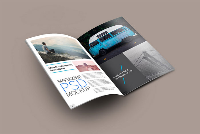
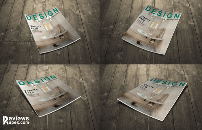
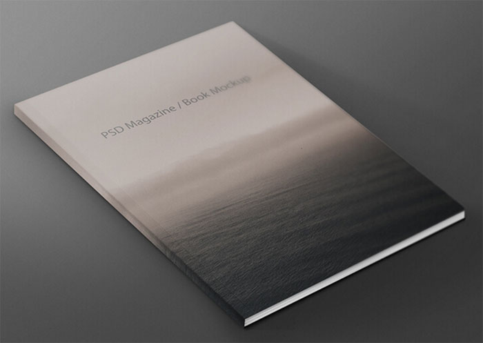
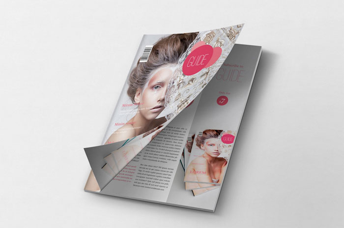
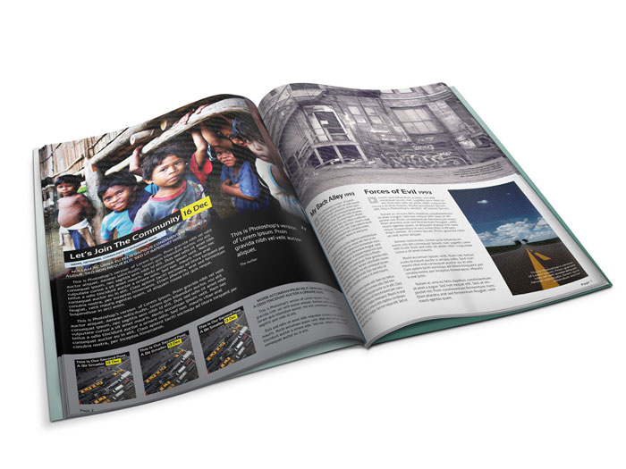

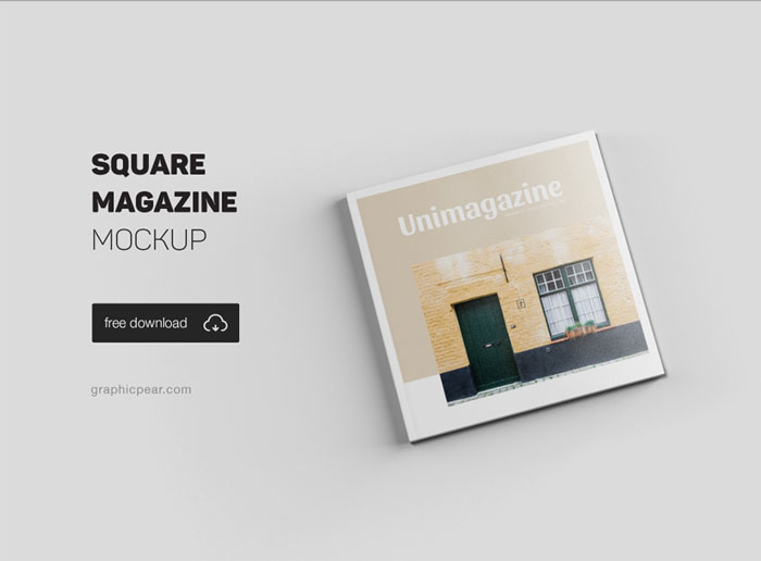
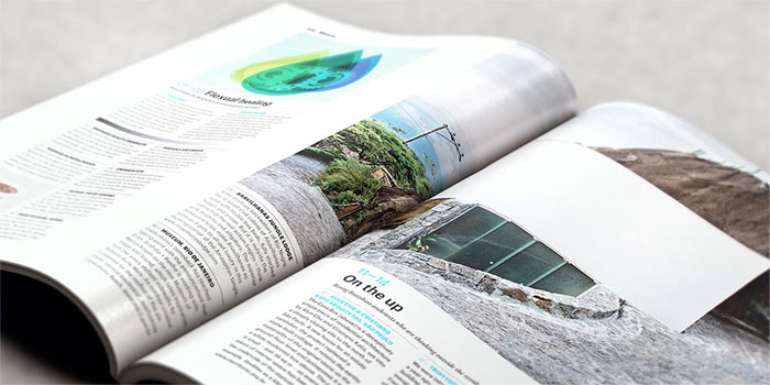
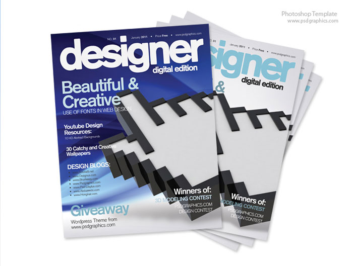
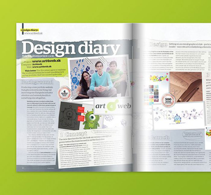
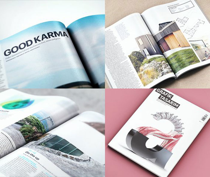
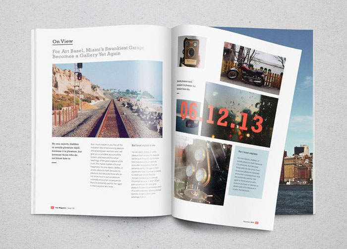
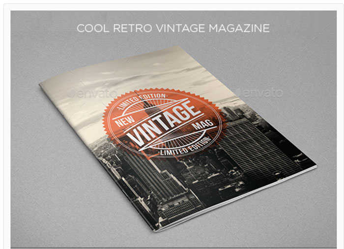
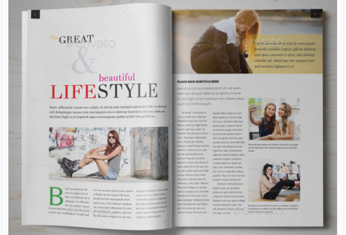
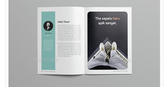
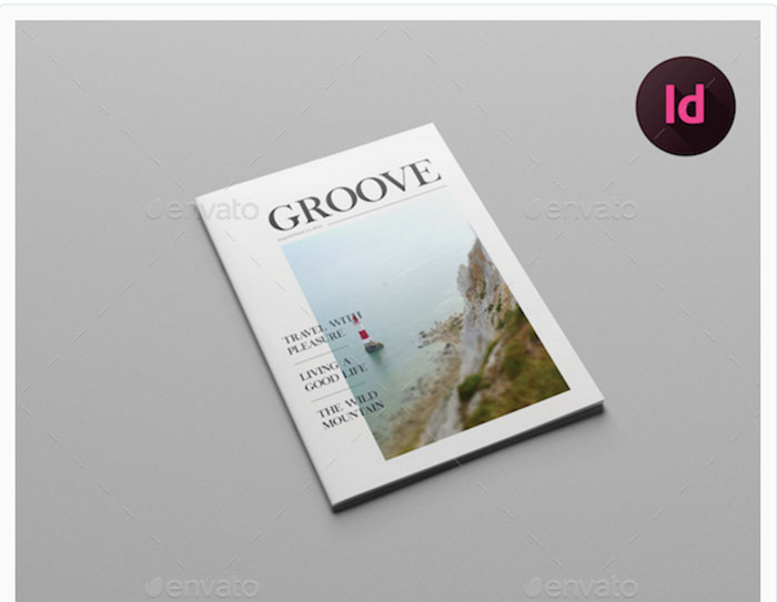
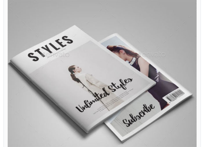
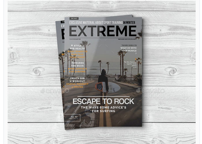
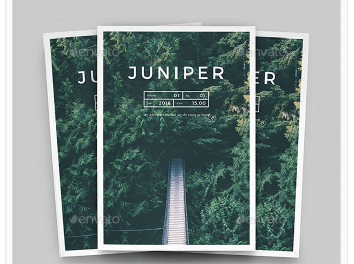
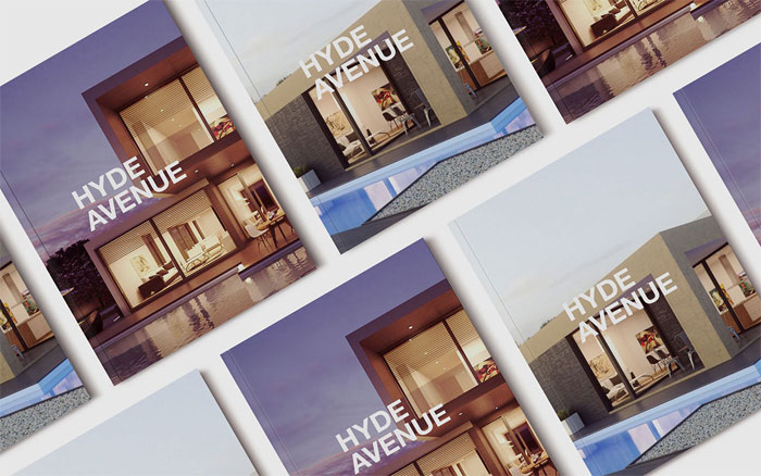
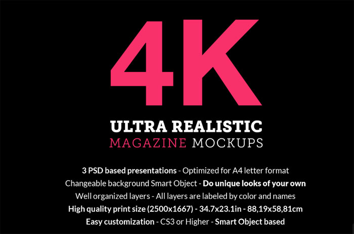
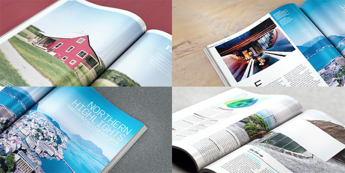
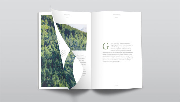
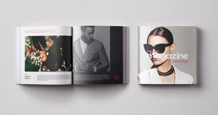
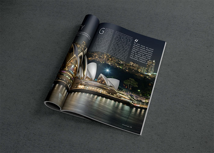
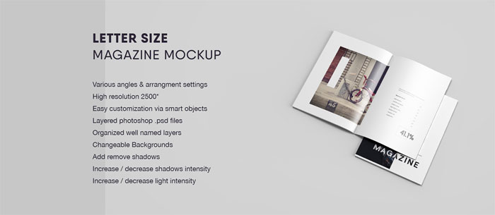
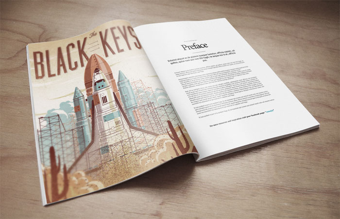
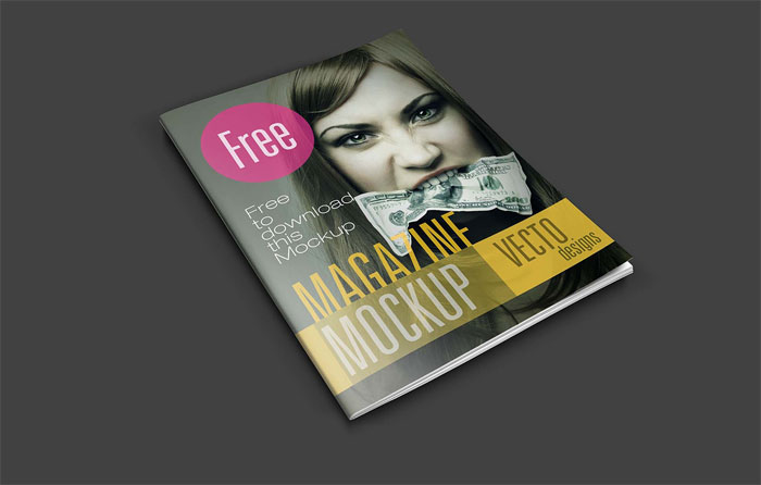
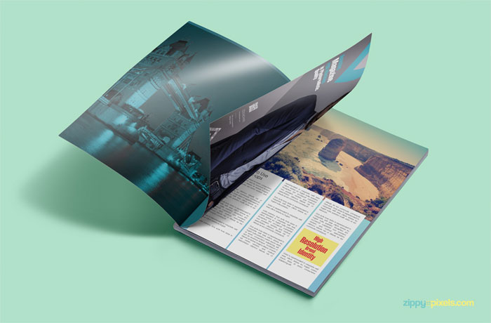
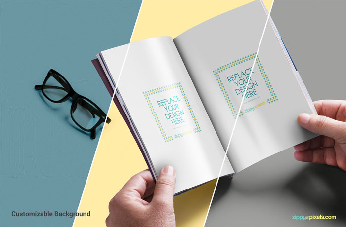

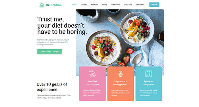
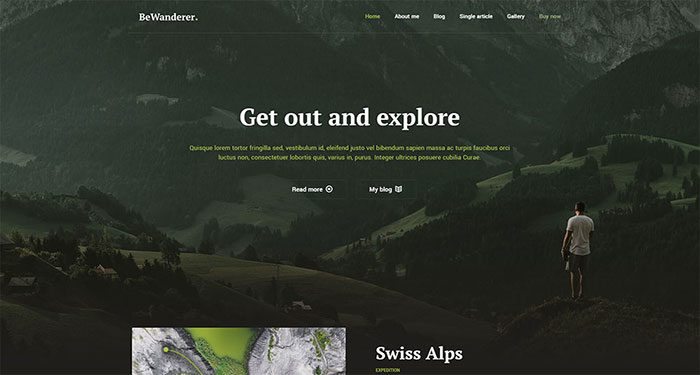
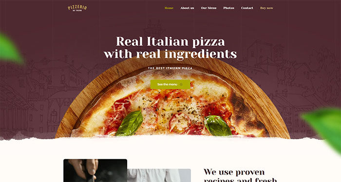
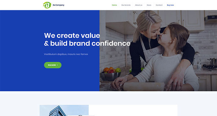
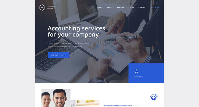
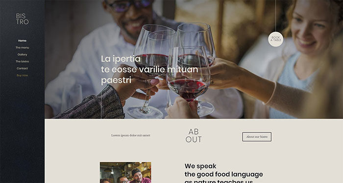
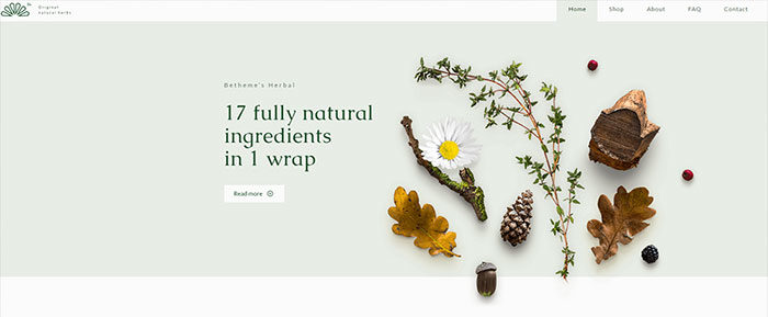
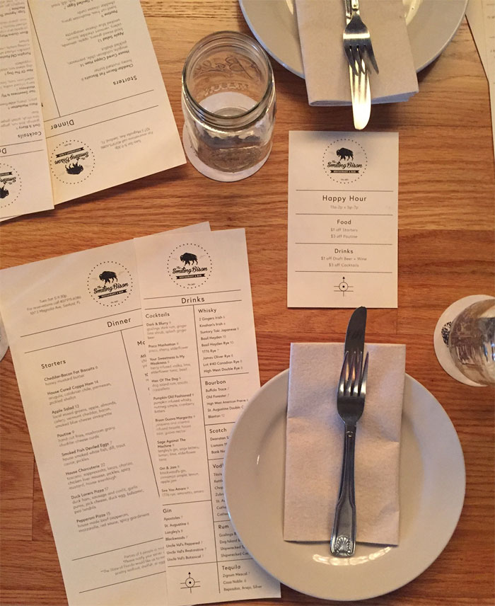
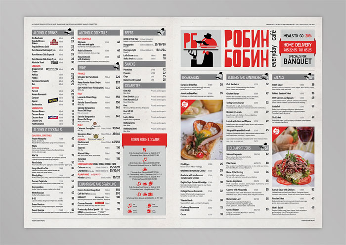
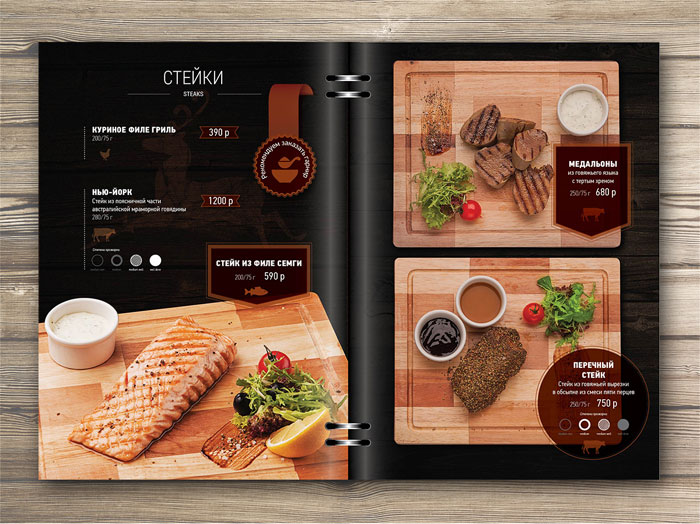
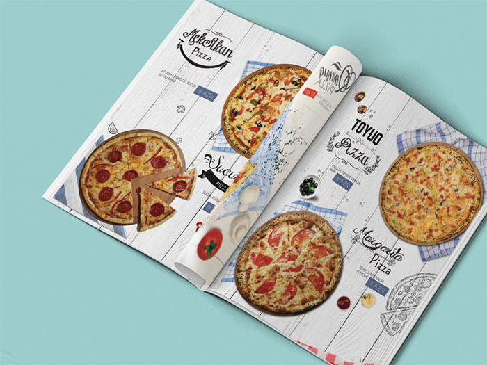
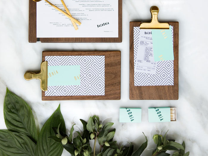
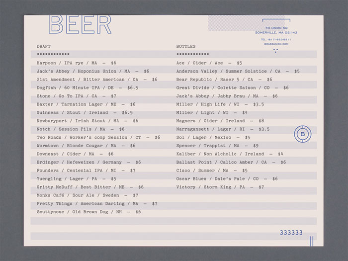
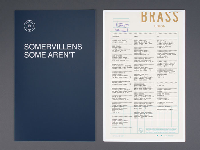
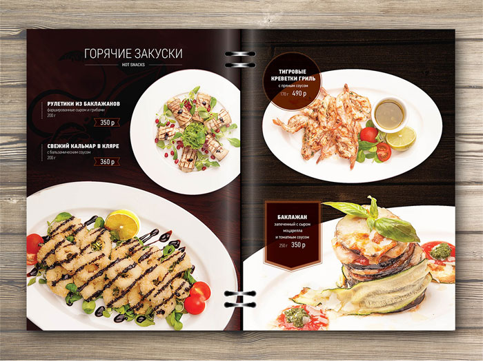
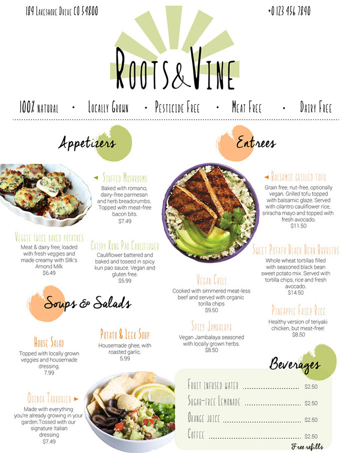
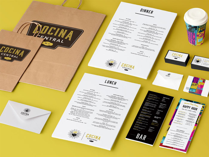
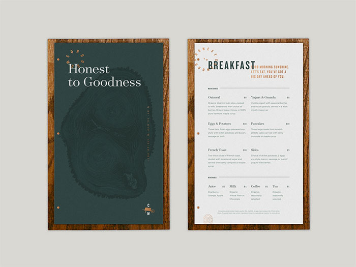
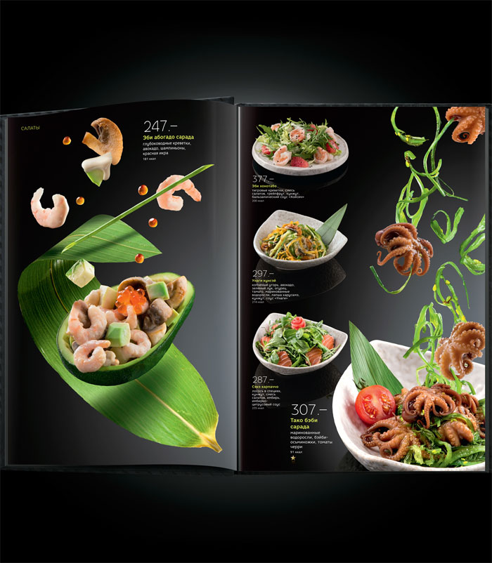
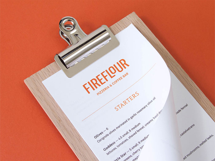
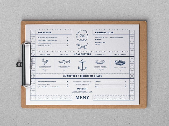
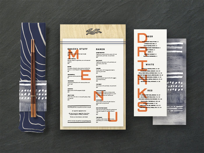
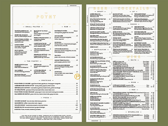
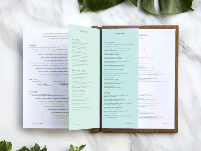
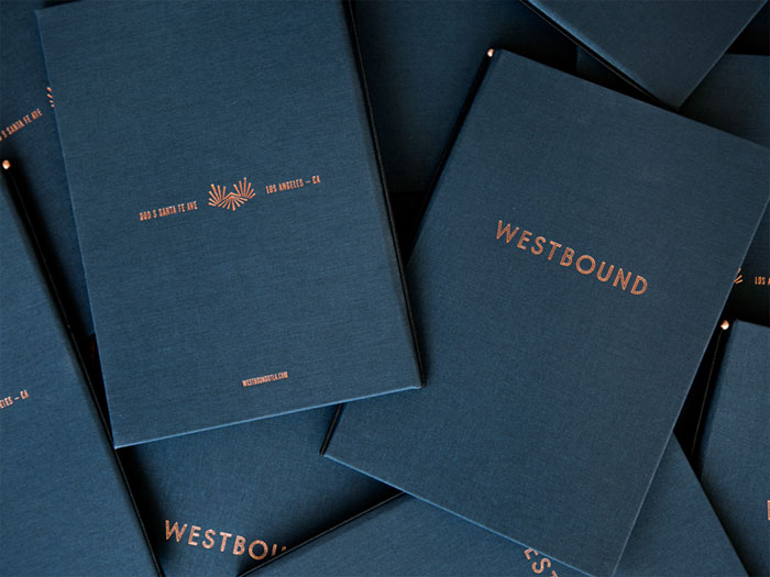
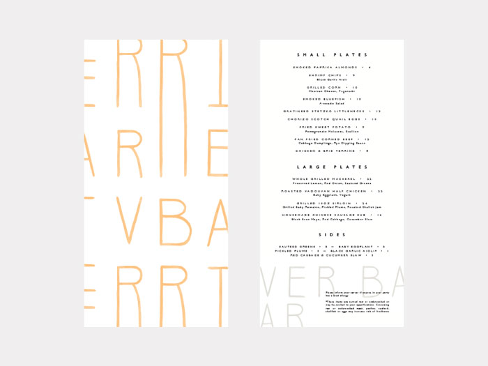
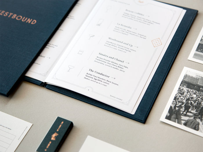
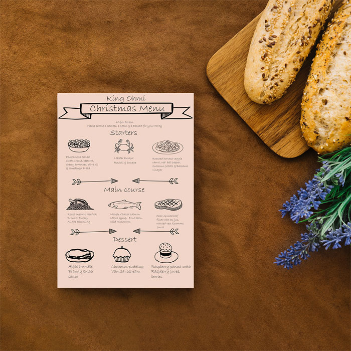
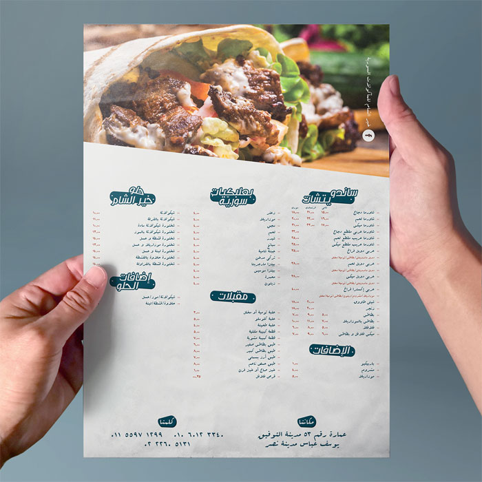
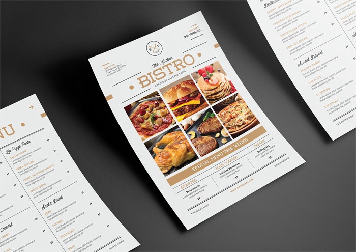
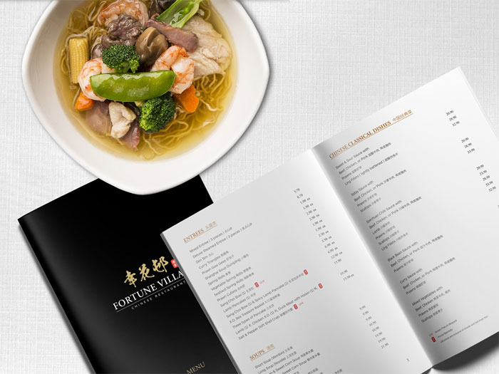
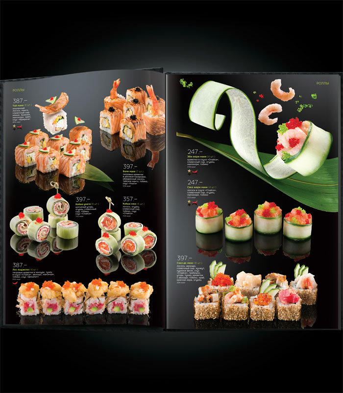
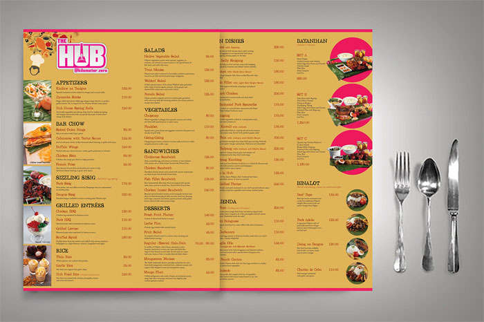
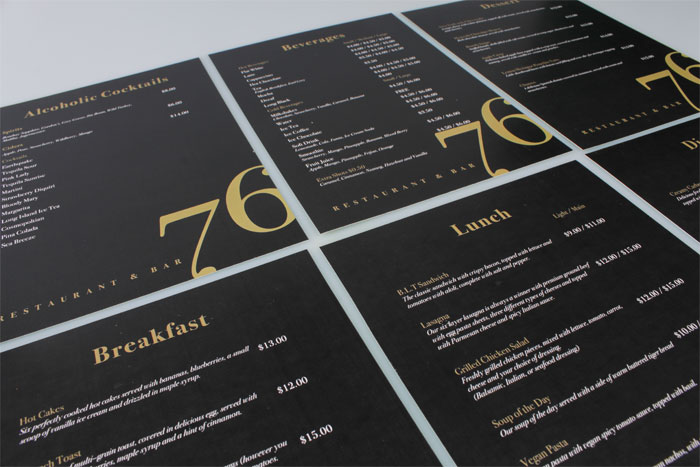
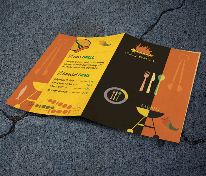
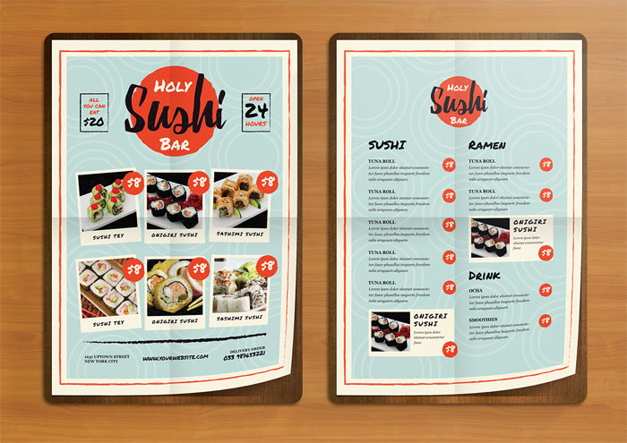
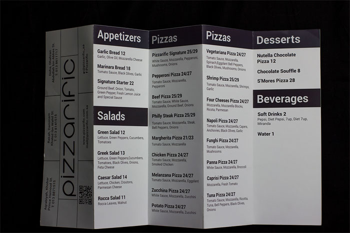
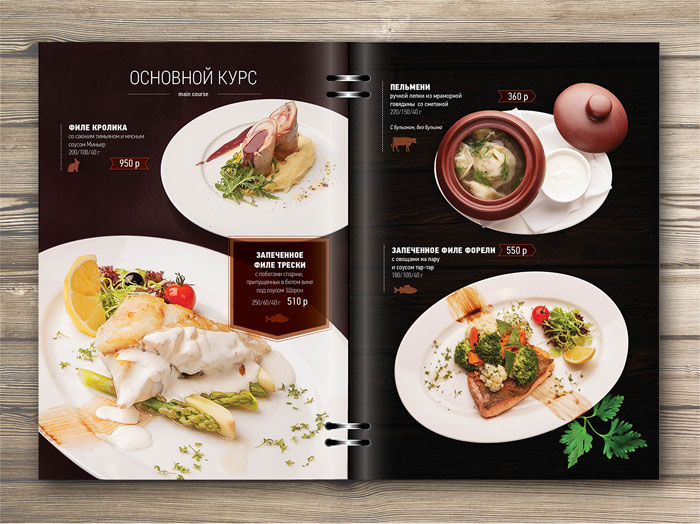

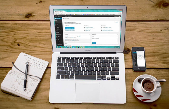


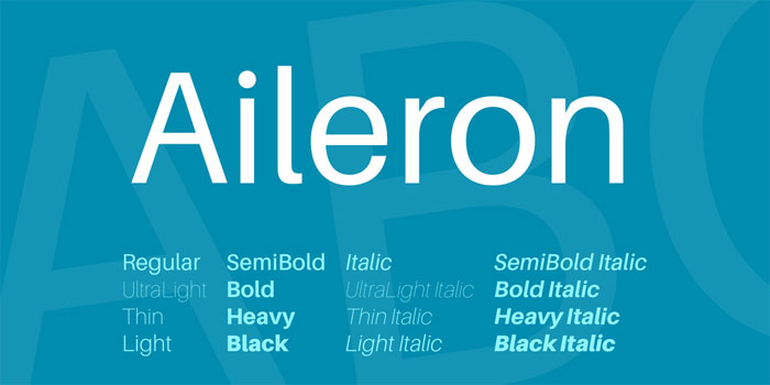
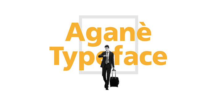
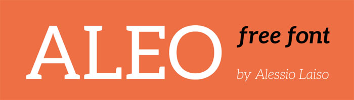
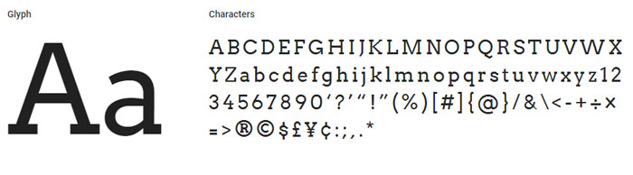
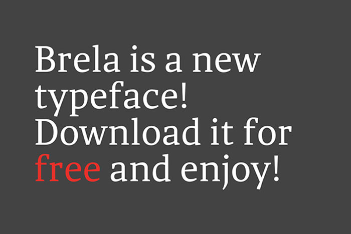

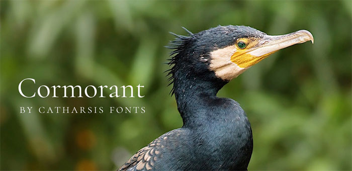
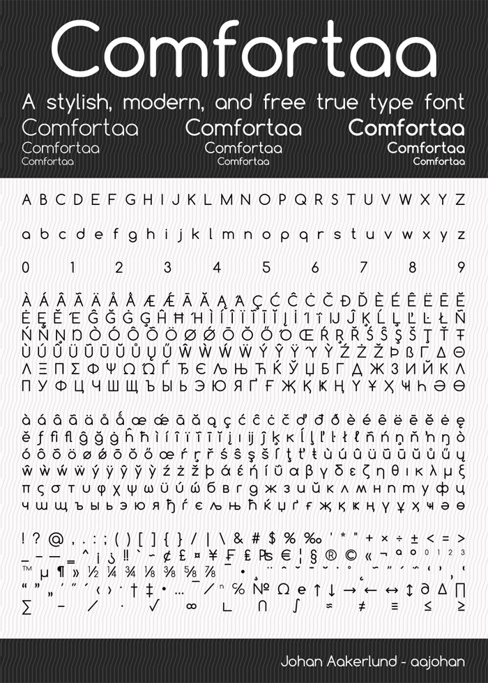
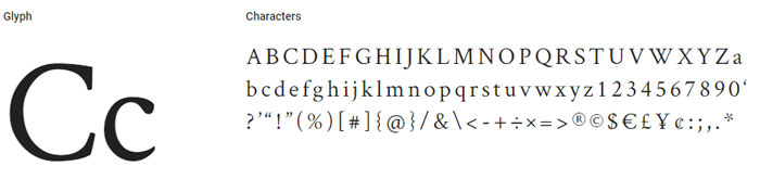
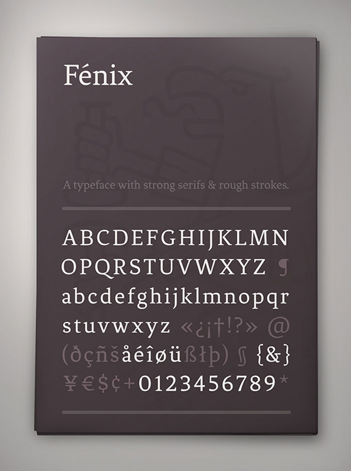
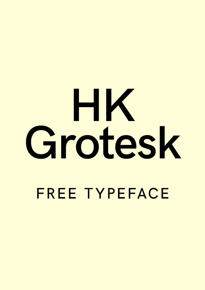
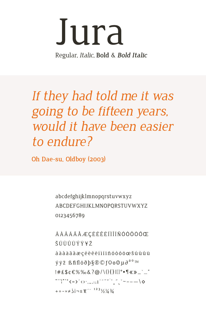
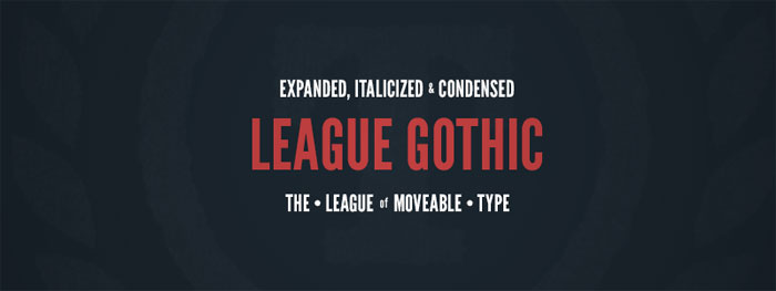
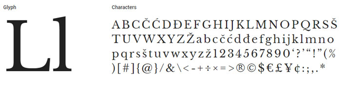
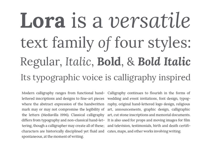
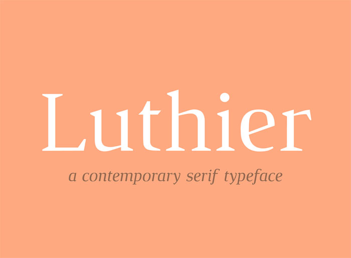
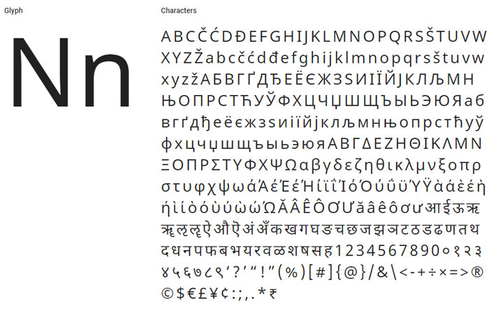
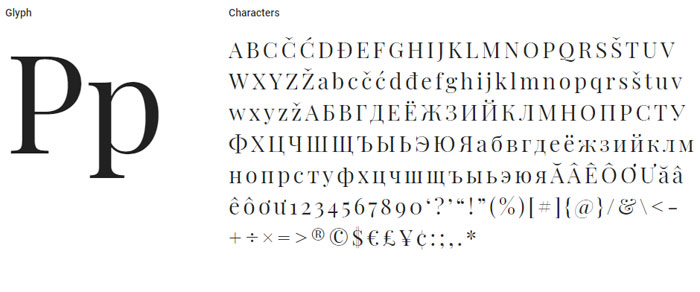

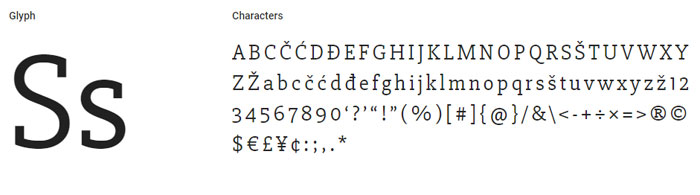
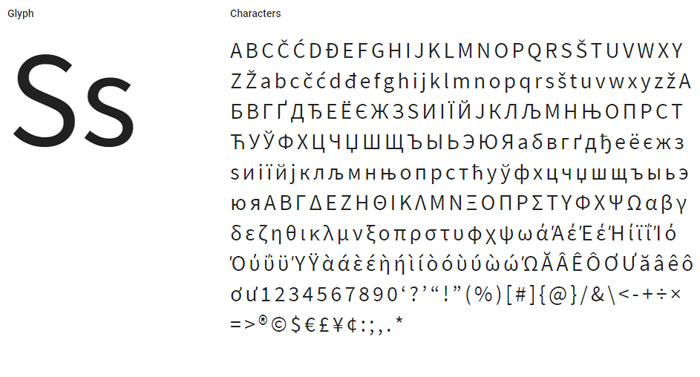
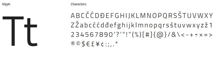
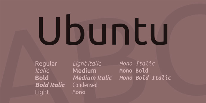
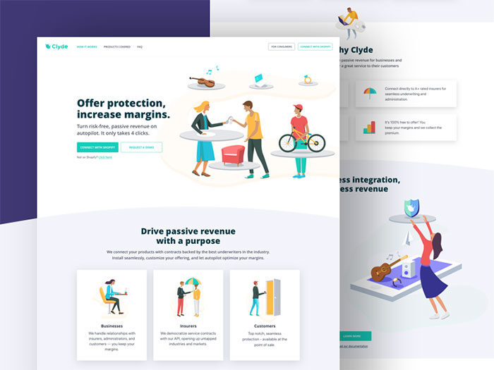
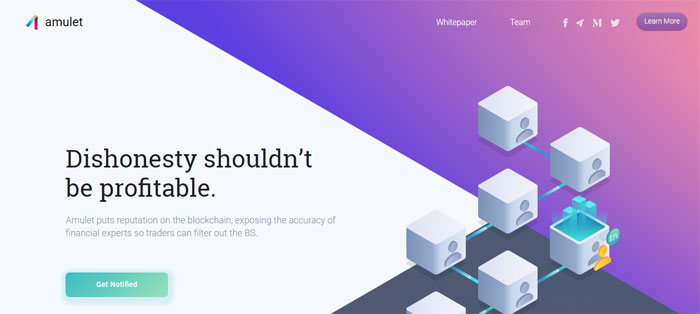

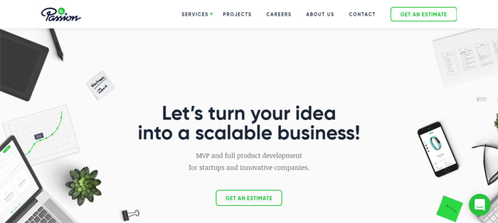
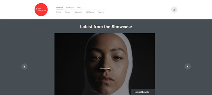
 RSS Feed
