Face cards are something that we take for granted. The playing card design is something that we never look too much at. However, when we see one that is well designed, we are pleasantly surprised. We can find design inspiration everywhere we turn, readily available to transform into a master piece. The commercials we see, the cars we drive, the cinema posters of long awaited movies – they all have a design lesson to teach, and if we give them a second look, we may come up with our own ideas. In this occasion, we will discuss playing cards. A standard deck of cards is to be found in nearly any American household, which takes us to the subject of playing card designs being taken for granted. Yet, the fact we don’t appreciate the ubiquitous playing card design doesn’t make it any less perfect, and doesn’t justify the fact we know nothing about it. Playing cards of today have inherited their looks from the French Renaissance cards. Their appeal was first interpreted in 1800, by a not so popular artist called John Cazenave. Cazenave was also the first playing card artist who inspired Charles Bartlett to improve his work and spread it among wider audiences around 1830. Two decades later, Philadelphian artist Samuel Hart took over the idea, and began printing playing cards in larger amounts. A historical overviewPlaying cards in many different shapes have been around ever since the 9th century, and can be traced to several regions in China. Their first appearance in Europe is usually connected to the 14th century. At this time, Europeans were designing two popular patterns: The French Parisian and the English Rouennais, the later being far more impactful on how playing cards look nowadays. It was also the French to have created the four standard card suits (spades, clubs, hearts, and diamonds). Originally, this concept belongs to the Italo-Spanish deck, where the suits were clubs, swords, coins, and cups. With time, the much simpler French design prevailed, as it was cheaper and easier to manufacture. It was no longer necessary to use the standard woodcut method, and numbers could be inserted with stamps, similarly to cards of today. Yet, the French deck court cards still needed woodcut illustrations. This already shows us the value of playing cards design – we see amazing graphics created specifically to be replicated in an affordable way. Playing cards observed from a different perspective
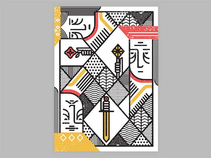
While playing, did you ever appreciate the design of playing cards? Most of us didn’t, and yet – we should have. Playing card designs are the role models of aesthetics balanced with usability, and that makes them almost perfect. In order to draw inspiration from playing cards, leave all knowledge aside, and look at them as if it was your first encounter. The symmetryWhen it comes to symmetry in design, there is no better example than playing cards. The basic principle has been wielded in a magnificent way, and there are two reasons for that. To start with, symmetry helps make cards more attractive, as the viewer’s brain finds symmetry very appealing, and relate it to both nature and art. More importantly, cards’ symmetry is functional, and prevents us from holding cards upside down. This may sound less important than it is, but think how it would be to play cards or pick them up without such functionality. 
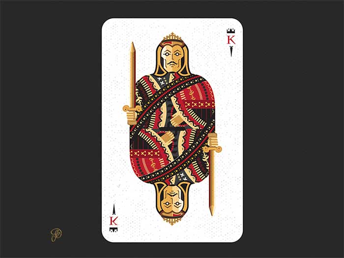
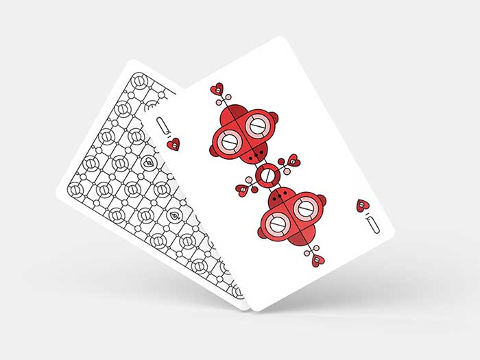
Numbered cards make this much simpler, but symmetry is still present (a reversed one, however). These cards are called court cards, or as modern users like to call them, face cards. In their original shape, court cards contained character illustrations in their first length. In order to improve them, mid-19th century designers thought of reversed symmetry. Face cards usabilitySymmetry, nonetheless, is not the only design hack artists came across while thinking how to improve cards. There are also other design characteristics that make cards functional, including the suit display with repeated icons that inform us on the card’s value. Such bonus indicators are even more valuable nowadays, when there is no typography to indicate the cards’ meaning. The playing cards with corner indices (numbers or letters) arrived in America around 1875. Thanks to the moderated design, players were able to hold the cards with a single hand, and were impressed by such usability. Prior to this advancement, Jack cards were usually called ‘Knaves’ or ‘Knights’, which prevented the letter ‘K’ from appearing to both cards. This is why they were renamed to Jack, and the players’ best interested was taken into account. The face cards’ Royal family
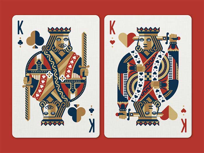
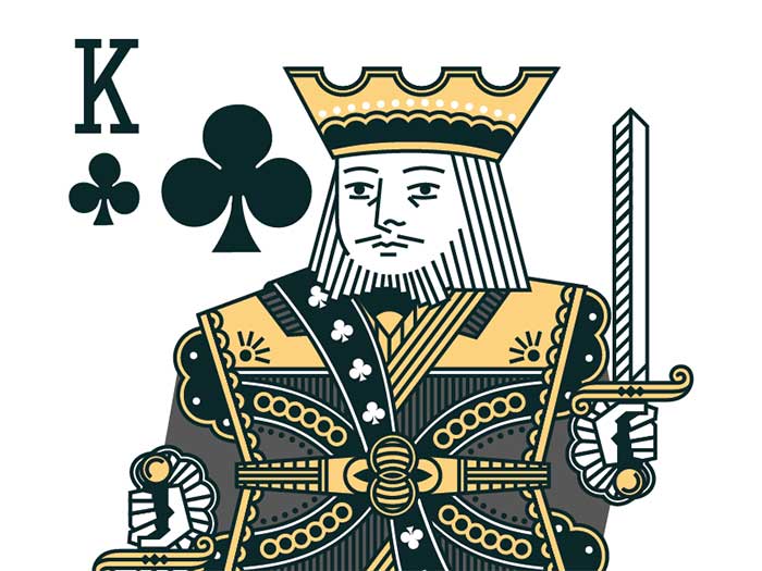
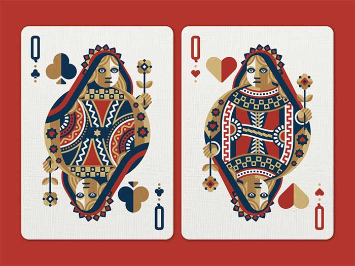
How many face cards are in deck of cards? Playing cards continued to evolve, and eventually caused the generic royal figures to take on particular personalities. Designers chose and ascribed a well-known royal figure to each face card – kings Charles, David, Julius Caesar, and Alexander the Great. As for the other face cards in a deck, there was the queen, namely Pallas, Rachel, Judith, and Argine; the Knaves/Jacks, respectively, La Hire, Ogier the Dane, Judas Maccabeus (Lanselot), and Hector. You may still come across an old deck with these names printed on the cards. However, the characters are not standardized in new decks. Interesting and intriguing facts
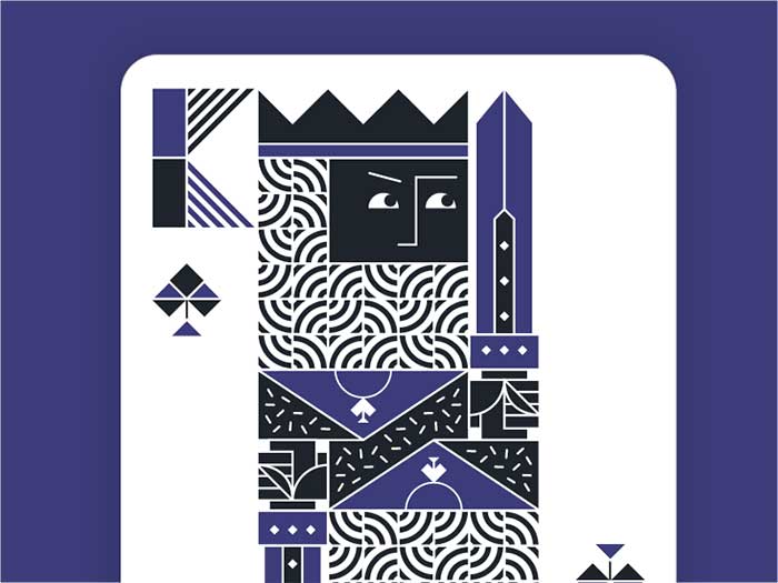
Not everything about face cards is known to the public. Taking a better look, you would notice that the King of Hearts doesn’t have a moustache, and he’s illustrated as if he was trying to kill himself! For some experts, this detail was used to illustrate the blurry and unresolved death of Charlemagne. Looking at the King of Diamonds, on the other hand, we’d see he holds an axe unlike other kings that hold a sword. All mysteries, however, can be explained with a very simple story. With playing cards being reprinted over and over again, the original artworks slowly lost its integrity. The King of Hearts no longer had a moustache. Also, the King of Diamonds is not the only one carrying an axe – now, this weapon is held by both red kings, while the sword is assigned to their black counterparts. Single-eye RoyalsAnother fact that attracts attention is that the King of Diamonds, Jack of Hearts, and Jack of Spades are all depicted as profiles, namely you can only see a single side of their faces. This is why they’re often called one-eyed royals or one-eyed Jacks. The remaining face cards royals are more front-facing, and you can see both of their eyes regardless of the direction where they’re looking. In certain games, these attributes have a special meaning. Last, but not least, there are only 4 face cards (all black) where the character is looking to the right. The remaining eight all look at the opposite direction. The Ace of SpadesIn many card games, the Ace of Spades has a special meaning. This rule was first introduced in the 15th century, while Kings were still considered to be the most valuable cards in a deck. The Ace, on the opposite, had the lowest value. Under the ruling of King James I of England, it was decided to give Ace of Spades insignia with a special law, to confirm the payment of taxes. As a result, many companies embraced Aces of Spades on their official logos, and many are still doing the same. At the beginning of 1860, the Ace of Spades lost its leadership thanks to games such as Joker. Joker was named after the German game ‘Jucker’. English face card designsThe English face card pattern is internationally accepted, and believed to originate from Rouen (France). We can trace it back to 1516, when cards showcased well-executed and highly credible images of elegant personas, whose heads are turned back over their shoulders, and we can only see their profiles. The same principle was used for the Jack of Hearts. Unfortunately, these designs didn’t make it through in their original form – the images were soon disfigured due to poorly informed and unskilled copiers, foremost English artisans to whom we own modern card designs. The bad copying distortionsHere are some interesting facts:
The 1800s updatesThe English playing cards design underwent many transformations during the 19th century, in particular the second and the third quarter.
Ending thoughts on face cardsThis article aims to help uninspired designers to give everyday objects a second look, and to think of them more creatively. Face cards are great examples, as there is plenty of logic and history behind each and every one of them. If you liked this article about face cards, you should check out these as well:
The post Face Cards: The Intricate Playing Card Designs appeared first on Design your way. from http://www.designyourway.net/blog/graphic-design/face-cards/
0 Comments
Are you in need of a few T-shirt design ideas? Cause there are some cool ones in this article. Ever since their rapid rise to popularity in the 1960s, t-shirts have been more than just clothing. They’re worn by everyone, and they’re pretty much the new billboards. They’re better than the old kind, because they’re mobile, and they give you the credibility of the approval of whoever wears them. They’re the perfect place if you want to get viral advertising and precious brand recognition. But, that only works if you have a good t-shirt design. A few key design considerationsThe base of your t-shirt is the shirt design that it displays. You want it to represent your brand, and you want it to stand out. That isn’t easy, as there are almost as many t-shirt designs as there are t-shirts. Here are four things you should consider if you want to design your own, or if you’re just looking at t-shirt design ideas.
… and 5 practical things to keep in mindIn addition to the theory, practicality is also required. There are limits to what a printer can do for your budget, and these limitations when you want to design a shirt are best addressed at the beginning. Here are a few of those technical considerations when you want to see how to design a t-shirt.
Sure, your definition on how to design t-shirts may be nothing more than your logo on a chest pocket. However, if you want it to stand out, you want to be creative and you need T-Shirt design ideas. Keep the technical limits in mind, and play with the design. Explore your concept and take your timeMake a sketch, go out for a walk. Make a few variations, eat something, and do a full brainstorming process. Afterwards, sleep on it. Then do it all over again. Sure, if it comes to you straight away, that’s amazing, but other options should be explored just in case. Imagine how it would look like on a shirtA design on screen and a printed piece can be vastly different. Mock it up on a photo of a model, even print it out if necessary and put it on an actual tee. Of course, your artwork should be created at actual size. Keep things simple, but don’t neglect detailsAttention to detail is something everyone appreciates. Seeing a well-executed masterpiece on a tee can look stunning, and you can study that for hours. However, some of the most classic, timeless designs have been dead simple, and the message is conveyed through the simplest form. Get in the middle, and delivering a successful design might prove to be a struggle. Consider your target marketThis is important. Who are you designing for? Male or female, young or old? You’re making something you want people to wear, and like any good marketer, you should write down who you want to attract to your design. Who they are, what other brands they like, what about them, everything, and start from there. Keep the humor subtleIf you want a humorous design, it shouldn’t come across as a low-cost joke shirt. Even some of the most successful loud, in your face designs have subtle humour. Color matters more than you thinkThe t-shirt color should be used effectively, and you should go for complementary colors. If you’re using Illustrator, turn on Global Colors – it’ll save you time and it’s a life saver. Halftones are also good if you have a restricted color palette. Properly prepare your artworkWhen screen printing, use CMYK colors – the printers will love you. Outlining text and expanding strokes are another thing they’ll love, and there are plenty of other tutorials regarding this, depending on whether you’re using Illustrator or Photoshop. Find a good printerEven though your design is finished and prepared properly, the tee is only as good as the printer. Give it to a reputable company, or give your local guys a call, but taking time to learn about the type of tee you’ll be printing on is important. Sizes, weight, labeling options, cost etc., they’re all things that affect the final product. Sure, this takes a while, but you should end up with a company that wants to treat your tee as an end product, and they’ll handle your work carefully. Educate yourselfIf you want a good understanding of basically anything, studying and understanding its context is important, and that is also the case for tees. They’ve come out of every subculture ever, from skateboarders, street art, general pop culture etc. This is where T-Shirt design ideas play an important role. Stay ahead of the gameInspire yourself with the latest trends, but don’t copy them. By the time you’ve seen that t-shirt already produced, designers are already moving on to something else and you won’t know it. Use PMS colorsYou might be used to CMYK and RGB, but for accurate colors using a silk screener, go with PMS colors. Color separations are both easier and more accurate here as well. The printer shouldn’t charge you extra for color matching, as you’re actually doing them a favour by being more particular with your colors. Convert your text to outlinesYour artwork may require a custom designed font, and when you’re sending it off for print, a substituted font is the last thing you want to see. If you convert the text to outlines, regardless of the computer where the artwork is opened, the text will be shown as an image, thus eliminating the need for any substitutions. Your artwork should be created at actual sizeThe printer’s judgement isn’t something to trust without discussing it with them. The vision you have of your end product might not match with what your printer has assumed is your vision. The safest way to defend yourself is actually creating the artwork in its final size. If you don’t know what size you want to use, get a ruler and slap it to the shirt you have on you. It may sound dead simple, but it does work. Use vector art as often as possibleThis isn’t an argument about vector and raster, but a suggestion to go with vector as often as possible. Color separations are much easier, and the small details will be much cleaner when printed. This is also a general rule for everyday jobs, but shouldn’t be an automatic in all situations. Expand the strokesIf your colors are properly set to PMS swatches, the color separations software shouldn’t have any problems. This is more often a human error that happens because strokes might be overlooked. Half-tones should be set with PMS colorsSometimes your budget, or design, may require halftones to save on how many colors are printed. The best way to achieve this is to slide that color scale down, to a percentage of the PMS color, thus leaving the color separations software to handle the rest. A few tips on creating an inspiring t-shirt designMake it feel comfortableBefore you even think about the design, make sure the shirt is comfortable. Choosing a material that is cheap and uncomfortable will result in people buying the shirt but not wearing it. Do you want your customers to think that you’re low grade, or high-quality? Your base shirt should be something that customers want to wear over and over again. Choose a color schemeNext, review your color palette, and come up with the right hue. Darker colors are usually more expensive to print, and certain colors may have limited availability. Common colors may include black, white and grey, and red and navy are also good choices. Picking well-known colors may be good for appealing to your target audience, you shouldn’t be neglecting your brand’s color scheme. Keeping the number of colors down is another thing to try, as complex color patterns aren’t only more expensive, but they may not appeal to your audience’s taste either. Reduce, and then reduce some moreFor a screen printed design, less colors can keep prices low. If the artwork is complex, or has too many colors, ask for a digital print, that should net better results. You should also identify the custom ink colors in order for the printers to be able to match it. As mentioned above, use the Pantone Matching System. Expand and outlineForgetting to outline your elements is a big mistake. As mentioned earlier, not every computer will have the font you chose, so outlining it is a good option. Outline all your objects, and expand the borders and strokes for things to remain proportional. Make a mock-upThis is the key to a beautiful shirt. Once your design is done, print it and hold it up to a t-shirt. It should look at the scale of your design, so you know whether or not it works on a t-shirt. If you have someone holding it up on their chest, several feet away from you, can you still make out the images, as well as read the words? You should know what works and what doesn’t before you even think about printing it on the t-shirts. Ask for helpAt the end of the day, if you’re having problems, the screen printing company undoubtedly has designers, and you can go ahead and ask them to give you an engaging design from your rough sketches. They may also offer help when you’re choosing colors, as well as offer some additional tips. Ending thoughts on T-Shirt design ideasT-shirts are a key part of any casual ensemble at work, and they’ve been ‘in vogue’ for around half a century. They’re an easy and quick option, and they are also a great way to get noticed. When you look at them from a business standpoint, a great t-shirt design is a great advertisement, since you can turn customers into a walking billboard for your company. If you liked this article with T-Shirt design ideas, you should check out these as well:
The post T-Shirt Design Ideas That Will Inspire You to Design a T-Shirt appeared first on Design your way. from http://www.designyourway.net/blog/graphic-design/t-shirt-design-ideas/ Have you ever thought about the UI designer salary you could get if you’d be in this field? How much does a UI designer make anyway? As key members of a software development team, user interface designers are responsible for creating and arranging a software’s user interface. For many software users, this is the only part of the program they will ever see and interact with. It’s an incredibly important element of software design. Sometimes user interface designers are hired under titles like user experience (abbreviated as UX) designer or user interaction designer. Regardless of the title, a user interface designer has the same duties and responsibilities. Some companies and organization may have slightly different expectations for specific competencies like programming languages or understanding of particular software packages. The job is almost entirely mental office work and most user interface designers are employed full time—though, like all software designers, a user interface designer may end up putting in a lot of overtime as deadlines and due dates start looming. A user interface designer should understand the entire software development cycle, as well as be an excellent programmer. Most employers expect a user interface designer to have a bachelor’s degree in relevant fields like human-computer interactions, graphic design, or other information technology related degrees. Other proficiencies will depend upon the position and employer. Like other positions in the IT industry, the average UI designer salary has gotten large due to the development of the internet industry around the world. With the importance of user interfaces and the high education requirements needed from a user interface designer, how much does a UI designer make? Should you invest time, money, and energy into the field? How important to a UI/UX designer salary are updated skillsets? Does experience level make any difference to user interface designer salary? What is the Average UI Designer Salary?You can expect the annual UI designer salary to be between $84,500 and $95,000. What’s particularly interesting about working as a user interface designer is that it is a profession that ranks quite highly for work-life balance. In Forbes’ article “29 Best Jobs for Work-Life Balance”, user interface designer and user experience designer rank at 5th and 2nd respectively. User interface design is an excellent profession to pursue if you are looking for a high salary while maintaining a nice balance between work and personal life. What Difference Does Experience Make For User Interface Design Salary?Quite a bit. A junior UI designer salary is normally about $40k to $60k a year. The exact number will depend in your education level and any related experience may you have. Job satisfaction rates fairly high among junior user interface designers. Women slightly outnumber men at this level. It can be hard to start at the bottom and work your way up, but take comfort in knowing it’s a satisfying job and there are plenty of opportunities after all your hard work. With work and time, you’ll find your footing and start earning more. The senior UI designer salary is often six figures. Major tech hubs and larger cities have more competition for user interface designer positions. However, there are still plenty of opportunities (and good user interface designer salaries) to be found in other locations. What Companies Need User Interface Designers and What Do They Pay?On Glassdoor it says that the average salary for user interface designers in the United States is approximately $85,000. $57k is on the low end of the pay scale and $121k is on the high end. For large companies like Google, a user interface designer can expect to make $112,000 a year. The average at PayPal is a little less, coming in at about $93k a year. Apple, as you might imagine, pays quite a large salary to great user interface designers, around $123k per year. Social platforms also pay a pretty large annual UI designer salary. User interface designers at LinkedIn earn $116,000 a year on average. Twitter offers from $104,664 to $116,501 per year. YouTube is quite similar. Facebook offers a smaller UI/UX designer salary, around $85,000 a year. Microsoft is one of several companies that outsource their user interface design to freelancers. Freelance user interface designers work on contract, normally at hourly rates. Most freelance user interface designers working for Microsoft can expect $43 an hour. Indeed.com states that freelance designers in general have yearly earnings of about $59k. Does the Country Matter For User Interface Designer Salary?Yes, though more experienced user interface designers notice less of a difference. There’s a lot of evidence that user interface designers make less in the UK than in the United States. Glassdoor lists the average starting annual salary for junior user interface designers at an average of $53k (in U.S. dollars). Junior user interface designers tend to start at $27k at the low end. Senior user interface design salaries in the UK can be as much as $200k a year. Canadian user interface designers also tend to make less on average than their counterparts in the United States. For Canadian user interface designers with 1-3 years of experience, $57k is the average salary. However, for those user interface designers with five or more years of experience, Canadian user interface designer salaries are very similar to user interface designers in the United States. At the very top, though, senior directors and designers make more in United States. For Asia, user interface designers make about $60,000 in Singapore dollars a year. Starting out in a junior or mid-level research position will net you $3,500 to $5,500 a month. At the top level in Asia, a user interface designer can expect $10,000 to $15,000 monthly. Australian user interface designers will find a sharp increase in annual salary rises very sharply within the first 5 to 10 years. More experience does not seem to make a significant impact on user interface designer annual salaries in the region. While Northern European countries tend to have higher user interface designer salaries, anyone looking to work there should also keep in mind their cost of living and annual GDP as well. Some general takeaway about UI/UX designer salary differences, regional and otherwise:
Are In-House or Agency UI Designer Salaries Better?In-house user interface designers typically make more money than those who work for design agencies. However, competition for these positions is often quite fierce. There are a lot of people looking to take them and the higher salaries. Many of these user interface designer positions are located in major cities where large tech companies operate, so consider cost of living when you’re thinking about applying to these jobs. If you’re looking for one of these in-house positions, you need to be on the top of your user interface design game. With that in mind, you might be asking… What Helps a User Interface Designer Make More Money?You can do things to help yourself make more money as a user interface designer. The first thing you need to do is master basic UI/UX design skills for the job you want. You should be skilled in the use of prototyping and wireframing tools like Axure, Mockplus, Proto.io, and Sketch. Photoshop or Sketch skills are a good idea, as well, so you can draw out wireframe models to help out the development engineers. Be able to use these applications well and easily. Understand how all their tools work and know the shortcuts to get the results you want quickly so you don’t waste time. Make sure you understand basic UI principles. User interface is perhaps one of the most studied fields of IT design, since it has so much to do with whether to not a product succeeds. Take a look at some of the more academic information out there about what foes into effective user interface design. Look for case studies that talk about both successes and failures. Understand how the human eye and brain work together to process information. And, of course, make sure you stay up to date! As with all other aspects of the IT industry, user interface design is a constantly evolving field. Keeping yourself up to date on the most recent trends and tech developments is a must if you want to succeed and make more money. Take look at the blogs, websites, and work of other user interface designers who have succeeded in the field to get a look at their inspiration and creative processes. See if technology developments can inspire you to create fresh new user interface designs. Stay ahead of the user interface design curve as best you can, since this will give you a competitive edge. Take a look at the recruitment requirements for your dream job. Note both the general and more specific requirements. You may find that you need to learn new programming languages or get a new certification. These additional requirements will require the investment of at least a little time and possibly an investment of money. These things are usually broadly applicable, so even if you don’t get the job you’re looking at, you will probably be able to use them for another position. It’s smart to always keep learning new user interface design skills, even if you’re not looking for another job. Build your user interface design portfolio up. Show off what you have done and what you can do. Pick work for your portfolio that stands out and reflects your own design processes. It should demonstrate why you should be the UI designer the company hires instead of someone else. Make sure all the images you use for your portfolio, especially if it’s on your website, load properly and are high resolution so potential employers or clients can see their details clearly. Include a nice diversity of the designs you’ve worked on, from traditional to trendy. Make sure to highlight your very successful designs if you have any. Make sure to keep your LinkedIn profile updated. A lot of companies who work in IT used LinkedIn for their recruiting. It’s a great resource to show what you’ve done and what skills you have. If you want recruiters to see you, make sure you allow your profile to show up on searches. If you have 500 connections, you’re more likely to show up in those searches. Make sure your connections endorse your skills for even better results. If you’ve made the UI designer salary a priority, you may find that you have to move to where the job is. Decide whether or not you really want to make that leap. Many companies are very happy to have candidates who are willing relocate, possibly several time in only a few years. The changing field of IT may land you in some interesting places, especially as laws and the industry evolve. If you are ready to pack your bags on a regular basis, make sure you let potential employers know. Last but far from least, work on your so-called ‘soft skills’. Communication, cooperation, and organization count for a lot in a team environment. In-house user interface designers will be a part of a large team, as will UI designers who work for design agencies. These user interface designers will have to understand how to work with other in a professional way if they want to keep moving up. You can be a very skilled user interface designer, but if you don’t have good soft skills, you will hit a ceiling. Your technical skills will only take you so far. Even if you plan on working as a freelancer, you will still need to learn how to communicate effectively with your clients. Ending thoughts on UI designer salaryA user interface designer salary is very impressive, especially for a job that so many people seem to enjoy. If you have the technical skills and the right interest in graphic design, see if it’s a profession you want to pursue. If you liked this article about UI designer salary, you should check out these as well:
The post UI Designer Salary: How Much Does A UI Designer Make appeared first on Design your way. from http://www.designyourway.net/blog/user-interface-design/ui-designer-salary/ Who thought that searching for the best iPad accessories was such a hard thing to do? It’s no secret that looking for a tablet nowadays presents you with a lot of options. However, Apple’s iPad reigns supreme, and comes with a world of possibilities, right out of the box. And, if you have the right set of iPad accessories, you can get things even further. As versatile as it is, the iPad can’t do everything. You might want to write on a real keyboard, or connect a camera, or stream audio to a stereo. Or, you might want a nice bag to carry it around and protect it. The built-in speakers are decent, but they aren’t going to blow you away. If you’re going to be listening to a lot of music, or watching a lot of movies, you’ll want to get yourself a pair of dedicated speakers for it. One of the best accessories for your iPad is a good pair of headphones. This lets you listen to your music, or watch your movies, and not disturb whoever is next to you. The ability to use Bluetooth instead of a wire is another great thing you could be taking advantage of. And, there’s also the plethora of other iPad accessories such as keyboards, keyboard cases and styluses you can use for drawing or writing on the iPad. The choice of iPad accessories is truly stunning. iPad accessories and gadgets that you should check outUSB Cable with Micro USB Connector2-in-1 cable, 8 pin lightning to USB cable with micro USB connector, widely compatible with your iPhone, iPad and android devices. 100% compatible with Apple devices and the newest iOS 9 system, transmit data stably and charge fast without warning message. 3.3 feet (1 meter) durable cable completely meet your needs, light-weight and not easily coiled. Premium USB 2.0 Type A to Micro-B with aluminum connector, ensure the high speed charging and data transmission. Provide fastest charging and data transferring speed to your devices. Sync media, pictures, and other files as you charge your micro USB compatible device or 8 pin lightning devices with this cable. Wireless Bluetooth Sport Headphone with Mic8mm Speakers combined with Bluetooth 4.1 create super accurate HD sound with powerful bass. The bullet-shaped Comply T-400 M memory foam tips provide Total Isolation from external noise. Easily stow your Earbuds by wearing them around your neck. Instantly access your Earphones anytime without searching your pockets. The patented winged earphone tips hold your Buds in place during rigorous workouts. Over- and Under-Ear fit options included. Say Goodbye to Water-Damage! Protected by Liquipel Nano Coating your Buds withstand sweaty workouts and will survive accidental dropping into water. Leather Case with Apple Pencil Holder By Capra LeatherBeautifully handcrafted, hand stitched iPad Pro case with an Apple pencil pocket. Fits Smart Keyboard or Smart Case attached. Full grain leather it has natural marks, making each case unique. Dedicated pocket for the Apple pencil. Hand cut from a single piece of leather, it enhances the authenticity of the leather and the durability. The stitching is made with the saddle technique, this case is 100% hand stitched. Every detail has been thoughtfully crafted to achieve the perfect balance between simplicity and elegance. Each Capra product is handmade with the finest full grain leather, top layer of the hide, maintaining the beautiful natural marks, making each product unique. The durable, attractive saddle stitching is done by hand, since no machine is strong or complex enough to handle the heavy waxed thread. Apple Pencil Charger DockIf you’re in the habit of charging your Pencil with the USB adapter and Lightning Cable, this sturdy, aluminum apple dock is a perfect addition to your workspace. Let your apple pencil stand and charge. Keep your Apple Pencil in easy reach and your desktop neat with MOOST Apple Pencil Charging Stand. This apple pencil charging dock holds your pencil vertically and fits around your charging cable nicely. It stops your cord from tangling up and keeps the Pencil in sight. A small notch holds the cap while the Pencil charges, so it won’t disappear on you. You can also use the apple pencil charger dock as a stand when you pause your workflow so you don’t set the pencil down and let it roll away. With Sturdy anodized aluminum construction, the Apple pencil stand’s solid base is weighted for optimum stability. Backlit Keyboard Case with Smart ConnectorDesigned to work with the Apple iPad Pro, this keyboard case connects to your tablet directly via the Apple Smart Connector. There’s no need to pair your device using Bluetooth, as this keyboard case is powered directly by the iPad. An extra row of shortcuts makes iOS functions accessible directly from the keyboard. You’ll be able to search the web, adjust screen brightness, and control volume levels with just the press of a button. Logitech Create is specially engineered for the 12.9” iPad Pro. This heavy-duty, lightweight keyboard case has full camera and headphone access and holes for the device’s four-speaker audio for optimal ease of use. Once you open the Logitech Create, your iPad Pro automatically wakes up. When the case is closed, the device instantly enters sleep mode. This preserves battery life, reducing energy consumption and extending device longevity. The overall surface of Create boasts a sleek, modern design that exudes a refined elegance. Its textured exterior prevents slipping on most surfaces. Targus Versavu Classic 360 Case for iPad AirAnother one of these iPad accessories is the Targus Versavu Classic 360 Case. It transforms how you interact with your device. Featuring a patented rotational stand, the case offers portrait and landscape viewing angles, as well as a low angle for typing. The durable shell protects your device from scratches and dust and the elegance of the design is apparent in everything from the topstitching to the stylus pocket. Stand rotates between portrait and landscape, all Ports accessible, stylus storage. Hard shell faux leather. Easy access to all ports. Digital Stereo Condenser MicrophoneWith an innovative mid-side architecture for clean, clear stereo sound, the MOTIV MV88 Digital Stereo Condenser Microphone directly connects to any Apple iPhone, iPod or iPad equipped with a Lightning connector to capture high-quality recordings on the go. The mid-side microphone element is mounted to a unique 90-degree hinge with built-in rotation that allows for highly flexible microphone position, even in video applications. Five built-in DSP preset modes (Speech, Singing, Flat, Acoustic Instrument, Loud) can be accessed via the Shure Plus MOTIV Recording App, a free download from the Apple App Store. The MOTIV app also allows for real-time adjustments including microphone gain, stereo width, and high-quality 24-bit/48 kHz recording for optimal results in virtually any environment. Shure-tested, all-metal construction provides confident performance in any environment. StilGut Pencil HolderDesigned especially for Apple Pencil. High-quality case made of genuine leather with a soft microfiber interior. Compatible with Apple 9,7” iPad Pro Couverture Cases by StilGut and other cases & covers on the market. Very elegant, ultra slim and lightweight holder. Luxurious and handcrafted material with detailed work for a perfect fit. Always on trend, yet classic and elegant, these Smartphone & Tablet Cases are available in a broad spectrum of colors and leathers. Native Union GRIPSTER Wrap for iPad Air 2Now you can grip, stand, protect and carry your iPad all with one stylish and lightweight case. Work or play, GRIPSTER is designed to multi-task as much as you do. Hold your iPad securely and comfortably with the elasticated rotating grip. With 8 lockable positions, you can adjust your screen’s orientation wherever you are. Quickly and simply position your iPad at any angle – landscape or portrait – with the adjustable, rotating stand; perfect for typing, gaming, watching and making video calls. Protect your screen with the 8-fold magnetic cover which can be neatly stowed away. Safely carry your iPad with the integrated handle. Universal Bluetooth Headset & 2200mAh Power BankYet another one of these iPad accessories is the GoChat. It is a Bluetooth headset & 2200mAh power bank in one. A perfect solution for those on-the-go, the GoChat Bluetooth headset offers 120 hours of talk time when charged with the on-board power bank. The GoChat is a perfect tool for those who communicate on-the-go. Whether in a car, at the airport, or simply taking your conversation outside, the GoChat is a unique device that not only lets you chat whereever, whenever, but it is also a charging source to power the headset or any other USB-enabled devices. Connects with up to two separate mobile devices perfect for personal and work mobile use. Ultra Slim Power BankThe true built-in cables power bank, T08 has Built-in 3 cables ,Lightning cable for Apple devices, Micro USB cable for Android devices, and Standard USB cable for recharging T08. Built in Lightning cable: applied for most Apple devices ,like Iphone 6 6S Plus 5S 5 Ipad pro 3 2 air etc. Built in Micro USB cable: applied for most Android devices,like Samsung Huawei LG Nexus Motorola VIVO,tablets and more. Built in standard USB cable for recharge the power bank. The fastest speed is 2.0A. There is also a Standard USB port for additional charging flexibility. Pass through technology, enable the power bank charges and discharge simultaneously. ensures the power bank is always topped up and ready to go. Twelve South SurfacePad for iPad AirSurfacePad for iPad is a luxury leather cover, a hands-free, multi-angle viewing stand and a typing wedge rolled into an impressively-thin shield for iPad. The stylish, premium leather wrap protects both sides of iPad, without hiding or disguising iPad’s beautiful profile. The hardback front cover is lined with soft felt to protect your iPad screen. Flip open the cover, SurfacePad wakes up your iPad; close it and iPad goes to sleep. SurfacePad is available for iPad mini and iPad Air in Red Pop, Modern White and Jet Black. SurfacePad for iPad is a beautiful, smooth cover with a clean, modern design. Another clever feature built into SurfacePad for iPad is a small kickstand that turns this sleek cover into a typing wedge and desktop display. Flip down the kickstand, and – as with the hands-free viewing stand – a hidden row of magnets grabs the edge of your iPad. Logitech Bluetooth Easy-Switch K811 Keyboard for Mac, iPad, iPhoneA beautifully designed illuminated keyboard with one touch easy-switching between all your Apple devices. Logitech Easy-Switch Bluetooth technology allows you to instantly switch between typing an email on your Mac to taking notes on your iPad, to replying to a text on your iPhone and even controlling Apple TV. Simply press one button to toggle between your favorite Apple devices. With sharp, bright, illuminated keys, this keyboard lets you create and communicate more easily on more devices—even in the dark. One touch Easy-Switch from Mac to iPad or iPhone. Bright, easy to read keys with auto-adjusting illumination. Compact and slim with a real aluminum finish to complement your Mac. Familiar Mac keyboard layout. Easy recharging with a USB cable. Unique Logitech keycap design for quieter typing. Kitchen Tablet Mount StandThe iKross 2-in-1 Mountable Tablet Stand for 7 ~ 12 inch Tablets offers a fully adjustable, sturdy, and space saving solution for tablet viewing and easy operation. The heavy duty solid metal base make this mount perfect for any room in the house, office, workshop, or business. The kit comes with 2 wall / cabinet mounting brackets as well as sturdy stand-alone legs making it an ultra-versatile and multipurpose tablet holder that can be used just about anywhere. Suitable as a hands-free tablet holder when mounted on wall or cabinet or as a desktop tablet stand. 360 degree pivot joints with tension adjustable hex keys ensure the mount can be adjustable to the most comfortable preferred viewing angles available. The tablet holder has extra wide rubber holding pads to fit tablets with or without protective cases. For thinner tablets, a case is recommended for better grip and positioning. Bamboo iPad Cutting BoardBring the power and convenience of the iPad Air, iPad with Retina display, iPad 3rd Gen, iPad 2 & iPad mini or a tablet up to 9.5″ wide into the kitchen with the CTA Digital Knife Storage Bamboo Cutting Board with Screen Shield. Easily view recipes and watch how-to videos while cooking, or simply enjoy apps and music while preparing delicious meals. This durable and handsome cutting board is made of naturally strong and antibacterial bamboo, perfect for chopping, mincing and slicing. It features a specially designed groove to hold the iPad on the edge of the board and a removable clear screen shield to protect it from debris while chopping. Up to 8 knives can be stored inside the cutting board with storage slots on each side. Base dim: 15.56″H x 12.94″W x 0.75″D. Want more iPad accessories? Keep scrolling. Smart Bean Portable Bluetooth ReceiverSmart Bean is an ultra lightweight pod that gives Bluetooth connectivity to headphones and stereos with a touch of a button. A 3.5mm input connects to any auxiliary input, including headphones, your home stereo, or a car’s auxiliary input, creating a hands free experience seamlessly. Replaces the need for audio cables. Enable Bluetooth functionality on wired headphones, speakers, or in your car! Receives music from up to 30 feet away. No need for messy cables. Built-in Omni-direction Microphone for clear, hands-free calls. USB Travel Wall ChargerNow you can charge two electronic devices using just one plug! It’s easy, fast, and can maximize the charging efficiency, so your phone will be charged in half the time, thanks to its smart ID Technology! Because it’s small, lightweight and can easily fit in the palm of your hand, it’s perfect to take with you when travelling. The plug folds upward for safer carrying. It has a 24W/4.8A power capacity and a 100-240V input worldwide. It can charge phones, tablets, power banks or kindles. Fintie for Apple Pencil Cap HolderProtect your Apple Pencil with this Fintie Pencil Cap Holder at all times! The Pencil Cap Holder sports a simple and classy design.It holds your Apple Pencil cap snugly and attaches to body of the pencil and doesn’t get in the way. You’ll never waste time searching for the cap again when it comes time to charge your pencil. It offers an ideal way to protect your Apple Pencil wherever go. Made of silicone rubber, durable. Easy to install and use. Grips tightly to the body of your Apple Pencil so it will not fall off. The Cover for Apple Pencil protects Apple Pencil Cap against rolling off uneven surface and being lost. And the Pencil Nib Cover can fully protected your Apple Pencil Nib from any damage. The Lightning Cable Adapter Tether secures Apple lightning to Micro USB Adapter and protects lightning charging from being lose. Available in a variety of bright and fun colors. Wireless Color Photo PrinterThe SELPHY CP1200 wireless compact photo printer is so much fun to use, you’ll want to take it everywhere with you. Thanks to it’s compact design, optional battery and multiple ways to print wirelessly, you can print just about anywhere. But there is more to it than that. It’s actually fun to print with the CP1200. You can print on postcard size paper, label size, square, and even 8 small little stickers at a time. And before you print you can even dress up your photos with fun borders and effects. SELPHY Prints feature a clear overcoat that protect against dirt and even liquids! Dedicated WiFi button to easily connect to and print from your wireless network. AirPrint enabled! Print wirelessly and effortlessly from your compatible iPhone, iPad, or iPod touch. Each SELPHY ink and paper kit comes with exactly enough of each to print 18, 36, or 54 photos. If you liked this article about iPad accessories, you should check out these articles as well:
The post iPad Accessories You Should Get For Your Tablet appeared first on Design your way. from http://www.designyourway.net/blog/tech/ipad-accessories/ How to create a minimalist logo design? You would think it’s simple, but you still have to be careful not to create a logo that is just basic. Simplification and reduction is not a new trend – it has been around for more than a decade, present in all design facets from fine arts to interior design. The common name of these simplification processes is minimalism. Rather than a technical approach, minimalism is modern way of thinking that strips and unveils the core of the design subject. With minimalism in the front plan, all superfluous elements are brought down to bare essentials, so that an observer would not be distracted from the purpose of that design. As practical as it is, minimalism may as well be the leading design movement of the 20th and 21st century. At the same time, bringing elements down to bare essentials is a very difficult process, as it takes a while for a designer to appreciate the beneficial effects of simplicity. Is it really worth it? Let’s explore. Is simplicity everything there is to a minimalist design? Yes, but not necessarily. What makes the difference is the definition of minimalism you chose to follow:
Minimalism – meaningIn the simplest way possible, minimalism can be described as a deliberate lack of adornment and decoration in any design faucet. Minimalism helps designers make their work simpler and more functional, doing as little as to stripe back all elements that are not necessary. In such way, they manage to convey their brand’s message, and encourage potential users to accomplish the exact action they expect. By ‘minimalism’, we’re not referring to empty spaces and text-free schemes, nor do we encourage users to believe simplicity is the perfect solution. To come up with a masterpiece, you should think the way your audience does, and give them the elements they expect regardless of what the minimalist trends impose. People must find your information to be relevant and engaging, which means that content, should be purposeful, rather than short. Designers nowadays advise focusing on the message and the content and leaving all other elements aside. Minimalism, of course, will be tricky for first time users who often underestimate the difficulty of applying it. The digital revolution and rise of mobile devices gave minimalism its 5 minutes of fame, and many companies grabbed the moment to enable technology to change our lifestyles. A short overview on the history of minimalismQuality examples of minimalist design can be found in almost any art or architecture style and era. Going back to some of them, we’d understand the reasons why designers decided to come back to it. To examine the emergence of minimalism, we should look primarily to three historical periods:
Minimalism nowadaysThe essence of minimalism didn’t change much over the years, in particular if we exclude the influence of other design trends, and how it interacts with them. Basically, what makes minimalism refined nowadays is its implementation with card-style elements, full screen headers, and flat and video design. The core concepts, nonetheless, didn’t change at all. The same as their predecessors, talented designers work with simple black-and-white schemes, use blank spaces around central elements, and often avoid types other than sans serif. These may not be universally accepted rules of minimalist design, but they make it easier for us to identify minimalism when we see it, regardless of its origins. Designing like a pro – Tips & TricksWork around your goals, and make a plan. It comes without saying that a good design requires planning, but instead of rushing into the process, you should devote each and every element the attention it deserves. Walk in your audience’s shoes. Who is your design supposed to serve? How will you attract potential visitors? The process will likely be more complex than you think, and may require you to give up elements you thought were essential. Last, but not least, minimalism should be applied on each and every element, including colours, space, contrast, typography, hierarchy, and all other dominant visuals.
Is minimalism worth it?To foresee the benefits of applying minimalism in their design, flowers of this trend must learn to differ between ‘minimal’ and ‘simple’. In short, a blank or very basic form is not necessarily minimal. Minimalism as a way of lifeWe can only speak of minimalism as a design trend after the beginning of the 20th century, as it is when it started influencing art and technology. However, minimalism as a philosophy and way of life emerged way earlier, attributed to people who believe they can leave with the bare essentials, and remove everything that is not absolutely necessary. Minimalist typographyMinimalist designs use straightforward and crisp fonts, and avoid decorations as much as possible. Serifs and ornate solutions are not strictly forbidden, but their usage is very limited. Tips
Minimalist logo ideas and why you should consider themBlack and white minimalistic logosThe best minimal logos are black and white. This is why we recommend you to start your project using these colours, and then proceed with other coloured elements. If you have a logo that can’t work without several different colours, you may as well rethink its entire looks. Other elements to consider for an engaging and catchy minimalist logo are gradients and textures, but you should only think of those once the basic concept is completed. Experiment with SquigglesWhimsical design is another hot trend in recent years, and you can make it work for you by crafting a minimal squiggle for your minimalistic logo. Squiggles are, in fact, clusters of crooked lines, but they look so attractive that they easily become iconic parts of a brand’s identity, making it easy for viewers to focus on specific words in the logo. You can develop your own squiggle in many different ways, as for instance introducing a spiral line or any free-flowing shape. Squiggles are nice because they let you inject a bit of ‘yourself’ in plain and simplistic logos, as you’re basically drawing them by hand. Other popular ideas are stylish sketches and illustrated elements that would look breathtaking against a textured background. Craft your own logotypeIf not sure how your minimal logo should look, work around your brand’s name (even your own), and practice some creative lettering to create a beautiful logotype. The type should always be readable and friendly, but the style is not limited. You can get something trendy; something more customized, or even bend-and-twist letters in a vintage package. The better your minimalist logo turns out, the longer it will last! Keep in mind that a solid logotype will be used quite frequently, and applied pretty much everywhere your brand’s being mentioned Think retroAs we mentioned several times, minimalism is not a new trend. Instead, its popularity relies on its old glory and classic concepts, and that sets a mood you can use to design a funky and retro logo. How should a retro minimalist logo look? Most of the retro styles in minimalist design use simplified types and clean line, and surround text with a simple circle. Other details that can indicate this period are sketches and thin strokes. Once the basic sketch is ready, bring up sepia or neon tones for a distinct 80s vibe. This shouldn’t be a challenge, as you can pull off tricks and ideas from multiple eras, and revive a minimalist hit many have forgotten about. Work with geometric shapesThe trick in minimalism is to make people understand what you’re saying even without words, and geometric shapes are simply irreplaceable for the purpose. People will recognize them instantly, regardless of how you’ve chosen to combine them. Another important role of geometric shapes is to capture users’ attention, and to indicate the importance of a particular action about to be performed. This is how it works:
Function instead of formHere comes our cherry-on-the-cake advice – do not embellish your minimalist logo! A logo can look breathtaking even when it is simple, as long as it accomplishes the purpose it was created for – telling people who you are, and what you do. The moment you decide to adopt a minimalist strategy just because it is trendy, all of your efforts will be in vain. Instead, you should be experimenting with several different mock-ups and sketches to preselect the most beneficial ones. The key if flatness – a minimal logo is a logo everyone can understand and relate with, and a logo that can be read and memorized right away. Most of the time, this will mean giving up on all extras, and coming up with a truly manual and basic solution. The more you exercise, the more able you will be to depict the mistakes and inconsistencies in your work, and that’s a good place to start. Think of ways to streamline your minimalist logo design concept, and test the result of your work before you publish it. It will take timeThe less-is-more minimalist logo approach looks simple at first sight, but it takes a bunch of trials, errors, and wrong experiments to create a minimalist logo that works. If not sure, observe the work of successful designers and companies, and learn from their mistakes – nobody designed the ultimate minimalistic logo overnight. Ending thoughts on minimalist logo designsMinimalism didn’t, and may never go out of style. Trends appear and disappear all the time, but a minimalist logo will likely be able to work just fine with all of them (think of Nike’s Swoosh mark that didn’t change to this point). Simple and minimalist logo designs are easy to identify and remember, and viewers understand their purpose as soon as they see them. Designing simplistic logos, however, is an art that takes years to master, so pave the path for your creativity, and enjoy the process! If you liked this article with minimalist logos, you should check out these as well:
The post Minimalist logo designs: Inspirational showcase appeared first on Design your way. from http://www.designyourway.net/blog/graphic-design/minimalist-logo-designs/ Have you ever wondered what is graphic design? In this article we’ll look at the graphic design basics. Graphic design is, simply put, where the art of aesthetics and the science of communication meet. It puts an emphasis on visual communication by making use of a range of elements and various media in order to promote a specific message. Most of us may have given up on this when we originally started, because we maybe weren’t that good at drawing on paper. However, the tools that we have at our disposal now may help us overcome this. You can always benefit from learning graphic design as a marketer, even if you don’t really have a formal education. In that case, you enter the world of DIY education, where you have recommendations that revolve around “learn Illustrator and Photoshop”, or “read books about the graphic design basics”. And, sure, they may help, but balancing between learning the fundamentals, navigating the new tools, and trying to develop a personal style can be tough. Graphic design toolsA graphic designer’s responsibility is to arrange and use various graphic design elements on different types of media, anything from a poster to a website, and that’s often done with the use of graphics software programs.
If you’re a designer on a budget, investing in those tools might not be something you want to do, and you can get alternatives such as GIMP, Inkscape or Affinity Designer. The use of graphic designYou are actually exposed to the professional designers’ work every day. Anything from a stationery template, to a complex ad campaign starts its life with a designer and his application of the art and science behind his craft. Professional design is something that gets inside even in the most humdrum of places. For example, you would be surprised, but the Federal Highway Administration actually has detailed technical specs for all signs, and they’re all specified with precise rules such as the layout, spacing, and the typeface, or even the placement and angle of arrows. Creating beautiful design is actually much more than an inspiration, or an idea, and this is something that is absolutely in the basics of graphic design. You will need to know the graphic design basics if you are to succeed. You can spend years studying nuances, but there are a couple of basic graphic design tips that you should know before you start. Even amateurs who want to learn graphic design to maintain their personal blog can utilize these things for more professional pieces. And, if you aren’t looking at “graphic design for beginners”, but you’re instead someone who wants to make some money with this, you still must know them. It’s true that rules are made to be broken, but to break the graphic design basics, you must know them first. LineThe line is the first, and most basic element of any design. When you’re drawing, a line is the stroke of the pencil or pen. In graphic design, it’s any to points that are connected. They are useful for anything from dividing space, to drawing the eye to a certain location. For example, a magazine will use a line to separate headlines, side panels and content. ColorOne of the most obvious elements of design, color can either stand alone as a background, or it can be applied to other elements such as shapes, lines, typography or textures. It will both tell a story about the brand, and create a mood within the piece. And, every color says something different, so you can even use combinations to further alter that impression. ShapeRegardless of whether they’re geometric or organic, shapes add interest. They’re defined by boundaries, like color or lines, and are commonly used to emphasize one portion of the page. Ultimately, everything is in shape, and you must keep in mind how the shapes, or the elements of your design, are interacting. SpaceOne of the most misunderstood and commonly underutilized aspects, is negative space. Those blank spaces, regardless of whether they’re white or another color, add up to the overall image. Negative space can be used to create shapes, just like any other element. TypographyThis is perhaps the single most important part of web and graphic design. Just like the shapes, colors and textures, the font will tell your readers if you’re a playful food blog, or a serious online magazine. Sure, words are important, but their style is equally important too. ScalePlaying with the scale, or size, of your objects can both add interest and emphasis. If you have a symmetrical website where all ingredients are similarly sized, it’s boring. However, the amount of variation usually depends on the content within. Some subtle differences may suit professional content, but if you have a creative enterprise, go for bold ones. Emphasis and dominanceSure, you can talk about emphasizing one thing or the other, but the sheer element of emphasis has much more to do with a color, style or object trying to dominate another, for that heightened sense of contrast. All of this will be intriguing, and create a focal point. BalanceAs far as balance goes, there’s symmetry, and asymmetry. Most designers will opt for asymmetry, mostly due to the eye-catching nature, but you’ll find that symmetry also has its place. Every once in a while. HarmonyHarmony is the graphic design’s main goal. So yes, it’s important. When all the pieces of your design work together, you get harmony. You shouldn’t have anything that is superfluous, and a good design will always be just enough, but never too much. Before you write off the project as complete, make sure this is present. TexturesThinking about texture when that piece you’re working on is never going to be touched sounds funny, but a website and graphic design will often rely on the impression the texture makes. It gives the two-dimensional surface a three-dimensional appearance, and helps you build a truly immersive world. Even though not very popular a few years ago, textures are now very commonly used. They compete with, and often replace, single-colored backgrounds. Textures often look similar to solid background colors, but analyze them a bit closer, and you’ll find small, yet effective differences. Those texture styles will include anything from paper and concrete, to fabric and natural elements, put among smooth or flat colors. The textures can also range from being very subtle, to being pronounced. And, they’ll work with pretty much anything. Even if they don’t really seem important, they can have a huge impact on the website. Tips for learning graphic designKeep an ear to the groundAs a marketer, you know how much you can learn from influencers. Well, 49% of the people trust someone they know above anyone else for recommendations, and in this digital era, this very well includes influencers. Influencers are actually individuals that have an online presence which influences the target audience’s opinions and behaviors. They’re often willing to share the secrets to their success, and if you try to listen to them, as well as engage with them, you will find that you’re much more familiar with the online design world. This helps you stay on top of trends and discover inside tips from other experts. How to engage? Start talking to them on Twitter or Instagram. You can never know who could respond to your questions, and absolutely any positive connection only helps you learn more. If you follow along, and join the exchange, this will lead to you becoming a big part of a design community that will constantly support you. What should you do right now?Make a targeted list of influencers on Twitter, so you can see their insights without having to go through a sea of other profiles. If you have a HubSpot software, you can use the Social Monitoring tool for this. You should add a variety of influencers, from people who are well-known amongst designers, to those who inspire you personally. And, put a few whose work you don’t like. That might seem counter-intuitive, but it will help you figure out why exactly you don’t like it, and thus, help you figure out design. Collect work that inspires youOnce you’ve decided to learn the graphic design basics, you should begin building a catalog of sorts, of work you consider to be successful. This can be as simple as making a Pinterest board, or saving items to a folder on your PC or Mac. Just like that list of influencers, a catalog of work will help you figure out trends, both present and past, as you start recognizing patterns. You should also begin to understand your own interests and style preferences. For example, if you’re constantly saving infographics, you could start looking into resources to learn how to create some. Getting inspirationFamiliarize yourself with Behance and Dribbble. They will showcase a lot of high-quality work from leading designers, and these designers often give you insight into the design process. This is key when you start working on your own creations. Set aside some time in your day and review those sites. One way to make this and not have it impact your workload every day is to use Panda, an app that replaces the New Tab in Chrome, with a stream of content from various sources such as, you guessed it, Dribbble. Even though some might find it a bit distracting, this kind of app lets you find and save something you find eye-catching every time you open a new tab. Dissect the whole processOne of the key moments you may have is that point when you recognize that every icon, infographic or illustration you’ve ever seen is actually the product of someone’s mastering on how to combine lines and shapes. You can’t say that things like meshes in Illustrator don’t play a role, but when you look at the fundamentals, most of the designs are built up from the simplest of shapes. When you’re analyzing the whole process behind a design, you will begin to understand the pieces that are combined to produce that piece. Depending on your skill level, you may know some of the tools used, or which aspect was actually created first. But, that shouldn’t stop you, as examining a design’s construction lets you flex your creative muscles a bit. You will also most likely find that:
Free graphic design resourcesA quick way is to download some free PSD or vector resources, and start digging through the various layers so you can see how that object was constructed. Get specific with the online search queriesAt some point, you’ll hit an obstacle, and start thinking “Wow, how do I do that?”. Others have most likely wondered that exact same thing, and you can learn this from something as simple as a YouTube tutorial with some careful and active following along. The key? Being specific with your searches, so you find something that is truly relevant. For example, “how to create an icon” gives you really broad results. On the other hand, “how to create a flat icon with a lot of shadows”, is spot on. Don’t be afraid of getting feedbackEveryone is scared of criticism, at one level or another. You’re afraid that your ideas might get shot down, and you’ll be back to square one. You must learn to accept constructive criticism, regardless of how difficult it is, as it is paramount to becoming a better designer. Ending thoughts on this graphic design basics articleSure, there are hundreds of rules and principles when it comes to creating stunning designs, both on and off the web. Above you have some of the graphic design basics that will help you get on the right path to creating professional and beautiful designs. If you liked this article about graphic design basics, you should check out these articles as well:
The post Graphic Design Basics: Tips for Beginners appeared first on Design your way. from http://www.designyourway.net/blog/graphic-design/graphic-design-basics/ You should bookmark this article for when you need a carbon fiber texture for your design projects. But what is carbon fiber? Just like you may have thought, carbon fiber is, actually, fiber made of carbon. However, these fibers are nothing more than a base. What you’ll commonly see referred to as carbon fiber is actually a material that consists of extremely thin filaments of carbon atoms. When heat-bonded together with a plastic polymer resin, or by pressure, or in a vacuum, you get a very strong, and very lightweight material. Examples of carbon fiber texturesHigh Res Dark Carbon Fiber TextureCold Carbon TextureArt Carbon TextureNano Carbon TextureBlack Carbon TextureAbs Carbon TexturePSD Carbon TexturePhotoshop Carbon TextureColorful Carbon TexturePlain Carbon TextureAluminium Carbon TextureDesktop Carbon TextureColored Carbon Texture10 Free Vector Carbon Fiber patternsGrey and Black Carbon Fiber TextureCarbon Fiber BackgroundPsd Carbon Fiber Pattern BackgroundFree Seamless Carbon Fiber Texture7 Tileable Metal & Carbon Fiber TexturesDark metal mesh backgroundAbstract metallic backgroundCarbon fiber backgroundGraphic Carbon TextureTiled Carbon TextureCarbon Texture PackDark Carbon TexturesFibre Carbon TextureCold Carbon Wallpaper TextureSubtle Carbon Fiber Pattern for PhotoshopCarbon Fiber Photoshop PatternsThe materialLike a rattan chair, a beaver dam, or cloth, you’ll find that carbon fiber’s strength comes from the weave. You get a more durable composite when you use a more complex weave. Imagine a wire screen, that’s interwoven with another one, but at an angle, and another one at an angle that’s a bit different, and so on. Each wire in each screen is made of carbon fiber strands. Now, when you drench this mesh of screens in liquid plastic, and then heat them or press them until the material bonds together, you will find that the angle of the weave, and the resin that was used, determines the overall composite’s strength. Most commonly, the resin is epoxy, but you’ll also find polyurethane, thermoplastic, polyester or vinyl ester as well. And, as an alternative, you may cast a mold, and apply carbon fibers over it. The composite is then allowed to cure, often with a vacuum process. The mold is what is used to get the desired shape, and a seamless carbon fiber texture. This is the process that is preferred for forms that aren’t complicated, and needed on demand. The material actually has a fairly wide range of applications, mostly because it can be formed at various densities, and pretty much limitless shapes and sizes. You’ll often find it shaped into fabric, tubing, cloth, but you can also custom-form it into a number of composite parts and pieces. What are some common uses?
What are some of the more exotic uses?
Some might argue that carbon fiber’s possibilities are actually only limited by the manufacturer’s imagination, and demand. Therefore, you can now find carbon fiber in:
The basic carbon fiber textureBasic carbon fiber textures are actually very easy to create, and you’ll get that real carbon texture in no time. You can use this if you want to make a carbon fiber background, or just want that carbon fiber pattern for something. Now, you will find plenty of tutorials on the internet, so we won’t bother breaking new ground. The important thing is to pick up the basic principles that are used in the more advanced stages. The main things to keep an eye out for are:
Let’s start things off by making a 4×4 document in Adobe Photoshop. Now, create a new layout from a 2x4px selection of the background. On this layer, add a basic gradient. The gradient should run from the bottom, to the top, and go from black (#000000) at the bottom, to dark grey (#4f4f4f) at the top. This is the gradient we’ll use as the foundation for the carbon fiber, and this is where you can come back if you want to change the final product’s outcome. Next, take a 1x4px selection of the gradient layer, with the Rectangular Marquee tool, and make a new layer via cut. Set this second layer’s opacity to 92%. If you’re wondering why, we’ll be making extremely subtle variations in the grey-tones, in order to end up with a believable light source. Obviously, there is no true light source, and we can’t really make one without a massive image, which actually defeats the point of a web pattern. However, small changes in the shading will make the eye think there is actually depth. Now, merge the two 1x4px layers together, and use the marquee tool to take a 2×2 selection of the new layer’s top. Next, swap the ordering of the two 2x2px tiles, from top to bottom, and vice versa. Now you have a complete pattern. Just save it to your pattern library by using the Edit menu’s Define Pattern tool. Name it however you want, and you can now see it whenever you use the Pattern Overlay library. Since we now have a basic carbon fiber texture, we can move on, and see how to create some modification on this idea. Modifying the basic textureManipulating the carbon fiber texture is pretty easy, and we’ll use the same process for a fiber texture that’s a bit higher. We’ll skip the repetitive things that we mentioned in the last step, and only the new techniques will be highlighted. This time, start with a 8x8px document. In the first pattern, we made a single gradient for the whole left side. And, because we had a fairly small document (4×4), it couldn’t really handle any more detail. However, in the second version, we’re going to be a bit more meticulous. Start by adding a 4×4 rectangle to your document, and add another one for the bottom space. Next, we’ll need to add a pretty subtle gradient to that bottom square. The bottom left region is dark, almost black, so using a very dark gradient is recommended. Repeat this step for the top 4×4 layer, but with a light gradient this time. Duplicate both layers, and swap the squares to the opposite corners of the document. Now that you have a basic pattern, you can add a level of customization. Go to the Layers menu, add a New Adjustment Layer, and choose Levels. This lets you mess with the brightness and contrast of the pattern, and once you’re done, just use Define Pattern, and you’re good to go. Note that when you’re using the Define Pattern tool, you can’t have the adjustment layer selected. Photoshop won’t let you do this. Ending thoughts on using a carbon fiber textureNow you have a good carbon fiber texture article! This process can be used and manipulated if you want to end up with custom variations. You can try different document sizes, as well as adding colors or adjusting the gradient’s contrast. Do anything you can think of, to end up with some pretty unique effects. If you liked this article with carbon fiber texture examples, you should check out these as well:
The post Carbon Fiber Texture Examples to Use As Background For Your Designs appeared first on Design your way. from http://www.designyourway.net/blog/resources/carbon-fiber-texture/ What is speed painting? Speed painting is art that is carried out in a set period of time, where the clock determines how much time an artist has. This can be anything from minutes to a couple of hours. After the time is up, an artist can no longer make any additional changes to the work. Speed painting can be helpful for beginner artists to learn painting techniques, and for experienced artists to practice their skills without over-thinking their work. Speed painting is often carried out by digital artists, who learn to work quickly and efficiently, but do not require the ‘drying time’ that is required by wet painters. Artists in the film industry, who create storyboards and often rely on creating multiple concepts rather than a single polished idea, often use speed drawing to get their ideas across quickly. Speed painting was made popular by the artist Denny Dent, who introduced speed painting for an audience in 1981, after performing with high emotion after John Lennon’s death. Dent would often speed paint portraits to rock music, sometimes turning the painting upside down after completion to reveal a celebrity face. With speed painting giving the artist an opportunity to show off painting techniques while still having a lot of fun, here are some tips on how to get started: How to speed paintRemember to use custom shapesCustom shapes mean merging or layering different shapes to create something new and unique. They are often forgotten by artists, but are fun to use, easy to create, and are a great option to think of when designing or speed drawing. On days when your work takes on an abstract element, you can play with custom shapes, using a brush for layering, copying, repeating and transforming them into art. Focus on colour and textureExperiment by filling a canvas with colour, and adding texture. Instead of trying to paint something specific, use a large brush to simply apply colour to the canvas. This playful and experimental technique will help you to see what emerges, without going into a detailed painting. Keeping brushes large means you won’t be able to go into too much detail. You can have fun with texture or transparency, allowing a new vision to emerge. Limit your use of brushesCreating a limited selection of brushes helps you to focus on the shapes and designs that you can produce using these brushes, rather than the brush strokes. Using a limited number of brushes might take a while to get used to, but it will speed up your process. Use the gradient toolOnce you have decided on your colour pallet, make use of the gradient tool in order to plan your colours. You can use the gradient tool to select a colour for every aspect of the painting, from the ground up to the sky. If you would like the colours to blend, use the eraser tool to blend the colours into each other. Take your own photographsIf you want to build up a reference library for images, take your own photographs. Going out into the world and selecting your own scenes means choosing images that you can use for good paintings. You might find moments which are atmospheric, or where designs are particularly unique. This will help you with developing content for your paintings or having images to choose from. You don’t only have to make selections from the natural world though. Old buildings, character faces or interesting street scenes, all make some excellent material. Search for creative inspiration everywhereSometimes, it is those unexpected moments that create new options or inspirations. It’s the time that you spill water and it mixes with the ink of your pen, forming interesting patterns, or the time the mist on your camera lens shapes into a salty formation which provides a layer on your images. These accidental moments sometimes provide new or interesting designs or opportunities that can be used as reference material for speed painting. Many of these images are unique and offer a creative opportunity to bring something new to your work. Add textureWhen speed painting, add intricacy by using a set of brushes which create texture. These brushes can often be found online. You could look for chunky brushes with hard bristles or brushes that will give a chalky look to the paint. Choose brushes that will create distinct lines, those that will bring atmosphere, and brushes that will create forests, rocks, stone textures or even vegetation. This way, it is possible to work quickly, knowing that there will be reliable results. Consider reference picturesWhen preparing your images, ensure that they are consistent, so that you can work with them quickly. This means checking lighting sources or perspective so that there is no need to modify or adjust your painting during the process. This will save you time, and enable you to keep using your photographs during the process of painting. Use your own knowledge – and experimentAt the end of the day, it is the knowledge an artist has of balance, flow, and composition that will contribute to making a good painting. When starting out, instead of working with a set photo or image, you can use concepts such as shape, repetition and other tools in order to create abstract designs, and allow the process to reveal the form a painting will take. This might lead you into new territory, creating a new and original result. Keep your story simpleInstead of trying to say a great many things with the images you’re producing, focus on one or two aspects. This will help you to keep your painting simple. Trying to share a great deal often means dividing up the canvas into two many different sections, which might be broken down to such an extent, that the meaning within the whole remains unclear. Keeping it simple will help you to create an iconic image. Ending thoughts on speed paintingSpeed painting will assist you in developing and refining your skills as an artist. Whether you are just starting out, or an experienced painter, learning to speed paint will assist you with crafting your technique and give you space to experiment. When you speed paint, you are able to get your ideas down quickly, allowing you conceptualize and explore new thoughts or ideas without over analyzing. You can then present your work to a colleague or creative director. Speed painting adds to your artistic repertoire. It is an important skill to have. If you liked this article about speed painting, you should check out these as well:
The post Speed painting: How to speed paint and create beautiful artwork appeared first on Design your way. from http://www.designyourway.net/blog/inspiration/speed-painting/ Steadily advancing in sophistication, Google’s AdWords now offer the capability of writing a single ad and having it automatically adapt itself for mobile or desktop viewing. The AdWords IF functions allow text ads to be tailored for the environment in which they’re displayed as well as the individual audiences for which they are intended. With this development, writing an effective AdWords listing has become somewhat simpler. Here’s what you need to know to get it done. Identify Your Target AudienceIf your business is at the point at which you’re considering running a pay-per click (PPC) campaign, you’ve probably done your research to figure out to whom your product or service appeals and why. If you haven’t, this is a really good time to do so. The tone and tenor of your ad, as well as the offer you present, will vary significantly depending upon your audience. To reach them, you’ll need to get a handle on who they are, when they’re likely to be searching for your terms, where they are and what words they will be most likely to employ when searching for your offerings. If you have multiple audiences, the IF Function will also allow you to create one ad and shape its message to appeal to each of them. Define Your Unique Selling PositionAlong with categorizing your audience comes taking note of their “pain points” as they relate to your business. In other words, what is the problem they have you can solve? Once you’ve answered this question, you’ll need to figure out how to present your offering to them in a distinct way. This is known as your unique selling position, which will ultimately guide the nature of all your advertising—just as it should have done your ecommerce theme when you established your site. Craft the Elements of Your ListingEvery AdWords listing is comprised of a headline, a display URL, a description and “path” text. In most cases, users will only read the headline and click if it seems relevant to what they’re looking for. For this reason, specific care must be given to its composition.
Keep in mind, you’ll pay every time somebody clicks on the ad, so you need the headline to attract people you want, while dissuading those who won’t buy from you. Therefore, it should be as specific as possible. Ideally, your headline should include your targeted keywords, a call to action and an indication of your unique selling position.
Your display URL is a shortened version of the web address to which the user will be taken when they click on the ad. This can be customized to reflect the specific product being advertised, which helps to reinforce the promise of the ad in the mind of the searcher. Let’s say you repair Porsches. Your display URL could be WeFixPorsches.com/Repairs. If yours is a service-oriented business, it’s also a good idea to include your phone number on the URL line, to give you an opportunity to talk people into coming to see your business.
The description, while often ignored by users, should be given attention nonetheless. This is where you’ll reinforce your USP and offer an incentive to contact you for more information. It’s also another opportunity to employ one of the keywords you purchased to demonstrate the relevance of your ad to the potential customer as well as incorporate an additional call to action.
If you have different offerings, you can provide links to additional landing pages specific to those offerings. Using our Porsche repair example, you could tout service specials, online appointment scheduling and directions to your location. An Example of a Good AdWith these thoughts in mind, a good Porsche repair AdWords listing would look something like this: Affordable Porsche Repairs – Get Expert Service Today www.wefixporsches.com/repairs (123) 456-7890 Honest Service, Reasonable Prices, All Work Guaranteed Ask About Our Routine Maintenance Discounts – Call Now. Service Specials – Schedule an Appointment – Directions One Final ThoughtA key part of writing an effective AdWords listing is ensuring it is linked to a landing page offering the specific information promised by the ad and each item in the path text. If your link makes people look around to find what they came for, they’ll leave, and you will pay for the privilege of having them do so. Remember, you pay each time someone clicks on your ad. Make sure it communicates clearly and takes people exactly where you need them to go. The post Writing an Effective AdWords Listing appeared first on Design your way. from http://www.designyourway.net/blog/misc/writing-effective-adwords-listing/ Ever thought about poster printing? Let’s dive into the subject. Posters are great choice to market your goods and service. They are cheap to get printed and easy to distribute. Poster can be used to target areas your regular customers frequent as well as more general high traffic areas. A good poster is more than just marketing, however, and figuring out the ins and outs of poster printing can be challenging. You need to consider resolution, paper type, and much more. Where to get started? Here are some tips and tricks for custom poster printing to help you figure out how to print a poster. The 40/40/20 RuleBefore you start printing posters, you should easing it with the 40/40/20 rule. What is this rule? 40 percent of the poster’s success depends on your distribution, 40 percent is based on your offer, and 20 percent deepens one everything else. You need to have an attention-getting headline and a design that really pops to viewers. Show off your offer and back it up by telling people the benefits. Make sure you make your call to action obvious so potential customers know what they should do next. What Do You Need to Think About With Poster Printing?Most Posters are BorderlessIt’s important to know that posters have no borders. No matter what you’re using your poster form, whether it’s for a sign at a business or as poster of artwork at an art show, they should be borderless. Giclee prints usually have a border added and that’s the key difference. Because posters are borderless, they will be full bleed prints. You should account for a certain amount of loss of the image, since some of it will be trimmed away. If you order a 20 x 30 poster without a border, the image will be printed with a slight increase in size. Most poster printing services, allow for size to vary 1/4 to 1/8 of an inch. The cutters most poster printers use are not incredibly precise machines, so they need a bit of room in case the cut is off by a bit. Design your posters with this in mind. Resolutions for Printing PostersMost posters are printed at a slightly lower resolution. Posters can be printed in very high resolution for very sharp images, but posters do not require the same resolution as other prints. Posters are typically very large and aren’t going to looked at very closely. Pixelated or soft-focused images are fine. The best resolution for printing a poster is not very high and you should only worry about making sure it clearly communicates your message. Sizes for Printing PostersHow large can you print an image and still keep it clear? Trying to print an image larger than it should be will result in a pixelated, unusable mess. The first thing you need to determine if an image is suitable for large poster printing is to determine its actual dimensions. You can do this through programs like Adobe Photoshop or the properties menu of the image file. Then you need to multiply the height and width. This will tell you the size in megapixels. Divide this by 300 to get the number of pixels per inch (ppi), the measurement used for high-quality printing. The more dots/pixels per inch, the higher the resolution and the higher quality the production. Some printers refer to pixels per inch as dots per inch (dpi). The terms are interchangeable. Try to keep this number at 300. The larger the megapixel count, the larger the image can be printed. If you’re designing your poster in Adobe Photoshop, you can change the dpi before you start by going to File > New and entering 300 in the Resolution box. This will help you avoid problems further down the line. Poster print files are very big, so don’t be shocked by the file size. It will probably take them a long time to attach to emails or to load on slower computers. It’s important to remember that bigger is better for posters. Large posters get attention. You want to make sure both pedestrians and drivers can see the important elements of your poster. It’s likely that they won’t spend longer than a moment to see what your poster is about, so make sure it grabs their attention. Large posters also make your product or service look larger than life. It’s well worth the extra cost to get larger posters printed. Look at the available poster size dimensions at various printers to see what your options are. Normal poster size includes A2 (594mm x 420mm), A3 (420mm x 297mm) and A4 (297mm x 210mm). Good options for the weight of your poster paper include 170gsm (grams per square meter; a measure of how heavy the paper stock is) Silk or Gloss Art FSC or 150 grams per square meter. Paper Stock for PostersPaying for good premium poster paper stocks is a good idea. They’re thicker and more durable, generally less prone to tearing. They are also often coated with matter or glossy sheens, and because of this look better and stay cleaner for longer. Altogether, this means they’ll hang for longer, allowing potential customers to see your ads longer, meaning there is a more likely conversion rate. Some good premium poster paper stocks include 100 lb. gloss text or cover, thick 16-point gloss cover, and eco-friendly 13-point 100 percent recycled matte cover. Investing in good poster paper stocks will pay you back. You’ll find that having longer lasting posters makes a difference in how well your poster campaign performs. FinishingYou probably do not need to have your posters sprayed with a protective coating. Posters are made to be much more rugged than giclee prints. It also cures faster. Posters much more resistant to scratching. If you’re looking to get artwork printed, this is the one benefit posters have over giclee prints. They’re just plain physically tougher. If you still want to coat your posters, do some experimenting. Local art stores might have laquer based sprays, if you’re trying to print posters at home. If you’re going the professional printer route, talk to the pros to see what they recommend. If you want to sign your posters, you likely won’t need any special pens, though you will defiantly want a Sharpie or other marker to make your signature clear. CMYK or RGB?Try to keep your poster designs in CMYK instead of RGB, since that is what most printing shops work with. It’s fairly easy to switch from RGB to CMYK in Adobe Photoshop. Just to Image > Mode > CMYK color. This will give you a more accurate version of how your printed poster design will look. If you’ve converted the poster image from RGB to CMYK, greens and blues in particular may look lifeless and dull. If you’re using Adobe Photoshop, use the Gamut tool to show which colors will have trouble converting to CMYK. Go to File > View > Gamut warning to use it. Change the colors bit by bit to make them work better with CMYK colors. RGB has a more colors available than CMYK. It’s important to remember, though, that all the computer generated colors you use in your design will have to be printed on real paper with real world inks. The ones that can’t be replicated will be replaced ‘out of the gamut’ and printed onto paper with the closest available inks. It’s important to remember this limitation before you send your completed poster design file to the printers and format it accordingly. Supplying Your FilesSupply print files to your printers in PDF format with a print resolution of 300 dpi or tiff with no compression with a print resolution of 300 dpi. You can also send very high resolution JPEGs. Always check all your image settings are correct before you send the final design to your printer. Make sure you keep backups and make sure one copy of the finalized poster printing file is on hand at all times. Printers can and will lose their clients’ poster printing files. If you file is not already a vector, convert it into one. Printers prefer vector files because they make it much easier to print correctly and crisply. They are also smaller files. Adobe Illustrator is a good program to design vector poster designs in. Litho Printing vs. Digital PrintingLitho printing is used to produce a wide number of mass print items, including books, newspapers, and— of course— posters. Litho prints are made using a set of plates that press the image to paper. Digital printing uses a printer much like you use at home or work, though they can be much larger. Creating the plates can cost a bit and is not as quick as digital poster printing. It will cost a lot more up front. It is the smart choice for a large print run, however, and also offers a better quality of printing. You can also get larger posters printed using this method. Larger litho prints generally cost more. Digital printing is much cheaper and faster, as it is done on either inkjet or laser printers. It’s a good idea for smaller print runs, typically no more than one or two. The quality will not be as good, but that may not be a major concern for very simple poster designs. Most of the time, you’ll have to stick to smaller posters than you do with litho printing, since the size of the print run is limited by the size of the printer. Smart DistributionPoster printing is relatively cheap, but you still need to use your resources widely. Feel free to blanket an area with your posters. If someone walking their dog in the area sees your poster several times along his or her route, that’s great! Just don’t waste your posters. Put them up in the places where your potential customers spend time, like hot spots and high traffic areas. Scatter a few posters off the beaten path, as well. Even posters in these areas can reach a number of people. Posters in restroom stalls, for example, can reach a lot of people every day. Think of how you see official posters distributed on college campuses and you have a good idea of how you should distribute your own posters for maximum effectiveness. What Not Do with Poster DesignUsing Image Resize to Enlarge ImagesPhoto editing software, including Adobe Photoshop, allow you to easily resize your images. This is a great tool for making images smaller, but you should never use it to make an image bigger. The resolution will remain the same. The resulting image will be heavily pixelated. Text, if there is any, will probably be unreadable. This is a terrible way to adjust your image to something bigger and looks very unprofessional. People will automatically be turned off by your poster design. There are software programs that are designed to allow you to enlarge photos and other images. There is an open source app called SmillaEnlarger that available for free that works very well. There are a lot of users that are very happy with this program and it is worth trying out if you’re trying to enlarge photos for your poster design. It doesn’t cost anything to try out and may just be the answer you’ve been looking for. Infringe CopyrightDo everything you can to use original or stock photos. Using copyrighted images can cause legal issues. If you get caught, the best scenario is that your posters will be pulled. You may end up having to deal with a lawsuit. It’s unethical, as well, and you may find customers recognize the image you’ve stolen, which could turn them off from your product or service. If you decide to use stock images, make sure you get them legally. Many stock image websites have rules about the use of their images and how credit should be given. Follow them to avoid issues. If you do have original art or photography, give credit to those who made them if it’s a part of your contract with the artist. Never steal art no matter how well it would fit with your poster. What to Do With Poster DesignScanning to EnlargeIf you have a flatbed scanner available, it can be a great way to enlarge an image. This is one of the best choices to enlarge old photos or low resolution digital images. Make sure you adjust the setting before you begin to scan at 600 dpi. Make sure you save the image as a low compression TIFF files instead of JPG. Congratulations, you now have a higher resolution image to enlarge for your poster printing! For digital images you’re scanning to enlarge, print it out at the highest resolution and largest size it still looks good in. Make sure you use good quality paper. After you’ve done this, scan it using the settings detailed above. Keep Photos LargeIf you’re taking photos for your own poster design, make sure they are large. You can adjust this in your camera’s settings very easily. A lot of photographers keep images small to save space on their memory card, but avoid this adjustment for images you plan to use for poster printing. Memory cards are cheap, so if you’re still concerned about losing space when taking photos for your poster, keep extra memory cards on hand. Get as many megapixels as you can in your photos. This will result in better resolutions for your photos at bigger sizes. Enlarge an Image With a Professional ServiceIf you don’t have the equipment or time to resize an image on your own, go to the pros. It is the lazy way to enlarge images, but it’s convenient, practical, and quick. It’s a very useful way to resize images in a format larger than your home printer can handle. Your local Costco, Walgreens, or FedEx Office can all do this resizing for you, but there are also a number of online services available like Snapfish and Shutterfly. Make sure you give them the highest quality images available to get the best results. Use SpellcheckCheck and recheck your spelling of any and all text on your poster. Use your word processor’s spellcheck during every stage of the poster design and then recheck that. Good spelling is very important for posters, since they are often the only way you can reach potential customers about your product, service, or event. If you misspellings and grammar are bad enough, people will get confused and end up uncertain about what you’re advertising. Smaller mistakes appear unprofessional and cause people to doubt that your organization knows what you are doing. It’s a good idea to have a friend check over your spelling on your final design before you send it off to a printer. Always keep backups of older versions so you can correct any issues in the spelling, grammar, or even gaps in important information. Remember, your poster design is about communicating with others. They should understand what you’re trying to say. Have a Good Relationship with Your PrinterYour printer is going to be the one ultimately responsible for the quality of your posters. Make sure you keep an open, polite, and professional line of communication with your printer. This way, any issues that arise can be caught and resolved early on. You’ll know about issues with the colors or any problems with equipment that might cause delays. Even when the pressure is on and you start to get frustrated, remain professional. It doesn’t matter if you communicate by phone, text, or email, you should always maintain good communication with your printer. A key part of this is to make sure you choose a good printer. Look at reviews and see how their operation works. Some printers are more suited to certain kinds of jobs than others. Professional, experienced printers will keep you informed about the poster printing project as it goes along. How Do You Print Posters at Home?Choosing to print a poster at home is a good decision only in certain circumstances. If you are creating a poster for a very small run, like for a small black party or a lost cat, it’s a viable solution. You can also print poster-sized photos from home for home décor. Printing posters at home is fast and easy to fix if there are any mistakes. It isn’t something you can do if you want very large posters, however, and the cost of printer ink means that complex and colorful posters are not cost effective when printed from home. If you want to design a poster to be printed at home, you can use any graphic design program and most word processing ones as well. There are also a number of free websites that can help you design posters you can print at home. They provide instructions, tools, and occasionally assets to help you design a poster. Posters printed from home will have the paper quality you print them on, so load your printer with whatever kind of paper you want to use for them. You can find poster quality paper in a number of sizes at many home office stores or order it online. Make sure you ink type will show up on the paper correctly. Your poster size will be limited by your printer. If you want a very large poster, even for a small run, go to a professional. You can get larger poster designs printed out in small runs at places like Kinko’s or office stores. These posters will not be as expensive or as high quality as they will if they come from professional printers, but they will look very nice for smaller poster printing runs. Ending thoughts on poster printingPoster printing is a much more complex process than it seems like. Make sure you check that everything is ready for printing once the time comes. Talk to your printer (or look online, if you’re printing from home) to make sure you have everything ready for the best poster print run possible. If you liked this article about poster printing, you should check out these as well:
The post Poster Printing: How To Print A Poster Flawlessly appeared first on Design your way. from http://www.designyourway.net/blog/graphic-design/poster-printing/ |
AuthorPleasure to introduce myself I am Jamie 27 years old living in Searcy, AR. I am web developer and have developed over 50 sites for clients. Now a days I am focused on designing as I feel I am lacking it. Archives
April 2019
Categories |