|
Like every Taylor Swift song: All the little things you love, but would never admit to your friends. Shake it off! Huge ShadowsThis trend kind of assumes that your design is lit with a GIANT soft box, which is pretty silly to think about. For one thing, everyone knows you should at least use three-point lighting system. But son of a mustache if I don’t love seeing a gentle, velvety shadow blanketing itself across my design. 
The New MacBook Pro Keyboard SoundIt’s pretty damn loud and arguably the least important thing about a computer, but I feel like the savant child of Kurt Vonnegut and Jane Austen when I’m typing. I, for one, welcome the stares I get when people assume I brought a typewriter to Starbucks. 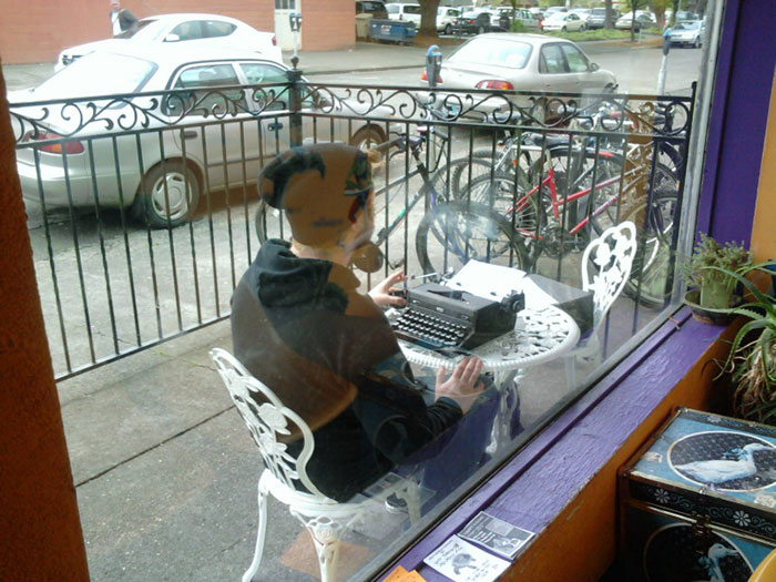
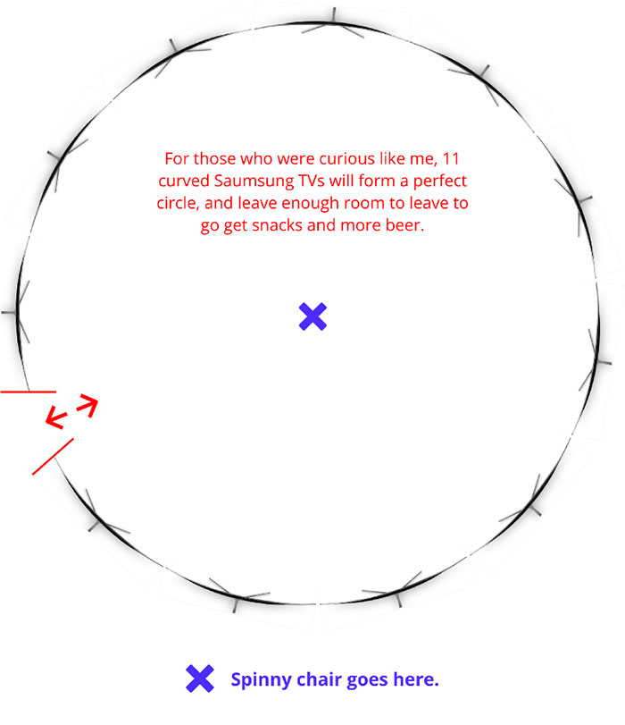
Curved TV’sCome on people, these are pretty pointless. When I’m asked if they’re better than flat screens, I usually just make up some “alternative facts” because I’m too guilty to admit that I just like that they are curved. HOW IS GLASS CURVED, YOU GUYS?! Give me 11 of these, please and thank you. 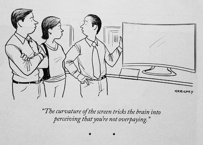
Unsolicited RedesignsLinkedIn…Twitter…Windows, you name it. I love them. Now, it’s my job to shame you for wasting your time on it, then discuss how arrogant it is to do something so audacious, but dammit, I love your surface-level redesign. A million bonus points for big shadows. 
DonglesI know…hear me out on this one. Dongles rank right between “Cereal boxes with only a little cereal left” and “The incessant beeping of a microwave” on the list of The World’s Most Annoying Things. But when you walk into a room and announce, “I need special equipment in order to show my work to you fine ladies and gentlemen!”…you feel like Steve-friggin-Jobs presenting the new iPhone. Everyone has saved at least one meeting by having the exact right dongle to plug into that 13″ Mid-2013 Retina MacBook Pro.
Kickstarter Idea: Dongle Utility Belt Not sketching AT ALLEveryone has that one guilty pleasure that involves not doing something. You’ve got your Moleskine, six bottles of ink, and one of those fancy nib pens sharp enough to get confiscated at the airport. Heck, you might even do adult coloring books. But, nothing is better than skipping all of the necessary planning, sketching, and pre-work and jumping directly into Sketch. It’ll be fiiiiinne. Sketching is for chumps anyway, right? 
Design ForumsI love to hate them, and hate that I love them. Nine out of every ten times, your design gets bashed, you’re publicly shamed, and you start seriously considering a new career in artisan candle making. But you still post, because evvvvery once in a while people are nice and say things that make you feel good. And that high is enough to get you through that Monday morning design critique. At least someone liked my work! Real people! On the Internet! Meetings“No way!” you say emphatically. “Meetings totally kill my productivity.” Boy, do I have great news for you. Meetings also mean you can mentally clock out for at least 30–60 minutes. That’s more than enough time to read some more Medium articles about how horrible meetings are. Or learn how to appear busy. Now matter how you spend your new free-time, be honest with yourself and appreciate that you’re most likely getting paid to do nothing. And isn’t that everyone’s dream? 
Saving Things to Your Desktop“Show us a screenshot of your desktop!” — 18,399 comments /quickly throws 68 unrelated desktop files into a folder labeled “miscellaneous” and hides it somewhere obvious like My Documents 
“Here’s mine. I like to keep it clean like my desk at home.” — 5,821 upvotes Sure you do… …sure you do. Taking Walks to “Brainstorm”Fresh air helps me think. Seriously. It also helps me avoid starting on that boring new modal dialog design that I really don’t want to do. But hey…at least I get my 10,000 steps in! 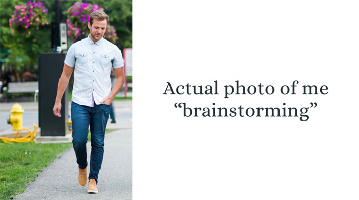
This Guilty Pleasure™ brought to you by Fitbit: When I’m not writing, I’m working on Sketch design tools like UX Power Toolsto make you a better, more efficient designer. All the best Sketch designers are using it, and I think you might like it, too. Check it out on Marvel! The post Guilty Pleasures for Designers appeared first on Design your way. from http://www.designyourway.net/blog/design/guilty-pleasures-designers/
0 Comments
Wherever you go, whatever you see, you have undoubtedly noticed that most of the people constantly stare into their phones. Even though the vast majority of them are simply posting their morning latte on Instagram, there are some that have discovered certain apps that pay you, and actually earn money with every second they’re looking at their phones. There are plenty of places where you’ll read how you can get apps that make you money, or how to find the best paying apps, but the majority of them aren’t really worth it. Some will ask you to work on them for months before you see any return of investment, or some simply don’t have any method that suits you. Below, you will find a fairly comprehensive list of apps that pay money. There are different ways to earn some cash, but the most popular one is by far watching adverts for money. These are the best rewarding apps, and you can see which one can earn you the most with methods that suit you. WeGoLook
WeGoLook is the app that opens our list of money making apps, and it works on a pretty interesting concept. There are plenty of people who would like to buy a vehicle or another auction item, but can’t really afford to travel just to inspect it, and this is where you and the app come in. You will inspect the item, take pictures, look for defects, and then report these things to the potential buyer. As simple as that, and you get weekly payments. Job Spotter
Even though Job Spotter doesn’t really pay cash, but Amazon store credit instead, it’s still one of the best apps to make money. Earning is very simple, you just need to look around for “help wanted” signs on local stores or businesses. Then you take a picture of both the store, and the sign, and submit it. If it is approved, you will get $.50, and as soon as you hit $1, the money will be transferred to an Amazon Gift Card. It’s a pretty good way to pay for your online shopping spree. CoSign
If you have a fairly big social following, and want to make some money from it, CoSign is one of the best ways to do that. Since you’re already uploading images to your social media accounts, CoSign asks that you tag the photos with information about the items in the picture. For example, if you take a picture of your new handbag, put some info as to what brand it is, how much it costs etc. You can use it for anything from books, movies, food to tech items and household goods, and when someone buys what you posted, you can get up to 35% of the price. For more expensive items, this can be quite attractive. If you already have a decent social following, and your content matches CoSign’s requirements, this is pretty much a no-brainer. Fronto
Do you want to get paid to watch ads? If your answer is “Yes, I want to make money watching ads”, then Fronto is just for you. You will get ads on your phone’s lock screen, and every time you view or interact with one of them, you’ll get paid. You won’t earn a ton of cash, but given the effort on your part, it is actually pretty decent. However, you should be aware that Fronto uses plenty of bandwidth and battery, and downloading those ads will take its toll on both. Perk
Another one in the list of best paying apps, Perk is fairly similar to Swagbucks. There are plenty of ways to earn some cash, such as quizzes, games videos etc. Each of the features comes in a separate app, and you might get confused as to what to do to earn money. The one that’s probably best is Perk TV, which gives you points while you watch videos. Even though earnings are not very big, there’s an autoplay option, which lets you play videos while you do anything else you want. If you do this on a regular basis, you might just rack up some decent earnings. Lucktastic
If you consider yourself a lucky person, Lucktastic should be on your list of apps to try. Playing games is similar to scratching lottery tickets, and the rewards can be fairly random too. You get a few tickets every day, and each one gives you anything between 5 and 10 points. However, since it’s a lottery, you can even win up to $10,000 at once. Those points are turned in for gift cards or cash, and it only takes you a minute or two to scratch the tickets. The earnings are, expectedly, small, but they will eventually accumulate. And, due to the earning system, you have nothing to lose but a few minutes each day. Pact
Instead of a survey app that pays, which seems to be a pretty popular concept nowadays, Pact helps you stay healthy by filling your wallet. You simply make a pact to eat healthier food, or go to the gym more often, etc. Pact will give you money each time you meet your goals, but it will also take your cash if you don’t, so there’s that for motivation. All of your activities are verified, with methods such as using GPS to make sure you did go to the gym, or you need to link it to your fitness tracker to prove that you did indeed run yesterday. If you meet your goals repeatedly, those earnings will eventually start to stack up. If you want to lead a healthier lifestyle, there’s no reason not to use Pact, and make a couple of bucks while you’re at it, as well. That is, as long as you stick to your goals. Ebates
Even though it is traditionally a website, there’s also an app that lets you check prices and get in-store coupons. This is a cash back option that can earn you quite some money over a longer period of time. You can connect a credit card as well, and use it to earn some money on store purchases. Payments are quarterly, by a check, as long as you have a minimum of $5.01. Acorns
Even though investing some of your hard earned cash can be a tricky thing, creating some passive income from that can be a welcome thing. Acorns is an app that makes you link a credit or debit card to it. Afterwards, each time you make a purchase with the card, the app will round up the purchase and use that extra money to invest in ETFs. You let the app know what your interests are, such as short-term investments, long-term investments, major purchases etc., and it gives you recommendations according to what you chose and your risk tolerance. Investment is taken care of by the app, so you don’t have to worry about anything. There’s a $1 fee per month if your account is under $5,000, and college attendees or people under 24 can use it for free. Clashot
Clashot is an Android and iOS app that lets you sell images that you upload. You simply download the app, take a few photos, upload them, and the moderators team will put the sites on the Depositphotos website. If your pictures are sold, you get a percentage of the price paid for them. Even though this might seem easy, if you don’t promote your photos they might be hard to sell. The app will help you earn a bit more by giving you certain themes for your photos, and works best on Android phones, since the iOS app has quite a few poor reviews. App Bounty
With over 5,000,000 installs and more than 100,000 5-star ratings, you can see that App Bounty is pretty popular. The concept is fairly simple – you download and install other apps, and you get credits for it. You can then exchange those credits for gift vouchers. The app is international, unlike many others, so people outside the US can benefit from it. Overall, the app is great and it gives you reliable payments, but those payments might seem like they don’t ever stack up. However, once you’ve earned enough, you can get yourself a gift card from Amazon, Steam, iTunes etc. Shopkick
If you’re a fan of online shopping, this one is tailor made for you. Every time you visit stores and scan barcodes, as well as buy some things, you get points. There will be different points for different stores, where some give you points as soon as you walk inside the store, and others require you to buy certain products. Offers will change every once in a while, so you might want to check where you can get points before you go out shopping. Even though it requires a bit of effort, Shopkick is a pretty easy way to earn some money by doing things that you’re already doing. Watch & Earn
Listed in quite a few “best app” lists, Watch & Earn is a pretty successful app. You get points for both downloading certain apps, as well as watching app videos. Every time you do one of these tasks, you get coins. These coins can be then exchanged for gift cards such as Google Play or Amazon ones, or you can get cash on PayPal and PayTM. MintCoins
Even though it comes with quite a buggy history, the developers have put in quite some effort into taking care of the app, and it now has a pretty good reputation. Making money with it is easy and you can do it in a few ways, such as buying paid apps, installing free ones, registering on websites, watching videos or completing surveys. The minimal amount for you to be able to cash out is $1, so earning with it is quite easy. Overall, the app is well worth downloading. App Karma
Another app that has been featured in a couple of “best of” lists, App Karma has a reputation of paying pretty well, and the app is available for both Android and iOS users. There is a variety of daily rewards you can claim. There is a points system in place, and those points are accumulated and then exchanged for rewards. It is also international, which means that people outside the US can also make some money with it. One of the best features, and a pretty big reason why people love it, is the fact that every time you cash out, you get 5% of your points back. The earning methods are mostly installing and playing apps, and you get 30% of each of your referrals’ points when your code is used for signing up. There are plenty of rewards you can choose from, such as Amazon and Google Play gift cards, as well as PayPal cash and Facebook vouchers. PanelPlace
The last on the list, PanelPlace offers some of the best payouts on the market, and the surveys are by far the easiest ways to make some cash. This is undoubtedly the best cash making app if you’re into surveys. However, there were some difficulties with the app reported. People are still waiting for the developers to fix the issues. This app gives you some of the best paying surveys out of any app you can find on the Play Store, including some very good competitors. If you want the best possible results, you should sign up to the survey panel on a computer until the problems are fixed. Ending thoughtsIf you want to make a little extra cash each month, these apps are quite useful. It is recommended that you make a list of all apps you use, especially the ones that involve investing, or ones that you don’t visit very frequently. This lets you keep track of your earnings. Even though a bit tricky at times, apps can be a pretty good way to earn extra money. And, let’s not forget that most of these apps have a referral system. Tell your friends that you’re using one of them, and you’ll make some extra money there too! The post Best Apps That Pay You appeared first on Design your way. from http://www.designyourway.net/blog/tech/best-apps-that-pay-you/ Three years ago I embarked on a journey to become a unicorn. A unicorn is a designer who also writes code. I had always wanted to learn to code. I’d dabbled a little bit. But I didn’t know anything about web programming. I’ve also wanted to learn how to design on my computer. My professional background was in product management. I’d worked with incredibly talented designers and developers. Then I went and got an MBA. I was tired of having ideas and not being able to execute on them myself. I had that creative itch that I couldn’t quite scratch. I’ve realized how many others out there who want to be makers but get lost along the way. There are so many tutorials out now on so many learning platforms teaching so many different frameworks. And then there’s learning to be a designer… I love learning and grew up in a household where education was the most important thing. Yet I was afraid of programming. It was scary and intimidating. As I grew up and became a professional manager of programmers and designers I felt like something was missing. I would have an idea and then find others to pay to make it. This hurts your soul. Yes, money is a wonderful tool. But so is hard work. I want to challenge you to step outside of your comfort zone and learn how to make things! I recommend learning HTML, CSS, Sass, and JavaScript today. If you want to make apps, I would then learn Swift or Java depending on whether you want to do iOS or Android. Learning design is a nebulous process. My recommendation here is to focus on the principles of UX design. It will help with what you build while you do programming exercises. Additionally, learning interaction and visual design both take lots of practice and time. You have to develop a feel for it, which won’t happen quickly. The key to remember is that you have to learn tools and processes. The tools will come and go, so the ones I suggest are good for getting started. The processes will take a long time to master, but they can be applied to any tools going forward. The other thing to note is how you like to learn. I used a mix of books, online tutorials, online courses, and in-person courses. I was working for a startup remotely for a large chunk of this, then running my own startup. This gave me flexibility and access to mentors. Things to learn: Positive Attitude — have fun being bad and learning. You have to get into the mentality of play and making mistakes, especially when you can’t quite understand something. Dev: HTML, CSS, JavaScript (jQuery, Underscore), Sass, bootstrap, github, sublime text, command line, Angular, React. Design: Sketch, PhotoShop, inVision, Marvel, Framer. Processes: Hosting, modular programming, object-oriented programming, chrome dev tool debugging, strategic design thinking, interviewing, surveys, personas, card sorting, information architecture, user flows, ui design, usability testing, wireframing, mocking up, prototyping, interaction designing, animating, color theory, typography, whew…that’s a lot. I’m sure there are more too. A lot of these you’ll learn while learning tools, but some take intentional focus. The last piece I want to point out is that my philosophy towards learning has changed so so so much over the last three years. If the only useful thing you get from my post is this then I’m happy:
Here’s the complete list of books, courses, and tutorials I found most helpful. Below the list I’ll give an exact order that I would recommend going through them. Oh, the power of hindsight! Books:
Courses: Bloc UX — I have mixed feelings about the Bloc course. I wasn’t thrilled with the content of the lectures and I ended up referring to books or the Team Treehouse UX content a lot of the time. However, the projects section is great for cutting your teeth and having a mentor involved is useful for feedback. I did the program before any of my in-person training. The price, for an online program, is a bit steep. RefactorU, full-stack JavaScript, in person 10 weeks — I had a fantastic experience at RU. I came in feeling confident in my html, css, and JS skills, and by the end of the 10 weeks I realized how much I still have to learn. I went through the program starting January 2015. I still don’t feel confident in Node/backend because I haven’t been using it, but my front-end skills went through the roof. I think an in-person experience is killer if you have the time both for networking and being in a structured environment. General Assembly, UX, in person 10 weeks — I enjoyed the GA program a lot. I was told by the admittance team that my knowledge of UX was likely above much of the course materials and this was true. However, being at GA is a fantastic experience in San Francisco, both for networking and building a portfolio in a collaborative environment. One of the biggest challenges for me after all my learning was how to showcase it. With the guidance of my instructors I feel like I’m getting there. Also, working in a program focused on real projects is useful and fun. Design + Code, in person, 1 weekend — I can’t stress how amazing Meng To is as an individual. The class is one day of Sketch and one day of XCode working on a real project. Part of what I found the most valuable was learning by doing. I still use the technique in the class for making drop shadows, and a lot of my Sketch workflow is based on Meng’s suggestions. I’ll also add that he is a walking encyclopedia of design resources and his newsletter is fantastic. Tutorials: The Bitfountain Design Immersive, iOS8 Sketch — This course helped me more than any other out there in learning Sketch. It’s intense, long, brutal, but so effective. Along the way you create a huge amount of assets and learn a lot of tips and tricks. The new Bitfountain site, iOS dev & design — Bitfountain released a new site last year and has a wonderful community. I can’t plug these guys enough, they create content based on what users ask for and have a wonderful teaching style. I’ve worked through a lot of their Swift content and some of the new Sketch materials. Codecademy -- Spend a weekend with codecademy when you start to learn HTML/CSS, then another weekend when you want to learn JavaScript. Their method of learning by doing is effective for mastering the basics. When you go on to more advanced tutorials you’ll begin to understand how things work better, but you’ll have a solid foundation. Dash — This was my introduction to General Assembly a couple of years ago. Similar to codecademy, but more of a full project than individual lessons. Learn git — A visual way to learn git, this helped me more than any other resource. It’s fast and pushed me to that “aha” moment. Codeschool -- A monster of a site. I’ve worked through about two thirds of it at this point. It’s a great place to learn JavaScript and the best for interactive tutorials on front-end concepts. I also enjoyed their Sass courses a lot. Sketchcasts — I can’t stress enough the value in watching experienced designers work. Sign up for a few months and watch all of the content. Many of the concepts covered I’ve gone back to a few times as they become relevant to me on projects. Also, the tips are incredibly useful. tuts+ — I often use tuts+ as a follow-up when I’ve learned the basics of a skill somewhere else. There are a good mix of design and dev tutorials and they add new ones regularly. Lynda -- Still the best place to learn new tools. Where I learned Photoshop. Also, they have some solid UX courses now too. Udemy -- Hmmm, not one of my favorite sites because the courses can range in quality so much. I recommend taking the courses when they are offered at a deep discount. The site seems to be down for me right now, but I enjoyed Rob Percival’s Sketch course and I found a couple of solid Affinity Designer courses as well. The dev courses I’ve taken haven’t impressed, so do your homework before purchasing one. Team Treehouse -- My favorite of all the resources for a couple of reasons. One is that they regularly add new content and re-organize their tracks. The second is that they have great instructors and a wonderful community when you’re stuck. Also, you can download any course as a video podcast and watch it elsewhere. I went through hours and hours on the treadmill on my iPad when I was training for a race last year! There are excellent dev and design courses, although I wish they had more on modern frameworks like Node, Angular, and React (it seems like they have a lot of new content in the pipeline). Just be warned that some of the challenges will require you to get help from the community. Level Up Tuts -- The best free resource I’ve found. Period. Scott is a great teacher and has gotten better over time. He has 1–3 hour courses on everything front-end related. If you are on a budget follow him! Either way, I would watch his courses before doing any paid content and support him along the way. Watch his tutorials on Sublime Text, Command Line, CSS/Sass, Angular, React, and especially all of his Sketch tutorials. Aside from UX practices and UI patterns he teaches everything you need to learn. I don’t have enough nice things to say — I’m amazed he puts everything up on YouTube. Learn the hard way -- Kind of a book, kind of a tutorial. This was a great way for learning the command line and for learning the basics of Regular Expressions. If you decide to learn Ruby or Python after JavaScript, I’m sure the materials here are excellent. Watch Me Code — Watching other people work is a wonderful way to learn subtle nuances of a craft. This is a JavaScript focused site where you watch Derick using modern technology and doing testing. Part of why I enjoyed this site so much is that you actually learn testing and see professional, shipped code. I wouldn’t start out here, but when you feel like you’ve hit a wall this is a great place to learn. Front-End Masters -- I don’t exactly know how to classify this site, but I love it. There are some beginner and intermediate courses, but their advanced courses really shine. Many of the people who create the frameworks you use are the ones actually teaching the classes! This is the best place I’ve found for learning advanced JavaScript, frameworks, and methodologies. I spend time here currently when I want to learn something new. Wes Bos -- I’m not entirely sure where to classify all of Wes’ materials, but DAMN they are good. His book on Sublime Text is the best I’ve found by far, and his email tutorials on Flexbox and React are wonderful. Use his stuff to help learn. I also enjoy his teaching style. Kopywriting Kourse — I haven’t included any other writing/content/copy materials as I think it’s a rabbit hole. Everyone should take Neville’s course. Understanding words, how they drive action, and marketing is important in life. We are all victims of this constantly on the web, you may as well understand the principles and how to put them to work. Some I didn’t include: Train Simple -- Adobe only training, I’ve found Lynda and Adobe’s own tutorials better. Also, check out Creative Live for specific Photoshop and Illustrator classes (I was in the audience for the recent Illustrator class!). Evented Mind -- I spent some time here learning Meteor, I generally found there to be better teachers and better content elsewhere. I prefer learning by doing rather than just watching. Ray Wenderlich -- If you dig further into iOS or Android programming you’ll come across the site. I haven’t worked through their materials, but have heard fantastic things. Some of the blog posts are tutorials in their own right and I’ve used a couple. Scotch.io — During my journey I’ve used Scotch’s tutorials a number of times. Some are very helpful, some are less so. I particularly enjoyed their, REST, Angular, React, and Sublime Text tutorials. I think all of their content is free. The Design of Everyday Things -- Along your journey you’ll stumble across Don Norman. He’s a father of UX and a big influence for many in the field. Personally, I’m not a huge fan of his writing style. Feel free to read this book and hopefully you enjoy it more than I did. I know this is blasphemy to some, but I want to be honest in my reviews. About Face -- The seminal book on Interaction Design by Alan Cooper and others, which has been updated several times. I enjoyed it, but don’t think it’s a must read like the books I’ve listed above. If you want to dig further into interaction design and prototyping give it a look. Processes: I want to quickly highlight three important processes that have helped me along my journey.
Other Resources: I realized as I finished that I hadn’t listed the other resources that I love and use regularly. Some of these are tools, some are blogs, some are newsletters. Rather than continuing with overwhelm, here are the best of the best in my opinion.
Universe or unicorn? Below is exactly what I would recommend for someone looking to become a unicorn. If I could turn back time… Here is the path I’d follow if I started again today. If you have the luxury of taking an immersive course, I highly recommend it. Having classmates to bounce ideas off of and a career center to help you find a job, create a new resume, and portfolio is invaluable. Feel free to jump around if you already understand some of the topics presented. Immersive Route:
Final Thoughts This turned into a substantially longer post than I’d expected. I hope it helps people navigate through the huge number of learning options. I am sure people will have different opinions on how they like to learn or tools they found useful. Please leave them in the comments! I love self-guided learning and am always looking for new tutorials. If you want some help based on where you are in your own learning journey I am happy to give specific recommendations as well. I spent many hours working down routes I don’t use much of anymore. The first six months I spent learning Ruby and Rails, and I’ve spent about as much time learning Meteor. I can post thoughts on learning these if people are interested. Thanks for reading if you made it this far! I am a product designer based in San Francisco. I’m currently a UX consultant and looking for full-time work in a playful, education-driven company. Please follow me on twitter where I focus on design, or follow my blog where I focus on living a meaningful life. Thanks! ♬ Listen to this Story or Read it in German, French, Spanish The post The Making of a Unicorn appeared first on Design your way. from http://www.designyourway.net/blog/design/the-making-of-a-unicorn/ At the end of November, I handed my MacBook back over to cxpartners and moved on to new pastures over at Hudl. I’ve learned a huge amount during my time at cxpartners and achieved more than I ever thought I would by my mid-20s. The cxpartners approach to design is far removed from anything I’d ever experienced, so I had to adapt quickly, learning along the way that I was a young & foolish designer who had a bunch of assumptions that were wrong. Here are a few things that I have learned in my tenure at this wonderful agency. Watching users is eye-opening I thought my ideas of how people interact with interfaces were pretty advanced. I was wrong. I thought sketching out an idea for ages before producing it in a prototype would mean a user wouldn’t miss it. Guess what. Watching users walk through your designs is nerve-wracking and eye-opening. You will spot glaring errors in your design in moments and, before you know it, post-its containing user insights will cover every wall. It blew my mind how much hand-holding users require. I’ve seen users misunderstand propositions entirely, miss huge calls to action, and ignore clear, basic microcopy. I’ve never left a user research session thinking ‘I have learned nothing today’. Seeing how much a user struggles to understand standalone icons, or how they totally ignore microcopy will stick in your mind and make you become a more empathetic designer. Post-its and Sharpies. Everywhere. Designers may be driving the stock prices of post-its through the roof. These yellow squares cover everything in the cxpartners office. There is so much joy in being able to scribble on a bit of paper and build a prioritised list of components in seconds. This habit must’ve dripped down into my process because, for even the smallest project, I will make sure I have a stack of post-its at hand to start writing notes. Kick-offs, communication, and stupid questions are essential Before cxpartners I had taken part in briefing meetings, asked standard sets of questions, and produced designs that required multiple rounds of feedback before getting them right. I had made the (daft) assumption that non-designers know exactly what it is they want. In reality, we are the experts and it is our responsibility to help the client understand what it is they really require. If we end up producing the wrong design, it’s our fault. If you visit a physiotherapist and tell them your knee hurts, it’s their responsibility to figure out that it is in fact your glute that is the problem. To get a true, accurate brief from a client these days I ensure the following happens:
This kind of thing requires additional time up-front, but mean the projects run more efficiently so are often quicker overall. Fast, collaborative iteration is the best ever. My most recent projects have involved working closely with ux designers, developers, and the client, allowing us to quickly iterate and deliver designs that everyone was happy with. What helps this is a massive dose of mutual respect. Each member of the team understood the value of the other members, but let everyone get stuck in. A dev wants to dig into my Sketch doc? Great! I have some input for a UXer on how a layout could flow nicer? They welcome the feedback. Working this way is the future. No more waterfall projects. There is an overlap in each department at cxpartners, so we should treat it that way instead of throwing wireframes over the fence at designers, and throwing designs over the fence at developers. Dribbble doesn’t matter. Clients and users do. A few months after joining cx I deleted my Dribbble account and, along with it, my modest number of followers. Why? Because I was pandering to peers instead of designing what was appropriate for the project I was working on. This realisation came when I was designing an icon for a project and I asked the Creative Director (Chris) if I could upload it to Dribbble. The conversation went a little like this: Me: Can I upload this to Dribbble? Taking a step back, I realised the mistake I had made. I had been designing something that would look good in a 4:3 panel, and I had been doing this on most of my designs since I got a Dribbble account. From this point on, I focused on client- and user-needs and my designs projects have been more successful as a result. Nobody appreciates a lack of humility When I was a bit younger, I thought my opinion on designs should be defended to the death. After all, I had put my heart and soul into this so I should fight my corner. But I shouldn’t have. Getting direct feedback from users, clients, and a pool of talented designers at cx meant that I had to back down. Whilst I’m being paid for my expertise and I may have solid rationale, there is always a time and a place for accepting that what I’ve done may not be right just yet. User experience is deeper than layout I didn’t really know what ‘UX’ as an umbrella term meant when I joined cx, and I’m not sure I really do now. What I do know is it’s more than sticking ‘UX’ in a Dribbble or Twitter biography. User experience design goes deeper into user research, ethnography, information architecture, experience mapping, and much more. It isn’t just about layout. UX is an umbrella term that covers many specialist roles, most of which should never ever be ignored or underestimated. Finally, I want to say thank you to cxpartners for giving me the opportunity to become a better designer. You should go and work for them. Thank you for reading my post! If you enjoyed it and want to stay in touch, let’s speak to each other in one of these places: Twitter, Instagram, my portfolio. The post 7 things I learned working at a user-centred design agency appeared first on Design your way. from http://www.designyourway.net/blog/design/7-things-learned-working-user-centred-design-agency/ If you’re working on digital products, you have already read dozens of articles describing how and why the hamburger navigation on mobile (and desktop!) hurts UX metrics due of its low discoverability and efficiency. (You can read some of best articles on the topic here, here, here, and here.) Luckily, more and more sites and apps are experimenting with alternative, more efficient solutions for this very problem. None of the ideas listed here is better than the others, their viability and performance obviously depend on the content and the context. 1. TabsIf you have a limited number of sections in your website or app and users should be able to quickly switch between these sections, a tabbed navigation might be the solution.
Tabs seem to be the simplest navigation pattern, however, you need to consider a few things when designing them:
Examples: LinkedIn and Google Photos
2. Tabs with a ‘more’ optionWhen there are more than 5 main sections, a practical solution might be to show the four most prioritized sections and have a fifth element list ‘everything else’:
The design principles for this solution are basically the same as for simple tabs. The ‘more’ item can either link to a navigation page or work as a dropdown menu with the remaining sections:
You could argue that the ‘more’ item isn’t better than the hamburger menu (it’s kind of hidden and its label does not refer to its content at all), however, if you have made the prioritization right, most users will be looking for one of the four visible items anyway so the navigation experience for the majority will still be improved. Example: Facebook
3. Progressively collapsing menuA more sophisticated version of the ‘tabs + more’ navigation is to design a menu that adapts to the screen width, shows as much of the navigation as possible, and puts everything else under a More item if necessary:
This means that the More menu contains more items on a lower resolution — items ‘jump’ under More when there’s not enough space to show them. The flexibility of this solution provides a better experience than the ‘tabs + more’, especially on in-between screen sizes. Example: BBC
4. Scrollable navigationIf you have a number of navigation items without a big distinction in priorities and having a ‘more’ category would be a bad compromise, another strategy is to list all the items in a scrollable view:
The downside of this solution is that still only the top few items are visible without scrolling and all the remaining ones are off the canvas. This is, however, an acceptable solution when the users are expected to explore the content, e.g. in a web shop or news categories. As far as visual design is concerned you need to make sure to provide enough visual hints to suggest that there are more elements available upon horizontal scrolling (e.g. by fading and/or off positioning the last visible element). Examples: Medium and Google
5. Dropdown menusAn uncommon but interesting pattern is to use dropdown-like menus when the visibility and accessibility of the other sections is not essential:
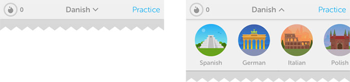
The dropdown menu actually has a double role in this case: first, it serves as a page title and the downward arrow suggests that there’s a possibility to quickly switch to similar sections. Although the options are hidden in this case, the dropdown design suggests that the list would contain options that are either siblings or children of the current page (and it should primarily be used for this purpose). Example: Barnes & Noble and Duolingo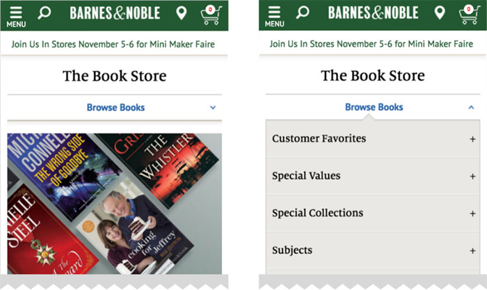
And sometimes, surprisingly, the hamburger menu might be a good choiceSince the main downside of the hamburger menu is its low discoverability, it’s recommended to consider one of the alternatives when it comes to designing the main navigation menu. However, when designing secondary navigation options, this pattern might be an appropriate solution. If the primary options are available as prominent on-screen call to action buttons, the hamburger menu seems a good place for all the secondary navigation:
This pattern can be used when the main navigation is designed around a user flow and the related options are clearly available on the screen. Uber might be a good example:
Since everything about this screen is designed to request a car, secondary options such as History and Settings should not be available more prominently than from a hamburger menu. Google Translate is really similar to this:
Since the main functionality (switching languages and entering text to translate) is the most prominent part of the screen, the hidden menu is a great place to host sections like Help and Community. ConclusionThere isn’t a one-size-fits-all solution for mobile navigation, it always depends on your product, on your users, and on the context. What works well for others might not work for you and vice versa. However, the foundation of every well designed navigation is information architecture — clear structure, priorities, and labels based on your users’ needs. So why not start finding the most efficient mobile navigation for your product today? The post Hamburger menu alternatives for mobile navigation appeared first on Design your way. from http://www.designyourway.net/blog/user-interface-design/hamburger-menu-alternatives/ Are you interested in learning calligraphy? If that’s the case, you’ve just come across the perfect article to do that. Learning calligraphy is not an easy process, but with the right guidelines in place it may take less time than you think. What is calligraphy? The term is borrowed from old Greek and refers to the skill of beautiful writing. Rather than a simple ability to write pretty letters, calligraphers are expected to follow a number of rules and conventions, including such that govern how letters are positioned and arranged in the text. How to do calligraphy? More importantly, does it really make sense to do it? If you’re a designer, for instance, modern calligraphy will be a great skill to add to your resume, and the fastest way to attract clients with elegant logos, signs, cards, invitations, and more. Our calligraphy for begginers article will help you familiarize with all these things and help you in learning calligraphy, and give your work a recognizable and personalized touch. Here comes our compact calligraphy guide: Learning calligraphy – where to start
All similar guides on calligraphy basics recommend these pens, as they don’t contain ink inside and can’t cause any damage – instead, you dip them into the special container while writing, and benefit from their flexibility to experiment with line variations. This way, your pen will never corrode or clog; despite of the number of different inks you have to use to complete your project. How to use calligraphy pens? These are the tools you will need:
The nib
The nib we’d recommend to beginners learning how to use a calligraphy pen is Nikko G-Nib, having in mind that it is relatively firm, and produces this and nice lines with the desired level of flexibility. The nib holderThere are two types of nib holders: Straight and oblique. The first time suits better upright calligraphy styles, while oblique holders facilitate the combination of several different styles. A high-quality and affordable alternative is the Speedball Oblique Pen Nib Holder, as well as Tachikawa Comic Pen Nib Holder for Various Pen Nib – Model 25 (great choice for upright styles, as it holds the nib more firmly than other similar alternatives). There are also designers who use the same holder for all calligraphy pens, but we advise beginners to try several different options before they choose a single holder. The paper
The roughness of ordinary paper will make it impossible for you to use it for calligraphy purposes. Among other problems, you will encounter situations of your nib catching on the paper, and creating annoying ink splatters. On top of that, regular printing paper has more fibers and consequently absorbs the ink and lets it spread inside, which will likely prevent the smooth and clean lines calligraphers are trying to achieve. In order to make calligraphy more effective and enjoyable, purchase paper that can withstand fountain and dip pens, as for instance popular brand Rhodia that is very smooth and ink tolerant. There are several types available: blank, lined, or with dot grids. The ink
There are several types of ink suitable for dip and calligraphy pen, but beginners should always go for quality black samples. Our choice here would be Speedball Super Black India, as this ink is very dark, waterproof, and on top of that reasonably priced. Preparation tipsThe same as any creative practice, calligraphy is done the best in a pleasant working environment. A convenient and well organized desk where you can place all your supplies, and feel positive and relaxed is the best place to work on your calligraphy skills. Choosing the best writing location
To make the most of your calligraphy practice, pick a comfortable and relaxing place where you can rest your feet flat on the floor. Organize supplies well, and keep the place uncluttered to ensure enough moving space for your arm. The writing paper should be placed over a special writing board, or at least 5-6 sheets of scrap pieces to write on. This way, you will have a soft surface that allows you to write more naturally than you would on the tabletop, and the surface won’t let your paper move around. Preparing the tools
Make sure there are a non-linty towel and a cup of water around, so that you can clean the nib here and there. Paper towels are also fine, but have in mind that their fibers happen to snag on the nib and cause frustrating splatters. Your ink should be placed in a wide-mouth bottle or jar to avoid touching the sides, and placed where you won’t easily knock it over. Basically, your working tools should be within your reach, but yet on a safe distance. For instance, we’d place them inside a tape roll, or even keep them closed to avoid any risk. As mentioned before, you should place the nib inside a nib holder. The easiest way to do that is to grasp the nib somewhere close to its base, and then push it inside the holder using its outer ring. Make sure you’re not holding the nib by its tip, as it may bend out of shape. To do this right, look for a YouTube tutorial and follow the instructions. The basic strokes of calligraphy
Calligraphy’s building blocks are thick downstrokes and thin upstrokes. The thin upstrokes are easy to draw, as you hold your pen lightly and move it upwards. Thick ones, on the other hands, require more pressure as the nib is being moved downwards. Of course, you should balance and combine both movements to produce the best possible line variation. Before you begin, dip the nib deeply inside the ink jar, making sure that the breather hole on the nib’s back is completely covered. Wipe the excess ink on the sides off, and you can begin writing. These are the rules you should follow:
Experiment with different loops, and combine thinner upstrokes and thick downstrokes. The continuous line loops will help you connect them, and come up with the perfect combination. The following step is to press the drills, and then release them. Proceed with thick downstrokes, and release the pen slowly as you move towards the bottom. Change the order. Draw your downstrokes in a way that they seem to flow into the downstrokes. Continue with ovals. Apply heavy pressure on the left hand side and lighter pressure on the rights side. It happens often that a new nib draws two parallel lines instead of a single one, or ‘railroads’, as experienced calligraphers describe it. The reason is that you either applied too much pressure, or have no more ink to work with. Equipment and stroke tips for professionals For those of you who feel confident to start writing professionally, we’ve prepared some pizzazz to add to your beautiful lettering. Modifiable characters
An easy way to give your writing a proficient look is to change the slant, something you can easily do adjusting the width of the strokes and the length of their connectors. Start by changing the distance between letters, and giving the baseline an angled, staggered, or curved look. Such modifications will help alter the feeling your writing inspires, as well as the message it conveys. Is it formal, dynamic, or whimsy? Think about it! You can also change the way in which you form letters, and make them a bit thinner, rounder, or even joined in a different way. Do this several times, and you will for sure come up with a brand new design. Flourishes and frills
Your are learning calligraphy so you need to do some flourishes. Flourishes can be added to your text as curlicues and loops, so that it will turn our more beautiful and easy to notice. For instance, you can cross heavy lines with lighter ones to show that you do care about the text’s visual balance. Another alternative is to trim the calligraphy with special drawings coordinated with your words, or use banners to highlight important lines. The more complicated your design is, the smarter it will be to start out with a pencil drawing and test it. Traditional calligraphy
Spencerian and Copperplate are the perfect examples of traditional calligraphy scripts, as there is little of their modern descendants’ variations to be seen on them, but the classic elegance is undisputed. Special projects may require you to familiarize with them, an idea that is also useful to improve your calligraphy discipline. The perfect nibs
Your ideal nib should be sharp, flexible, and very responsive. In such way, you will be able to draw thinner lines, and enrich them with dramatic and fine finishes. For sensitive projects, we recommend three great nibs in particular:
None of these nibs will be easy to use, but the effort is absolutely worth it. Useful tricks
You’ve just started monetizing your calligraphy skills, but something still looks quite wrong with it. It may be that you’re having problems using the nib, in which case you may find the following tips useful: If you’re facing problems with the strokes:
If you got a sloppy-looking slant
If your hand is too shaky or tired to work:
If the ink simply won’t stay on the nib
If your work could use some refreshment:
Choose a style
Unlike calligraphers of the past, designers today are free to choose whatever style they like, or even professionalize in several ones to complete different projects. As discussed before, knowledge on several calligraphy styles is useful to showcase the writer’s personality, convey an important message, or simply complement a formal occasion. Here are some popular ideas that could inspire you: Formal flourishes
If the tone is classic and vintage, that doesn’t mean that the script won’t look modern. Combining styles like these will impress everyone who sees your work, starting from your friends to the Queen of England! Elegant calligraphy
Writings can be fun and sophisticated at the same time, and elegant calligraphy is there to prove it. Mixing classic lettering with dynamic flourishes is the best choice you have to design invitations for weddings and other special occasions. Romantic and artistic
Did it happen to you that a particular slender script reminds you of romance? These lace-like writings have scrolled and high angle flourishes, and are thus suitable for delicate letterforms and invitations that will captivate your guests’ attention. Whimsy
Whimsy writings feel breezy and relaxed, and usually inspire us to think of fairytales and getaways. It is because of their fluid baseline and dynamic angles that these writings capture our mood, the way a well written poem makes us dream of adventures. Bouncing balls
Regardless of your age, you will always be attracted by good-looking invitations, a trick designers often use to get the fun rolling and sell well. The perfect script for such invitations is the romping one, achieved with playful baselines and rounded letters to set the good time tone. Important calligraphy facts
The top five calligraphy optionsNext, we will set down the most important calligraphy outlines categorized in five different approaches and sets of lines and letterforms. The section will also help learn on diverse tools and techniques that can be used for your projects, and we recommend you to try all of them. Double-pencilsDouble-pencils are both simple and very helpful for those constructing calligraphic letters. They can also be applied to create large and captivating lettering for posters, banners, and similar promotional materials. You need a couple of well-sharpened pencils with two rubber bands. First, shave some of the pencils’ side surface off to place them in an adjacent position, and to make sure they are close enough. Rest them together in a vertical, point-down position, and make sure their peaks are at the very same level when touching the paper. For the purpose, you can fasten them with tapes or rubber bands on both ends. Then, take the double-pencil and hold it in your usual drawing position. Ideally, it should be pointed front-left, and at an angle of about 45 degrees. While both pencils are placed upon the paper, press them lightly, and point them both forwards and left. The distance between their points is what forms the so-called ‘invisible nib’. As you move your hand, you will be drawing a double line, and if you decide to make circles while pointing it in the same direction, your double pencil will create unique thin-and-thick ribbons with unparalleled precision. If you don’t feel familiar with pen angles, or are lacking the confidence to produce the thin-and-thick effect, think carefully of all moves and directions involved. This process will require three different skills: working with the pen angle; directing the hand movement; and putting the right pressure on the paper. Felt-tip pensThese pens are more than convenient, very cheerful, and most importantly – much cheaper than all similar tools. Of course, this doesn’t come without a toll, and the ink of these pens tends to fade in time, or maybe look too heavy and be damaged easily under the slightest pressure. This is why these pens are a great tool to practice, but not a top rated alternative when completing important projects. To get one of your own, get a pen and a piece of paper. In case you tend to mess around with first-time experiments, get two – a 3-5mm and a 1.5-2 mm pen. Start with the broader one. You won’t have to worry about paper either: felt-tips pens will work just fine on printer samples, parchment (not ideal for beginners), or similar materials. The pressure here must be light and even, as many calligraphers undergoing training make the mistake of pressing too heavily. Doing so won’t help your felt-tip pen work perfectly, but only soften and splay the only tool you have to practice with. Keeping clinging contact with the paper, on the other hand, will produce much better results. Touch the paper with only one corner of the nib, and then proceed with the other to get an overview on how your writing is going to feel. Rest all of the nib’s end-width on the page, and then rock it slowly: does it feel that one of the corners is leaving the paper while the other still remains there? It is almost like magic! This time, place the full width of your nib on the page, making sure that both corners are touching it appropriately. Remember that this is the ideal writing contact, and that pressing harder may cause any of the nib corners to lift. The pen angle and the pressure are two different points, and the pen should point out to the left and the front at approximately 5 degrees. Doing that, the hand should be moved to form light and beautiful ribbons. For sharper and crisper lines, consider getting a higher quality marker, but you should be considering this only once you feel confident to practice calligraphy professionally. The best value and best-buy pack we recommend is Sharpie Calligraphic, which contains 12 nibs with different colors and sizes; and Staedtler Duo, a 2-piece fair quality marker set. The superior pack that doesn’t smudge and bleed is called Calligraphy Pen Set, and comes with four light-fast ink pieces in the primary colors. As discussed previously, it makes no sense to buy special calligraphy paper while you’re practicing, as printer paper is both satisfactory and affordable. Still, if you find yourself annoyed by constant ink stains you can consider Ampad’s Dual Ruled Pads or thin at cartridge paper such as the one used in UK, but have in mind that they will cost slightly more. Writing calligraphy with refillable, cartridge, and fountain pens
What you will need is: a pen, a separate ink supply (a refill bottle, or an included cartridge). If looking to understand how refillable and cartridge pens work, think of their fountain counterparts: Each pen will hold a large reservoir filled with thinner ink, and that ink will flow through the barrel’s baffles controlled by an internal mechanism. This way, it will run straight inside the nib unit, and spread easily onto the page. With a pen like this, you will also get multiple nib units in different sizes, and a wide selection of cartridges to use with the pen’s main body. The biggest benefit of using refillable and cartridge pens is that they’re easy to work with on horizontal surfaces, thanks to their advanced mechanism for mechanical control of ink flow. Unlike dip pens, they’ll prevent you from running out of ink in the middle of a word, and are certainly a much safer option for clumsy beginners. Cartridge ink is slightly thinner, in order not to dry out and clog on the innards of your pen, and this also gives it a jolly thin look when applied on paper. The nib unit is also notably rigid, having in mind that its mechanisms have to screw within the barrel. This means that cartridge ink combined with a flexible and responsive nib may indeed revamp your whole calligraphic experience. The same as fountain pens, cartridge calligraphy pens leak in a spectacular manner. This doesn’t change the fact that the ink left inside them over time can dry out and clog, which imposes the need to maintain them properly. Here and there, you will have to wash their nib unit really carefully, but you can never remove all ink stuck on their basin. A bonus tip
Refillable and cartridge calligraphy pens are considered most productive by calligraphy professionals, and are also typical for many popular websites. For this reason, beginners are highly recommended to use them. Dip-pens and quillsThere are many different types of dip pens, but there are few essential principles that apply to all of them. For instance, all dip pens are built with these elements:
The reservoirs will not always be built within the nib, which makes it possible to buy each of the three elements separately, namely to mix-and-match between them. The options are endless, and can’t possibly be put together in a single guide, but the experience of popular calligraphers may help you make the right decision. As a beginner, you may also want to save some time and effort, and thus consider buying a preassembled dip-pen kit. In most cases, you will be given 4-6 different nibs with holders and reservoirs, and they will cost less put together than what you’d pay buying them separately. We once again recommend Speedball’s Calligraphy Lettering kit, where you will find a holder and even 6 different nibs. Ink may or may not be included in your set, so start looking for a suitable one. The best ink types for dip pensThese are the best inks you can use with dip pens: The best results are achieved with opaque and thicker inks such as Chinese stick ink, India ink, or even gouache paint you’ve previously diluted to make its consistency half-creamy. For wishy-washy and undefined strokes, you can consider watery inks typical for fountain pens. What you can do instead is to get a medium-sized brush suitable for watercolors, and then refill the reservoir at the nib-slit’s upper portion. Writing calligraphy on slopesWith a dip pen as your preferred tool, you will find it easier to write on slops than writing desks, including easels and boards perched within your lap and supported by the desk’s edges. Calligraphy will take its time, so make sure you’re comfortable.
If you’re using a quill or a dip pen:
Pay attention: Resting the loading pen/brush across the open ink bottle will cause ink to spread on the handle, and eventually end up messing up your fingers while working. How to load a quill/dip pen
The choice of your ink, nib, and writing surface will determine how often you have to reload your reservoir. In the best scenario, you will do so after few words instead of few letters, but this may also depend on the speed you’re working at. The very same rules apply when you’re using a quill. Unlike steel nibs, quills are more flexible and wear down easily, especially when you’re using them on cheap and abrasive paper. Because of the slit nibs of quills and dip pens, these tools happen to damage paper when handled by a non-professional. Unless you’re absolutely sure that you know what you’re doing, we recommend you to look at similar calligraphy methods that take less effort to learn. Writing calligraphy with sponges and square-end brushes
Here comes the ‘messiest’ calligraphy approach we prepared in this guide: The thinner the brush’s sides are the better results you will achieve. The recommended width is somewhere between 6 and 20 mm, preferably with a firmer texture (sable and nylon instead of bristle, for instance). Brushes are also categorized as flat and bright, the later being consider as a better option that preserves line control with its shortness and stiffness. You can take a normal cleaning sponge and cut it into block, and then turn it into the most remarkable calligraphy tool. When using it, don’t forget to protect your hands with ink-proof gloves. There are several important differences between writing calligraphy with a nib and a square brush. The brush, for instance, is very flexible and soft, and will respond to higher pressure by creating thicker lines, and that’s not what traditional nibs actually do. Another characteristic of brushes is that they tend to run out of ink quite fast, and happen to produce a modern texture and unique, scratchy look. The best way to use brushes is on a sloping surface (approximately 30 degrees). Horizontal writing surfaces will also do well, as long as you they grip the color well. We recommend using sponge nubs for bold and large letters, as their firmness can make your strokes unbelievably crisp. You must, however, control the pressure you apply, as any variation may squash the finesse of your lines and cause paint to run down the page, but you can of course do this deliberately (looks absolutely adorable!). Another interesting effect of sponges is that when running out of ink, they produce patchy effects similar to the ones of the brush, and create interesting contrasts and fading lines that are very attractive. Ideally, you should use a thick and opaque ink as for instance India, extra thin poster paint, or diluted gouache colors for your sponges and brushes. All other runny and watery ink won’t stay long on the sponge, and will thus make your letters look drippy and patchy. The biggest advantage of using sponges and large brushes is that they leave enough space and wet ink on the letter line for you to add additional colors, blend them in an interesting manner, or simply let them flow. When mixing several colors in a single letter, take a slight scope is whatever bright color (white is also fine), and draw a basic letterform. Afterwards, place it on a horizontal surface, and pour several drops of darker and contrasting colors. Don’t move it until it dries completely, unless your original intention was to blend it more, and make it look unique. Mastering faux calligraphyFaux calligraphy is in fact modern calligraphy that has been created with a standard pen (gel, ballpoint, and so on). For many designers, standard pens help get acquainted with calligraphy altogether, and there are two important reasons for that: The thing with standard pens is that they’re not intimidating, and are often more flexible and more approachable than other types. At the end of the days, these are tools you’ve used ever since you can remember, and there’s already enough muscle memory to work with and create beautiful calligraphy. Faux calligraphy, nevertheless, is not only there for beginners. Regardless of your proficiency level, you can find it useful to practice for your important projects. Assembling a great calligraphy dip pen kit of your ownHere is what you’re going to need:
Instead of buying expensive, overrated calligraphy kits for beginners, we recommend you to put together one of your own, and pick only the tools that are beginner-friendly, affordable, and genuinely useful to you. Cleaning the nibsUpon purchase, all nibs come with manufacture oil on them, as this oil helps keep them sellable and well-preserved. It will be almost impossible to keep oil and ink on the nib at the same time, so clean the nib thoroughly before you start using it. Once done, you will see how ink flows off the nib smoothly and seamlessly, and doesn’t blob on your paper as it would with oil in it. Assembling the dip penMost beginners opt for Speedball’s plastic pens because of their Nikko G nib, but there is nothing wrong with using universal-insert dip pens either. These pens have a rim and even 5 metal petals, and can thus accommodate many different sizes and types of nibs. Holding the penGripping a dip pen is no different than gripping a standard one, which means you’re still supposed to use the thumb and the forefinger, pinch the holder with them, and place the middle finger behind the pen for additional support. While drawing, use the ring finger and the pinky to drag light lines. Dipping the pen in the ink jarThe nib you’re using won’t matter – the quality will still depend on whether you’ve dipped it deep enough. In technical terms, this means dipping slightly above the vent hole (the central one), in order to avoid putting too much ink on the nib, and letting it flow down while you’re writing. You should also shake the nib firmly over the art water to make sure all excess ink has fallen off. You are ready to go!The main difference between regular ballpoint pens and dip pens is the angle: modern calligraphers should be looking to keep the nib angle related to the paper constant. You should never hold your pen vertically, but shoot for an angle of 45 degrees between your pen and the paper. Holding it too upright is not a good idea either, as the nib may catch on the paper’s fibers, and affect the way in which your ink flows. The post Calligraphy for beginners – Guide on learning calligraphy appeared first on Design your way. from http://www.designyourway.net/blog/typography/learning-calligraphy/ Whether you’re giving a presentation to a big client or marketing your small business, your work’s first impression comes from a binder cover. Some people won’t read the contents if the cover is boring. A well-designed 3-ring binder can excite clients to dig into its contents. In this post, we’ve rounded up 20 of the most incredible binder designs the web has to offer, so you can get fired up to compose your own awesome creation. 7Up
With this distinctive design, the face of 7Up could be you. The mosaic makes people feel connected to the citrus soda’s brand by inviting them to take a closer look and see if their face was featured. It’s great that a design with so much detail still leaves the logo and color branding of a classic product intact. LA Lakers
The Los Angeles Lakers present information to season ticket holders in style. The team’s embossed logo on the cover and spine add texture to the smooth binder, while the purple covers and gold interior incorporate the team’s colors. A basketball swooshes through a net on the corner of the front cover to get fans excited for another winning season. Tigerpaw Software
Tigerpaw Software went with a fierce design that showcase a tiger’s bright, bold colors. This contemporary cover features the company logo, name, and slogan. The logo uses a diamond to represent security, professionalism, and creativity. Stripes and a paw print in the square tie into the tiger theme. A black stripe across the front makes the slogan stand out to mimic a tiger’s stripe. California High Speed Rail
California High Speed Rail used a fresh design for its project proposal binders. Though each design uses a different bright color, they all feature the same design to create a consistent brand. The company name is diagonally aligned to create a train speeding across the cover and encourage clients to open it. Akzo Nobel
This modern aluminum binder for Akzo Nobel features a simple design. The global paint and coatings company’s name and logo are printed in professional, dark gray text. The words specialty plastics are in all capital letters let clients know which products the binder is promoting. Ralph Lauren
Ralph Lauren’s binder looks chic and stylish with its cool color palette. The company name is printed in the center of the blue cover for a neat, clean look. Its popular serif logo speaks to the brand’s history and its taste for the finer things in life, as serif fonts are associated with tradition and wealth. A Tailored Space
This chic binder for A Tailored Space takes on a sophisticated look with minimal design. The firm’s name takes center stage for the design kit binder. Combining two fonts creates a tailored look to show the modern, personalized attention each client will receive. A sharp contrast comes from using black and white colors to add more style to the design. Portable Furniture
Designer Patrick Carter went with a sophisticated look for Portable Furniture’s binder. Funky fonts spell out the furniture’s best qualities, informing clients about the products and creating a cool, modern vibe. Shades of gray and black add a more formal element to keep the design professional. Done Right Roofing
This design lets customers know Done Right Roofing has them covered, as the company’s quality guarantee is front and center. A cute cartoon of happy couple pointing to the brand’s quality seal as their house in the background emphasizes that point. The red flap highlights the words your roofing handbook, which are vertically aligned to create emphasis. With this binder, customers’ documents are just as secure as their roofs. Faculdade Martha Falcão
Blue and white color branding represents success and perfection for students at the Martha Falcão campus of DeVry College in Brazil. Students feel welcomed by the use of a serpentine line on the clean, crisp cover as it adds motion to the design. The letters in the FMF monogram logo connect to each other, alluding to the connection between the college and its students. Texas Heat
This design features a rustic, Western theme. The Texas Heat logo looks like it was stamped into the top of a wooden crate. A star in the center of the logo gives a nod to Texas’ reputation as the Lone Star State. The words team handbook are printed in a bubbly yellow font to play into the old-time Western motif. Water Street Brass
Water Street Brass chose an organic design with warm, neutral colors on the linen cover for a cozy, comfortable feeling. The furniture hardware company’s name and logo are on the center of the cover and spine. Yellow, orange, and brown squares form a W above the brand to reinforce the brand’s identity and remind customers of shiny brass fixtures. Widmer
Widmer Interiors’ fun, modern design uses a professional gray and black background with a splash of red for excitement. Dark gray rays beam from the red box, emphasizing the workplace superheroes tagline. A funky shaped, black border draws attention to the window. The back is quieter, with Widmer’s mission statement written in white to contrast the formal black background. Stroock
This sophisticated design shows the lawyers at Stroock are an authority in their field. The clean, crisp cover is a strong black with white, traditional serif text. The firm’s name is written in all capital letters and centered on the contemporary cover as a symbol of power. Secure Start
The natural cover of Secure Start’s binder looks like it’s made from cardboard includes the company name in a white, sans serif font for a clean, minimal look. A monogram of the brand’s initials encourages the viewer to think harder about the design, with one S in a dark gray on its side, and the other S is embossed over it near the edge. A large red circle overlaps the embossed logo to attract attention and add a splash of color to the design. Innovative Composites International
Innovative Composites International uses a cool blue and green color scheme in its sleek, modern design. Dark, horizontal lines give a 3D impression that looks like the siding of one of the company’s modular homes. Product descriptions and the company slogan are listed under the company name and logo, which are featured at the top of the cover. PetSmart
PetSmart’s cover features two things that can uplift anyone’s mood: a smiling child and a cuddly puppy. Calming blue panels match the logo and the puppy’s collar. The red word Pet stands out in the logo and shows that the company is all about pets. Global Safety & Security
Global Safety & Security, Inc. uses a trusted blue and white color scheme for its design. The company logo, which features a capital G inside a globe, acts as a background pattern and becomes brighter as the blue panel lightens into an ombré effect. This design continues onto the pocket, as well. Contact information, the presentation title, and the presenter’s name are easy to find on the cover. Cordis
Cordis is going for the gold with this design. The cover features images of athletes training for various Olympic sports, with the center image showing a gold medal around a contestant’s neck. All images use neutral, brown colorization—except the photo of the gold medal winner, which uses blue colorization to imply success. This is fitting, as the slogan above lets clients know the brand is “Committed to Success.” SC Home Décor
SC Home Décor uses its cover as a window into one of its showrooms. Stylish artwork and decorations adorn the room, along with a table, dresser, grandfather clock, and lamps—all of which offer a sample of the products available inside this wholesale catalogue. The wood paneled effects on the rest of the cover feature decorative floral “carvings” and the brand name in an equally elegant serif font. The post 20 Custom Binder Designs to Inspire You appeared first on Design your way. from http://www.designyourway.net/blog/misc/20-custom-binder-designs-inspire/ Getting started as a freelance web designer is full of challenges, not the least of which is figuring out how to create a portfolio website. You need a way to build your web presence, whether you’re a student, unemployed, or a part of a design studio. Not only will a portfolio page offer you a chance to showcase your work, it offers a platform for blogging about your design life and current projects. So, how to build a portfolio website? How do you display your work? How do you show your potential customers what you’re capable of doing for them? It can be hard to figure out how you’re going to start building a portfolio website. A simple Google search will show you plenty of independent freelancers and studios with good portfolio websites, but they can all seem so different. You can start by sticking to some key points and goals for your portfolio. What makes a good portfolio website?Logo
When making a portfolio site, remember that it is all about presenting things to the customer. The first thing he or she will usually see is your logo. Place your logo where customers will automatically look first, so you can start associating all the work in the web design portfolio with you and/or your studio. In the Western World, the best location is usually on the top left of the page, as we read left to right, top to bottom. Be sure to link your logo to your homepage, as that is expected by most customers, especially from a professional website, especially from a professional website about a web designer’s work. As for what makes a good logo, that’s up to you. Remember that you’re trying to build online presence. For freelancers especially, this is the gateway to success. Your name is a good option for a logo when creating a portfolio website. Tagline
Now that your potential customer has seen who owns the website, one of the most important things you need to do is let everyone know what exactly you do. You need to have a tagline. It should be a snappy, quick summary of what you do and what you can offer. When creating a tagline, ask yourself:
Contact
While often neglected, this is one of the most important things you need to have on your portfolio website. It doesn’t matter if a client is impressed with your work if they can’t figure out how to get in contact with you. You will not be hired without making your contact information available. Your contact information needs to be presented in a clear and obvious manner. It should be very easy to find and access. Offer a way for customers to contact you for a chat or a quote. You could even have a form available to make it even easier, allowing them to email you right from their email manager without needing to write down your email address. You can use that form to ask for particular information you need, including email address, name, website, or even the details of the customer’s proposed project. Blog
A blog is a great way to keep your portfolio website active. Blog about your expertise, new projects, old projects, or relevant news. Offer the chance for potential customers to subscribe to an RRS feed to follow you. Show off your most popular posts. Your blog is another way of building your web presence. Allow visitors to post comments. As tempting as it is for security purposes, don’t force commenters to register or add Captcha software. This discourages people from commenting and providing you with feedback. There are a lot of anti-spam plugins out there that are much less off-putting. Social media
Encourage people to follow you on social media websites if they like your work. Let them know that following your Facebook, Twitter, or Instagram (or any of a million other options) can offer the most up-to-date updates. Make the most of social media on your portfolio site. Use it as a way to network and market your skills. Principles for creating an online portfolioOnce you have the basics of logo and tagline down, your website design is up to you, based on your needs goals. Here are some major guiding principles for creating an online portfolio: Make yourself available
Availability will make or break you. If it’s not clear how interested people can reach you, they will not work at it. There are plenty of other freelancers out there with many of the same skills as you have. If it’s easier to reach them than you, they will get the jobs and you will not. Ease of contact can’t be emphasized enough. Ensure your site loads quicklyTime is money, especially for anyone working a project or a business. Most people wait less than 3 seconds for a page to load before moving on. You need to invest (time, effort, or even money) in creating a functional website. Choose a solid hosting package to ensure fast load speeds. Look carefully at what a web hosting service has to offer and do your due diligence in reading reviews while you’re in the early stages of making a portfolio website. A slow website will lose customers. Be yourself
While it’s a good idea to take a look at some of the well-made websites out there already created by successful freelancers, don’t treat them as the perfect “how to make a portfolio website” guide. You are selling your work and your creativity. While you do need to market yourself, it won’t do to pretend to be someone else or copy their way of doing things. Show your personality
In that vein, add a bit of a personal touch. Let potential customers see who you are. Add a nice headshot of yourself or your team, if you’re a part of a group. Let them know you’re a real person. Part of the reason people go to freelancers and small studios is because they know they’ll be dealing with real people who can customize projects to order. Emphasize that fact on your portfolio site. Tell a tale
As with any other kind of communication, your pieces should tell a story. Aesthetics should match the ideas they’re trying to communicate. A web site designed for a locally owned, mom-and-pop restaurant known for recipes from two generations ago should look the part. Your work should be communicating something, telling some tale to give people a reason to be interested. That’s what your customers want to see. You might want to turn each piece on your portfolio into a case study. Explain the needs that the clients for that piece had, or the particular problems they needed addressed. Detail the solutions and components of the project. Highlight your processes and your ability to creatively overcome challenges. Turn them into a kind of short story that can hold the interest and catch the attention of potential customers. Brag creatively and reap the rewards. Let your work speak for itself
Have you ever seen a good painting or photo be ruined by its ridiculous and distracting frame? Try to avoid that same scenario on your portfolio site. Make your work the focus and don’t clutter up the site with loud little additions. Keep it simple and elegantly professional. Let the skills you’re trying to sell take center stage. Quality over quantity
Anyone visiting your portfolio website will probably only view two or three of your pieces before deciding if they want to use your services. In light of that fact you should only display your best work. Try to stick to displaying only newer pieces, not things you did years ago, unless they are high profile in which case you should highlight those pieces in particular. While your full personal portfolio can show off the full breadth of what you can do, stick with only a few to show off on your portfolio site. Any interested potential customer will probably not look through all of it. Remember that as you organize your portfolio site’s layout and presentation. Show your real workAnyone looking to buy your services is looking for you to show off your actual services. If they want to see redesigns of existing products, they can just as easily find them on a design student’s Instagram as your portfolio website. Show them what you’ve actually done as much as possible, so they can see that you can offer up original and successful results. Include personal and pro bono projectsEven if you didn’t get paid for a project, you did make it. Clients won’t care. Demonstrate the personal projects you’ve done to show that you enjoy what you do and are a real self-starter. Feel free to add in work you’ve done for friends or even charities, as well. Don’t let these overwhelm your portfolio though. Make sure you balance out the professional and the professional, so that your services don’t just look like a hobby. Include appropriate project covers
It’s a common practice to see projects presented with thumbnail images, also known as covers. These are used to draw potential customers into clicking and give them an idea of what to expect. Choose a clean image that shows off something unique about the project and you’ll be off to a great start with your project covers. Share your process
Show off what goes into your work. End results aren’t everything and every project is its own story. Show interested people how you do what you do. It demonstrates that you value your craft. It catches the eye and means that clients aren’t just hiring a freelancer off the internet, but something of a craftsman who brings real thought to their work. Other creative people might see what you’re doing and be struck by how you solve problems or create solutions. There are a lot of different ways to showcase your processes:
Give credit where it’s dueDesigners surprisingly rarely extend credit to others. You really should do this. Others will appreciate the respectfulness of it. Potential customers will understand exactly what you do, which isn’t always very obvious. Most in-house or agency projects involve anywhere from a few to more than dozen people. If you really did do it all yourself, go ahead and brag, because that’s not easy. If you didn’t, make sure you credit them for all their parts in the project. Give others credit for their art, copywriting, branding…whatever they did, let viewers of your portfolio know. Implying you did everything is both dishonest and misleading. If a customer has skewed expectations, it can be easy to embarrass yourself or even lose the job. Think about your real contributions and showcase those. You wouldn’t want anyone else to take credit for what you’ve done, so don’t do it to others. Give them credit for work displayed on your portfolio website. Think about what you include
Be professional and calculating about what you include on your portfolio website. Take the time to go through your pieces. Don’t display anything that embarrasses you or doesn’t look like your best work. Like with anything else, you get out what you put in. You will get more of the kind of work that you show in your portfolio. If you didn’t enjoy a certain kind of project or working with a certain kind of customer, don’t show those pieces. Again, when deciding on what on display, also remember that people will look at fairly few pieces. People have short attention spans. They will only click through a gallery a few times. Remember to go for quality, not quantity. A good rule of thumb to start with is displaying 10 to 20 pieces, each carefully chosen to show off your talents. Keep it cohesive
Your portfolio site’s design is just like any other project. It will function much like your resume. This site will be the way you begin building (or continuing) your online presence. Take the time and care to craft it right. A good website will let your potential customers see what you can bring to the table and make you stand out among the many other freelancers on the web.
You should avoid being boring, but you should also remember that unnecessary flash and gimmicks can sometimes drive away your customers. To seem professional, your portfolio site should have a coherent aesthetic, with consistent layouts, image sizes, and writing styles. Colors should fit together and not clash. Pages should look like they belong on the same website, with all the same principles underlying their design. Note that typography sets the tone just as much as anything else. It should fit the feel you want to give (playful, elegant, professional) and complement your design samples. Make sure it never steals the spotlight from them, as they should be the central focus of your portfolio. Keep the typography as consistent as everything else. Provide detailed case studies
Showcasing your work is just one use for portfolio website. Potential clients will also be looking for the results of your work. Did your designs help your past customers? Did you create something that made their business more successful, or help them achieve their goals? Use case studies to answer these questions. Explain your reasoning behind your designs, what you saw the end goals as and how your choices contributed to them. A business case for your work will help your potential customers see that you have the right sort of thinking. They can see that your products can help them succeed down the line. A case study should include the following:
Stay professional
At all times, in all aspects of your portfolio site, stay professional. Keep your language concise and clean. Don’t ramble. Always edit all your text and make sure it does not go on forever, but says only what it needs to say. You don’t need to sound like a robot, but you should come across as a professional selling service to other professionals. ConclusionThe above tips are a great starter for learning how to make a portfolio on the net. If you’re looking for ways to get started using them, there are a lot of options out there. If you already have a website, go ahead and start creating an online portfolio to add to it. A lot of existing hosting services, like WordPress, offer themes specifically set up for portfolios. If you’re brand new to freelancing or just don’t have a website yet, take a look at Dribble or Behance. These are free global creative communities where you can show off your work and network with others, maybe even find a job. Flickr has been growing into a portfolio site, as well, and functions much like a regular portfolio, allowing you to group your work into categories. A lot of people also use Instagram as the unofficial portfolio, as well, though usually on work-focused accounts (you don’t want to be mixing your work and your selfies). Hopefully, now you have some ideas on how to build a portfolio website! The post Portfolio Website Examples And Tips To Create Them appeared first on Design your way. from http://www.designyourway.net/blog/web-design/portfolio-website/ It was January 2017. I moved from San Francisco to Seattle. The winter was dark and the rain seemed never to stop. One night, I sat down, played some music, and opened Sketch. Four months later, I completed my 4th 100-day-project — 100 Days of Vector. I started my first 100-day-project back in 2015. It taught me that creativity is a skill — the more you practice it, the more creative you are. Since then, I have challenged myself to explore different tools to exercise my creative muscle. My past projects include 100 Days of Doodle, 100 Days of Lettering, and 100 Days of Watercolor.
In my most recent project 100 Days of Vector, I focused on the digital tool. Each day, I created a vector illustration in Sketch and posted it on Instagram with the hashtag #100daysofvectorbytx. Here is my thought process and reflection behind this project. Why vector?As a visual thinker, I enjoy vivid color and shaped-based illustration. The digital artwork posted on Behance and Dribbble have always inspired me. I wanted to learn how to create vector illustration in order to make beautiful things. Plus, without a formal training in graphic design, this 100-day-project would be a good opportunity to hone my vector illustration skill. I chose to use Sketch for this project because it’s easy to use and affordable. Its basic vector-editing feature set helped me focus on completion rather than perfection. Getting startedMy setup can be summarized into the following 3 steps: 1. Set up Sketch I used a 600px by 600px artboard for each illustration. Inside my Sketch file, there are 100 artboards arranged by a 10×10 matrix in one page — it allows me to look at all the pieces together for easy comparison and reference. 
2. Brainstorm ideas The subjects created in this 100-day-project were things I like. Once I came up with a topic (e.g. food series), I spent time on brainstorming different things I’d like to create within that topic. I used a notebook to record ideas. Sometimes I doodled everything on notebook and organized them into sub-groups. This way, I can plan ahead to avoid the last-minute “idea-hunting” panic. 
3. Define color palette One thing I learned along the way is to define a color palette ahead of time. For example, in the food series, I defined 5 background colors to be used repeatedly. It not only ensured consistency but also helped me narrow down the subjects of the day — some items matched well with the background color while others didn’t. 
Day 1–25Follow tutorials Following tutorials is the best way to learn a new skill. I followed two of my favorite tutorials on Tuts+. They were created for Adobe Illustrator, but the vector-editing process were the same in Sketch. I created the succulent series by following How to Create a Trio of Succulents in Adobe Illustrator written by Nataliya Dolotko. 
Then I created the planet series by following How to Create a Solar System Planets Icon Pack in Adobe Illustrator written by Andrei Stefan. In this series, I went beyond the original tutorial and applied different visual styles to each planet. 
Day 26–42Dog alphabet On February, I participated in the alphabet challenge organized by HandletteredABCs on Instagram. During the challenge, I illustrated 26 dog breeds in alphabetical order. I had a lot of fun researching dog breeds while honing my illustration skill. 
Day 43-90Food series I spent the next 48 days illustrating food icons. Some food ideas were inspired by my childhood — the popular Chinese snacks like Zongzi, Yuan Xuan, Shaomai, etc. Other food ideas were inspired by my experience in the U.S. — the street food like hotdog, taco, pretzel, etc. In order to collect more ideas, I asked people what their favorite food was on Instagram. The comments were amazing — some food like Nattō and pop-tart were the ones that I have never tried before. I loved the fact how a side project can encourage me to step out of my comfort zone and try out new things. 
Day 91-100Cocktail series In the last 10 days, I created 10 cocktail illustrations. This time I applied a consistent visual style across all the pieces. I also managed to play with color blending modes — something I have never used before. 
Reflecting1. Always stay inspired I have always believed that creativity is a skill — the more your practice it, the more creative you are. However, this time I learned something new: In order to be creative, you need to stay inspired. When I was working on the dog alphabet, I simply repeated the same visual pattern everyday. I didn’t look for outside inspiration. Soon I got bored and wasn’t feeling creative anymore. Since then, I decided to stay inspired all the time. I spent 10–30 minutes every day browsing Dribbble, Behance, Instagram and collected the best work on my Pinterest boards. My growing Pinterest collection has served as my source of inspiration and I was able to stay creative for the rest of the 100 days. 2. Stop comparing I still remember the feeling when I stumbled upon the wonderful work from “36 Days of Type” challenge. Those work, created by top artists and illustrators all over the world, were so good. For a while I started to question the existence of my own work. As I dug into those artists’ backgrounds, I realized that they are professional illustrators/designers who have been in the creative field for a long time. It doesn’t make sense to compare my work with theirs because we have different background, experience and goals. We are on different creative path. The only thing I would compare my work to is my old work. Whenever I was in doubt, I looked back at my own work from the first day. The huge improvements on skill and process have always motivated me to continue my creative journey. “Take pride in how far you’ve come. Have faith in how far you can go. But don’t forget to enjoy the journey.” — Michael Josephson 3. Embrace the gap between ambition and output Although I can see improvements on my illustration skill over time, I was frequently disappointed by my own work: the poor color combination, the bad type choice, the lack of consistent visual style… Sometimes I simply felt the work was not good, but I had no idea how to improve it. Ira Glass described this gap between ambition and output: “Nobody tells this to people who are beginners, I wish someone told me. All of us who do creative work, we get into it because we have good taste. But there is this gap. For the first couple years you make stuff, it’s just not that good. It’s trying to be good, it has potential, but it’s not. But your taste, the thing that got you into the game, is still killer. And your taste is why your work disappoints you.” I decided to embrace the gap between ambition and output. As long as the gap exists, there is room to learn and improve. It is only by going through a volume of work that I will close that gap, and my work will be as good as my ambitions. 4. Do the work that feeds your soul I started my first 100-day-project in 2015. Since then, I would receive a few “Likes” and gain new followers on social media. However, as more and more people paid attention to my work, I started feeling lost. I got distracted by the number of “Likes” and wanted to create something people like in order to gain more recognition. That’s why I found Jessica Walsh’s words resonating: “Do the work that feeds your soul, not your ego.” I reminded myself the goal of this project was to make beautiful things even if nobody cares. I wanted to hone my vector illustration skills. I wanted to express myself by creating things that resonated with me. This project was started for the sake of creation, not for fame. “Create for the sake of creation whenever you feel the urge to do so. Treat it as a basic human need. Challenge, surprise, change yourself .” EndLooking back, I feel accomplished. I created 100 pieces of vector illustration during the past 100 days. My illustration skill has been improved. The satisfaction of creating something that resonates with my soul feels great. Since I started the first 100-day-project in 2015, I have formed the habit of creating. I’m grateful to be part of the 100-day-project community and I look forward to starting the next 100-day-project soon. Below is my 100 days of vector illustration in 15 seconds. Resources Here are some helpful links:
Also, check out the following Instagram accounts for design inspiration: Community: supplyanddesign, thedesigntalks, genecreative, illustate, Individual: maite_franchi, lukedoylestudio, juliendreamdesign, liquid_ink, rosemarie.cc, typoe11, bymeilne, marioayala.design
The post 100 Days of Vector Illustration appeared first on Design your way. from http://www.designyourway.net/blog/inspiration/100-days-vector-illustration/ In my early days as a designer, I relied on Photoshop or CSS to tell me whether something was right or wrong. If Photoshop indicated that two shapes were aligned, then they were aligned. If two different shapes were the same size, then that was the case. If two colours had the same hex values, then they looked the same colour. This approach seemed logical, but it was an incorrect way of working. The calculations software makes are rational, but software cannot take into account the way humans perceive shape, colour, and size — that is to say the software cannot understand the context of an object in relation to other objects, in the context of an overall visual language, or how a human would perceive the object. The irrational mind of a human needs to decide whether something looks optically correct or not, because we can see and understand a context when a computer can’t. Understanding these subtle differences and knowing how to adjust them is what makes a good designer even better — few will notice if it has been considered, but many will notice if it hasn’t. Let’s take a look at a small number of examples of this in action. Alignment + Visual WeightComputers cannot figure out where the weight of an object lies in an accurate way, it can only rely on certain information such as the width, height, or x/y position. As designers, we need to compensate for this through something called optical adjustment. The triangle in a play icon is centre-aligned in the circle right? Wrong. Drawing a rectangle around the play icon reveals that it’s off-centre. 
Whilst the ‘correct’ play icon doesn’t appear off-centre, it is clear here that it is, and not just by a little bit. Why? Visual weight. The weight or mass in the triangle lies in its left-hand side, this creates an optical illusion of being off-centre even when it isn’t. To solve this, we have to manually nudge the triangle until it appearscentral. ColourOptical adjustments in colour are more subtle. Once again, it is about the weight of the object, and how much of the colour appears. In short: the same green might be used for a filled-icon and some text, but one of them will look lighter than the other. 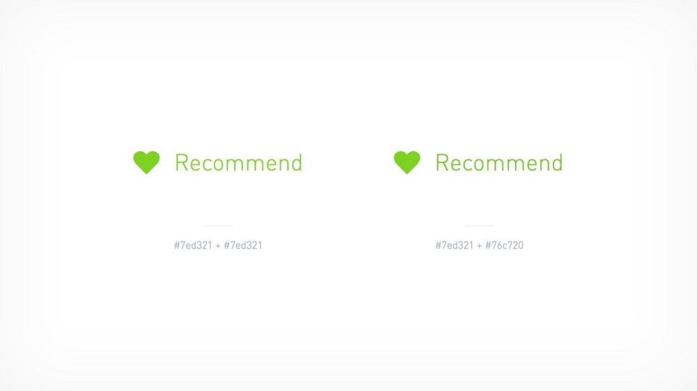
It is subtle, but you can see that the icon is heavier than that of the text. To adjust this, either make the icon colour lighter, or make the text darker — I suggest picking whichever colour will help you meet AA accessibility guidelines. 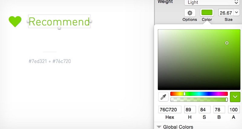
ScaleScale is about how our brains perceive the size of objects, text included. If we think about this in terms of circles and squares, a 120 × 120 pixel square has a larger surface area than a 120 × 120 pixel circle, so the circle must be larger to compensate. 
As with all other adjustments this is subtle, but the adjustments help the overall design look right. This is very much fine-tuning of an element — nudging values up and down by 1 pixel until it feels right. 
This is also true in typography, where overshoots on curved letters drop or rise above the cap-height, baseline, etc. If you write a line of text in Garamond and draw a line on the baseline and x-height of the text, you would see the curved shapes overhanging these lines. If these overshoots didn’t exist, the individual characters would feel too small next to their siblings. Uppercase textA final, quick example of where optical adjustment is necessary: when setting uppercase text next to standard case text. Uppercase text is more prominent than standard case text, and needs to be adjusted to compensate. 
Unless the aim of this design aspect is for the uppercase text to be more prominent, uppercase text should always be reduced by a small number of pixels, e.g. 16 pixels to 14 pixels or 12 pixels to 11 pixels. When working on a large interface each of these tiny design details add up and will affect the overall feel of the website. This attention to detail is what makes a good design great. Once it becomes part of a workflow, reducing text size by 2 pixels or nudging a triangle 10 pixels to the right takes moments, but these are the things that make a design feel pixel perfect.
Computers or even AI cannot understand the context of a piece of design, so it cannot make the accurate adjustments that a designer can make. Until a computer can make a rational judgement about an isolated component within the context of an entire visual language, it cannot be relied on to make complex design decisions. We shouldn’t rely on computers to do all the thinking for us, we should rely on our eyes and our instincts. Designers hone their instincts with every working day, so we should trust them, even when a computer tells us otherwise. -- I’m a bit of a nerd when it comes to stuff like this, so if you have any interesting examples that you’ve had to fix then please shoot me a tweet. Or is it that I am totally wrong? If I am, please call me out on it, I want to talk about it! The post Optical Adjustment appeared first on Design your way. from http://www.designyourway.net/blog/design/optical-adjustment/ |

AuthorPleasure to introduce myself I am Jamie 27 years old living in Searcy, AR. I am web developer and have developed over 50 sites for clients. Now a days I am focused on designing as I feel I am lacking it. Archives
April 2019
Categories |
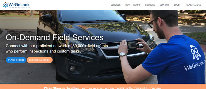
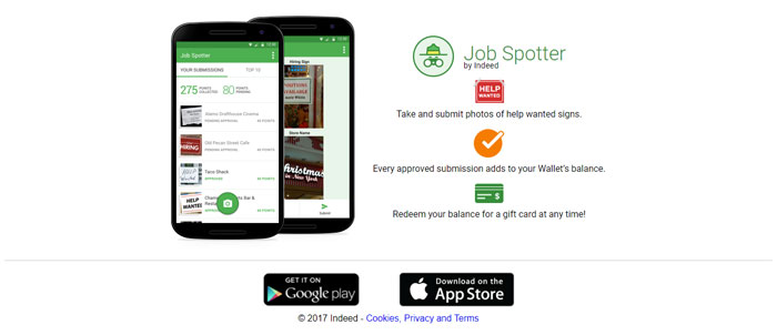
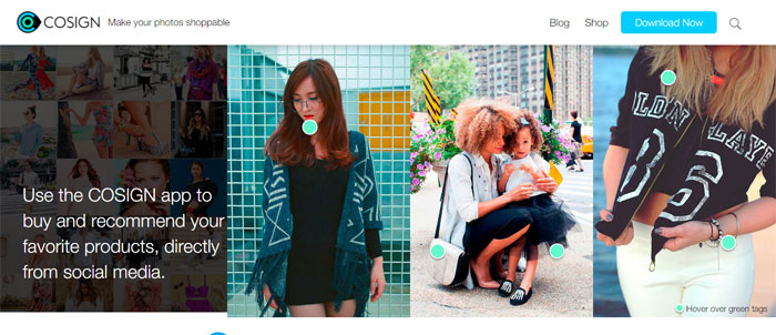

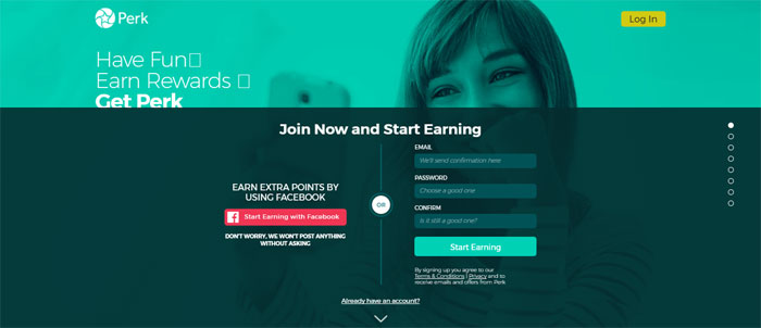
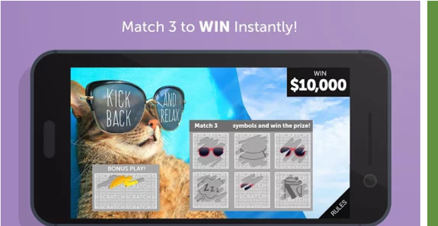
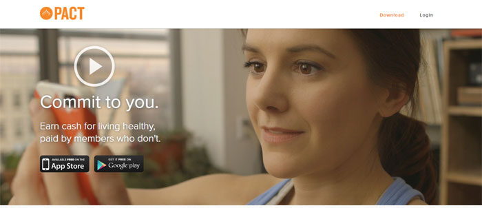
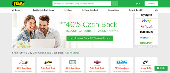


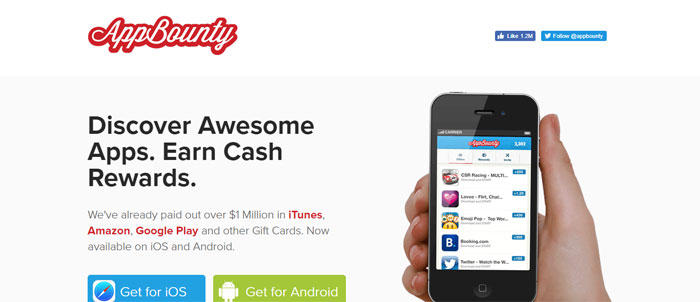

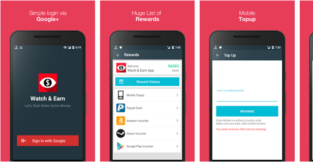
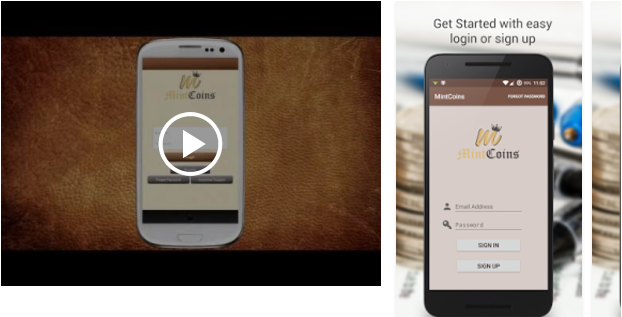
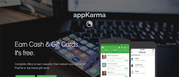


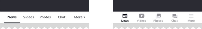
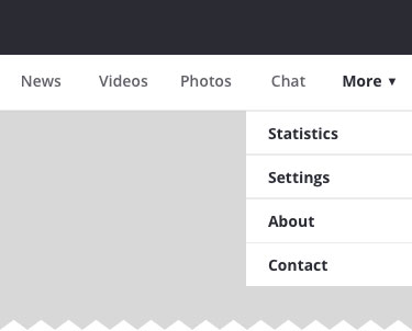
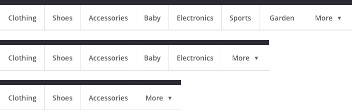
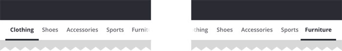
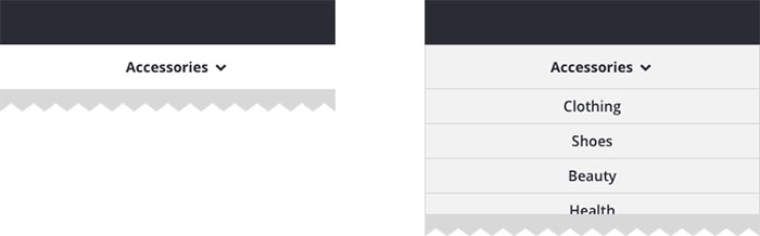
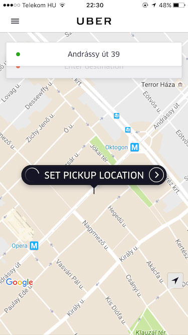
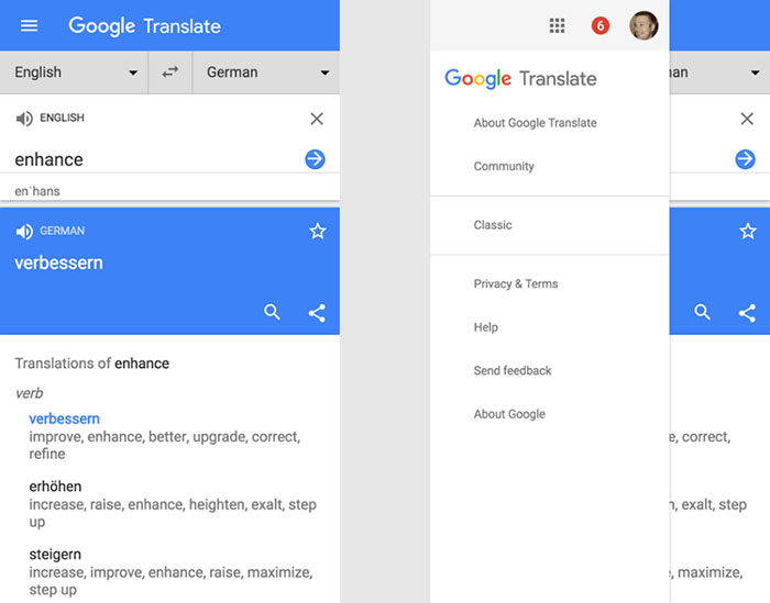
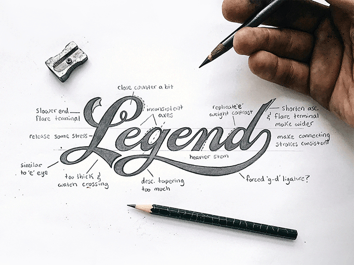
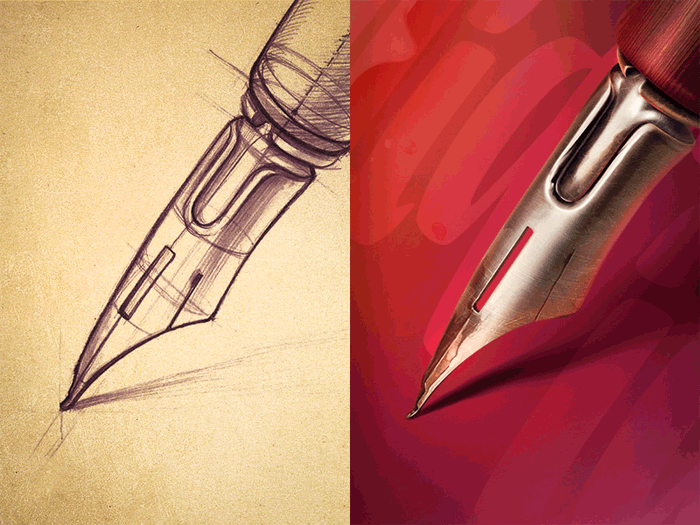
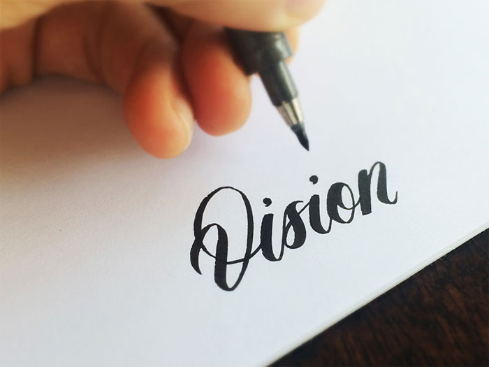
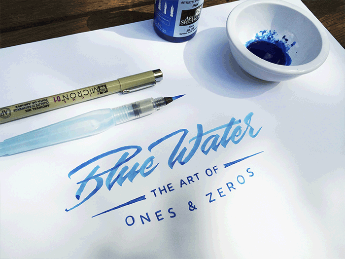
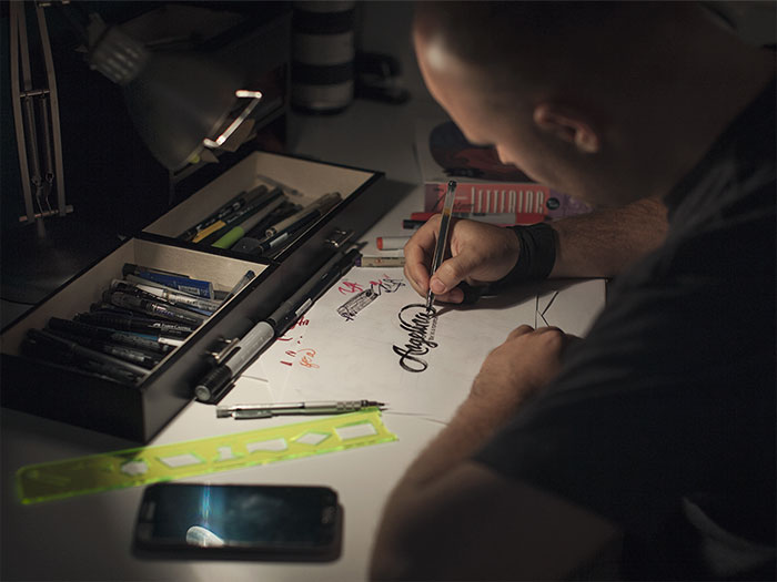
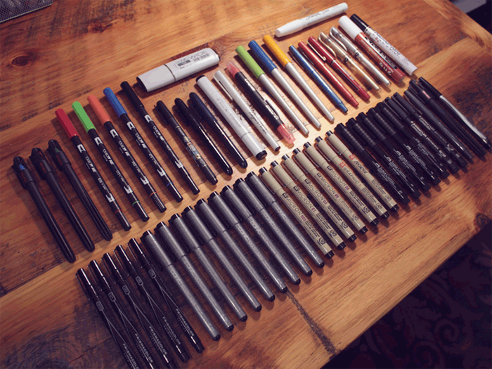
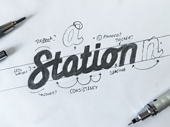
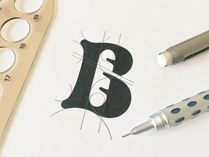
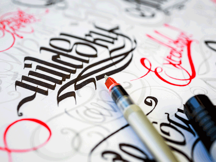
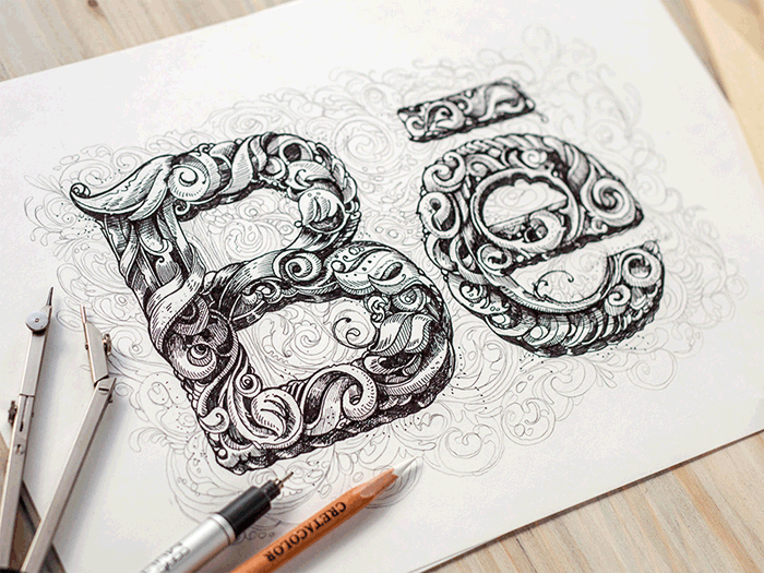
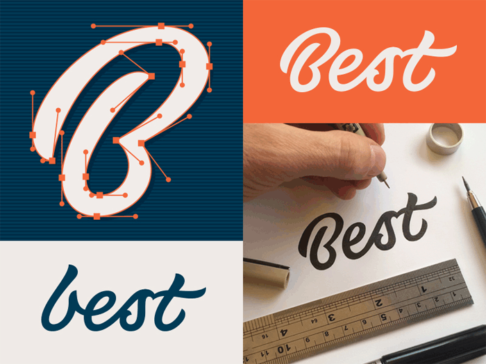
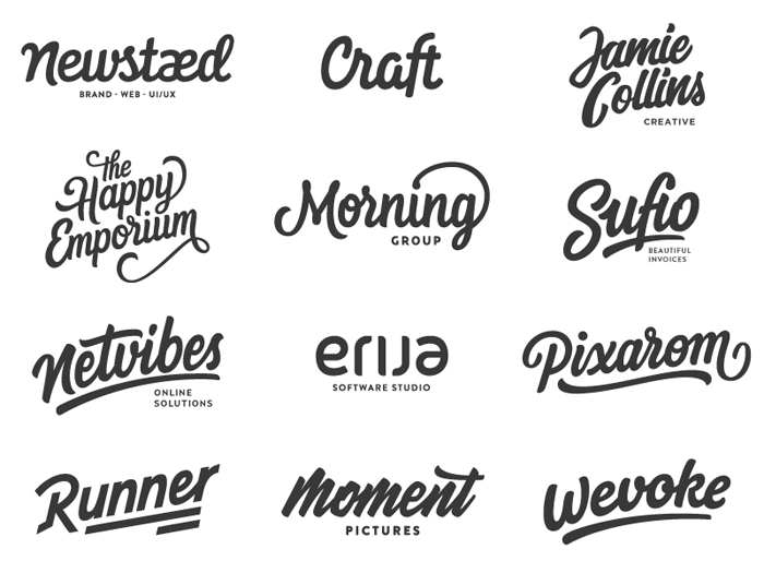
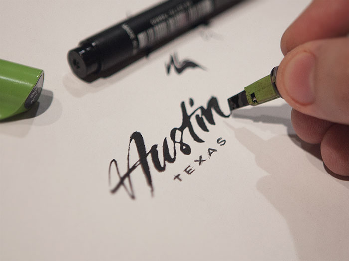
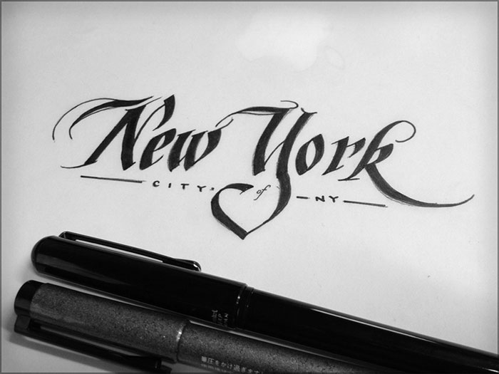
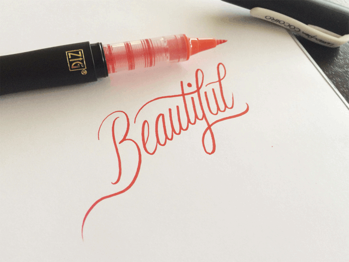
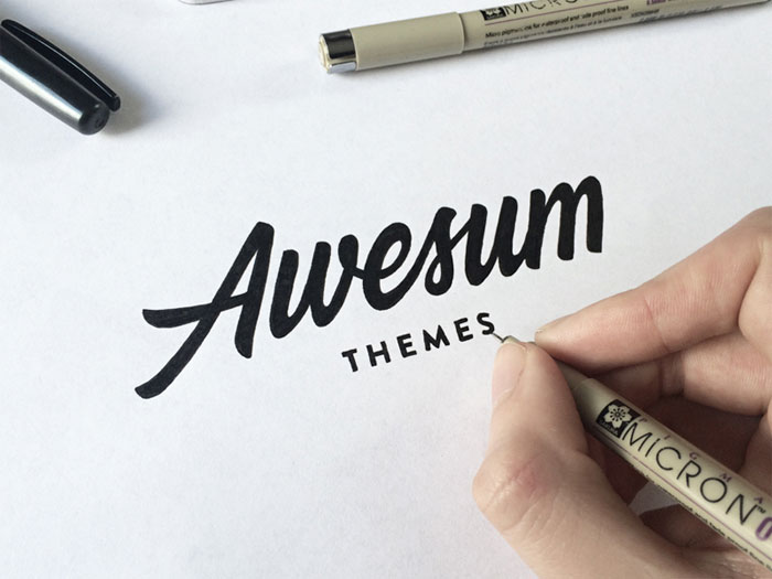
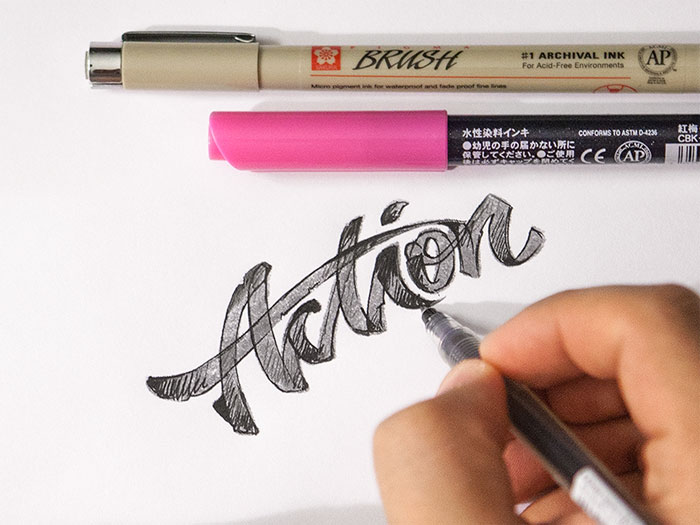

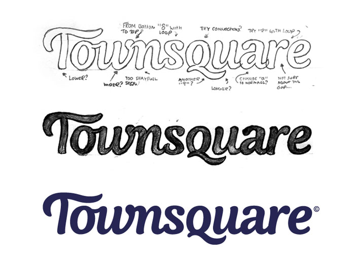
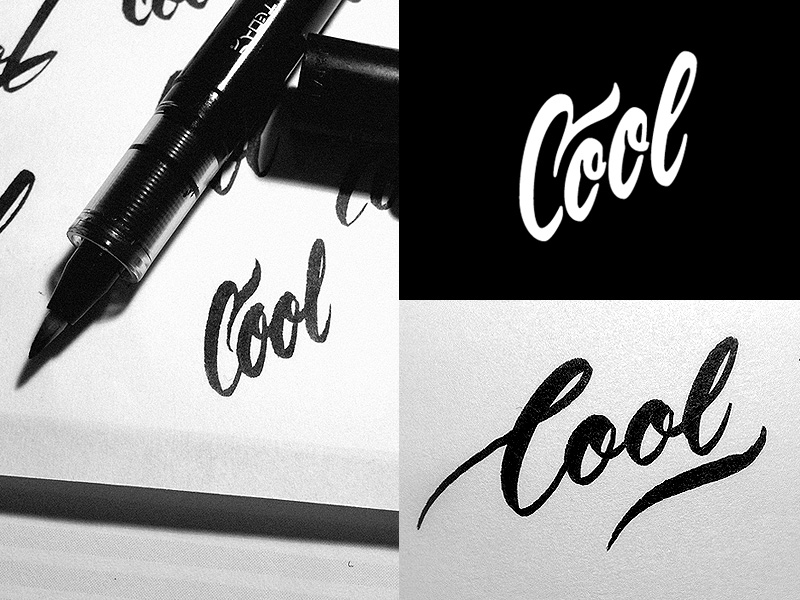
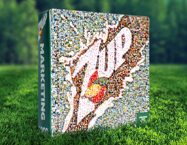
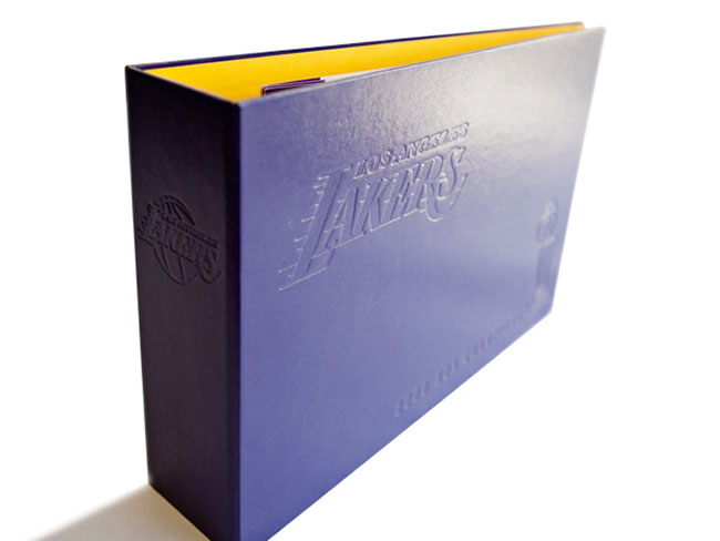

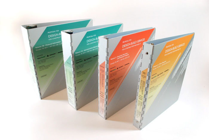
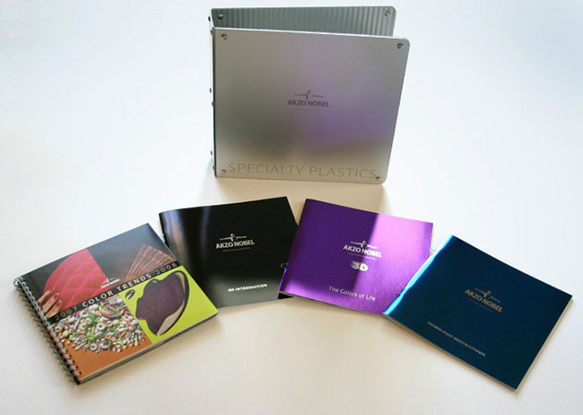
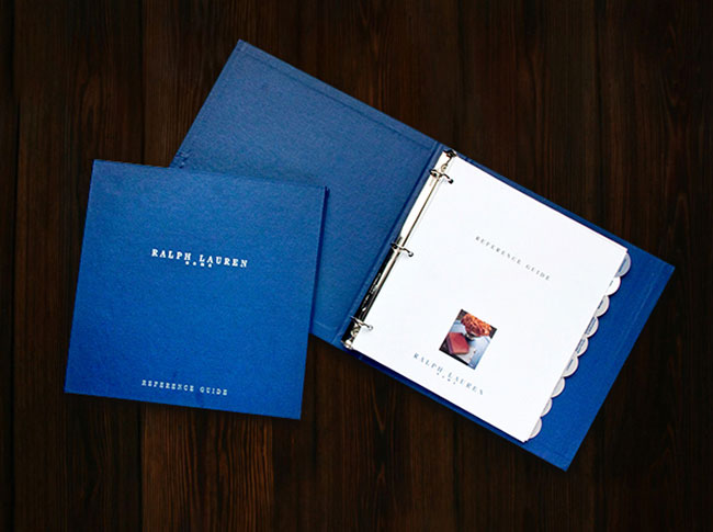
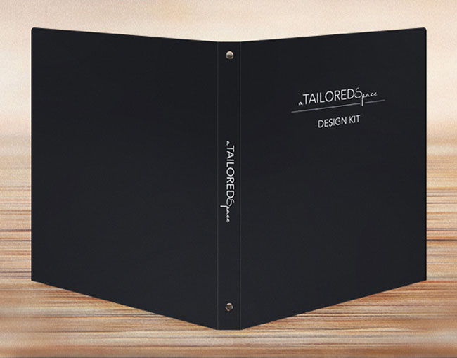
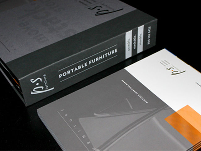
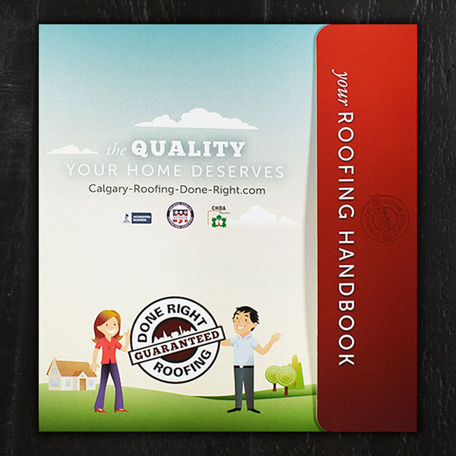
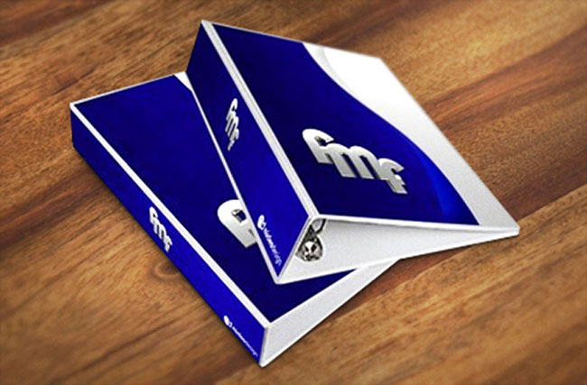
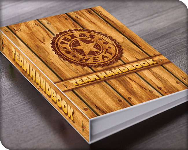
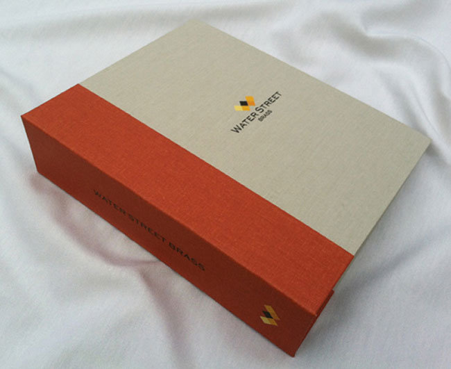
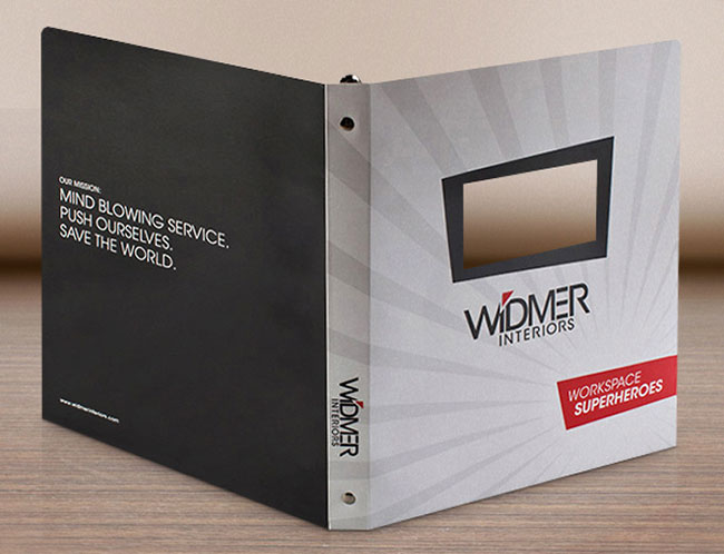
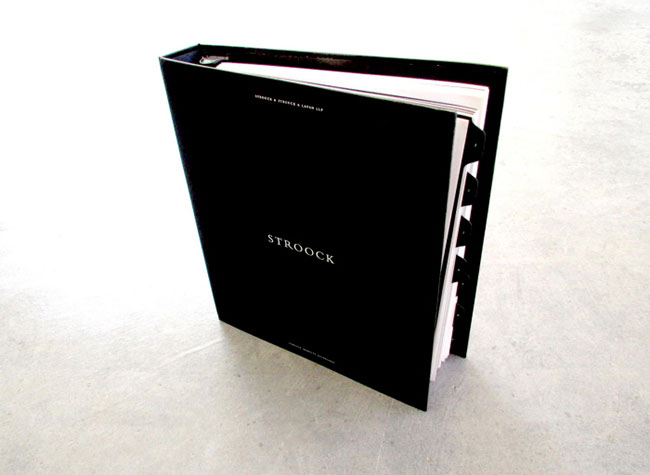
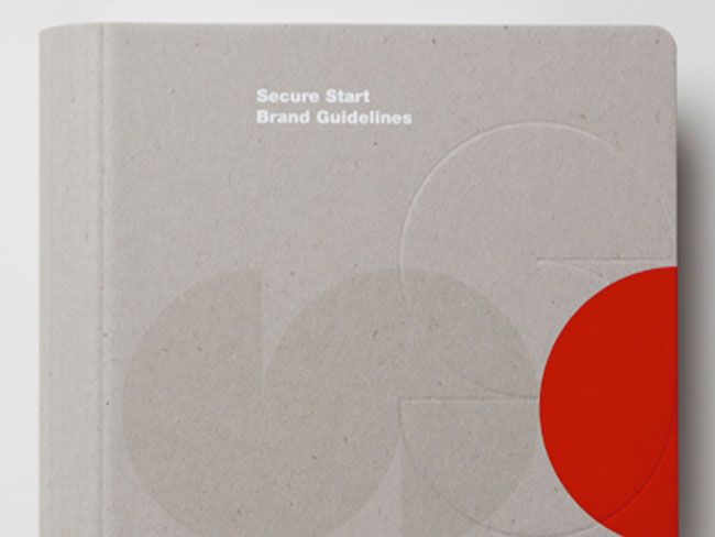
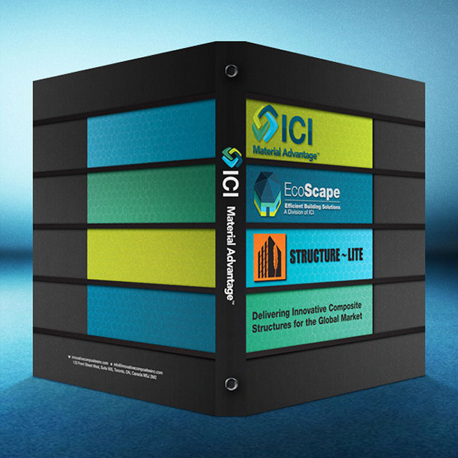
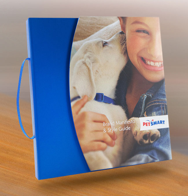
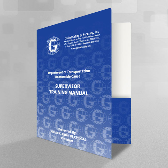
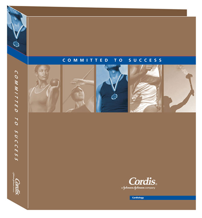
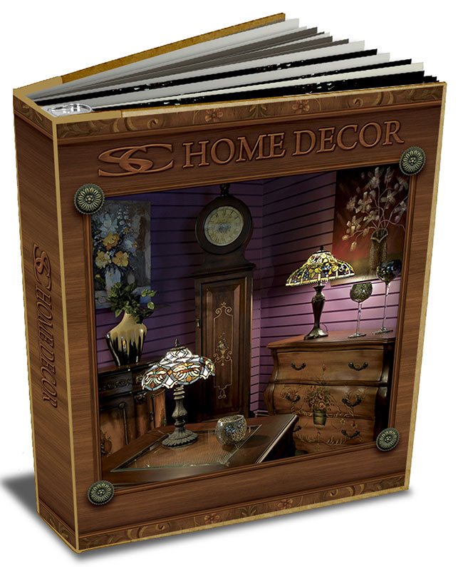
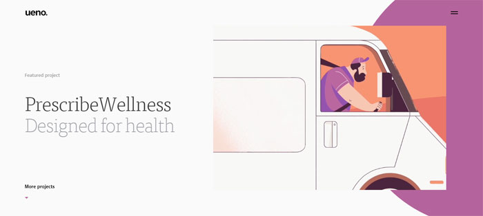
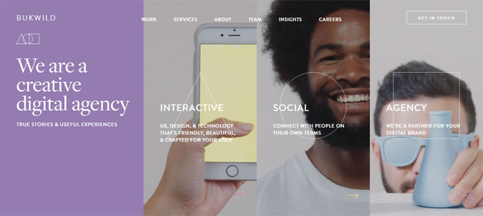

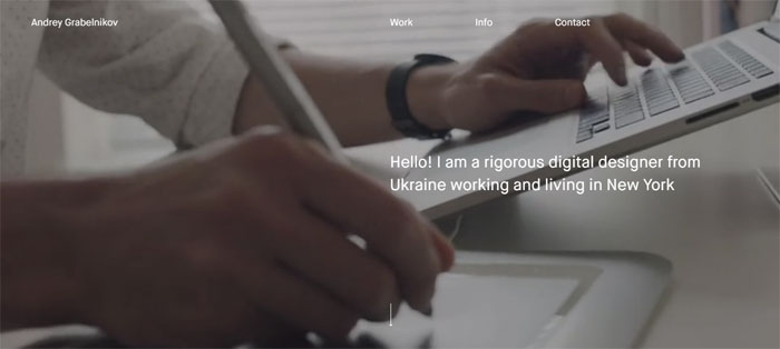
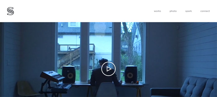
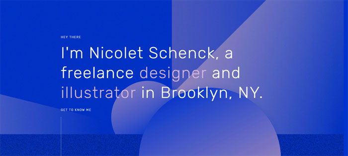


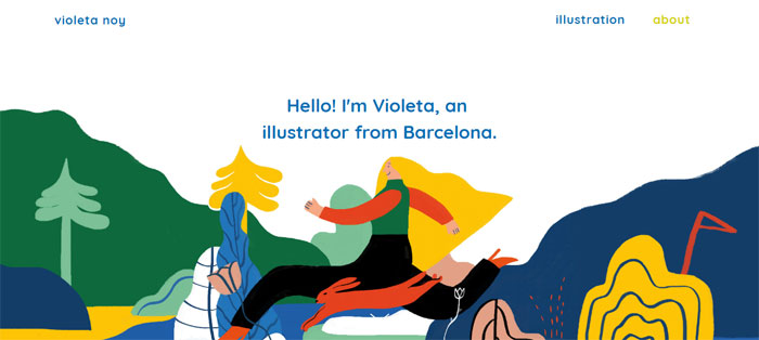
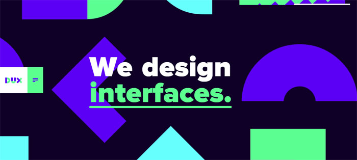


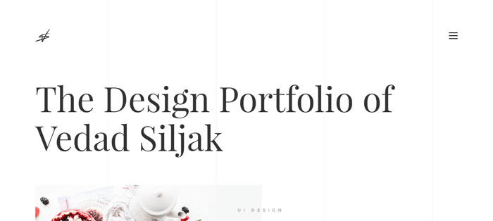
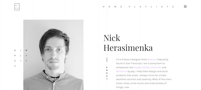
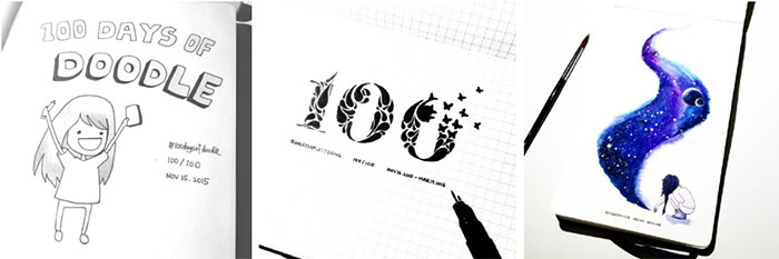

 RSS Feed
