|
Vintage design is a smart choice for all sorts of things. Make retro posters, or include retro stylings on your website. And to do that you need a good selection of free retro fonts. It’s not glossy or sharp look, yet there’s something about it that seems professional. It’s clever look with a lot of personality and can be easily tooled to look unique by blending it with more modern additions. Retro fonts are a great basis for an overall retro design. They are often inspired by old posters or signs. Use a faded color scheme to make them look just right. Old-school borders, shapes, textures, and ornaments accent them perfectly. One of the most interesting things about retro fonts is that they incorporate atmosphere and other information into their design overall. It’s amazing how the shape and style of a retro font can convey a lot about what its saying. Just think of how well retro band fonts let you know the personality of the music they play. Use vintage fonts for headlines and other larger text. They make for great titles and any other short bit of text you want to catch viewers’ eyes. It’s not often suited for closer, smaller body text. Retro font adds a splash of personality to whatever you use it on. There are a lot of options for free vintage fonts on the internet. Here are some of the best retro fonts out there. Aemstel Free Font
This free retro font is available in 5 styles: regular, line outside, line inside, horizontal line, and shadow. Traveler Typeface
This font has a western style. It was created by Gleb Guralnyk. The characters are wide and narrow with many ligatures. It has a trendy extruded effect, which is created in separate font file. This makes for easy editing and coloring. Phenomena Font
This free vintage font has condensed proportions and round geometric shapes. It has rounded corners that help cement the retro look of this font. Phalanx Typeface
This font is a hand-drawn typeface created by Mark Richardson. It was inspired by print catalogs common in the 1900s. Paralines Font
Bartolomew Typeface
This retro font is a hand lettered typeface. It was created by Klapaucius Co. It has 2 styles: regular and rustic printed. Black Mask Typeface
This font is one of many vintage fonts that only has capital letters. It comes to us from Giemons. Bukhari Free Font
This is one of several vintage script fonts. It has a bold, monoline cursive look. It works great for web or print use. Use it for posters, logotype, signage, badges, business cards, and t-shirt designs. Palm Canyon Drive
This popular free vintage font is a monoline script. It was inspired by retro travel postcards, matchbook covers, Tikki bars, and Hollywood style. It is classy but not pretentious, a good choice if you want something comfortable that still seems high class. It comes in 3 weights. Nexa Rust
Nexa Rust is a rougher bersion of the popular Nexa, Nexa Script, Nex Handmade, and Nexa Slab font families. It has a warm feel, with sans, slab, script, and handmade versions. There are 83 versions of Nexa Rust, all available for free. It works very well for logos. Parker
This retro font was created by James Lafuente, a Seattle-based art director and designer. It is an all-caps font. It works very well for posters, t-shirts, and logos. It’s free for personal use and you can get it for commercial project for a fee of $12. It’s recommended that you use capslock when you test this retro font. Stiff Staff
This is a very decorative free retro font. It was created by Borislav Petrov, a Bulagaria0based designer. It has clean lines and distinctive angles for a constructivist look. Lovelo Inline
There are no closed endings in this free retro font. It was made by Hans Rezler, an art director in Vienna, Austria. It comes in 3 styles, and has a basic Latin alphabet with numerals, as well as an extended Latin alphabet. Ailerons
This font was created by Brazil-based graphic designer Adilson Gonzales de Oliveira Junior. It was inspired by 1940s aircraft models. It has clean and stylish feel, mixing rounded and sharp edges. It was originally an experimental design project and is available for personal use. Big John / Slim Joe
This is a geometric font that only comes in capital letters. It was made by Ion Lucin, a Madrid Based designer. It comes in both bold and ultra-light. They work together to create an eye-catching contrast that works great in almost any retro styled project. It is free for both commercial and personal use. Moon
This retro font is a rounded sans serif font. It was created by Jack Harvatt. It comes in light and bold weights. It’s a very popular font. It is free for both personal and commercial use. Aqua Grotesque
This retro futuristic font has a unique mysterious feel. It is only available in regular wright and has no glyphs. It’s great if you want scientific retro feel for your design. Laika
Laika is clearly derived from vintage cartoons. It was created by Araya Salas, a Chilean type designer and illustrator. It was inspired by the Russian Cyrillic alphabet. It only has capital letters. Hello Stockholm
This retro font is a fun and modern brush script font. It was inspired by Scandinavian minimalism and made by Mats-Peter Forss. It looks great just about everywhere it’s used. You can get it free for personal use. For commercial use, you need to license it for $14. Obake Font
Obake was made by a Buenos Aires-based font designer. It is a textured sans serif font with a retro drop shadow and condensed design. It adds an aged feel to any design. It is free for personal use. Retro Display Typeface
This is a hand-lettered typeface with a lot of personality it was created by London-based designer and illustrator Kisty Mea as a student project. It is free for personal use. Helsinki
This is a geometric font derived from Finnish traffic signs. It is available in two extreme weights: hairline and heavy. It comes from German graphic designer Ludwig Übele. Roseline
Roseline is lovely script font with elegant curves and a hand-drawn feel with a great textured feeling. It was created by Alexey Potapov. It’s a very friendly font that works well when you want a welcoming feel for your retro project. Supria Sans
This retro font is much more quiet than most. It was inspired by utilitarian Swiss type design. It was created by Hannes von Döhren from HVD Fonts. You can get the regular and italic weight for free. Ansley Display
This is a slab serif with a retro design and some modern twists. It works very well for any text you want to display prominently. It was created by Kady Jeska. It is free for both commercial and personal use. The designer would appreciate a donation if you choose to use it. Cast Iron Font
Geometric and industrial, this font looks great as a high-impact headline or powerful logos. It is free for both commercial and personal use. Hustler’s Roug
Hustler’s Rough was inspired by vintage signage. It is free for personal use. The commercial version requires a fee and comes with both clean and rough options as well as over 300 glyphs. Noir
This elegant font is a geometric sans serif free retro font. It comes from Matthias Guggisberg, a Switzerland-based designer. Duwhoers
This free retro font has a vintage handmade feel with its brushstroke styling. It is free for both commercial use. It was created by Indonesian designer Agga Swist-blnk. If you choose to use it, the designer would appreciate a donation. Sabo
Sabo is a pixel-style font. It comes in two styles: inline and filled. It is a great option for arcade-style designs, especially games designed to look retro. It was created by Philippe Moesch, a Swiss designer. Graphique Pro Next Comp
This retro font was created by Profonts studio. It was inspired by the work of Swiss designer Hermann Eidenbenz. It is available in 8 weights, but the Graphique Pro Next Comp is the only one available for free. Gist Rough
This is a letterpress version of the font Gist. It has a warm and weathered look. It’s an all capital font and lends any text that uses it a retro edge. Gist Rough Light Three is available for free. Other versions cost a small fee. Alt Retro
This a very charming free retro font. It has an eye-catching look with its multiple lines. You can find it in 5 weights. It was designed by Andreas Leonidou, a Cyprus-based designer. It is available for free for both personal and commercial use. Fibre – Vintage Font
Fibre is a highly detailed and textured font. Every character has been uniquely designed. Typnic
This font’s name is derived from the term “typographic picnic”. It is a retro calligraphic font family that has 18 styles. Typnic Titling is the free style. It is particularly elegant. Lichtspiele
Lichtspiele was inspired by early 20th century cinema. It was created by Stefan Huebsch. It has 5 stykles available. Lichtspiele Trailer is free. Bobber
This retro font is a sans serif with only capital letters. It was inspired by vintage bobber motorcycles and has a modular, grid-based design. It looks hand drawn and ornate. It can be downloaded for free. There is also a pro version available for $5. Mensch
This font operates on a pay-as-you-can personal use license. It has a condensed uppercase design. There are four weights: regular, thin, bold, and inline. The license for commercial use is $40. Orwellian
This a very atmospheric font. It has a reversed-stress design. It was inspired by concepts found in George Orwell’s novel Nineteen Eighty Four. It has a pay-as-you can personal use license. American Captain
American Captain is a free retro font that is inspired by the type style of the 1940s. It was created by Michael Adkins. It comes in two different weights for personal use. For commercial use, you can pay for the full five available weights. Sho-Card-Caps
This font is an adaptation of the 1930s font Future. It works very well for headlines and drop-caps. It was created by Nick Curtis, who says that it was inspired by “hand-lettered posters from a bygone era”. Matchbook
This font has extended forms and rounded serifs. It has a textured version that resembles letterpress type. It was create by the lettering artist Simon Walker and was his first evert typeface. It has a pay-as-you-can license for personal use. The commercial use license for $30. Mekon
This free retro font family has a bold heavyweight design that works great for web, print, t-shirts, and anywhere else you want big, eye-catching lettering. It was created by Jonathan Hill. Additional weights are available for a fee. Yesteryear
This retro font is based on the title screen from the 1942 film The Palm Beach Story. It is a “flat nib connecting script font” according to its creator, Brian Bonislawsky. This font has a sharper feel than its source design and resembles chrome scripts from vintage automobilia. It is free for both commercial and personal use. Arvil
This font has strong lines and softly rounded terminals. The letters are strong and friendly, great to create a more welcoming atmosphere. It has a pay-what-you-can personal use license. Silverfake
Silverflake uses modern curved with an old-fashioned vibe to create a modern font with a bit of retro flair. It uses all capital letters and comes has several alternate characters. It is free for personal and commercial use. Nautilus Pompilius
This is a modern script font with some vintage touches. It works well for posters, headings, and logos. There are many ligatures, stylistic swashes, and alternates. It is free for personal use. Curley
Curley is handmade font with a bit of retro twist. It comes from the Jakarta-based Konstantine studio. It was designed to cause a “cuteness overload”. It can also work as a lighter party font. Sonder
Sonder is a curvy retro font that has both serif and sans serif options, as well as distressed and non-distressed options. All versions come in regular, bold, and black weights. This retro font works great for vintage logos, packaging, or branding. You can get a sample version for free and for personal use. You can also purchase the full typeface for commercial use. West Side
This free retro font draws from the designs of 1980s handmade posters and illustrations. It is block-styled with bold sharp edges and works great as a display font. It was created by Artimasa Studio. It is free for both commercial and personal use. Billionaire Medium Grunge
This font has a slightly roughened-up art deco look and gives your work a faded sophistication. It is one of the 6 fonts in the Billionaire font family. The whole typeface was created by JumboDesign. You can use it for free. Frontage Condensed (Outline)
This is a family of retro fonts that works great for any vintage design. It was created by the Swiss art director Juri Zaech. Frontage Condensed in a number of weights, but the only free one is Outline. Hamster
This retro font is a script typeface inspired by traditional sign painting and brush lettering. It has a very dynamic flow and is more legible than most cursive-style fonts. It is free for both commercial and personal use. Lazer 84
Lazer 84 is 1980s brush-style retro font. It was designed by art director Juan Hodgson. It has everything you need in a font, including numbers, symbols, and accents, making it a great option for a retro arcade game feel. Glasoor
This experimental retro font has a highly playful design. It works great for logos and posters. It was made by type designer Sergiy Tkachenko. Zebrazil
This font has thin letters with bold serifs. It was designed by Zarni, a Burmese graphic designer. He offers this retro font as a free download. Unique
This retro font is flashy and has a slight contemporary edge. It was made by designer Anna Pocius also known as Artmaker. It was created to be used for logotypes and headings. Canter
This is a condensed all-caps retro font available in 6 weights. It is great for headlines, posters, and titles. Use it for any retro style. This font was created by New York-based designer Christopher J. Lee. Rispa
Konrad Bednarski was inspired to create this retro font by his new hometown. You can download a free test version. A more refined version with more weights will be available soon. Society6 offers Rispa Regular T-shirts, prints, tote bags, pillows and more. White Rabbit
This font is free for personal use. It was created by Alice Creative. If you use this retro font, please donate to their author. Andes
You can find the Andes retro font in two styles. The lettering has a basic curved design, perfect for any vintage project. This font is free for personal use. Sesame
Seasame looks great on retro-styled posters and website headlines. It was created by Dieter Steffmann. It has a complete selection of uppercase letters and numbers as well as numerous special characters. Arwen
This is one of the most beautiful and elegant retro fonts around. It was designed by Keystrokes. It is an all capital font. You can get it for free. Highlands
The designer of this retro font, web and UI designer Tyler Galpin, describes this font as “a charming slab-serif that draws inspiration from National Park posters of old”. You can use this font for free. The author appreciates any donations. Quid Pro Quo
This is a handwritten script retro font. It was made by designer David Kerkhoff. It has both upper and lowercase letters, as well as numbers and a selection of special characters. It is free for personal use and the author would appreciate donations if you choose to use this font. Pricedown
Pricedown is a bold font inspired by game shows. It was designed by Ray Larabie of Typodermic Fonts. He describes his work as being “based on a late-Sixties font called Pinto Flare; famous for its use in the titles for the TV program The Price is Right.” This font is free for personal use and donations would be gratefully appreciated. Pompadour Numerals
This is a stylish free retro set of numerals and punctuation. It was created by designer Andy Mangold. Offered online by Lost Type Co-Op. It was inspired by the 1950s Rockabilly Hairdo. Evert number fits perfectly inside of a square. It looks best in large font sizes. You can use this retro font for free and donations are appreciated. Riesling
This retro font harkens back to the 1920s. It is a very elegant typeface. It comes with upper and lowercase letters, numbers, and special characters. This font was designed by Bright Ideas. Sakra Font Duo
This retro font mixes both old and new to create a curvy script type font with some beautiful swash details. It has a complete set of letters, numbers, and symbols. Top Speed
Top Speed is highly reminiscent of 1950s Chevrolet. It was created by Jason Vanderhill. It comes in three variations. If you want to link the letters together, just use the underscore key. It is free for personal use. Echo Deco
Created by GreyWolf Webworks, this font was inspired by old music posters. It only has capital letters. It also comes complete with numbers and special characters. It is free for personal use. Deftone Stylus
This is a retro script font. It comes from Ray Larabie of Typodermic Fonts. He states that “Deftone Stylus is a structured, industrial script from the late 20th century. It was rebuilt in 2011 and now features custom letter pairs to make words flow.” Bellerose
Bellerose is an elegant retro font. It is a highly popular font, with more than 1.5 million downloads since it was released. It was designed by James M. Harris. It has a full set of lowercase and uppercase letters, as well as numbers. It is free for personal use. Parisish
Designed to bring to mind old Paris, this an elegant retro font. It was created by George Williams, who has designed 57 fonts. This is one of his most popular creations and it has been downloaded over 200,000 times. It is free for both commercial and personal use. Budmo
This is a very flashy marquee font. It looks like it belongs a posters at the Moulin Rouge. It was made by Ray Larabie of Typodermic Fonts. It consists of four variations all contained in a separate font file. It is free for personal use. Bauru
This free retro font is immediately reminiscent of bygone eras. It is considered by many to be one of the best free retro fonts. It is instantly nostalgic and has a sense of timelessness. Use it for posters, branding, advertising, and logo design. It was made by Pier Paolo, a Brazilian art director and illustrator. Hamurz
This font has rough edges and rounded shapes, giving it a hipster retro vibe. It is a very versatile retro font, working well with T-shirts, logos, headings, and badges. It was designed by Bagus Budiyanto. Leafy
This is an all-caps brush font with 95 hand-crafted chacrters. It was drawn by Ieva Mezule. Krisjanis Mezulis, of the Latvian agency Wild Ones Design, assembled it. It adds a handmade touch to any design. It is free for both personal and commercial use. Playlist
Playlist is a hand-drawn retro font. It has 3 styles: Caps, Script, and Ornament. It works very well for illustrated designs featured on T-shirts, posters, and any other kind of merchandise. It was created by the Indonesian studio Artimasa. Sophia
This font has a light, friendly, slightly off-kilter, fun style. It was created by Mats-Peter Forss (of Finland) and Emily Spadoni (of the USA), who describe this font as “a hand-lettered brush script with a sweet decorative bonus”. It has multlingual glyphs and both left and right stylistic letter combos. Reckless
This font is a handwritten brush font. It has uppercase and extended Latin characters. It works very well with watercolor types design both in print and on screen. This don’t was made by Nadi Spasibenko, as Russian designer. Kust
This is a slightly distorted, corrupted-looking font. It is based on letters drawn on paper with a thick brush and black ink. It was created by the artist and fashion designer Leva Mezule. Wildtype Design out of Latvia released this retro font for free. Brux
Brux is unusually rigid formal brush-style retro font. It seems almost like a stencil font. It has an original and fresh feel. It includes German, Spanish, and Swedish characters. It comes from Marcelo Melo, a Stockholm-based art director. Zorus Serif
This font is composed of antique style letters and glyphs. It adds a quirky and old-fashioned feel wherever it is used. It comes in both standard and italic versions. It was made by the Canadian designer Jérémie Dupuis. Oldways Free Font
This font mixes contemporary design and old west typography. It’s great for posters, logos, and branding. Stiquez Font
This serif font is perfect for any design that calls for retro fonts. It’s great for shop signs and logos. Jibril – Vintage Style Font
This font comes in four styles: regular, grunge, and inline. It is truly great vintage font. Heubeul Vintage Typeface
This is handmade retro font. It was crated on a set of hand-drawn letters. It includes a full set of letters, numbers, and punctuation. It has some incredibly detailed texture. Sinara Font
This font takes a lot of inspiration from the Victorian era. This serif font owes a lot to the period’s Sianra font. It has a complete set of letter, numbers, and punctuation. Lawless Font
Lawless is a retro font based on early American wood typed from the 1800s. It is bold typeface that works great to create an Old West atmosphere. It has four different styles that can be easily mixed and matched. Vanillate Font Duo
This is a script monoline font. It’s designed to be very sweet, and the download comes with 15 bonus logo templates with various food themes. Trincha Typeface
This grungy hand-painted font was inspired by vintage signs and is named after the Portuguese word for the brush used to create them. It has a bold sans serif design. The lowercase version has a more distressed look. If you liked this article about free retro fonts, you should check out these as well:
The post Retro Fonts: Free Vintage Fonts To Download appeared first on Design your way. from http://www.designyourway.net/blog/typography/retro-fonts-free-vintage/
1 Comment
Ever since you’ve read your first comic books, you were fascinated with them. And if you’ve got an artistic background you might have asked yourself how to make a comic book. Comic books have captured imaginations for decades. They are a great way to introduce new characters, thrilling plots, and amazing worlds. Their format allows artists and writers a great deal of freedom and some really great opportunities for collaboration. If you’ve decided to make your own comic book, you need to know that it’s a complicated and often difficult process. Making a comic book is a process composed of many steps. In the mainstream comic book industry, even producing one issue takes an army of specialized workers from its conception to its printing. This is an intimidating process, especially if you’re new to printing comic books. Switching from short-form media like webcomics to a long form project is in tall order. Here are some tips and trick to help you learn how to make a comic book. Read Books about Making Comic Books
One of the best ways to learn how to make comics is to read books from experts. Draw on the experiences of those who have studied and succeeded in making a comic book. This will spare you a lot of pain and also give you some ideas for how to go forward. Here are a few good books for you to read before you decide on how to start a comic:
Be Inspired by Your Idea
You need to really believe in your comic book concept and want to share it with others. Making a comic book is a long, hard process. If you really love what you’re doing and care about what you’re trying to say, it’s going to be a lot easier to dedicate the time and effort you’re going to need. This dedication will also show in the final product. Model Your Characters
Characters and character design is a very important element of your comic. Take the time to really figure out how to make a comic book character. Make a model sheet or turnaround. If you have the resources, time, and skill, try sculpting your character in clay or 3D. You’re going to be redrawing these characters over and over again in different poses and environments. You want to have a solid grasp on their design. Redrawing a character halfway through your comic is not something you want to end up doing. Develop a Good Style
You need to draw in a style that won’t take too long to draw. While detailed panels may be fun, they take time to create and color. This is going to make it take a long time to make your own comic book. If it’s going to have more than one issue, it’s going to make producing them take a long time. Modern technology has made drawing a lot faster. You don’t have to ink all your pages since you can just boost the contrast of pencil lines in Photoshop or similar software. This will save you hours of work. Having a good grasp of the various effects of your graphics software’s tools is a smart idea. Focus on Your Strengths
Draw what you like drawing. If you are terrible at drawing giant robots or animals, they shouldn’t be what your story is about. The time to learn how to draw something is not when you are learning how to draw comics. It’s not a great medium for it. Fixing issues that you notice will make your production rate a lot slower and more painful. If you have a great idea, but don’t have the skills for it, write it down somewhere and start figuring out what you need to learn to be able to make it a good comic book. Study the Basics
It’s important to know how real things move, especially if you’re drawing human characters. Even highly stylized comic book artists need to know how the body actually works so they don’t dip into the uncanny valley or draw disturbingly ugly characters all the time. Study anatomy before you start on your comic book. Buy books. Take classes. Use references. It’s also important to understand other basic visual rules like perspective if you’ll be using it. Knowing these rules will result in a better looking comic book. Understand the basic artistic rules in order to learn how to create a comic book. Even the most wildly stylistic comic book shows a good grasp of these rules. Their artists knew when and how to break them for the best effect. They understand why a particular scene or character makes a reader feel uneasy or charmed. Create Stylistic Rules
As you’re deciding how to start a comic, decide on the rules you’re going to keep for its style. This will ensure that it has a single coherent look from start to finish, instead of switching randomly. Sometimes, you’ll find yourself suddenly inspired by some new technique or the works of some other artist that you’ve just found. These rules are up to you. They should fit your artistic process and the subject. They should also be appealing. Every comic you make should have a different style. This allows for people to differentiate them and it also allows you to experiment with new ideas. This applies to comic series as well. They should maintain a consistent style so they don’t confuse readers. Tips for Working
Here are some basic tips to help you know how to how to draw a comic book effectively:
How to Make a Comic Book Step by StepCreate Your ScriptThe key to knowing how to make comic books lies in the idea behind it. Often, this core concept begins as a very simple idea, like “what would happen if aliens crash landed in 1860s England?” It could also be centered on a character, whether that’s a superhero, a werewolf, or an everyman who finds himself in an extraordinary situation. It’s a good idea to keep a notebook or word processing document just for these ideas. That way, you always have somewhere to look for inspiration. Sometimes you’ll get a new idea when you’re in the middle of a project or otherwise occupied.
It’s all too easy to lose these ideas if you just keep them in your head. Write them down for you to look back at. Feel free to include images that also seem like good inspiration for new stories to tell. Writers are highly important for making comic books. Your writer can be one person, or you can have several writers for a comic book. The writer can be the person who originated the core idea of the comic, or it can be someone else. Artists can be their own writers if they’re skilled at both drawing and writing, but not everyone is and some choose not to.
What do the writers for comic books do? Aren’t they primarily stories told with pictures? Yes, but they are pictures with a plot and usually dialogue as well. Even if you are doing a ‘”silent” comic, where there is no text and the story is entirely told in pictures, you still want to plot it out. Good comics use all the plot rules of any other kind of storytelling. Learning how to write a graphic novel is much like learning how to write many other kinds of media, especially movie and television scripts.
A comic book writer gives the comic its structure, setting, rhythm, and characters. How much detail the writer gives to the artist (if they’re different people) varies. Some writers give specific instructions of characters and panels. Other time, a writer may only give a vague plot. He or she will come back to add in the right dialogue after the art hits a certain point of development. Most comic books are created by a team that works closely together. Writers and artists need to communicate their plans to each other. For the best results, frequent updates to each side of the comic book creation process work well. Writers are often the more visionary of the two, creating the ideas behind the plot, world, and characters. Their scripts provide the basis for the art.
Here’s a list of comic book writer skills that you should develop if you’re looking into trying it out:
Here are some more tips for anyone who wants to be a comic book writer:
Plan Your Layout
With your script complete the next step you need to take in order to make your own comic book is plan the layout. A good comic book layout keeps readers interested. A good technique is ending almost every page with a cliffhanger. This will draw readers in and make them wonder what is coming next. They’ll know it’s going to be something interesting, but they won’t know what it is. This will keep your readers turning the page. If you’re creating a comic book series, do the same for every issue for the same effect.
Thumbnails are a useful format to create layouts. Thumbnails are similar to storyboards. They will allow you to work through any compositional issues before you start inking and coloring your drawings. Treat them as an extremely rough draft of your drawings and overall layout. Keep it on hand as a reference for when you move further down the line. Be prepared to change it since you, your writer, or your editor may make changes that affect the flow of your layout. Don’t forget to leave room for dialogue. This will be added after the drawings have been completed, usually as their own layer on graphics software like Photoshop. Penciling
Once the layout and plot are ready, the first step in creating your art is to, well, draw it. At this stage, it goes to the penciler. This is the person who draws out the story using a pencil. Using a pencil makes it easier to fix any mistakes or make changes quickly. The penciler is only responsible for a small portion of the comic, but that small piece is a vital piece. Many people judge a comic solely on the basis of its artwork. Good writing will not save a comic with bad art. The penciler is the one who takes the script and really gives it form. Some scripts are highly detailed, describing how everything should look. Others only make basic suggestions about what should be on any given page. The penciler will need to take whatever kind of script there is and bring it to life in a quality way that makes sense. The skills you need if you want to be a penciler are:
Here are more tips for anyone aspiring to be a comic book penciler:
Inking
Inking takes the penciled sketch of the artwork and turns it into a final piece of artwork. Inkers go over the pencil lines with black ink and add in depth. It will look much more finished and three-dimensional after this process is completed. The inker also makes the artwork easier to copy and color. Pencil lines are rougher and fainter, making it much harder to do these things. Sometimes the penciler is also the inker, though it is a different set of skills. Sometimes people refer to inking as glorified tracing, but it is a vital step in comic book creation. A good inker is an artist in their own right. You cannot move a comic book to the printing stage without them. Some well-known comic book inkers are Klaus Janson, Bob McLeod, Vince Colletta, Jimmy Palmiotti, and Mark Farmer. Skills an inker needs include:
More tips for aspiring inkers:
Coloring
Coloring is addition of color, shading, and lighting to the inked drawings of the comic book. Attention to detail is vital. If a colorist makes a mistake people notice. Randomly switching hair colors and suddenly vanishing details confuse readers. Good colorists bring in the final, vital touch of life to comic book art. Coloring is often broken up into two sections: flatting and coloring. During flatting, basic color areas are blocked out to guide the colorist through what space needs to be what color. Coloring consists of adding the color, lighting, and shading. This helps complete dimensionality and depth added in by inking. Some comic books choose not use coloring at all, like “The Walking Dead”. These generally don’t sell as well in most places. Sometimes it is an attempt to save money, while others use it to add a certain style. Most Japanese comics (manga) are not colored. Skills required of a colorist:
Other tips and trick for a colorist:
Lettering
Lettering is the process used to add dialogue. Letting works alongside art to move the plot forward and allow the characters to express themselves. Letterers don’t only add in dialogue. They also add in the titles, sound effect, captions, thought bubbles and more. Text needs to be added in so that it’s easy for a reader to follow. The chosen font should be easy to read at relatively small sizes. There’s a lot of room for creativity in word balloons and sound effects. Many letterers add in these elements on a computer, though some add them in by hand using an Ames Guide and T-square. Text, word bubbles, and thought bubbles should always add to a story, never detract from it. They can’t block important things that are going on in the scene. Skills that a good letterer needs:
More tips for aspiring letterers: The industry standard for lettering is a Mac. You can use Windows, but you’ll find that you’re expected to work on Mac. Lots of RAM and fast processor speed are the important things to remember when getting a computer for lettering. Adobe Illustrator is the industry standard. Adobe Illustrator is a vector based program that uses lines and curves based on math to create images. You can use other programs, but anyone you work with or for will expect you to use Adobe Illustrator. No matter if you’re working on your own or with a larger company, you’ll need a way to transport files. Companies often use an FTP server to do this. If you’re on your own, you’ll need to get some kind of storage that you can take to the printer. Speak with them to see what one has worked best for them in the past. If you plan on doing hand lettering, make sure to have pencils, erasers, an Ames guide, and a T-square on hand. These are the tools that you can use to get consistent, great looking letters. When you have the letters penciled in, then you should use a crow-quill pen and India ink to ink them in. For consistently shaped word balloons and other items, purchase some stencils in a variety of sizes. Editors
An editor works as a manager through the whole production process. Editors ensure product quality. They identify problems and arrange for any fixes that need be made. They may even be able to do it themselves. The editor checks for errors- -text, color, or even plot issues—and makes sure the final product is polished. Printing and PublishingPrinting is only done after everything has been signed off by the editor. Often this is done in physical print, but more and more comics are printed digitally. This process can be done very quickly. The publisher is the one who releases the comic. The publisher can have a lot of other roles, too, including editing and marketing. They may also provide the funding for the comic. Some people choose to retail their comic online, at stores, or at conventions on their own, but you can also turn to studios like Dark Horse or Image Comics. Skills needed for publishers:
Some other tips for anyone looking to go into comic book publishing:
MarketingUsually, you start getting the word out about the comic before it’s even finished. You should make press releases for websites and magazines. Advertise in those places, too. Once you have review copies ready, send them out to reviewers. Good reviews will give you a nice head start. Tell anyone and everyone about your comic and why they should read it. Social media makes this much easier than it used to be. Crate social media pages for the comic and post regular, interesting content. You don’t want to flood people’s feed, but you do want to catch their attention. Distribution
The most common way to get your comic out there is to distribute it through Diamond Comics. They have a tricky submission process and you will need to make sales quickly. You can also sell at comic book conventions, which can be found in almost every major city and quite a few smaller ones. You can also sell your comic online or, if you think you’ve got a good sales pitch, ask comic book stores in person if they’ll sell it. Start a Webcomic
There are a lot of reputable webcomic series out there, including Genius Girl and Penny Arcade. Some are like the comic strips found in newspapers, others have long-running plotlines. This can be a better option for your comic. A lot of them are free, but they offer a number of products or even fan clubs that can help turn a profit. If you’re running into issues with traditional publishing, consider figuring out how to start a webcomic instead. Ending thoughts on how to make a comic bookMaking a comic book requires a lot of work and a lot of cooperation, but it is an incredible thing to see your writing or art come together to tell a story. If you liked this article on how to make a comic book, you should check out these as well:
The post How To Make A Comic Book: Design, Characters, And Cover appeared first on Design your way. from http://www.designyourway.net/blog/graphic-design/how-to-make-a-comic-book/ So, what is UI design? This question arises whenever you tell a non-design person what you do for a living. You’re in charge of creating beautiful user interface designs, and in the future, this role will only become more and more important for you! Most UI design principles of today work revolve around simple navigation and basic contact forms. On the other side of the spectrum, the design world is becoming richer with new standards and technologies that will imply designers to create more customized and dynamic experiences. What is user interface design? The term encompasses all interface designs created for machines and software, as for instance the looks of websites and mobile apps, and their orientation and ease of use. Some interface designers also define UI design as the art of creating graphical interfaces, excluding in such way user voice and natural interfaces.
With software being as intangible as it is, GUI design plays a crucial role in how users interact with an app or a website, which means that the only good UI design is the one that enables streamlined and seamless experience. Thereof, the two main design fundamentals are efficiency and usability, so that interfaces would enable users to accomplish their missions without even noticing how a design works.
Basically, the best user interface design examples are those that are ‘invisible’, and they portray reality so effectively that a user doesn’t reckon that it was him who produced the changes happening on screen. Yet, with so many good UI designs around, it is no longer enough to rely on efficiency to create a functional product – the interface should also be beautiful and enjoyable, as it is with chat apps and games.
Most of the time, UI interface designs appear on services where interaction is required for a user to accomplish a mission and should include all tools and buttons he needs to perform the desired action. GUI design is dictating the user’s approach towards software and hardware and increases usability by making these actions as frictionless as possible. The UI designer is required to meet both the functional and aesthetical expectations of users. He can do so sketching with paper and pens, using any dedicated visualization program, or even build directly his design using any material. He can also create simulation interfaces to test the effects of his final product prior to release.
What is important is to distinguish user experience design from user interface design – they are both complex and multi-faceted but have a different role. User interface design is created to transform a product’s layout, content, and even development into a pleasant and efficient experience for the user. Thereof, it represents a strictly digital task. The main responsibilities of an UI designer are as follows: Looks, Feel, Market & Customer Analysis, Research, Graphic Development, Branding, Navigation guidelines, Storyline, Responsiveness, Interactivity, Prototyping, Animation. Suitability for all devices and different screen sizesWeb development implementation & adjustment
Creating a good UI means the world to any interactive design, and it usually defines how end customers perceive and appreciate a brand. The designer will obviously not be the only person in charge of branding, but it will be his responsibility to translate the brand to the product. To author a solid UX experience will not require coding, but the designer should be ready to adapt it to the emerging trends and technologies.
Put this way, user experience design matters to everyone interested to create a great product, and moreover to understand what customers really want. If you’re into interface design, on the other hand, you should be more interested in the basic principles of digital design and think of ways to present a product to the user, both in terms of reactivity upon input and quality of display. UI Design FundamentalsKnow who you’re creating for
You won’t always like what you’re creating, and you must make peace with that idea. You should always align your goals with the goals of your clients, and get the full picture of what they need and what they want. Learn from the interfaces they like and keep in line with trends and adjustments. And yes – mimicking the trending designs of your competitors won’t help you achieve these goals! Be careful with patterns
Make users feel at home! Your interface won’t be the customer’s first encounter with such designs, especially nowadays when people use all sorts of web and mobile apps. Therefore, you are not required to reinvent the wheel but to simplify these processes, and solve a problem rather than creating one. For the purpose, try to stick to common and familiar patterns, and your users won’t have any issues understanding your work. Consistency matters
Keep your work consistent. When a user learns how to do something within your design, they’ll expect to do the same again. Consistency matters to both layout and language, and applies to only few main elements that must remain the same on all instances. This way, both you and your customers will be more efficient. Arrange elements in visual hierarchyInstead of wasting estate to explain customers what is important, use the interface design to inform them on the order. The placement, size, and colour of the elements can help you create visual hierarchy, and give the user a clear path to follow. Note that successfully displayed hierarchy will also make your designs less complex. Give feedback
Interfaces are all about interaction, which means that you should remain in contact with users and let them know whether what they’re doing is right or wrong. Use messages and visual cues to evaluate actions, notify changes, and suggest solutions, and your users will find it easy to follow your work. Expect mistakes
For some people, technology is a burden even when literally served to them. What this tells us is that UI designs should be tolerant to errors and misunderstandings, and always come up with a way for users to undo their actions (would you mind to start filling an application just because you got the birth date wrong?). At the same time, users should know exactly where they messed up so that they won’t let it happen again. Shift power to your users
As soon as users learn how to work with your design, shift power to their hands. Let them work independently and chop their actions into consumable units, so that they won’t get distracted along the way. Abstract ways to accomplish a task should also be part of the process, as for instance using keyboard shortcuts. Preserve a conversational tone
Copywriting is quite common even in the best interfaces, as designers are not trying to make a sensation. Instead, they’re walking in the shoes of their users with concise and clear labels and instructions. Users like this even if it is not fancy, because it doesn’t feel as if they were listening to anyone else but themselves. Make it simpleMany people won’t be able to answer the question ‘What is UI design’, and for a good reason. Most of them don’t even see the interface, as it is a silent engine that moves wok forward, but still stands out of the way. Before you make any change to your design, estimate whether users really need it and whether they’d be able to work with it. That’s the only thing that matters to you. Keep it going
To develop an interface is not a one-time task, but an ongoing process that needs frequent iterations. Mistakes will happen, but don’t let them discourage you! Learn and practice, and try to create a seamless interface your users won’t even notice. Best user interface design practices
What is UI design? When learning more about it, your first lesson should be to get to know your users, and estimate clearly what they can or can’t do. You also need to discover their interests, preferences, tendencies, and skills. Here are the most important user interface design practices to abide by:
User Interface Design Laws you must abide toThe law of clarity
All elements that cause confusion and misunderstanding will stay in the shadows, and there are no exceptions to this rule! Are you a Gmail user? If so, you’ll remember Google changing the navigation panel on the top where you could easily access your Drive, Calendar, Sheets, or other services.
The company, however, came up with the idea that they can simplify navigation by hiding all these elements behind an abstract icon, as a result of which many Gmail users couldn’t find their way around it. Consequences? Ask Google’s support team! It is absolutely human to ignore what you don’t understand, so make sure your interface won’t cause this problem. The law of context
If you’re inviting a user to control a certain object within your design, place the interface controls as close to it as possible. The user expects to see interface controls close to the object he wants to control. The success of such attempt is made obvious on LinkedIn, where you can easily change all the data you want (and your name!) by clicking on the small pencil right next to it. Facebook, on the other hand, has a very long and complex procedure before it allows you to do that.
The context requirement in UI design is reminiscent of context in real life – to prepare popcorn, you put it in the microwave and turn the device on. Would you still be encouraged to do that if you were expected to run down to the electricity box and switch a button to make it work? Probably not, which is also why most users mind changing their Facebook names. Users want operations to be smooth and simple, so make it happen for them! The law of instructed actions
Most users perform an action on a website because they were asked to. The reason is quite obvious, as everyone feels intimidated to take a step he has no clue about. To get the picture of what we’re saying, think of LinkedIn – as they were introducing the Endorsements feature, they didn’t rely on the assumption that users will know what it is about. Instead, they came up with large call-to-action banners on top of the profile pages and turned the feature into one of their best updates. The rule is simple: If they need to do something, ask them to. The law of timely feedback
To make the user feel confident, give him constant and clear feedback. You can follow Gmail’s example – each action you perform there is subject to notifications, and people feel as if they are in full control of the service. The law of simplifying
Web designs used to complete complex tasks should be broken into several manageable actions. No one likes complicated and long forms because they’re overwhelming, and one always has to double-check if the info inserted is correct. Yet, if you take this form and split it into smaller steps (ideally with a progress bar), people won’t find it that boring. This is the so-called law of simplifying and easing, and it tells us that people would rather go through 5 simple steps than a single large one. The less you intimidate them, the more able they will be to complete the tasks they came after. Ending thoughts on what is UI designUI design can be interpreted in many different ways, as it assembles an amalgamation of actions that help creators optimize their service both in function and in form. In a nutshell, UI design dictates how users interact with a product/service, and how they feel about it. Now you have the answer to the What is UI design question. If you liked this article covering what is UI design, you should check out these as well:
The post What is UI Design: User Interface Design Fundamentals appeared first on Design your way. from http://www.designyourway.net/blog/user-interface-design/what-is-ui-design/ You don’t have to spend time on a computer with a generic Windows background. You need awesome wallpapers to make you feel great. Your old desktop might be getting stale or that family picture might be clearly out of date. Changing your PC wallpaper can be inspirational, helping you get new start on a project or simply give you a new reason to smile throughout the day. An image of a planned vacation spot might give you a goal to work towards, or a photo of the great outdoors might help you remember to spend a bit more time outdoors every once and awhile. Desktop customization also gives you a great chance to add a touch of personality to your office environment. It also gives you a chance to show off your 4K monitor (if you’re that lucky). Whatever reason you have for changing your computer desktop backgrounds, have a few sources for images on hand. You may have to make a few tweaks to get the most out of these awesome wallpapers. Here are some tips and tricks to help you figure out how to make your desktop background look cool. Awesome wallpapers for your desktop background
Checking Your Screen SettingsFor the best looking PC wallpaper, make sure you use a desktop wallpaper with an aspect ratio that matches the aspect ratio of your screen. The aspect ratio of any rectangle is the proportion between its width and its height. The most common screen aspect ratios are 4:3, 16:9, and 16:10. You also need to match a desktop wallpaper’s display resolution tot eh display resolution of your screen. If the computer wallpaper is too small, it will look blurry because it’s been stretched out to fill the screen. If the computer wallpaper is too large, it will look perfectly fine, but it will take up unnecessary disk space you can use for other things. Finding an Image for Your Desktop WallpaperChoosing a desktop wallpaper is a personal choice. As the saying goes, there’s no accounting for taste. There are a lot of sites out there that offer high quality wallpaper, so a quick search for the image subject you’re looking for will yield up some good results. Don’t just rely on Google images, but click through links to wallpaper galleries and stock photo galleries. Good desktop backgrounds will be high resolution, 1920 x 1080 or higher. A high resolution image can always be compressed and will still maintain its quality, but you can’t stretch an image out without losing quality very quickly. Resizing or CroppingIf that awesome wallpaper doesn’t match your screen’s resolution, you’ll need to make some tweaks. If it already matches the screen, you’re good to go. You should download and install GIMP before getting started if you don’t have another image editing app. ResizingIf the desktop wallpaper’s aspect ratio already matches your screen’s aspect ratio, all you need to do to it is resize it. In GIMP, follow these steps to resize an image:
CroppingFor images with a different aspect ratio than your screen, you will need to crop it to make sure it loosk good. Cropping will cut out parts of the image you don’t need. In GIMP, follow these steps to crop an image:
Export the ImageOnce you’ve resized and/or cropped the image to fit your screen, you can save it by clicking File > Export as… to save it as a JPG format for optimal file size or PNG format for optimal image quality. All you need to do from there is set the image as your new PC wallpaper. Downloading Pre-Made Desktop WallpapersIf you’d rather not mess around with an image editing program, that isn’t a problem. There are a ton of free, easy to find websites out here that offer cool desktops that can work for you. Check your screen resolution and aspect ratio before you search. A lot of these sites offer a search feature where you can filter for aspect ratio. One of the cooler features of recent Windows updates is that you can customize a lot of elements of your PC. You can choose a photo for the desktop background, the lock screen, or the sign-in screen. CenteringIf there’s an image that seems perfect for your cool desktop but is still too small, consider centering it in the settings instead of having it stretched to fill the screen. Centering an image will create a framed or matted look for your desktop wallpaper. You can change the color of the framing as well. All of this can be accomplished in your desktop customization settings. There’s a preview window under settings so that you’re not flying blind. This is an excellent choice for your desktop wallpaper if you want to use a family photo or other image you took yourself. Often these can be hard to modify quite right and with centering you won’t need to try. Ending thoughts on this awesome wallpapers collectionAwesome wallpapers are a great way to add a personal touch to your PC. Windows has made desktop customization incredibly easy, and you should take the opportunity to show off some high quality wallpaper. If you liked these awesome wallpapers, you should check out these as well:
The post Awesome Wallpapers To Download For Your Desktop Background appeared first on Design your way. from http://www.designyourway.net/blog/inspiration/wallpapers/awesome-wallpapers/ Running a business is not always going to be an easy journey. There are going to be a lot of difficult decisions you need to make along the way to success. For one, you have to think about how you are going to properly market your business. Getting your name out there is easier than ever before thanks to the internet. If your company does not yet have a website, now is the time to think about all of the reasons you need to get on top of that. Small businesses absolutely must have their own websites these days in order to get ahead of competitors. A failure to have a solid web presence can easily lead you to financial ruin. Check out these reasons to have a site designed for your small business and get yourself started. The Internet is Everything
The internet has been around for a significant amount of time now. Over the years, it has become completely ingrained in the daily routines of most people. If you want to make sure you are connecting with the widest audience possible, you need to use the internet to your advantage. A great way to get the ball rolling is by creating a social media profile or two for your business. Creating a presence on sites like Facebook and Twitter helps you to make the first important steps towards using the internet to your advantage. While it might be useful to start with a social media profile, you need to take things to the next level to make a real impact. A website helps to bring consumers directly to your front door. With clever small business website design, you can create a site where customers can discover everything they need to know about your company, what you have to offer, and what you want to share. Explore your options with design and see what you can do to really sell your company to the public. The Real Deal
In all honesty, people are not going to take your company seriously if you do not have a web presence. This might seem harsh but it is a real concern to think about. Most people use the internet for everything from instructional videos to keeping in touch with friends to checking their bank accounts. When your business does not have a website, people are going to think that you are shady or too new to matter. Since you don’t want to create these impressions, you need to act. A website helps to give your business legitimacy. Even if you have a very basic design that only gives the bare minimum in regards to information, it speaks volumes over a lack of a solid presence on the internet. Since you want to use the internet to your advantage, you want to start now by touching base with designers and learning about your options. You can have a site custom designed for your needs in no time when you work with the most qualified individuals. Make More Money
A website can do a whole lot more than promote your goods and services, you can also sell them right from your own online store. Create an online shop and you will see a huge difference in how many orders you fulfill in a given amount of time. Consumers are more likely to order online these days and you want to use this fact to your advantage. Having the right people create a website for your small business can be a very important step to take for your success. Work with professional designers and have a site crafted for the needs of your company. In no time, you are going to see a significant difference thanks to your new web presence. The post Why Your Small Business Needs a Website appeared first on Design your way. from http://www.designyourway.net/blog/misc/small-business-needs-website/ When we think of photography, the common association for all of us is the camera. This is why professional photographers are looking to hire designers to create unique camera logo designs for them. To help them out, we collected the best tips on how to create a photography logo. How to make an efficient camera logo design? There is no unified or simple answer to this question, and many designers find it extremely challenging to meet the needs of their clients.
Looking at the best photography business logos, however, will reveal several common patterns, and we’ve looked exactly at those to push your photography branding ahead with useful tips and recommendations. Your first task when creating a photography logo will not be to sketch its looks, but to think of the message you want it to convey. A camera logo, for instance, will be an attractive and entertaining image, but also a representation of you brand that tells people who you are.
Your target audience must find your camera logo attractive and up to their expectations – a wedding photography logo, for instance, would look differently than the logo of a newborn photographer. At the same time, your logo should express your artistic aspirations, and wrap up in a nutshell the things that make your work different.
The more you relate your logo to the work you do, the more efficient it will become. Therefore, you should think of distinct connections between the image and your style, especially if specializing in fashion, event photography, or luxurious travelling. You also have to consider the colours and fonts, and pick such that are adequate to your work.
Design and font treatments change the way people respond to what they see, and how they feel about it. Without drilling deeper in the science behind it, we can say people distinguish with ease whimsical from classy designs, and we can all confirm that with personal examples.
The good news is that your photography logo options vary from plain name signs to fully-elaborated, artful branding displays, and it is you who get to choose. The general differentiation of photography logos is between commercial and wedding ones, but it happens in both cases that designers use a multitude of simple and well-elaborated elements.
So, are there any camera logo design rules you should adhere to? Let’s figure them out together: Don’t be afraid to experiment and to get creative – Truth is, creativity knows no boundaries, and you should never restrict your virtual imaginations. Go bold, choose an idea you like, and turn it into reality.
Go for the colours, sizes, shapes, and frames that correspond the best to your ideas, and bring your logo sketch to life. Bold and striking colours look adorable when amalgamated with lasting imaginations, making sure that viewers will remember the signature impression your logo invoked. Yet, turning your imagination into practice is no easy task, and you should get ready for a number of unsuccessful attempts, tests, sketches, and experiments before you reach the ideal solution.
Even once you believe you have the appropriate logo in hands, you may have to work around it and make it more innovative. At the same time, you should be looking at samples and ideas that could enhance the individualistic spirit of your logo, as done with camera lens logos, for instance. What we have in mind here is that the subtle design requirements for wedding photographers will not apply to wildlife photography agencies, or the other way around. The choice of fonts and colours must be handled carefully. Should you get a camera centric logo? As good as all those camera shutter logos look on other photographers’ portfolios; this doesn’t make them convenient for you as well. Decisions like these are not easy to make, but you’ll eventually have to get down to them.
The best approach when deciding whether to design a camera lens logo is to compare them to your current sketches and ideas, and check whether you can place them there. Regardless of how overwhelmed we are by 3D camera images, the possibility to get a new, unexplored one is still open. Yet, remember that the image has to blend with your logo design, and in case the two don’t seem to match, you should explore more ideas.
To stay on the safe side, double-check the image to ensure it was not trademarked or copyrighted by another designer or photography business. Work with vector graphicsA camera logo should not only be appealing, but also scalable enough to adjust to all sizing requirements, and still look well. To make a logo efficient, designers work with vector graphics, trying to achieve a design that can be used for different purposes (printing, websites, TV, and similar media forms).
Vector graphics are helpful because they can be enlarged and reduced in many different ways, and yet preserve the original sharpness and quality of complex logo images. To get a clear picture, think of the curves and lines of your small business card logo neatly displayed on a giant billboard.
Ending thoughts on camera logo designWell-designed logos matter the world to any business. They bring forward the essence of the brand, and the personality of your business. They are also the best bet you’ve got to make a memorable first impression, and make sure potential clients know about you before you’ve even launched your official products. If they’re poorly designed, on the opposite, they can even ruin an established good reputation. If you liked this article about camera logo design, you should check out these as well:
The post Camera Logo Design: Its Usage in Photography Branding appeared first on Design your way. from http://www.designyourway.net/blog/graphic-design/camera-logo-design/ You thought of becoming a web designer and the first thing that you think of is the web designer salary? Let’s start from the beginning. Web design is an ever growing industry as the internet becomes an increasingly integral part of our lives. People are using websites to shop for everything from electronic, books, and music to clothes and groceries. They’re accessing those sites through desktop computers and through all sorts of mobile platforms. Any company who wants to make it big has their own, well-designed website. More and more people around the world are taking part in this internet revolution. This means that web designers are increasingly in demand. A web designer needs to understand programming, coding, and the ins and outs of the net. They need to know how networks work and understand what the latest web design trends are.
Attention to detail is vital, and so are the abilities to meet deadlines and manage time. A web designer should have good customer relationship skills and be a good team member under pressure. Most web designers have an associate’s degree or even a bachelor’s degree in computer programming or a related field. A few even have relevant graduate degrees. Being a web designer is hard work, especially if you are trying to keep up to date on the latest and greatest. It’s a highly demanding job. Why, then, does anyone put in all that effort into becoming a web designer? Well, how much do web designers make? Average Web Designer Salary
The range of a web design salary is typically between $62,791 and $83,819 a year. The median website designer salary is $73,347 a year. Now do you know why people invest so much time and energy becoming web designers and polishing their web design skills? Experience levels do make a difference for web design salaries, of course, as does the region you work in. If you have trouble getting hired with a web design firm or as a company’s in-house web designer, or simply prefer being your own boss, you might end up working as a freelance web designer, which makes a difference in your web design salary, as well. Experience Levels and Web Designer Salary
You’ll find that a junior web designer salary is noticeably less than that of a more experience web designer. The entry level web designer salary tends to be around $60,000 a year, though there are a lot of variations depending on the company you work for and where you live (we’ll discuss this in a moment). It can be a lot of work just getting hired, and a lot more work moving up the chain. The hours can be brutal. Your work-life balance may be rough for a few years if you’re eyeing a serious promotion. However, the reward is the senior web designer salary. This is often a six figure job, netting you somewhere in the vicinity of $100,000 a year. It is a lot of work to get to this point, and you can expect some pretty fierce competition, since this field pays well and is steadily growing. You’ll need to keep your skills polished and sharp.
If you’re considering working as web designer, know that working environments vary. While dreams of Google’s and Apple’s amazing work conditions may be a draw for you, the increase in web designers and their necessity means that you may find yourself in a cubicle farm the same as any other kind of programmer. You can use these jobs as stepping stones to bigger brighter (and better paying) things, so don’t get discouraged if that’s all you can find. Location and Web Designer Salary
Location is as vital to what you can expect not only for a web designer salary, but also for the kind of living conditions you can afford on that web design salary. Large cities attract more tech firms, especially in places like Silicon Valley and New York, meaning it will be easier to find a job. The jobs in these locations probably pay more than they do in less tech giant-friendly cities…however, this is partly because living conditions are much more expensive in these urabn areas. In California, for instance, a $100,000 per year job will get you a tiny apartment, a decent car with very good gas mileage, freedom to shop at decent grocery stores, and a chance to pay off any student loans. Rent is a huge consideration when figuring out where to work, and the rent in California in particular is very high. However, in different areas, even a smaller salary can get you pretty far. In the Midwest, with $60,000 a year (substantially less than in California) can get you everything you can get in California…but with a nicer apartment and less need to find the best gas mileage possible.
That $100,000 a year web design salary is what a senior web designer can expect in California. The $60,000 a year web design salary is what a junior web designer can expect in the Midwest. While that’s a good argument for staying away from California and other places with expensive living conditions, it’s worth noting that you may prefer the cultural and geographic traits of California over elsewhere (or you might prefer the cultural and geographic traits of elsewhere over California, whatever works for you).
It’s important to factor living expenses into your job plans, especially when considering web designer salary, but don’t let it be the only factor. Being miserable is miserable. If you have a dream and an ambition, be willing to make sacrifices for it. Who knows, you may have a roommate, be driving a used smart car, and working ten hours a day for five years in Washington, and then you make a breakthrough and find your place at Google or one of the other tech giants. Is Freelance Web Design the Way to Go?
If you’re just starting out in web design, you may find the best or even only route to go is as a freelance web designer. How much does a web designer make as a freelancer? That is up to you in many respects, even more so than as a web designer working in a web design agency or as an in-house web designer for a company. Many freelancers, whether they do web design or something else, are paid hourly. Others have a flat rate for certain kinds of work.
Many web designers find work through their personal websites, others through LinkedIn and other networking websites, and others work through services like Fiverr or UpWork. Some of that last category will take a portions of the money a freelance web designer makes for the use of their services, i.e. verifying payments, helping with client issues. One major thing for anyone looking to go into freelance web design is that, as free as it seems compared to working for an agency or a company, as much as you are your own boss, your creative vision I still bound by the wants and needs of your clients.
You may want to pursue designing only one kind of app or one kind of website, but your clients may want a different kind. This can be frustrating. You should understand it’s likely to happen before you start freelancing and make your peace with it. A freelance web designer will start out doing small gigs for small websites. You’ll probably start out living quite small and keeping a tight budget. However, this small web design salary has its own benefits, and it can be a good stop gap if you’re between jobs or working on furthering your education. You should start doing freelance web design only if:
All that said, don’t become a freelancer ifYou just hate your job Everyone hates their job. Even freelancers sometimes hate their jobs, don’t like their clients, and would rather have a steady salary. Hating your job is not a good reason to quit and become a freelancer. You are indecisive As a freelancer, you have to make your own schedule and all final decisions up until the project is presented to the client. You are also the one who usually reaches out to clients and you put yourself out there. Being too shy is going to end your freelancing career, and “let me think about it” when it comes to big decisions with looming deadline is rarely a viable answer. Hesitation will break your credibility with many clients who are relying on you to deliver. You’re going to have to be the one who decides where things go next when you come to crossroads on a project. There isn’t anyone else you’ll be relying on to make those calls. You don’t already have a portfolio of at least five projects you can be proud of If you want people to hire you, prove to them you have skills that are worth their money. Many clients who use freelance web designers have small budgets and they need to know they’re getting their money’s worth. On top of this, there are a lot of freelance web designers out there. You need to make sure you stand out from the crowd. Show people what you can do and why they should choose you over all the rest. Make it easy for them and build a great portfolio website right away (you should do this even if you aren’t considering freelancing!) You have a lot of bills with little to no savings. Freelancing is not the way to easy money. You should have a bit of money you can use as a cushion before you can get your freelancing work really rolling. It take time to get gigs, and there may be times of the year where you can’t get anything, or clients go quiet for a little while. Freelancing is risky business, and a certain level of income is not assured, especially if you’re working on large projects that don’t involve repeat work. A financial cushion is a necessity for a freelancer. You don’t like talking to people. As a freelancer, you are your own sales department and your own customer service rep. You are going to have to talk to your clients, often extensively. You’ll need to figure out how to communicate with others on a regular basis both clearly and professionally. If you’ve been hired to be a part of a team, this is just as important. It can be very hard, and if you don’t enjoy frequent back and forth with clients or teammates, don’t freelance. You don’t enjoy revising your web design work. Your client basically functions as your boss. It’s just that now there’s no middle man. You’ll have to revise your web designs for your clients until you get them right. Expect to have to revise your web designs several times before the project is done. Know that clients love revisions. It gives them a sense of control in a domain hey often know very little about. You can talk to them about what you think if best, but know that he who holds the cash gets to make all the final decisions. You don’t have a through grasp of real web design. If you think web design means just using Photoshop, you really, really should not consider freelancing. That’s just kindergarten level graphic design (at a stretch). What a freelancer should know is how to convert concepts to reality via Photoshop or other image editing applications. You need to know how to convert image files to working CSS or HTML websites. A freelance web designer will need to be technically very skilled, and being skilled at higher levels of web design, even web development, will mean you get paid better. You can’t commit to excellence. “That will do” is not good enough for a freelance web designer. You will need to strive to do your best for every job and meet every deadline. One of the freeing things about freelancing is that your performance matters in very real ways and you’re not just another numbered hamster on a wheel, but that means you rely heavily on clients’ reviews and recommendations. In many ways, every project you work on is a part of your portfolio. That means every project you work on needs to be the best it can be, otherwise your freelancing career is doomed. If you would like to dip your toes in the water and see if freelancing is for you, try out a few small gigs through services like Fiverr or through friends or small local organizations and see how it goes. How to Increase Your Web Designer Salary
Whether you’re just considering a web design career, doing web design for a firm, or working as a freelance web design, there are a lot of things you can do to boost your web design salary. One of the big things you can do is earn formal certifications. The biggest of these, of course, are college degrees. You can go to a four year university for your bachelor’s degree in a field relevant to web design, or you can pursue an associate’s degree.
If you’ve already got your bachelor’s, consider a master’s degree if you have the time and funds. There are also lots of other certifications you can earn for skills like programming languages, often at the end of a set of classes. All these certifications and diplomas are a way of proving that a professional organization has verified you know a certain set of skills. They can be worth a lot to companies and clients a lot when they are considering hiring a web designer and know what they should pay them.
Another thing you can to help boost your web designer salary is know the latest trends and developments in web design. Follow blogs that follow these web design trends. Pay attention to the statements and work from the most successful web designers whose work you admire. When new technology comes out (or is rumored, for that matter), look into discussions about how it will change the field of web design. Staying on the cutting edge of these things will help you become a better web designer. If you swing it right, it could even win you a better job. You should also work on your so-called soft skills. Work on your public speaking, so you can better present your ideas to groups of people. Learn how to communicate not just with other web designers, but with people who work in very different fields. People who can communicate and work well with others are more likely to get hired than those who are unpleasant to work with, no matter how technically skilled they are.
Even if you have no desire to become a freelance web designer, learn how to talk to clients so that you can do it if you have to and can also help the sales reps on your team communicate ideas to your team’s clients. Take a look at the requirements and culture of your dream job. Your current job may consume a lot of your time and energy, but you should be working for the position you want, not the one you have. Many companies hire for culture fit as well as skills. If there are certain habits that you need to work on to be a better fit for that dream job, take the time to gain or lose them.
Ending thoughts on the web designer salaryA web designer salary is something worth pursuing if you have skills as a programmer and skills in graphic design. It won’t be easy money no matter where you go or how you choose to purse a web design career, but you’ll be a part of the thriving It industry with a lot of possibilities ahead of you. IF you liked this article about the web designer salary, you should check out these as well:
The post Web Designer Salary: How Much Does A Web Designer Make appeared first on Design your way. from http://www.designyourway.net/blog/web-design/web-designer-salary/ Buying gadgets for men is really difficult. Maybe it’s something personal, but whenever my birthday is close and my friends ask me if I want a gadget or another, it gets difficult to say clearly that I want one or another. This happens as well when my friends and I want to get something for another one of our group. Why? There are simply a lot of possible gadgets for men to choose from and the decision is really difficult. Gadgets help to make life more exciting, whether those gadgets are sports related or hobby related, they help to make life a little more interesting. For those who enjoy having gadgets around to play with, there are a variety of them available. This showcase of must have gadgets for men will help you find something new and interesting to buy for yourself or to give as a gift. These fun gadgets for men are suitable for all kinds of individuals. There are gadgets here to keep a variety of men happy. These gadgets are cool and different and great for entertainment. Whether you are looking for tech gadgets for men or another type of gadget, this collection of gadgets will help you to find just what you are looking for. If you need to buy a gift for the man in your life you might be wondering just what you should get him. If you need to buy a gift for someone who seems to have everything they could ever want, you will find something special for him in this showcase of fun gadgets for men. You can find the perfect gift for any man in your life right here. Whether you are shopping for a birthday or holiday, you will find a gadget here that will bring a smile to the face of the recipient. Gadgets help to make life more fun and there is a variety of gadgets showcased right here in this collection of choices that are great for men. Leather Wallet and Card Holder for Smartphones
Simplify what you carry with a leather pocket that’s secretly a wallet: Wally hides your essential cards – so you can leave your wallet at home. Trademarked “Wally Pull-Tab” design provides easy access to your cards, and ensures they stay securely hidden out of sight. Removeable 3M sticker securely adds a card holder to most smartphones and devices. Also works to add a credit card and ID holder wallet to most cases like OtterBox, LifeProof and more. No RFID blocking means it’s NFC and tap-to-pay compatible, and the 3M adhesive makes Wally easily removable. Compatibility: Fits any smartphone or device with a flat (not curved) area the size of a credit card. Tile Slim – Phone Finder. Wallet Finder. Item Finder
Another one of these gadgets for men is this one. As thin as two credit cards, Tile Slim easily slides into your wallet, purse or pocket—anything you want to be able to find quickly. Use your smartphone to make your Tile Slim ring when it’s nearby, but out of sight. If your Tile is within Bluetooth range, it will play a loud tune until you find it. Can’t find your phone? Simply double press the button on your Tile Slim to make your phone ring — even on silent! The app automatically records the last time and place it saw your item. So, if you left it somewhere, you know where to look first. Mark an item as lost, and every phone in the Tile network automatically begins looking for your lost Tile device. When it’s found, the Tile app privately notifies you of its latest location. Smart Car Charger
ZUS is a smart car finder and USB car charger. It charges up your mobile devices at their max speed and finds your car with the companion iOS/Android app. Say good-bye to time-consuming searches for your car at the mall, stadium, outdoor event or a busy neighborhood. ZUS comes with a one-year warranty and we provide friendly customer service that can be easily reached seven days a week. For optimal use, your original cable or a third-party certified one (such as MFi). Download the free iOS / Android app to locate your car’s parking location in crowded parking lots. Not suitable for underground or covered parking lots due to requiring GPS signal. Need to work with phone compass. ZUS’ USB ports use smart device technology to identify what mobile device it’s charging in order to send it the fastest charge possible. Best Money Clip and Front Pocket Wallet
Carry your cash and credit cards in your front pocket without that awkward looking wallet outline. Very easy to take your cards and ID’s in and out. Designed for both the minimalist, and the style conscious. Comfortably hold up to 5 cards and 15 bills! Perfect for any serious traveler! Very lightweight and professional. Black cash clip is Made with Real Genuine Leather & card holder out of Military Grade Carbon Fiber. Battle-tested Nylon Stitching ties it all together. Feel security and peace of mind with this tactical, anti-theft technology. Never fall victim to an e-pick pocketer. RFID Blocking Wallet for Men
Great look and feel while resistant to wear and tear for a long life with a sleek Bi-Fold design of Genuine Smooth Leather. For added style and durability, our men’s wallets feature a superior quality lining which does not contain any materials to artificially stiffen it as in other brands. Widest RFID blocking range. This RFID Wallet has been tested for HID i Class 125 KHz (security & Metro Transit cards) up through 13.56 MHz (credit cards). No need to pick and choose what cards to carry! Guardian Travel Gear’s bifold wallet has plenty of space with 8 credit card slots, 2 concealed slots, 2 currency sleeves, and 1 one flip-out ID window. All protected against RFID scanners. Great for the everyday commuter or traveller. Rocketbook Wave Smart Notebook
Introducing the world’s first microwave-to-erase smart notebook. The Rocketbook Wave provides the freedom of a traditional pen and paper notebook, while instantly blasting your notes into the cloud using your smartphone. And when you use Pilot FriXion pens with the Wave notebook, you can erase your notes using your microwave oven and reuse your notebook. Go ahead and re-read that last sentence. Erase and reuse your Rocketbook Wave up to 5 times using your microwave when you use any FriXion pen by Pilot. Pilot FriXion pen ink turns clear at 140 degrees F / 60 degrees C, and the Rocketbook Wave is specially constructed to be microwave safe. Each Rocketbook includes one FriXion pen and you can buy more on Amazon and in retail stores. Download the Rocketbook app for android or iOS. Blast your notes to Google docs, Dropbox, iCloud, Evernote, Box and email. Polar A300 Fitness Tracker and Activity Monitor
One gadget for men is the the new A300. It combines the best of the smart heart rate training features you have come to expect from Polar along wtih daily activity and sleep tracking to give one a complete view of their day. Customize your A300 to fit your style with changeable wrist bands in vivid colors. Waterproof fitness monitor motivates you to reach your daily goal by tracking your steps, distance, and calories burned 24/7. Vibrating inactivity alerts help you keep moving throughout the day. Automatically tracks your sleep time, quality of sleep, and sleep patterns. Compatible with H7 Heart Rate sensor for continuous, accurate heart rate. Spire Mindfulness and Activity Tracker
Requires a compatible iPhone or Android smartphone. Spire measures your breathing and provides feedback for a more focused and calm day. When your breathing indicates tension, a gentle notification reminds you to stop and take a deep breath. The included smartphone app can guide you in short, simple exercises or mini-meditations to increase focus, calm and productivity. Clip the Spire stone unobtrusively onto your pants or bra to track steps, calories and respiratory patterns. Incorporates wireless charging, up to 7-days of battery life and thoughtful washer-proof design. Spire measures breathing to give you insight into your state of mind. It is not a mood tracker or medical device. Electric Back Hair Shaver
The mangroomer professional do-it-yourself electric back hair shaver is the newest and most advanced back shaver available for men to quickly and easily eliminate their back hair. It features the professional handle that extends and locks at any length you choose by engaging the professional lock button on the handle, enabling you to create your perfect custom shaving length. The extreme reach of the shaver measures over 2 feet in length when fully extended, allowing you to reach even the most difficult middle and lower portions of the back. The professional has new rechargeable battery power for quick-charging and operates at optimum power between charges. Additional new feature includes 100% non-slip rubberized grip, handle and body to create increased control at any shaving angle and maximum maneuverability. The professional premium blade design delivers superior smooth shave results and measures 1.5 inches in width for maximum coverage and fewer strokes. Sleek, lightweight and compact design fold flat for storage and travel. Accessories included are new protection cap, cleaning brush, ac recharging adaptor and instruction booklet. Bike & Motorcycle Phone Mount
This mount will perfectly suit your bike and your phone will never fall out being securely fixed by all its four corners with our safety rubber belts. Holder fits any device up to 3.9″ wide and fits all handlebars from 0.2″ to 1.6″ in diameter. No tools for installation required. Simply adjust and secure your phone to any angle and position that suits your preference and enjoy the comfort of your ride! The bands wrap four corners of cellphone of any size even when in lifeproof case. Use your mobile screen, buttons and mic jack for music. No need to unmount your smart phone or iPod to use it. Keep your hands on the handlebar. Mpow Bluetooth Receiver, Streambot Hands-free Car Kits & Wireless Music Adapter for Stereo System
Get high quality audio sound than the Bluetooth 3.0 version, both in playing music and answering calls. Built-in battery provides up to 10 hours’ play and talk time, 120 hours’ standby time, only takes 1.5 hours to fully charge it. Can connect two bluetooth devices at the same time. Bluetooth range reaches up to 30 feet in open space without obstacles. Compatible with most Bluetooth enabled devices like smartphone, MP3, tablet, etc, ideal for home or vehicle audio systems. You can answer phone calls or control music on the receiver. Change volume, play/pause/skip music, answer calls, redial the last called number with ease. This receiver doesn’t turn on automatically, Please long press the ”Multifunction Button”button about 3 seconds,when it turned on the blue light will flash,then connect it with your Bluetooth devices. Bluetooth Headphones Wireless Neckband Headset
Neck-Behind wearing style provides a comfortable fit and easy button control in light weight. Bluetooth 4.1 ensures crisp, skip-free stereo sound. CVC 6.0 Noise Cancellation reduces outside noises. The magnetic design greatly decreases the burden on your ears when not in use. To protect the earbud cable against the damage of pulling force, please pinch the earplugs instead of the cables when pulling earplugs out of the shark-like magnet which can ganrantee the lifespan of earbuds by using it in the right way. Bluetooth Earphones with built-in microphone allow auto switching between music and calls. You can control all functions of music and calls easily via the buttons on the headset. Enjoy a cheerful chat with your friends while you are doing your office work, housework, gardening, or particularly when you are driving along the fast lane. Amazon Echo
It is a hands-free speaker you control with your voice. Echo connects to the Alexa Voice Service to play music, provide information, news, sports scores, weather, and more—instantly. All you have to do is ask. Echo has seven microphones and beam forming technology so it can hear you from across the room—even while music is playing. Echo is also an expertly tuned speaker that can fill any room with 360° immersive sound. When you want to use it, just say the wake word “Alexa” and Echo responds instantly. If you have more than one Echo or Echo Dot, Alexa responds intelligently from the Echo you’re closest to with ESP (Echo Spatial Perception). Amazon Echo provides hands-free voice control for Amazon Music—just ask for your favorite artist or song, or request a specific genre or mood. It provides hands-free voice control for Amazon Music—just ask for your favorite artist or song, or request a specific genre or mood. Fitbit Blaze Smart Fitness Watch
PurePulse continuous heart rate and multi-sport modes enhance every exercise, while next-generation features like Connected GPS and FitStar workouts on your wrist help you take your fitness to the next level. All-day activity and sleep tracking and call, text & calendar notifications help you track your day with ease. And interchangeable band and frames and customizable clock faces on the hi-res color touchscreen let you personalize your style for every occasion. Fitbit Blaze syncs wirelessly to 200+ leading iOS, Android and Windows devices using Bluetooth 4.0 wireless technology. Notifications: Text and call via Bluetooth 4.0 Syncing to mobile devices requires Bluetooth and Internet connection. Syncs with Windows Vista and later, Mac OS X 10.6 and up, iPhone 4S and later, iPad 3 gen. and later, and leading Android and Windows devices. Electric Foil Shaver for Men
Experience the world’s most efficient and comfortable shave with a breakthrough Series 9 shaver; noticeably different. The SyncroSonic shaver head has 4 specialized cutting elements, each performing a specific and different task:
The world’s only 5-action, alcohol-based Clean and Charge Station hygienically cleans, charges, and lubricates the shaver. Plus, it selects a cleaning program and dries the shaver at the touch of a button. The integrated and skin-friendly precision trimmer slides out of the back of the shaver for easy and accurate sideburn shaping. Sphero 2.0: The App-Controlled Robot Ball
Meet Sphero – the app-enabled ball that does it all. Intelligent and well-rounded, Sphero lets you play, learn and explore. Create obstacle courses, upgrade family game night with multiplayer fun, or learn to program with our free SPRK lessons. This virtually unstoppable companion is waterproof, pet-proof and ready for any adventure. It’s time to upgrade your play. Choose from over 30 apps and launch a whole new world of gameplay. The result is limitless possibilities for new types of connected play that meld the virtual and real worlds for a fun gaming experience. Control Sphero, turn your living room into a video game with augmented reality apps or upgrade family game night with multiplayer games. Sphero is also pet-proof, swims and is ready to roll wherever you go. Samsung Gear VR – Virtual Reality Headset
Mobile virtual reality is finally here. With the Samsung Gear VR, you can play amazing games, watch Hollywood’s best movies in your own private cinema (or even on the moon!), socialize with friends new and old, be at the center of a suspense thriller, and so much more. The Gear VR drops you right into the action—and it’s only from Samsung & Oculus. Compatible with following phones (software update from your carrier required for S6 edge+ and Note5) – Galaxy Note5, Galaxy S6, S6 edge, S6 edge+, Galaxy S7, S7 edge There are amazing new things to do in Gear VR. Try hundreds of games, apps and experiences. If you liked this article with gadgets for men, you should check out these as well:
The post Gadgets For Men: The Best Men Accessories That You Can Buy appeared first on Design your way. from http://www.designyourway.net/blog/tech/gadgets-for-men/ If you want to improve on your graphic design skills, you don’t have to go back to school. You will find a lot of online graphic design courses, and it’s pretty easy to learn graphic design online, take some graphic design classes and even get graphic design certification. There are a lot of graphic design courses you can take, and some of those graphic design classes will help you do anything from brush up on the essentials, to get some advanced knowledge. You will find that any field of knowledge is just a couple of clicks away thanks to the era we live in. A graphic design course is also just a few clicks away, and you will find that taking a graphic design class is actually pretty worth it. The best graphic design courses are all around the internet, and you could spend a lot of time looking for them. Or, you could take a look at some of the best graphic design schools we’ve found below. If you’re wondering are graphic design degrees worth it, the answer is yes, especially if graphic design is something you like doing. Read on and choose your online professor! Alison Online
A “new world of free certified learning”, you’ll find plenty of courses that will get you a test-based certificate which adds a new qualification. Having a certificate goes a long way towards a new job, and there are several options for graphic design here, from Visual and Graphic Skills, to Design Principles or specific classes such as Photoshop Essential. Udemy
Udemy has videos by independent teachers, where the prices vary according to the teacher and field. It is a competitive classroom marketplace, where classes are rated, and choosing the highest quality one is pretty easy. There are also often sale specials, as well as a lot of free graphic design courses. The Introduction to Graphic Design is only one example of the many. Massachusetts Institute of Technology
MIT’s open courseware is a great form of education. It’s a free online database of courses by professional academic teachers, where most of the graphic design lessons relate to another class or topic, but they’re very helpful and trusted as resources. Skilled Up
You’ll find a lot of different courses here, and each one costs a different amount. However, there are free ones, such as Visual and Graphic Design, and many of the other courses are pretty affordable too. If you like the style, they may very well be worth checking out. Teach yourself graphic design: A self-study course outline
Sean Hodge will outline all resources you’ll need to teach yourself graphic design while avoiding traditional education. There are books and online resources, and it’s broken down into subtopics. It is a list of information that you can use as the basis for learning graphic design. Veerle’s graphic design blog
A Dutch graphic designer with a website that talks about all things graphic design, such as tips, tricks and tutorials. She gives you insight on working with clients, as well as some simple solutions many designers may face, and there are also tips and tutorials for using design software. Definitely a well-designed blog, and a great place to visit, even for inspiration. Canva Design School
With the free course named Introduction to Graphic Design, this is a great place to learn. It is divided into four modules, and covers all the basics such as colors, fonts, images, backgrounds etc. It is pretty comprehensive, and amazing if you’re looking to learn the basics. Envato Tuts+ illustration and design courses
Envato gives you a tutorial archive with almost any software and design process, such as Illustrator, Photoshop, Rhino, Cinema 4D etc. You’ll find over 990 courses, and you’re very likely to find a solution to your problem you don’t know how to solve. Creative Pro
This is actually an online design magazine, but it has a stunning how-to section. The articles and videos are commonly for experienced designers, and if you want to expand your skills, this is a great place. As a beginner, you could pair the how-tos with some of the other resources we’ve listed and get a well-rounded education. CreativeLive
This website gives you a range of graphic design courses. Not all of them are free, but for the paid ones there are often good deals. You’ll find anything from introduction to typography, fundamentals of the Adobe suite, and HTML and CSS for designers. Lynda
Lynda is another popular resource, and you’ll find a wide range of topics, from drawing, logo design and illustration, to infographics, digital painting and digital publishing. There are also plenty of software-specific lessons that cover programs such as Adobe’s InDesign, Illustrator and Photoshop, as well as Gimp, Corel or Sketchbook Pro. The memberships cost $25 per month, but if you’re working at a large company, they may already have Lynda memberships for their employees, as Lynda often gives deep discounts for such companies. Visual Design – UC San Diego
A great course on the visual design basics, such as information architecture, typography, layout, color etc. You will also learn a few things about mobile and responsive design, as well as handling new devices. Data visualization – University of Illinois
A class that teaches students how to present data in a visualized format, and it helps students create charts, graphs and infographics, something that is a very popular form of content nowadays. You’ll be introduced to elementary graphics programming, and you’ll primarily deal with 2D vector graphics, but you’ll also learn about human cognition and perception, as well as data mining, information hierarchy etc. SCAD (BFA in Graphic Design)
SCAD offers a very rigorous design program that will give you all the expertise and experience you may need if you want to begin your career as a designer. The college has a fairly solid reputation as a great art school, and their online bachelor’s program was ranked #25 by the US News and World Report, as one of the best online degrees. As one of their students, you’ll get the same instructions, coursework and support as the students in their on-campus program, without needing to put your life on hold. You will have the foundations of drawing, art history and color theory, as well as advanced courses in web design, graphic design and business practices that will help you on your way to becoming a professional graphic designer. And, in order to prepare you to enter the world of graphic design as a skilled designer, SCAD requires their students to complete a final portfolio. Parson’s School of Design – New School (Online Graphic Design Degree Program (AAS) at Parsons)
A world-renowned design program, this school is located both in the chic streets of Paris, as well as the heart of New York City. The online course of study is both rewarding, and rigorous, and will undoubtedly prepare you to enter the workforce commanding plenty of graphic design skills, as well as the confidence you’ll need to precisely communicate your client’s vision. You will take courses in anything from graphic design and typography, to web design, critical reading and writing. Their faculty has some of the best instructors in graphic design who have years of professional experience, both in working and teaching. Learning from them will help you with your education, and their reputation is there for a reason, as their instructors, courses and resources will help you become a stunning graphic designer. Their program is ranked as the #10 program in graphic design by the US News and World Report. They will give you an outstanding education, as well as a degree that will cause your employers to take note. This degree won’t only give you the prestige and benefits of an on-campus student, but will also give you access to career services, job listings and even one-on-one advising, which are all incredible advantages when you begin to look for work. This might be the right fit for you if you’d like to make a splash in the design world. Full Sail Online (Graphic Design Bachelor’s Degree)
One of the premier campuses for media and digital education, they give you bachelor’s programs that will prepare you for the nuances and intricacies of working in this kind of environment. You will find online degrees in Game Design, Game Art, Web Development and Design, and Graphic Design. They will teach you to master both communication theory and design principles, as well as various multimedia platforms. Their curriculum goes way beyond the basics, and gives you a professional experience that you’ll need if you want to excel. You’ll learn how to work with clients effectively, as well as understand intellectual property and copyright law. You can choose between a 20-month full time commitment, or some of their less time-intensive courses. And, regardless of how long it takes you to finish the degree, you will need to put together a fairly detailed portfolio, that prepares you for the real world. Their graphic design course might not be for everyone, but if you want to excel, you will be prepared for the rigorous course, and be focused on becoming a graphic designer. And, if you ever need to transfer from Full Sail, your credits might not be completely transferrable, as they lack the regional accreditation required for that. However, they have a fairly high graduate employment rate in jobs that are related to the degree, and give comprehensive job placement services, as well as an impressive alumni list in various leading media and business firms. Coursera
Founded by professors Andrew Ng and Daphne Koller, this is an education-focused technology company that is venture backed. It gives you online courses from plenty of top schools, like Yale or Stanford. And the best thing is, you get many of them for free. However, you can’t get your work marked, and you won’t get a certificate for free. However, if you only need the access to lectures and quizzes, getting them for free is fairly easy. Just ignore the free trial offer, and opt for ‘Audit this course’, to access all the materials, for free, without any time limits. Ending thoughts on graphic design coursesWant to become a master of design without getting in debt? Choose one of the courses above and be on your way! If you liked this article about graphic design courses, you should check out these as well:
The post Graphic Design Courses: Learn Graphic Design Online appeared first on Design your way. from http://www.designyourway.net/blog/graphic-design/graphic-design-courses/ Ever needed a gold texture? How much did it take to find a good one? I know the pain, so I made a shortlist of the best I found when I needed to download one. Gold is a close cousin to yellow, as well as brown and orange. And, while green might be the color of money, at least for the US, gold is the color of extravaganza and riches. The color is warm, and can be anything from cheerful and bright, to traditional and somber. It is also commonly associated with love, illumination, courage, compassion, magic, and wisdom. Metallic Gold Textures
Acrylic Gold Paint Swirl Stock
Gold
Gold Metal Wrinkled Paper
Gold Ribbon Sparkle Texture
Gold Paint on Canvas Texture
Texture 71 : Gold
Gold Bead Halo Circle Texture
Metallic Sun Shine Gold Sheet
Gold Brass Foil Leafing Metal
Gold Coins
Gold Plating
Scratched Gold Metal Texture
Golden Bokeh
Gold Leafing Gilding Texture
Gold Tinsel Fabric Texture
Gold Texture
Yellow Churning Gold Water
Gold Texture
Gold Texture
Gold Sparkles
Gold Metallic Texture III
Candleholder 9
Candleholder 10
Gold Glitter 2
DARMOWE TEKSTURY DO POBRANIA
Fabric Shiny Metallic Texture
Yellow wall texture with scratches
Stone Gold Texture
Curves Gold Textures
The color gold’s meaningsGold is a precious metal, and therefore, the color, or even the gold texture, is commonly associated with prosperity and wealth. Sure, all that glitters isn’t gold, but the gold textures will commonly suggest grandeur and the excesses of the rich. For Hindus, for example, gold is learning and knowledge. In China, it stands for the element earth. And, gold is commonly a traditional gift for a 50th wedding anniversary. Using gold in graphic designRegardless of whether it’s a gold leaf texture, gold foil texture, gold glitter texture, or even something like a seamless gold texture, or shiny gold texture, gold is a winner’s color, since first place medals are always gold. If you want a special, rich touch, add a small amount of metallic gold to your project. Darker shades of gold, almost subdued, will lend warmth and richness, while bright smooth gold texture will catch the eye. Accenting a logo or other elements with gold foil, or using gold braids or ribbons on a certificate, diploma, or a formal invitation, will look stunning. If you have an earthly palette of green, brown and orange, add a golden glow or gold background, and add glittery gold to double the riches of a purple or burgundy red palette. The gold color selections for a graphic designerEven if your print project calls for gold, and ink and metallic gold aren’t in the budget, you could go for a non-metallic gold color to add that rich feel to the project. When working with HTML and CSS, use the Hex values, while the RGB percentages are used for a document viewed on screen. For print, you need the CMYK formulations. Some options include:
Spot color gold optionsNothing will catch the eye like an accent of metallic gold ink, regardless of whether it’s a printed logo, signage or packaging. If it’s within the budget, opt for Pantone Metallic 871 C, which is one of the best options. If not, choose from the other, non-metallic spot colors, such as:
The language of goldYou will find “gold” mentioned in quite a few familiar phrases, and you can see how your color of choice might appear to others, in both positive and negative aspects. For example,
Ending thoughts on these gold texture examplesHave you noticed gold’s rapid rise in popularity recently? You might’ve noticed it in the blogosphere as well. And, it is no surprise – gold will add warmth and richness to anything that you try to associate it with. If you liked this article with gold textures, you should check out these as well:
The post Gold Texture Examples: 30 Golden Backgrounds appeared first on Design your way. from http://www.designyourway.net/blog/uncategorized/gold-texture/ |

AuthorPleasure to introduce myself I am Jamie 27 years old living in Searcy, AR. I am web developer and have developed over 50 sites for clients. Now a days I am focused on designing as I feel I am lacking it. Archives
April 2019
Categories |
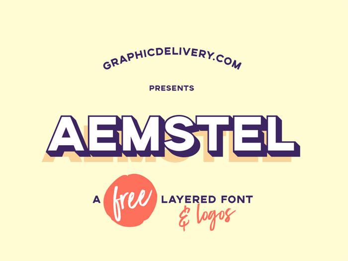
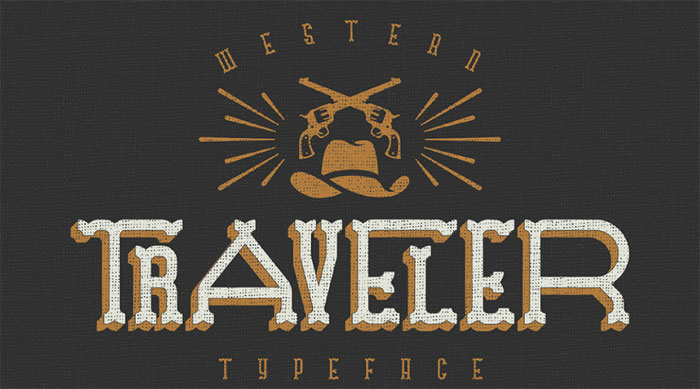
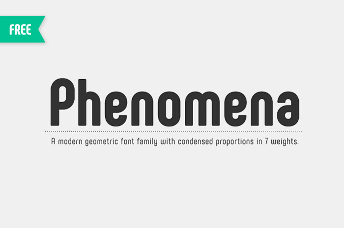
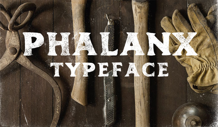
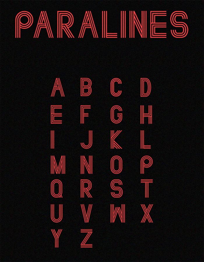
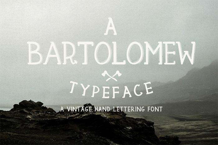
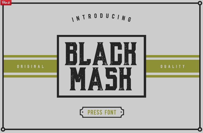
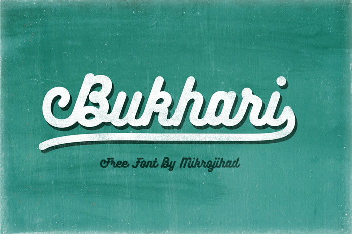
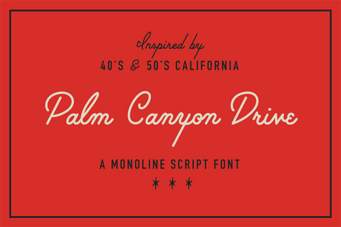
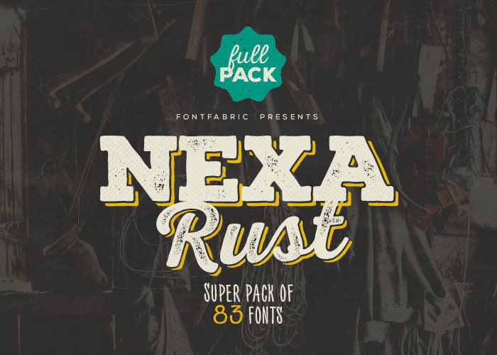
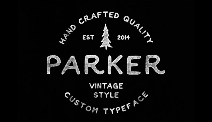
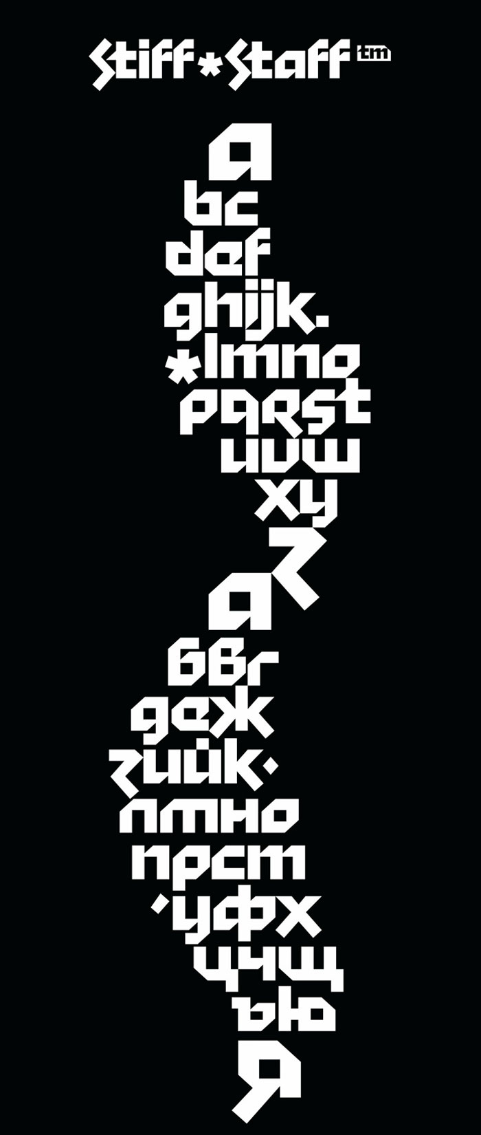
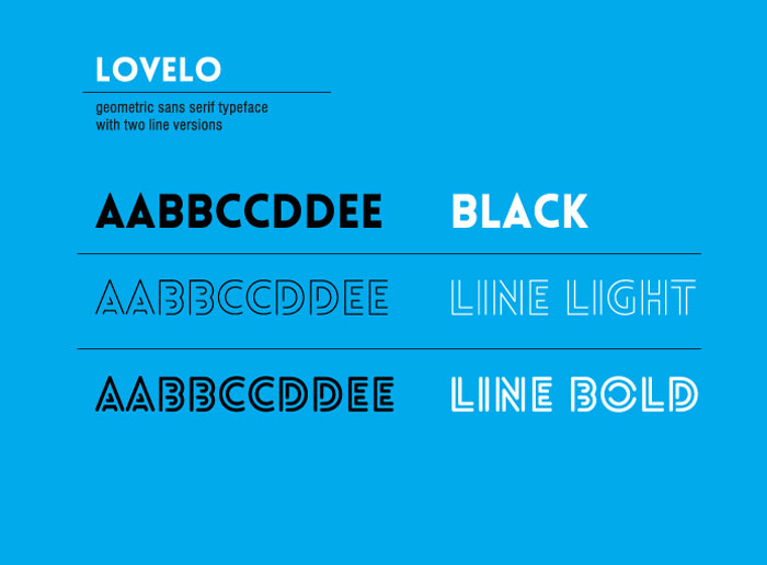
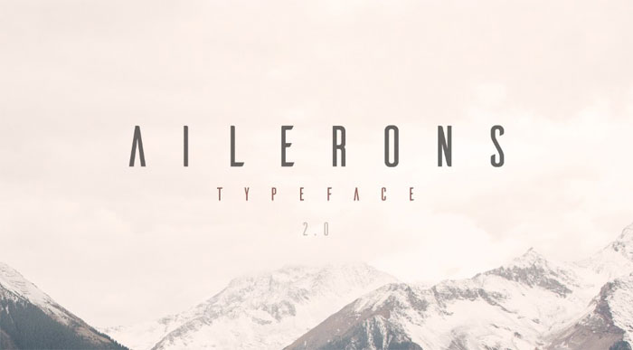
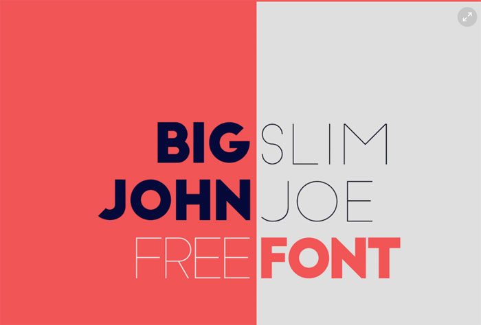
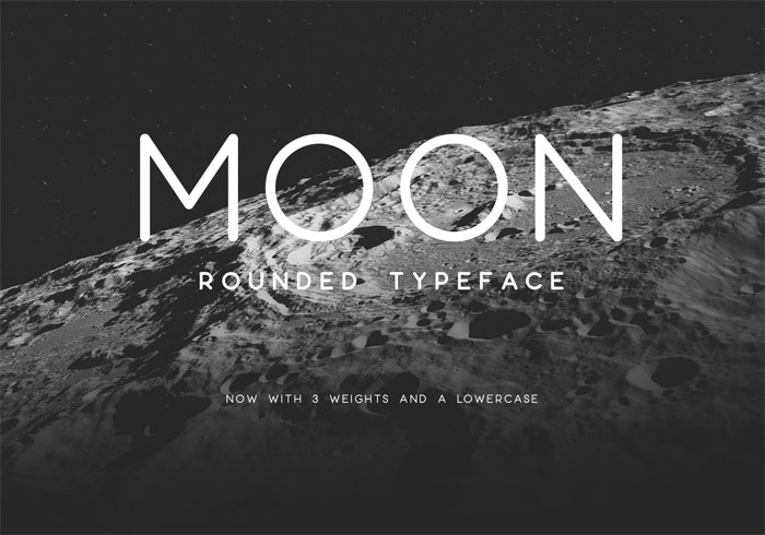
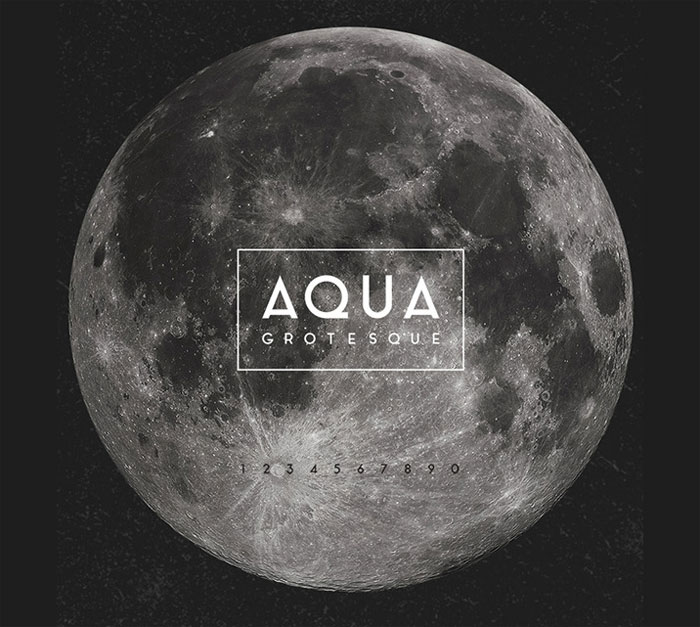
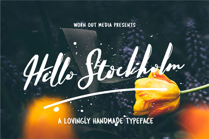
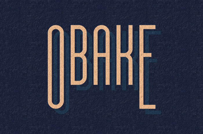
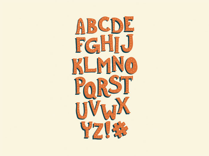
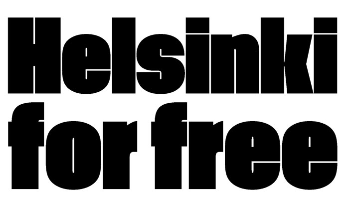
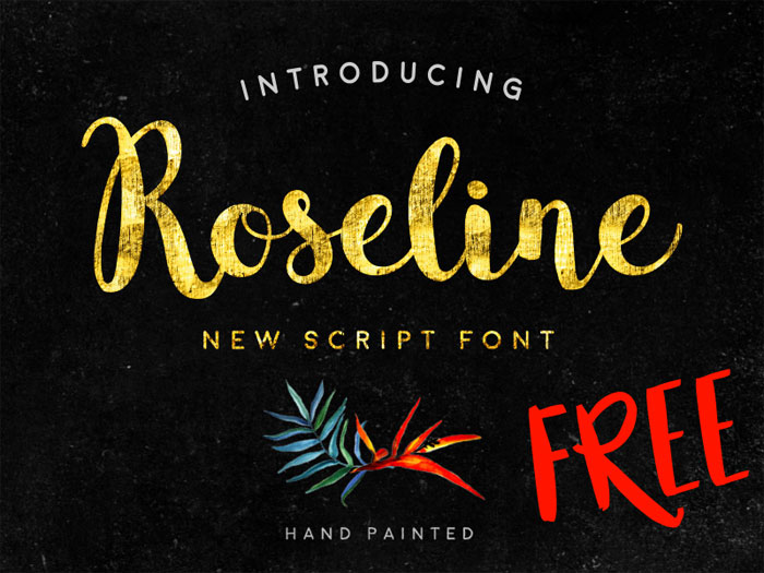
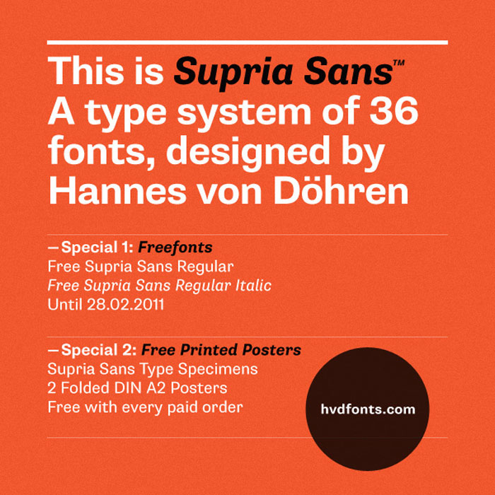
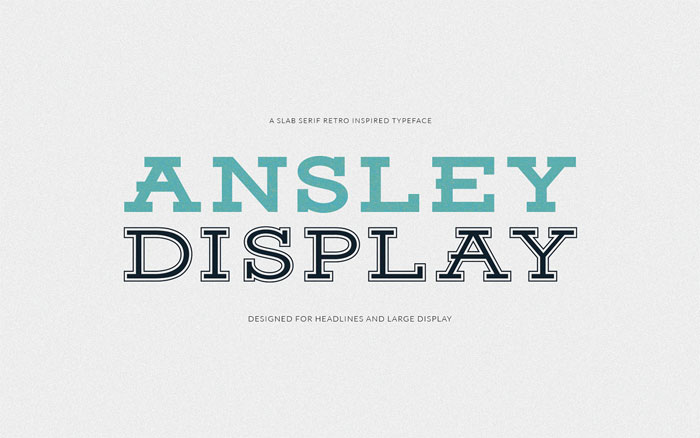
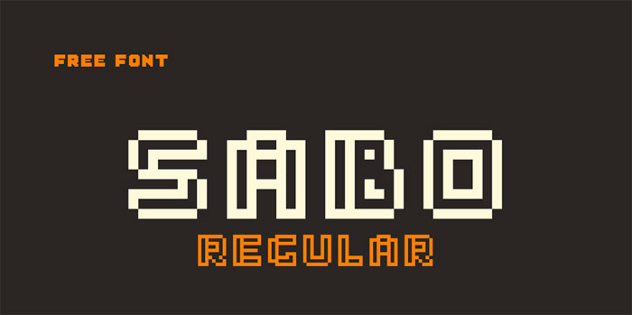
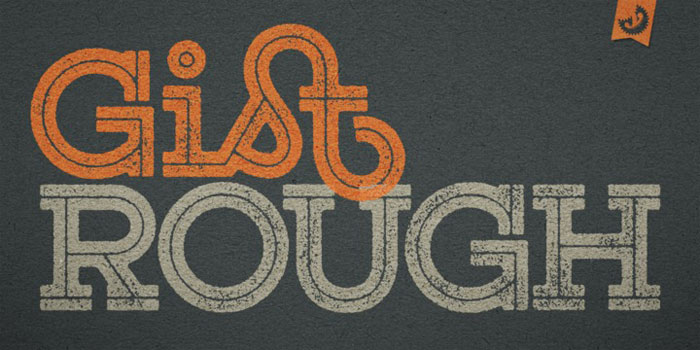
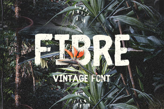
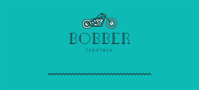
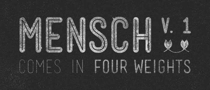
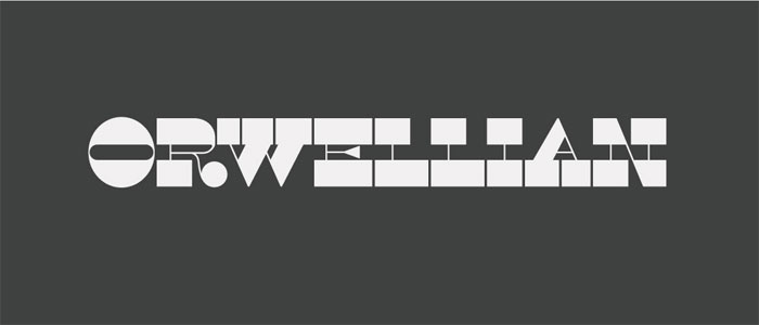
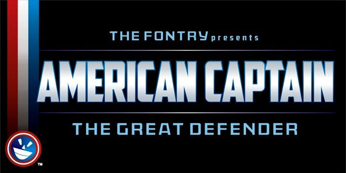
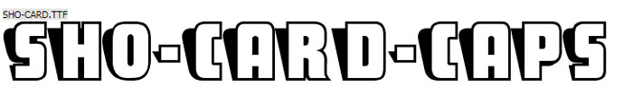
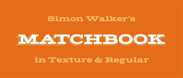
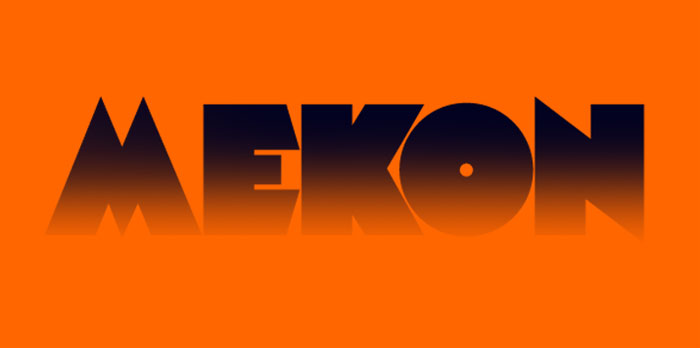

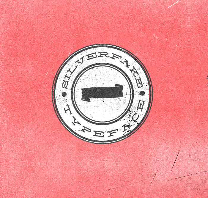
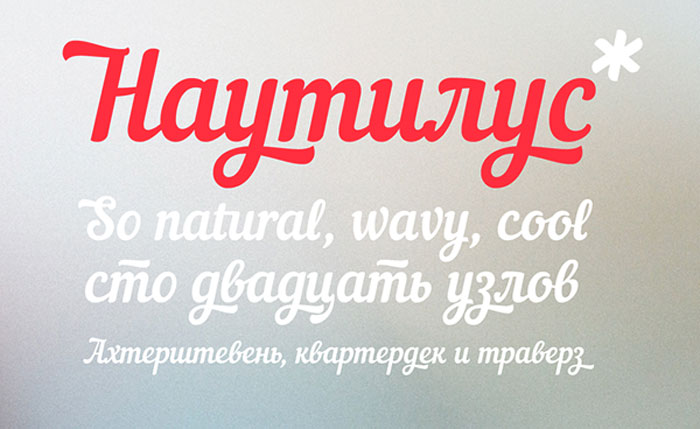
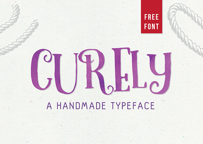
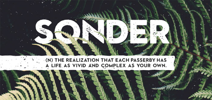
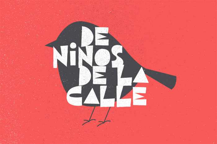
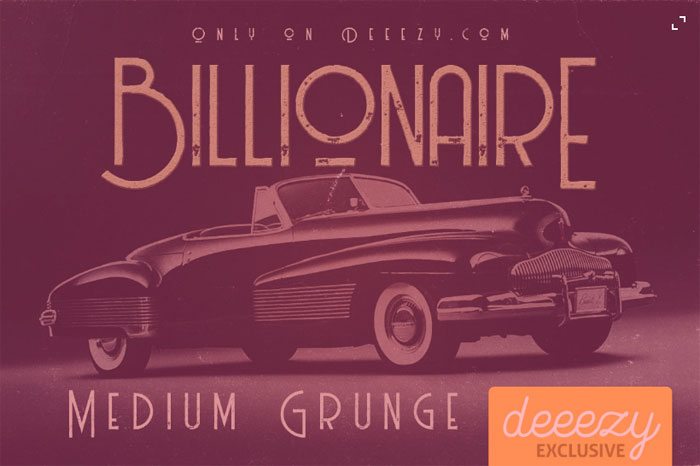
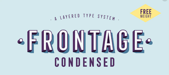
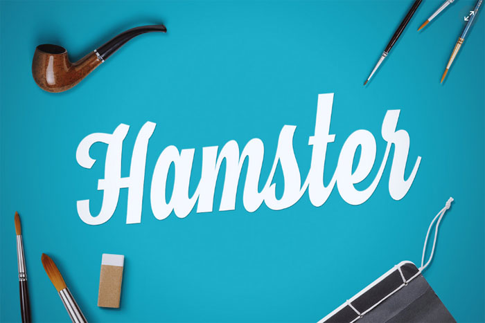
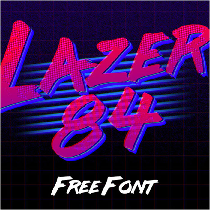
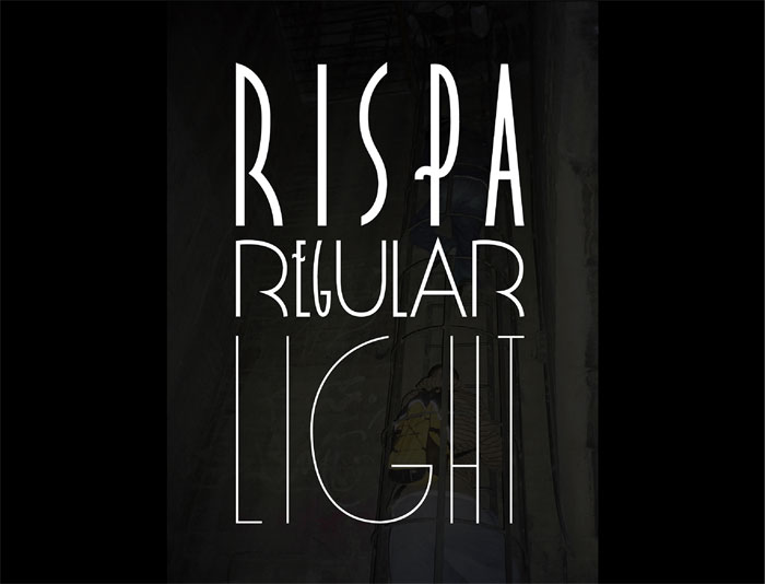
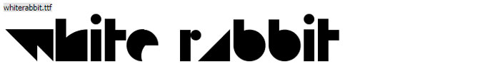
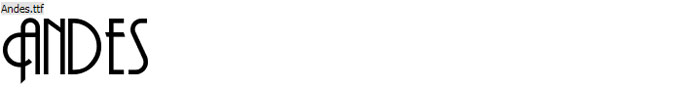
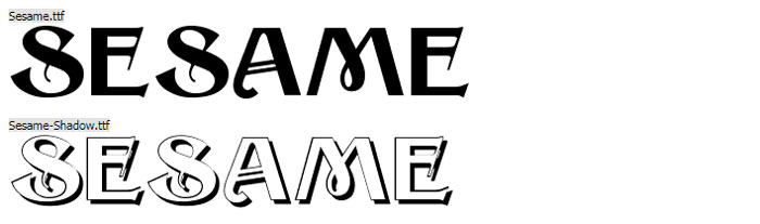
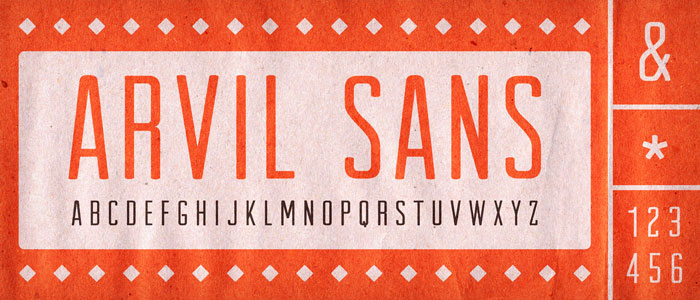
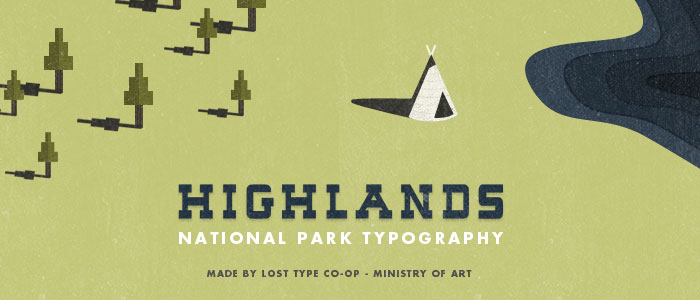
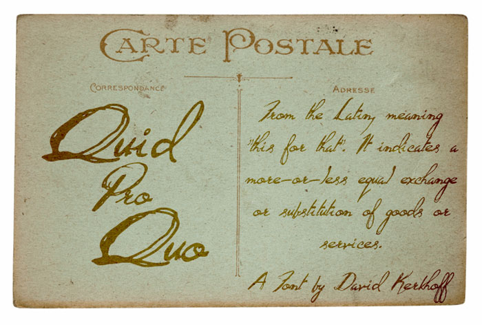
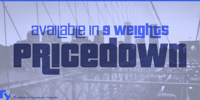
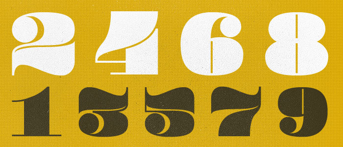
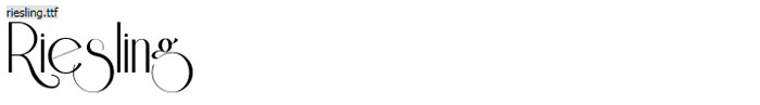
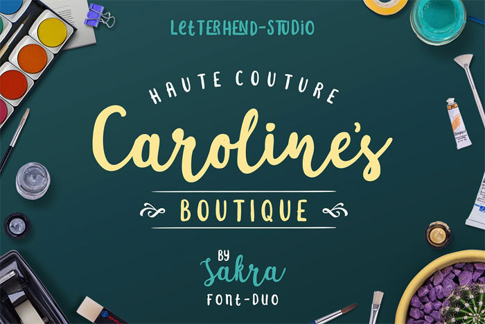
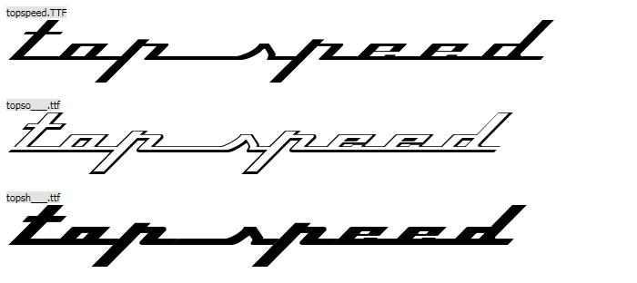
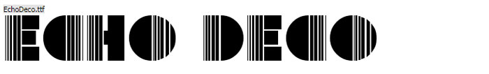
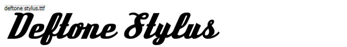
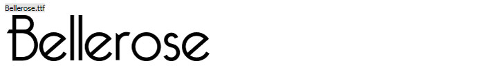
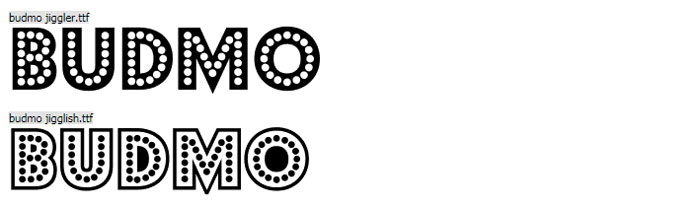

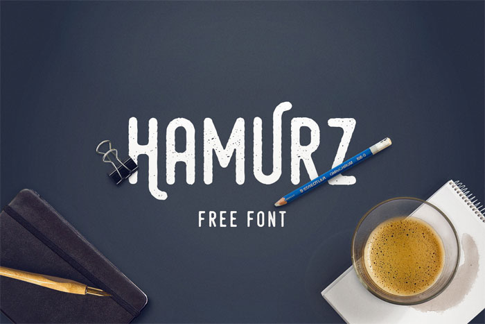
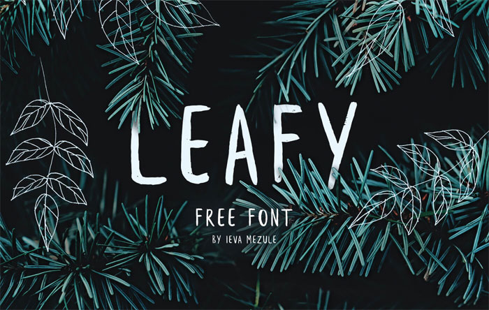
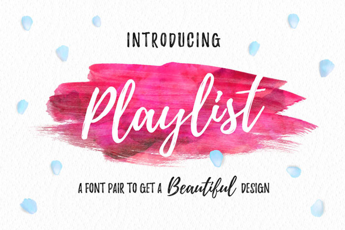
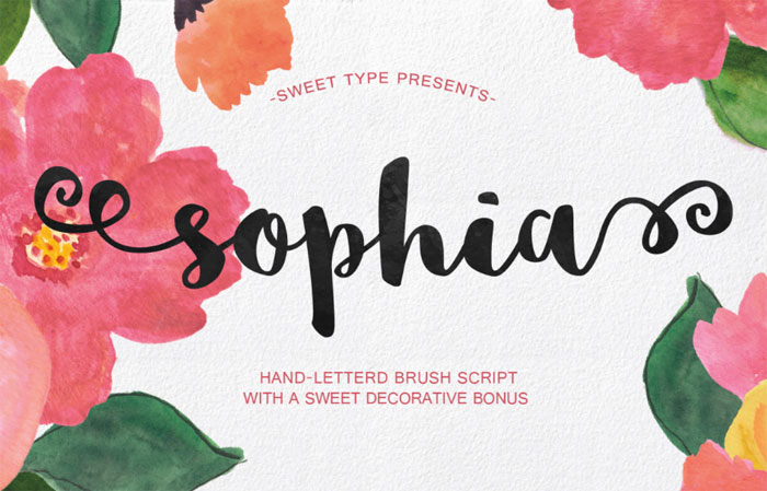
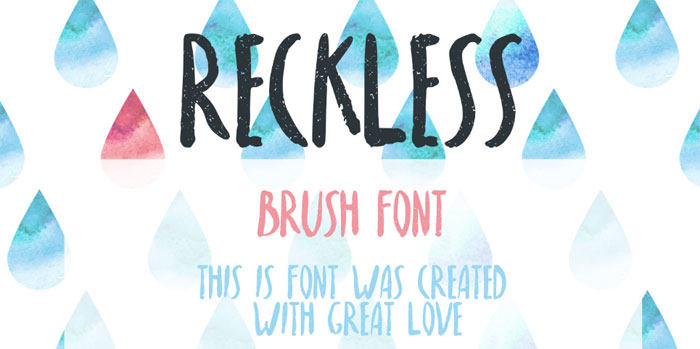
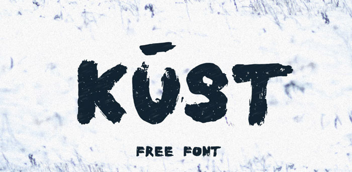
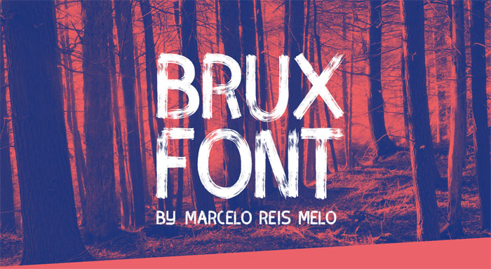
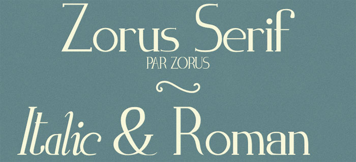
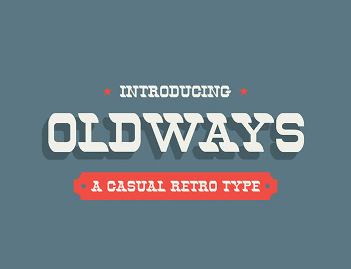
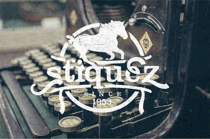
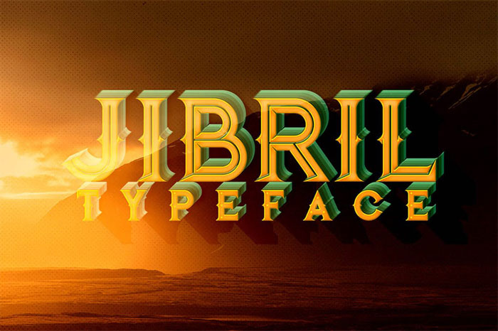
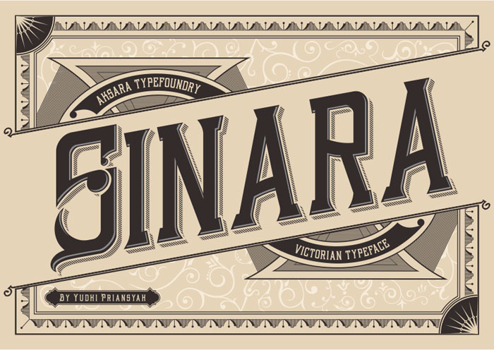
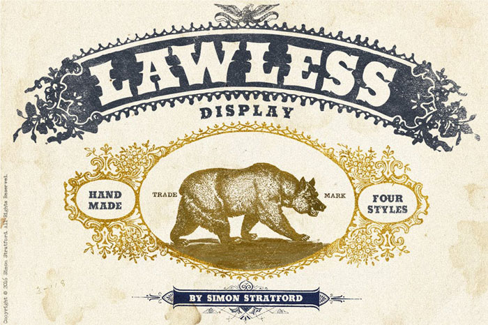
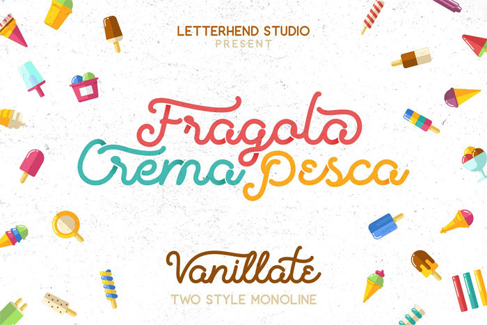
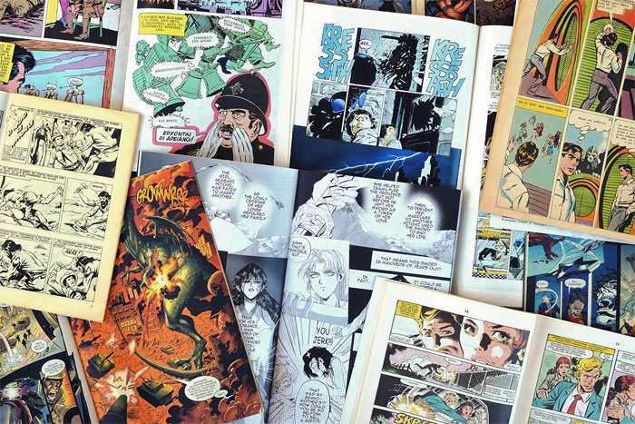
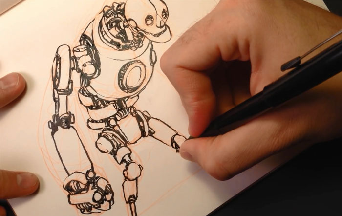
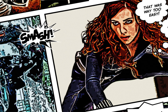
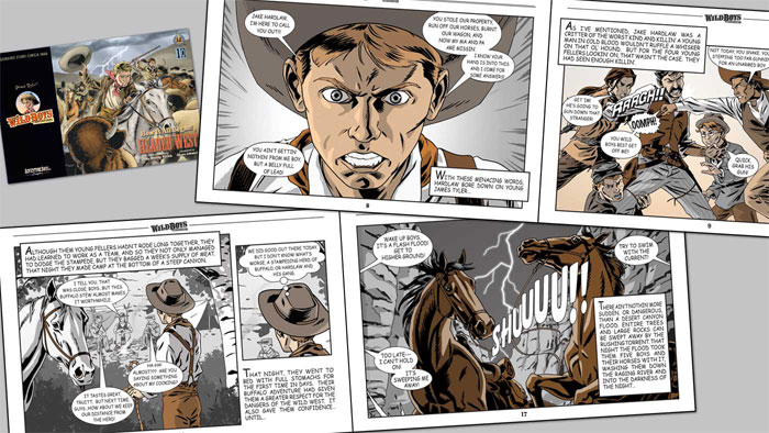
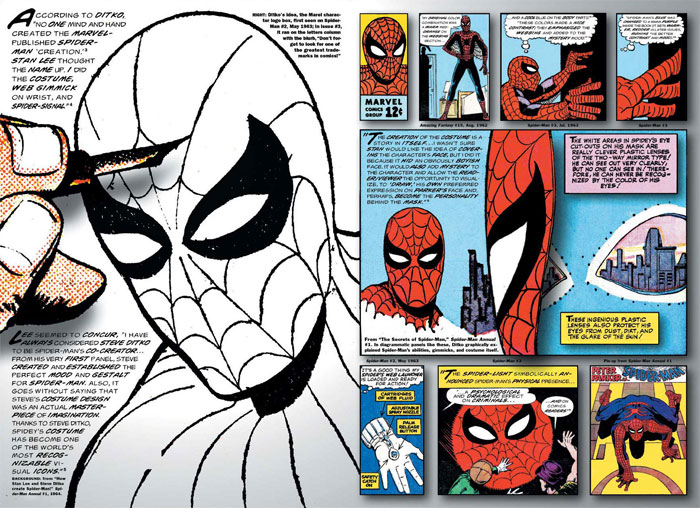
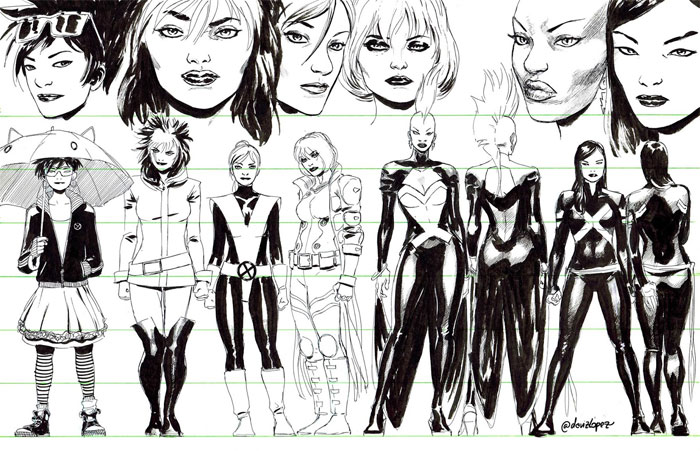
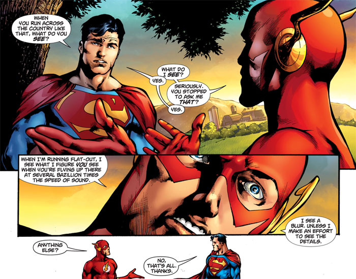
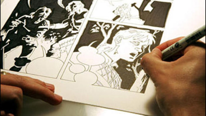
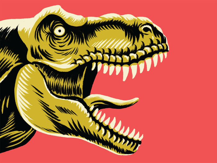
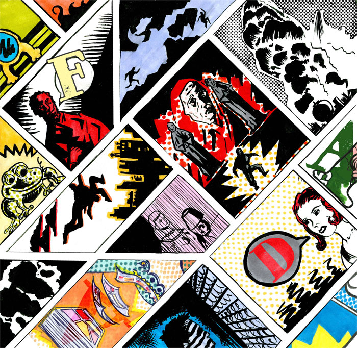
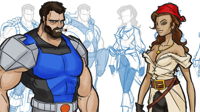
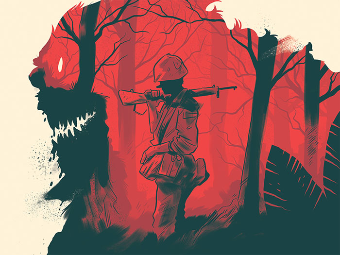

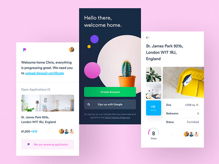
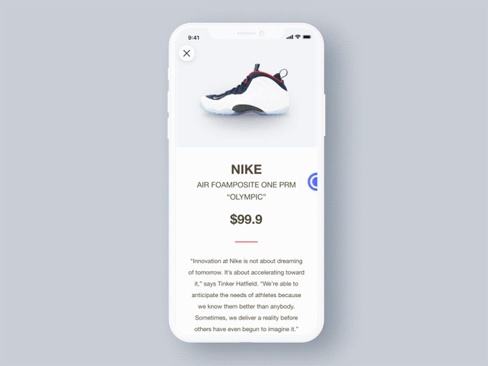
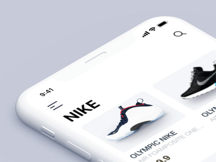


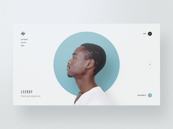

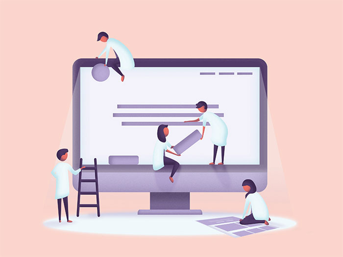
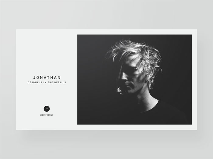
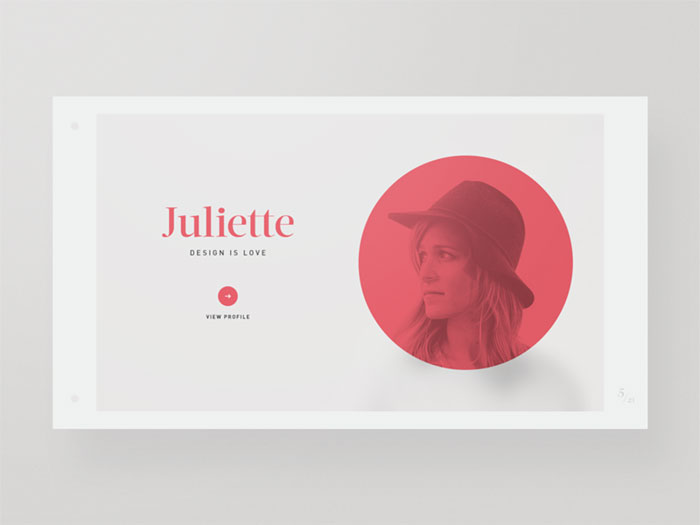


 RSS Feed
