Negative space is, as you might imagine, hard to define. Either the lack or the overabundance of negative space can throw off a whole design in an odd, hard-to-explain way. A viewer tends to instantly notice this problem, and it makes him or her almost immediately dislike the design. The use of negative space and how it affects a design, whether that is interior, graphic, or even art design, two dimensions or more, can be hard to put your finger on. It is even harder to get negative space design right. Here are some tips for how to use negative space well in all your designs. What is Negative Space?A good way to define negative space is very simple: negative space is the open or empty space around and object that lends that object its own definition. Another way useful negative space definition is a kind of the breathing room around a central subject that affect its appeal. How can you know an object’s true shape if you can’t figure out its limits? It’s easy to tell when negative space isn’t present. Most people dislike a cluttered, suffocating design. Negative space allows for clear borders and definition. The design elements do not look good when they blur together into a blobby mess. With proper use of negative space, these elements are divided into sections, which allows viewers to understand them and what they convey in discrete pieces. This way, it is easier to process and understand the whole design and each of its detailed aspects. What Makes Negative Space So EffectiveOnce you understand the general concept behind negative space, you can start to play with it and leverage it to your advantage in your designs. Properly composed negative space can make all the difference in a design. Viewers will appreciate a design with good use of negative space, much more than cluttered, busy, claustrophobic design. It ensures that viewers do not have to work very hard to see the details and fine touches of the design. Balancing out negative space in your design eases the eye into the design and makes it easy to look at. 
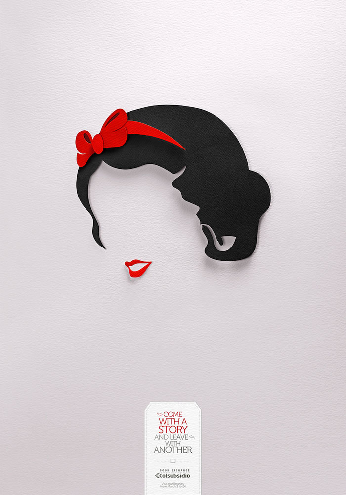
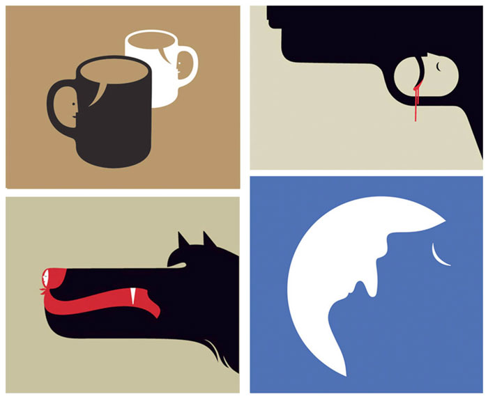
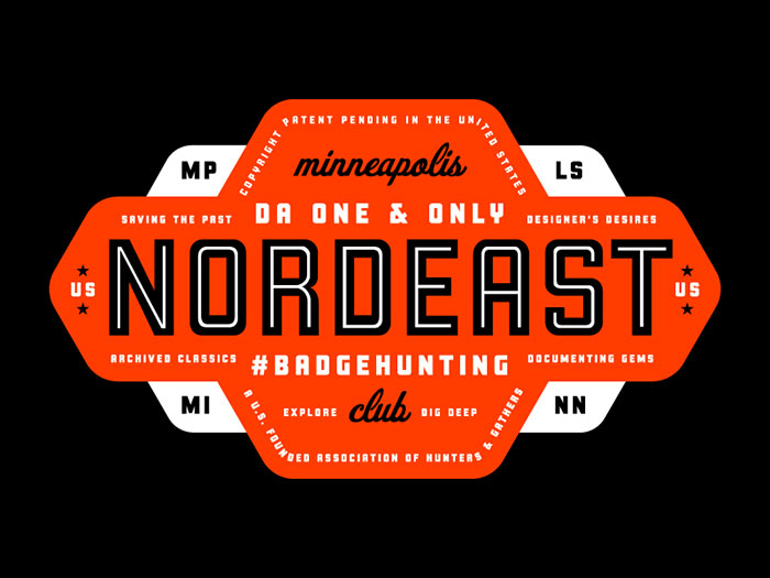
Designs that rely heavily on negative space are usually very simple. This simplicity can be deceptive, as there is normally much more tot such designs than viewers initially assume. Clever and creative uses of negative space reward viewers. Once they understand the subtle hidden messages or images in the design, they feel included. This sense of being aware of the inside information is highly enjoyable. It is especially effective for negative space logos and designs with similar purposes, as they tend to stick in the viewer’s mind. Because of this, negative space is a great way to enhance and add appeal to your designs. Using Negative Space in CompositionFew things will have as much an effect on your design’s composition as negative space. In many ways, negative space will define your composition. Without the use of negative space, even the simplest designs will look complex and busy. In artwork this can be particularly noticeable. Without negative space, a simple piece comprised of smooth lines will look snarled and compact. If text or a title is a part of the artwork, it can be easily lost. Messages, symbols, and other subtle touches can be lost. If it’s too crowded, especially if it has a busy color scheme, the piece can be unpleasant to look at and will drive viewers away. On the other hand, a piece that uses negative space well draws focus to where you want it to be. It showcases important and subtle elements in the design. Negative space art and design is all about making sure the composition highlights important elements. Using Negative Space for TypeIt’s easy to think of negative space only as an element of composition. However, it can also be used very effectively for type. In typography, the negative space between each line is called leading. Leading is important because it makes the type much easier to read. Without it, the text may be rendered almost absolutely unreadable. Reading a paragraph with no or barely any leading is much, much harder than reading a paragraph with leading. Without enough leading between lines, it is very hard for the eye to determine where the next line of text is. This will cause readers to skip or re-read text often. The human eye and brain do not process such tightly placed text very well (at least in the Roman alphabet; for other writing systems, take a look at the size of their normal leading). Having to do this causes a lot of frustration and will probable cause people to quit reading the text altogether. This is the last thing any designer wants, as it means the information is not conveyed. Beyond just the practical aspect of using negative space in type, it also brings a certain aesthetic element to any text. Using negative space in combination with the weight of the text creates a sense of visual texture on a surface. This texture is not something you can detect easily off-hand. Squint your eyes and you will see the relationship created by the use of negative space in the text. It is created by the space ratio of what is visible and how the letters and words associated with each other. A lower leading amount will make the text look darker because it is much more densely packed. It is very attention grabbing. A larger leading amount makes text seem more spread out and less demanding of attention. Using these can help you figure out how to highlight (or draw less attention to) parts of text, including headlines. Using Negative Space to Increase ReadabilityFor both hard-copy and web pages, the spacing is very important for making sure readers can understand your text. For the web in particular, since web pages have only a few moments to connect with visitors, easily readable text is absolutely vital. Most webpage visitors are not looking for a leisurely read, as they are with a newspaper over breakfast or a book before bed, but they are instead looking to get relevant information quickly. You text should be placed so that it’s easy to read and important information is easy to find, especially if you are selling a product or service. Use white space wisely to reduce clutter and create buffer between elements. This space will allow visitors to pick out what they were looking to learn quickly. Using Negative Space in Web Design
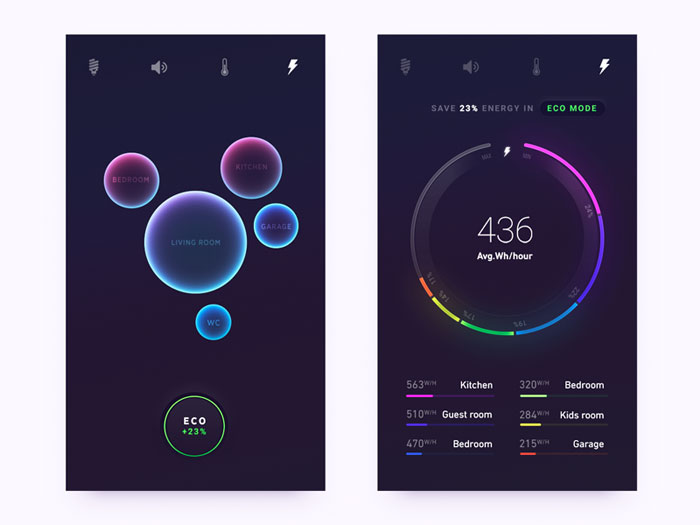
Negative space has a significant place in web design beyond just tis use in text. In the information age, getting important information across quickly is extremely important. Even video game User Interfaces are designed to this end, and a poor User Interface can lead to negative reviews. It turns out that a thousand lights and bars flashing are not very helpful when fighting off digital aliens and people will only take the time to look at what they need to in order to accomplish their goal. Negative space allows the important things to receive the focus they need. The same mentality carries over to effective web design. Use negative space to highlight what’s going to be important to visitors to a site. Take a look at the most significant and successful web stores. Amazon, for instance, uses negative space to highlight the most important facts for potential buyers as soon as a page loads: the name, a picture, the price, the user rating, relevant facts about the product, sample downloads for books, and –right up on front—how to buy the product. Above this, of course, is the search bar, another key feature of the site. It is easy to find what you want to know about a product and how to get to it right away. Important times are not buried in clutter, but instead float prominently on white space. 
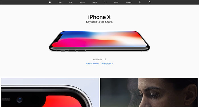
For a more complex example that makes very good use of negative space, look at the Apple Store. Apple uses very minimalist designs for all their products and their store is no exception. Products and prices stand highlighted on neutral colored negative space, easy to read and identify. You see a similar design in their physical stores, with products standing like pieces of art on simple tables and against clean walls. They are remarkably consistent and intelligent about how to use negative space to sell a product. Using Negative Space to Communicate Luxury and SophisticationYou might notice, when looking at modern furnishings and interior designs, that many of the most luxurious rooms are quite minimalistic. They are not crowded with artwork, but rather make clear that what few items are in the room are worth quite a bit of money (or seem like they are, anyway). A similar use of negative space in other kinds of visual media can achieve the same effect. A copious amount of white space adds a touch of class to a simple, generic webpage. Your products and services seem more important the place that they can be found in. ‘Less is more’ makes products seem like they have a higher quality, because you are not trying to pull any gimmicks or pointless flair to sell it. You do not need very much content to make a product or service seem high-end. Keep taglines minimalist as well. Information should be to the point; you often see details spelled out in less than seven one line bullet points, most of which are not complete sentences. Look at top-rated sites that sell sophisticated goods and services, like high-end furniture or luxury spa services. Notice how they utilize negative space and minimalism to show you how good their product is. One of the easiest ways to identify a cheap product is how much it tries to cram information and graphics on every inch of its website. Ads are often found everywhere, promoting low prices and seasonal offers. There are a wide assortment of products displayed on any given page, sometimes crammed into the same pagespace as similar items, begging for you to buy something. There are often ‘price stickers’ showing how much you will save if you buy now or how much the product used to cost. It is very busy and comes across as a jumbled garage sale, not a quality store front. What Does “Improving White Space” Mean?Occasionally, especially if you are new to web design, people will say you should ‘improve the white space’ on your design. What does this mean? It’s easy to assume that the negative space is just left over space, the parts of the page you did not use. However, there is a lot more nuance to the use of negative space than you think. There are a lot of small tweaks and tricks you can do to make your negative space do more for web page and product. You might be surprised how small, simple problems can make a big difference to how your negative space works on site. Margins and SpacingInconsistent spacing can cause a lot of problems on a website. It can make your page unbalanced and hard to read, working to bury pertinent information. However, inconsistent spacing is an easily remedied problem. Just tweak it so that everything looks even, balancing out the white space and helping focus visitor’s eyes on the right information. Make sure you do the same for the page’s margins. Weird, uneven margins make a page look strange, cheap, and badly made. Visitors usually click away very quickly. Always preview before you publish, as all it takes to make spacing and margins uneven is a bit of code. Fortunately, it is usually just as easy to fix. Micro-Level SpacingMicro-level spacing is the negative space between the smallest parts of a page, like the letters in the text. This includes leading. The right leading makes a serious difference to the legibility of your text. The larger the leading, the easier it is to read. Too much, however, can cause issues with legibility all its own, making the text a chore to read and making the page seem disconnected from itself. Make sure you choose a readable font that works for the amount of text you are using. Very flashy, thematic fonts can work great for short title or headline, but when put together in a normal text, they can have strange spacing between words and letters that can be hard to read. Your information will be lost and a user will swiftly click away to a more legible site. Negative Space vs. White Space‘Negative space’ and ‘white space’ are interchangeable terms. White space is typically used in regards to print publishing, while negative space is a term often used in art and other forms of design. They refer to the same thing, however: unused or open space in a design, to include text. White space is the word publishers and copywriters, as well as designers working with any form of print (newspapers, books, and magazines), use. They use white space because the open space on paper is normally white instead of some other color. Other designers use the term negative space for the same concept. The term originated with photographers in reference to the space behind and around the actual subject of the photo (positive space). Negative space is often used to refer to any kind of area that is not meant to draw attention. It can be any color—the sky is often used as negative space in art and photography, for instance. Patterned backgrounds, such as many websites have, are also a kind of negative space. Sometimes web designers confuse white space with negative space that is only colored white. Make sure those you are working with understand the terms you are using. Make it clear that negative space/white space does not have to be white. Colors, patterns, and even background images work just as well if chosen properly, and sometimes even better depending on your overall web design. Ask anyone who is confused to think of how their desktop background image works on their computer. It is a kind of negative space against which you place application programs. Negative space serves to unify and focus your entire design. They render text readable and highlight important information, images, and objects. You will not likely notice white space if it is done well, but the lack of it, or its improper execution, will stand out immediately. Every visual project, printed or on the web, has an element of white space. Every style guide or style sheet includes it in its guidelines. Too little space makes everything feel claustrophobic and difficult to process. It becomes a jumble of information that can cause headaches depending on its colors and arrangements. Too much leaves a design feeling internally dissonant, even completely unconnected, more like a random collection of images or text than a cohesive, thought-out whole. The most memorable, simplest way to see how this works is in good logo designs found on the web. Think of Apple’s apple symbol, with its noticeable negative space in the bite, or Nike’s simple, instantly identifiable swoosh. Each of these are great examples of a negative space logo, where wise use of white space draws the eye and allows for a viewer to remember the logo easily. Neither is sparing of its use of negative space, either, so remember that you should not be afraid of using it in your designs. Negative space will not automatically kill a design or render it unmemorable. Experiment with what works best. Using negative space is something that requires practice. Your goal should be neither overuse nor underuse, but instead a use of white space that draws the eye and balances the design. Even small tweaks and simple changes can make a big difference. Create drafts and look at previews side by side to see what works best and don’t be afraid to make adjustments based on viewer feedback or technological developments. Negative Space and BreakpointsNegative space has started to make an appearance in responsive design. Designers have begun to use negative space to help deal with the differences between browser sizes and different breakpoints in responsive grids. It is also being used to deal with oversized browser widths. This is often pretty often unnoticeable. It is usually just a small bit of space on the left and right of the screen. More and more, though, designers are being creative with this use of negative space. Not very long ago, many designers just left this space blank, often with the same color as the background. Now, many designers are adding extras into these spaces. This is normally a patterned background, but you should take the opportunity to try new things to see if they work or not. Nothing is set in stone, so feel free to experiment. This is not a necessary addition to your design, remember. Depending on your overall design, it can be a very fun and playful feature. Many of the more creative websites use this breakpoint negative space to bring more to their pages. It is a small detail hat can do a lot to impress visitors and make the site seem more professionally well-crafted. It needs to be an unobtrusive addition that is incorporated into the design with care. There’s nothing wrong with keeping the breakpoint white space simple, however, and it may be a better for your site design. ConclusionNegative space is an important element of design. Without it, your designs will likely be a disaster, lacking definition and focus. Use too much, however, and you don’t have a design; you have a random collection. Use of negative space is a balancing act meant to unify a design and draw a viewer’s eyes comfortably into the details and subtleties. Play with negative space in your drafts and ideas. See how it looks in the completed project and make adjustments depending on outside input. You’ll be surprised by the ways you can use negative space and how it can help your design look more complete and pleasing. If you liked this article, you should check out these as well:
The post Negative Space Design: What it is, Logos and Art Use appeared first on Design your way. from http://www.designyourway.net/blog/design/negative-space-design/
1 Comment
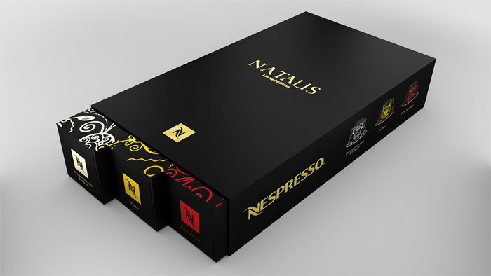
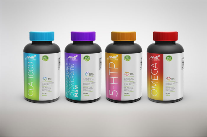
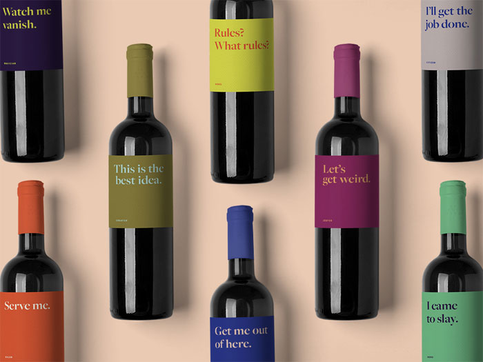
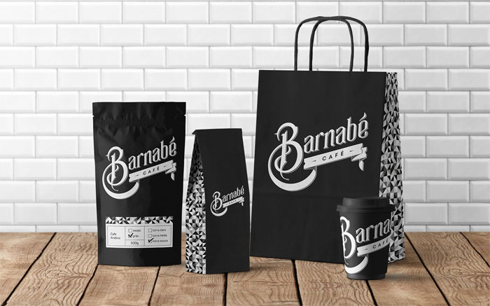
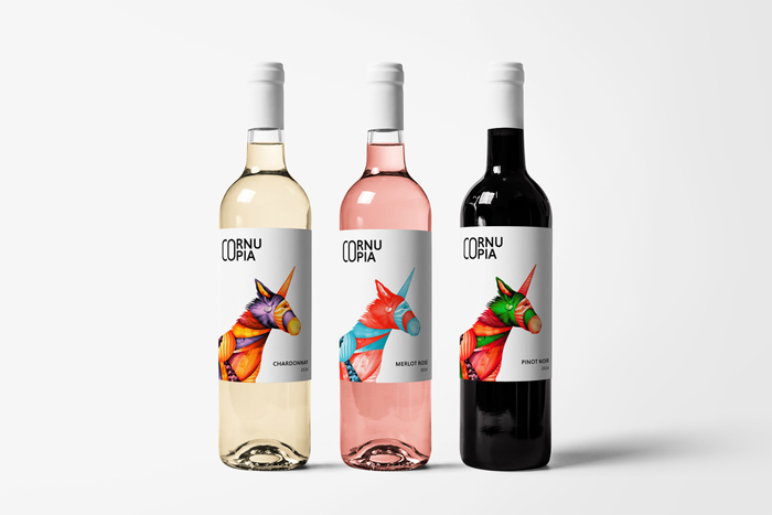
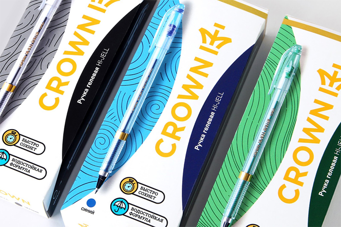
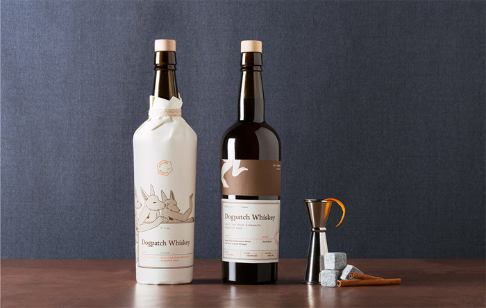
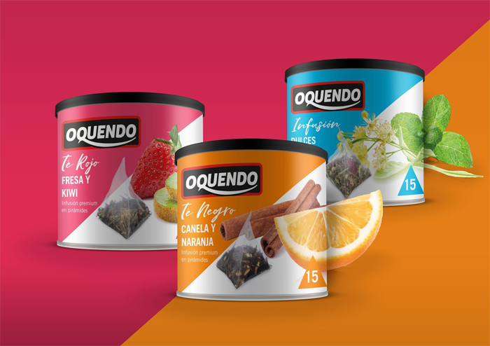
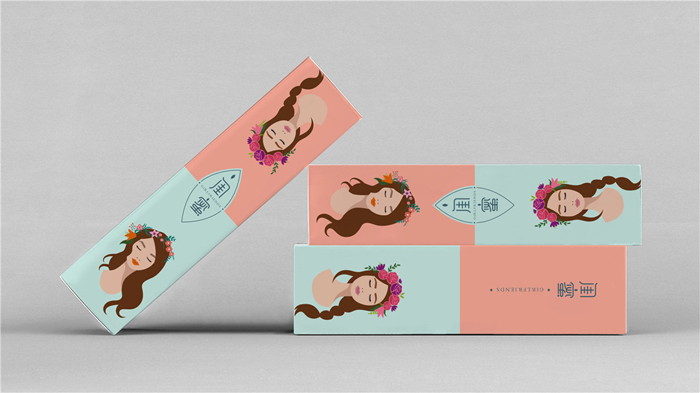
Packaging design isn’t the easiest thing to do. And once you send the design to the client and he starts printing, you can’t CTRL+Z your errors. Try to imagine a world without packaging. You probably can’t, or at least you find that the result to be a disorganized mess. It’s easy to underestimate the necessity of packaging. It is important to have cans for your soda, a wrapper for your candy, or even a hamper for your laundry. Package design is not only practical but it forms so much of our visual world. Good product package design is more than just a container; it tells a story. Packaging design engages the viewer through all the senses—sight, sound, touch, sometimes even taste and sound. This engagement should help the viewer (your potential customer!) understand what the product is used for, how to use it, who might want to use it, and whether or not they should buy it at all. Achieving this goal can be daunting. Product packaging design is the translation of 2D package designs into 3D packaging designs. This is an intimidating task, but it doesn’t have to be as difficult as you fear. Here are some ideas for package design inspiration to help make the process easier. You will learn how to get your 2D packaging design ideas ready for printing and we will offer you a look of some different print finishes you can use for your box package design. Picking the Best Software for Your Packaging DesignYou need to pick out the best program for designing packaging before you really start in on the design process. You will probably end up sending the finished design to the manufacturer in a vector format. Vector files can be scaled easily. It is very easy to create a dieline templates with the line and shape tools in vector programs like Inkscape or Adobe Illustrator. 3D visualization is a bit harder. Vector software is normally designed for 2D images, though you can use plugins or even other programs to help you out. It also allowed you to rotate the 3D version of your packaging design so you can work on it from different angles. These is also a toll called Cinema 4D which can render flat deisigns into 3D. It’s fairly common to skip these plugin and programs, and simply opt to create a mockup a photorealistic design in Adobe Photoshop. Three Important QuestionsBefore you even start on your custom package design, you need to ask yourself these three important questions:
These questions will help you find the right mindset to start out with your packaging design. Let’s look at them in more detail. 1. What is your product?This is a simple one. What is the product you are trying to sell? How big is it? What is it made of? Is it fragile? Does it need to be kept at a certain temperature? By answering this question, you will be able to determine the logistical requirements of your packaging design. More fragile products require more secure and reinforced packaging. Large or weirdly shaped items will need custom packaging, made specifically for the product. Items that need to be transported and sold cold will need to be made of materials that can handle the temperature without issue. If your product is going to microwaveable in the package, it needs to be designed accordingly. 2. Who is buying your product?What is your target demographic? Is your product meant to be used by men, women, both? It is it for children? Is it meant for environmentally conscious customers? Is it being sold to people on a budget, or is it meant as a luxury item? Awesome designs are geared towards the customer. It needs to appeals to its ideal customers. You will need to do some research before you begin your design. This can also be a good source of packaging design inspiration. For instance, a product designed for older people may need to use large text, while medicine meant for children should have extensive safety features. Products meant for the budget-conscious customer should be simple and pragmatic. Packaging for luxury items should seem luxurious itself. 3. How are people buying your product?How does your product get from the retailer’s store or warehouse to your customer? Is it being sold in a big box store? Will it be bought off the internet and shipped to customers, or will they go get it at a small boutique store? The answers will affect your packaging. Items that will be shipped from a warehouse to a home address require a different kind of packaging than they would if they were being sold in a department store or supermarket. Products sold online should have streamlined packaging without any extra space that will allow it to rattle around and possibly be damaged. Anything sold in smaller, boutique shops should have charming designs to catch the eye. Research, Research, Research!Information is key. It is the only way you will be able to answer those three key questions above. It’s easy to become overwhelmed by information as you do this. To help you with information overload, focus on these key areas as you do your research: Brand RequirementsIf a product is a part of an established brand, it will have certain aesthetic requirements to fit with the branding campaign. Every brand has its own aesthetic. You need to research these key components of it:
Content RequirementsEvery product is going to have unique content requirements. Some of it is a part of the brand’s own standards, like a certain mission statement or part of an advertising campaign. Other requirements are legal obligations, like nutritional information, contents, and hazardous material warnings. Certain products might need to have expiration dates or batch marks placed on the packaging. These will probably not be printed on the packaging (they will probably be stickers) but you should leave room for them and make sure it does not disrupt any other important elements of the design. You may need to include a barcode or association marks. Any symbols or text, whether required by the industry, the company, or by law, will need to readable. Do not get so wrapped up in making your creative packaging that you forget the pragmatic requirements. It can be harder to pull off than you think. Factor in BudgetBudget is one of the most important elements of product packaging design. The budgets for these box designs are broken into two categories:
Get a general idea of how much you are willing to spend before you even begin the design process. Cheaper does not always work out better. Paying a bit more for quality materials can make a big difference in the presentation of your design. It can make your work stand out from your competition and help you with your selling price. Do Not Forget About StyleStyle is a crucial element you need to research as well. The best way to get a sense of current, stylish box designs is to start collecting images of stylish packaging. Take photos when you are out shopping. Use a Pinterest board to collect interesting design you see online. Style is a complex thing. The packaging design ideas you see might have elements you like, rather than the whole thing. You might like the shape of certain package or a certain color, or a print that you see on a friend’s furniture. It’s important to remember here that you are not looking for yourself, but instead for your product’s target demographic. Your personal style might be slick and modern, but if you’re trying to sell vintage candy, that is probably not the best style use for the packaging. You should also look into materials, an often forgotten element of style for packaging design. Innovative packaging, in particular, uses interesting and new materials. Take a look around as you shop and visit friends, much as you do for all the other elements of design. It is not a decision you can really make now, but it should be a decision you keep in mind as you create your box design. Once you finish all your research—brand requirements, content requirements, budget, and style— you can begin to get down to the hard and fun work of actually designing your product packaging. A good tip for the actual design work is to have the packaging tell a story. The choices you make based on your research are going to help you tell that story. Understand the Use of Packaging LayersProduct packaging consists of three layers: outer packaging, inner packaging, and product packaging. Your product may or may not need any or all of these, depending on many factors (which you’ve already researched). The outer packaging layer is what customers will see first. It performs more than an aesthetic function. It also protects the product from the elements. Outer packaging could include the box the product will ship in or bag that will be used at the store. The inner packaging layer keeps the product safe inside the outer packaging. It could be tissue paper, a foam cradle, or even packing peanuts, anything that keeps an item from being jostled, scuffed, or damaged. It could also be something that keeps a food item fresh, like a sealed bag. The product packaging layer is what you probably think it is. This layer includes the box an item is in, the labelled bottle, a tag on a piece of clothing, or a wrapper for a chocolate bar. Every one of these layers should be a consideration in your overall design, as they all play a part in the message and story it tells. Pick the Right Kind of PackagingThere are a lot of packaging design ideas out there. Knowing the right one to use requires a bit of thought. It can typically be easy to choose between a bottle and box. On occasion—for instance, when your product is vitamin pills—it may require a bit more thought. It really all depends on your product. Your product is the most important consideration in your packaging design. You want to showcase it and catch customers’ eyes. Your product seem may seem to limit you, but remember that unique packaging is a possibility. Capri Sun and Go-Gurt both sell liquids, but they changed the way their product was perceived and even used by using unconventional packaging for their products. This can help your product stand out from the competition. Selling fruit juice in something other than a typical jug can catch the eye and market it very well without any extra help. This can backfire, however. Customers used to seeing a certain type of product in a certain type of packaging can be thrown off when they see something different. Even with clear labelling, they may not pick up on what you are selling. If you are going the unconventional route with your packaging design, think it though carefully. Also think about your budget for every package. Unusually shaped boxes cost more to produce, for instance. Can your budget handle the extra cost? The customer is an important factor here. Knowing how much your product will be bought for means you can better evaluate how much money you have to spend on the packaging design. Get a Color GuideA good color guide is invaluable. Accuracy colors is important to branding and getting the most up-to-date color guide will help everyone involved achieve their goals. It will help you avoid any unpleasant surprises that might occur once the box design has been printed. Colors might fade over time, especially with heavy usage. In fact, you should expect them to do so. Update you color guides at the end of every year. Line Up a Good PrinterAs with many other kinds of design, packaging designs can be thrown off by the simplest oversights. You won’t start printing until you are done with design phase of your project. It should be in your mind long before you get to this point, however. Connecting with a good printer will help you on a lot of levels. It will save you on the costs of printing. Giving the printer a call or sending them an email can get you some more specific information that will help you with your overall design. Make sure you ask the printer about:
Create Your Information ArchitectureCustomers will look at will remember one thing when seeing your packaging design. You can put an immense amount of effort into every element of your box design, from your color, to your materials, to the copy. All of that does matter, but the customer will still only remember one part of the design. Decide early on in the design phase what you want that one thing to be. It should be the most appealing and important thing about product (hazard warnings are probably not a good choice, for instance). It needs to be the centerpiece of your design. Everything else should complement it. You should only add in two or three more things you want to show about product. This keeps the important information front and center, not overwhelmed in extraneous info or too small to find. Remember, your packaging design is about selling a product to customer. The customer should be the focus of your entire design process. Evaluating Your Packaging DesignOnce you have some designs, you can evaluate them. This can be hard to do, especially if you’ve created multiple iterations. They can blur together and be hard to differentiate. Is it clear what the product is?The packaging should let customers know what the product is, what it does, and who it is for. People will only buy something which has a purpose they can quickly understand. You need to make certain that your box design does not look like it belongs to something else, unless that is the intention. The last thing you want to do is confuse your customers. Is the packaging honest in its representation of the product?Almost as bad as confusing consumers is misleading them. You need to make sure any images on the packaging are actually images of your product. You could of course try to make a good impression and put your best face forward, but do not lie. Especially with the advent of internet reviews, the truth will come out to the public very quickly. Make sure your customers do not feel cheated. What will the packaging design look like in 3D?You should make two mockups: one in 2D, your flat print design, and another in 3D. The 3D mockup will give everyone, including yourself, a clear idea of what the completed project will look like. You can create this mockup by printing the design out on white paper and assembling it into the correct shape. You will notice things on this 3D mockup you wouldn’t on a 2D version. Occasionally flat images will look very good, but the 3D mockup will not look good at all. How will the package look in stores?How much of the packaging will be visible in the store? The product will probably be displayed in a line next to similar product. Only one side will be immediately visible. You should make sure the most important information is going to be front and center for possible customers to see. You should also think of what the box design will look like when a bunch of these boxes are stacked together. They may create a distinctive pattern. You need to figure out if you want that pattern or not. Next, think about how the product will look when it is sitting next to your competition, as it very well might. Do some scouting and go to stores where the product could be sold. See how the competition looks. What will it take to get your packaging design noticed? Bear in mind that the purpose and nature of your product should remain clear to your target demographic. Is this packaging design versatile?While your product may only have one variation right now, that may not remain the case. You could end up with multiple flavors of a product, for instance, or similar items belonging to same brand. Your packaging design should be easy to modify for these variations. You should be able to keep the branding the same while conveying the nature of this different product. Is the packaging reusable?Figure out if the packaging design is reusable. If it is, decide if you want it to be. You may not be able to reuse the packaging for every product. However, for those that you can reuse, think of it as free marketing. Clever use of reuse might even be used a selling point. Collect FeedbackAfter you complete your initial design phase, it’s time to collect feedback. Don’t get your heart set on a certain design. You should run your concept(s) through your stakeholders and customers (or potential customers). You should even try asking people who have never heard of the product what they think of the design, to see if it could help grow the customer base. These people will probably notice elements of the packaging design that you never would notice. Ask if they know from your box design what the product does, who is supposed to buy it, and what is the single key message they receive from the packaging. Their answers will help you figure out if your packaging design is communicating what you want and need it to. With any issues identified, you can go back and make any modifications you need to. Create a DielineA dieline will be the flat template of your packaging design. Is it normally created in a vector program using simple liens and shaped. The dieline should inform the printer where the packaging should be cut and perforated. The cutting, or trim, lines and perforation, or fold, lines should be placed in separate layers in spot colors. The cutting and trimming will happen at different stages. Rename the dieline layers in your vector document as ‘DO NOT PRINT’. This makes it clear to the manufacturer that those layers are meant for post-print processing. Creating dielines can be a bit awkward and difficult at first. It is one of those things that gets easier with practice. A nice form of practice is to find a box with similar dimensions as you packaging design. Take it apart and measure it. These measurements will be the basis of your dieline creation. A Box is Not Just a BoxIt is a mistake to think of a box as a simple box. Take a look at the packaging you see in your home or office. Many of them are probably some kind of box, varying in size, shape, and depth. They might have flaps integrated into the sign, or they could have a separate lid. There are, functionally, two kinds of boxes: setup boxes and folding carton. Setup boxes are more expensive to produce and are typically used for high-end products. These are the kinds of box designs you see for retail packaging and gift boxes. They normally have two parts: a top tray and a bottom tray. These kinds of boxes are what you should order if you want a very special box and do not mind spending more to have it made. Folding cartons are used for many, many products. You see them for household goods to food products. They usually consist of a single template. It is created as a fold-out 2D design, printed on a card, then laminated, folded, cut, and glued together. With this format, you can choose a box design that fits for your product and your retail price point. There is really no reason to package a product in an expensive box if it is being sold for a fairly low price. Options for Closing the BoxNow you have a box format type chosen, next you need to pick out how to close it. It isn’t as simple as you might think. There are a dozens of options for box closure. Most are designed to work as sturdy seal for the bob while being easy to open when needed. The various types if box closures include (but are not limited to):
Do some research on the boxes at your home. Identify what kind of closure is what and how it works. There is no right or wrong kind of box closure. However, some types of closures are easier to design and some of the more complex ones work well without needing to be glued. This can save you time and money when you hit the production stage. Styles of BoxesThere are a few styles of boxes that have industry standard formats and closure typed. A few of these more common styles of boxes are:
Think Out of the BoxBoxes might be the most common type of packaging, but they are not your only option for packaging design. There are a lot more options! Boxes have the advantage of being easy to design as 2D templates. You might find your product is not going to work in a box however, as it is not that angular. Tubes, pouches, and wraparound bottles might be a better fit. These are going to be harder to design. Good 3D modeling and accurate measurements are key to these sort of packaging designs. With these things, you can more accurately see how the design will look even on curved surfaces. As it turns out, some kinds of packaging are even easier to produce than boxes. Nothing can be easier to make than labels, which are just a 2D sticker that needs only length and width measurements. Bags are also easy to create designs for, typically needing only a logo that will be repeated across a solid colored bag. Working with Bottles and Other Curved SurfacesThe thing about curved surfaces is that the technical drawing rarely communicate the effect of the curve of the bottle or other container. The curvature can make the design take up more space than it would on a flat surface. See if you can get a print guide from the manufacturer for accurate measurements. Think carefully about the layout of your marketing copy. It should not be difficult for a consumer to read the information of the bottle. Think of how difficult it is to read a bottle when you have to keep turning it around to follow the text. Remember, you can compensate for conical distortion in your design using the ‘wrap’ command in Adobe Illustrator. Mockups are particularly important for curved packaging designs. You will be able to get a better sense of the way your design looks with a truly three dimensional images that you can turn every which way. You’ll be able to see for yourself how easy and legible any text is, or if the curvature warps any images or other graphics in a weird (or even inappropriate) way. You can also make sure the label fits properly, if that is what you are designing, and is neither too long not too short. Spot CheckingBoth you and you client should check to see if the finished printed batches of the design are right. Look for plate slippage, which occurs when there are slight changes in batch in what should be straightened artwork. Inconsistent color is another issue that crops up. Color consistency can change across separate print runs when ink batches or changed or even when ink runs low during a single print run. It is also sometimes a mistake that happens made by your printer. There is also a rather shady move to hide defective or less-than-ideal pieces under perfect copies. You should be thorough with your check and look throughout the batches. Don’t just glance at the ones displayed up front. If you find any issues, talk with the printer to clear them up. This can be a difficult task, as money might be involved. At the end of the day, however, resolving these problems will be worth the hassle, as it will mean an accurate representation of your carefully planned packaging design is out there for the customer to see, rather than a warped version. Terminology
Below we have assembled a set of references to help you understand the lingo used in packaging design. This will be especially helpful when you work with your printer, who will know these terms and their uses inside and out. Packaging Design TermsAdobe Illustrator (AI) file — Adobe Illustrator is a design program used to create the vector images needed for printing. Adobe Illustrator files us an .ai extension. To open these files, you will need Adobe Illustrator. If the program cannot be found on your computer, your printer will have it. Barcodes (UPC and EAN) — Barcodes are the groups of lines found on just about every package. They store information abotut he product in a machine-readable data format. That product information includes price, quantity, and many other things. There are many different types of barcodes. The most predominantly used one in North America is the UPC (Universal Product Code) format. The commonly globally used format is the EAN (International Article Number). The acronym originally meant “European Article Number”, which is why there is an E still in its current version. You may choose to apply for these before you finish the packaging design. You should plan on a spot for it even if you do not apply it. Bleed — In printing, a bleed is the term used when your design goes to the edge of your paper, box, or wrapper. Because of this, designers will actually add a little extra design to the edges. When the design is printed and cut to the correct size, this additional bit of design work allows a bit of room for error if the cuts are a little bit off. Canister — A cylindrical or round container, often made of metal, used for storing things like food and chemicals. CMYK — This common printing acronym stands for cyan (blue), magenta (red), yellow, and key (black). These four colors are the four colors used in printing. Every color has a CYMK code that a printer will can to help color match between your design and the finished package design. Dielines —This is the flattened pattern of the product packaging. Designers and printers use them to create the correct layout for a package. EPS — This stands for encapsulated postscript. The encapsulated postscript is a file extension for vector-based images. EPs is generally only opened in specialized graphic design programs. Digital printing —Digital printing air a modern printing method that consist of sending information about the file to a printer digitally. After that is done, every piece of packaging is run individually through that printer. Digital printing works very well for small-runs and short turnaround times. The more traditional offset printing is usually much cheaper for larger print runs. Offset printing — This is a printing technique using plates of your design are created in the four colors of CMYK. After they are created, these plates are run through a large industrial printer. Offset printing has high setup costs because the plates need to be custom created. In large volumes– typically over 1,000 or more units– it works much better for the price point Pantone — Pantone is the company that created the Pantone Matching System (PMS). The PMS is a catalogue of standardized printing colors. Every color has an assigned number so that they can be reproduced nearly identically by any printer. PDF — PDF is a widely recognized file format that means portable document format. It’s a versatile file format that be either a vector or raster. Remember vector files are what you want for your packaging design. PDF can support both text and images. PDFs can be opened on nearly any computer, as the Adobe PDF Viewer is free and normally standard on business computers. Raster file type — Raster images are images made up of thousands of tiny dots, also known as pixels. Because of this, they are difficult to resize and are not what you want to use for your packaging design. RGB — This widely used acronym stands for red, green and blue. These are the three primary colors that can be combined to create all other colors in visible light. The term is often used in reference to digital screens. RGB or hex codes are used to identify colors in a digital context. RGB codes can be converted into Pantone color and CMYK for printing. Vector file type — Vector images are made up of lines. Because of this makeup, they are very easy to resize. Common Back of Box Terms and SymbolsRoHS Compliant – Restriction of the use of Hazardous Substances. The materials this box is made of do not pose a health risk. CE Mark – European Conformity. The product meets legislative regulations created out by the European Union. The term allows customers to know that the product meets a basic level of quality. Green Dot – The Green Dot is a symbol lets consumers know that the manufacturer has covered the recovery and the recycling cost of a product. This cost is often a license fee that differs between various countries. It is also highly dependent on the materials used in the making of a product. On opening; use by – This brief, often mechanically stamped words indicate the month and date a product will remain effective for before it is opened. Recycling symbol (three arrows twisting and pointing to each other) – This symbol means that the material can be recycled. It is sometimes paired with a material ID number. Leaping rabbit – The products in the package have not been tested on animals. Soil Association symbol – The soil association has a large set of standards covering a the quality of the products from many different kinds of industries. Vegetarian Society symbol– The product in the package has meet the Society’s regulations and is suitable for vegetarians. IMPORTANT: Ensure that both you and the client understands their responsibility when using any of these marks. Slapping them on the packaging design without the testing to back them up or forgetting them when they are required is punishable by customer anger, media condemnation, and occasionally legal action. Material Identification CodesThese are used to identify what material you plan or want an item to be made of. There are more, but here are a few common ones used for packaging:
Barcode Use and TerminologyBarcodes need to be acquired by registering at an official number supplier, like the GS1 or any of its various member organizations. This can be done by either the designer or the client. With that done, the officially supplied numbers can be used with a barcode generator found on the web to create an EPS file to use in the packaging design. Make sure you check which kind of barcode you will be using before you output the file. For instance, in Europe and many other parts of the world, they normally use the EAN13 barcode format. The normal recommended size for barcode displayed on international packaging is 16mm high. If you mess up either the format or the size, even the most innovative packaging design will be useless at its intended purpose. Always double check this kind of information. You should remember that a ladder, in barcode terms, means the barcode is placed vertically. A gate is about the placement of a barcode horizontally. The terms at metaphors and it is easy to remember what they mean once you start using them regularly. Batch NumbersBatch numbers are normal for cosmetic or pharmaceutical products. Make sure you leave an unintrusive space for them in your design, as they will be placed on the packaging during actual production of the product. They will be mechanically stamped in the directed area on the packaging. Your client should include this specification in their brief to you so it can be easy to work into your design. Ending thoughts on packaging designAs you can see, innovative packaging design is complex and multifaceted process. It consists of many different stages. So much of the success of a packaging design lies in the communication between the client, the designer, and the printer. Take your time, do your research, learn the right terms, pick the right programs, and make sure you are constantly talking to everyone involved. You might find yourself designing the next big marketing wonder! If you liked this article about packaging design, you should check out these as well:
The post Packaging Design: Tips, Ideas, and Inspiration appeared first on Design your way. from http://www.designyourway.net/blog/inspiration/packaging-design/ Advertising slogans are often the most memorable part of an ad campaign. The best advertising slogans stick in people’s minds for days, months, even years or possibly decades later. They become imbued in popular culture, becoming catchphrases that are used in jokes and parodies for a long time. Many businesses don’t understand the importance of product slogans. Modern advertising for just about every brand uses a slogan, no matter the size of brand or product. These ad slogans tend to be so ubiquitous that we rarely notice them, but there is probably more than one local business you can identify by their slogan alone. Product slogans emphasize the essence of the brand and catch customers’ attention. With so many advertising slogans around, it can be hard to identify what makes for a successful one. The best advertising slogans make it clear what a brand exists for. How do you determine which of these brand slogans is the best? Take a look at the most famous advertising slogans. They get across the core idea of brand in a few words. They stick in customers’ minds, so they can be quickly, almost instantly identified with a brand. Advertising campaigns and campaign are often based around them. Let’s take a look at famous company slogans. You’ll be able to recognize the source of many of these popular slogans before you see what company or organization uses them. They have stuck in your memory because not only are they are simple quick phrases, because they are so quickly identified with the brand’s core principles and traits. The Traits of a Great Ad SloganBefore we take a look at some existing popular slogans, let’s look at what makes them great brand slogans. A great slogan is memorable. Customers instantly recognize it. Most people only take one or two seconds to look at a product’s branding. The best advertising slogans consist of a few catchy words that can be run for the last few seconds of a TV ad or fit easily on a small bit of SWAG (Stuff We All Get; the items given out at conventions, sporting events, or during company events) and product packaging. A great slogan highlights the product’s key benefit. Good ad slogan sell the product’s benefits, not features. They make the benefits of using or buying or participating in a product clear to the audience. A great slogan differentiates the brand from others. What makes your brand different? What makes it a cut above the rest? Great advertising slogans talk about their products’ fullest flavor, best performance, fewest calories, greatest mileage…whatever makes a product stand out from its competitors, that should be the focus of the slogan. A great slogan imparts positive feelings about the brand. You’ll notice that popular advertising slogans are upbeat and positive. Good slogans makes audiences feel like, by buying into this brand, they will have a good time and/or a better life. Avoid negative connotations, even ones meant as a joke, as it is easy to misinterpret. You want to leave the audience feeling better, which means they will think your brand will make them feel better, too. So how do some famous advertising slogans fit into these rules? Let’s analyze some of the best known. How and Why Do Some Ad Slogans Work?“Think Different”, AppleThis slogan was first seen by customers in an Apple commercial known as “Here’s to the Crazy Ones, Think Different.” The ad was a tribute to well-known visionaries who challenged the prevailing status-quo and changed the entire world. The slogan itself is a tribute to the IBM phrase being used at the time to advertise for the IBM Think Pad, “Think IBM”. In many ways, Apple’s slogan as a direct challenge to IBM and instantly asked customers to compare the two—finding Apple had the better product, of course. “Think Different” became the Apple ad slogan from that point on, even when Apple wasn’t releasing anything significant. People began to think of Apple as different from other companies. They didn’t just make any computer, but innovative and new products. The slogan instantly communicated this idea, especially when paired with Apple’s increasingly creative, sleek, and original line of products. The combination of simplicity, originality, and smarts associated with Apple products is communicated well by the “Think Different” slogan. This slogan makes people feel smarter and more innovative. It is a positive message that users want to hear. Forbes tells us that Apple’s stock price tripled within a year of releasing the commercial that feature “Think Different”. The slogan has now been retired, though the ideas it embodied still remains with the company and its users. “Vorsprung durch technik” (“Advancement Through Technology”), AudiThis slogan is less common in the United states (where Audi uses the advertising slogan “Truth in Engineering”), but that does not mitigate its success. This ad slogan has been used by Audi since 1971. There are many ways to translate the phrase. “Vorsprung” can be translated as “advance” or “lead” in terms of distance someone is winning a race by. Audi provides their own translation of the phrase, however: “Advancement through technology.” There is a clever little near-pun in the use of “vorsprung”, which for a car company makes the phrase seem to refer to a car race, making this one of the more interestingly creative slogans. Audi’s first generation Audio 80 (B1) was launched a year after the slogan came into use, in 1972. The car was a great reflection of the slogan, since it had many new technical features not seen before. Throughout the 1970s, Audi established that their brand was a very innovative car manufacturer. They introduced their models with what were new features throughout the decade: the five-cylinder engine in 1976, turbocharging in 1979, and the quattro four-wheel drive in 1980. You can still see this innovative, technological bent in Audi cars today. “The Ultimate Driving Machine”, BMW“The Ultimate Driving Machine” is BMW’s North American advertising slogan. The slogan came into use in 1970s from a small, fairly unknown ad agency called Ammirati & Puris. It was originally directed at Baby Boomers coming out of college and first starting to earn money. The intent was to offer these young men and women a quality car to spend their hard earned money on. The agency knew its target demographic and directed the message specifically at them. The ad slogan’s point was to make it clear that cars were thrilling to drive. They were designed to be performance machine, great for a young professional looking to enjoy a fun drive on the weekends or even just on the commute to work. It’s an emotional, positive message meant to get consumers to see the value in the high prices of BMW vehicles. This slogan is all about the experience. “The Quicker Picker Upper”, BountyBounty’s advertising slogan has been in use for almost 50 years. It is an immensely catchy slogan, rolling off the tongue in a way that manages to make it one of the funny slogans out there. It has a sing-songy sound to it, kid and family-friendly, which works very well for a product that is considered nearly vital for families with a lot of messes to pick up quickly. This slogan uses something called consonance. Consonance is a poetic device that uses the repetition of the same consonant two or more times in rapid succession. The phrase “pitter-patter” is another example of this. Bounty has modified the slogan over time, replacing the word “Quicker” with other descriptive words for new marketing campaigns. Some ads featured the “The Quilted Picker Upper” and others had the phrase “The Clean Picker Upper”. The website also changed, from the slogan-related name quickerpickerupper.com to bountytowels.com. While the brand has clearly moved on to more modern slogans to fit their ad campaigns and a more up-front website address, they have let their original ad slogan’s catchy feel and identity. “Got Milk?”, California Milk Processor BoardThe “Got Milk?” campaign has left a mark on almost an entire generation. It was found everywhere, featuring many famous gifted athletes, adorable children, and even animals with milk mustaches. It ran from 2003 to 2014. It involved TV ads, magazine ads, and even billboards. The origin of this advertising slogan is often lost. The California Milk Processor Board (CMPB) was looking to achieve multiple things with the “Got Milk?” ad campaign. They were looking to combat the rise in soft drink and fast food consumption, trying to get people to go back to preferring to drink milk instead. They also wanted to bring back some life to what was seen as a boring product, just another grocery staple without anything interesting about it. Above all, however, the California Milk Processor Board wanted to get the idea of drinking milk out to the country. This is why you likely did not know offhand what company or organization was behind the ad campaign. These simple words were very effective and it’s hard to find anyone in America who does not remember (and smile) at the campaign. “A Diamond is Forever”, De BeersOn their own, diamonds are not worth very much money. A diamond is typically worth at least half of what is paid for it at a jewelry store. Yet they are now often associated with romance, power, and wealth. They became the powerful symbol they are now because of this slogan and its ad campaign. This brilliant strategy came from an ad agency called N.W. Ayer in the early 1900s. “A Diamond is Forever” have been in every De Beers ad since 1948. It was named the advertising slogan of the century by Ad Age in 1999. De Beers sought to communicate one message with pristine clarity: A diamond, like your relationship, is eternal. They were seeking not only to sell diamonds but to prevent people from re-selling their diamonds. A mass re-selling would disrupt the diamond market and show how little value the diamonds had on their own. This tory demonstrates the real power of a good slogan. Used as the basis of a massive ad campaign, it can provide the product with a huge, needed boost. “America Runs on Dunkin”, Dunkin DonutsDunkin Donuts launched this ad slogan with a new ad campaign in April of 2006. It was the most significant marketing repositioning in the company’s history, a multi-million dollar advertising effort meant to update the company and revitalize its business. The idea behind that campaign is that Dunkin Donuts coffee keeps American running while they are on the go. The official press release reads: “The new campaign is a fun and often quirky celebration of life, showing Americans embracing their work, their play and everything in between — accompanied every step of the way by Dunkin’ Donuts.” The idea was to make Dunkin Donuts coffee seem like a part of everyday American life, the coffee of choice for people on the move. The ad campaign was a partial success, but not quite as much as Dunkin Donuts hoped. Ten years after the launch of “America runs on Dunkin”, the company decided to change gears again. They decided they need to honor and celebrate their current customers. In 2016, they launched the ad slogan “Keep On”, selling it as a more modern reinterpretation of their old slogan and ad campaign. “Imagination at Work”, General ElectricGeneral Electric had a different slogan that they have used since 1979, “We Bring Good Things to Life”. This slogan was very well-received and became very well-known, as well, but the company decided that they needed a more modern change to cover all the very different things they do, which can now be found in “Imagination at Work”. This slogan began as an internal theme within General Electric. The company’s goal with the ad slogan change was to connect their ad campaign with their corporate roots. General Electric wants customers to know it is an organization defined by innovation, producing new and innovative products. This shift shows how a company’s slogan is not merely a product of outside influences, but can come from within and its own shifting ideas of its culture. “Betcha Can’t Eat Just One”, Lay’sLay’s really pulled off an excellent move by using this slogan. Has anyone ever just eaten one chip? The slogan could of course apply to many, many kinds of snacks, but Lay’s brilliantly started using it from the start. The ad slogan taps into the fact that no one can ignore an open bag of chips. It’s a fun, playful phrase that makes people think of Saturday picnics and evening barbeques. The emphasis on the slogan is not on the taste of the product, but rather on its effect. It’s a dare, a fun play on the fact that these chips are so good that you can’t just eat one. “Because You’re Worth It”, L’OrealL’Oreal’s ad slogan is a great slogan for a beauty company. Women wear makeup to look and feel beautiful, desirable, wanted, and ‘worth it’. This slogan is not about the features of the product, but rather how the product can make a consumer feel. This advertising slogan is anything but utilitarian, adding an emotional element to the ad campaign. It has served L’Oreal well over time and can be found on all their products. It helps make the message about much more than makeup and fashion, but an appeal to a sense of self-worth not often found in beauty products. “I’m Lovin’ It”, McDonald’sMcDonald’s memorable, ubiquitous “I’m Lovin’ It” slogan was launched in 2003. It is still seen today and has worked its way into popular culture, often in the form of a short, simple jingle. There is fun, modern, and young sound to the slogan, revealing it is among the more creative slogans in recent years. It resonates very well with the target audience. McDonald’s does not offer the healthiest food, which is a widely known fact, but the taste and convenience are presented as being worth it. Image issues prompted the attempt to update the brand, and it looks to have succeeded, as the company shows no signs of collapsing. “Tastes So Good, Cats Ask for It by Name”, Meow MixWhile you might not remember this ad slogan, you probably remember the attached jingle: meow meow meow, as sung by cats. It is something of an earworm and definitely memorable. Who can forget a chorus of singing cats? The slogan is very smart and creative, as it presents it that every time a cat meows, it is asking for Meow Mix by name. The market for cat food is very full, but this slogan and its jungle have heled Meow Mix stand out. A clever ad campaign can help people find a brand in cluttered isles full of similar products. “Melts in Your Mouth, Not in Your Hands”, M&MsCandy is a market full of very similar options. M&Ms figured out how to stand out, however, playing off the convenience of having chocolate that will not melt as you hold it—or even in the oven, as M&M cookies exist. This ad slogan demonstrates how to highlight what makes a brand really stand out among competitors. By making it clear what makes M&Ms unique and preferable, this slogan makes MK&Ms an easy pick for people on the go, as they know they don’t; have to worry about a mess if they can’t finish and have to leave the candy somewhere warm. “Just Do It”, NikeNike managed to make their brand and ad slogan mean more than just a way to sell athletic apparel. The phrase embodies a state of mind. It is an encouragement to believe that you don’t have be a world-class athlete, or any kind of athlete at all, to be in shape or overcome any obstacles. If you want to do something, just do it. Nothing more, nothing less. This ad slogan was developed by an ad agency called Kennedy + Weiden. The original intent is unclear, as Nike used to market their products almost exclusively to marathon runners. It was a brand for the most hardcore of athletes. With the ad slogan “Just Do It” and the ad campaign based around it, the brand widened its market significantly. A smart slogan can make a serious impact on how a brand is perceived and create a message that resonates with a large audience. “Like a Good Neighbor, State Farm is There”, State FarmWhen you read that slogan, you probably want to sing it. You might even be expecting a helpful insurance claims agent to pop out of the air. The ad slogan is intended to emphasize State Farm’s community-first values, setting them apart from other, faceless insurance companies. It instantly establishes a close, helpful relationship between the company and the consumer. Combined with a very fun and relatable marketing campaign, State Farm comes across as the insurance company with a friendly face. “Every Little Helps”, TescoThis is a very flexible ad slogan. It is simple and catchy, usable for a variety of messages. It can be used in regards to quality, value, and environmental responsibility. The company uses the slogan to convey how they address these things in the impacts in all aspects of their business. “The Few. The Proud. The Marines.”, U.S. Marine CorpsKnown as one of the best advertising slogans out there, the Marine’s “The Few. The Proud. The Marines.” quickly and clearly communicates what it means to be a Marine. The slogan “underscores the high caliber of those who join and serve their country as Marines,” according to Maj. Gen. Richard T. Tryon, former commanding general of Marine Corps Recruiting Command. It earned a spot on Madison Avenue’s Advertising Walk of Fame in 2007 for its simple, inspiring effectiveness. “Can You Hear Me Now? Good.”, VerzionThe way this slogan was used makes it one of the more memorable and funny slogans in recent years. It has left a mark on many people, used to annoy parents and children, while being a fun reference. It has helped the much-embattled Version stand out in a highly competitive market, making it clear that no matter where you, you will have cell phone service. More advertising slogans examplesEnding thoughts on advertising slogansA good advertising slogan can make a huge difference for a product and company. It can expand markets and change attitudes. Executing the attendant marketing campaigns can even add value to a product that does not actually have much. Take the time to craft your slogan well and you might be surprised by the results. If you liked this article about advertising slogans, you should check out these as well:
The post Advertising Slogans: Creative and Popular Product Slogans appeared first on Design your way. from http://www.designyourway.net/blog/inspiration/creative-advertising-slogans/ Vintage logo designs are all around us nowadays. Each and every day you will find new, impressive collections of retro logos, old school logos, and some pretty amazing retro logo designs. Vintage logo elements are also incorporated into modern projects, just to add that vintage touch. Regardless of whether you want to get a vintage logo or retro logo for yourself, or you’re looking at vintage logo ideas, you do need to know what’s in and what isn’t. There are a lot of options, from a vintage circle logo, to a vintage badge logo, and even a modern vintage logo. However, not all of them work everywhere. Read on for a few vintage logo design tips and tricks, and see where to get that retro logo design inspiration you need. Why is the vintage logo design popular?Retro and vintage designs aren’t affected by time, taste, age or style. The web design templates with a vintage logo are very well received by a lot of people with different backgrounds. The vintage logo design, be it a badge logo or any other old school logos you might run into, often focuses on a certain ear or culture, however they also enjoy a loyal follower group around the world. The color scheme is usually a middle ground between a colorful and dull one. When you’re combining things into a modern vintage logo, you do get a vintage appeal. Old things are usually associated with value, and retro logo design tends to keep this tendency alive. The “value” part will draw in visitors, and the modern design elements will keep them there. Therefore, retro designing will get you the best of both – a vintage look and modern design. There is also a touch of romanticism in web design that has been brought here, and many web surfers can be found guilty of romanticizing such old things. Most of them have that feeling that when they were younger, in college, life was much more relaxed, less stressful, and that is exactly where a retro design will take you. Back to those memorable days when everything was more relaxed. There are several approaches, and you will find repetition with certain elements. For example, a very popular element here are handwritten scripts. There is also a rapid rise in the usage of old cars, old fashioned photos, as well as early electronic devices or other retro product models, just to perfectly recreate that retro look. Some might opt for pin-up girls’ images, others go for military themes, such as old badges and war planes. There are a couple of crucial elements here, so let’s take a look at them below. Shapes and illustrations in vintage logosFor a retro look, simple shapes can do wonders. One common element is different sized circles, and if you go through the designs of some famous eras, you will find how those simple shapes were used back then to achieve maximum impact. Bright colors and floral backgrounds were used in situations where you wanted to draw attention, and the techniques are pretty widely adapted by a lot of designers. Color schemes for retro logosThe most noticeable thing about retro designs is the limited use of the color palette. Since full color printing used to be very expensive, designers limited how much colors they used in their designs. The most commonly used setting was two-toned coloring, where usually a focal color was selected, and then blended with another color to create a pretty unique theme. Typography in retro logo designTypography has always been present when designing a retro site. The designers tend to use pretty simple techniques, such as duplicating and pixel strokes, as well as repositioning of fonts, to add a pretty unique flavor to their design. BordersA pretty fascinating part of retro logo designs, and retro site designs as well, is the use of borders. You can use them for a lot of things, from creating a focus area, to framing a picture or highlighting content. You also get the option to choose between matching, solid colors, or ornamental designs. Textures and noises in vintage logosIf you want a visually appealing retro design, you can always opt for a subtle, discrete use of noise and texture in the background. Some designers here opt for a background with a worn out look, and others go for a poster artwork with more subtle colors. These vintage designs are stunning, from the stained structures to the blending of the brush works. Pattern overlays and drop shadows are also commonly used, and all of them are usually very easy to create with Photoshop and other design tools. Logos and badgesA vintage logo, be it a vintage badge logo or a vintage circle logo, is a crucial part of the whole design. They tend to have a round shape, and have a fluttering slim banner as well. The colors used are commonly subtle and contrasting, and they can easily be created with Photoshop, just like the noises and textures we were discussing a minute ago. Vintage badgesAt the core of vintage logo design is the badge concept. The goal for a badge is a simple shape that looks nice, and you can still stamp it on just about anything, anywhere. You will find a lot of shields, hexagons and diamonds, but by far the most popular shape, are circles. Hand drawn itemsThe hipster, retro movement has a love for everything handmade. Logos with a hand drawn look, or a sketchy look, will fit really well here, and you will be impressed by the artistic talent in this specific category. Industrial designIf we turn back to the 20th century design, you will find that those logos manage to convey a bold visual statement, yet there are no feathered shadows or gradients, even 3D renders, to be seen. There is, however, a strong use of graphical icons, such as hammers, wrenches, axes and factories, unlike the Wi-Fi signals and clouds of today. It is pretty natural for this generation, which is actually a pretty tech-savvy one, to be drawn to these icons and visuals that truly remind us of this industrial revolution. We sit at our desk, and we actually have a quiet respect for all the people who built us this world we’re living in, through sweat, not keystrokes or mouse clicks. The sea and landVintage logo designs also often tend to come with animals which have antlers. Regardless of whether it’s a deer, moose, elk – if it has antlers, it can be used here. This works well with the outdoors trend noticeable in these types of logos, and you will also find a rise in popularity with nautical themes. Ropes, fish and anchors can be used for great graphical elements. Coffee and alcoholic drinksSome things never change, and one of those things is mankind’s love for coffee and beer. These two liquids are excellent subjects for vintage art, in great part due to the shared affinity with our ancestors. Photos with logosA few years ago, when you wanted to see at how old school logos were displayed, you would notice that there were bright, complex and colorful logos, displayed against a gradient or a solid background. This was mostly because they looked too busy for anything more complex. However, nowadays we have monotone logos, which are dead simple, and when you put them on top of a good photograph, they look stunning. If you want your shop’s logos to look even better, you should definitely give this a try. Line artCurrent design trends severely change the way in which we create vintage graphics. Back when skeuomorphism was something to follow, you would see heavy textures such as rust, leather or paper, as well as ink brushes. Nowadays, flat design is taking over, and retro logos often go for simplified illustrations and thin lines. Be yourself when designing a vintage logoThe design community both drops and latches onto certain ideas, in tandem, and this is somewhat fascinating for a lot of people. If your clients prefer a trendy, popular design, you can use other ideas as an inspiration for your own vintage logo design. Or, if you want to create your own path, you can go ahead, you already know what has been done already. How to create a retro logoRendering is a very powerful skill – it helps designers convey their ideas, feelings or moods to their clients. The style of vintage faded logos is easily explored in the tutorial below. You should note, though, before beginning, that rendering is actually an art form in itself. The steps of the tutorial below aren’t to be explicitly followed, but you could use them as an introduction to the rendering process. This process consists of a lot of trial and error, as well as experimenting with a design until you think it’s successful. If you want to achieve individuality and creativity, you should keep this process at least slightly different. There is a thing to be noted, though. Rendering is very helpful to morally sound designers, but there are people who may resort to abusing it in order to impress a client with a weak design. This is an abuse that is discouraged pretty strongly, in order to fill the world with strong designs. Start with a vector design Having a strong vector design to begin with is a pretty important thing. Oftentimes, that vector design is everything that the client actually uses in their process. As a designer, you should know that only when you have strong vector art, can you move to rendering. Since this is usually done in Illustrator, here are a few things to do, and why.
Rendering in Photoshop Now that you’re done with illustrator, get the logo in Photoshop. The background, logo and textures have layers, and organization for them is pretty important, since projects often become pretty layered. You can choose your texture and copy it to the clipboard. Which texture you choose is completely up to you. There is no right way, and these things are often based on feeling and instinct, which also adds a touch of personality to the design. You can go ahead and play with the design in Photoshop as much as you want. As said earlier, there is no tutorial to doing things “right”, and therefore, this results in a pretty personal design that fits your design style and aesthetic. Wrapping things upOpting for a vintage logo design, and including vintage logo elements in your web design is an interesting way of bringing back your past memories. When you purposely develop a vintage design, and you incorporate new technology and services, you get the true retro effect. If you liked this article about vintage logo designs, you should check out these as well:
The post Vintage Logo Design: Inspiration, Tips, And Best Practices appeared first on Design your way. from http://www.designyourway.net/blog/inspiration/vintage-logo-design/ Looking for a PHP boilerplate? PHP Boilerplates are in fact minimal PHP projects you can use to launch a development task faster and simpler than usual. You shouldn’t confuse them for MVC framework. These projects do not possess a fully-featured resource library, but rather provide you with the basic tools you need to develop simple apps while you’re still learning. Check out these PHP boilerplate examplesCodeIgniterCodeIgniter is a popular PHP boilerplate for developing applications, and a suitable kit of tools for every user familiar with PHP sites. It aims to make project delivery faster and more successful, as you’re not writing your codes from scratch, but using library resources arranged in a logical manner. CodeIgniter also enhances your creativity, as the coding burden is off the picture. The recommended versions are PHP 5.6 (and newer ones) – the framework may still do for 5.4.8 users, but we don’t recommend it because some features may be missing. Another risk is facing serious performance and security issues. Phalcon FrameworkPhalcon Framework is an open-source web development tool offered as a PHP C extension that lowers the consumption of resources against maximal performance. It was written using Zephir/C with all platform independence considered, and it is thus available to use on Windows, MacOS, GNU/Linyx, and FreeBSD. With this PHP boilerplate, you can choose between building your own binary package, or downloading a ready-to-use one from the site. Cake PHPIf looking for a rapid PHP boilerplate that works with all popular design patterns (MVC, Data Mapping, Front Controller, and so on), look no further than Cake PHP. The structure of this framework makes it suitable for all users regardless of their PHP level, which is how developers create robust and good-looking apps even without experience. Cake PHP is flexible and installed using Composer, and offers a premade skeleton you can use to launch your app development projects. For an already existing application, run the following: $ composer require cakephp/cakephp:"~3.4" ZendZend Framework collates several different PHP packages for professionals with over 141 million available installations. With it, you can develop PHP applications and services, or use any of its multiple language features and 100% object-centred codes. Again, the dependency manager is Composer, but also PHPUnit that tests the different packages and Travis CI that allows unlimited integration. Zend Framework is also well-known for following PhP-FIG rules and standards, and implementing PSR-7 for HTTP message interfaces. Developers are currently running and promoting the third version of their product (Zend Framework 3) which combines the best features of Zend Framework 2 and 1, both downloaded over 15 million times throughout the years. The founder and leading sponsor is Rogue Wave’s Zend Company, but the app has many other contributors and partners. For instance, it is supported by Microsoft, Google, and StrikeIron which are regularly providing it with services and technologies that enhance users’ experience. YiiYii is another top PHP boilerplate for developers looking for modern and high-performing PHP frameworks. It is designed to help building complex applications and delivering important projects in time. Its name is actually pronounced as Yee, and stands for ‘Yes It Is!, a consisted description for what Yii can and will do for novice developers – provide them with a fast, secure, and very professional environment to complete their projects. The best thing about Yii is that it is open-source, and it promotes modern, clutter-free PHP5 design and rapid development absolutely for free. Thus, you can turn to it at any stage of your project’s development, and use it to ensure you’re creating an efficient and maintainable product. Yii is also fully performance-optimized, and works well for projects of all types and sizes. Its main target group, however, and developers of enterprise applications which search for full, head-to-toe configuration and presentation-to-persistence control in line with that they were asked to do. The framework will make this easier for them with testing and debugging features, and its clean, compact documentation base. Fat FreeAll of Fat Free (or F3’s, as some like to call it) top notch functionality is condensed in a single 65KB file, including its rock-solid development foundation, mature code bases, code writing-free approach to app creation. The suite is extremely easy to use, but yet puts in place one of the best-in-breed cache engines that allow URL routing, code highlighting, and support for Multilanguage products and applications. Hence, F3 will help you deliver projects effortlessly and in time, and won’t stand in your way while coming up with interesting solutions. The Fat Free PHP boilerplate makes sense for both novice and professional PHP programmers, as there is no cumbersome installation or unnecessary, convoluted directory structures to worry about. In fact, it is so simple that you can start using it as we speak. F3 will support both SQL and NoSQL databases, including the most popular ones such as MongoDB,MySQL, MSSSQL, DB2, Sybase, and PostgreSQL. Inside, you will also discover a number of great object-relational mappers in charge of data modelling and abstraction, which won’t be more difficult to use than the framework itself. No configuration works will be needed at all. Fuel PHPFuelPHP is a very flexible, intuitive, and community-driven framework for PHP 5.3+ developers, which collates a number of best-in-breed practices for those of you lacking inspiration. Its structure is unique and MVC-based (model-view-controller), developed with the aim to ensure full HMVC support for all users. Recently, the framework was enriched with new ViewModels (presentation models) that help add interesting layers between Controller and View modes. Another handy feature is the router-based approach, as the user can route directly to deal closure with his input uri, and maintain control over the upcoming execution of the project. MINIMost developers would describe MINI as a very simple and intuitive skeleton PHP tool, which won’t overwhelm you with the complex, ultra-powerful engines typical for professional frameworks, but will still deliver enough functionality for the creation of simple sites. In order to show a couple of pages, it will be enough to make few database calls, do some occasional tweaks with AJAX, and the page will run smoothly wherever you need it. At the same time, you won’t be expected to read tons of development documentation or to undergo complex installation procedures. LaravelLaravel has one of the most expressive and elegant syntaxes for web application development, and focuses on transforming this process into an engaging and enjoyable experience. The framework eases a variety of development tasks common to all web projects, among which:
Laravel is very powerful, but that doesn’t change the fact that it is very accessible and easy-to-use by development juniors. It combines elegance, simplicity, and innovation in a single, superb package, and provides you with the tools you need to build any type of application. SymfonySymfony unites several important PHP components alongside web application developing, the most popular of which are Community and Philosophy. Developers are offered a suite of reusable PHP elements used to develop all sorts of different applications. Many popular performers were designed using Symfony, among which projects such as Drupal, Magento, and BlaBlaCar.com. If you liked this article with PHP boilerplate examples, you should check out these as well:
The post PHP boilerplate examples you should use appeared first on Design your way. from http://www.designyourway.net/blog/resources/php-boilerplates/ We bet your talent and creative skills have taken you a long way. Yet, sometimes you feel you’re being held back by tasks you have to keep doing over and over. Or, it happens that you feel you could be doing much more efficiently. The world of web apps for designers is loaded with solutions to many of your everyday problems. Most, if not all of them, work on any platform and you don’t need to install anything. If one doesn’t do what you would like it to, there are usually plenty of others to play around with. Checking out what might be useful to you will be time well spent. ApptivoThis powerful customer relationship management system provides you with a complete set of tools for managing customer accounts, contact information, sales opportunities, customer lead information, and the like. Apptivo is a flexible software solution that is accessible from your Android or iOS device, and one that will grow with your business. WebflowWebflow CMS gives creatives the power to create completely custom, responsive websites — and manage them with a powerful, visual CMS. So now you can your design concepts to life in clean, performant code, without having to write a line of it. Whether you choose to export Webflow’s code and hand it off to a developer, or go straight into production, this app saves tons of time. PaymoIsn’t it time to invest in a full-featured project management app to manage your projects from start to finish? Let Paymo handle those critical, but tedious and time-consuming tasks. You’ll find a wealth of advanced task management features, work time tracking and resource scheduling, bundled into this powerful app. Nutcache, another project management app worth checking into, helps teams manage Agile and Scrum projects more efficiently. This robust software product manages the total project lifecycle. Nutcache supports initial budget estimating, time tracking, and expense tracking; right down to the final billing, and all within the Agile set of principles. pCloudThe name says it all. pCloud gives you an across-the-board cloud storage capability that’s easy to use, and gives you instant 24/7 access to your project documents, photos, and video. pCloud is one of the top Dropbox alternatives that you can find. In addition to the security this cloud-based app provides, your storage requirements won’t take up space on your hard drive. The Importance of Keeping Up to Date with the Latest Tools and TrendsIt’s important to keep abreast of the latest design and development tools and trends. It’s not always about having the “latest and greatest”. It is a matter of making you more productive by making your work easier. You want to choose wisely since there’s often a trade-off involved. Some web apps are delightfully easy to use. Others can confront you with a steep learning curve. A sound approach is to hear what others say before you dive in and invest in a web app. After all, it’s not the tool that’s important; it’s the results you will receive. Either way, you’ll stand to benefit from your new-found skills and ability to keep pace with the industry. In SummaryDesign procedures can vary; but as designers, we tend to rely on a certain set of tools. As a matter of fact, our toolkits enable us to work in a comfort zone of sorts. Yet, it’s still important to keep up to date with the latest trends if we are to avoid losing to competitors. Web apps, like those described, provide the solid foundation for planning and communicating. They enable you to easily overcome technical hurdles. The post Start Using These Top Web Apps For A More Efficient Workflow appeared first on Design your way. from http://www.designyourway.net/blog/resources/start-using-top-web-apps-efficient-workflow/ On today’s competitive market, entrepreneurship is a game of chance. What is a lifetime opportunity for some happens to be a stepping stone for others, and sort of an intimidating roller-coaster you can never be totally prepared for. The ups, downs, and foremost unexpected turns will make you frightened and excited at a time, and no matter how many tries you give it or how other people feel, you will always have a different story to tell. At the same time, the risk and the unpredictability is what makes most entrepreneurs jump on the start-up wagon. Startup analytics, on the positive side, comforts and inspires most of the frightened ones, and gives this seemingly shaking decision a rational background. Do you still feel intimidated? Well, you’re in your full right to do so, with so many gray areas and unanswered questions. Worst yet, many of our ‘how to start a business’ searches end up result in ‘lean start-ups’ and ‘why do business fail’, but it won’t hurt to wrap up some info that will flip the coin. Here are some analytics for start-ups you may find useful: Crazy EggCrazy Egg is used by many website owners in order to examine visitors’ interaction with their content, and reveal valuable hints that can optimize your performance at a minimal cost. For instance, CrazyEgg offers Confetti and Heatmaps that are very simple to use, and yet help understands what users are actually looking for. Take Heatmaps as an example: in technical terms, they represent visual graphs of where people have clicked the most. Translated to content optimization terms, this means distinguishing attractive from unattractive posts and focusing on the first to get even more clicks. The system will also help segment clicks by search terms, referral sources, and more. Another distinctive advantage of having of having valuable traffic sources revealed is being able to discover similar ones at little to no effort at all. GeckoboardGeckoboard is another data visualisation platform that brings all sources under the same roof, and segments important metrics independently. You will appreciate its neat and friendly dashboard, built up from over 120 different services to ensure no key data will be missing from your view. Geckoboard will also provide instant access to statistics, and foster an open-minded and advanced data culture that helps you make smarter decisions. KissmetricsIt is more than simple: if you know what your customers need, you will also know how to develop you business. KISSmetrics will make this happen with real people examinations rather than hypothetical guesses, as it reveals all essential data including locations, demographics, age, purchase history, and preferences. Able to track all geographies and devices, KISSmetrics will most certainly enhance the performance of your website or application. KISSmetrics was developed by a team of creative developers, designers, and most importantly entrepreneurs. All of these people focused on helping small businesses grow and monetize their online performance, and learned from names such as CrazyEgg, Product Planner, ACS, and more. OptimizelyA list such as this one would not be complete without Optimizely, one of world’s leading website optimization systems that specializes in multivariate and A/B testing. Optimizely is hassle-free to use, and requires no technical expertise to change your website in a dynamic way. The biggest benefit of it is that you get to test any variation of your website to live trafic before it has been implemented, which gives you a clear picture of the quality of that variation. Optimizely is currently serving more than 5,000 enterprises, among which Weather.com, Disney, eBay, Starbucks, Crate & Barrel, and more. It has performed an incredible number of 190,000 (and counting) web experiments, with more and more users being able to confirm its data-driven approach to decision making. MixpanelMixpanel has a slightly different way of helping websites optimize content: it targets primarily online businesses, and helps them understand their users’ behaviour and actions undertaken towards a specific product. The goal here is to collate product data, which is why the system works with 6 billion information points month by month. At this very moment, Mixpanel helps hundreds of millions of web and mobile users build successful products. ChartioChartio has been recognized by leading experts in the industry for its unique data processing approach. It is probably the simplest BI tool you will ever get to use, as Chartio focuses on your own database rather than external sources and complex data warehouses. Plus, the platform is coding-free, and lets anyone build a functional and shareable dashboard. SegmentSegment collects first and foremost customer-related data. If you’re a developer, for instance, it will allow you to input customer data only once, and then track how customers are browsing on their desktops and mobile devices. It will also translate data upon need, and pass it on to as many analytic applications as necessary. Another important reason to consider it is the JavaScript browser library, as well as server-side languages, and dedicated apps for Android and iOS users. The same as Mixpanel, it will go over billions of data points, be that you’re running a startup or a Fortune 500 company. UxcamUXCam is one-of-a-kind when it comes to collecting data in a creative way. What it does is to record in video users’ experience while using your app/website, and making that data available to you for any type of analytics. It will take you exactly 2 minutes and 2 lines of code to integrate it with your system, and you will soon have all important info captured and fully visual. It is most useful to developers looking to gather UX experience, and apply it for the sake of their apps’ usability. You can also use UXCam to: Test users anonymously Collect feedback and gather bug reports Correlate video with other types of analytics to put things into context TrepscoreIn short, TrepScore lets entrepreneurs see all of their important data and customer accounts gathered on a single dashboard. The integration logic is the same large companies support, but yet comes at a price low-tier marketers can afford. While it analyzes your data and prepares detailed reports, this system also sends automated alerts for the owner to take immediate action. The system takes your data under control, and automates a number of cumbersome analytic tasks that waste both your time and your energy. Their unique package is also able to adapt to whatever change in your dataset, always trying to let you focus on genuinely important matters. Basically, you will be getting a whole new perspective of the health of your business, and more importantly – some clever investment directions. Trepscore is very easy to apply, as it bases its work on an independent evidence-principle. This is how it manages to turn seemingly disconnected sources into actionable data units, and how it brings everything you need under the same umbrella. Google AnalyticsThere is little chance that someone hasn’t heard of Google Analytics, world’s leading enterprise-grade web analytic tool that comes up with the richest traffic and marketing effectiveness insights. It is intuitive, flexible, and no-brainer to use, and provides all features necessary to analyze data in your own way. What will Google Analytics do for you? To start with, you will learn how to improve your ads for better targeting, and how to foster marketing initiatives towards higher and lasting conversions. The company offers a Premium package for business usage that combines powerful optimization tools with professional assistance and ease of use. The rates are affordable, to say at least, and there are no recurring fees to worry about. Ruler AnalyticsRuler Analytics targets companies that handle multiple phone calls and online conversations, being the number-one call tracker and web analyzer able to match data from different sources (PPC, SEO, and so on). Using it, you will have access to:
The post Analytics Tools That Startups Should Use appeared first on Design your way. from http://www.designyourway.net/blog/resources/analytics-tools/ You see a calendar design and you like it. But did it ever cross your mind to design your own calendar? Almost all of us thought of designing a calendar at some stage of our childhood, but the traditional roll-page month rectangles are now far behind us. Instead, creative artists are coming up with all sorts of interesting calendar design ideas, and use those as excellent tools for marketing promotions. The market readjusted from simple poster calendars to o-coil wire artworks, cards, magnets, and saddle stitched calendars, to name a few. In fact, custom-made calendars depend mostly on what the customer wants, and that explains the fascinating diversity. If you have in mind sending calendars to your clients and business partners, think of it as a unique opportunity to promote your brand every day during the year. Hence, your calendar must grab attention and stand out immediately, and you must abide to a number of basic rules and indications on how to create one. How to design a calendar that everybody will adoreChoosing a suitable theme for the calendar designYour first task while learning how to make a calendar will be to pick an engaging theme and concept. Wrap up few creative ideas, and consult your colleagues to choose the best one. Ideally, you should go for something that will appeal to target users, but still make it obvious that it is your company that has issued the calendar. This will mean using images, colours, graphics, and fonts that remind of your company, but used with care in order not to make the calendar too serious and corporate. Viewers will be looking at it daily, so you better go for something that will surprise them over and over until December. Choose the number of months on a pageCommon calendaring options are 1 month, 2, months, 6, or all 12 months per page. You can choose any of these, as long as the numbers on that page are readable enough. For legibility purposes, businesses mostly go for a single month per page option, so that their message will be properly conveyed, and feature a different product image on each page. Therefore, before you design a calendar, think of the goals it should achieve. Define the number of pages for the calendar designOnce the number of months per page is settled, decide whether you want double-side prints or not. If yes, use also environment-friendly materials, and you will communicate in such way your commitment to Green practices. Define and ‘pack up’ your messageThemes and elements do say a lot on the message a calendar conveys, but since this one is used primarily for business purposes, you should highlight your company’s image, and pick a theme that goes along with your brand. Choose images with careImages matter the world to your calendar, but that doesn’t mean that you should overwhelm users with too many of them. Instead, apply the less-is-more rule, pick few high-resolution and high quality photos, and make sure they will be attractive to the end user. Avoid everything that loos crowded, messy, or distractive, and go for elegant, generic pieces you will either make yourself, or download in high resolution. For the purpose, of course, you’ll need the right to use the image, so it might be a good idea to consider pictures that already appear on your leaflets, brochures, and posters. In such way, you will also reinforce brand awareness, and monetize the effort you’ve invested in your calendar. The better these images look, the more the calendar will pay off in the end. Manage your space properlyDepending on the size of the calendar you’re designing (wall, table, or pocket one), distribute content and images accordingly, and balance between pages that look too plain and too overwhelming. It is the only way to make a calendar eye-catchy, and have enough space to promote the achievements and services of your company without sacrificing actual calendar elements. Select a functional date displayThis is a good practice for those interested to make a unique calendar – the piece should be readable, attractive, and yet very practical. As it will be applied all year long, the accent is on functionality, and that should be your leading motif when working on the date display. Promoting your companyBusiness people use calendars not only to check, but also to memorize important dates and appointments, and that’s where your opportunities are hidden. The calendar should help you promote your company and its upcoming events, so that users know when they can take advantage of your sales and exclusive offers. Turn the calendar into a portfolioSince you’re already using your calendar to promote the work of your business, why not including some more of it, and creating a great portfolio? For each month, you can showcase a different masterpiece you’ve created, be that a dress you designed, or a stunning bathroom you remodelled. This is most useful for companies with wide range of products and services, which report calendars being a very important part of their marketing strategy. Choosing a printing techniqueOnce you have your calendar designed and ready to hand out, think of the printing strategy. For the purpose, consult an expert on techniques that would suit you best, and that match both the style and the theme of the calendar. You will most likely be asked to choose between glossy and matte paper, and to select a binding mechanism: wire-o-coil, stapled, or saddle stitched calendar. Keep your goals clear and achievableIt comes without saying that in the world of calendar design, great appearance is only a part of the process. Your goals should also be to make that calendar useful to the viewer, and to find a way to sneak in the promotion of your business. This means pretty much that you need a powerful and captivating calendar that motivates people to look at it, and that inspires particular feelings for your brand and your products. This is why corporations spend a lot of money on their branded calendar design, and it makes perfect sense knowing how many leads, prospects, and sales it can generate. Add interestCalendars should always be interesting, and perhaps even leave little something to the imagination of the audience. This will require a good understanding of what that audience likes and enjoys, so that each and every one of them will find a suitable place to hang that calendar. Relevancy will help you make your calendar more interesting – if you’re selling luxurious cars to passionate care fans, depict some interesting moments, and showcase your best pieces. Leave blank spaces in your calendar designBy useful, we don’t only mean readable, but also writable calendars. A usual business user will likely leave notes on the calendar to remember an appointment (we all do this for birthdays and important events!) so make sure he/she has enough blank space to do that. Better yet, if you’re running an appointment-organized business, think of interesting ways to inspire people to make and add appointments with you. Think of sustainabilityIn the overall number of pages, consider also the front and the back cover of the calendar. To make it cheaper, you can always opt for a double sided calendar, and print it on sustainable paper to show your customers how much you care about the environment. Long calendars and why they’re a good idea
Such calendars often come with a banner on top, then the dates, and the ending blurb in the bottom section. The upper banners can be also date calendars and photos, as long as you size them appropriately. Depending on how you’ve chosen to decide a calendar, you can fit in different styles and ideas, and ensure the calendar feels differently each month. Little desk calendars and why they’re a good ideaWho said that good calendars should hang on a wall? Smaller, desk ones are obviously more practical, usually produced in triangle formation, and designed to enable the user to flip pages month by month thanks to the coil on top. These calendars save a lot of space in small and crowded offices, as they’re only few inches long, and still wrap up all important information. Plus, they are easier to reach and more readable for people who don’t have the time to move around the office and check them. On a desk calendar, you can also include the brand’s logo and contact info in the bottom section, so that each time the user flips a page, the data is clearly visible. This way, they will remember you, and very likely contact you in future. Magnet calendars you can put on the fridge (or any metal surface)Once you’ve completed all standard calendar forms, prepare a magnetic one people can stick on their fridges and other metal surfaces. These calendars are just perfect for office environments, restaurant, food deliverers, bars, and similar venues. On them, you can also imprint the name and contact data of the brand, and users will find it easier than ever to contact you for your services. Writing your own storyPlan the content first. In order to do that successfully, answer the following questions:
Working with your company’s coloursColours matter a lot to your brand, and it is therefore essential that they will appear on the calendar is well. Some brand have done such a good job choosing a palette that it takes nothing but the colour itself to indicate that it is them who are distributing those calendars. In other cases, the colour of the brand is the one that dominates, accompanies with the logo or slogan used in other marketing tools. Use your original artworkEven if we wanted, we could not discourage a designer from digging into the thousands of free, royalty stock images available on the net, as we all know this saves time and money. Still, a calendar is a one-time possibility to do something enormous for your brand, and there are so many options firms work with nowadays that a classic, mediocre calendar may simply take you off the scene. Plus, it will always be a challenge to find images that genuinely represent who you are and what you do, and it is always better to go for new ones nobody has seen before. Make symbolism work for youDescriptive and high-quality images are the best way to communicate what you’re offering without cluttered explanations. Still, it won’t help repeating the same display practice year by year. Instead, you can rely on symbolism to bring something interesting and unexpected to your design, and to enhance the quality of your content. Show what you’re capable of when designing a calendarWith calendars, there are no right and wrong decisions. Once you see through engaging visuals, your focus should switch to the brand – does your calendar actually help you sell more? If it does, you’ve done the right thing. Keep looking for ideasThe functionality of your calendar is as well your main priority. This is why you should never stop collecting insights on what users like or expect from calendar design, as for instance extra space for writing notes. Keep your previous ideas in the loop to see what went wrong with them, and consult experts and colleagues before you make a final decision. Ending thoughts on calendar designThose who follow these tips will very likely obtain awesome results – an inspiring, memorable, and effective marketing tool, instead of a useless client gift that will end up tossed in a box. This calendar will be appealing and functional, and leave enough space for the user to make notes and stay in control of his schedule. If you are not exactly in your most creative phase, don’t worry – a photographer or an experienced illustrator can help you achieve your goals. How to make a calendar for the first time? In order to be successful, your calendar needs to fulfil two basic criteria – aesthetics and relevance. If you manage to balance between the two, and come up with a unique solution, the audience will simply adore what you’ve done. Better yet, it won’t take long for you to return the investment! If you liked this article about calendar design, you should check out these as well:
The post Calendar Design: Tips To Design Your Own Calendar appeared first on Design your way. from http://www.designyourway.net/blog/design/calendar-design/ Mobile dashboard design for business intelligence (BI) has reinvented the concept of monitoring key performance indicators in corporate environments. According to a recent Gartner study, only one third of all business intelligence users used mobile devices to check on their KPIs. As it can be concluded, mobile app dashboard design is the hottest BI trend to look out for, and it is nowhere close to losing that reputation. But why is mobile app dashboard design still the gift of very few talented designers? As you can already guess, it is because of complex analytics being processed and displayed on mobile devices. The leaders of complex stats will still remain on-premise desktop solutions and their robust comparison dashboards, unless, of course, you don’t see this as a competition. The task of mobile dashboards is not to overcome what their desktop counterparts do, but to cover the most important information, and make it accessible anywhere, and on any device. BI Mobile dashboards – Who needs them, and why?To make matters clear from the beginning, you should look at BI users as you do at any other user immersed in consumer culture. This means that mobile BI apps, the same as all other mobile apps, should be fast, on point, and intuitive. Companies have spent enough money, time, and efforts on deploying complex on-premise solutions for you to ask them to do the same thing over again. What they’re after is a clutter-free working environment, but we’ll come back to that in a while. BI app consumers, as all other consumers, arrive to you with experience and expectations, and in order to meet those, you need a well-elaborated use case on how to make mobile dashboards effective to them. Take the example of a warehouse manager who keeps tabs on multiple supply metrics, among which shipping schedules, amounts and stock levels, amortization, inventory turnover, and more. Inventory turnover, for instance, will matter to him only in particular cases, such as the monthly report to managers and other officials, but he must stay alert on changes in his shipping schedule for every day that goes by. This makes it clear that his priority are operational metrics and KPIs, which, as all other metrics, are displayed best on a large screen with guides and comparisons. Nevertheless, he must be able to access them on a mobile device, where it’d take him a minimal amount of time and effort to get what is going on. How should an effective BI mobile dashboard look like?Let’s make another clarification: All BI systems and apps are designed in a similar way, and offer more or less the same analytic capacity. This means that it will be up to the deploying organization to customize the tool and make it work for its needs, namely include all metrics, user roles, cases, goals, and scenarios. Going back to the warehouse manager’s case, we can easily conclude that he needs little to no analytical data on his mobile device. Therefore, the limited estate on his smartphone’s screen will limit his possibility to analyze data in depth, but won’t stop him from checking on what is most important. At the end of the day, the work of a warehouse manager is hardly ever sitting on a computer and monitoring data, unless he is preparing a detailed report for a boardroom meeting. Clarifying the context and the focus of the mobile app dashboardNow that the canvas is small and all info is displayed on a mobile device, the first and most important priority of any designer is to decide what that user needs to see, and what he doesn’t. For instance: “I might need to check on [blank] while I’m going there” “I should check whether the [blank] has increased/decreased before I get into the office/speak to the client” “I would just love it to find out that the target for this month is exceeded while I’m attending the VP meeting.” The sooner you realize, the better – You won’t have enough space to bundle all details that seem important. You can’t squeeze a fully-featured analytic dashboard meant to be used on a computer, and the context for specific numbers may be difficult to capture. What we have in mind here is that it won’t make sense to estimate the value of December sales for multiple products without the necessary charts and trends, as those would explain regional trends, external factor contributions, month-to-month variances, and more. These stats can’t (and don’t have to!) appear on a mobile screen. Interactions: That problem is already solvedIf working in a place where mobile devices are required, the first thing you want to do going back home is through them away for the rest of the day. Plus, smartphones require additional effort to read and fit in stuff, and the more interactivity filters there are on the screen, the more frustrated we become. Luckily, an app was already designed to solve this problem. Tableau offers a great mobile app that optimizes the filter in regard to the screen size, provides pop ups, and thereof counts as the most useful BI mobile app so far. You can also scroll, zoom, and pinch as you do with all other apps. This, of course, will depend on the type of mobile device you’re using. The more sizes, brands, and ages of mobile phones there are in your company, the more challenging you will find it to get an app that suits everybody. One way out is, of course, getting everyone a brand new Galaxy Note to work on, but a much affordable solution is to get an app that meets everyone’s interactivity possibilities. The responsiveness issueAs the ‘developing engine’ of an app, you better make sure it will be responsive on all possible devices. As complicated as it sounds, this simply means working with the same HTML code over again, adjusting it to the size of the screen by cascading style sheets (CCS) and other elements. The app you’ve built that way will most certainly respond to every device. Find out who your users areYour potential user is every business person out there who’d like some extra data control while visiting a grandmother or waiting to check in for a flight. The better you’ve informed yourself on who your user groups are and what they want, the more critical functionality you’ll be able to provide; in the best scenario – the exact dashboards and reports. Here are some common mobile BI users you probably wouldn’t think of:
Giving users what they’re used toToday’s competitive market gives the user the convenience of being nitpicky with technology, especially if he has experience and knows how to consume these products. It can be a newspaper, a book, or a Kindle user, but one thing will remain the same (at least in the US): users read from the left towards the right, starting from the top, and moving towards the bottom. This is just as important for mobile dashboard design as it is for desktop ones, as that’s how users will behave looking at it. ‘Fat-finger’ friendly design in mobile dashboardsIt happened to all of us to try and touch a link, and opening something completely different by mistake. Such things take our time and frustrate us, especially when we’re trying to do business on a mobile device. This is why the fat-finger barrier must be overcome, and why all important click-picks must be easy to consume and explore. For the purpose, you will have to balance accordingly when placing the links, filters, and other visuals, and leave enough space for the finger to touch the right element. This will be nowhere close to easy on a limited screen, but try to leave at least 48×48 display picture so that elements won’t overlap. This way, users will describe your app as comfortable to use. Make contrasts work for youDue to the limited size of mobile screen, it is very important for a user to make the interface engaging and aesthetically pleasing. A good way to achieve such result is to use contrasting colours for the backdrop and the foreground elements. Given that mobile devices already display backgrounds a bit darker, choosing a lighter secondary colour is a safe way to go. Style is also very important, as we know that high contrasts tend to appear more elegant, and help users find with ease every call to action they need. Preserving consistencyYou’re almost done with your mobile app dashboard design, and you love what you see. Next, you should open some of the detailed reports you provide to test how it looks. Unfortunately, the layout seems completely different than you styled it, data overlaps here and there, and your end user is absolutely shocked. This is why you must preserve consistency in all sections on your app, as this will help the user learn how to use it in less time. A tactic that helps is using the same colours, and users will certainly appreciate that. Build in parameterizationThe reason why all good apps have filters is the need to have data ready and displayed in minutes. Desktop apps will, of course, come packed with these filters, but on a mobile device you must narrow the list down to few essential ones. For instance, there should be a searching list with a dropdown menu of suggested options, and metric filters that make it possible to prepare reports on the move. Top-level view on all important detailsWhat a good BI dashboard does is focusing on the most important KPIs, be that a standard or a mobile one. With this in mind, you already know that a 10-panel board doesn’t do much for a mobile user, as he gets lost, and has no clue on where to begin. Basically, you’re not helping him find answers, but raise questions that impede his productivity. Displaying charts as they areIf you know which the charts you need are, displaying them won’t be an issue, but remember that you have to position them right, and give them the hierarchy position they deserve. With mobile bar and pie charts, for instance, you can link other visual on the very same page, and connect it to similar reports. Those should ideally appear as popup panels and tooltips, so that the user will have them by hand, but won’t be redirected from the page where he was already working. Limiting the number and type of filtersOn each screen, you should have 1 to 3 filters the most. Embedding more may cause the window to scrunch, and make the filters quite difficult to benefit from. Go for sliders and single-click filters as they’re handier for phones, and dimension them properly as buttons, bar charts, tree maps, field maps, or highlighted tables. Replace tooltips with labels on mobile dashboardsHere is a rule that contradicts completely how desktop BI apps are designed: The tooltips should be simple, or excluded altogether. Your text should be kept under 3 lines, and there should be turnoff commands for the user to preserve full control over his visuals. An idea is also to replace tooltips with simple labels, so that the user can understand what a chart is about without switching pages to read about it. Lower the number of tabs and views per screenPicture this in your head: A screen with simple stats, and only two view plans. Doesn’t it sound like a perfect scenario for a mobile screen? Stack the views up for vertical viewing, or lay them down next to each other for a horizontal one. Using more of them may scrunch the view, or even cause reliability issues, and that’s not what you planned for your app. The user’s priority is time, and you should take care of that with concise, simple, and short navigation. Give insights advantage over data explorationSince you already settled for the idea that end-to-end data exploration is impossible on a mobile screen, solve the problem with great insights. Again, your users are rushing somewhere and they need quick answers, so don’t make them dig around to find those. Even if you did manage to bundle data exploration on a smart phone, the issue won’t be solved. These screens were not design to accommodate all that information, and you won’t be able to feature multiple related views, interactions, or filters on a single page. Synchronize dataThe best way to keep users engaged on a mobile analytics screen is to let them track a live event that matters to them. For instance, when you post a blog article you’re following closely how the community is interacting with it, whether someone liked it on Facebook or shared it on LinkedIn, and how well it rated on search engines. To do so, you’ll appreciate some live numbers on what’s going on at each platform and a solid comparison of the article to other similar articles. What if all this information would be right there on your phone, ready to use, and regularly updated on all devices? Put forward data that requires immediate actionThis is, in fact, the data customers are after. As an example, think of a sales executive and what he needs to know. I bet he’d vote for quote performance over historical sales data, and for a good reason! Basically, you must focus on stats and indicators that are urgent, and will most likely prompt instant reaction. Simple data snapshots in mobile dashboard designIs there such a thing as ‘enough data’ on a mobile screen? Let’s put it this way: targeted and simplified data snapshots will work better than a complicated and overly sophisticated desktop dashboard. This is because it captures the essence of your metrics, and shows only what genuinely matters to your business. Mobile app dashboard design examplesSmartphone and tablet statistics are showing an incredible adoption rate, putting the spotlight on the mobile web and forcing web developers and designers to adapt to the new environment. This means that there must be created a whole new way of imagining and thinking a website or app. When doing work for a product that will work on the mobile platform you have to concentrate on things that you usually ignore on websites or apps destined for desktop monitors. For starters, designing buttons does have its creative freedom, but there are also limitations and guidelines. You can’t put in a mobile dashboard design small buttons of the app’s features because the app will be difficult to use and the whole idea behind deigning mobile apps and websites is making things easier, not harder. Besides buttons, the location of the User Interface is also an important aspect about designing for mobile. Its ideal placement should be in the bottom right or left corners where users can navigate with their thumb, depending if they’re left or right handed. This, though, creates quite a buzz between designers so we can reduce the placement to just bottom of the screen to avoid comments. However, not all people navigate with their thumb, others preferring the index finger, especially those who have bigger devices, like a Galaxy Note, for example. What you have to remember is that you need to design for the majority and even if you start from this basic idea, you will see that you will make exceptions along the way. A few of these exceptions are made in dashboard designs, where you will see that the previously mentioned navigation rules don’t necessarily apply. In a mobile dashboard design, the buttons are placed on the whole screen. Placing them all at the bottom of the screen and leaving a lot of space is pointless so you know understand the importance of making exceptions from some rules. This article features examples of dashboards from various apps, designed either Android dashboard design or iOS dashboard design. I hope these will help you with designing the app that you are working on or the ones that you will work on in the future. Fingertip therapySmart Home mobile dashboard designMobile TogglesSimple white UIGoop New YorkInPartyAppFlowerly mobile dashboardManager ScreenrunensHolo CardsitrackAUPEOBritish GasCowon X9LilypadCatchSwitchSay HelloSaltwater TankBCN mobile dashboard designTest Drive mobile dashboardTargetBuyIphone assistant mobile dashboardNeighborlyCirrusMDCafe LoveParking defendersInvesteraDay OneApp NoteRed buttonsExploreDISCO APPEndorphinEnding thoughts on mobile dashboard designAs explained before, mobile dashboards are the hottest trend in the industry that gave birth to a while new KPI/metric monitoring paradigm. Mobile workers are just as interested in BI tools as they are in leading mobile apps, and will certainly appreciate ones that distribute information in the right way, and in the right time. Like it or not, mobile dashboards are more and more used for monitoring operations and performance, as data is simply synchronized on all devices, and you can control it even when you’re not in the office. Thus, mobile dashboard design implementations are not just making companies modern and astute, but also giving them a chance to keep data in order and make decisions on dot. If you liked this article about mobile dashboard design, you should check out these articles as well:
The post Mobile Dashboard Design: Android and iOS UI Examples appeared first on Design your way. from http://www.designyourway.net/blog/inspiration/dashboards-inspiration-for-mobile-user-interfaces-34-examples/ Artist websites? What’s the deal with them? Regardless of whether your interest leans towards art or design, there is an undeniable relationship between both of them. Nowadays, where we have internet dominating the complete flow of information, their co-existence is more important than anything else. If an artist wants to get their name and portfolio out there, having a good ability for utilizing their online presence is a good point to start. A well-made artist website is a crucial thing here. Build your own artist websitesEven though many would think that you need to have some kind of great technical knowledge to build a website, nowadays this is simply not true. There are a lot of services that can help you create your own, personal website, and there are also some that are specifically designed for artists. They will give you templates that are visual-intensive, and made for artist portfolio websites specifically. Domain nameIf you’re at the beginning, hosting modern artist websites using a free site is absolutely fine. However, once you get out there and start making a name for yourself, you will need a domain name. You can use Godaddy or Namecheap for that. I’ve been using Godaddy since 2008 to buy domain names. I heard a lot of good things about Namecheap, so you could check it out as well. There is a pretty big difference between yourartistname.wordpress.com, and yourartistname.com, as the second one looks more professional to begin with. Second, if your URL is short and easy to remember, that is going to be a pretty significant advantage some time later. Check different devices and browsersBefore you publish your website, make sure it looks good on various browsers and devices. If it looks good in your Safari browser on your desktop computer, it doesn’t mean that it will look that good on a smartphone running Google Chrome. Using a “responsive” site, where most themes tell you if the theme is responsive or not, is a good way to get ahead of this. Some of the best artist websites use responsive themes, and you should always make sure to try it yourself before publishing the website. Why you should have a custom artist websiteMany business owners would agree that an effective website is an essential tool for both marketing and customer service, as well as sales. When you’re an artist, having a portfolio website is very important when you want to appeal to galleries, or potential clients. Some of the best artist websites make very good use of this concept. Regardless of whether you want to sell your work on your website, or just use it as a place to share your resume and document your work, you should know that one of the first thing a new contact will do is google you. If you have your online presence sorted, you will present yourself as a professional artist. If you want to compete with some of the best looking artist websites out there, you should know how to make a good website, and how to make an artist portfolio.
A custom website gives you a great opportunity and pushes you in a direction where you stand out from the crowd, and all your work is presented in a professional light. What does your artist website need?Before you get too busy with the design, you should be sure that the basics are there. There are a few core elements that all artist websites should have, because if they aren’t there, there is a pretty big chance that potential buyers will be turned away. Your name.Your name is your brand, and having it included in the URL if possible, is great. That is how people find you, and it should be visible at all times, regardless of what page the visitor is on. This can be easily done by creating a logo and putting it in the header. Keep it bold and legible, and have the design and font match the artwork. By doing this, your visitors can remember your name, as well as associate it with your work. High quality images.If you are actually proud of your art, you should show that. Don’t post blurry, low resolution images on your website. Your artist website is an open studio. If you have someone in your studio, do you give them the real thing, or just a tiny, blurry image of it? You can’t perfectly represent everything, unless you’re a digital artist, but you will be surprised at what a decent camera can do nowadays if you know how to use it. Details for the artwork.No, not close-up shots, even though they can sometimes be important too, but the title, dimensions, medium, year and price. This helps your visitor get a sense of everything they need to know in case they want to purchase the artwork. It will also make your website more easily searchable, whether it is through Google, or other search engines. Can I buy this?You don’t have to keep your posts to available artwork, but any piece of art should be clearly marked whether it is available for sale or not. Your CV and biography.When you want to use your website as a portfolio, this is especially important. This will help a lot when you want to apply to a gallery, competition or commission. Your artist statement.This speaks for you, when you aren’t there to lead the conversation. You should always have it written in first person, as it is different from your biography. Contact information.Last, but not least, you can’t sell anything if people don’t know how to reach you. Make sure your contact information is easy to find. Organizing your websiteA good portfolio website is like a gallery, and you can’t have your artwork stacked up. In a website, this translates into not shoving everything in one page. Every item, regardless of whether it is artwork or text, should have room to breathe. The best way to do this is having pages on your website. And here’s a little secret – every page should have a single purpose. If you put too many things on a single page, you will be losing interest with your visitors. This isn’t just the clearest way to organize the website when you’re looking into how to make an artist portfolio, but it also helps with search engine optimization. When your website is focused and differentiated, the search engine’s “crawlers” will know exactly what your website is, and give it a boost in the search results. So, what are the pages you need? Landing page, or home page.This is the face of your website, and it should have three main elements: the title, visual, and a map. The title tells your visitor what the website is. For example, “Art by {your name here}” is a good, fool-proof way to start. Don’t make things too complicated, you want the title to be easily translatable to any language. The visual should be a single artwork, or a slideshow or collage. Don’t put everything on a single page, that is what your artwork pages are for. Use this to give your visitor a sense of who you are and what you’re doing. If you have two or three distinct styles of artwork, you can go with one example of each, but if you’re working with fairly uniform art, don’t go with more than one image. An easy to understand navigation menu.It should specify, pretty clearly, which pages are available on your website. Don’t hide the menu, but make it bold. Keep it either on the top, or the left-hand of the page, where visitors can immediately see it. Artwork albums.Your artwork, just like the overall website, should be broken up into smaller parts. You shouldn’t have more than 20 or 30 images in a single album, otherwise your users will get bored and start skipping. You can sort your artwork in a plenty of ways, from style, medium, series, year, you name it. You can even have an abstract album that is sorted by mood, or a landscape album sorted by a season. Just don’t split things too much, make sure you have at least 10 images in an album. Just remember to keep things clear on which artwork is available for purchase, and which isn’t. This can either be indicated within the albums, or just create on album for available or sold artwork. However, if you have more than 25 to 35 pieces that fall into either category, you should avoid this. About me.You can have your statement, CV, and biography here, but make sure to have visual elements to help break things up. You can either achieve this by delineating each section with a background in a different color, or by choosing to go with images or icons that separate the text blocks. Put your headshot, an image of you working in your studio. Do you still keep the first crayon drawing you made as a child? These things add personality and a human element to modern artist websites. Contact page.Even though some choose to put this either in the footer, or the header, of their website, if you have a full page dedicated to sales and contact, that will remind your visitors that you’re available. You can also put a contact form if you’d rather keep your e-mail address private, but make sure you check your messages often enough. Missing out on a big sale isn’t something you want to do. What you should NOT have on your website?Music. Having music auto play on a website isn’t a good thing. If a visitor wants to listen to music, they are most likely already doing that. Music is both annoying, and distracting, and if a visitor has to listen to music against his will, he will most likely exit your website immediately. If you want to put music on your website and can’t help it, put something that won’t pierce your visitors eardrums. Some have headphones on. Ads. They are a downside of some “free” website hosts, so before you commit, make sure to check if they will be putting ads on your website. An ad can be very distracting from your artwork, and they never look professional. Work from other artists. Even if it is something that has inspired you earlier, if a visitor sees artwork that isn’t yours, they will most likely be confused. It will make them wonder if that other piece of art is yours, and your authenticity will be put to the test. Maintain your websiteRegular updates are important. The least you can get away with is new art once a year. However, more updates make things better. That shows your visitors that you are active, and you’re still alive. If your most recent post is from three years ago, visitors will start wondering if you have up. If you have new artwork more often, make sure to update equally often. If you have a contact form, make sure you check your messages. If you happen to change your phone number, or your e-mail address, update it on your website, everywhere it appears. Missing a sale because the buyer inquired on the wrong e-mail is a bad thing to happen to you. What do you need to make your own artist website?Having a custom website is always great. People all over the world will be looking at your art, and people will want to buy it when they like it. Having a website doesn’t mean you need to have a web designer, nor that you have to be a computer genius. Basic design is very easy to learn if you’re comfortable with computers. Your knowledge will develop along with your website, and you can always change things on your website when you find a better way to do something. Where do you begin?Forget about HTML and JavaScript and CSS, and focus on something else, for starters. Your most important starting point is the pencil, a piece of paper, and your imagination. Give your website’s look a good thought. Do you want different galleries for different subjects? Do you want a links page to your favorite websites? Write down the things you’d like. Once you have your initial list, filter it down to the basics, no more than four or five things. This is what you need to begin with, and you can do everything else later on. Next, draw a square on that piece of paper. This is now your homepage, or landing page. This is the front door to your website, and your visitors will need to find their way around it in an easy way. Write the title at the top, and sketch in the elements you need here, such as the visual mentioned earlier. Add navigation buttons as well. For every navigation button, connect another square, to represent the page that is linked to that button. Put a rough sketch of the content here as well. Do this for every page, until you have your complete website. Now, you can go ahead and reach for your computer, and make things happen. How long does it take?If you have everything ready, such as the sketches, images on your computer, and the software you need, you can have it ready in less than a day. However, when you put your website on the internet, those links should lead somewhere. Make sure you test everything in your browser before you upload it. Most web-building software will come with a link checker, but doing this manually is always better. It might seem like a tough or boring thing to do, but when something doesn’t work, it greatly reduces the chances of someone re-visiting the website. So, with a little patience, your site should be running smoothly on your computer. You can also try out some new ideas if you have spare time. A few tips and tricks for the designThere are a few things that you should know before you begin, which you should use in addition to what you read earlier. You will find that if you only read these things after you’re done, you would’ve appreciated knowing about them earlier. Keep things simple on artist websites Overcrowding your website with content isn’t all that good. Dancing animations and flashing banners may look fancy, but if someone accesses your website with a slow connection, it will take a lifetime to load. They will most likely get tired of waiting and head to another website. Make sure you do a good compromise here. Keep it small Images should be kept in .jpg. This is a compressed file type, which you can make even smaller. This ensures they load even faster. Larger files take longer to load. If anything is in megabytes, it will take a long time to load, and you should get them down to kilobytes using an image editing program. Don’t use a splash screen on artist websites A splash screen is a page that simply says “Click to enter” in one way or another. This is nothing more than a barrier in front of your website. If someone is visiting your website, they want to see your work, and not have additional obstacles in the way of getting there. The more clicks they need to get where they want to, the more likely it is they will simply give up and go to another site. Every page should be at most a few clicks away from your homepage. This is why designing everything on paper first is important. Get a domain As said earlier, having your own domain and distinct name is very helpful. Your site now has an entity in its own right, and you’re the only person who has this name. You can even get a certificate that proves you’re the rightful owner. When you’re doing this, it’s best that you use the same company that is hosting your site, to avoid additional fees. Name your pages When you’re saving your pages on your computer, give them names such as “gallery.html” or “photos.html”. Otherwise, they will be named “untitled1.html” or “untitled2.html”, and that will show in your URL. And, avoid spaces, as they show much differently in the address bar than they do on your computer. Wrapping things up on artist websitesEven though the website itself may not get your artwork in some top art galleries, it is an essential step nowadays if you want to progress as an artist. These examples and guidelines will hopefully help you in creating your website, and you will see that it can be both simple and complex, either a platform, or a piece of art itself. The most important thing is to make sure everything conveys the right message. If you liked this article about artist websites, you should check out these articles as well:
The post Artist Websites: Their Online Portfolios and How to Design Them appeared first on Design your way. from http://www.designyourway.net/blog/web-design/artist-websites/ |
AuthorPleasure to introduce myself I am Jamie 27 years old living in Searcy, AR. I am web developer and have developed over 50 sites for clients. Now a days I am focused on designing as I feel I am lacking it. Archives
April 2019
Categories |