|
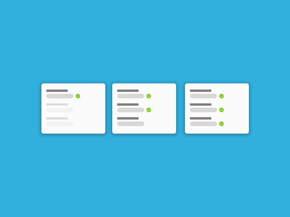
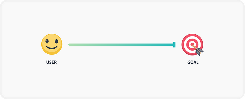
Forms are an important component in interaction design. From selecting dates to providing text input, they can get complex very quickly. As such, it is important to design something that handles multiple scenarios or error states. I have been working on designing a form for scheduling appointments these past few weeks and have learnt a few things which I am going to share here. Designing the happy pathIn my experience designing forms, it is important to show the success of the user each step along the path to the finish line. Designing this way also makes it easy to construct your invision prototypes and helps get the basic idea out the door. My biggest realization was that I wasn’t spending as much time designing the happy path and was missing out on communicating the right details to the developer. For example, some questions to think about when designing the happy path are –
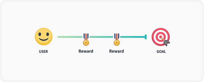
Use progressive disclosure when necessaryNot all forms are alike. Some forms are better served with all the fields active at once and some others are better served with only the necessary / compulsory fields shown first. Sometimes, the user could be having a lot of cognitive load when the whole form is shown right away. For example, one of our forms required the user to pick a date before filling out any other information as it was dependent on the date. Instead of showing all fields at once, we decided to show only the date field as active. This immediately made clear what the user needed to focus on when they landed on this page.
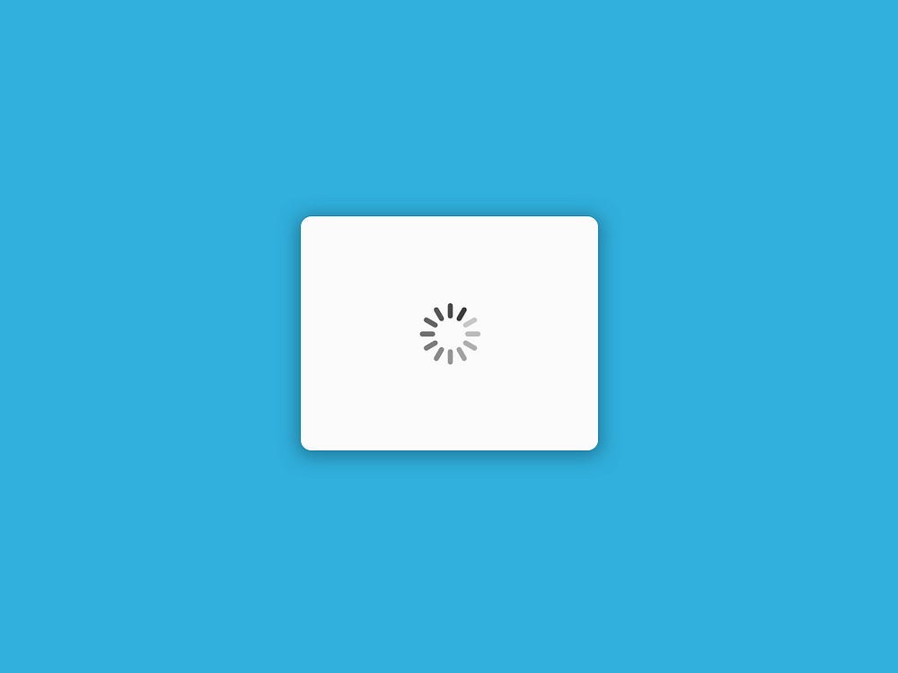
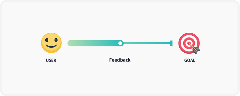
Think about the loading stateA noob mistake to make is to not think about how the form loads before the user sees it. Most forms are static, but some forms like the appointment scheduler that our team was designing were dynamic. It may be a simple spinner or a fancy animated loading state, but some sort of loading state as the data loads is a useful way to provide visibility into the system status. If you do not design a loading state, your form will feel stuck and as a result clunky.
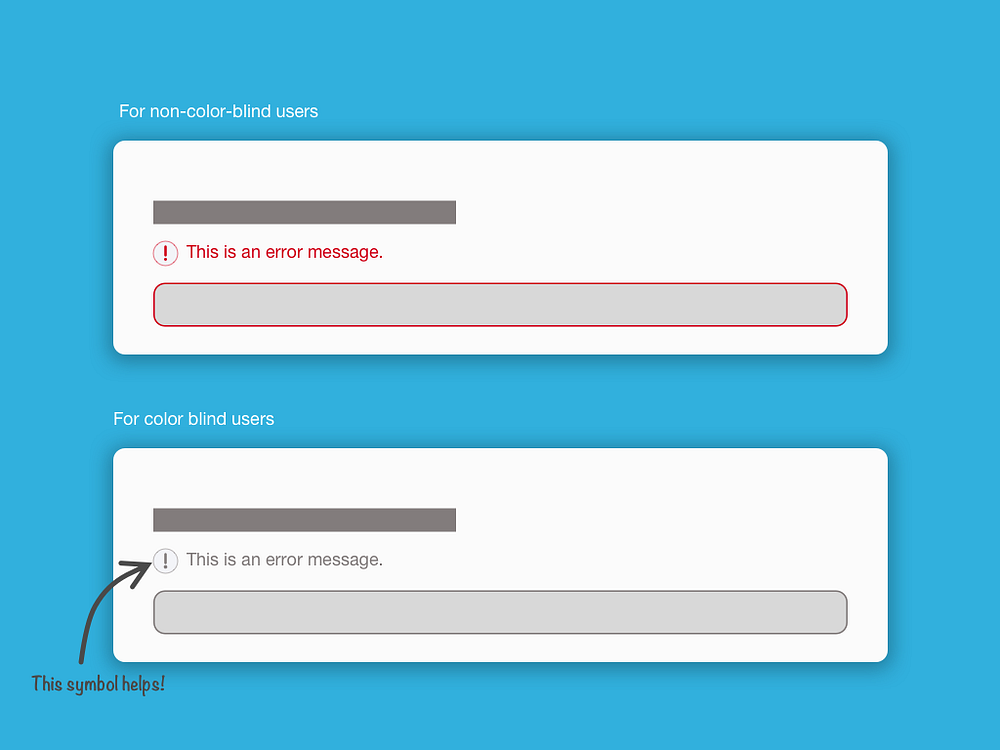
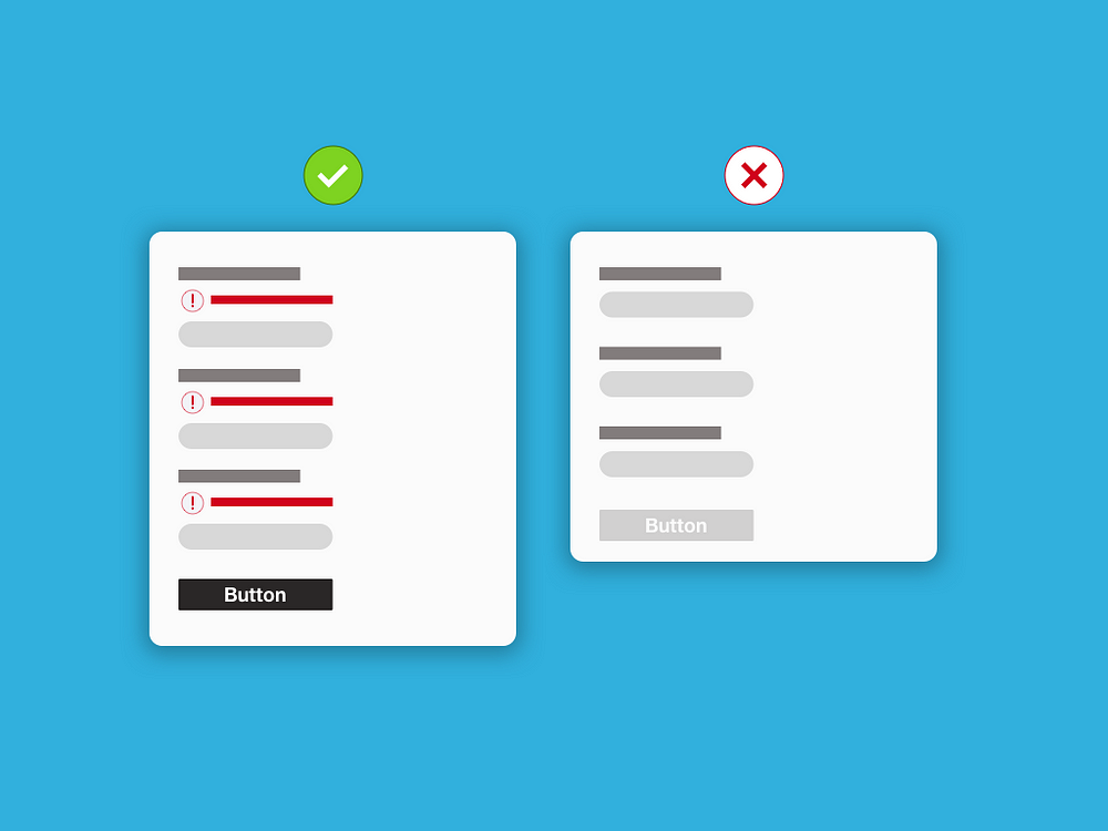
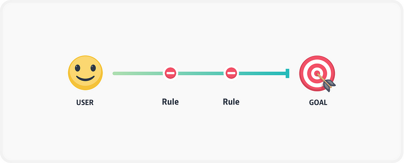
Make error states color-blind friendlyDesigning for error states is a messy but fun process. While it is a no-brainer that you have to cover all error states, there is one little important detail that most forms miss — making sure that color blind users too can see your errors. So what does this mean? Instead of just throwing red error messages with red-highlighted form fields, design an error icon that goes along with the error messages. This makes the error clear for everyone.
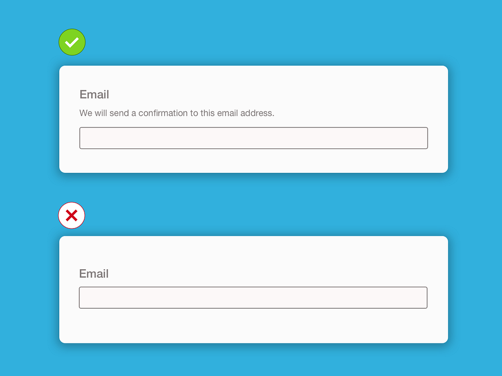
Explainer textAny design is an exchange of intent. Forms are no different in that the user gives information to get something in return. As we seek information from the user, it is important to explain why we are collecting that information. This is where explainer text comes in. It simply explains why we’re collecting the information that we are.
Do not disable the submit buttonSome forms disable the submit button (for the lack of a better name) until the user has filled out all the required fields. I initially designed the form in a similar way, requiring the user to fill out all required fields before enabling the submit button. There is a problem with this approach — It is for one not at all accessible, and secondly, doesn’t provide any feedback at all when clicked. Keeping the button enabled provides you the opportunity to highlight all the errors on the form as well. The only time it is okay to use disabled buttons is when you have a single form field and there is no other way to proceed. PS — please do not use the label “Submit” when creating buttons. Buttons at the end of forms work best with clear labels that reflect the overall user goal.
ConclusionGood form design accounts for multiple scenarios and is easy to fill out. If I were to share one lesson from designing forms, it is this — Forms need to reduce user-anxiety as much as possible, as you may be collecting important information that could have a huge impact on the user’s life. In summary, here are all the points we went through –
The post A few lessons in form design appeared first on Design your way. from https://www.designyourway.net/blog/user-experience/a-few-lessons-in-form-design/
0 Comments
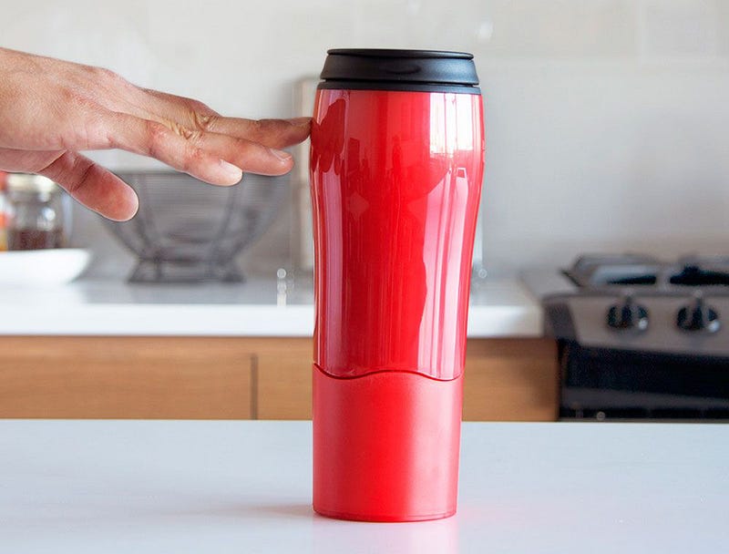
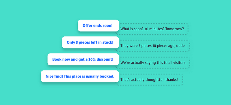
Short analysis on the current state of affairs and a few tips to keep in mind.You know how it works. Casually watching a review on Unbox Therapy about this mug that apparently is unspillable. I’m having a laugh but by the end of the video I’m also intrigued what people ask for it. There it is on Amazon. On sale at $14.99 from $24.99. For a limited time only. Only 3 left in stock for the stainless steel version. I love stainless steel. It’s a bargain and it will soon be gone. I’ll be left to drink coffee from my spillable mug. It would be a shame to pass this. F**k it. ?
It makes things desirableScarcity is the psychological bias that makes us place a higher value on things that are scarce than those in abundance. Basically, we tend to like things that are harder to obtain. It has become the normAs most things, scarcity started offline. Expensive restaurants serve small portions on large plates to suggest that ingredients are rare and prestigious colleges have limited places to maintain the sense of exclusivity.
But as tech businesses became more mature and digital products more refined, scarcity was quickly adopted online and it is now one of the most popular methods to increase desirability. We have come to a point in which people are so used to seeing and expecting some form of scarcity when browsing online, that implementing one inside your product is not a competitive advantage anymore but a starting point for any goal that aims to satisfy users’ needs. It combines multiple biasesScarcity became popular because it’s extremely powerful and fairly easy to implement. And the reason it’s so effective is because it combines multiple biases into one: 1. Loss aversionIf we don’t act upon a scarce product, it basically means we’ll lose both the product itself in the short run but also our freedom to choose it in the long run. Double the loss = double the pain.
2. Social proofUsually, products become scarce when the demand is high. Once that happens, it implies that other people bought it in the past so it must be valuable and we should seize the opportunity.
3. Anticipated regretWhen facing a decision, we anticipate not only the events but also the associated regret we might experience. Deciding to act now is our attempt to try and eliminate that possibility.
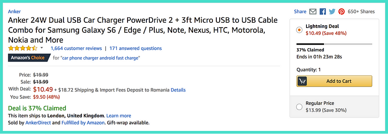
It comes in different formsEven though scarcity can be applied to unquantifiable features like quality or experiences, its effect is much more powerful when assessing measurable resources like objects or places. It’s the reason the likes of Amazon and Booking.com embrace it and use it extensively. Based on these measurable resources, there are 3 main forms of scarcity: 1. Time-limited scarcityWhen time has a limit, it creates a deadline that makes people act before the time is up. When the deadline is unknown, people are not certain that they can get the object anymore unless they act now, which increases the pressure but shows lack of empathy from a UX standpoint. Examples: Lightning Deals on Amazon: GoodThey last a few hours and show the deadline. They are accompanied by the percentage claimed by other people to highlight the urgency.
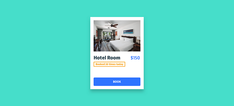
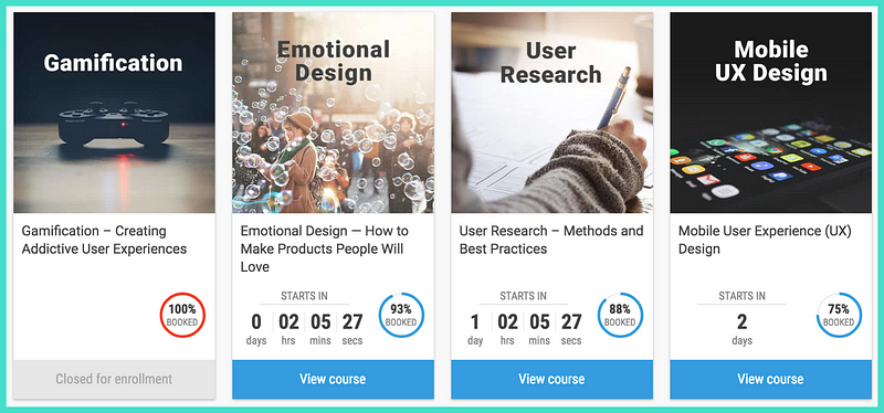
Courses on Interaction Design Foundation: SmartPresent the time until enrolment ends. Fully booked courses are still displayed to show people what it’s like to miss the opportunity.
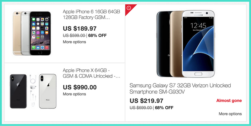
Buying things on eBay: BadTime limited products are marked with a red icon and a vague “Almost gone” tag. Not showing when the offer ends is unthoughtful and manipulative.
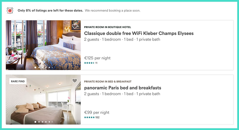
Searching places on Airbnb: FairIt shows people how limited the offer is by displaying the low percentage of listings left and a “Rare find” tag to make them feel lucky about their search.
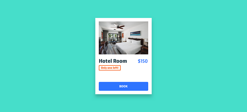
2. Quantity-limited scarcityLimited or rare supplies are perceived by people as a threat to their freedom of choice, triggering a reaction to fight the threat and maintain their access to the resource.
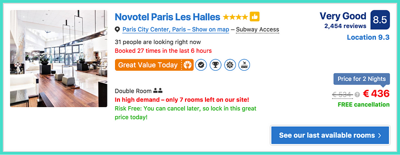
Examples: Looking for hotels on Booking.com: ImpressiveBooking is the Usain Bolt of scarcity and probably owe much of their success to it. They show the number of rooms left but also a ton of tags and labels that make you feel you’re about to make the deal of your life. It’s smart how they use the massive data they have and, even though everything is pretty overwhelming, the information is useful.
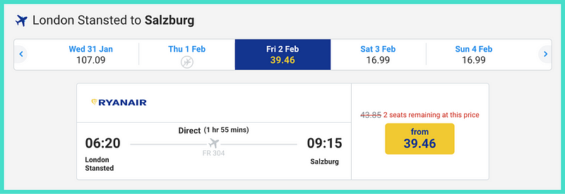
Booking flights on Ryan Air: GoodThey take advantage of the fact that cheaper seats sell first and use this to highlight the limited number of seats left for the lowest price.
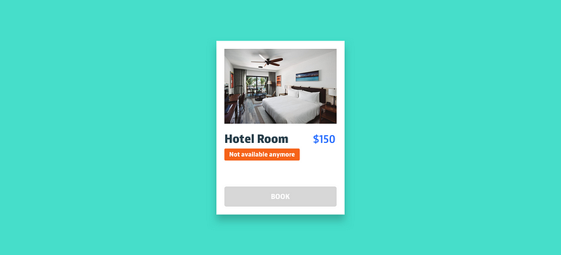
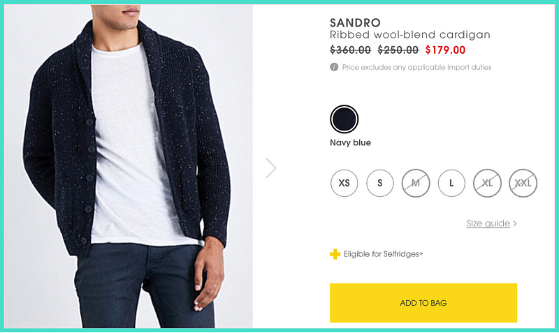
Buying clothes on Selfridges: SubtleProduct details display both the available and unavailable sizes. This way, it makes the available ones feel more scarce. Subtle and useful as some people are between sizes.
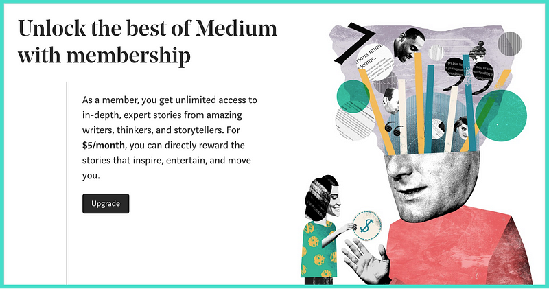
3. Access-limited scarcityIt refers to limited access to features like information, groups or spaces. Research showed that censorship made people place a higher value on the restricted features than those that were not because exclusivity made them feel special. Examples: Becoming a subscriber on MediumMedium charges you if you want to be able to read all the stories on their platform. But once you do, you’ll be one of their privileged users.
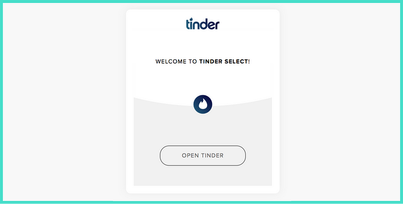
Joining Tinder SelectTinder uses the “Elo” ranking system to rate members based on desirability and invites the top ones to join the closed version called Tinder Select. Even though a bit cynical for the rest of the pack, it does what it’s supposed to do: reward popular users by making them feel unique.
It is controversial but it shouldn’t beIf suitable for the product we design for, scarcity can optimise user flows and impact business goals. It reframes information and alerts users when there is a need for urgency.
Having said that, I agree that some businesses take advantage of this and use it unethically by inventing fake stocks and artificial memberships. But this is true for any other method used with questionable intentions and it always leads to loss of credibility in the long run.
It should follow a few rulesTo avoid this, below are some suggestions for making the best out of scarcity and actually improve the UX: Do
Don’t
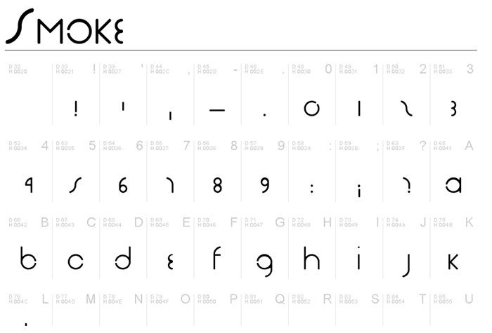
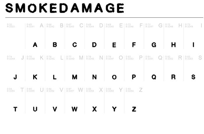
ConclusionScarcity makes us place a higher value on things that are scarce and, over time, has become the go to method for increasing desirability. It is powerful because it combines multiple biases (Loss aversion, Social proof and Anticipated regret) and it comes in different forms (Time, Quantity and Access). It is controversial but it shouldn’t be because hiding the information from people is not really an option. It can also improve UX if you follow a few simple rules. The post Scarcity in UX: The psychological bias that became the norm appeared first on Design your way. from https://www.designyourway.net/blog/user-experience/scarcity-in-ux/ Are you looking for a great smoke font to create a timeless design? A smoke font will never go out of style. By using a smokey font, you will be able to add flair to your design projects. Smoke fonts are both dramatic and eye catching, attracting attention to your text. Each element of your design will add aesthetic appeal to your overall design. However, a smoky font will lead the viewer’s eye to a specific area of your design. Smokey text will also add a unique element to your design, emphasising elements of your content. Smoke fonts are can be used in a variety of different designs. From website headers to logos, T-shirts, graphics, titles and personal projects, smoke fonts add versatility and aesthetic appeal to your designs. Many graphic designers add smoke fonts to projects with a dark design, adding visual impact. No matter how you choose to use smoke letters, their dramatic impact will send a visual message to your audience. From adding a bold finish to your letters, to creating an air of mystery around a character, your smoke font will add pizzazz to your designs. There are many different smoke fonts on the web and good designs can be hard to find. This is particularly true when you are looking for a free smoke font generator. The smoke fonts in the list below are free for personal use. If you wish to use these fonts for commercial designs, contact the designer. You could arrange to pay a small fee to use the fonts for professional projects. Smoke fonts to pick your favorite fromHere is a great collection of smokey fonts to give your designs a unique appeal. Vaporized BB Font
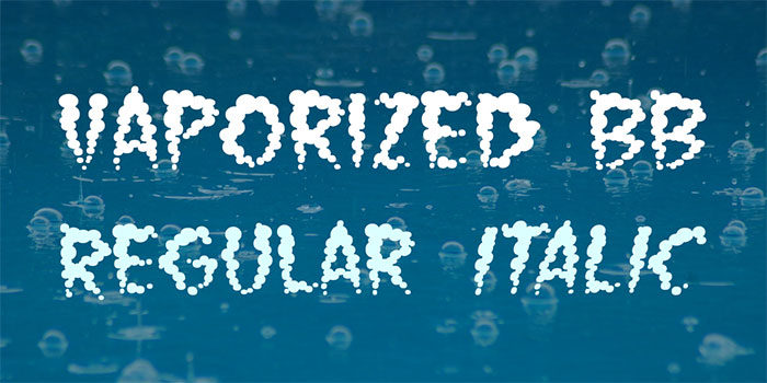
Nate Piekos designed the Vaporised BB font with sizzling sound to add energy to his font designs. These great smoke letters have a warped effect and their slightly distorted appearance makes them very suitable for projects which have blasts of smoke combined with great sound effects. This excellent smoke font comes in regular and italic and makes great project choices for creative design projects which do best with font smoke. Alpha Smoke
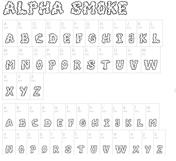
The Alpha Smoke font is an excellent way to deliver your messages in a creative and appealing way. By using font smoke in a creative and very playful way, you will be able to add interest to posters, billboards and flyers. This great smoky text can be downloaded free for personal and creative use. You can use this font in normal width and the font comes in a semi bold style, with a 72 glyph count. The font is upright and has normal width but it is not mono-spaced. The font includes letters, numbers and some symbols. If you are looking for cloudlike font smoke with a fun appearance, Alpha Smoke will make a great addition to your website, blog, and logo or poster design. Old Dreams Font
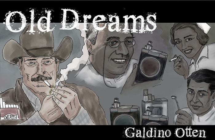
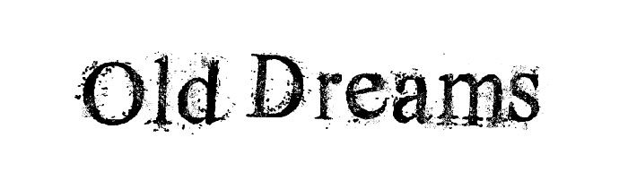
The Old Dreams Font is a great smoky font with a sandy effect. The overall aesthetic is grungy and this is a smokey text with a high impact. The font was designed by GaldinoOtten and can be used in personal designs free of charge. If you’d like to use the font for personal use you can do this by paying a small fee via PayPal. This font contains both uppercase and lowercase letters as well as some symbols and numbers. Old Dreams is a great smoky font which can be used on posters, headers, banners, flyers and card designs. After Cheret Font
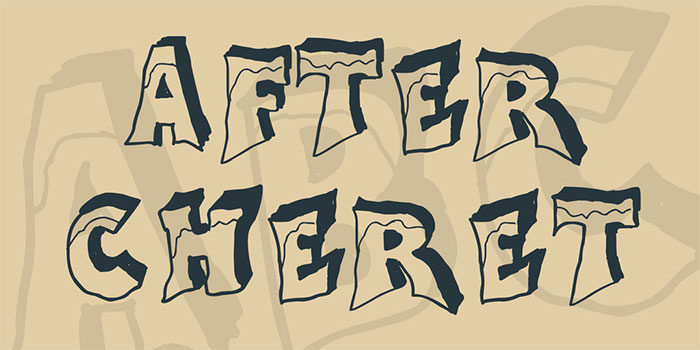
If you are looking for a great smoky font with a 3D design and an icy impact, this great font by GaldinoOtten will be great for you. This smoking font has a 3D effect and appears to have ice crystals at the top of each letter. It is a high impact font which will add interest to your designs. The chunky letters will draw attention to your designs and can be used completely free within any personal design. This is a great smoke font for drawing attention to your design projects. Tabaquera Font
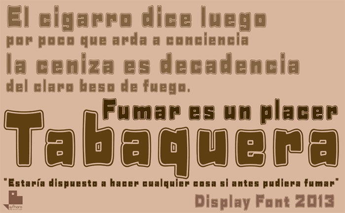
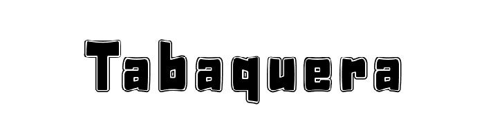
Designed by Fernando Haro, this chunky smoke font has a geometric style. Chunky, squared letters offer rounded corners for a quirky touch. With this interesting smoke text font you’ll be able to add interest to any design project. The font comes with upper and lowercase lettering, numbers and characters. You can use it with a range of personal and commercial project designs. Social Monster Font
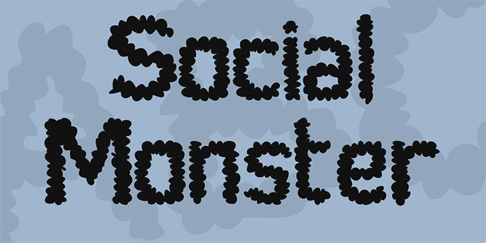
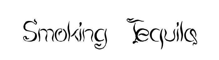
Designed by Gunarta, this smoky font has been created in cloudy style, with letters emerging out of plumes of smoke. The font is cool, fringy and unique enough to add style to any design. This is a font which can be customised by changing your colours to suit your design message. The design includes uppercase and lower case letters numbers and symbols. You can use the font to add a playful and creative touch for your graphic design projects. Gunarta has made this smokey font available for both personal and commercial use. Smoking Tequila
Are you looking for an elegant smoke font which appears soft and fluid? GemFonts has created Smoking Tequila as a free font for both commercial and personal use. This font is soft, stylish and appears to be a genuine smokey text which makes great headlines. The font comes with 200 glyphs and special characters and will make a great stylish smoke text for all your designs and projects. Add a touch of sophistication to your print or digital designs with Smoking Tequila. PWSmokey Font
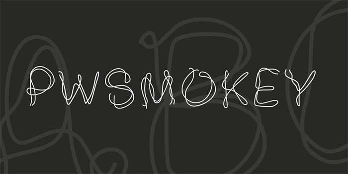
PWSmokey Font has a great selection on smokey letters with a light and airy feel. The font has a scribbled effect and has been created by Peax Webdesign for personal use. You can use this great smoke font to add a soft and quirky touch to your commercial design projects by making a donation to the designers. Headshop Font
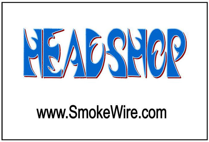
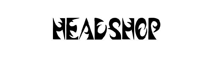
Smokewire designed Headshop font as a smoking typeface with a cool and edgy vibe. The font is sharp and creative and will make a dramatic and striking addition to headlines, posters and other design projects. The overall feel is creative with the letters seemingly carved out of smoke. This is a great smoke font to choose to add glamour to your work. Smoke in the Woods
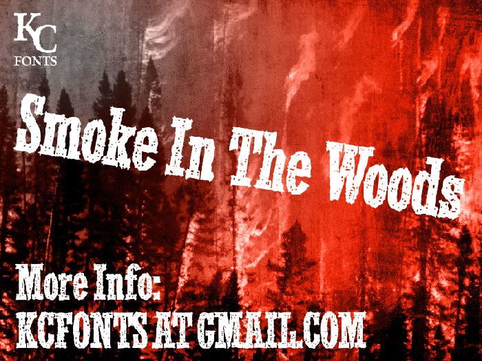
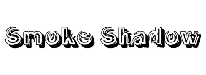
KC fonts designed Smoke in the Woods as a solid smoke font which will add a grungy touch to your work. Like a forest fire, the font creates a carved out effect with an eroded feel. This is a great smoky text to add originality to your work. You can use this excellent smoke font free for personal use. Contact the designers if you would like to use it for a commercial design project. Smoke Shadow
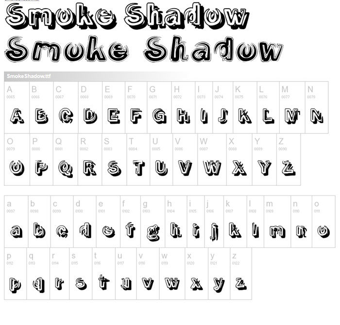
This great 3D smoke font is created by CybaPee and comes with a smokey text shadow. The font is strong and sophisticated and would add a great design element to a poster or header design. You can download this smoke font with two different effects – one has shadow and the second has contour styling. Both will add an eye catching element to your designs. Holy Smokes
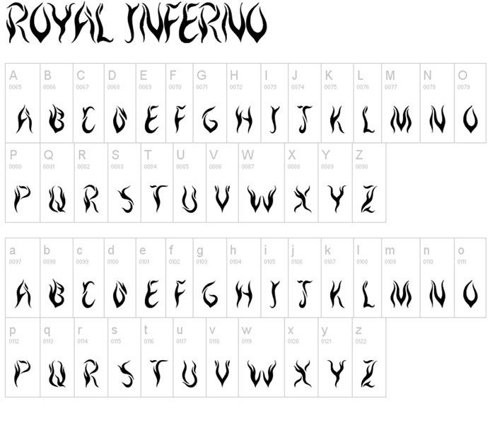
Holy Smokes is a great smoke typeface for adding a flexible, warped and twisted cigarette effect to your design. You can use this excellent smoke font free for both personal and professional graphic designs. Add an interesting design element to your graphic designs. T-shirts, logos, signs and web designs will all be enhanced by this great graphic font. Royal Inferno Font
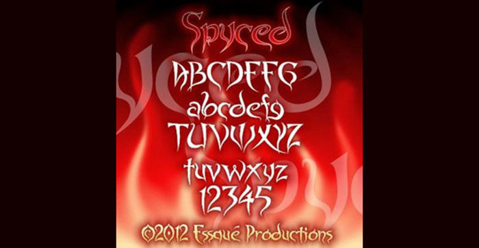
This incredible smoke font was created by Jonathan S. Harris. The font appears to be smoke or fire and is free to use in all of your personal design projects. If you want to use the font for commercial use, you would need to contact the designer for a commercial license. A great font choice to add a dramatic impact to your website designs. This font can be downloaded in TTF format. Spyced font
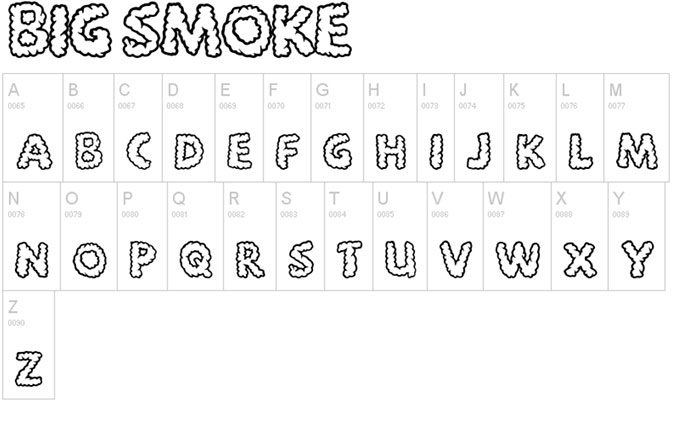
Spyced was created using inspiration from Indian style design. The overall appearance is mysterious and will add a great creative touch to your design projects. This smoke font is highly fashionable and looks excellent when used in combination with a smoke or thorny effect. Big Smoke font
Big Smoke is a unique and very creative smoke font which has the appearance of smoke, clouds or intestines. You will be able to use this great smoke text free for personal use. If you wish to use it for commercial use you can do so with a donation of between $15 and $25. Contact the font author for commercial licensing rights. PW Smokey Font
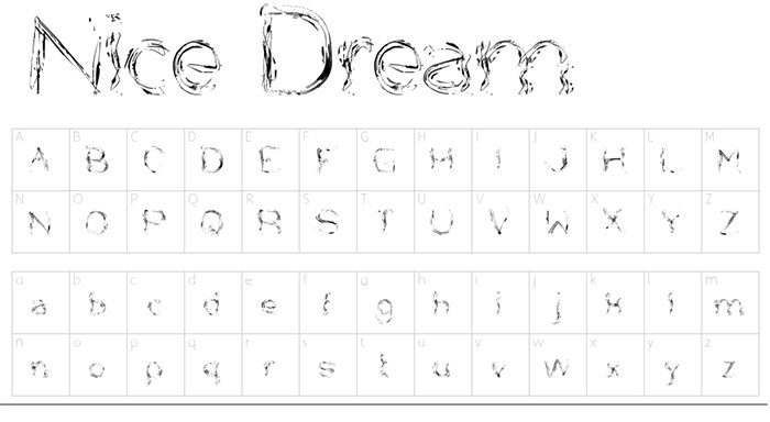
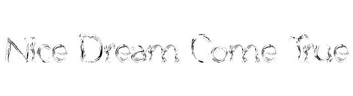
PW Smokey Font was created by Peax Webdesign and is a great thin, scribbled looking smoke text. You can use this smoke font free for personal project designs. If you’d like to use it for commercial projects, you can donate some money and get a commercial license. The font comes with 62 characters and can be downloaded in TTF format. Nice Dream Come True font
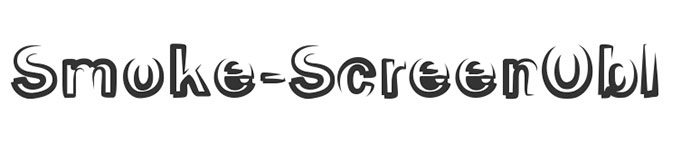
This smoke font can be used to add an attractive element to both personal and commercial designs. All you need to do is make a small donation through PayPal before use. Smoke Screen Font
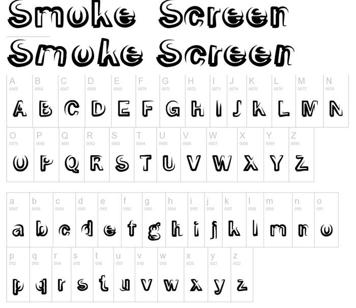
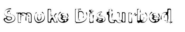
Smoke screen has great smoke text which can be used free for both commercial and personal designs. Designed by CybaPee this font will add a creative touch to your designs. Smoke Disturbed Font
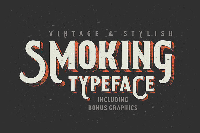
A great smokey font which looks charred and eroded for a grungy and wild appeal. This font is free to download for all your personal as well as commercial project designs. Smoking typeface
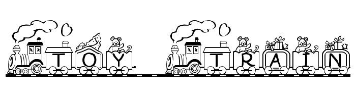
Are you working on vintage or retro designs? You can use this great smoke font to add a nostalgic and yet trendy appeal to your designs. Smoking Typeface is a smoking font which is great for posters, greeting cards, adverts and digital designs. Toy Train
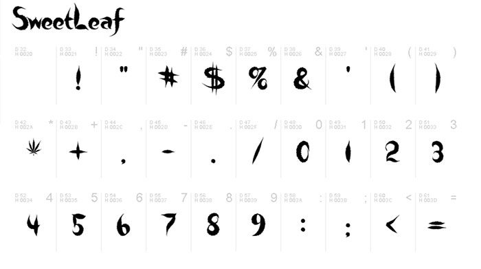
Toy Train is an excellent semi-lightweight yet bold smoky font which has a medium width. The font will add interest to any design and has a glyph count of 87. This font has a serif style which has arms which are not fixed and can be adjusted for custom use. You can download this excellent smoke front and use it freely for personal design. Sweet Leaf
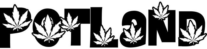
PotLand
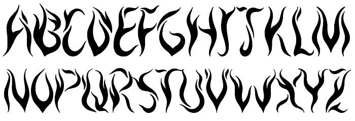
Pot Land is a smokey text which can be downloaded free in order to add creativity to your design projects. The font is semi-lightweight, has a glyph count of 219 and is licensed (protected). Royal Inferno
This bold smoke font has a glyph count of 153 and belongs to the Latin family. You can use this smoke font for online designs as well as for cards and posters. This great font has a regular pattern and will make a great addition to your smoke font collection. Nice Dream Come True
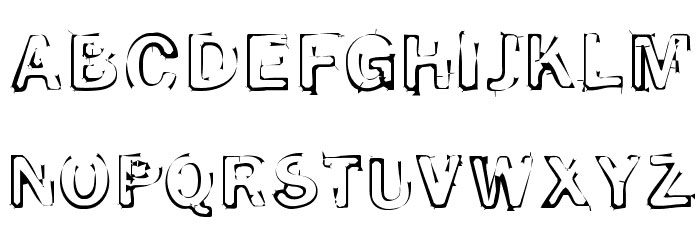
Smoke Disturbed Light Font
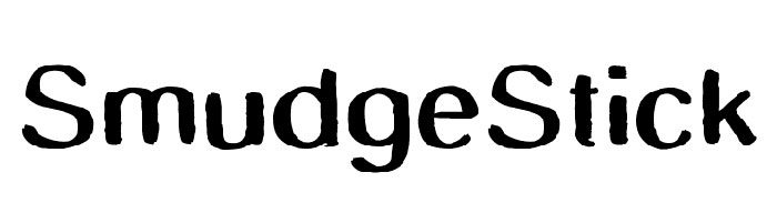
This great smoke font comes from the Latin family and has a glyph count of 119. The font has a bold mac style as well as a normal weight. Use this great smokey text for eye catching graphic designs. Smudge Stick
Old Dreams
SmokeShadow Medium
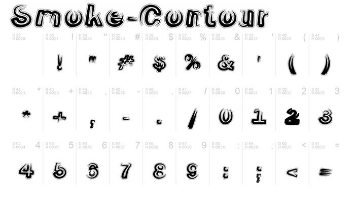
Smoke Contour Italic |

AuthorPleasure to introduce myself I am Jamie 27 years old living in Searcy, AR. I am web developer and have developed over 50 sites for clients. Now a days I am focused on designing as I feel I am lacking it. Archives
April 2019
Categories |


 RSS Feed
