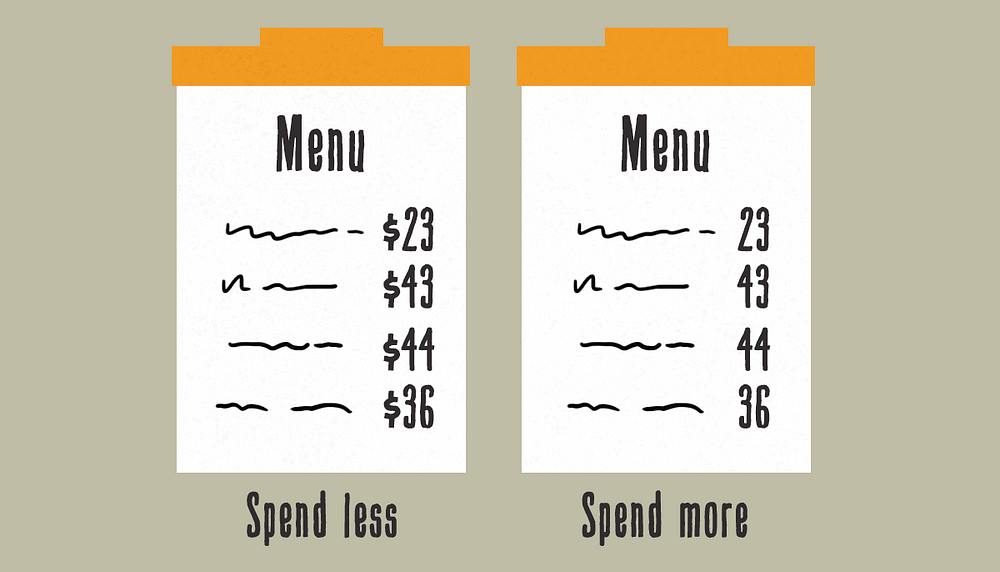
Years ago, I wrote about Designing for the Appearance of Speed, outlining some impetus and methods for creating the illusion of short page load times in apps and on the web. Shortly after that article was published, I had amazing conversations with fellow designers and engineers, largely around a single question — “how do we actually know that skeleton screens work?” A valid question — no definitive studies exist to validate the efficacy of the pattern (which, to us, seemed to make so much sense). Skeleton screens in different shapes and sizes are seemingly found everywhere across the web and apps — anywhere humans are forced to wait. But do they actually work? ?Research summary (TL;DR)
Skeleton screens: an overview ?Luke Wroblewski first coined the term “skeleton screen” in a blog postadvising that designers eschew the use of spinners (typically a graphical element that is animated rotating on its center point) in favour of visual placeholders. He referenced work he had done on a native mobile app called Polar, specifically around excessive wait times reported by users when loading the app’s web views. Initially, spinners were used to indicate that a web view was loading in. Luke said it best:
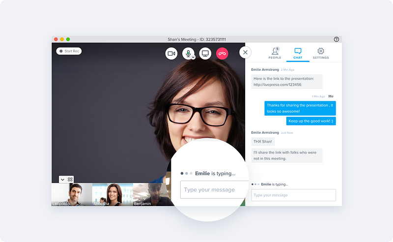
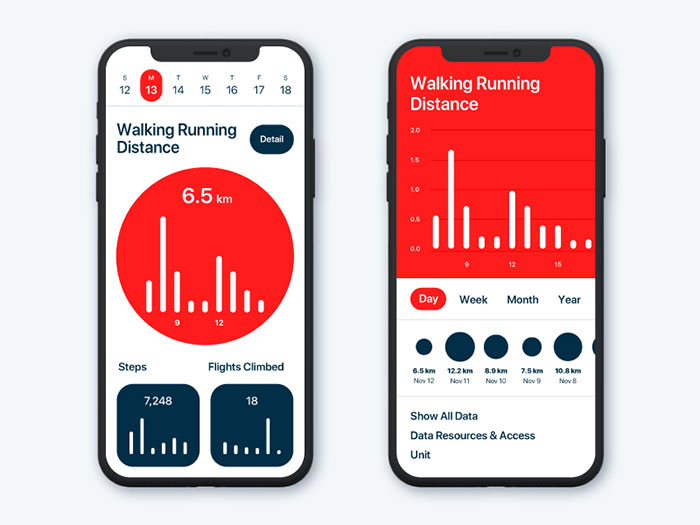
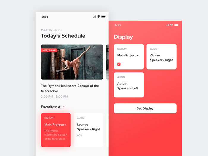
To mitigate focus on the loading process, versus the actual content that is loading, Wroblewski introduced a novel new design pattern — the skeleton screen. In his own words, they are “essentially a blank version of a page into which information is gradually loaded.” These visual placeholders were shown by Wroblewski to be light grey boxes that appeared instantly in areas where content had not yet completed loading. Shifting our focus to the content being loaded, and away from the actual loading itself — an almost Dickensian red herring. But what’s the actual impact? Explicit loading paradigmsInitially, spinners were used in the Polar app to communicate to users when the web view was pulling from a server. Let’s be clear here: in his post, Luke isn’t picking on the common place practice of using spinners — instead he is commenting (perhaps indirectly) on a natural human tendency to detest idle time, and the need to manage human perceptions. Spinners and progress bars are explicit loading paradigms in that they focus the user on communicating a loading period and, more often than not, are blocking user interaction until a layout has loaded enough to be useful. Skeleton screens definedSkeleton screens are blank pages that are progressively populated with content, such as text and images, as they become available (i.e. when network latency allows). Grey or neutral-toned filled shapes, commonly called placeholders, meet the user instantly upon user interaction with calls to action or links. The placeholders (the so-called “bones” of the skeleton) are then replaced with the actual site content, and the illusion is complete. That’s what skeleton screens do: create the illusion of an instant transition. Skeleton screens in the wild
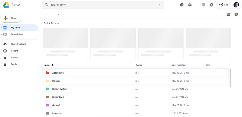
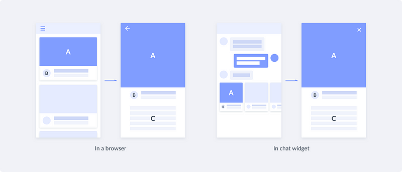
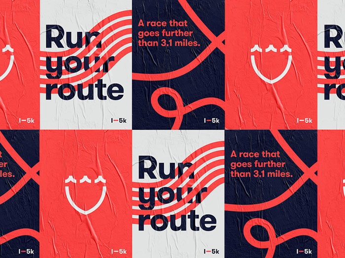
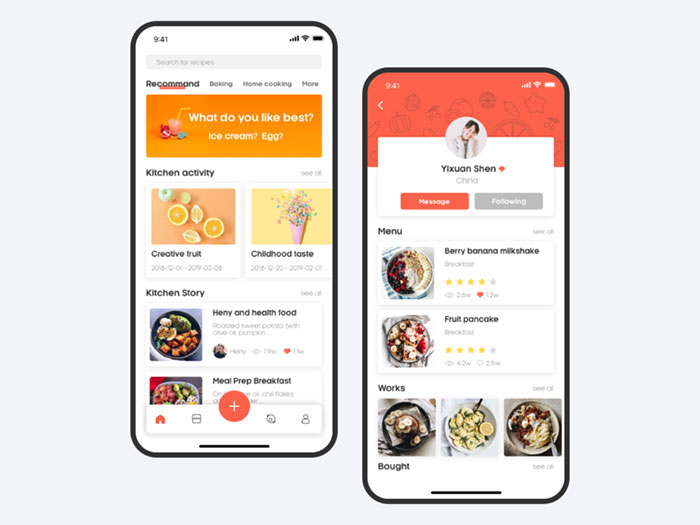
Google Drive
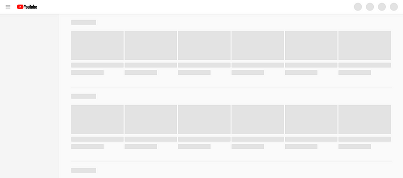
YouTube
CommonalitiesAll of these examples above employ common visual design approaches:
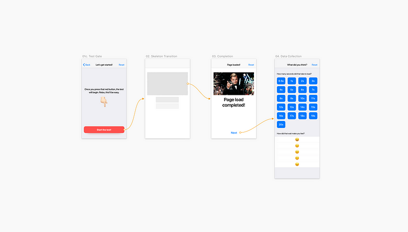
The study ?️The study is comprised of two primary phases: The first phase pits a common loading paradigm (a spinner) directly against the skeleton screen approach, and is described in more detail in the section titled “Paradigm vs Paradigm”. The second phase investigates variations on skeleton screens, gauging the effectiveness of each variation. I planned this study before knowing fully the outcomes of the first phase, as my assumption was that the skeleton trend would continue regardless of its assessed efficacy, and I wanted to see for myself what would be optimal in my own work. See the section titled “Implementation variables” for more on this phase of the study. Previous studiesLittle research has surfaced that shows the effectiveness of skeleton screens at reducing perceived queuing times. Viget released a 2017 study that speaks against the touted value of skeletons when compared to spinners and a blank screen (spoiler alert: skeleton screens performed the worst in terms of perceived duration of time). Yet even with the Viget study in hand with seemingly indicative results, I wanted to take things a bit further. Testing principlesI wanted to test skeleton screens as much as I could on a physical mobile device, as that best represents the “half-focussed” state that most of us are in when we’re on our mobile (half focussed on the device, and half focussed on traversing the streets or eating a bagel). I also wanted test participants that (preferably) did not work in the tech industry. So I took to the streets of downtown Vancouver and got to work talking to locals of all ages, genders, and life situations. In the second part of this study, I leveraged testers on UserTesting.com (sadly because the weather had turned and it was becoming increasingly unpleasant to sit and wait for research participants outside). Paradigm vs paradigmHypothesis: displaying a skeleton screen will cause humans to perceive a loading period as being shorter in duration. MethodologyIn considering how to best approach participants, I realized that past tests I had attempted against this hypothesis were rife with issues that could be easily mitigated, namely that:
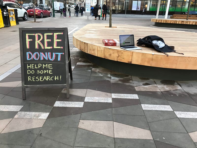
To mitigate some of these issues, I decided that an app on a physical phone, presented to the test participant to complete on their own, was the best solution. Preliminary user testing of the testing app proved positive after several iterations and refinements. Once I approached a potential test participant on the street, I asked them to complete the tasks as instructed on the device and assured them that they could stop at anytime to ask any questions or rest. Once they completed the test, and offered any open ended comments on which paradigm they preferred, a donut was offered as a reward and my participants were sent on their way, happy in the knowledge that some odd fellow was on top of testing different loading methods with strangers. Hurrah! ? 126 total unique individuals were approached on the street from varying backgrounds, primarily from non-technology oriented backgrounds. The sample size was 80 individuals who have all had experience with mobile devices. The testing app?The app was written in the Swift programming language and was loaded onto an iPhone 7 (this is the form factor I felt would feel comfortable in most hands). When the participant completed their test, the results were sent to a Firebase database from where I could pull daily results into a CSV (comma separated values) file for analysis. Participants were asked to read the instructions presented in-app, and take their time when completing the presented tasks. Before beginning the tests, I ran the participants through a really quick warm-up, so that they knew what to expect. Here’s what our participants had to do:
In order to mitigate any bias, where seeing one pattern before another might skew the perceived duration, the app automatically randomized the order in which the different loading paradigms appeared. The app also randomized the actual duration presented for each loading paradigm, so the duration didn’t seem as if it was progressively getting longer, or shorter.
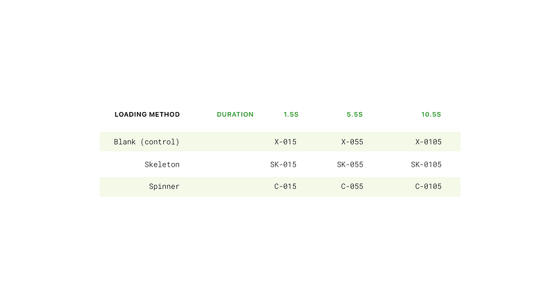
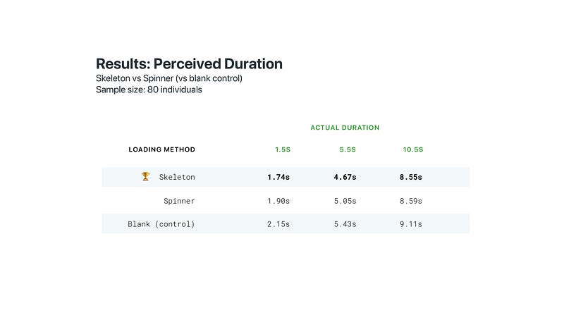
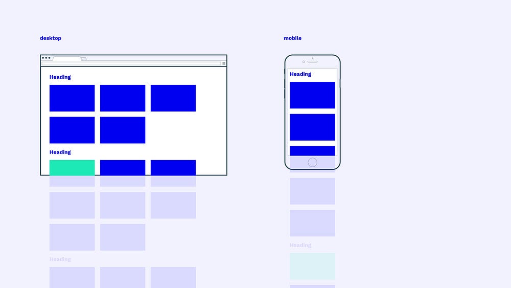
ResultsWhen testing skeletons versus spinners and our blank control in random order, the skeleton performed the best in terms of perceived durationwhen shown to people using mobile devices (see the below table for a summary of the mean test results for a sample size of 80 individuals). Actual durations shown to these participants were randomized to prevent them from interpreting a progressive increase in duration. Our blank control performed worst overall.
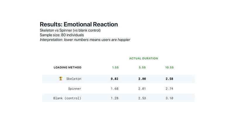
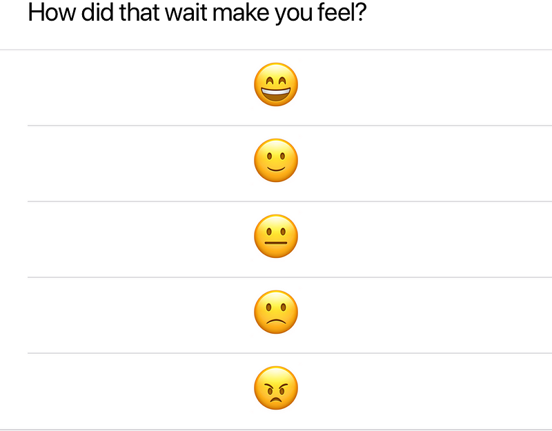
Skeleton screens also performed best on the emotional level, with participants being the most happy with skeleton screen loads, and least happy overall with a blank screen. After viewing each combination of duration and loading method, participants were asked to measure how each viewing made them feel using emoji, with 0 = Very happy, and 4 = Maximum frustration. Here’s what they were shown after each test:
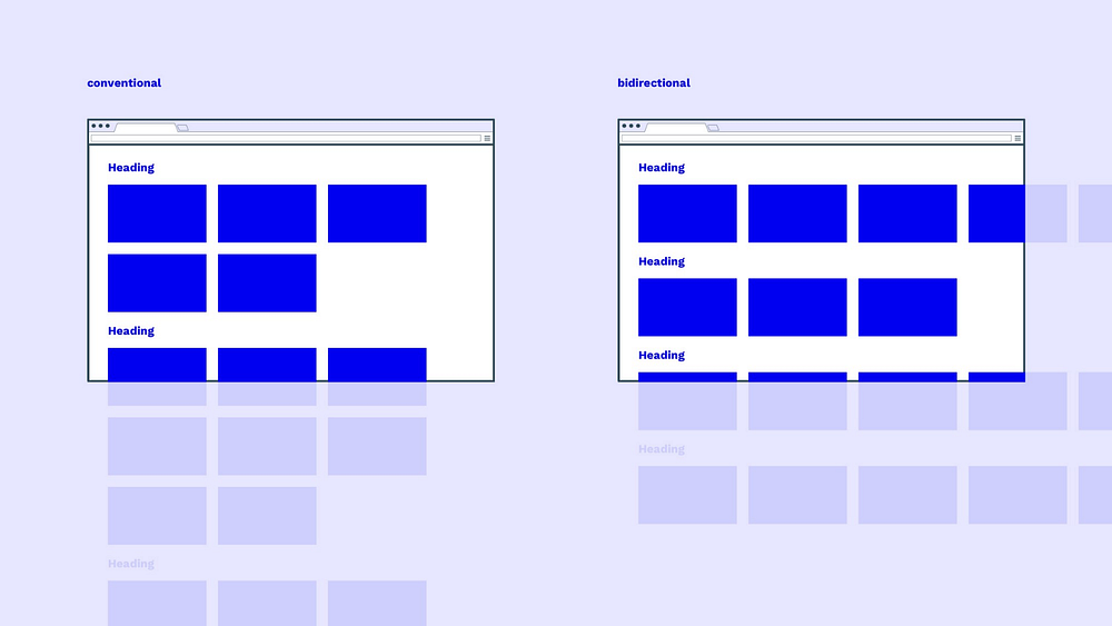
Analysis & interpretationWhen skeleton screens are used between page loads on mobile devices, the perceived elapsed time (duration) is shorter when compared to a spinner or a blank screen. In some instances, the skeleton is equivalent to the spinner, such as in our 5.5s duration tests, and indeed the superiority of skeletons over spinners is minor. One might hypothesize that different presentation methods of the spinner might affect results significantly. In our tests, I used a spinner that I thought was generic and looked most native to the platform (iOS in this case). In both dimensions (perceived performance and emotional impact) using any loading indicator is superior to a blank screen. Implementation variablesHypothesis: the visual presentation of skeleton screens will cause humans to perceive a loading time as being shorter in duration. I began hypothesizing how variations on the skeleton could affect perceived duration early on in this investigation (before I had results on whether skeletons were more performant than spinners). Early hints that the visual presentation of skeleton screens could affect perceived duration came from sources such as this 2010 study (in this study, progress bars presented with a “ribbing” animation proved superior in terms of perceived wait duration). Further reading can be done on the contrast of objects and how they impact human perception of speed. MethodologyIn order to determine the effectiveness of any particular visual presentation of skeleton screens, I spent time to collect the most popular approaches currently used in the market. Here are some common approaches:
With the weather turning outside (I had done all previous tests outdoors in downtown Vancouver, BC) I turned to 80 unique mobile devices users on UserTesting.com in order to test these implementation variables. Participants were from a largely North American audience and were asked to conduct the tests on mobile devices. To conduct the test, I mocked up a mobile product page for a make-believe footwear brand to make the comparison seem like a real-world example. Participants were shown one presentation, then another immediately after. The order in which I showed each presentation method was flipped in each “set” presented. For example, if I tested a static versus pulsing skeleton screen, the first 10 participants were shown the static version first, and the last 10 were shown the pulsing version first instead. This was done to mitigate any concerns that a bias may arise from seeing one method before the other. The participants were not told that the duration of each example they saw were exactly the same duration (all durations were 5 seconds in length). Upon viewing the two presentation methods, the participant was asked, “of the two page transitions you observed, which page transition was faster?” The testsI sequentially layered the implementation methods in order to move from macro variables into micro variables. Here’s the order of tests I went through:
 Results: Static vs animated skeletons60% of test participants guessed that the animated skeletons represented a shorter duration. Sample size: 20 unique testers Results: Pulsing animation vs wave animation65% of test participants guessed that the wave animation represented a shorter duration. Sample size: 20 unique testers Results: Quick vs Slow and steady wave60% of test participants guessed that the slow wave animation represented a shorter duration. Sample size: 20 unique testers Results: Left to right wave animation vs right to left68% of test participants guessed that the left to right wave animation represented a shorter duration. Sample size: 20 unique testers Analysis & interpretationThe results from this grouping of tests is indicative but not conclusive by any means. What might throw some flavour into these results is that, when speaking aloud about why they decided the way they did, test participants were fairly indecisive when it came to more nuanced tests (for example the quick versus slow wave test). However, when it came to tests that were more obvious to discern (such as the pulsing versus wave animation test) testparticipants were decisive and fully convinced that one was shorter in duration than the other (even though the durations were all consistent across the board). How should we design skeleton screens?The key role of motionWhile further study of the efficacy and effectiveness skeleton screens is needed, this exercise has provided us with a few clues as to how we can make the most of this unique pattern, namely:
Use of dominant colorsThe use of dominant color based skeleton objects is a unique method of providing future context to objects that are loading, as if to imply more acutely the future loaded state. Google Photos uses this pattern, as does Pinterest.
Skeleton screens are not splash screensBefore we dove into the details of this study, I mentioned that the vast majority of skeleton screens implemented today act exclusively as splash screens. When designing loading experiences, strive to progressively load content, replacing skeleton placeholder objects with content like real text and images as soon as they are available. Luke Wroblewski (the early pioneer of skeleton screens) speaks about this in detail at the 2018 Conversions at Google. Luke calls this “gradual content loading”. Future studies should compare a true gradually loaded skeleton with other loading indicators, while leveraging a larger sample size. Afterwards: on time perceptionAllow me to be real for several thousand milliseconds here: why would the mere perception of a site or app loading several hundred milliseconds faster, prompt such a deep personal investigation into something seemingly innocuous as skeleton screens? As part of the generation that inserted 13 floppy disks to install Windows 95, you would think that the LTE and fiber connections we enjoy today might make me nostalgic for simpler times, times when I could head to the fridge for pie while waiting for my favourite Geocities web page to finish loading in all its animated GIF glory. But alas no. I am as impatient as teenagers on the bus complaining about the 12mbps load of their Instagram feed. I cringe when the animation of a mobile navigation stutters along at sub-30 frames-per-second. I wonder why the payment terminal at the grocery store takes a full 2 seconds to actually get ready before I can tap my watch to pay. Our world and the society it hosts, now moves faster than large swathes of our species can process. Does it seem to you that our perception of time is accelerating beyond our ability to acclimate? You are not alone. Delving into how humans perceive time in the context of the pace of technology around us, has been an enlightening experience. But I am also filled with trepidation. As Peter Conrad best put it, “Modernity is about the acceleration of time”. From pure personal observation, the truth of this seems self-evident. Our culture’s patience thins daily, our walking pace has seemingly quickened to near jogging speeds, and our waning tolerance for all things even mildly idle in nature has given way to an entire industry of productivity pundits. This very article grew from my own personal awe as I beheld our collective impatience. In this human rebuke of slowness will undoubtedly arise new anxieties and irrational impulses. And perhaps new ways to stanch our fear that time is slipping from our grasp — as we sit and quietly contemplate skeleton screens. With gratitudeThis study would not have been possible if not for the hard work of my friend Karl Schmidt, an iOS developer who volunteered to code up an app to automate collecting results from research. Thanks to designers Jaybe Allanson, Mitch Lenton, and UX researcher Ben Cole for their guidance in collecting data used in this study. Special thanks go out to Michael Chung and Nikki An for reviewing ahead of publication. The post Everything you need to know about skeleton screens appeared first on Design your way. from https://www.designyourway.net/blog/user-interface-design/everything-you-need-to-know-about-skeleton-screens/
0 Comments
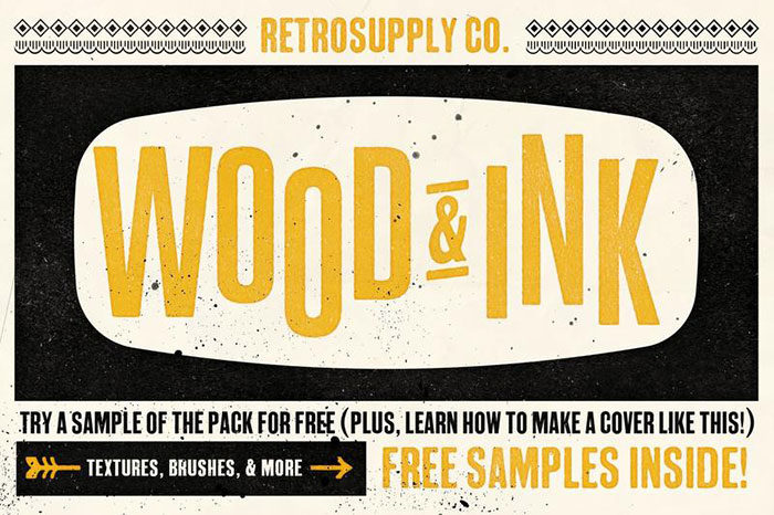
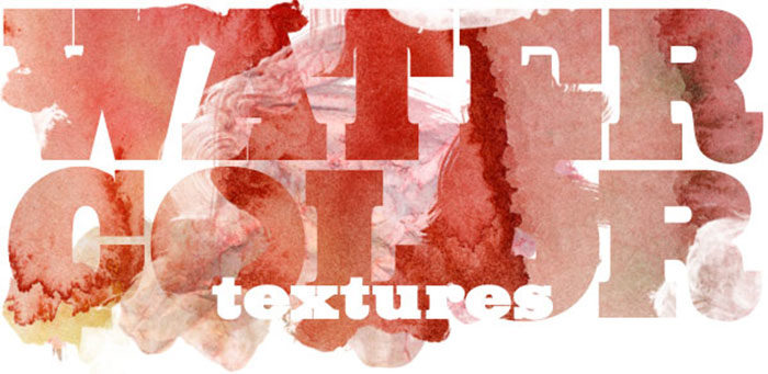
When you add Photoshop textures to your digital designs, you will be adding richness to your work. This is because textured Photoshop backgrounds add depth and atmosphere to your work. Searching for perfect Photoshop textures can be time-consuming. To help you out, we’ve put together a list of excellent quality free Photoshop textures to add a professional element to your designs. If you’re looking for great backgrounds for Photoshop, don’t miss out. Explore our list and select those which suit your designs. What is a texture?If you’re looking for Photoshop textures but would like to understand more, don’t worry. A texture is about the surface quality of an object and what it feels like to the touch. Think of the grainy texture of wood or the smoothness of polished concrete. Woolen blankets will have a different texture to fleece. Even the salt scrubs or soapy exfoliation gels you use in your bath will differ in texture. We make choices every day based on the textures which appeal to us. In graphic design, you can’t touch the textures you work with. Instead, a texture is simply visual. However, the textures you use will strike a memory within your viewer. Your viewer will be able to imagine the way your designs would actually feel. Photoshop textures, therefore, create an illusion for your viewers, adding an interesting dimension to your designs. What are Photoshop textures?Photoshop textures create backgrounds for your visual designs. They can add a range of different textures such as gritty concrete, smooth marble or polished wood. Photoshop textures use photo effects to add depth. When you use cool background designs you’ll be drawing on a very useful design element. You’ll be able to work with your Photoshop textures to create a range of different possibilities. Some designers may choose to create textures from scratch, while others prefer to work from photographic images. These images can either be downloaded or taken by a designer. Free Photoshop backgrounds can be complex and earthy, or they can be simple patterns such as dots and stripes. When you choose a background for Photoshop, take your design and the brand into consideration. You’ll be looking for a texture which works well with the style of your site as a whole. Great backgrounds will never distract from your site. Using Photoshop textures to enhance your portraitsIf you have a great portrait image and you’d like to add depth to your webpage, Photoshop textures add a new dimension. Before using a texture, have a look at the picture and how you would like to show it off. By applying great backgrounds you’ll be able to create a customized portrait that looks great on your site. Why use Photoshop textures?If you’d like to add an authentic appeal to a project, adding Photoshop textures gives visual appeal. Imagine a gritty concrete setting behind an urban design or a marble wall behind a site for a luxury spa. When creating a visual mockup of a site, Photoshop background textures help your clients to see where your work might be going. On a final product, a background texture adds polish to your designs. High-quality background textures make your site feel sensual and add atmosphere to your site. This will add a new dimension to your site. The high-quality Photoshop textures in this article have been designed to enhance photographs, illustrations, tutorials, and page layouts. They have been created by professional web designers to assist with creating wonderful sites. If you’re short of time, you may not be able to create your own background textures. This list will help you to add interest and a great atmosphere to your site designs. All are available for personal use, and many are available for commercial use. Check the terms and conditions of use before including them in your design projects. The very best Photoshop Textures availableFree Wood & Ink Texture Pack
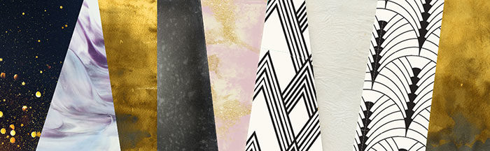
If you have been looking for a great wood type shop, this great Photoshop textures set offers a free sample. All you have to do is click on the link to download this great package. If you buy the full version of this set you’ll get over 60 different textures which have been made from ink, water wood and brushes. You’ll also get 20 Photoshop wood styles, 10 brushes, 15 patterns, 5 Wood Block brushes, 5 overlays with ink splatter designs and free updates. Artistic Textures And Art Deco Patterns
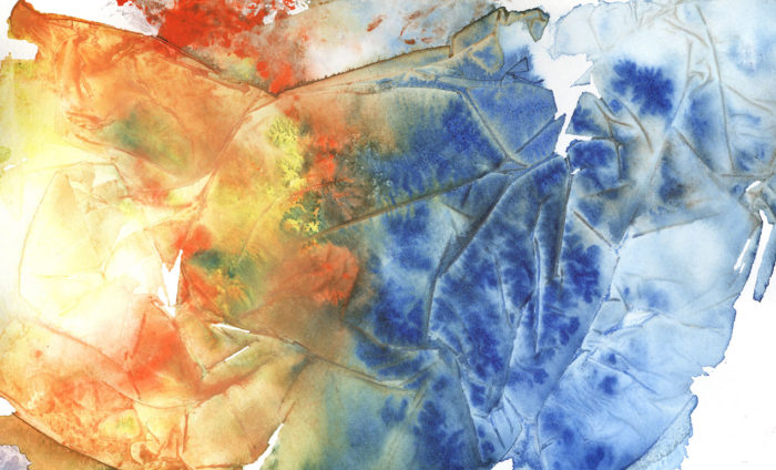
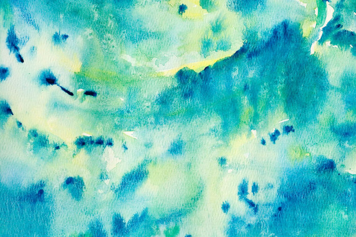
DesignCuts has greated a great package filled with vintage and retro Photoshop textures. Artists include NKate and Umember, 2 Lil Owls, Artist Mef, LuOtero and Mix Pix Box. You’ll also get great art deco patterns from The Paper Town to add to your Photoshop textures collection. 23 Water Color Textures
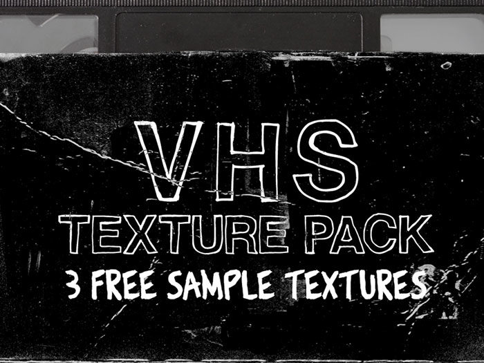
Great Photoshop background textures created in water color can be downloaded free. You can download individual files at SadMonkey’sDeviantArt Page. You can use these files for both personal and commercial use. You can also modify and redistribute them in any way you choose. Free VHS Texture Pack
Are you looking for great Photoshop backgrounds with a retro appeal? This great 10 texture pack designed by Timothy Swim is available free. You can add a great crackled effect to your designs. Download free on Dribble. DirtbagHd
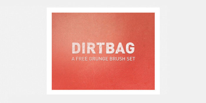
Would you like to add grungy Photoshop design textures to your site? If so, this 15 set package with free texture brushes is perfect for you. This package was created by UK designer Visual Idiot. 50 Outstanding Free Design Textures
How would you like a super pack of 50 great Photoshop textures absolutely free? Create outstanding designs with this great library of cool background textures. You’ll get a range of different styles to suit every design. Free Pasta Textures
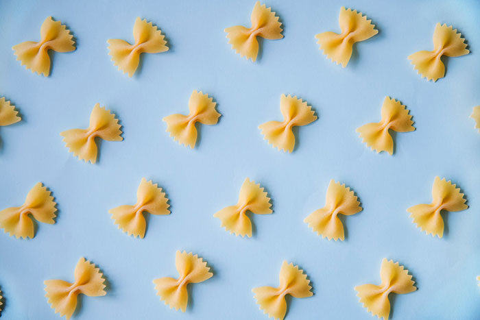
Food textures are not your usual option when creating websites. However, if you’re working on packaging designs, food sites or other commercial designs you may need pasta related textures. This 5 part collection has a range of different pasta designs, from farfalle to fusilli and twisted egg noodles. Use these simple textures to create a great site. Ending thoughts on these Photoshop texturesIf you want to create a great collection of Photoshop textures to use on a range of different site backgrounds, you’ll find a great selection to choose from. Save yourself time by exploring the above designs to see if you can find the pattern or texture you’ll need. Many great website designs use a cool texture background to add visual appeal. Photoshop textures are interesting and easy to use. You can also adjust your images to suit your unique needs. The possibilities for creating unique and customized designs are endless. We hope you enjoy these great Photoshop textures and use them to make incredible website designs. If you enjoyed reading this article about these Photoshop textures, you should read these as well:
The post 37 Photoshop textures that must be a part of your toolbox appeared first on Design your way. from https://www.designyourway.net/blog/graphic-design/photoshop-textures/ Productivity is a subject everyone talks about, but not everyone knows how to achieve it. Still, we try our best to find ways to do workplace activities more quickly. At the same time, do them as well as before or even better. The digital age has become both a curse and a blessing in this respect. It’s provided us with tools to become more productive; in some cases, almost instantly. The digital age has also given us more work to do and quite often less time to do it in. One area where technology helps us comes in the form of good productivity apps. They can help us organize, manage our workflows, give us a head’s up on actions to be taken. They can take care of a lot of areas in our work that might otherwise create stressful situations. We offer several of these top productivity apps for your inspection. Mason
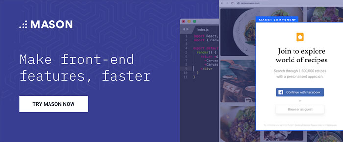
Mason offers a platform on which product teams can come together to create robust and functionally precise front-end features for the applications they produce; economically and at lightning-speed. This modern productivity tool enables its users to bypass documentation, sequential wireframing and prototyping, and QA analysis. It also minimizes, and in many instances eliminates, the need to hand a project over to developers. Mason’s somewhat radical approach saves time and keeps budgets in bounds because of the way it streamlines the design/build process. It can also save engineering teams time and additional expense by shortening the software feature deployment process and in some cases, bypassing conventional deployment practices altogether. Anyone who has a Mason account and is authorized to make changes or add features to a live application can do so. This typically includes all team members and can also include post-deployment maintenance personnel and even clients. If you’ve been looking for a UI/UX productivity tool that can do things faster, with great precision, and save you money in the process, give Mason a good, hard look. Proto.io
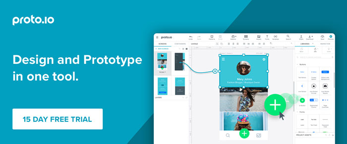
Proto.io provides an all-in-one solution for designers, entrepreneurs, developers, and product managers, or anyone else who relies on creating wireframes, mockups, or prototypes to support their software design and development process. In the early stages of design, you can create wireframes, mockups, or low-fidelity prototypes to test concepts and get feedback. During the later stages, you can use Proto.io to create high-fidelity prototypes that mimic the look, feel, and overall experience of a live application. The high-fidelity prototypes you build can be used for user testing on mobile devices, as well as to support design approval and signoff. Proto.io offers a wide spectrum of tools, features, and options. Its latest version, Proto.io 6, has a redesigned UI and other productivity-enhancing features including new state transitions, an interaction wizard, and enhanced user testing feedback capabilities. monday.com
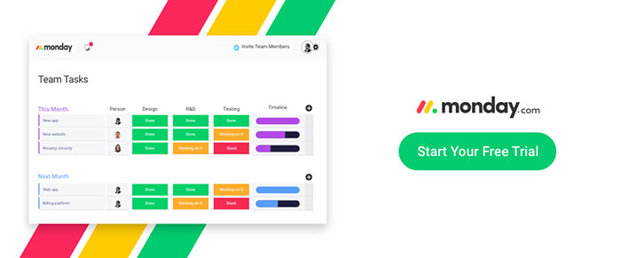
monday.com is a team management tool that gives teams ranging from two freelancers to thousands of teams working together around the globe a centralised platform to work from for project information sharing, collaboration, and workflow streamlining and improvement. monday.com promotes transparency. In doing so, it gives its users a greater sense of personal empowerment; making them feel more important than simply being owners of their individual tasks. Team leaders and members can easily track time, see who is working on what, and view project and task status. monday.com stores information securely while placing needed information at users’ fingertips when they need it. The number of teams currently using this team management tool exceeds 50,000 and is growing rapidly. In fact, this fast-growing company tripled its revenue and tripled its user base in the past year alone. ActiveCollab
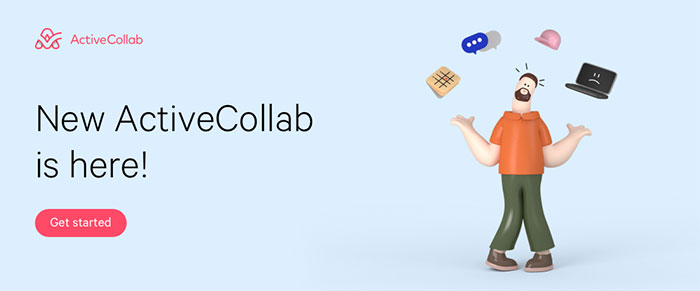
ActiveCollab is a project management software for creative professionals that enables you to organize your entire work from start to finish. The latest update brought in some awesome new features and it now has a completely new look & feel. The star of the show, task dependencies with automatic task rescheduling, is a real game changer. When you modify a task, any tasks that are dependent on it are changed and rescheduled accordingly. There are many other neat surprises as well. Lucidchart.com
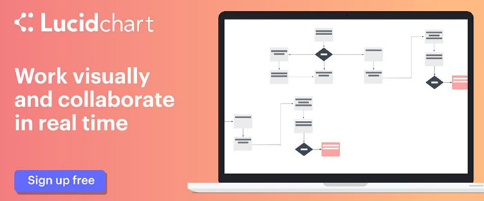
Lucidchart is aptly named. It’s one of the best ways, if not the best way, to communicate ideas visually. This is what Lucidchart does, and it does it to perfection. With this productivity application, you can present technical flows to non-technical types and better organize your ideas and personal goals. Lucidchart’s secret lies in its library of custom shapes, import and export features, and drag and drop diagram-creating interface. Nutcache
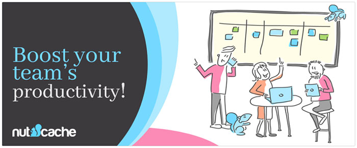
Like the little mascot depicted in its logo, Nutcache saves and stores important things for you until you need them. This all-in-one project management software solution will help you and your team manage your projects more efficiently and with greater effectiveness. Nutcache integrates all aspects of a project including task management, budgeting, time tracking, expense management, and invoicing from estimating to final billing. 5 Productivity Tips to Help You Achieve More, Work Smarter, and Create Peace of Mind
Some people have elephant-like memories but most of us don’t. Trying to remember something can be a genuine time waster. Completely forgetting something you should not have can sometimes lead to bad situations. To repeat: write it down.
It’s remarkable that when you have a task you dread on your to-do list, it has a way of gravitating toward the bottom. You may forget some things, but a dreaded task is not one of them. Give yourself a break and do it first.
Even when you’re zeroed in on a task, it’s often a good time to take a break now and then. Experts say every 45 minutes is about right but do what works for you. This gives your brain a chance to recharge and you’ll be more effective at what you’re doing because of it. Make taking breaks a habit, and don’t feel guilty about it.
The reason for this is almost self-explanatory. Sound mind—sound body – synergy.
Say Yes all the time and you tend to put control over your work (and to some extent your life) in the hands of others. Do what’s important, what you’re comfortable managing, and what you prefer doing. ConclusionThere are many ways to boost your productivity or that of your team’s. But if you try too many different approaches, you’ll soon reach the point of diminishing returns. Use one or more of the top productivity tools we recommend. Couple them with the 5 little but super-important tips we shared. This should put you on the right path to greater productivity and the success that goes along with it. The post How do you tackle design projects? Start with these productivity apps. appeared first on Design your way. from https://www.designyourway.net/blog/resources/design-productivity-apps/ You need to agree, building a one-page website would be 10 times easier than building a 10-pager. Or not? Almost the exact opposite is true, however. The reason? It’s not all that easy to make a one-pager visually appealing and at the same time user-friendly. Just settling on a design can take up to 10 times the effort you would put into a multi-pager. It takes superb planning to stuff all the information you believe is important on a single page. Too much information and you’ll start to lose visitors by the third scroll. According to the ancients, and the less-informed, nature is made up of air, fire, water, earth, and spirit. One-page website design is also characterized by 5 critical elements. Follow them, and you will significantly reduce the bounce rate. Extensive scrolling-induced carpel tunnel syndrome will decline as well. 5 Critical Elements that Will Make or Break Your Design#1 The GOAL: Identify the Goal of the Website & Work Towards ItYou may be super-enthusiastic to get going. But that’s the #1 website design mistake you can make. It is starting out without first having a clear understanding of what your website is to achieve. You need to have a single goal in mind. One that drives the user journey, before you place your first design element on the canvas. Is the purpose of your website:
Now, let’s say you’ve identified the purpose of your site. It’s time to think about ways in which your design might chase visitors away before responding to your CTA. An example is using parallax effects. While they can be engaging, they typically slow down page load speeds. This is a situation that will cause lots of users to bail out. Here are several examples of techniques used to avoid load speed issues:
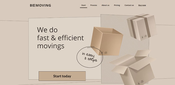
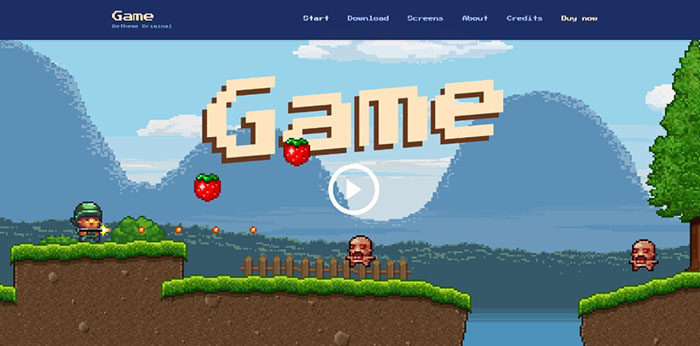
This website’s interactive effects above the fold don’t drag down its load speed.
The image on this BeTheme pre-built one-pager appears to be dynamic; it isn’t.
Tiny animated items add to this page’s illustration without slowing down page loading.
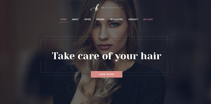
Here’s an example of where a page’s fresh look is all that’s needed.
Here’s an outstanding example of how large images and sliding panels contribute to engaging site visitors.
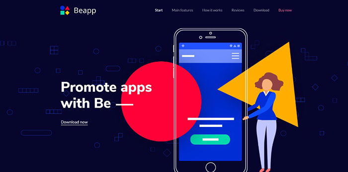
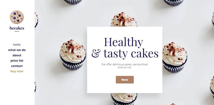
You don’t need a long list of technical details to promote an app. Vivid colors, neat effect, and a genuinely cool presentation will generally suffice. #2 TEXT: Keep It to the Minimum & Make It Easy to ReadAvoid clunky blocks of text on a one-pager. They will turn off a user almost immediately. The remedy? Use bold headlines, short paragraphs, and bullet lists. You need to totally avoid blocks of text. Use easy to follow sections and visuals to keep users entertained. You might like to bookmark some of these examples to use as references:
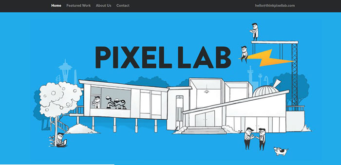
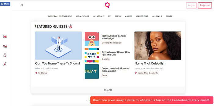
This one-pager is about as entertaining as it gets.
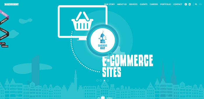
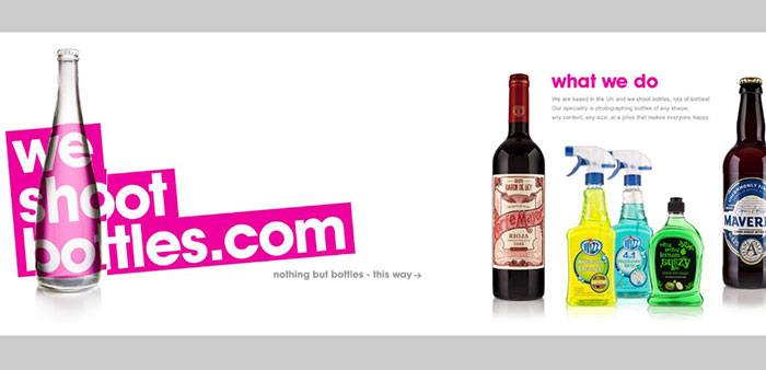
An example of what neat organization can accomplish.
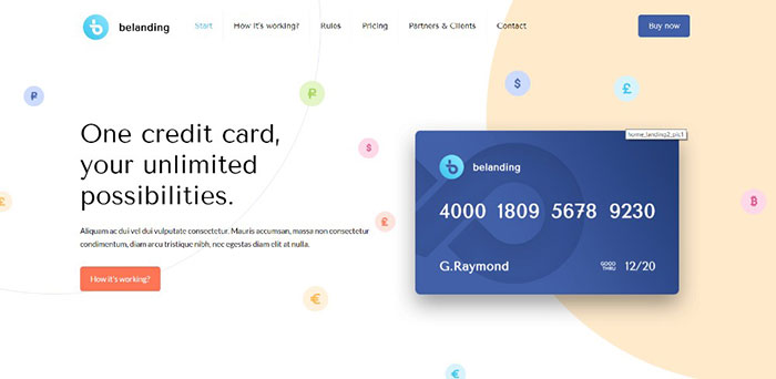
Key information is kept above the fold; and bullet lists aid in keeping the message concise.
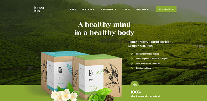
An illustration of how large attractive images help do the selling when accompanied by astutely placed paragraphs of text.
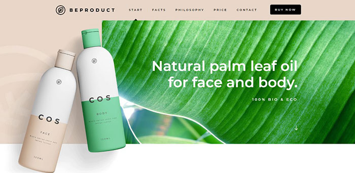
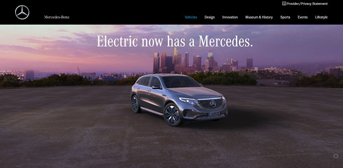
When a vehicle has the stature Mercedes-Benz does, focusing more on high quality images than on text is usually more than sufficient. #3 VISUALS: Identify the Right Patterns & Use Negative Space WiselyThe “way” people read is important to take into account. Most read text in an F pattern and scan visual elements in a Z pattern. Being aware of this should help you maintain a nice flow as you mix elements. This flow leads people to the critical stuff and away from things of lesser importance. White space is useful here. You can use it to separate sections and make the text more readable. It can stoke reader’s curiosity about what they’ll find lower on the page, and help them avoid visual fatigue.
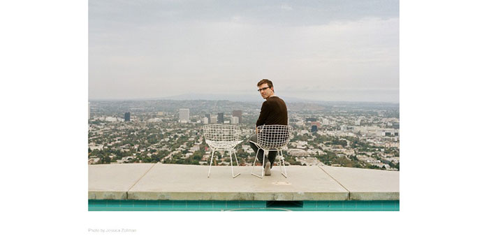
An example using white space to create a sense of order.
A wildly creative website using white space for its canvas.
The white space in this pre-built one-pager maintains a sense of order and makes the different sections stand out.
Here’s an example using a mix of design principles to create an amazing visual sensation.
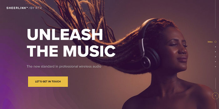
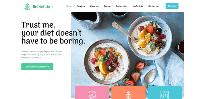
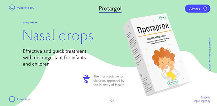
You would naturally expect a page promoting nasal drops to be dull. This page, with its ingenious mix of slides, white space, and animations is anything but. #4 NAVIGATION: Make It Easy to Navigate & Entertaining to ScrollIf you’re not careful, navigation can cause problems on long-form one pagers. Users can get hung up, sent to somewhere they didn’t intend to go, or simply leave. An alternative navigation scheme is a good practice for a one-pager. It could consist of either a classic horizontal sticky menu or a sidebar menu. As long as it enables users to quickly jump to a section of interest to them with a single click, it’s good. Auto-scrolling nav links can also be extremely helpful. This is if you let the visitor watch the page scrolling rather than jumping directly to the new section. You might find these examples of user-friendly navigation helpful:
This website features 3 different auto-scrolling links.
Be Game offers a navigation experience that’s more entertaining than most.
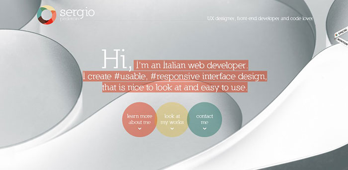
Three things stand out, the layout structure, the color scheme, and the use of 3 mouse scrolls to scan the page.
A menu on the top and one on the left provide a sure-fire way to help you navigate this site quickly. #5 CALL TO ACTION: Identify the Correct CTA & Don’t Be Afraid to Use ItDon’t be afraid to use CTA buttons. The CTA is the introduction to the endgame of your website’s raison d’etre. The beauty of a one-pager is that you’re typically directing people toward a single action. For this reason, it’s preferable to have the CTA button above the fold. This is especially if you’re presenting a portfolio. If, however, you’re selling several products or a range of services, you may need to use several CTA buttons.
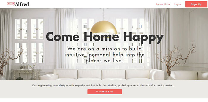
In this example the CTA button is above the fold along with one in the menu.
The two CTA buttons above the fold allow users to choose where they want to go.
This site employs a simple opt-in form with a bold CTA button.
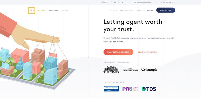
Reneza uses CTA buttons judiciously, with an optimum choice of colors and text sizes. Wrapping It Up5 critical elements? Maybe we should add “spirit”. Great designers seem to have it in abundance. Learn and master the 5 elements discussed here. They are key to providing engaging one-page website user experiences. They look simple, but once you try applying several or all 5 to a design, the going can get tough. You can also take a shortcut by using pre-built websites. These have incorporated these basic elements. Be Theme is a great resource for pre-built websites with its huge library of 60+ one-pagers to choose from. It has 400+ pre-built websites of all kinds to fit your needs. The post 24 Stunning Examples of Top Quality One-Page Website Designs appeared first on Design your way. from https://www.designyourway.net/blog/wp/24-examples-one-page-website-designs/ What is a logo? Logo designs are everywhere, but if you are not familiar with the term, you might be asking “what is a logo and why do you need one?” Well, logos are all around you. Everywhere you look, both online and off, you will find logos. A logo is a visual representation of a brand and it has the power to influence your choices. The easiest way to define logos is as a visual message a company uses to share its values. A logo therefore has meaning. Why Use A Logo?Producing logos means creating a symbol for a brand. This symbol can be used digitally on a company website. It is also used on letterheads and business cards. A logo is also known as a logotype. Logos make a company easy to recognize as the logo becomes increasingly familiar to the public. Identification logos are usually bespoke, and carefully designed for a company. They are specifically designed by a marketing or graphic design logo company to represent a brand.
Great logos visually represent more than just a product or service. Instead they show a visual representation of the client’s aspirations or goals. A definition of logo is therefore a sign or emblem which identifies a company and expresses an associated meaning. Think of the bird logo associated with the social media platform Twitter. Logos do not only belong to businesses. Families often use crests or emblems as a means of identity. Logos are not necessarily visual art images. Some companies use letters or initials to share their work goals. At one time it was only large companies or organizations that could afford logo designs. Often family crests were considered a sign of wealth. They were very detailed and expensive. As human beings were drawn to signs, symbols and metaphor.
Visual representation has been used to represent countries in the form of flags. Road signs tell us where to go and how to get there. Signs have therefore always directed our attention. Like ancient signs, logos use color and contrast to attract attention. Fortunately, logo designs have become less expensive and available to even small businesses. In a digital world where so much information is conveyed very quickly, a logo assists with putting across information at a glance. Our brain can pick up a visual image in the blink of an eye. Logos are therefore not easily overlooked and become a memorable part of a brand. When coming up with a logo, designers work on a concept which will make an impression on customers. The logo needs to both unique and stylish in order to make an effective impact. A logo needs to be both catching and memorable. It will also need to convey the message behind a brand.
When creating a logo, it helps to look at the costs of reproduction. The more details a logo has and the more colors it uses, the more expensive it will be to reproduce. Simple logos are also more effective when reduced to small sizes. This is important in the digital era where people often use small screens and wearables to view a website. Your logo therefore needs to look as good on a watch screen or pen as it does on a billboard.
Well-designed logos also take into consideration logo styles. Some logos use words or letters and initials. Others use pictures, abstract images or emblems. The age of a company, the company’s name and budget all impact on the design choices. Logo design styles are sometimes used in combination if a company has the budget. Think of the CK or HP logos, Coca Cola and Pepsi, Twitter, Adidas and Starbucks. What’s the purpose of a logo?
|

AuthorPleasure to introduce myself I am Jamie 27 years old living in Searcy, AR. I am web developer and have developed over 50 sites for clients. Now a days I am focused on designing as I feel I am lacking it. Archives
April 2019
Categories |


 RSS Feed
