|
What is interaction design? Interaction design began in web and graphic design, but it has since grown into its own thing. A good interaction design definition is the practice of creating digital environments, products, services, and systems. An interaction designer makes everything on a screen that can be clicked, tapped, typed, and swiped. With the increasing prominence of the digital world, interaction designers are in increasingly high demand. But what does the job entail? What kind of working environment can an interaction designer expect? What is the typical interaction designer salary? What Does an Interaction Designer Do?
In short, interaction design is the design of the interaction between products and users. Interaction design is commonly used in the creation of websites and apps. The goal is to make products that allow users to accomplish their goals in the best way possible. This seems like a very broad definition. This is fitting because it is a very broad field. Think about it. The interaction between the user and products includes many different elements, including motion, aesthetics, motion, space, sound, and many more. There is even more specialization within these elements, like the sound design involved in creating sounds that are involved in user interactions.
There is a lot of overlap between UX design and interaction design. UX (user interface) design is all about designing the experience a user has with a product. Much of that experience is concerned with the interaction between the product and the user. UX design is much more complex than interaction design, however. It involves figuring out what who the users are, learning why and when someone would sue a product, and the performance of user testing and usability design, among other things.
Interaction design has its own complications, but in a different way. It’s a more focused process. Interaction designers create interfaces with well-thought out and logical actions and behaviors. A successful interaction design utilizes principles of good communications and technology to create desirable, effective user experiences. For websites and apps, interaction design has been discussed for the last decade, though it doesn’t get talked about much outside the IT industry. There is are a number of principles behind interaction design. In 2002, Bob Baxley published “Introducing Interaction Design”, a 12 part series that breaks the filed into five pieces. This publication is still quite relevant today.
Here are the five elements of interaction design he discusses:
There are several considerations that an interaction designer needs to keep in mind when they develop design interaction.
Usability.gov gives interaction designers some basic questions that can help them create their design and shape how everything comes together.
What is an Interaction Designer’s Role in Development?
If the questions above intrigue you or you’ve already been asking them as you work on projects, you have the makings of an interaction designer. Interaction designers typically work as part of a multifaceted development, design, marketing, or creative team. They are responsible for helping to form a design strategy, define the key interactions of the product, create prototypes so the team can test out ideas, and stay current in the trend and tech that impact users. That is very complex and vague job description, right? Broken down into more normal terms, an interaction designer is hired to make sure a company’s digital applications function well when used by the people who buy the product. Because their job covers so many different elements of design, interaction designers can have varied career paths. There are some formal design programs that teach interaction design, which is how some people come to it. Others end up going into interaction design due to experience or chance. One thing all these interaction designers have in common is that they have a desire to understand how things work, aren’t afraid to ask questions, and have the ability to visualize and modify elements in new different ways.
Because interaction designers are key members of a team, it’s important that anyone interested in working in this position understand how to work with others. Interaction design is key to the development of a product, but it’s not king. Learn how to make compromises as necessary and how to professionally argue your point. It’s very helpful to develop relationships with others on your team and learn what you can about their respective disciplines. This will help you to better integrate their concerns with yours. The result will be a better product and a more productive, happier team. Don’t be afraid to take advice or ask questions. Because interaction designers need to create interactions that are both effective and original, most people expect you to ask questions about what is and is not possible. Interaction Design Concepts and Principles
How is interaction design different from regular design? What pushes the field forward? Like many things with interaction design, the answers are a bit fuzzy. Interaction design is just one element of a good web, digital, or application design and development. Core Concepts of Interaction Design
The Five Dimensions of Interaction Design
Gillian Crampton Smith, an interaction design academic, was the one who introduced four of these dimensions of interaction design language. Kevin Silver, the senior interaction designer at IDEXX Laboratories, added on a fifth dimension. These five dimensions are a very useful model for understanding that is involved in interaction design.
Words used in interactions design should have meaning and be easy to understand. This is especially true for words like button labels. These words need to communicate info to users, but not so much info that users are overwhelmed.
This dimension covers the graphical elements that users interact with. This includes elements like typography, images, and icons. They typically supplement the words that are used to communicate information with users.
This dimension is concerned with the physical way in which users interact with a product. What are the physical objects users utilize to interact with the product? Is it a laptop or a smartphone? Do they use a keyboard? Does it use a mouse or a touchpad? Do users interact with the products using their fingers to touch a screen? What is the sort of physical space that they do so? Would the user be standing in a crowded bus or waiting in line while using the app on their smartphone? Would he or she be sitting at a desk to interact with the website? All of these things significantly affect how a user interacts with a product.
This is a more abstract dimension than many others. It is referring to media that changes with time, like sounds, animation, or videos. Sounds and motion are very important for giving users audio and visual feedback about their interactions with the products. It also is concerned with the amount of time a user spends interacting with the product. Can they track their progress? Can they resume their interaction at a later time?
This dimension concerns the mechanisms of a product. How do users perform an action on a site? How do they operate the product? To put it in simple terms, this describes how all the previous dimensions define the interactions user have with the product. It also includes the reactions of both users and the products, like emotional responses and feedback. Common Interaction Design Methodologies
Interaction design covers a number of the aspects of web and mobile app design. There are certain methodologies that all kinds of designers rely on. We’re going to discuss some of the most common ones. They integrate the core concepts in principles discussed above in a practical way, demonstrating how you can transform them from abstract ideas to useful practices. Goal Driven Design Goal driven design was made popular by Alan Cooper’s book 1999 The Inmates Are Running the Asylum: Why High-Tech Products Drive Us Crazy and How to Restore the Sanity. In this book, he defines goal drive design as design that focuses primarily on satisfying particular needs and desires of the user. Problem solving is the biggest priority. Older methods of design focused what the technology’s capabilities were instead. For many designers today, these points seem obvious. However, it’s always been easy to get lost and forget the purpose of the design. The process Cooper describes requires five shifts in the way interaction designers think.
Usability Usability is one of those terms that gets tossed around a lot but seems to have a vague definition. What it means in design terms is relatively simple, however. Designers should be asked, “can someone easily use this product?” Many books and articles have been written about usability, but here we’re going to use three major sources.
Alan Dix, Janet E. Finlay, Gregory D. Abowd, Russell Beale’s book Human Computer Interaction breaks usability into three principles:
Nielson and Schneiderman break it down into five principles:
The international standard (ISO 9241) also breaks usability down into five principles, though they are different:
As you can see, there are some common themes among these definitions. Usability is an incredibly important guide for an interaction designer, no matter which definition you choose to go by. Human Interface Guidelines There isn’t really a single set of human interface guidelines. The idea behind creating them is itself a form of methodology. Major tech design businesses have all created human interface guidelines, including Java, Windows, Apple, and Android. They all have the same goal of alerting prospective designers and developers to recommendations and advice that will aid them in creating easily intuitive interfaces and programs. Daily Tasks and Deliverables An interaction designer is a vital member of the development team and plays a very important role in the development process. The interaction designer has a set of activities that are important to the project team. Among these are commonly the formation of a designs strategy, wireframing key interactions, and prototyping interactions. Design Strategy The interaction designer needs to know who he or she is designing for and what the user’s end goals are in using the product. A user researcher typically provides this information. The interaction designer still needs to assess the goals and create a design strategy, either on his or her own or with help from other designers on the team. This design strategy will help the team develop a common understanding of what the vital interactions are in order for the user to achieve his or her goals. Wireframing Key Interactions Once the interaction designer has a design strategy and understands what is motivating the designing, he or she can start to sketch he interfaces that will allow the necessary interactions. Details are crucial at this stage. Some interaction designers physically sketch out the interaction on a pad or dry-erase board. Others use web applications to help them out. Some will even use a combo of the two techniques. Some interaction designers create these interface sketches alone, while others collaborate with other to make them. It all depends on the interaction designer and how he or she likes to work. Prototyping Interactions This step depends on the project. It may or may not logically that the interaction designer begins creating prototypes. There are a lot of ways to do this, which won’t be covered here, but a few common ones are HTML prototypes, CSS prototypes, and paper prototypes. Remember to Stay CurrentKey to your success as an interaction designer is keeping up with changes in the industry. Interaction designers are taking the field in new directions every day. Users are thus expecting these new interactions to show up on your website or in your app. In order to truly succeed and advance as an interaction designer, you need to be constantly exploring the internet for new interactions and utilizing new technology. However, you need to keep in mind that the right interaction or tech is the one that best meets the needs of your user, which is not necessarily the newest or most exciting thing on the net. Keep up with notable designers on Twitter and their personal blogs if they have one. Work on pushing the field of interactive design forward yourself. What is the Typical Interaction Designer Salary?
With all these complex concepts and principles, and a constantly evolving field, what can an interaction designer expect in return for their hard work? As with many other IT fields, interaction designer salary depends on a number of factors. Location is very important. You can expect to be better paid in major tech hubs like New York or San Francisco than in other areas. There are also often more interaction designer positions available in these tech hubs. However, these tech hubs often have a high cost of living and there will be more competition for those interaction designer positions there. Experience is the other important factor. The longer an interaction designer works, typically the higher their salary gets. This is, of course, predicated on the fact that you’ve been keeping up with the latest trends and tech so you can continue to get results and eventually assume a leadership position. Results matter and the IT industry is very cutthroat.
An interaction designer can expect a starting salary of around $37,000 a year. Expect to need to work as an intern for a few years before you can take this position, especially if it’s at a major firm. Senior interaction designers can make around $190,000 a year. Ending thoughts on a interaction designerInteraction design is an exciting and changing field. Excelling in it requires a lot of hard work, but it is well-compensated and comes with some great opportunities. If you enjoyed reading this article about interaction designer, you should read these as well:
The post Interaction designer: definition, salary, and how to become one appeared first on Design your way. from http://www.designyourway.net/blog/user-interface-design/interaction-designer/
0 Comments
If you’re looking to present an idea to a client, a book mockup may be the way to go. A mockup is the next step to showing your client what you can do and what their final design could look at. It gives a much more comprehensive look at the design. Flat designs don’t really offer a true understanding of all the components that go into producing a book design. A mockup can allow you to spot missing elements or aspects of the design that don’t fit with the rest. A book mockup is a great tool that every designer should make use of. Figuring out where to get a good book mockup is the next step. Fortunately, we’ve got you covered! Every item on this list is a free book mockup PSD file. Every one of them is completely layered with smart object. This is a great collection of resources. See if one of the book mockups on this list will help you! Free book mockup examplesSlipcase Book Mockup
If you’re creating a collector’s edition book or want to experiment with any kind of more elaborate boxing, this is a great choice. With this PSD mockup, you can create a book cover as well as the slipcase for that book. You can modify the color inside the slipcase as well, an area that is often overlooked. It’s a great template that is easy to use thanks to its smart object layers. Pixeden offers the download for free. Book, Brochure Mockup
This is a very elaborate and thorough set of seven files that you can use to create a comprehensive book mockup or book template. You can easily customize the PSD file however you like. All elements are names so that you don’t waste time figuring out where the next item you need. You can focus your energy on creating a great looking book mockup. This book mockup is available for free for both personal and commercial use. It’s an open book mockup, so you can freely modify it as you need to. Book Cover Mockup Free PSD Template
This free book cover mockup is great for showing off your book cover design skills. It’s very easy to use. You can easily switch out colors and design elements on this book cover template with only a single click each time. It’s easy and intuitive to use. Create either a paperback book mockup or a hardcover book mockup with ease. Another advantage of this book cover mockup is that you don’t have to leave your book cover design floating in a void. You can showcase your book cover design in a realistic working environment. This way, you and your clients can get a preview of what the book will look like in the real world. This allows you to take photorealism to the next level and may be just the thing you need to get a project really going. This book mockup is available and free to use for both personal and commercial projects. Hardcover Book Mockup
This free hardcover book mockup is incredibly simple to use. You can use it to design a variety of hardcover books without digging through many difficult or obtuse tools. Feel free to use it on commercial or personal projects. Just make sure to take a look at the licensing info including on the download to make sure that credit is given where it’s due. PSD Book Cover Mockup
Another book mockup found on Pixden, this is a great book cover mockup. It offers both a front and a back view, with a fully visible spine on the front view. You can choose to display either or both views. The display also sits on a wooden shelf background. The 300DPI PSD book mockup is fully scalable. Free Book Cover Mockup PSD
Looking for a paperback book mockup? Here’s a good one! This book mockup is easy to use and very simple. Just place your design in the smart-object layer. The book cover is featured laying on a wooden table, so it is a great photorealistic option to work with. Free Book Mockup
This book mockup allows you not only to design the cover, but also the inside pages. You can freely modify the background as you need to. This file was originally created in Germany. It’s highly photorealistic. You can easily edit the colors of the cover and import your designs into the file. This PSD file is free for both commercial and personal use. Book Cover Free PSD Mockup Template
This is a smart, effective book cover template. Use it to create professional book mockups that look great. The book template itself and the background are separate layers so that you can make changes as you need to. Like every other book template on this list, this one is based on smart objects, making it easy to replace the mockup template’s cover design with your book cover design. You can use this book cover mockup freely for both commercial and professional use. Hardcover Book PSD Mockup
This is another nice option for hardcover book mockups. Simple and smart, this mockup template uses smart objects to allow you to easily replace the template’s design with your own. It works particularly well for textbook designs. Hardcover Book Mockup PSD
This is a very simple book cover mockup. It allows you to quickly showcase your book cover. It uses smart-object layers. The second file allows you to show two books with either overlapping shadows or spate shadows. This is a great way to see if the book covers in a series look right together. You can also adjust the spine and background colors, though it doesn’t appear you can modify the design of the book spine. Hardcover Book Mockup PSD
You can easily adjust the smart layers in this PSD files to show off your design at its best. This is a wonderful tool for creating photorealistic hardcover book mockup. More book templatesHardcover Open Book
Hardcover Book in Hand Mockup
A4 Book Template
Book Cover Mockup
Clean Book Mockup
Book Cover Mockup
A5 PSD Book Mockup
Hardcover Book Mockup
Square Book Mockup
Stacked Book Mockup with Varying Width Spines
Landscape Book Mockup
Notebook Mockup
Floating Book Cover Mockup
Open Book Mockup
Square Book Mockup
Notebook Mockup
Text Book Mockup
Notebook in Autumn Scenery Mockup
Old Photo Mockup
Hardback Book Mockup
Book Magazine Mockup
Dust Jacket Book Mockup
9 x 7 Landscape Paperback Book Mockup
Photorealistic Book Cover Mockup
Nature Book Mockup
Paperback Book Mockup
Landscape Book Cover Mockup
Ending thoughts on a book mockupIf you’re in a hurry and looking to create a book mockup, look into these files. They’re a great fit for client presentation, ads, and your portfolio! If you enjoyed reading this article about book mockup, you should read these as well:
The post Book mockup examples: Free to download book cover mockup designs appeared first on Design your way. from http://www.designyourway.net/blog/resources/book-mockup-free/ Cool websites, you say? We have them. It isn’t easy to build one of these cool website designs, but it is worth every bit of effort. The layouts that we see on the new website designs are a lot different than the ones that were even a few years back. In the past years, there have been major changes, thanks to HTML5, CSS3 and the jQuery library that everyone loves. The impact of these and the trends they’ve generated is massive on the web design industry. If before them, we had websites which had a layout based on a standard grid or on a platform that was somehow rigid, nowadays we are having websites that are a lot different. And that is a good thing, because the designs are getting more and more visual and designers are paying a lot more attention to user interface design and user experience. I’m happy to see the wheels moving forward in web design and I’m inviting you to check out a few of the cool designs that fall into this category that I’ve been talking about. Cool website designs to check outVolusion
Volusion is a fully hosted, all-in-one shopping cart software trusted by over 30,000 merchants. The platform, designed for small and medium business owners, includes everything you need to succeed. BigCommerce
Another one of these cool website designs is BigCommerce. It is a robust, flexible eCommerce platform that provides established and emerging brands with everything they need to launch, promote, manage and scale a successful online store. InSymbiosis
They provide the biopharma industry with an alternative strategy for outsourcing in order to accelerate drug development programs and provide lower costs, thereby enabling critical new drugs to reach patients faster. Chaptr
Chaptr provides forward thinking brands with end-to-end creative products. Their hand crafted digital experiences tell stories that connect with people. Visually powerful and unforgettable. MENDO
Another one of these cool website designs is MENDO. It is a candy store for book aficionados with a flagship store situated in one of Amsterdam’s most inspirational neighbourhoods, called The 9 Streets (De 9 Straatjes). The store is fully dedicated to sharing the love for beautiful books. Envato Elements
All the awesome UI Kits you need as well as many other design elements (including 240,000+ fully licensed stock photos), are available for a single monthly subscription by signing up to Envato Elements. The subscription costs $29 per month and gives you unlimited access to a massive and growing library of 29,000+ items that can be downloaded as often as you need. Héloïse Thibodeau Architecte
Another example of cool web designs is this site. The main goal of the firm is to put forward the outmost standards in excellence in design, while maintaining superior norms in construction. The firm believes in the importance of applying high regulations for every projects. From conception stages to the final outcome, the team works to guaranty to both the clients and their users the best functionality and the design that make each project a long term success. QC Terme
A restyling of the e-commerce for QC Terme spas and resorts, but also a new seamless, omni-device experience for the user. Bulgari Serpentiform
Design your Serpenti is an interactive project, to let the user be one of the artists in the Serpentiform exhibition path at the Singapore ArtScience Museum and at Mori Tower of Tokyo. Piero Milano
PeekaBeat
Pal Zileri
The high-end Pal Zileri men’s label was launched in 1980 and it still today perfectly embodies the tailoring excellence and a strong contemporary creativity. Linea Light
Cecchi Winery
Cecchi Winery is the historical development of Italian wine, handled with passion by Cecchi Family. Claraluna
Aquardens
Müller
Assos
Citco
Citco creates stunning marble surfaces capable of generating scenic impact that speaks contemporary languages. Cars and Coffee
Cars and Coffee is not just a rendez-vous for cars: it’s a meeting point of the supercar owners’ passion, supersporty and prestige vintage cars. Galvan Mobili
The tradition and the innovation in a single Italian name: Galvan Mobili. More than 50 years of passion and dedication that meet the needs and tastes of everyone in the heart of Veneto. Risotteria Melotti
Studio Brusco
Grand Hotel a Villa Feltrinelli
Villa Feltrinelli was restored in 1997 and transformed into a deluxe hotel by the famous hotelier, Bob Burns, the founder of Regent International Hotel. Space Style Concept
The Space Style Concept nourishes by creativeness and “made in italy” values, for a strong and ultra-feminine identity, beyond the boundaries of conventional luxury. Four days in Paris
Lubiam | Luigi Bianchi Mantova
One of the few Italian companies which is still run by the family of its founder, Luigi Bianchi, who in 1911 set up Primaria Sartoria Luigi Bianchi – menswear and women’s dresses. Andrè Maurice
Codetex Group
Borgo 27
Conspiracy
Discover Genny
Digpro
Digpro company provides cutting-edge technology to their clients all over the world Spa Monkeys
EZYcount
EZYcount provides an easy and secure online accounting solution. This clear and well structured information architecture is a result of the challenging knowledge mix – design, UX and UI. Planet Escape
Re-design always generate a a lot of controversy – how to find a trade-off between funny solutions beloved by the current audience and the need of branding change. Seasoning School
Seasoning School is an online guide with full of tasty graphic. This Responsive Web Design Website with well-organized set of tiles make this website easy to find desirable recipe and designed kitchen equipment to prepare the dishes. P22
Shantell Martin
Autobiographical and dreamlike, Shantell Martin bridges the fine art and commercial world, as well as the objects, places and conversations of the everyday experience. RFF — Reykjavik Fashion Festival
Les Pédaleurs
Size
Size is a small creative agency based in Zagreb, Croatia. They do branding, design and advertising. And they have designed a cool website for themselves. The New Panamera
Redesigned, reimagined, reborn. The new Panamera is like no other sedan in the world. This presentation site is one of the cool sites that’s included in this article. European Music Incubator
An innovative European cooperation that will develop support programs to break the boundaries between music sector and other creative sectors at local and European level. All the organizations of the partnership are working throughout the music value-chain. The European Music Incubator provides one of the cool websites from this article. Erminando Aliaj
Genesis II
Wealthsimple
They invest your money across thousands of companies using Exchange Traded Funds (ETFs) that track different sectors of the global economy. This way, you bet on bigger slices of the economy while taking advantage of market diversification, without being impacted by the growth or loss of one company. In a few easy steps, they’ll determine the right mix of investments you should have based on your personal goals. Volta Footwear
Ever since the launch of its first collection, Volta’s design idea becomes immediately clear: the blending of different and sometimes even apparently contrasting aesthetic Universes. Volta’s research focuses on designing and manufacturing the original Instant Classic, synonymous of a contemporary style that withstands the wear and tear of time. Anagram.paris
They’re not just another digital agency. They are passionate digital creatives who just love the web and its unlimited possibilities. And they have an awesome website. Taptaro
Taptaro is a simple yet effective audio phrasebook of more than 450 useful English words and phrases translated and recorded by native Japanese speakers to help you communicate better and learn more about the Japanese culture. bearideas
DOT
DOT is a line of innovative products, dedicated to feminine and hygienic world during the menstrual cycle. Thanks to their 100% Cotton formulation and to its special Combimedica patent, they are not only hypoallergenic but also naturally antibacterial. It is quite clear that the company cares about their image. This is why they hired a great agency to provide one of the cool websites of this article. HotelTonight
One of the cool sites in this list is HotelTonight. It was built because the owners don’t think the big booking websites make great mobile experiences, and they felt the world needs a fresh approach – a reinvention of hotel booking for the mobile era. Still want more cool website designs? Read on. l’Amour Fou
Character
Character is one of the awesome website designs in this list. It is a San Francisco-based branding and design agency with a passion for launching, rejuvenating and propelling brands. Their goal is to create lasting and meaningful relationships between their client’s brand and their audience through smart thinking and thoughtful design. They aim to do this by crafting stories that touch people on a personal level, sparking a change in their everyday behavior. They also have amazing website ideas. You Gotta Love Frontend
You Gotta Love Frontend has one of the coolest websites and will provide a fun, energized atmosphere in which the field’s freshest minds can share their experiences, creative ideas and latest technologies – over pints of beer. Like-minded developers find an enriching opportunity to interact with each other, learn from one another and establish a professional network of communication. Madeo Acadaemy
Based on their experience, you can learn only few things at school that are necessary for practice. When working in a team on large projects it is double true. Therefore, they decided to run madeo.academy – a challenge for all future web developers. All participants will receive some pieces of advice based on our know-how. Helbak
Danish ceramist, Malene Helbak, combines the simplicity of Scandinavian design with a world of exquisite colours. Her ambition is to produce articles for everyday use that make a difference, attract positive attention and become a source of joy in our daily lives. Why only ever use a cup for drinking coffee or tea? Why not use it for flowers or pencils? Malene Helbak’s simple designs lend themselves perfectly to such multiple uses. Pen & Quill
Located at the corner of N. Charles and E. Lanvale, Pen & Quill offers quality food and drinks in a refreshed setting that’s right at home in Station North. Now, one of Baltimore’s most famous buildings is once again full of great food, drinks, and life. ADAY
Goodmoods
Another one of these cool website designs is Goodmoods. This is a place of inspiration dedicated to the eShopping and the mix of genres: vintage design with new publishers, art streetwear, from handmade to home-made. The products mix & match to create moods and styles offer: A trend, a time, a combination of colors, a place, an artistic movement, everything is inspiration and the web is an endless source of products and talents. Scottie & Russell
Scottie & Russell established in 2012, after visiting small county shows & St.Tropez markets, Lucy Bee was inspired to develop her own range of fragrance candles & supplying beautiful baby gifts & accessories. Scottie & Russell is now a successful online business having been featured in Glamor magazine, along with an ever increasing select list of stockists throughout the United Kingdom. Zenhusen
One World
One World Trading Company offers beautiful things for the home at great prices without compromising on quality, customer service or delivery – whilst maintaining a fun and rebellious spirit along the way. Freddie Meadows
Coming from Sweden and being a surfer aren’t two things regularly intertwined. Especially on a professional level. He was introduced to waveriding at a time when the Swedish surf team was compared to the Jamaican bobsled team. Since his first wave in Sweden aged 13 he has navigated his way to being the first Swedish Professional surfer and after many years on tour, he am currently on a sabbatical from the contest world; instead, residing at home amongst the familiar swells of the Baltic Sea in search of a little magic. Moving Waldo
Fhoke
They’re honest folk that believe in hard work and building lasting relationships. They enjoy making companies look better with great design, going above and beyond to please our clients. Katvig
Cultivated Wit
Having an awesome design made them be in this article with cool website designs. They are a company of creative conspirators who tell stories, build community, make products, and teach. They collide comedy, design & technology to bring good ideas to “Earth.” Ginventory
Ginventory is another one of the cool website designs from this article. Search for your favourite gin, tonic or garnish and find the Perfect Serve. Discover the best Gin & Tonic combinations according to distillers and connoisseurs. Creative Clash
Creative Clash is one of the coolest website designs you’ll see and was created and produced by The Infantree, a design and branding studio located in Lancaster, PA. It’s always been a dream of their growing agency to make a game based on their experiences in the wide world of advertising and design. Postbox
Postbox is a new desktop messaging application that offers powerful new ways to find, use, and view email messages and content, organize work life, and simply get things done. Postbox works behind the scenes to catalog everything in your email: every bit of text, every contact, address or link, every picture, document or attachment. This smart information engine provides you with ultra-fast search, smarter and more intuitive views, and tools to help you organize and focus. Withings
Making the most of innovation, technology and design, Withings invents smart products and apps that fit into any lifestyle that lets you track what matters so you can improve you everyday well-being and aim for better long term health. Mah-Ze-Dahr Bakery
Tan Handbags
Another cool web design example is the Tan Handbags site. They are a company specializing in leather handbags of all sorts. Their bags are manufactured from high quality leather. Skilled designers with a long experience of working with the material are creating stylish and practical bags that are hand crafted with precision for a flawless appearance. P & Co
P&Co as a brand has now traded online by Clark & Timms for almost three years and has reached customers from around the world all from this very website. Continually creating products and ideas, there’s lots more to come from the pair and the brands journey will continue. Frank Digital
One of the last cool website designs in this article comes from Frank Digital. They create beautiful digital work. But that’s only part of the story. To them, every part of the experience must be beautiful – from user interactions, to your journey throughout the development process (and beyond). They believe it takes the experience of their team and their agency to do both. Combining strategy, creative and technology, they’ve made a deliberate commitment to putting the user ‘front-of-mind’, and engineered every aspect of our operation to achieve it. 8 Bis Agency
Besides having a cool website design, 8 Bis is an innovative brand, design and communication agency that creates consistent dialogues and emotional experiences between brands and customers. If you liked this article with cool website designs, you should check out these other articles with awesome designs:
The post Cool Website Designs: 78 Great Website Design Examples appeared first on Design your way. from http://www.designyourway.net/blog/inspiration/cool-new-website-designs-for-inspiration-35-sites/ In a world of endless completions between brands, your logo is your identity, it says a lot about you; what you have to offer, what you represent or how you are you are unique. Today, there are hundred thousands of graphic designer around the world, few of which are capable of designing a logo worth the uniqueness of your brand, few that are capable will charge you almost a fortune to get the job done. But wait, what if there is a way you can design your own logo, directly from your very own imagination, with little or no graphic design skills and with little or no payment at all. The Wix Logo Maker
Wix logo maker is a web-based logo designing tool, as part of the effort of Wix company to make web design and other professional digital skill an easy task for everyone, this simple yet amazing tool was created to allow you to turn your thoughts and ideas into simple, unique and memorable illustration, to design your own logo like a professional. With loads of exciting features, you can customize your brand identity to your taste. There are tons of similar tools on the internet; arguably, Wix logo maker is one of the best, if not the best. Below are some of the exciting features of Wix logo maker:
What you need before utilizing the full ability of Wix Logo makerBefore heading over to Wix website to design that captivating logo you’ve been thinking of designing, there are few things you need to keep in mind, even professionals too do make use of these ideas. Your logo is your identity, it does not necessarily have to contain every detail of your brand, but basically, it has to be able to spark interest from your intended audience. Also designing a perfect logo consumes time and effort, if you can pay a professional to design it for you, good, but oftentimes, even the professionals cannot get the full image of what you have in mind. Designing a logo is not all about placing symbols over symbols or icons over icons, every text, color, shapes and special effects on your logo must be able to answer the question of why they are there. Now that you have what it takes to create your own logo with Wix logo creator, let’s proceed to how to actually create the logo. Creating your Logo
Colors – several color themes that can be professionally combined to illustrate your design. Name – this gives you the option of editing the name on your logo; font type, font style, font size, opacity, color, letter spacing, rotation and alignment. TagLine – like the name option, this option also allows you to modify the tagline. Icon – this option allows you to change or modify the icon on the logo, use the search button to find an ideal icon for your logo. Shape – this option allows you to modify shapes used in the logo; type, color, border color, opacity, size and positioning.
ConclusionIdeally, if you want to save time and money and time and still create a logo that best suits your brand or organization, Wix Logo Maker is your best option. The post A Unique Identity for a Unique Brand appeared first on Design your way. from http://www.designyourway.net/blog/misc/wix-logo-maker/ iOS productivity apps? How many can they be? A lot, apparently. A selection of the best ones is in this article. Smartphones can be incredible as productivity aids and persona assistants. In case that you are wanting to become more productive this year, having some helpful apps on your device will really help you. From calendars to mobile suites, to-do list and timers, take a look at the best ios productivity apps. Any.do
Busy people often forget daily tasks and chores, but Any.do (Android, iOS) is there to keep your schedule on track with to-do list, reminders, notes and the ability to share lists with and assign tasks to others. This productivity app lets you sync between phone, desktop, web, and tablet to keep your lists up to the minute. A voice-entry feature lets you add items to your task list just by speaking. Calendar integration is available for better task list management. Further enhance your productivity with cross-platform support for sub-tasks, notes, and file attachments. Choose either a free or premium version with advanced features. Word, Excel and Powerpoint
Microsoft’s Office suite of programs has long been a gold standard for desktop productivity, and the mobile versions of Word (Android, iOS), Excel (Android, iOS) and Powerpoint (Android, iOS) continue that tradition. Designed to provide maximum file compatibility with their desktop versions while modifying the interface for touchscreen devices, each of the three apps allows users to view and edit documents, spreadsheets and presentations respectively. Cloud support for services such as OneDrive, Drive and Dropbox make for easy sharing and collaboration. While the free tier is OK for basic viewing and editing, you’ll get the most out of the apps with an Office 365 subscription. Just Press Record
Just Press Record is a versatile one-tap recording app for iPhone, iPad, and Apple Watch that also adds some useful features like built-in transcription features for easy note taking. Users can record from a long press on the app icon, from a lockscreen or notification widget. (There’s also an Apple Watch Complication for Just Press Record if you’ve got one of Apple’s smartwatches.) The app can transcribe speech with support for a number of languages and spoken punctuation commands. Recordings are sorted by date and time, and can be manually renamed. The transcription also allows you to search through recordings for specific terms. Recordings and transcriptions sync to iCloud, and you can share them to a variety of apps. MyScript Nebo
MyScript’s Nebo is a feature-rich note-taking app built with the iPad and the Apple Pencil in mind. Featuring MyScript’s Interactive Ink technology, Nebo automatically parses your handwritten notes into text, while allowing you to easily format your text, add extras like emphasis, underlining, bullet points, diagrams, mathematical notations, and picture annotation. Users can write equations and calculate or export to LaTeX, export text into Microsoft Office documents or text files, and search through your notes to quickly find something you’ve scribbled down. If you’re more about jotting down notes as opposed to typing them down, MyScript Nebo is an incredibly versatile note taking tool. There’s also a Windows 10 version designed to work with the Surface Pen. WPS Office
WPS Office (Android, iOS), formerly known as Kingsoft Office is another popular mobile office suite, especially if you’d rather have an all-in-one app for word processing, slideshows, and presentations. WPS supports a broad variety of file formats, such as MS Office’s .doc, .ppt and .xls, and is a full featured office suite for viewing and creating documents. Tabbed document editing allows you to easily work on and cross-reference multiple files, and cloud support through Google Drive, Dropbox and other services allows you to easily save and share your documents online. Adobe Acrobat Reader
Adobe Acrobat Reader (Android, iOS) is a highly functional annotatation app, which users rely on to view and sign their PDFs. Open PDF files from email, the web, or any app that supports sharing as you search, scroll, and zoom in and out. You can comment on PDFs using sticky notes and drawing tools or highlight and mark up text with annotation tools. Fill out PDF forms by typing text into fields and use your finger to e-sign any document. Save and share documents through a free Adobe Document Cloud account or Dropbox. In-app purchases lets you create PDFs, reorder pages, and convert Micorsoft Office files and images. Outlook
The Microsoft Outlook (Android, iOS) app is a mobile productivity powerhouse, bringing your email, attachments, contacts and calendars into easy reach. Outlook’s built-in analytic engine automatically surfaces important email (across multiple accounts) based on your communications, and quick swipe controls allow you to easily triage your email. It’s a great mobile email app, and works with Exchange, Office 365, Outlook.com, Gmail, Yahoo Mail and iCloud email accounts. IFTT
If you find yourself wasting a lot of time with repetitive internet tasks, or just want to automate tasks on your phone, try IFTTT (Android, iOS). The app comes with a variety of pre-built “applets” that automate tasks like backing up photos to cloud accounts, messaging your roommate or family if you’re near the grocery, or having your smart lights turn themselves on when you return home from work. In addition to the pre-built applets, Users can also build custom tasks from these applets and services, combining multiple tasks and triggers in an “If This, Then That” structure (from which the app takes its name). Newton Mail
Newton Mail (Android, iOS) has long been one of our mobile email favorites even when it was known as CloudMagic. It supports a wide variety of email accounts such as Gmail, iCloud, Exchange and IMAP, with a unified inbox. The app comes with a raft of features, such as mail scheduling, read receipts, snooze, and two-factor authentication. Particularly useful for business users is integration with popular services such as SalesForce, OneNote and ZenDesk, making it a mobile worker’s best friend. It’s a pretty impressive set of features rolled into a mobile email client, though it does come with a subscription fee of $49.99/year. Accompany
Accompany brings together calendar and contact management features so you can up your meeting prep A-game. Sign up for the service with your work email account, and Accompany turns itself into your mobile chief of staff, assembling detailed profiles for people and companies in your upcoming events and meetings, all of which you can look up on the fly or consult in an Executive Briefing emailed to you the night before the event. You can look up your last communications with contacts, their social media posts, or news stories featuring them, as well as company profiles, financial reports, and news, meaning you’ll never come unprepared. Users can sign up for the open beta in Accompany’s site, and the app is available on iOS or through a web interface. Email by EasilyDo
Email by EasilyDo (Android, iOS) aims to be your all-in-one email solution, taking in all the email coming from your different accounts and automatically categorizing messages into easy-to-manage groups such as travel, entertainment, packages, bills and more. In addition to the quick mail categorization, EasilyDo bakes in a handy unsubscriber feature for easily unsubscribing from bulk mail. Real-time travel notifications immediately inform you of any travel-related messages such as flight delays or gate changes, and the package tracking system makes a search for tracking codes a thing of the past. EasilyDo’s Email app supports Gmail, Yahoo Mail, Exchange, Outlook, Office 365, Hotmail, AOL, and IMAP accounts. Forge
If you work in a visual field such as design or advertising, you might want to check out Forge, a mobile drawing app with a more design and productivity-oriented approach. The app provides users with plenty of brushes and marker tools as well as the organizational tools to create their own idea boards, project walls, and storyboard galleries. Besides drawing on your tablet, you can import photos, sketches, and notes from your camera roll, Dropbox, and Adobe Creative Cloud, which can be viewed and labeled beside the drawings you’ve created in-app. Paper by FiftyThree
Paper by Fifty Three may have started life as a drawing and notebook app, but it’s since expanded its functions to include checklists, photo annotations and general note-taking, all while retaining the app’s expressive drawing engine and analogue feel. Users can easily bring together checklists, notes, and annotated photographs into a notebook system for easy organizing. Once you’re done, your work can be exported into PDF, Keynote or Powerpoint formats for easy use. Google Drive
Google’s cloud storage service, Drive (Android, iOS), serves as a great productivity aid due to its integration with the rest of the Google ecosystem. Users can easily upload and download any file, and efficient file sharing and collaboration features let you easily work on shared projects collaboratively. Easy configuration of sharing settings, folder structure, quick access to recent files and details, and built-in viewing of documents, PDFs, photos and videos make for a versatile cloud storage tool whatever mobile OS you use. Trello
Trello (Android, iOS) is a highly customizable digital bulletin board that you can use to set up anything from to do lists, tasks, notes and more. Users create “lists,” which are dynamic containers that can be filled with “cards.” These can be anything from tasks, notes, ideas, pictures and more, which you can then drag and drop up and down the line, or move to other lists. All of this can be shared with other users, with provisions for creating new cards, adding comments, and assigning tasks. DropTask
Droptask (Android, iOS) is another task and team management app that takes a highly visual approach to coordinating your projects. Taking inspiration from mind mapping to present your tasks and projects in color-coded, linked circles, complete with who’s assigned to each, completion status, and how each task interacts with other parts of your ongoing projects, and more. It’s a remarkably versatile and useful package, even on the free tier, with teams of up to 5 people, and the paid subscription ($99.99/year) adds a ton of premium features such as task dependencies, unlimited file attachments, unlimited project members, and more. Slack
Slack (Android, iOS) takes conventional instant messaging a step further to make a more useful group messaging and coordination tool. Slack covers your IM basics with real-time messaging synced across devices. It also supports file sharing, direct and group messaging tools. In addition, the app features a system of chat channels, allowing you to quickly set up subgroups for task or topic-oriented discussions. Slack archives your communications, allowing you to search through old messages, channels and shared files, and includes integration with a variety of services such as cloud storage, Asana, Zendesk and more. Premium plans provide more features, such as expanded file storage and better app integration. Asana
Asana (Android, iOS) aims to avoid the hassle of keeping track of multiple email threads by putting your team’s project management and communications all in one place. Rather than coordinating over multiple messy email threads, Asana users can create projects, assign tasks to individuals, set deadlines, comments, requests and more. This way you can easily look up who is supposed to do what, check what’s already been done, share ideas, comments and efficiently communicate with the entire team whether on Android, iOS or in the Web app. You can use Asana and create projects and tasks with teams of up to 15 people for free, with premium tiers increasing this cap and unlocking more organizational tools. Basecamp
Basecamp has a long history as a powerful project management and team coordination tool, and the latest major version, Basecamp 3 (Android, iOS) delivers tried and true tools, as well as new refinements. The app features threaded messaging and quick messaging with its group Campfire as well as Pings, to-do lists, centralized schedules and document and file storage. New tools include a Clientside mode for quickly getting feedback from clients while keeping your internal group content separate, a notification scheduling system so you don’t get notifications after work hours or during the weekend. LastPass
You never need waste time fiddling with your logins and passwords ever again with the LastPass mobile app. The LastPass Premium app (Android, iOS) is a password vault, strong password generator and browser all rolled into a single mobile app. Users can sync their password vaults, and then have the LastPass browser automatically fill in forms and login details when surfing the Web and accessing sites, either through the in-app browser, Safari or Chrome. Users can also generate new passwords, as well as add or update their list of Form Fills. Additionally, the app includes Secure Notes features for important information that you want to bring along in encrypted form. Evernote
Evernote (Android, iOS) is one of the premier cross-platform note-taking services, allowing users to take and upload notes, pictures, audio and video snippets and organize them into cloud notebooks that can be synced across different devices. Loaded with powerful organization, formatting and sharing options, Evernote is still king even with competitors such as OneNote and Google Keep. The free version lets users upload 60MB worth of content monthly, with paid accounts allowing more options.
Have you ever wasted too much time reading interesting articles or links when you should be doing something else? Then put it in your Pocket (Android, iOS). Pocket, the rebranded version of the venerable Read It Later service, is a great offline reading tool that allows you to select and save articles, pictures and videos for later viewing. OneNote
Microsoft may have been a bit slow in bringing Office over to the mobile side, but OneNote (Android, iOS) is here and continuously evolving. A cloud-syncing note-taking and uploading app, OneNote also shines with its collaboration features, such as the ability to have multiple users working on the same note or document. OneDrive integration is yet another selling point, especially for those who use Windows 10. Dropbox
One of the best and most popular services that gave birth to the cloud storage boom, Dropbox (Android, iOS) is the go-to solution for many people’s cloud storage and sharing needs. At its core, Dropbox is an online storage locker for your files, documents, photos and other data that you can access anywhere (as well as download for offline access). You can also use Dropbox as a way to share files for collaboration, as well as upload new material. SwiftKey
Custom keyboards can add a lot of useful features doing a lot of email, messaging, and document editing on their phones and tablets. SwiftKey (Android, iOS) is among the best third-party options, with silky-smooth responsiveness, swipe typing and a creepily accurate predictive typing system that quickly learns your typing and vocabulary quirks. Highly configurable settings allow you to set the keyboard just how you like it (with provision for variant keyboard layouts), and SwiftKey Cloud allows you to sync your personal typing habits and dictionary quirks between iOS and Android. Gboard
Swiftkey’s long been one of the best picks for a custom keyboard if you do a lot of mobile typing, but last year, an interesting alternative entered the fray, and it even comes stock on some devices: Gboard (Android, iOS), a revamped version of Google’s stock Android keyboard. In addition to all the expected features of a top-notch mobile keyboard like a strong predictive typing engine, gesture and voice typing, emoji and GIF support, Gboard’s killer feature is building Google’s search engine right into the app. Users can easily search for everything from nearby eateries, word definitions, movie schedules, sports scores, and more, and then export the results straight into an email or text message. Fantastical 2
Fantastical is a great iOS calendar that has a neat look while also delivering power features when it comes to creating and manageing events. A clean presentation of events in daily, weekly and monthly calendar views is backed up by really easy reminder and event management. Users can create events through a traditional menu based interface, or simply type in or speak a quick audio note that the app automatically parses into an event (which users can further tweak). The Day Ticker is especially great, allowing users to view and manage their events and reminders. Timepage
Moleskine may be better known for its notebooks than its mobile apps, but the company’s Timepage calendar app for iOS does a good job at being stylish and feature-packed. A smart calendar and day planner, Timepage works with existing calendar providers like iCloud, Facebook and Google, while providing some nifty calendar views and easy event creation. The base view provides a simple timeline of the day’s coming appointments, with a date tab on the side for selecting specific days of the week. A month “heatmap” view quickly shows which days are free or busy, with filters surfacing particular events or calendars. Natural language parsing for event creation, maps and weather info, and natural language support are among the other additions. The iPad app provides expanded view modes and split-screen support. OmniFocus
This productivity app is, while pricey, considered to be one of the (if not the) most robust and full-featured productivity apps on the market. QuickCal Mobile
If you want a calendar app that looks and works great, you can’t go wrong with this choice. and it allows you to add events using “natural language”, which increases productivity, well…naturally. Agenda
Another calendar app, productivity app also has built-in messaging options that allow for easy communication when you’re running late or need to make changes to appointments. Drafts
A tremendous capture tool that allows for simple capture, followed by sending items to various applications such as OmniFocus, Things and more. Clear
To-do apps are a dime a dozen. But long before Apple pre-installed its Reminders app on all iPhones, Clear ($4.99) led the pack. Clear is a simple, powerful to-do and reminders app that now commands over 2.5 million downloads. Clear, however, is revered most of all for its elegant flat interface, a design language that’s since been embraced by every major tech company as well as its use of gestures to mark items as done. Swiping left and right on items to “complete” tasks may not seem so innovative today, but back in the day it was revolutionary compared to tapping on checkboxes. Steps
This productivity app seems to be similar to Clear in a lot of ways visually — and was overlooked when it arrived on the scene as a result. Steps doesn’t rely as heavily on gestures to operate, syncs with iCloud, and allows for due dates and times. Definitely worth a look. Streaks
This productivity app follows the model of the popular “don’t break the chain method” in that you use the app to track how you are donig in the pursuit of your goal. Great for goal-setting — and an easy and elegant interface to boot. Pop
This productivity app is one of the simplest out there — and that’s by design. The idea is to simply treat Pop for iOS as a piece of paper, capture your thoughts and deal with them later. It is very quick and easy to use. While it may not be the backbone app of your productivity workflow, it very well can act as a starting point. Cheddar
This productivity app is fast as well, and it has Markdown support (which is nice for those who would rather write in Markdown as much as possible). It looks good and is getting better all the time as it is under active development. Sparrow
One of the first really good alternative email apps, Sparrow mastered features like gesture controls and support for multiple accounts long before Google, Apple and just about everybody else added them to their mail apps. The app was so good, in fact, that Google acquired it 2012 to help improve Gmail. Though Google didn’t immediately shutter the service, Sparrow languished in the App Store for years without significant updates until it finally flew away for good in 2015. Luckily, thanks to Sparrow’s contributions, email on iPhones doesn’t suck anymore, though few apps have managed to match its greatness. Spendee
As the name might suggest, Spendee is a budgeting app that can help you manage your personal finances. All of your spending habits are displayed in a selection of attractive graphs and charts, and it can handle multiple currencies for when you travel abroad too. Everything is then synced across multiple devices, including a browser version and an Apple Watch app. Todoist
There are plenty of to-do list apps out there (and a couple more in this list), but Todoist is one of the classics, and it’s still got plenty going for it. It’s available across more than ten different platforms, so you can track what you have to get done across just about every device you own, online and offline. Tasks can be broken down into sub-tasks, shared with other users for collaborative progress, colour-coded for different priority levels, and set to recur, while paid add-ons include attachments, reminders, labels, and filters. Throw in the attractive, minimalist design, and it’s easy to see why Todoist has stuck around for so long. Forest
In the straightforward sense, Forest doesn’t really do anything. It doesn’t let you take notes, plan your calendar, share documents, or anything like that. But it could, in theory, help you get better at doing all of those things. The idea is pretty simple. If you want to get on with some task, you plant a tree within the app. If you can stay in Forest for a set period of time, the tree will grow. If you get distracted and open Facebook, it will wither and die. The more successfully you work and resist distractions, the bigger your virtual forest. Sure, it’s a bit silly, but we’ve heard of worse ways to keep yourself motivated. ShoeBoxed
There are few elements of modern life more tedious than filing expenses. Thankfully, there’s an app for that. Shoeboxed is pretty simple: it uses your iPhone camera to scan receipts and store digital copies of them, allowing you to get rid of all those crumpled bits of fading paper cluttering up your ‘miscellaneous stuff’ drawer. The app can use your GPS to track mileage, and receipts are actually scanned and turned into text, rather than just left as photos, for easy use in other software and apps, and it’ll import email receipts from Gmail too. You can even have them printed out and sent in a ‘magic envelope’ to anyone who insists on receiving physical copies. Habitica
Habitica is another motivational, habit-forming app – but with a pretty crucial difference. The whole app is 16-bit RPG themed, turning chores and tasks into quests and hopefully making everyday life just a little more epic. You can set real-world rewards (like getting to watch TV or eat a treat), level up, unlock new gear, and even team up with other people to defeat monsters by generally all being a little more productive in your day-to-day lives. Admittedly, if you don’t know your Final Fantasy from your Chrono Trigger you might not get as much out of it, but for those of us weaned on epic RPGs, it’s a great way to make flossing your teeth every night feel a little less mundane. 1Password
Passwords are, frankly, bloody annoying. A necessary evil of the modern world, we’re all stuck either using one password everywhere, with all the obvious security risks that involves, or using different ones on every site and inevitably forgetting them every time we actually need to use them. 1Password is intended to be slice through this particularly modern Gordian knot. It stores passwords for hundreds of websites and apps behind one secure Master Password – or a pin or fingerprint on your iPhone, if you prefer. It’s free for the first 30 days, but has a small monthly fee if you decide you’d like to keep using it beyond that. Unroll.me
Unroll.me is less about helping you do things, and more about helping you avoid doing things – namely waste your time reading emails you don’t care about. There are two main elements to the app: the first lets you see a list of every mailing list you’re subscribed to, giving you a quick way to unsubscribe from all the emails you started getting when you signed up for that free trial that one time. The second element is the Rollup, which combines all the emails you do want into one handy digest. Rather than getting bothered throughout the day, you get one email with all of the information you need, letting you spend the rest of your day getting on with what matters – including paying attention to the emails you really care about. Letterspace
Letterspace is a beautiful note-taking app that uses hashtags to organize your thoughts. It also has a handy swipe bar that lets you move your on-screen cursor without moving your hands from the keyboard, which makes editing your notes much easier. Workflow
Workflow lets you customize your phone so that you can skip time-wasting tasks. By telling your phone what to do when it notices a certain action, you can instruct your phone to call an Uber before your next calendar appointment, upload your latest photo to Twitter, and virtually any other string of actions you can think of. Quip
Quip is a mobile word-processing app created by Facebook’s former chief technology officer, Bret Taylor. Quip infuses a messaging element into the app to make collaboration a breeze. You can use the app to create documents, spreadsheets, and presentations. You can also use the app to collaborate on blog posts, manage projects, or even share a grocery list. Day One
Day One brings the daily journal into the modern age, and it’s great for micro-journaling or whatever you want your daily writing to look like. The app can record the weather conditions and location of your entry, and if you’re particularly proud of a day’s journal, you can upload it easily to Facebook in a gorgeous webpage format. GoodReader
You never know when you’ll need to open up a random PDF or annotate a text file, and GoodReader is meant to process them all, and quickly. With the ability to add annotations, text boxes, sticky notes, highlights, and drawings, you’ll never be caught with a file you can’t fiddle with. Simplenote
Simplenote makes note taking incredibly easy. With this productivity app, you will be able to capture ideas and make lists fast and efficiently. Use tags and pins to keep all of your important notes organized. The clean interface and easy-to-use features make it more convenience to play. You can sync your files to access them via all of your devices. Planner Pro
Planner Pro is a fine task manager. Combining tasks, notes, and events at one place, the app allows you to handle them comfortably. You can add, edit and delete events. If you want to have more privacy, hide your calendars. TimeCamp
Our time tracking app is available on every system. It monitors time spent using a particular device and provides users with a display of all the activities – both positive and negative ones. Users are able to log their time, create new tasks, and generate reports and so forth. Producteev
Producteev is a task management app equipped with an intuitive and elegant interface. It helps in project management, email and task management, and team cooperation. Users can create to-do lists and set due dates and reminders. It is completely free for an unlimited number of users! Doodle
This productivity app is designed to help with social scheduling. We can use it to find the most convenient time to start an event, select the preferences of our guests, and start sending invites. It is great for organizing both typical fun parties and business meetings. Box
Box recently launched revamped web and Windows apps to better tackle online collaboration. The app is simple, and it works just like other collaboration apps, allowing you to send a link to those you want to have working on a document. Box takes things a step further, however, by offering an overhauled web app that you can access through any browser by logging into box.com. You can also download the standalone app for Windows or MacOS, which provides access to all your notes and enables you to work with them offline. All these features, combined with Box’s secured encryption, make the app an excellent choice for individuals and businesses alike. iWork
If you bought or registered an iOS device on or after September 1, 2013, then you get iWork for free. This includes Pages, Numbers, and Keynote. Collaboration is live now as a beta, and it’s very simple to use. If you’re working on a document, you can now tap on the More menu in the upper-right corner, and you will see an option that says Collaborate with Others. This works in a similar fashion to the Notes app, in that you can share the link to your document with others. Anyone who has access to the link will then be able to edit the document in question, which makes iWork another great option if you’re an iOS user looking to collaborate on documents that are a bit more complex. The post iOS productivity apps for iPhone and iPad appeared first on Design your way. from http://www.designyourway.net/blog/tech/ios-productivity-apps/ A comprehensive visual guide to making web technology available to a diverse world. What is accessibility and why is it important?In a diverse world like ours, we cannot simply assume that all the users access and experience digital products in the same way. That’s when accessibility becomes a crucial element of the design process that has inclusion and diversity in mind. An accessible product — in it’s simplest sense is making sure that all of your users can consume your content. The products we work on are designed with the perceived majority of our users in mind — users who do not experience any difficulty in using a web or mobile application. In many cases, there is very little thought that is put into designing components for most products that work for almost any user — be it someone who has a broken hand, someone who’s hard of hearing, or someone who has visual impairments.
Digging deeper into accessibility statistics, it was found that close to 56.7 million Americans, that is 18.7% of the U.S population, experience some type of disability. Out of this number, it was found that 38.3 million have serious disability problems. This accounts for 12.6% of the entire U.S population. These are figures are as of 2012, for just one country. When scaled up to the entire population of the world, these numbers would reach an alarming point, and it is no more a case of a “minority user base”. Accessible design aids in creating a better experience not just for people with disability, but also for people without it. 
Curbed ramps have been designed for helping people in a wheelchair move around cities. This also has a plethora of other uses — parents walking the streets with strollers, people out for a run, people using the sidewalk to skate etc. 
Push to open buttons have been installed in most buildings to help people on a wheelchair open doors. This is also used by people to open doors when they’re carrying a lot of bags, or a child, or just use it all the time because it is easier than pulling/pushing doors open. Section 508 Law mandates that federal agencies have their digital/electronic applications accessible to people with disability. Companies have a minimum required level of compliance based on WCAG to aid people with disability in using their products a lot easier. More than laws and compliance rules, is it not just humanto make sure that our products can be more widely used? It is important to not view accessibility as a checkbox that you need to tick to meet requirements, but as a tool that helps to design for people, those we have been ignoring all these years. Current landscape of Assistive TechnologiesBefore delving deeper into patterns, do’s and don’ts, it is imperative to get an understanding of how existing assistive technologies for the web work. The Mac OS comes with VoiceOver, and Windows users have the option of using NVDA (NonVisual Desktop Access). It is highly recommended to try using a website by dimming the screen brightness and using assistive technologies such as VoiceOver or NVDA. This would help designers empathize with how users who are differently abled use the computer. Assistive technologies for the web read three attributes of any component that is focused through tabbing — Role, Name, and Value. 
Recommended visual patterns for an accessible interface1. Color ContrastThe first step towards an accessible UI is to get the color contrast for your product right. 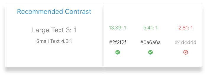
The recommended contrast is 3:1 for large text and 4.5:1 for small text. What does this mean? Tools that help with contrast check However, products we work on already have an established color guide, or a set of brand colors to choose from. In such cases, it is important to find contrast ratios of colors from the product’s palette. WebAim is the go-to tool for such checks. Quickly identifying areas to improve contrast 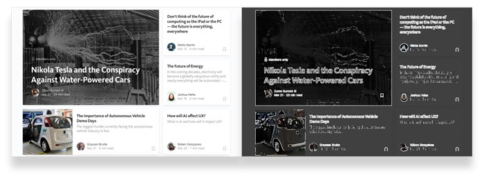
This quickly identifies areas that require work on a screen. The areas on a screen that maintain good contrast is highlighted by white lines, and areas with poor contrast have subtle outlines that are not very prominent. 2. FocusFocus is one of the most important accessibility features that enables users to use a computer with only a keyboard without the need for a mouse. Most reset stylesheets have this one line of code that causes major accessibility failure –
This is an anti-pattern that needs to be avoided like the plague. Keyboard only users know what elements on the page they are interacting with the help of focus styles. Focus highlighting should be used only for interactive components within a page such as form elements, buttons etc. There are websites out there, in the attempt to make their content more accessible, the heading and body text is tweaked programmatically to highlight on focus. This is absolutely unnecessary effort as screen readers would read the content out by default and directing focus to such content particularly does not help in any way. There are a few caveats to this rule which will be discussed later with examples. Focus ContrastAs a rule of thumb, it is necessary to have the focus color as distinct as possible from your background color. 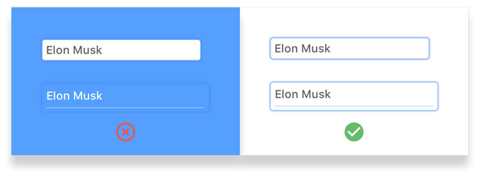
Left: The contrast is poor and competes with the background hence making it difficult to spot the elements being focused . Right: The contrast is clear enough to differentiate the focus elements. Off-screen contentWhen off-screen content hidden from the viewport exists in the form of hamburger menus, modals etc, it is likely that when a user is tabbing through focus points, they would lose track of the focus as it is highlighting something that is off the working area. This can cause confusion and make users lose track of their current position on the screen. 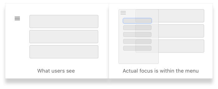
Recommended Solution: One way to tackle this issue is by either hiding the elements when the menu is closed with CSS with display: none, or making sure the focus does not enter the menu when collapsed by programmatically altering the flow of focus with JavaScript. ModalsModals are another type of off-screen elements that can be a huge accessibility disaster when not executed fittingly. When a user is navigating within the modal, it is necessary for the focus to remain within the modal and not move through points behind the modal. This is one of those rare use-cases where it is okay to programmatically force the focus to get to the title of the modal window to ensure that users are not deviating from the intended flow. 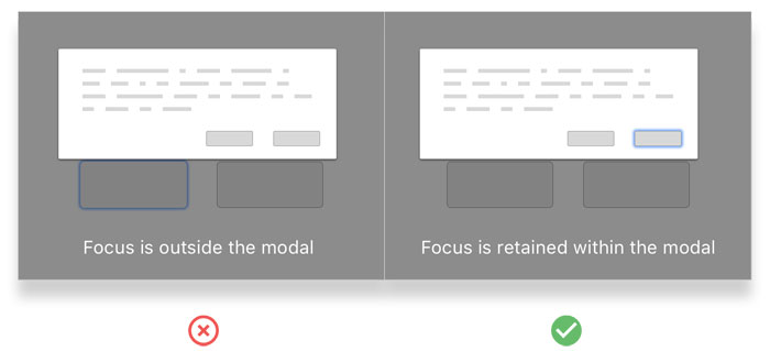
Hover States and FocusHover states and focus have different functionality. Many products have actions hidden under hover states. A good example is Facebook’s hover states for reactions. 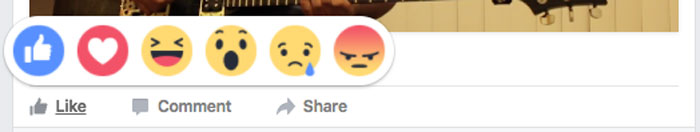
A bad example is Product Hunt’s cards. They show multiple actions that become visible only on hover which is not keyboard-only accessible. 
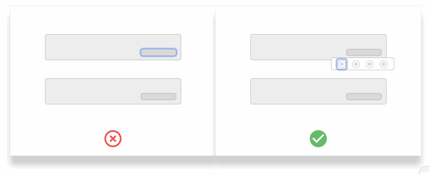
Left: Focus ignoring on hover actions and jumping to the next focus element. Right:Focus states allowing users to perform actions that are hidden within a mouse-hover state. Scenarios to “re-focus”When an UI element on the page is removed from a user’s action, it is important to refocus to an element within the context of the current working area. A good example to this is when a user decides to delete an item — the focus disappears from the current element and moves to the top of the page. There is a clear need to bring the focus back to an element after the deleted item. 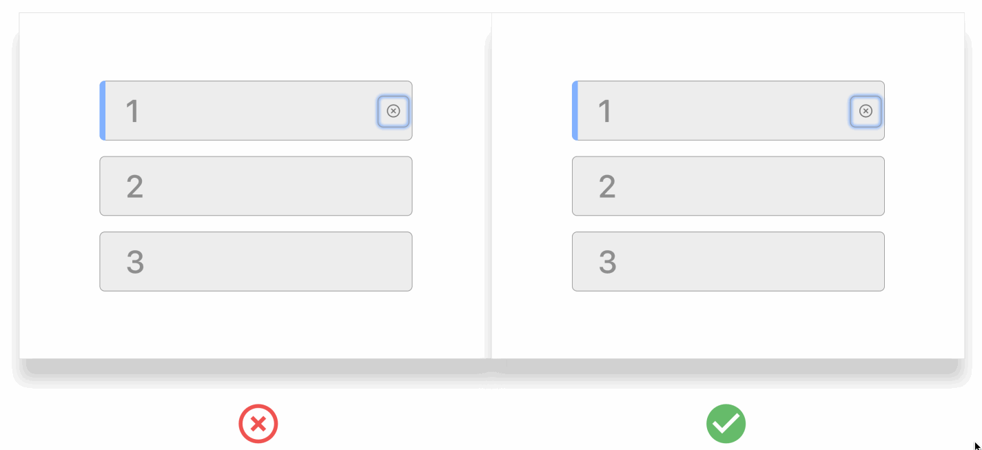
3. Click TargetsCardsCards are very prominently used in products these days. Thanks to Material Design, there is a lot of structure and guidance over how cards should be designed. However, it is important to create accessibility-friendly ones. Cards can get quickly complex with multiple states based on the type of interaction being performed on them. Another bad example of card design are cards used on the Product Hunt page (Sorry guys, I really love Product Hunt but this seemed like another apt example). Imagine a user tabbing through these cards without using a mouse. 
Is it possible to identify which card is being focused? If you look closely, you’d realize it is the second card. It is hard to identify this for even people with 20/20 (perfect) vision. A great example of how cards can be made accessible is Google Inbox --
☑ They assign specific focus states for cards when they are navigated to. Target AreasUsers with motor impairments find it hard to select items on the page with precision. It is our job as designers to make sure that target areas are not very narrow or hard to access. 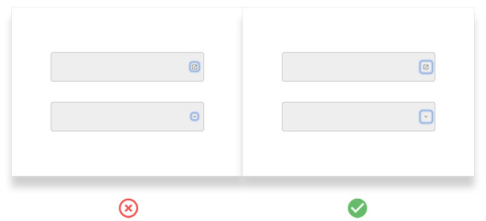
4. Quick Access to ContentIf you are a user navigating with only a keyboard, and you would like to get to the content immediately. But, there is a high possibility that there are multiple menu items or other navigational items before you can actually get to the content of your product. It can be a pain for users to sift through each one of those links before they can get a glimpse of the product. Below is an example of a bad experience from a very famous blogging platform -- 
One possible solution to this problem is by providing a quick way for users to jump to the content as they start tabbing through the product. Below is an example of how AirBnB achieves this. 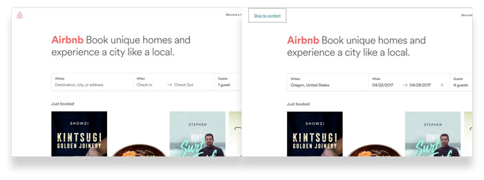
5. Summarizing InformationIt is tricky to get an ideal experience when a user with accessibility needs is going through a checkout process, or any flow that consists of multiple steps. Use-cases to such a scenario can be --
It is of primal importance to give the user a summary of information that is being entered before or after they hit the call to action. This rule holds applicable in UI components such as a date picker, steppers or setup wizard etc. This is particularly tricky because you don’t want redundant information to be visible for users without accessibility needs. Recommended Solution: When users are tabbing through information, there could be elements that I’d like to call “Ghost elements” that show up only when a user tabs through complex UI components such as date pickers. These ghost elements contain a brief summary of the selected value that the screen reader can read out to users for confirmation. 
Such an approach is usually critiqued as power users who navigate with keyboard faster will have to tab through twice to get to the next element. This is when the accessibility toggle comes into the picture. 6. Accessibility ToggleFor most products, it is a small, yet important fraction, of users who require assistance for a better experience. To not interfere with the experience for the larger fraction of users, there should exist a switch that toggles between accessibility mode and default mode. The accessibility mode should contain a color scheme that offers high contrast and easy navigation between elements on the page especially when it is in the form of keyboard-only interaction.
Closing ThoughtsAccessibility should be inscribed early in the design process as it gets harder to allocate resources and time for handling it as a standalone project. Every component or pattern designed should be vetted with accessibility as a parameter. The post Designing accessible products appeared first on Design your way. from http://www.designyourway.net/blog/user-experience/designing-accessible-products/ A UX researcher is crucial for UX design. UX researchers? What does a UX researcher do? UX research consists of the systematic investigation of user experiences in order to assist the design process. This research helps to add context and insight that shed important light on user experiences with the product. It allows a design team to better understand the needs and desires of the user in order to better tailor the product to meet them. In order to do useful, good user experience research, you need to learn how to apply the right techniques at the right time in the product development lifecycle. There are a number of UX research methods and principles that you need to learn in order to truly answer important questions about how you should develop your product. This article is your beginner’s guide to UX research. We’re going to cover the ins and outs of UX researcher jobs, including a deeper look into the UX researcher job description, UX research methodology, and the typical UX researcher salary, and give you a brief primer on how to become a UX researcher. The Main Goal of UX Research
A user experience researcher has a pretty simple goal or at least a goal that seems simple. They look to inform the design process from the point of view of the end-user(s). UX research strives to prevent designers from creating a product for one user and one user alone: themselves. A user experience researcher wants to let the design team know who the end-users are, what is the context for their use of the product or service, and what they need from the design team. With good UX design, you are protected from designing the wrong product. Without it, you could up creating a product that no one wants. All the hard work, time, and money put into the project would be wasted. It also removes assumptions from your design process. Thanks to UX research, you will now have data to back up your design decisions. On top of all this, with UX research, you will also know the places and direction to focus the project’s resources. UX research finds the right requirements at the right time for the right people. It’s a deeply vital part of any project. You can tell when a product online has not used UX research. Avoid their mistakes by using it on your projects, no matter how big or small. There are plenty of online tools that can help anyone, from large firms to individual freelancers, do effective UX research. How UX Research is Conducted
User experience research consists of two parts: gathering data and synthesizing that data so that you can use it to improve usability. During the early portions of the project, UX research focuses on learning what the requirements are from the project stakeholders as well as learning about the needs, wants, and goals of the end users. The UX researchers will collect surveys, conduct interviews, and observe both current and prospective users. They also review existing data, literature, and analytics. As the product development lifecycle continues, UX research shifts the focus to usability and sentiment. At this point, US researchers conduct usability tests, interviews of users about the process, and A/B tests. They want to be testing assumptions that can improve the effectiveness and appeal of the design. Quantitative and Qualitative UX Research Methods
Quantitative UX research methods are those that can be measured with numbers. It asks and answers questions like how many clicks an area received or what percentage of users were able to find the call to action. It’s very useful for understanding statistical likelihoods. It can help paint a hard, clear picture of what is going on in an app or site. Qualitative research, on the other hand, is “softer”. Its goal is to help design teams understand why people do what they so. It is often conducted through conversations and interviews. Some common questions used when conducting qualitative UX research include “why didn’t people see the call to action?” and “what other things did people notice on the webpage?” A user experience researcher can specialize in particular kinds of tests or interviews. However, most UX researchers can and do conduct many different UX research methods. This means that a wide enough amount of info can be gathered in order to allow the team to design in a smart, contextual and user-centered way. Techniques Used for UX Research
Common UX Research Methodologies
UX research can take many forms, from in-person interviews to unmoderated A/B tests to online surveys and much, much more. All of them are designed to answer important questions a design team has about the user experience. However, all of them share three key methodologies: observation, understanding, and analysis.
This is the first step in conducting any form of research. You need to observe the world around you. Beginning researchers, like beginning photographers, need to learn how to see what’s around them, They need to start picking up on the nervous ticks that may show interview subjects are uncertain or stressed. They need to learn how to notice apparently minor references that actually indicate with long-held beliefs or deeply entrenched thoughts that should be further looked at. While observation may seem to be a simple skill, it is easily clouded by unconscious biases. Everyone has this unconscious biases. If you want to be a user experience researcher, you need to train yourself to observe and take notes so you can begin to see patterns across what seem like very diverse groups of people.
Understanding is something you do every day in normal life. We work hard to understand our families, friends, and coworkers. We try to grasp the point and figure out the reasons for unfamiliar concepts or points of contention. In terms of UX research, understanding is not so much about disagreements as much as it concerns mental models. What is a mental model? A mental model is the image a person has in their head when they think of a specific phrase or situation. If someone owns a red sedan car, their mental model of “car” will probably be different from the mental model of someone who owns a white SUV. Mental models inform the decisions people make. If asking someone how long it takes to drive a long distance, the answer will depend upon a number of factors based on their mental models, like their car’s gas mileage. UX researchers should understand the mental models of those they test or interview. Everyone speaks in shorthand frequently. A user experience researcher needs to recognize the shorthand based on the mental model of the person who is speaking. Also, if a researcher can correctly identify someone’s mental model, they can share this info with the rest of the design team and help make sure the design accommodates this mental model.
After you have conducted your research and gathered your data, you need to make it usable for your design team. Analysis is the way you do this. It is the process you do where you identify the patterns revealed by the research, propose possible reasons for these patterns or offer solutions, and make recommendations. Sometimes, analysis techniques include the creation of personas and scenarios. It might also require you to described mental models or provide charts and graphs that represent behaviors or statistics. Research is only valuable if it’s shared with the design team, otherwise all your effort and planning is for naught. It needs to be integrated into the design process. Types of UX Research Tests
Questionnaires and SurveysYou’ve filled out many surveys and questionnaires in your life. They’re an easy way to collect a large amount of info about any given group in a small time frame and minimal cost. They’re a good choice for projects that are looking at a large and diverse group of users or a group of people with a high concern for anonymity. It’s easy to create surveys with a number of tools available online, like Google Docs or Wufoo. You can then email these surveys out and get hundreds of responses back in only a few minutes. There are downsides to using these tools, however. Using these form of research means that the UX researchers won’t be able to directly interact with respondents, so they can’t help with interpreting questions or reframing if they wording isn’t quite right. They rarely allow the opportunity for follow up, and when they do allow for it, it’s quite limited. Surveys get a much higher response rate when they don’t; require any kind of login or any input of contact info. This anonymity makes it extremely hard to ask for more details or clarification about responses. Card Sorts
Card sorts are often integrated into interviews or usability tests. Users are given a set of terms and are then asked to categorize them. They can be closed or open. If closed, the user is also given the category names. Open card sorts allow the user to create whatever categories they feel are the best fit. The goal of card sorts is to explore the relationships between content. It helps design teams to better understand what hierarchy a user sees. Card sorts see a lot of use by information architects and content strategists since they allow them to test out hierarchy theories or help develop a sitemap. Usability Tests
Usability testing is very common in UX research. It asks potential or current users of the product or service to complete tasks and observe their behavior to see what eh actual usability of the product or service is. It can be done with live versions of apps or site, prototypes, works-in-progress, clickable wireframe, or even paper and pencil. There are many variations of usability tests, often tailored to the product or service that’s being tested, but there are three common types: moderated, unmoderated, and guerilla. Moderated usability tests are more traditional than the other two. They can be conducted in person or through screen share and video. Often, whole usability labs are set up. They often have one-way mirrors for stakeholders and team members to observe the participants. An unbiased facilitator will sit and talk with the user, reading the task aloud and asking the user to think aloud as they perform it. This facilitator’s job is to perform as a conduit between the stakeholders and the user. They must phrase questions to evaluate the effectiveness of the design. They are helping to test assumptions all while helping the participants feel comfortable with the testing. Unmoderated usability tests are also sometimes called asynchronous research. It is conducted online at the user’s convenience. All instructions are delivered through either recorded audio or video. Users click a button to start the test and record their screen and/or audio. Much as with moderated usability testing, users are asked to think aloud. There is, however, no facilitator to ask follow-up questions. You can design and distribute these unmoderated usability tests through a number of websites and they are typically much cheaper than moderated usability tests. Guerilla testing is lightweight and modern. It’s the least traditional form of usability testing. Rather than renting or building a usability lab, this research is done out in the community of potential or current users. UX researchers go out and find their users at coffee shops and subway stations, where they ask them to complete some basic tasks on a site or with a service in exchange for some benefit like a cup of coffee, a few dollars, or just out of the kindness of their hearts. This can be a good option for those design teams on a budget. It works best for products and services that have a large user base. Niche products have issues garnering reliable or sufficient information from the random selection that comes from guerilla testing. Tree Tests
Tree tests are a good way to evaluate a website’s information architecture. In a tree tests, a user is given a task and show the top level of a sitemap. Like with usability tests, users are asked to talk through how they are going to go about doing the task. Unlike usability tests, however, the user will not see a screen when they click a site section. They will instead see the next level of the website’s architecture. The goal of this form of testing is to identify if information is being categorized appropriately and how well the nomenclature demonstrates the sections of the sites. A/B TestsThis is another way UX researchers find out what actions users take. A/B tests are used when designers are having issues choosing between two options. These options can be two styles of content, whether to use a button or a link or two different approaches to a home screen. In an A/B test, each version that is being evaluated shown to an equal number of users. The analytics of which version better accomplish the desired goal are then reviewed. This form of testing is very helpful for comparing reviewed screens to older versions of that screen. It also helps to collect data to prove an assumption. How to Become a UX Researcher
You can start doing UX research in two ways. You can read as many books as possible and learn the correct way to conduct UX research before you start doing anything. This is the approach many people take. It’s quite normal. Many people feel as though they need some basic skills in their toolset before they can really offer any value to a design team as a UX researcher. However, this approach is far from flawless. Like anything else, UX research is a skill. Like all skills, when you first start out, you’re typically not very good at it. There is no real way to avoid making mistakes when you first start. No matter how many books you read or how many classes you take, you’re not going to start out as a perfect UX researcher. You’ll find yourself asking leading questions, being totally biased, and making all sorts of other mistakes, even if you’ve been reading and learning for six months. So that leaves the other way to start doing UX research: start doing it! Start off by moderating sessions, observing the behavior of the participants, asking them questions, and learn as you conduct UX research. Yes, you’ll make mistakes, but that’s normal and even expected when you’re just starting out in UX research. In the short-term, this is a much more difficult approach. You’ll get much more out of it, however, and much faster. You’ll be going through this stage if you spend months and months researching, anyway. By jumping into the deep end of UX research, you’ll begin honing your skills at research and pattern identification. The sooner you do this, the better off you’re going to be as a UX researcher. Start setting up studies. Write down your observations, ask questions, listen to the users, and learn. The participants in a study will help you make your tests better, too, just as they help you make your product better. All you have to do is listen to them and pay attention. The more you set up and design these studies, the more you pay attention, the better and more effective your studies will be. As you continue to do UX research, you’ll start learning what the best practices are from trying things out to seeing what works and what does not work. Simply reading lists of best practices isn’t going to give you a real understanding of how they apply in the real world. Only repeated practice over time will allow you to get a real sense of what works best. Don’t be afraid to get tripped up or make mistakes, even large ones. The best and fastest way to become a great UX researcher is to get out there and start doing UX research. Remember that you’re still learning. As you practice UX research, keep up with your reading and learning, as your experience with doing it will make those lessons make more sense, much as working on an engine will make books about engine repair manuals make more sense. What else will help? Shadow Experienced UX Researchers
UX researchers are busy people with a lot of extra technically unskilled work that needs to get done. If you can take notes, you can help them out and learn something in the process. Ask an experienced UX researcher if you can sit in on a moderated usability session and take notes of them. If you can follow instructions and pay good enough attention to take useful notes, most UX researchers will welcome the hope. These note-taking sessions are great opportunities to learn. You get a chance to work with more experienced researchers and learn from them as they work. Watch how experienced researchers run their research sessions. What do they do? What questions do they ask? How do they manage difficulties? Be an information sponge. Get as much info as you can during the sessions. Ask questions about how they are tackling certain problems. Also, think about asking to sit in on the UX research debrief reports. You can see how UX research gets presented to stakeholders and see how it gets analyzed. Learn how to take the data that’s been gathered and turn it into something useful. Take Experienced UX Researchers Out to CoffeeSet up a coffee meeting with three to five experienced UX researchers and pick their brains. Ask them what you should be doing to conduct good UX research, what you should be looking for, and what resources are out there so you can stay on the cutting edge of this developing field. Pay close attention to the answers you get. Use their experiences as models for your own education in UX research. Learn how you can take their advice and lessons so you put them into practice. Keep Reading Up on UX ResearchOnce you start conducting or sitting in on studies, start reading. Look for blogs, books, courses, podcasts, and conferences that cover UX research and related topics. These are great tools to help you get better, though keep in mind that all this homework is no substitute for actually practicing UX research. It’s easy to just passively consume information, but it’s not going to help you be a better UX researcher. Learn what you can and then put it into practice. Some Guiding Principles for UX Researchers
It is Easier to Learn What You Got WrongUX research is very good for helping us figure out what we got wrong. If you add a new feature to your product or service and the first set of participants hate it, you know you have a problem. That doesn’t mean that a lack of comment means something works, however. There is No “One Size Fits All” Sample SizeSample sizes should be based on the risks that you’re willing to assume for a piece of research. They need to be calculated based on the type and form of UX research that you’re doing. Using a single sample size for all your UX research is a very flawed approach. Avoid doing it. Conducting Testing on Just One User is Not UselessLarge tests aren’t the only ones that reveal important information. The first user can sit down, try to save their work, and the process can instantly reveal itself as broken. Do you really need to try the process out with more users? No! Sometimes, just one test can reveal major problems. Larger Sample Sizes Offer Better AccuracyA bigger sample size makes it more likely for the data to be accurate. The general rule is that, if you want to double the accuracy, you’ll need to increase the sample size by a factor of four. Randomizing Can Help Overcome Research Design Flaws
If it’s possible for you to change the order of the questions, responses, process flow, and other such items, do so. The more random the flow of these things are, the more likely you are to get consistent results. It helps combat experimental design flaws. Research Results Don’t Have an OwnerThe data you collect does not belong to you. It is not the team’s. It belongs to the whole company. You need to get your data out to the company as a whole. This makes it much more likely that it will make an impact and get the company to start focusing on user needs. UX data needs to flow so that everyone can reap the rewards. Know That Scale Ratings Aren’t Very ImportantThere’s a lot of arguments about whether a y-point scale is better or worse than an x-point scale, or whether or not you should have a neutral rating. At the end of the day, it doesn’t really matter, especially not if you’re going to waste 10 minutes worrying about it. Just pick a scale and get started on doing your UX research. Participants Should Demonstrate Personas
Your product is not likely to be used by every person under the sun. Not everyone fits into your target audience. Learn what the user personas for your product are. Recruit your research participants based on those personas. That way, you are more likely to get results that are actually useful for your project’s design process. You can’t please everyone and trying to do so is a waste of resources. What People Say Versus What They DoBoth what people say and what they do matter, even if they are different, even opposite, from each other. One is not more important than the other. Exploring the disconnect can reveal a lot. As you do more UX research, you’ll get a sense of when people are saying that they want what they really want, when they don’t want what they say they want, and when it matters. What is the Typical UX Researcher Salary?
An average UX designer can make anywhere from $2,247 a year to $20, 566 a year. That’s a big range! Experience plays a big factor, as does who you work for and where you’re working at. As you can expect, new UX designers make less, as do most people working for very small firms or even as freelancers. Larger companies tend to pay more. Location also matters, though not quite as much for UX researchers as for many other IT field jobs, since UX researchers are likely traveling to wherever the target market is anyway. Ending thoughts on being a UX researcherIf everything we’ve discussed interest you, start seeing how you can get into UX research. You can be a great (and well-paid) member of a dynamic design team while helping make sure people get products they enjoy using! If you enjoyed reading this article about UX researcher, you should read these as well:
The post UX Researcher: Job description and how to become one appeared first on Design your way. from http://www.designyourway.net/blog/user-experience/ux-researcher/ |

AuthorPleasure to introduce myself I am Jamie 27 years old living in Searcy, AR. I am web developer and have developed over 50 sites for clients. Now a days I am focused on designing as I feel I am lacking it. Archives
April 2019
Categories |
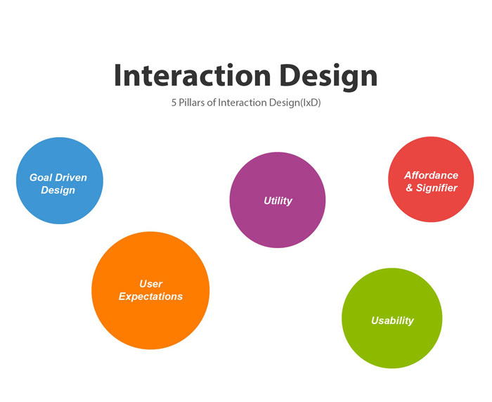
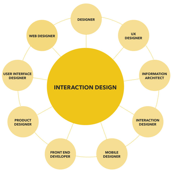
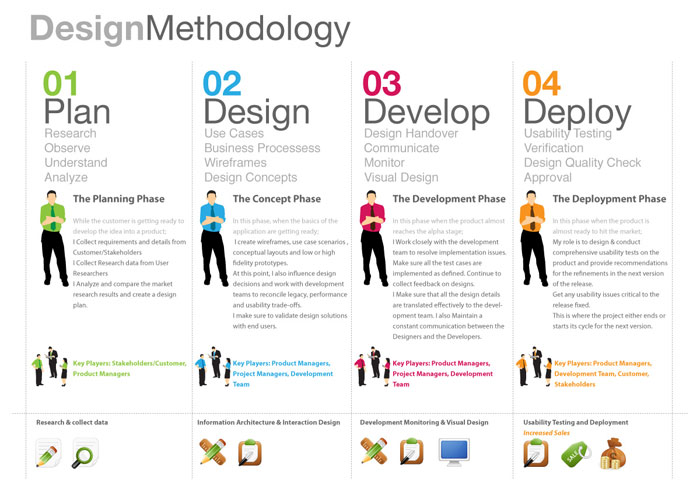
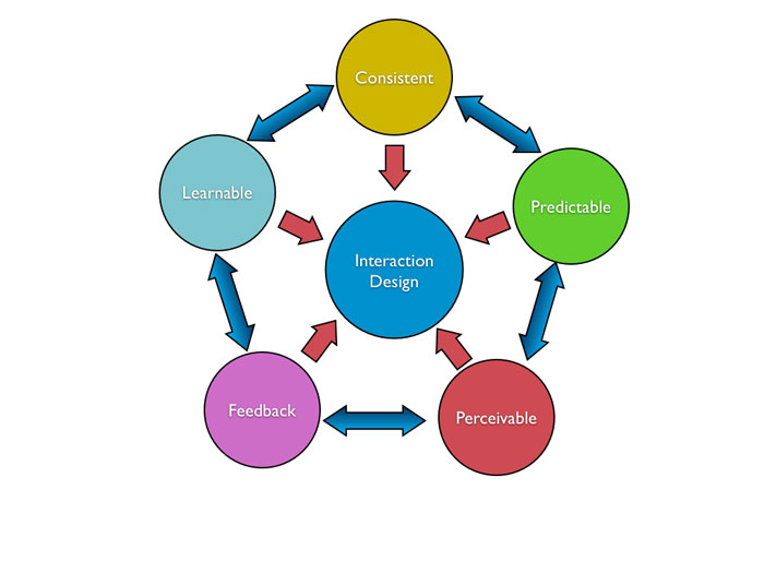

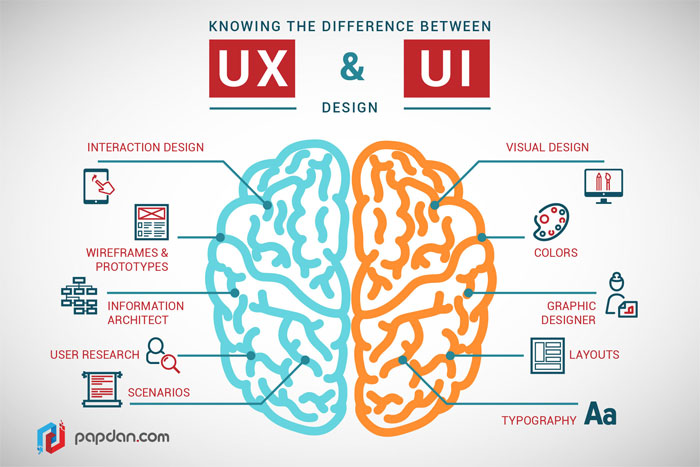
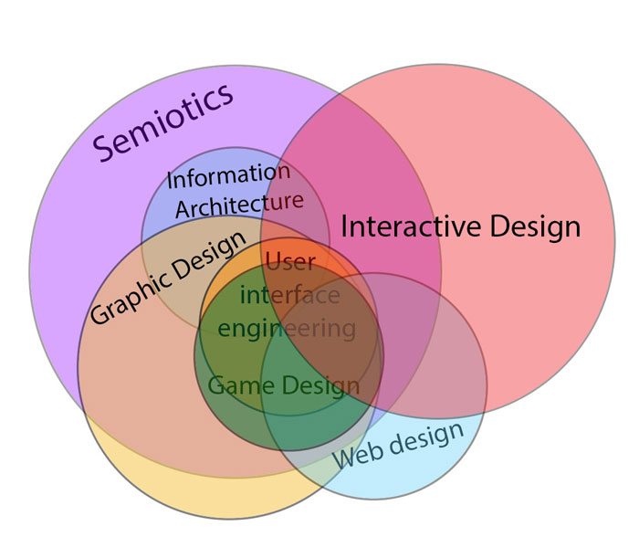

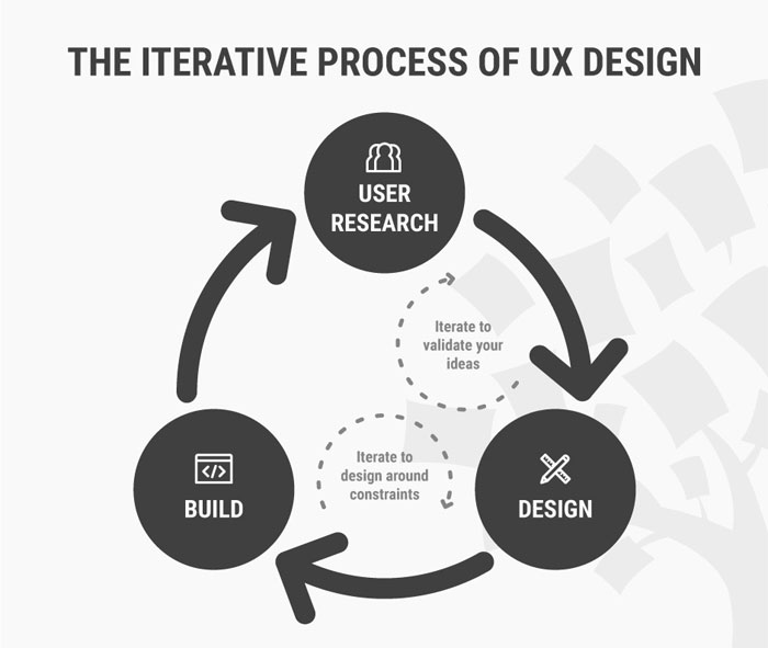
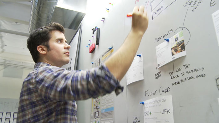


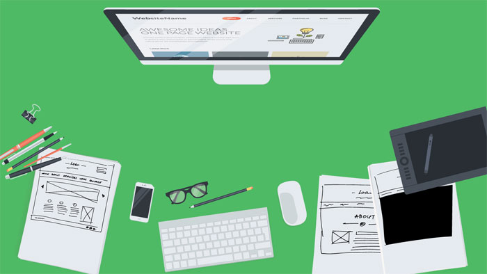
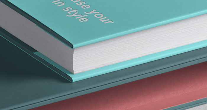
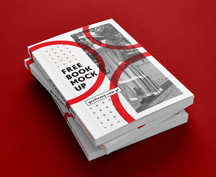
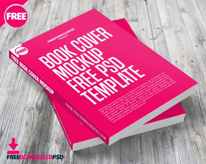

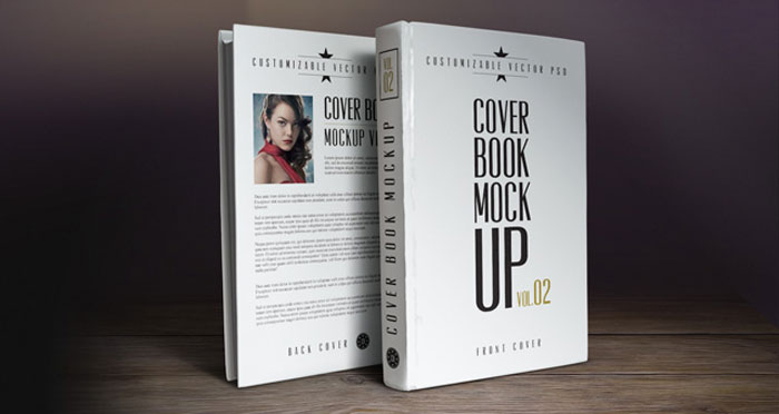
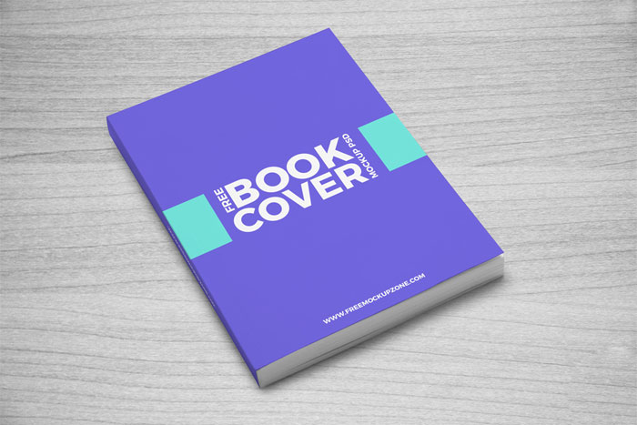
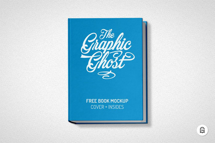
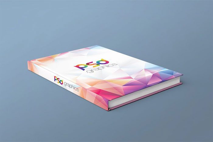
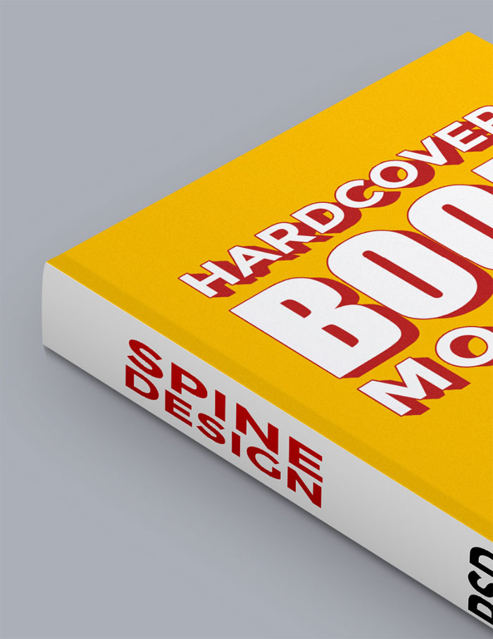
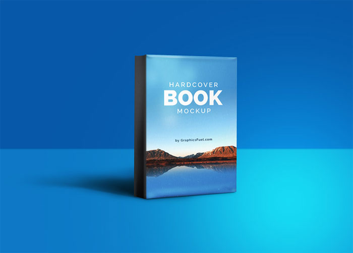
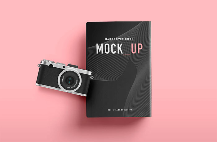
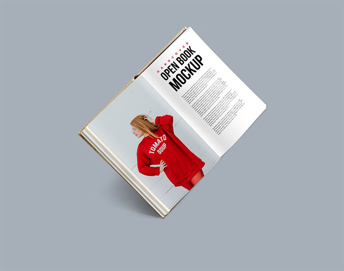
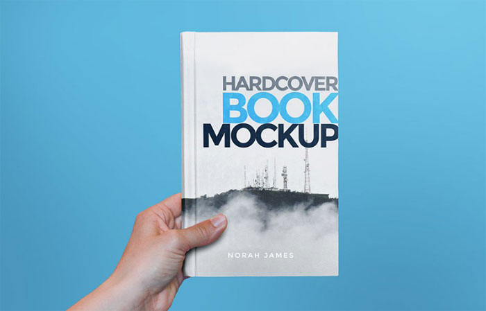
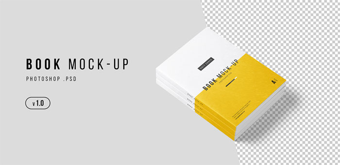

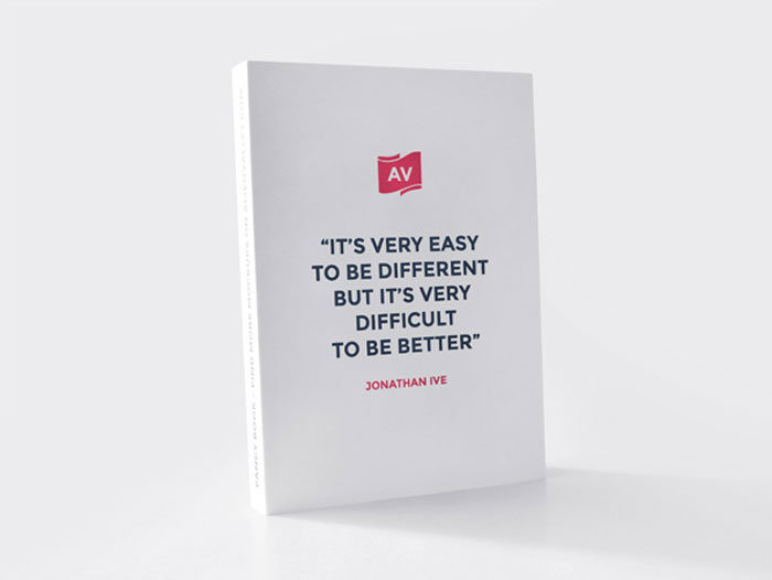
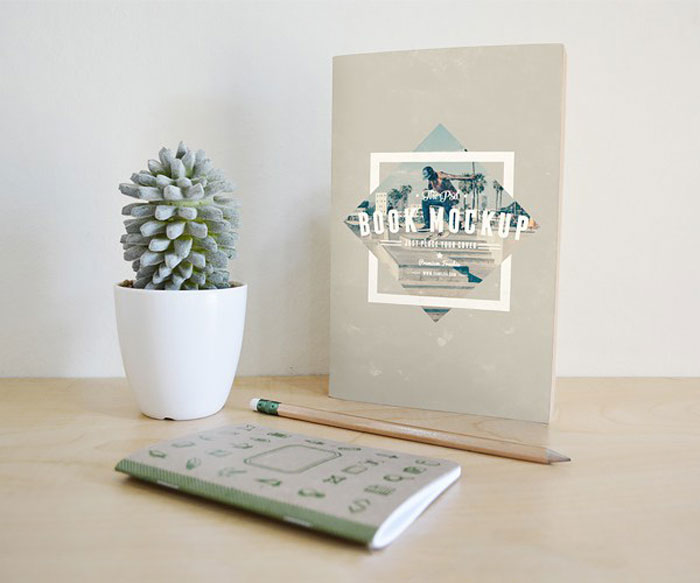
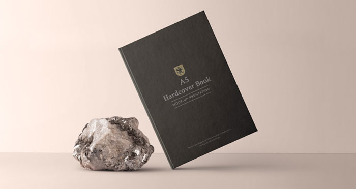
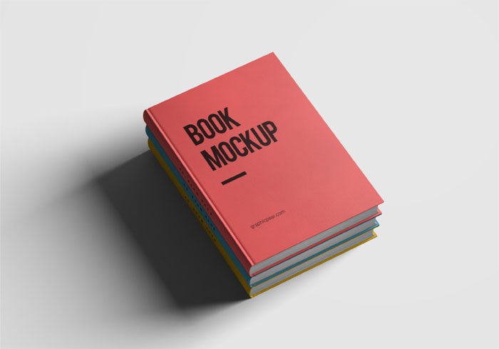
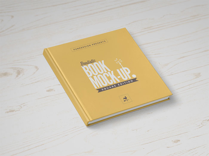
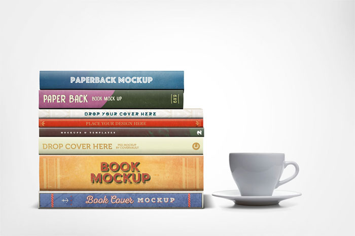
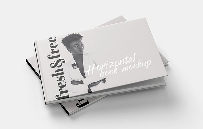
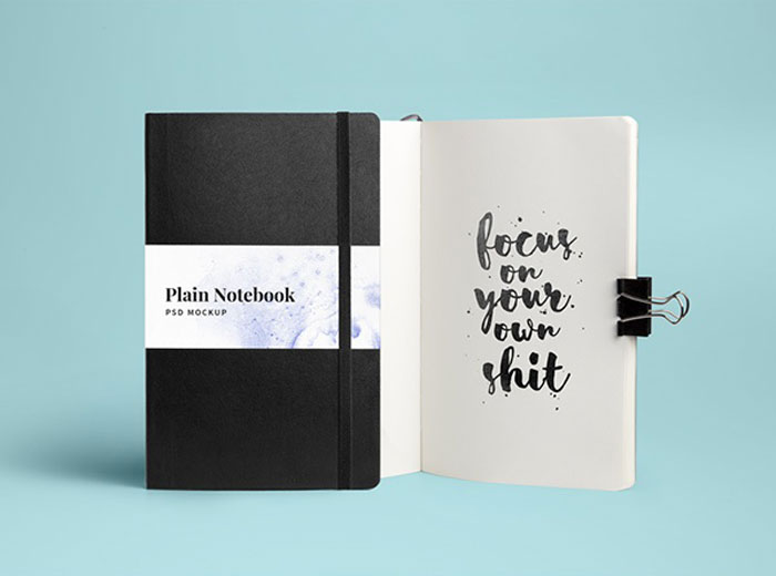

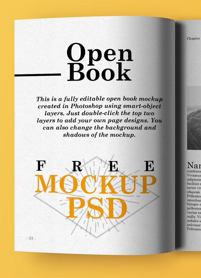
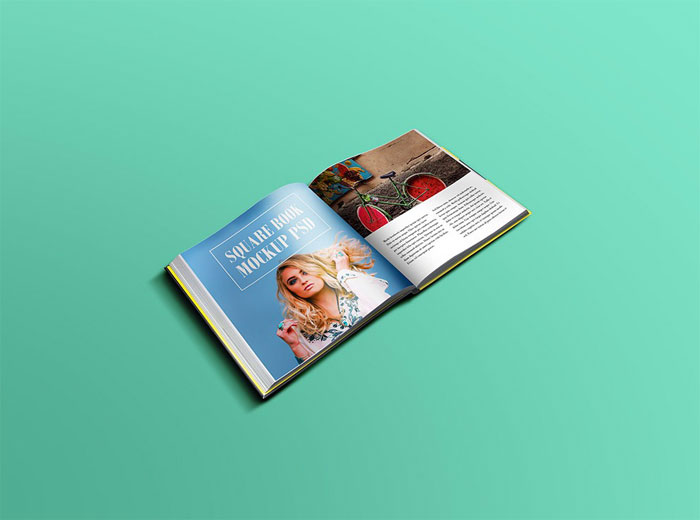
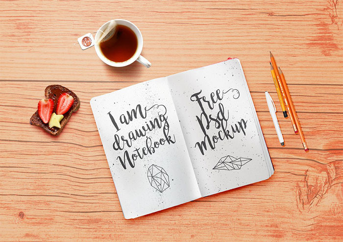

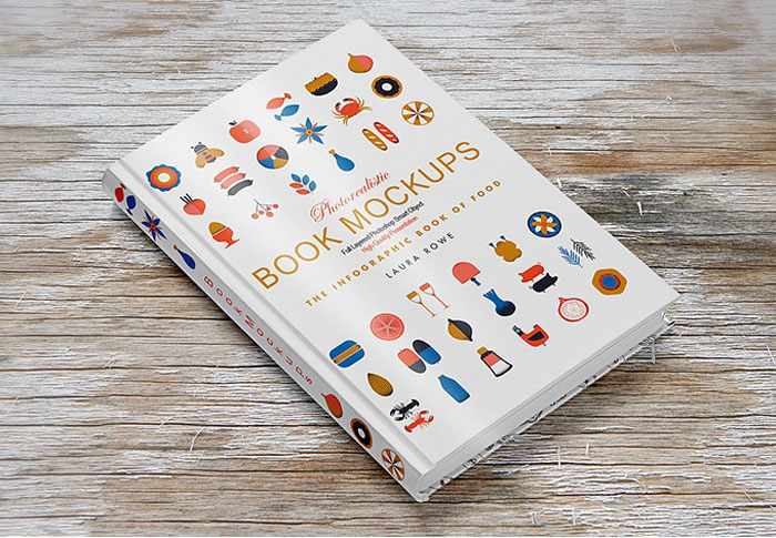
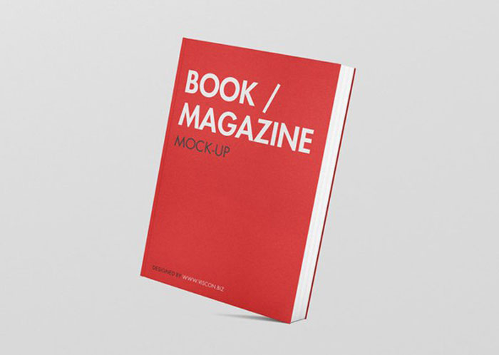
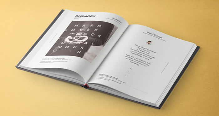
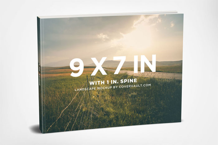

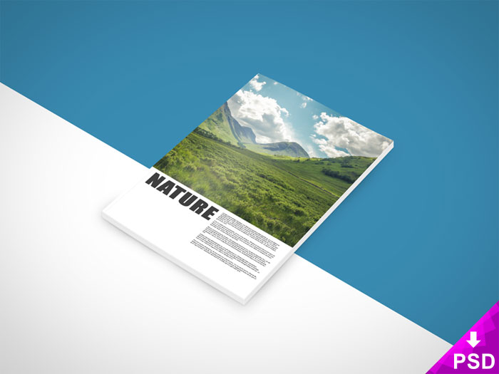
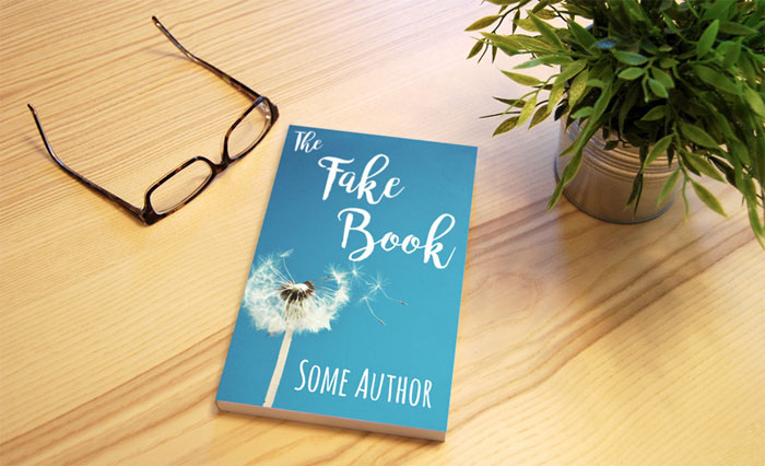
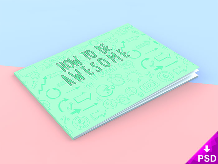
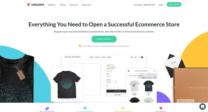
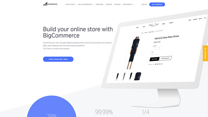
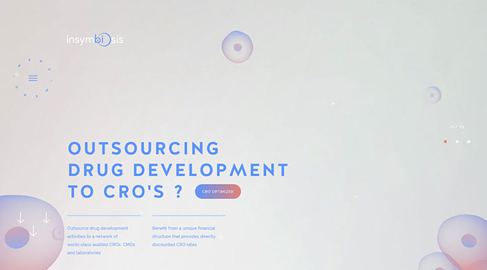
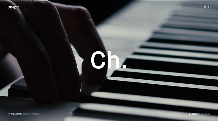
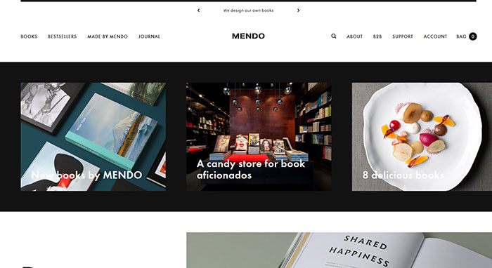
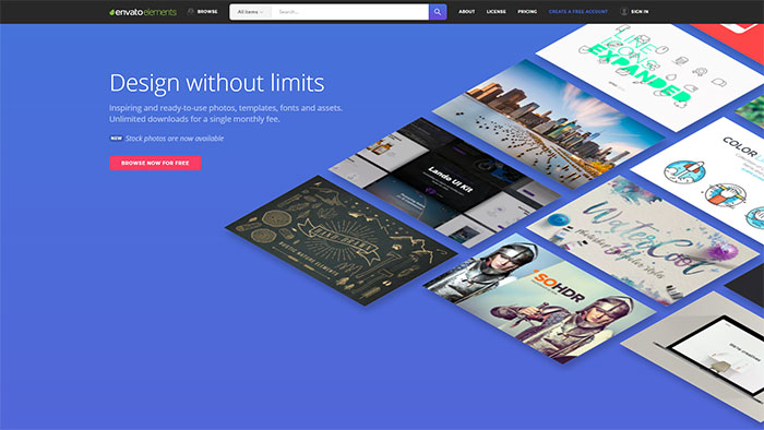
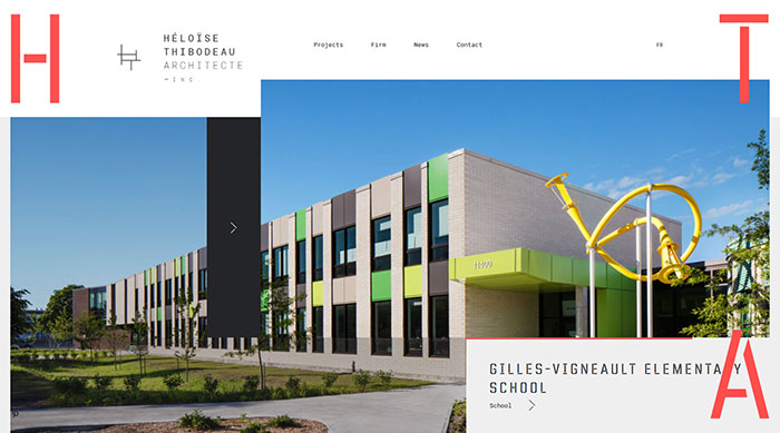
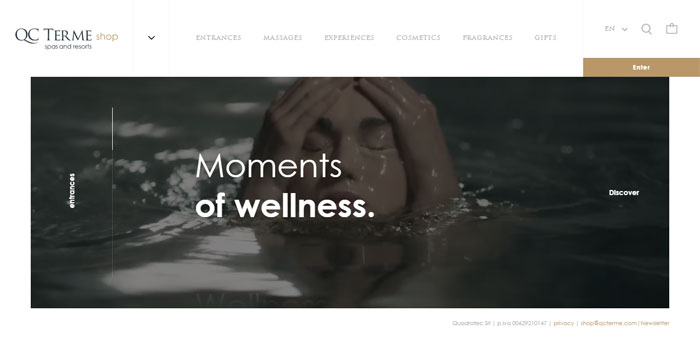
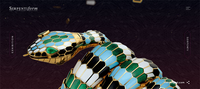

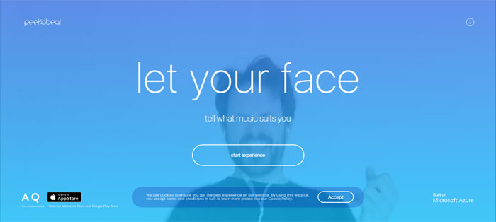

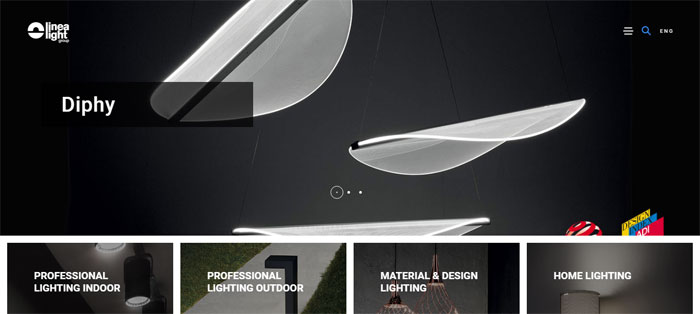
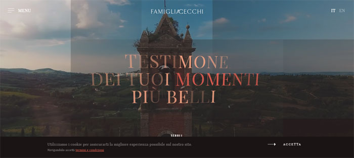
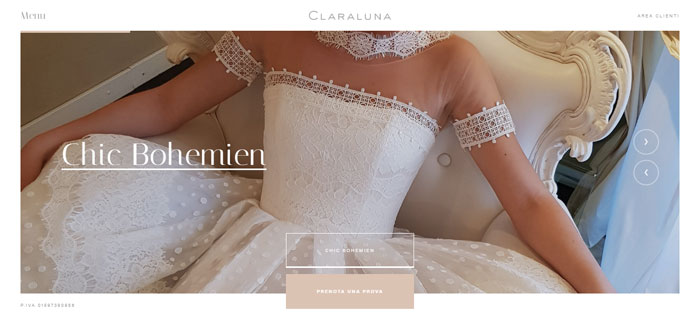
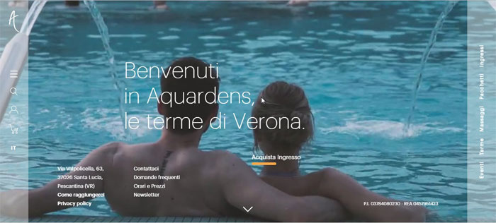
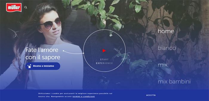
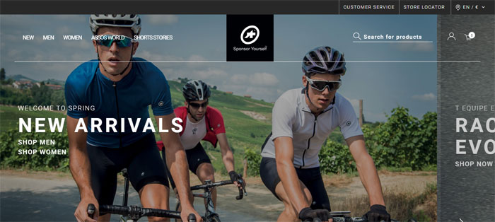
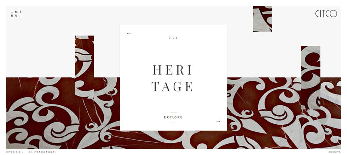
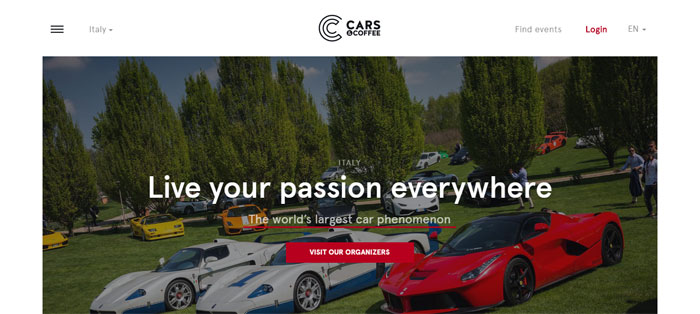
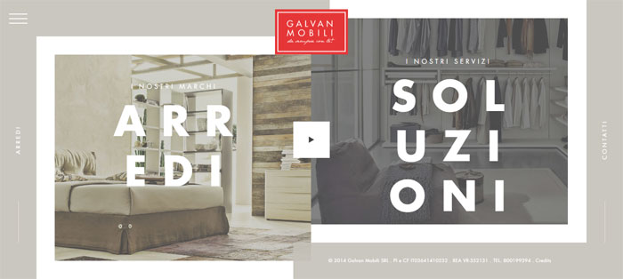
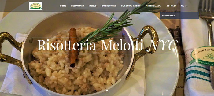
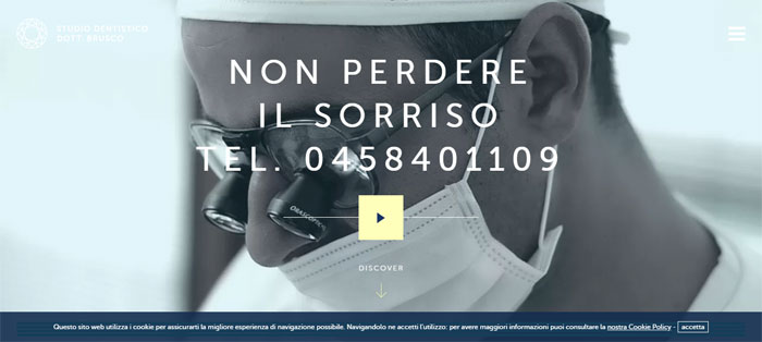


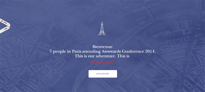

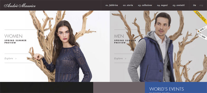
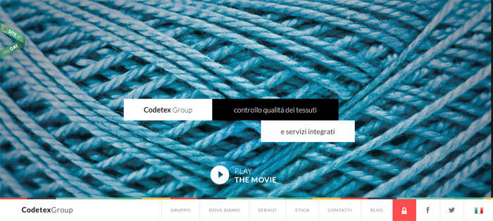
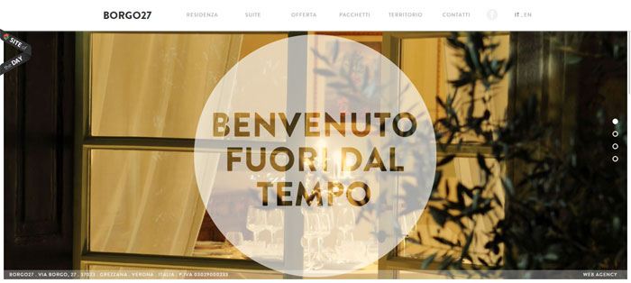
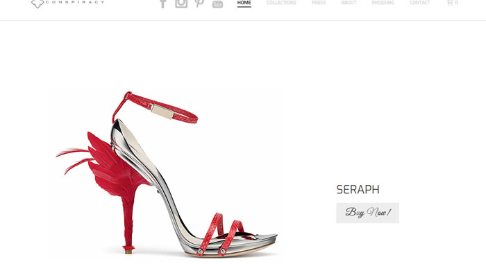
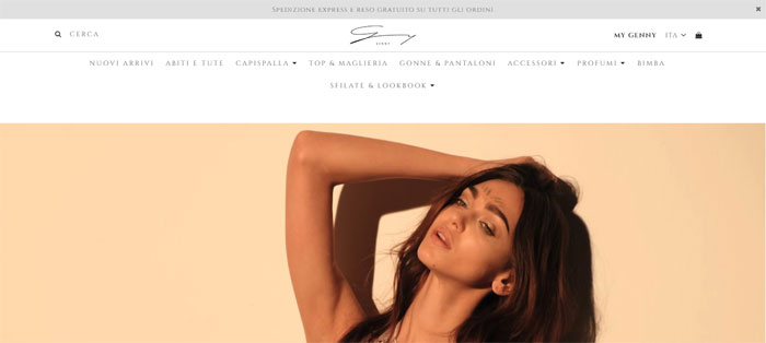

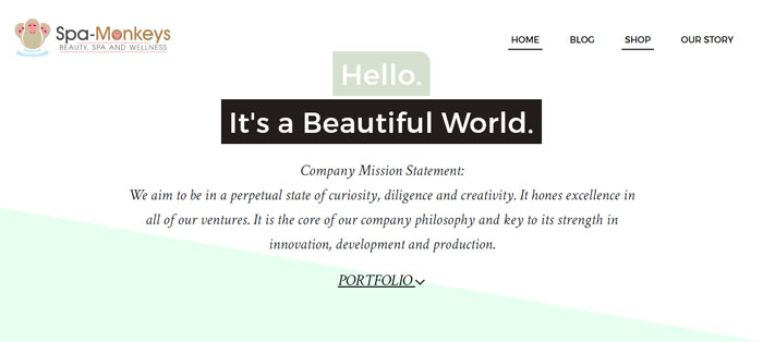
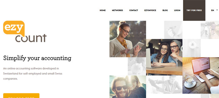
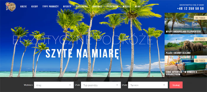
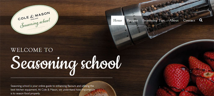
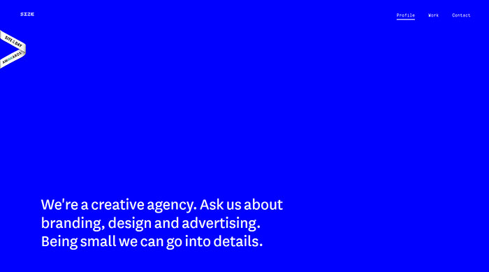
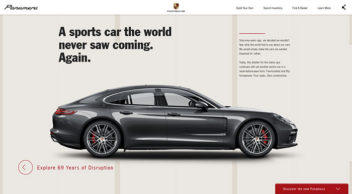
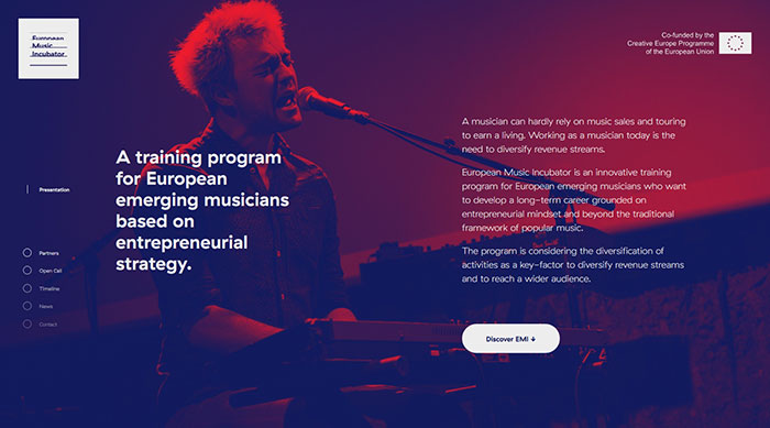
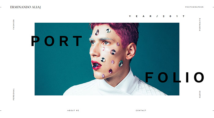
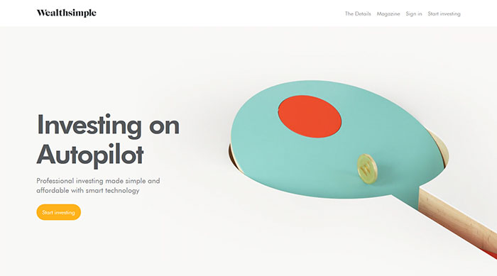
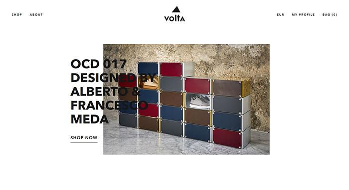
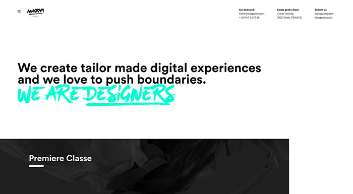
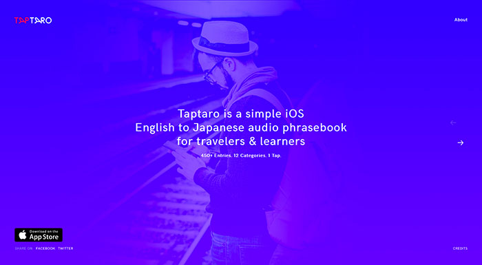
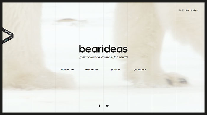
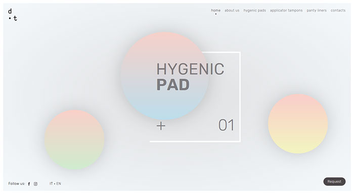
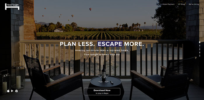
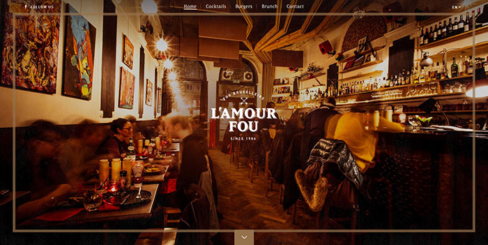
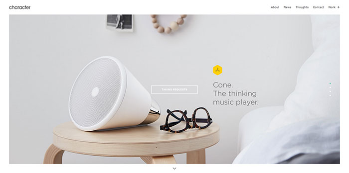
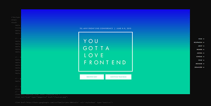
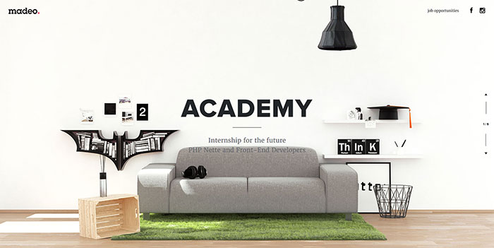
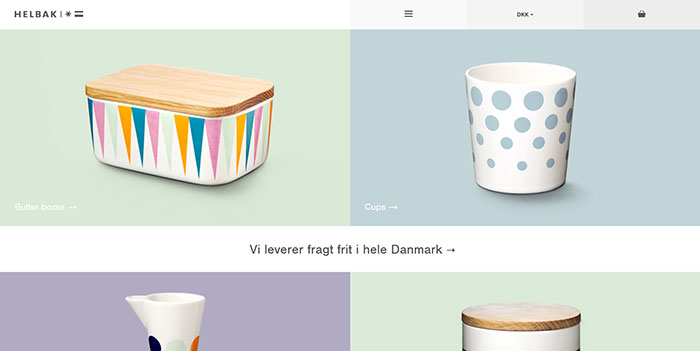
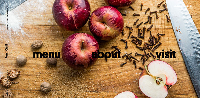
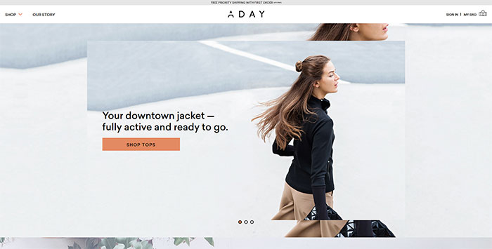
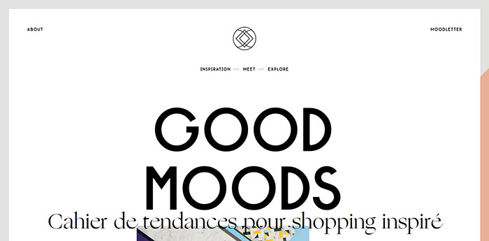
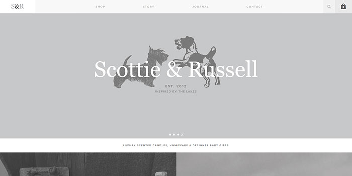
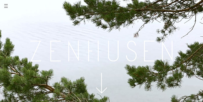
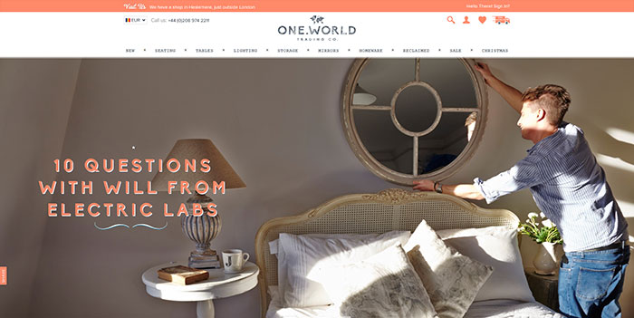
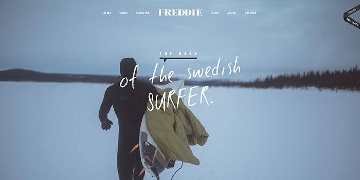
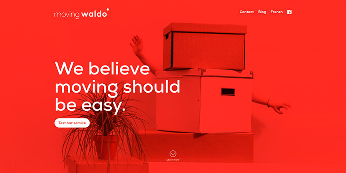
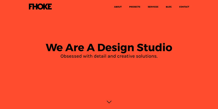
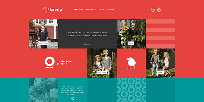
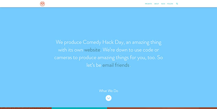
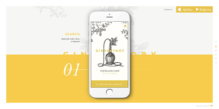
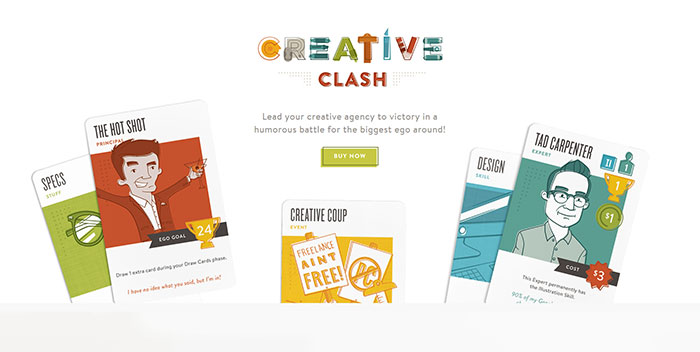
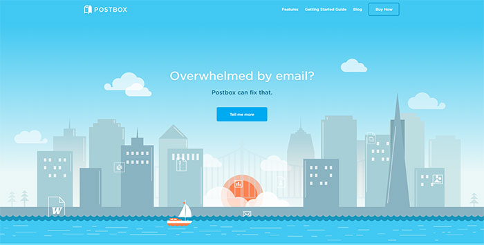
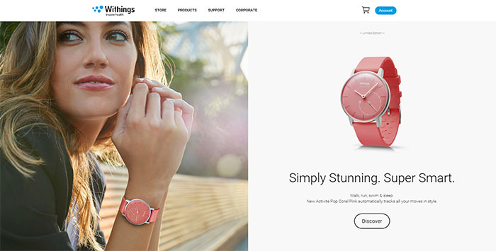
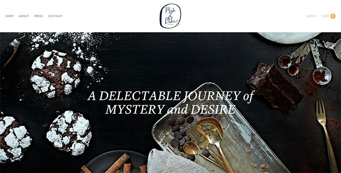
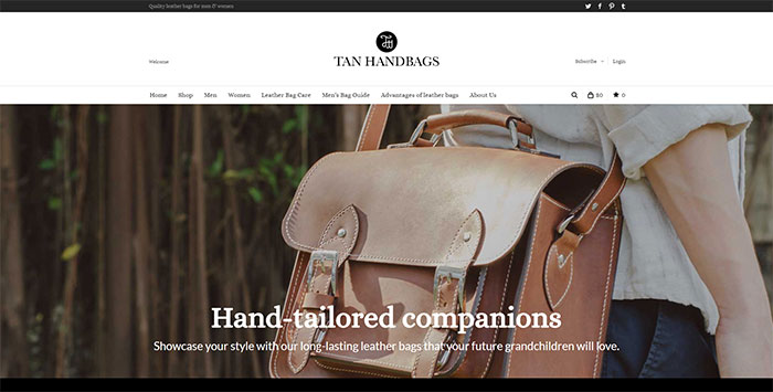
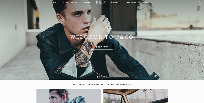
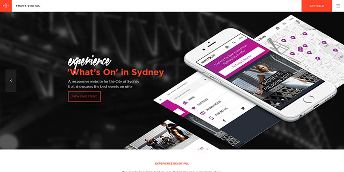
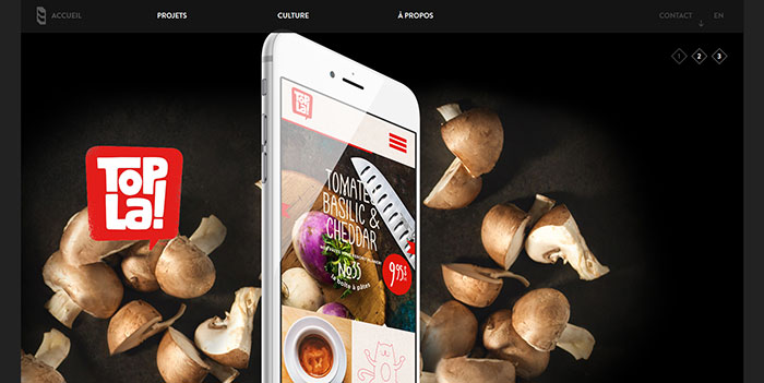
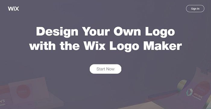
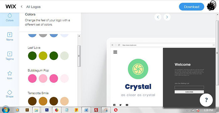
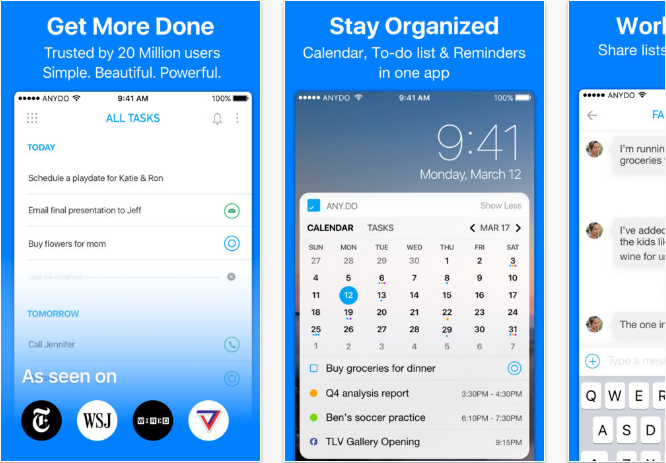
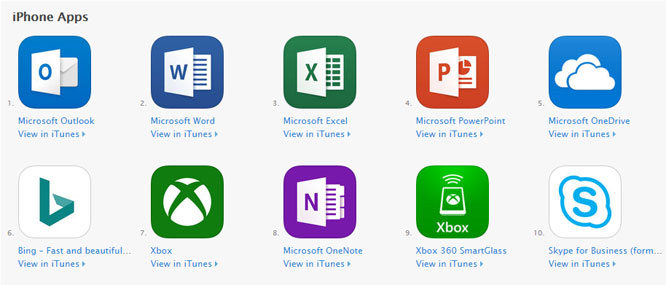
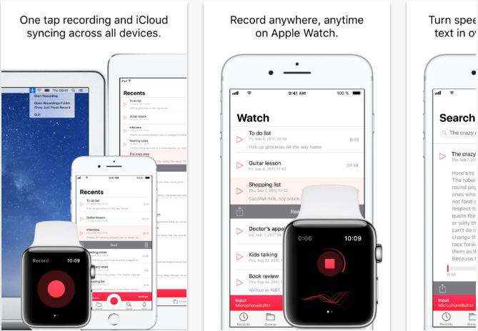
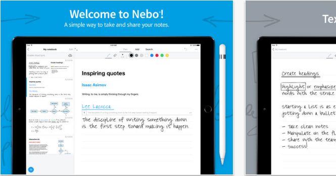
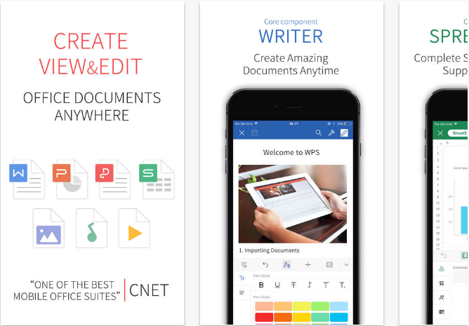
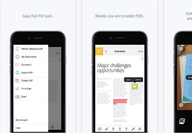
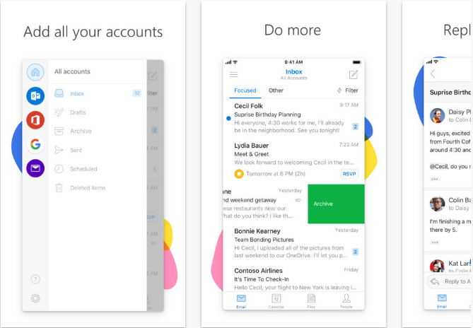
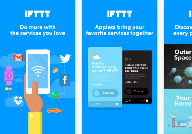
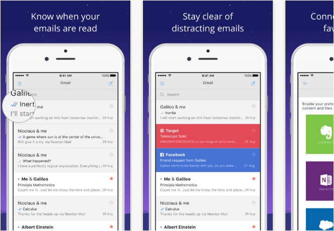
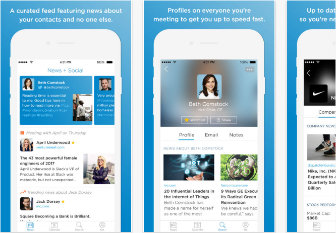
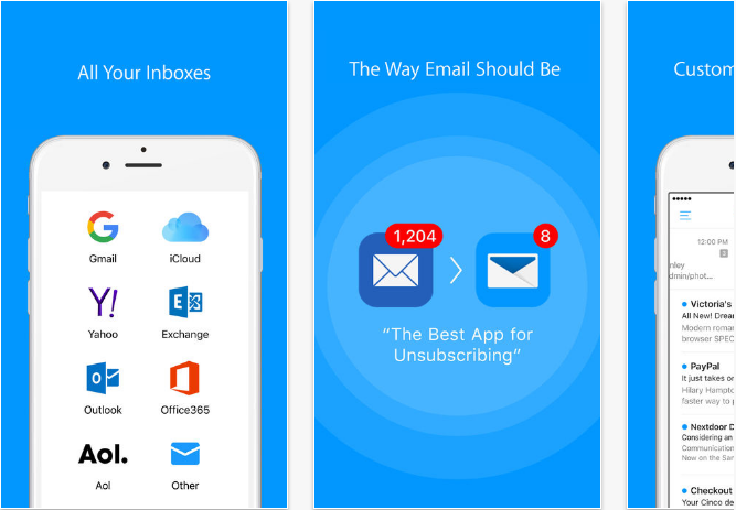
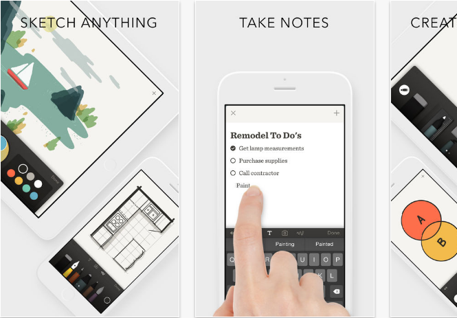
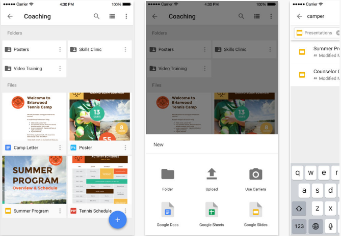
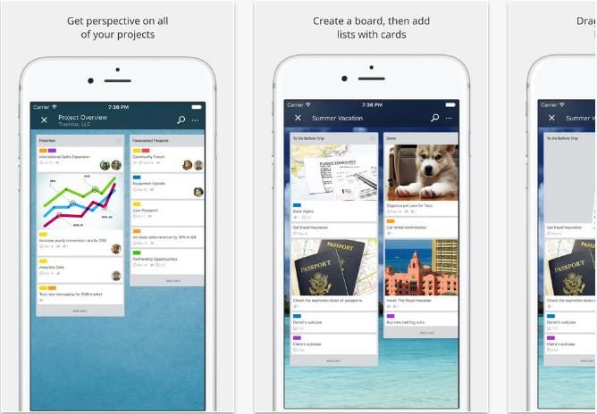

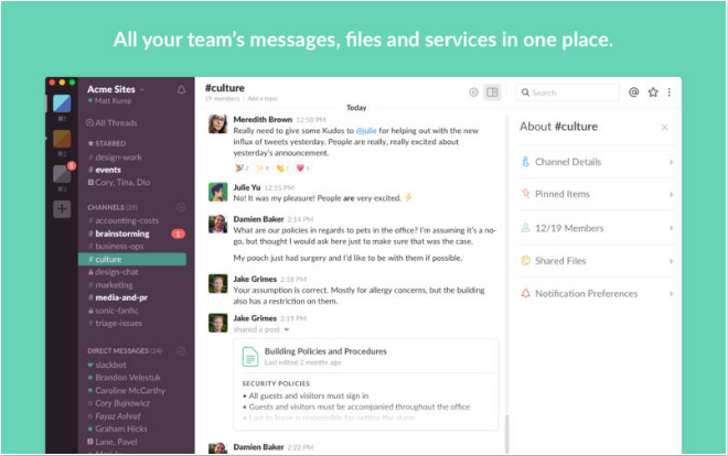
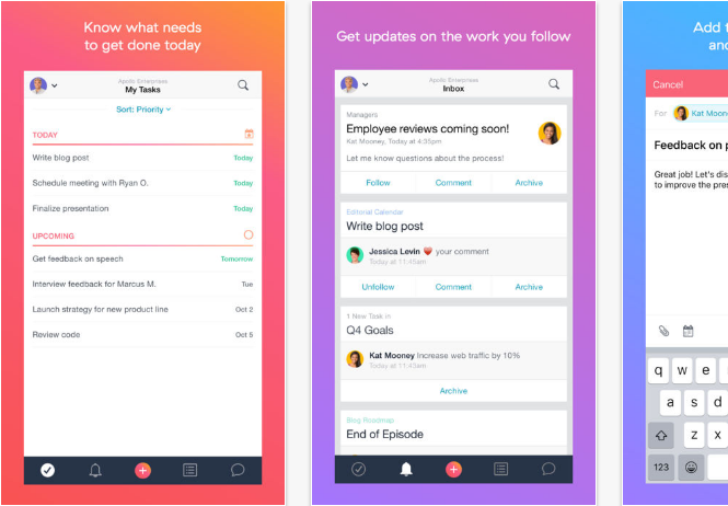
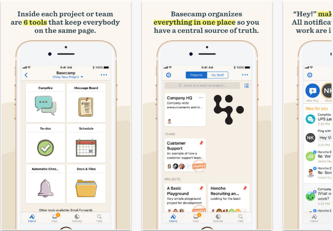
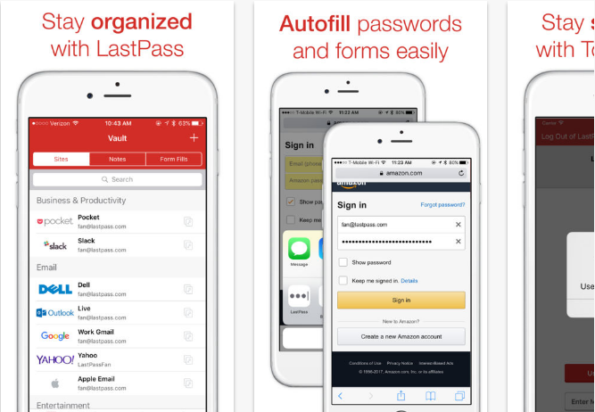
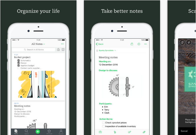
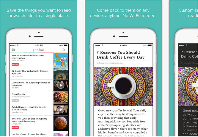
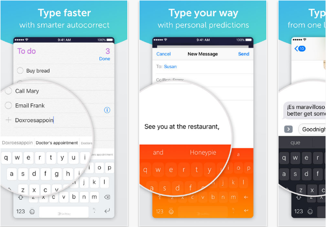
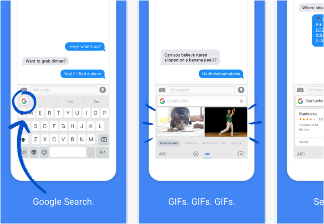
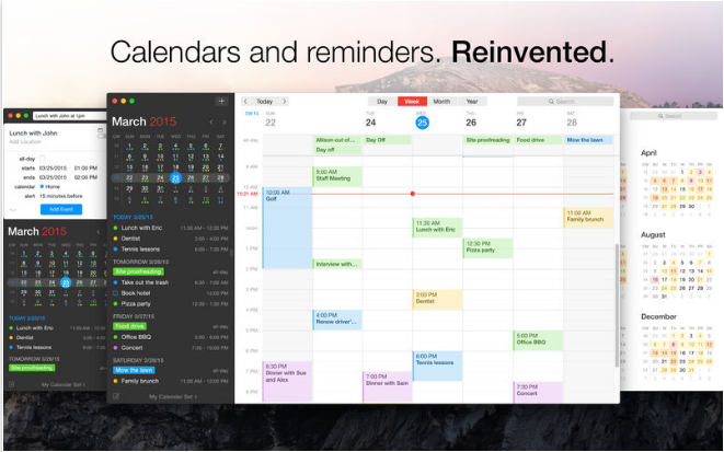
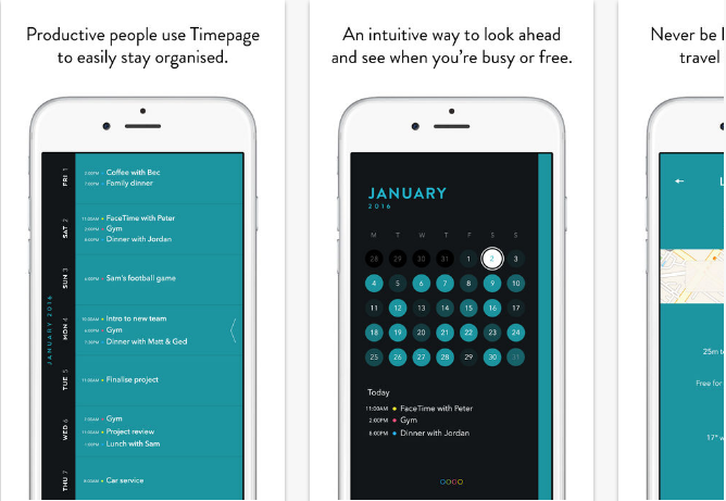
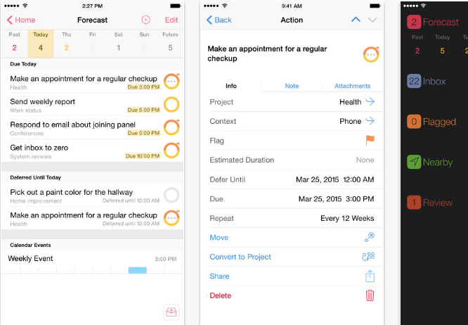
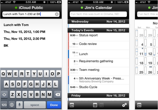
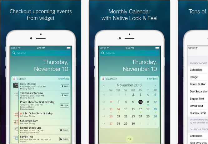
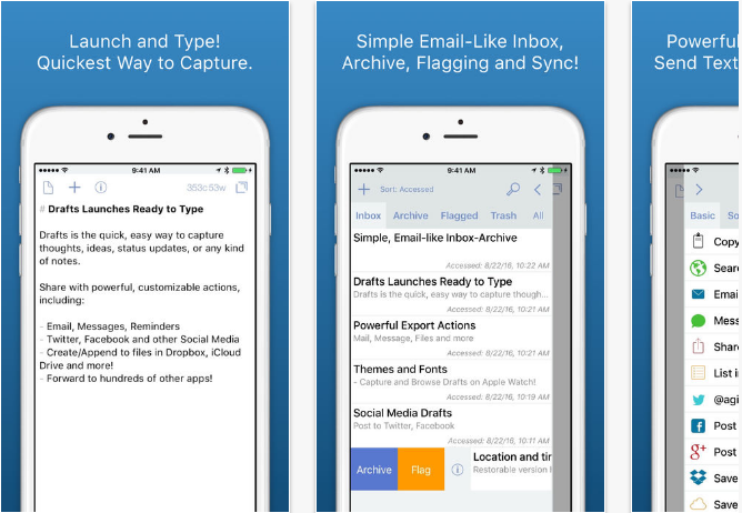
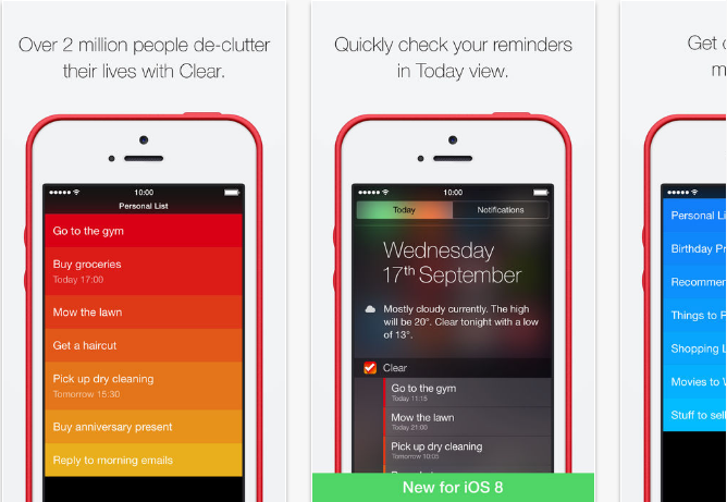
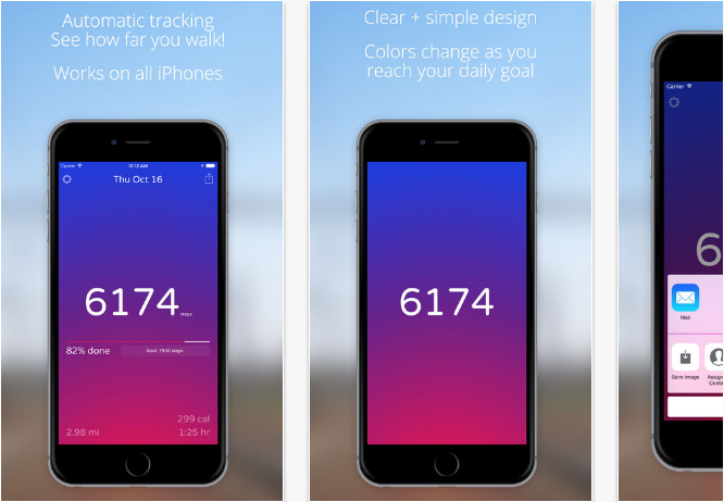
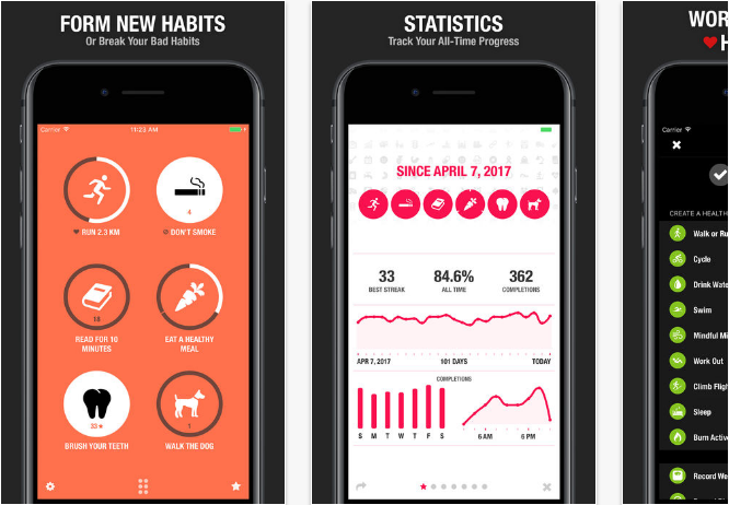
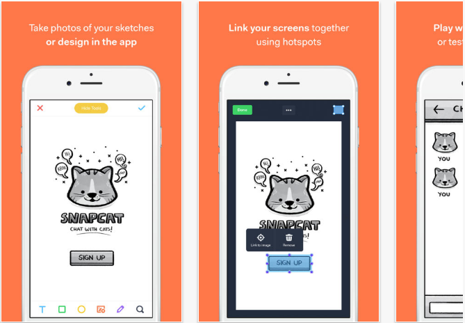
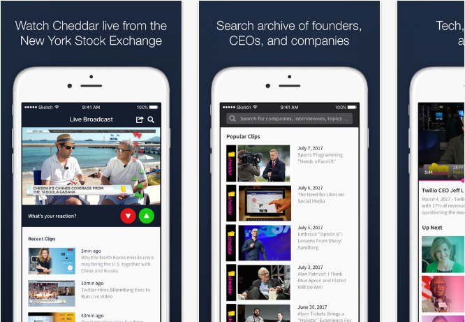
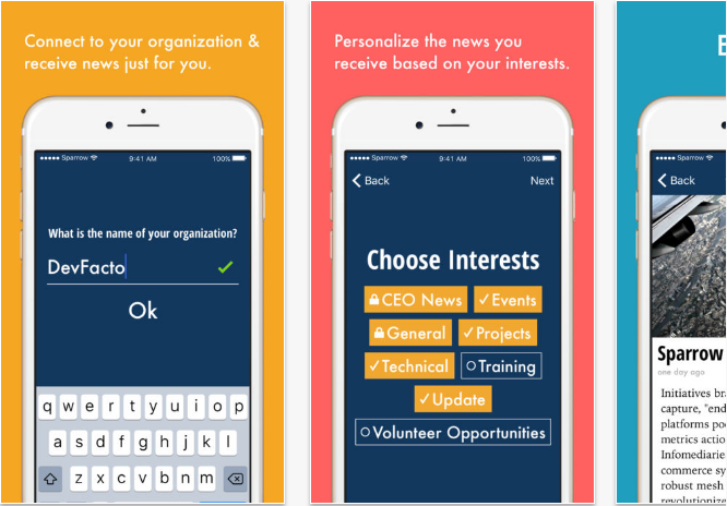
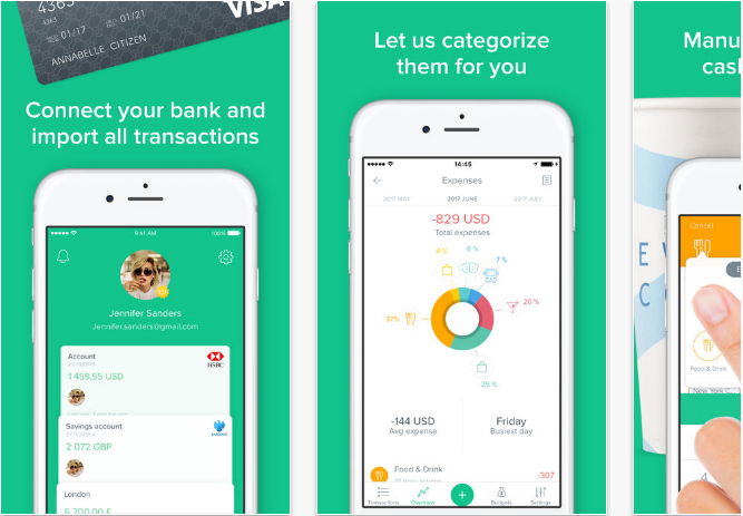
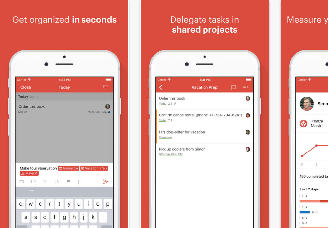
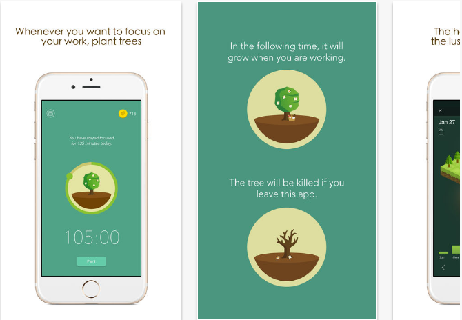
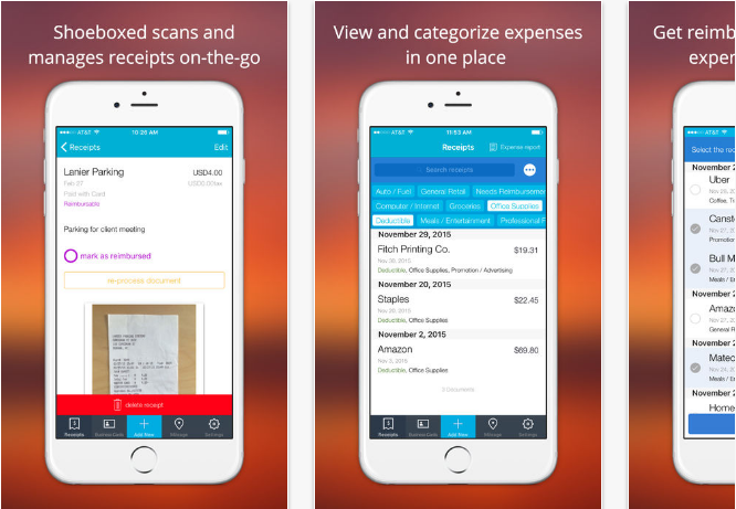
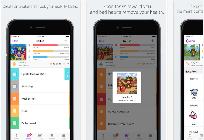
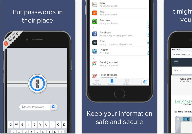
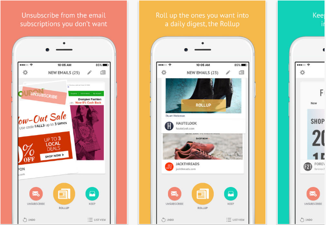
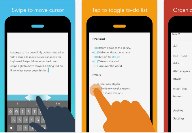
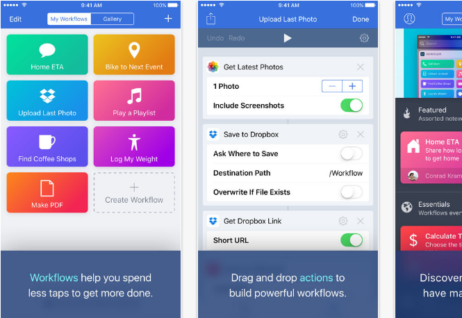
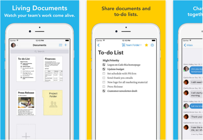
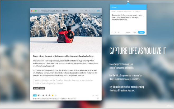
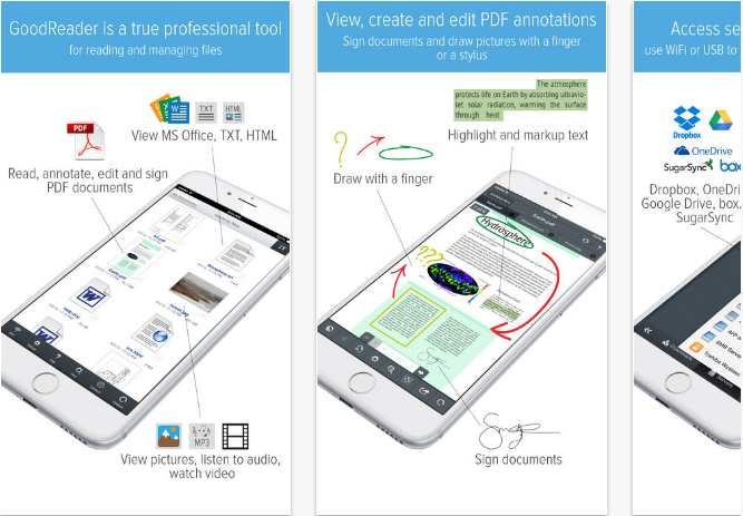
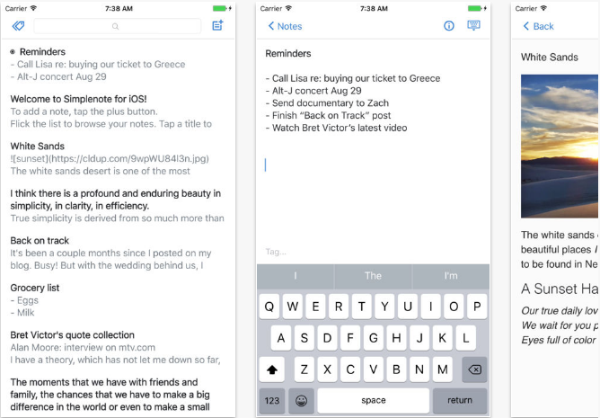
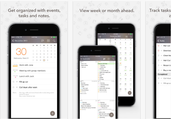
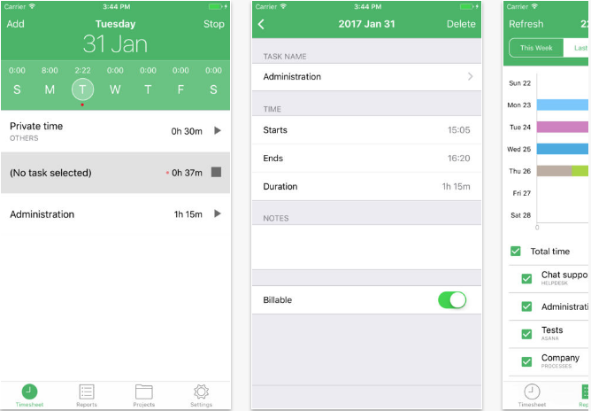
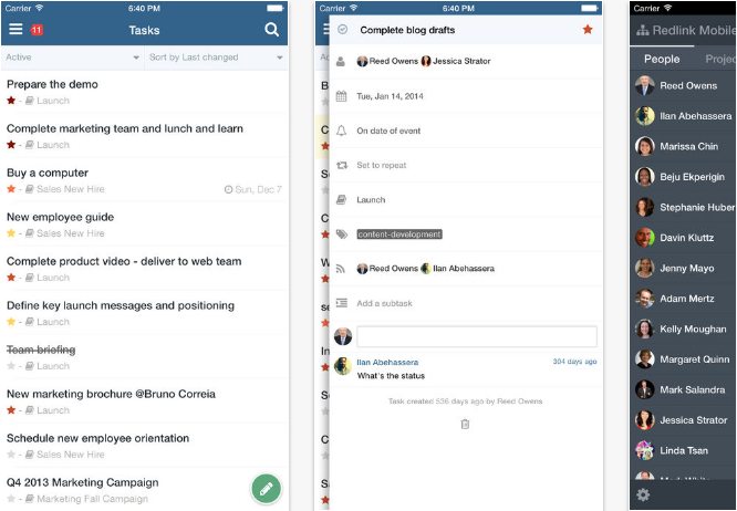
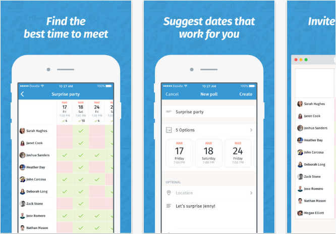
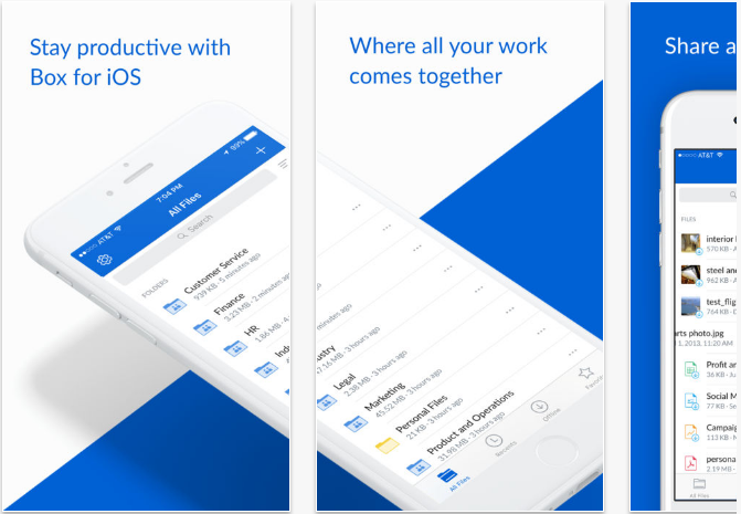
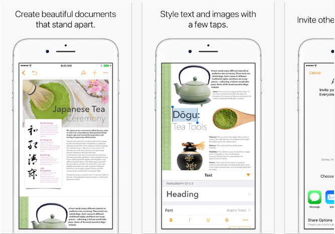
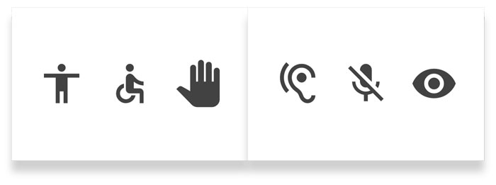
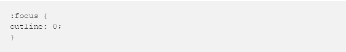
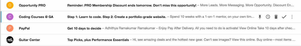

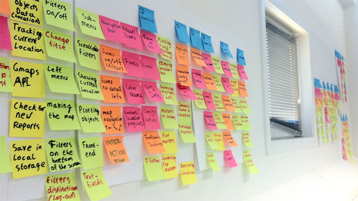


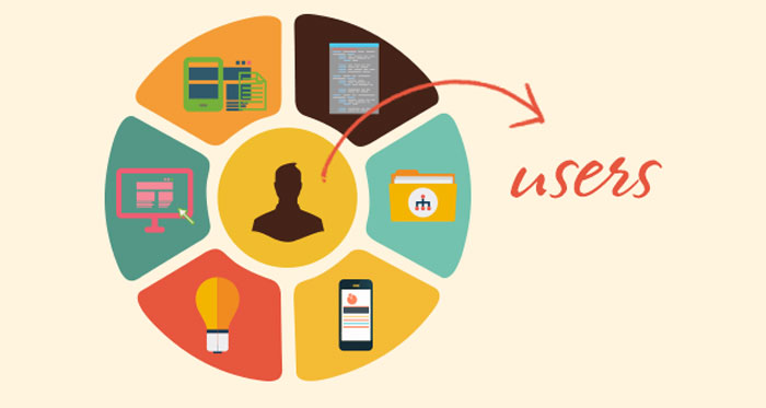
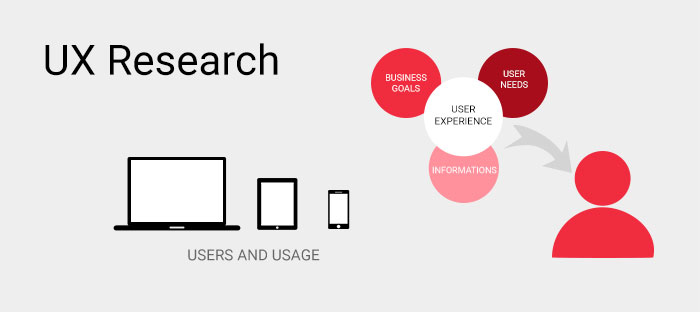


 RSS Feed
