|
Apple proved that beauty not only works. It sells. By marrying design and technology, Apple evolved from a niche brand for hobbyists into one of most valuable companies ever. After their success, many companies followed suit and leveled up on design. If you can’t beat ‘em…
Many of the products we spend our time with — our phones, laptops, and the software that comes with them — were originally designed, or at least inspired by Apple. And with Apple creating and managing the App Store, a huge chunk of the software industry is now required to have ‘Apple-approved’ design to survive. For design and beauty, our expectations as consumers are higher than they’ve ever been. And the future of where products will compete will hinge more and more on the emotions driven from thoughtful, pleasurable design. As a designer, I appreciate this attention to design. I look at my laptop screen and the icons look like candy. I zip fluidly through my apps, getting hits of pleasure from well-designed transitions along the way. The visual beauty of technology is so much different from how it was even just 10 years ago. A computer used to feel like you were navigating a maze in a cornfield. Uncertainty around every corner until you finally found the path to get something done.
Yet, for all the good this focus on design has done for us, this same focus on visual polish has a cost. In our worship of the design and marketing of companies like Apple, we creators lose sight of an even more powerful way to present our ideas to the world. Because we’ve seen the results of visual beauty in product design, we expect putting this level of focus on visual beauty in our brand’s message will have the same effect. I’ve seen companies spend tens to hundreds of thousands of dollars perfecting a website, email, or ad’s visual design while spending the last few hours on writing the words that will make up that design. Our intense focus on visual design can blind us from focusing on the most important part of the message: The story. Choosing substance over styleWe’ve had a taste of this ourselves. A year ago, we sent out two versions of this email campaign.
One email closely followed the principles of how a well-designed email is supposed to look:
The other version took a different direction. We wrote it as if we were telling a story to a friend. It broke every rule:
Here were the results:
Even though our ‘less-beautiful’ email broke many of the rules, the longer, story version had almost three times the click-through rate compared to the shorter version. Though this example is limited in that it was constrained to people in our community who might prefer a more story-oriented approach (since this is our usual style), it supported our hunch that beauty isn’t always best. And that being more authentic (i.e. telling our story just like we’d tell it to a friend) has a bigger impact than we might expect. A lesson from Pixar: It’s not about animation, it’s about storyThere are examples of this same preference for a well-told story in all creative fields. In 1995, Pixar released Toy Story, the first computer animated feature film. And while Toy Story went on to smash box office records, Pixar had a rocky start. Star Wars Director, George Lucas, sold his shares in Pixar before Toy Storywas made, and Pixar almost went bankrupt (if, ironically, it weren’t for Apple founder Steve Jobs stepping in to invest). The film industry thought a mainstream audience wouldn’t care enough to see an animated feature film. What they neglected to see was the power of story. Even though animation was at its core, the Pixar team knew their success would ultimately fall on one simple thing: Their ability to tell a good story. Ed Catmull, one of the co-founders of Pixar, wrote in his bestselling bookCreativity, Inc. about his company’s creative process:
Pixar has won the Academy Award for Best Animated Picture for 8 out of their 16 films. And every single Pixar film has landed on the respective year’s top ten list of most profitable films. No other studio comes close to this hit rate. Telling a good story, whether that’s through email, film, or any medium, creates a connection. And it’s this connection that leads to attention, which leads to trust, which leads to sales. As Pixar realized early on, you can get away with lesser visual effects if your story is good. But the reverse is not always true. Case in point, if we look at the ten most expensive movies ever made, the average production cost was $274 million per film.
And the average ranking across these films according to Rotten Tomatoes? 59% (The highest rated film was Tangled at 90% which was produced by Disney/Pixar). Meanwhile, the average Pixar film cost an average of $145 million and averages an 89% review from critics and audiences alike.
What’s even more telling is that if we take a sampling of the critic consensus from the poorly rated movies in the top ten, you’ll notice that critics rarely say the quality of the animation or special effects as the reason why they gave a bad rating. They cite issues with the story: “…this Pirates runs aground on a disjointed plot and a non-stop barrage of noisy action sequences.” -- Review of Pirates of the Caribbean on Stranger Tides “…mixes in too many characters with too many incomprehensible plot threads.” -- Review of Pirates of the Caribbean 3 “While John Carter looks terrific and delivers its share of pulpy thrills, it also suffers from uneven pacing and occasionally incomprehensible plotting and characterization.” -- Review of John Carter “…a grim whirlwind of effects-driven action.” -- Review of Batman vs. Superman While the other producers may have had the budgets to make something as visually stunning as Pixar, where they didn’t level up was in their story. We can make something look pretty. But if pretty doesn’t tell a good story it won’t matter. Why beauty doesn’t always work (especially today)Just like you can’t rely on beauty alone in the design of your product, you can’t only focus on beauty to tell your story. A well-designed message is one that tells a good story first. As we saw in our email campaign example, a story is powerful enough to overcome an email design that breaks all the rules. You might not have Apple’s marketing budget ($1.2 billion this year) or design chops. But that’s okay. Sometimes Apple-level beauty isn’t the best way to present your story. And sometimes it might even make things worse. In a recent article published by BBC, researchers from the University of North Carolina at Charlotte reviewed findings on if there was a drawback to being ‘too beautiful’. The researchers uncovered several studies, including one in 1975 that found people tend to move away from a beautiful woman on a pathway. A similar behavior was found from a review of the profile photos from the dating website OKCupid. Men with ‘average’ looking profile photos got more messages than men with the ‘most attractive’ profile photos. The researchers suggested this behavior could be because attractiveness conveys power. As a result, people feel they need to respect an attractive person more and keep their distance. These examples illustrate that beauty can backfire. If something is too beautiful it can be seen as less approachable, further distancing you from the people you are trying to reach. Similarly, clothing brands like American Eagle recently saw an increase in sales after they stopped photoshopping models. Too much beauty can be seen as a sales tactic. Though we may be attracted to something that looks good, we also have a strong unconscious aversion to being sold to. And this aversion is getting stronger. First, because of the internet and the power of online networks like Facebook, we have more access to information, which means we see more instances of bad things. For instance, of the top movie documentaries all-time listed on Rotten Tomatoes, 4 of the top 10 are stories of injustice or corruption and have been made since 2005.
Every phone has become a media device. Stories spread fast. And while there’s a lot of good happening in the world, stories of corruption and distrust tend to surface to the top because they grab our attention.
Trust is at an all-time low. As this 2013 USA Today poll suggests, two thirds of Americans polled said they were suspicious of others. This is double the rate of distrust since the survey was first done in 1972. We’ve become hypersensitive to bullshit. We have an increasing lack of trust for everything, including beauty. Beauty can be perceived as a layer of bullshit, making people feel like they are being sold to. As one of the lead researchers from the study said: “If you are obsessing about attractiveness, it may alter your experience and interactions.” This is exactly it. If we focus too much on the visual attraction of our message, the experience people have with our stories will likely suffer. Increase in information; Decrease in attentionAdding to our natural aversion to being sold to, we’ve become overloaded with things vying for our attention. In the last decade, as the world moved mostly online, messages started to attack us everywhere. And these messages are smart. With billboards we could just look away. With TV/radio we could shut it off. But today’s messages are connected to all the tools we use to communicate. And brought to us by people we trust.
Facebook. Twitter. Email. Phones. Laptops. Tablets. Notifications come flying at us from all angles. Because today’s messages come in bits and pings, they are cheap, effective, and easy to spread. With so much access to information, we only have two options: Either we try to consume everything (which isn’t possible) or we filter (i.e. we stop paying attention to a lot of things).
Since we can’t consume everything, we’ve become experts at filtering. Filtering out crap. Filtering anything that looks remotely untrustworthy or has the tiniest hint of salesmanship. To quote multi-platinum musician Rihanna:
Our brains have actually changed to adapt to the current information overload. A recent study by Microsoft on Canadians found that our attention spans have dropped by a quarter, from 12 seconds to 8 seconds, since 2000; which is less than the attention span of a goldfish.
There’s a general fatigue that’s happening. We’ve been forced into becoming B.S. detection experts. While ads and marketing may have gotten prettier and better with more data, we’ve gotten better at filtering. Resisting. It’s an arms race. And it might seem like we’re doomed to lose as creators. That no will ever care what we have to say. But we’re not. There’s an easy solution. The solution is easy and you already know how to do itWhen you see an email from a friend saying, “hey lets catchup for coffee monday. you in?” it cuts through everything. Even though it breaks every standard of writing: no capitalization, missing punctuation. It grabs your attention. You answer it first. Why? First, this message comes from a person you trust so that plays a huge factor. But, adding to the trust you have in the messenger, is a message you know came from a human. Not a machine. There’s no fancy headlines, graphics, or words so you feel safe. You’re not being gamed. You can let your guard down for a second. There’s plenty of results to back up that you don’t need visual beauty to connect with people. Multi-platinum musician Beyonce’s most watched music video on her YouTube channel is her song, 7/11. Even though many of Beyonce’s music videos have a high production quality, 7/11 is shot with low-quality video. Yet, it outperformed every other Beyonce video.
Kelly Starrett is a physiotherapist and trainer who has some of the most consistently viewed fitness videos on YouTube. He recorded most videos with a phone in his garage with no professional gear.
Some of Kelly’s videos even show his daughter accidentally walking in and ‘mistakes’ in editing. Kelly could have edited these things out but because they were kept in, I feel an even deeper connection with him. These ‘mistakes’ make me feel like Kelly is a human and he’s not trying to sell me. Like he’s one of my friends in his garage figuring something out and he’s sending over a video for me to check it out. He’s a person who has kids, a dog, a somewhat messy garage. And he shoots low-resolution, unedited videos just like me. I can relate to that. His videos aren’t the highest quality or the nicest shot. But what they do have is some of the best fitness coaching I’ve ever seen. They have substance. So I trust Kelly. When I’m looking for fitness tips, I search Kelly first. When Kelly wrote a book, I bought it. Maybe if Beyonce and Kelly used professional equipment for these videos, viewership would have increased, but the way they shot these videos in raw form is partly what makes them attractive. These videos make Beyonce and Kelly seem approachable and relatable. Comedian Louis C.K. does a similar thing with the emails he writes. Louis sends email newsletters that feel like he’s just writing to you. Some have spelling mistakes or improper punctuation but that’s part of them. I don’t care about those grammar mistakes. In fact, I like them. It makes me feel like Louis is simply talking to me like he would talk to a friend. Here’s an example:
Time and again we see the substance of the story is more important than the look of it. We don’t need beauty to connect with people. When we sense someone is being ‘real’ with us, our brain’s natural urge to resist influence is calmed. What your message needs is authenticity. Your unique way of sharing your message with all its blemishes and imperfect sentences.
Authenticity doesn’t mean beauty. Authenticity means substance. It means cutting the bullshit. While visual beauty counts for something, it isn’t the only thing that connects people with your message. If you want anyone to trust you. To pay attention to you. To maybe one day buy from you. Your best option is to remove all the barriers in your message. To sound more like how you sound when you talk to a friend. To sound like just another human. Because ‘just another human’ is much more relatable than a corporation. Authenticity is powerful. It’s easy. And we all already know how to do it. We just need a reminder sometimes that it’s ok to be authentic. Even when it comes to business. Actually, especially when it comes to business. When you think of our company, picture it as a person. A brand should sound like a person, rather than a company. Whether it’s a website, an email, a tweet, or an ad, everything should feel like it’s coming from a person. Because it is. You might think you need to use industry words because you think you need to sound like an ‘industry leader’, or you feel like you need to watch what you say so you don’t offend a partner, investor, or customer. Or in certain cases, there might be legal or company policy reasons outside your control that require you to hold back from saying what you really want to say. But the closer you can get to what you really want to say, the better your message will connect. That said, I know how hard it is to wipe the business off a message when we’ve been trained to think we need to sound a certain way when we operate professionally. One thing I do is start rough drafts for any of our company announcements as Facebook posts.
There’s something about the context of writing the message directly in Facebook that shifts my brain and makes me write like I’m writing to a friend. Sometimes we can overdo a message because the tool we use to write these messages that makes us feel like the stakes are higher. Writing in professional tools subtly tells your brain, “Hey, this is going to be important cause you’re writing it in your WordPress backend so be careful.” This kills your personality. Try lowering the stakes. Write your important business messages using a tool where you communicate with friends and family. I bet your personality will come spilling out. The way you explain your company to a friend is how you should explain it to the world. If you’re being overly formal just because it worked for someone else, you will sound like everyone else, and you will be tuned out. We’re all humans. Even under a suit. -- Making something pretty is fine, just make sure this beauty is paired with substance because beauty alone won’t be enough. And if you have to choose between making something prettier or making the message more authentic, choose the message. Without a story you have nothing. Without a story, people will glaze over you even if you spent hundreds of thousands or millions of dollars making your story look pretty. Showing your imperfection is better than faking perfection. More so than ever before, direct communication is expected. Instagram, Twitter, and newer communication platforms like Snapchat are even more focused on raw, direct connection. For all the bad the connected world shows us, this same connection is a unique opportunity to share your beliefs and connect with people on a massive scale. Never has it been easier to reach so many of the right people with your story. You might think you need beauty to create impact but you don’t. Authenticity is more powerful. Authenticity is approachable. It creates connection. Being authentic is the most beautiful thing you can do.
The post Why you don’t need design like Apple appeared first on Design your way. from http://www.designyourway.net/blog/design/dont-need-design-like-apple/
0 Comments
Web presence is everything these days. Your startup needs a startup website, and not just something thrown together cheaply and without any effort. Most people will find your company through the net, so it’s vital you create a professional and topical site. There are a ton of benefits to building a startup site. You’ll find yourself with increased revenues, reduced operating costs, better relationships with customers and other businesses, and increased workflow efficiencies. It’s well worth your time to make sure you have a good website. What do the best startup websites look like? Here are a few rules to help you figure out how to launch a startup site for your company.
These ten rules will help you get started in starting a startup site. Here are some more website ideas for you to figure out how to make a startup website. Present Your Message Clearly
Your message is the most important part of websites for startup companies. Your messaging should take up most of the time and energy you spend on creating your company’s website. Copywriting is usually treated as an afterthought. It’s the stuff you put in to fill spots, the last thing you worries about or put resources into. That’s wrong. Writing your copy does matter. It’s the way you get your message across to anyone who visits your site. One of the reasons companies like Apple are so successful is because of their message. What Makes for Good Messaging?
The same rules that apply to professional writing apply to your messaging: be clear, concise, and to the point. However, it also more than that. You’re not looking to beg people to buy what you’re selling, though you certainly shouldn’t hide that you’re selling it and you’d like them to buy it. There’s a sweet spot you’re looking for, which is both clever and honest. Good Messaging Is Worth People’s Time
You and your company know who your customers are. You know where your target audience spends time online and what they spend their money on. You know your product is for them. You know all this, but do your customers know about your product? The faster you can let them know about your product, the better off your site will be. The people who wouldn’t be interested will leave, and the people who are will stick around longer to possibly buy what you’re selling.
You need to figure out how to communicate if your target is for a viewer or not. If it’s not, that person will leave. This is no loss because he or she wasn’t going to be your customer anyway. If you have good messaging, that means they just figured it out that much faster. How do you know your message is good? You test it! Show your site to some neutral users, members of your target audience. See how fast they understand what you’re trying to say or sell to them. This can give you excellent feedback throughout your start-up website’s design process. Think About Using Video
A lot of content nowadays is communicated via video. How can that help out your startup website? A well-made video can communicate a lot of complex ideas quickly. Sometimes it even manages to demonstrate things or ideas that are hard to explain just using words. On many occasions, you can demonstrate your product’s use or your team’s processes more easily with a video. Another thing to remember is that web users tend to be lazy. Give them the chance to click play to see the details of what your startup is trying to sell, rather than offering them a long article they’ll have to scroll through. Why Are Startup Websites Usually Useless? Well, this breaks down to two primary reasons:
Static Versus Dynamic Startup Websites
What’s the difference between static site and a dynamic site? You need to know the difference, as it will make a difference about how you manage your site budget and strategy. Static Sites Static sites stick to presenting only information. It provides relevant info to site visitors. It also provides contact information to them. It doesn’t offer much interaction or offer the chance to allow for transactions. Usually, static websites are used as temporary sites until a more complex and larger site is able to be launched. The term usually used is a prelaunch site or a temporary landing page. These prelaunch sites are used to create awareness of a company and get info from visitors so that they can be contacted about the full site launch. Static websites are not going to cut it in these modern times. Consumers expect complete and dynamic websites that allow them to complete transactions and do other business with a company. Dynamic Sites
Dynamic sites are designed and developed to automate procedures and processes through technology. Dynamic websites provide information of a static website with additional functionality, allowing consumers to buy what you’re selling. Information inputs can be used as results immediately.
The site offers the chance for employees to train and test almost any time. A dynamic website is very powerful and creating one costs more. Maintenance can also costs more. As such, the site should generate more value for your business. Interfaces Aren’t Everything
Make sure you don’t focus on surface level issues. You may fret about how to render existing content, or present aggregated data. Don’t get caught up on these issues. Look beneath the surface. The systems you use make all the difference. Change those systems and you’ll change the rest of the issues. Who Should Develop Your Website?
Time is money, as the saying goes. One of your first decisions needs to be figuring out how to develop your website. Choose wisely, as you’ll not only be paying but also because any delay to your site will cost you exponentially. Option 1: Build It on Your Own
This option can save you and your company a lot of money. It may now, however, be the best choice. It might waste your time or generate a site that is less than what you need. You already have to manage finances, marketing, sales, strategic planning, product development, and much more. Developing a website requires a lot of effort and has a steep learning curve. You’ll need to keep learning, too, as your site needs to be kept as up to date to possible.
Developing a good website is hard and time-consuming even for people who do it professionally. There are a lot of tools and templates out there to shorten the process, but it still takes time to put those pieces together into a coherent whole. Option 2: Have Professionals Build Your Website Professional website developers design websites for a living. They are faster, more efficient, and more up to date on current trends and technology. They know how to identify and implement different technologies that can make a serious difference for your startup company. You need to know what you’re good at and learn how to hire the right experts. How to Know You’re Working with a Professional
Professionals are not going to be your cheapest option. The lead of your web design team needs to understand both front end and back end parts of the project. They need to demonstrate how their solutions will impact your company. A lot of companies will do exactly what they ask for, but very few bother to make a good business case for the features they integrate. Professionals solve problems. Full-time Programmer, Web Development Company, or Independent Contractor? Independent Contractors Usually, these are freelancers. Pros: These contractors have more flexible schedules and relationships. You can start and stop the project, as well as adjust hourly schedules, more or less as needed. You aren’t going to be spending money long-term on these freelancers. You won’t have to be concerned with employment liabilities. They also usually work for cash. Cons: Most contractors want to be compensated for time, not results. They have an incentive to take longer to do a job, and they’ll generally try to do it with the minimum amount of work. They don’t have a long-term investment in your company. You’ll need to provide these individuals with leadership and technical involvement. Web Development Companies These are teams of contractors. You’ll hire the company and they’ll assign their contractors to your job. Pros: These companies share a lot of the same benefits as hiring individual contractors and then some. You can usually expect a high quality of work. They tend to be more professional generally. The company will usually provide their own project manager to keep everything on schedule and within budget. Cons: This is usually the most expensive option, in terms of cash. A reputable company will run you $10-$20K a month. You can easily pay more than that a month for a really good development firms. They’re also not generally as flexible as individuals and will want longer contracts. You’ll also usually have to use their own legal contracts, rather than yours. Full-Time Programmers These are formal and dedicated members of your team, usually hired on a long-term basis. Pros: As your employee, these programmers’ interests align with yours. They have a vested interest in your company. They are much more likely to go through extra effort than contractors and innovate on their own. If your employee has equity or option in your company, that shared interest only increases. Cons: You’ll need to identify and then sell the best candidates for the job. This can be a long and involved process. You’re also taking a risk on new hires. Any single person in a startup can sink the ship. You’ll also have to deal with worker’s compensation, tax liabilities, unemployment insurance benefits, and other legal implications. You’ll need to provide leadership as well to keep everything on track. You can hire from universities, craiglsit.com, startupers.com, and even take a look at relevant job boards. You can find quality hires from any of these locations. You just need to make sure your vetting process is solid. Conclusion
Hopefully, these tips have helped you figure out how to start a startup and provide it with an excellent website. As you can see, it’s a multifaceted process. You’ll get out what you put in, but a good website is undeniably a necessity for any modern startup company. The post How to make a startup website appeared first on Design your way. from http://www.designyourway.net/blog/web-design/make-startup-website/ Have you ever noticed a service message on your mobile device screen that reminds you about your mobile bill payment or a latest sale flash message from one of the online store apps you have installed? What are these pop ups are for? These pop-ups are also called as server push notification that delivers a piece of information from a software application to computing devices. In simple terminology, it’s a way to stay connected with users and offer them convenience and value for their downloaded apps. Without knowing the importance of push notifications it’s not a worth to talk about it. So here are some of the key points that highlight the focus that needs to be given to push notifications in today’s times.
In this mobile World, a constant touch with users is the need of the hour. With push notifications, app publishers not only get a constant connection with its customers but also get an opportunity to portray their brand image directly to end users. As explained before push notifications need to be valuable, relevant and timely so it’s a marketer’s call to make it a point that notifications are not poorly executed.
In the above example, Crunchyroll is sending push notifications for shows that the user is hardly interested in. This generally annoys your users & compels them to opt out of notifications or in worst case scenario, uninstall your app.
Another example of badly executed notification is sending the exact same notification every day. Duolingo is creating a negative brand image by following such practices. Now the question arises is how to make notifications that are both meaningful and valuable for your products and customer? Without giving it a second thought lets talk about some of the elements, both from a developer & marketer’s perspective, that can be used to make notifications that are good, valuable and are enjoyed by users in order to promote engagement. Limit the count of your notifications From Duolingo’s example, one thing is clear that sending too many notifications doesn’t work. Make a point to send relevant and required information than sending more notifications that a user is unable to handle. With so many notifications they either start ignoring it or opt out altogether. Try to figure out their needs, lifestyle, interest, and products they are looking for, then you can generate smart notifications that would be helpful, personal and time sensitive.
Relevant notifications are always appreciated by its users and they start relying on the app publishers for more purposeful information in near future. Worth their Time There is a thin line between a well-presented push notification and a useless, non relevant push notification. A user will invest their time only if they find some value for interruption with the notification. Notifications at the wrong time are worse than anything. Getting notifications at odd hours does not fulfill the purpose; it only portrays your lack of attentiveness towards your viewers.
By getting such notifications users can surely go for DND setting on their mobiles, but this can lead to loss of your potential customers. Always make it a point to send a notification to your viewers in their local time zones. Before starting push notification’s journey, take a closer look at the target audience & decide what type of notification are real worth of their immediate attention. A smart example of keeping a track of your viewers need, Foursquare uses Geodata to track its viewer’s location and accordingly sends notifications with relevant offers and information at right time and place. Know your audience and personalized with them
Before installing any app, the user provides their details plus the information they share on social networking platforms can result in decent data collection. This data can be used to study viewer’s behavior and their engagement with your brand. Segmenting this data for personalization will result in four times increase in open rates. Let your users feel as unique viewers because push notifications are meant for individuals & not for mere devices. A clear and precise message says it all Using difficult and lengthy messages does not make any point when your message can be conveyed smoothly and easily in short and precise language. Users don’t look for any sort of high-level language; they just want a simple and easy language that can convey the information of their interest. You can also look for various testing strategies to determine what works best with viewers – phrases, sentences, emojis and character length. It is said that Push Notification with emojis opens 85% so try to mix and match to make notifications that grab viewer’s attention. An option for easy opt out
Keep a transparency with your users for your app. Yes, it’s true that no app publisher wants their user to turn off the app notifications but to avoid the worst case scenario, app un-installation, it’s the most obliged step to be offered. With the app remains installed, you can go for other mediums to grab user’s attention and moreover at some point of time user will look out for help while using the app. Keep Testing for better results
Keep a track of all the factors – negative as well as positive. Do not assume that sending some promo code offer messages yields higher results; Test It. Look for a bigger picture and try to tackle all major factors. Ask relevant questions and answer them – with which notification are users going for desired actions? Is the notification helping in achieving user’s re-engagement? What leads to user’s opt out or uninstalling the app? A good notification strategy is the one that is user centric, which in turn, results in higher customer engagement, better brand image, and higher ROI. Using the right techniques at the right time helps in making every message count. The key lies in understanding customer’s problem and offering them the best solution possible in order to make their in-app experience a worth and keep them coming back for more. The post How to leverage mobile app push notification for business growth appeared first on Design your way. from http://www.designyourway.net/blog/tech/leverage-push-notification-business-growth/ Arcade games are the first sources of 1970s kids entertainment and the following 20 years. Later in the 1990s, arcade games saw a decline but today the devices are allowing you to play arcade games on your Iphone or iPad. Here you can find some of the best arcade games to spend time on. You will find arcade games for iPhone and iPad. Also, if you are a 1990s kid, you will remember the feeling while playing video games, electro-mechanical games, pinball machines, merchandisers and redemption games. Candy Crush Saga
This has become a household name as you must have received at least hundred requests on your Facebook profile to play this game with your friends. The game takes you through wonderlands, mysterious places and meeting deliciously kookie characters. Challenge your friends to score higher than you; the game is absolutely free to play. You can switch off the payment feature if you are asked to buy in-game items like extra moves or lives. Temple Run
Temple Run is a favorite among kids. It is one of the most exciting running games on the App Store. Test your running skills while you are racing down temple walls and steep cliffs. During your run, you will find some obstacles which can be avoided with the swipe. Buy power-ups by collecting coins and see how far you can go. Temple Run is popular as the best endless running game in the App Store. Enjoy the fast and frenzied iPhone experience. Subway Surfers
Even the kids would love to play Subway Surfers on iPhone. Run as fast as you can and save yourself from the fast coming trains – this is the simple way to play this game on your iPhone and iPad. On your run, collect coins and other cool stuff to increase your score. If you get Shoes on the way, it will be great fun to jump over the trains and other obstacles. Hoverboard Surfing is especially loved by kids. Angry Birds
Arguably one of the best games for kids and adults alike to keep them busy. Angry Birds is a game that has around ten different variants – Angry Birds (Paid), Angry Birds Go!, Angry Birds Rio, Angry Birds Star Wars Free, Angry Birds Star Wars II, Angry Birds Space, Angry Birds Friends, Angry Birds Star Wars, Angry Birds POP! – Bubble Shooter, Angry Birds Seasons, etc. In this free version, the story is about taking revenge on the green pigs who steal the Birds’ eggs. You will have 175 unlockable levels to unleash the destructive power of the Angry Birds. Hill Climb Racing
Hill Climbing Racing presents eye-soothing background and colors that will capture your attention. It is about a young uphill racer, who is on a journey that takes him to a bumpy ride. Defying the laws of physics, our racer Newton Bill will conquer the highest hills up on the moon. During the steep climbing of hills, you will face many challenges; if you can tackle the challenges, you will get bonuses and coins to upgrade your car and reach even higher distances. Fruit Ninja
If the slicing fruit is your favourite pastime, Fruit Ninja is your game for sure. Go further and explore the nuances of three different modes like Classic, Zen, and Arcade; the last one is quite popular among users. Want to swing your blades for multiple times? Go for the multi-slice Pomegranate or you can use power-ups and special bananas to the full effect. Unleash your power to swing your blade and enjoy Fruit Ninja! Toy Blast
Toy Blast can also be slotted into puzzle game as the user has to match two or more blocks of the same color to remove the level and collect the stuck toys. However, this is not as easy as it sounds because your moves are limited. The game can be addictive once you use your talent to solve puzzles. Just bust the blocks and enjoy this colourful adventure. You don’t have to crush candies, break diamonds, crunch cookies or farm. Bowling King
This one is the best multiplayer bowling game that can be played on The Internet – it could be the only disadvantage of Bowling King. The game features intuitive tap and swipe control and beautiful bowling alleys from Las Vegas, New York, Sydney, Paris and other cities. Display your class with more than 60 bowling balls, 27 pins, and lanes. While playing with your friends, you can win millions of chips; moreover, you can bowl together with your friends from anywhere, anytime. Soccer Stars
Indulge in online table soccer matches all over the world! Soccer Stars boasts a simple gameplay and excellent physics to boost your competitive style. You can challenge your competitors in different tiers from different countries. You can also play the game against your friends. You will be required to log in with your Facebook account to challenge your friends. If you don’t have internet access, you can play offline with your friend on the same device. Jetpack Joyride
Jetpack Joyride is an award-winning game from Fruit Ninja. The game is now updated to support retina display of your new iPad. Jetpack Joyride takes you to a secret laboratory of evildoers who are developing a jetpack. And the hero Barry Steakfries secretly enters the lab to take that jetpack. Once Barry gets hold of the jetpack, touch the screen to ascend and leave to descend. Save him from bullets, bubbles, rainbows and lasers. Hook Worlds
Players try to survive as long as possible across four game modes, using grappling hooks as transportation. The game modes, along with unlockable hats to customize your character, complement the simply fun swinging gameplay. Canabalt
This endless runner game, initially popularized on Flash before being introduced on iOS, is well-known for its perfectly-tuned gameplay. Do you try to survive when the game accelerates to high speeds, increasing the possibility that an ill-placed window or a sudden obstacle dooms you to fail? Or, do you slow it down by cleverly utilizing the boxes in your path? The tradeoff requires more than reflexes, but strategic brainpower too. The Blocks Comet
While playing Tetris, have you ever imagined you were jumping over the blocks that constantly descended down, down, down? Well, that’s what this game is! Plus, enjoy a bonus mode that pays homage to handheld games of the past, and all the pixel art you can handle. Whale Trail
This is one of the most pleasant endless runner games around. The music and graphics create a happy and charming world. The game is easy to play: Just hold down on the screen to fly upward and loop-de-loop. Hitting bad cloud obstacles doesn’t mean game over, but it does reduce your score multiplier, so fly carefully and score as many points as possible! Bit Pilot
Players try to survive while being bombarded by asteroids. A unique dual-swipe control system works great for trying to precisely navigate the asteroid menace. The game boasts a rocking chiptune soundtrack, unlocks rewards accumulated throughout the game, and takes total advantage of the high-resolution retina display and iPad screens. Super Crossfire
Fans of Galaga, Space Invaders, and other retro shoot-em-ups will love this game too. Players flip between both sides of the battlefield in order to avoid damage, and to attack vulnerable enemies. Despite new elements and modern twists, the game still features old-school shooting fun. Forever Drive
Speed along neon-colored tracks in this endless racing game, while trying to unlock new cars and designs. All the tracks in the game are user-generated, so prepare for tracks with devilish twists and turns and amazing futuristic city scenery. Pac-Man Championship Edition
This isn’t quite the Pac-Man you know and love. The basics are the same: Run around a maze and collect power pellets to eat ghosts. However, the maze constantly warps with each fruit that you eat, leaving players wildly attempting to survive! Thousand Heroes
Formerly entitled 1000 Heroz, this running game presents a new challenge each day: courses fraught with new perils and new leaderboards to conquer. Part of the fun is the ability to join custom leagues and compete with friends. Penarium
Help a character move across a dangerous circus arenas. Move on the platforms, jump over gaps and avoid traps. Get to the exit and don’t let the main hero die in a sinister circus. Die with glory
Help a viking to go to his forefather to Valhalla. Travel across incredible locations together with a flying skull. Fight against monsters, destroy fortresses, make friends. Interact with surrounding objects and don’t let the hero die. Toca life: Hospital
Take part in events happening at a big medical center. Cure patients, take care of them, rescue lives and complete other interesting missions. Apply modern equipment to make a diagnosis. Find a secret laboratory in the department. Lanota
Start an exciting adventure across a magic world together with two courageous heroes. Explore local territories and find a rare magic element thanks to which you can recover the planet after natural disasters. Bring bright colors to dull locations. Dragon’s Lair
Dragon’s Lair was another huge hit at the arcade. For its time, it had stunning graphics, and the embedded humor in the game made it a blast to play. But what really kept kids like me pouring quarters into it was the addicting difficulty of the game. Like most games of that era, it was built around seeing how far you could get and how long you could play, but unlike games that racked up a score, Dragon’s Lair pushed you along because you wanted to see what would happen next. The only downside of this HD version is the $4.99 price tag, which is a little steep for any classic arcade game ported to the iPad. Street Fighter II Collection
When I was a kid, people lined up to play Karate Champ. It was the first fighting game to feature martial arts, and it was always a popular game. But it was Street Fighter that really set the mold for all fighting games to come and paved the way for classics like Mortal Kombat. This collection includes the original Street Fighter II, the Champion Edition and Hyper Fighting, which is Champion Edition on steroids. Double Dragon Trilogy
Talk about a blast from the past! Double Dragon did a double whammy on arcades in the 80s. Not only did it take the side-scroller to the next level, it revolutionized the idea of co-op game play. Mostly, you had a choice between playing a fighting game or similar player-vs-player game or taking turns trying to hit the high score in Donkey Kong, but with Double Dragon, you got to team up with your best friend and beat the crap out of people. Ultimate Mortal Kombat 3
Mortal Kombat is a game that needs no introduction. There are few games that have become so popular and are so recognizable. But despite its popularity in the arcades, the original port of this game to the iPad wouldn’t make it on this list. It was a tad overpriced and had too many glitches, especially with unwieldy controls. In some games, you can work around bad controls, but in a game like Mortal Kombat, that’s impossible. Luckily, EA has patched it since its release, with the latest patches fixing a lot of the initial problems. They’ve also reduced the price, making this one a good download for any fan of the series. Midway Arcade
The Midway Arcade is the only arcade developer collection with a price tag, but you do get a nice selection of games for the $1.99. The price tag includes Spy Hunter, Rampage, Joust and Defender among several others. You can also download some game packs, including a fantasy game pack that includes Gauntlet, Gauntlet II and Wizard of Wor. These were all favorites at the arcade, and with the game packs only costing $.99, they are a good deal. The Namco Arcade
The Namco Arcade contains classics like PAC-MAN, Galaga and Xevious. The game features two ways to play: buy the game machine to play all you like or buy coins. Unfortunately, you only get 10 coins for a dollar, so that quickly becomes too expensive. And the game machines are usually $2.99 , so of all the game collections, this one is the most expensive. Still, with the full-fledged Galaga game no longer working with iOS 7, this is the only way to play this particular classic. Most of the games on this list support the iCade. Activision Anthology
I’ve listed Activision Anthology last not because it is the worse app on this list, but because it really doesn’t meet the ‘arcade’ criteria. The Activision compilation is of games for the Atari 2600, which is close enough that I include it here. Certainly, anyone interested in reliving their arcade past will get a kick out of getting some 2600 games as well. The anthology includes Kaboom! for free and has other activision classics like Decathlon, River Raid and (of course) Pitfall. You can buy game packs for $2.99 or the entire collection for $6.99. Activision Anthology is compatible with iCade. Growing up in the 80s, I have fond memories of dimly lit arcades, incessantly feeding quarters with reckless abandon. When you took control of a machine, you would line up your quarters, letting others know you’d be there a while. I must have dropped hundreds of dollars over the course of a few years, all worth it. Nothing can bring back the excitement of first playing Space Invaders, my absolute first experience with an arcade game, but you can relive those moments on the iPhone. There are others, but these are the best 8 classic arcade games from the 80s for iPhone. SPACE INVADERS
Originally manufactured by Taito and picked up in the U.S. by Midway, Space Invaders was basic, yet incredibly addictive. As you lay waste to the invading aliens, they would increase their march, reinforced by the game sounds and your heartbeat. And when that spaceship would fly across the top, you’d forget about any strategy, as you sent as a stream of bullets trying to blow the mystery ship out of the sky. Now you can strap yourself to the laser cannons and fight this battle again, this time on your iPhone. PACMAN
No one ever admits to liking PacMan in the same way they don’t admit to wearing parachute pants. Admit it friend, you did both and loved it. Chomp on those pellits, grab fruit where you can eat those ghosts while they are weak. POLE POSITION REMIX
Prepare to qualify! How many times have you heard that echo into the corridors of the mall? In a remixed version of Pole Position, you race to glory using the tilt wheel controls of your iPhone. Bring yourself back to 1983 with the game that set records for being the most-successful game of that year. Crank up Down Under from Men at Work and race to the winner’s circle. FROGGER
Want to feel old? Frogger just celebrated its 29th brirthday. Still, after all these years, this frog hasn’t learned that busy streets might not be the best thing for an amphibian. You can choose from the classics or opt for new modes that include turbo, night time inferno (in-app purchase required). Feel up to the task of navigating your frog past cars and trucks.
You are just one space ship, fighting a legion of ships. As you do battle, they send kamakaze fighters down forcing you to go one on one. Galaga sprung onto the arcade scene in 1981, developed by Namco. Despite making it to the list, I cannot recommend buying this one, at least not yet. While it checks most of the boxes (awesome, retro, awesome), the developers have yet to update it for iOS 7. So if you are rolling with a retro iPhone circa iOS 6, then go get yourself some Galaga. If not, just add this one to your wishlist and hope the developer gets on the ball. Despite this major oversight, Galaga was simply too important of a game to not make this list. Atari’s Greatest Hits
Atari’s Greatest Hits features a collection of some of their best classics, like Tempest, Asteroids and Centipede. It also includes their library of Atari 2600 titles. Controls aren’t too bad, and the games are emulated pretty well. The token system is pretty stupid, but if you spend $10 you’ll get all 100 games available to play anytime you want. Tokens? We don’t need no stinkin’ tokens. Karate Champ
Oh, it’s so good … it’s sooooooo good. The original one-on-one karate game was a huge hit in arcades and it’s been faithfully ported over to iOS. It looks great on your iPhone, but wait until you see the iPad version. Beautiful crisp graphics and responsive touch controls make every match just as intense and stressful as they were in the arcade. Now if only I could master that darn jump kick, I might actually get past the fifth stage. Pinball Arcade
Surprised by my #1 pick? Who said the best retro arcade game had to be an arcade cabinet game? Pinball was just as incredible an experience as arcade games, and FarSight Studios has gone above and beyond with their faithful ports of Funhouse, Bride of Pinbot, Medieval Madness, Monster Bash and more. New tables are being added every month, so the game is constantly being updated with the pinball classics you grew up playing. They even secured enough Kickstarter funds to get the rights to adapt the heralded pin The Twilight Zone. If you’re an arcade junkie, you owe it to yourself to download Pinball Arcade. Believe me, you won’t be disappointed. Death road to Canada
Become a leader of a group of survived under the conditions of zombie apocalypse. Get from Florida to Canada. Get food, resources and weapons to fight against walking dead and enemy bandits. Look for the survived and add them to your squad. Destroy as many zombies as you can and try to survive! Vive le Roi
Rescue the king of France from execution. Move across dangerous locations guarded by watchful guards. Penetrate the castle, remain unnoticed and rescue the king from execution. Pick up useful objects which will distract soldiers. Mujo
Place tiles on the playing field in the best order to defeat monsters of Ancient Greek mythology. You will face Cyclop, Minotaur and other monsters. Join as many tiles with swords as possible to deliver maximum damage to beasts. Ancient Greek gods and heroes will help you in the battle with the help of mighty power-ups. Bethesda pinball
Play pinball on original pinball tables. Return the ball and score points. Fight against dragons, mutants and other beasts. Each challenge will bring you bonuses and upgrades. Compete with the participants from all over the world and demonstrate best high score results. Euclidean lands
Is an exciting journey across a hexangular world. Rotate the levels to move the main character forward. Help the warrior cope with villains wearing black overcoats. Think over every move of yours carefully in order to move and avoid attacks of enemies. Use teleports, tiles and other objects to reach the destination. Ghosts’n goblins mobile
Adventures of a brave knight in a pixel world. Take the hero across dark forests, underground tunnels and gloomy castles full of monsters, ghosts and other evil spirits. Move on the platforms, jump, dodge tricky traps and destroy opponents. Get to the den of villains and rescue the stolen princess. Ellie and Max
Play as a girl whose name is Ellie and her faithful dog Max. They got into a unique cubic world by chance. Help the characters overcome moving platforms, unsteady grounds and other geometrical figures. Turn locations and lay new ways. Use the found switches and useful objects. Take the characters home! Cosmic express
Travel across endless cosmic spaces. Your task is to create routes along which an express will move from one galaxy station to another and pick up aliens. Lay rails in the best way, avoid obstacles on the way. Every passenger must get home! Ball transformer 2
Roll a ball across tropical jungles and lands of Arctic. Avoid various traps and overcome numerous obstacles. Take the ball to the finish on each of the levels. You will face moving platforms, swaying pendulums, sharp thorns, water barriers and other dangers on your way. To overcome obstacles use an original feature of the ball – it can become wooden, metal or paper. Kingdom: New lands
Build your own pixel kingdom. Expand and fortify your territories and defend citizens from enemies. Use resources in the best way, build defense towers and other constructions. Ride your horse and discover new lands. Be careful because many dangers are waiting for you on the way! Summary:Kids today would likely thumb their nose at this list and rightfully so. They are growing up games like Infinity Blade. While some of these developers have certainly used their historic cache to cash in, these apps have a place in arcade gaming history.
The post Best Arcade Games for iPhone and iPad appeared first on Design your way. from http://www.designyourway.net/blog/tech/best-arcade-games-for-iphone/
Ever wanted to get Photoshop CC but were scared away by the $29,99/month? I know how it is. “Free Photoshop” sounds good when you are a student or newbie designer. 30 bucks per month doesn’t seem much, but for a newbie designer who doesn’t have projects on a regular basis, that seems a lot. So, why is it so expensive? Consider that Photoshop has had its release date in 1990. Since that date, they’ve poured millions of dollars into research and into product development. They have a great team of developers, artists, and others who expect to get paid for their work. The fact that so many people work for the product means they require to keep the price relatively high to compensate. Over the years, they’ve improved the software and added more useful features with each version. It’s a huge editing tool that can help you:
How to get Photoshop for freeYou read that right. I’m offering you the chance to get Photoshop CC for free. I’m putting on the table a Photoshop license valid for a year. How about saving $239.88? Or €285.37 with VAT included, if you’re from the European Union. Yaay! And I’m not talking about the Photoshop free trial that many of us have used. You could download the full version of Photoshop for free. Legally. :) Are there any limitations? Nope. You can download it for Windows, 7, Windows 8, Windows 10, or Mac. Whatever you want. Along with the app, you’ll get: 1. Your own portfolio website created with Adobe Portfolio
Over half a million creatives use Portfolio, from interaction designers to sculptors. Whatever your creative field is, they’ve got you covered. Don’t know HTML or CSS? No problem. With Portfolio, you pick a layout, customize it, and your website is ready — it’s that easy. Your site is natively responsive so you don’t have to worry about making it look great on mobile. Adobe Portfolio even lets you easily connect with Behance to import your projects. You can use your own domain name, and I’m sure you’ll want to. 2. The portfolio plan from Typekit worth $49.99/year
If you don’t know much about Typekit, I’ll shed some light. Typekit is a subscription service for fonts which you can sync to your computer or use on a website. Instead of licensing individual fonts, you can sign up for the plan that best suits your needs and get a library of fonts from which to choose. Fonts from Typekit can be used to make websites, t-shirts, books, posters, and more. What you are getting: Fonts for syncing Bring fonts from Typekit into your applications and use them as you would any other system font. Synced fonts aren’t limited to Creative Cloud apps and work anywhere you need them.
Fonts for the web
3. 20 GB of cloud storageEnter the competitionTo enter the competition, use the widget below: Win a Photoshop CC subscription for 1 year You’re in a feed reader or in your inbox and can’t see the widget? View the page in a browser. Enter the giveaway and get a chance at getting Adobe Photoshop for free for 1 year. Picking a winnerThe winner will be picked randomly through Gleam.io. I won’t pick the best looking person, the one with the curliest hair or the one with the most bad-ass beard. The winner will be chosen randomly. Trust issues with contests like this one I’ve always taken giveaways with a grain of salt. I never knew if the contest admin will deliver what is promised. So, I’ll make everything as transparent as possible when it comes to choosing a winner and delivering the product to him or her. Screenshots, screencasts and everything. The post Free Photoshop for a year (Giveaway) appeared first on Design your way. from http://www.designyourway.net/blog/misc/free-photoshop-giveaway/ Designers are a precious and proud people. I’ve met a few who would rather have pixel-perfect builds than let their colleagues work normal hours — that’s not a collaborative process, it’s a dictatorship. The expectation that developers ruin the hard work of us designers is poisonous. Developers are doing a tougher job than people give them credit for. Instead of complaining, designers should figure how to work with them to make this difficult job easier, and how to work with them to create the most efficient process for everyone.
Mutual respectI can’t work on a team where people don’t have respect for the work and skills others have. All of our jobs overlap. UX Designers, Visual Designers, Developers, and Project Managers each have skills the others do not, but they also overlap. This isn’t just an empty ‘Hey, I respect you’ and a thumbs-up, it’s allowing people to take ownership of their own work, and giving them control over your work too. Even though they’re a developer, they may be okay designing something from a quick sketch based on your visual language without any design input!
Don’t be so damn precious!Design is about communicating something in the most effective and appropriate way possible. Fuck this nonsense about it fixing the worlds problems. It doesn’t. When working with developers, this means reaching pixel-perfection on that new Halfords site is a low priority. The highest priority is making sure the message you wanted to convey is conveyed in a way that doesn’t look broken. That’s it. Getting miffed about kerning is just going to make you angry, and the developer frustrated. My development critique is a two-step process:
If the answer to #1 is ‘yes’ and the answer to #2 is ‘no’ then it’s okay for that to go live. That’s not to say I’m flimsy about the details… Rather, I think it’s more important time to sweat the big picture stuff instead of worrying about the border radius of that text input in the footer of a website.
Adapt to their processesDevelopment is a rigorous process. It requires lots of planning, tools, and applications to help it flow smoothly. I’m not saying us designers have it easy, but I’ve never seen a visual designer have to work until midnight on a Friday because the recently deployed application doesn’t work on some obscure mobile OS. By saying ‘yep, I’ll create a GitHub issue in that branch’, you are making a developers job easier with very little effort. This is the environment they are used to, and it’s easier to figure out how to create a Jira ticket with an attachment than it is for a developer to find the exact folder where my most up-to-date designs are.
Respect their timeI’ve worked with designers who assumed their time was the most precious on an entire team, but it wasn’t true. I’ve been busy, but I don’t think I’ve ever been as busy as a developer, so I trust that the thing that they’re doing is going to get done. To help this in the past myself and developers have sat down together and gone through the list of tasks — bugs included — and prioritised all of it. It provides an opportunity to understand what takes time in development, figure out whether a feature is worth the effort, and for us to negotiate the importance of tasks.
Get them involvedWhat’s worse than being dropped into a project at a crucial stage? This is when many developers in an agency environment are called in. Designers should be proponents of collaboration, getting developers included at an early stage. This isn’t just inviting them to planning meetings, it’s involving them in workshops, sketching, design critique, and anything else you are doing.
This entire post is selfishWe’re not an altruistic species and I’m not going to pretend to be either. I don’t do the above for selfless reasons, I do it because it makes life better for me. By making developers more design-aware, by making our processes more efficient, and by having a happier team, it makes my life easier. If I adapt to their processes, they adapt to my processes. If I respect their time, they respect my time, and if I get them involved, they’ll get me involved too. It works both ways. We all win. Thank you for reading my post! If you enjoyed it and want to stay in touch, let’s speak to each other in one of these places: Twitter, Instagram, my portfolio. The post Designers. Work better with developers. appeared first on Design your way. from http://www.designyourway.net/blog/design/designers-work-better-developers/ Good design principles can be learned and exercised by anyone. This guide will give you a basic knowledge of practical design tips you can apply today (and impress your design friends). If you don’t believe you can learn design, just remember what our legendary friend David Eric Grohl said about learning new things: I never took lessons to play the drums. I never took lessons to play the guitar. I just sort of figured it out. I think that if you’re passionate about something and you’re driven and you’re focused, you can do anything you want to do in life. — Dave Grohl, Foo Fighters With Mr. Grohls words in mind, are you ready for your crash course? Buckle up buttercup, here we go in no particular order: 1. Use plenty of contrastThe background and font color should be different enough to not cause eyestrain. Typically black text on white backgrounds tends to be the most legible. Stay away from the light gray, yellows and greens. If you have to squint to read then you know you have a problem. 
2. Almost Black is easier to read than BlackIf you have the choice, try using the color #333333 RGB (51,51,51) instead of pure black for your text. Pure black on white jiggles for the eye and makes the letters hard to focus on.
3. Important Content FirstLayout the most important information first to clearly support the primary use case of your app or website. Important content should be visible without zooming or scrolling or tapping. 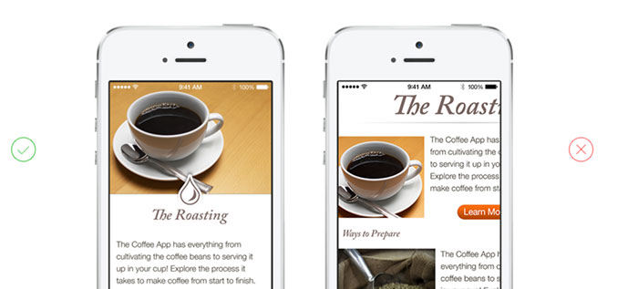
Lets view some examples of good visual hierarchy in the wild. Instagram (below, on the left) puts a clear focus on the photo/video posted by the user. Pinterest (below, on the right), creates visual hierarchy by pinning their search bar to the top followed by their nice grid below. Pinterest is very intentional about having their search box as the first item on the page. Search is the core function of the app, folks use Pinterest to discover and browse.
Lets look at two more examples Spotify (below, on the left) clearly is celebrating the album artwork and song title first and player controls second. Even though the player controls are secondary, Spotify gives more weight to the play and pause button over fast forward and reverse. Facebook (below, on the right), looking very similar to Instagram, chooses to put the content of your friend front and center.
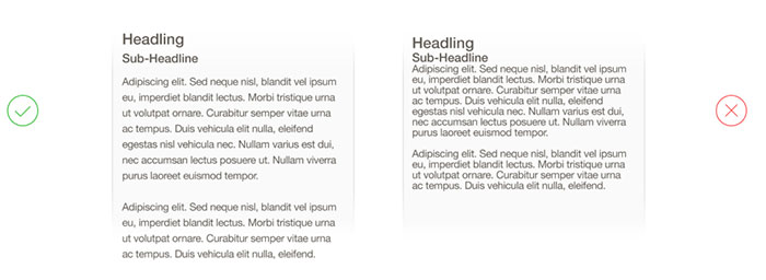
4. Align all the thingsThe fastest way to fix something that feels off or janky is to make sure the alignment is not off. When designers talk about the need to use a “grid” they are trying to alert the team to the issue of mis-alignment. Fixing alignment is one of the easiest improvements we can make to any app or website and instantly makes an app or website look 10x better. 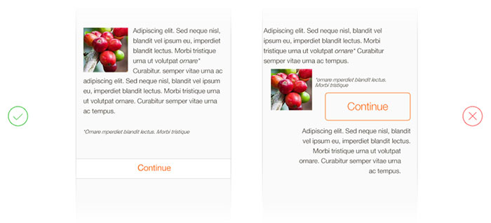
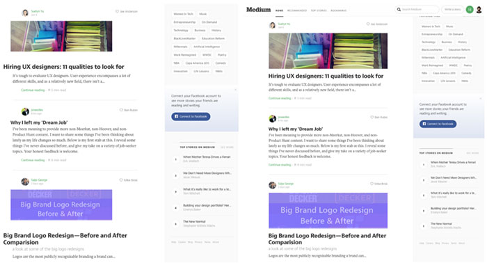
Lets look at another alignment example, this time from medium.com
Here is a web layout I tweaked from Medium.com — how does this look to you? Does anything feel off about this layout? Hint: notice the alignment on the left edge. How does it look? On the left I highlighted the visual river caused by mis-alignment, on the right I simply left aligned all the major content blocks. 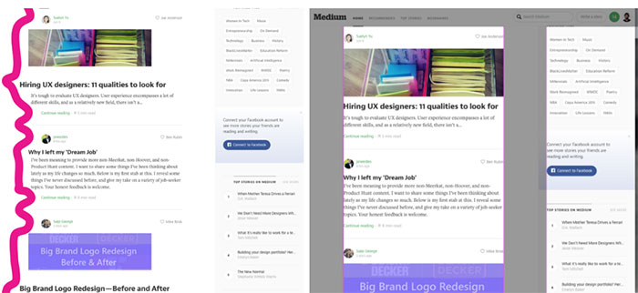
5. Text size with spacingWe are not designing for ants. Increasing font size will make your content much easier to read and digest coupled with some liberal line spacing. 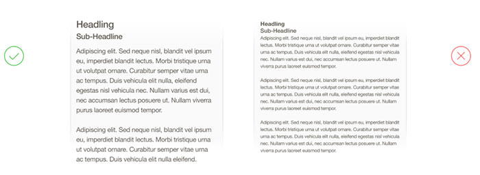
6. Use a list view for results, if order is importantMost mobile and web apps have some type of search and there can be some healthy design debates on how to display the results. If order is important then a list view is most effective. If order doesn’t matter and you would like to encourage discovery (like Pinterest or AirBnB) then a grid view will encourage a gaze pattern to support discovery. 
7. Design in black and white first, add color laterDesigning in black and white will keep the focus on solving and designing the core experience of your app. Color evokes strong emotional responses and often interrupts our ability to focus on the core design problem.
8. Create comfortable designHand strain is a real issue, consider the graphic below from Luke Wroblewski’s amazing article: Responsive Navigation: Optimizing for Touch Across Devices. Luke lays out the areas of a phone that are easiest to reach and use (at least for right handers) — I’d love to see apps have a setting where you can switch the interface from right hand dominant to left hand dominant. Many effective mobile apps keep navigation and core actions in the bottom third of the phone.
9. Borrow Color PalettesColor is a bit of an elusive dark art. I highly recommend heading over to Dribbble and searching for “Color Palettes” or use a color palette generator like Coolors or Color Claim. Save yourself the hours of endless debate and second guessing.
10. Use Apple and Google OS ConventionsApple and Google have created incredible resources for anyone building software for Android or iOS. For example, the Google Material spec has guidelines, resources, colors, icons and components to help jump start the design of your app. Apple has the HIG — their Human Interface Guidelines, which outline everything you need to know on how to design an iOS app. 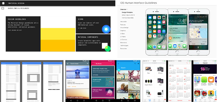
Remember, design takes practiceTraining your eye to look for the design issues takes a bit of time and practice, but you will find the above tips will go a long way to making anything you create better designed. The post How to not suck at design, a 5 minute guide for the non-designer appeared first on Design your way. from http://www.designyourway.net/blog/user-interface-design/how-to-not-suck-at-design/ Client revisions are part of the game, but when #19 finds its way into your in the basket, it’s more than a little annoying. Imagine, your client may like your proposed solution well enough. However, he/she has suddenly come across a “must-have” from another website. Or, perhaps, your client has come to believe that a different set of fonts would better serve the brand. So, the project drags on and on, while other clients are kept waiting. Sometimes, you have to work overtime to avoid missing their deadlines. There is a remedy. It’s called Be Theme. It adapts to any client’s needs – and it will save you a ton of time. Be Theme delivers what your clients needWhat magic does Be Theme possess? This top-5 Themeforest best seller doesn’t rely on tricks to solve your problem. Its wide array of core features, including 260+ pre-built websites, makes the difference. With Be Theme’s pre-built websites, you can satisfy the needs of even the pickiest clients. Moreover, handling those who can never make up their mind will be a breeze. It is easy to start off with a prototype based on a selected pre-designed website. That is all it takes to make your client a believer. See how easily you can install Be Theme by watching this cool 40-second video. Here are 10 Be Theme templates any client can appreciateFor clients selling online courses: Be eLearning A clean, simple, and intuitive website is a nice fit for any business or organization involved in education or learning. Be eLearning is the perfect match for a client offering online courses, or one who has established an eLearning platform. For small business owners: Be Craftbeer This pre-built website lends itself to creating a design that will appeal to any client who sells a handcrafted product. The focus here is on a well-structured design featuring large, eye-catching images, combined with some clever JavaScript effects and attention-getting CTA buttons. For interior designers and architects: Be Tiles It sometimes takes a special style of website to adequately showcase visual work. The example here is destined for an interior design agency or an architect’s firm. The combination of high-quality images, selected graphic elements, and architectural design concepts gives clients the stunning portfolios they’re looking for. For clients working in creative industries: Be Artist Any website designed with creatives or artists in mind, needs to display their work in a unique, compelling way. Be Artist gives you a head start to make that happen. This pre-built website, with its parallax scrolling and JavaScript portfolio filtering capabilities, will help you satisfy the most exquisite tastes. For businesses in the catering industry: Be Burger You wouldn’t dream of designing a website for a food service business without including a few large, mouth-watering images like this one. This pre-built website’s clean structure, intuitive menu design, and easy-to-order form formats will do the trick. For clients in the health & fitness industry: Be Sports club The Be Sports Club pre-built website’s appearance is dynamic, just as is the case with the type of business it represents. It’s also modern and interactive, and it features attention-getting animations and parallax effects in its interior pages. It’s just the right fit for the health and wellness sector. For clients in the travel and lodging industry: Be Hotel2 Travelers typically make a place, and not a hotel, their destination; but a website like this one might inspire them to pick up the phone and make a booking – just to get away from it all. Large images and perfectly-structured sections combine to create a pleasing user experience. For restaurant or bistro owners: Be Restaurant You’ll have to do some serious searching to find another restaurant website like this one. It’s a client’s dream, and this pre-built website can serve as the basis for a 5-star restaurant, or the corner bistro. Note the stunning contribution made by the special effect on the slider. The glass of juice isn’t supposed to be this website’s centerpiece, but it does send a message. IT client’s look for a well-organized, professional-looking website, but even a corporate website will benefit if you introduce a friendly, human touch. For those who sell luxury products: Be Car If a client sells elegant or luxury products, he/she will expect the same qualities in the website. A stunning hero image gets everything off to a great start. Also, a clever use of white space makes navigating to a CTA that much easier. Summary: How does Be Theme relieve you of those endless client revisions? It does so in at least 5 web designer-pleasing ways:
ConclusionRevisions keep piling up? It’s time to say, “Enough is enough”. With Be Theme, you will have over 260 pre-built website themes to choose from. Therefore, you’ll have no problem finding the perfect fit to match a client’s needs – time after time. And, don’t forget how Be Theme’s one-click installer will save you time. Are you tired of spending a week or more trying to satisfy a client who can’t quite make up his mind? Be Theme is here to help you complete an intuitive and responsive website in just half a day. Give Be Theme a try. You’ll never go back. The post How to stop endless stream of client revisions with Be Theme’s 260+ pre-built websites appeared first on Design your way. from http://www.designyourway.net/blog/wp/stop-endless-client-revisions-be-themes-pre-built-websites/ Our work at This Also mostly falls into two categories: product design and product vision. For our product design projects, we work on existing products or platforms and design for near-term launches. We share detailed designs and scrappy prototypes early and often with our client to get the best product to the end consumer. Product vision work, on the other hand, explores what a product, or a platform, could look like in two to five years. The details are less important than presenting a compelling vision of the future. The final audience for this type of work is often an executive with limited time but the ability to make strategic decisions that will allow product teams to pursue innovative work. When tackling these types of complex products, a motion design can be a great tool to organize large teams around core concepts. We’ve found that being faster and more efficient with our tools has freed us to solve problems holistically. In this tutorial, I’ll share a little about how we’ve sped up our workflow to make motion an integral part of our design process. Over time, I’ve even found that I’ll use After Effects as the first tool on a project, since it can be one of the fastest ways to sketch out the structure of a product. There’s no shortage of great motion design and After Effects resources out there, and I’ll be sharing my favorites here (and in this handy link pack). However, I found one of the challenges in developing a UI motion skill set is building a workflow and toolset that will have you working and iterating faster. This is not a how-to, but rather a blueprint of my favorite techniques, tools, and tutorials to help you develop your own practice. Some familiarity with After Effects is helpful, but I’ll also point you to resources help you to get started from scratch. Setting up your Photoshop FileOrganize your file before moving into After Effects If I’m just producing quick motion concepts, then I’ll sketch the UI using solids and shapes in After Effects. But for more polished designs, I always begin in Photoshop. It’s the quickest, most direct way to get a design animated quickly. If you’re primarily a Sketch user, there is workaround involving Illustrator, but I’ll be focusing on Photoshop here. There are two simple but important things to know when setting up your Photoshop file:
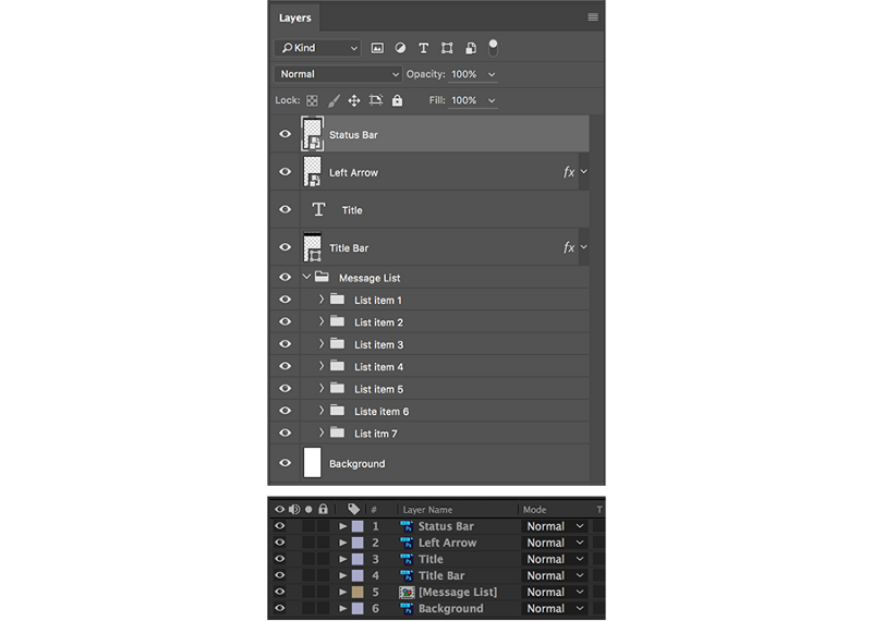
This is a tedious process with no concrete rules, but with enough experience you’ll learn how to quickly and efficiently organize your layers and groups for your own needs. Tip: Add a few empty layers to your Photoshop file before importing. While some changes to Photoshop files will appear in After Effects, there are limitations. The best way to add a new element is to add it to an existing, empty layer in your Photoshop file. Importing into After EffectsKeep an organized folder and project structure When you import a Photoshop file into After Effects you’ll see the following:
Always select Composition -- Retain Layer Sizes and Editable Layer Styles. This imports your file as a composition and includes access to any layer styles you’ve selected in Photoshop. Here, organization is key. After Effects does not play nice with missing files, and you won’t want to spend precious time relinking files. To save yourself a headache:
Lastly, you’ll want to adjust your Composition Settings for your purposes. When working purely with digital assets, and no video, I set the composition as follows:
Generally, we deliver video at 1080p. Setting the Frame Rate to 60 FPS provides a smooth animation and selecting Square Pixels ensures our Photoshop files appear 1:1 in After Effects. Organizing your workspaceThe essential panels and plugins for UI motion Because After Effects was originally developed for video post-production, there are hundreds more features available than you will ever need. Here are the default windows I keep open. Once you set up your workspace, save it so you can always return to your default.
Plugins There are many plugins and scripts out there to accelerate your motion design and AEscripts.com is a great resource. Here are a few plugins I’ve found essential to my process:
Tip: To be sure your plugins will work, open Preferences > General and make sure the box next to Allow Scripts to Write Files and Access Network is checked. Shortcuts Like any software program, mastering shortcuts will improve your speed and workflow. After Effects is a very tedious program to use with a mouse — you’re constantly twirling down properties, moving the playhead, adding keyframes, and so on. Here’s a selection of helpful shortcuts to get started. Animating the UITutorials, resources, and tips As I mentioned before, there’s no shortage of great tutorials and resources out there. Here are just a few of my favorites to get you started:
Start with navigation Approach UI animation just like you’d approach UI design: think about the structure and flow of the product before diving into the details. While the specific animation techniques I use vary widely from project to project, I always start by roughly stringing together the core screens. The key here is to reduce dependencies. Say you’re animating a mobile app where you swipe from screen to screen. You may want to change the timing or order of your screens later without impacting the UI animation of each screen.
To do so, make each screen a separate composition. There are three ways to do this: 1) import each screen as a separate Photoshop file, 2) create a group for each screen in your Photoshop file, or 3) precompose your layers directly in After Effects. Then, by arranging the screens side-by-side and parenting each one to the first screen, you can animate the screens together by only adding two keyframes. Then, animate the details Once I have a good handle on the flow, I’ll start animating the details. Here are a few suggestions and resources for tackling this part of the process:
Tip: In you feel like After Effects is being a bit sluggish try this: Go to Preferences > Media & Disk Cache and select Empty Disk Cache… You can also try allocating more space to your cache if you have space available. ExportingRendering and sharing your drafts and final pieces Like animating, there are many different approaches to rendering and exporting your work, and a lot of opinions on the “best” way to do so. You’ll need to consider your desired quality, output file type, time you have to render, and so on. Here’s a high-level overview of how the basics of exporting. Quick Previews As you work in After Effects, you can preview your animation by using the shortcut designated in the Preview panel (often the Spacebar). However, I usually find myself wanting to get out of the After Effects program to watch my work and to share with my team. As I mentioned above, I like using GifGun to quickly share rough concepts and ideas. Sometimes motion design is an early part of our process — while working on a TV interface, part of our team worked in Photoshop to develop visual design, while I worked in After Effects to explore navigation concepts. Sharing gifs in Slack accelerated our team’s workflow and ideation. If I want to share QuickTime file but not spend a lot of time rendering, I can render at a lesser quality by adding my composition to the Render Queue, selecting Render Settings and choosing a smaller resolution. Final Renders Now, if you’ve ever played around in After Effects and exported a QuickTime file, you may have run into an issue where QuickTime has to convert the file, a process that consumes precious time. To solve this problem, you need to export the video using the H.264 codec.
To do so, add your composition to the Render Queue, click the blue link next to Output Module. Be sure Quicktime is selected in the Formatdropdown and then select Format Options. From the Video Codecdropdown, select H.264. After selecting OK twice, you’ll notice the Output Module now says Custom: QuickTime. However, this will only apply to this render. To apply to all your renders in the future, you’ll want to create a custom Output Module Template. This isn’t a straightforward process, so here’s a good overview tutorial. Once you get a handle on creating your own templates, however, you’ll be able to streamline your exporting process and spend less time in messing with the settings. Tip: If you’re working on very complicated, long, or 3D-heavy animations and have access to multiple machines, you may want to consider network rendering. These basic workflow principles will help you work more quickly and efficiently in After Effects. With enough fluency in the tools and methods, motion design can become a key part of your design process. Not only will you be able to produce polished, slick videos, but you’ll also have another tool at your disposal to tackle the challenges of UI design. Here’s a link pack of all the resources mentioned here. The post Getting started with UI motion design appeared first on Design your way. from http://www.designyourway.net/blog/inspiration/getting-started-ui-motion-design/ Google APIs can be categorized in many different ways, but most experts in the industry tend to divide them in three separate groups: – The HTTP APIs (RPC-based Geocoding API, RESTful Google Data API, SOAP AdWords APIs) that are interacted with directly from our server’s side; Each and every conversation on APIs and why they’re useful ends up with a simple question: Why does Google offer such at the first place? It would be an easy question to answer if all APIs were to be paid for, as Google would earn plenty from enhanced websites where people click on ads. Another important reason is branding awareness (the rule of thumb says, each time you see a Google logo or a map embedded on a website you tend to tryst it more). On the user’s side of the story, APIs provide end-to-end data control, as there is a dedicated Data Liberation Front team that ensures users can import/export data easily, use developer-ready extensions, and make their products more visible on Google. Gmail API
Gmail APIs are in fact RESTful APIs developers use to access correspondence via Gmail inboxes. Basically, if you run a popular website or a mobile/web application, Gmail APIs are the only way to access your users’ Gmail data in an authorized way. The access Gmail APIs provide is flexible and easy, with an interface reminiscent of how Messages, Labels, Threads, Drafts, and History are displayed in a Google inbox. The very same APIs allow you to include other features such as:
In order to start using Gmail API, you will only need access to the client library suitable for your language, and an app that is able to authenticate itself as a regular Gmail user. When do you use Gmail APIs? There are many types of web and mobile apps that can use Gmail APIs, including:
Gmail APIs are in fact a web service based on RESTful APIs with a specific JSON payload. In this part of the article, we are providing a complete overview of these APIs and their intended use, while for more details, we recommend you to refer directly to Google’s API references. Google BigQuery API
When you don’t have the right software and hardware, querying and storing large datasets can be a daunting and expensive process. Google solved this problem with an enterprise-grade data warehouse called Google BigQuery, as the API enables rocket-fast SQL queries to process this data within Google’s standard infrastructure. All you have to do is to transfer information to BigQuery, and let it handle the heavy lifting. At the same time, you will be able to control how data is processed and whether it meets your business needs, and apply unique processes that would produce metrics valuable to you. The core value of Google BigQuery is that you can run the SQL queries for as many long datasets as you have or, as the company points out, process as many as billion rows at a time. We recommend BigQuery for users that process numerous big, append-only charts, as there are many tools that can be useful to them (the REST API, the bq command lines, Google App Scripts, and so on). Google Books API
Google’s Books Family also provides users with open APIs allowing them to use its features within their site or application. This means that you can perform most operations programmatically, and interact in a lot of useful ways with Google Books’ website. For instance, there will be an embedded Viewer API that allows direct content transfers from one website to the other. Google is continuously working on making information accessible and easy to understand, and that’s exactly the point of introducing API for the purpose. You need to understand, however, that most of the data used to power up Google Books is licensed, and cannot be distributed in a way Google would find convenient. Another important thing to remember is that Google Books APIs are not classical replacements for commercial service ads. Google still reputes such services as its main source of profit and basis for building public APIs. You can find the Terms of Service for Google APIs on the following link: https://developer.google.com/books/terms.html. Each attempt to violate these terms will result in user suspension, and may be due to legal actions and remedies. Calendar API
Google Calendar is another extremely popular app used by millions, and an interactive and smart calendar that helps you schedule and remember events. The app also offers Open API for you to connect it to your app, and make sure users have new ways to engage with the service you provide them. As an example, the owner of a hiking app can use these APIs to schedule the roots on users’ Google Calendar. How do Calendar APIs integrate with your web and mobile apps? They are often used to find and check public calendar events. With the right authorization, the user will also be able to reach and edit private calendars and add events. Calendar APIs also help deepen the integration with Google Calendar, as both web and mobile systems will be able to sync data completely between the apps. Last, but not least Google’s Calendar APIs let you create, edit, and display important events and tweak a variety of calendar-related elements. Check Google’s repository for more documents on how to use them with different programming languages (they work well with NodeJs, Java, Java Script, .NET, PHP, Python, iOS, Ruby, Android, and Go). Google Classroom API
If you want mission control for your classes, look no further than Google Classroom. The service is free for both students and teachers, and enables them to create courses, distribute content and tasks, provide feedback, and gather their data under the same roof. Basically, it makes learning easy, instant, and completely paperless. With Google’s classroom APIs, users can integrate their domains and accounts into a single education app from where they will organize and hold classes, prepare aliases, and distribute invitations for students, teachers, and other interested parties. Student’s roasters are managed through a REST interface, while access to the classroom is governed with OAuth 2.0. Google Custom Search
Custom Search are JSON/Atom APIs for developers that let them enhance their apps and websites with the capacity to display and retrieve original Google search results. Using the API, you will have all results displayed in Atom and JSON formats. How does it work? Google’s Custom Search Engine is in fact a RESTful API service for developers used to locate and display search result data in both Atom and JSON formats. On the developer’s behalf, this means empowering any app/website to serve clients by searching and collecting data available on Google. Google Drive API
We all know and like Google Drive, the world’s best rated cloud storage app that works with files in all formats, and saves them automatically on the Internet. The SDK service also offers APIs of its own (HTTP ones) for developers to sync files stored in Google Drive with third-party websites and applications. Consequently, the user will have the possibility to enable streamlined interaction between multiple apps and services, with his files being located on a single cloud location. Google Fit API
Fit is another of Google’s open-to-use ecosystems, this time used to upload lifestyle and fitness data within a central repository. This means that users will have all of their data concentrated in a single location, and will be able to access it from any device:
If planning to develop a wellness, lifestyle, or fitness app, you also have to consider a mechanism for gathering meaningful user information. These are the principles you should have in mind:
Google Font API
This set of developer API makes Google Fonts metadata available to all users, so that they can query fonts and create dynamic fonts with them. The REST APIs provide fonts as JSON data, and make sure each family will get a list of available styles and scripts their app supports (or Font subsets, as they’re also known). You will also be able to sort out family lists alphabetically, by styles, trends, dates, or popularity rates. Upon need, you can always expand the lists with more data. You can use Google’s Font API for any type of website, and benefit from some of its numerous advantages: cross-browser functionality, ease of use, open-source and top quality fonts, and so on. You can even add a link to special style sheets directly on the HTML document, and then refer users to the same font in CSS style. You will also have numerous font libraries open to use: to start with, there is the Google’s Font Directory and the JavaScript WebFont Loader co-developed by TypeKit. Google Genomics API
Google Genomics APIs are used by developers to store, explore, share and process DNA information across Google’s in-cloud ecosystem. These APIs were designed to handle different reference-based alignments, DNA sequence reads, and variant calls. The toolset was controlled by the Global Alliance for Genomics and Health, and is only compliant with selected types of software. Google Identity Toolkit API
The best-known Google APIs are probably the authentication ones, namely the company’s secure sign-in system that ensures users won’t have to log in separately in order to use different Google Apps. In practice, this means signing in to your Google account, and being able to use Google+, Gmail, Google Calendar, Play Store, YouTube, and similar services. On the developer’s side, Google Sign-In ensures easy and streamlined connection to users and customers, as they will be provided with a secure payment method (Android Pay), and enabled to import contact data automatically and share it with other Google contacts. These APIs are foremost user-centric ones, which means there is a lot of functionality left to the user to tweak and convert to his needs. Google Monitoring API
Google’s monitoring APIs are known as The Stackdriver Monitoring API v3, and make sure developers will be able to access900 Stackdriver Metrics from Google Cloud and also Amazon Web Services. There is an open possibility to create your own custom metrics, and organize and group resources in a way which is convenient for you. The monitoring APIs also let developers integrate them with other applications, and use a variety of unique methods such as calculating data costs, retrieving information, managing contacts, fixing users issues, and many more.
The post Google APIs That You Can Use appeared first on Design your way. from http://www.designyourway.net/blog/resources/google-apis/ |

AuthorPleasure to introduce myself I am Jamie 27 years old living in Searcy, AR. I am web developer and have developed over 50 sites for clients. Now a days I am focused on designing as I feel I am lacking it. Archives
April 2019
Categories |
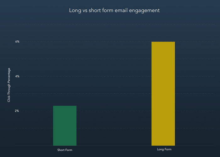
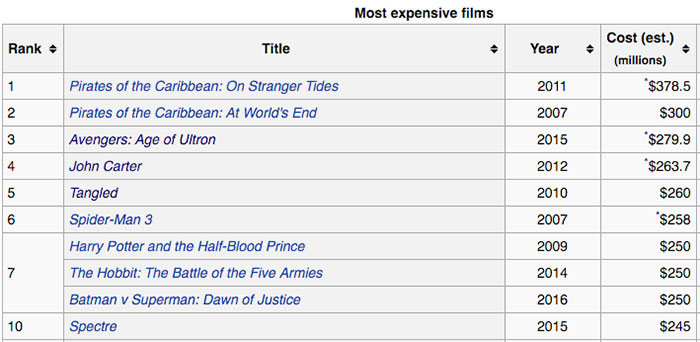
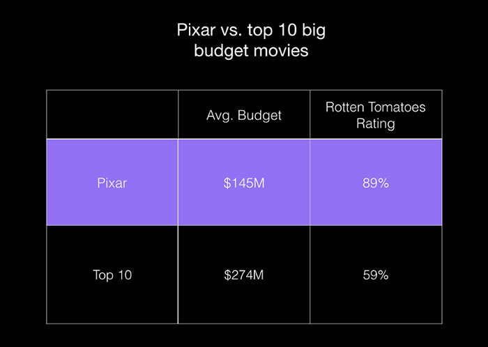
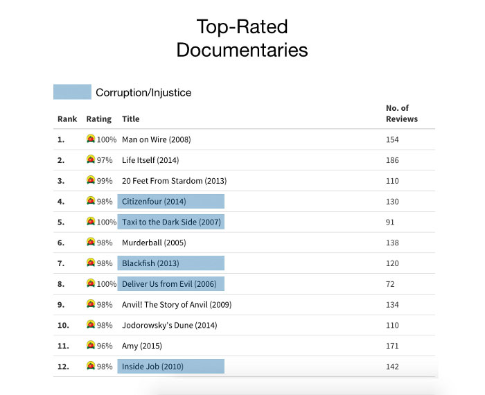
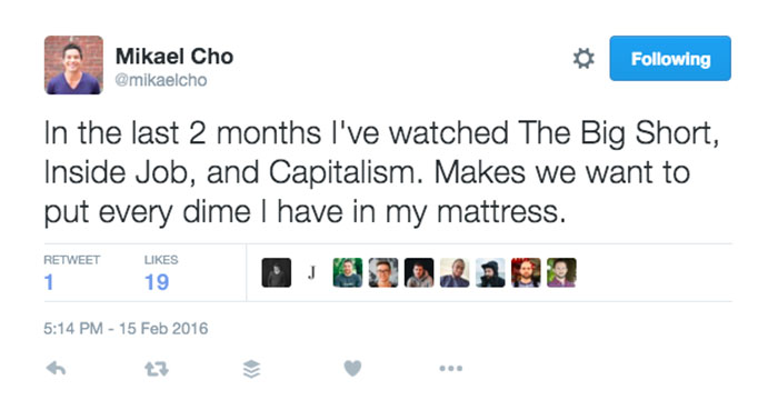
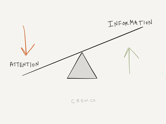
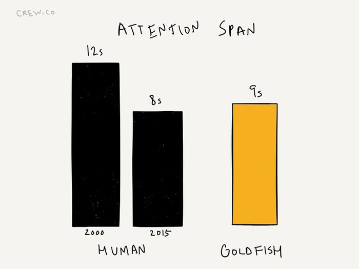
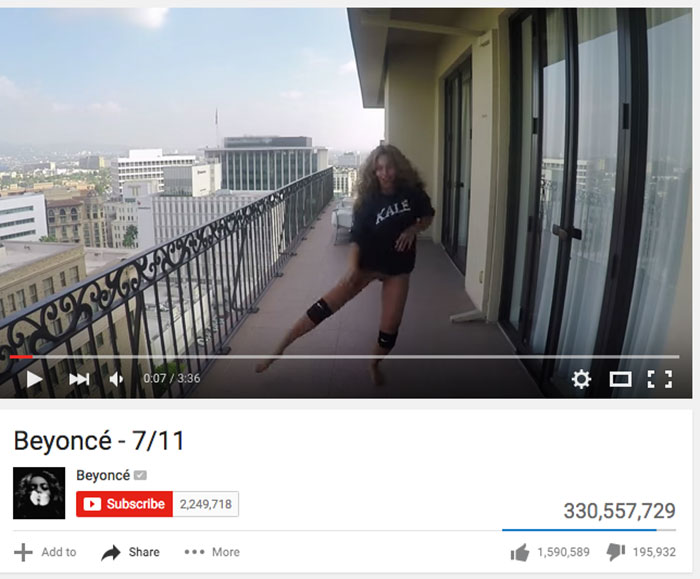

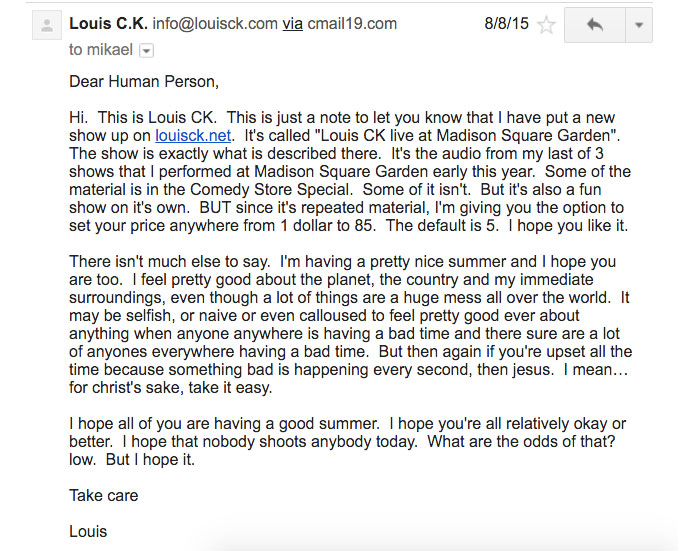
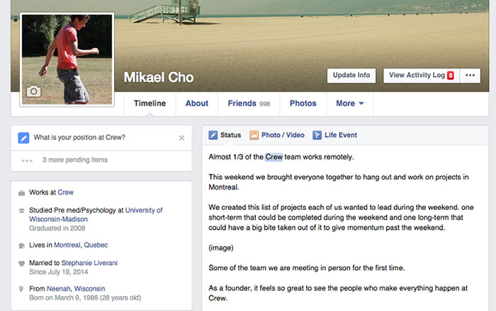
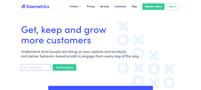
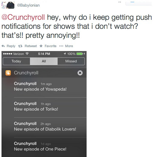
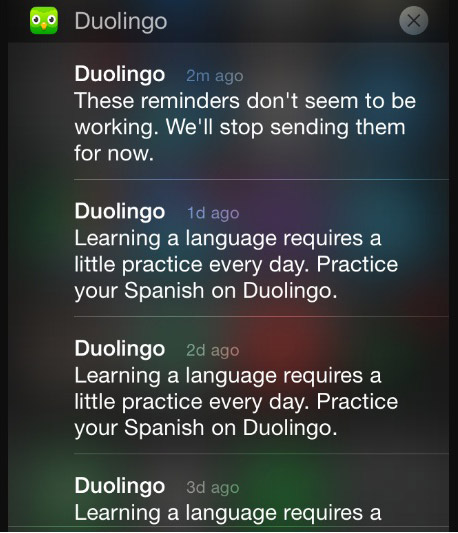
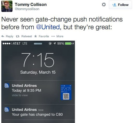
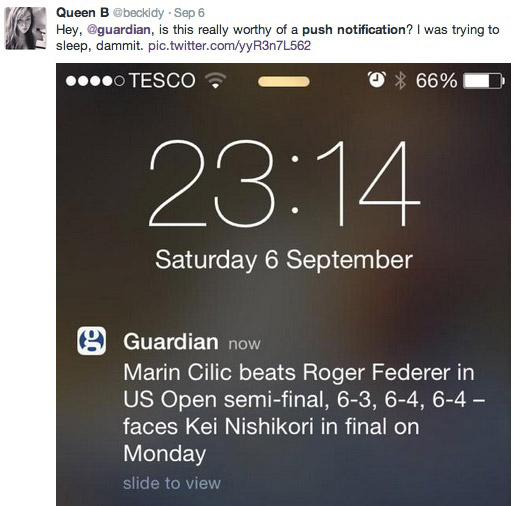
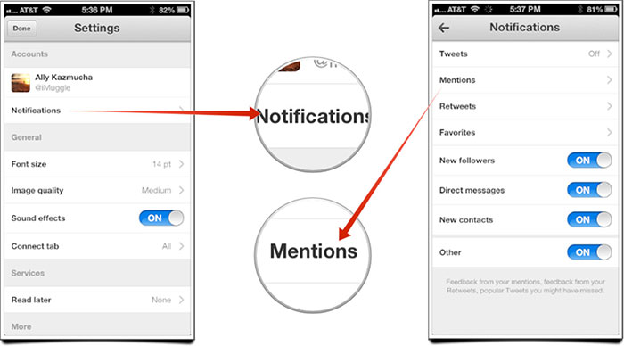

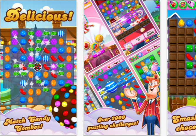
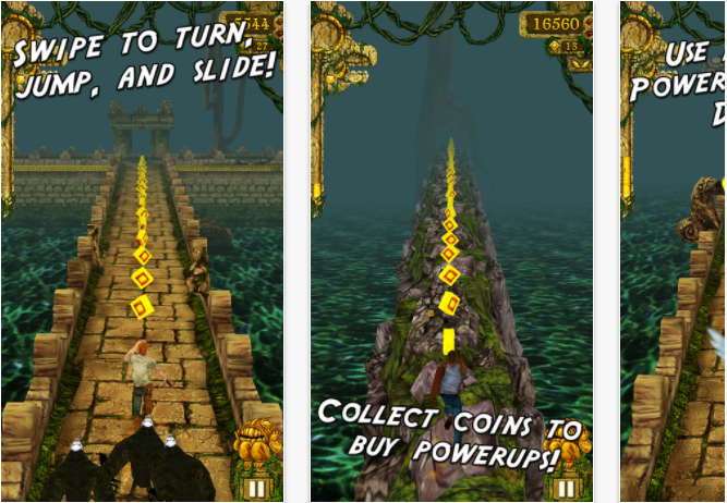
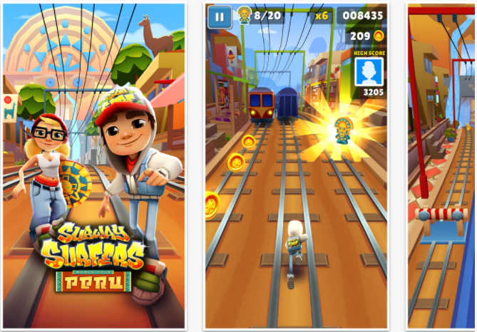
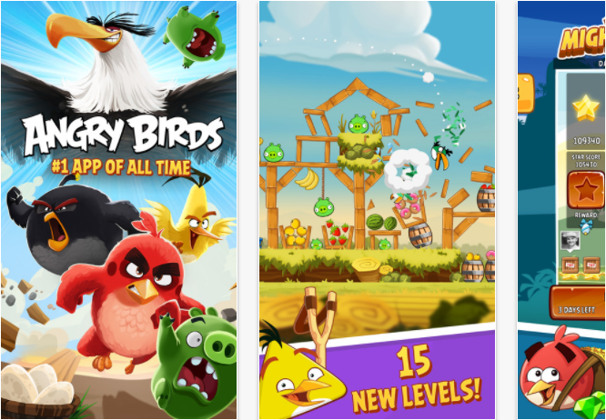
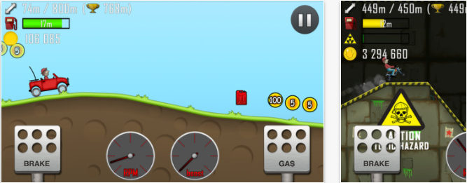
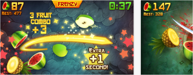
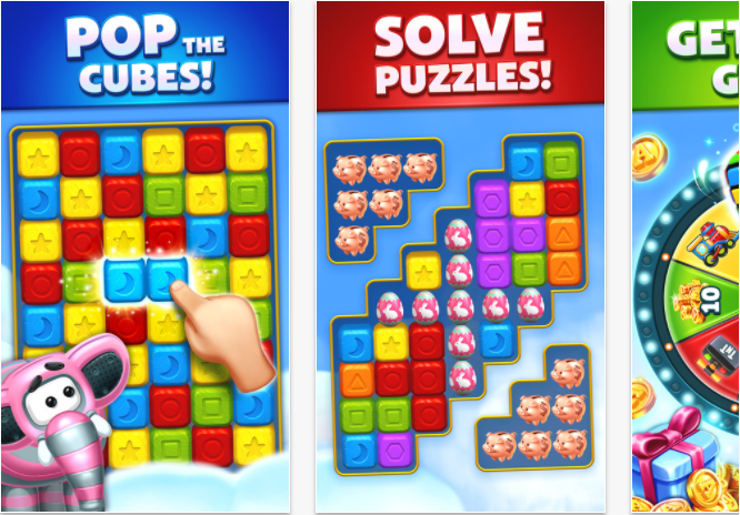

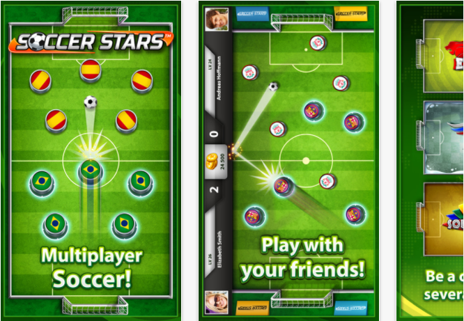
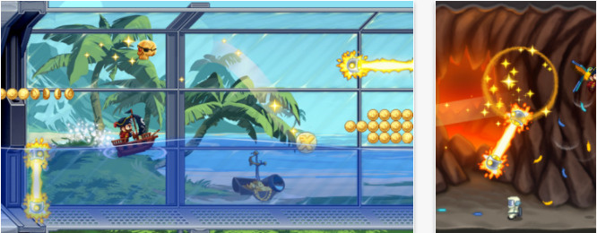
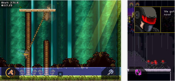
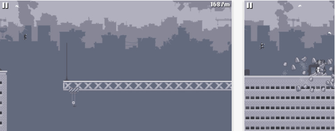
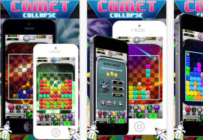
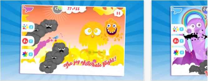
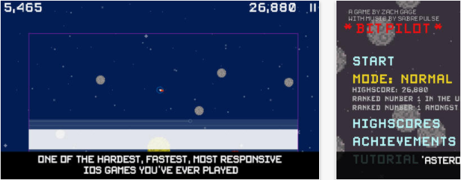
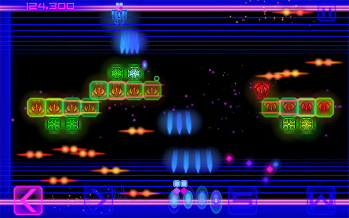
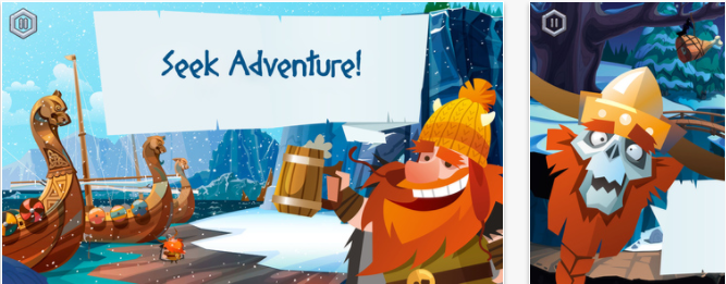
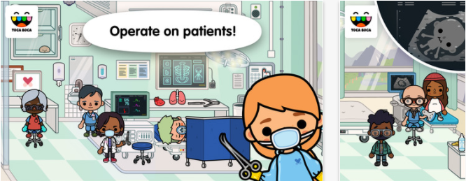
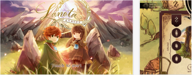
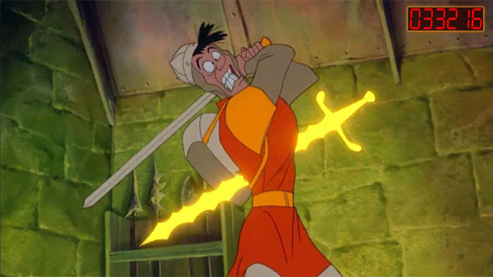
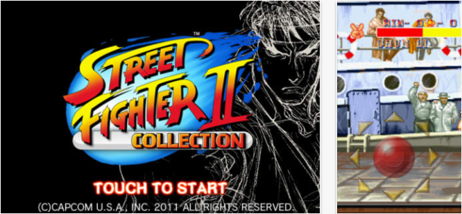
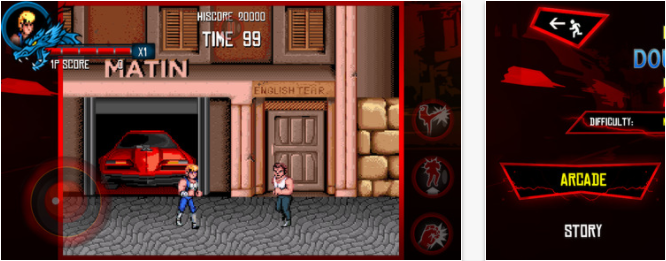
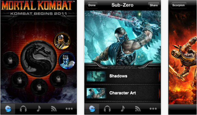
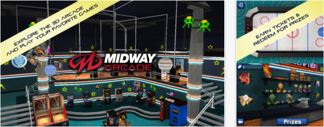
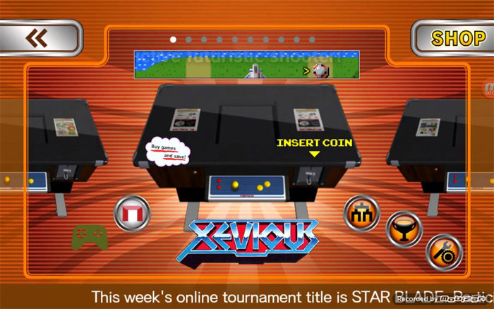
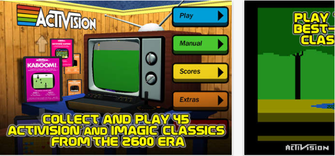
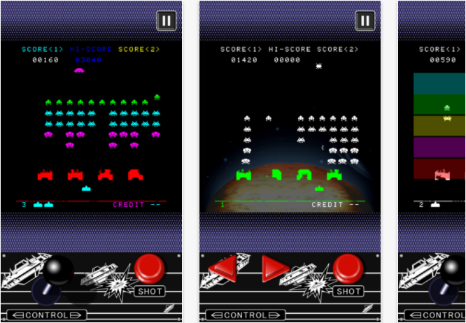
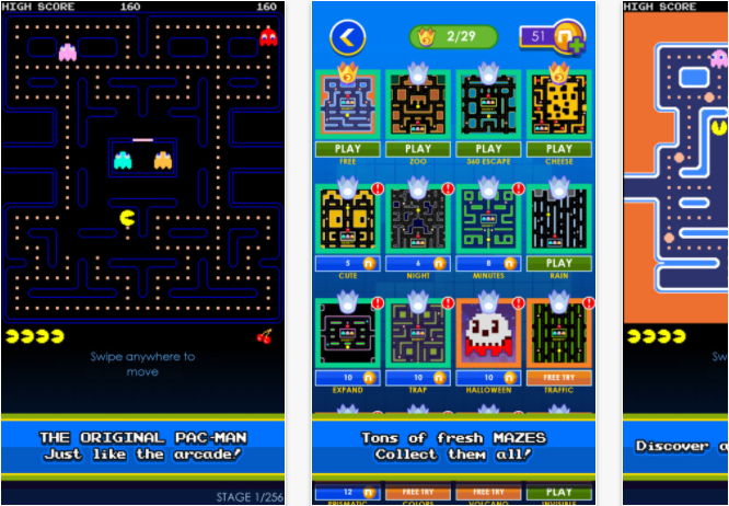
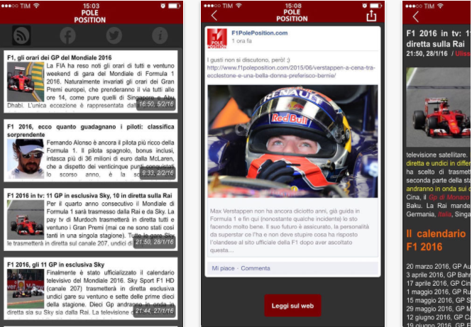
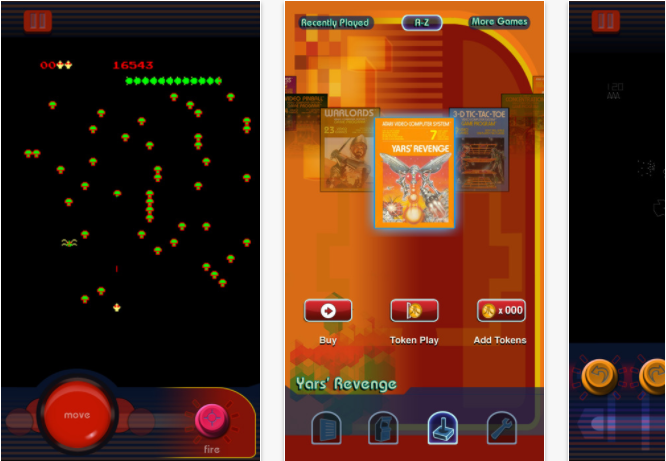
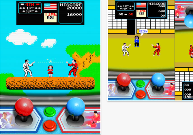
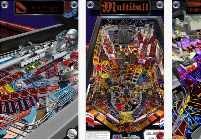
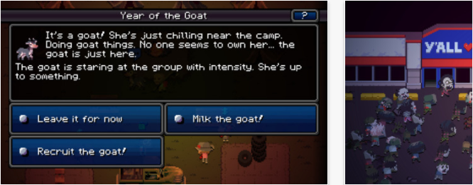
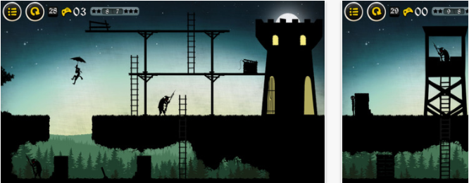
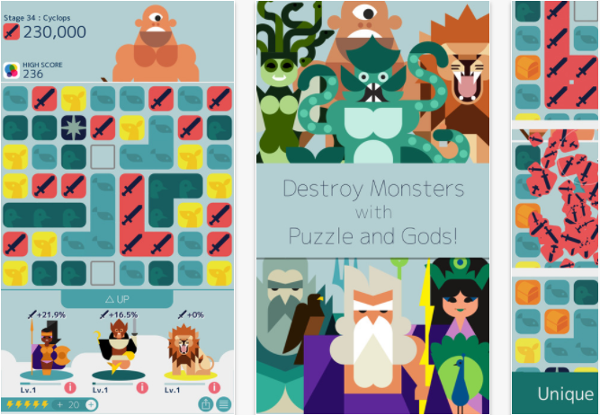
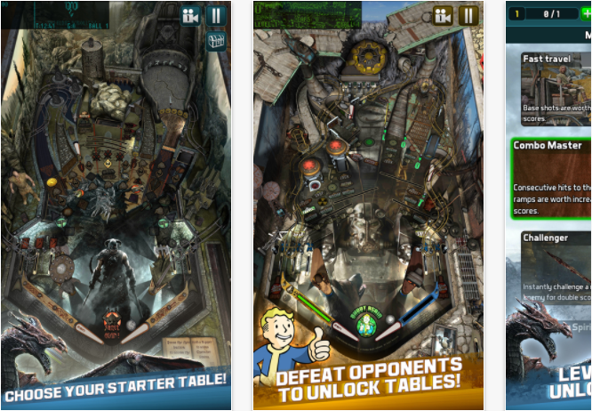
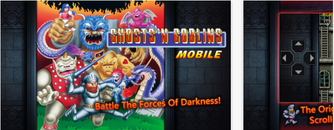
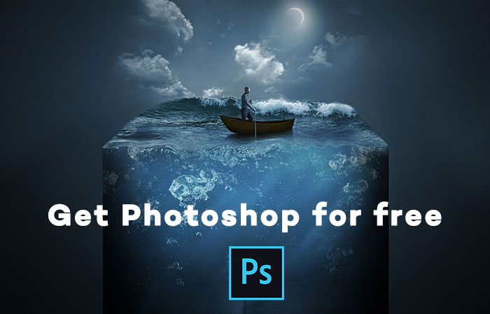
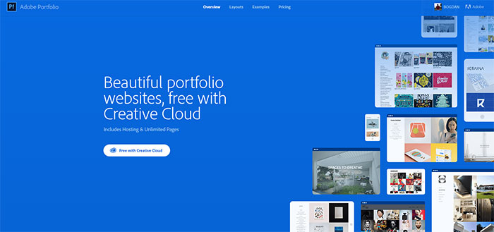
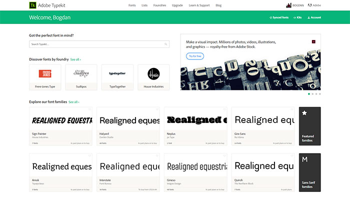


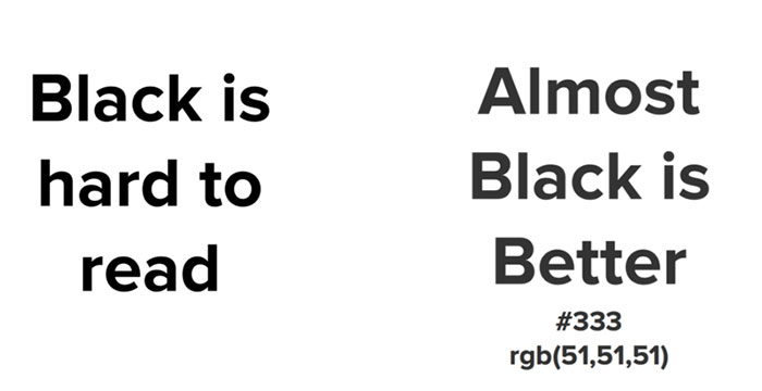
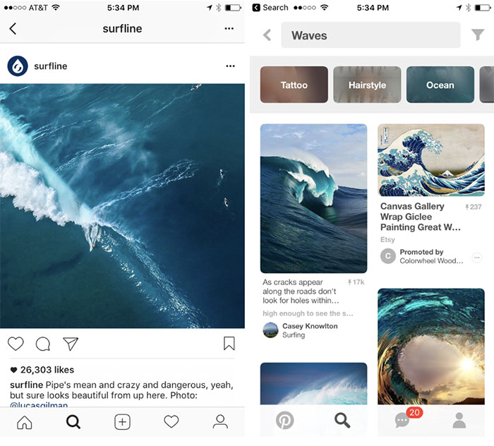
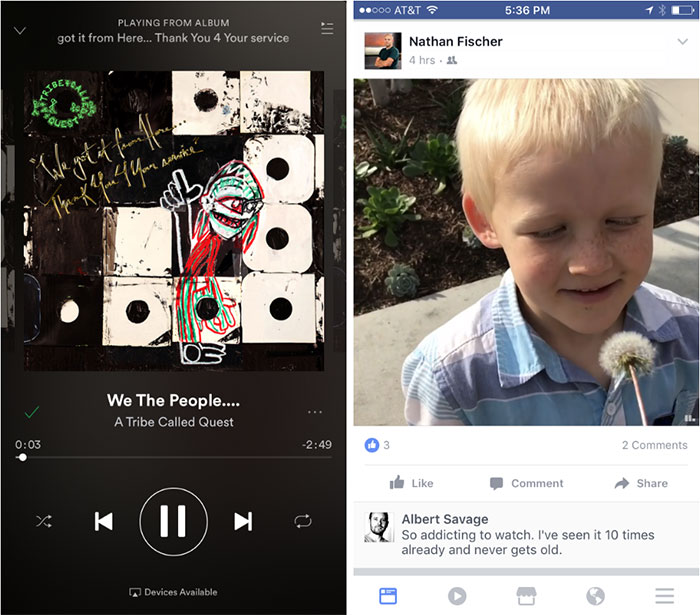
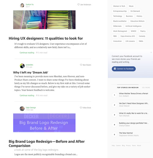
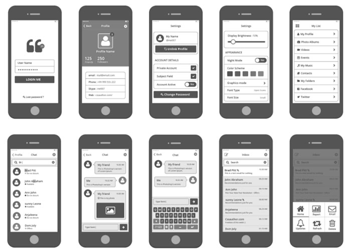
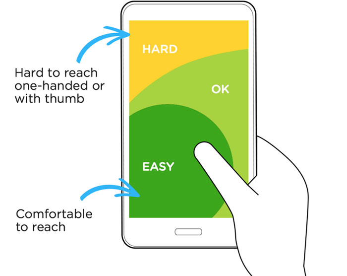
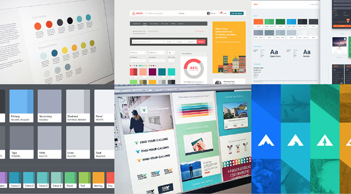

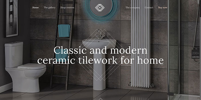
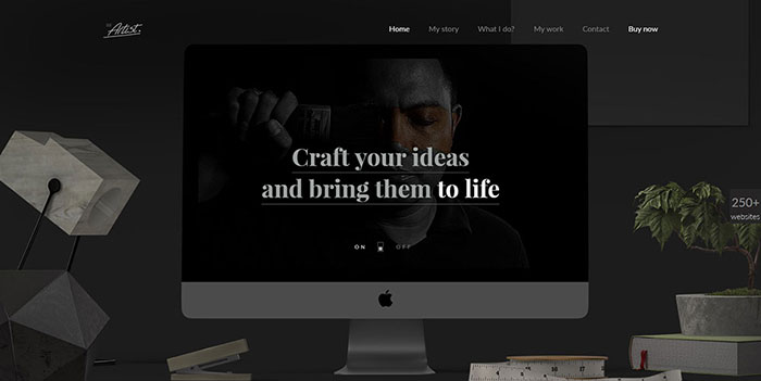
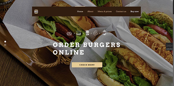

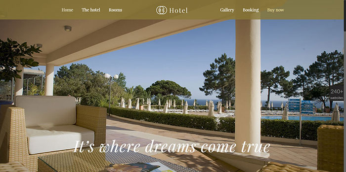
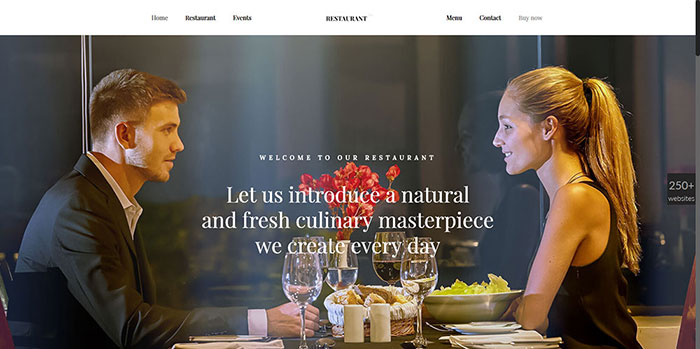
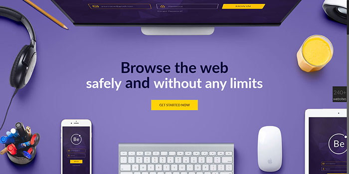
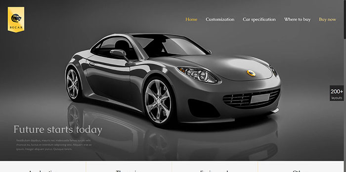

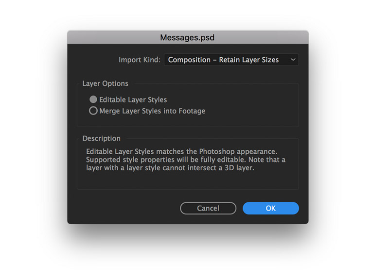
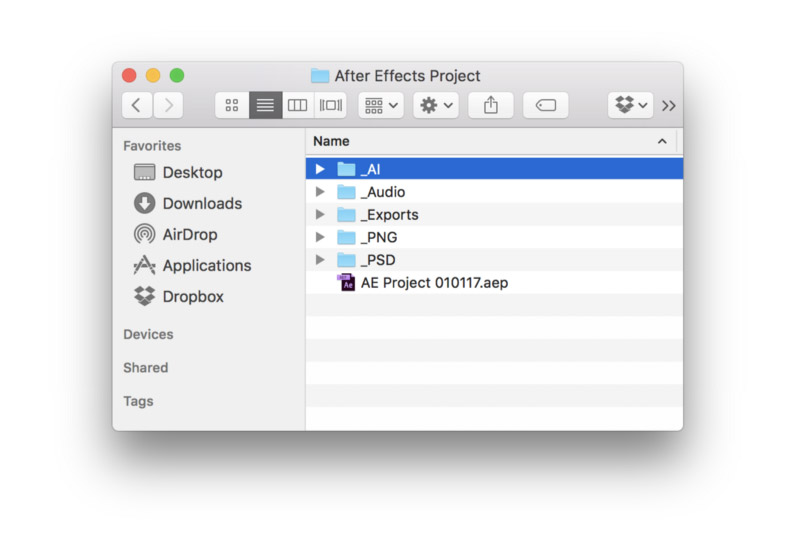
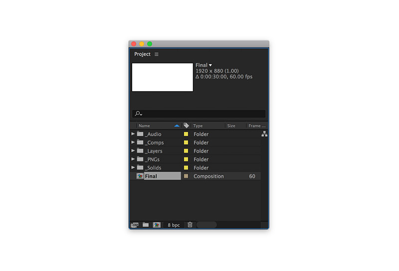
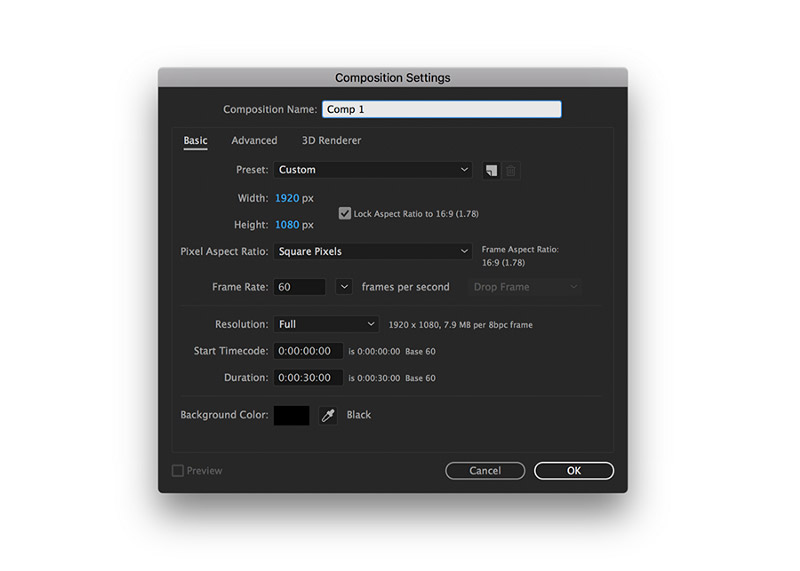


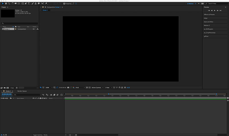
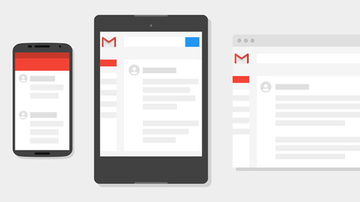


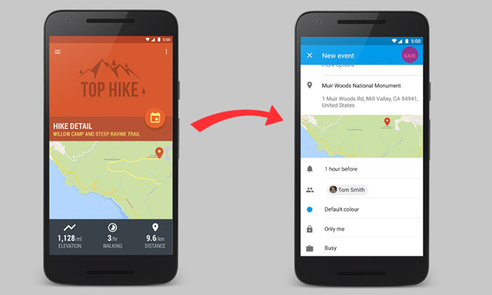


 RSS Feed
