|
Designing a restaurant logo? How hard can it be do design one? Just throw a theme icon, use a fancy font and you’re done. Or, are you? Nowadays, we are overwhelmed by fancy restaurants, fast food joints, diners, bistros, coffee points, and bars to luxurious 5-star restaurants. In fact, if you are a food aficionado, you may find it difficult to choose from all their dreamy, leery, and drooling offerings. There is no doubt that restaurants are undergoing their oversaturation era, but at the same time, it is only few of them that become viable brands and genuinely offer something to remember. At the end of the day, gastronomy is a very competitive business, and unless you make a dramatically good impression you may end up neglected until you transform your brand entirely. It is because people, regardless of being taught not to judge books by their cover, still opt for what is visually attractive, and in the case of restaurants, that’s nothing other than successful branding. Restaurant logos are the shortcut to sales turnover, as it is exactly the logo that causes customers to draw conclusions and form opinions before they’ve visited the place and tried the specialties it offers. This is why gastronomy venues are competing harshly into coming up with the best restaurant logo designs, and choose inspiring symbols customers would be able to identify with. It is also logos that set up the ground for a loyal customer base, becoming easily an effective and recognizable marketing tool nationally, or in the best case, internationally. It is not rare to find an outstanding performer in the industry that made millions thanks to a captivating logo, and luckily – designers are more inspired than ever to outdo this success. Are you looking for restaurant logo ideas? To help you find those, we’ve assembled the best and most inspiring examples, and we are sure you can find something that suits your taste. How is an elegant logo supposed to look like?
Had we had to select the most widely used restaurant logo in the world, we’d opt the Italian flag restaurant logo, as it is exactly national cuisine what most caterers choose as their theme. Therefore, logos are designed around French, Japanese, Chinese, Mexican, Arabic, and other national flags and symbols, to give customers an idea of what they’d be offered when going there. Another common practice is to choose a logo that displays the specialties themselves, including rolls, sushi, seafood, and – of course – pizza!
Informing prospective clients on what they’re about to get has always been a smart marketing strategy, which is also why certain caterers choose logos that resemble their style and specifics. This is a complicated process, as a restaurant logo with a crown will hardly be enough to convey a truly personalized message. Based on the results you want to achieve, you will be supposed to choose suitable fonts, colours, and icons, and test the logo multiple times before you release the official version. Time to create your own restaurant logo
Restaurant logos and names are an inspiring task for creative designers, and it often takes as little as a sudden idea to intrigue customers and create a profitable business. Look around, and you will soon be inspired to create something no one else did, but be ready to invest both time and money to get there.
With the right budget in place, you can hire a professional designer, or organize a tender to select the best candidates. In an even better scenario, you can sketch your own draft, and hand it in to a professional editor who will turn it into a usable product. Creating the perfect restaurant logo for your business – Tips & TricksThe first place to look at will obviously be the Internet, but you may soon end up wrapped within thousands of good logos, and not being able to decide. Most of the ideas you’ll be suggested are typographical restaurant logo and names structures, with or without an icon that reveals the main specialty. At this point, restaurant logo design will look much simpler than it actually is, because you haven’t reached the stage of injecting some character into it. Restaurant logos with stylish icons
When used and positioned properly, stylish icons can make any logo memorable. The more specific you intend to go; the harder it will become to plot the shapes you need. As much as you try, you can’t make a logo ‘say’ everything you wish your customers knew, but what you can do is make them conclude that without an overdone image. The icon checklist goes as follows:
Restaurant logos – Monogram style
The beauty and class of monograms can’t be surpassed, but in order to use one on your restaurant logo you must work with a skilled artist. Not that many people know how to handle elegant typography, especially with more than 3 letters to include in a small logo. Choosing a cool font and calling it a day won’t be enough. The monogram logo checklist goes as follows
Restaurant logos for fast food venues
It is easy to get inspired here – Subway, McDonalds, Burger King, Pizza Hut – you name it! On one thing we can all certainly agree – these logos are ‘easy’, happy, and inviting. There is nothing retro, alternative, or luxurious about them and, well, that’s what makes them stand out. Observing carefully, you will see that all of their colours are cheerful and energetic, namely yellow, orange, and red. The checklist for fast food logos goes as follows
Restaurant logos colors
Colors are another decisive factor in logo design, namely the one that influences the most how customers will feel about your brand. In this aspect, you have to think of ideas that contribute to the style and purpose of your restaurant, and give each chosen color a specific connotation that resembles your location and the specifications of the audience you’re targeting.
While it is absolutely desirable to use vivid and energetic colors, you should avoid shades that are too bright, and stick to those viewers can relate to natural and healthy dishes (green, in particular). Refreshing colors will also give your restaurant a more approachable and inviting vibe. If you want your restaurant logo to breathe our style and elegance, your first choice should be muted reds, warm browns, or the always fashionable black and white combination. If using more than one tone, make sure the amounts are balanced, and try the combination in advance to get an overview on how it is about to look in different printed mediums. At the same time, there are specific colors recommended for each sector and industry, and you should look at those before you make a decision. Millions-worth brands and their logos
In the next section, we will share key takeaways from the 100 leading and most expensive brands worldwide to see how they’ve become the masters of successful logo design. More often than rare, these companies spend millions (billions) on enhancing their branding strategy, and their manoeuvre of colors is always a good place to draw conclusions. In most cases, they use restricted palettes compelled from primary and secondary colors, and choose only such shades that have a positive impact on human cognition. Logo fonts
When designing a logo for your restaurant, you should also be careful with the fonts and slogans you’re using. The best way to go is to skip text altogether, but if you believe that incorporating it will make a crucial difference, you should try out different combinations, and make a decision based on simplicity, legibility, and style compliance. With a font that is hard to read, for instance, the entire professional image of the logo (and the reputation of your business) will be put in danger. Simplicity is also very important, as the same logo will be replicated on other promotional material, including the napkins and the table cloths. This means that you will have to compromise on details despite of thinking that your logo may not be attractive enough. Here’s a collection of fonts for logos that might help you. Logo shapes
In restaurant branding, it is of critical importance to use the appropriate symbols, and make sure customers will recognize your venue wherever they see it. This is where simplicity plays an even more important role. The general approach of successful marketers is to use basic geometric shapes, and to combine them with suitable fonts and colors to strike a memorable balance. This is because straightforward logos are more intriguing for the eye, and they support the concept of easy brand recognition. Even when thinking of associating your logo with a location symbol (think of a restaurant logo with palm tree), the concept of maximized simplicity remains valid. Proper restaurant logo sizing
An interesting way to experiment with your restaurant logo without bundling several elements in is to use different sizes. To decide on this matter, you need to have a clear idea on which features are most important, and should therefore be made bigger. Depending on owners’ preferences, these can be the icons, the names, the symbols, or any other element supposed to draw attention towards the logo. Basically, it is your sizing and tweaking approach that will be decisive on what customers will look at, and eventually remember.
Proper sizing is even more important from the applicability aspect – the only acceptable restaurant logo is the one you can resize easily, and without having to change anything about its original design layout. In fact, this is how popular restaurants get to appear in all promotional sites without additional efforts. If not really sure how to size a logo properly, consult a designer, or learn more on how to use vector graphics, and to scale icons while preserving their resolution. Ensuring reliability
The reason why we’re encouraging you to use memorable logo elements is that those will become your symbols of recognition in future. Therefore, they mustn’t be overly complicated and difficult to spot.
Take Nike or Coca Cola as examples – what they and thousands of other extremely popular logos have in common is consistency, and it is consistency that makes them timeless regardless of all emerging marketing trends. Taking restaurant logos from paper to screen
The best way to go is to draft your future restaurant logo on paper, and use the same sketch to gradually perfect it. It will take more time, but you won’t be in a rush to polish it to foresee the final result, and you can easily add/remove elements upon need.
Of course, you can always turn to graphic programs and solutions and craft your design there, then scan the sample on your device, and use it as a rough sketch you can modify upon need. Dynamic logos – Yes or no?
An overview of today’s most popular logo design trends will reveal that it is dynamic designs that are the most favoured and effective ones, compared to their traditional, static counterparts. The reasons are quite self-explanatory: with a dynamic logo, you’re offering the viewer an engaging flow and more visual interest, and you are more likely to preserve his attention. With a business to run, you will also strive towards a modern, dynamic solution, so that you can change it and adjust it upon need. Before you do that, however, there are few implications you have to consider.
Are you ready to engage in interactive communication? Do you have enough experience with such applications? Do you offer a variety of services that need to be distinguished between? If so, a dynamic logo design is an idea you should definitely consider. Optimize the value of your logo, and define your expectations, but don’t forget that a static logo also has a lot to offer. You must keep both in the loop if you want your design process to succeed. Investing in a good logo
Unless you have a fortune and don’t mind spending it on a logo, work around a balanced and reasonable budget, and adjust your expectations to it. The most affordable scenario is to craft a logo of your own using a free maker service, as long as that service provides all the features you need and intend to include.
The vast database of sources and solutions is of course the Internet, where you can choose downloadable and ready-to-use design templates, and make quick changes of the colors, fonts, and textures to make the logo unique. If you don’t have enough experience to create your own restaurant logo, your best bet is to entrust it to a talented and experienced professional. Ownership issuesUnique or not, the logo becomes the restaurant’s main branding tool, and is to be applied and involved in a variety of business operations. This is why we advice all creative designers (including experienced ones), to research and consult other professionals on trademark and copyright limitations. It is imperative to understand how far you can go with your restaurant logo design, so that you will stay on the safe side and avoid legal issues that could affect your reputation. Ending thoughts on restaurant logosLet’s face it – you can’t become a great logo designer without hours of trial and correcting errors, and you have to go the long mile until you produce that one restaurant logo that can symbolize your brand. The effort, however, pays off. Luckily for aspiring designers, there are many online tutorials and guides that can prepare them for this process, including our list of tricks that assembles the best practices in restaurant logo design. Launch your awesome logo design process today, and don’t be afraid to experiment. If necessarily, hire professional help and editors that will ensure that your work is perfect. Before you decide, make few different drafts of each element, and check whether they are suitable to your style and message. Consider all factors involved in the logo design process, and most of all – enjoy yourself! If you liked this article about restaurant logos, check out these as well:
The post Restaurant Logo Designs: Tips, Best Practices, and Inspiration appeared first on Design your way. from http://www.designyourway.net/blog/inspiration/restaurant-logo-designs/
0 Comments
When you want to know how to design a poster, regardless if we’re talking about concert posters, gig posters, or any other show posters, there is no better option than looking at what the pros do. And that’s exactly what we did. Regardless of whether you’re doing work for a client, you should have a good poster design that conveys the right information, and at the same time appeals to the aesthetic tastes of the audience. This is especially important for a music poster design, concert poster design, or event poster design ideas. The first piece of critical information is knowing your audience, as well as the product or service, or event. The mood and emotion, or reaction, will tell you all about the fonts, colors and graphics that you should use when you want to create a poster, and you will have a good start point on how to design a poster for that specific situation. Use color to attract attention and create energy
One of the aspects of a wide open design is color. It will elicit a mood, and attract the eye. Depending on what subject you have and the poster layout, you can choose from bold, romantic or subtle colors. Going all out is also an option. Another one of the cool poster ideas is to use solid color blocks. Make sure they work together well, and you’ll have a striking background. Typography is something you can experiment with
Fonts can convey a lot of things in a poster, especially in concert posters. When you’re looking at poster design ideas, or poster layout ideas, you will find that a lot of good posters enhance elegance with an italic serif, or show a serious tone with a bold sans serif. Choose at least two fonts, one for the headline, and another one for body copy. If you want to achieve greater impact, experiment with typography. If you’re making band posters, choose a template that matches their style
If you have an R&B band, make a clean, smooth poster. Use cool silhouettes and smooth lines, as they will help you describe the gig’s atmosphere, and attract the right audience. On the other hand, a punk rock band would most likely opt for choppy word type, graffiti, and a grungy overall look. Consider going with a black background
Even though some might push colors, when it comes to creative posters, you can do a lot with a black background. It is sleek and professional looking, especially in music. What do most bands have behind them at a live show? That’s right, a black backdrop. This is the same concept. Just add the bright lights and flashy wording to get your audience into party mode, and they’ll most likely show up. The selection and treatment of images will make or break the concert poster
A template with a single image is much less cluttered. One large image that draws attention is a good option, or go for one small images, and a lot of white space that will awaken curiosity in the readers. For example, a vintage flyer or ad is nowadays pretty popular, where a 1950s or 1970s look with a bright colored background, as well as one to three band line up photos and big, bold words is enough. Add the band photo with a yellow tint, or use an antique effect to make it look vintage. Don’t forget the information – place, time and date, fee
This is crucial. It is also crucial that you don’t make that information overwhelming, so it shadows the entire design. Make it a bit smaller, and put it towards the bottom, as the eye is naturally drawn from the top to the bottom. A high price which is very noticeable may turn away people’s heads very easily. Put social media information on your concert postersIf you are linked to any sites or social networks, put the social network’s icon on the poster. This gets the viewer’s attention to your page, where more views leads to more likes, and in turn more people and exposure on the events. Include an incentive for show adsThink of something like a drink tab or food discount, or a free drawing for an autographed item you can win, something that goes further than the ticket discount for pre-sold tickets. It should show a connection between the band, and the event, and help connect your audience to both. This makes it much more likely to tell their friends, as well as like your page, and they’ll most likely return to the place. Give back, and create good willIf you want to do benefits or help charities, this is an amazing way to advertise and get more positive feedback. You will donate anyways, so what’s stopping you to involve your band as a supporter of a certain foundation? Highlight your cause on your event poster, and this may get you a lot of positive feedback. Make use of holidays as an additional attraction
It is proven that people love a good gimmick, and using holidays to your advantage is a good idea. If it is Halloween, for example, dress up, and advertise your event as a costume contest. This, just like any other holiday, will give them an additional reason to go to the event. And, you can make your concert poster festive as well, to match everything. Resize your concert poster so it can be shared on social mediaYou can post it on your Facebook page, and make an event for it as well, ensuring it is public. This will help anyone who looks for you, know who you are, as well as when your next show is going on. Do it at least one week ahead, and make sure all band members, as well as family and friends, invite everyone they can. It might be a bit of a tedious task, but you will see it is well worth it in the end. Make sure the venue posts the image on their social media accounts, thus increasing exposureEvery venue should know that they need to promote the shows, and they may also need some reminding in order to do that. You can’t be shy, and you can use the fact that the venue will also benefit from the event, so increasing exposure is a win-win situation for both. You can also brainstorm with them for ideas that they may like. For example, you can make up a drink that is named after the performing band, and offer it on the poster at a discounted price. This will cause the fans to remember the band’s name, and don’t forget that you were the one that helped them get a drink deal. Don’t skip the press
Most of your local TV or radio stations, as well as the local papers, will have an “Entertainment” section, or an “Events” calendar. They will also most likely have a Facebook page. You can contact them to see how you can use your Facebook post and poster, and get it shared with their audience. This is a great way to advertise the event you’re making a poster for. Make the concert poster easy to read from further away
A poster has one goal – exposing someone and letting them know of an event. The most important information should be easy to read, even from further away, to make sure that people are drawn to the poster. If you want to make things work, there are three layers you can use:
Don’t hold back on the contrast
A poster gives you one chance to grab someone’s attention. If you want something to help with this, go with a high contrast between elements. Don’t go with a monotone color palette, or pale gradients. Bold colors and type options are the way to go, and a poster design is a great place to try a color palette or typeface that you might deem too crazy for other projects. A big color background is something to think about too. A poster designer will often start with a white canvas, but if your printer lets you do this, you can go for a high color background and full bleed, and make your poster stand out from everything else. Keep the size and placement in mind when designing concert posters
It might not seem like it, but this is important. You should know where your poster will be located, as this impacts the size of the poster itself, as well as the visual clutter around the poster, and whether the people who see the poster, abide to your call to action. If you know where the design will live, this will help you with all choices on how to make it. Visual contrast is a very important external factor. If you’ll have your poster on a red wall, you should go for a contrasting color scheme, which prevents your design from blending into the environment, and it’ll stand out instead. Make a smaller version of the concert posterAs mentioned above with social media, a smaller version of your poster is well worth making. One of the basic principles of marketing is the fact that a person needs to be exposed to something around 20 times if you want him to remember it. Multiple versions of your poster can get you to this.
Have a single big visual on concert posters
Regardless of whether it’s an illustration, text or a photo, you should have one big, dominant image. And, like the text itself, it should be readable from a bit further away. When you’re designing a poster, know that you should have single item illustration, or a common scene which comes with a sharp focal point. When you select this option, careful with the layering of the elements. The type and images should have enough contrast for them to be readable independently. Space is your friend
Even though it might seem a bit funny at first, exaggerated spacing between elements can increase visual impact by a ton, as well as the readability at a larger distance. There are a few places where this will work wonders:
White space, or negative, can form a very clever composition. Creating one image from another one, is a bit tricky, but once you have it, it is amazing. You can also draw the eye into a small object which is surrounded with a lot of negative space. This lets the viewer’s eye breathe, and if you drop your copy into the open space, that will draw the eye. Shapes can create visual interest in a concert poster
Shapes create other shapes, and guide lines that will lead your reader’s eye around the design. Regardless of whether you use them to contain text, or to create an interesting composition, or lead your viewer’s eyes in some particular direction, using shapes in an event poster can be very effective. Paper is your friend
We live in a digital era, and one of the greatest appeals of a gig poster is the fact that it is actually a physically printed product. One of the true joys of being a print designer is specifying, and you can make that lifelong wish come true by adding tactile texture with a certain finish, or by printing silver on a black sheet, as opposed to sticking with white. A single box of almost any sheet is pretty affordable, and it is more or less anything you’ll need for a limited print run. Challenge yourself by going for new techniques
Do you have a new camera? Have you never illustrated before? Do you want to contrast your love for clean fonts by using a hand-scrawled type one? There isn’t a better opportunity than a project that only has a limited edition print run, and demands bleeding edge design. Push your limits, and you’ll be rewarded. Try new techniques in production as wellA limited run can mean that you have greatly lessened financial implications for your experiment. This is where you can take a risk or two, without having a multi-million dollar company behind you wondering if what you’re doing is working or not. Do whatever you want with the design, and learn things you can later incorporate for your other projects and clients. Would you hang that poster on your wall?
You can’t escape the fact that a gig poster should look cool. And it should be cool enough to be the only thing you hang on your wall. Cool enough for everyone that goes in your room to know a bit about your tastes. This is the rule you should follow. If you don’t want to put it in your room, you’re doing something wrong. Take advantage of letterpress or screenprintingYou will find that no two screenprints are truly the same, and this is something you can use to your advantage. This is a pretty rougher printing technique compared to the big commercial presses, and it can give you a creative edge. Hand-pulled will mean that the ink will never distribute in the same way, and the colors will lay over each other and blend in different ways. Do you want silky smooth curves, or a rough texture? You can have it all, depending on the setup. Do you want to change a letter in a different spot on every print? You can do this with letterpress. There are things you can only achieve this way – take advantage of them. When you’re stuck, go for a giant head
Posters let you use faces, regardless of whether they’re half-toned or illustrated, and you can manipulate them to make a huge impact. You’ll also create a funhouse mirror for the viewer to look back upon. Looking into a mirror is something everyone loves. Listen to the band or artist whose poster you’re making
The poster should appeal to the audience of the band, and if a designer hasn’t done his homework, it becomes pretty obvious. The poster can reference a line of a song’s lyrics, or be there as an abstract artwork. The audience is who you want to impress, as they will want to buy your print. If you respect that, they will respect you and your work. Follow the simple ethical rules when designing concert posters
Many designers jump at this game because they love the music, and want to test their skills in this area of the industry. And, very often, they have an enthusiasm that will blur the fact that they still have rules to follow. 50 prints and 5 million soda bottles only differ in scale, and not the rules. If you’re selling prints without permission, you’re actually taking money out of your favorite band’s hands. Ending thoughts on concert postersOnce you know the event, you should know the audience. From that point on, finding everything that conveys the right message will result in a great design. Do you want just words? Maybe a large photo, or an illustration? Do you want it to be simple and elegant, or bright and bold? It is up to you. If you liked this article about concert posters, you should check out these as well:
The post Concert posters: Design, Ideas, and Inspiration appeared first on Design your way. from http://www.designyourway.net/blog/inspiration/concert-posters-design-ideas/ From all fabulous Absolut Vodka ads, designers often take us back to TBWA’s 1980 masterpiece, a vodka bottle image with a small halo on top, and the impactful message ‘ABSOLUT PERFECTION’ underneath. The ad didn’t take long to become a hit, and to initiate a huge 80s/90s Absolut vodka adverts campaign that promoted the drink in a variety of creative ways. With more than 1,500 cool Absolute Vodka advertisements launched by the beginning of the new millennium, the company obtained a dramatic increase in US sales, from only 10,000 cases by the end of 1980 to incredible 4.5 million recorded in 2000. Young adults were simply fascinated by the ads, and cut those out to make all sorts of beautiful decorations. But the story doesn’t end there: Absolut Vodka’s designers worked tirelessly to impress audiences worldwide, and 30 years later, their work still represents a role model for on pint advertising. This perfect marketing reputation doesn’t come as a surprise, having in mind that one can rarely find ads that genuinely focus on visual appeal. Absolut Vodka ads always contain the artful, charming, and chameleon-like traditional Swedish bottle, and convey the same message regardless of how the bottle is presented. Therefore, the ads are ingenuous and timeless, full of artistry and creativity, easy to understand, and focus on the brand’s value. Viewers don’t find it challenging at all to interpret the message, which is why Absolut vodka advertisements won so many awards, among which being listed on America’s Marketing Association Hall of Fame. The company made it there in early 1992, in line with brands such as Nike and Coca Cola. The creator of the Absolut magic was and still is the TBWA Advertising agency. How did the Absolut vodka advertisement story begin?
In order to attach a meaning to all communication messages conveyed by the popular brand, we need to delve into the history of this product, way before it got promoted worldwide. We will be doing this mostly to understand why and how certain layers got added to the product’s imagery. Absolut is a Swedish vodka brand manufactured in Ahus (the southern area of Scania). In the early days of its development, the product was still unrefined, and it took a while for other countries and regions to appreciate the raw, yet very fine ingredients it contained: rich Swedish wheat, and pure, unprocessed water.
At the time, developer Lars Olsson Smith gave the product a Swedish name (Absolut rent bravin), which translated to English means ‘Pure Vodka’. During the 1970s, production and distribution of alcohol beverages in Sweden was highly controlled by the government, which acknowledged Absolute’s distillery quality soon enough to start exporting it to other countries. The ownership company Vin & Spirit focused efforts on the American market, which even at that time covered more than 60% of the free world’s vodka consumption. Nevertheless, 99% Americans at the time consumed exclusively homemade products as a more inexpensive option, considerably convinced that there is little difference from one product to the other.
According to them, the limited number of ingredients and easy manner of production made vodka pretty similar around the world, something they also agreed on for whiskey brands and Scotch. The trend at the time was also to consume vodka in combination with fruit juices and mixers, and its quality didn’t really matter – the cheaper it was, the better. The sole 1% of imported vodka in the States was still coming from Russia (Stolichnaya), a brand they started importing since 1968 as compensation for exporting Pepsi products across the Soviet Union. Due the fact that a portion was developed exclusively for the American market, Russia exported the finest of their Vodka to America, making Stoli the sole and authentic representative of consumers’ picture of Russian symbolism – vodka and celebrated czars and revolutions.
Even the vodka that was produced in America often had Russian-inspired names (Smirnoff, Georgi, Romanoff, and so on). This is why it took more than two decades for Vin & Sprit to place their products on the American marketing, sending a delegation only in 1978, still unsure whether they can find a local distributor. The reception was not exactly the friendliest one – in the States, people had hardly any interest to try Swedish vodka, especially one that doesn’t have a label to promote it. As simple as that, Vin & Sprit representatives were told that their product wasn’t going to sell.
It is hard to blame American consumers for that situation, given that Absolut was not taken seriously even by its producers. Photographers had no idea how to shoot and promote a product with no history – to do so, they had to envision the ideal consumer of the beverage, who was, lamentably, a young college graduate still experiencing nightlife. The company that accepted to launch the first Absolute campaign was TBWA, a marketing agency that was at the time involved in supporting LGBT communities, and came up with a simple ad of a bottle in front of a black background in order to promote it as a premium product.
In line with the agency’s priorities, Absolut embraced openly the gay community members’ as its desirable consumers in 1981, soon to launch ads across all gay media, and support a number of their events (including Tom of Finland Clothing’s fall line in early 2000). Analysis of Absolut Vodka ads
The theme product adverts
Absolut’s product ads were called like this due to the fact that they showcased an actual Absolut Vodka bottle in the limelight of an otherwise pitch black setting. The most popular Absolut Product Ads are the 1960s’ piercing discourse signifiers – modern and symbolic pierced bottles released to support the gay & punk subculture. The piercing was also used to convey a non-conforming fashion statement, and as a symbol of human bodies being carved to express non-compliance with codes of conduct and societal norms. Body experiments were made visual using these ads, especially thanks to background lights that help associate the bottle to the upright body posture and body language of a person looking to share his emotions with the world.
Basically, a single ad helped thousands of people share how they feel and voice their openness to the world, and to be absolutely comfortable with themselves and how they’re treating their body. The black background emphasized in s dramatic manner how such experiments emerged, and what motivated these people to come out from the shadows that stopped them from being themselves, and to cease hiding. This depicts pretty much why people afraid to share their sexual preferences embraced these ads with so much enthusiasm. Success is not complicated
Car companies have disrupted in many ways how a successful advertising campaign should look – each day, we see flashy and luxurious commercials that make us dream of owning an expensive vehicle, but the truth is that we forget what we saw after only a while. What we need is an ad we can associate with, namely a simplified, every-day concept that has been effectively branded. Embracing a classic concept is a safe option for every modern marketer, as he is solving an actual problem by simply adjusting the font and the style of his image.
Even large and prominent companies are shifting towards the ‘less is more’ concept, doing something Absolut did 20 years ago. Everyone seems to remember the instant and iconic success of these ads in the early 80s, and want the same, effective synonyms for their brand. Success connects cultures
Another feature that marked Absolut ad campaigns is the focus on building bridges between cultures, and creating something memorable. You can see as many as 1000 fancy and flashy commercials at a time, but with nothing there to relate to your culture and interest, you will hardly remember any of them. Absolut invented a marketing device that is universal, and that applies perfectly to all settings, groups, and moods. This is why it is referred to as the role model of marketing efficiency that makes everyone have a piece of luxury, and feel understood and fabulous (without necessarily rolling in cash!). Dedicated to a premium product that doesn’t break the bank, an Absolute ad tells everybody’s story at once, including even those who don’t like vodka. Success materializes creativity
Artwork and icons were and still are the most popular advertising means. Some companies know well how they should use them (think of Coca Cola, or Pepsi, for instance), and have given the world Mean Joe Green Coke-like commercials to talk about for years. Ever heard of Mean Joe’s Coke? It is time to look it up – you will be amazed! Younger generations, for instance, missed Joe completely, or have a blurred idea of what he meant while they were growing up. Even so, they’d enjoy watching Mean Joe now, and remind them of a number of similar commercials that utilized cool icons to sell a simple product. Well, that’s where Absolut specializes – taking the marketing concept to a whole new level!
Ever since its ad campaign was first launched, Absolut recruited the best artists, comedians, actors, and musicians to make its commercials hip and recognizable. A good example is the recruitment of Zach Galifianakis, and giving him the leading role in their commercial. Step by step, Absolut advertising took over icon recruiting, and established a cult of collecting ads among young supporters. This may not sound as a huge achievement when selling a unique product, but what Absolut sold was only vodka. Yet, it didn’t stop it from imposing its marketing achievements on a whole generation of ad fanatics and web ad collectors.
Nowadays, you can even find whole fan websites and social groups for people collecting and reselling Absolute ads, and celebrating in such way the 20-years long and recognized branding campaign. Another highlight in Absolut Vodka adverts’ history happened in 2012, when the company decided to collaborate with Swedish House Mafia, an electric dance music trio that promoted the beverage in a popular video, and got over 41 million views in YouTube.
As metrics indicate, the Greyhound marketing effect of Absolut ads worked perfectly, and provided vibrant, premium, exciting, cool, and fun content for wider audiences. As the company’s VP of Flobal Marketing Jonas Tåhlin once said, Absolute made a smash hit all across social media. According to him, a commercial that doesn’t reveal much about the product or the brand won’t necessarily fail – instead, it will even cooler and attract more attention. Still, Absolut Vodka would probably never get where it is without being promoted in collaboration with popular artists.
For instance, it is believed that it was its appearance in New York’s Studio 54 that boosted its overall sales in the US. It was also in Studio 54 where an iconic bottle captured the attention of Andy Warhol, and inspired him to create one of the most popular artworks in 1986. This is how the story via Absolut Book goes: One night over dinner, Andy Warhol and Michel Roux met for dinner, and Warhol shared how impressed he was about Absolut’s new bottle. Along, he mentioned also that he doesn’t drink alcohol at all, but would still like to interpret Absolut’s advertising story in his own painting, and Roux noticed even then what a great ad that was going to be.
For Absolut, this was the first time to cooperate with a popular artist, and it was then when they launched a large campaign of print ads that lasts even today. 25 years later, Absolut is conquering the interactive digital world, leaning on the legacy CopyRanter once called ‘the best campaign in the history of advertising’. Conquering the digital world, as Tåhlin points out, was an idea inspired by Red Bull media. The enormous success of this company inspired many brands to start their own media studios, and make sure their ads are original and brought to perfection.
Greyhound is, in fact, Absolut’s original attempt to venture into the content marketing world, and yet stay true to the simplicity deeply embedded in its DNA. The music video, for instance, didn’t say enough about the product, but people still watched it knowing it was Absolut that stood behind it. Therefore, the video got immense popularity, and Absolut Greyhound did its job – there wasn’t a powerful brand message, at least no other than the one of people trying to enjoy themselves. From then on, Absolut focused on its new, experiential strategy, namely creating an experience instead of static and dynamic commercials. For the purpose, it used its already established connection to clubs and nightlife events, and attempted to leave a memorable mark on customers while they’re actually consuming the product.
Clarity: The object in this commercial was a magnifying glass that emphasized the origin and native country of the product. In a way, the company made use of a tense period between the USA and the Soviet Union, and relied on the noticeable unpopularity of the Soviet Union due to the war in Afghanistan and the lining of the Korean jetliner. Basically, they wanted to point out that Absolut is a Swedish and not a Russian product, and managed to boost consumption even among people who were not, at the time, thinking that there was a message to decode. The phenomenon was actually sub-conscious, and filled gaps in consumers’ minds without them even realising it.
It was a challenging experience for the company, as the connection between vodka and Russia was naturally established, and people wouldn’t really paying that much attention to where they drink was coming from. Advertisers had to work around consumer psychology and downplay Sweden’s connection to the brand, and eventually realized that the best way to do that is to highlight the origin as their primary message. Absolut Theme objects: This is another popular category of Absolute ads where vodka bottles are made of materials different than glass. The shape and size of the object did nevertheless resemble an actual bottle, and conquered easily the attention of consumers who already had the image of an Absolut bottle established in their minds.
Absolut Tradition: In a line of memorable adverts, Absolut Vodka also made use of icons that symbolize Christmas, as for instance trees, hearths, gifts, and so on. Hearths, in particular, were often associated to warmth, safety, and family. English people use the Yule log for the purpose, and believe that it is good luck to sit on one before it was thrown to the fire. If the fire went off immediately, it was considered bad luck. In many regions of England, people keep a piece of this log and rekindle it at their next Christmas celebration. Another way in which Absolut symbolizes Christmas is with it a bottle made of toy train, and reminding irresistibly of the epic Polar Express.
Silhouette Absolut bottles are strategically placed also on other Christmas items, resembling in such way the company’s diplomatic route to depicting in detail a real Christmas celebrations. Basically, if you see an Absolut symbol embedded on a Christmas product, it indicates by default that you should bring up a bottle of vodka as part of your Christmas celebration, or at least that’s how consumers perceive it. A simple silhouette bottle tells an entire story and finds its place in both pastoral and urban settings, resembling how a true American home should look and feel on Christmas Eve.
Absolut City themes: Absolut also launched a series of city-specific adverts, such as the 2003 campaign devoted to Las Vegas. In this case, ads define and arrange cities in the shape of an original Absolut bottle, and showcase a connection between the beverage and the cities that may even change how people feel about that city (nothing in the Las Vegas commercial had something to do with casinos or the Sin City concept). Instead, the commercials were artistic, executed with care and taste, and brought up a whole new image of the cities they exposed. The ads also established a visual and logical connection between drinking vodka and eating a meal, excluding in such way the image of vodka being the drink of alcoholics and amateurs. Of course, the connection between Absolut and Las Vegas is not an intuitive one, but you’d be able to guess right away had we told you there were shrimps, sauce and other exotic food.
Another interesting detail you can notice from Absolut commercials is the connection with spicy food. Developers tried to push in the idea of vodka being a companion for exotic and modern dishes, so that consumption was to spread on using vodka as a meal ingredient. It was so successful, that in a popular Las Vegas restaurant run by Chef Alaya, there is a special Mandarin Soup prepared with vodka. This restaurant was originally frequented and acknowledged by a small, elite circuit of people, but has now become the favourite dining venue of most Las Vegas locals. The marketer’s endeavour is more than obvious – to bring newness in the campaign and the city at a time, and to promote the beverage both as an appetizer that goes well with seafood, but goes even better inside it. Let’s not forget that vodka is not at all perceived as a dangerous drink, but subconsciously connected to water that is pure and harmless.
Absolute theme stories: The theme stories were first released in 2008, and are still the company’s main armoury for promoting a common product in an uncomon way. Th story deals with an ‘Absolut World’, where people are not only drinking vodka, but feeling confident about themselves, and happy with who they are. This is why on such commercials we can often see body parts, tattoos, specs, and urban settings exposed, as well as contemporaty decor and lots of modern symbols. Let’s remind ourselves of a very popular example: Pushing in the idea of this being ‘our world’, where we can do or have anything we want, Absolute created a commercial with a woman receiving a package full of male body parts, and not being surprised by it. What this should tell to women worldwide is that there is no such thing as a perfect man, and that they should look beyond it. Another thing that draws attention is that the body parts are mixed in terms of colour – there is a white face, white arms, and a peculiarly dark torso.
What a woman would expect from a perfect man is also to buy her roses, and be gentle to her despite of being strong and very professional. He should ideally have an inspiring hobby, such as playing the guitar, and a perfectly toned, young, and fit body with a six pack. On top of that, the carton has a Mars Male on it to underline heterosexuality. While the woman is unpacking the body parts, there is a dog observing her, and looking both scared and confused by seeing a human body in that form. Ending thoughtsAbsolut Vodka adverts set a precedent in the marketing industry, and the proof of that is them still bearing the crown of success after 20 years. These great ad ideas withstood the test of time, and despite of the changes they were submitted to over the years, managed to preserve the original semiotic of a person and the world he lives in. From that point, Absolut vodka ads transited to campaigns that that represent all people in the world, and that’s exactly what makes them brilliant. For marketers today, Absolut is no longer branded for the American market – its reach is global, focused on a larger picture of how we all want to be, rather than embracing a particular identity. The many-to-one phenomenon works with today’s homogeneity and vast diversity, tackling common fears such as deadly viruses and terrorism threats, and uses these unifying factors to connect individuals, communities, and whole countries. to still being popular even 20 years From a completely unfamiliar product, Absolut Vodka became Absolut Vodka ad campaign is undisputedly one of the big ideas in the ad industry. In short, these ads tell us how an Absolut World should look like. If you liked this article about Absolut Vodka ads, check out these other articles as well:
The post Absolut Vodka Ads to Check Out appeared first on Design your way. from http://www.designyourway.net/blog/inspiration/absolut-vodka-ads/ No matter how big or good it will get, people will still look for a Gmail alternative. In recent years, Gmail has been hugely successful, and no matter where you are getting your numbers, Gmail is undoubtedly close to the top in the market share. Gmail is virtually the same thing as email or webmail for some people. Several people enjoy its fresh UI and the easy at which their inbox can be accessed from wherever they are in the world. Google has launched their new easy Gmail interface which they have for a while been experimenting with. While some people are in love with it, some people totally dislike it. The latest Gmail interface is designed to offer a very simple and easy user experience. Also, you can customize your line spacing whichever way you want it, and if you wish, you can also temporarily go back to the old appearance of Gmail. But as far as web based email clients are concerned, Gmail is not the only name in the business. There are actually several available open source options for people who would like more choices, and sometimes a totally dissimilar method of running their email without needing to depend on any desktop client. Thus, rather than enduring persistent quest of Google for everything you’re accustomed to be changed all in the name of G+, below are different email services that are similar to Gmail, or even options better than Gmail. Gmail alternative examplesOutlook
Outlook is a Microsoft webmail service, and is a successor to Hotmail. Outlook incorporated with Facebook, and you can also import your Facebook contacts into outlook and thus, it can be used like the messenger. You can also update your status and see the status of your friends and family too. AOL Mail
AOL Mail is renowned alternative to Gmail, and being free, it is very common in so numerous countries around the world. Similar to other mail client services, it also offers limitless Email storage space, although just more than 25MB file can’t be sent. But the most outstanding thing about AOL is that it enables the users to incorporate other Email addresses to their set-up. Also, it allows users to select their preferred Email address at no cost. All these @love(dot) com, @games(dot) com, and @ygm(dot) com can be chosen from. You can use messenger in AOL, just like in Yahoo! Messenger, which allows you to send and receive messages and at the same time sending and receiving emails. Besides these, AOL is free of ad also and it gives encryption against spams and viruses. It is packed with Events, Text Messaging, To do’s, and also, you can get AOL application which is obtainable on all key platforms. ProtonMail
Made by CERN and MIT scientists, ProtonMail enables you to secure email without any compromise. Due to the end to end encryption on this service, your data’s encrypted already before it reaches their servers, thus your messages can’t be accessed by them, and your messages cannot also be shared with third parties since the messages can’t be decrypted by Proton. Proton mail is compatible with any new age browser, and there is nothing to be installed. ProtonMail is also compatible with other email providers, therefore you can keep receiving and sending emails from relatives and friends that are not making use of ProtonMail. ProtonMail believes privacy is a basic human right, and that is why it is absolutely free. Tutanota
Tutanota is an open source and free web mail client which concentrates on privacy. It also has an app available for iOS and Android. All data is encrypted and stored and is unsearchable. It offers dead easy end-to-end encryption. Mailpile
Mailpile is a fresh, quick web mail client which is very user friendly. It offers a lot of privacy features and has end to end encryption. Mailpile is developed by a big backers’ community and every code connected to the project is released under a Free Software license. Yahoo! Mail
If the first thing you consider in email clients is storage space, you should do away with every other email client because Yahoo! Mail is perfect for your needs. It provides an adequate 1GTb of storage space for business or normal people, and this is probably the reason it is the best alternative gmail. And despite all these mouth watering features, it is surprisingly free. Your contacts can also be imported from Facebook, Outlook, Gmail, and other excellent email clients. It also provides SSL encryption, which is perhaps why it is the best email client when it comes to privacy and security. Also, it as well provides Yahoo Messenger, which is a messenger service that is in some way comparable to Facebook messenger. It enables us to receive and send whilst sending Emails. Furthermore, Yahoo! Mail is not only restricted to Mail service as it provides latest news on Movies, Cricket, Lifestyle, Celebrity and a lot more. Yahoo app is available on all main platforms and included with the messenger, Aviate, Flickr, News, Weather, and more. OpenMailBox
Their web solution provides e-mail address hosting at no cost for people looking for a premium service stirred by a free idea and not depending on any existing big service online companies. Users privacy is their main priority, and that is the reason behind all their efforts in making sure that every information that is entrusted to them is safe. FastMail
FastMail offers probably the most reliable and secure email service around.
Mail.com
Mail.com offers its users a bespoke variety of exclusive domains to match with their preferred address for free. Users can select a domain which fits their profession, lifestyle, personality or location, and by this personalization, the kind of person they are and where they come from will be expressed by their email address. Thunderbird
Thunderbird has been available for some time now and it has been sustained by the Mozilla organization, the same folks that provide you with Firefox browser. It is a regular POP and IMAP email client which can be arranged for virtually every email address. Thunderbird is open source and free. It is simple, decent, and with some latest modifications, fairly beautiful. Opera Mail
Opera Mail comes with the adored Opera browser and it is extremely easy to set it up to function with Gmail and some other providers of email. Rainloop
Rainloop is an extremely contemporary webmail client, and it has an interface you would anticipate if you are accustomed to Gmail or some other email client. It comes with great features like filtering support, email address auto completion, keyboard interfaces and drag-and-, and a lot more, and can simply be expanded with extra plugins. It is integrated with accounts such as Facebook, Google, Twitter, and Dropbox for better experience, and it as well provides HTML emails. Zoho mail
This is another one of the best Gmail Alternatives, designed for Business Mail and also as a tool for Customer Relationship Management. It gives two different options whilst Signup one is is paid, which is Business use, and the other is Personal use. Provided you would like to send an email to numerous people, you don’t have to input each email ID one after the other. Via Zoho mail, several people can be tagged by the use of Zoho contact list which is the outstanding feature of this webmail client. Whole mail folder can also be sent by making use of share folder option. Also, it enables you to create notes, set the reminders, and a lot more. BlueMail
Blue Mail is another outstanding app with a big benefit of being able to handle pretty much every service underneath the sun: Gmail, Microsoft Exchange, Outlook.com, AOL, iCloud, POP3, and even IMAP. If you love some of the feel and look of Gmail’s Inbox, other than you want to utilize it with an account that is non-Google, then this perhaps is the best option as the concept generally is alike with the capability to swipe away messages. BlueMail also provides a mail management that is extremely detailed due to the fact that you can set how frequently some particular folders configure quick replies, sync, and take complete charge over what shows up in every swipe menu. In the case you truly want to customize your email app to your taste, then, BlueMail has a lot on the table for you. Ending thoughts on finding a Gmail alternativeEmail is not leaving anytime in a little while, therefore choose the app you prefer so that this most essential of evils can be tamed. The most awesome thing about modern technology is that there so many options. This is fortunately a nice thing, particularly when something you utilize such as an email interface can be a very important element of your workflow like this. If you’re unhappy with the latest changes made on Gmail or you just need a new or another way to view your email, those Gmail alternative options listed above are the best you can find. If you liked these Gmail alternatives, you should check out these articles as well:
The post Searching for a Gmail alternative? Try these different email services appeared first on Design your way. from http://www.designyourway.net/blog/resources/gmail-alternative-email-services/ Interested in finding good React boilerplates? If that’s the case, don’t worry – finding a good one has never been easier! The likelier scenario is that you will be overwhelmed by great alternatives to choose from. The first react boilerplate projects to appear are still the most popular ones – they have a leading number of GitHub Stars and must-have recommendations, and are available in many different packages and dependencies. This will make it even more difficult to choose the right react boilerplates that will work for you. When looking for a kit, developers usually look for something simple and easy to learn, and try to avoid complex and ultra powerful suites. At the end of the day, starter projects ought to be simple, and pack neatly the things most needed in a clutter-free environment. What are React boilerplates?As a novice user, you may find React boilerplates a bit too complicated to set up, but pretty straightforward once you get grasp of how they work. Getting a simple, create-react app will probably make the most sense in the beginning, especially when you want to skip burdensome development and coding. The curious ones among you, however, have an unlimited world of possibilities to consider. Let’s check. There are two basic requirements for each React user nowadays: To secure a streamlined way to deliver all the node-modules code he wrote to his users To make ES6 and JSX run successfully in any browser. Both missions happen to be problematic to inexperienced users, and in order to solve them, they need two specific tools: babel and webpack. The one doesn’t necessarily exclude the other – you can always choose one to get the work done, but pairing them into a single ecosystem is proved to bring the best results. Which are the top React Boilerplates you should be considering? React Starter Kit
React Starter Kit is another opinionated and modern boilerplate built on React, Express, Node,js, and GraphQL. The pack combines a variety of advanced web development tools, including Browsersync, Babel, and Webpack, and helps you stay productive and make use of the industry’s best practices. The kit will work impeccably both for newcomers and industry professionals. React Boilerplate
Here are some of the main benefits: Fast scaffolding You can create containers, routes, components, sagas, and selectors, and test them directly from your CLI. Immediate feedback You will be able to enhance your Developer experience (DX) and code apps faster than you can possibly imagine. All JS and CSS changes are saved automatically, and will reflect instantly without the need to refresh the page. In fact, the current state of your application will be preserved even while updating it in the underlying code. Predictable and intuitive state management You will be provided with unidirectional data flows that make it possible to log changes and debug time travel. Next generation JavaScript You will also have access to JSX syntax, object destructuring, template strings, and more similar elements right away. Next generation CSS For the purposes of complete modularity, you will be invited to prepare compostable CSS codes within the same location of your main components. In order to avoid style clashes and keep specificity low, you can also generate and use original class names, and yet ship only those styles that appear on the page to ensure top performance. Industry-standard routing Another thing you may wish to do is to add pages (for instance, an ‘About’ page) to the app, and React Boilerplate will make this possible with its industry-standard routing. 18 n support for internationalization If interested to develop a scalable app, you should also be looking to implement support for several languages, and leave an open possibility to add more of them (‘react-inl’). Offline-first The latest trend in web app design is to make applications available even without a network connection. SEO React Boilerplate also supports SEO (management of document head tags) for those searching engines that index JavaScript content (Google is one of them). React Slingshot
React Slingshot is another compact application development suite that targets beginners. You should choose it because:
React Static Boilerplate
React Static Boilerplate (or RSB) is a server-less toolset dedicated to trendy and standalone web apps (SPAs). It is best known for reducing developers’ costs, and eliminating all EC2 instances and allowing them to host sites directly from CDN storage bases (GitHub, Amazon S3, Firebase, and so on). Still, all pages you’ve built using RSB will be fully responsive and functional due to their REST API, as well as GraphQL calls to different micro-services (Azure Functions, Amazon Lambada, Docker endpoints on DigitalOcean, and more). Newcomers will also have access to frontrunner technologies such as Redux, React, React Hot Loader, Babel, Webpack, and Browsersync to learn more on component-based UI development. NWB
nwb is a popular development suite you can use to:
You will also be provider a configuration-free development setup, and a possibility to add some additional plugin functionality upon need (SaaS support, for instance). ReactStrap
ReactStrap is a development library full of interesting Bootstrap 4 components that is completely independent from both jQuery and Bootstrap JavaScript. Nevertheless, it relies on Tether to ensure advanced content positioning, as for instance Popovers, auto-flipping dropdowns, tooltips, and more. The library is pretty simple to manipulate, and requires only basic understanding of core development concepts. Razzle
Keeping in mind how difficult standard JS apps can be to develop, you should consider Razzle as a much simpler option. Instead of setting things up yourself, or buying a separate Next.js framework or a react server, you can use Razzle to transfer all necessary tooling within a single dependency, and decide at the very end on all routing, frameworks, and other architectural decisions. Create React App
Here, there will be no need to configure or install Babel and Webpack tools. They apps are preconfigured and well-organized, and allow you to stay focused on the code. The only thing you need to do is to create and launch your project. Here are some installation tips: You can install the app globally using: npm install -g create-react-app Note that you should have Node >= 6 operable on your machine, so that you can switch different Node versions for different Node projects with ease. Also, keep in mind that the tool does not assume a Node backend, and that the above-mentioned installation process is only necessary for the Create React App. Next.js
As all developers will agree, one of the most cumbersome operations nowadays is to create one-page JavaScript applications. The good news is that you have access to a variety of projects that can simplify and accelerate this process. In fact, Create React App is the leading example of how that works. What’s the challenge with it then? Create React Apps usually involve a long and daunting learning curve before you’ve actually built something that looks like a decent application. The reason is that you must familiarize with routing on the client’s side, pick a good layout for the page, and complete several similar processes. With more bells and whistles coming along the way (including the need for the server to render quicker page loads), there will be even more learning to do. How do we simplify the process? The answer is customization. Think of web apps and how they’re developed using PHP. Your role there is to create the needed files, write their specific PHP codes, and deploy them afterwards. The routing is not that much of a concern, as the app will be rendered on the servers automatically. Here is where Next.js comes on the scene: the same app is built with React and JavaScript instead of PHP. Other interesting features include:
StarHackIt
StarHackIt is starter-friendly web app development kit written with es6/es7, and created using React and Node.js. These are the features it provides:
Universal Relay Boilerplate
Universal Relay Boilerplate is an open-source project development foundation that makes use of Node.js, Cassandra, and React’s stack for backend development. You can also use it as a boilerplate and an educational tool with an array of useful examples. It will also offer a basic kit for account management, namely allow you to create accounts, strengthen password indicators, and manage user profiles. When applied as a boilerplate, Universal Relay is fully customizable and modifiable, and allows you to update as many projects as you want with minimal intervention. The reason is that this suite packs several modern features for project improvement and bug fixing, and allows the following operations:
If you liked this article about React boilerplates, you should check out these as well:
The post React Boilerplates That You Should Know Of appeared first on Design your way. from http://www.designyourway.net/blog/resources/react-boilerplates/ An ecommerce software is an extraordinary instrument that can help you create an online store regardless of the possibility that you have no specialized slashes. However, there might be one issue, which one is the best ecommerce software for you? As to find out which is the best ecommerce software for both small and large businesses, we have investigated a huge number of shopping carts and ecommerce software on many different websites. We also tested them all. So, in case that you are considering making your own particular online store and searching for a few thoughts for the best online store builder to utilize, this article will reveal some insight into this field for you. How to build an Ecommerce WebsiteYou can only build an ecommerce website in two ways:
In both ways, you can get your best online storefront builder. Yet, contingent on the volume of products that you’re offering, the degree of the customization that you need and the quantity of knowledge curve you are ready to undertake, one of these software’s will be more suitable for you. Hosted Ecommerce Software – Shopping ChartThis software shopping chat will help you to build a store without being a professional! This is the best ecommerce website builder option for the ordinary people that desire to concentrate on their company, and not on the professional side of managing an online store. Who should use it?Here you can find the reasons why individuals want to utilize this ecommerce website maker: You don’t fancy worrying about security, hosting or some technical features of managing your online store. Essentially, this ecommerce website builder gives you ecommerce features and also takes care of every technical system controlling features of managing a website so you don’t have to perform the role of acting your own IT administrator. This allows you to concentrate on your company instead. You require a solution where every shopping cart devices appear pre-installed and you can use them right away. All the devices you will need to manage an online store like payment processors and product management are previously built-in to the received ecommerce builder. There is no unification work and minimal arrangement that needs to be completed. They all work immediately. In case that you get lost, they have committed support teams to assist you with your problem. You need to be capable of building your website managing easy drag and dropping technology that needs no coding abilities. The plan is that hosted shopping carts are hiding the codes, and perform easy and non-technical user interface for you to build your personal website,(utilizing drag and drop technology for you to include your content like pictures, galleries, and so forth) upload your products, attach your site to a pay processor, then you can begin selling immediately. The advantages of these ecommerce store builders is the fact that they are pretty basic to utilize, even in case that you are not a professional in this field. The disadvantage is that you can’t find much adaptability in case that you need to change the functions represented by these particular ecommerce software providers. Ecommerce software examplesShopify
The user interface of Shopify admin panel is just amazing. Even if there are many limitations, you can still accomplish many things. The disadvantage of Shopify is its limited capacity of changing the checkout page. You only have some minor control over it. If you want to design this page in your taste, than Shopify is maybe not a fit for you. As none of the solutions are offering customizable process, you can jump straight to the Self-Hosted section. The biggest advantage of this platform is its add-on applications. You can easily download and install many apps on Shopify, just like you can on your smart phone. Shopify has the huge number of available applications and that’s why it is the best ecommerce site building. The pricing starts from $29 per month. If you utilize their credit card processor, you will only pay 2.9% plus 30 sent rate. The transaction fee is much lower if you upgrade to their higher plan. Volusion
If you want very similar platform to Shopify but less customizable, Volusion will be the perfect platform for your needs. You can’t do many things here since it’s pretty locked down. The whole website is created utilizing only one principal template file. In case that doesn’t seem ridiculous enough, you likewise cannot recover basic data about products, store, categories, or even cart contents required for various remarketing tracking lines. Despite the fact that their maintenance is responsive, they really are not effective most of the time. Yet maybe that’s because the most of the technical issues I’ve asked were not likely to perform on this platform. The pricing starts from $15/month, which makes this platform almost 50% more economical than Shopify. BigCommerce
If you want a platform somewhere between Volusion and Shopify, BigCommerce is the platform for you. Despite the fact that you can customize it insignificantly, it, however, lacks the complete command of Shopify. You can realize Product Feed and Google Trusted Stores with their built-in features, but if you try to realize a diverse system, it would probably be impossible. One section where BigCommerce is better than Volusion is the user interface of the admin panel. It is easier to navigate and it seems to be a lot cleaner. The pricing starts from $29.95 per month and you will also have to pay a 1.5% transaction fee, in interest to different credit card processing charges. So, you might soon find yourself wasting money even though you are making sales. Magento
Despite the fact that Magento is utilized by a huge number of ecommerce sites, this is a platform that I would not advice the companies to use. There are various reasons why; still, the difficulty to customize should take the first place. It surely has huge number of features; still the user interface isn’t really friendly. It is an excellent example of an item designed from developers and engineers that are not really familiar with the user interface. OpenCart
Whilst osCommerce has the user base which makes it simpler to find add-ons or a willing, pro developer, OpenChart has definitely more elegant appearance and is very easy to use. This shop has a professional look, scale well and also provide the admin with features that are including support of over twenty distinct methods of payment. This platform is one of the many free tools that you may want to consider utilizing, that comes together with the choice of integrating various distinctive design themes as to give your website its own different look. Quick eSelling
You can easily boost your online campaign with this ecommerce app that features mobile coupons, commerce catalog, wish lists, native store and many more characteristics. If you want to build a mobile ecommerce app for your online store, Quick eSelling will most likely help you to achieve that. PrestaShop
This platform is a global shopping chart solution that is set in motion in 2007. They have a huge number of employees that are based in Paris and Miami and work on many distinctive languages. As they have more than 250 thousands stores all over the world, they kind of have to. You can download PestaShop for free, but this doesn’t mean that this platform doesn’t have some expenses. You will have to pay the web hosting if you want to download their software. You will probably have to buy some usually expensive modules to combine distinctive software with your website. You can consider funding a web developer to assist you with the rough spots, in case that you have basic technology knowledge. NopCommerce
NopCommerce is offering its users a customizable shopping cart, front end catalog and an administration tool for monitoring and management. It has been downloaded over 1.5 million times by now, which makes this platform excellent alternative for online and medium or small businesses which have outgrown their present systems. Users can easily tweak and customize this platform to suit the demands and needs of their businesses, as NopCommerce is builded as an open source platform. This is an excellent ecommerce solution as it provides a lot of advantages for many businesses. Here are few of the visible advantages:
3dcart
This ecommerce platform has huge number of features that are serving small and large traders. 3dcart is a perfect choice for traders that are looking for an acceptable, hosted selling solution as it has a huge number of pricing choices and huge number of features. This platform has over 17 thousands clients and also more than 23 thousands active stores. Its founder is Gonzalo Gill, and this platform is launched in 2001. This platform will probably expand in the future as it has huge number of partners and themes. Different from most of the shopping carts, 3dcart offers almost all features at each price point. The smallest trader can profit from almost precisely the same software as the biggest, without any performance fees or storage limits. Rather than offering extra functionality as an inspiration to buy a higher plan, this cart bases its pricing formation on bandwidth usage and the number of guests that the store hosts. Big Cartel
This platform is very simple whilst other ecommerce software is loaded with various features. It is a very simple store builder which lets you to get up and run quickly. As many customers will find this platform too limited, some of them may want it. The challenges are showing when you try to customize your personal store. For instance, taxes are very simply and you can only put taxes for one country. Unless that country is from the US, it can’t have regional taxes. So, if you have a Canadian store, you can’t put provincial taxes. This is very unhelpful because Canadians have distinctive tax rates. Some of the Big Cartel themes are setting your homepage as a item page and some different themes are showing a splash page. Unluckily for you, you can choose your own item page or splash page for the homepage. You will simply have to use the default theme. This is very simple but it can also annoy some customers. For the users that don’t want to customize their store often, Big Cartel has very simple design, so it will be perfect for them. But, on the other side, if you have some sophisticated needs and want to customize your store often, Big Cartel is probably not for you. WooCommerce
As one of the most popular platforms WooComerce plug-in will turn your WordPress website in an excellent online store. Therefore, it is not a big surprise that the company behind WordPress known as Automatic attached the WooComerce plug-in to its portfolio back in May 2015. Unlike Bigcommerce, Shopify and some other competitors, this platform is an open source solution which means that WordPress and the WooComerce plug-in are both free. Since it is and open source, you can host everywhere given you may install WordPress. LemonStand
This platform is Canadian ecommerce solution founded back in the 2010 and it is a platform for growing online sellers. This platform as of now is hosting over 2 thousands traders and is providing all of them with good web hosting, continually increasing feature set and amazing client service. Nevertheless, this platform is not typical SaaS solution. LemonStand sites are totally customizable unlike the most of the SaaS platforms. Here you can change almost all aspects of your website store’s feel and look. But, if you want to make these changes, you will probably need to dive in the source codes. How does building ecommerce websites work?Building an ecommerce website will definitely help you to create an online store with both a website from custom or existing templates and a shopping cart. Using the templates, you can adjust the aspects of your site such as attaching items and deals. You can likewise attach and change images and text. Some of the platforms will likewise allow you to utilize a drag and drop editor as for you to adjust the layout of the template that you will choose, but this is not open in all of the features. Nevertheless, CSS and HTML editors are there to assist you to easily adjust your site. You can likewise adjust some aspects of your shopping cart like whether or not to let your clients to check out your website as guests or they will need to create an account. Frequently, ecommerce answers can combine with several diverse payment gateways, therefore in case that you already own a credit card processor, you can keep it when you start selling your items or services online. However, this is contingent of the service you prefer. Principal Shopping Cart CharacteristicsSome of the shopping carts are quite adapted for trading material goods, whilst others may promote virtual and digital goods, like file downloads eBooks, and also services. You will need to think of the varieties of goods you want to trade before choosing a shopping cart service. Some sets are quite good about migrating information from an actual shopping cart. They manage bulk uploads for the goods database, as well as driving client and order records. In case that you aren’t placing up a new online store, you certainly need to look for shopping cart software with devices to assist with the progress. Search for carts where you can create an inventory and keep a client database. In case that there aren’t some built-in tools, look if you can combine with a third-party service. In case that you already make email marketing in MailChimp, for instance, and then integrating your shopping cart software with MailChimp will simplify your future operations. Be sure you can advertise gift certificates, discounts, and run sales. You will want the search engine optimization tools to assist your storefront in rising up in the search results. Also, you want the possibility to combine Google Analytics to the dashboard as to know who is coming to your website and what people are doing. You won’t require Google Analytics if the shopping cart gives its personal site metrics, yet Google Analytics is a useful thing to have for small businesses. In case that you have a Facebook page, or an eBay store, holding that offline channel and social media combination will assist you remarkably. Don’t count on tutorials, forums, and documentation for client support. Those are really excellent sources; still, you should preferably be prepared to get somebody on the telephone, or on chat. Also, the support ought to be accessible 24/7. You don’t really know when something will go wrong, so why you have to expect the normal business hours to receive help? Some of the shopping carts are offering trial periods. Take advantage of the test period as to see how you should work with the shopping cart dashboard. In case that you find it irritating to see orders arranged, to enter items, or accomplish orders, then your online store will suffer. Search for the application that matches your work as to spend less time fighting the software and extra time shipping items. Find the best ecommerce softwareThere is a huge number of ecommerce software, and they all appear to guarantee to make assembling an online store straightforward. They additionally appear to offer comparable devices and components. It is difficult to deal with all the specialized languages and discover the ecommerce site builder that will be ideal for you, particularly in the event that you are a tenderfoot and new to the universe of offering items online. It can turn out to be considerably scarier on the off chance that you consider yourself as an ordinary PC client. Building a machine that can offer items and profit for you sounds a bit crazy, correct? However, it’s absolutely doable for you as ecommerce site builders these days can help ordinary people like yourself to get an online business. To sum upWhen you are trying to figure out how to sell online, finding the right ecommerce software isn’t really easy thing to do. Firstly you need to decide whether you are a tech type or not. In case that you are, the self hosted open source software will most likely give you more flexibility and you can also customize the cart as you want. In case that you are an intermediate user or a beginner, if you want easily and quickly to put up an store and start selling, or if you are not good with codes, than you should probably use hosted ecommerce shopping carts as to avoid dealing with the tech issues. Also, hosted ecommerce software has full-time committed support team which will answer all of your questions and will assist you in solving your user problems. They are expensive, but their platforms can assist you to grow from a small to a very large, high traffic volume business. BigCommerce and Shopify will likewise allow you to take in and combine external devices, providing you a little more adaptability here. In case that you don’t know how to make that, they both have pre-qualified specialists for you to book as to customize your online store. If you liked this article about ecommerce software, you should check out these as well:
The post Best ecommerce software to build an online shop appeared first on Design your way. from http://www.designyourway.net/blog/resources/ecommerce-software-build-online-shop/ Being a freelance web designer, you’re quite aware of the importance of being able to find new clients. You have to be a go-getter to find each new client. Since your pay depends on it, learning better ways to get more design work is key to your success. Does your choice of assignments involve a full-time site design and maintenance? Or, perhaps, you might be doing the design work only? Either way, you need to know how to find clients whose needs match your talents. Here are three ways to go about it. 1. Make your own creative website – or update it now.
What better way to showcase your design skills than with your own website? Prospective clients will want to see examples of your work. Thus, creating your own website is the best and most efficient way to do so. It’s a must! You want a website that does more than gives visitors examples of your design skills and talents. You want to create one that absolutely blows them away! In other words, a good website isn’t enough. It must be an outstanding website, in all respects. You want your visitors to say, “I want something this good, and here’s someone who is capable of making it happen.” Your website must emphasize your talent for creating an exceptional UX. it should highlight page layouts and intuitive navigation. In addition, it should point out the fast page load speeds, SEO, and the exceptional content. 2. Use pre-built websites to attract more clients in less time. Grow your portfolio, and get more referralsBe Theme has an outstanding collection of pre-built websites for every industry. Virtually every business niche you can imagine will find something in Be Theme. These customizable pre-built websites make it a cinch to create beautiful, high-performance websites. You will be able to satisfy even the most demanding of clients and do so in just a few hours. See how easily you can install a pre-built website with Be Theme by watching this cool 40-second video. Creative Pre-built websites There are more than 60 pre-built websites for creative industry clients. That could include finding just the right one for your own website. Showcase – tailormade for a photographer or photographic agency AdAgency – for Marketers and Ad Agencies Video – for Video Making Agencies Model – one of several for photographers, or fashion or interior designers Barber – for a barber; a visual artist in his/her own right; or a beauty salon Design – a good choice for a blogger, a web designer, or an architect; interior designers could use it as well Each of these pre-built websites is unique. Any of these can lead to building a website that will stand out from the competition. At the same time, they all have a few things in common, including:
One-Page pre-built websites – more than 30 of them Building a one-page website that will satisfy a client’s needs isn’t always the easiest of tasks. But Be Theme has you covered. Currently, there are 37 one-page pre-built websites to choose from. They address a variety of topics. Yet, since they’re completely customizable, there’s really no limit as to what you can do. Take one of more of these, and play around with them. These one-pagers make it possible to:
9+ pre-built websites for online shops These examples demonstrate how you can use high-quality images and clean design. You can combine these to put products in the spotlight. Each pre-built website is designed with eCommerce in mind; and features: Product galleries For more specific clients’ niches, there are: 20+ pre-built websites for health & wellness clients 12+ for fitness & nutrition clients 16+ for businesses catering to events & lovers of nightlife 9+ for restaurants, bars & cafes 10+ for IT services and products and, 7+ for finance and bookkeeping That’s just the beginning. There are many more industries and niches you can choose from. 3. Let others waste hours searching for the perfect designThe third way to find more and better clients involves something you do. This something is what your competitors are not doing. And that is, doing whatever it takes to keep a client from waiting. When someone makes you wait needlessly, doesn’t it make you feel less important? What do you suppose your client thinks? That you don’t care? With Be Theme, it takes but minutes to find the right template. Compare this against spending hours searching for one, or creating one from scratch. ConclusionProblem solved. With Be Theme, its 280+ pre-built websites and 1-click installer, you can: Make your own creative website to demonstrate your impeccable design skills and expertise. Easily satisfy the most demanding of clients. This equates to more referrals, and a steadily growing and improving the portfolio. Show a client you care, by not keeping him/her waiting. You can deliver a flawless, responsive website in as little as half a day. The post 3 Ways to Leave Your Competitors in a Cloud of Smoke – Starting Right Now appeared first on Design your way. from http://www.designyourway.net/blog/wp/3-ways-leave-competitors-cloud-smoke-starting-right-now/ Mobile interface designers are among our faced-paced web space’s favorite artists, as the ones in charge of optimizing our mobile browsing experience. While it is not that much of a challenge for a site developer to optimize pages for mobile use, there are those who lighten the burden with fully-featured mobile applications. Mobile user interface (UI) is a term that refers to preparing graphical and touch-sensitive content for mobile devices with different functions and interaction features. Unlike traditional desktop web design, mobile interface design requires adjusting content to small and touch-sensitive screens, and creating special readability, usability, and consistency control. This often means using multiple symbols and hidden controls, and resizing all elements to make enough space for clutter-free texts and images. A critical part of the job is designing search UI patterns and accounting for different search filtering considerations. To learn more on search UI design or get some app design inspiration, check our list of app UI tips & tricks. Search app design best practicesExplicit search
In terms of app UI design, explicit search means enabling users to perform explicit search actions and get results listed immediately. Depending on the designer’s idea, this can be enabled with search fields and buttons, or by pushing a button on the keyboard. In both cases, results are listed right under the search bar. A good search interface design practice is to combine such explicit patterns with auto-complete ones. Auto complete search
Web 2.0’s best known search pattern is auto-complete, where results are displayed while you’re typing in the desired term. All you have to do next is to select a field and your search will be completed. In case you wish to search by different criteria, a paired explicit search pattern will get the job done. When executed properly, auto-complete searching displays results right away, but you can also enhance it with a progress indicator that provides users some feedback. A search indicator like this is used by Netflix, while Fidelity only provides one once the results are displayed. Another owner of a fast auto-complete search function is TripAdvisor that supplies you instantly with information on hotels, restaurants, bars, and popular traveling destinations. LinkedIn comes quite close to it by listing direct connections first and only then suggesting other people. Dynamic SearchAnother really popular search interface design pattern is dynamic filtering, where you enter text in the searching field on key press, and all data is filtered on the screen. In many occasions, dynamic searching patterns remind of auto-complete ones, but they have a whole different integration model. They also serve two distinct purposes, as dynamic patterns whittle and refine a list of objects that is already there. Scoped Search
What many designers perceive as the fastest and easiest search pattern is scoped search, as these fields produce results before the search is completed. An option like this in put in place by Photobucket and Google, which use two completely different design, but with the same purpose. Recent and saved searches
The usability concept of successful mobile app interfaces is quite simple: You have to show users that you respect the effort they made. The best way to do that is to keep track of their previous searches, and give them the chance to refer to one instead of repeating the process and typing in the same keywords. Search forms
Some designers prefer to give users the chance to browse a database based on several criteria at once, again clicking on a single button to complete the search. Search resultsAs soon as the searching process is completed, designers have two choices: to display results on-screen, or provide a dedicated page/window for the purpose. You can get pretty creative here, and showcase results in lists, tables, maps, or even thumbnail images. This will all depend on the preferences of your users. A popular technique is the so-called ‘lazy loading’, where the app displays leading results while more of them are loading. In some cases they load and appear automatically, while in others it is the user that has to click on ‘View More’ to get them (social networks, for instance). Searching within a mobile app must feel like a proper conversationThe main reason why search UI design is so important is that it enables interaction between your content and your users, and helps them discover more about what you do. Successful search filtering, however, is nowhere close to an easy task, and the designer must understand in detail what users are going to look for, and how they’d prefer to find it. He should try and answer the following questions:
In order to get the right answers, the designer should create a search interface design that resembles a two-way conversation. Basically, he should be in full control of what users need, and whether they’re able to find it. To understand the basics of search UI design, you can divide it in three different components:
Let’s check them outEntering a query
In order to find results, users should have a type of search bar to type their query in. The app will then automatically match the query with the information in your database, and select the best results. To do so, the app interface should be brought to perfection, as in all other cases it may produce irrelevant results or make the list too difficult to navigate. This, however, is not a reason to be afraid of experiments – you can always develop your own app design best practices, and think of unique ways to meet your users’ desires. A searching option that is easy to discover
There are apps where user engagement depends heavily on searching for results, in which case it is particularly important to make search interaction visible and findable. You can do this by embedding an always-visible and persistent search bar on the screen, or using a magnifying glass icon placed on the navigation bar to save some space. Hint placeholdersDespite of generic placeholders being the safest option for a searching bar, you can always go a bit out of the box and describe in detail how the box ought to be used. If the search function is limited in anyhow, make sure the user knows about it, and doesn’t go beyond what the bar has to offer. Making suggestions
A common and very serious mistake some designers do is keeping the search bar blank until someone actually taps on it, as this can either confuse the user, or waste precious real estate on the already limited screen. Besides, there is nothing personal about an empty search bar – you’ll be missing your chance to guide the user through the process, and to be appreciated for curated content and interesting suggestions (related results, popular searches, top rated, favorite, and more). Suggestions have multiple advantages, and one of them is the possibility to keep a user engaged even if you can’t offer what he is looking for. Didn’t it happen to you to open predefined content and simply forget what you came for? Searching within tabs and categoriesThere are search UI patterns that make it possible to navigate only through groups and categories of content, even if they’re not that easy to find. Yet, those who made the effort to design them are recording significant success, as they have what each user dreams of. Dedicated searching is also a smart strategy to avoid errors, because whatever the user is looking for, he will find it. Search history
Users of today expect nothing less than an app that takes them back to their previous session, as they’ll very likely search for a similar thing. Put yourself in a user’s position – wouldn’t it be frustrating to search over again just because a notification interrupted your session? With a search history section included, users will appreciate the professionalism of your service, and feel encouraged to explore your database. There are two ways to execute such a pattern – to store searching terms as they’re inserted, or to let the app do that proactively and independently. Constrained searching
If offering specific content, you should limit searching possibilities, and narrow the list down to only few suitable parameters. This will give you a clear app that ‘knows’ that users want, and provides them with specific results that match their needs and expectations. Needless to say, search parameters like these are also easier to prepare. No results availableLet’s devote some time to how you’re going to display results. Or how you’re not! Again, you shouldn’t deviate from the basics of the usability principle, namely making it possible for users to diagnose errors, recognize information, and solve their problem. As the one behind the wheel it will be your responsibility to prepare for worst-case scenario. A way to do this is to prepare a no results page, and use other mechanisms instead that could keep users interested. Here are some tips and suggestions: Let the user know what the problem is. If something went wrong, be clear about it. Suggest related terms and misspelling suggestions. The reason why most users reach the no-result page are misspellings and errors, which is why you should think of a mechanism that will detect those. Don’t make searching too specific. Users may also reach a dead end looking for overly specific information, so make sure you’ve removed or transformed queries into keywords that can match with them. For instance, when a user is browsing in a particular category, you can only display results from that category.
Fallback content. Popular/related posts and curated content can cover in cases you’ve tried and failed with all other mechanisms. Let users login upon need. In case some of your category require users to log in/ sign up, give them an opportunity to do that right away. Displaying results
What happens when the user’s search produces results? The worst thing to do here is to bundle all sorts of related data on the same page, and expect the user to find his way around it. Here are some tips to consider: Don’t forget the default sort: once generated, results should also be arranged in a logical manner, and the user should be able to depict instantly the piece of content he wants. Ideally, you should give the user a chance to prioritize and save results, or follow an intuitive pattern such as alphabetical order or filtering by prices and days. This, of course, depends on the nature of your business. Categorize the results: Don’t miss the chance to keep posts in order by sorting them out in different categories, following the example of the apparel industry, for instance. This is a very simple procedure, as all you need to do is to arrange search results in headers. Let the user choose the view options: There are many different modes in which you can display different results, as thumbnails or carousels, for instance, but priority should always be given to the users’ preferences. You should let the user decide on the view mode depending on his search’s context, and enable a procedure that doesn’t require too many steps to get the job done. Replace pagination with infinite scrolling: As you’ve noticed lately, not that many apps display results on paginated screens. Instead, they favor infinite scrolling over the results page, packed with a lazy search pattern that loads additional results. To improve user experience even more, you can include a show-more button, and let the user choose how many results he wants to see displayed. Inform the user on the number of results: Once you’ve categorized results, it will be easier to depict the exact number of queries for each, and give the user at least a brief idea of what to expect. Highlight the keywords: Without this, it will be difficult for users to understand what they’re looking at. 3 common search UI patterns you should considerWith more and more apps specializing in their niche, an attempting to introduce a unique search paradigm, you’re no longer obliged to follow a ‘pure’ searching pattern, or adhere to any rules. What will matter more is pre- and post-filtering, and whether your search mechanism actually meets the goal it was created for. Basically, you should know from the very beginning how users are going to interact with the search pattern, and what you could do to make the narrowing process a bit easier for them. Mobile design makes this even more imperative, given that there should be less text-entry interactions, and more swiping gestures. Nevertheless, it is a good idea to check the work of popular designer, and see which filtering options you have at your disposal. Here are three good examples: Here are 3 common best design patterns you can use for showing filtering options: Filter panels and overlays
Full-screen filtersAnother type of filters that can help is whole-screen filters which appear prior to results being brought up, and the user has to either use them or dismiss them. They’re not always the best idea for mobile screens, and may take the user out of the context of his search. These filters take up the whole screen of the results, and the user must dismiss them to see the results. Filter forms
Such filters are used for apps that ought to display a large number of results, and are generally perceived as the most advanced filtering solution. Top search filtering practicesTo master the skill of creating functional filtering options, follow these tips: Stick to the filters that matter
A phone’s screen is already limiting the estate you have to work on, so use only those filters that will genuinely makes a difference for your users. If you think your app needs no filters, don’t include them. Put important filters firstWith many content filters to include, emphasize on those that matter the most. Base this decision on your own option, but also users’ feedback on what they’d like to know about your products. You can even promote several filters at once by putting them in a different location (ideally, on top of other filters), or using a different color for them. Keep less important filters out of sight
Embed filters that are easy to changeIt may happen that a user selects a filter from your list, but decides to change it once results are displayed. Therefore, important filters should be on screen all the time, giving users the freedom to change their search criteria. Another good idea is to place all filters on wider screen bar, and make it possible to switch them off with a single tap. Limit the number of searching optionDoes it really matter to enable filtering price ranges between $10 and $20? Such nuances will only clutter your app interface, so save some real estate for more important details. Consider suitable UI controlsThe UI controls you need will depend on the type of filters you’re using. For some of them, you will only need users to check/uncheck a box, for others to define a range or a quantity, and sometimes even to build their own list of affordances. In such case, you should have multiple controls that match and replicate a real-time purchase experience. Searching or filtering: Most important guidelines
Search and filtering are actually very interchangeable, as search sometimes depends on filtering, and filtering depends on it as well. This is the struggle of improving users’ experience – you have no strict rules that tell you how to do it, but rather a batch of general tips and ideas you should tweak to your needs.
Search UI examplesThe mobile environment is growing and everybody is trying to improve the elements that are present in apps and create the mobile user experience. When going from desktop to mobile design, you have to realize that things are completely different.
Moving from a big screen to a small one means that a lot of white space is gone and you have to think really minimalist in order to get everything useful inside the viewing area. The instant rise in popularity for this environment causes a hype that intrigues a lot of designers to create apps for Android or iOS without much thinking and that leads to a lot of fails. There’s no hidden truth that most mobile apps end up failing and no surprise considering how some designers view their projects. Instead of hurrying into a project and designing everything really quick, a designer should take his time to analyze the market, look for mobile user interface inspiration and observe how others are doing certain elements of the app design. One of these elements that I’ll showcase today is the search form for mobile apps, which I hope will help you design better mobile apps and succeed in creating well designed and successful apps. Search To Back Arrow
Search Bar Animation
N-calendar app concept
Craiglist Mobile animation
Mail App [Inbox+Search]
Home & Side Menu Screen
iOS App Filter
iOS Search Experience
DateNight – iOS App WIP
TailsLife: Advanced Search
Linkedin Mobile App Redesign
Food & Drink Menu
Counsellors – Feed & Chat
Search
Search Results
Mobile apps search transition
Schedule App #2
Search Doctor Mobile app design
People + story screen
Responsive Search
Fashion Inspiration Android App
Search – exploring new styles
Top+search
Ending thoughts on mobile user interface search forms
Search interface design is slowly becoming the make it or break it trend in app design, and plays a decisive role on what users will read, buy, like, or where they will go. It simply shapes our knowledge and beliefs, and imposes a responsibility on designers to explore different patterns and solutions that match the specification of their industry. Thus, search UI design matters to eCommerce, web, enterprise, social, mobile, and real-time discovery, and the more relevant and appeling it becomes, the more users are relying on it. In short, searching is reinventing the way users interact with content, and what they perceive as relevant to them. From the designer’s perspective, this means paying more attention to faceted navigation, display and visualization, by-sensor search, multi-touch, and augmented reality. In order to improve users’ experience, designers rely mostly on how define their users’ expectations, but also research for clues and evidence to make the search pattern more effective. Their biggest challenge may as well be to get the user involved, and transform what seems a pretty streamlined operation into a memorable experience. If you liked this article about search in mobile user interfaces, you should check out these as well:
The post Search In Mobile User Interfaces appeared first on Design your way. from http://www.designyourway.net/blog/inspiration/search-in-mobile-user-interfaces-37-lovely-designs/ If you want to update your home to match the outside, during the autumn and winter periods, you can simply opt for an autumn wallpaper. Autumn wallpapers, especially autumn leaf wallpapers, look stunning in a variety of environments, and choosing the ideal autumn wallpaper can’t be simpler nowadays. You should consider a couple of things when looking at autumn leaves wallpapers, and the choice will most likely depend on the home décor you have at the moment, as well as the current trends. Many of the autumn high definition wallpapers look stunning in any environment, and if you don’t want to go all out with the fall wallpaper, you can put it on some walls only, and put autumn pictures on the other ones. The autumn background and pictures will blend in with the fall background on the wallpapers, and everything will look stunning. Enjoy autumn
Fall wallpapers can greatly emphasize your love for this season. From camping trips, to warm apple cider, you will find that there are a lot of reasons to love it, and below are only a few autumn wallpaper examples. The trees change their color
This is especially visible in the southern parts of the US, as seasons are very apparent here. Spring is very green, summer is hot, winter is extremely cold, and autumn is where you have a lot of magnificent colors.
The maple trees are especially good at showing this, with the red and golden yellow colors, and combinations of both of them. These are among the favorite trees for many. The season is ideal if you want to spend time outdoors, and take beautiful photos. Nothing can be more relaxing than enjoying nature in this kind of scenery. The weather is ideal
The cooler temperatures mean you no longer have to face summer’s heat, and saying hi to autumn isn’t all that hard. It’s a good time to break out the coats, jackets, and hats, and prepare for a change in the season.
It’s also the ideal time for hot cocoa, and a fire in the fireplace. This is the right season if you want to get that sense of warmth, comfort and reflection. It’s also ideal if you want to go fishing, camping, or on any other kind of road trip, and spend quality time with your family, or friends, and eat some good food. It brings you back memories
Fall can remind you of people who had it as their favorite season. Every year, when fall comes, it reminds you of them, and you are reminded of those people. It can also bring you back memories of situations as you sit in front of the fireplace and keep yourself warm with a cup of cocoa. It is full of holidays for you and your family
You can change up your decorations, add some bright red and yellow colors, and pull out those scented candles. You will reminisce of the year that passed, everything you went through, and the memories you have with your family. It will make you look ahead, and imagine a new, exciting year.
One more reason to love holidays is the food. This is the part of the year when you get to eat excellent food, compared to the rest of the year. Autumn is definitely one of the most scenic periods of time, and it’s ideal if you love the outdoors. It is all about creating memories with your family. The fall foliage
One of the all-time favorite activities in fall, you can take a drive up a tree-lined street, and enjoy the canopy of leaves. You can also do this with a hike in nature. Pumpkins and Halloween
Your taste buds will react to everything pumpkin. From ales to lattes, and waffles, everything gets a pumpkin version which is extremely tasty if you love it. These seasonal delights mustn’t be missed. Halloween is worth mentioning here as well, as you have a miniature Spider Man, with his miniature friend Iron Man, knocking on your door and asking for candy. This is a favorite, especially for the kids who get to go trick-or-treating. Thanksgiving
Holiday time begins in late November, and you’ll find yourself surrounding the table with your family and friends. Thanksgiving is very special in this regard, because you get to reflect on all the things you have, and show your gratitude for everything. Wrapping things up
Sure, all seasons have their perks, but they’re a tough match for fall. Every step feels cool, and you’re no longer dripping in sweat from the heat, and the weather is much more pleasant in that time! And, it’s time to open your windows, and turn of the AC. More autumn wallpaper examples for your desktop
If you liked this article about autumn wallpaper examples, you should check out these articles as well:
The post Autumn Wallpaper Examples for Your Desktop Background appeared first on Design your way. from http://www.designyourway.net/blog/inspiration/wallpapers/autumn-wallpaper-desktop-background/ The 1000 Floor Elevator: Why Most Designers Fail Googles Infamous Interview Design Challenge10/5/2017 Design challenges are nothing new. Plenty of companies use them in order to assess potential employees’ problem solving skills. But a Google interview challenge in particular seems to have captivated the global design community:
Designers from around the world have taken stabs at the question; there are dozens of articles, diagrams, projects and sketches online, attempting to solve the 1,000 floor elevator interface: 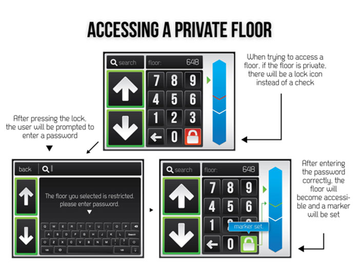
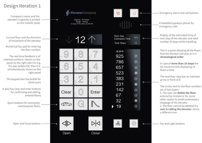

[caption id="attachment_10050" align="alignnone" width="700"] Yet virtually all solutions I’ve encountered fail almost immediately for the exact same reason… The Presumption Reflex If a friend says “I’m going to the movie theater” we automatically presumeshe’s going to watch a movie, because personal experience tells us that’s the main reason people visit theaters. But it was never stated she’s actually going to watch a film. However unlikely, she may be meeting up a friend or just really likes overpriced Skittles. When given a scenario, we have a tendency to conclude outcomes that seem reasonable to us. It is precisely this cognitive reflex that we as designers have to fight against, and the very first line of defense is questioning, as experienced designers always have more questions than answers. Let’s tackle the challenge Before we get to the 1,000th floor, we need to start with the foundation- uncover constraints and obtain greater context. Let’s start with the… Purpose “Let’s say it’s a biggish elevator, can hold around 50 people, probably has a few seats for taking rest, and a TV screen” –random online solution When we think of an elevator, our personal experience recalls all the times we’ve rode in one, so our presumptive reflex tells us that elevators are used by people. But what if the elevator in question is for transporting animals, cars, or washing machines? Nearly all solutions made this mistake and designed a human-centric interior equipped with TVs, NFC card readers and directories, without knowing if it will be used by people:
“Who lives here? A 1000 floor building is potentially a whole city living inside a mega structure, so it is feasible there is everything a city needs (parks, schools, playgrounds, hospitals, theaters etc) within the building.” -random online solution The second presumptive mistake is assuming that the building is inhabited by people as well. Once again, nothing suggests that there are any residential or commercial spaces, yet solutions included searchable directories of the building’s imaginary residents: [caption id="attachment_10051" align="alignnone" width="700"]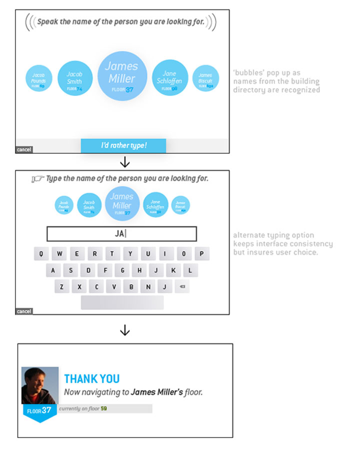 Images by William Clark Images by William Clark
Why assume that the building is not a parking garage for cars or an industrial warehouse for washing machines? Users
This line of questioning quickly leads us to the realization that we don’t know who the users are or what their needs might be. Is the interface meant for elevator passengers on the way to their apartment or operators who control multiple industrial elevators in a washing machine factory control room? Is there even a need for an interface in the first place? Could it be automated? Perhaps more worrisome than making presumptions blindly, is to make them consciously. Many proposed solutions start out by stating the very assumptions they’re making in hopes of absolving themselves of fallibility: “Assumptions Made In This Scenario -Each residence or business is provided with an appropriate amount of keychains -There is a security desk at the lobby -The buildings would need to be at least a dozen or so blocks wide to have a solid foundation…” -random online solution This misses the point entirely. If we start making up arbitrary constraints, this is no longer a design challenge- it becomes an exercise in imagination. Why not just presume the elevator can read brainwaves, thus eliminating the need for an interface all together? Because that’s an equal of a leap as assuming the elevator will be used to transport people in the first place. The truth is that at this stage, there is only one correct response:
Potential employers don’t pose design challenges with the expectation that you blow them away with your ingenuity or clever solutions. They want to see if you ask probing questions that uncover constraints, or if you rush to the whiteboard without deeper understanding. Being a designer means fighting the presumptive reflex, which takes disciplined reasoning and self awareness in order to truly understand the context of a problem. Although there is no guaranteed way to pass any given design challenge, the surest way to fail is to offer answers before questions. The post The 1,000 Floor Elevator: Why Most Designers Fail Google’s Infamous Interview Design Challenge appeared first on Design your way. from http://www.designyourway.net/blog/design/why-most-designers-fail-googles-infamous-interview-design-challenge/ |

AuthorPleasure to introduce myself I am Jamie 27 years old living in Searcy, AR. I am web developer and have developed over 50 sites for clients. Now a days I am focused on designing as I feel I am lacking it. Archives
April 2019
Categories |
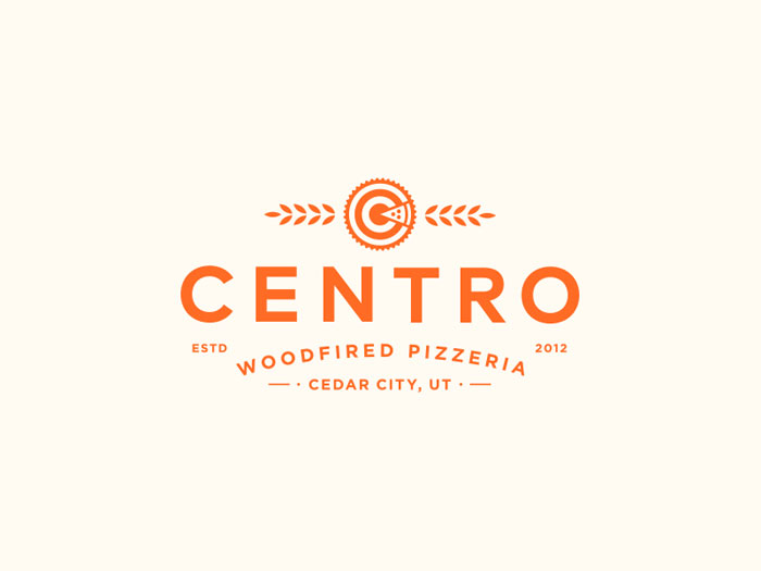
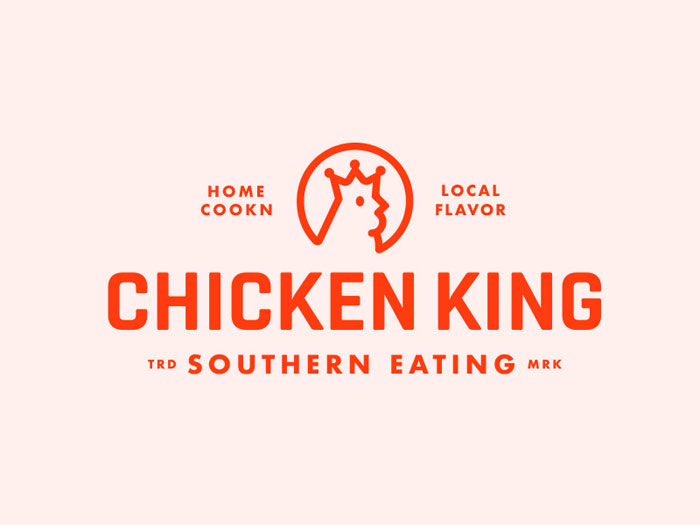
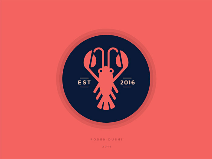
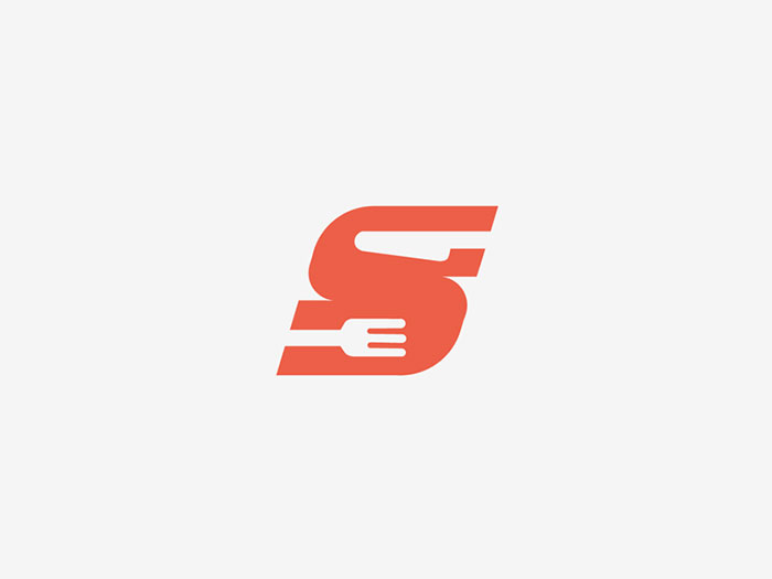
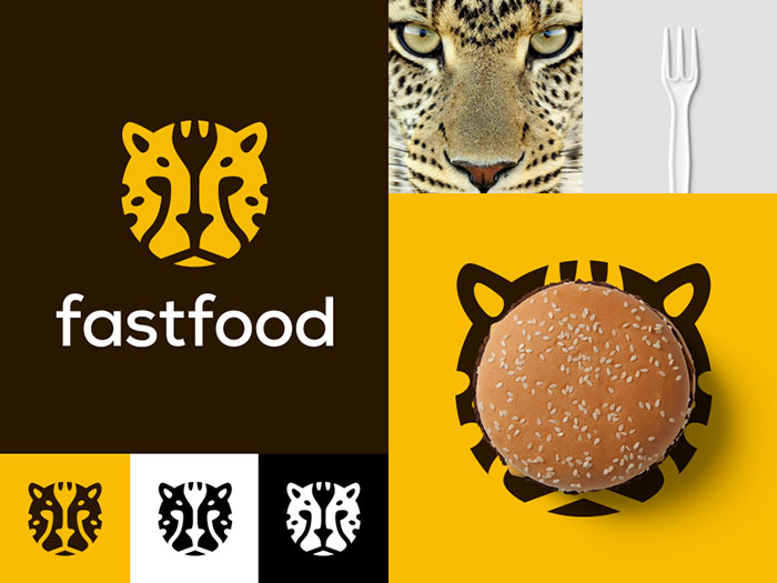
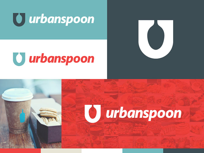
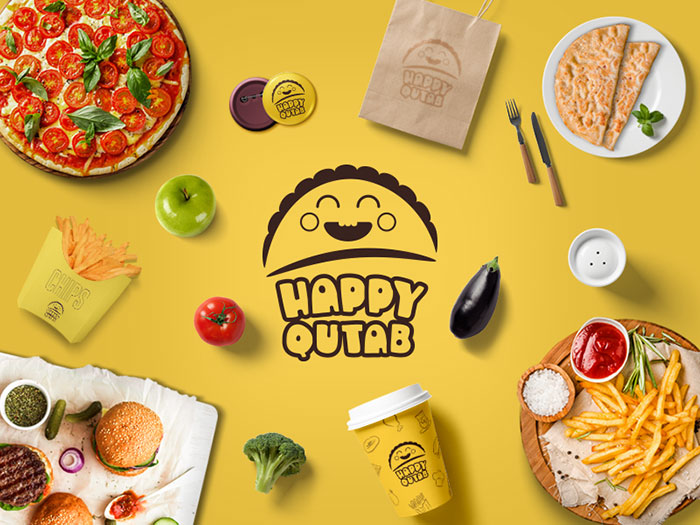
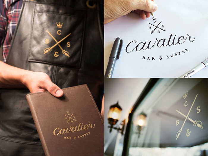
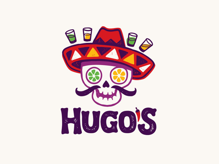
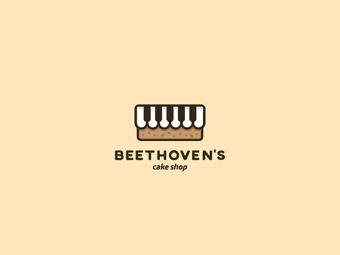
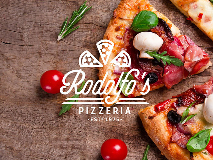
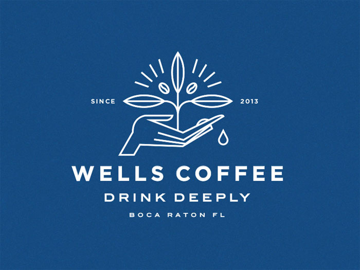
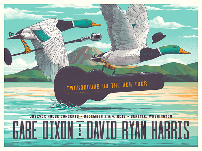
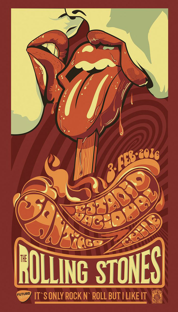

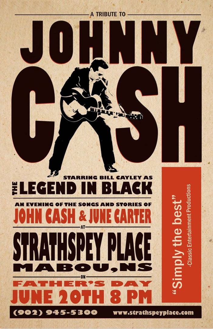
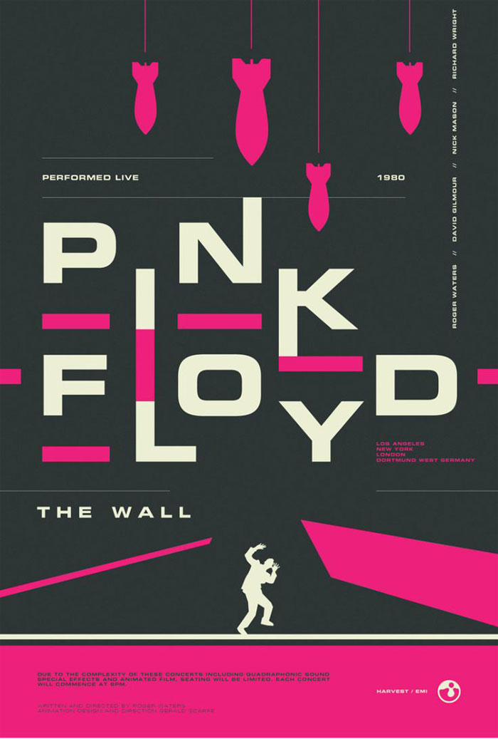
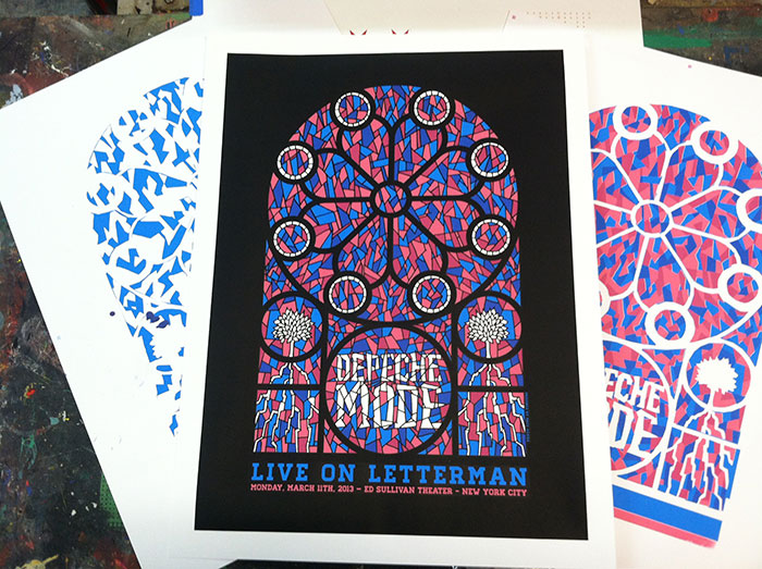
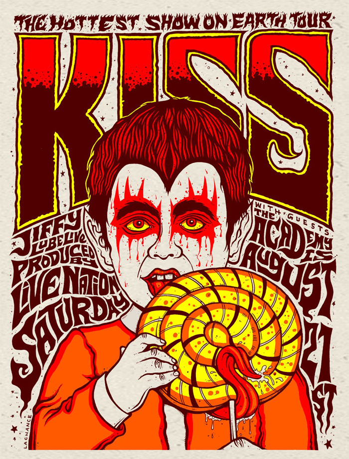
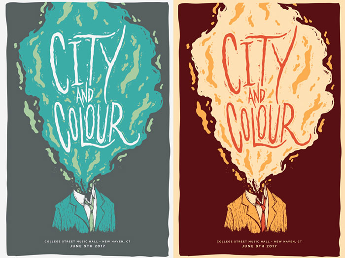
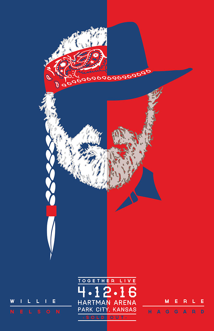
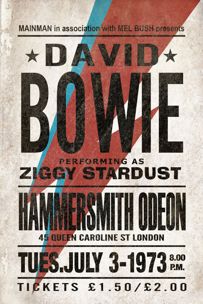
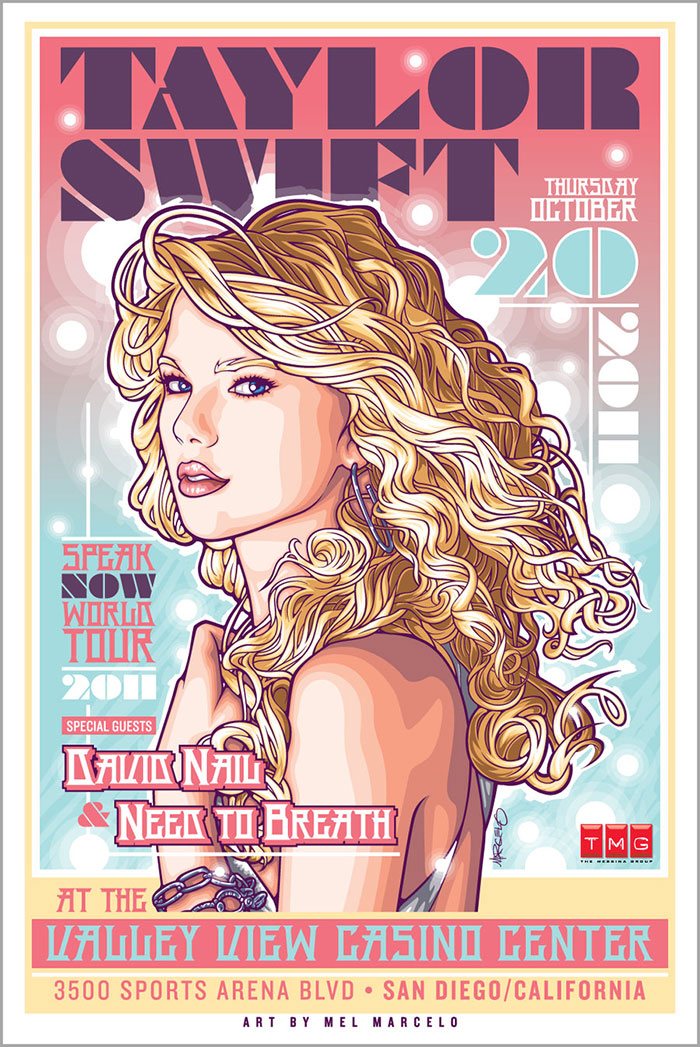
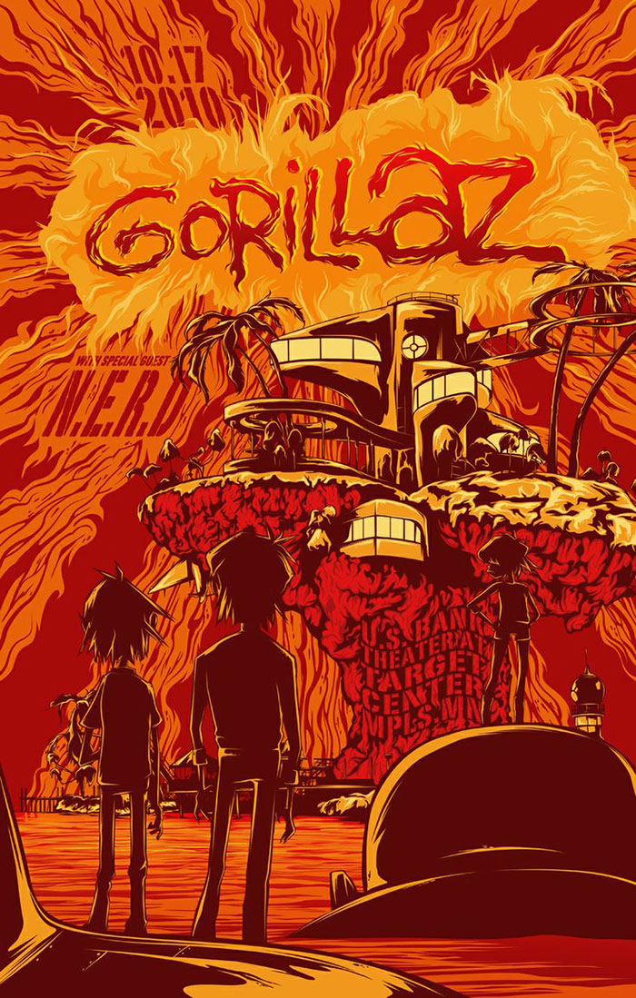
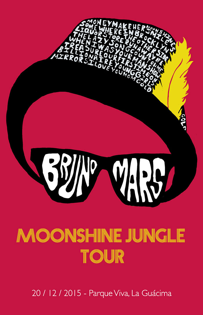
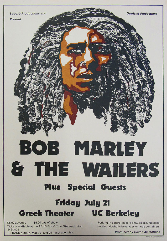
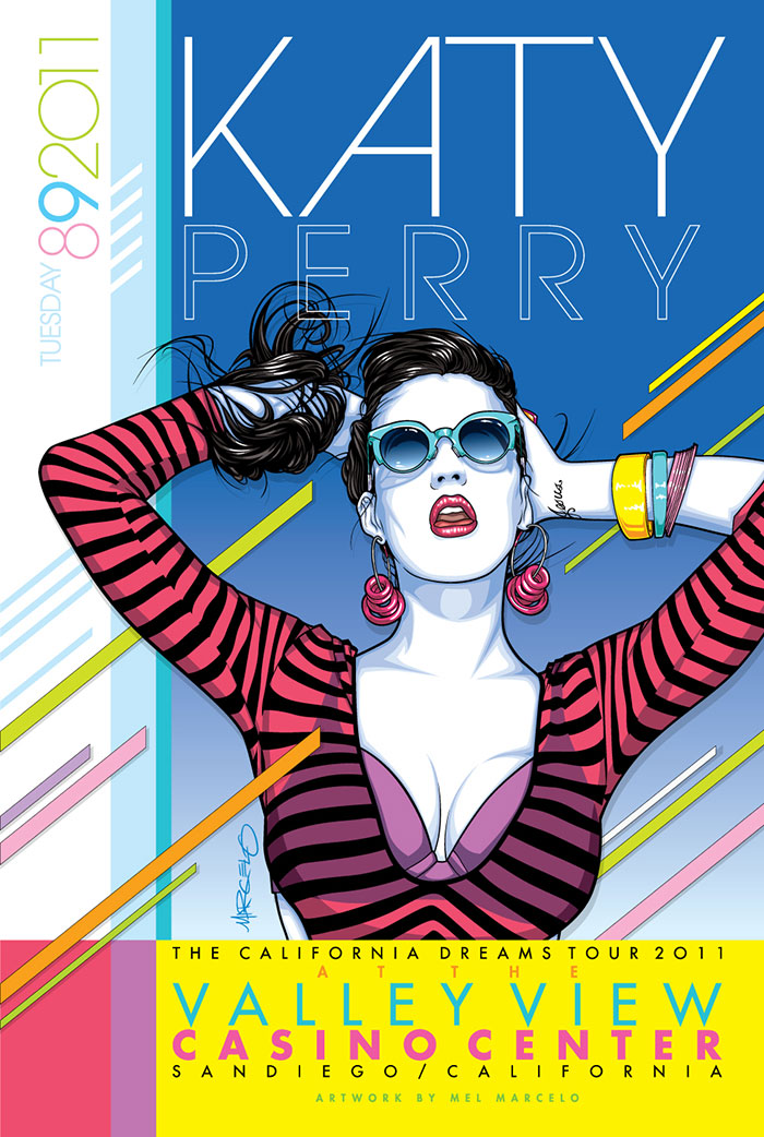
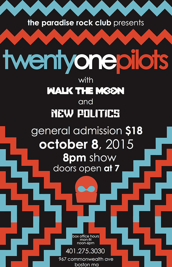
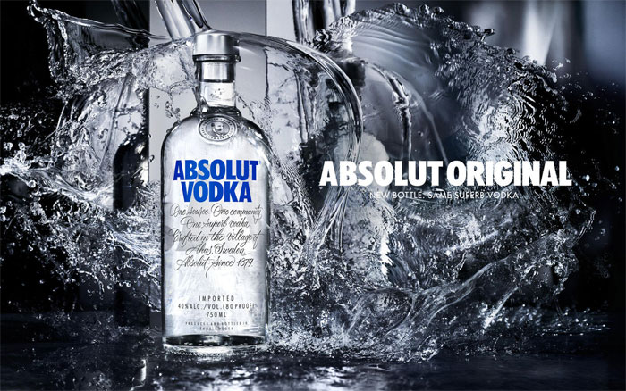
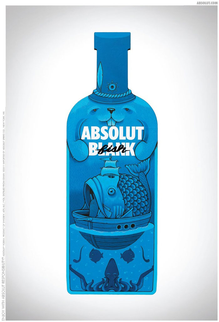
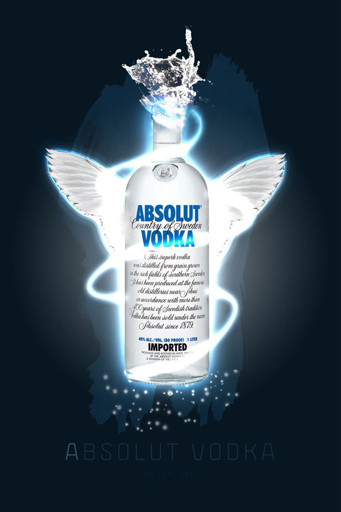
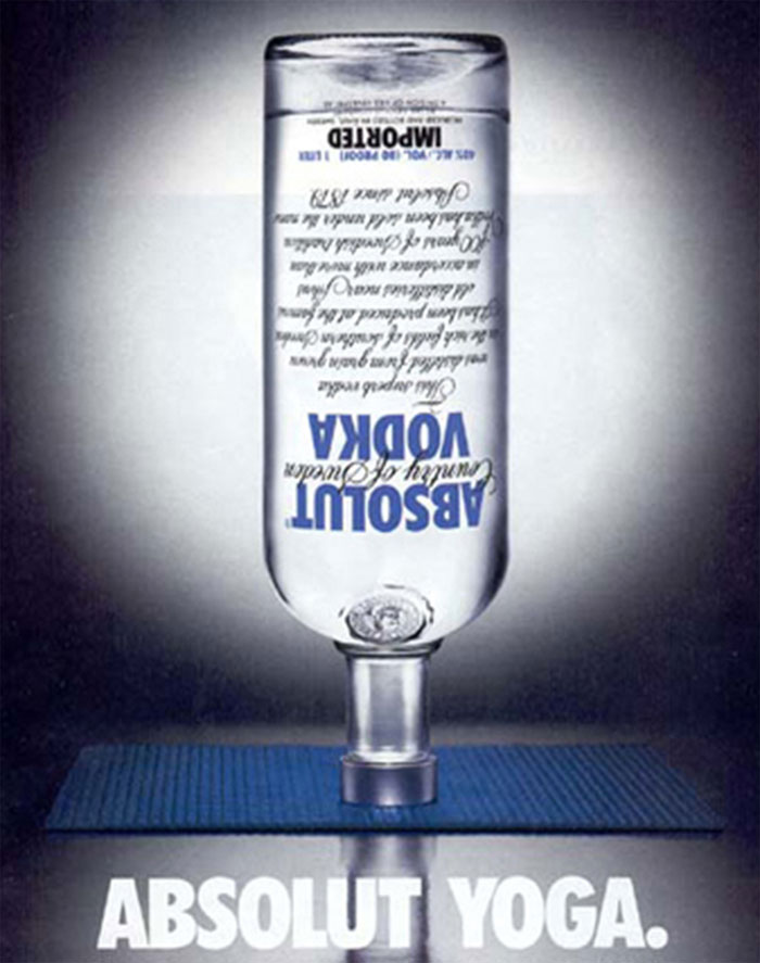
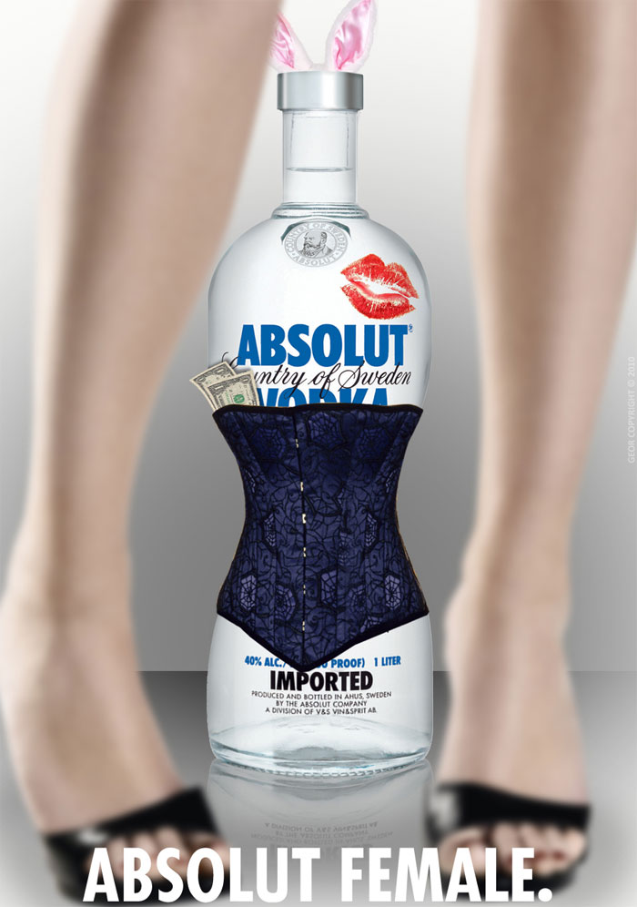
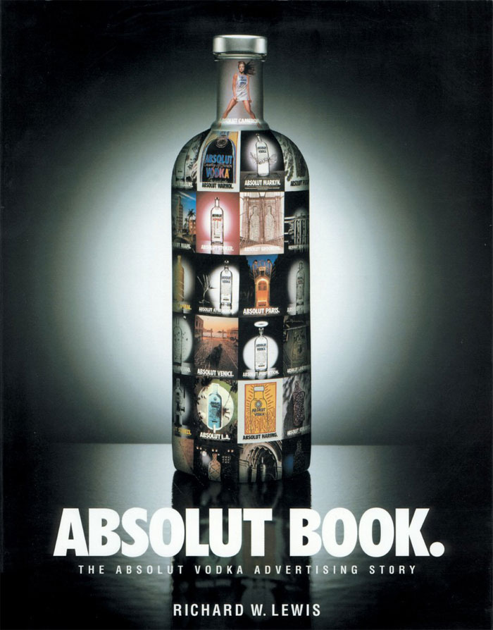
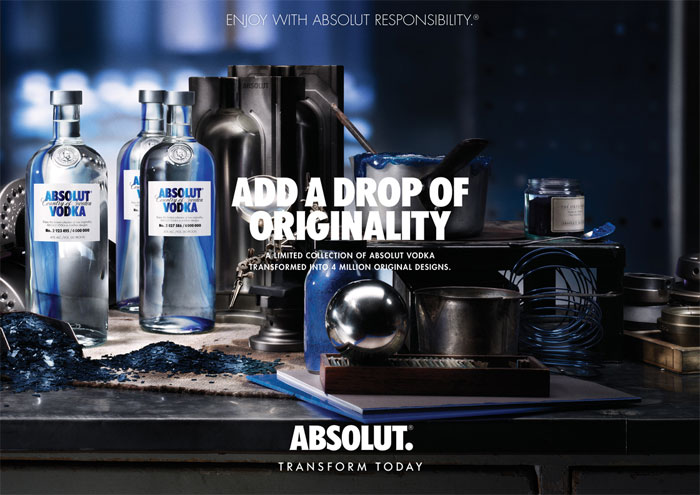
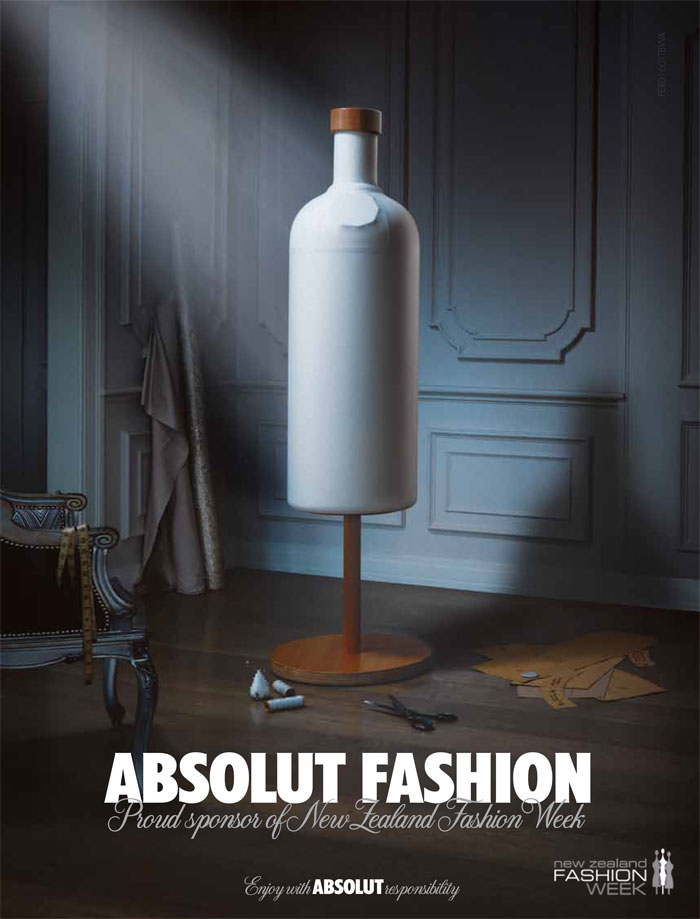

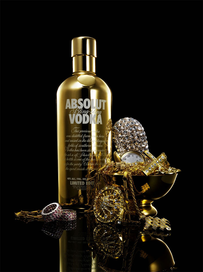
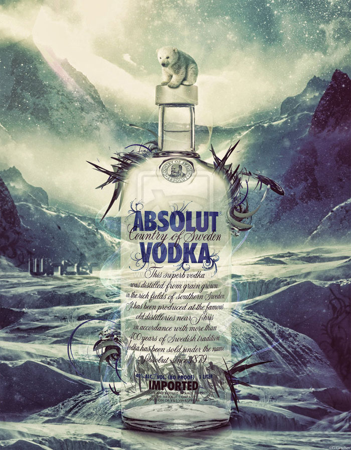
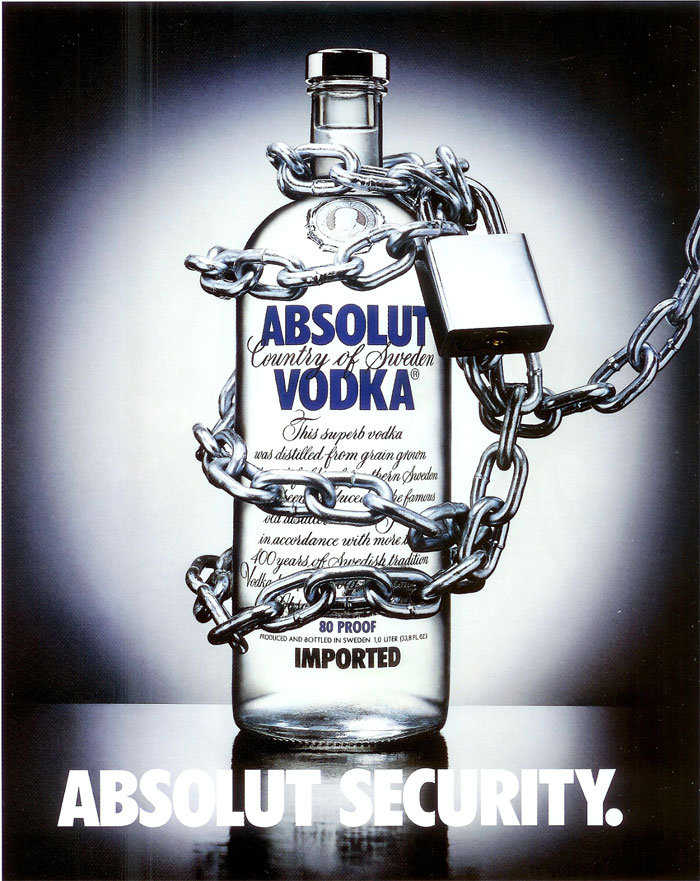
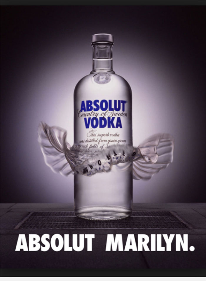
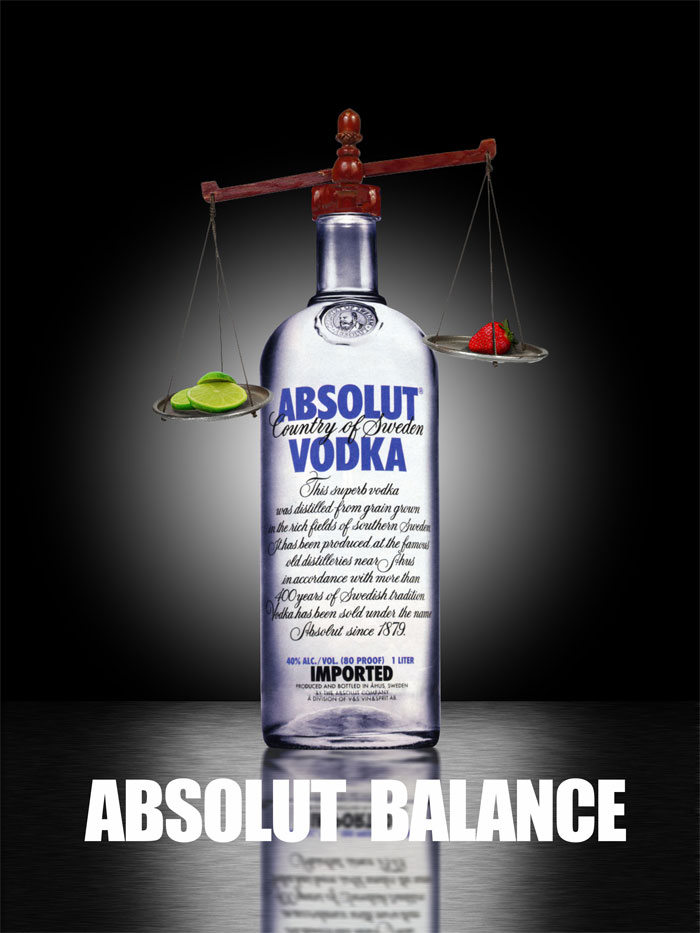
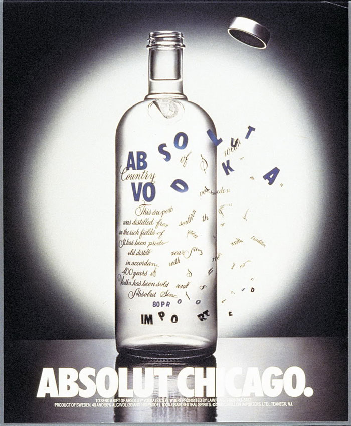
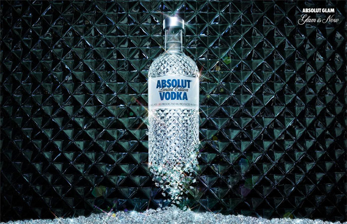
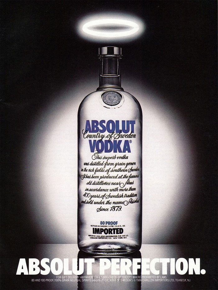
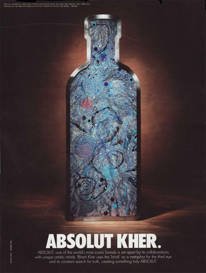
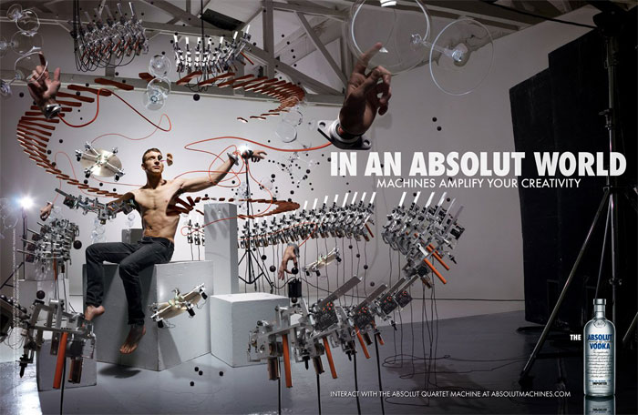
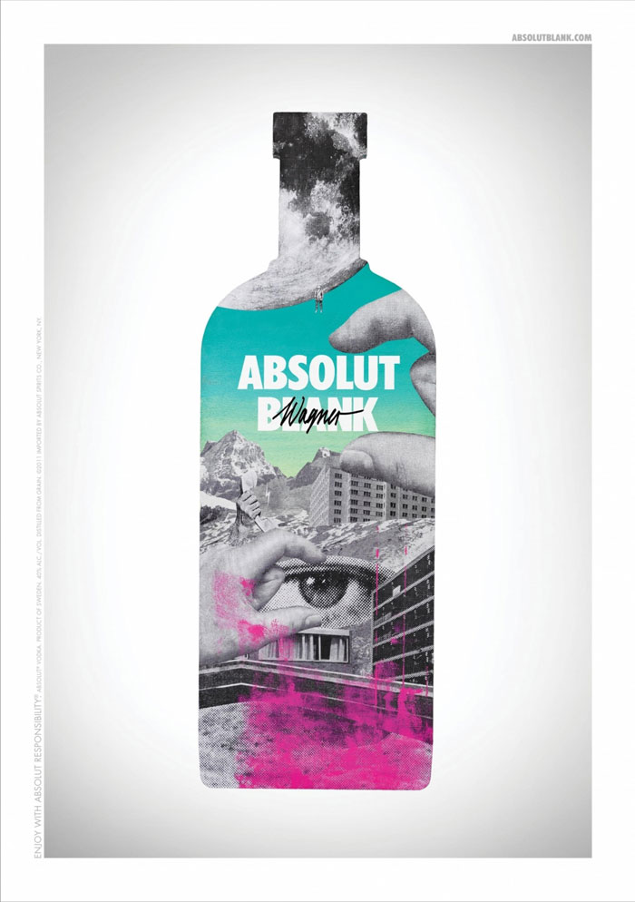
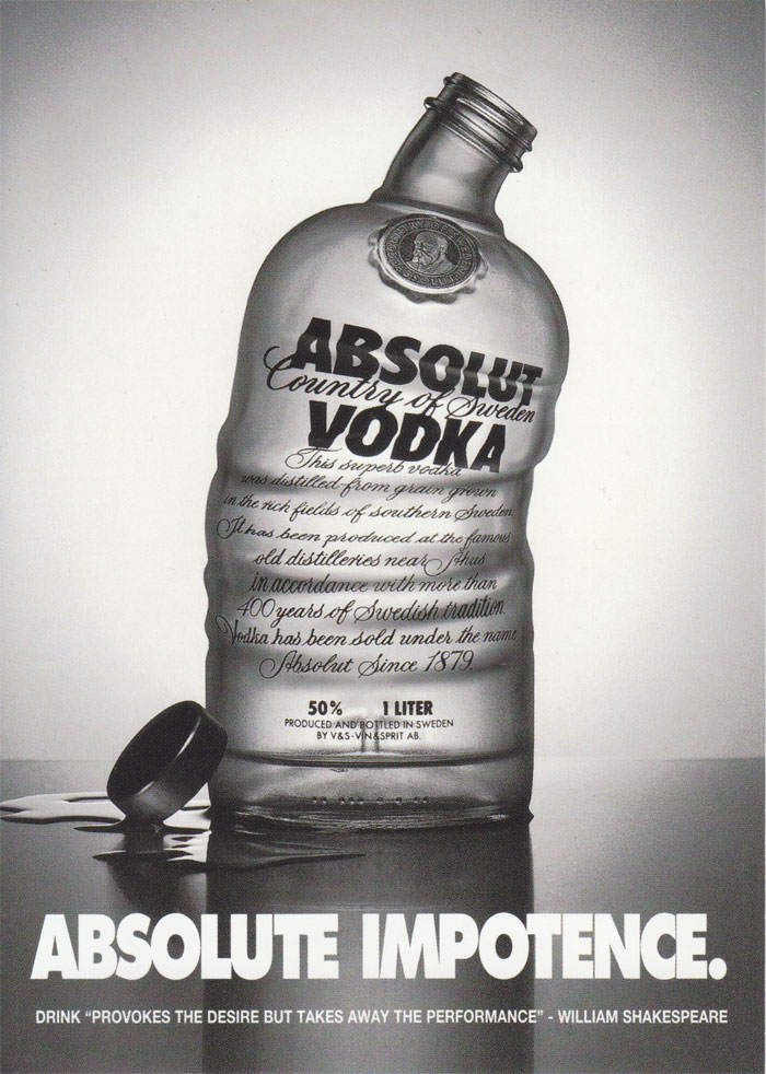
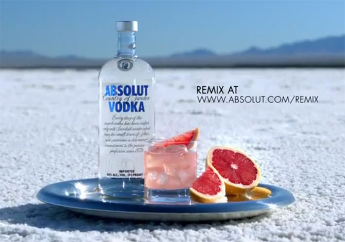
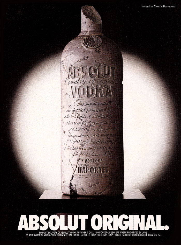

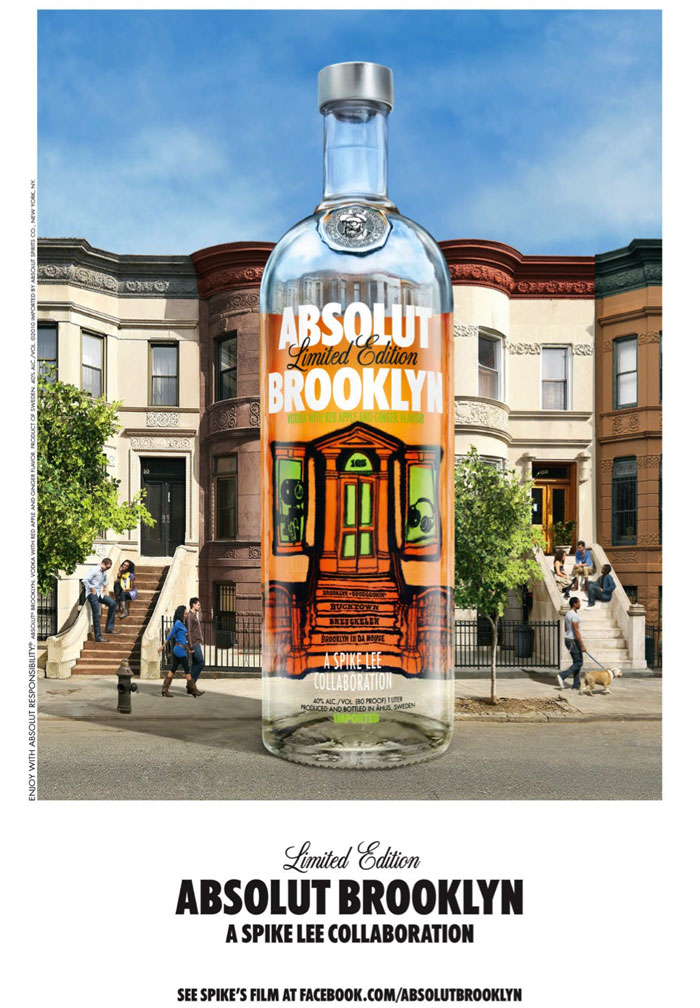
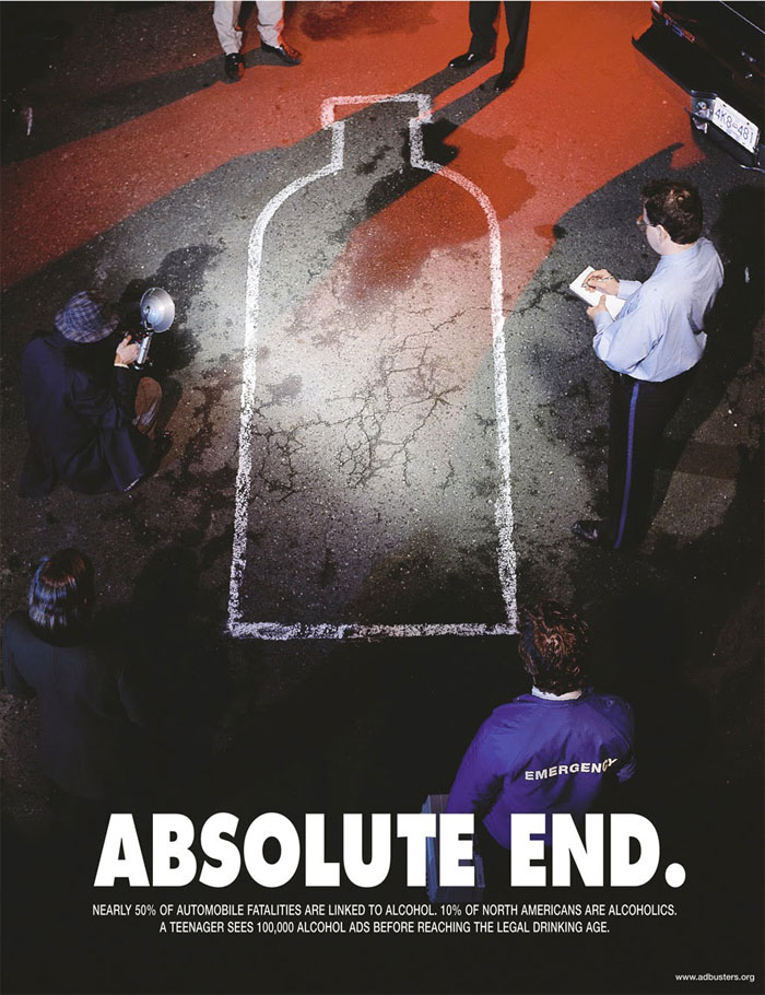
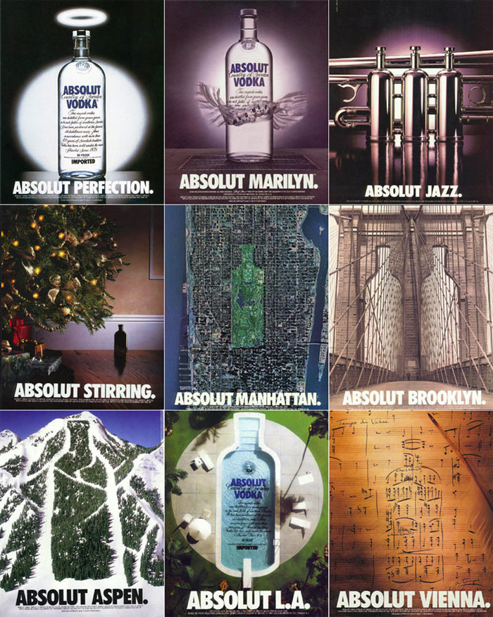
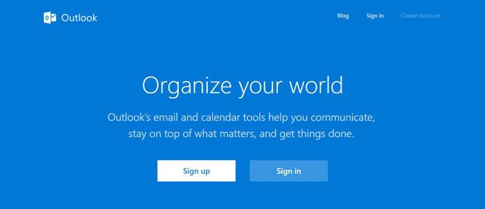
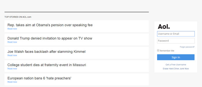
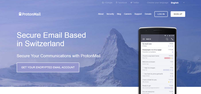
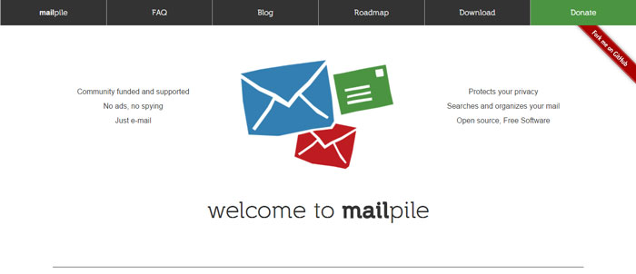
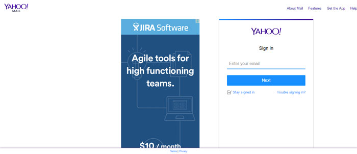
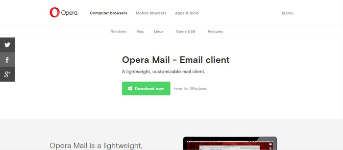
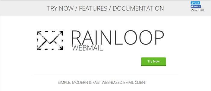
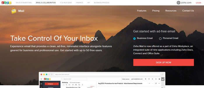
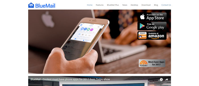
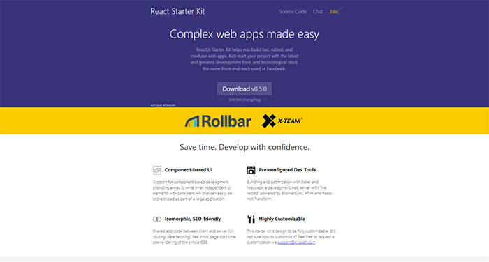
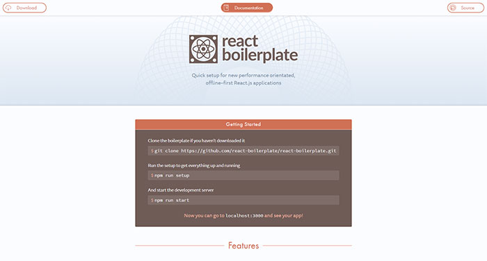
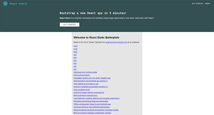
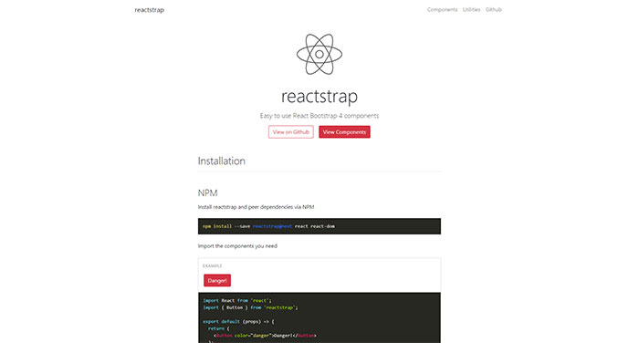
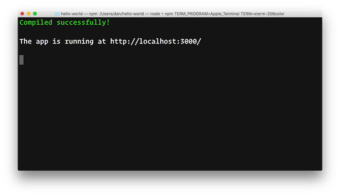

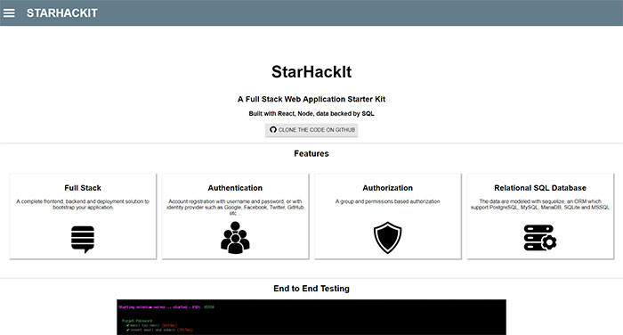
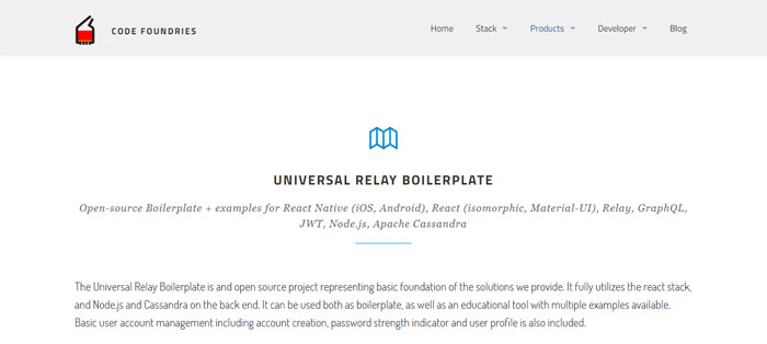
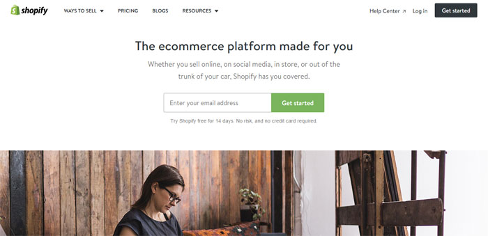
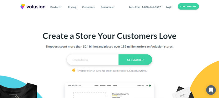
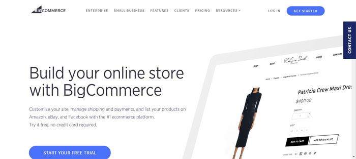
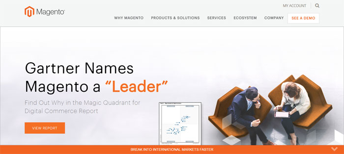
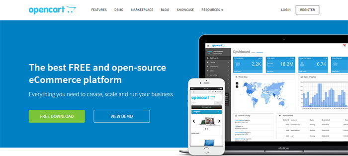
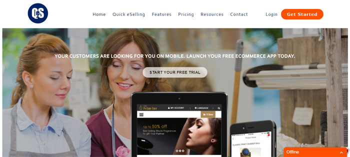
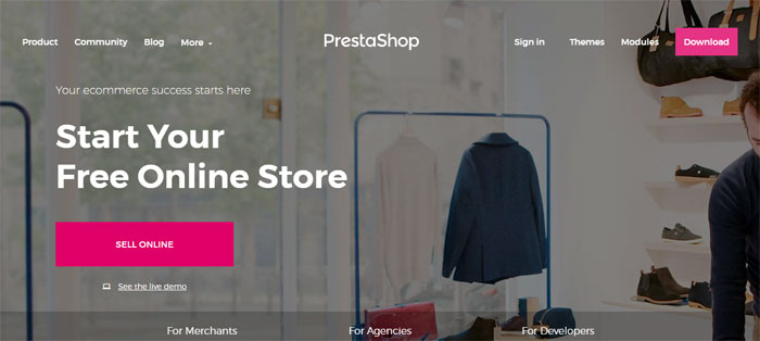
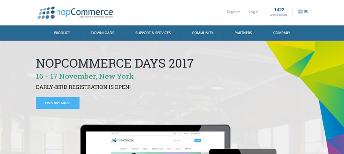
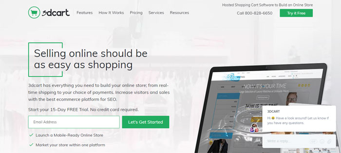
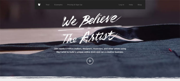
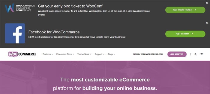
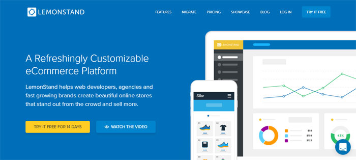
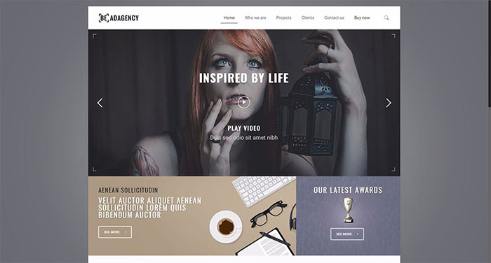
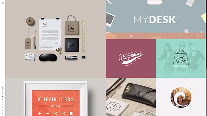
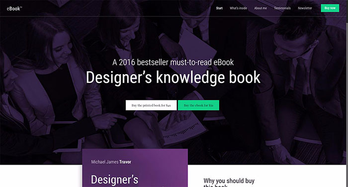
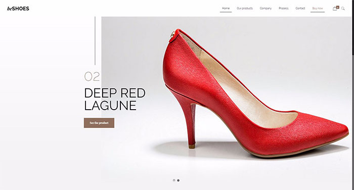
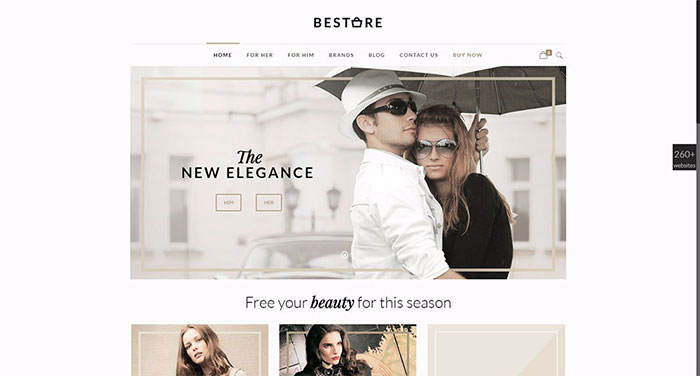
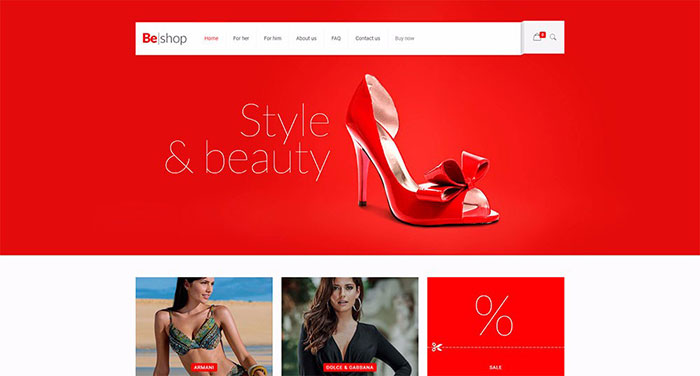
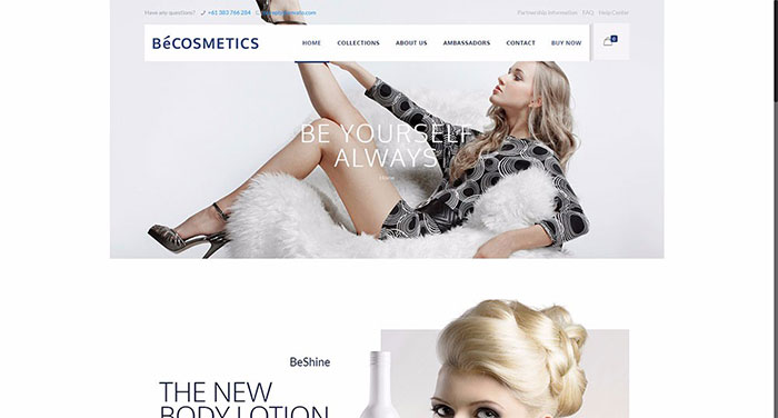
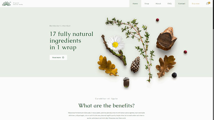
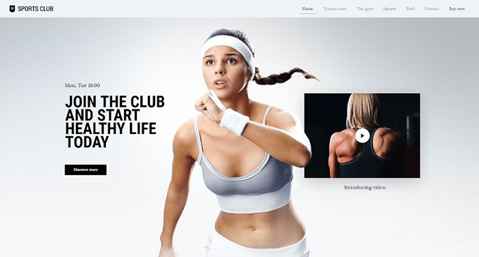
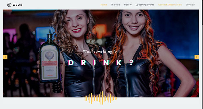
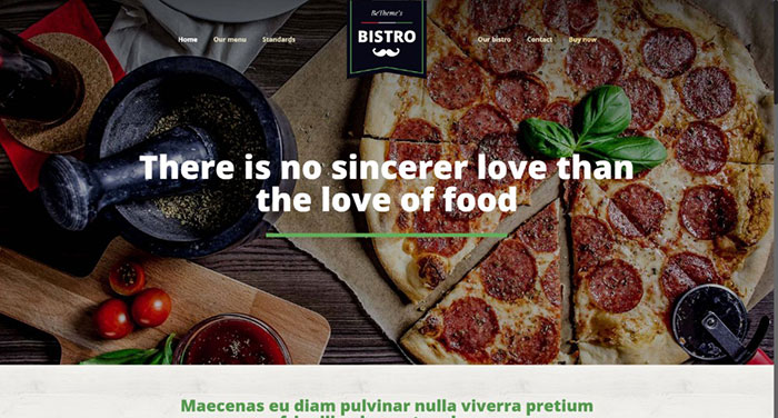
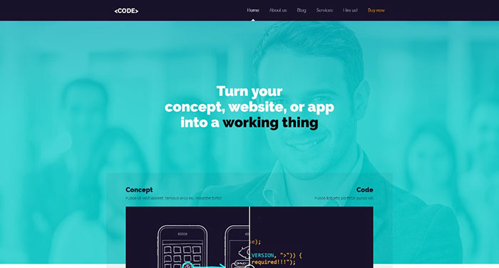
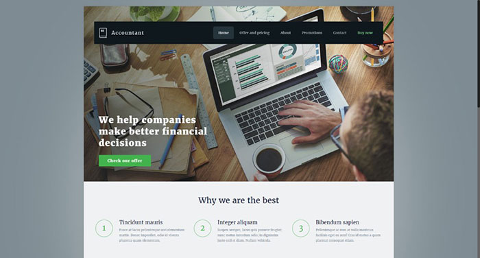
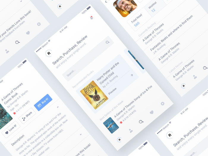
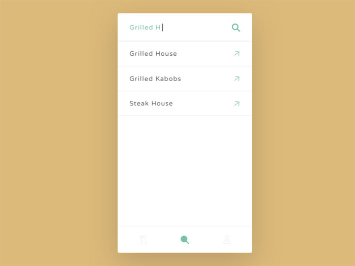
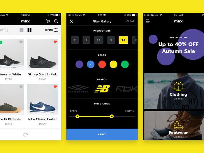
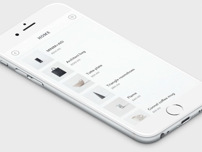
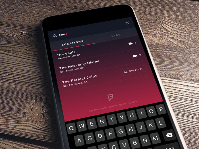
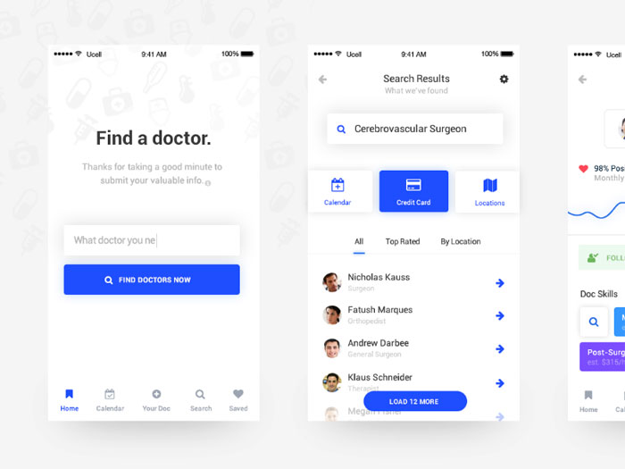
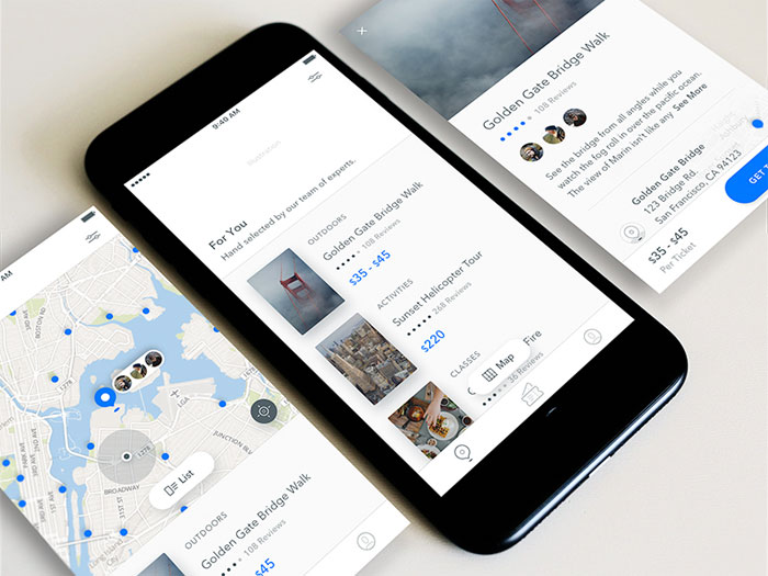
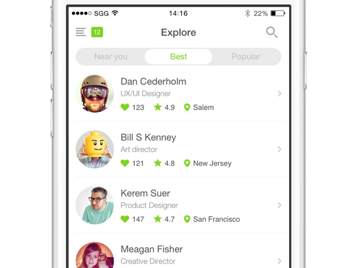
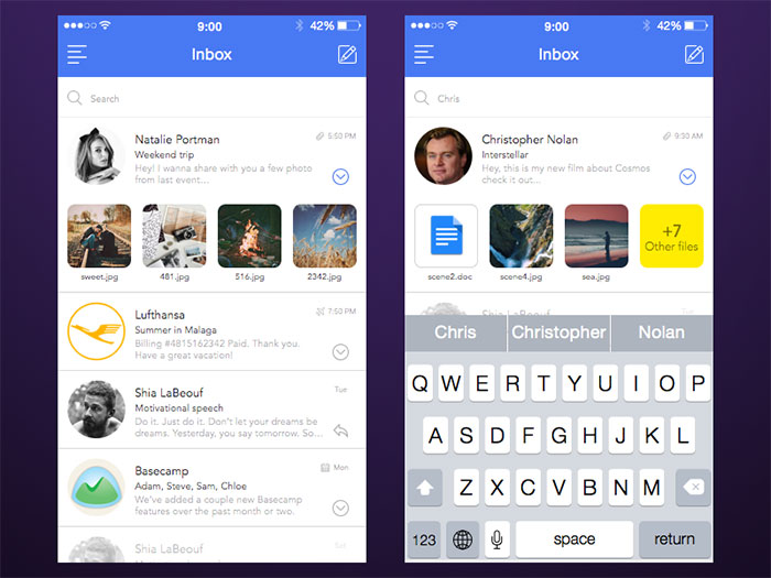
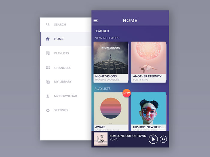
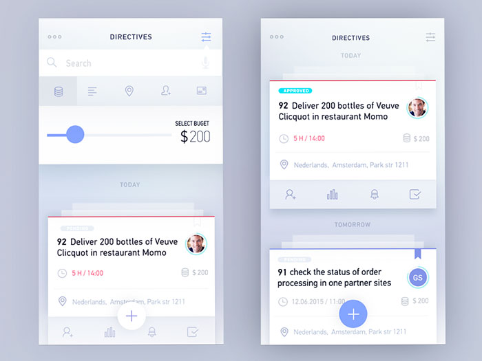
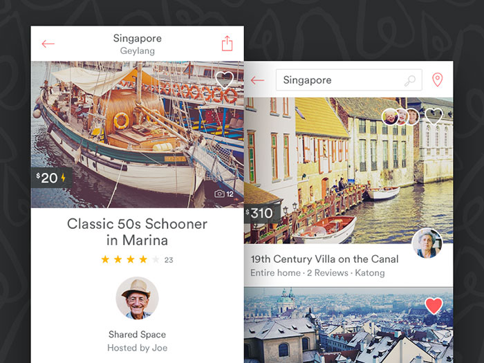
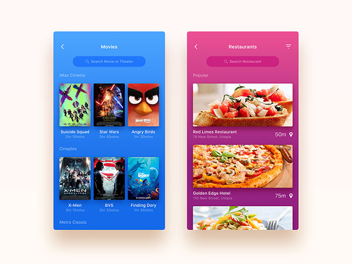
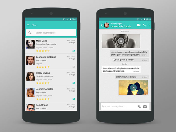
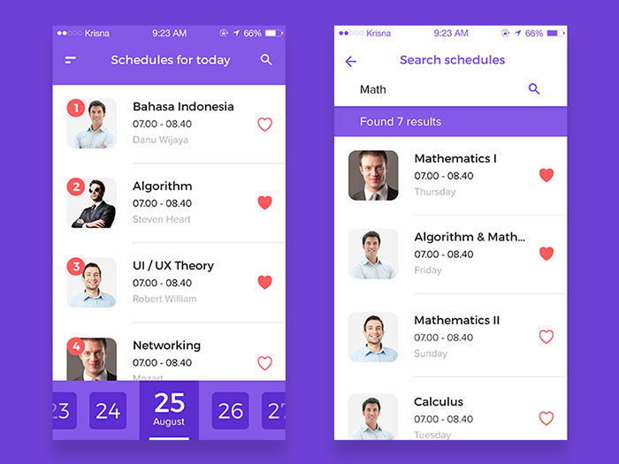
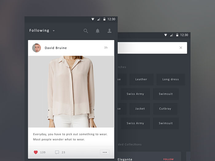
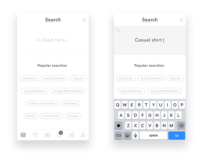
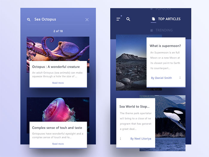
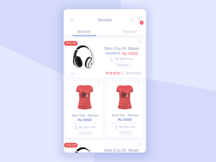


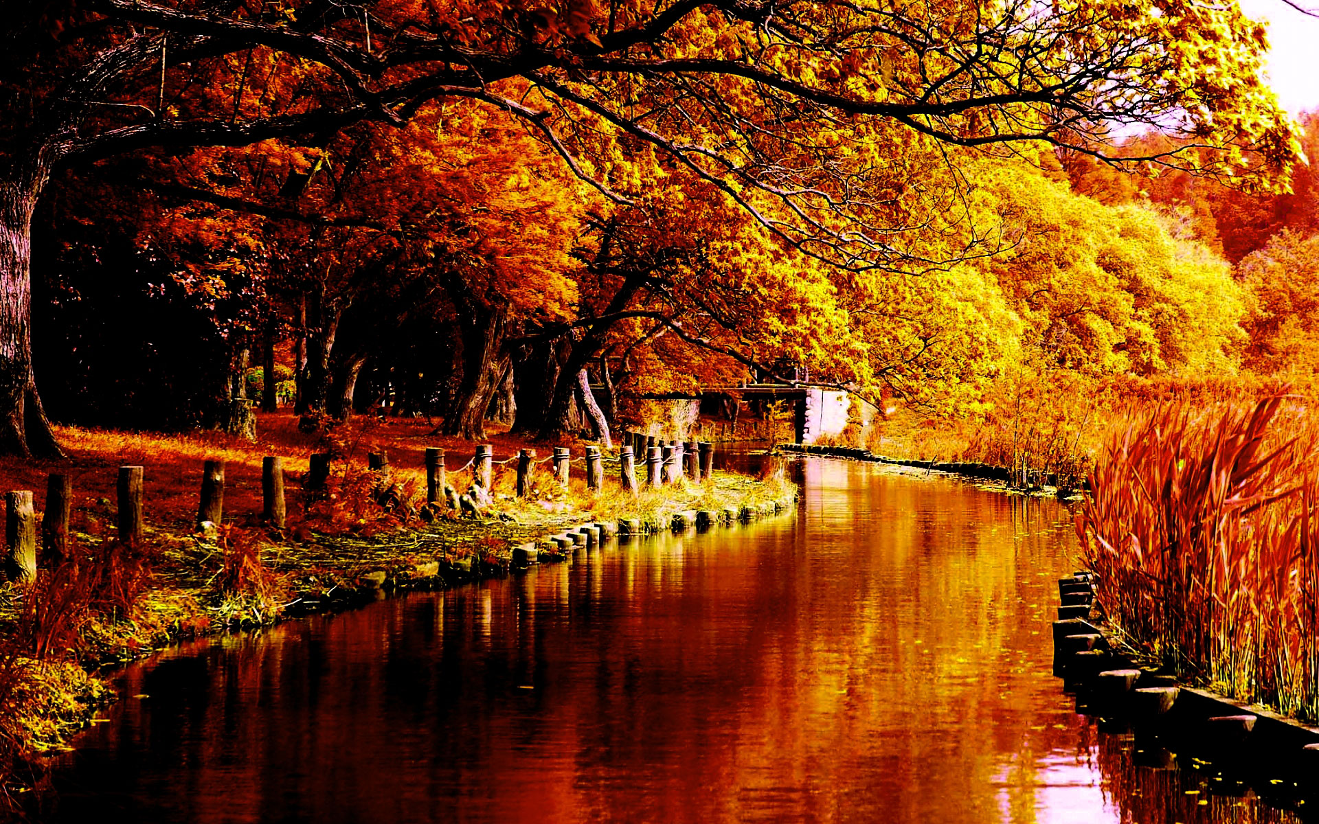


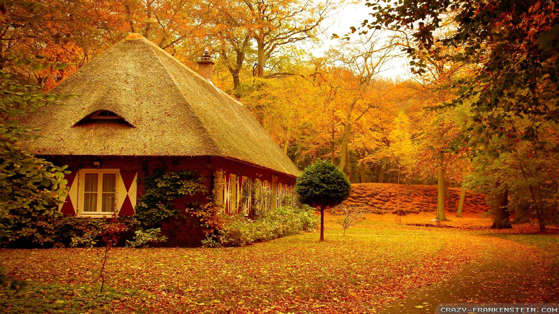


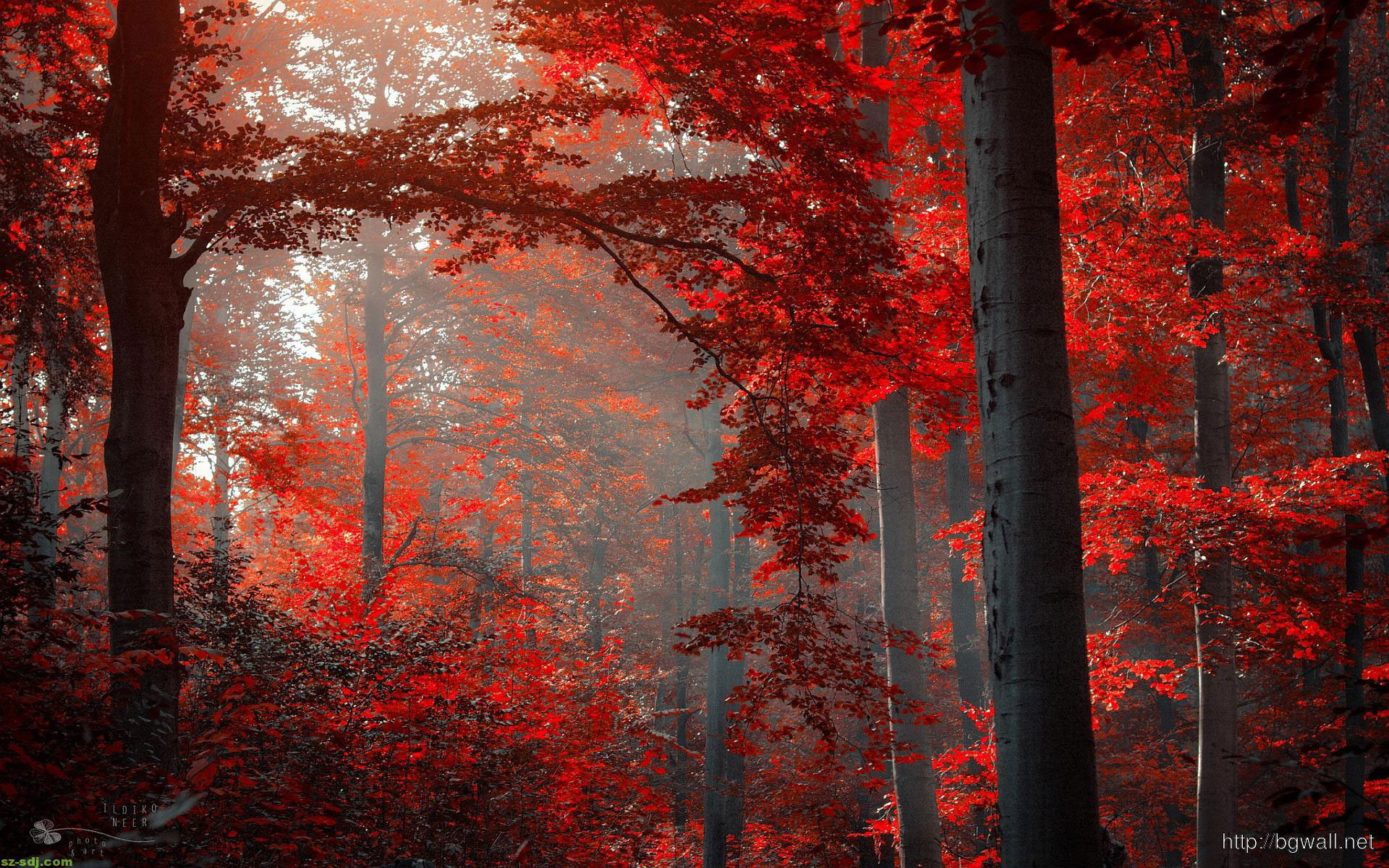


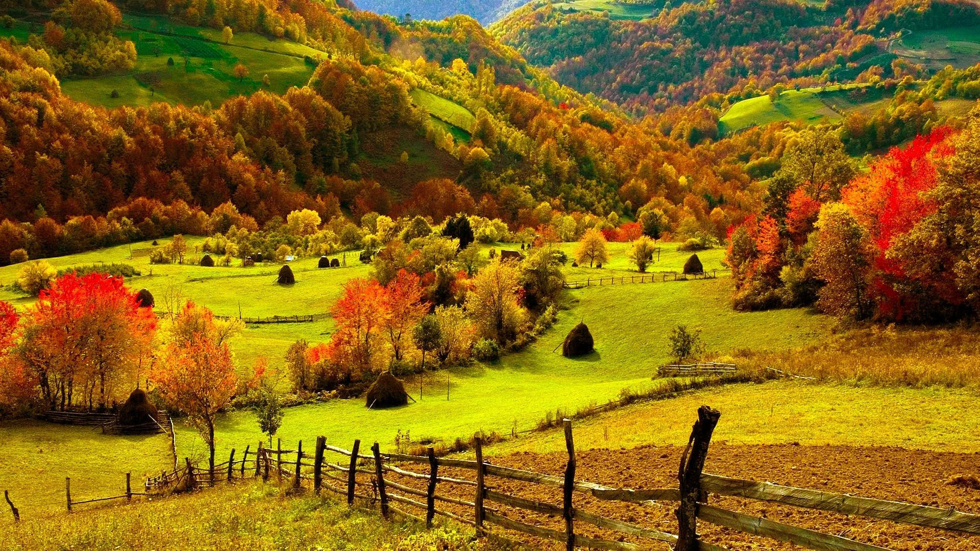


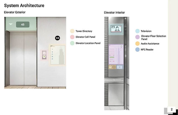
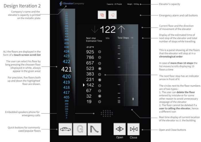 Images by Aayush Jain
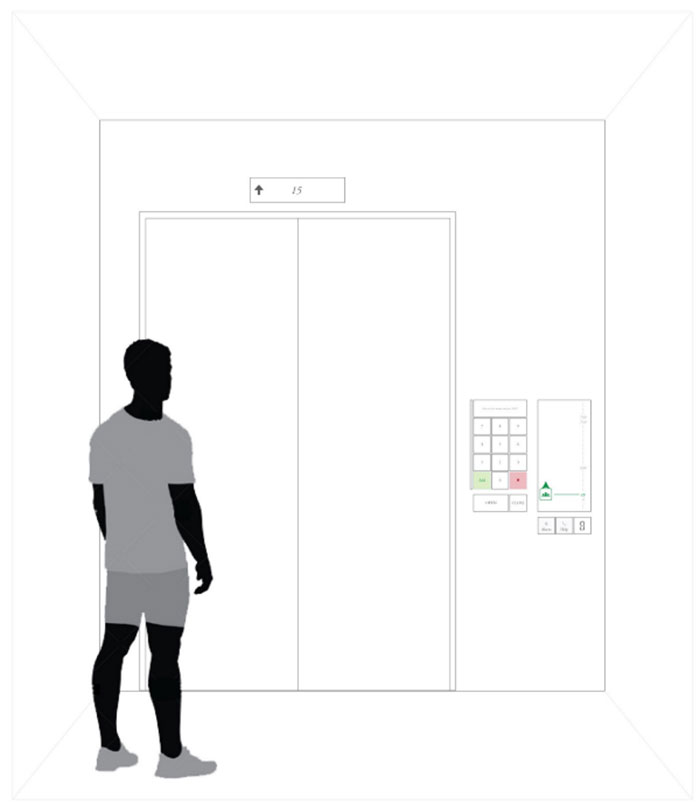
 RSS Feed
