|
The Nielsen Norman Group is probably the most influential usability consultancy in the design industry. So, when they publish an article about their research findings titled “Flat UI Elements Attract Less Attention and Cause Uncertainty”, many designers perk up and pay attention. In the few days after the article’s release I’ve already seen it shared several times as evidence of the weaknesses of flat as an interface aesthetic. But there’s a problem with that conclusion. It’s not actually supported by the study that was done.So what’s the issue? Let’s take a look at the very beginning of the article: The popularity of flat design in digital interfaces has coincided with a scarcity of signifiers. Many modern UIs have ripped out the perceptible cues that users rely on to understand what is clickable. While the title had clearly set the expectation that “flat design” was the subject of the research, the article immediately jumps in to an equivocation between flat design and design with “weak or absent signifiers”. It turns out the latter was actually the focus of the study even though we were promised the former. Leaving aside the issues with calling anything “weak” before actually running the study, one might still expect (based on the title of the article) that the weak signifier scenarios tested were reasonably representative of flat design. However, a deeper dive into the full set of designs tested shows this was not true in most cases. Five of the nine scenarios asked users to find text links that differed only in how they were styled and colored. 
Visually differentiating links helps users to know they are clickable? Who knew? The thing is, changing the display of links in this way doesn’t actually tell us anything about flat design. Flat is characterized by a lack of depth cues, but neither of the designs above have any depth cues at all! Some test cases did more closely resemble a comparison between flat and depth based UI but they came with their own problems. Let’s take a look at the first test case. 
Notice anything strange? Not only are the buttons in the design on the right flat, they’re also “Ghost” buttons which make them almost entirely a different color! The difference in visual contrast between the buttons acts as a confounding variable. The version on the left may have performed better simply because it had stronger contrast, not because it had more depth cues. A similar problem can be found in this scenario: 
Again, color and depth cues were tested simultaneously. The color difference resulted in a significant contrast disparity that may have been responsible for the difference in results. So how about this one? 
While we’ve moved beyond color contrast, there are still confounding variables here. The toggles in the slider on the left are much larger than those on the right. One test case remains. Could this be the one that fairly compared flat and non-flat UI? Actually, it is!
The thing is, there was no noted difference between these two designs. The eye-tracking results showed roughly equivalent results. The scenario that most fairly represented flat design didn’t result in a significant difference between either option. So what’s our takeaway here?When looking at secondary usability research make sure to read past the headline. Don’t take the conclusion presented at face value without understanding the research that was done. Often a blanket statement about particular design elements will be based on examples that are poorly implemented or examined within a very narrow context. It may be that flat UI does have some disadvantages when compared to UI with depth but it’s risky to make that determination based on a single study like the one we’ve reviewed here. To Nielsen Norman’s credit, they do share a good deal of the methodology behind their testing. Without that transparency we wouldn’t have been able to consider their study in as much depth as we have. You can view their full article here where enough information is provided for anyone to draw their own conclusion. For organizations that don’t share testing methods up front you should be even more skeptical about adopting their recommendations without doing additional research on your own. The post Flat Design: Why you should question Nielsen Norman’s research on the trendy design style appeared first on Design your way. from http://www.designyourway.net/blog/web-design/why-you-should-question-nielsen-normans-research/
0 Comments
A good photography website is vital to any modern photographer. It is how your clients will find you. Even if you don’t use the internet very often yourself, many, many people do and you will need to create a photography website if you want them to find your business. Even if photography is just a hobby, a photography website can be a great way to connect with other photography enthusiasts. It will allow people to view your work, and you could possibly even end up making a bit of cash off of it. Designing a photography website is its own challenge. It’s not simply enough to upload an album of your photography to a website and call it a day. As image-heavy as the best photography website examples are, there’s actually quite a bit of consideration in their layout. Here are some photography website ideas to help you out so you can build your business or hobby successfully online. PurposeWhat does a photography website need? Well, photos, obviously, but it should also have focus. What kind of photography do you do? Is it in the studio or do you largely do outdoor shoots? Is it event photography? Wedding photography? You photography website should answer these questions easily. Figuring out how to design a photography website is mostly about figuring out what you want to communicate with it. Information should be clear and the photography website design should be easily navigable with only a few clicks. Website visitors are not just browsing, like they might at a shop.
They are at your website for a reason. You only have a few seconds to make it clear that possible customers should choose you over your competitors. Remember, the purpose of your website should guide every decision you make when building a photography website. Target Demographic
It’s important to know who you are making your photography website to appeal to. Photography website best practices work much like physical photography portfolio best practices. Wedding photographers, for instance, structure their portfolios and photography websites in similar ways. Clean, white, and easy to find what the customer to navigate. Your photography website should call to mind the sort of event or subject you want to take photos of. If you photograph children and families, have some elements that are kid friendly. Your photography website design should be aimed to appeal toy our target demographic. Simplicity
Avoid adding too many flashy effects or overcrowded pages. You want your photos to be front and center. Anything that detracts from them should be avoided. Your previous work is going to be your biggest selling point. You aren’t selling your clever tricks with web design or Photoshop, after all! Show off your work and relevant information. Make it easy for anyone who is interested in your work to contact you. A good photography website needs little else. Show Off Your Best Work
When starting a photography website, remember that it features your best photography, not all of your photography. No one is going to view all of your shots when visiting your photography website, so choose the ones that look best. Keep the phots on your site updated regularly, especially if you photograph events like weddings. Visitors looking to hire you will be able to tell from the dress styles how old the images are. Experiment with what photos work best. Don’t get locked into a particular set. Different pieces may help you get more traffic and therefore more customers. Start and end with your best photos on your gallery page. Keep some variation in the middle. This should have visitors keep clicking ‘next image’. They will leave with a good impression of your photography skills. Using ‘Hero Photos’
Large images or ‘hero photos’ can help out your photography website immensely. Site visitors are there to see your work, so why not put it right out there? These massive dramatic images draw visitors in almost immediately, especially if they are very good photos that you’ve taken. These photos should show off what your brand is all about. Show off photos you’ve taken of beautiful weddings, beautiful landscapes, adorable children, and happy families. Pick an image that is worth a thousand words. Choosing the right ‘hero photo’ can prompt a serious improvement in your business. Protect Your Work
One of the most important things you must do when figuring out how to create a photography website is figuring out how to protect your work. Photo theft is a serious problem on the internet, no matter what you are photographing. It’s going take more than disabling right click or putting all your images as background images. The tech savvy photo thieves of today’s internet will beat those measures.
The only truly effective way to protect your photos is to embed watermarks on them. If you embed watermarks in JPGs, it will always be there. The thieves can’t remove it. The bigger the watermark is, the more of the image it covers, the more difficult it will be for a thief to crop out or try to paint over. That said, watermarks have two major problems:
Watermarks are not terribly common anymore. If online photo thievery is a concern, however, it is the way to go. Photography Website Tips and TricksPlan Your Layout
Sit down with a piece of paper and figure out how you want your photography website design to look before you start working on a computer. This sketch gives you an idea of what you want your end result to look like. Think of what colors you want to use and what features you want to have. You can always adjust it later if you have new ideas, come across a better elements on other sites, or find out that something is too difficult to pull off. Search Engine Optimization
Search Engine Optimization (SEO) is one of the most important aspect of web design today. Properly done SEO pushes your photography website up the search engine results when someone searches for certain keywords. SEO is complex, based on algorithms used by search engines to find the most relevant sites and keep scammers from the top listings, but there are a few things you can do without too much work. You should give all the photos you put on your site a name using their alt tags. This increases the number of keywords found on your website. If you use the site as a blog and post regularly, more people will link to your site and improve your ranking. Use High Contrast
Use the colors of your photography website to make your photos look better. Most photos look better on black backgrounds. Black backgrounds usually create a higher contrast than a white background would. Contrast will bring out the colors of the photos. The images will appear more vivid. Viewers will get the best possible impression of your work. For sports, commercial, nature, portrait, or HDR photography website, look at the images on a black background, them look at them on a white background. Figure out which one looks better. Sites that are designed to be predominantly dark colored should have splashes and flares of color added in. This will give the photography website a distinctive personality. Sites down in purely black and white can still have personality, but it requires a lot more care and consideration. Only Use High Resolution Photos
If you want potential customers to see your work at its best, only use high resolution images. Full sized images should not be displayed at 300px by 300px. This will make details harder to see and hide just how skilled you are at photography. Let viewers see your work in all its glory, color, and detail. Don’t shortchange yourself or your viewers by posting images with low quality optimized for bandwidth. That does no one any favors. You’re there to sell your skills as a photographer! Visitors to your photography website may have to wait a few seconds longer for the images to load, but if they are there to see photos, they will understand. It’s not worth sacrificing a detailed view of your phots for a few moments or seconds of load time. It will not do you any favors. Use Good Marketing Copy
Choose good marketing copy. It should be easy for visitors to your photography website to learn what you do, what your hours are, where you are located, how to contact you, and what sets you apart from other photographers offering the same services. Without that information easily available, there’s no point to the rest of the photography website design. Keep text topical. Make sure it matches the page you’re on. A page showing photoshoots of children should have text discussing about how you take photos of children and what kind of packages you offer for those shoots. It’s better to not have any text beyond a header at all than text that is not about the subject of the page.
Make sure your text is properly proofread and edited. Misspellings and grammar mistakes make your business look unprofessional and lazy. The wording should fit the target audience; there’s some call for poetic turns of phrase when talking about wedding photography, but pertinent information should not get buried in it. Font should be legible. It’s okay to use fancy fonts for titles and page headers. Those are usually short and are meant to instantly grab attention. Smaller, longer liens of text, however, should stick with traditional fonts like Sans Serif or Arial. You also need to make sure the text is not squished together illegibly. There should be a decent amount of spacing between lines and between letters.
Colors should also stand out so the text can be easily readable. Purple on bright blue, for instance, is unreadable. That sort of color choice will drive visitors away. Black on lighter colors and white on dark colors usually works best. Make sure you run your color choices by one or two other people before finalizing them. Something to keep in mind when building a photography website is that your text and your image should not make each other difficult to see. It’s easy to make it so images block text, or the text describing a gallery interferes with the ability to click on the images. Always preview your website before you update it to help prevent this issue. Keep up with Current Tech Trends
Take a look at a few professional photography website examples. You’ll notice that they regularly update. Good photography website design changes over time, with either technology, the market, or tastes. After you build your photography website, look at other sites regularly to see what they are doing. If your photography website is starting to look dated, go ahead and take the time to update it. It’s always a good idea to optimize your site for mobile use on both smartphones and tablets. People looking for businesses when they are on the go often do so on these devices. You need to make sure the site is viewable on these devices and that pertinent information about location, hours, and contact info are still easily visible. Galleries tend to have the most trouble with this, but it is definitely worth the time and effort to make sure they look good. Ending thoughts on designing a photography websiteA well-designed photography website will help your business. Customers will find it easier to find you. Many will learn of you only by finding your website. Take the time to do it right. Put your best foot forward and show off your photography skills. Make sure it’s easy for visitors to contact you and your website can begin helping your business! If you liked this article with photography websites, you should check out these as well:
The post Photography Website: Design, Ideas, How to Create One appeared first on Design your way. from http://www.designyourway.net/blog/web-design/photography-website-design/ After writing Placeholders are Problematic some people suggested the floating label pattern.
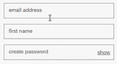
We are often seduced by novel patterns that save space but this pattern is problematic. Here’s why: 1. There is no space for a hintFloating labels start inside the text box leaving no space for an additional hint.
2. They are hard-to-readFloating labels typically have small text, so that as it floats, it takes up a small amount of space. But small text is hard-to-read.
3. They need space to move intoFloating labels needs space to move into. If label text is friendly (see previous point), there would be no saved space anyway — just more white space.
Alternatively, we could create space as the label moves into position. But this makes the page judder, creating a disorientating experience as the user starts typing. 4. The animation is problematicAnimation, even if it’s done well, could be distracting and disorientating, particularly for low-confidence and cognitively impaired users. And, when zooming in, the label might disappear off screen. 5. They have poor contrastLike placeholder text, floating labels have low contrast to differentiate it but low contrast text is hard-to-read.
Depending on the design, when the label floats outside of the field, its colour will need to change. Otherwise the text will be lost against the background colour. 6. They may be mistaken for a valuePeople may skip the field thinking it’s completed already. When they submit, they will see an error which needs fixing. This is frustrating and time consuming. 7. They are inconsistently locatedRadio buttons, checkboxes and select boxes have static labels and legends. Where as text boxes have floating labels. This creates an inconsistent experience. When looking at a text box, for example, the user has to look inside the control. For a select box they have to look outside of it.
8. The label may get croppedIf the floating label is longer than the size of the field, it will be cut off by the field. We should design for content, we shouldn’t make content fit the design.
9. They ignore the standardsWe know placeholders are problematic anyway. However, if we’re going to put text inside a text box, it should be a hint, not a label. SummaryForms are not a source of entertainment. The floating label won’t make users enjoy using forms. Users don’t care. They just want the outcome. Static labels and legends positioned outside the field create familiar and consistent experiences. Two qualities often found in well-designed interfaces. There are better and more productive techniques for improving form design. Let’s spend time and energy on those instead. The post Floating labels are problematic appeared first on Design your way. from http://www.designyourway.net/blog/user-interface-design/floating-labels-problematic/ Designing Programmes by Karl Gerstner is one of the most elusive design books in the world. Brand new copies retail for over $2,000, and even used versions go for over $250. Luckily for you, I spent my hard earned $277 for a copy so you don’t have to.. Let’s startThe book itself is surprisingly thin and it’s not really a book per se- it’s a compilation of four essays from Karl Gerstner. The entire introduction is spent philosophizing the very definition of a “programme” but in essence, you can think of it as an algorithm that produces different, yet cohesive outcomes. It starts with an example of a 15th century Gothic cathedral Karl passed by on his way to work every day…
Notice how every window design is different, yet looks related. The architects of the cathedral used a “design program” which adheres to the same constraints and variables in order to produce different ornamental designs which feel like they belong together. Karl describes it in detail:
MIT’s Media Lab RebrandAnother great modern example of a visual design program comes from MIT’s media lab. In 2011, they rebranded their identity and for a logo, they used a “program” that could generates 40,000 different permutations so each student, faculty member, building and project can get their own unique logo for the next 25 years…
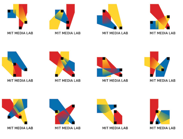
Just 3 years later, MIT’s media lab changed its identify yet again, but retained the grid of the earlier logo design program…
This in essence captures the spirit of what design systems are all about. Deriving complexity from simplicityThe astonishing richness and beauty of geometrical patterns The book offers another great example of a morphology program:
Now, the program itself is very simple: connect the nodes in the original 3×3 square (shown in #5 below) anyway you wish, then reflect it onto the other 3×3 squares as show in examples 6–20:
As you can see, immensely diverse and interesting possibilities exist within these extremely simple set of rules. Now let’s shift to applying programmes outside of visual design to other fields as well. Morphological TypographyDesigning means to pick out determining elements and combine them In this section, Gerstner presents us with his “morphological box of the typogram” which breaks down certain expressive characteristics of typography by rows…
The power of this mechanism is that you could blindly make selections as you go from row to row and arrive at the creative solutions shown below:
Let’s examine how the first example could have been generated by the typographic morphological box. This logotype…
…is the result of the following choices:
This systematic, generative approach to creative output is another great example of a design programme. Program as GridThe typographic grid is a proportional regulator for composition, tables, pictures, etc. It is a formal program to accommodate x unknown items. The difficulty is to find the balance, the maximum of conformity to a rule with the maximum of freedom. Or: the maximum of constants with the greatest possible variability. The grid is a fundamental principle in design which plays a major role in 60s Swiss design, thus explaining Gerstner’s affinity for it (he was a prolific Swiss graphic designer for those who haven’t Google’d him yet.) His contribution to grid theory is his famous “mobile grid” which he developed for the German magazine Capital:
I know what your thinking- WTF. But the grid is actually a lot less intimidating than it looks at first glance- I put together this diagram to show that it’s actually 6 separate grids into one:
Programs as PhotographyAn example is given of a photographic program: “a picture of pictures” which let’s the viewer select his or her own perspective of a car exterior:
Notice how the camera adheres to the same movement at each angle to provide a consistent perspective of the car. Programs as Literature
As beautiful as this beautiful poem may be, it wasn’t written by a romantic staring into the moon out of his window. Much like the morphological typography box earlier, it was generated by a similar mechanism…
As you can see, you can combine any of the alphabetically labeled boxes above to form poetic sentences without much thought. Go ahead and try it. Program as musicA partial example is give of a music generating program consisting of layers represented by squares. This is the first layer:
The different sized points represent different sounds. In this second layer, the 5 lines represent different frequencies:
When you superimpose the 2 layers on top of each other, you get sounds played different frequencies:
Now in the last described step perpendicular lines are drawn between the points and lines, which represent “distance to be observed” which I only assume is time. Although convoluted and difficult to understand, the beauty of this musical program is that it can be played by any number of performers with any kind of instruments. Integral TypographyIntegral means: shaped into a whole. There the Aristotelian dictum that the whole is greater than the sum of the parts is assumed. And this vitally concerns typography. Typography is the art of making a whole out of predetermined parts. The typographer “sets” individual letters into words, words into sentences He goes on to say… “letters are the elementary particles of the written language- and thus of typography. They are figurative signs for sounds without content, parts which acquire meaning and a value only if they are combined. This means that combinations of two, three and more letters show in any case a word-picture, but define letters render a definite idea only in a certain sequence” He demonstrates this by showing that only one combination of the four letters form a meaningful word- “wife.”
The following example is applied to the brand identity of a record shop called “Boîte à musique”
The brand flexibility is displayed below- example 14 is company card with various proportions, example 15- notepaper, example 16 and 17- ads, and 18- a gift voucher:
Another example is given with Holzäpfel’s brand:
3D ProgrammesGerstner dives into three dimensional examples of programmes at work. The first example is a 3D sculpture which can be viewed from multiple angles yet appear cohesive from all angles:
The second example is a cylinder split into 9 rings based on the golden ratio proportions, which can be rotated to form various permutations based on the angle it’s observed:
Color ProgrammesThe very end of the books touches upon color and how it could be used systematically. One of the examples Gerstner gives is similar to an earlier example of reflecting a 3×3 square in order to arrive at different color patterns:
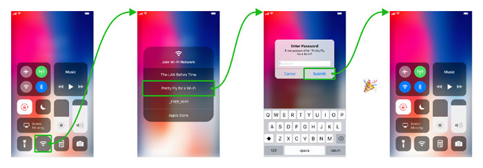
That’s all folks… I’ve tried to capture the main ideas that I found interesting, but the book has plenty more. If you found this useful, please like and share with others who might also derive use from it. Let me know your thoughts, feedback or questions in the comments :) The post What I learned from the $2,000 elusive design book “Designing Programmes” appeared first on Design your way. from http://www.designyourway.net/blog/design/what-i-learned-the-2000-design-book/ A quicker way to connect to everything! Note: Sketch and Principle assets from this post can be downloaded from dribbble, if you also feel the urge to tweak something After updating to iOS 11 this week, I’m pretty impressed. Nothing too overwhelming different, but Apple seem to have resolved a lot of minor annoyances from iOS 10. One of my favourite new features is the ability to customise the Control Center. I’m particularly loving adding quick access to alarms (which I change a lot) rather than timer (which I never used). But, Control Center could be so much better!For example, try connecting to a new WiFi networkIf you try to do this just through Control Center it’s impossible, you’ll hit a dead end. Force touching on the WiFi icon just means more “connection” options. With only the ability to turn these on/off. Useful. True. But I’d still want to quickly connect to something new, just as much as I want to turn on/off. 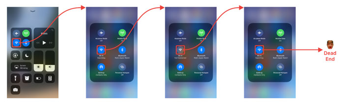
So, how do you join currently a new WiFi network?The only way to actually do this is to go through Settings. As follows: 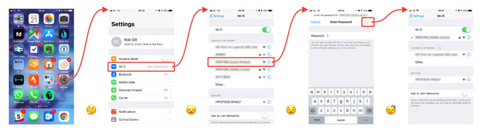
Lets see both of these in action, many many steps …
…and here’s how you should be able to join WiFi network on iOS 11…Lets see this in action, not so many steps… 
It could be even be simpler. Don’t duplicate the WiFi icon on the bottom and add this functionality to the existing force touched ‘connection’ screen. But, I’ve never heard of force touching, and then force touching again. There’s also no reason you couldn’t do the same for connecting to Bluetooth devices. But, I definitely say I change these way less than connecting to new WiFi. What do you think?Would this be a nice addition or unnecessary bloat? I’d love to hear what other features would you like to added to Control Center? Or, maybe you’re on Android and want to gloat that you already have this feature? Tweet me @rob_gill_ or grab the assets yourself from Dribbble. The post iOS 11: Suggesting A better Control Center appeared first on Design your way. from http://www.designyourway.net/blog/user-interface-design/ios-11-better-control-center/ When you’re looking at WordPress schools themes, you will find plenty on offer. However, not all of them can do what you need them to do, so choosing a college WordPress theme can be a little tricky. To help you, below you will find a collection of some of the best college WordPress themes, as well as some of the best WordPress themes for schools and WordPress themes for kindergartens. As Nelson Mandela said, education is the most powerful weapon one can use to change the world. Everyone wants to change the world, and there’s no reason not to take part in that. The education industry is currently valued at $3 trillion, and most of that is spent on online education. Regardless of whether you want to create a website for a university or kindergarten, or start another kind of education-related website, the WordPress college themes below can undoubtedly help. WordPress is by far the most popular and most commonly used CMS platform, so why not take advantage of it? Take a look at our choice of school WP themes, as well as college WP themes, choose one that fits your needs best, and use it as a starting point for your website! Life Coach
It’s a fully responsive HTML5 and CSS3 template based on the Material Design guidelines to guarantee the maximum usability and accessibility. This powerful Life Coaching WordPress Theme features tons of flexible and interactive elements such as slideshow, carousels, testimonial slideshows, podcasts, and much more. Kids World
This multipurpose kids WordPress theme includes nine fascinating home pages, each of them embraced with enchanting graphics, vibrant colors, attractive icons and much more. In addition, kids world accompanied with the Visual Composer, so that you can create and customize the website as you wish. Education
A stunningly flexible and extensive education WordPress theme which is the right solution for those who want to present their college, school, high-school, university, courses or training in the most comprehensive and convincing manner. Thanks to the integrated LearnPress plugin, you can to create a professional LMS WordPress website with courses, lessons, quizzes, and much more. University of Education
University Of Education is based on modern design build with Bootstrap and power full frame work. It provides awesome features to create the online courses and displays the information of the courses the subjects they are offering. University Of Education offers the online shop with products , teachers profile , study time line , lesson , quiz , assignments and event management. Campress
Campress is an Education theme for WordPress. You can create a website for any education, teaching and learning company. You can setup your site in few steps. We have included necessary King Composer blocks on it. Edupro
Education WordPress Theme Pro is the best education WordPress theme designed for university, college, school, online courses and other education related websites. Education WordPress Theme Pro has everything you need to create an excellent education websites. This WordPress education theme has a streamlined, practical design that is sure to attract many readers. Education WordPress Theme Pro also incorporates a huge premium features, which were added free of charge. LMStudy
Want to create and incredible Education WordPress website? Sick of testing and evaluating themes? Choose the ONE completely versatile theme you can use to create the website you need. Educare
Educare is an Education theme for WordPress. You can quickly create a website for any education, teaching and learning company. You can setup your site in few steps. We have included the necessary Visual Composer blocks so editing is easier for you. EduCare is hand-coded & minimalist, so it will load faster & you will rank higher in google. We have used visual composer 5 for drag & drop & front-end edit. TechEdu
TechEdu – Education WordPress Theme is a responsive, clean and modern designed WordPress Theme. Techedu is premium education theme for academia, academy, campus, course, courses, e-learning, education, laboratory, learn, learning, school, student, students, teacher, university etc. EduPress
The EduPress is a beautiful learning management system WordPress theme. This theme compatible with all mobile devices and modern browsers. EduPress suitable for learning management system sites, English classes, colleges, online courses, educational websites, online learning sites, LMS projects, schools, tutorial sites, university sites and similar websites. Coaching
Speaker & Life Coach WordPress Theme (Coaching WP) is a stunning, flexible and multipurpose WP theme for speakers, mentors, trainers, therapists, and coaches. Its ultimate aim is to help individuals and businesses in the coaching industry promote their speeches, services, and consultancies to the world easier. Coaching WP’s uniqueness is due to its amazingly beautiful designs and easy to use Website template solution that maximizes user satisfaction. Teachme
The Teachme is a creative design learning management system responsive wordpress theme.The Teachme theme ideal for university, education, school, online learning sites, online courses, video blogs, paid membership sites, blogs, business and technology sites. You can build powerful learning sites with our awesome course page examples. Education Pack
Education Pack is perfect for create an education website for any learning business related to education, teaching and learning and set up your site in a few steps. Thanks to the many education demos included as university, design school, language school, learning courses, music education school, dance academy and driving school you can choose the best design that fits more to your education needs, depending on the type of education and learning institute. Kidzy
Kidzy is beautiful and feature rich theme for kindergarten or elementary school sites using WordPress. Kidzy features an adorable menu design with dynamic colors and looks great on every device. It can adapt to any screen size. There is Visual Composer drag-and-drop page builder in the theme package with three homepage variations which can present your institution exactly as you desire. Education Press
Say hello to our all new EducationPress WordPress theme. EducationPress is a theme that is perfectly suitable for colleges, universities, academies, education centers, and everyone that needs a powerful learning management system (LMS). The theme is built from the base up with the sole purpose to be the one stop solution to offer the best LMS experience, and be the best WordPress education theme on the planet. Melody
Melody theme has modern and functional design especially created for Music School or Visual Arts Classes for Children, Teens and Adults. The theme can be suitable for Private Lessons or Group Study. Melody is compatible with Booking Calendar plugin to allow you making your own schedule or book a class. UniLearn
“UniLearn” is a unique and flexible Education and Courses WordPress theme, suitable for a wide variety of educational websites. This theme offers many various possibilities which will help you easily create a beautiful and stunning website. “UniLearn” is applicable for colleges, online courses, tutorial sites, personal blogs and may other various site types! Preschool
Preschool is a versatile and multipurpose WordPress theme that has been developed with scholastics at heart. With a playful vibe and a focus on bright and bubbly colour design it is highly suited to early learning websites, including Creche through to Kindergarten, Prep school and Junior through to Primary school learning centres. Michigan
Michigan Learning Suite is a powerful Learning Management System for WordPress. It is an e-learning and education WordPress theme which is made for LMS, Training Center, College, Academy, University, Primary School, High school and Kindergarten with creating and selling your courses ability. Primary
PRIMARY is a perfect WordPress Theme crafted for professional child care centers, preschool and kindergartens. This item is empowered with trending material design colors and full UI set which make it second to none on the market. Come with vibrant design styled with multi-color palette, Primary is a godsend which will impress anyone interacting with the website. Smarty
Smarty Education WordPress theme has been specially designed with your learning community in mind. Perfect as a kindergarten, school, college or university WordPress theme, this contemporary and intuitive platform works for teachers, staff, parents and students at every level, engaging all parties in the life of your school or learning environment. School Time
This theme comes packaged with Visual Composer and Layer Slider premium plugins which give you another level of power when customizing the site to fit your needs. Unlimited colors and collection of Google Fonts give you even more scope to personalize the look and feel of your website. You can add profiles for your Teaching staff and tutors, with description, Photo, Contact details, Schedule and manage your school events. Smart Learning
Smart Learning is dedicated WordPress theme for Education and E-Learning with creative design and ease of customization. The purpose oriented design, responsive layout and brilliant premade concepts represent content in smart way. Smart Learning offers the complete features for an E-learning, Education website with 4 unique demos, different layout & styles for Course, Teachers, Events and Blog pages. Academica
Academica is a premium Education Business WordPress theme created especially for education center, university, academy, online courses & event. It is very easy to use. We analyzed many of education center & online courses websites before planning of education business features to ensure we covered all elements and functions. You can use this Premium theme for use other variant business. Kiddie
I’m new on this playground (last updated on 20 June 17) and I’d like to make new friends. My creators told me that I’m a fully responsive WordPress theme and Retina Optimised suitable for children related projects like kindergartens, preschools and child care centers … KidsWorld
KidsWorld has been designed and developed from the ground up with early age education websites front of mind. Suitable for preschool, primary & elementary schools, kindergarten, child care centers, nurseries, creches and early education school websites, Kids World is a feature rich, content first, premium WordPress Theme. Academia
This stunning educational WordPress theme fits perfect for schools, colleges and language centers, the modern edge designs coupled with latest web features flourishes the use of all functionality and provide an informative, contemporary experience for students and viewers. Language School
Language School – Courses & Learning Management System WordPress Theme is a powerful tool to create a website for any school, courses, training and other learning and education website. The theme features functionality that will satisfy any learning, teaching and other education needs, including Timetable integration, full support for The Events Calendar plugin, support for LearnPress plugin. Skilled
Skilled is a LMS (Learning Management System) for WordPress powered by Visual Composer. It?s suitable for school, university, college, education etc.. and also for private tutors and individuals sharing their knowledge. This theme is designed especially for creating and selling courses. Online University
Online University is an ideal option if you want to build a fully functioning online education website on WordPress. This theme is intended for learning and teaching online no matter where you are located. Upside
Upside is the ultimate responsive multi-purpose WordPress theme designed for any kind of business websites, from small to medium-sized enterprises. With Upside Education theme, you can find it easy to manage events, manage courses by category, search courses by subject, sell online courses, and manage faculty and staff through back-end. This theme enables you to create a forum page using bbPress plugin and a document page for downloading document right from the site. Lincoln
Lincoln is a unique WordPress theme using material design for Education & Learning Centers. Though it is perfect for educational organizations such as University, School, Online Course & Training Center, It is still flexible enough to be used for business website and creative digital agencies. To fine-tune Lincoln, we have done a deep research within the industry. Kidix
KIDIX is a responsive WordPress Theme best suitable for kindergarten, school, education, child care center, preschool or nursery related websites. The theme is very easy to use and comes with Visual Composer page builder which will help you to create awesome custom pages with KIDIX’s beautiful elements. Little People
KINDERGARTEN WordPress theme, is a purpose built theme that will deliver an easy to use kindergarten, child care or nursery wordpress website. Packed with every premium wordpress plugin you will ever need and prebuilt pages that are optimised for the childcare and nursery industry, you will have your new website up and running in no time at all. Youthy
Youthy is a theme perfect for Youth Centres/Centers, Youth Clubs, basically any Youth Projects or Education based services. It could also work for charities and other not for profit organisations. Education Center
Education Center & Training Course WordPress Theme is created especially for educational establishments like colleges and schools, as well as trainings and courses. Incredibly colorful design will get your visitors interested, so that they will be applying for your courses with no hesitation. Fully responsive, translation and WooCommerce ready, One Click demo installation, numerous color settings etc. all these features will help you have strong and easy operated online educational business. IKnow
iKnow is a powerful Learning Management System theme with a very attractive design. Theme comes with complete Learning Management System for selling online courses, tutorials and have a WooCommerce store. Create Teacher Profile, Student Profile, Quiz, Attachments, Ratings and Event Management and many other valuable features are included. Invent
Invent is an education theme with an unique look and feel, designed to meet the needs of Schools/Colleges/Universities. It is a result of extensive study of countless actual websites of educational institutions and their requirements. Along with educational institutions, Invent is flexible and feature rich enough to also cater to the needs of design agencies, corporate websites and small businesses. If you liked this article about WordPress Themes for Schools, Colleges, Kindergartens, you should check out these as well:
The post WordPress Themes for Schools, Colleges, Kindergartens and more appeared first on Design your way. from http://www.designyourway.net/blog/wp/wordpress-themes-schools-colleges-kindergartens/ Tips & resources to help you get started Recently, I’ve been receiving similar questions from a lot of people: How can I get more into UI/UX? I’m a programmer/marketing manager/social media strategist and I want to know more about design. Where do I start? How do you know what is good design and bad design? What does it take to become a designer? “How do I start?”This question brings me back to when I first started my career. 7 years ago, I’m on my first day of my first design job. I’m sitting in front a blank Photoshop file on an iMac (I was a Windows user back then). I’m trying to grasp what my manager just briefed me about. I have no idea how to start. Blank.
Before landing that job, I had just graduated from university with a Multimedia degree. So, why did I not know anything about design? Practicing and learning by yourself is the only thing that can make you a better designer. 7 years later of self-teaching, I’m now a Design Teacher and International Conference Speaker. The first thing you should know is: You don’t have to be born with it. We’re not some unicorn creatures that were meant to be designers and were just born artistic like that. Design is learned. There are many areas of design: UI, UX, product designers, graphic designers, interaction designers, information architect, and the list goes on. Start by figuring out which specialty interest you more. 1. Familiarize yourself with UI principles.
Before practicing design, the first thing you need to do is learn some design principles. From this, you’ll be able to enter the design world and start thinking “creatively”. You will learn the psychological aspects of design: why it can look good and why it can fail. Here are some basic principles you should know about. 1. ColorColor vocabulary, fundamentals and the psychology of colors. 2. BalanceSymmetry and assymetry. 3. ContrastUsing contrast to organize information, build hierarchy and create focus.
Principles of design: contrast 4. TypographyChoosing fonts and creating readable text on the web. 10 Principles Of Readability And Web Typography 5. ConsistencyThe most important principle, creating intuitive and usable designs starts here. Here are some great do’s and don’ts to design a good UI. 2. Learn the creative UX process.The next thing is to understand the creative process. UI/UX design is a process of specific phases that every creative person goes through. 
Divided into four distinct phases — Discover, Define, Develop and Deliver — the Double Diamond is a simple visual map of the design process. DiscoverThis is the start of the project. Designers start researching, getting inspired, and gathering ideas. DefineThis is the definition stage, where designers define an idea extracted from the Discover phase. From this, a clear creative brief is created. DevelopThis is where solutions or concepts are created, prototyped, tested and iterated. This process of trial and error helps designers to improve and refine their ideas. DeliveryThe final phase is the delivery stage, where the final project is finalised, produced and launched. Also, check out my 5 steps for a successful website design. 3. Develop your eye for designKnowing design principles is great, but sometimes it’s not enough, you also have to train your eye to see good design and bad design and to identify strengths and weaknesses in designs. The most effective way to train your eye for design is through inspiration. 
So look at what other designers are doing on Dribbble, and whenever you come across pretty designs or something relevant to your project, save it in your notes and mention what you like about it, you can also take screenshots. This way, you will have a collection of inspirational designs for you to start from. Here are my favorite websites for inspiration:
4. Read design articles everydayTo make ourselves get familiar with design, the best way is to read a few articles each day. Make reading design news and blog an everyday habit. There are millions of articles available online for us to discover about new trends, use cases and tutorials. All we have to do is find them. There’s nothing better than learning from other people’s experiences. 
So start your day with a cup of coffee and a few inspirational articles on Medium or Smashing Magazine. Learning new things in the morning will broaden your mind and will make room for creativity during the day. Then, every now and then during your day, take a few breaks to read more. Taking breaks is very important for creativity, especially when you get stuck and feel unproductive. Bookmark the website you like as your browser homepage or subscribe to a design newsletter. Here are my favorite blog and news websites for design: 5. Design fake projects.Practice makes perfect. And we all know we can’t get clients/jobs without experience. But without a job or projects, we can’t practice, right? But we can break this cycle by practicing on our own, by creating fake projects for fun! Dribbble is full of it. 
Make time to pick a website or app you already use and redesign it. It could be anything you think it can be better. You can also design your own app idea. From this, you’ll build your design portfolio and you’ll practice design. 6. Learn the latest web design tools.There are tons of design tools out there, but you don’t need to know all of them. Get to know the best ones out there, choose your favorites and stay updated with the newest features and trends. Here are the latest tools that I use in my design process:
7. Mentor and get mentored.Another great way to learn design is to find a design mentor or designer friend who is willing to help. They will help you speed up your learning process. The designer would review your work and give their comments whenever possible. It’s like a shortcut. They would also give you tips and tricks they learned from their experience. So go ahead and e-mail a designer, ask questions and discuss your concerns.
Also, from the few years that I taught design and front-end, I learned more than I taught. When you’re ready to start talking about design with people, you can mentor or educate someone about design. You will learn to see it from a different perspective and you will get feedback and questions that you might’ve never thought about. Whenever you’re talking about design with other people, your mind will be in “brainstorm” mode all the time and you will find yourself getting interested in design more and more. 
Want the full list of my design resources?Check out my Awesome Web Design github repository, a curated list of resources for web designers. If you liked this post, make sure to follow my profile for more design articles. Images source: pexels.com The post 7 steps to become a UI/UX designer appeared first on Design your way. from http://www.designyourway.net/blog/user-interface-design/7-steps-uiux-designer/ Have you tried creating the forms from scratch on your website? Why not use jQuery form plugins? Having forms on your website just doesn’t really cut it. You need those forms to be validated to receive the appropriate data from the sender. This way you don’t only stave off unwanted submissions, but you also guide your senders to fill out the forms. Validating the date is just as important as having the forms themselves. There are a few ways to create flawless forms, and the good news is that if you use some of the jQuery Form Plugins available, things get much easier. jQuery form plugins to check outFileuploader
Fileuploader is a beautiful and powerful HTML5 file uploading tool. A jQuery and PHP plugin that transforms the standard file input into a revolutionary and fancy field on your page.
Conditionize.js
A small jQuery plugin for handling showing and hiding things conditionally based on input – typically groups of form fields. It works using data attributes to keep all of the name/values for inputs directly in the markup and saves you the trouble of having to manually show/hide a bunch of stuff through JS, as well as improving maintenance if you need to change the name or value of an input you were listening to. Cleave.js
Cleave.js has a simple purpose: to help you format input text content automatically.
AttrValidate
A lightweight jQuery plugin for basic form validation using HTML5 form attributes. Recommended as a polyfill for older browsers which do not provide built-in validation. Mobiscroll Forms
Mobiscroll Forms supports multiple themes for different platforms and the web – iOS, Android, Windows Phone. Shipping with 13 elements for:
Multipicker
Multipicker is jQuery plugin for selecting days, numbers or other elements, it supports multi selecting (like checkboxes) or single element selection (like radio buttons). SmartWizard
Smart Wizard is a flexible and heavily customizable jQuery step wizard plugin with Bootstrap support. It is easy to implement and gives a neat and stylish interface for your forms, checkout screen, registration steps etc. Based on the feedback from our users over the past years we have come up with the best ever built jQuery wizard plugin of all time. Features:
Contact Form to Google Spreadsheet
Create Contact Form in HTML and submit the data to Google Spreadsheet. Google re-captcha has been integrated to protect forms to be submitted by robots. Check the demo and documentation for more details. Features:
Hierarchy Select
A jQuery hierarchy select plugin used for selecting hierarchy structures in a selectbox format with autocomplete search. SmartMenu
SmartMenu is a user-friendly, highly customizable and responsive jQuery mega menu plugin. It allows you to use multiple menus with different submenus. Features:
BunnyJS
BunnyJS is a modern Vanilla JS and ES6 library and next-generation front-end framework, package of small stand-alone components without dependencies.
Dirrty
Dirrty lightweight jquery plugin to detect if the fields of a form had been modified. If a field has been modified then the form is dirrty
Inputmask
jQuery inputmask is a jquery plugin which create an input mask. An inputmask helps the user with the input by ensuring a predefined format. This can be usefull for dates, numerics, phone numbers, … Features:
Formbase
Formbase is a better default styles for common input elements.Formbase eliminates cross browser bugs, inconsistencies across systems and applies a beautiful default styling to several input elements.
File Input
File input fields look differently in all browsers. It’s a pain in the arse to design something that looks nice in all browsers and it sucks that support for this is not available in Twitter Bootstrap. This jQuery plugin is designed to make all file input fields look like standard Twitter Bootstrap buttons. Form Designer
FORM-DESIGNER is a jQuery form builder tool which will help you to build an interactive form to use in your website template. This is mainly a HTML developer’s tool, but anyone who have a little knowledge about CSS and HTML structure and use of them, can use this tool. I try to keep this jquery application very simple and user-friendly so that anyone can understand it within one or two tries.In this tool you will get total 7 option to create form from 7 different template and one option to create a custom form. As a final output, you will get the HTML,CSS and jQuery code here. Choices.js
A vanilla, lightweight (~15kb gzipped), configurable select box/text input plugin. Similar to Select2 and Selectize but without the jQuery dependency.
JSON Manager
JSON manager: jQuery plug-in that converts JS & JSON objects to HTML forms and back again. Medea loves JSON. Give Medea a JSON object, even one with nested objects, and it will be converted into an HTML form. The form allows fields in the object to be edited, or deleted, or for new ones to be created. The modified object is returned via the submit event. Spider
TextArea
One of the most used, but under featured HTML controls, is the humble TEXTAREA control. This control is designed to accept large blocks of text from the user. A wide variety of plugins exist for the TEXTAREA that layer it with toolbars, auto-resizing, rich-text editing and the works. More jQuery form plugins? Keep scrolling. There are more. Character and Word Counter
This jQuery Word and character counter plug-in allows you to count characters or words, up or down. You can set a minimum or maximum goal for the counter to reach.
Addel
Addel is a simple & lightweight jQuery form plugin for powering UIs that enable dynamic addition & deletion of HTML elements, conceived with form elements in mind. PopSelect
A jQuery plugin to replace the traditional <select> box with a sleek Popover with options pre-populated. Better User interface than any other multiselects. Timon
With Timon – Step Form Wizard you will have power combo of 21 different styles, 8 different transition effects, validation in your step form, titles and subtitles with multiple step. , also Timon – Step Form Wizard has predefined set of form sizes from tiny to large. You can easily create and customize any form to fit your needs. Features:
Select.js
Another one of these jQuery form plugins is Select.js. It is a Javascript and CSS library for creating styleable select elements. It aims to reproduce the behavior of native controls as much as is possible, while allowing for complete styling with CSS. Tagger Widget
jQuery plugin to turn a HTML select into an auto-suggesting, tagging widget. It was written from the ground up and has support for hierachical data, searching for data that isn’t displayed, displaying arbitrary HTML in the suggestion list, running the original onChange actions, displaying tags for items previously selected but no longer in the list, keyboard accessibility and many other features. formBuilder
A jQuery plugin for drag and drop form creation. To start building forms with this plugin call formBuilder() on the textarea you would like to make your editor. FormBuilder takes a number of options and is translatable. OrderNow
PHP Order Form will helps to get project orders from the clients for the people like web developers, corporates and freelancers easily. This form is PayPal integrated and admin functionalities are integrated. Features:
Easy Forms
Easy Forms is one of the jQuery form plugins in this article that will help you design and develop web forms quickly and easily. Actually, you will not need programming skills to make your forms work in minutes.
Parsley
Parsley.js is a lightweight and feature-rich library that instead of validating forms with Javascript, it uses data attributes embedded in the DOM to achieve the same function. The surprisingly easy to configure plugin also allows you to override almost every default behavior so that it will fit in with your form requirements. jQuery Validation Engine
When it comes to the jQuery Validation Engine, you don’t need to worry about the structure of your form as the plugin will create an error DIV and position it in the top right corner of the specified input, keeping both the forms code and validations seperate. Phis is probably the easiest validation solution in this article. Validatr
Validatr uses HTML5 input attributes to perform validation, with support for color, date, email, number and range. The input types text, checkbox, radio…. are supported, but do not require the same level of validation. Where possible, Validatr will use native validation, using Modernizr to test for support. If an input type is not supported it will use it’s own ruleset to supplement native validation. In both cases case, the validation message is shown. Smoke
Smoke is a collection of components for Bootstrap – including a form validator. In comparison to the other Bootstrap validator (#4), it doesn’t use native browser validation – therefore error messages aren’t automatically localized and validation rules have to be specified using HTML5 and data attributes, as well as JavaScript. Validetta
This plugin offers validation using a data attribute, with quite limited options. It comes with just the basic validation rules, everything else can be added with custom regular expressions – but there is no example demonstrating it. Compared to the other plugins, the only unique feature is that error messages are displayed in a bubble (see demo below). jQuery.validity
A plugin to control validation with JavaScript only – no HTML5 or data attributes. While this may be helpful for dynamic validation rules, the plugin doesn’t offer enough options to make writing efficient. It even doesn’t allow using new HTML5 type attributes like email, nor does it provide a function to check if a form is valid – necessary in order to show a success message. h5Validate
This plugin has unfortunately been abandoned by its creator (Eric Elliott). Consequently, the demo/documentation website returns a 404 and there are two dozen open issues. The plugin doesn’t automatically validate inputs by type and the following example even doesn’t show error messages. We’ve included it in the list, as Eric is looking for a new maintainer for the project, so there’s a chance that at some point in the future, it might get some life breathed back into it. SkipOnTab
A jQuery plugin to exempt selected shape fields from the ahead tab order.This library is maximum beneficial while the customers are familiar with the shape, and makes use of it frequently. Contact Tabs
A jQuery shape generator for creating limitless slide-out or static touch tabs containing AJAX powered customised bureaucracy. Plugin consists of 12 one-of-a-kind form factors and consumer-aspect validation. Simple Contact Form
With jQuery Simple Contact Form, you could installation an ajax touch form for your website, writing only the form html code and one js code line. Email is generated and ship by using the plugin (php report blanketed) . Form Recover
By installing this plugin you’ll permit your users to have a draft of their shape saved and restored automatically in cases of unintended refresh or browser crash. Forms Plus
Forms Plus is a form framework. JS version includes everything CSS has, plus date/time pickers, shade pickers, sliders, captcha fields, spinners, area groups (for code, credit card number, and many others.) Prosto Forms
Prosto Forms is a responsive Form Framework and set of beautiful shape factors with large quantity of javascript capabilities: validation, protecting, modals, ajax put up, datepickers. Simple Subscription Popup
Simple Signup jQuery Form Plugins will gather the visitor’s electronic mail deal with in your internet site with an attention-grabber, effective manner. It has a number of elective customization alternatives and you may setup truely in mins. Foggle
jQuery Foggle is a plugin that helps you to interact with various shape factors primarily based on consumer-enter. It helps you to pick which elements to allow (or disable) whilst the person fills out the shape. WizardPro
WizardPro lets in you to create website wizards in only a few mins. You can use this plugin for nearly some thing that requires some steps, like a utility installer, a signup or touch form. Virtual Phone Number Selling Form
Virtual Phone Number Selling Form is a selling form for those voip commercial enterprise who’re promoting virtual telephone numbers designed for All styles of VOIP Business. It’s an jQuery Plugin based totally on present day Bootstrap 3.3.7. If you liked this article with jQuery form plugins, you should check out these as well:
The post jQuery Form Plugins To Use In Your Websites (46 Options) appeared first on Design your way. from http://www.designyourway.net/blog/resources/jquery-form-plugins/ You’ve decided to buy a new pair of shoes. You open up google, navigate to your favorite shoe site, and linger for a second at their home page. The banner image is appealing, but where is the button to get you to the pair you want? It couldn’t be that small, square box right in the middle of image, could it? Ghost buttons, buttons with a colored border but no color fill, have become pretty commonplace online. They get the name “ghost” to describe their transparent nature — since they lack a fill color, they take on the background’s appearance (frequently a photograph). But whenever I see them, I have to wonder: did the designers a/b test the buttons? Maybe it’s my background in Conversion Rate Optimization, or maybe it is the ubiquity of them in modern web design. Either way, I have a problem with them. In this article, we will discuss how web design has evolved from skeuomorphism to flat design, how ghost buttons have gained in popularity in the past few years, and what their impact can be on user conversion.
Where did Ghost Buttons come from?Ghost buttons weren’t designed in a vacuum — much like anything else on the web, they are the result of user understandings, technical limitations, and aesthetic preferences. So, when we ask ourselves where ghost buttons comes from, we need a little historic context: 1984: Apple releases the first Macintosh It’s arguable that the first Macintosh was responsible for introducing the graphical user interface (GUI) to the general public. It used the concept of files as rendered papers, containers that could hold files as folders, and a group of containers as a file directory. In 1984, personal computers were a relatively new concept and very few homes had one. By using these visual metaphors, users were able to make the cognitive leap between the physical object and the digital one. Apple used the design approach of skeuomorphism where the designer stylizes digital tools and concepts to resemble their real-world counterparts. For instance, earlier versions of Apple’s Notes app, referenced yellow legal pads. The idea was that the visual metaphor would help new users quickly understand how to use the app — the Notes app was merely a digital version of the iconic yellow legal pad.
2001 — A team at razorfish launched the first site that adapted to a user’s viewport, 2004 — Cameron Adams creates this example of resolution dependent layout. 2007 — Release of the first iPhone The invention of the iPhone is significant not only because it introduced a greater number of people to skeuomorphism and the Apple way of thinking, but also because it is a mobile device. This was the beginning of smart phone ubiquity and the emphasis on mobile design. 2008–1 in 2 human beings in the world, owned a mobile phone. 2010 — Release of the first iPad 2010 — Ethan Marcotte coined the term “Responsive Web Design”. Ethan Marcotte defined Responsive Web Design to mean fluid grids, flexible images and the use of media queries. Instead of creating separate architectures for mobile devices and desktops, RWD proposed one fluid architecture that could adapt to any screen size. Flat DesignWhile early explorations in responsive web design began to explore how the web could be more fluid and elastic and how that might work, Flat Design began to envision what it might look like. Although many at the time saw Flat Design as a more futuristic, modernist aesthetic, its roots date as far back as the 1950s to Swiss International Style, Modernism, and Bauhaus movements. Flat design strives to subtract unnecessary decoration. Enter the ghost button — stripped of all decoration, reduced to an outlined rectangular shape with actionable text — this design choice is definitely in the flat design family. When did we start seeing ghost buttons?We start seeing references to ghost buttons sometime in 2014. A tumblr blog called websiteswithghostbuttons started circulating and Daniel Klopper was the first to tweet #ghostbuttons. 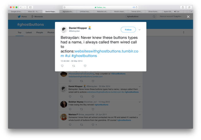
First known tweet about ghost buttons. Some speculate that ghost buttons originate from Heads-Up-Display design. (There are similarities in that HUD UI is often monoweight, and meant to give information without obscuring the pilot’s field of vision.) It’s hard to tell exactly where ghost buttons began, but we can review some of the early adopters. Examples of Skeuomorphism. With the release of Windows Phone 7 and Windows 8, Microsoft introduced a design system called “Metro”. This system featured the use of bold color, simple typography and…ghost buttons!
Amongst all of the early adopters , Apple’s iOS 7 release was perhaps the greatest influence over the trend taking hold. In this Wired article, Apple stressed that user interfaces should be “unobtrusive and deferential” so that the UI “recedes, elevating your content” — rather than competing with it. There aren’t many people who today would argue against Apple’s philosophy — content should be the most important element, not the interface elements that support it. 
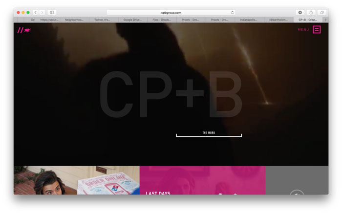
How are designers using ghost buttons?Now that we have an idea how ghost buttons may have originated, why did they become a full-on trend? Most designers would likely argue, that their simplistic design makes them versatile. Especially, when you consider full-width hero images or video-heavy website, ghost buttons will often recede and help put the focus on the imagery and type. It’s not uncommon to see ghost buttons pop up on creative agency websites. Perhaps it is the versatility of ghost buttons — they can be an element of a simple, minimalistic design and they can also be used in richer more complex designs. For example, Crispin Porter and Bogusky’s homepage uses a version of a ghost button that is even further simplified, with the top border of the button subtracted.
One common use case for ghost buttons, is as a compliment to a solid fill button beside it. This two button approach typically has the solid fill button as the main call to action and the ghost button as the secondary, less important actionable task. Some designs go further than this, and incorporate a mix of ghost and solid fill buttons, either to denote hierarchy or to provide variety. 
The use of solid color (or gradient) backgrounds, has also been on the rise since the advent of flat design. Ghost buttons can pair well with this type of design, because it serves as a neutral element. Ghost buttons are also (as we mentioned earlier), an evolution of flat design so if the overall look and feel embraces that aesthetic, then ghost buttons can work well visually. The Implications of Using Ghost ButtonsWhile we’ve just discussed all the great reasons why designers use ghost buttons, here are some unfortunate facts and figures that make them less than awesome. Although ghost buttons can aid in creating a pleasing visual design, they can also create issues that can both affect the user experience and have a negative business impact. Angie Schottmuller, former Chief of Conversion Marketing at Unbounce, had this to say about them: Ghost buttons drive me crazy. It goes against usability. The concept is a designer’s fantasy trend that should die. The only time I find this tactic useful is when a client insists in having two CTAs on the page, and I basically want one to disappear. Ghosted buttons have ghost conversions.” Here are some common usability issues that can be associated with the use of ghost buttons: Legibility: If placed over a busy image/video without sufficient contrast, it can be difficult for users to make out what the cta says. 
Contrast: If say, the ghost button and typography are both white, placed over an image, there is often a lack of hierarchy to draw a users eye to the main actionable task you want them to complete. This can have real implications on landing pages, where conversions can be impacted. 
Clarity: While copy and interaction animations can help, it may not be clear that it is a button. If there isn’t appropriate context and depending on your audience’s age, there could be some confusion. 
While all of the above issues should not be taken lightly, the potential impact on conversions is one that can cost businesses money. There have been a couple of conversion studies that have looked at the impact a ghost button vs a solid fill button can make. Elevated Third ran a test on their newsletter, one version populated with ghost button CTAs, and another with solid fill buttons. They found that the solid fill version, outperformed the ghost button version by nearly 7%. 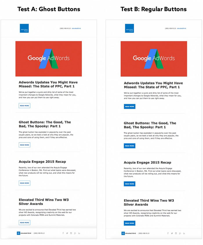
In another test, the website ConversionXL found a 20% decrease in clicks (based on 10,000 visits) when testing the following images:

Nielsen Norman Group recently released a study, that concluded “Flat UI Elements attract less attention and cause uncertainty.” In the study, NNG found that users spent 22% more time on web pages that had weak signifiers (i.e. there weren’t clear, actionable buttons or links). Since this study was based on targeted findability tasks, the goal is for a user to complete the task as quickly as possible. More time on a page means those users faced more cognitive load. Since the publications of NNG’s study, there has been some backlash that it did not truly focus on flat design. Sean Dexter of Cigna wrote an article titled Flat Design: Why you should question Nielsen Norman’s research on the trendy design style. In his article he mentions that one of the better examples in the NNG study actually compares a ghost button to a solid fill, thus making the test more about contrast rather than flat design. The problem with this observation is the assumption that ghost buttons are a different problem and not intimately tied to flat design. The argument that NNG’s study was primarily focused on weak vs strong signifiers rather than flat design, is not without merit. That being said, I don’t think it is a stretch to say that many flat design executions have suffered from a lack of contrast. 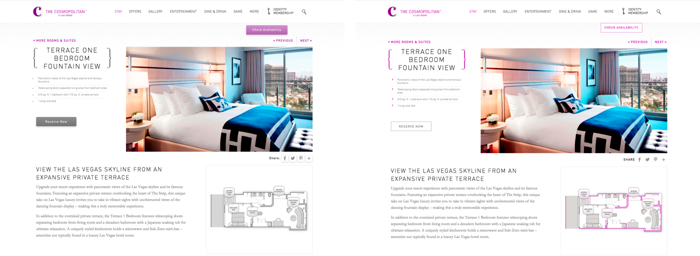
These are small samples, and results will vary based on a number of factors such as industry, audience, type of traffic to the page, position on the page, copy, etc. That being said, if you use ghost buttons prominently in your website or email newsletter, this data should make you consider running some a/b tests. Do you have any ghost button conversion tests that you’ve ran? I’d love to hear the results. Next Steps: Design with intentionality.We’ve talked about what ghost buttons are, their possible origins, different ways they are being used and possible implications for their use. What can designers do differently, as the approach the design of new brand identity systems and websites? Here are a few takeaways to consider the next time you are considering using ghost buttons:
Above all, be aware of the possible implications and do not create designs that are largely dependent on ghost buttons. Talk with the involved stakeholders and be sure to have an action plan to test your buttons, early and often. Many designers are wary of data-driven decisions, perhaps because they are afraid that the data will force an undesirable design direction. Data is not the enemy, and if we choose to ignore it, we do so at the potential peril of our clients and the brands we manage. Surely the decision to use ghost buttons will not single-handedly destroy a brand’s user experience or conversion rate, but if it is not considered and approached with intentionality, it can be a significant factor. It’s our responsibility as digital designers to be aware of the impact of our decisions, so next time think twice about using that ghost button and at the very least, test! Originally published on Medium. The post Ghost buttons: Why you should be afraid appeared first on Design your way. from http://www.designyourway.net/blog/web-design/ghost-buttons-be-afraid/ Have you ever created a music logo design? Even if you see cool music logos every now and then, it doesn’t mean it is easy to create one. Marketing and branding are constantly changing, especially in the musical industry. Digital music has changed the way the industry connects with listeners, and you will find that social media is actually the new game changer. You can remember, for example, Justin Bieber getting his big break from his YouTube videos. Video marketing, specifically, has somehow served as a replacement to MTV music videos. The videos were actually our first music ads, but today new artists are commonly found on videos that are shared on social media. To make a mark here, you need a call signal, which is better known as a music logo. Any artist knows that music logos are the most important visual aspect, and the power of a good music logo should never be underestimated. If you have a good music logo design, it’ll last you a lifetime, and it may also make a good profit through merchandise. The benefits of music company logos
If your goal is to create a connection on social media, you should have unique music logo ideas. This should be an image that will reflect your company across the board, and you will need it for anything from your YouTube thumbnail, to your other social media profile images. These logos are the key to online branding, and it should give your users, or listeners, an overall feel for the company. From the graphics and color, to the vibe, it should represent your business well. This applies for music apps logos, music store logos, music label logos, and any other cool music logos you may think of, so be careful. Using logos for a music business
How you use your music logo is a pretty big deal when discussing thumbnails and social media profiles. It basically introduces your business before a consumer actually listens to it, or takes any further steps in connecting. Regardless of whether you want musicians to buy instruments, or trying to attract new talent, or anything else, the first symbol they’ll see is your logo. To put it shortly, you have to do your best with your logo. The logo is a pretty big selling point, as it gives your fans a graphic representation. You’ll be putting it on your merch, albums, website, everywhere. You do know this already, so let’s see how you can create a memorable logo. A style guideFrom freelance illustrators, to designers, photographers and small businesses, as well as multi-national corporations, they would all benefit from a style guide. That is a document that puts down some rules for applying their brand assets, such as the logos, colors and fonts. The primary purpose of this document is to give others a guidance as to how the company’s branding is to be used when they want to create anything from a business card to a website, basically anything that will visually represent the business. Even if your company only has one employee (yes, you), a style guide will help you regarding how you can tie together all the ways you present yourself visually, and help you create your brand identity in the process. Regardless of the scale of the business, a style guide will have a pretty practical purpose, and is also very fun to do as well. Why do you need one?
You may be wondering why you’ll need something that will put restraints on how creative you can get. Well, designers usually fall into two camps. If you work for an agency, or as a freelancer, you’ll be used to working within the restraints of the guidelines of your clients, but you may feel like you have a bit more freedom for your everyday work.
The client may outsource to get a different perspective, which may result in them lifting the restraints a little, to reap the benefits of the creative insight they just got. After all, big clients tend to have an in-house design team, people whose jobs revolve around sticking to that style guide, and creating company materials that live up to a certain standard. There’s where the second camp comes in – designers that work in-house, for one business or organization exclusively. The first camp may feel sorry for the second camp, because they may feel like they don’t get enough creative work. While this may be true for some in-house design teams, for others, this isn’t really the case. The deciding factor here is the brand guidelines of the employer. If you have a successful style guide, it will channel creativity, instead of restraining it. Which leads us to a single statement, which you should stick to if you want a good style guide. A style guide should merely guide creativity, and never restrain it. There are a few situations that adhere to this motto, and you can use them as guidelines on building your style guide. The building blocks
Rome wasn’t built in a day, and brand guidelines aren’t that different from that perspective. It all takes a bit of work, and how much it takes is up to you. Below you’ll find guidelines for the essentials, but how much you want to follow and stick to them is completely up to you. Keep it simple when designing a music logo
Minimalism isn’t just a method of design, it something that ensures longevity throughout your career. For example, the Beatles logo is just black text, but the font is instantly recognizable, and has worked throughout their entire careers. A lot of artists are tempted at throwing designs, colors, shapes etc., but you should be careful, and keeping things simple is pretty effective. Choose color carefully for a music logo
Colors can evoke emotion, so you should be careful. If you don’t want to stick with neutrals, make sure it isn’t something too loud, or a hue that doesn’t really work with your brand’s voice. Fewer colors will also save on printing costs as well. And, be subtle with the color. Even if you use it in just a few places, such as a letter or a symbol, that can make a huge impact. Versatility is very important
Great logos tend to come with two pieces. One is the logo, the complete one, and the other is an icon that you can use by itself. For example, the Nike logo is the check, and “Nike” below it, but you will also recognize the “swoosh” by itself. When you’re creating a logo, make an image that you can either use as a complete symbol, and you can break down without it losing the meaning. Typography matters in music logo designs
Your logo will most likely consist of text and subtle images. Therefore, you should indeed be picky about the typeface. If you want a classic feel, go with serif fonts. If you want a clean look, go for sans serif fonts. For example, Pixar and Apple’s serif fonts give a regal, classic vibe. A bold band image for a music logo
What does your band stand for, and what do you want to send to your band as a message? The logo should communicate both of these things. For example, we can take a look at The Rolling Stones’ logo. Millions of fans will recognize the shiny red mouth and the red tongue sticking out. It is known as “Hot Lips”, and was drawn in 1969 by a 24-year-old student. How much he charged for it? 50 pounds.
He was a student at London’s Royal College of Art, and was inspired by Mick Jagger’s mouth, and the Hindu goddess, Kali. The logo first appeared on the Sticky Fingers LP in 1971, and it was instantly a fan favorite, being used decades later. An iconic, professional image
You may be coming up with a whole range of services and products that are music related. Your brand is more business, and less performer. In this situation, you’re best off with one iconic logo image, which you can just tweak for each branch. Universal Music Group and Universal Studios are good examples, as they deal with different sectors, but you’ll see that they are actually visually linked with their logos.
Both of them share the image of a globe which has North and South America. The Universal Studios logo is usually seen in full color on a black background, but the Universal Music Group logo is usually a sketched version, in black and white instead. Simple, yet spot on
If you want to make a music service or app, take a look at the logos of some popular ones, such as Pandora or Slacker Radio. They usually keep things simple, and play around with fonts and colors. Pandora is a great example, and the particular shade of blue reminds of their brand immediately.
Napster, for example, has a logo of a catlike face, and the outline of headphones on its head. The logo is also sometimes found in thick, blue lines, and the cat’s eyes are in green. Spotify is another alternative, with the green circle and three curved lines. The lines represent wireless streaming or sound waves. You can get inspiration everywhere
Thinking outside the box is actually accepted and appreciated. Music logo design inspirations can be found from a person, place, song or an object. Just grab an idea, and play around with it, you’ll be surprised.
You can experiment with images, colors, shapes and fonts, until you get the look you want, and the look that will convey your message. Once you have it, you’ll see your brand taking off with the audience. Get inspiration from the lyrics
Feeling stuck? Look to your lyrics for the answer. Is there a particular line in your biggest hit, one that fans scream out along with you at concerts? Use it to improve your design. Get your own font
The font plays a huge role. Even if you decide you want to change up the colors or design later on, if you have a font that is your own, can help you a lot in keeping things consistent. Most bands will want a custom font, especially with the growth of their fan base. However, if you can’t afford it, just make a few letters stand out. Make them a different shade, or make a design out of them, the possibilities are endless. Carefully choose colors
The colors tend to say a lot about the type of music people can listen to from your band. Heavy metal goes well with blacks, silvers and reds, and if the music is easy and relaxing, greens and blues are the way to go. However, make sure you have at least two colors, especially If you’ll be wearing your own merch onstage. Your genre can be your guide
If you’re a classical music band, having a logo with neon hues or raining glitter isn’t that much of a good idea. But, if you make electronic music, such as techno, that’s amazing. Make sure that your design correlates with the type of music you play. And, if you’ve changed your sound recently, your logo might be in for a redesign as well. Your fans can help
Want to show your fans you appreciate their opinion? Let them influence the music logo design. You can do this with anything from them voting on the final options, to them helping you create images, or you can get feedback from dropping subtle hints about the upcoming logo reveal on social media. You should remember that these are the people that will wear your logo, and you have to make them happy. Ending thoughts on music logo design
The aforementioned logos and ideas are very successful at presenting what they stand for, and spending some time to study what makes them so good, is actually well worth it. The logo is actually the visual identity that makes your audience aware of your services. Give the above a good read! If you liked this article about music logo designs, you should check out these as well:
The post Music Logo Designs: Gallery, Tips, and Best Practices appeared first on Design your way. from http://www.designyourway.net/blog/inspiration/music-logo-designs/ |

AuthorPleasure to introduce myself I am Jamie 27 years old living in Searcy, AR. I am web developer and have developed over 50 sites for clients. Now a days I am focused on designing as I feel I am lacking it. Archives
April 2019
Categories |
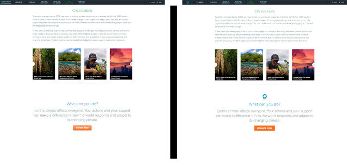

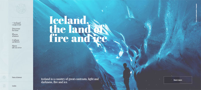


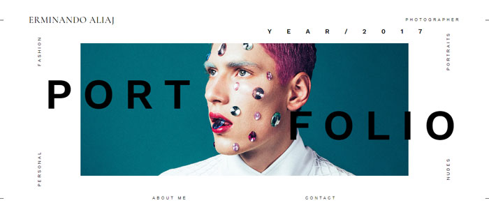
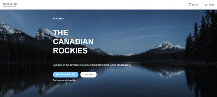
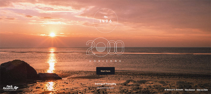

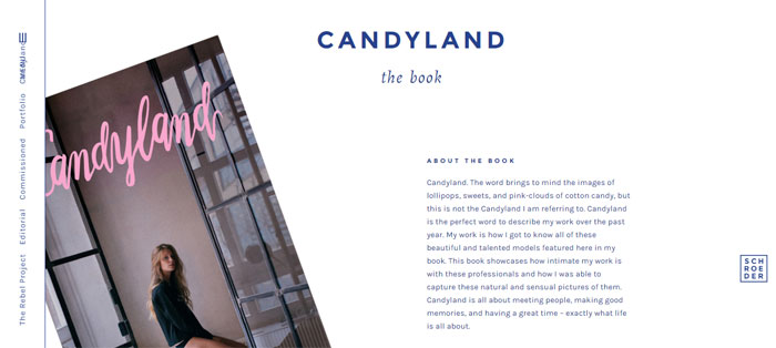
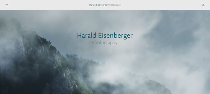
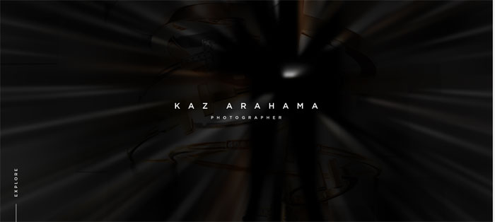

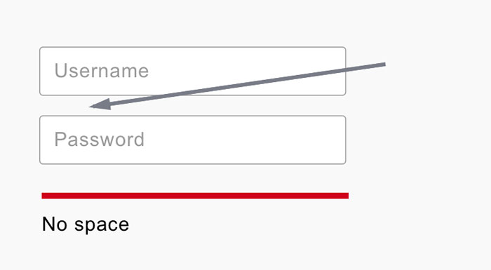
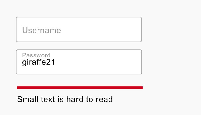
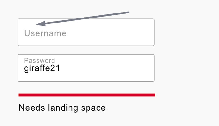
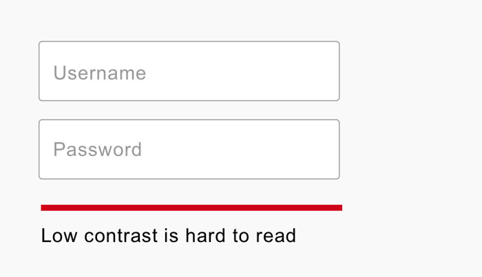
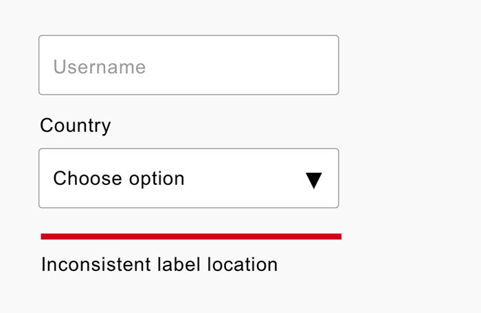
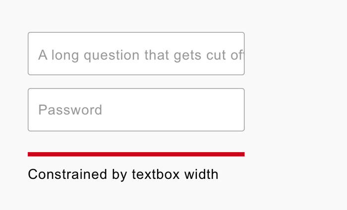
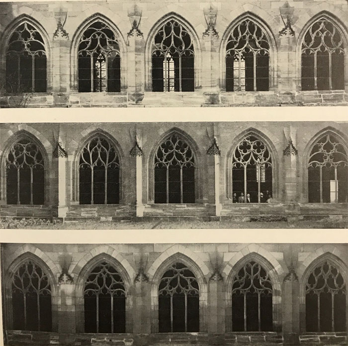
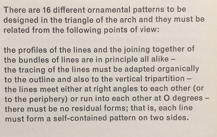
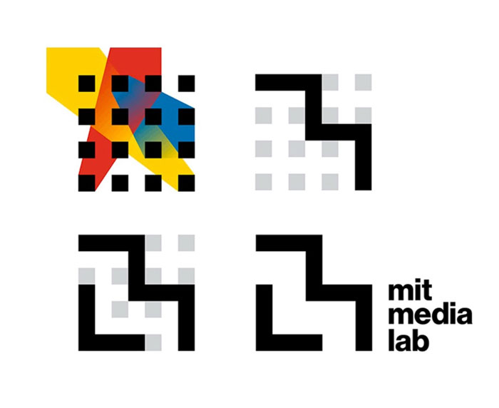
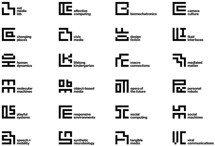
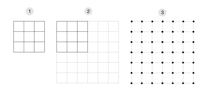
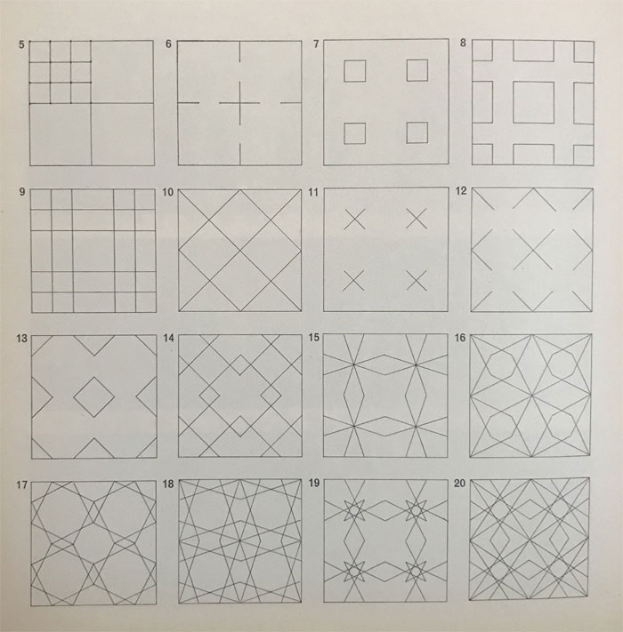
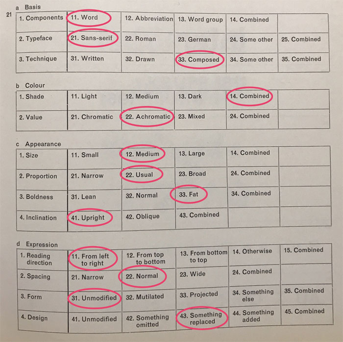
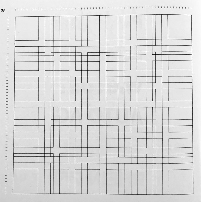
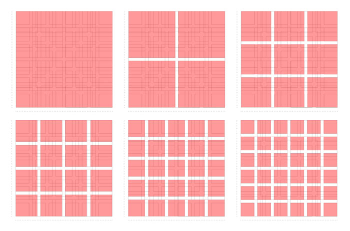
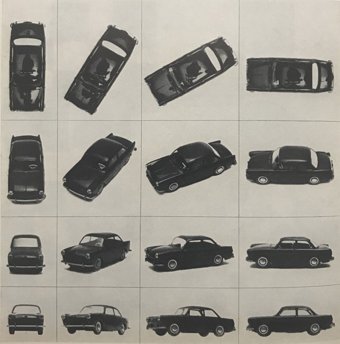
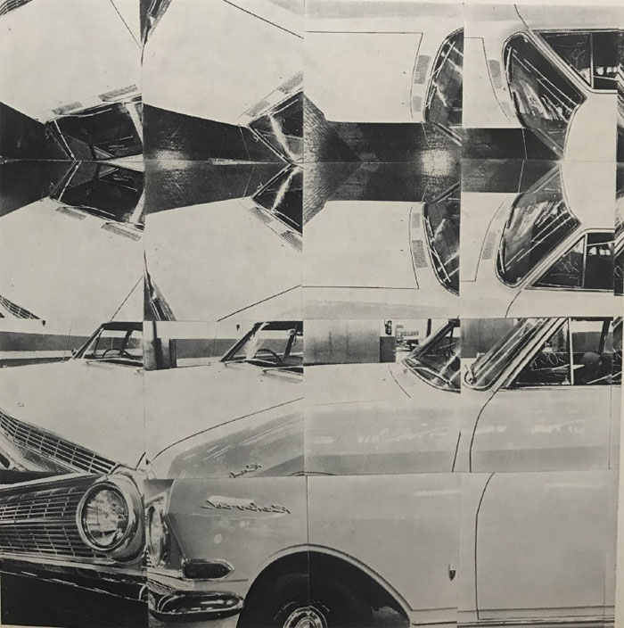
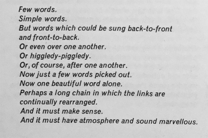
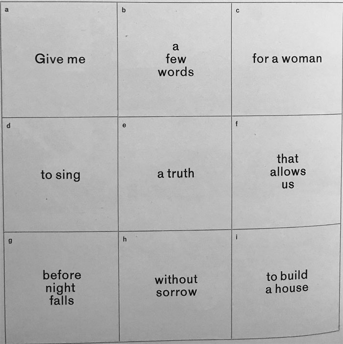
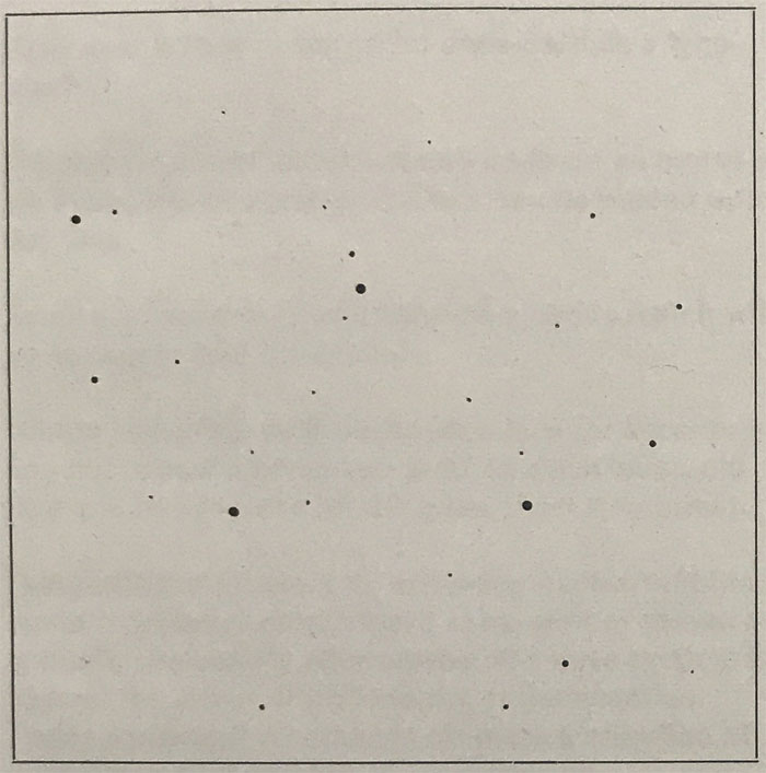
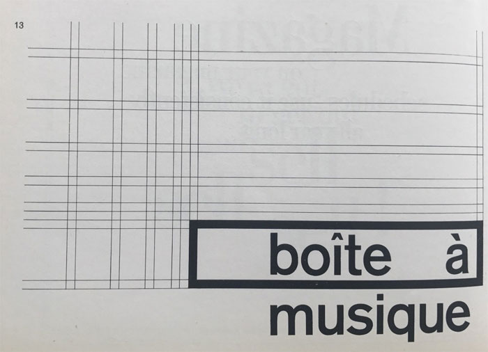
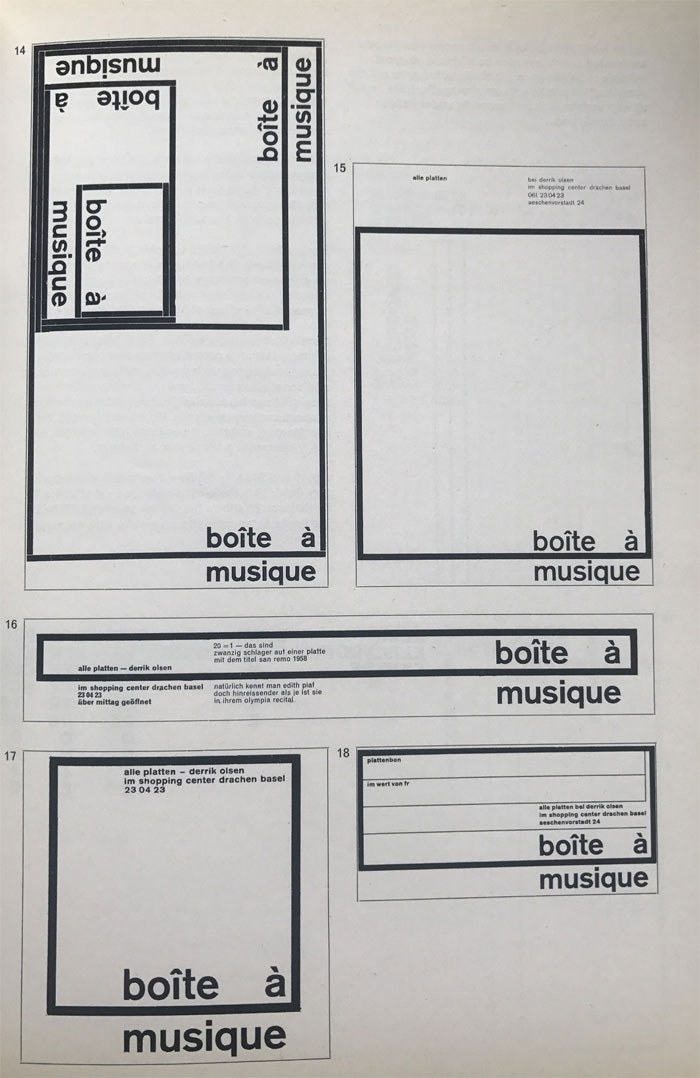
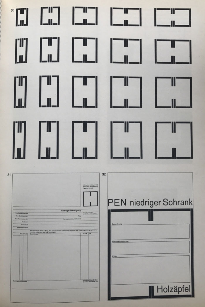
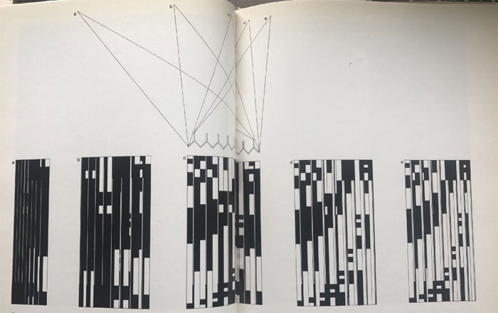
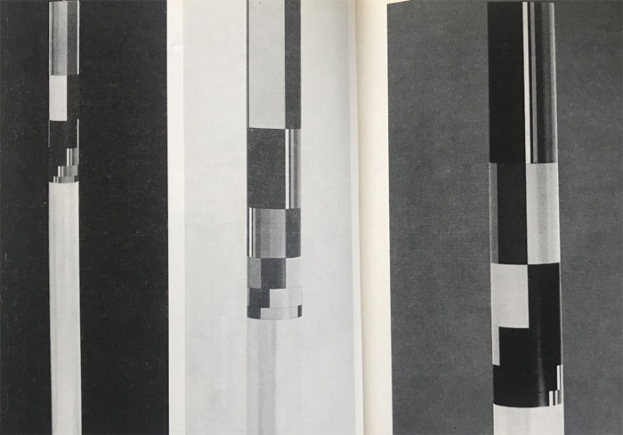
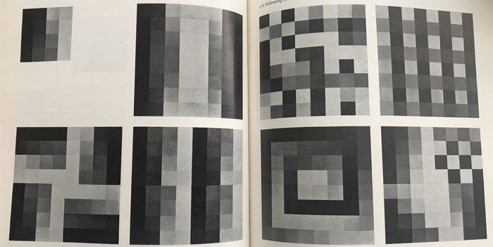
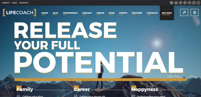
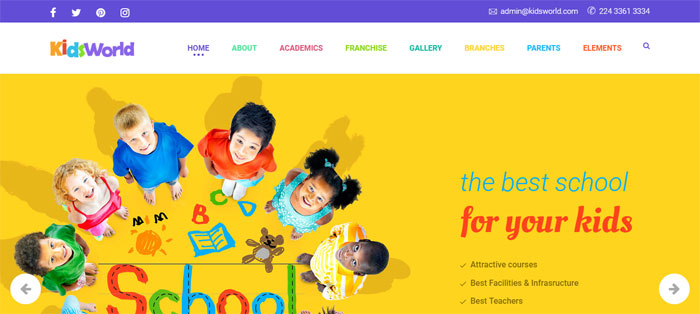
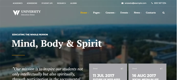


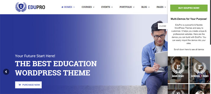


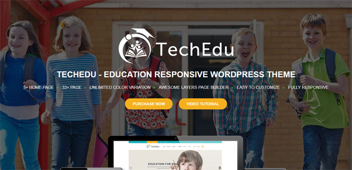
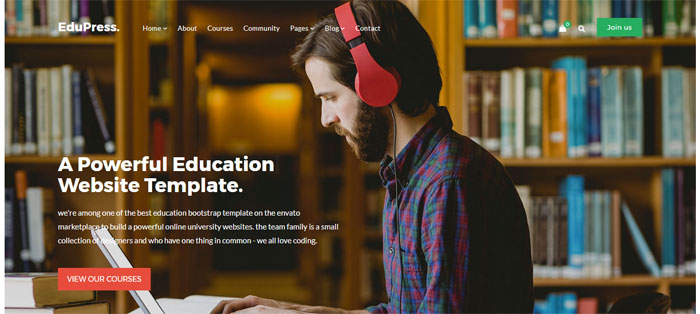
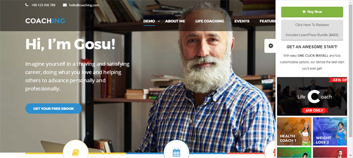
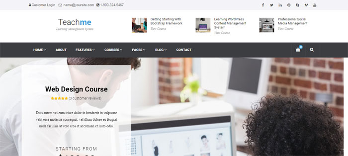
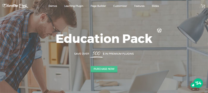
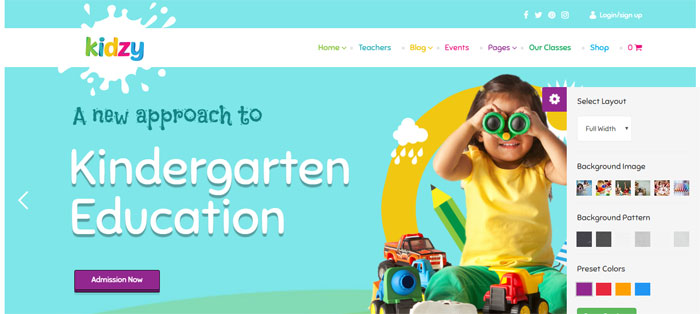

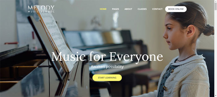

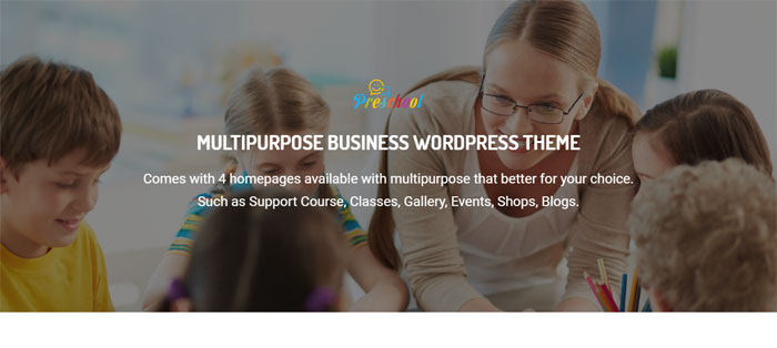

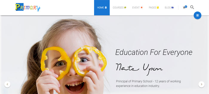
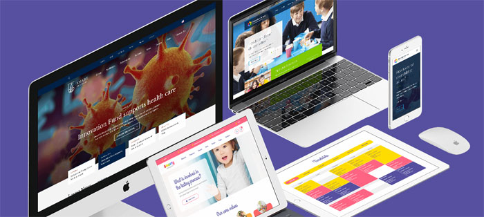
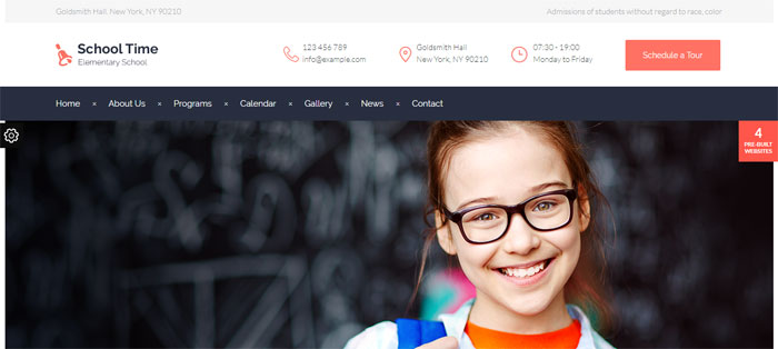
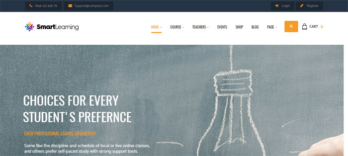

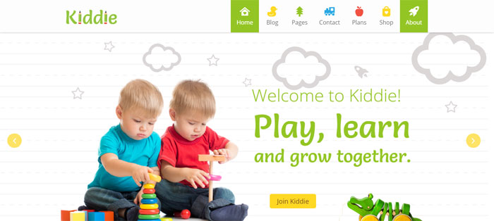


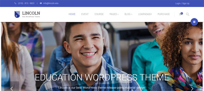
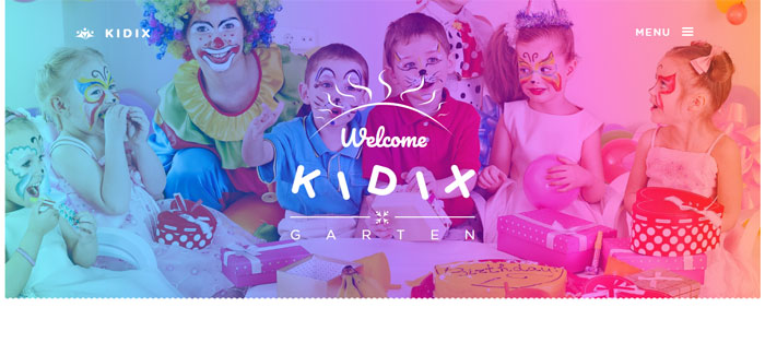
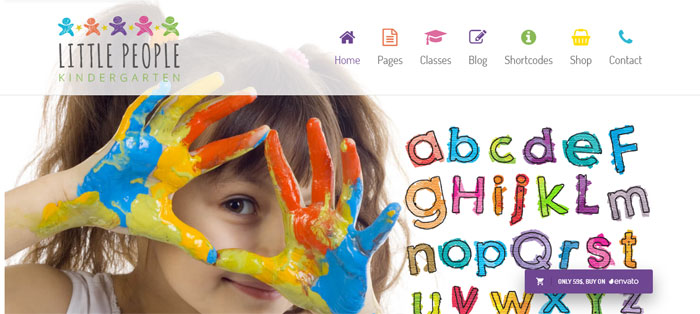
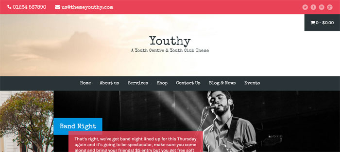
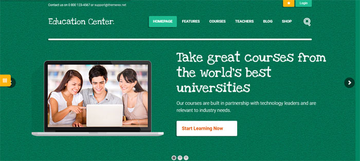


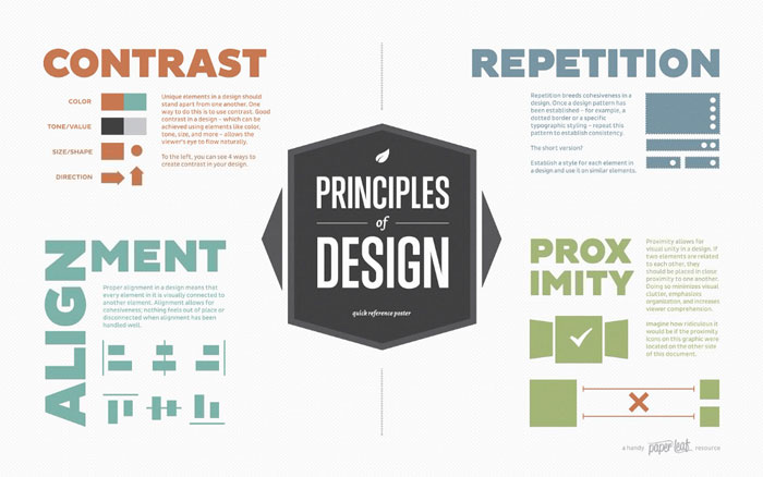

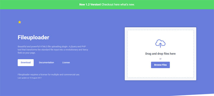
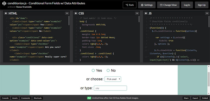
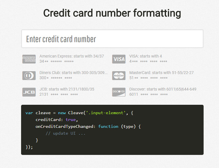
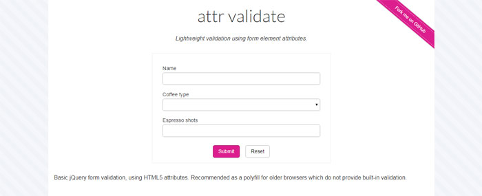
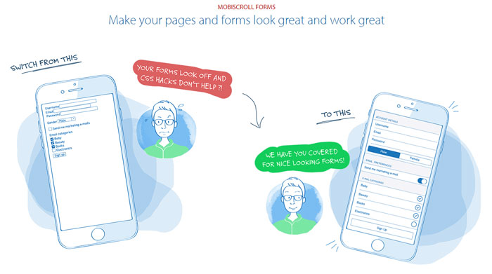
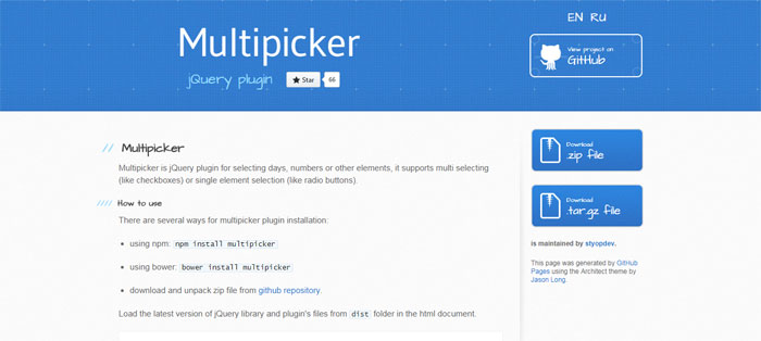
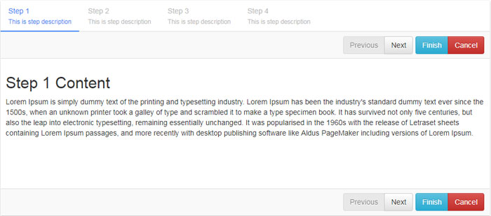
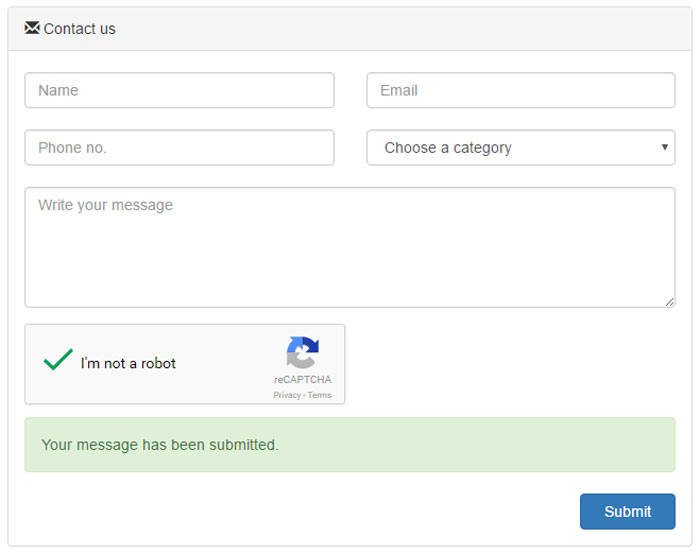
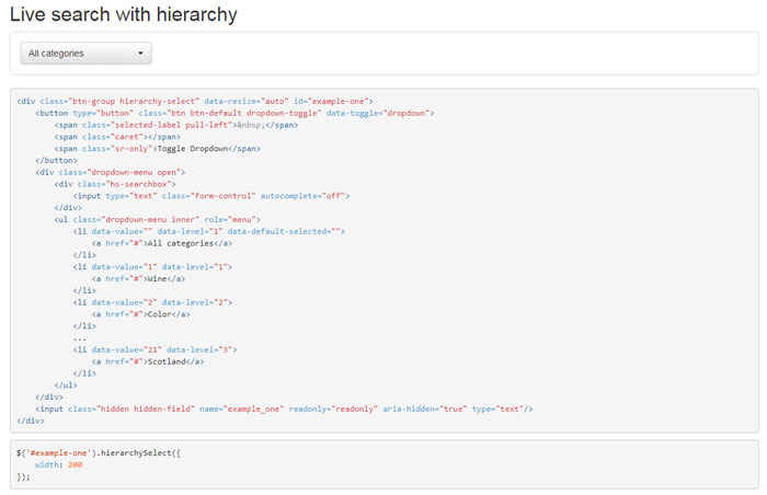
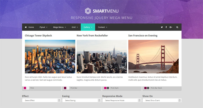
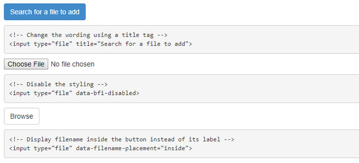
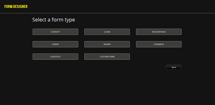
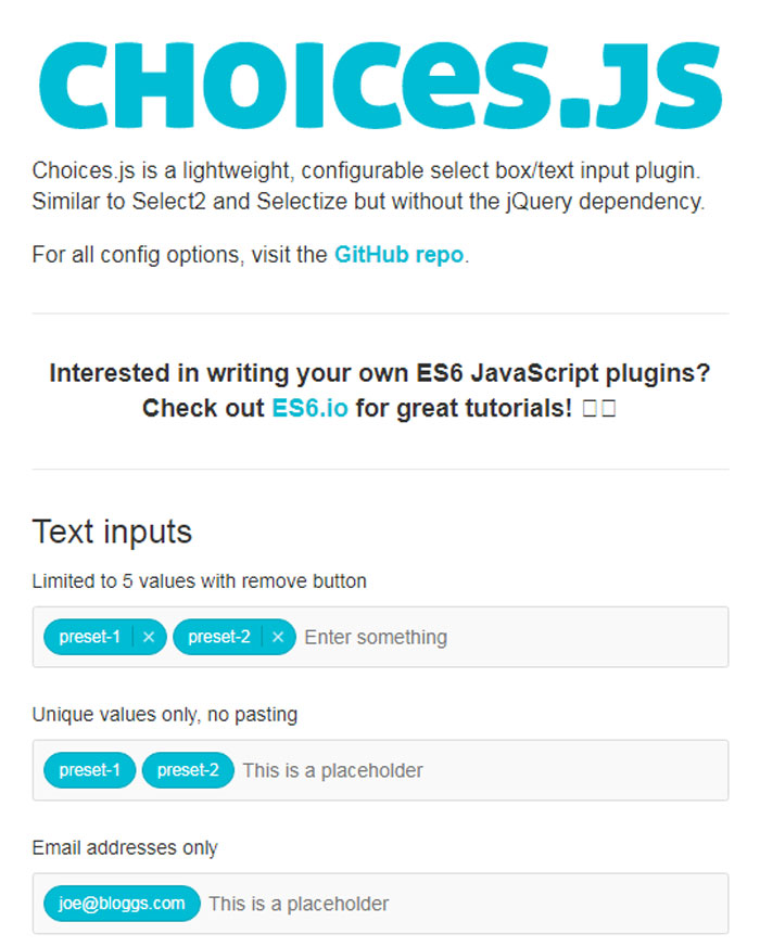
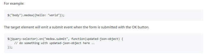
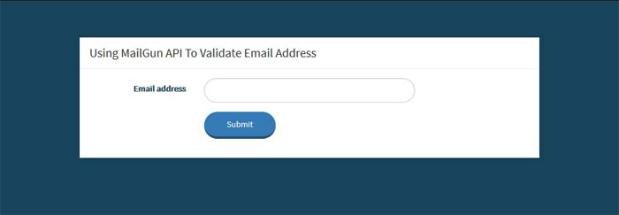
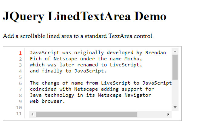
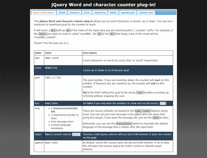
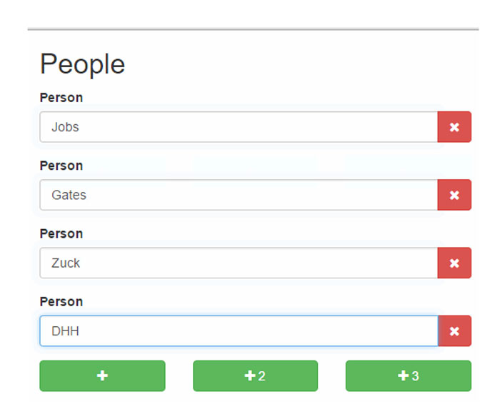
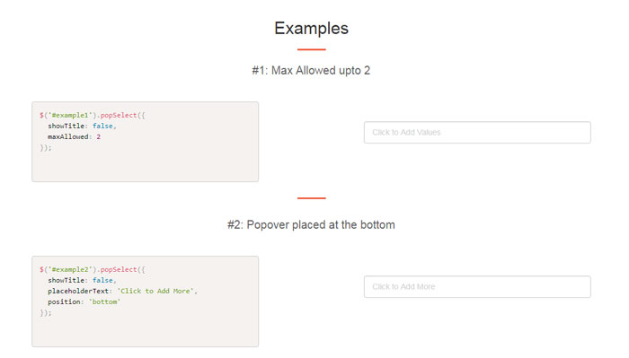
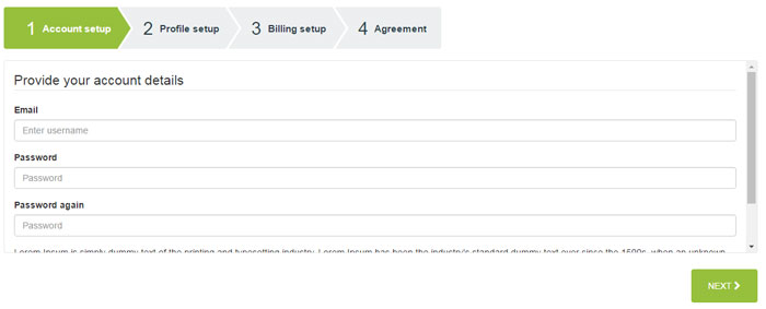
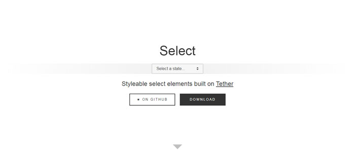
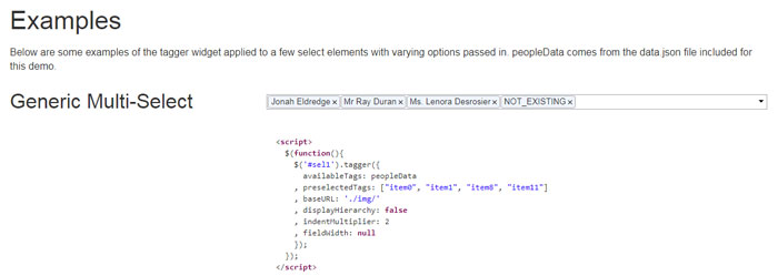
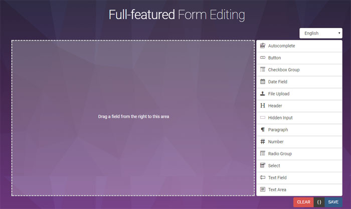
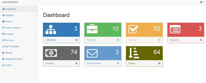
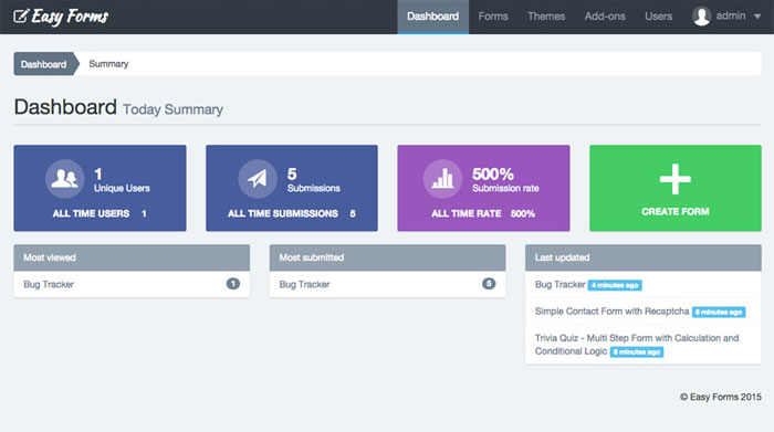
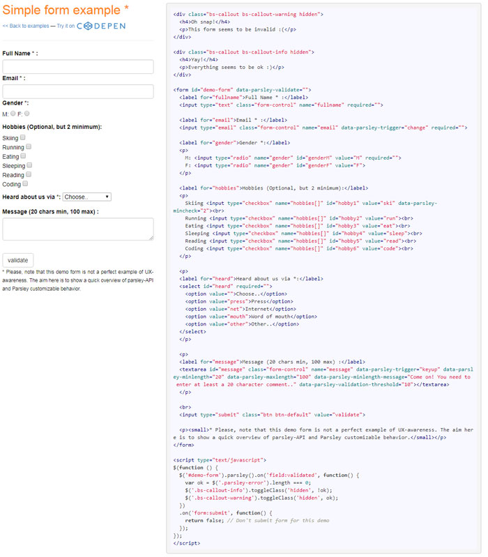
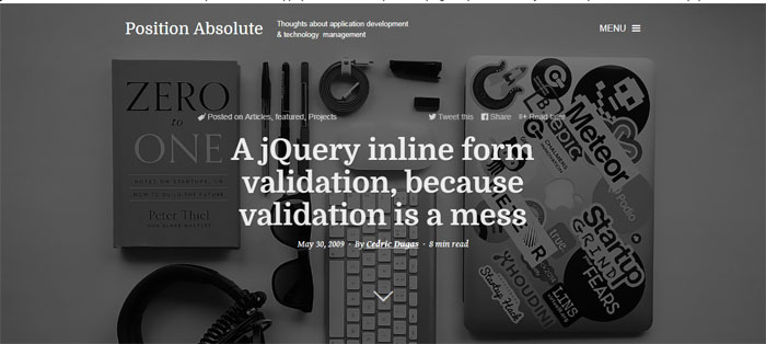
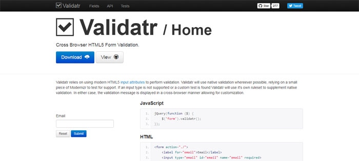
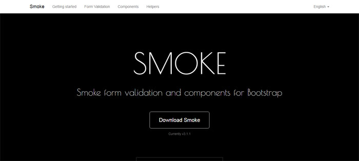

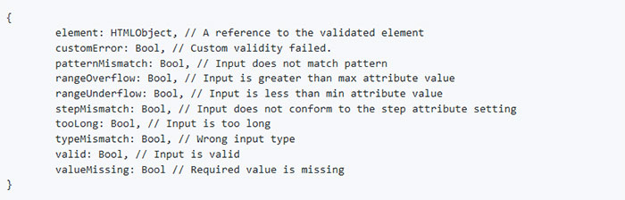
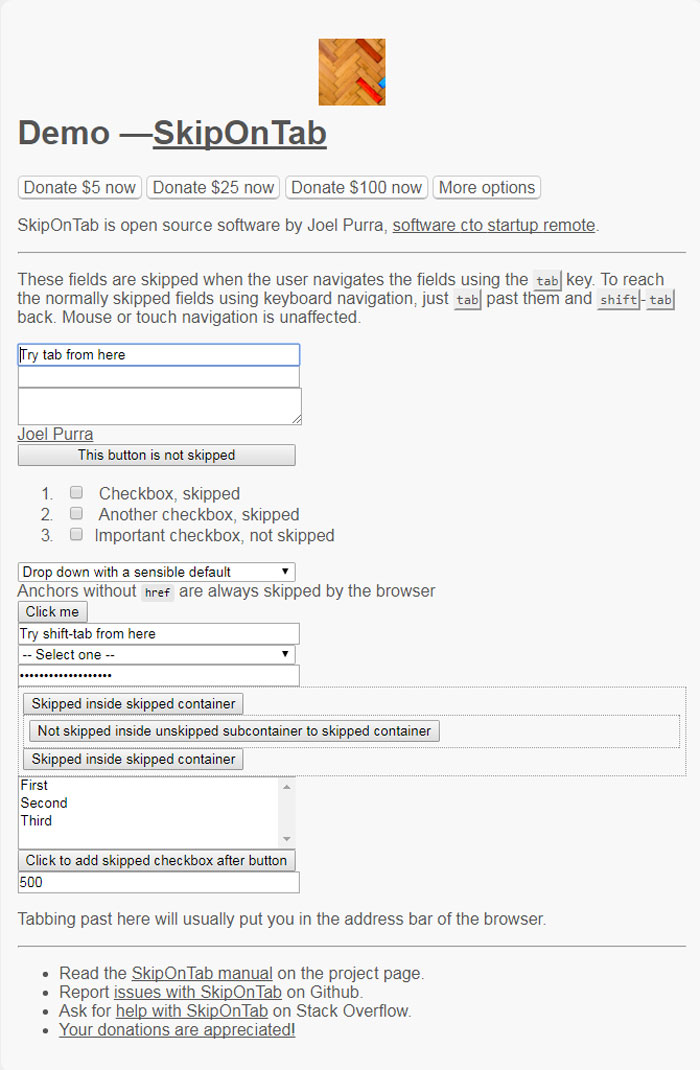
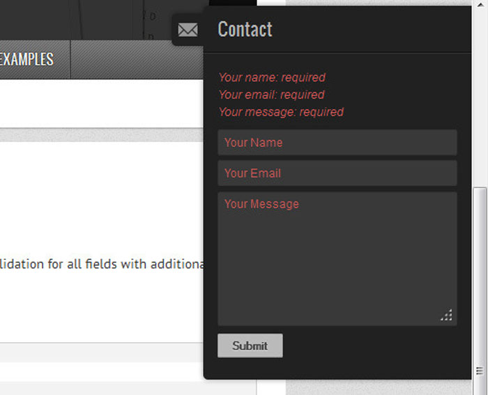
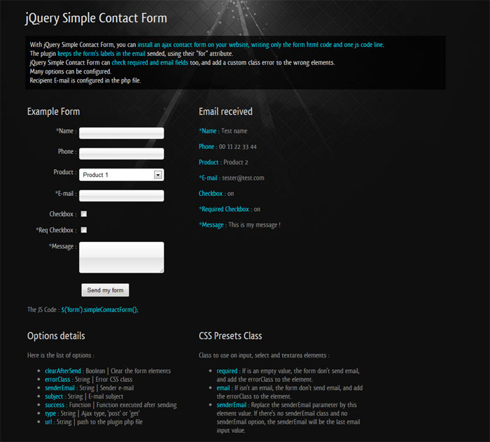
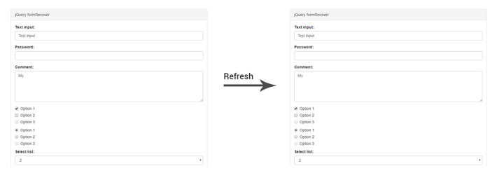
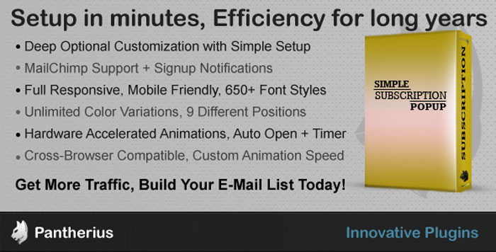
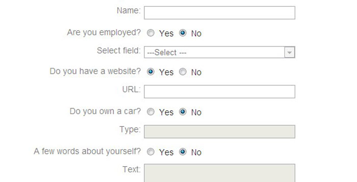

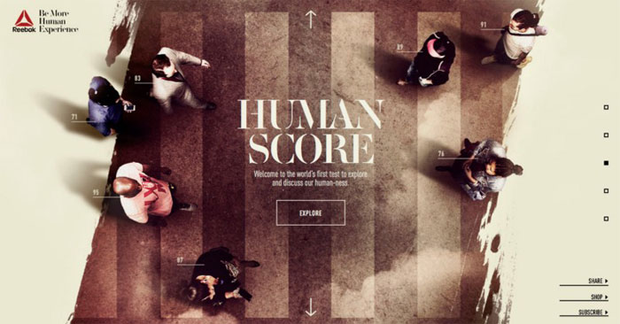
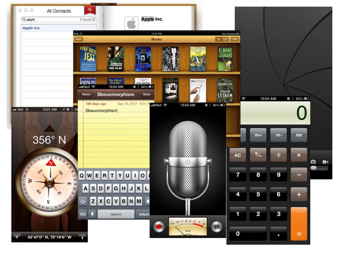

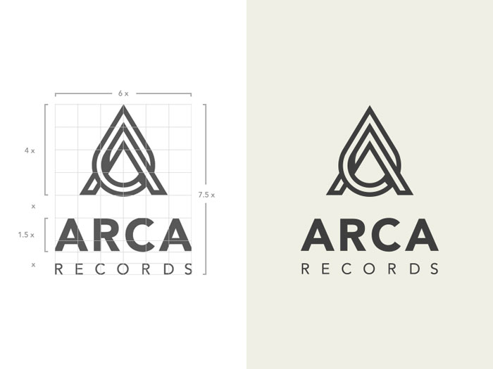


 RSS Feed
