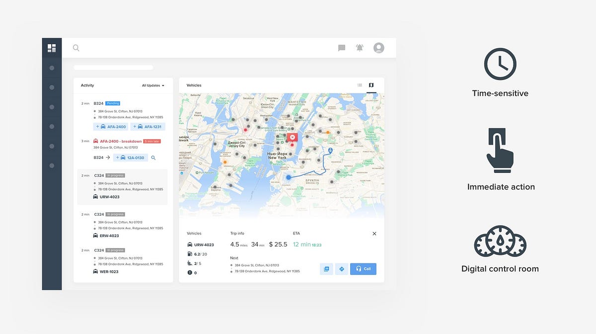
One view to rule them allDashboard design is a frequent request those days. Businesses dream about a simple view to present all information, show trends, risky areas, update them on what happened, a view that will guide them into a bright financial future. For me, dashboard — is an at a glance preview of crucial information important for the user at the moment he is looking at it, and an easy way to navigate directly to various areas of the application that require users attention. The term “dashboard” is a metaphor for a car dashboard, sometimes also called cockpit — area, usually near the front of an aircraft or spacecraft, from which a pilot controls the aircraft. Working on enterprise project for years I designed countless dashboards. And every new one is the next challenge for me. A good dashboard can be a daunting thing to design. Based on my experience i put together a list of useful suggestions to help you in the future. Eather you just starting, or a seasoned designer I’m sure you will find something interesting for you. 1.Define the purpose of the dashboardLike any other view in your product, the dashboard has a specific purpose that it’s undertaken to serve. Getting this wrong renders your further efforts meaningless. There are multiple popular ways to categorize dashboard based on their purpose(Analytical, Strategic, Operational, Tactical etc). To keep things simple I will divide them into 2 more general forms: Operational dashboardOperational dashboards aim to impart critical information quickly to users as they are engaged in time-sensitive tasks. Main goals of the operational dashboard are to present data deviations to the user quickly and clearly, show current resources, their status. View support actions, its a digital control room designed to help users be quick, proactive, and efficient.
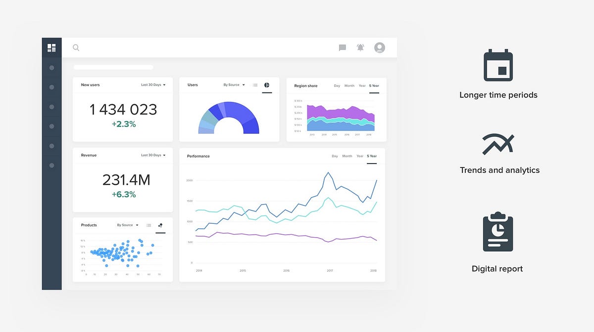
Analytical dashboardIn contrast to Operational, Analytical dashboards provide the user with at-a-glance information used for analysis and decision making, and are less time sensitive and not focused on immediate action. A primary goal is to help users make the best sense of the data, analyze trends and drive decision making.
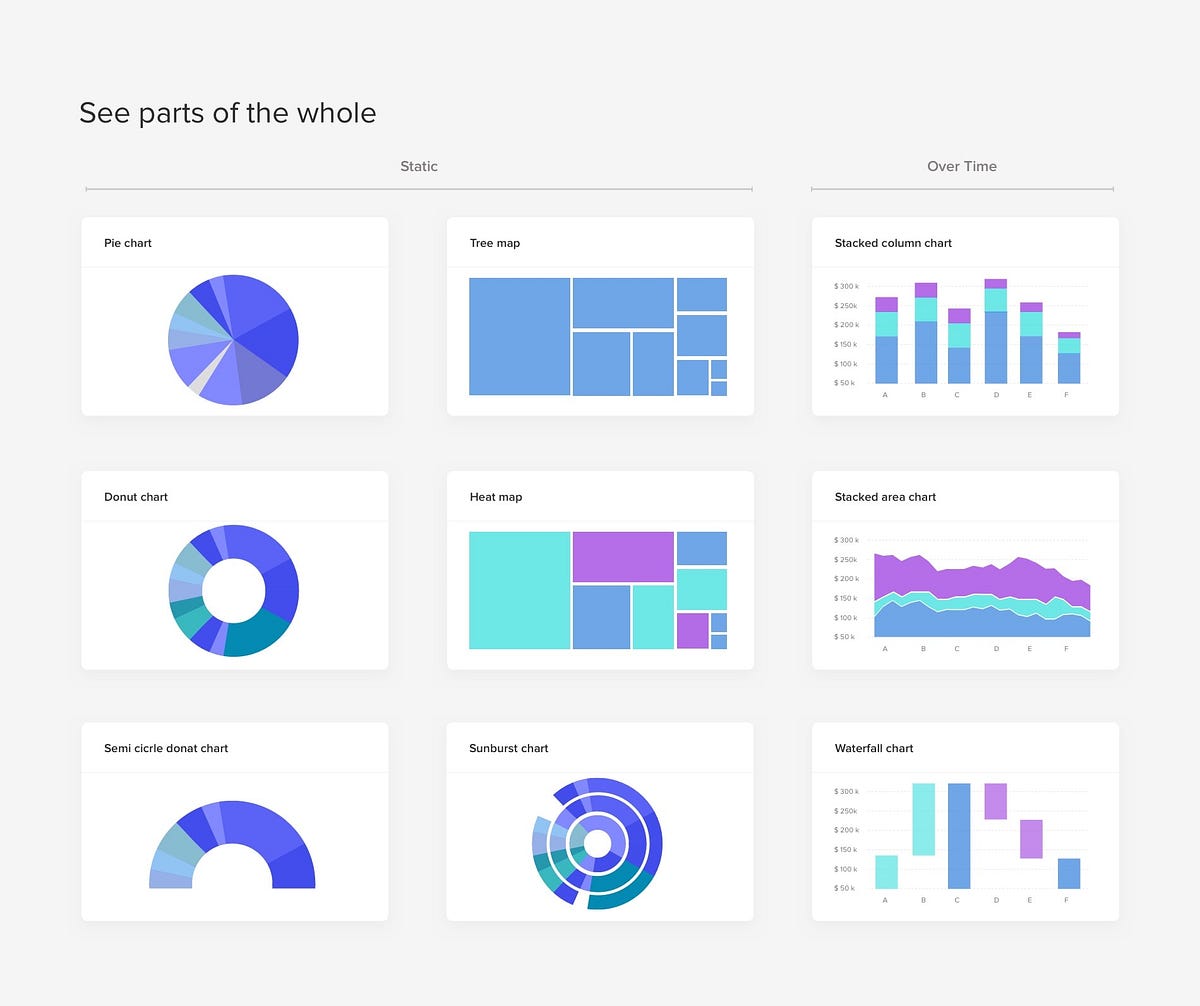
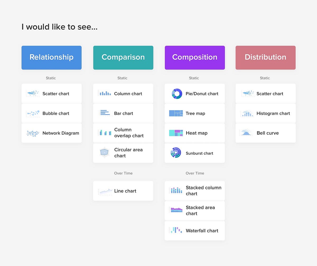
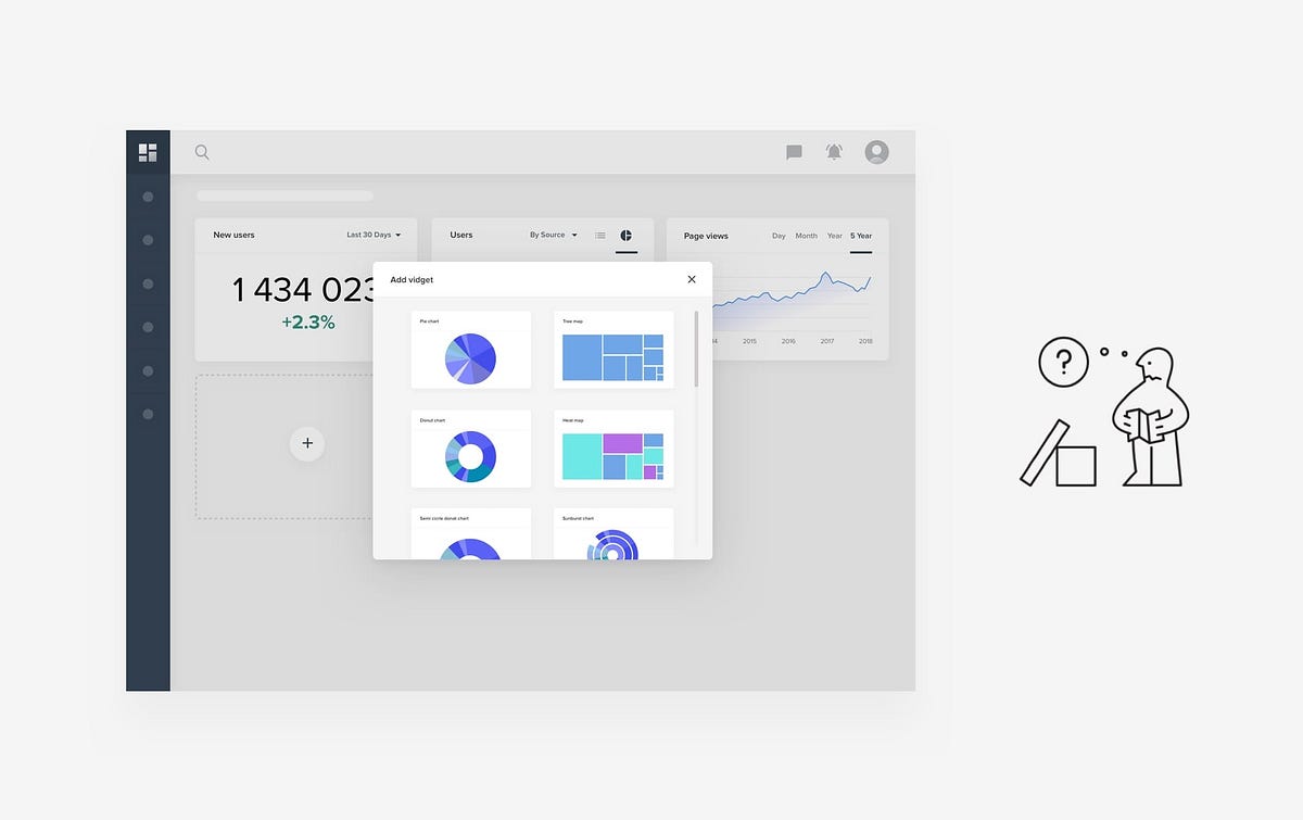
Deciding what type of dashboard you need should be driven by the user roles and need you to try to satisfy. Your product may have multiple roles which should get a unique dashboard. Lower tear managers may require operation dashboard, while higher management is a need of analytical. Often designers mix those, providing the user that suppose to react fast and take action, with a ton of analytics and vise versa. 2. Chose the right representation for the dataWhen we talk dashboards, we talk charts). Data representation is a complex task, especially as on dashboard you will usually try to show multiple types of information, be it static or dynamic changes over time. This can be quite challenging. Choosing the wrong chart type, or defaulting to the most common type of data visualization could confuse users or lead to data misinterpretation. Before you start, take a look into internal documents and reports to get some inspiration. If you starting from scratch here are some visualization suggestions that are based on what users need to see:
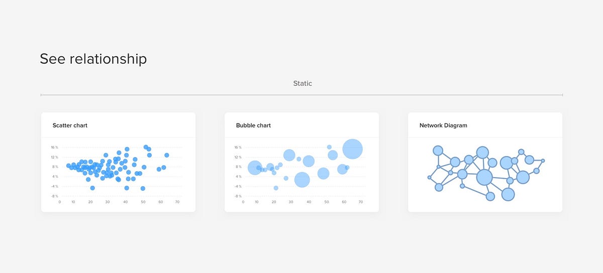
Scatter charts are primarily used for correlation and distribution analysis. Bubble chart helps introduce the third dimension into the chart. A network diagram is handy when even the most connection between data points are very important.
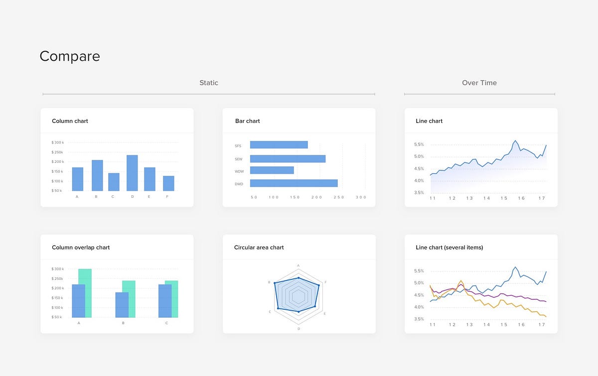
Using visualization to compare one or many values sets is so much easier than looking at numbers in the grid. Column and line charts are probably the most used ones. Some recommendations:
Pie and Donut charts have a bad reputation for data visualization. These charts are among the most frequently used and also misused charts. They are quite bad to read when, — there are too many components, very similar values. Its hard for humans to different values when it comes to angles and areas.
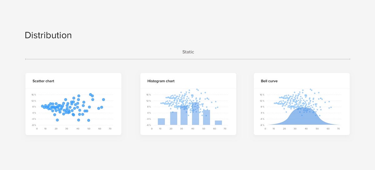
Distribution charts help you to understand outliers, the normal tendency, and the range of information in your values.
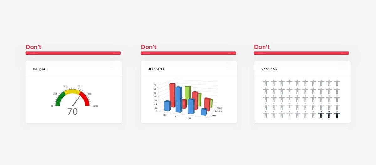
But certain chart types you need to avoid at all. Gauges were a big deal for dashboards in the past, trying to replicate physical object digitally is a bad idea. 3D charts and overstyled charts have lover readability, distract the viewer from data and even harder to develop, so little reason to go there.
When to use various graph types
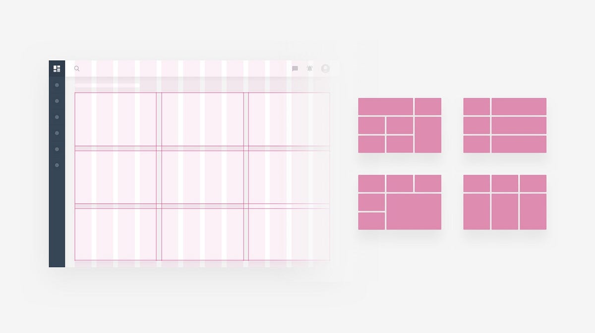
To help you choose the right representation type for the chart. Ask yourself this questions: 3. Clear and consistent naming convention, Consistent date formatting, Truncate large valuesAs the main goal of the dashboard is to get the message at a glance, every little thing counts. The biggest benefit of using a clear framework is data consistency. If your data is named the same way in each tool, it’s easier for you to use those tools. One framework. No questions. 4. Define the layout. Flow. PrioritizeGrids help you to achieve effective alignment and consistency with little effort, create a basic structure, a skeleton for your design. They consist of “invisible” lines upon which your design elements can be placed. Doing so ties them together in an overall “system” and supports your composition — rationally. That’s is crucial for dashboard design as you will need to organize a ton of information in a seamless way.
When making decisions on what information should go were, keep this in mind: And when they will finish with the first row, they move down to the next one.
5. Use building blocks with consistent structureAfter we defined the grid, we can start work with multiple “widgets” that will hold the info, charts, and controls. Cards sweet and tasty, easy to arrange. The most important thing about cards is that they are almost infinitely manipulatable. They are a good choice for responsive design since cards act as content containers that easily scale up or down.
An important characteristic of cards is the consistent layout of controls and data inside. Put the name in the top left corner, align view controls or actions to in the top right corner of the card, leave the rest for the content. When all have a consistent structure, it’s easier for the user to work with the interface, he finds everything where he expects it.
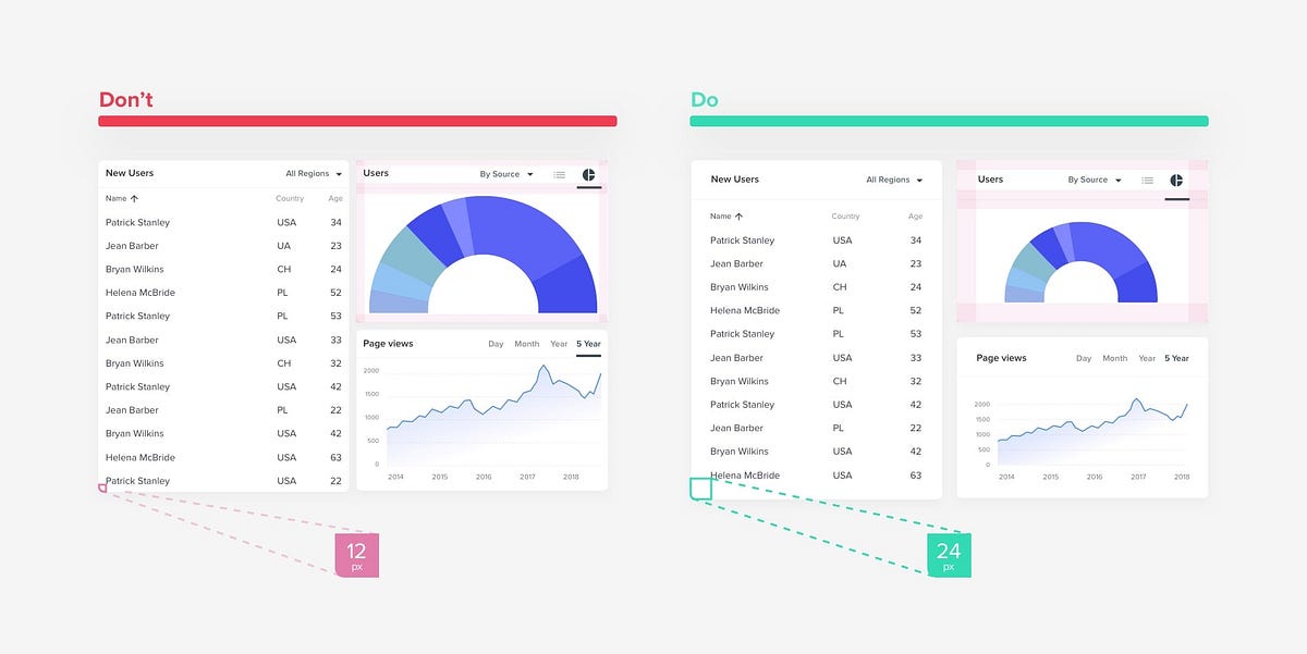
Using the suggested above layout has additional benefits of flexibility when it comes to responsive, or user customization. While the card is getting larger or smaller all main components remain anchored to specific locations. This is also beneficial for developers, and the overall scalability of your designs in the future. 6. Double your marginsWhite space, also known as negative space, is the area between elements in a design composition. Readers aren’t usually aware of the great role of the space, but designers pay a lot of attention to it. In case the white space is not balanced, a copy will be hard to read. That’s why negative space matters as much as any other typography element.
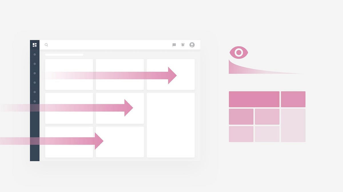
7. Don’t hide information. or rely on interactions too muchAs one of the primary goals of the dashboard is to surface information at a glance, relying on scrolling or many interactions dilutes the whole purpose.
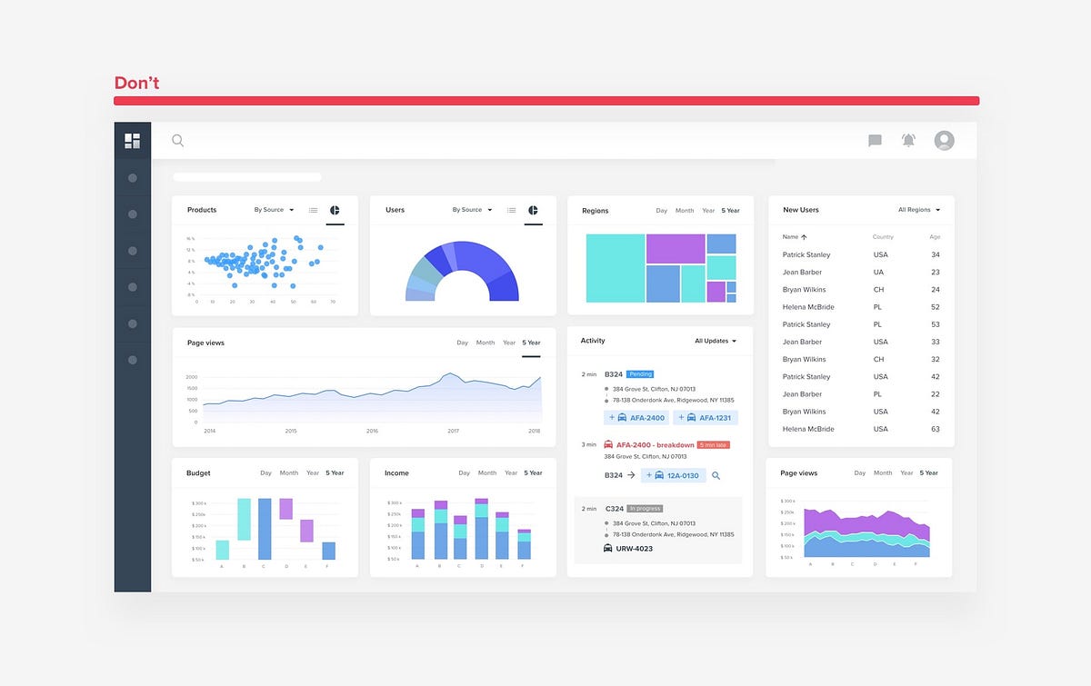
Designing long scrollable dashboards is one of the most frequent mistakes designers make. They try to display more information in a clear way, positioning it one under another to not overwhelm the user. This leads to only information visible above the screen fold to be discovered. Everything below gets little attention from users. So what’s the point? The solution is prioritization, after doing more research and interviews you should e able to identify core information, work only with space above the fold to display it. Don’t tell the full story, instead summarize, surface only key info. You can use additional interactions as a way to fit more content, and not overwhelm the user with data.
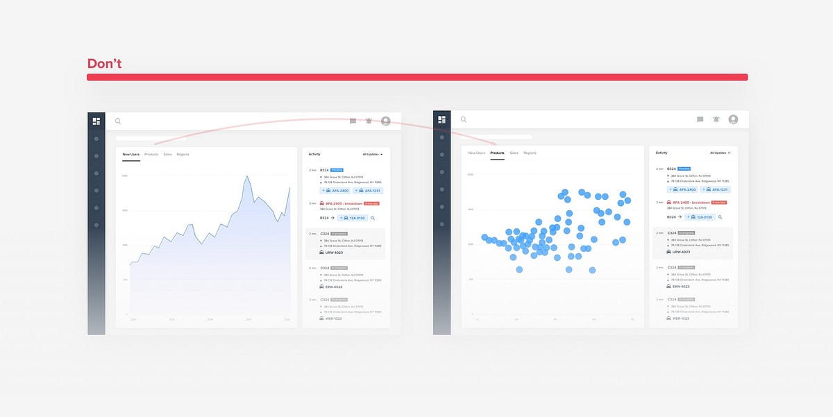
Interactions help surface secondary information. Fully relying on them as the main way to work with the dashboard is a big mistake. In the example above we see how a user will have to painfully switch between multiple tabs to get the full picture. This renders information on all other tabs hidden from user same way like content below the fold.
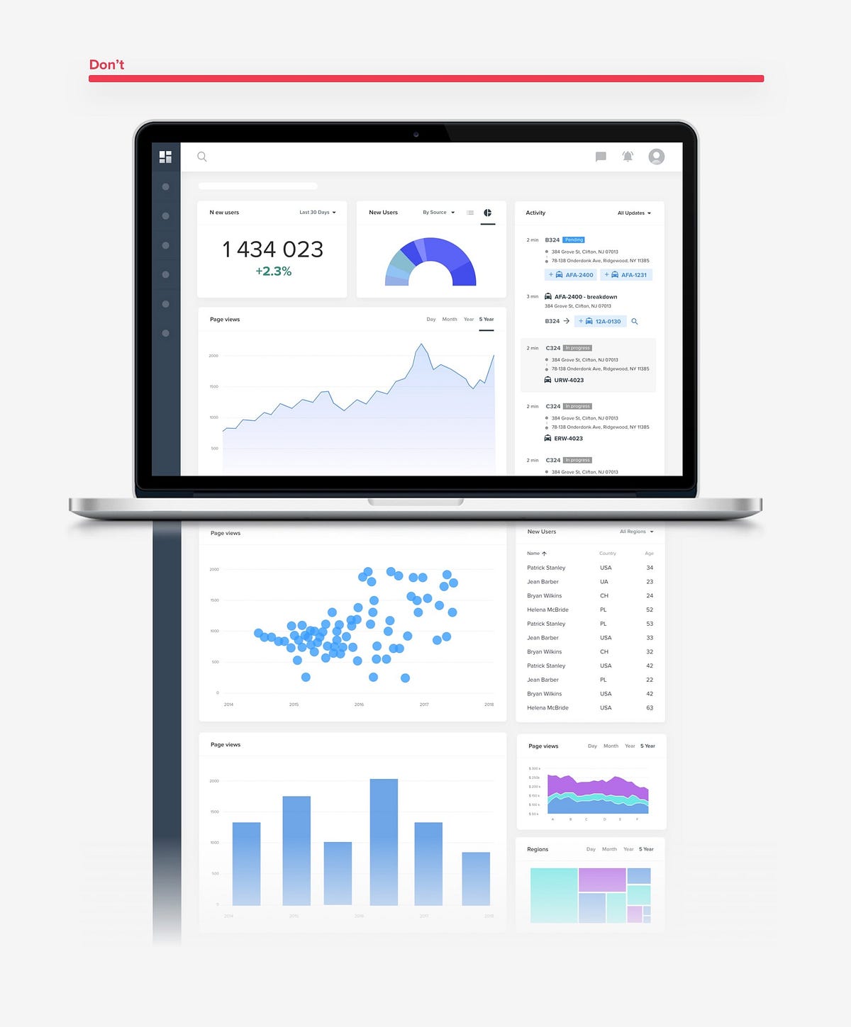
Trying to truly make your dashboard informative may lead to extreme cases. We should always remember that humans are bad when it comes to keeping track of multiple things in mind. Don’t demand too much for your users, don’t overwhelm them with data. Use max 5–7 different widgets to create a view. Otherwise, it will be hard for a user to focus and get a clear overview. 8. Personalization rather than CustomizationUsers expect that the content they see will be relevant to their individual needs. Personalization and customization are techniques that can help you ensure that users see what matters to them. System id set to identify users and deliver to them the content, experience, or functionality that matches their role. Customization is done by the user. A system may enable users to customize or make changes to the experience to meet their specific needs by configuring layout, content, or system functionality.
Giving users more power to customize his dashboard is a good initiative, as long the view was already personalized. Designing more ways to customize is often an excuse, to not go into a tedious process of truly finding out what each user role truly needs to see. In the end, user is left on his own, to build a view himself. 9. When integrating data tables or list, make sure they are interactive and data is aligned correctlyA data table is a great solution when you need to show a lot of information for a big number of items. For example list of clients with their I’d, status, contacts, last activity etc… would be best displayed as a data table. There are many other benefits, like a great use of space, easy scalability, easy in development, user comfortable working with grids (majority already working with Excel for many years). The easy way to find and change something. You can find out more about data tables in this article. 10. Design the dashboard in the endAs the dashboard is one of the most visually exciting views, it’s often a first thing that is being designed. I would recommend the opposite. A dashboard is a summary view of everything else, display a key info from various part of the application, it’s just more practical to design it the end. Otherwise, you will need to constantly go back and update your dashboard designs while you are working on all other pages. Also once a majority of the views is designed, you have a ton of components to work with when putting together a dashboard. Hope this was useful for you. Thanks for reading through. The post 10 rules for better dashboard design appeared first on Design your way. from https://www.designyourway.net/blog/user-interface-design/10-rules-for-better-dashboard-design/
0 Comments
Leave a Reply. |

AuthorPleasure to introduce myself I am Jamie 27 years old living in Searcy, AR. I am web developer and have developed over 50 sites for clients. Now a days I am focused on designing as I feel I am lacking it. Archives
April 2019
Categories |
 RSS Feed
