|
There are 3 small changes you can make to your content to provide a more pleasurable read. The tips don’t just apply to design — use them to make your text documents look great too! The names of each principle may be complicated, but understanding and using them is simple. 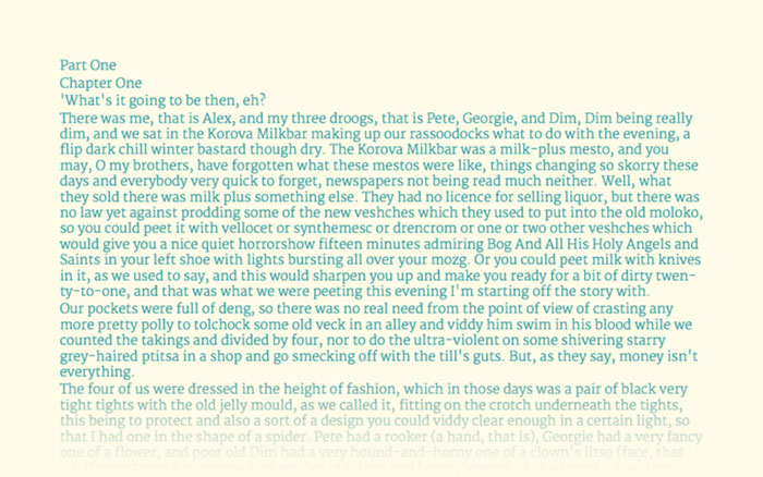
Important note: Every font is different, so if the content doesn’t feel right, go ahead and adjust your measurements. What is important here is that the reader is getting a comfortable reading experience and that it looks correct to your eye. Tip 1 — Use Typographic Hierarchy To Give A Clear Sense Of The Structure Of A PageTypographic hierarchy is the visual hierarchy of the text on a page.
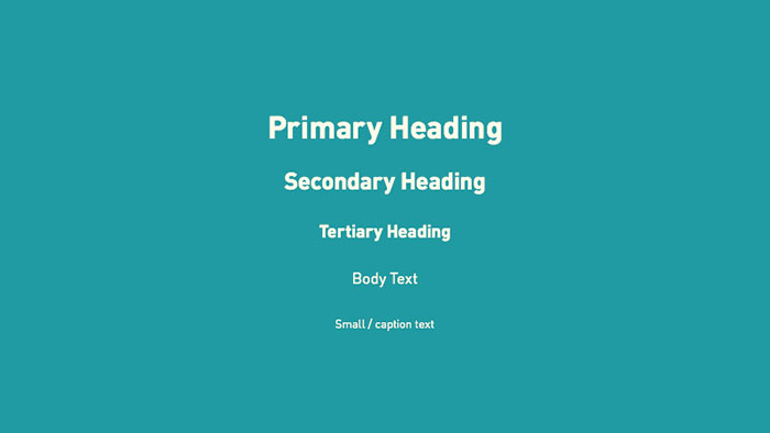
Imagine a textbook. In it, the primary heading (the chapter title) is more prominent than the secondary heading (the sub-heading) which is, in turn, more prominent than the body text (the main content of the page). The same principles should be taken into account in a design or word document. All font sizes should be derived from the body text, as this is what will be most-read on each page. Here are a few simple steps to define your hierarchy.
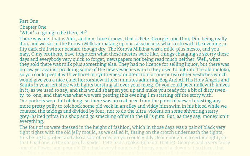
Here’s what the page looks like after following this advice: 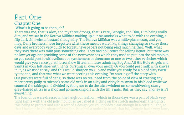
Further Considerations These levels weren’t necessary for this article, but you should also consider a tertiary heading and caption text.
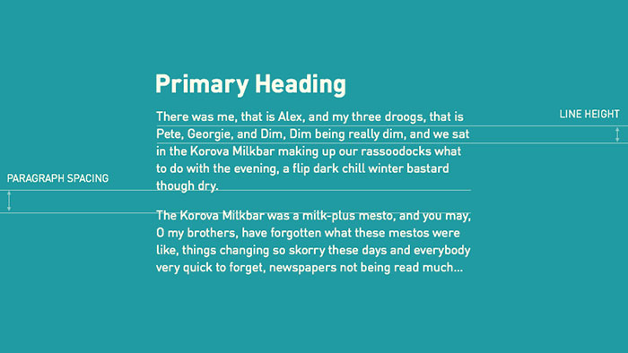
Tip 2 — Use Vertical Spacing To Make Your Words Easier To ScanThis is the spacing and arrangement of text as the reader descends the page. We need to make sure the the line spacing and space between paragraphs is generous enough to allow the eye and brain to more easily decipher characters, words, and word shapes — which is how we all read.
Paragraph Spacing Setting the paragraph spacing is simple, but is very different to just pressing ‘return’ twice for a new paragraph. Pressing return twice means the gap is too big to immediately decipher whether it’s part of the same or a new section of content. In most cases, it should be equal to the body text, so if the body text is 16pt then the paragraph spacing is 16pt.
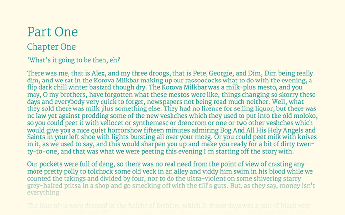
Line Spacing The line spacing should be set somewhere between 120–160% of the text size. As a rule, the smaller the text, the more generous the line spacing needs to be to give each word room to breathe. Tip: You should be able to fit a sideways ‘h’ between the lines without it hitting the tops of d/b/t’s (ascenders) or the bottoms of p/q/y’s (descenders). If the body text is 22pt, then the line-height of that text should be between 26–35pt.
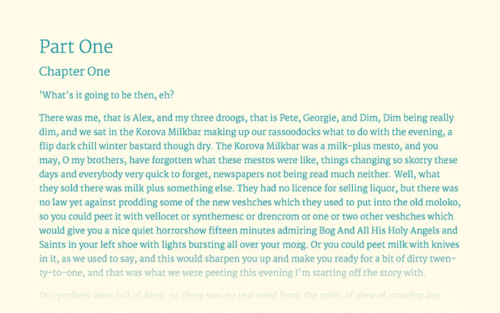
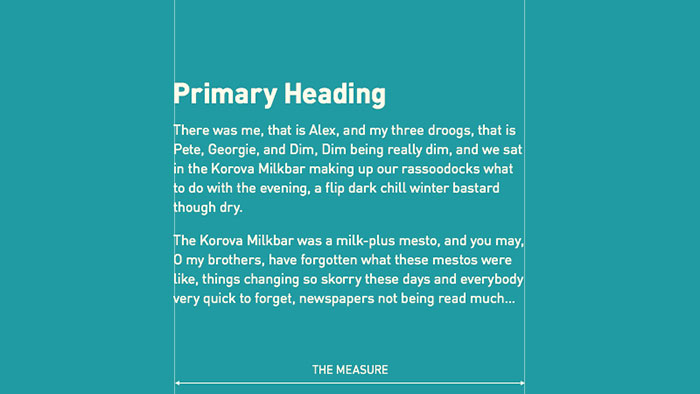
Tip 3 — Adjust The Measure To Make Each Line Of Text More Comfortable To ReadThe measure is the length of a line of text. Long lines of text are difficult to read, with shorter lines being easier. The ideal number of characters per line is 65–75. The measure should be defined by the width of the body text rather than headings or sub-headings.
Tip: A line of upper- and lower-case letters and numbers is 62 characters, a simple way of finding a comfortable measure. When you’ve worked out where 65–75 characters is on a line, reduce the width of the column of text until that is about to wrap, you should find the measure is comfortable. 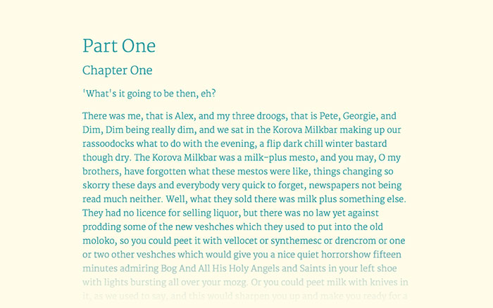
The Final ResultOnce you have followed these steps, the readability of your content should have vastly improved, as seen below.
Setting type is not an inaccessible skill, it is possible to follow a few simple principles to make every bit of content an easy read. Make this part of your content creation workflow and your readers will be in for a treat. This list is succinct and by no means comprehensive. The intention is to provide non-designers with a simple list of steps to follow to make their content look better. If you have any questions, comments, or suggestions, please speak to me on twitter. Thank you for reading my post! If you enjoyed it and want to stay in touch, let’s speak to each other in one of these places: Twitter, Instagram, my portfolio. The post 3 Typography Tips For A More Comfortable Read appeared first on Design your way. from http://www.designyourway.net/blog/typography/3-typography-tips-comfortable-read/
0 Comments
Leave a Reply. |

AuthorPleasure to introduce myself I am Jamie 27 years old living in Searcy, AR. I am web developer and have developed over 50 sites for clients. Now a days I am focused on designing as I feel I am lacking it. Archives
April 2019
Categories |
 RSS Feed
