|
Great dashboard designs are developed daily to remind us of the unlimited possibilities we have to present data in a creative way. Rather than getting heaped with information we can’t understand, dashboard UX designs help us understand what is really important, and open up a data wonderland where we can understand everything, interpret everything, and make use of the story it is telling us. Dashboards are becoming increasingly important as the digital age showers us with more and more data. They help to prevent us from drowning in that sea of data, or at least the good ones do. Great dashboards are like windows into a data wonder land. They help users to navigate data, to interpret it, and to unravel the story the data is trying to tell us. The best user dashboards out there organize data in a way which makes it easy to understand where information is coming for.
The best dashboards also make it possible to monitor the progress of data, and reflect each change that has happened to it, as minor as it may be. In the ideal scenario, a dashboard UI would divide all info in bars and sections, but screen estate will rarely allow this in real terms. What are more important in UI design is visual order, and whether the viewer understands how elements are correlated, and depend on each other. Dashboard design may be the hottest trend right now, but your web designing experience won’t necessarily make you good at it. The process is fairly challenging, which is why we recommend you to look at our digital dashboard tips and best dashboards samples. Get to know your users
Who said dashboards were all about data? What matters the most in dashboard design is whether it provides enough information for users to have their questions answered. Basically, dashboard provide valuable knowledge that must be cut to cater to different needs, but that doesn’t mean you should simply throw all data you can think of on the screen in order to meet them. And well, that’s the challenging part about UI design. You must have a clear idea of who your audience will be, and build a dashboard that will indeed be useful to them. Try to discover their objectives, and think of questions they might want to answer. This will give you at least the basic idea of how the dashboard should look. Don’t overwhelm users with data
When choosing information to present on the dashboard, try to answer one essential question – Do users need that information? If yes, find a way to bundle all of it on the screen. If not sure, simply skip it. Users don’t like being burdened with useless and unprocessed data, but are rather looking for ‘digestible chops’ that won’t take too much time to understand. Start with a basic overview, but make sure interested users can drill into details
Think of your prospective dashboard as a popular newspaper – you pick it up, glance quickly at the front page, and decide what is important for you to see. Then you only return to the important section of the paper, unless the overview is so good that you don’t need to find out more. This is how your front page is supposed to work – users will see all important info, and then read more on data that is relevant to them. All of this is possible only with visual hierarchy and quality design. Design helpful visualizations
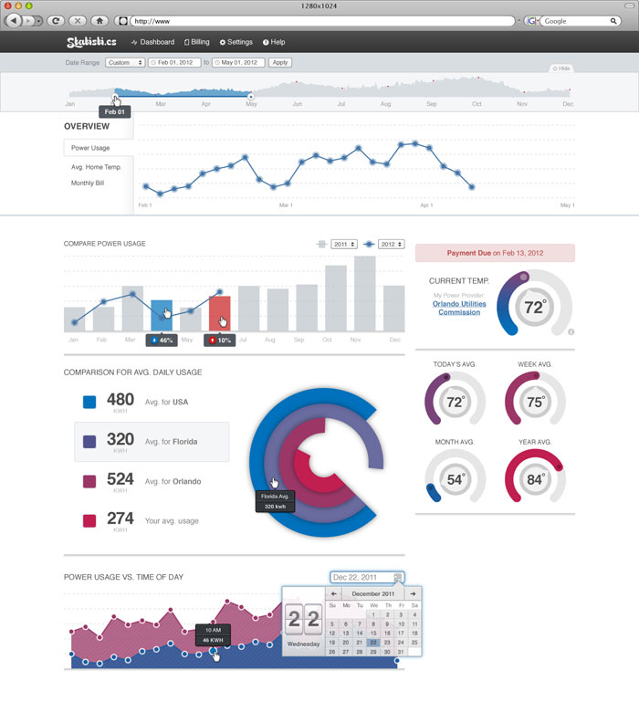
Data visualizations are priceless in UI design, including plots, charts, and graphs that help users understand and analyze your data. Try to keep things simple, as too much visualization may look less attractive to users. Basically, this is the moment when you decide how you’re going to tell your data story, and that depends entirely on the nature of that data. In some cases, pie charts may be better than regular ones, while complex graphics and top visualizations should be avoided almost in all cases. Add interesting and functional animationsSurprising transactions, as cool as they seem, won’t work everywhere. Therefore, try to restrict their usage. There is nothing wrong with a static image looking to share some really important information. When and how can animations help users?Before you decide to bring your dashboard design to live, you have to decide which type of animations would be most interesting to your users. As you know, dashboards consist of several data portions coming from a variety of sources, and will therefore take time to upload. This is exactly the gap animations fill to ensure users won’t notice the loading delay. The choices and solutions are simply endless – preloader icons, custom waiting messages, percentage loading bars, and many more. Another cool idea is to leave the dashboard empty and then show data step by step as it is uploaded. Think of this as starting the engine in the car – you wait for it to pick up pace, and start driving only after it. Provide intuitive orientation and navigation
Most dashboards are in fact a set of pages rather than a single one, and hide more details than what is visible on first sight. This is why you must ensure users can find their way easily, and navigate from one dashboard to the other without hassle. What this means is that you should work with familiar patterns (tabs on the top, left-handed menus, etc.) users have already seen somewhere else, or at least tag items with clear signposts and labels that would let them know what they are doing. The options you have are once again overwhelming, so make sure you test in advance the breadcrumb train and dashboard hierarchy you’re planning to apply. Keep the dashboard clear and uncluttered
How do you recognize a good dashboard? The first indicator that you’re working in an organized environment is that there is nothing that could compromise your experience, be that extra text, imagery, or confusing graphics. Use the best design practice you can find, make sure related information is visually united, and all elements are aligned to exhibit the connection between them. In this case, you will end up having an uncluttered dashboard users like to work on. Focus on legibilityIn order to make sure users can extract and process information and visual stimuli without problems, use fonts that are easy to read. After all, your interface is supposed to guide users and motivate them to take action, not the other way around. Color can also help you
Colors have plenty to do with how users perceive and analyze information. A basic research of color psychology will tell you which shades work the best for all types of information, as for instance that red, green, and amber communicate statuses and low/high value indicators. Keep the scheme simple and consistent, as this makes your information more credible. Guidance and help should be available at any momentIn the best of all worlds, a dashboard would speak on its behalf, and there will be no need to explain whatever. However, odds are good not every user will understand what you were trying to say, and the poorer your design is, the longer this list will be. This is why you must secure additional assistance and guidance, especially for users landing on the page for the first time. Access to contextual help should also be provided for more specific questions. Go no further than design patterns users have already seenUse only the design patterns, icons, language, and visualizations you think users are familiar with, as your novel story telling ideas don’t have an effect equivalent to their looks. Generally, the best approach is to use popular and standardized patters you may not really like, but which can help your users navigate the dashboard without any problems. Dashboard design inspiration
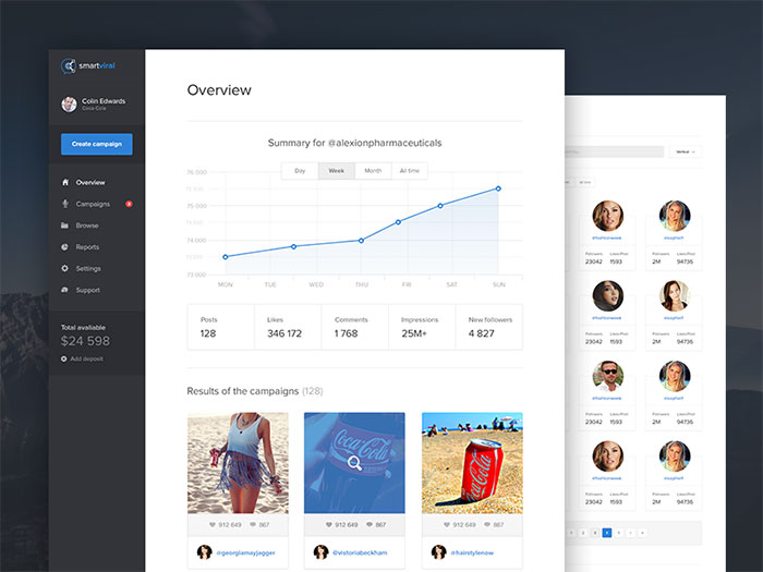
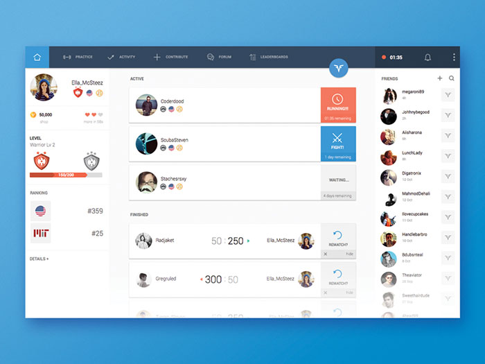
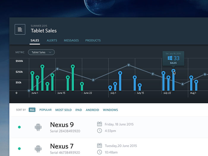
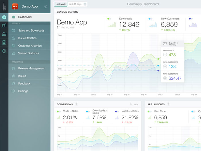
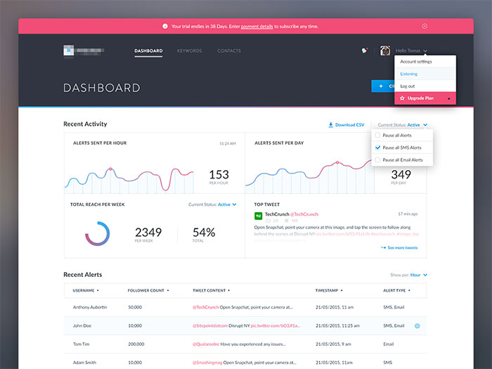
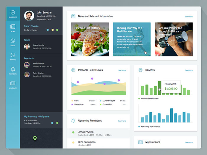
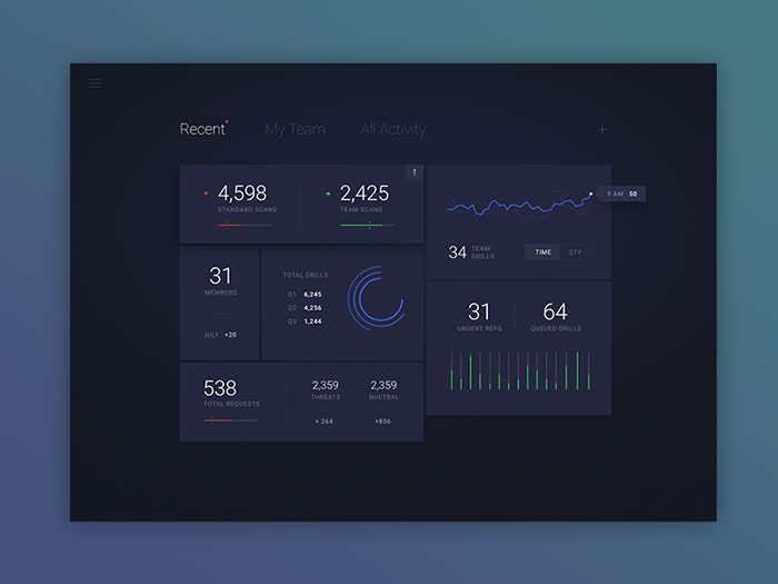
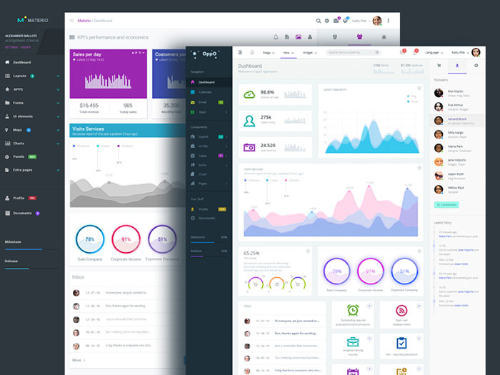
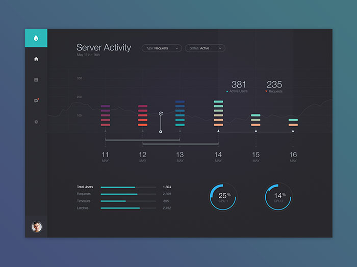
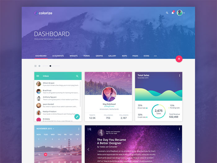
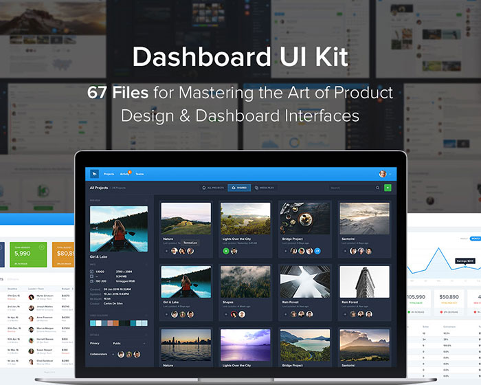
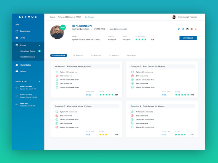
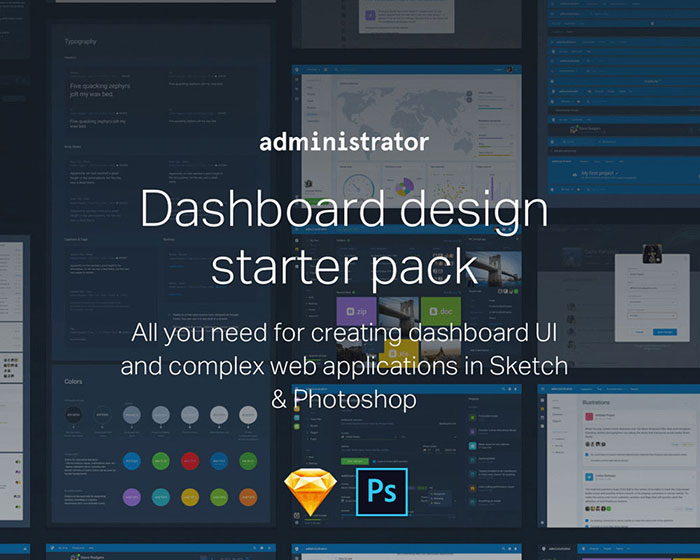
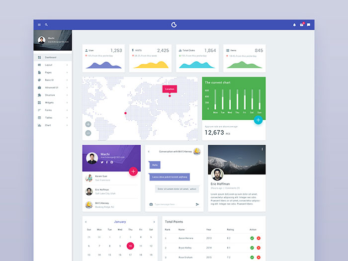
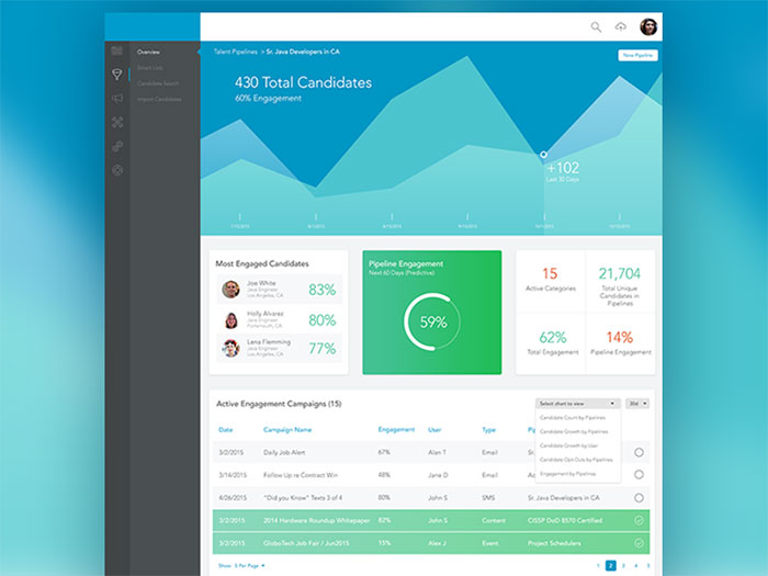
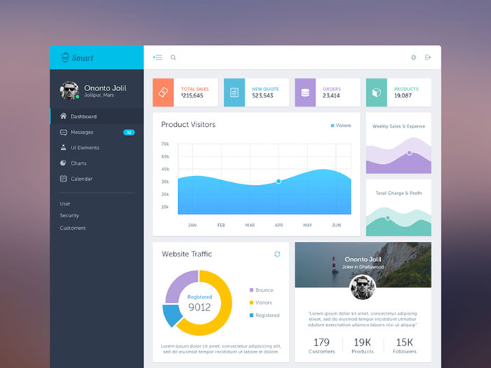
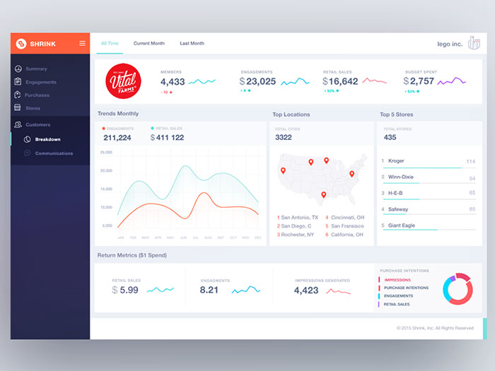
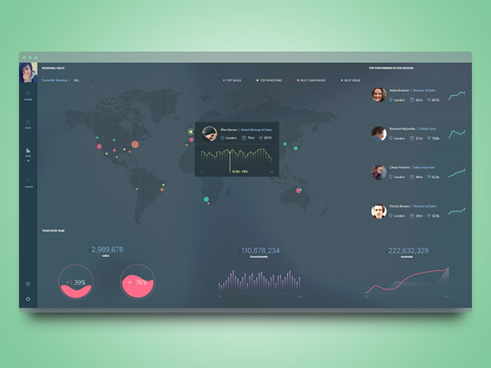
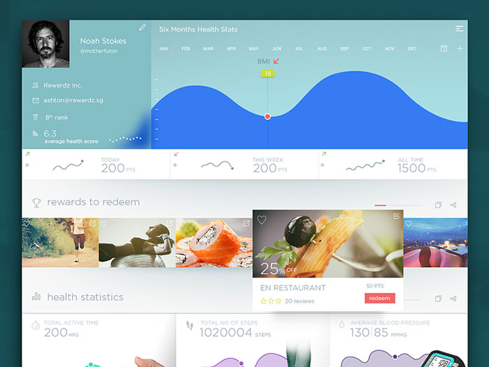
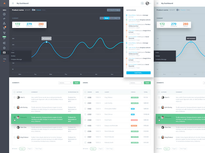
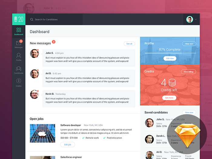
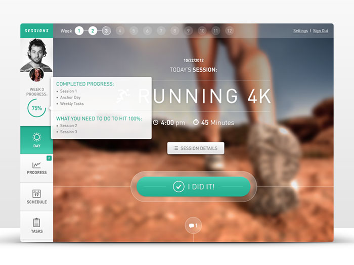
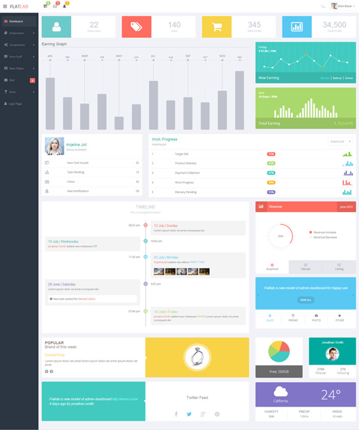
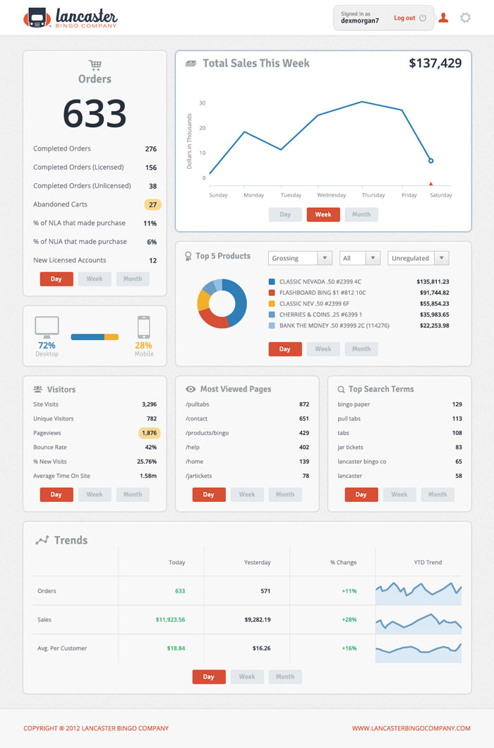
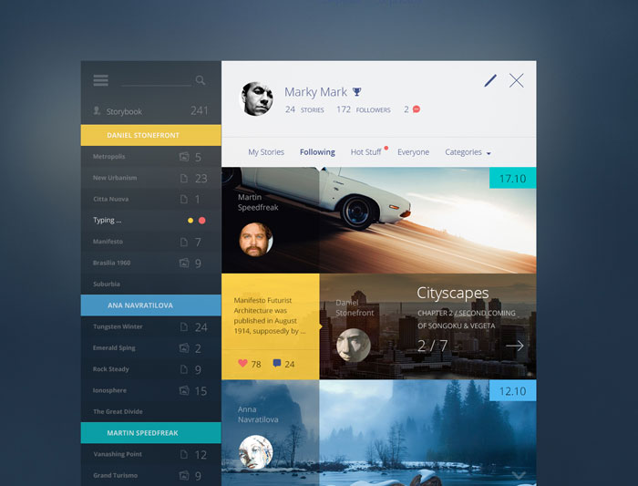
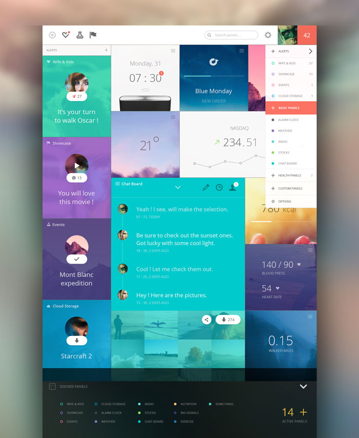
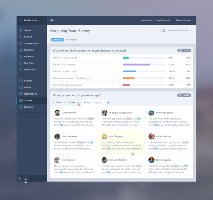
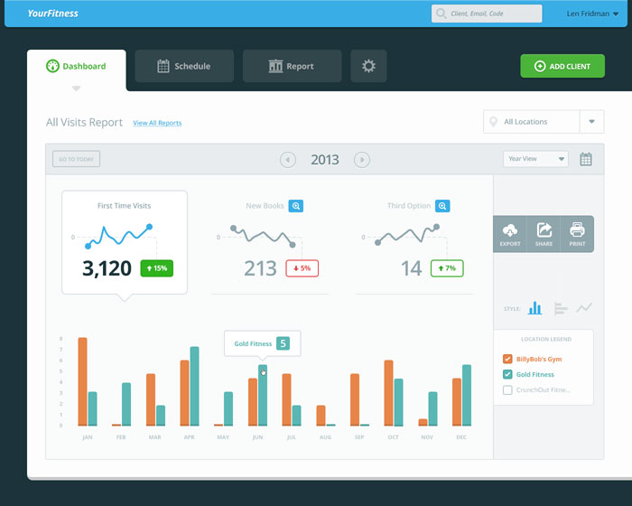
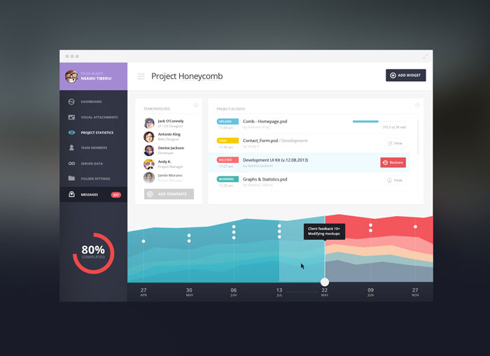
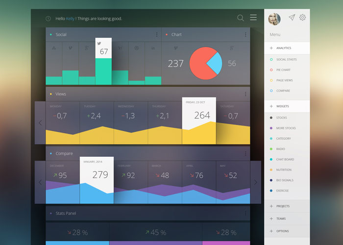
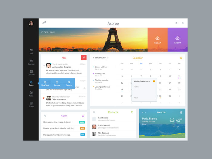
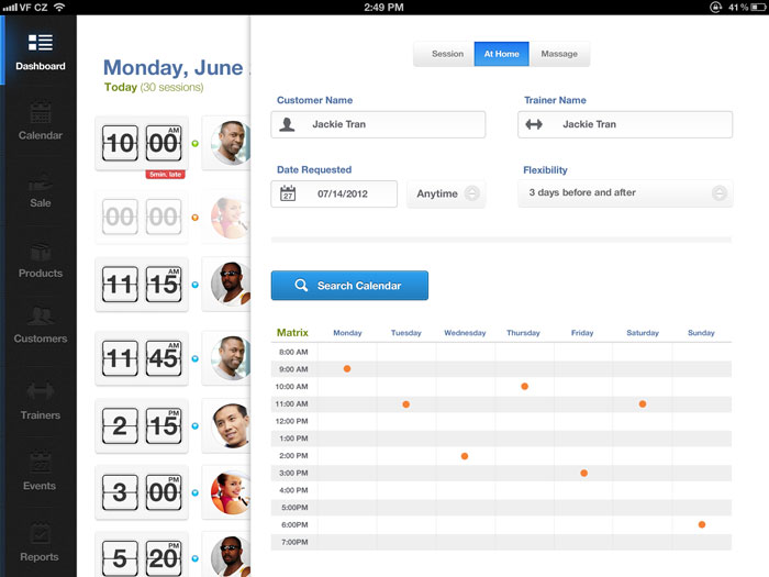
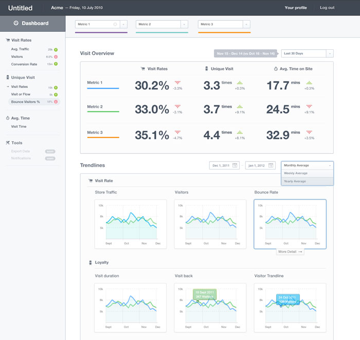
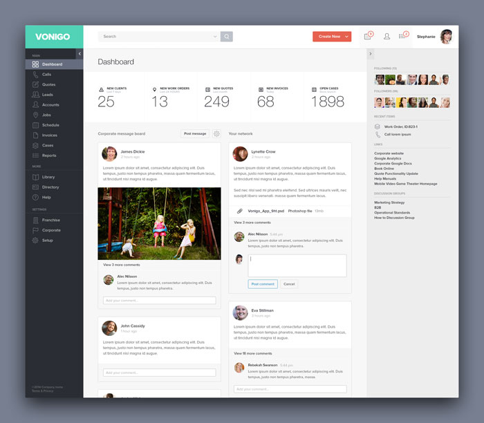
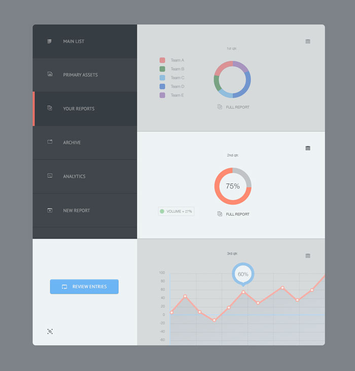
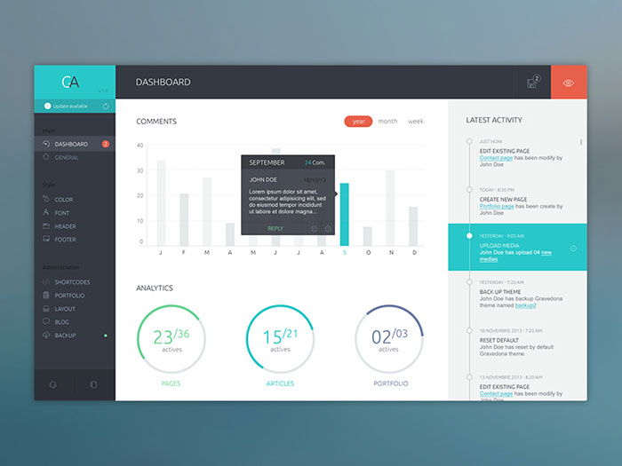
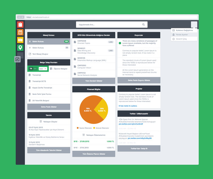
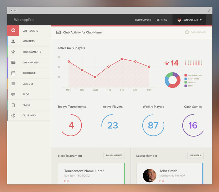
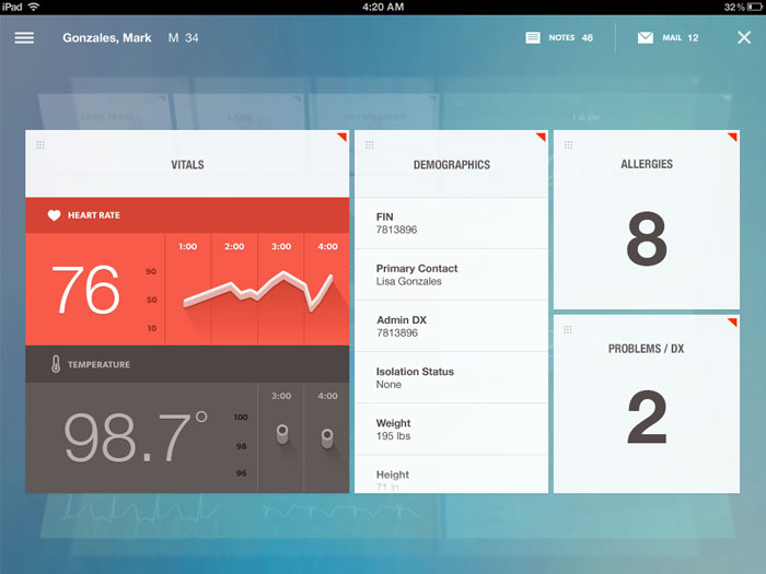
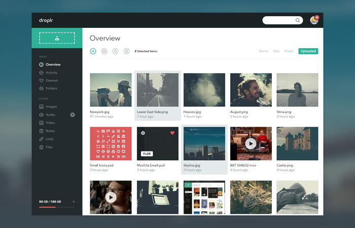
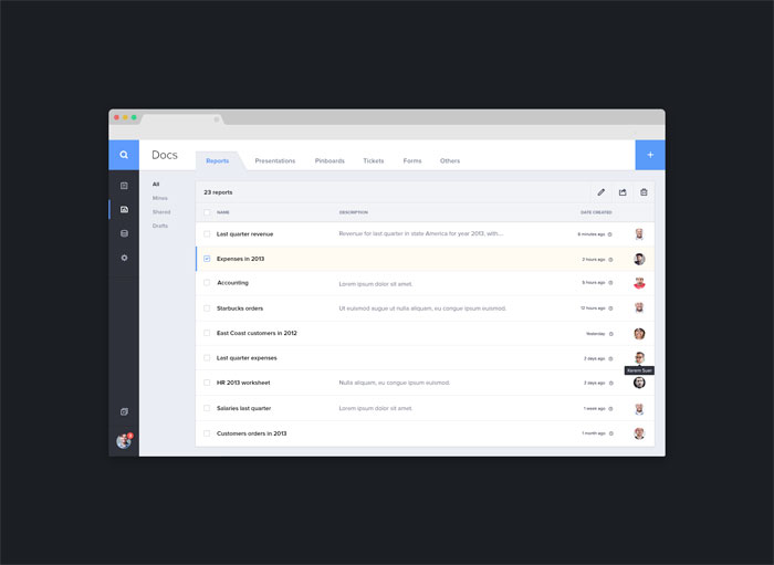
A dashboard is a set of graphical menus and interfaces that give the user quick access to data and information as well as simplify any editing processes they might need for a website or even an application. In most cases, dashboards will contain information such as stats, analytics, schedules, messages and much more. Essentially, a dashboard is a user interface designed to interact with the back-end of a website or application that makes it easier for the user to make changes and access information. Think of it as a control panel or admin panel that gives users access to all the necessary data to perform virtually all the functions of a site or application. Data visualization can be a difficult task for even the best designers and not all designers are suitable for dashboard design. When done correctly, UI dashboards will truly stand out to a user and the applications or websites using them will receive praise and even increased usage because of the fantastic design. These dashboard designs are often colorful with a fantastic layout that make it easy for anybody to control the site or application and make intuitive decisions. Dashboard design is not a typical element that designers often focus on. But, they are extremely important to the user experience. Proper research and planning is a must before designing a dashboard and when developing a dashboard, one must consider perfect design to create a user experience that is both intuitive and useful to anyone who will use it. Dashboard Design Code Exam Dashboard Administrator: Dashboard Design Pack Material Dashboard Smart Admin Dashboard Dashboard for Employee fitness app Dashboard from http://www.designyourway.net/blog/inspiration/showcase-of-beautiful-dashboard-ui-designs/
0 Comments
Leave a Reply. |

AuthorPleasure to introduce myself I am Jamie 27 years old living in Searcy, AR. I am web developer and have developed over 50 sites for clients. Now a days I am focused on designing as I feel I am lacking it. Archives
April 2019
Categories |
 RSS Feed
