|
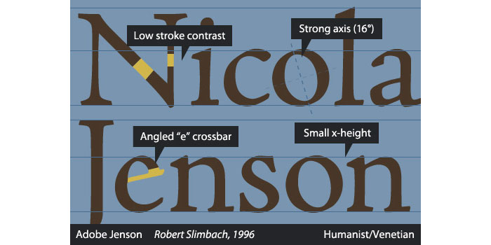
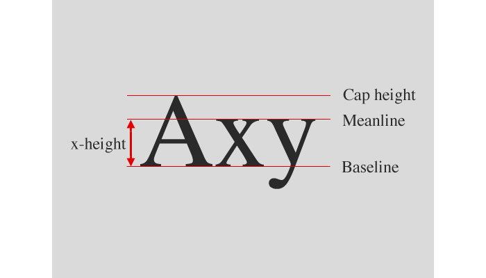
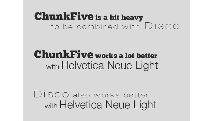
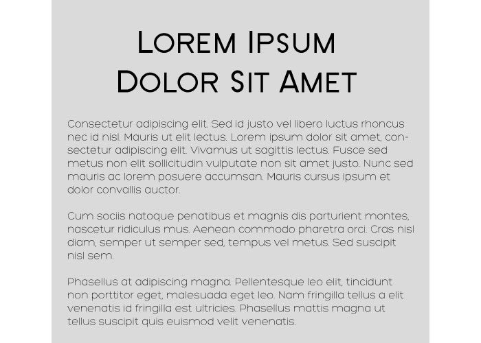
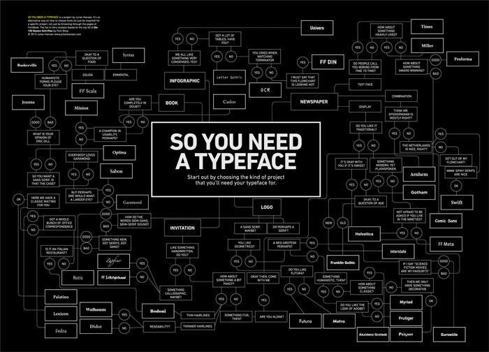
Typography forms a large part of any designer’s learning curve. Thanks to the internet all available information is at your fingertips. There are a lot of tutorials available that are easy to follow and relevant to learning typography skills. Learning from these tutorials can make almost any student to produce high quality pieces of typographical art. Whatever your field of expertise is, the skill of typeface design is a challenge. The tutorials here represent an easy and enjoyable way to use and improve your typographical skills. Below you will see that the tutorials are split in four categories: Things that you should read first (the basics of typography), web typography, Photoshop typography tutorials and Illustrator typography tutorials. You need this before anything elseMaking Sense Of Type Classification Everyone knows their serifs and sans, slabs and scripts, but most classifications go much deeper than that. Type classification, while helpful, is often convoluted, confusing and even controversial. This article, distilling some of the complexities into a more understandable format, lands somewhere in the middle between the basics and genuine type nerdery — the perfect level for a practicing designer. The Basics of Type Typography could be considered the most important part of any design. It’s definitely among the most important elements of any design project. And yet it’s often the part of a design that’s left for last, or barely considered at all. Designers are often intimidated by typography, which can result in bland typographical design or a designer always using one or two “reliable” typefaces in their designs. Paragraphs and Special Characters Body copy makes up the majority of many websites. Headlines and other bits of typography are often considered more fun to design, or more artistic, but without a good design for your body copy, your overall project will suffer. Principles for Combining Typefaces When combining typefaces, there are a couple of important principles you’ll need to keep in mind, namely contrast and mood. Effectively combining typefaces is a skill best learned through practice, and trial-and-error. Once you’ve mastered the principles covered here, you’ll have the tools you need to try out combinations while making educated guesses about what will and won’t work together. Pulling It All Together In this article, there are guidelines for combining fonts for paragraphs and headlines, as well as for other common type elements, like pull quotes and by-lines.
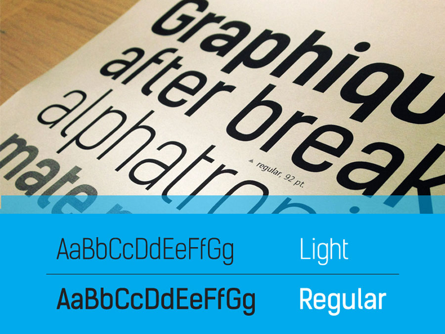
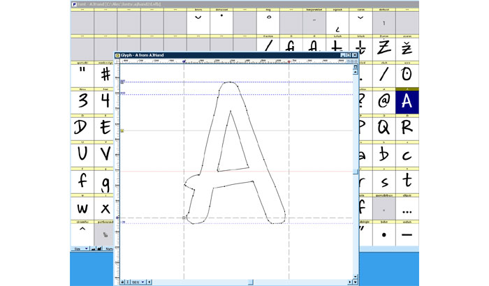
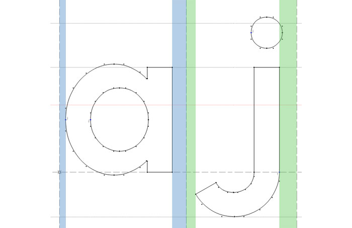
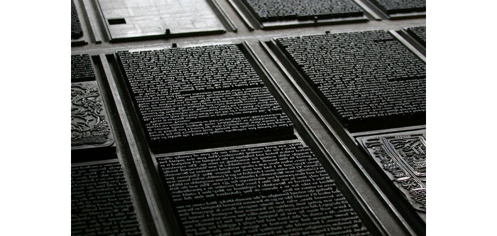
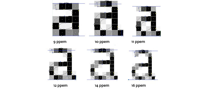
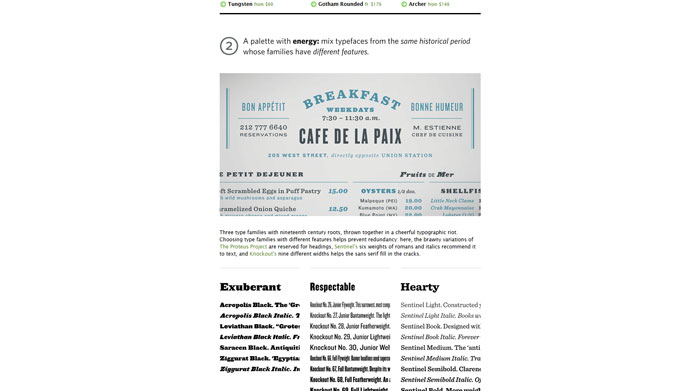
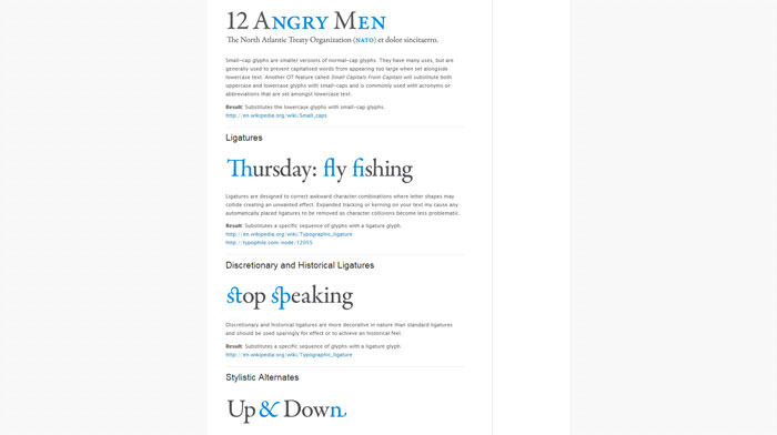
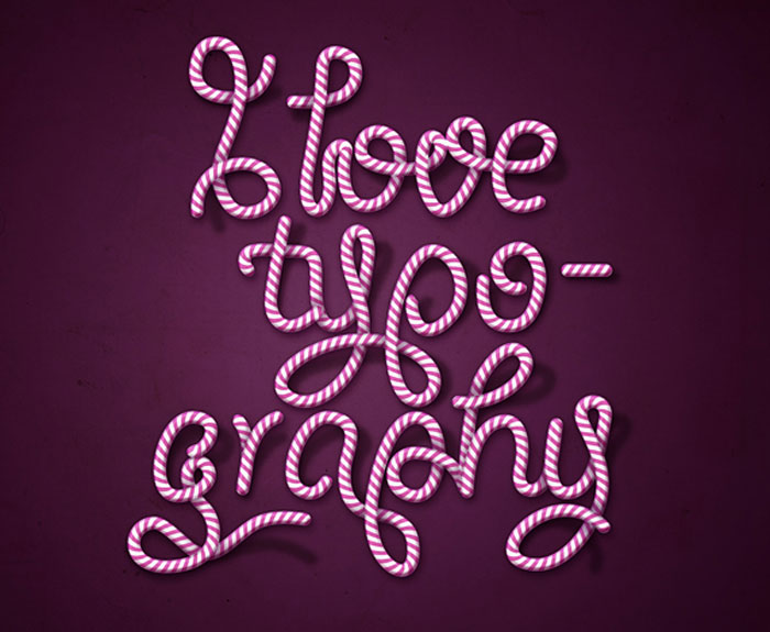
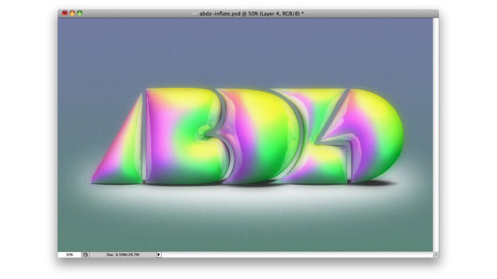
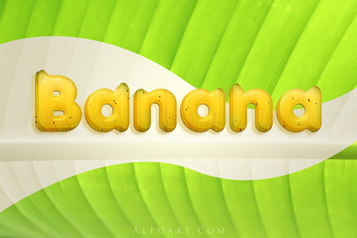
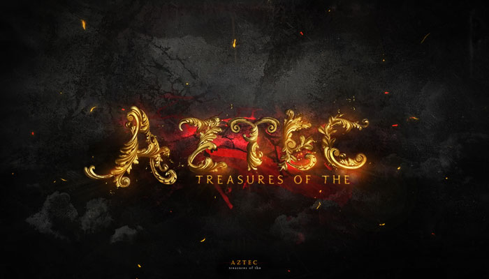
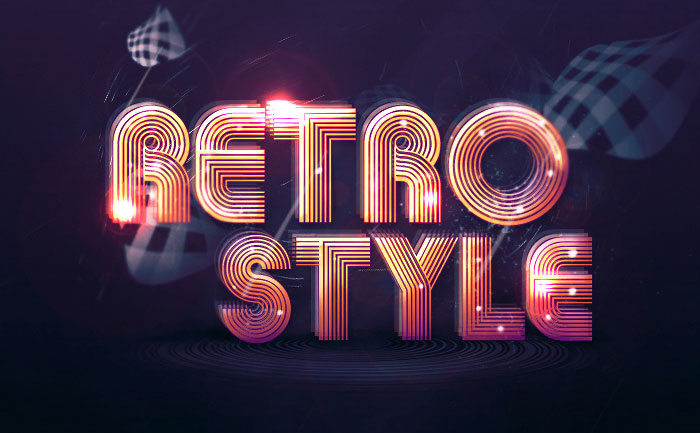
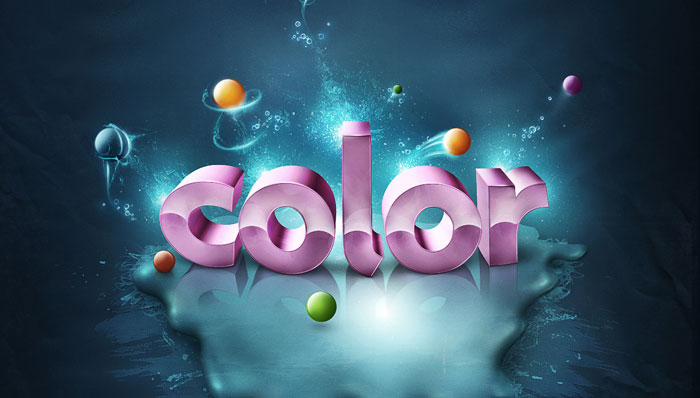
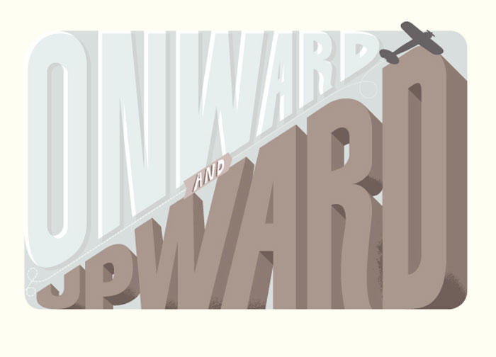
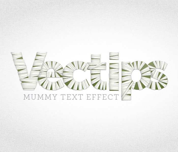
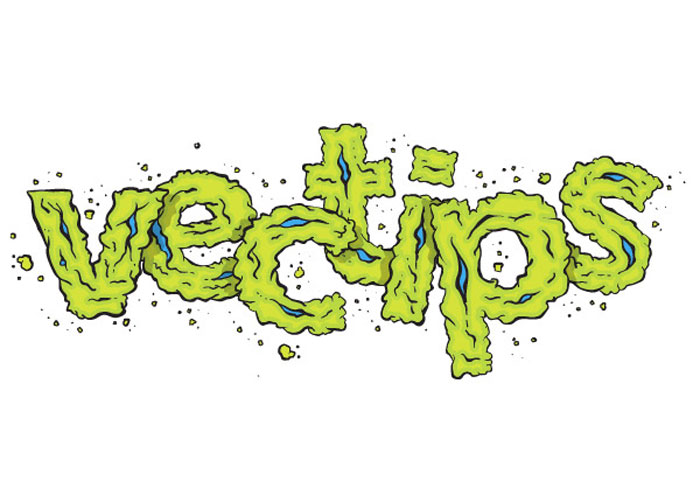
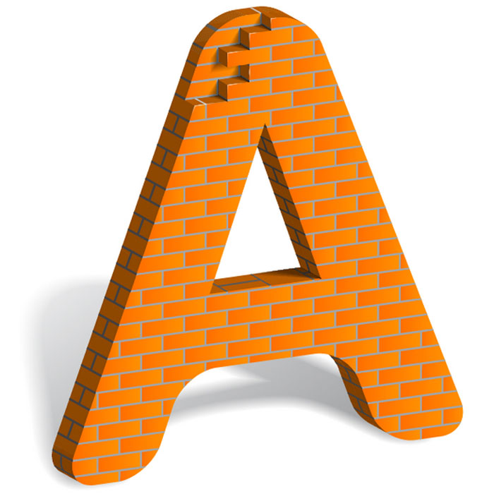
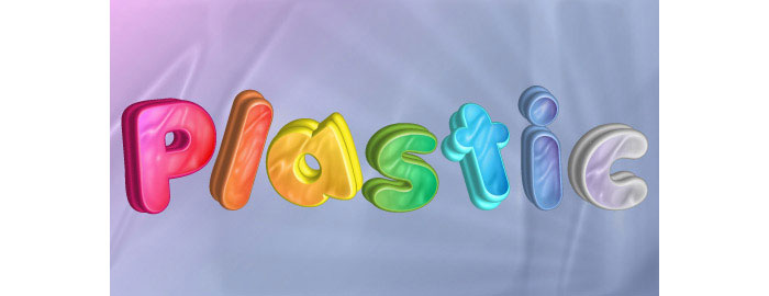
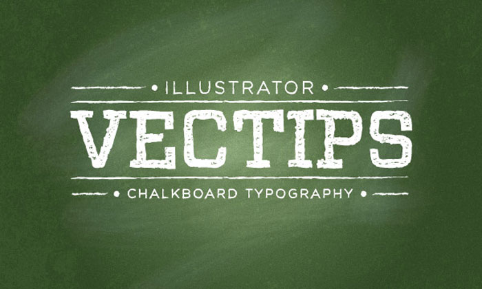
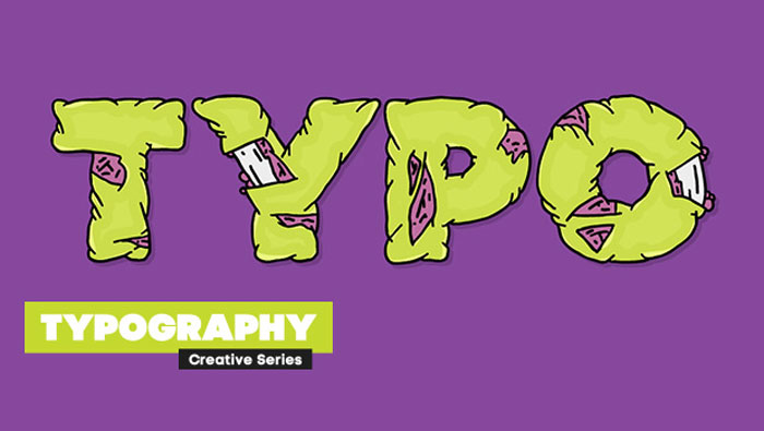
Font creation has become incredibly popular in recent times and has become more accessible to those who wish to get involved with the creation process. This is thanks to a number of font creation programs which are now available across many desktop computer systems. So you want to create a font. Part 1 So you’re a brilliant designer, a master calligrapher, and you’ve learned all about serifs, side-bearings, and kerning. Now you want to create your own font. So you want to create a font. Part 2 The sheer number of fonts out there is a testament to the fact that there are nearly an infinitude of creative choices that can be made when designing a font. Understanding The Difference Between Type And Lettering Unfortunately, as with any popularity surge, there have come with it a lot of misunderstandings of some of the terms and concepts that we use. This article will help you gain a clearer understanding of what typography is and isn’t, and why. Font hinting Hinting, or screen optimising, is the process by which TrueType or PostScript fonts are adjusted for maximum readability on computer monitors. This text compares different ways of hinting (black & white, grey-scale, ClearType, DirectWrite), and explains the behaviour of fonts under different rasterisers. Four techniques for combining fonts Is there a way to know what fonts will work together? Building a palette is an intuitive process, but expanding a typographic duet to three, four, or even five voices can be daunting. Here are four tips for navigating the typographic ocean, all built around H&FJ’s Highly Scientific First Principle of Combining Fonts: keep one thing consistent, and let one thing vary. Beginners Guide to OpenType OpenType (OT) is a cross-platform type format that includes expert layout features to provide richer linguistic support and advanced typographic control. Using OT technology you can substitute your characters for different glyphs1 using many different methods; Ligatures, Small Caps, Oldstyle Figures, Fractions, Superscript/Subscript, Ordinals, Alternates, Titling Characters and many more. Making Geometric Type Work For graphic designers beginning to experiment in type design, a geometric or modular typeface is a natural starting point. Illustrator and other programs offer a simple collection of elements such as circles, squares, and triangles which can be combined to create a passable alphabet. This is the same route the author took when dissatisfied with the limits of commercial fonts at the time. Ian twisted and distorted each character to fit into a few simple, incredibly strict rules of construction. Invariably this produced a wide range of exotic letterforms, some more legible that others. Web typographyA guide to Web typography Typography for the Web has come a long way since Tim Berners-Lee flipped the switch in 1991. Back in the days of IE 1.0, good web typography was something of an oxymoron. Today things are different. Not only do we have browsers that support images (gasp!), but we have the opportunity to make our web pages come to life through great typography. Avoiding Faux Weights And Styles With Google Web Fonts If you’re using Google Web Fonts on your websites, then there’s a very good chance that 1 in 5 visitors are seeing faux bold and italic versions of your fonts — even if you correctly selected and used all of the weights and styles. That’s because the implementation method recommended by Google Web Fonts doesn’t work with Internet Explorer 7 or 8. Legibility And Readability – Principles That Shouldn’t Be Ignored When Designing Readability is an important aspect of web design usability and that is not a secret. If readability is done correctly, it will allow the users to assimilate easier the information given in the text. This will depend on a few factors like the content structure, style and design. Legibility, on the other hand, is a measure of how easy you can distinguish a letter from another in a typeface. While making a text readable is doable, making every font legible is impossible, because not all fonts are designed to be legible. How To Pick The Right Font For Your Design Typography continues to be overlooked by many designers yet it is a very important aspect of the design process as choosing the right typeface can make a real difference to the effectiveness of the design. Typefaces are just as important to the visual effect of the webpage as images. Responsive Typography: The Basics The body text definition dictates how wide your main column is, the rest used to follow almost by itself. Used to. Until recently, screen resolution was more or less homogeneous. Today we deal with a variety of screen sizes and resolutions. This makes things much more complicated. Typographic Contrast and Flow Designers create typographic contrast and flow by emphasizing certain text. Contrast is important because not all the content within a page have the same value, some have greater significance than the others. By creating contrast, you can direct the reader’s attention to the important messages and at the same time enhance the visual appearance. Here are seven basic methods on how you can create typographic contrast. 8 Simple Ways to Improve Typography In Your Designs Many people, designers included, think that typography consists of only selecting a typeface, choosing a font size and whether it should be regular or bold. For most people it ends there. But there is much more to achieving good typography and it’s in the details that designers often neglect. Photoshop tutorialsAn Awesome Collection Of 80 Photoshop Typography Tutorials Finding them all in one place is a little bit tricky… unless you find this article where you have almost all the cool and interesting Photoshop typography tutorials. How to Create Candy Cane Typography with Photoshop and Illustrator Awesome Milk Typography Effect in Photoshop Playing with Inflate in Repoussé in Photoshop CS5 Extended Create an Ice Cream Type Treatment in Photoshop Create Awesome Particle Flame Text Effect in Photoshop Create a Dream Design with 3D Typography Create an awesome broken plate typography effect Banana style text effect Create Gold Ornamental Text in Photoshop Honey leaking effect on the delicious pancake Cool Text Effect with the Puppet Warp Tool in Photoshop CS5 3D Ribbon Wrapped Text Effect Master 3D type effects Create a Tasty 3D Typographic Illustration in Photoshop Dramatic Text on Fire Effect in Photoshop Create Abstract Shining Text Effect with Groovy Font in Photoshop Add Fantastic Color to 3D Text – Part II Honey bubbles text effect Create Stunning 3D Text in a Grungy Landscape Creating Retro Folded Typography Using Photoshop Smoke Type in Photoshop in 10 Steps Create a Spectacular Grass Text Effect in Photoshop Glossy Snow Globe Text Effect Design Soft Stylized 3D Type Super Easy Pewter Style Metal Text Effect in Photoshop Create Cool Typography Using Paths in Photoshop Illustrator typography tutorialsUseful Typography Tips For Adobe Illustrator Old School Type – Line Gradients Create a Furry Calligram in Illustrator Create a Variety of 3D Lettering Effects for Poster Design Getting Carried Away with Balloon Lettering Create a Mummy Text Effect Create a Grimy Text Treatment with a Pen Tablet How to Build Letter Art From Bricks In Illustrator How to Create a Neon Text Effect in Adobe Illustrator How to Create a Fun 3D Plastic Text Effect Create a Chalkboard Type Treatment Create a Glassy Text Effect Filled with a Green, Acidic Substance Create a Zombie Style Typo using the Blob Brush in Illustrator from http://www.designyourway.net/blog/resources/tutorials-to-learn-how-to-create-typography-based-designs/
0 Comments
Leave a Reply. |

AuthorPleasure to introduce myself I am Jamie 27 years old living in Searcy, AR. I am web developer and have developed over 50 sites for clients. Now a days I am focused on designing as I feel I am lacking it. Archives
April 2019
Categories |


 RSS Feed
