|
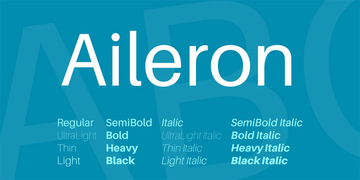
Looking for creative fonts? There are quite a few in this article and I’m sure that you’ll create beautiful typography based projects with them. The font is an incredibly important element of design, no matter what kind of project you’re working on. The typeface can completely change the message, tone, and feeling the text conveys. Some designers stick with safe font choices like Arial, Times New Roman, or Verdana. Those who do often try to stick with selecting either a serif or sans serif font. Yet, they should use more creative fonts. Your design might be lacking something that helps it to convey the tone you’re looking for. A creative font can be just the touch your project needs. There are a lot of free creative fonts out there that might be just the thing! Creative FontsAileron
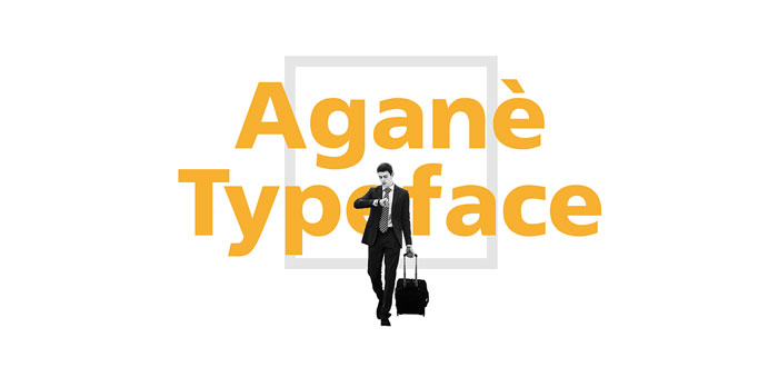
This creative font has a neo-grotesque look. It is very versatile and comes in 16 weights from ultralight to black. It was made by Sora Sagano, a designer at Tipotype. Aganè
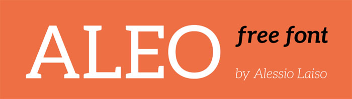
This font is a clean sans-serif inspired by wayfinding signage. It works well for anything that needs to be viewed from an angle and is a good choice for user interfaces. It was designed by Danilo De Marco, a Swiss graphic, UI, and type designer. Aleo
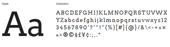
This font is sleek, with semi-rounded details. It has plenty of personality while remaining plenty legibility. It has 6 styles: light, regular, bold, with italics for each. It was designed by Alessio Laiso, a designer at IBM Dublin, under the SIL Open Font License. Arvo
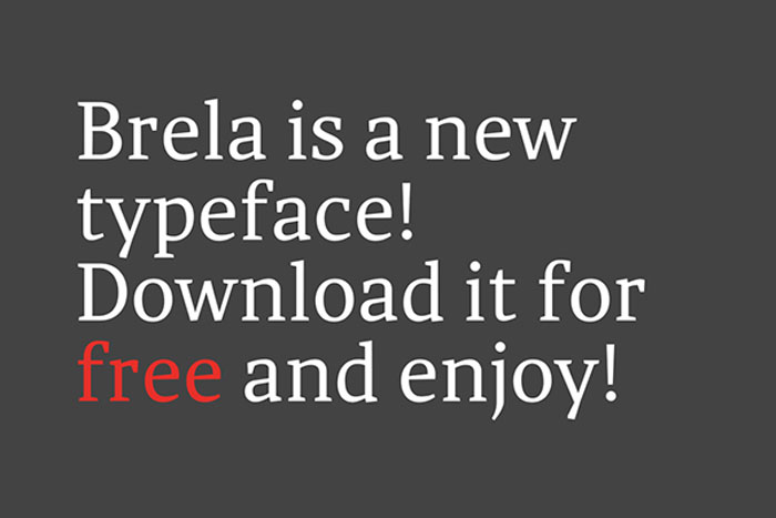
This creative font has a geometric slab-serif design. It was created by Antoon Koovit and works for screen and print alike. It has normal, bold, italic, and bold italic styles. Brela
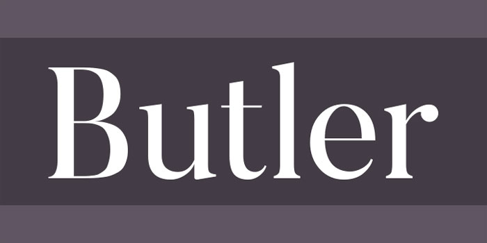
This font is a serif font made for editorial design. It has tall x-height, making it very legible even at small sizes. It can work very well as a bold headline don’t as well. It comes in both regular and bold weight. It was created by Makarska Studio, a Spanish creative agency. Butler
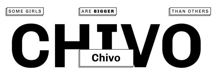
This is a free font designed by Fabian De Smet. It was inspired by the Bodoni family and Dala Floda. It is a more modern take on classical serif fonts and also has a stencil family. This font has 334 characters, 7 regular weights, 7 stencil weights, text figures, ligatures, and fractions. It works well with many different languages since it also has glyphs. The designer has stated that it works well for large titles, posters, books, and anything else that needs a fancier looking font. Chivo
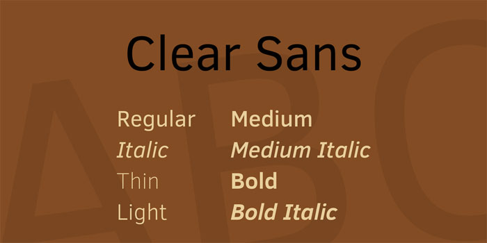
This creative font has a grotesque look. It works well for headlines because it grabs attention so well. It comes in 4 weights with matching italics. It was created by Héctor Gattiand of the Omnibus-Type Team. Clear Sans
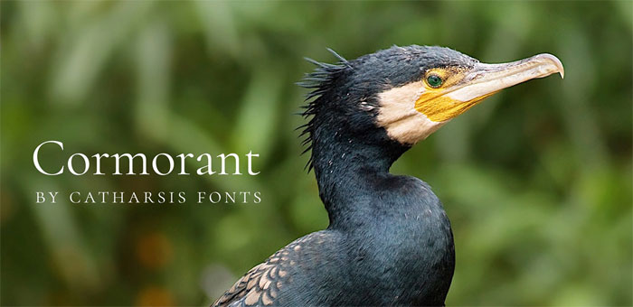
This font was designed by Intel for on-screen legibility. It’s great for UI design in particular. It comes in a number of alphabets and medium, regular, thin, and light weights. Cormorant
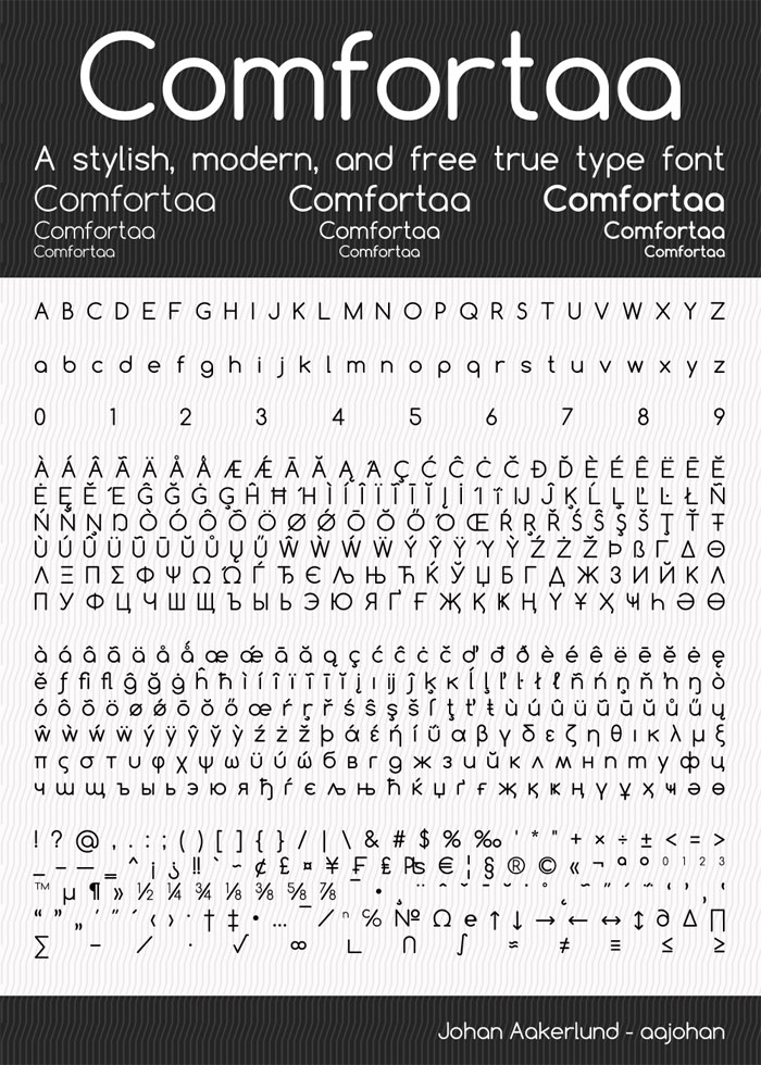
This creative font was inspired by Garamond. It is a hand-drawn font made by Christian Thalmann, also known as Catharsis Fonts. It works great for poster text and headlines. It looks great in large sizes both on screen and in print, though it does remain legible at smaller sizes. Comfortaa
This font has a rounded geometric sans-serif design. It looks good in large sizes and has a simplistic modern style. It was made by Johan Aakerlund, a design engineer at the Technical University of Denmark. Crimson Text
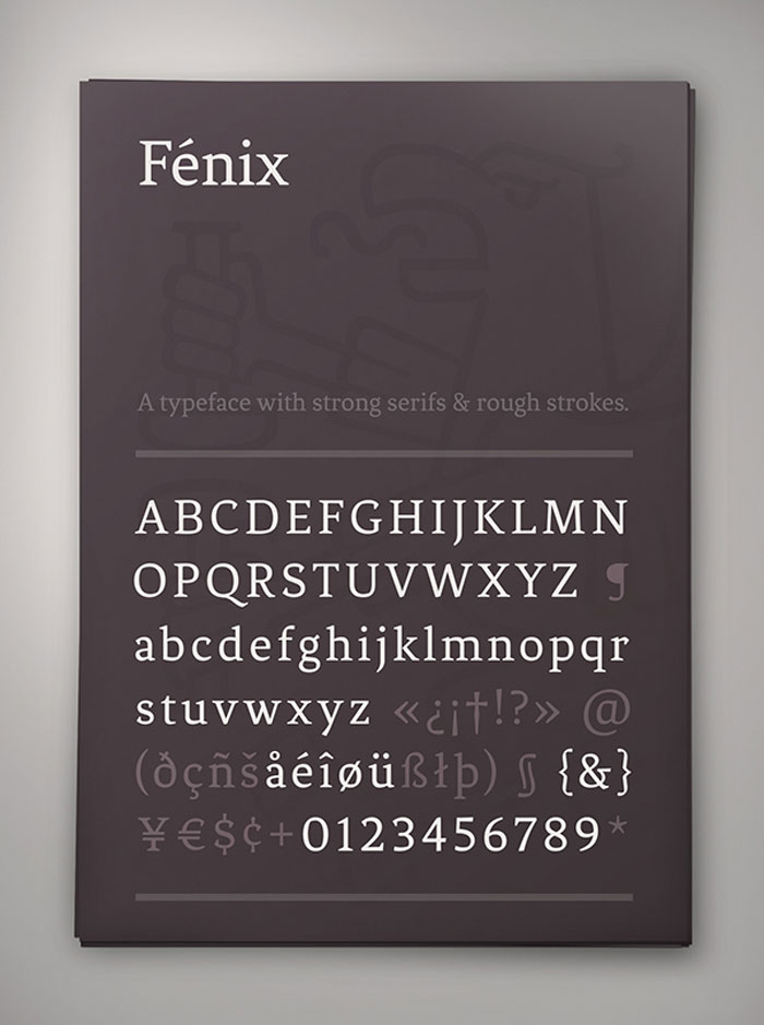
This creative font was inspired by Old World Garamond-like book typefaces. It was designed specifically for book production by Toronto-based, German-born designer Sebastian Kosch. He was heavily influenced by Jan Tschichold, Robert Slimbach, and Jonathan Hoefler. The italic version, in particular, is very expressive. Fenix
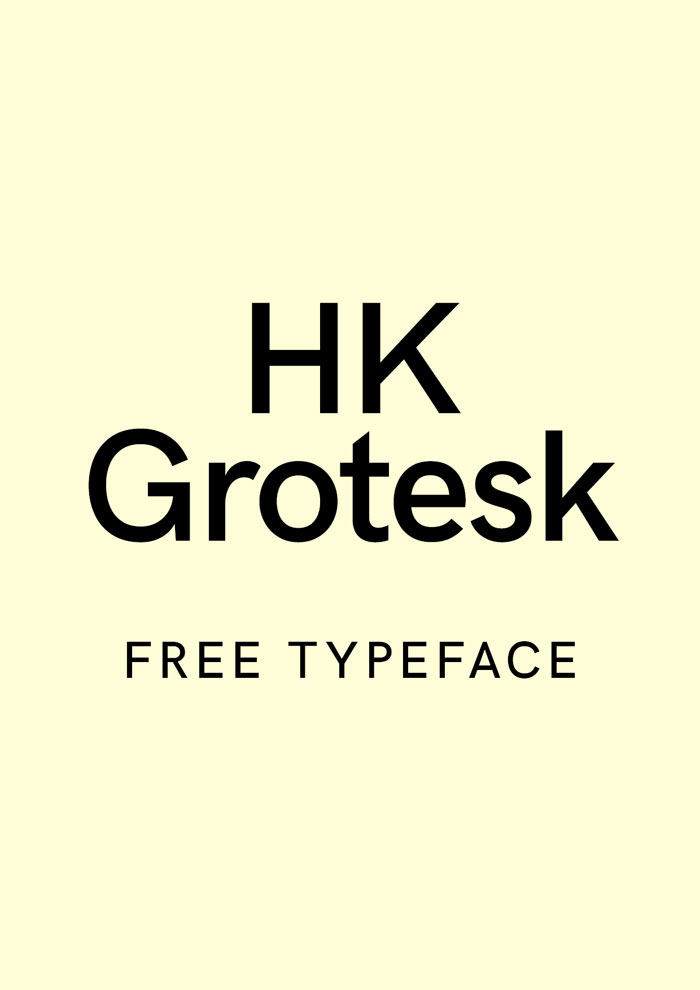
This creative font was inspired by calligraphy and has strong serifs with rough strokes. It has a nice rhythm that works well for headlines and body text. It was created by Fernando Dias from the Uruguayan foundry TipoType. HK Grotesk Hanken
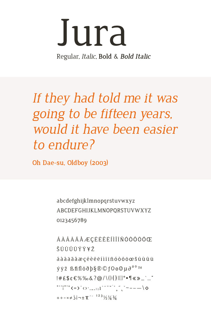
This font is a sans-serif inspired by classical grotesque fonts like Gill Sans and Trade Gothic. It is friendly and works well in small sizes. It was created by Hanken Design Co. Jura
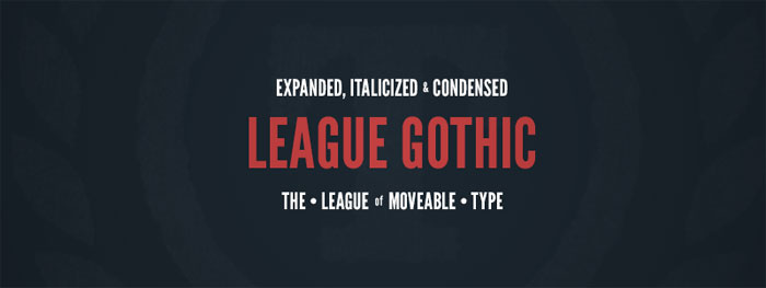
This font has narrow proportions and rounded wedge-shaped serifs. It looks good at both large and small sizes. This creative font was designed by Ed merit, a UK-based designer. League Gothic
This font is a condensed sans-serif typeface. It takes its inspiration from Alternate Gothic #1, originally designed in 1903 by Morris Fuller Benton for the American Type Founders Company. This modern version was made by The League of Movable Type. Libre Baskerville
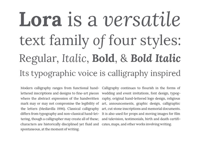
This creative font has been optimized for body text. It has its origins in American Type Founder’s Baskerville from 1941. It has a taller x-height than that font does, however, with wider counters and less contrast, so it works well for on-screen use. This is an open source project led by Impallari Type, a foundry based in Rosario, Argentina. Lora
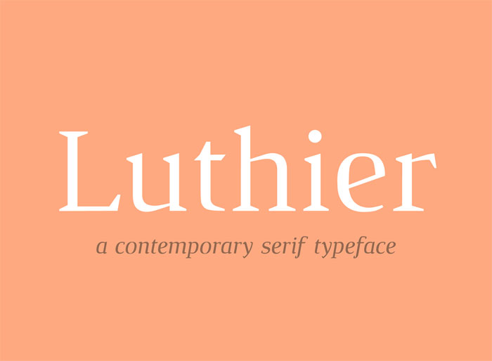
This calligraphic font was designed by for the type foundry Cyreal in 2011 and received an extension added in 2013. It has four styles: regular, italic, bold, and bold italic. This creative font has brushed curves and driving serifs. It has a balanced and contemporary look. It’s also been optimized for web use and can look very good on print projects. More creative fonts in this article. Keep scrolling. Luthier
This creative font has sharp serifs and a high contrast. It comes in two weights as well as italics. This creative font has a serious and intellectual look. It works well for both headlines and body text. It was made by Adrià Gómez, a Barcelona-based designer. Noto Sans
This creative font was designed by Google. It is meant to maintain a consistent look across several languages and alphabets. It comes in regular, italic, bold, and bold italic. Playfair Display
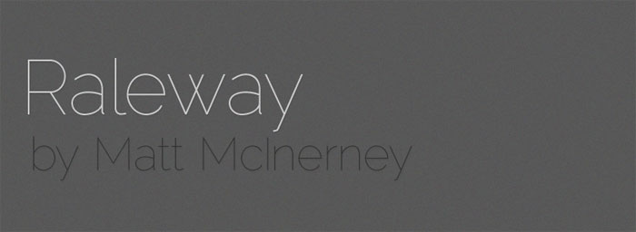
This free creative font was inspired by the work of the type designer John Baskerville and the European Enlightenment of the late 18th century. This typeface was created by a team led by the Dutch Designer Claus Eggers Sørensen. It looks like something created using pointed steel pens with high-contract letterforms and delicate hairlines. It is an open source development font. Raleway
This creative font has sans-serif, neo-grotesque look. It was created by Matt McInterney, formerly of Pentagram. It is only available in a single thing weight. There is also a more geometric alternate version. Slabo
This creative font was designed by John Hudson, the co-founder of Tiro Typeworks. It is currently the most popular serif font on Google Fonts. The creative fonts in this font family have been fine-tuned for web display at certain sizes. So far, there is Slabo 27px and Slabo 13px. It has blocky, modern feel and really is great for web design. Source Sans Pro
This font was the first Open Source font for Adobe. It’s a classical grotesque typeface. It is very simple and unassuming. Titillium Web
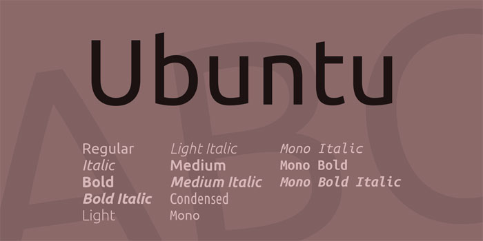
This creative font is part of an ongoing project from Italy’s Accademia di Belle Arti di Urbino. Every year, a dozen students continue development on it. They request that all designers who use this font to email them examples of it in use, which they use to continue to refine it and fix issues. Ubuntu
This creative font was made to complement the voice of Ubuntu, the Linux operating system. It looks very good on desktop and mobile screens. It was created by the font foundry Dalton Maag. Type, Typeface, and FontIn order to make sure you are using the correct creative font, it’s important to make sure you know the difference between type, typeface, typography, and font.
Why Do Fonts Matter So Much?Type is more than just the way you communicate a message. You can’t just use any font for your project and expect it to work perfectly. The font does a lot for defining the project and setting its tone. If you are creating a project for a corporation or business, the font will do a lot to help (or hurt) branding. Typography is as important for branding as logo or color choice. Different fonts make people have different emotional reactions. The font you choose can tell people a lot about your product before they even really read it. Creative fonts can be used to add visual flavor to a design without needing to add superfluous design elements. It can be used to grab attention without risking excessive busyness or loss of message. A wise choice of font is vital. Serif or Sans?The two basic font styles of most typography are serif and sans serif. A quick look through a word processing program reveals a lot of fonts with these options behind their names. What do they mean? Serif fonts have serif, the small strokes on the ends of the letters. Serifs help the reader’s eye flow from letter to letter. Serif fonts are often more elaborate. Cambria is an example. Sans serif fonts do not have serifs. Their letters are often simpler in design. Calibri is an example. Modern design can use either serif or sans serif font for its body copy. You should stick with simpler fonts that are easy to read. Before you finally decide on a font, step back from your screen and see how hard it is to read the text. If you’re designing a poster, flyer, invitation, or something else that will have physical copies, print out examples to see how the font looks on paper. Some kinds of fonts are much more legible on paper than on screen. Testing is important. A font might seem good in concept, or the name might make it seem like a perfect fit for the project, but that doesn’t mean it really works well. Pick a few different options that seem like they might be good fits and try them out to see which one, if any, works best for your project. Don’t be afraid to experiment with different creative fonts. How Many Fonts Should You Use?Try to only use two or three font types for your project. Using too many fonts is confusing and distracting. Even if the fonts you select seem perfect, they will just confuse your message. Fonts selection principles are much like the principles you use to select other elements of your design, like the color. Keep in mind contrast and repetition. Make sure your selections are distinctive enough to be clearly separated from each other. They should still work together well, however. A great way to achieve this sense of interest and cohesiveness is to use fonts that belong to one font family. Use a typeface that comes with options like italic, bold, light, medium, and block. They work well together, but will still break the text up into separate sections and generate visual interest. Creative fonts in headlinesBody copy looks great with either serif or sans serif fonts. However, to make your design really pop, you should use an attention-grabbing font for your header or headline. Headlines and headers are typically shorter. They need to grab a viewer’s attention in just a few words. This is a great opportunity to use a creative font with a big personality. It doesn’t need to be as easy to read as smaller text. Consider creative fonts with handwritten, script, or decorative styles. Look into wilder designs with unusual flourishes. For a more formal tone, look into script fonts with a cursive look and large loops. These can set the tone of your project immediately, even if your body text uses a simpler, more conventional font. If you liked this article with free creative fonts, you should check out these articles as well:
The post Free Creative Fonts To Download And Use In Your Projects appeared first on Design your way. from http://www.designyourway.net/blog/resources/free-creative-fonts/
0 Comments
Leave a Reply. |

AuthorPleasure to introduce myself I am Jamie 27 years old living in Searcy, AR. I am web developer and have developed over 50 sites for clients. Now a days I am focused on designing as I feel I am lacking it. Archives
April 2019
Categories |
 RSS Feed
