|
A horizontal scrolling website seems counterintuitive. They don’t seem to be as user-friendly as vertical scrolling websites, but the truth is that sideways scrolling can be a good fit for your website design on occasion. Creating a horizontal scrolling website is an exercise in an out of the box thinking. This design choice has been a small but growing trend. It’s something different and sometimes that’s what your website design needs. However, creating an effective and usable website with a horizontal scroll layout is a challenge. Follow these tips and trick to know if one of these layouts if for you and, if it is, figure out how to make a horizontal scrolling website that helps rather than hurts. Sideways Scrolling Can Be Used to Attract Interest
Creating a website with a side scroll layout (also known as horizontal navigation) has been a controversial web design technique for a long time. It was long considered one of the greatest web design faux-pas. However, sideways scrolling has been around since the earliest iterations of the internet. It’s only recently begun to make a truly strong comeback. Some consider them the most modern and latest web design layout. What prompted this change in attitude? Well, with tablets, swiping motions have allowed horizontal scrolling websites to make an effective comeback. This swiping motion makes a horizontal scroll much more viable and user-friendly, even less counterintuitive.
Horizontal scrolling websites have their advantages and challenges. They can create a more intriguing, interesting layout. They typically cause a user to take a look at your website for a little bit longer. However, that means that your horizontal scrolling website needs to be designed well. You can’t just set it up to use a side scroll layout. You need to think through it carefully. It’s not necessarily an easy form of site design to create, either. Are You Sure You Want to Use Horizontal Scrolling?
Before you even start down this path, make sure sideways scrolling is for you. This layout, as stated above, is pretty controversial. It’s a major subject of dispute and is frowned upon by a number of advocates of user experience. The only real reason to use a horizontal scrolling website layout is to attract user attention.
A recent study by user experience expert Jakob Nielsen revealed that only 1% of users take a look at the information that is originally hidden by sideways scrolling. However, when you design one of these websites right, it creates a unique and intriguing user experience. You can use the parallax effect to great result with a side scroll layout. How Horizontal Scrolling Websites Can Be Great for User Experience
There are four specific situations where a horizontal scrolling website creates a good user experience:
Horizontal scrolling website designs are better for certain website functions than others. Gallery sites often make use of it and so do quite a few portfolio sites. It is an interesting way to allow site visitors to scroll through a set of images. Occasionally ultra-niche retailers use as well as a way to have a fresh look. Some more typical retailers use it to display features of particular products that they want to highlight. What is the Appeal of Horizontal Scrolling?
Consistency across device– Horizontal scrolling websites allow for a consistent look on mobile devices and computer screens. Horizontal swiping has become very common on mobile devices. Many apps use it, after all. Because mobile-focused designs are increasingly important, choosing to use horizontal scrolling as the basis of their websites to save on resources and sign time. This has a catch, though. Sideways scrolling has been less common on desktop sites for a long time, so users may not pick up intuitively that they have to scroll across the screen rather than up and down it to see more content. This can cause a one-size-fits-all design approach to backfire. The key take ways here is that users are more likely to think about design consistency when they are moving between websites on the device they are currently using. They’re much less likely to remember exactly how they interacted with the website when they use a different device. Consistent horizontal scrolling may be a better choice if you’re trying to save resources or you expect your site to be more often viewed on mobile devices. However, if you expect users to view it on a desktop screen, you may want to create a sideways scrolling mobile site and a vertically scrolling website.
Browsing through non-critical content—not all content is critical. This secondary information can be communicating in different ways, including photo galleries of example images. This info can be great for a horizontal scroll layout. It allows users to see a sample of the content and allows them the choice of swiping through or clicking to learn more. It’s fine if site visitors don’t scroll through the entire filmstrip. You just need to be sure that no essential content is hidden away behind a horizontal scroll. Saving vertical screen space- Instead of displaying all the site’s content all at once on an extremely long page, a horizontal scrolling website introduces users to information in smaller, more digestible chunks of information. A sideways scrolling site is more flexible and lends itself to being extended quite easily (once you get the initial design structure down). You can add content in both vertically and horizontally. The Control Issue with Sideways Scrolling
Your goal with designing any website is to make sure the site design doesn’t make users think. The content should be where their brains are focused. Navigating through the site and the process of viewing that content should not be where a user’s brain power is invested. Horizontal scrolling websites are not as intuitive to get around for users as vertical scrolling ones. They tend to have to think it through. It should be obvious how the site moves. Include obvious indicators of how the site works. Make it friendly to your users. You need to think about how the scroll bar will look, where menus go, and how users will know which particular information is actually important, like calls to action.
A lot of horizontal scrolling websites rely on a browsers scroller function. This is not necessarily the best idea, but you also shouldn’t get rid of the browser’s scroller altogether either. Without it, users have no guideline to go off of. It creates another hoop to jump through. Instead, include a range of navigational aid above the horizontal scroller. This includes arrows and large scrollers that can zoom across a site. They will make the user experience more smooth and comfortable. Tips and Tricks for Good Horizontal Scrolling Website Design
Careful PlanningThis is true of any website design, not just horizontal scrolling websites. It has special meaning for sideways scrolling however because it’s so easy to get it wrong. Don’t get lazy and start without having a plan. Take the time to create mock-ups and paper porotypes. Decide where and how everything is going to fit together. There is a lot to think about. Especially because horizontal scrolling website design is not that common, it requires even more thought than vertical websites. Horizontal Navigation
The biggest issue for users of horizontal scrolling websites is the way that they are navigated. Even if they look great, they can end up being confusing and drive visitors away if they find it hard to get around the site. The navigation for your horizontal scrolling website should be both obvious and good looking. It should both look and behave as site visitors expect it to. They should not have to click on a side scroll bar and slide it along. A lot of users will make use of their mouse wheel or arrow keys to scroll. Most have forgotten that you can click on the scroll bar and use that to move through a website. Most people use scroll bars as a visual gauge of their location on a webpage, especially for younger people, who are more likely to be the target audience of your horizontal scrolling website. You should never try to remove the scrollbar. People do know what it’s for and do find it useful. It’s a good backup for when peripherals fail and there are a few people who will make use of it. Overall, your navigation should be easy for users to find and easy for them to use. Make sure it’s pretty intuitive so no one feels they have to puzzle out how to move around on our page. If this takes too long, they’ll leave. Basic Navigation
Stick to your fundamentals of good site navigation. It should be clearly visible and easy to use. A menu is generally a good idea. It allows users to know where they are and where they might be interested in going. Don’t leave them scrolling through the page to find it, either. This gives you the best of both worlds. They can enjoy your unique horizontal scrolling website design but be able to freely navigate without any trouble. Make Use of Labels
Horizontal scrolling websites are not as intuitive for users as vertical scrolling ones. Make free but smart use of labels to help them out. This will help avoid making the site too confusing and driving away visitors. Allow your visitors to know what the items on the page are, rather than having them click around to figure it out. Allow them to get to what they actually want from your site instead of spending time figuring out how your site works. Users really do want things spelled out for them. They don’t want to feel or look stupid when they don’t know something. They need to be able to figure out what’s going on the site and be able to do so quickly. Do Not Neglect the Site Content
It can be tempting to let your sideways scrolling site design speak for itself. They tend to be used on trendier sites, especially when they’re image heavy. This is acceptable, of course, but you should also remember that your site has a purpose beyond just being an exercise in unconventional design. “Look at all this cool stuff” can be fun, but it is rarely the reason you’re creating a website. You need to make sure all the relevant info about hat the site is for, including info about the business, products, services, how to contact you, order forms, and so forth. A horizontal scrolling website, as cool as it may be, will not make up for a lack of important content. Content is king. You need “contagious content” to get visitors to come back to your site. It’s the only way they’ll really take the tie mot look at your horizontal scrolling website design. Coding
Coding lends itself to vertical scrolling design more than sideways scrolling design. It is just more intuitive in that context. It’s more comfortable and what designers are more used to. It is thus more difficult to code a horizontal scrolling website and is going to require a bit more effort. You might not even know how to do it yet. There are a number of tutorials out there that can help you along with coding a horizontal scrolling website. You’ll probably need to break it down to the essential HTML and CSS elements. Learning how to code for a side scroll effect may end up being a project unto itself—which is something else you need to consider before you start designing a horizontal scrolling website. Ending thoughts on designing horizontal scrolling websitesA horizontal scrolling website may be a good fit for your site design. It has a lot of challenges and does not always look right, but it’s a different and original way to create a website to display information. If you enjoyed reading this article about designing a horizontal scrolling website, you should read these as well:
The post Horizontal scrolling website examples to use as inspiration appeared first on Design your way. from https://www.designyourway.net/blog/web-design/horizontal-scrolling-website/
0 Comments
A good background pattern can make or break a website. Background patterns serve to provide interest and contrast to a webpage design. The trick, however, is finding the right one. A textured background can all too easily become a distraction or a detriment to your content. Finding a good background pattern can be hard because there are so many out there. What looks good in a sample may not look very good as a background texture for a full webpage. Here are some great background patterns for you to try. They are refined and light background patterns, percent for a variety of web pages with all sorts of different topics and content. Background pattern examplesSeamless Space Pattern
[FREE] Woodgrain Pattern
Seamless Polygon Backgrounds Vol.2
FREE PATTERNS SET – VOL.2
Wood pattern background
6 Quirky Geometric Patterns
FREE AMAZINGLY FRESH VECTOR PATTERNS!
Mid century patterns
Subtle tile patterns vol 7
8 Free Seamless Vector Topographic Map Patterns
Free Set of Background Patterns
3 Recycled Paper Textures
15 FREE FRESH COLORFUL PATTERNS
25 White Background Texture Patterns
Catch-all* Patterns Pack
New Set of Subtle Background Patterns
Blueprint Pattern *Freebie
Breakfast Pattern Freebie
CHRISTMAS PATTERNS – FREEBIE
Free Hand-Made Patterns
Free pattern
Free New Set of Material Design Patterns
Office Things
Blue wooden wall
Crack, texture, paint and cracked paint
ELNÒS Shopping mall pattern
Patterned background
Screen Print & Wool Patterns
Seamless Polygon Backgrounds Vol.2
Geometric Seamless Patterns
This pack of three geometric background patterns offers a modern look that can be as bold or subtle as you want. Every one of the patterns in the set comes in vector AI format, vector EPS format, JPEG format, and transparent PNG format. All of the files contain a seamless pattern, so you can use them for any length of website without having any unsightly seams pop up. These abstract background patterns have a nice modern simplicity. It costs $7 for the standard license and $70 for the extended license. Dotted/Striped Seamless Patterns
If you’re looking for a simple pattern for your webpage, this webpage background pattern pack is for you. The 14 simple, seamless designs all have light dot and/or stripe designs. You can easily change the color and size of them in Adobe Illustrator. This pack includes JPG, PNG, and Eps files of every pattern. This is really the go-to texture pack if you want a very simplified background pattern. The standard license costs $6 and the extended license costs $49. Woodgrain Seamless Vector Patterns
Wood grain makes for some very cool textures in a website. It adds a touch of class or a rustic air depending on how you use it. This website background pack comes with 6 wood grain web textures. It includes vector EPS, vector AI, JPEG, and PNG files. You can scale all the vector graphics and edit them in Adobe Illustrator. You can purchase this background pattern pack for $11 under the standard license and $89 under the extended license. Organic Patterns
For a more natural yet still abstract touch for your website background, this background texture pack offers 8 seamless patterns inspired by nature, including giraffe spots and woodgrain-like striped. All of them are still abstract, giving a modern edge to these naturalistic patterns. The pack comes with 8 patterns in vector EPS, vector AI, JPEG, and PNG file formats. There are two color palettes available for all 8 patterns. All graphics can be scaled without loss in quality and the vectors can be edited. Purchase this background texture pack under the standard license for $14 and under the extended license for $89. Chalkboard Seamless Textures
A chalkboard background texture can be perfect for many websites. This pack includes 18 excellent seamless chalkboard textures in gray, green, and black. If you’re looking for green textures for an educational website, or just a simple smart set of dark textures, this offers you some great options. This pack includes .pat and .png files. It is available for $8 under the standard license and for $80 under the extended license. Watercolor Floral Patterns
This collection of floral pattern backgrounds offers you a lot of options. They are truly lovely patterns that will bring a bright and lovely touch to your website design. It includes 28 hand-drawn patterned images in a variety of color palettes. This is a set of free background images. Realistic Shelves on Wall Backgrounds
If you want to bring in a homey touch to your website design, take a look at this set of 6 background textures. It offers you a set of 6 images of shelves on realistic backgrounds in JPG and PNG file formats. These are a pack of 6 free textures. Twisting Patterns
This is a set of 2 seamless abstract background patterns. You can easily change their colors in either Abode Illustrator or Adobe Photoshop. These patterns look great and interesting but are still light enough to keep from being distracting. These cool textures are available for free. Big Stripes Set
Thus pattern back contains a set of 5 bold, retro striped patterns. They look great and have a number of color combinations that can look good as a number of website backgrounds. This set of 5 is available for free. This is a small fraction of a full pack available of 48 striped backgrounds for purchase on Creative Market. Tuff Textures Brushes
If you want to modify your existing backgrounds or images to add a more grungy look, this brushes pack offers a set of 4 hi-brushes to add a rough look to any texture. This pack of 4 is free. You can also purchase the full pack of 20 Tuff Brushes on Creative Market. Marble Halftone Textures Pack
This set of 6 marble textures will work for almost any webpage. It includes both classical modern marble texture patterns as well as more modern takes on the marble look. This set of marble textures is free. It is a small fraction of a pack of 30 Marble Halftone background textures available for purchase. Magic Watercolor Texture Bundle
These abstract backgrounds look great n a number of websites. They offer a dash of color and asymmetry guaranteed to make your website interesting. They have a certain dreamy look to them. This pack includes 7 watercolor patterns. It is a set of free background textures. You can purchase the free set of 30 Magic Watercolor Textures Bundle on Creative Market. Handmade Watercolour Washes
This is a set of 4 simple patterns. They offer a bright yet soft touch to any website background. They have been scanned into digital format high resolution. This set of 4 is amiable for free. You can also find a full set of 24 Handmade Watercolour Washes for purchase on Creative Market. Realistic Field Landscape Backgrounds
This set of 10 realistic backgrounds can be great for a website looking for a more naturalistic touch. They are serene yet interesting. This is a set of free website backgrounds, but you can also get the full set 100 for purchase on Creative Market. If you enjoyed reading this article about using a background pattern, you should read these as well:
The post Background pattern examples that you should check out appeared first on Design your way. from https://www.designyourway.net/blog/resources/background-pattern/ Scroll bars are a key part of any user interface. A jQuery scrollbar may be just what your site needs. The thing is that CSS has not allowed developers much leeway to change the appearance of scrollbars. With Javascript, however, your options become nearly limitless. You can quite easily replace the standard scrollbar with a custom scrollbar. There are many critics of custom scrollbars. Some say that custom scrollbars can make an intuitive and natural interface clunky and strange to use. This is rather outdated thinking. Imagine many social media websites with clunky vertical scrollbars instead of the simple ones that pop up when you scroll through your feed. This would be annoying and ruin their great looking interface completely. It would get in the way rather than help. Here are some of the best Jquery scrollbar plugins you can find on the web. They can help you make free custom scrollbars that are a perfect fit for your user interface without worrying about interfering with browser performance or interface usability across devices. SimpleBar
This is a vertical scrollbar JavaScript that utilizes the browser’s native scroll mechanics. All this scrollbar plugin does is show a floating scrollbar over the native user interface. It will disable itself on mobile devices and any other devices with “floating” scrollbars, like the MacBook trackpad, whenever it isn’t needed. The script of this scrollbar will not overwrite and mimic browser scrolling. All it does is provide an overlay. It works well with IE11+ and all other modern browsers. IE10 can be supported, but you’ll have to do some minor tweaks. This is a good script to use if you need vertical custom scrollbars. Perfect ScrollBar
With this Javascript, you can add a custom scrollbar to all scrollable elements of a page except the BODY element whenever the user hovers over that section. It’s designed to be as sleek and unobtrusive as possible. It does not make any changes to the target container’s original style. All it does is add a custom scrollbar over it. It takes into account any changes in the container’s dimensions automatically, which is great for responsive designs. This scrollbar plugin works both with and without JQuery. You can set it to work with any container using the “position” and “overflow:hidden” CSS properties set. It supports both vertical and horizontal custom scrollbars. The scrollbar will enlarge on hover, allowing users to more easily grab it. It supports RTL completely on both WebKit and Gecko-based browsers. It also supports a CDN hosted version so you don’t need to worry about downloading the core .js and .css files. This is a great custom scrollbar for most users. It can be used easily and quickly. Malihu custom scrollbar plugin
Malihu is a custom scrollbar plugin that supports both horizontal scrollbars and vertical scrollbars. It also provides scrolling momentum, mouse-wheel, keyboard, and touch response. It comes with several different themes for you to try out in order to experiment with different looks. It works great with many different browsers, even including IE8. It does need jQuery 1.6 or higher in order to work, however. It also includes RTL direction support, as well as optional parameters for full control of the scrollbar’s functionality, methods for triggering actions like update, destroy, or scroll-to, user-defined callbacks, and selectable or searchable content. This scrollbar plugin allows for a lot of customizability to be done easily right off the bar. It has some nice features for developers that make the user interface much better. jQuery Scrollbar Plugin
This plugin is very easy to implement. It comes with a long list of features. One of these is the custom scrollbar that you can place outside the target container and added to text areas—something not supported by many other custom scrollbar plugins. It comes with extensive support for legacy browsers (IE7+) in case that’s something you need. It does, of course, require jQuery. It does not have any fixed height or width. Its other features include responsive design support, vertical scrollbars, horizontal scrollbars, or even both, automatic reinitialization of scrollbar, and RTL support. It supports IE7+, Opera, Firefox, Chrome, and Safari. This is a very good scrollbar plugin, just remember that it requires jQuery. It has many useful features that make it better than many others, but that is a major limitation in some cases. NiceScroll 3
This custom scrollbar plugin is not subtle. It comes with a huge number of options that allow you to fine-tune how it should behave on mobile browsers and desktop browsers. It is one of the very few JavaScript custom scrollbars that advertises its ability to replace the main document scrollbar on top of iframes and text areas. It also has a unique zoom feature, allowing users to expand the scrolling container to fill the entire page to make it easier to read. It requires jQuery 1.8.3+. It functions very similar to native scrollbars, including features like dragging, mouse wheel, and keyboard navigation. You can customize the speed of the mouse wheel. There is a dragging scroll mode that makes use of scrolling momentum. It supports IE6+ and all modern browsers. This is an effective jQuery scrollbar. It is useful for replacing the main document scrollbar is that’s something you would prefer to do. The user interface aspects, like expanding scrollable content to fit the entire page, may also be part of this scrollbar plugins appeal for you. Baron Native Scroll with Custom Scrollbar
This custom scrollbar script uses native scrolling for optimal performance and it can also be nested. It supports horizontal, vertical, and bidirectional scroll. CSS can be used to totally customize the way it looks. All it is really doing is hiding the system scrollbar, not replacing it. This means that the scrollbar will work with any system. It will work both with and without jQuery. You can initiate it on hidden blocks. It provides infinite scroll and allows for the addition of nested scrollbars. It provides support for IE6+ and all modern browsers. The nesting and the ability to add scrollbars to hidden containers is a nice feature. It can have an issue where headers become fixed after a user scrolls past them. React Custom Scrollbars
This is one of the best-integrated custom scrollbar plugins for those working with the React Javascript Library. It is React centered in design. Installation is done through a npm package with a module bundler like Browserify or Webpack to allow it to consumer CommonJS modules. It provides frictionless native browser scrolling. It does not replace native scrollbars on mobile devices. It will run on both the server and client environments. It has requestAnimationFrame for 60fps. It does not come with an extra stylesheet and can be used right out of the box. This is very well tested scrollbar plugin. It has 100% code coverage. It is a great choice for a clean React-based custom scrollbar. It works wonderfully on both the client and server end. Facebook-like jQuery Scrollbar Plugin – slimScroll
This is a Facebook-like jQuery scrollbar plugin. It is simple and lightweight. It can transom any div into a scrollable area. The resulting scrollbar is much like Facebook’s and works well with minimal visible clutter. Responsive Browser Scrollbar Replacement Plugin – ClassyScroll
This responsive browser scrollbar plugin will replace the native browser scrollbar. It needs jQuery. It comes with vertical and horizontal scrolling modes. jQuery Inner Scrollbar Plugin with Smooth Scrolling Effect – Tween Scroller
This is jQuery scrollbar plugin that you can use to create a vertical scrollbar on an inner DIV. It has a nice, smooth scrolling effect. Tinyscrollbar
Tiny scrollbar is an elegant way to create a custom scrollbar on both desktop and mobile. It is meant to be a dynamic and lightweight utility. It also offers a user interface designer a great and powerful way to enhance the user interface of any website. This custom scrollbar plugin comes written as vanilla Javascript microlib as well as a jQuery plugin. Brower support between the jQuery plugin and the vanilla Javascript microlib differs a bit. The Javascript microlib does not support legacy browsers like IE6-8. You’ll need to use the jQuery plugin release if you need support for those browsers. This scrollbar plugin also comes with IOS and Android Support, as well as AMD, Node, requires, and commonjs support. It also supports both horizontal and vertical scrolling. It has an update method that can handle (async) content changed. The size of the track and thumb can be set to auto or at a fixed number. It is overall quite easy to customize. You can even allow it to do wither normal scrolling or mobile style invert scrolling. The code is very lightweight, small, and clean. Enscrollplugin
This jQuery scrollbar plugin allows you to replace the scrollbars being rendered by the web browser with ones of your own design. You can replace them with your own image, or you can use CSS to customize them any way you like This is a great tool if you want to great more artistic with your custom scrollbars. jScrollPane
This is a cross-browser jQuery scrollbar plugin. It was designed by Kelvin Luck and converts a browser’s default scrollbars into an HTML structure that can be easily skinned with CSS. This conversion includes all elements with a relevant outflow property. It is designed to be very flexible and very easy to use. After you have downloaded all the relevant files in the head of the document, all you’ll need to do is call one JavaScript function up to initialize the scroll pane. From there, you can easily style the resultant scrollbars with CSS or opt to choose one of the existing themes. It includes many different examples to showcase just what jScrollPane can do. It also provides a number of routes to get support. scrollator
This jQuery scrollbar plugin can be used to replace the default browser scrollbar with an animated CSS3 one that can be highly customized. GScroll
This is a very simple jQuery scrollbar plugin. It allows you to make a DOM element scrollable and will append a custom scrollbar in it when a user hovers their mouse over the area. nanoScrollerJS
NanoScroller allows you to ass MAC OS X Lion-styled scrollbars to websites. It uses native scrolling and will work with iPad, iPhone, and even some Android devices. Scrollbox
This is a very lightweight jQuery scrollbar plugin. It applies a custom scrollbar to the content that will trigger an event when it reaches a defined point. Phancy Scroll
This scrollbar plugin uses jQuery and allows you to make a fancy scrollbar that only appears when a user hovers over the scrollable area. mintScrollbar
This jQuery scrollbar plugin includes both horizontal and vertical scrollbars. It also features scroll to, scroll by, mouse wheel, keyboard, and touch support. Fakescroll
This is one of those lightweight jQuery plugins. It is good for making long content scrollable. You can customize your scrollbar using CSS/CSS3 that will display when a user hovers their mouse over the content. Ending thoughts on a jQuery ScrollbarA custom scrollbar can be just what you need to make your user interface look truly amazing. There are many options out there allowing for you to customize your scrollbars however you need. If you enjoyed reading this article about jQuery Scrollbar examples, you should read these as well:
The post jQuery Scrollbar plugins you should use appeared first on Design your way. from https://www.designyourway.net/blog/resources/jquery-scrollbar-plugins/ Car logos are an incredibly key part of a car company’s advertising, and often a core element of their identity. You can quickly identify the make of a car by the logo on its front or back, in many cases. A well-designed car logo allows you to know which car brand you’re seeing even without text. Car badges are even more important for car companies than for many other companies in other industries. They are literally branded on the car itself. Just take a look at a parking lot or the driveways in your own neighborhood. The car emblems are quite prominent on all of the vehicles there. These car logos are closely associated with the company and making a change is close to impossible. Let’s take a look at what makes many of the most popular car logos work and why they mean so much to their respective brands and audiences. Mercedes-Benz
Mercedes-Benz uses a distinct 3-pointed star emblem. It is a symbol of the company’s ambition of universal motorization in all domains—land, sea, and air. The circle around that three-pointed star only came into use after the trademark was registered in 1909. A four-pointed star car emblem was also registered at the same time, but it has never seen use. The star design originally came from the company’s technical director of the gas engine factory, Gottlieb Daimler. When he began in the position, he drew a star above his house on a postcard of the city, telling his wife that someday his factory would become famous because of its success. Mercedes has not made many changes to their logo since around 1916. Recently, however, they have removed their name from the logo, which has become a popular design choice for companies in many industries. The logo still has an elegant simplicity, highlighted even more by its lack of text. Vauxhall
Vauxhall is a British car company affiliated with a German car company called Opel. Both are owned by American car company General Motors. It was founded in 1857. They only came to car manufacturing later, however, in 1903 and started out as a manufacturer of marine engines. The Vauxhall car logo has gone through several iterations, though they have a constant theme. The Vauxhall emblem has always featured a griffin holding a flag. The current version dates back to 1998 and brought a modern twist to the classical car emblem, stylizing the griffin into a sleek modern circular logo. The griffin and flag in the foreground are silver and the background is red. Ferrari
Ferrari has one of the most iconic automobile logos in the world. Their black prancing stallion communicates everything the company stands for: power, speed, and elegance. The founder of Ferrari, Enzo Ferrari, told the story of the Ferrari car logo only once. The black horse was originally painted on the fuselage of Francesco Baracca’s fighter plane in the First World War. Francesco Baracca was a national Italian hero and an early flying ace. When Enzo Ferrari met the hero’s mother, she asked him to put the horse on his cars for good luck. He did, keeping the black color of the horse and adding in a yellow background to stand for Modena, the region where Ferrari cars were made. On top of the Ferrari car emblem is the green, white, and red of the Italian flag, another expression of pride in the company’s roots that also makes clear that Ferrari cars are an example of Italian luxury. Jaguar
Jaguar’s logo features a leaping jaguar above the company’s name or—increasingly– on its own. This logo displays the power, speed, and brilliance of the company’s cars and is instantly associated with speed and luxury. The leaping jaguar car logo has been since 2002, though it received an update in 2012 to give it a more three-dimensional feel. Jaguar has also used a stylized image of a snarling jaguar’s face on occasion. The sleek leaping cat done in the style of Jaguar’s logo makes ample use of shadow and gradient, emphasizing the graceful lines of its form and the implication of its strength. Previously, Jaguar used a simple black and white outline of a cat, but that was not nearly as effective or iconic. While easy to identify, it didn’t communicate the same elegant strength that the current logo does. Audi
Audi’s logo is simple and elegant. It consists of four interlocking rings all in a line. These four rings don’t just look good, but they also have meaning for the company’s history. Each of the rings represents one of the four car companies that came together to create Audi’s predecessor: Horch, DKW, Wanderer, and Audi. Interestingly, the Audi car logo is sometimes confused with the interlocked Olympic rings. It was created sometime around 1915 by Lucian Bernhard and modified by Sedley Place in 1994. The modifications were very slight and the four rings of the Audi car emblem have remained constant for a hundred years, a clear sign of a well-designed car logo. It has a timeless look that worked in the past and will work well into the future. Lamborghini
Lamborghini’s logo has a storied history. The founder of the company, Ferruccio Lamborghini, was working on agricultural manufacturing in 1949, focusing on engines, tractors, and heaters. He originally wanted to start working with Ferrari to engineer supercars, but they turned down his offer. He then hired a team of young engineers and began to make supercars that competed directly with Ferrari, who was then a giant. The charging bull of Lamborghini reflects the determination and power the company came to embody. It’s strong tones of yellow and black only emphasize it. The bull is also posed so that its strength is on clear display. The use of the two powerful animals by rivals Ferrari and Lamborghini also makes clear their status in relation to each other. There is some question as to whether this was on purpose, but it certainly makes them instantly identifiable as working in the same niche. Renault
Renault was founded in 1899, though its current logo only came into use around 1925. The company used several different car emblems prior to it, including the founder’s initials and even a tank. Only in 1925 did they start using the diamond shape with their name across the middle. In 1971, this car emblem was overhauled by the Hungarian-French artist Victor Vasarely and updated to its current form. The car logo incorporates yellow heavily to represent joy, optimism, and success. These are key to the Renault brand—and a far cry from a tank. Ford
The Ford logo was first made in 1903. While it has received a few tweaks since its modern typographic letterforms have remained constant. In 1919, the car company began using a car emblem featuring the word ‘Ford’ written in a manner similar to Henry Ford’s signature surrounded by a blue crest. It pays tribute to the company’s heritage while remaining timeless. It has stayed consistent for several generations. The current version was used first in the 1960s, though it has had a minor updating tweak applied here and there. The log remains easy to recognize, even at a glance and has an American feel of reliability. Bentley
Bentley is a British car company that has become known for opulence, luxury, and celebrity lifestyles. It is based in England and was founded in 1919 by W.O. Bentley, though Rolls-Royce acquired the company in the 1930s. The Bentley logo is fairly simple, at least in concept. It features a prominent capital B on top of the wings and tail feathers of a bird. It’s remained relatively unchanged, only being updated a little to the shape and layout. The bird wings and tail are meant to suggest the speed and grace of a bird in flight. The color palette of the Bentley car emblem tends to be limited, sticking to black, white, and silver, a sophisticated monotone fit for an elegant car brand. Volkswagen
Volkswagen us a powerhouse. It is the second largest car company in the world. Three of the top ten best selling cars in history come from them: the VW Golf, the Passat, and the well-known VW Beetle. The Volkswagen name means ‘people’s car’ in German. Their current slogan is “Das Auto”, which means “The Car”. Volkswagen is all about honest, workable simplicity. The Volkswagen car logo shows this. It features a V and W placed on top of each other. They still look great, however, because of how they follow the form, almost seeming to connect to form two interconnected Vs. It’s both simple and elegant. This logo wasn’t created by a graphic designer. True to form, it came from a Volkswagen engineer named Franz Reimspiess, who was the one who perfected the Beetle engine in the 1930s. The logo was the winner of an office competition, with a prize of 50 Deutschmarks. Volkswagen has used this in-house developed logo ever since. Abarth
The Abarth car emblem used vivid primary color to draw your attention. It features a prominent scorpion, which is the astrological sign of its founder, Carlo Abarth. The use of this astrological sign is meant to be a symbol for the birth of his motoring company. It’s an aggressive and bold image, one that is instantly striking and even a bit shocking. Coupled with a shield, Abarth’s scorpion gives off an air of strength and victory, which is perfect for a company that has a proud racing heritage. The Abarth car logo can’t be mistaken for anything else. Volvo
Volvo’s logo was designed in the 1950s by the famous Swedish Swedish calligrapher and typographer Karl-Erik Forsberg. It’s meant to showcase the brand’s strength by incorporating the symbol for the element of iron. It also is a play on the traditional symbol for ‘male’. This is all keeping in with Volvo’s rugged image and attitude. Volvo cars are designed in order to take abuse and keep on working very well. Rover
Rover drew inspiration for their car emblem from the Vikings. This choice was made because the Vikings were known to be fearless travelers, the most famous ‘rovers’ of all time, something that Rover wanted to communicate about their cars. Like the Vikings, Rover wants to be seen as a force to be reckoned with. It is also a very unique logo. The Viking longship appears in very, very few other brands across the world, making Rover’s car logo almost instantly recognizable and easy to associate with the brand. Cadillac
Cadillac started out with the plan of making reliable and affordable ‘horseless carriages’ for the masses. The company set out to design a car logo that reflected this noble mission. The car emblem itself comes from the family coat of arms of Antoine Laumet de la Mothe, Sieur de Cadillac, a French explorer and the man who founded the city of Detroit back in 1701. This crest is relatively basic and has been in the logo for decades, changing only slightly as the car logo has been updated/ Subaru
This company’s car emblem is a reflection of their complex history. In 1953, five Japanese car companies merged to form one company, Fuji Heavy Industries (FHI). Subaru was the motor vehicle division of this new massive company. They focused only on the production of motor vehicles and nothing else. The word ‘subaru’ means ‘unite’ and also refers to the six-star cluster in the Taurus constellation called the Pleiades in the west. The company opted to use this stylized car emblem of the constellation to pay tribute to the union of the five companies. The Subaru car logo has become associated with high-performance vehicles thanks to how often Subaru cars appear in rally driving competitions. The car logo has become so well-known and so successful that Subaru’s massive parent company, FHI, adopted the Subaru car emblem as its worldwide corporate symbol starting in 2003. Ending thoughts on designing car logosCar logos are something we see all the time. Most of us can typically identify a car’s make by its emblem alone, without any accompanying text, at least for more popular and common car brands. Understanding the whys and hows of the ways these car logos work can help you better understand what goes into building a successful logo. If you enjoyed reading this article about car logos, you should read these as well:
The post Car logos: Showcase of great looking car company logos appeared first on Design your way. from https://www.designyourway.net/blog/graphic-design/car-logos/ This collection of HTML templates offers a lot of useful features, including responsive layout, flat design, jQuery sliders, and more. On top of that, they are all completely free website templates! Don’t think that just because they’re free that they’re also buggy, difficult to use, or have few useful features. These are some really great templates that perform just as well as many premium web templates. Sometimes, you really can get quality stuff for free! Why are CSS3, Bootstrap, and HTML5 web design templates so popular?CSS3 is the most up-to-date version of the CSS language. It’s able to offer some of the best website styles, including unlimited color combos, some truly amazing font styles and font selections, as well as much, much more. Use CSS3 to make your website more beautiful and stylish. Bootstrap is one of the most popular front-end frameworks out there for user interface development. Its key advantage is its open source usability. It helps save user interface designers a lot of time. It also has several innovative features, including mobile-friendly web design, SAAS, clean and lightweight code, cross-browser compatibility, and much more. Many designers find that the Bootstrap framework allows them to create more responsive websites in much less time and with much less effort than using other web design templates. HTML5 is the latest markup language for creating amazing websites. It is compatible with all browsers. It has grown increasingly popular and shows no signs of falling out of favor. Because of this, HTML5 templates are also extremely popular. Capture- Free Bootstrap HTML Template
This simple web design template is elegant and easy to use. It can be used for just about any website design you like, but was designed specifically for mobile website development. It’s very elegant and pretty easy to use, allowing you to create lean code without much trouble. La Casa- Real Estate HTML5 Template
This HTML5 template was designed for real estate websites originally. It’s a simple HTML template, only containing the homepage of the site. However, this still makes it plenty useful. It has a clean design and eCommerce support built-in. Drifolio- HTML Portfolio Template
The odd name stands for ‘Dribble Portfolio’. This is one of the newer free HTML templates on this list. It allows you to create a nice business profile with all kinds of cool and fun animations. It is a responsive one-page layout, with a number of unique features. It comes with CSS and HTML5 download files, whichever you prefer. Pluton—Single Page Bootstrap Template
This is a modern website template. It works very well for photographers, studios, and other designers in creative fields. It has a unique, single-page layout complete with responsive design. It works well on many different screen sizes on all kinds of different devices. Boxus
This is a fresh take on free website templates. It is a free response HTML5 website template. It has been designed for dynamic web designers, firm, and creative software companies. The layout and responsiveness are excellent. This free template includes a number of features. It has a creative agency template, a sticky navigation bar, Google Maps support, social media icons, colorful interfaces, font icons, and bright color schemes. It also provides the latest JavaScript plugins, helping to make your free website templates more efficient and powerful. Using this free HTML5 template can reduce the amount of time and energy you need to create an amazing website design. Its development tech is HTML 5, CSS 3, JS and, jQuery. AweSplash
This free website template is great for welcome pages or any other kind of landing page you need for your website design, including upcoming events or new product launch announcements. It offers four good-looking presentation page templates. There are ghost buttons that allow you to link to other pages, like ones for upcoming products. If you use a JavaScript plugin called Animate Headline, a page built using this free website template will be even more fresh and exciting. This webpage template includes sliders, a responsive retinal menu, ghost button, SEO friendly formatting, device response, jQuery and Javascript plugins, and YouTube and Vimeo Player plug-ins. Its development tech is HTML 5, CSS 3, JS and, jQuery. Beverages
This is a free responsive website template that has a restaurant theme. You can easily use it for any kind of food and/or beverage website design. It works with all devices and screen sizes. It is built entirely in the Bootstrap framework, CSS3, HTML5, and JQuery, it is easy to convert the template into one that’s ideal for any other form of business. It includes features such as being fully responsive, allowing support customization, and using Google web fonts. Its development tech is HTML 5, CSS 3, JS and, jQuery. TravelAir
This is one of the best free website templates for modern design layouts. It has an owl carousel slider with title text for the homepage. It also has a jQuery UI Calendar travel booking form. This website template allows you to include information about tour packages, destinations, and about your company overall. It looks very professional and polished, which will be sure to impress website visitors. The web template’s features include Bootstrap 4, a sticky title, cross-browser compatibility, and support of Google Fonts. Its development tech is HTML 5, CSS 3, JS and, jQuery. Jessica
This is a website template meant for use as a dietician’s homepage. It has a lovely minimalist design style. The color scheme is modern yet classical and it features a number of yummy looking food images. There is a place to highlight a number of topics, including health, fitness, body, food, beauty, diet, weight loss coaches, female coaches, and women’s diet. Other features include Bootstrap V3 +, HTML5 CSS3, use of a Google Font Download (specifically Montserrat), and a style guide (specifically a developer usage and template design guide). Aisle
This is a free magazine web HTML5 template. It has a clean look and is highly flexible, allowing you to design highly responsive magazine websites. It works well for news or general blog sites as well. Dexter
This is a multipurpose Bootstrap template meant to be used for creating one-page websites. It is limited with its options and features, but they are all solid choices, created by some great designers for use by professionals and those in the creative industry. Guide
This is a free HTML5 bootstrap template that allows you to create a landing page. It was originally meant for startups, but you can easily modify the elements to fit your needs. It offers both a boxed and wide layout. It comes with 8 color schemes, offering a lot of options for you even if you don’t want to make extensive modifications. Senela
This HTML5 template is very modern and can be used to create multi-purpose, responsive websites. It is quite easy to customize and is also very organized. Delish Food
The Delish Food HTML template is a great choice for a restaurant or food-based website, though it can be used for other kinds of sites with some easily done modification. It offers a variety of homepage styles in a number of color variations. Dithy
This is a very modern looking and clean landing page HTML template. It is made with Bootstrap 3+. There are some well-organized comment codes allowing for easy customization. It offers some variations on the style as well as a number of color schemes to choose from. Scholastic
If you’re looking for a free HTML template for an educational website, this is an excellent choice. This HTML template allows you to create web pages for organizations like a training center, courses hub, college, academy, university, school, kindergarten, languages school, and much more. Triip
This is a very clean free HTML5 and CSS3 website template. It is meant for use by travel agencies or travel blogs. It uses flat design very effectively, allowing the site to look professional and functional even on smaller screens and devices, which is very useful for potential clients who are likely to be on the go. Baker
This free HTML5 template was made for agencies and professionals. It works well for any professional business website, including business, portfolio, corporate, and blog websites, anything that needs that clean, professional touch. Tycoon
This free Bootstrap template uses flat design to offer a great professional site design. It uses flat design very well and makes great use of mobile design. Use it for any image-reliant professional website you expect to be accessed from mobile devices. It makes for a very good landing page. SquadFree- Free Bootstrap HTML template
This one-page HTML template works great for startups and creative professionals. It’s easy to customize for your needs and offers a lot of fresh, fun elements. Sublime- HTML5 and CSS3 website template
This webpage template provides a clean and striking look. It works great for creative agencies, start-ups, and even individual portfolio sites. It has a responsive design and offers two layouts to choose from. E-Shopper- Best free e-commerce HTML template
This is hands down the best free HTML template for a site focused on e-commerce. It offers some great features, including a unique slider, fully functional sidebars, and more, It’s perfect for making online shopping on a site easy and interactive. You can display the product listing with interior product pages that the template provides. It also allows you to place ‘add to cart’ options as well as image previews. If you’re looking to build an online storefront, this is the free HTML template for you! AdminLTE Dashboard and Control Panel Template
This is an admin dashboard template made with HTML5 and CSS3. It is based on the Bootstrap framework. It can be scaled to display well on smaller screens and devices. It offers over 1000 icons to pick from and a massive set of user interface elements. It’s a great template to base admin sites off of. Magnetic- Free photography webpage template
This is a wonderful HTML5 template for photography websites or any other kind of website that displays a lot of images. It allows you to fully showcase your portfolio. The interior post content looks spectacular. The template has a responsive design so that it scales properly for screen size and mobile viewing. The full-width contact page has a single left sidebar that allows for easy, intuitive navigation. Ending thoughts on downloading HTML templatesThere are an immense number of free HTML templates for you to choose from, in as many styles as you can imagine and many of them tailored to specific kinds of websites. Once you know the purpose of your website, you can select the free HTML template that’s best for you and your organization, then start modifying it to your needs. Using a template will save you a lot of time and energy in the development process. If you enjoyed reading this article about free HTML templates, you should read these as well:
The post Free HTML templates for Portfolios, Real Estate, Business websites and more appeared first on Design your way. from https://www.designyourway.net/blog/resources/free-html-templates/ If you’re a designer or a developer, your work involves a certain amount of collaboration with others. Unless it is for your personal use only, a project is rarely a solo effort. Even then, you stand to profit from having one or more extra sets of eyes offering feedback, help, or guidance. For a studio design project, collaboration is crucial. It can involve internal team members, different agencies, and even external specialists. There’s more to collaborating than simply communicating back and forth, however. Tools are available to manage the effort and make it as efficient and effective as possible. Here’s a roundup of the best design collaboration tools currently on the market. These tools are designed to make sharing feedback and ideas a breeze. Whether you’re a freelancer or you work in a small agency, this list is for you. Mason
Imagine designing, building, and deploying a complex digital product from a single platform without having to worry about fragmentation across 3rd party apps or having to rely on prototypes to collaborate with others and wait for their feedback. Imagine being able to make and publish changes to an already deployed product without having to wait until it’s time for the next deployment cycle. You no longer have to imagine how things might be with Mason. Mason’s front-end-as-a-service platform lets you do all the above and more on a single platform and in real time. It’s simply a better way to design, build, and deploy a digital product. Mason is efficient, it’s centralized, designed, and built components can be quickly and easily modified, and the entire process is secure. When you transmit data using Mason, your data end-to-end HTTPS encrypted without hosting. Only you and your need-to-know party have access to the information. With Mason it’s drag and drop, design, publish, and make changes as and when needed; all from the frontend and all in real time. monday.com
monday.com is a team management tool that’s equally suitable for two freelancers working together or a world-wide team consisting of thousands. It’s currently in use by 22,000 teams; some working for startups or small agencies, others working for Fortune 500 companies. monday.com is especially popular for collaborating and sharing information among non-technically oriented teams, as demonstrated by the fact that roughly 70% of the teams using it fall outside the tech sector. It offers an alternative to whiteboard discussions and presentations, searching for information among countless Excel files, and lengthy meetings. This productivity-boosting team management tool is intuitive to use, centralizes everything to smooth outchaotic work flows and quickly and easily determine who is doing what and when. monday.com promotes transparency and empowers team members by improving team communication and collaboration. Fleep — Collaboration Software
Fleep is a flexible messenger that integrates with email and makes team collaboration easier and much more efficient. Instead of having to rely on several applications to find out who is doing what and who is communicating with whom, Fleep manages these communications from a single platform. You can use your Fleep account for team collaboration as well as for communicating with other Fleep users or any other teams with Fleep accounts. Fleep also has lightweight native task management for to-do lists. All information is stored securely in the cloud, making it readily and easily available on demand. This collaboration tool can be used on a PC, Mac and Linux, or an Android or iPhone device. Sign up for the free Basic account or sign up for a free 30-day Fleep Business Plan trial. Visual Inspector
Collaborating website content with copy writers, design issues with stakeholders, or changes with clients all too often involve back-and-forth communications over screenshot & email, where important information sometimes falls through the cracks. Visual Inspector is a feedback collaboration tool used by over 40,000+ teams to edit live web pages built with HTML/WordPress or, even at design stage on SketchApp for faster collaboration and decision-making. Subscribe to monthly plan or grab lifetime access to Pro Plan for one-time payment of $49. ConclusionYou work hard to set up a smooth-running and effective collaboration network. Due to personnel changes or slip-ups in manual tracking, it doesn’t keep running smoothly forever. You can eventually experience breakdowns. With the right tool in place, communications breakdowns seldom if ever happen. Any of the tools described here should keep collaboration activities humming along. From an ROI standpoint, any one of them is worth its weight in gold. The post Top Design & Development Collaboration Tools You Will Need this Year appeared first on Design your way. from https://www.designyourway.net/blog/resources/design-collaboration-tools/ Advertising agencies plan, manage, and execute advertising for clients of all sorts. There are three general types of advertising agencies, according to their preferable area and campaign size. They can provide full-service marketing which means they handle everything, from website and online ads, social media, stuff like that, to catalogue, brochures, radio and TV ads, etc. But, an advertising agency can also choose to focus on one area, like interactive advertising for instance. Advertising agencies in New YorkIf you’ve been searching “advertising agency NYC” on Google, most likely some of these have popped up in the organic results. Ogilvy & Mather
In the beginning, there was one Ogilvy advertising agency in New York, the company founded by David Ogilvy in 1948. Today, there is again one Ogilvy, in 83 countries and 132 offices. They are one doorway to a creative network, re-founded to make brands matter in a complex, noisy, hyper-connected world. BBDO
If you think you’re good at what you are doing and you are looking for “advertising agency jobs nyc” on Google, this agency is the place to apply for a job. JWT
droga5
Creatively Led Ambition for the best creative leads all of us. They care about the quality and integrity of their work above all else. Strategically Driven They believe the path to world-class work is through rigorous creative strategy that has clear and measurable objectives and is rooted in Brand Purpose. Systems Thinkers From product innovation to performance marketing, they believe all their work needs to work in concert to connect every element at every phase of the customer journey. Humanity Obsessed They strive to create work that adds value to people’s lives, not noise. They believe their industry needs to be transformed to create things people actually want and welcome. Interbrand
At Interbrand, they believe that growth is achieved when an organization has a clear strategy and delivers exceptional customer experiences. They do both, through a combination of strategy, creativity, and technology that helps drive growth for their clients’ brands and businesses. RGA
Marcel
They believe brands interact with people, not consumers. And the truth is that people don’t really care about brands. That’s why brands need to bring something truly useful and relevant to the table. That’s what they do. Likeable Media
They were one of the first-ever pure-play social media agencies and remain rooted in social-first thinking to this day. With a strong expertise in finance, food, and fun, we’ve been named a Top 50 Ad Agency and Top 50 Fastest-Growing Women-Owned Businesses by WPO and American Express OPEN as well as Crain’s 6th “Best Place To Work in NYC.” VaynerMedia
They’re a full-service digital agency built for the now. They partner with clients to drive their business outcomes with best-in-class modern video production, media planning & distribution, influencer marketing, Google & Alexavoice services, and everything in between. If you’ve wandered a bit on YouTube, you surely know about this digital marketing agency. Fred & Farid Group
They believe in business intelligence ideas that create growth. a good strategy with the right creative is not enough. So, we covered the “advertising agencies NYC” subject. Let’s move on to advertising agencies in Chicago. Advertising agencies in ChicagoIDEO
IDEO is a global design company. They create positive impact through design. Leo Burnett
They create many of the world’s most business-transforming ideas across all digital and traditional channels, earning their clients nearly 200 major creative awards in 2016 alone. DigitasLBi
They are The Connected Marketing Agency. their data, strategy, creative & content, media, and technology experts uncover and act on the truths that help brands better connect with people. And realize their most ambitious outcomes. Digital Kitchen
Another one of these marketing companies transforms businesses through creative experiences—in the form of environments, branding, marketing, & content. Momentum Worldwide
Welcome to Momentum, the Total Brand Experience agency. Because today the most important product a brand makes—aside from the actual product it makes—is experiences. And at the heart of every meaningful experience is a big idea. Rise Interactive
Rise helps marketing leaders make smarter investment decisions, grounded in data insights. Orbit Media
Award-winning web design and development company located in Chicago. Performics
Full-Service Performance. With solutions across paid, owned and earned channels, Performics creates more personalized and dynamic customer experiences and more targeted media buys. They harness billions of digital data points to optimize relentlessly for client success. Intechnic
When it comes to the success of your website, app or software, strategy is everything. It’s the foundation for your success. It’s do or die. They understand business. That’s why they begin every project with a workshop — crafting a one-of-a-kind, unique strategy that is designed to help you win. Cramer-Krasselt
Their mission: Make Friends, Not Ads®Too much agency work is disposable. Here today, forgotten tomorrow. But great work endures. Because at its core is a big, truth-heavy insight. And when it’s delivered with the right execution, a big truth powerfully told creates what cannot be easily stolen. A friend. Advertising agencies in Los AngelesSingle Grain
We’re starting the list of advertising agencies in Los Angeles with Single Grain. This online advertising agency is helping great companies grow their revenues. They’re not your traditional digital marketing agency.They’re not satisfied with doing the bare minimum.We’ll set you up with a specialist. Not an account manager. 72andSunny
We’re looking at another advertising agency in Los Angeles, now: 72andSunny. They are a global marketing, advertising and design company. A spirit of collaboration defines their culture and people. Deutsch Inc.
AMP Agency
Every person has their purpose. At this creative agency they bring together number-crunchers, strategists, analysts, geeks and creatives with one goal in mind: to connect people and brands in more meaningful ways. Cashmere Agency
Cashmere Agency is a lifestyle marketing collective comprised of creative minds from the worlds of entertainment, advertising and new media. Arcana Academy
Arcana Academy is a Los Angeles based creative content agency specializing in strategically sound solutions for branding, advertising, and marketing across all media channels, both new and traditional. Wagstaff Worldwide
Wagstaff Worldwide is a leading public relations and marketing agency with five North American offices devoted to communicating the nuances of the travel and hospitality industries. MKG
They create experiences where people can connect with brands the same way they connect with each other. Team One
This is the single reason this creative agency was created: to help brands build relationships of worth with affluent customers. Understand them more deeply. Advertising agencies in San FranciscoAKQA
Among the great advertising agencies in San Francisco, we have AKQA. Through the imaginative application of art and science, they exist to create a better future with you. Fantasy Interactive
Another remarkable advertising agency in San Francisco is Fantasy Interactive. They combine digital strategy, UX and design to help clients think beyond ordinary. 140 Proof
140 Proof is a creative agency in Los Angeles that brings precision to in-app advertising by analyzing the billions of signals that run through social platforms. Pereira & O’Dell
The choice between business results and pleasing the audience is an artificial one. To claim to be a good agency, in the time they live in, requires you to know how to balance those two sides with equal enthusiasm. Ramotion
This digital agency is a team of multidisciplinary product design and development experts. They extend design departments of the most innovative companies. their studio is small, working with a few clients at a time. Mekanism
Mekanism creates advertising at the intersection of technology, design, culture, and brand stories. They help brands build loyalty, authenticity, and love. Mobvista.
Mobvista is a world leading provider of mobile marketing automation that empowers brands and marketers to attain, engage and entertain audiences across all media. Beyond
Beyond is a design and technology ideas company. Allison & Partners
They keep their senior talent on the front lines of their accounts, a quality that separates us from others and one that is well-known and appreciated by their clients. Collectively
They’re a pioneering influencer marketing agency connecting brands with the most creative voices on social media. The Main Three Advertising Agency TypesEvery advertising agency has a similar role, true, but not all of them are completely the same. In fact, there are some major differences between these three main types. Although they all do advertising, naturally, all advertising agencies are generally divided to these 3 types: ATL (Above the Line)As you might already know, creating advertising campaigns on national or international scales requires special planning and handling, which is why it is done by the biggest advertising agencies, who handle big budgets. These include large TV campaigns, newspapers, magazines, as well as the non-traditional media campaigns (guerrilla campaigns, stunts…) BTL (Below the Line)Also, a vital participant in overall advertising, below the line agencies do not handle such large-scale campaigns and budgets but are still very much needed. They handle the more common marketing, like mail adverts, promotional texts, site banners, social media, etc… Even though they work on a smaller scale, they can sometimes handle ATL accounts, but not as a rule. TTL (Through the Line)This type is perhaps the most common today. As their name states, they are somewhere in between the two types, combining ATL and BTL advertising and creating all kind of campaigns, from large-scale, TV and radio commercials, stunts, and such, to small stuff like coupons, flyers, social media posts. This third type became so popular today because of the information age they live in, and the availability of advertising opportunities all around. Because of the development of social media and smartphones, advertising that was once below the line now gets a whole new perspective and big budgets, like campaigns you see on Facebook, Twitter, or YouTube. Today, some of the top advertising agencies are precisely in TTL. Every Advertising Agency Consists of Six Major DepartmentsThere are many factors and sub-departments that can be included in an advertising agency, but there are 6 major departments every agency must have. These are essential for advertising and the skeleton of any agency there is. They include:
Employee Roles in an Advertising AgencyDifferent roles employees can have inside an advertising agency are agency president, media director, creative director, graphic designers and copywriters, and account executives. Are there any top marketing agencies or digital agencies that you know and think should be in this article? Let me know on twitter @boogiesbc. If you enjoyed reading this article about advertising agencies, you should read these as well:
The post Top advertising agencies and their great work appeared first on Design your way. from https://www.designyourway.net/blog/web-design/advertising-agencies/ Mobile charts are an important way of displaying a lot of information in an easy to digest way. Good charts allow designers to quickly communicate complex statistics in a way users enjoy looking at. Even on normal computer screens, chart designs can be hard to pull off. For mobile, however, it can be even harder. Mobile chart design can be a challenge. It’s vitally important to do it as more and more users view more information on mobile platforms. Charts include pie graphs, bar graphs, and tables. They can be presented in a variety of ways, but small mobile screens make it even more crucial to do it effectively. Whether you’re creating an app that provides analytic assistance or your site displays weather data, these tips on chart design can help you create better charts. Advantages of Linear Graphs
Bar charts are a time-tried way of presenting quantitative data. They’re an excellent choice for your dashboard charts if you data works with the chart design. Bar graphs work so well because people naturally asses the length of each bar very efficiently.
It is easy for viewers to compare the values. This process works especially well when the bars are ordered in either ascending or descending order by length of bar. Mobile charts that use 2D position, like scatter charts, or line graphs also provide similar advantages. Circular and Area-Based Graphs Are Hard to Understand Quickly and Accurately
On the other hand, we have the classical circular chart design. This includes gauges, pie charts, tree maps, and radar charts. They don’t communicate information as well as linear graphs do. These chart designs use area and angle to communicate their data. It’s harder for people to understand when one area is really bigger than another, especially with nuanced data and complex relationships between data sets. If you’re looking to use dashboard graphs to quickly and effectively communicate info, these area-based graphs aren’t the best choice. They can’t communicate complex quantitative relationships in a data set very well. Pie charts are known for being very bad at communicating info. Donut charts are even worse. They are, however, useful for showing overwhelming disparities. For instance, a pie chart can be used to demonstrate that a single source of revenue is providing the large majority of a company’s profits. Tree Maps
Tree maps are another form of chart. They show hierarchal data sets in a series of nested rectangles of differing sizing. The size of each rectangle corresponds to a numeric value. They can be very useful for displaying complex data in a compact overview. Use it when users can have the opportunity to explore the dataset at their leisure and look for additional details. They are not a good fit for more simple actionable dashboards. GaugesGauges use angles to communicate data. They are not a great choice for quantitative data. Gauge charts are composed of gauges that resemble analog gauges ion car dashboards. They take up a lot of space and are difficult to interpret quickly. More Tips for Smart Mobile Chart Designing
Have No More Than 5 Slices in a Pie Chart
If you really think a pie chart would be a good choice, do what you can to keep it to having five slices or less. If there are more slice on a pie chart, the more difficult it is for users to understand what it is saying. You’ll end up with strange solutions to show labels or odd ways to make hover interactions work. If this is difficult for you to do, look into using a different kind of chart. Order Your Data Series
It’s much easier and faster for viewers to process information in a bar graph it’s sorted in either ascending or descending order. This is only really applicable to bar chart designs. This will not work, however, if you’re working with dates or other forms of time-associated with information. Don’t Use Randomly Generated Colors
There are some charting frameworks randomly generate colors for the data series. This is not really what you want for your mobile charts. The algorithms are not very likely to select colors that fit your site or apps overall color scheme or provide enough visual distinction between the data series to be easy to read. The best thing to do for good chart design is select your own colors. Be sure to choose enough colors to display all the data series that could potentially be featured on the charts. Trend Lines Are Typically a Distraction
Even though trend lines seem like they are a good addition that helps viewers get a better grasp on the data, but they usually hurt more than they help. A viewer is typically able to identify the trends on their own without the visual clutter of a trend line. If you do feel the need to add a trend line, allow users to be able to toggle it off. Avoid Relying on Tooltips
Tooltips are supplemental or expanded information. Don’t rely on them. Viewers should be able to identify values without them on good charts. Don’t Include a Legend When You Don’t Need One
Simplify where you can. If you only have one data series, don’t feel you need to add a legend. Instead, just use the chart title to demonstrate what data is plotted on the mobile chart. Use Grid Lines When It’s Helpful
Grid lines guide viewers’ eyes from axis label to data points. They can be helpful sometimes, but they are not necessary on simple charts. If you opt to use grid lines, decide if you want them on both the x-axis and y-axis. Often you’ll only need it on one side or the other. Use Real Data in Chart Mock-ups
While you might be tempted to create a beautiful chart without any regard for your data whatsoever for your mock-up, that forgets the purpose of your chart. You should sue real data whenever possible during every stage of your mobile chart design. That is the purpose of your chart, after all. Mobile charts examplesDesign can be considered a craftsmanship because you do it until you are good at it and then you keep doing it to be better. The problem is that many developers are really eager to solve functionality problems rather than spending time to solve the interface issues. A mobile designer must embrace minimalism because he will have to limit the features available on each screen and use them efficiently. Of course, the designer must also pay a lot of attention to usability. If a function cannot be found, is to small to notice, or not large enough to be used, the application becomes unusable. Designing for mobile seems like a difficult move from designing for web or for desktop applications and a designer must keep an eye on almost everything that he can think of and on what he doesn’t know yet. Seems like a lot of pressure meaning that there’s little time left for imagining how to make the required elements of mobile UI design. The charts and graphs which are displayed in this article for inspiration should help a mobile app designer to expand his imagination and relieve some of the stress that he comes across while designing an app. Android – Statistics Data Chart
Arco’s charts and graphs
Stock App Design
Analytics
Mobile Dashboard
Optimize – Stats
Charts and graphs in mobile UI
Buckit financial app
Financial and news app screens
Pay Bills
Line Graph Screen
Analytics app screens
Analytics App
Health App mobile
Cycling Match
Threat Dashboard Direction iOS
Mobile dashboard
Charts
Indian Creek Trail App Concept
Manage modules
Purple charts and graphs
Sport Tracking App – Profile
Iron Chart
Noblyn App Redesign
Mobile Investment Platform
Tracking app
Ending thoughts on a mobile chart designGood charts are important, especially for mobile platforms. Keep in mind some of these tips as you create mobile charts for your site or app. If you enjoyed reading this article about mobile chart design, you should read these as well:
The post Mobile UI Design Inspiration: Charts And Graphs appeared first on Design your way. from https://www.designyourway.net/blog/inspiration/mobile-ui-design-inspiration-charts-and-graphs/ App menus are key to making an app work well. An app menu should appear upon interaction with a button or some other action. A well-designed menu UI will display a list of choices. Context is very important when designing a good app menu. These contextual app menus change available menu items dynamically depending on the current state of the app. As simple as all this seems, mobile app menus design is fairly difficult to get right. You have to determine the purpose of the app menu and every menu item on it. Then all of this needs to be designed so that users can easily understand what the items are, find them, and click on them. This guide will help you understand how to design a good app menu. What is the Usage of the Menu?
A menu is really just a way for users to get from one point in an app to another. It’s a temporary thing. A menu should contain at least two items, otherwise, it’s not of much use and is an extra loading screen. Every menu item should offer a discrete option or action that affects the app or selected elements, including the view within the app. Typically, these are accessed via menu buttons. As useful as a menu is, it shouldn’t be the primary method of navigating through the app. They are there to help people maneuver through the app. Even the greatest features aren’t of much use if no one can find where they are. Even if you have a search function in your app, that shouldn’t be the only way someone has to find your app’s features. If you look at many commonly used apps, you’ll see their designers recognized this and included some form of navigation app menu. Don’t get stuck in thinking of a navigation app menu as something that has to look a certain way. They can take many forms, including a navigation bar or a hamburger menu. Menu Labels
One of the vital features of a good app menu is the labels of every app menu button. Every one of these labels needs to accurately and concisely reflect what the button does. You need to make sure the menu buttons avoid confusing users by being too vague or improperly labeled. They should also be short and to the point. A lot of menu bars use a single simple word for their labels, including “format”, “file, or “edit”. While one-word labels have their advantages, you can also use longer labels as necessary. Don’t feel you need to keep it overly simple in order to provide the information users need. Disabled Menu Options
A well-designed app menu should display a consistent set of items. This doesn’t mean that the options are always static. Allow menu items to be enabled or disabled depending on what eh current state of the application is. For instance, having in-app purchases disabled will disable attempts to purchase items from the menu. The button may be grayed out or obviously not working in some way. Contextual Menus
Contextual menus have become increasingly useful and common. They dynamically change the items available on the app menu based on what else is going on in the app. In a contextual menu, items that are irrelevant to the present context might be removed. Menu items that are relevant, but need certain conditions to be met before they can be used, can also be disabled. It’s all a matter of understanding how to communicate to users what they can do when they can do it. Single Menu Item States
On occasion, a contextual app menu can end up showing only one single menu item. This is not a bad thing if that is the real limitations of the app. It reduces the amount of clutter on the screen and helps prevent any kind of confusion. If disabled items are visible but grayed out, a user may click on them and wonder why they aren’t working without realizing why they don’t work. This can be a much better option than graying out text or menu buttons in some apps. A lot of this depends on the app menu style you’re going for. Options MenuAn options app menu contains commands that apply across the current activity. They can also be used to start a new activity. They should not apply to a selected item in the content. That’s the domain of a context menu. For most devices, users press the menu button to access the app’s options menu. To close it, they typically press the menu again or press the back button. They might also press the menu button again or touch a point outside the menu. This can and does differ on different devices depending on what works better. Every activity should have its own set of operations, which means that it should have its own options menu. If your app offers multiple activities, every one of them should have its own options menu. For instance, in an email app, the options menu could let you compose a new message, search messages, refresh the list, or alter the email settings. In the compose view, there would be a different options menu that might include adding a CC field, attaching files, or discarding the message. In order to decide on what menu items you should have and how they should be organized, most options app menu progressively disclose them in two steps:
Scrollable Menus
A menu can be too tall to display all its items on the screen. In that case, it should be able to scroll internally. This might be a technique you use all the time, or when an app is being (or must be viewed) in a landscape orientation. The scrolling should be easy to access and not require users to use bars that are small. A lot of apps use touch scrolling. Some use arrows to accomplish the same thing. Ideas for Menu ItemsSingle Line Display
Every menu item should be limited to single line of text, whether this is a single word or a short phrase. This line of text should describe the action the menu buttons will perform when it’s selected. Menu items can also contain icons and helper text, like keyboard shortcuts or social media sharing buttons. They can also have controls like checkmarks that can be used to indicate a number of selected states or items. See ‘List Controls’ for more details on how these menus often work. Menu Ordering
If you have an app menu with static content, it should have the most frequently used menu items near the top of the menu. This enhances usability and prevents users from getting lost. It simply makes the most relevant menu buttons easier to find. If the app menu has dynamic content, they may not stick to this formula. For instance, previously used fonts can be placed at the top of a menu that lists fonts. This order can change based on user actions. This will allow the app menu to adjust dynamically to the user’s preferences, allowing them to more easily find the options they want on the menu. Menu Nesting
You can design a menu so that clicking on it, or on a particular point on it, reveals nested submenus. Try to limit nesting to one level deep as much as you can. Multiple nested submenus can be very hard to navigate. Sometimes they also tend not to work right, becoming hard to select before the app starts to think the menu has been closed. Nesting is a nice trick to use, but be discrete with it. Also, do a lot of testing to make sure your nesting works intuitively and well before publishing your app. Disabling Actions
While you can remove actions that are unusable at the moment due to the conditions, this isn’t always the best choice. For instance, on a document or photo processing app, the redo button may be disabled but not gone when there is nothing to redo. Often this is indicated by it graying out. When it becomes usable again, it simply fills in with color. Deciding between visible disabling or complete removal will depend on your app and the action itself. There is not one right fit. Context is very important for making this decision. A minimalistic menu style may be better served by getting rid of the option altogether, but others would work better by keeping it visible but disabling it. Common Mistakes to Avoid when Designing App MenusMake It Visible
Even those who know these guidelines by heart can end up making app menus that users overlooked. It’s hard to objectively evaluate your own work and things slip through the cracks when deadlines are tight or you’re stressed. If you know where a menu item is, part of the reason is that you’re the one who put it there. You need to be sure to test your app menu design with users to be sure that they can see everything they need to without any trouble. Communicate the User’s Current Location Effectively
Make sure users can tell where their current screen is located within your app menu options. In order to navigate, users first need to know where they are. Users rely on assorted visual cues to figure this out. If you don’t, clearly let them know where they are in the app relative to your menu options, they will probably get frustrated. This is one of the single largest issues on both websites and apps. It’s especially important for a menu to indicate the user’s current location when it’s not likely a user has entered from the homepage. Coordinate Menu Items with User Tasks
Make it Easy to Use and Manipulate
Separate Selection-Specific Commands from the App Menu’s Global Commands
For a good example of this, consider when a user does a ‘touch and hold’ on a person’s name in their smart phone’s contact list in the contacts app. The context menu then usually displays a couple commands, like “call contact”, “message contact”, or “edit contact”. Place the Most Commonly Used Operations First
Screens are only so tall, so some menus may be scrollable. Make sure you place the most important commands so they can be viewed without scrolling. This will save users time and energy. No one likes scrolling through the menu to find some option they use all the time. It can get very frustrating, causing users to look for an app that wastes less of their time. Also, place similar commands in the same location. This will make it easier for users to make adjustments if they need something similar but different. Mobile Menu Design ExamplesA very difficult part about mobile menu design is organizing it intelligently and designing in a way that will make the mobile navigation easy and intuitive. Coding can be relatively easy when you have what to work on, but the creative process is something that must not be made in a hurry. The navigation menu can be a very challenging aspect of mobile design, especially if a site or app has many sections or pages which you have to squeeze in a mobile resolution. On desktop websites things are easy, you can make a large menu, maybe even two of them and you still have a lot of space to do more. However, on mobile things are different and this is why I made this second article about navigation in mobile user interfaces to showcase a few mobile designs that I hope will be good UI inspiration for you. If you haven’t seen the first article in this mini-series, check it out. It has a lot of interesting examples. ICQ mobile app redesign
Mobile menu Animation
V Avenue
Test and Navigation on Mobile
Timeline & Profile menu design
GeGe App: user interface menu design
Musixmatch Prototype
Profile UI
Project collaboration: Mobile navigation
Cloud Analytics Mobile App
Mobile Side Menu UI/UX
HomeSwipe
Evalarm project
Linkedin – Android material design
Appbooster dashboard
Bolder Multipurpose Mobile UI Kit for Sketch
Profile
Mobile navigation
Ending thoughts on designing app menusSmart app menu design is key to a good app. It isn’t central, yet it allows the app to be easier to navigate and understand. If you enjoyed reading this article about app menus, you should read these as well:
The post Mobile Menu Design: User Interface Examples (33 App Menus) appeared first on Design your way. from https://www.designyourway.net/blog/inspiration/menus-and-buttons-in-mobile-design-45-examples/ Sketch for Windows OS may be something you want if you prefer Windows over Mac, or even Linux over Mac, but the unfortunate fact is that it’s not likely to happen. The Sketch software is a modern graphics design application that was originally made for the macOS. It became very popular on the macOS in 2010, quickly becoming the standard app used for mobile, web, and UI/UX design. The Sketch program is the favorite of just about every designer and has very few direct competitors. Because of its reliance on tech that’s specific to macOS, the developers aren’t planning on releasing Sketch for Windows or Linux. You’ll need to find a replacement with the same capabilities. However, there are plenty of substitutes for the Sketch app for Windows that can do the trick. Adobe Illustrator
Adobe Illustrator is likely the most well-known and well-made vector graphics editor in the entire world. It sees a lot of use in the graphics design world, helping to make logos, icons, web design, mobile design, sketches, print design, and typography. It is also backed by a large and gifted community, like other Adobe programs, making it easy to find tutorials, guides, and resources for just about anything you want to do with the program, both free and paid alike. It has many, many useful features that make it a good equivalent of Sketch for Windows. These include a shaper tool, live shapes, perspective drawing tools, dynamic symbols, smart guides, multiple artboards, transparency in gradients, and live gradient editing. With the Creative Cloud feature, you gain additional features including cloud syncing, allowing you to access your design files from anywhere, companion apps for both iOS and Android, and access to Adobe’s vast collection of royalty-free images, videos, and graphics. There’s one area where Adobe Illustrator falls through as a replacement for Sketch for Windows. Unlike the Sketch program, it does have a workflow for product and user interface/UX design. You can do UI/UX design in Adobe Illustrator, certainly, but it is not as versatile as Sketch is for the same work. Inkscape
Inkscape is a general use vector graphics editor program. It doesn’t have as many features or the same power as Sketch but is cross-platform and very lightweight. It provides support for more file types than any other, including CorelDRAW, Illustrator, and Microsoft Visio. It will also support using a Sketch file if you download and install an extension. Inkscape has many useful features. There are flexible drawing tools, including a pencil tool you can use for freehand drawing, a pen tool you can use to create Bézier curves and straight lines. There are also many other great tools for creating illustrations, web design, and general vector image editing. Because Inkscape is free and cross-platform, it’s a really great program for anyone on a tight budget, including students, people with older computers, and newcomers to vector graphics design. It is not an ideal replacement for Sketch, but it works very well for a variety of tasks. Affinity Designer
Affinity Designer is a winner of the Apple Design Award. This vector editor was originally made as an alternative for Adobe Illustrator. You can also use it as an alternative to Sketch for Windows or Linux depending on how you use it. The Windows version is still in beta, so it is prone to bugs and doesn’t have complete functionality, especially when compared to the fully functional and stable macOS version. Affinity Designer also has features that Sketch doesn’t. It doesn’t only handle vector graphics creation and editing, but also offers total support pixel design as well as more precise and powerful pen tool. It also includes overprint, artboards, canvas rotation, bleed, trim, crop marks, and much more. It does, however, have some of the same limitations as Adobe illustrator, especially in its limits with UZ/UX design workflow. It’s not as streamlined for that kind of design. Xara Designer Pro
This is a highly comprehensive graphics design program. It provides support for general vector design, as well as illustrations, web design, and photo editing. It also includes advanced features like Live Effects, non-destructive photo handling, vector masking, layer blending, website creation tools, and support for both PDF and PSD file formats. It covers pretty much all your bases and makes for a good substitute Sketch app for Windows. It’s a very general purpose graphic design application. It does not share Sketch’s UI/UX design focus but instead offers something for just about everyone. It is more useful for web design, as well. However, if what you’re looking for is basic vector and raster image editing, Xara Designer Pro is overkill, both in its price and scope. You can opt to buy only the Graphic Design version or only the Web Design version of the program for slightly less money. Gravit
Gravit is a web-based application. Most such apps are simplistic and don’t have the great performance. This one is different. It can hold its own against Adobe illustrator and Sketch. Because it is web-based, it is cross-platform. It just needs the most updated version of Safari, Mozilla Firefox, and Google Chrome. This alternative to Sketch for Windows and Linux has tools for interface design, screen design, logo creation, and vector graphics. It comes with a number of preset canvas sizes, more than 29,000 icons, over 1,000 stock photos, a curated list of Google web fonts, and a large community marketplace where you can purchase even more assets. Like other web apps, it automatically syncs everything with the cloud. This can be a great help, but it can also be a problem since you can easily lose access to the app and your files if there’s no internet connection available. It also lacks keyboard shortcuts. It can certainly hold its own among the desktop apps like the Sketch program, but it lacks some of their features. ConclusionSketch’s exclusivity to macOS can be annoying, but there plenty of alternatives to Sketch for Windows. They may not be perfect replacements, but they offer a number of features that you can work with. They may even offer features that Sketch doesn’t. If you’re using Windows for your design process, look at these alternatives to Sketch. If you liked this article presenting alternatives to Sketch for Windows, then you should take a look at the other alternatives articles:
The post Sketch for Windows: Alternatives to make it a reality appeared first on Design your way. from https://www.designyourway.net/blog/resources/sketch-for-windows-alternatives/ |

AuthorPleasure to introduce myself I am Jamie 27 years old living in Searcy, AR. I am web developer and have developed over 50 sites for clients. Now a days I am focused on designing as I feel I am lacking it. Archives
April 2019
Categories |
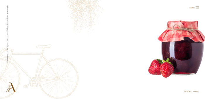
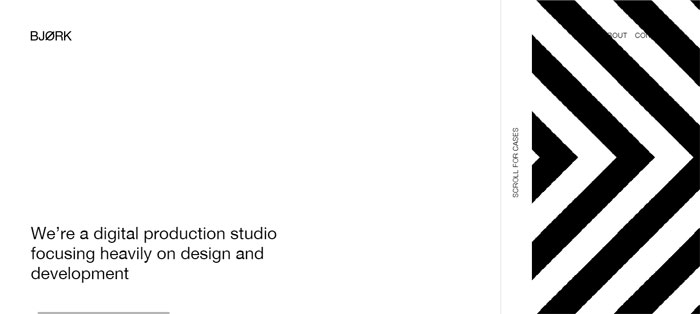
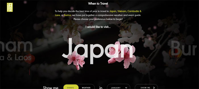
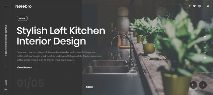
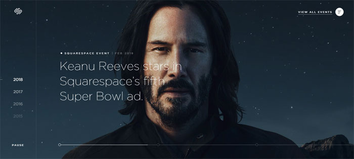
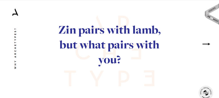
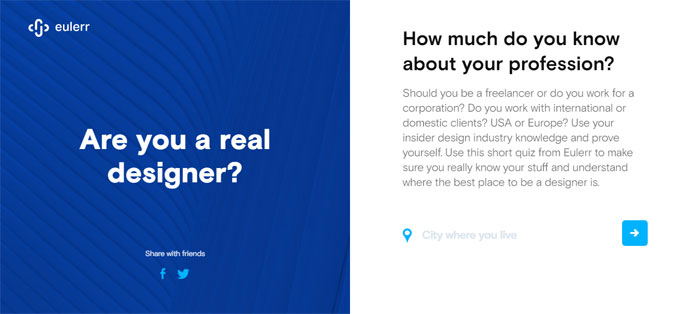
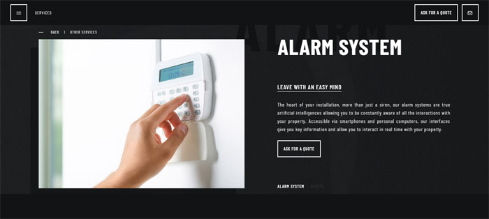

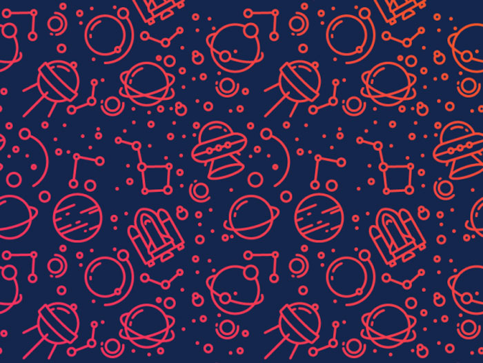
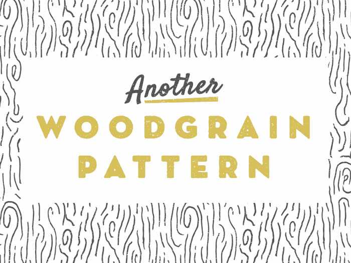
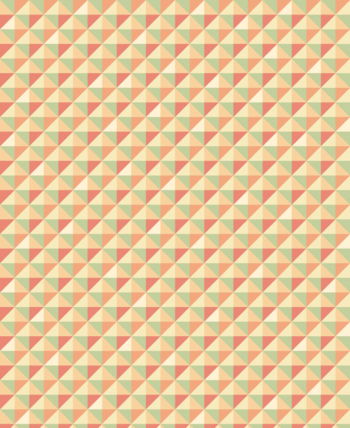

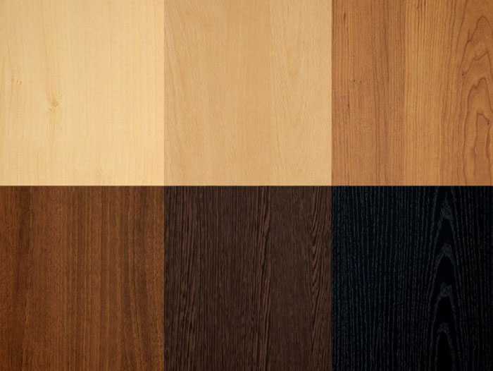
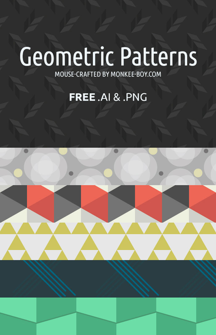
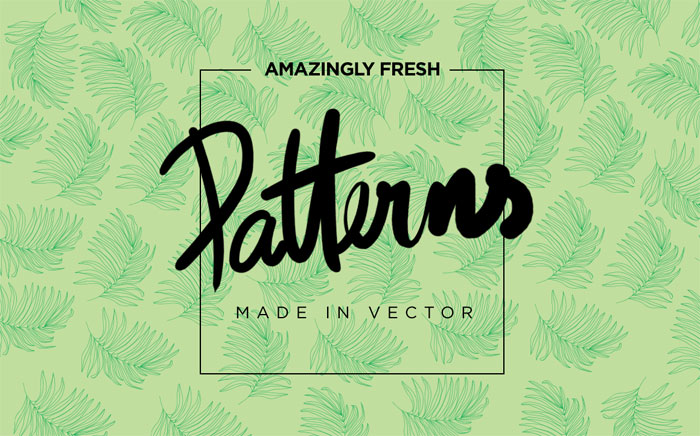
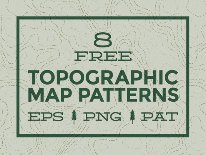
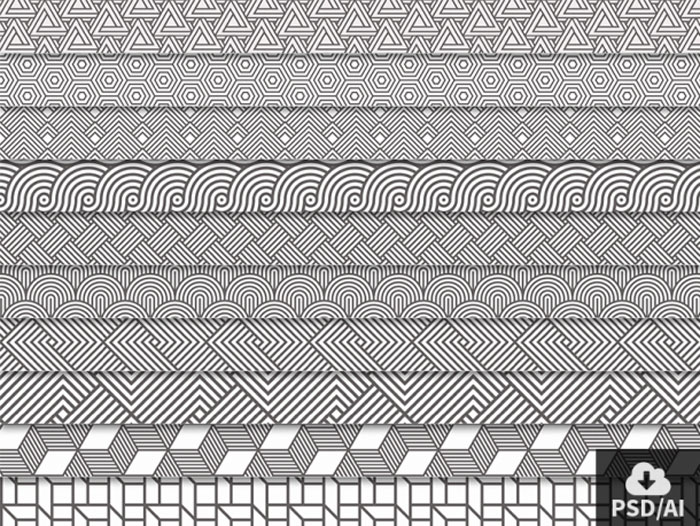
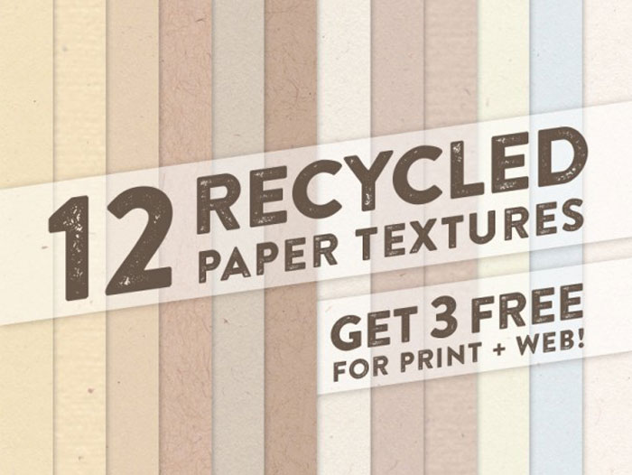
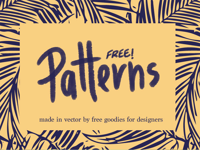
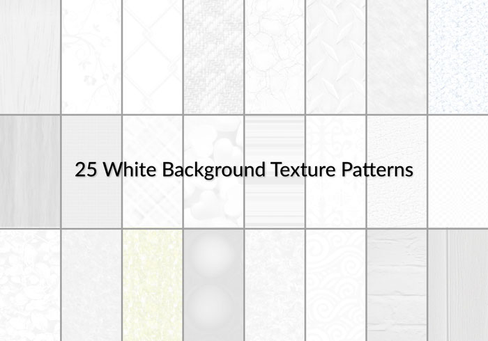
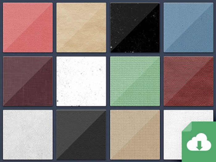
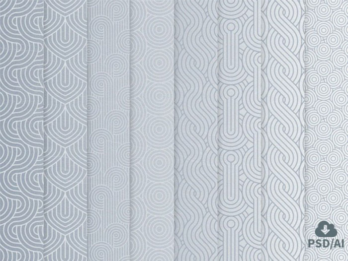

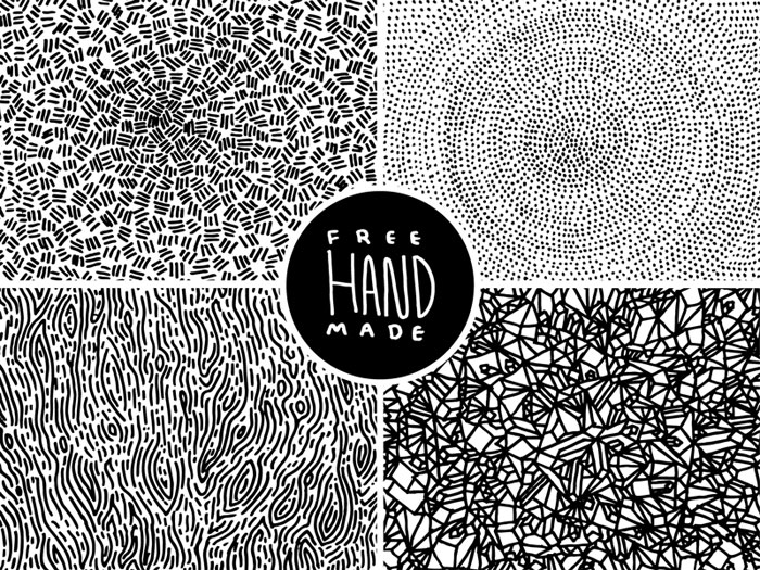

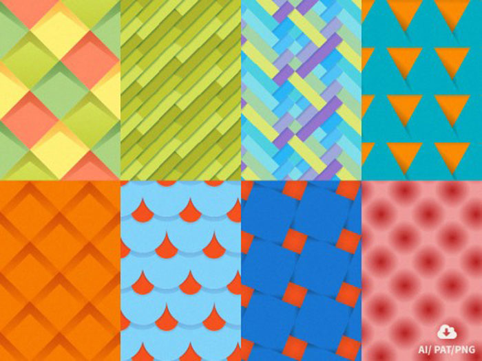
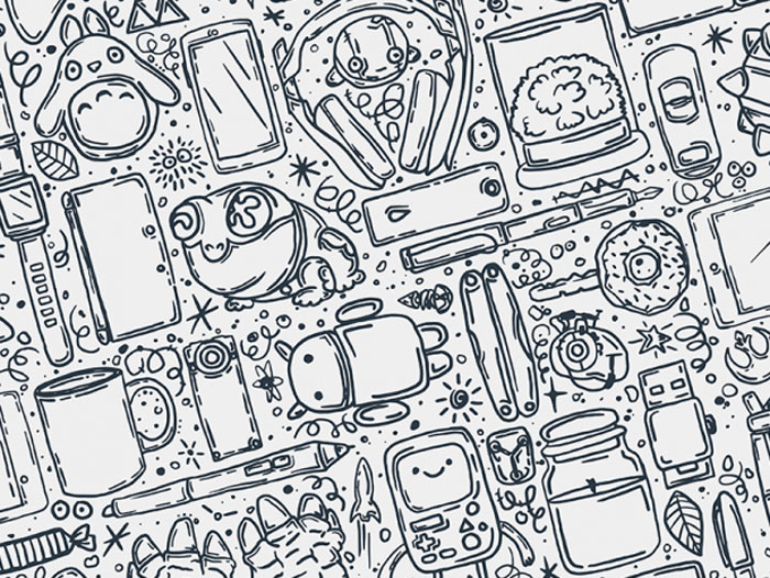
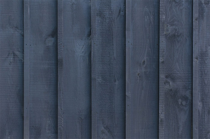


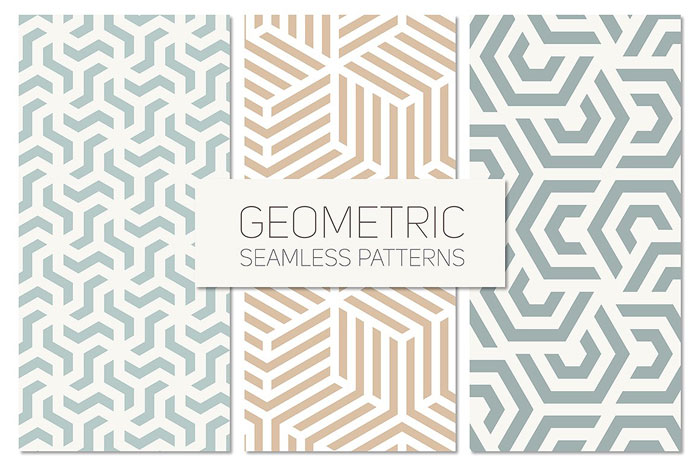
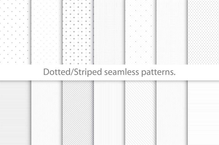
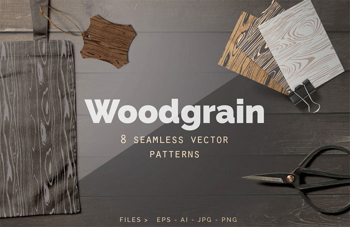
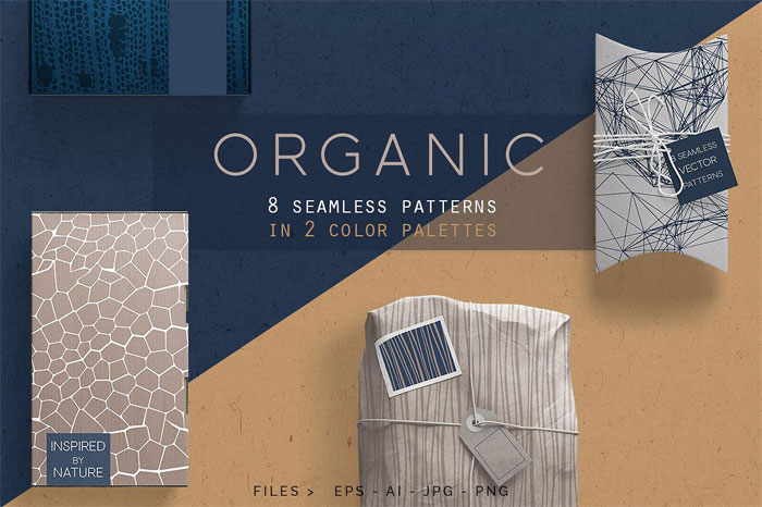
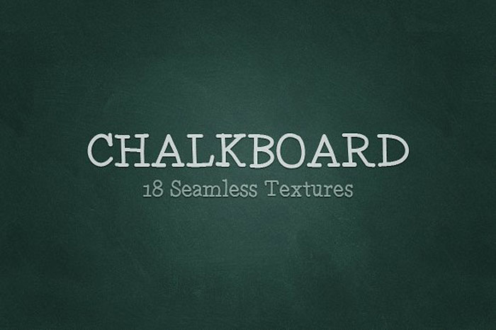
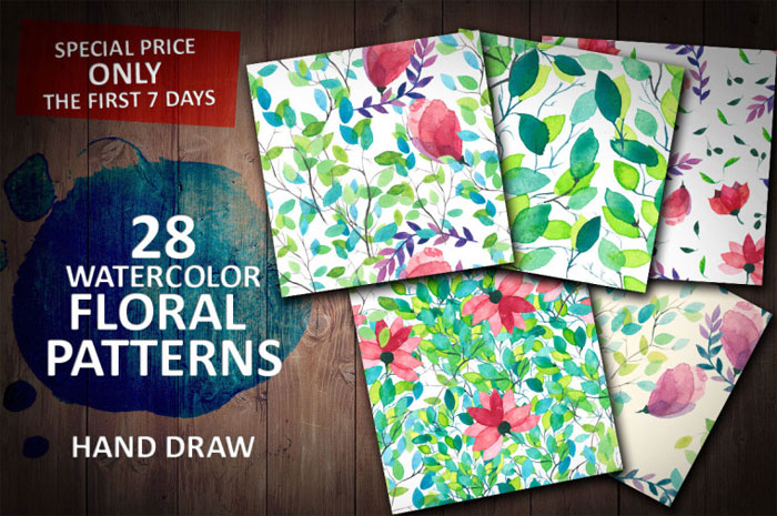
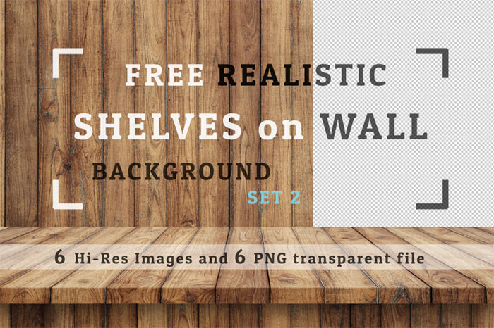
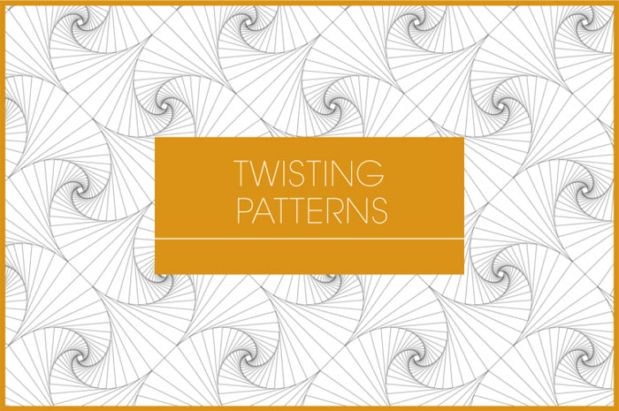
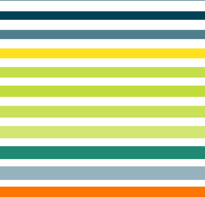
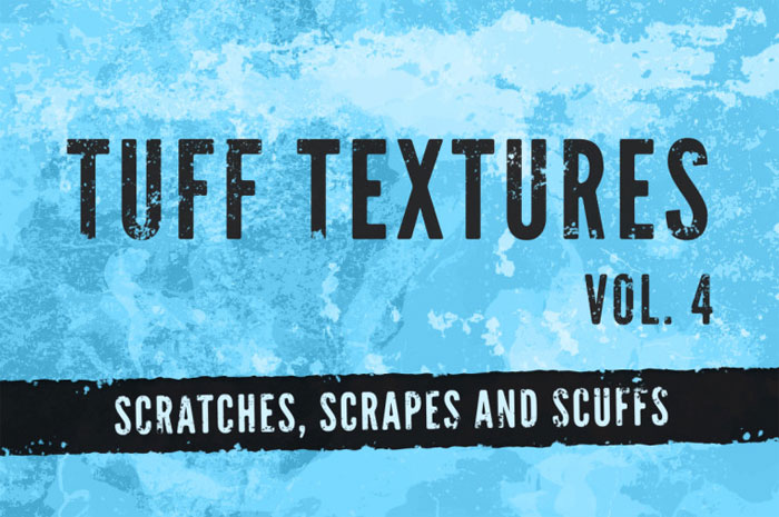
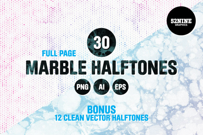
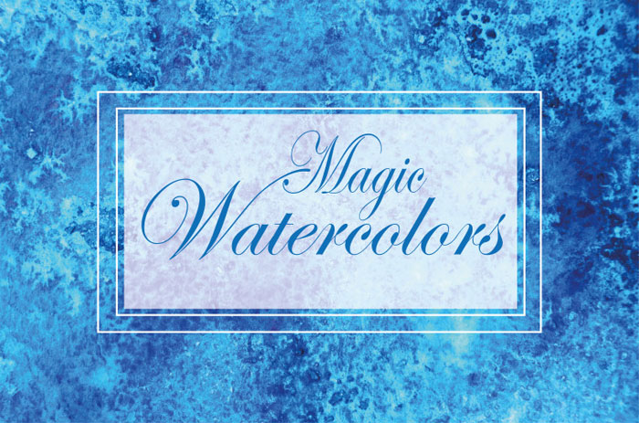
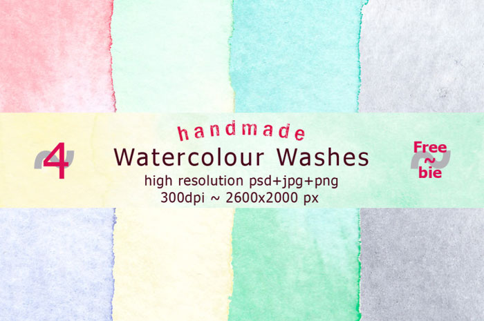

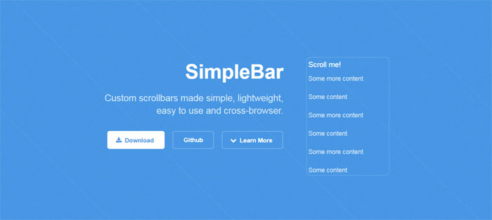
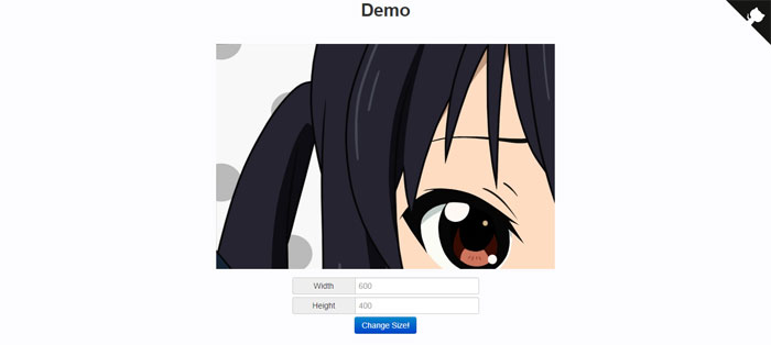
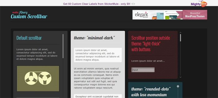
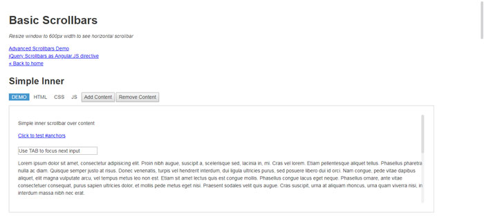
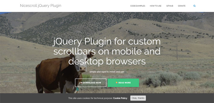
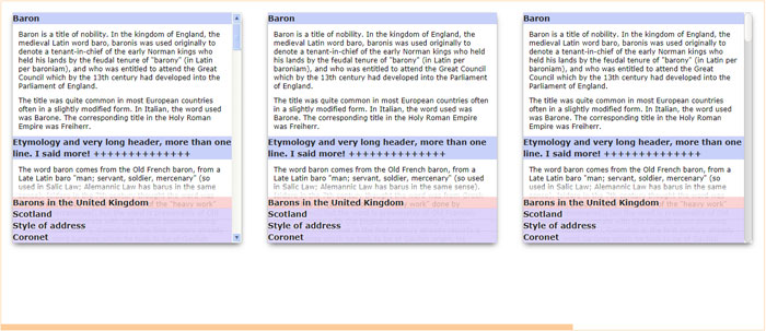
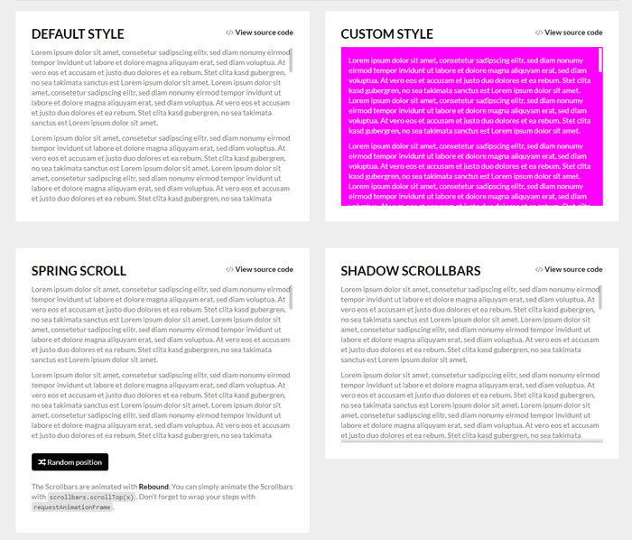
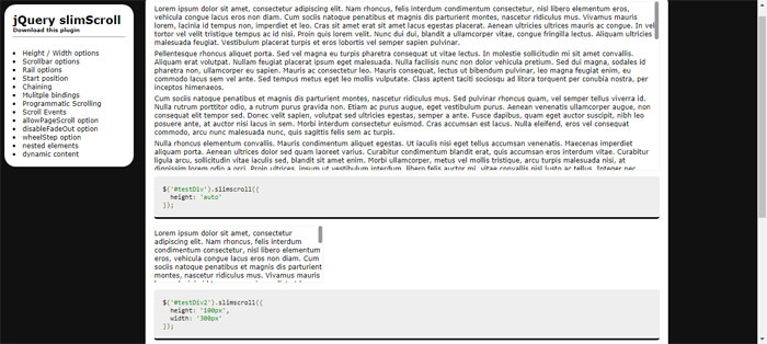
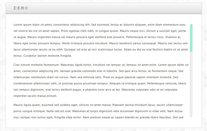
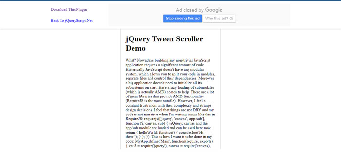
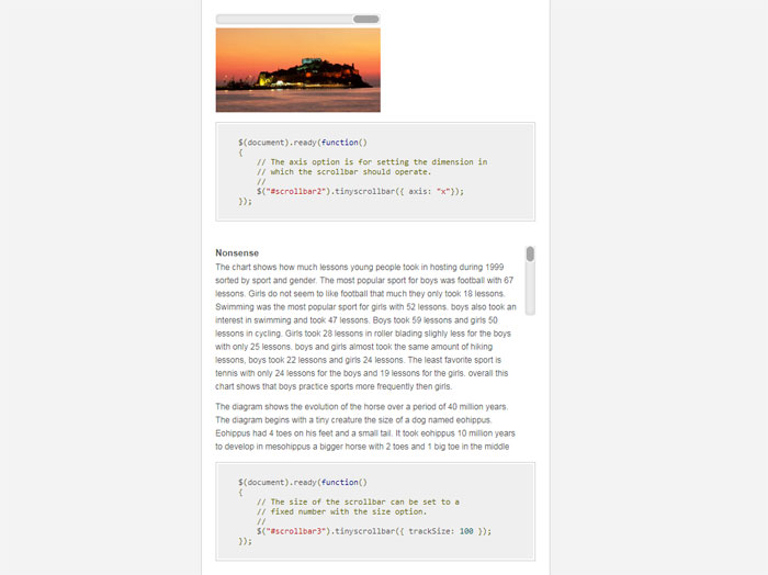
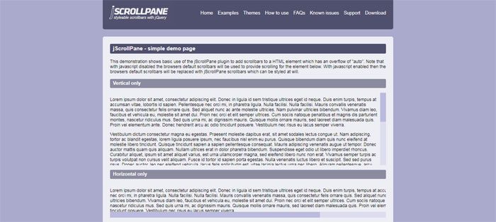
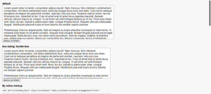
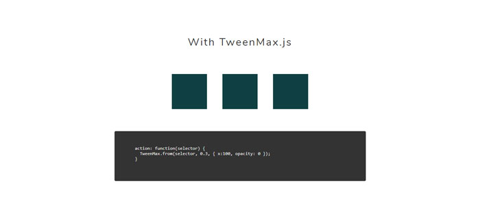
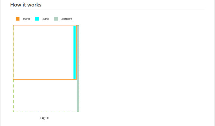
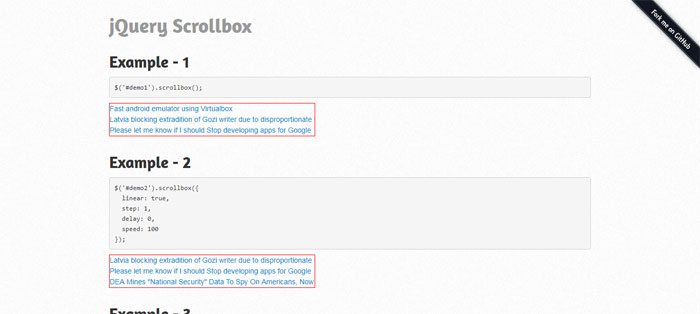

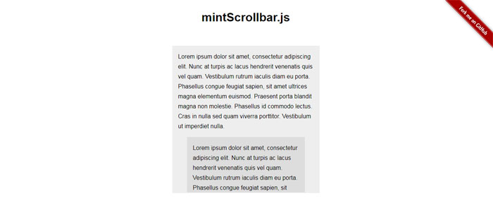
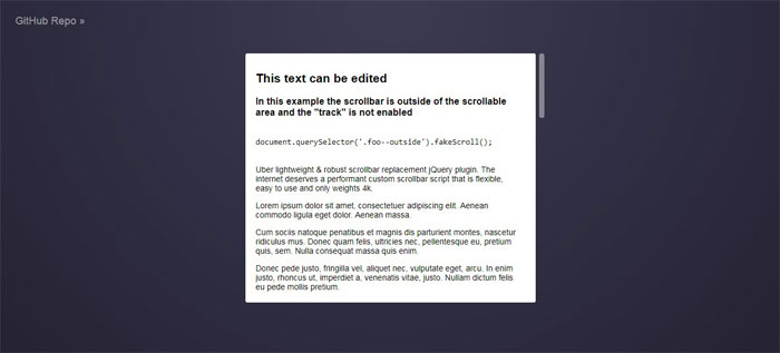
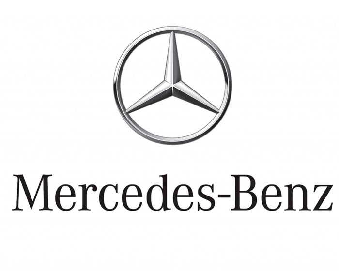
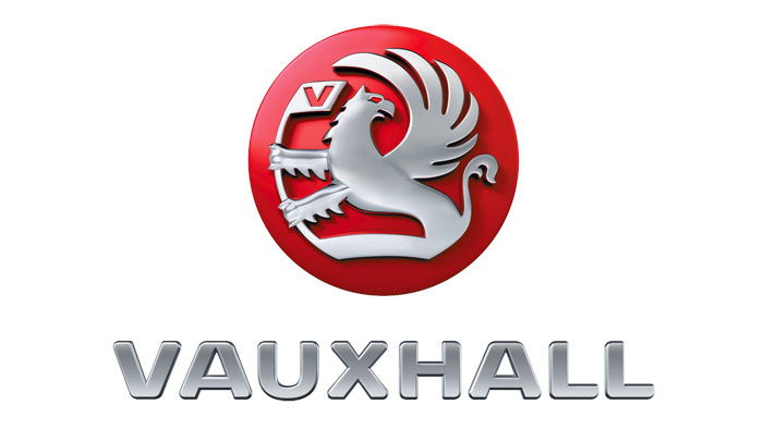
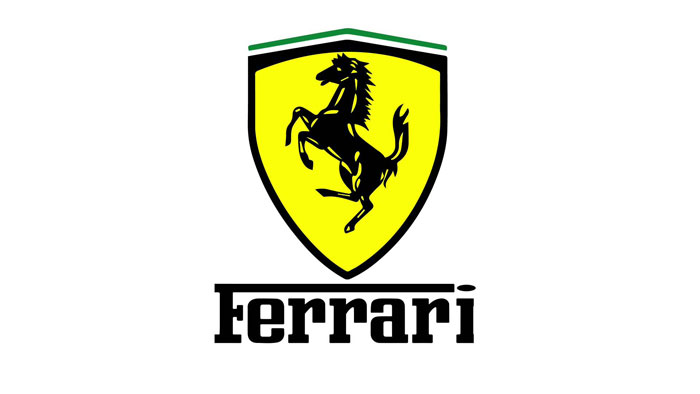
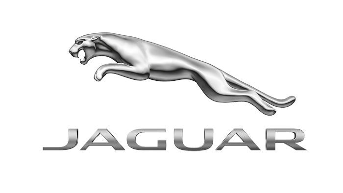
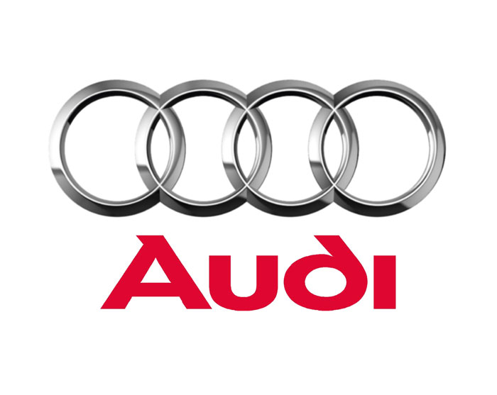
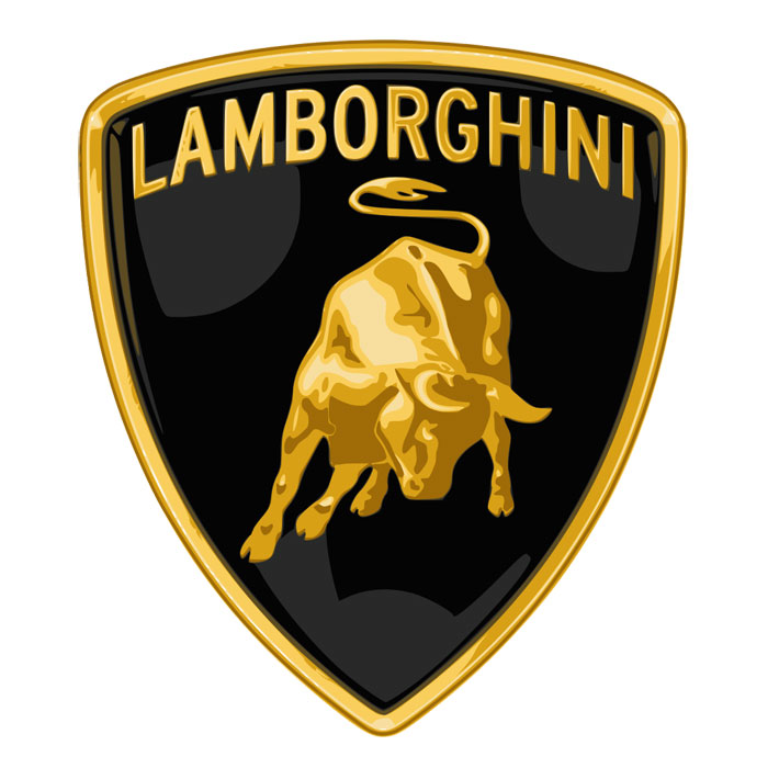
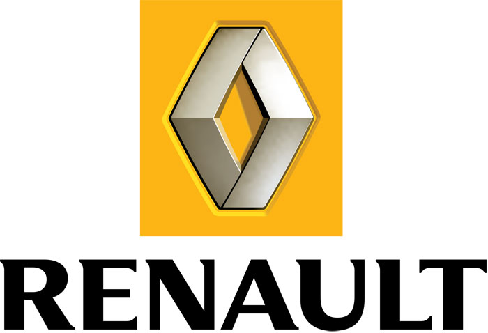
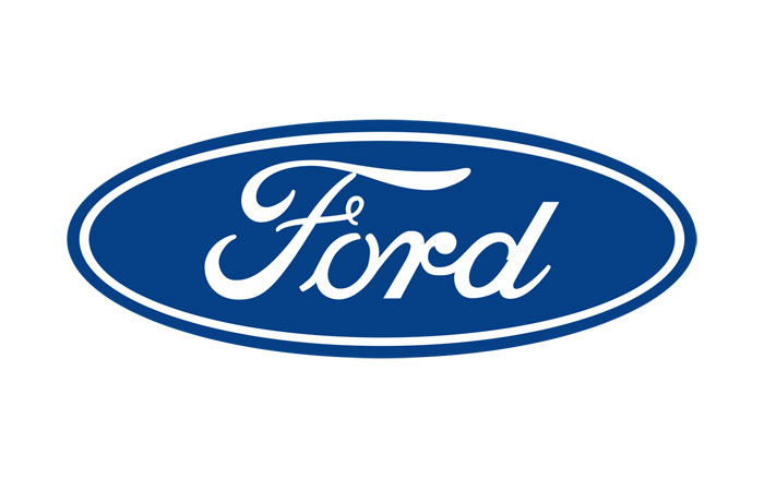
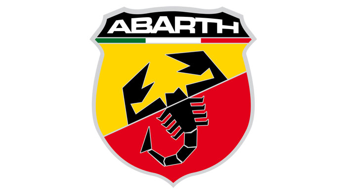
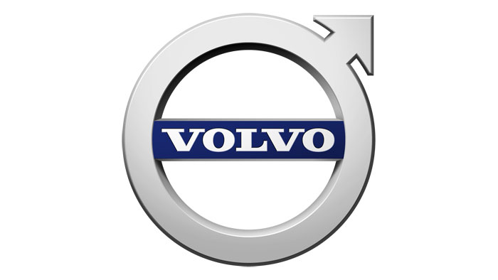
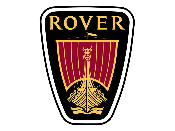
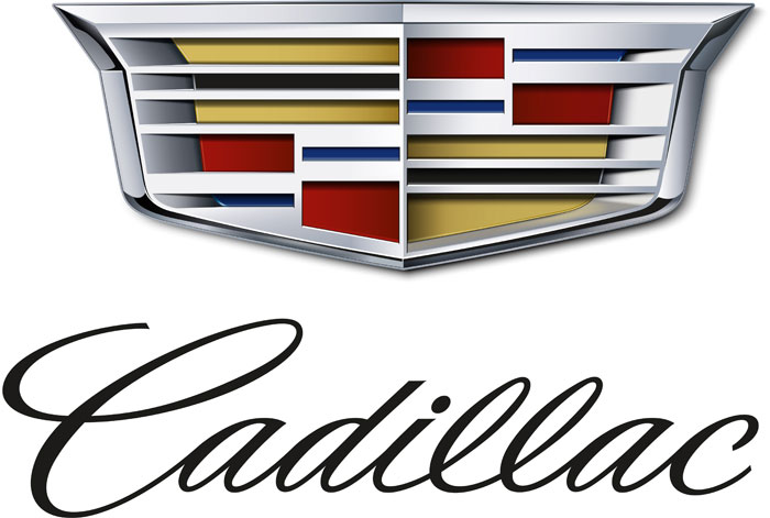
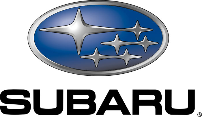

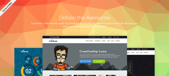
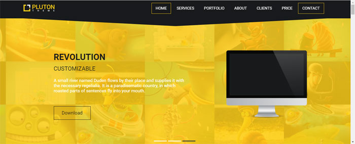

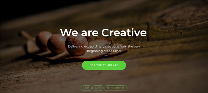
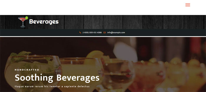
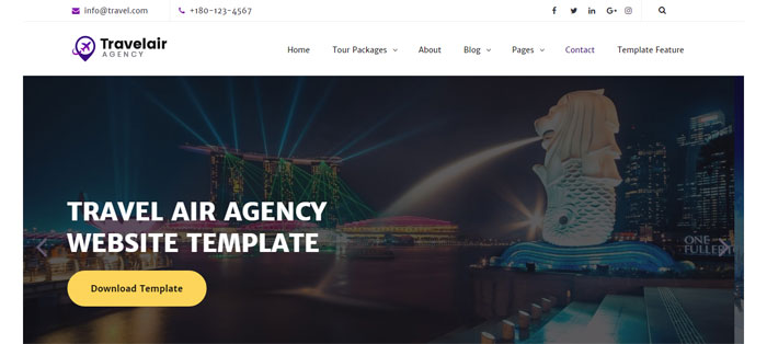
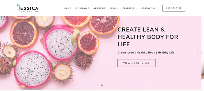
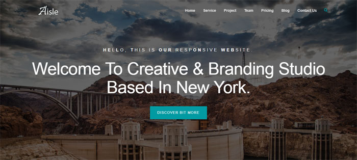

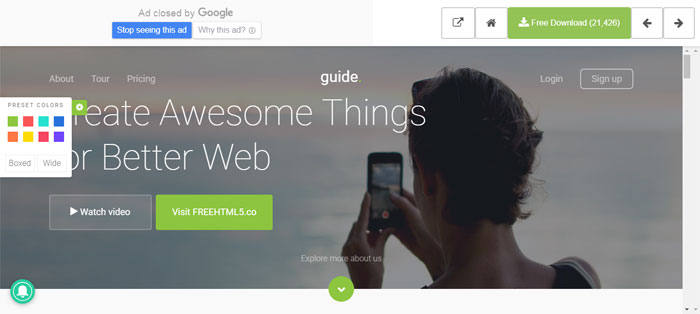
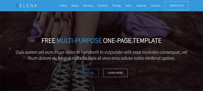
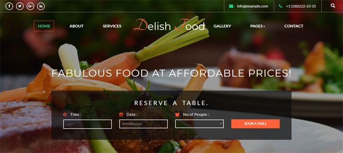


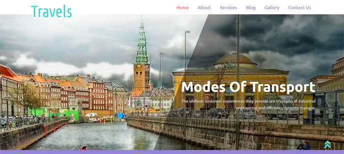
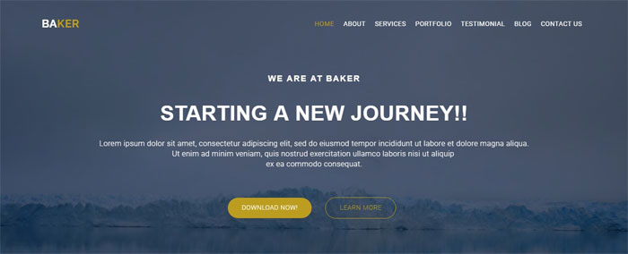
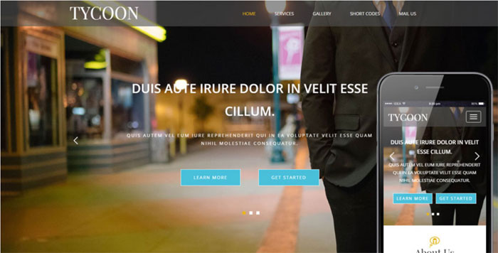
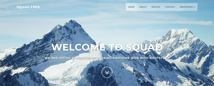
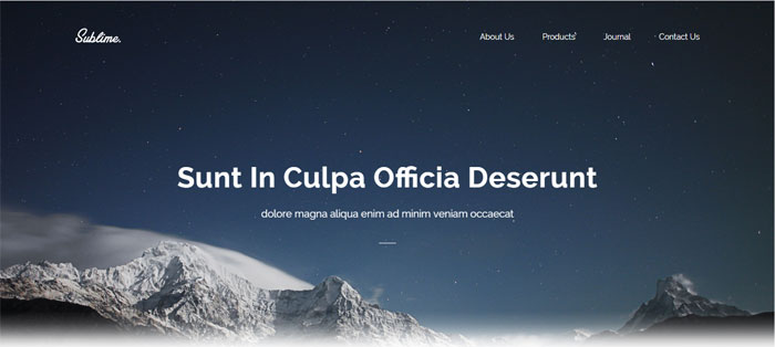
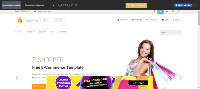
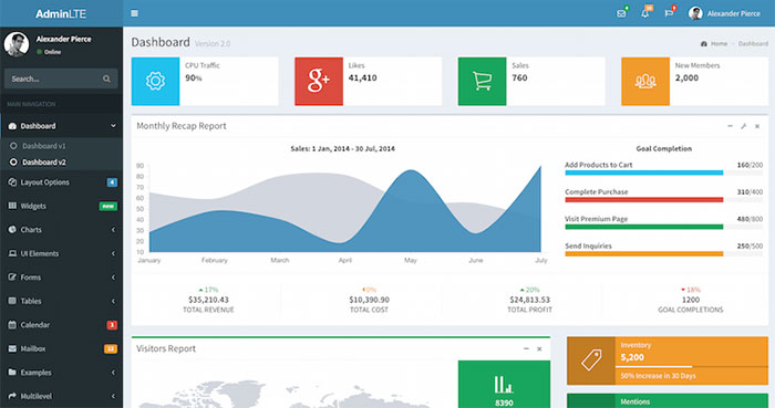
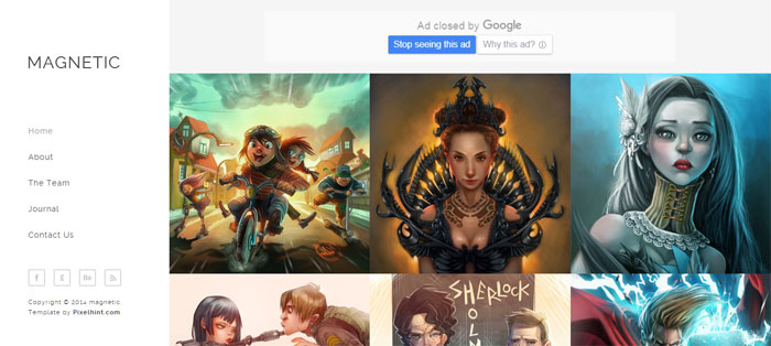
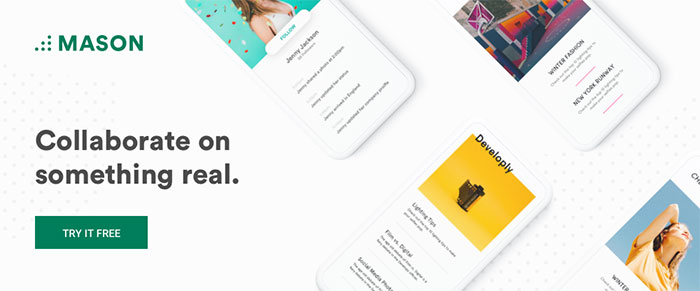

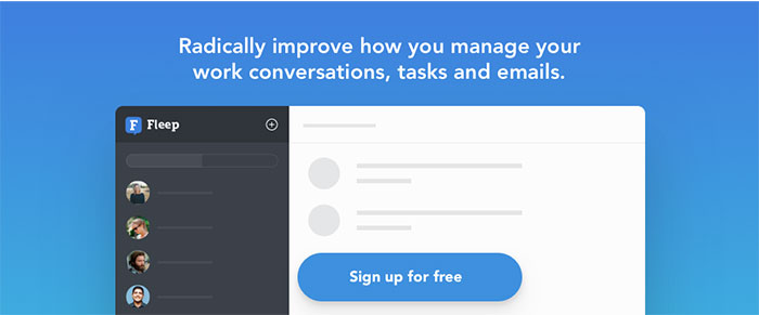

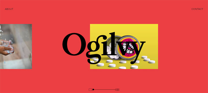
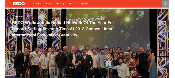
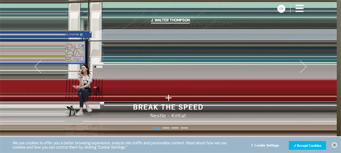
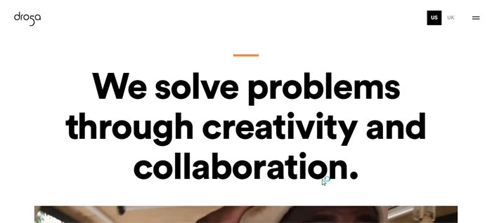
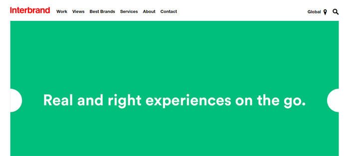
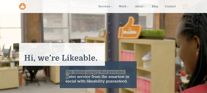
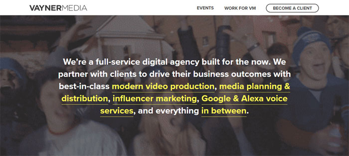
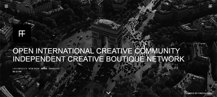
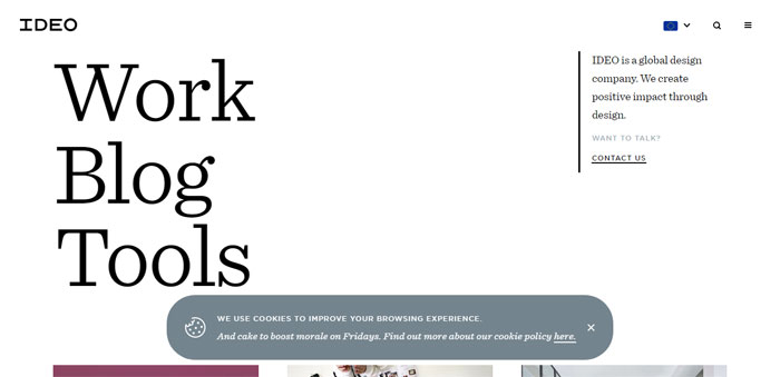
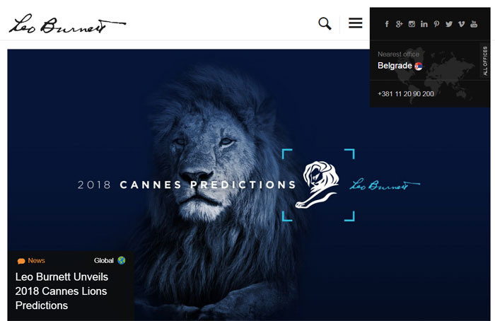
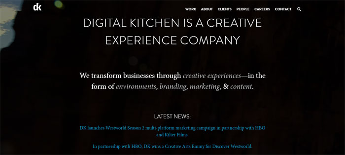
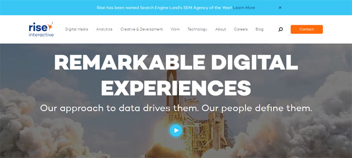


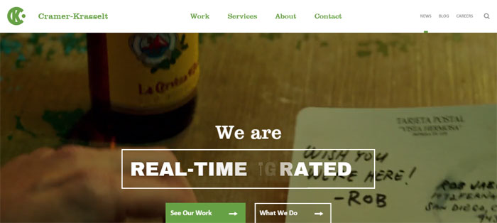
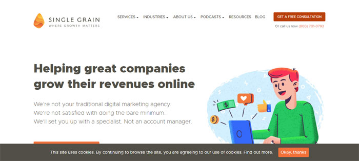


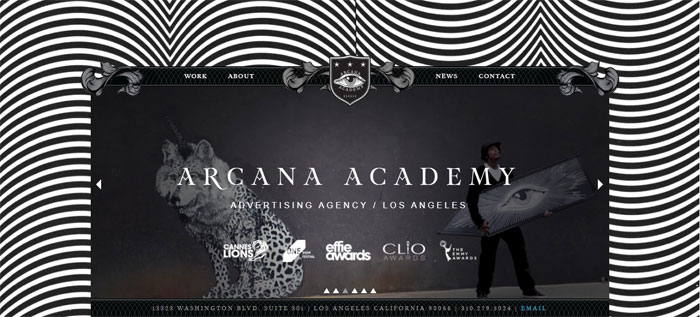


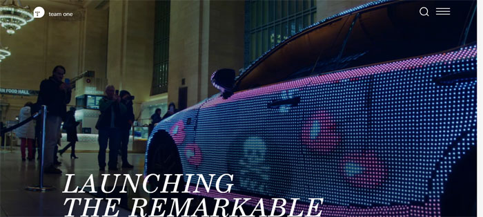
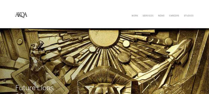

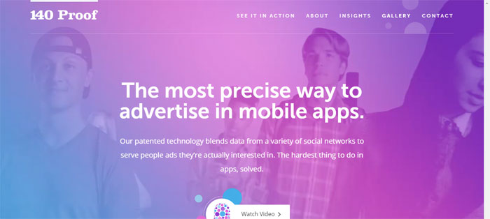
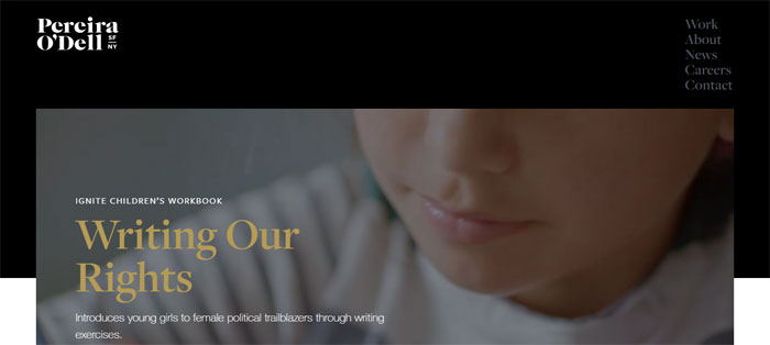
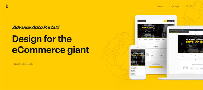
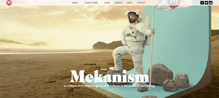
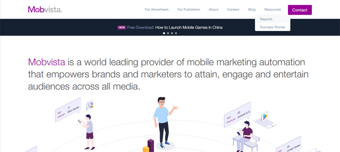
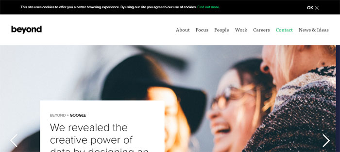
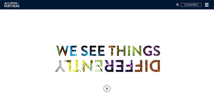
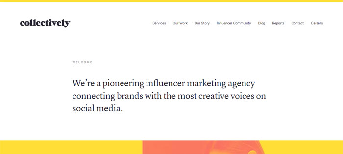
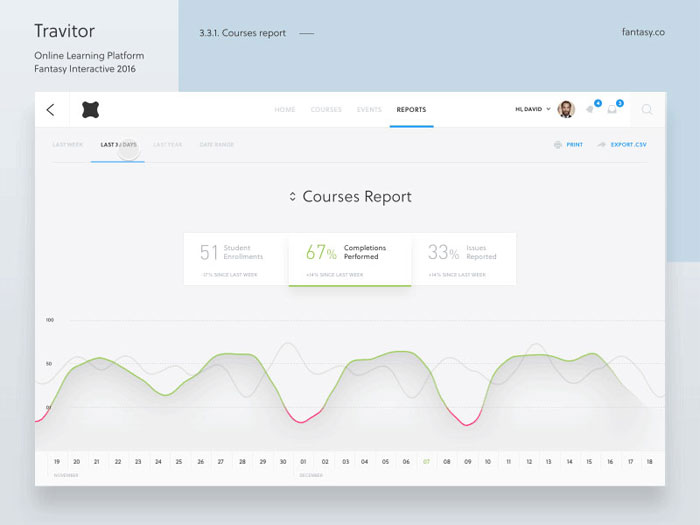
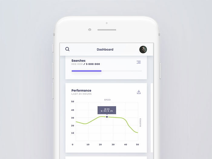
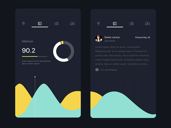
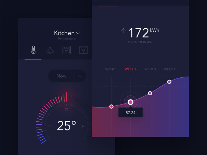
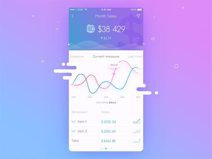
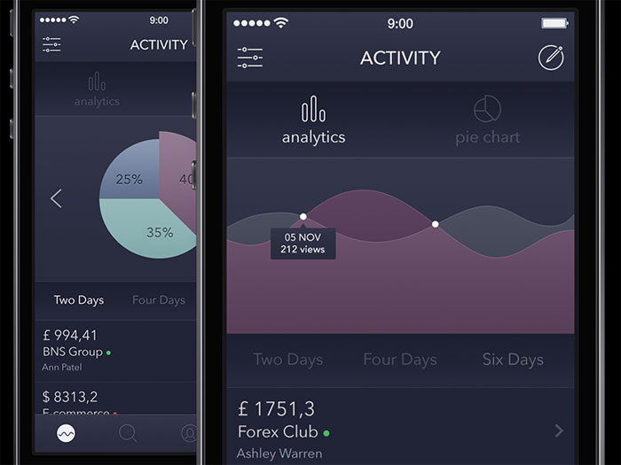
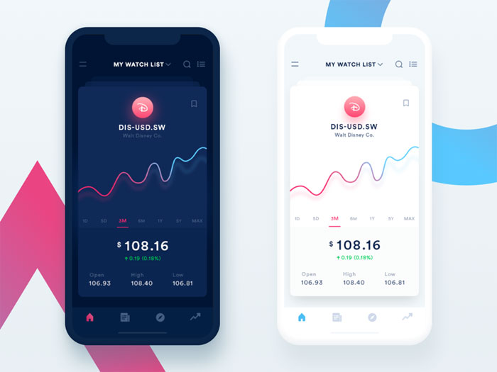
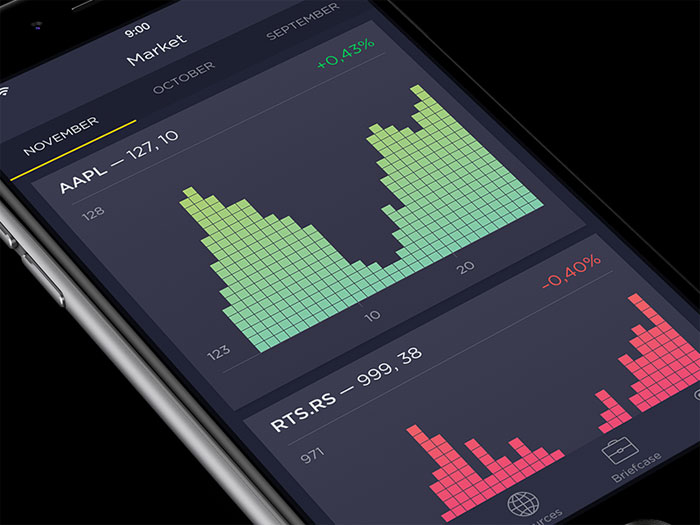
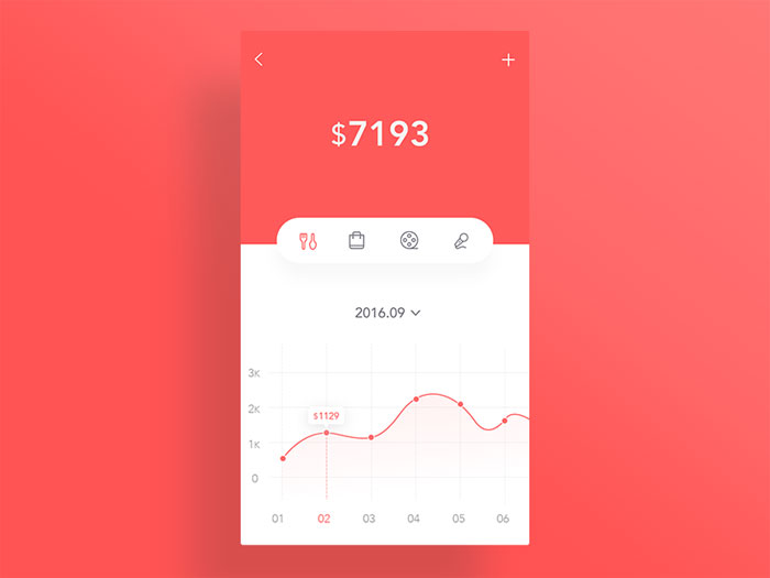
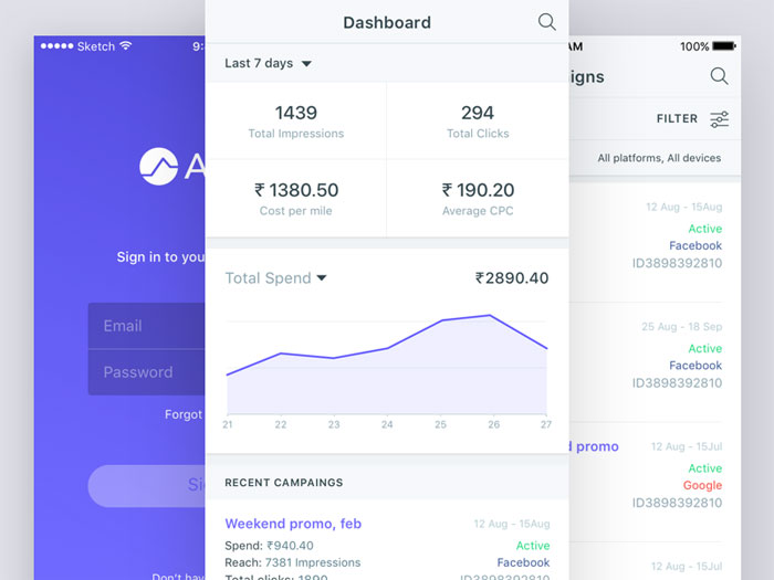
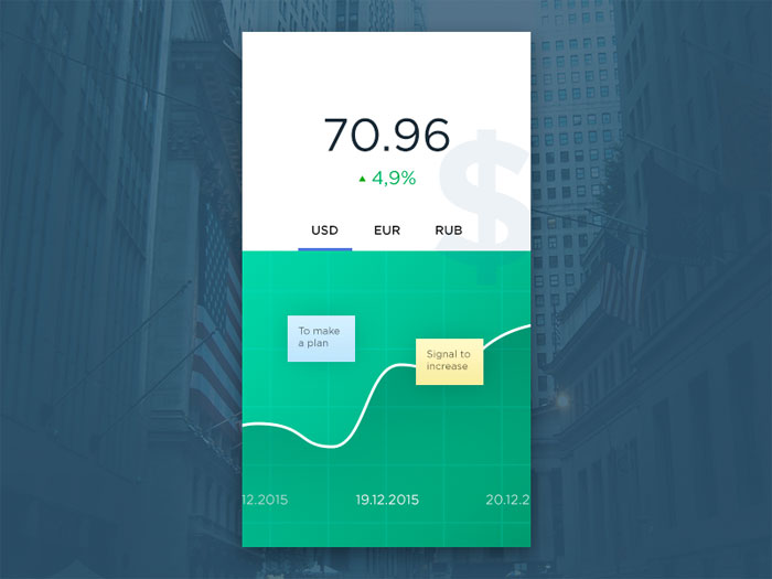
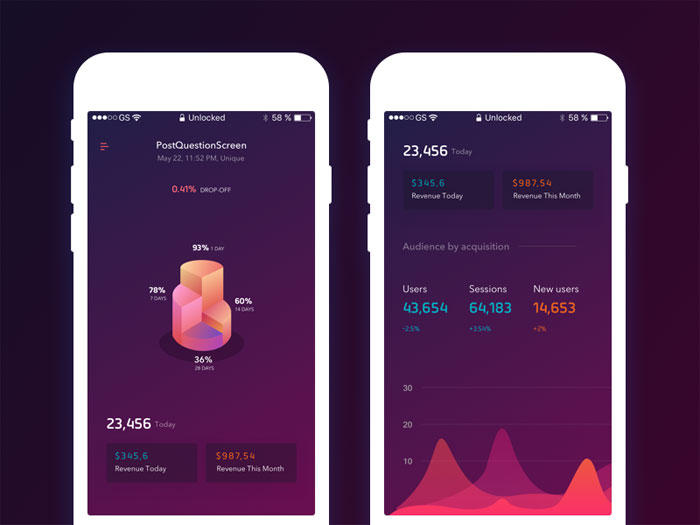
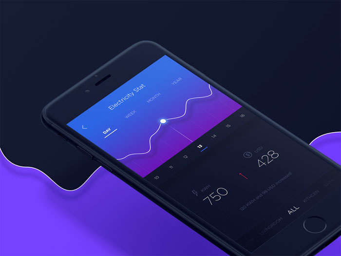
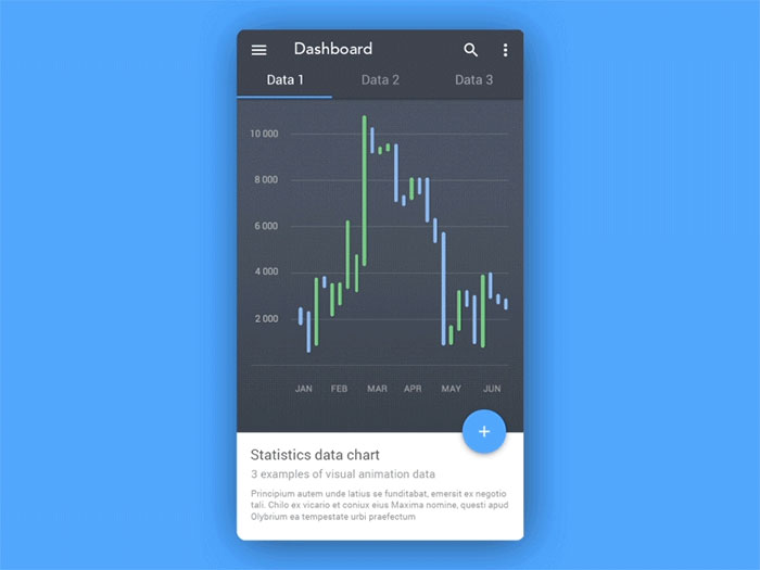
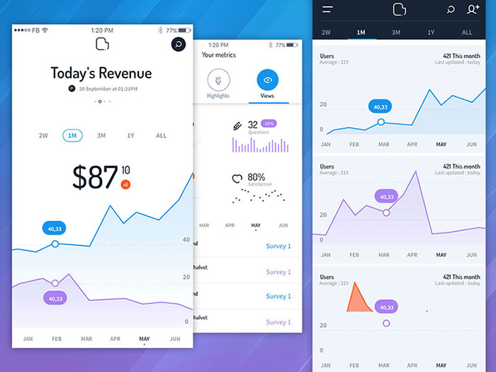
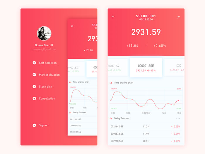
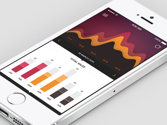
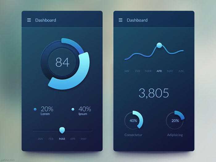
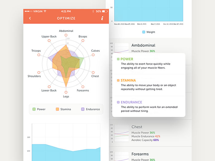
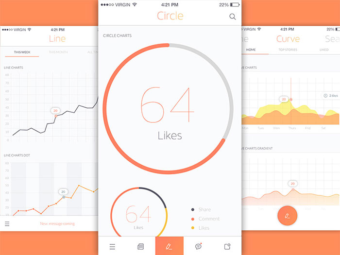
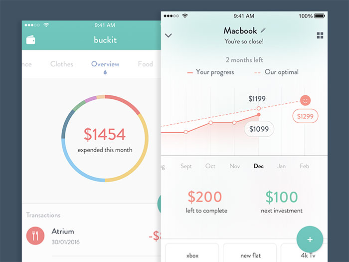
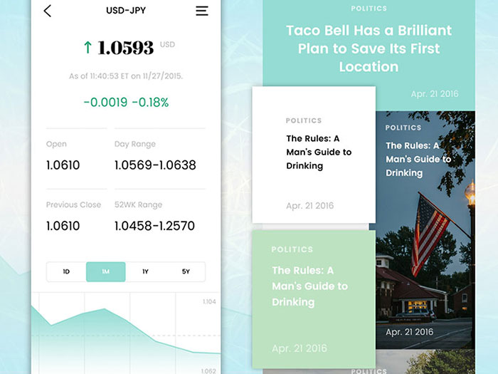
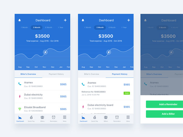
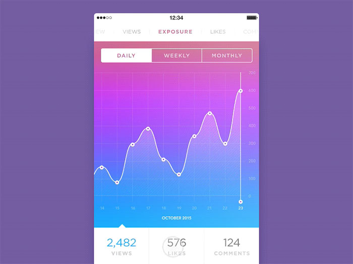
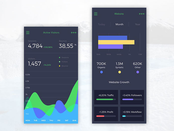
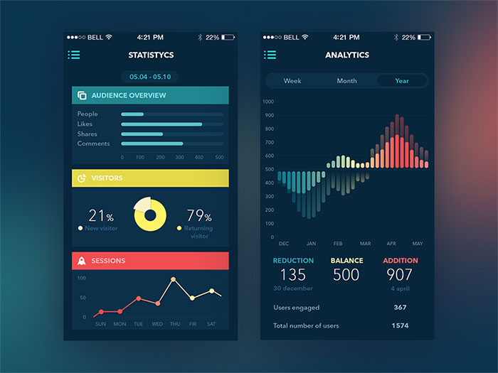
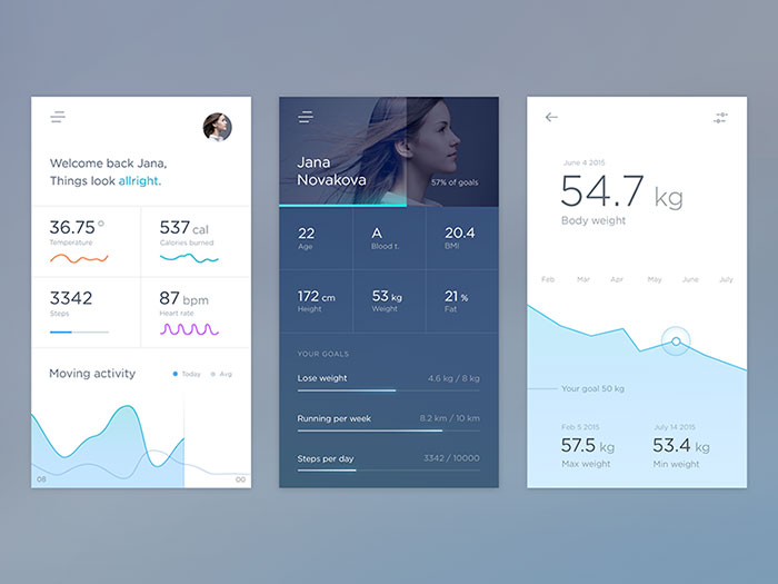
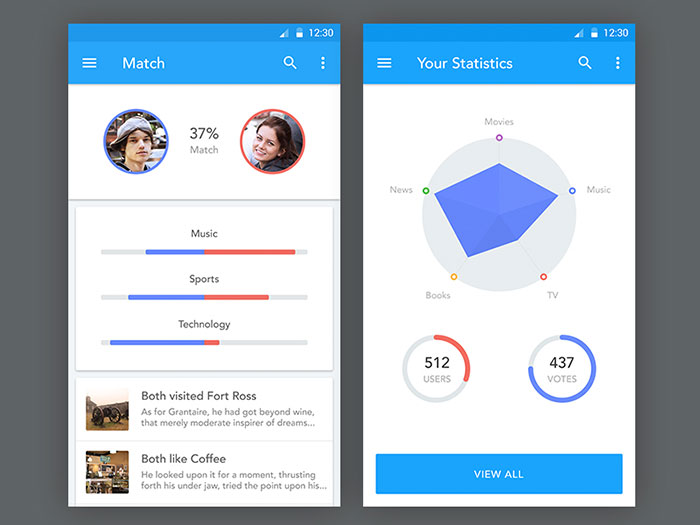
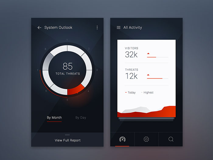
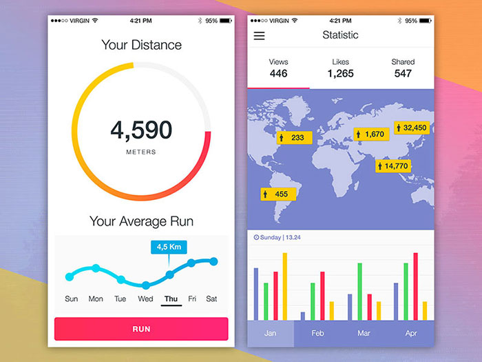
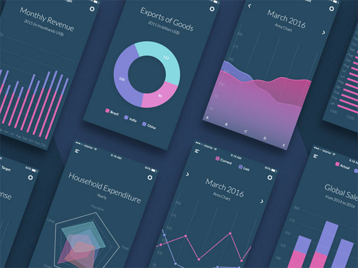
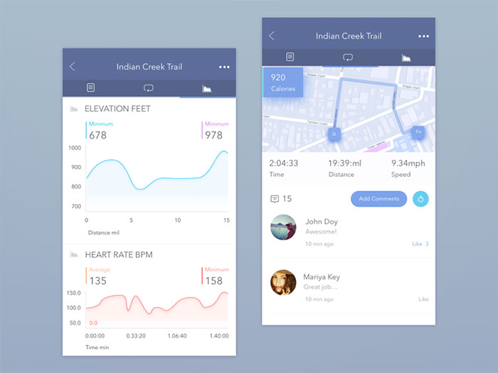
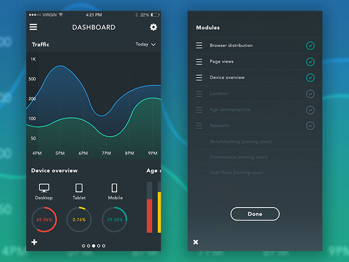
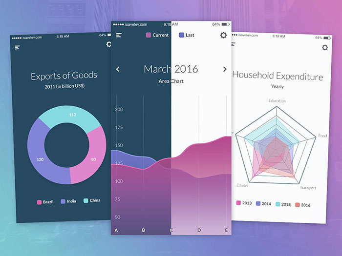
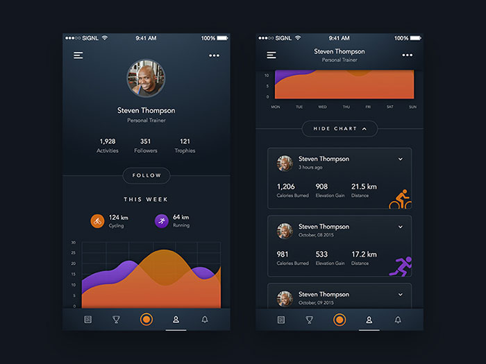
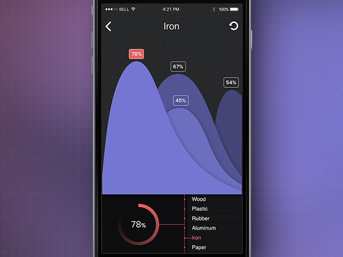
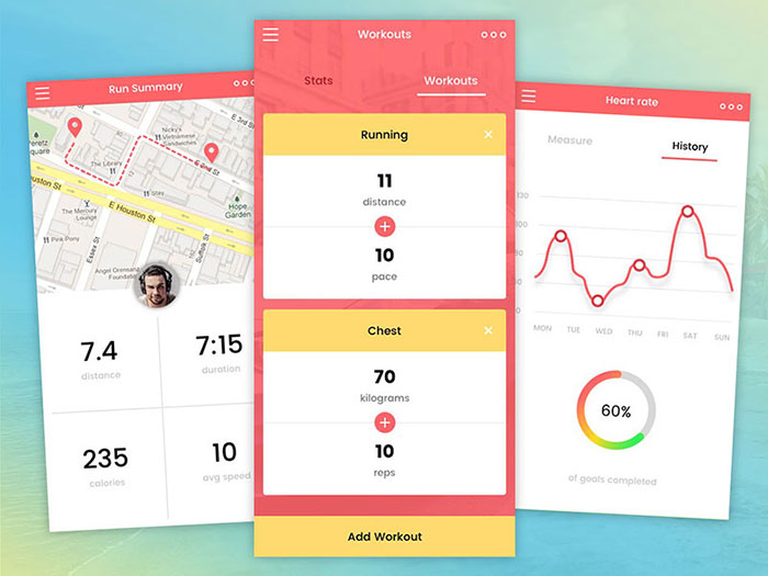
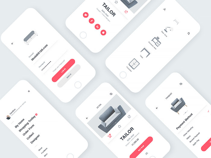
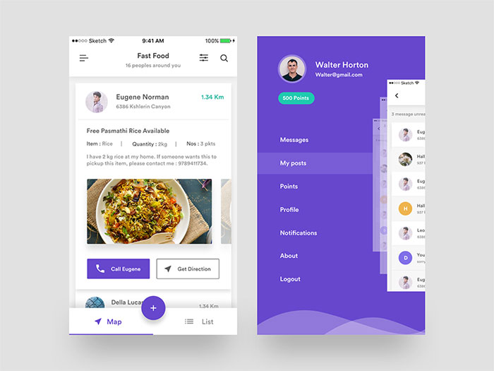
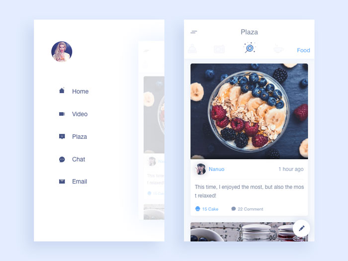
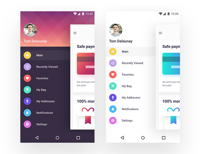
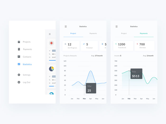
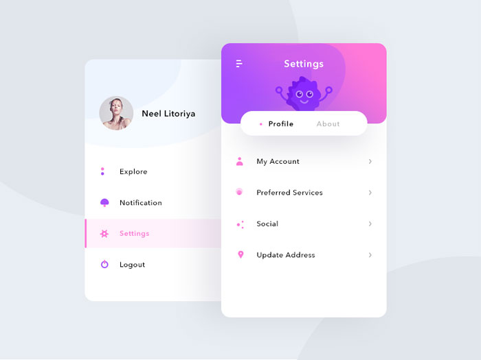
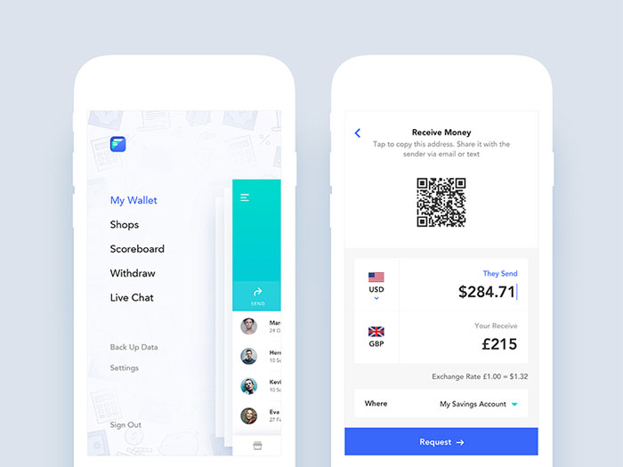
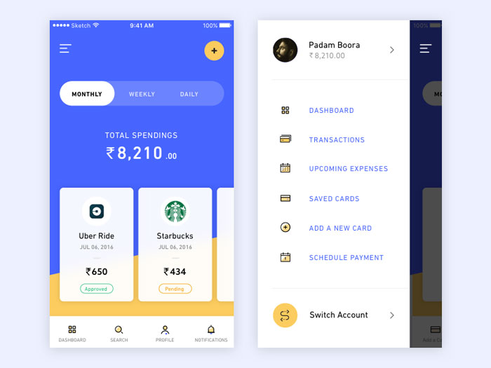
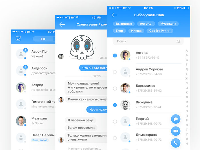

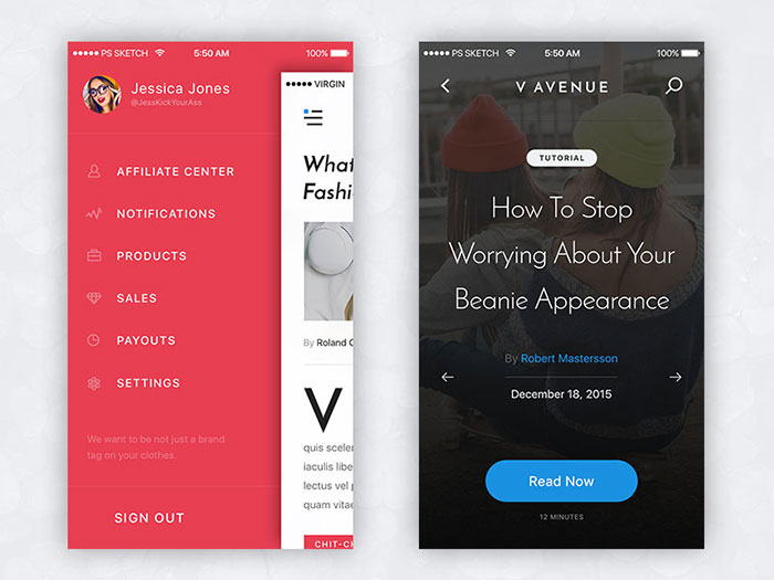
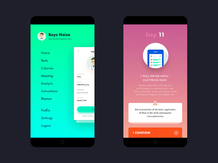
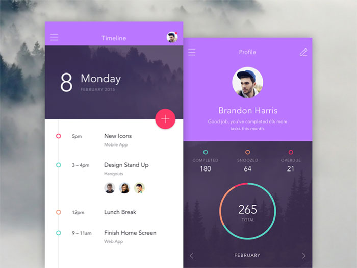
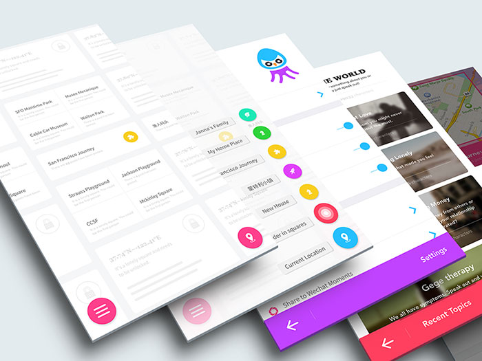
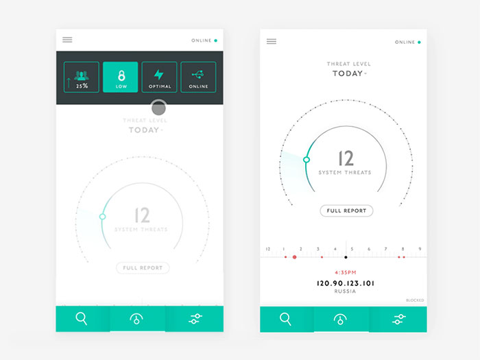
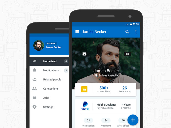
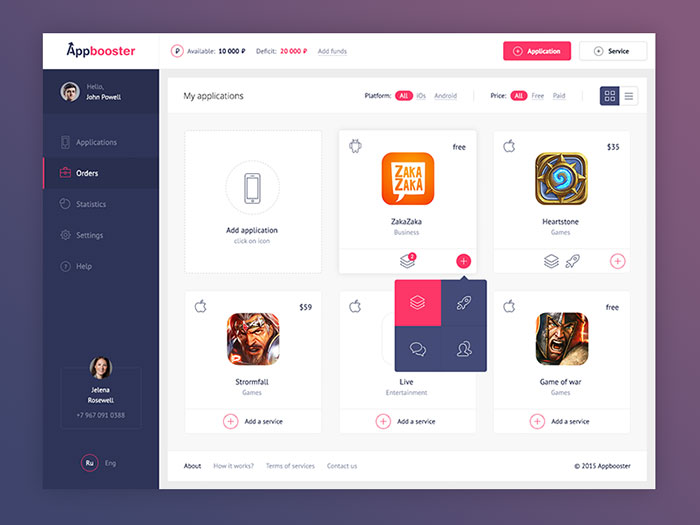
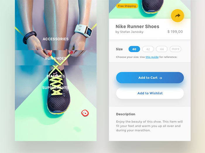
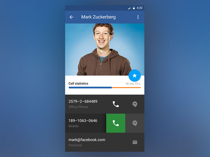
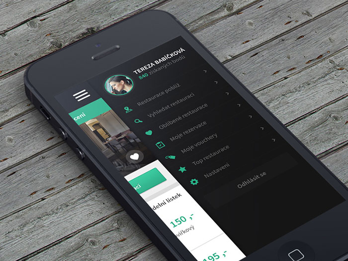
 RSS Feed
