|
App menus are key to making an app work well. An app menu should appear upon interaction with a button or some other action. A well-designed menu UI will display a list of choices. Context is very important when designing a good app menu. These contextual app menus change available menu items dynamically depending on the current state of the app. As simple as all this seems, mobile app menus design is fairly difficult to get right. You have to determine the purpose of the app menu and every menu item on it. Then all of this needs to be designed so that users can easily understand what the items are, find them, and click on them. This guide will help you understand how to design a good app menu. What is the Usage of the Menu?
A menu is really just a way for users to get from one point in an app to another. It’s a temporary thing. A menu should contain at least two items, otherwise, it’s not of much use and is an extra loading screen. Every menu item should offer a discrete option or action that affects the app or selected elements, including the view within the app. Typically, these are accessed via menu buttons. As useful as a menu is, it shouldn’t be the primary method of navigating through the app. They are there to help people maneuver through the app. Even the greatest features aren’t of much use if no one can find where they are. Even if you have a search function in your app, that shouldn’t be the only way someone has to find your app’s features. If you look at many commonly used apps, you’ll see their designers recognized this and included some form of navigation app menu. Don’t get stuck in thinking of a navigation app menu as something that has to look a certain way. They can take many forms, including a navigation bar or a hamburger menu. Menu Labels
One of the vital features of a good app menu is the labels of every app menu button. Every one of these labels needs to accurately and concisely reflect what the button does. You need to make sure the menu buttons avoid confusing users by being too vague or improperly labeled. They should also be short and to the point. A lot of menu bars use a single simple word for their labels, including “format”, “file, or “edit”. While one-word labels have their advantages, you can also use longer labels as necessary. Don’t feel you need to keep it overly simple in order to provide the information users need. Disabled Menu Options
A well-designed app menu should display a consistent set of items. This doesn’t mean that the options are always static. Allow menu items to be enabled or disabled depending on what eh current state of the application is. For instance, having in-app purchases disabled will disable attempts to purchase items from the menu. The button may be grayed out or obviously not working in some way. Contextual Menus
Contextual menus have become increasingly useful and common. They dynamically change the items available on the app menu based on what else is going on in the app. In a contextual menu, items that are irrelevant to the present context might be removed. Menu items that are relevant, but need certain conditions to be met before they can be used, can also be disabled. It’s all a matter of understanding how to communicate to users what they can do when they can do it. Single Menu Item States
On occasion, a contextual app menu can end up showing only one single menu item. This is not a bad thing if that is the real limitations of the app. It reduces the amount of clutter on the screen and helps prevent any kind of confusion. If disabled items are visible but grayed out, a user may click on them and wonder why they aren’t working without realizing why they don’t work. This can be a much better option than graying out text or menu buttons in some apps. A lot of this depends on the app menu style you’re going for. Options MenuAn options app menu contains commands that apply across the current activity. They can also be used to start a new activity. They should not apply to a selected item in the content. That’s the domain of a context menu. For most devices, users press the menu button to access the app’s options menu. To close it, they typically press the menu again or press the back button. They might also press the menu button again or touch a point outside the menu. This can and does differ on different devices depending on what works better. Every activity should have its own set of operations, which means that it should have its own options menu. If your app offers multiple activities, every one of them should have its own options menu. For instance, in an email app, the options menu could let you compose a new message, search messages, refresh the list, or alter the email settings. In the compose view, there would be a different options menu that might include adding a CC field, attaching files, or discarding the message. In order to decide on what menu items you should have and how they should be organized, most options app menu progressively disclose them in two steps:
Scrollable Menus
A menu can be too tall to display all its items on the screen. In that case, it should be able to scroll internally. This might be a technique you use all the time, or when an app is being (or must be viewed) in a landscape orientation. The scrolling should be easy to access and not require users to use bars that are small. A lot of apps use touch scrolling. Some use arrows to accomplish the same thing. Ideas for Menu ItemsSingle Line Display
Every menu item should be limited to single line of text, whether this is a single word or a short phrase. This line of text should describe the action the menu buttons will perform when it’s selected. Menu items can also contain icons and helper text, like keyboard shortcuts or social media sharing buttons. They can also have controls like checkmarks that can be used to indicate a number of selected states or items. See ‘List Controls’ for more details on how these menus often work. Menu Ordering
If you have an app menu with static content, it should have the most frequently used menu items near the top of the menu. This enhances usability and prevents users from getting lost. It simply makes the most relevant menu buttons easier to find. If the app menu has dynamic content, they may not stick to this formula. For instance, previously used fonts can be placed at the top of a menu that lists fonts. This order can change based on user actions. This will allow the app menu to adjust dynamically to the user’s preferences, allowing them to more easily find the options they want on the menu. Menu Nesting
You can design a menu so that clicking on it, or on a particular point on it, reveals nested submenus. Try to limit nesting to one level deep as much as you can. Multiple nested submenus can be very hard to navigate. Sometimes they also tend not to work right, becoming hard to select before the app starts to think the menu has been closed. Nesting is a nice trick to use, but be discrete with it. Also, do a lot of testing to make sure your nesting works intuitively and well before publishing your app. Disabling Actions
While you can remove actions that are unusable at the moment due to the conditions, this isn’t always the best choice. For instance, on a document or photo processing app, the redo button may be disabled but not gone when there is nothing to redo. Often this is indicated by it graying out. When it becomes usable again, it simply fills in with color. Deciding between visible disabling or complete removal will depend on your app and the action itself. There is not one right fit. Context is very important for making this decision. A minimalistic menu style may be better served by getting rid of the option altogether, but others would work better by keeping it visible but disabling it. Common Mistakes to Avoid when Designing App MenusMake It Visible
Even those who know these guidelines by heart can end up making app menus that users overlooked. It’s hard to objectively evaluate your own work and things slip through the cracks when deadlines are tight or you’re stressed. If you know where a menu item is, part of the reason is that you’re the one who put it there. You need to be sure to test your app menu design with users to be sure that they can see everything they need to without any trouble. Communicate the User’s Current Location Effectively
Make sure users can tell where their current screen is located within your app menu options. In order to navigate, users first need to know where they are. Users rely on assorted visual cues to figure this out. If you don’t, clearly let them know where they are in the app relative to your menu options, they will probably get frustrated. This is one of the single largest issues on both websites and apps. It’s especially important for a menu to indicate the user’s current location when it’s not likely a user has entered from the homepage. Coordinate Menu Items with User Tasks
Make it Easy to Use and Manipulate
Separate Selection-Specific Commands from the App Menu’s Global Commands
For a good example of this, consider when a user does a ‘touch and hold’ on a person’s name in their smart phone’s contact list in the contacts app. The context menu then usually displays a couple commands, like “call contact”, “message contact”, or “edit contact”. Place the Most Commonly Used Operations First
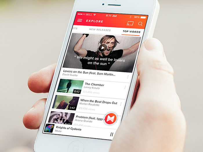
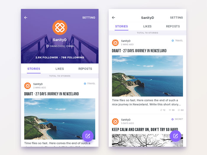
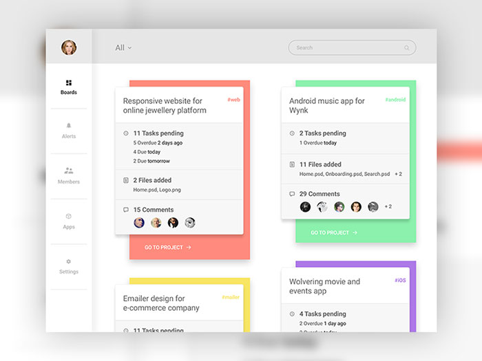
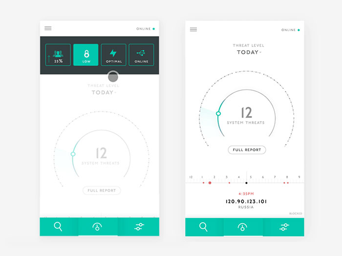
Screens are only so tall, so some menus may be scrollable. Make sure you place the most important commands so they can be viewed without scrolling. This will save users time and energy. No one likes scrolling through the menu to find some option they use all the time. It can get very frustrating, causing users to look for an app that wastes less of their time. Also, place similar commands in the same location. This will make it easier for users to make adjustments if they need something similar but different. Mobile Menu Design ExamplesA very difficult part about mobile menu design is organizing it intelligently and designing in a way that will make the mobile navigation easy and intuitive. Coding can be relatively easy when you have what to work on, but the creative process is something that must not be made in a hurry. The navigation menu can be a very challenging aspect of mobile design, especially if a site or app has many sections or pages which you have to squeeze in a mobile resolution. On desktop websites things are easy, you can make a large menu, maybe even two of them and you still have a lot of space to do more. However, on mobile things are different and this is why I made this second article about navigation in mobile user interfaces to showcase a few mobile designs that I hope will be good UI inspiration for you. If you haven’t seen the first article in this mini-series, check it out. It has a lot of interesting examples. ICQ mobile app redesign
Mobile menu Animation
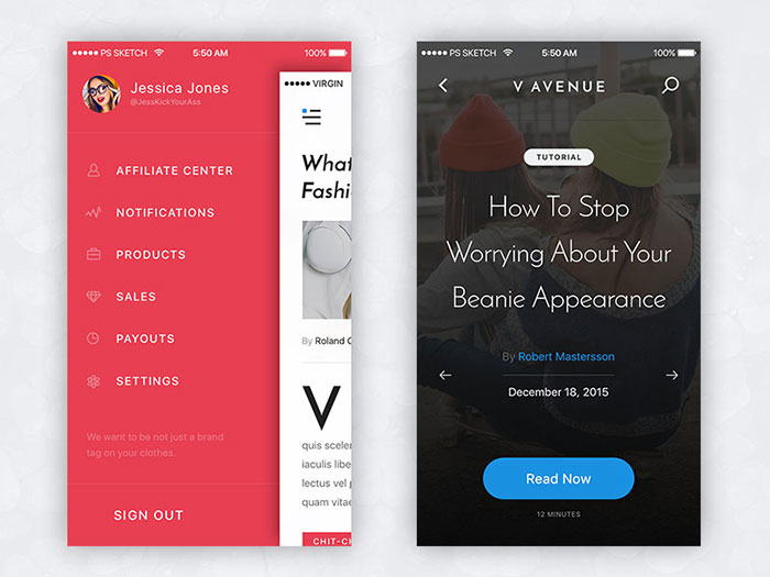
V Avenue
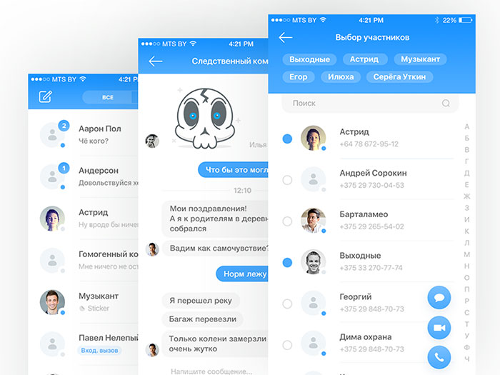
Test and Navigation on Mobile
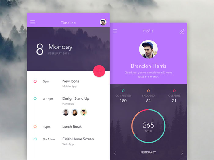
Timeline & Profile menu design
GeGe App: user interface menu design
Musixmatch Prototype
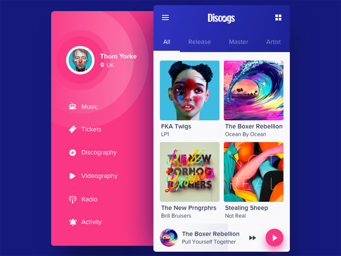
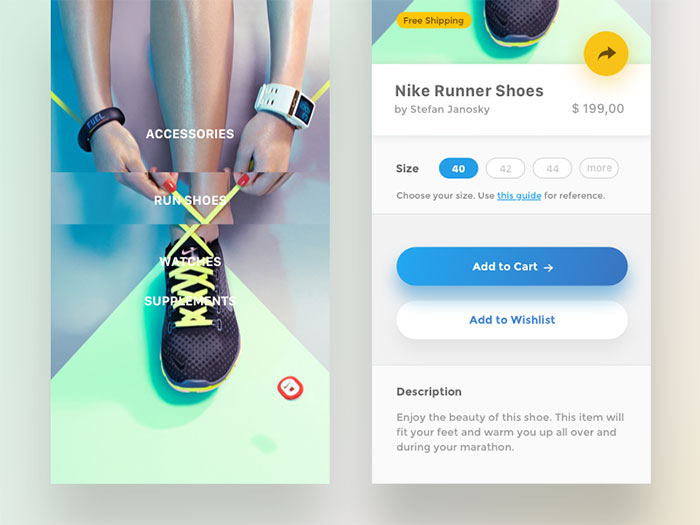
Profile UI
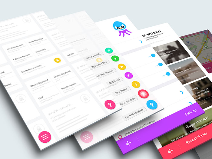
Project collaboration: Mobile navigation
Cloud Analytics Mobile App
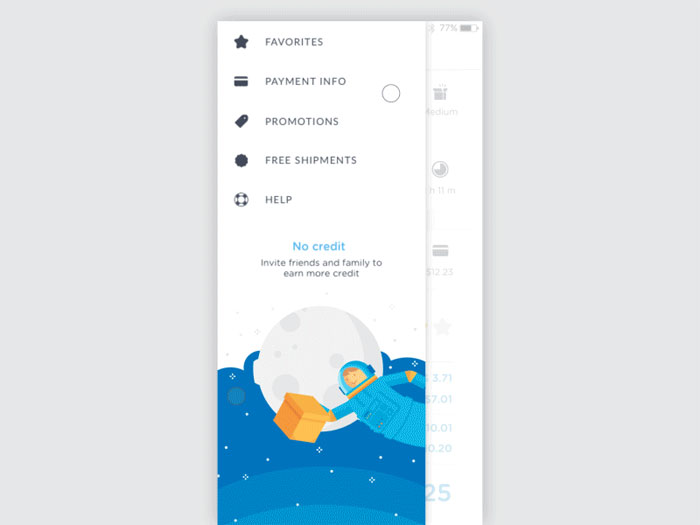
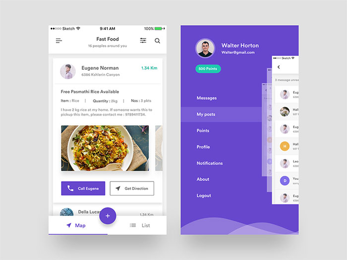
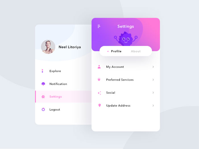
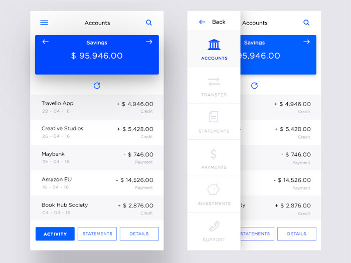
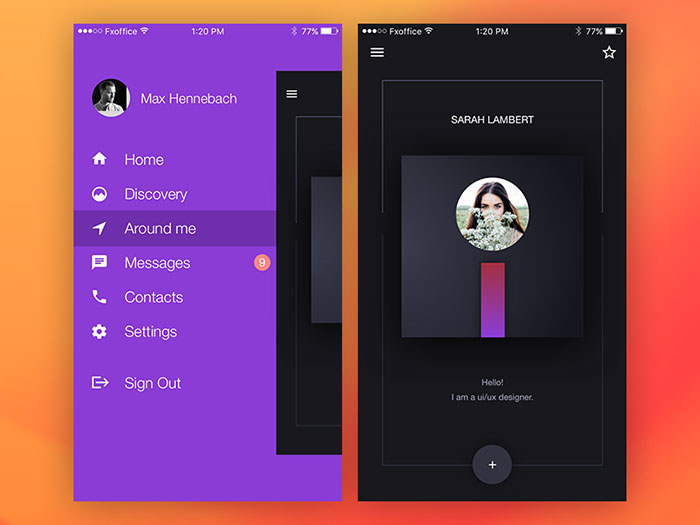
Mobile Side Menu UI/UX
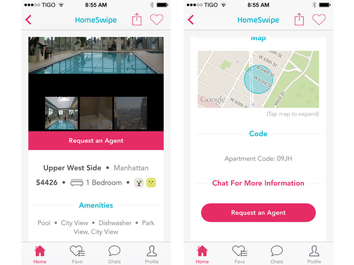
HomeSwipe
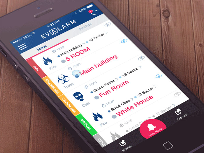
Evalarm project
Linkedin – Android material design
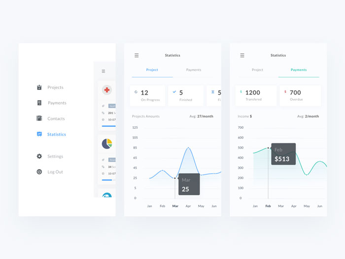
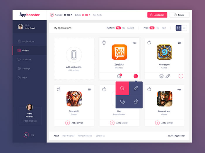
Appbooster dashboard
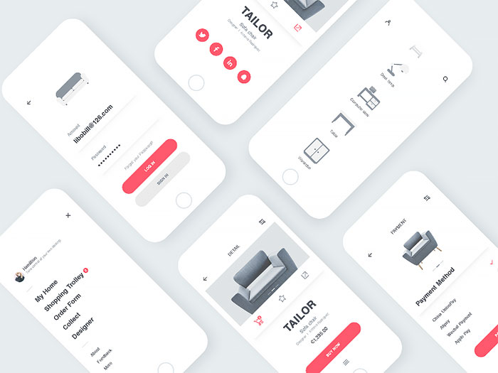
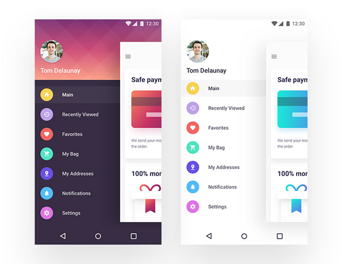
Bolder Multipurpose Mobile UI Kit for Sketch
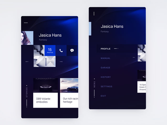
Profile
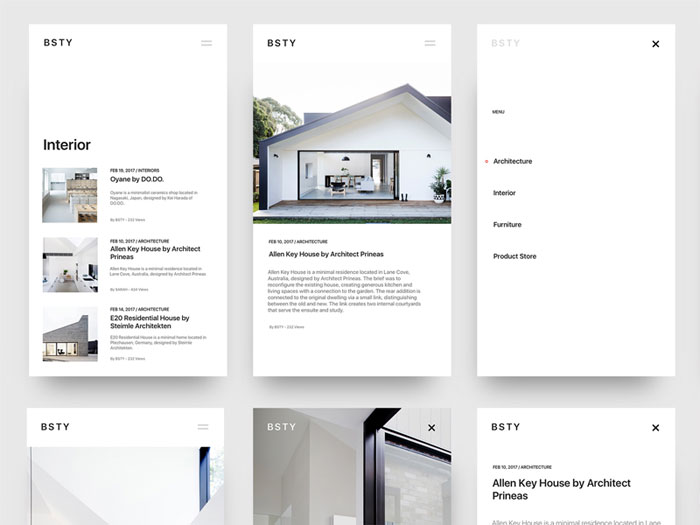
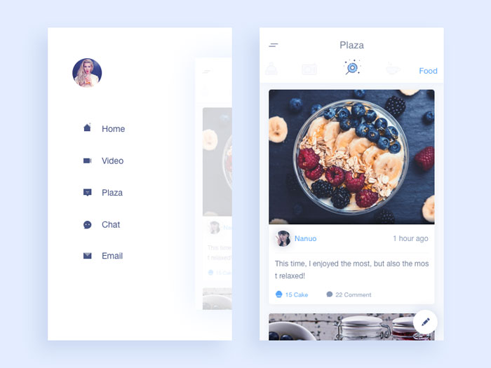
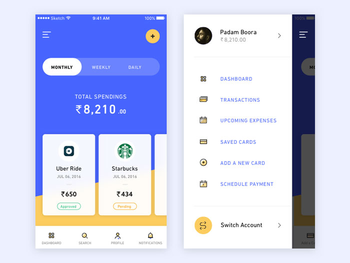
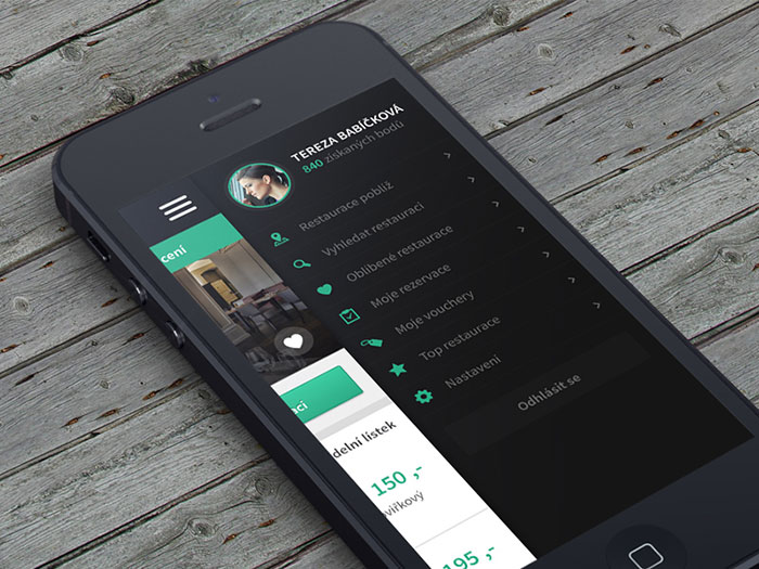
Mobile navigation
Ending thoughts on designing app menusSmart app menu design is key to a good app. It isn’t central, yet it allows the app to be easier to navigate and understand. If you enjoyed reading this article about app menus, you should read these as well:
The post Mobile Menu Design: User Interface Examples (33 App Menus) appeared first on Design your way. from https://www.designyourway.net/blog/inspiration/menus-and-buttons-in-mobile-design-45-examples/
0 Comments
Leave a Reply. |

AuthorPleasure to introduce myself I am Jamie 27 years old living in Searcy, AR. I am web developer and have developed over 50 sites for clients. Now a days I am focused on designing as I feel I am lacking it. Archives
April 2019
Categories |


 RSS Feed
