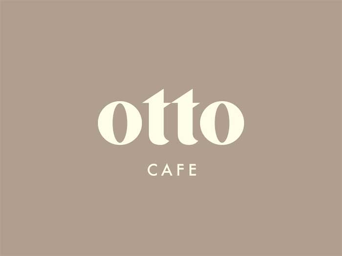
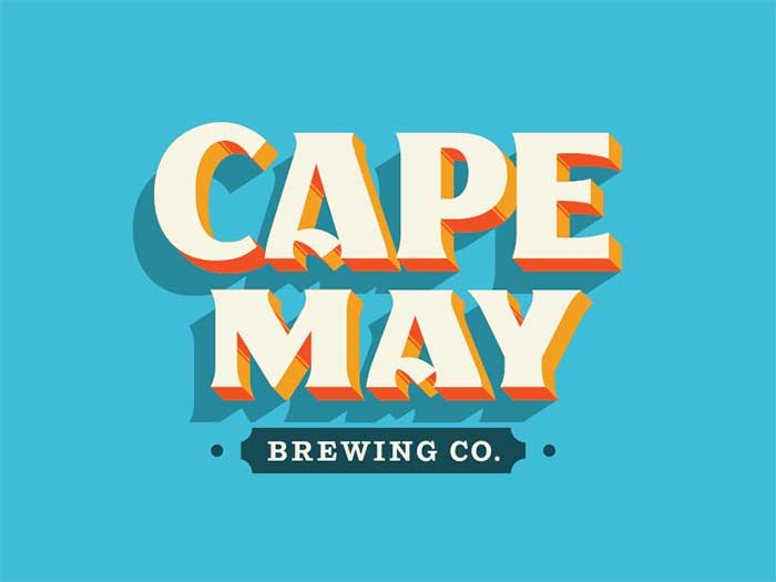
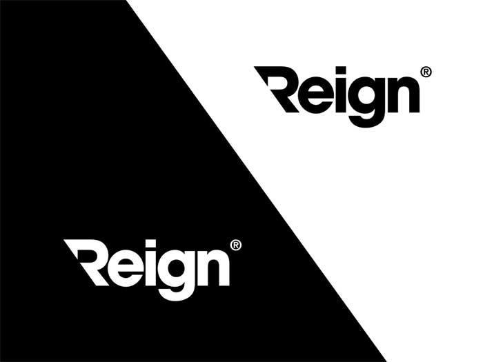
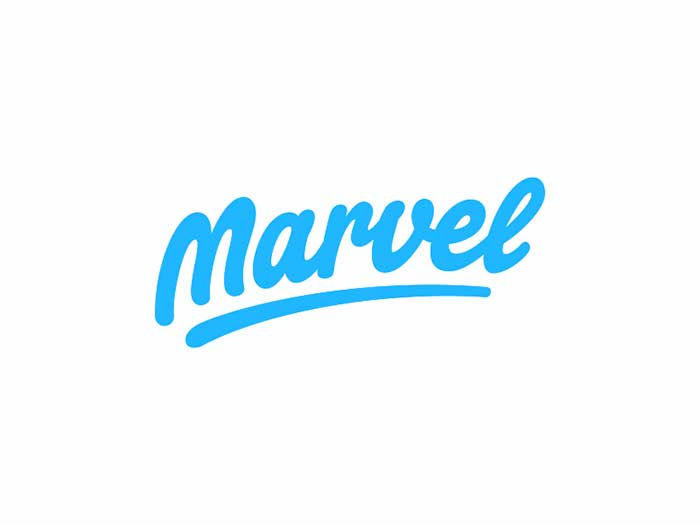
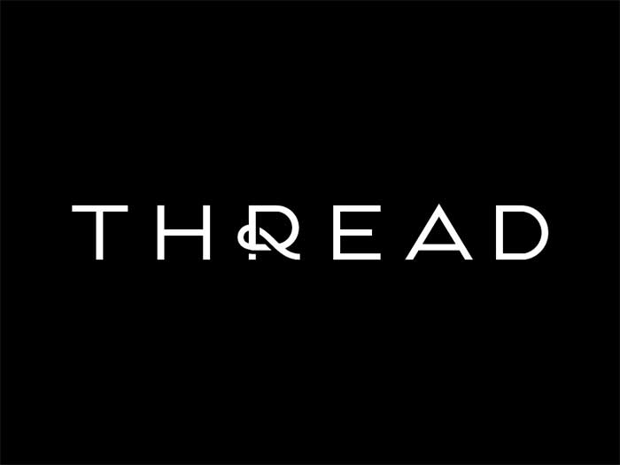
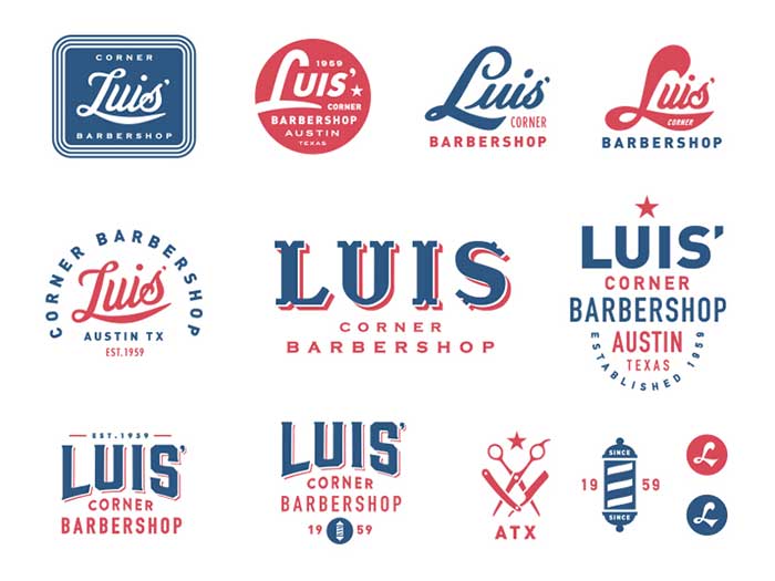
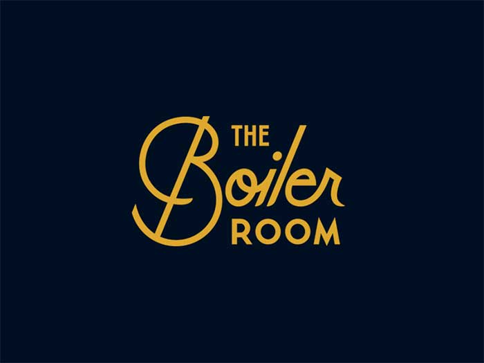
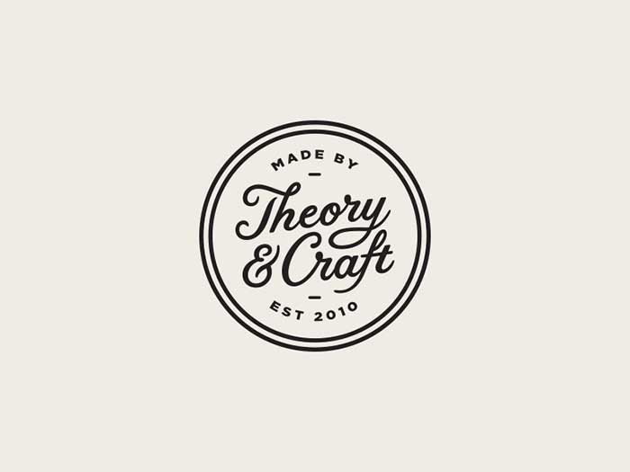
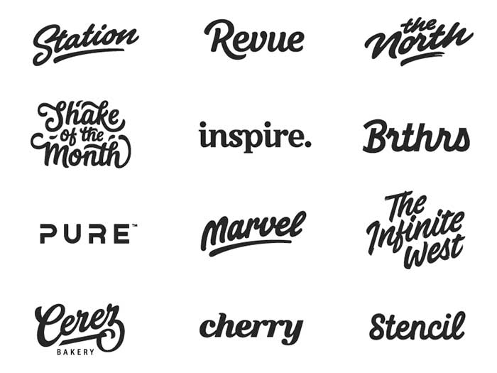
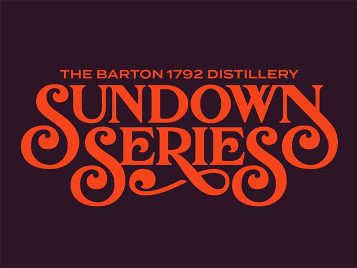
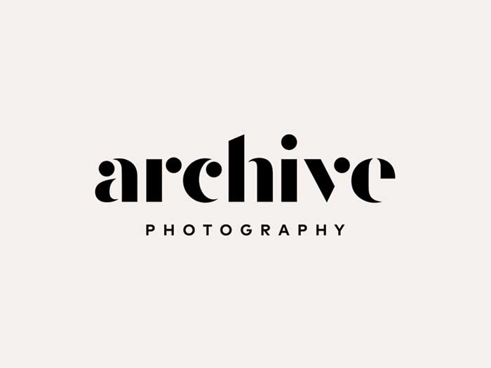
There is more to creating typography logos than simply thinking of a way to visually identify the brand and the business. Therefore, your job won’t be done by arranging the business’s name inside a rectangular box. If you ask an experienced designer or entrepreneur you will always get the same answer – logos have both a visual and a substantial aspect, and they bear the responsibility of shading positive light on your brand and crafting the perception of your customers. The most successful logos so far have balanced accurately between business and art, a task which may be a bit overwhelming for an inexperienced designer. One of the best ways to strike a balance like that is to master the use of typography. Typographic logos are usually simple and easy on the eye, which may lead you to think that they’re not creative enough for your needs. Rather than a fact, this is a very common misconception among aspiring designers who seem to underestimate the memorable and beautiful effect of typography logo designs. As simple as they may be, typography logos look very professional and attractive, and they often help businesses build a trustworthy and reliable reputation. This article will discuss the benefits of good-looking typography logos, and help interested designers get inspired. Speak on behalf of your brandWhen it comes to creating logos, your opportunities will be almost unlimited, but you shouldn’t get stuck on any idea without being completely acquainted with your business’s essence. You need to know and understand your brand, and show both your customers and competitors how it could be useful to them. Which message do you intend to convey? Why should customers reach out to you? What type of emotions is the logo supposed to invoke? If you have the answers to all these questions, you are half way through with creating your ideal logo. If considering a typography logo, you should focus on the brand’s name as your main asset. Arrange it in a self-explanatory way, so that customers won’t have to wonder who you are and what you do. Meet your audienceNext, you need to familiarize with the needs and expectations of your audience. Surprisingly enough, your logo ideas and the ones of your customers may turn out to be two different worlds. In order to create a typographic logo customers will adore, answer the following questions:
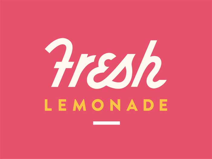
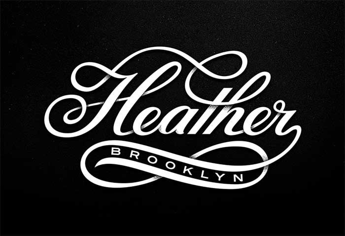
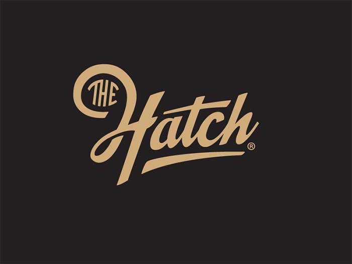
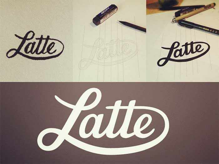
Learn the visual basics of typographic logos
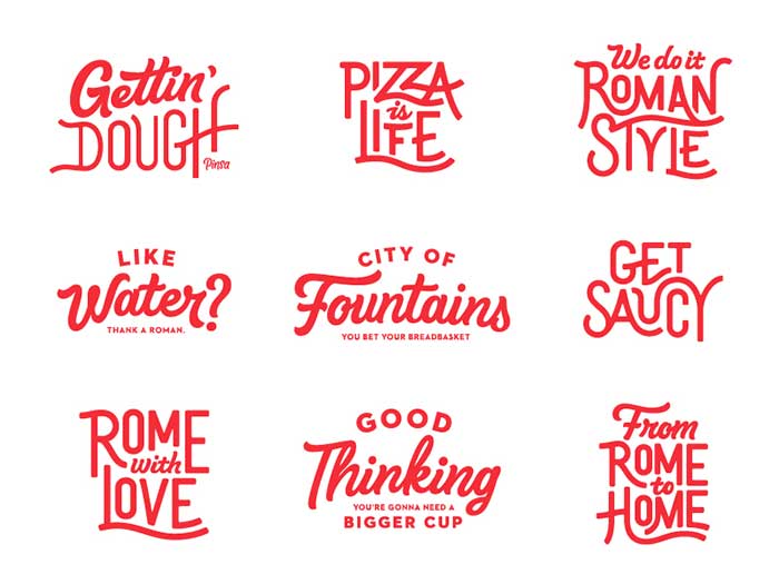
Once you’ve gathered all information and familiarized in detail with the potential of your brand, it is time to make the most important choices that will make or break your logo. First in the line will be fonts, so make sure you know a thing or two about them. The bustling number of available fonts will make it difficult to choose an appropriate one, so spend some time evaluating their effect on your design. The good news is that all fonts can be categorized in groups, and each of these groups has a different emotional tone:
Here are some extra tips that can help you make a professional choice:
Create a versatile logo
The design mistakes you should avoid
The power of the AmpersandIn the corporate world, businesses are often formed from collaborations and partnerships, as a result of which we have a brand with two or more names to include in the logo (H&M, D&G, Smith and Sons, and many more). Instead of the standard ‘and’, you can always use an ornate, decorative ampersand to make the logo loo more old-fashioned and sophisticated. The larger the ampersand is, the more you’d be highlighting the collaborative spirit in the company, and thus convince future customers that their needs will be handled by an expert and trustworthy team. Ampersands are quite often for formal businesses in the service arena, including in particular financial and legal consultancies, and academic institutions. Still, this shouldn’t stop you from using them for casual and informal purposes. Friendly logos with retro typefacesBusinesses have all sorts of design needs and requirements, but most of them would still go for a brand look that is accessible and friendly. Quite often, such logic is adopted even by exclusive and formal sectors that are also looking for a cheerful font that’d support their open-ethos approach. Such business should consider retro-inspire typefaces, as these are nostalgic and trendy at the same time, and inject a vintage vibe that can make any service seem inviting and attractive. By retro fonts, we have in mind cheery designs that reference the 1950s style, usually packed with curved types and pastel colour backgrounds. The design should remain flat (no gradients or shades), but yet fresh enough to adhere to today’s design standards. How to make an iconic typography logoNowadays when designers come up with all sorts of amazing image solutions, typography logos are put aside as the ‘duller’ or ‘more boring option’. Yet, we believe that that there are many size and shape adjustments and interesting frames that can make a font look more dynamic and engaging. What businesses do in such cases is to create icons, namely smaller logo versions for their brand. Icons have proven to be very successful despite of their limited size, usually crafted upon a square layout instead of a rectangular one. The reason why they’re often more memorable than logos is that they display less information (no subtitles, for instance). If you ran a clothing store, for instance, you can get a memorable icon to print on merchandise tags, ideally designed as a punching and modern symbol that will be noticed despite of its size. To strengthen its effect, you should work with attractive colours and striking contrasts. In order to create a logo that captures interest wherever it appears (tags, printouts, digital media, shop windows, and so on), set it within a rounded or a square layout. Go for a minimalist solution, and display only the information that is absolutely necessary. Getting inspired for designing typography logosInspiration can come from the least expected sources, but for most of today’s designers it is gathered online. At the very beginning of your search, you can consider looking at the portfolio pages of prominent design companies, and learn more on their colouring, spacing, and typography strategies. The right ideaThe critical step towards a well-executed logo for a client is to know in detail what that client is doing. Therefore, spend time on their website, check out their promotional materials, and you will certainly get inspired. ‘Try out’ your design with a sketchAs soon as the idea and the plan come together, grab a piece of paper, and prepare a sketch. Take into consideration all differences caused by the font you’re about to use. Choosing colors for typography logosTwo points will be particularly important for you to choose the right color for your typographic logo: The business categoryThe business category or industry you operate in is without doubt the leading factor to consider. For a company in the finance and banking sector, for instance, you need a logo whose colours invokes and builds trust. The targeted audiencesTo give you an example, logos of cosmetic brands and make up studios often use feminine colors such as purple or pink. Green, on the other hand, is a prominent choice of fitness studios and bio food brands. Typography logo design tricks you can’t go withoutKerning upside downWhy does kerning the character pairs upside down make sense? It is because in such way, you get to examine the spacing between letterforms without even reading the words and understanding their meaning. Upside-down kerning may not be an option for fancy and highly-personalized designs, but the technique is proven and more than welcomed in all other scenarios. Spacing words with an ‘o’Another concern you will have is spacing before and after the words, and in order to get it right, we recommend you to imagine a letter ‘o’ between the words. Kerning and tracking of headlinesKerning and tracking will be most useful with headlines, and it is imperative to get them right. Using Sans Serif fonts will be enough to notice all the mistakes you’ve made. Let’s say you’re working on a sans serif headline – rough tracking should always come first compared to kerning, and the two should be aligned. Namely,-10 kerning between most of the character combinations will only work where you used -10 tracking to arrange the spacing between your characters. Same goes for numbers: A single number with no characters before and after it (not even space) will need a tighter kern. Keep a lower font countThink of all the fonts you will need for your design project. With more than two (a serif, a slab, and a display, for instance), your content may become complex and difficult to understand, and viewers may not catch on the hierarchy right away. A much simpler and more beautiful solution is to use a single font in different weights, as long as you know how to combine those. Designs like this look sharper and cleaner, and send a much more understandable message than their ornate counterparts.. Font rentalLet us introduce you the revolutionary font rental service Skyfonts. The solution developed by Monotype solves the age-old issue of having to purchase a font in order to test it to its full capacity, and does so by allowing you to rent and try any font from its library for 5 minutes, and do so without paying at all! Credits are also available for those interested to rent fonts for few days or a month, depending on what they need. You may think this is not necessary, as most foundries do let you test characters on their site, but using the actual font in your design program will take this experience to a whole new level. Better yet, it will invoke the very same feeling viewers will have when looking at the final product. Don’t overdo it (unless you really have no other choice)Unless achieving a specific illustrated effect was a goal at the first place, don’t alter the fonts on your own. There is no need to skew or stretch them, as this will mess up their dimensions once you’ve turned them to outlines. The same rule applies to any vector piece: when you stretch a refined photo, the effect is usually an amateurish and ugly piece, and you don’t want a logo like that representing your company in the first plan. Ending thoughts Typography logos are definitely the easiest business logos out there, but in order to make them work for your business and your clients, you have to keep several things in mind:
If you liked this article about typography logos, you should check out these as well:
The post Typography Logos That You’ll Enjoy Looking At appeared first on Design your way. from http://www.designyourway.net/blog/inspiration/typography-logos/
0 Comments
Leave a Reply. |
AuthorPleasure to introduce myself I am Jamie 27 years old living in Searcy, AR. I am web developer and have developed over 50 sites for clients. Now a days I am focused on designing as I feel I am lacking it. Archives
April 2019
Categories |