|
If you’re working on digital products, you have already read dozens of articles describing how and why the hamburger navigation on mobile (and desktop!) hurts UX metrics due of its low discoverability and efficiency. (You can read some of best articles on the topic here, here, here, and here.) Luckily, more and more sites and apps are experimenting with alternative, more efficient solutions for this very problem. None of the ideas listed here is better than the others, their viability and performance obviously depend on the content and the context. 1. TabsIf you have a limited number of sections in your website or app and users should be able to quickly switch between these sections, a tabbed navigation might be the solution.
Tabs seem to be the simplest navigation pattern, however, you need to consider a few things when designing them:
Examples: LinkedIn and Google Photos
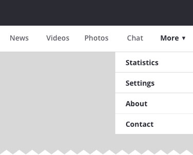
2. Tabs with a ‘more’ optionWhen there are more than 5 main sections, a practical solution might be to show the four most prioritized sections and have a fifth element list ‘everything else’:
The design principles for this solution are basically the same as for simple tabs. The ‘more’ item can either link to a navigation page or work as a dropdown menu with the remaining sections:
You could argue that the ‘more’ item isn’t better than the hamburger menu (it’s kind of hidden and its label does not refer to its content at all), however, if you have made the prioritization right, most users will be looking for one of the four visible items anyway so the navigation experience for the majority will still be improved. Example: Facebook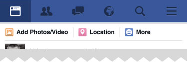
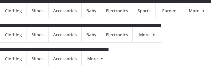
3. Progressively collapsing menuA more sophisticated version of the ‘tabs + more’ navigation is to design a menu that adapts to the screen width, shows as much of the navigation as possible, and puts everything else under a More item if necessary:
This means that the More menu contains more items on a lower resolution — items ‘jump’ under More when there’s not enough space to show them. The flexibility of this solution provides a better experience than the ‘tabs + more’, especially on in-between screen sizes. Example: BBC
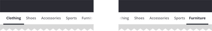
4. Scrollable navigationIf you have a number of navigation items without a big distinction in priorities and having a ‘more’ category would be a bad compromise, another strategy is to list all the items in a scrollable view:
The downside of this solution is that still only the top few items are visible without scrolling and all the remaining ones are off the canvas. This is, however, an acceptable solution when the users are expected to explore the content, e.g. in a web shop or news categories. As far as visual design is concerned you need to make sure to provide enough visual hints to suggest that there are more elements available upon horizontal scrolling (e.g. by fading and/or off positioning the last visible element). Examples: Medium and Google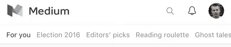
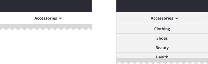
5. Dropdown menusAn uncommon but interesting pattern is to use dropdown-like menus when the visibility and accessibility of the other sections is not essential:
The dropdown menu actually has a double role in this case: first, it serves as a page title and the downward arrow suggests that there’s a possibility to quickly switch to similar sections. Although the options are hidden in this case, the dropdown design suggests that the list would contain options that are either siblings or children of the current page (and it should primarily be used for this purpose). Example: Barnes & Noble and Duolingo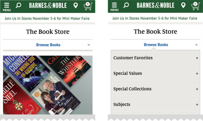

And sometimes, surprisingly, the hamburger menu might be a good choiceSince the main downside of the hamburger menu is its low discoverability, it’s recommended to consider one of the alternatives when it comes to designing the main navigation menu. However, when designing secondary navigation options, this pattern might be an appropriate solution. If the primary options are available as prominent on-screen call to action buttons, the hamburger menu seems a good place for all the secondary navigation:
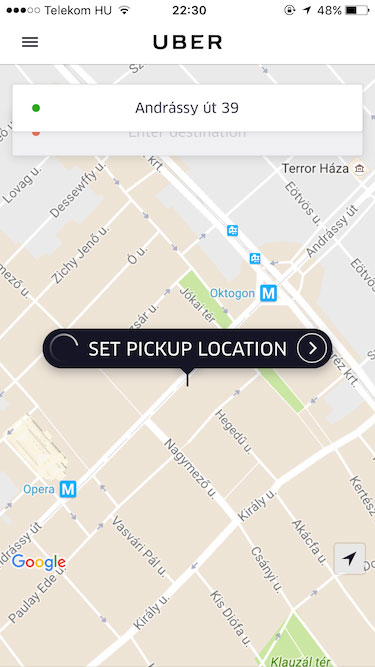
This pattern can be used when the main navigation is designed around a user flow and the related options are clearly available on the screen. Uber might be a good example:
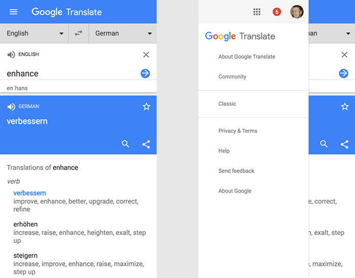
Since everything about this screen is designed to request a car, secondary options such as History and Settings should not be available more prominently than from a hamburger menu. Google Translate is really similar to this:
Since the main functionality (switching languages and entering text to translate) is the most prominent part of the screen, the hidden menu is a great place to host sections like Help and Community. ConclusionThere isn’t a one-size-fits-all solution for mobile navigation, it always depends on your product, on your users, and on the context. What works well for others might not work for you and vice versa. However, the foundation of every well designed navigation is information architecture — clear structure, priorities, and labels based on your users’ needs. So why not start finding the most efficient mobile navigation for your product today? The post Hamburger menu alternatives for mobile navigation appeared first on Design your way. from http://www.designyourway.net/blog/user-interface-design/hamburger-menu-alternatives/
0 Comments
Leave a Reply. |

AuthorPleasure to introduce myself I am Jamie 27 years old living in Searcy, AR. I am web developer and have developed over 50 sites for clients. Now a days I am focused on designing as I feel I am lacking it. Archives
April 2019
Categories |


 RSS Feed
