|
Details are often the most interesting aspects of a product. Little details make up the product as the whole. But no matter what these details are — preloaders, icons, or error pages — they must complement the general look and feel of your app. In this article, we unfold how to create a beautiful and effective error page. An error page or 404 page informs users that they’ve followed a non-existent link or typed an address that doesn’t exist. The error page can have diverse designs: it can be minimalist, funny, or reserved. Its design depends on your product and the mood you aim to create. Let’s take a closer look at examples of 404 pages and see how we can make the error page look nice and be more informative and user-friendly. Things to add to the 404 page:
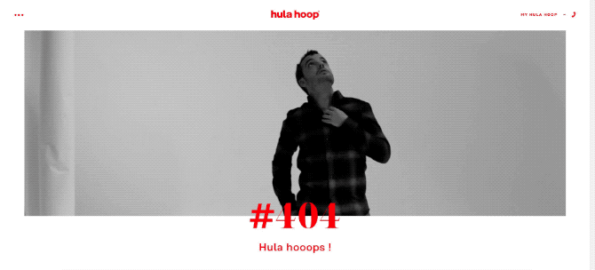
Tips and ideas to get you inspired with your very own error pageStick to your overall styleThe 404 page is part of your site, so try to keep to the same style, fonts, colors, and mood that you use across all other pages. Look at how the creative digital agency Hula nails it:
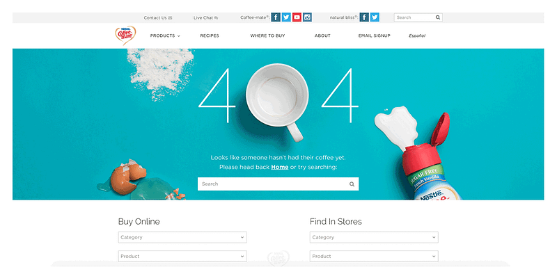
Provide optionsWhen the 404 page is displayed, users are redirected to the previous page. Yet who likes to go back? It’s better to give users an opportunity to go further, for example to the homepage or to your portfolio. Coffee Mate redirects users not only to the search box but also to the form for quick search and online purchases.
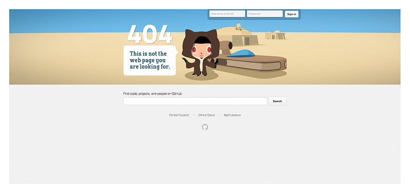
The largest web service for hosting IT projects, Github also redirects users to the search box.
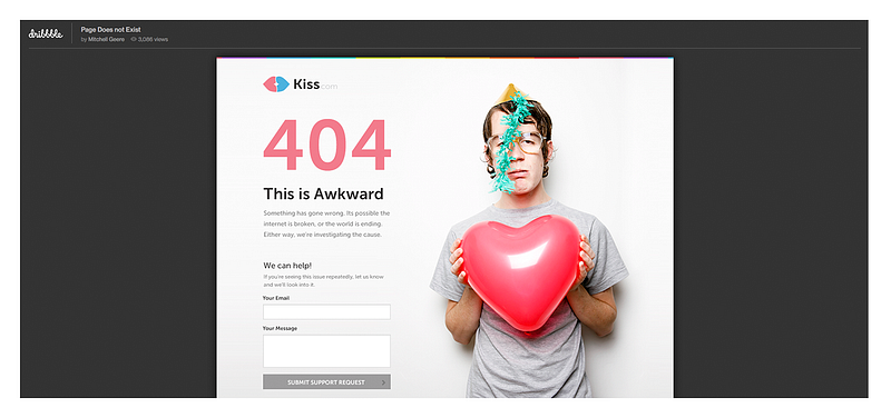
Explain what went wrongIt’s great if you briefly explain what went wrong. One or two sentences will do. This design and prototyping company preserves its common website style and explains what caused the error to occur in the first place:
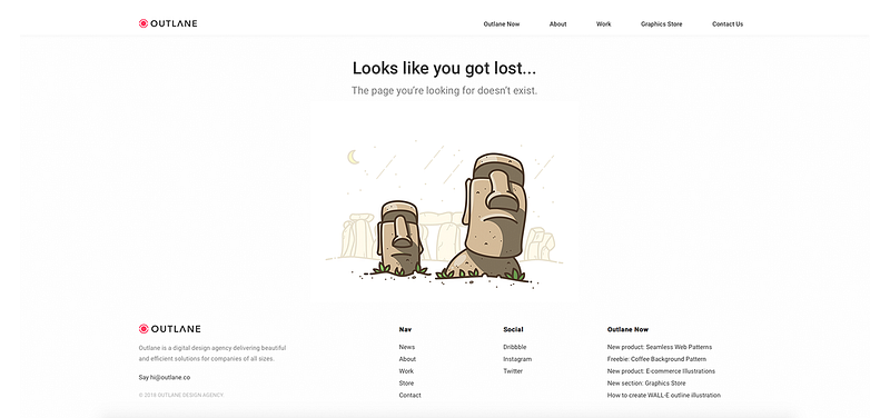
Don’t overload the pageThere’s a chance that a user will land on your site through a broken link from a different source, a wrong URL, or a page that’s been deleted. If you want the user to navigate your website further, offer them a couple of links — for instance, to the homepage or works section. These links can be highlighted separately or be placed in the footer of the page. But keep to just a few links and don’t overwhelm the user with too many. Take a look at two examples below from a digital agency and development company:
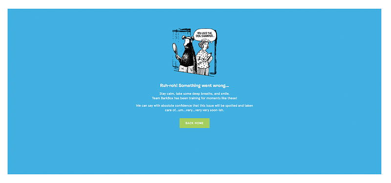
Add a bit of funUsers may be upset if they can’t find the information they’re looking for. Why not lift their spirits? Funny pictures or videos will get the job done perfectly. This company manufactures products for pets and entertains visitors when they find themselves on the 404 page: 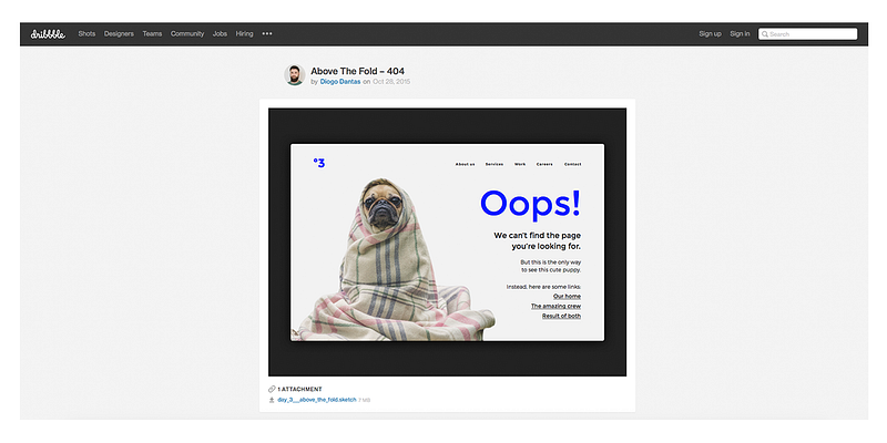
Appeal to emotionsSome designers deliberately drop the 404 number and use “Oops!” “Hmmm,” or “Oh” instead and add animations or illustrations to appeal to people’s emotions. This approach encourages visitors to look further for the information they wanted.
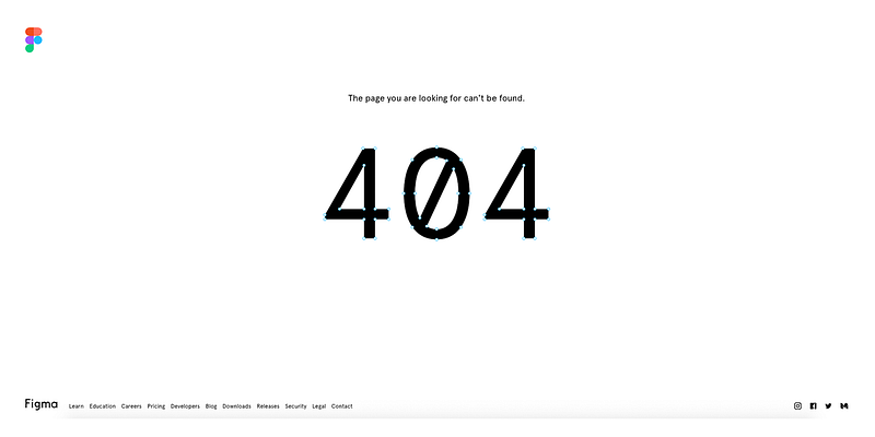
Make an interactive error pageInteractive error pages or pages with gamification elements are great to engage users. Figma, an online tool created specifically for interface design, offers such 404 page. 404 is rendered in vectors that you can reshape as you wish.
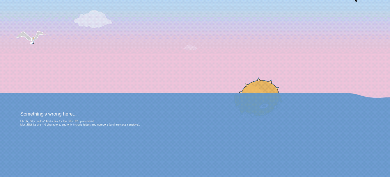
On the error page for the link shortening service Bit.ly, you can bounce a fish when you put the cursor into the sea and can also follow the links in the footer of the page.
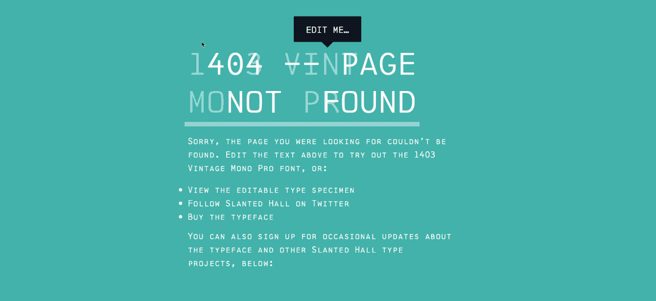
One custom font designer offers users to try this 1403 Vintage Mono Pro typeface on the 1403.slantedhall site:
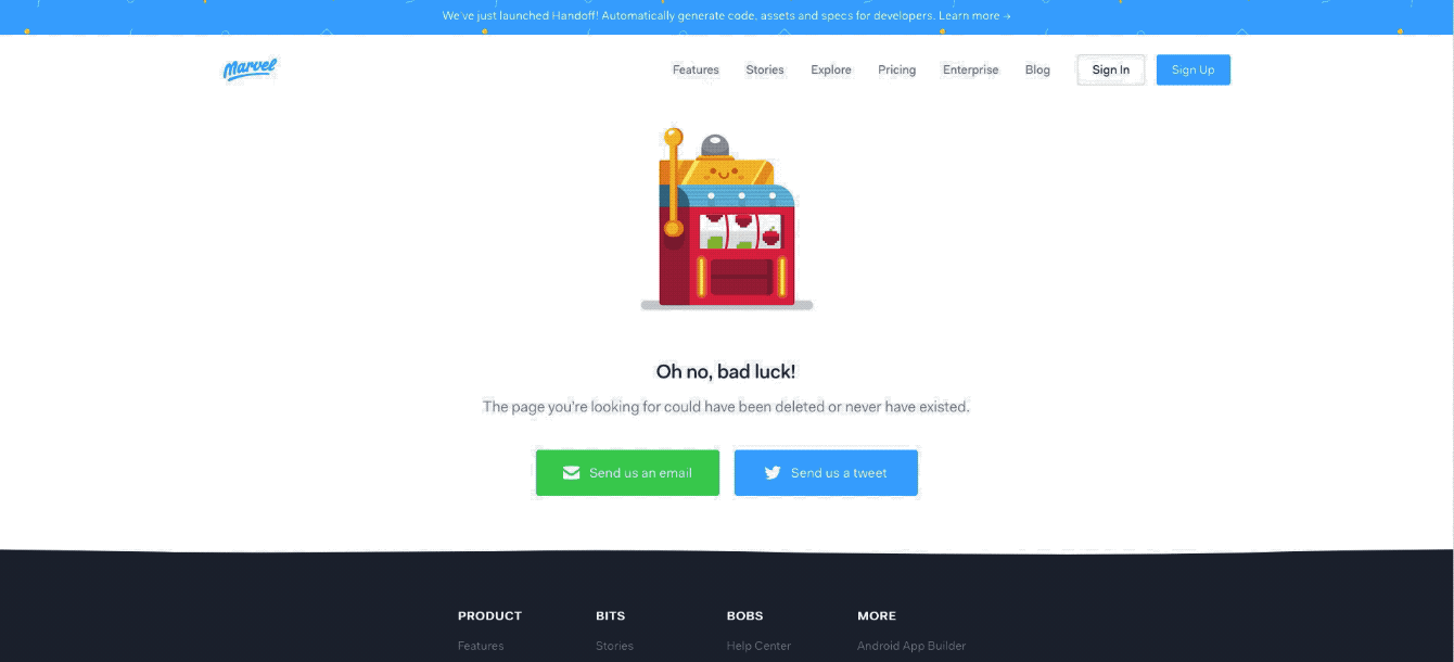
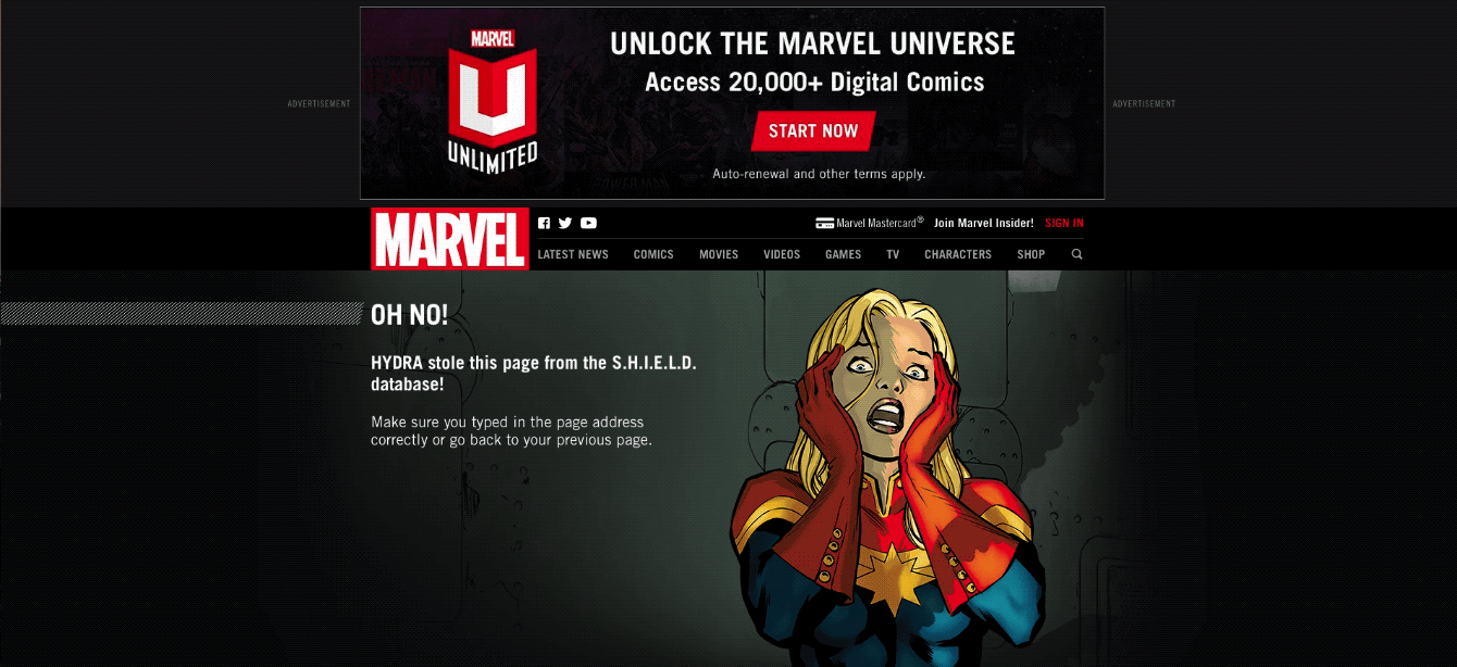
The Marvel website offers users a 404 page that has a set of different heros when you refresh the page:
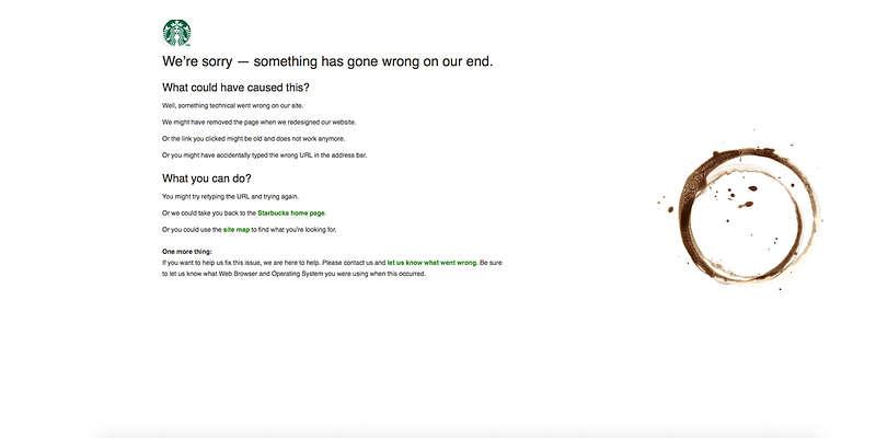
Use the productFor companies that sell different products, it’s a good idea to use images of that product. Look at how successfully Starbucks does this:
Chris, the designer, takes his illustrations and is going to find the right page on his Chrisglass.com website.
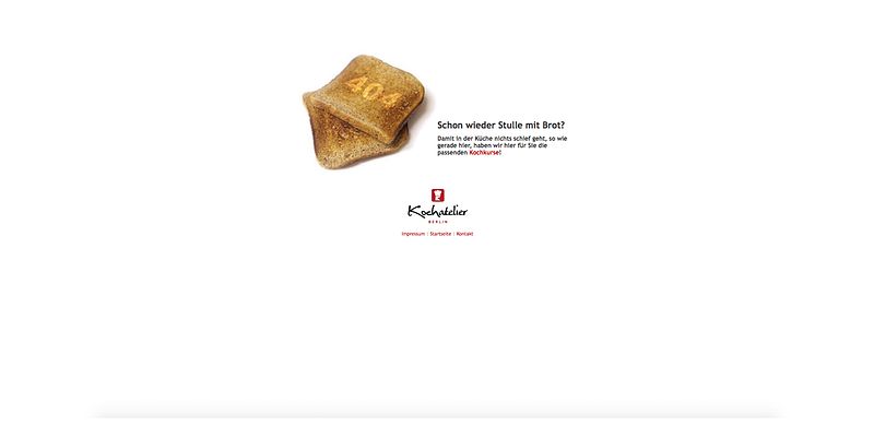
The cooking agency Kochatelier shows pieces of toast and offers users to go back to the homepage or follow the brand on social networks.
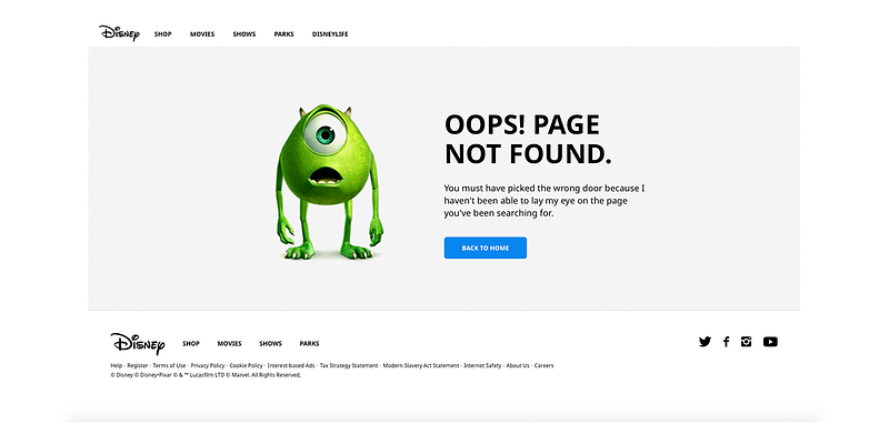
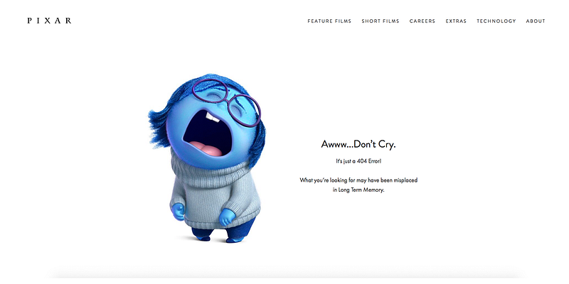
You can use your mascot or logo to diversify your error page. Pixar chose a character from the movie Inside Out. This character is sad, which perfectly fits the error page.
Design your own error page with SteelKiwiDesigners don’t want to create a mere 404 error page. They see this page as an opportunity to apply creativity and make users navigate a website further.
You do need to design a 404 error page, but it’s still best not to have broken links on your website. Here’s a free tool from Google to search for broken links: Google search console. Wanting to add more creativity to your 404 page? Get in touch with us or check out our Dribbble and Behance shots for inspiration. The post How to Create an Effective 404 Error Page appeared first on Design your way. from https://www.designyourway.net/blog/web-design/how-to-create-an-effective-404-error-page/
0 Comments
Leave a Reply. |

AuthorPleasure to introduce myself I am Jamie 27 years old living in Searcy, AR. I am web developer and have developed over 50 sites for clients. Now a days I am focused on designing as I feel I am lacking it. Archives
April 2019
Categories |

 RSS Feed
