Many — mostly young — designers create digital products based on their gut feeling. Although this may work in many cases, there are proven common standards that help you to logically construct well-founded UI solutions instead of relying on your gut feeling. In this article, we are going to explore the common standard of modality in user interfaces, discuss the reason why there are only two fundamental types of screens and analyze how apps and websites fail at converting information architectures and user flows into intuitive user interfaces. Oh — and we are going to talk about kittens. Let’s start the exploration with a bold claim: There Are Only Two Types of Screens
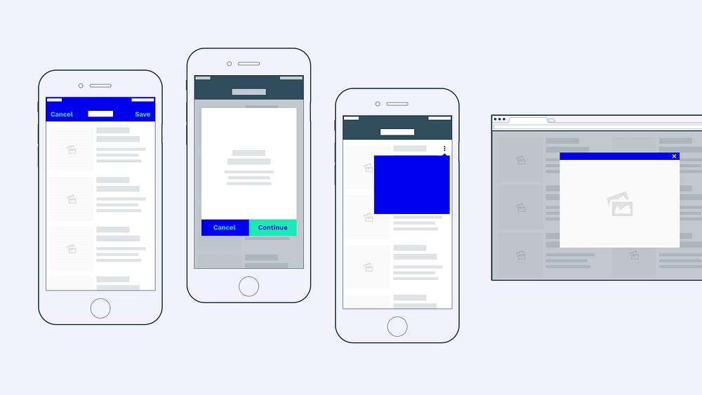
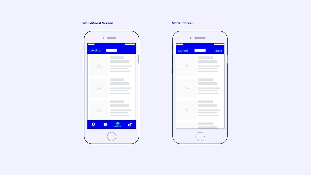
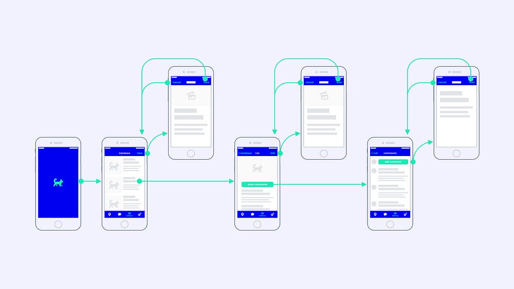
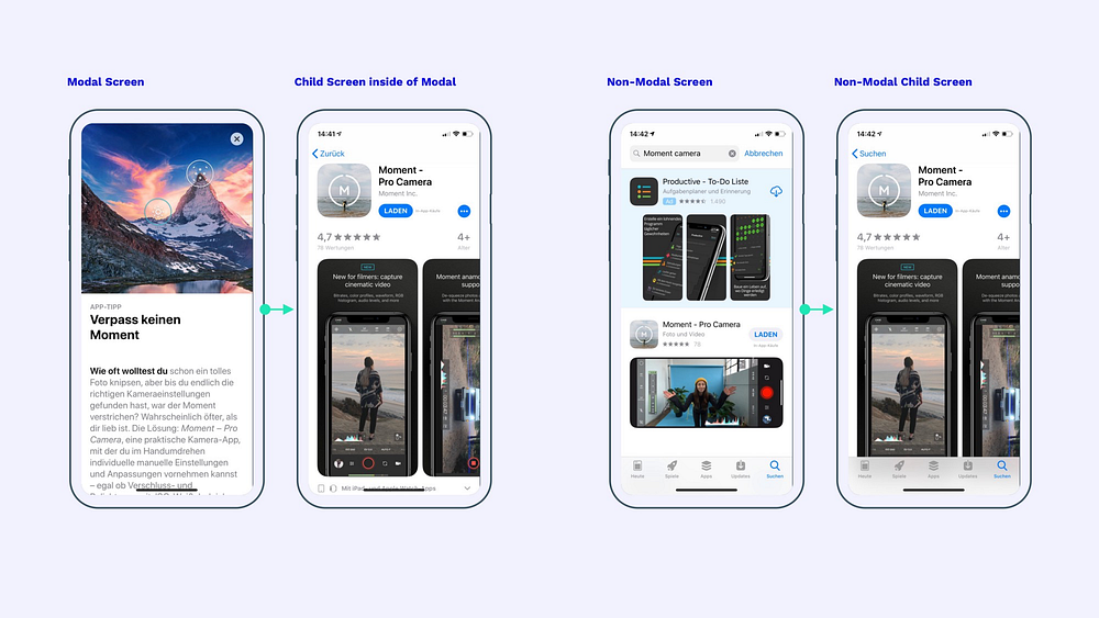
That is it — Let me explain. (Almost) Every imaginable viewport falls into one of those two categories. In order to understand what differentiates a Modal Screen from a Non-Modal Screen, we first have to define a Modal Screen. What Is a “Modal Screen” ?Modal Screens can be found in different shapes and sizes:
Both Modal Screens and Non-Modal Screens are child views, meaning they are subordinate to the app’s main window. But there is one important difference:
Most Modal Screens — especially on desktop applications — can be easily identified, because they visually overlay the main window: This is true for popups that fade out the main window in the background, popover menus and popover dialogs, lightboxes, alerts, … However, screen estate on mobile devices is limited, which is why many modal screens on mobile devices take up the entire screen. They no longer keep the underlying main window visible and therefore make it harder to distinguish them from Non-Modal Screens: The main difference lies in the way you can interact with each screen. While a Non-Modal Screen allows users to simply go back to the parent screen, the Modal Screen requires users to complete an action before returning to the main window (“save” in our example) or cancel the current action. The most distinct visual indicator for Non-Modal Screens is the visibility of the navigation (a tab bar in our example). Non-Modal Screens allow users to jump back and forth at the primary navigation level even if they happen to be on a subpage. On the other hand, a Modal Screen requires users to close the window before being able to use the primary navigation again (“Save” or “Cancel” in our example). This distinction is what most apps are failing at and one of the reasons why I wrote the article “Tab Bars are the new Hamburger Menus”. Why Should Modality Be Used?Modal Screens solve a simple problem: Users are easily distracted, so you have to grab their full attention sometimes (source). A Modal Screen does exactly that: it requires people to focus on a single task before continuing.
When Should Modality Be Used?Now that we know what a Modal Screen looks like, how it compares to a Non-Modal Screen and what its purpose is, we have to ask ourselves “What kind of situation should we use it in?” I promised you kittens, so here we go: Let’s imagine we are creating an ingenious and innovative Silicon Valley app: “purrrfect” — a kitten database that allows users to upload, view and comment on cute cat GIFs. Brilliant concept. A (simplified) user flow of our app might look like this: The user opens the app, he enters one of several available tabs (our kitten database), clicks on one of the kittens (enters detailed single kitten view) and then clicks on the comment section (enters comment section). In addition, the user can perform supplementary actions at each stage. For example, he can add another kitten to the database in the kitten database screen. Or he can edit data in the kitten detail screen. Good stuff. Now, which of these screens is modal and which is not? The classification is anything but simple — this is my personal rule of thumb:
A “self-contained process” is every action that has a clear start- and endpoint to it. For the limited time frame of this action, it takes the user out of the general user flow, lets him focus on the action and then takes him back to where he started. Google phrases this as follows: Use Modal Screens (dialogs) for…
In the case of our purrrfect app, this means that the primary user flow (used to explore the app) is not modal. However, special time-limited actions like adding kittens, editing kittens and writing a comment are modal. All modal actions can either be canceled or successfully completed before the user is brought back to the main flow. For this reason, Modal Screens use Cancel and Save buttons (or other similar actions) instead of back-buttons. If your back-button simultaneously triggers a save action in a Non-Modal Screen, you might want to consider switching to a Modal Screen with Cancel and Save buttons. The contradiction is also (often) true: If two different actions such as Cancel and Save do not make sense in your Modal Screen (because they would trigger the same action) you might want to switch to a Non-Modal View. In this case, the primary navigation (e.g. tab bar) should also remain visible on the screen. Let’s get back to our game-changing app: A possible interface for purrrfect could look like this: In the real world, the distinction between modal and non-modal screens is often less obvious. For example, the fullscreen view of an image is modal in most apps, although it is not a process or dialog. A Modal Screen might also make sense in other special situations in order to generate focus. If our kitten detail-screen (middle) was an end-point view without other actions like editor comments, we might have used modality (fullscreen view). But since it allows users to navigate deeper into the information architecture and perform various additional actions (show comments, edit, …) it no longer has a clear endpoint and therefore it is part of the main flow. Hence, a Non-Modal View. It is the designer’s responsibility to evaluate whether an action is self-contained or part of the app’s general exploration flow and to decide whether modality makes sense or not. In case of doubt, remember Apple’s words:
Disclaimer: Of course, an interface can work perfectly fine without a strict distinction between modal and non-modal views. However, the concept of modality is deeply embedded within the interface ecosystems of Apple, Google, Microsoft, and other enterprises and users have developed corresponding expectations. Apple wouldn’t be Apple if it didn’t break its own rules from time to time: For example, the new App Store opens highlights in the “Today” tab as a modal screen, but still allows users to navigate to further recommendations at the bottom of the modal screen (no clear endpoint). This way users navigate deeper inside of the modal screen without having a fixed endpoint. In the process, they lose the ability to change tabs and can no longer close the modal view on sub-pages. Opening the same app screen from something other than a recommendation results in the screen being displayed as a non-modal screen. This preserves the tab bar and back actions (click on current tab bar icon again to go to its main screen). The inconsistency on the left could be fixed by…
How should Modality be used?By now, we should have a general understanding of when to use modality. The only question remaining is “How do we design it?”. Here is a quick checklist for modal screens:
Multi Step ModalsThings get more difficult as soon as a modal dialog consists of multiple steps or child screens. By default, the continue button is displayed on the top right. The second step screen won’t open a new modal screen but instead stays inside of the modal screen and is displayed as a non-modal child screen of the existing modal overlay. When placing the primary action (“save”, “apply” or “continue”) at the bottom of the screen (as recommended earlier) the top right area of a modal’s second step frees up space for an optional cancel button. Although it jumps from the left to the right side, this placement is still better than not offering the ability to close the modal screen on child screens. AnimationsSo far, iOS and Android are quite similar in the way they use modal views. However, this changes as soon as you look at the animations.
VerdictMany designers design products based on their gut feeling. And sometimes a gut feeling is more important than a norm. But it is important to know the common standard in order to adapt or ignore it when it makes sense. In my opinion, the concept of modality is one of the most neglected UX principles of today’s apps. Cross-platform apps and web-native hybrids don’t exactly make working with platform guidelines and norms easier. But the general concept of modality is a guideline that you should be familiar with in order to break it when necessary. The post Modality Is the One UX Concept That Most Designers Don’t Fully Understand appeared first on Design your way. from https://www.designyourway.net/blog/user-experience/modality-is-the-one-ux-concept-that-most-designers-dont-fully-understand/
0 Comments
Leave a Reply. |
AuthorPleasure to introduce myself I am Jamie 27 years old living in Searcy, AR. I am web developer and have developed over 50 sites for clients. Now a days I am focused on designing as I feel I am lacking it. Archives
April 2019
Categories |