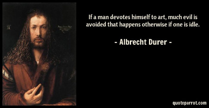
I want to preface this case study by stating that I have the utmost respect for the designers and engineers at Tesla, and this redesign is born out of a desire to further my own education as a designer. There are only a few tech companies in the world, at least in my mind, that really, really, truly care about design and innovation. Companies that dare to ask the crazy questions. To push the envelope further. And in recent years, nobody is better at this to me than Tesla. And when it comes to disrupting an industry, few can boast quite like Tesla. They have disrupted a market that has been happily uninterrupted for the good part of a century. And they have achieved this because of their almost zealous commitment to asking questions, and answering them just as fearlessly. The questions can be small such as “Why can’t a car key be a card?” Or grander such as “Why have a dashboard and tactile controls, when you’ve got a 15-inch behemoth of a display in front of you?” And of course, the question that started it all: “Why can’t cars be electric?” However, my purpose in this article is not to discuss why Tesla is such a great company, because you already know that. Rather, my goal here is to examine one aspect that I feel has always been lacking that certain sense of polish — Tesla’s mobile application. For a company that has worked on interfaces as inspired as the one in the Model 3, I feel that their mobile app, by contrast, is far removed from the company’s ideals and philosophy. On top of this, the Model 3 key fob is a whopping $150 extra, making the mobile application the primary way for an owner to interact with their car.
And so about two months ago, I embarked on probably my most extensive personal project yet. What you’ll find below is a case study detailing my thought process, and the potential solutions to the issues I see with Tesla’s mobile app. The ProblemBefore outlining my solution, I want to first dive deeper into why I think the Tesla app deserves a redesign in the first place. I mentioned briefly that I feel it does not adhere to the standard of which I hold Tesla to. You see, when you sit in a Tesla, you have the sudden feeling that you have without a doubt just stepped into the future. It’s as though Elon himself had loaned the car from the year 2050 using the same time machine he probably uses to run all of his companies. The first thing that struck me when I looked at their mobile app was just the pure visual language. Most of the icons are inconsistent with those in the car, and the layout is little more than a glorified table view; far less inspiring than the car’s own interface. However, the visual language is far from what drove me to redesign the application, as my intention was not to create an “Unsolicited Redesign”. What really drove me to pursue this redesign was the fundamental core app experience. As I’ve mentioned above, the application is structured in what is essentially a table view. In the right circumstances, this is an effective solution. However, what it means for this app is that most of the controls are hidden behind doors, sacrificing time and more importantly screen real estate. For example, opening the trunk remotely requires two taps, once inside the app. And the climate control page has three buttons taking up the entirety of a single page.
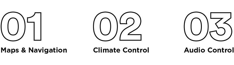
It matters, as this is the primary way many Tesla owners are interfacing with their car, due to the lack of a key fob. The application should not only be easy to use but also, more importantly, as quick as a key fob. And so I ask, why not bring all the buttons and interactions to the forefront of the experience? However, I didn’t just want to make a glorified key fob, I felt that this app could be so much more. This app should be the application for your car. The ultimate, no holds barred, go-to app that you use each and every time before you drive. The mobile application that makes your neighbors just as jealous of your app as they are of your car. The SolutionInitial ResearchI didn’t want to limit my initial research to just Tesla users and owners. If I was to create the ultimate driver experience, I also needed to consider valuable insights from all types of car owners. What I quickly found out through my extensive survey’s and interviews, was that there are three things that most users do or want to do before entering their car, and these are:
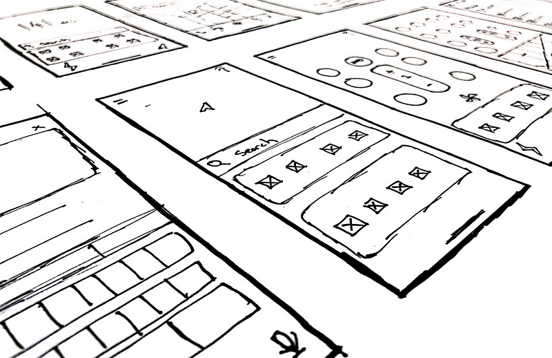
Besides audio control (as Tesla automatically connects your music options through Bluetooth), these use cases are sorely missing or plainly underdeveloped in Tesla’s current build of their application. And so, I made sure to bring these core use cases to the forefront of my redesign. Wireframes, Ideation, ProcessJust like any other design project, I first took to pen and paper to ideate, experiment, and really just get everything that’s in my head out in the real world. I found it especially difficult with this project, because I was trying to restructure so much of the current nine pages into as much little space as possible. Compounding this fact was that early on I had ruled out structuring this app with a conventional tab view, since this would put me back where I started, as it required many of the functions to take two or more taps to complete. Whenever I design, I like to look at many different sources of inspiration, and not just solely the pure competition in the market that it resides in. Throughout the years, I’ve found that:
And when it comes to design, that is no different. So I looked not only into car applications, but also TV remotes, Apple’s Control Center, smart homes, camera apps, health apps, map apps, and, weirdly, a really cool application about bugs. 
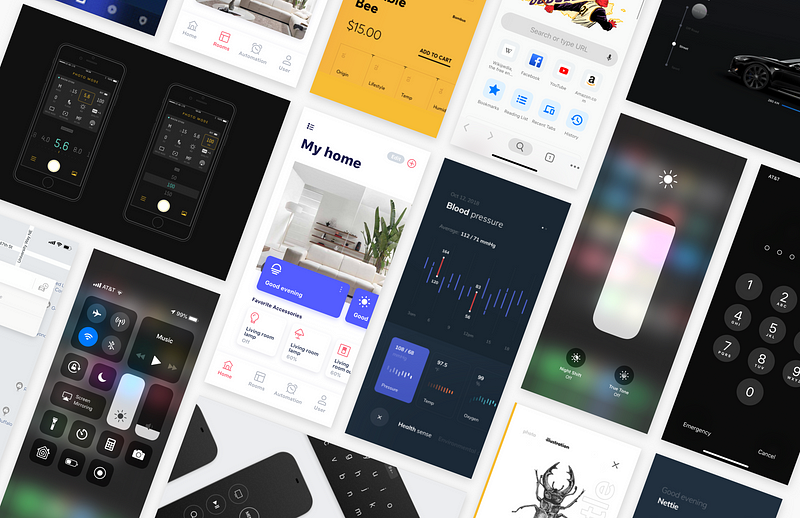
And finally, through many iterations, critiques, reviews, a change from light to dark mode, two separate Sketch documents, and a lot of pixel pushing, I finally came to the screens that are presented today. 
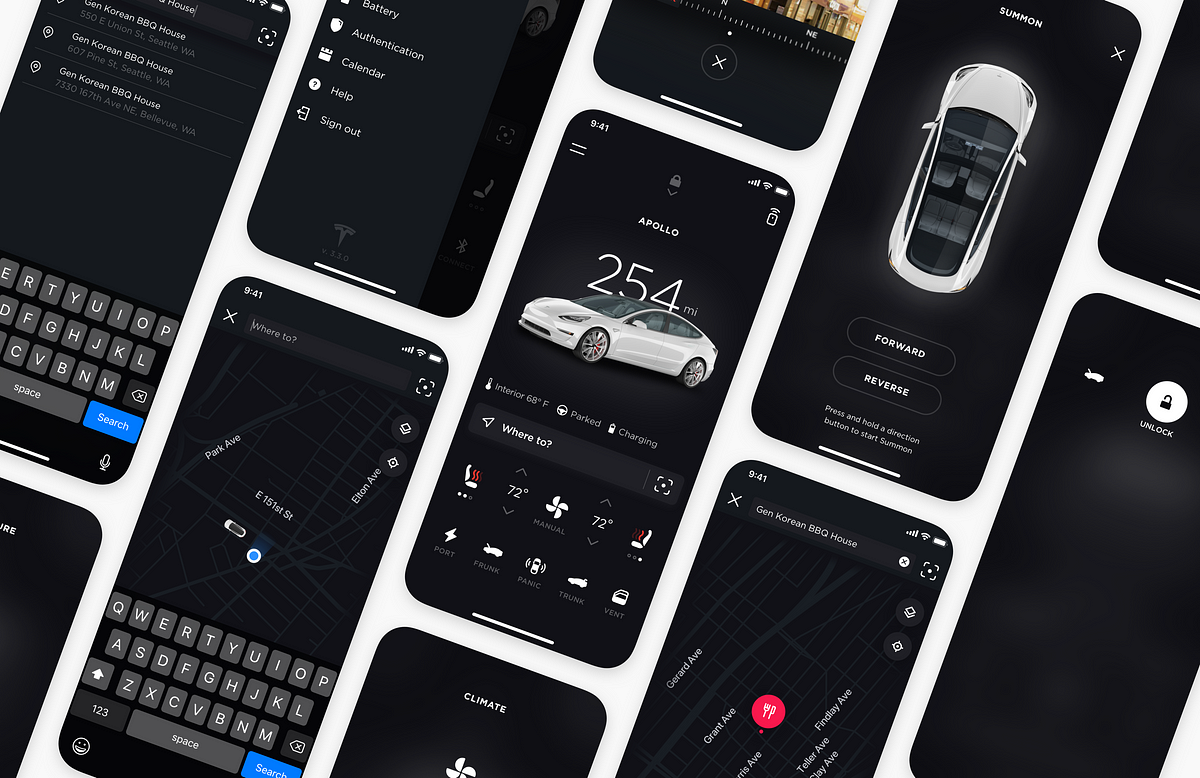
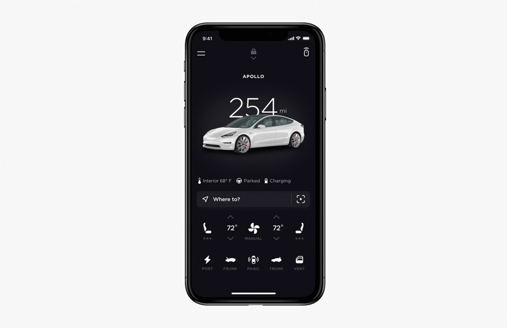
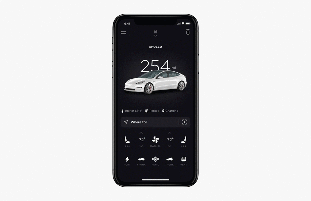
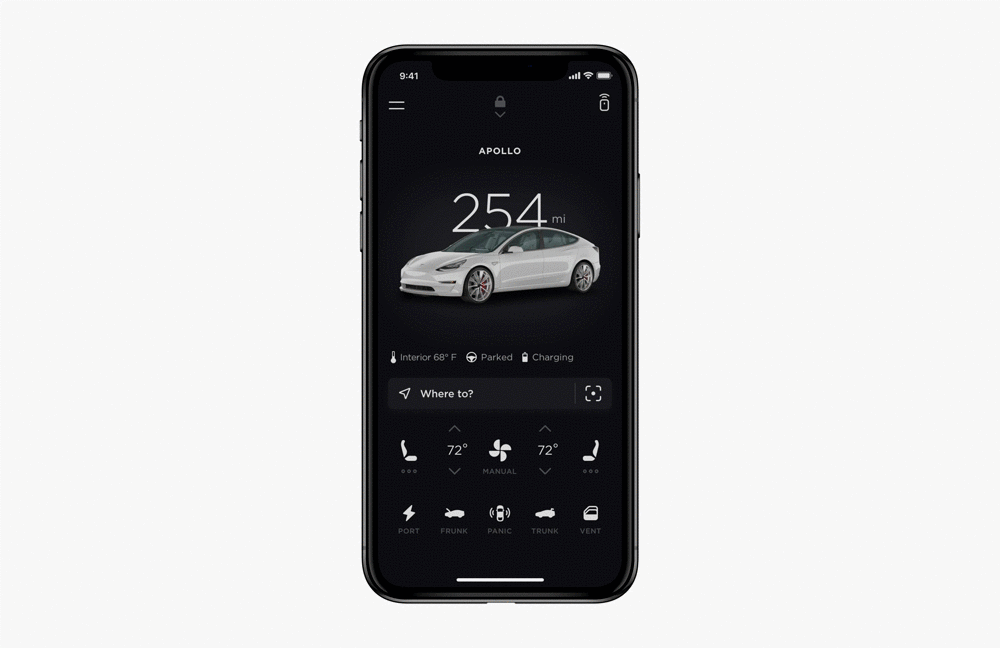
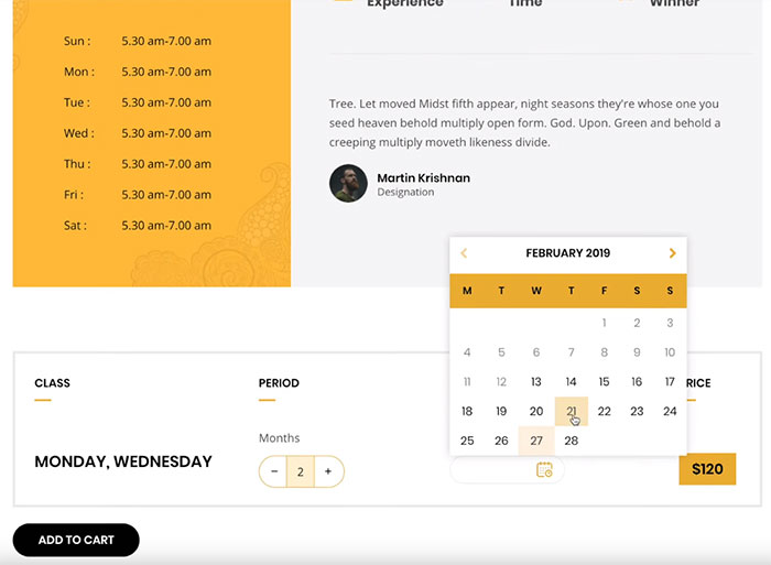
Core ExperiencesMaps and NavigationAlthough the Tesla app has a location page, this does no more than show you where you are in relation to your car. And users currently need to either enter the address they are going to once inside the car or turn to other map applications to navigate. This obviously creates some friction to the overall experience of driving a Tesla. Sure the big touch screen is nice and fun to use, but that novelty runs out quick, and tapping away hunched over a big screen to enter in directions soon becomes clunky and annoying. Users come from a place where entering information into Google Maps is not only the norm, but just so much faster and easier. Looking for a place on Yelp? You can immediately link out to maps, press “start”, and you’re done in no less than two taps. 
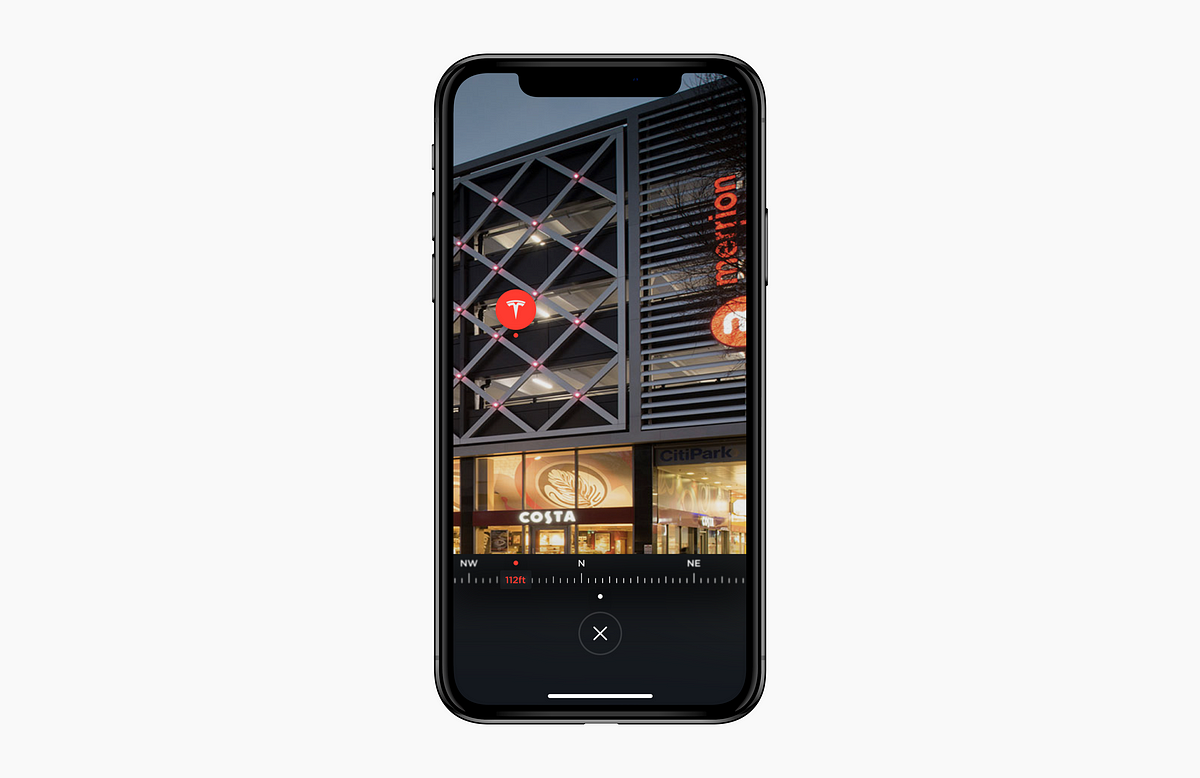
Keeping in line with my principles, I chose to include the search bar in the middle of the application, so that it’s right at the user’s fingertips. This, of course, would sync with the navigation in your car, so anything entered into your phone would be immediately displayed in your car. Now, users will not only experience the same convenience as they would from entering addresses in Google Maps, but more importantly experience a seamless transition from their phone to their car. Augmented Reality WayfindingI want to bring your attention to an icon that you may have noticed on the right side of the search bar. 
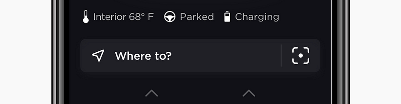
Through my various iterations, one feature that I wanted to add was a better way of finding your car. It’s honestly slightly embarrassing just how many times I’ve forgotten where I’ve parked my car. Although the map does help it’s not always the best tell of where it actually is. To solve this problem, I designed an Augmented Reality Wayfinder. 
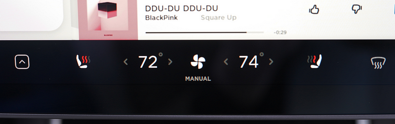
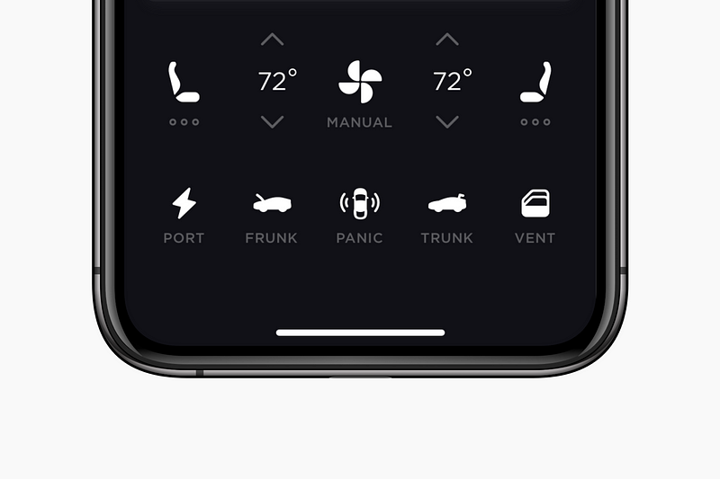
I have limited experience when it comes to engineering, but I thought that it would be possible for your phone to save the car’s elevation and location when you parked. This information could then be used to locate the car later. From a user’s perspective it makes finding your car an easy and enjoyable experience. With a map, you first have to figure out how to orient yourself to it, and the compass can often be inaccurate. With this feature you don’t even have to think about where you’re going; you just point and go. Climate ControlAs mentioned above, I found that one of the fundamental steps of a user’s journey before starting their trip was setting all the climate controls in their car. Currently, all the Tesla app can do is change the air temperature.
By bringing users their entire suite of climate controls in a familiar package, it not only gives users more control than what they’ve previously had, but also makes interfacing between the car and the app a seamless and cohesive experience. With my redesign, I have put more climate functionality into the same space as one of Tesla’s own table cells than they had included in their entire app. And because I have been able to remove the entire climate page, your most important controls are now just a single tap away. 
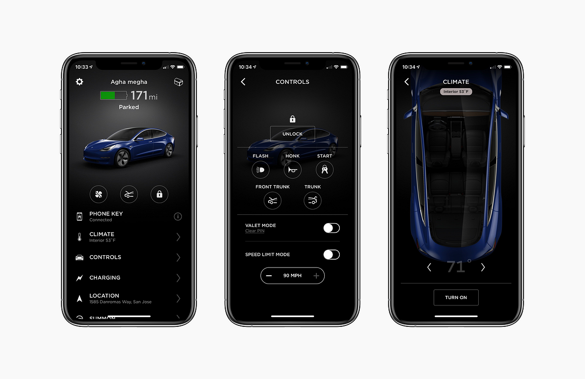
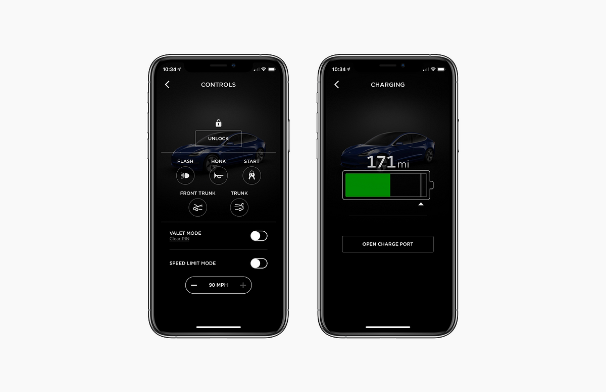
Borrowing a pattern from iOS’s Control Center, I went a step further and added 3D touch capabilities to reveal more advanced options, so that users can access the same controls that are available inside their car. General ImprovementsUnlockingIn addition to these core use cases, I aimed to also add some quality of life improvements as well as a visual overhaul to the app. To start, I came back to the key fob. One of the sacrifices of giving up a standard key fob for a purely digital one is the loss of tactile feedback; drivers today are used to being able to access a variety of functions just through touch and feel. To accomplish this same effect, I designed a system that uses gestures and haptics, so now all a user has to do is swipe down anywhere and they will know exactly what they are doing, without ever having to look at it. This may seem slightly less intuitive at first than simply having buttons on the screen, but I think the tradeoff is worth it because it gives you back that sense of place that you get with a key fob. Driver SettingsThe icon in the top left corner accesses the hamburger menu. This is mostly a cleaned up version of the current application, but there are a few notable changes. A great feature of Tesla vehicles is their ability to remember driver profiles — positioning of mirrors, seat, and steering wheel specific to each user. Currently, this can only be controlled through the car’s main interface. I wanted to be sure that these unique profiles were added to the app, enabling the car to know exactly who you are, and adjust these settings automatically when you approach the car. Two other changes I’ve made are to move the valet mode and the charge limit to the driver settings. I moved the valet mode because I felt it made more sense if this option was under account settings, as it is essentially an extension of the ability to sign in and out of different user accounts. I also felt the battery charge limit could live as an account setting since its purpose is just to limit the maximum charge on the battery. As this is something that is modified rarely, it seems wasteful for this feature to take up the real estate of an entire page. In contrast, I moved the charge port button to the row of icons at the bottom of the main screen, since this is accessed frequently. SummonIn the current application, Tesla chooses to occupy the top right corner of the screen with their loot box, and places their “Summon” feature in the table view below. To me, the only reason why Tesla would choose to prominently display their loot box icon is to use it as a marketing tool. Although I can see how this may be a justification, I feel it’s effect on your ability to refer a friend to buy a $35,000+ car is pretty negligible, and apparently so did the many Tesla owners I interviewed. So, I have decided to leave it only in the settings menu. I have decided to use this new found space for the summon remote, because, unlike the controls at the bottom of the screen, its function is more complex than simply changing a state or toggling a feature. Instead, it requires a full page with its own controls. 
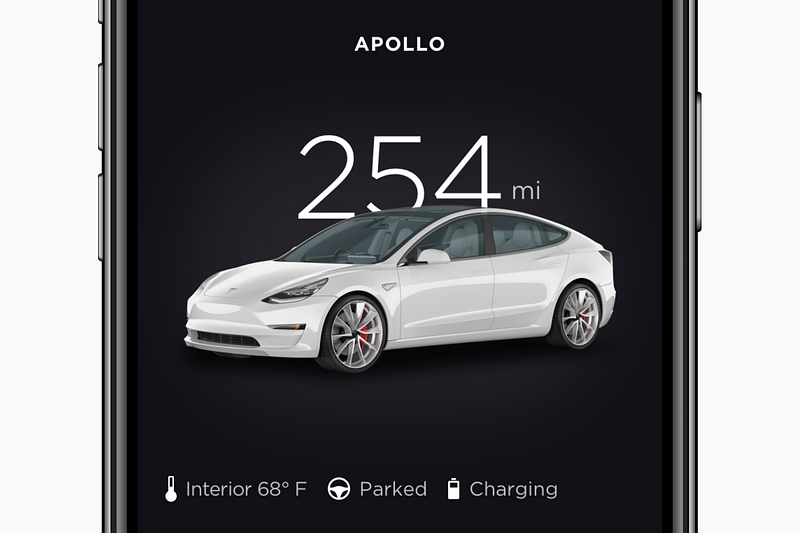
Besides a visual refresh, the summon remote page stays mostly the same as the one on the current application. Although I have experimented with different interactions, I felt that the current model was effective at its job, and was probably backed by countless hours of research on what would feel the safest to pilot your $35,000 car from your phone. Status SnapshotThe next area of improvement is what I call the “status snapshot”. As the name implies, this is simply an overview of how your car is doing. This information is kind of all over the place with the current application. For example, interior temperature is a caption underneath the climate table cell, and ‘parked’ just appears awkwardly underneath the battery. In my model, these status indicators all reside in the same place, making it easy to assess your car at a glance. I felt that keeping the car as it is in the current application was also necessary as it provides the ability for visual indicators of the car status; such as whether or not a door has been left open. The Bottom RowBy reorganizing the entire structure of the application, I was able to populate a second row of icons with additional necessary remote functions. This row is the closest extension of the key fob metaphor, as these are all functions you’d find on a typical key fob. As mentioned before, I took the open charge port button from the current app’s “Charging Page” and placed it here. And, while I do have my gesture-based opening method for the frunk and trunk, I still wanted to include standard buttons for these actions as a secondary option. I also added an option to vent the windows and/or sunroof. Lastly, I combined flashing the lights and honking the horn into one “panic” button. Frankly, I don’t like the name, but looking at the many different key fobs on the market, the designation of “panic” for this kind of feature seemed to be an industry standard. ReflectionI started this redesign really as a challenge. A challenge for me to start a personal project, and to see it through to the end. And I’m so glad I did. Throughout school, I’ve done projects I’ve been assigned to do. In my internships and client work, I have worked on products the businesses needed. However, this was an opportunity to do something for it and my own sake; to fully explore my own sense of creativity and passion for design. And well maybe it’s because it’s my last year in college, but that existentialism really has started to hit me. I remember in high school, I’d stay up long nights, working tirelessly on creative projects and passions. I’d grind until to 2 or 3 AM forgoing sleep and studies, because that was the only time in the day that I could work on it. I’d zone out in school, not because I was bored, but because to focus on anything else would be remiss. I’m lucky and grateful that I’ve been able to study a creative field, and even more lucky to pursue it as a career. And although creative work is my life now, I think I’ve forgotten just how important it is to still get away from it all and do something by myself, for myself. Thanks for ReadingThank you so much for reading through this case study! I really didn’t expect to write this much, but honestly I’d quite like to try it again sometime. Hope you enjoyed learning about my design and thought process, and I’d love to hear your feedback and learn from you! Sketch, Principle, Photoshop, and After Effects were used in combination for this project. Hi, my name is Matthew Farmer. The post Redesigning the mobile app that Tesla deserves - a UX case study appeared first on Design your way. from https://www.designyourway.net/blog/user-experience/redesigning-the-mobile-app-that-tesla-deserves/
0 Comments
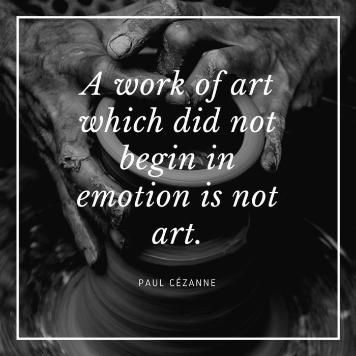
Superhero logos are as interesting and important as a logo design for Apple. Superhero symbols instantly identify a hero. A superhero logo is used at the scene of a crime and many hero symbols are drawn into the sky to show that a city is being protected by a powerful being. Superhero logos are also used to promote a movie or sell merchandise. Fans who identify with a superhero wear hero symbols to show their appreciation. Whatever a superhero stands for, logos need to be bright enough, bold enough or cool enough for fans to identify. Fans who wear hero logos want to it to represent the power and awe of the character. How does a crime fighter choose a superhero symbol? Should hero symbols represent the animal a hero has a deep connection with, like the Batman logo? Or should superhero emblems use the letters of a character’s name as a form of easy identification? When superheroes get their logos right, they become easily identifiable throughout the world. When companies are paid large amounts of money to create great iconic logos, how is it that superhero symbols are created by the supers themselves? ExamplesIs it their superhuman skills which enable our heroes to design superhero emblems which stand out from the crowd? And why are their outfits just so awesome? If you want to create a great superhero logo to express your own superpowers here are some cool superhero logos to draw inspiration from. Batman Logo DesignBatman is a mysterious character and his logo shares as much. Although the logo has changed and transformed over time and the media used, the overall concept remains consistent. Batman’s logo is simple and easy to identify. He has a silhouette with pointed ears and outstretched wings. Batman’s logo is as mysterious as our hero himself. When Tim Burton released his Batman film in 1989, the logo was loved by fans that wore it on their clothing or displayed it on their coffee cups or stationary. Batman’s logo is sometimes displayed in a yellow oval, often against a dark background. Batman appeals to the fashionable and the cool. His super hero symbol has been used on cars and gadgets and shines from the sky as a warning to criminals. The Batman story has undergone changes as his story has changed and developed. Nevertheless, he is one of the most loved and adored of the comic book heroes. Like all superheroes, he wears a costume, with his superhero logo shining out from his chest. Like many comic book heroes he does this to divert his enemies. While enemies fire bullets at the hero logos, the bullets are wasted and the hero emerges as strong, whole and able to disarm his enemies. Batman has a dark logo which expresses his mystery. Encased in attention-grabbing yellow he also appears to be warm. Our dark hero identifies with the bat in his logo but he does not possess any powers. His logo, a dark symbol in a bright, oval shape, shares his mystique as a man emerging from the darkness to combat crime. Superman Logo DesignSuperman is one of the greatest and most memorable superheroes, and what would he be without his super hero logo. Superman’s super hero emblem has certainly evolved since its first introduction back in 1938. At this time, the “S” was not representative of a super status at all. Instead it was small and no more than a squiggle. But was it ever meant to be an S? The symbol comes from Krypton and symbolises superman’s original family. If it looked like an “S” on earth, it may have been a coincidence. The symbol was vague and comic artist John Byrne shared that he believed it was two small fishes who were travelling towards one another. The “S” has changed in this superhero’s logo. The “S” now stands for the name Superman. Placing Superman’s symbol in a shield showed that he had warrior or super hero qualities which would protect him from evil. Superman’s logo is so easily identifiable that when Bizarro reversed the logo it was easy to spot. Fans knew that any reversal of hero symbols indicated a move towards evil. Like many effective logos Superman’s super hero logo showed simplicity and an easily identifiable and iconic design. However, this logo was created with a great deal of thought. Strength is shown through the upside down triangular shape but the logo also represents the diamond, the strongest mineral in the world. Superman’s superhero symbol, placed upon a tight fitting suit which reveals a strong physique, is symbolic of strength and masculinity. The red and yellow colours used in the logo are strong and bold enough to attract attention while displaying passion and vitality. Captain America Logo Design
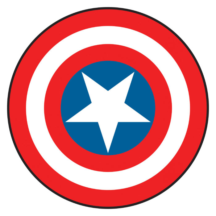
Captain America displays the national red, white and blue colours which symbolise glory. These are the perfect colours for a hero committed to fighting an evil regime. Captain America was designed by the US government as a super hero or solider who would fight the Nazis. His super hero symbol displays his patriotism as a part of his badge. His shield contains a star which references the American flag. Circles (which bear the colours of the flag) refer to deeper meanings such as power, infinity and energy. Although many would identify Captain America’s shield as a part of his logo, his shield may not be considered to be a hero logo. Instead, the A featured on his head, like a cowl may be considered to be an alternate logo. Viewers however may relate to both (or either of the) hero symbols. Both have been carefully thought through and designed to create superhero logos that an audience can identify immediately. The Flash Logo DesignThe Flash has a bright red and yellow costume which has a lightning bolt super hero logo placed upon the chest. The bold colours and lightening speed give a clear indication of The Flash’s identity. The Flash is so speedy that he might not even need a superhero logo. After all, he moves as quickly as lightening moves. Would we be able to see it? Without his logo, however, he wouldn’t be as easily identifiable. Creating a simple logo which stands out against the background of his chest is a great way to go. A bolt of lightning surrounded by a bright circle gives a quick flash of the character in the midst of the action. By using a letter to identify Flash, the symbol would not have as much impact. It may take too long to read. Criminals (and viewers) would no longer understand who had come to the scene of a crime. The flash has a bold personality which is expressed by the bright red and yellow colours shaping his logo. As a bold bright and passionate superhero, The Flash fights against injustice at a speed which is hard to match. He is as warm and passionate about his community as the colours in his logo. As a result his super hero symbol describes him perfectly. Green Lantern Logo Design
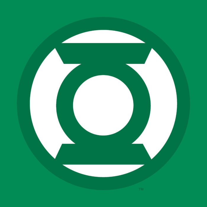
The Green Lantern is easily identified by his green colour. As a unique superhero, The Green Lantern has a super hero logo which is as interesting as he is. A unique looking lantern is featured inside of a white circle. In some ways, this lantern appears to be a bulls-eye. The Green Lantern has rings present in many super hero logos. However they apply to Green Lantern in particular as he uses a power ring as his main tool. His logo is easily identifiable, simple and iconic, making it one of the perfect superhero logos for fans to relate to. There are many different Green Lanterns who are on patrol throughout the universe. Using the name ‘The Magic Ring Extension Cords Corps’ all wear the same hero symbols. The logo is very literal and speaks directly to the characters identities. The Green Lantern corps uses this lantern as a symbol of willpower. Each has a black, white and green costume to identify them. The simple design of the Green Lantern superhero logo has always been appreciated by comic book fans. As superheroes reach a broader audience and appeal to more and more people, Green Lantern has become a valued superhero logo amongst fans. Punisher Logo DesignThe Punisher goes to war against crime, using a skull as his superhero logo. This interesting character was seen to be an angel of vengeance, a stitched together Frankenstein style monster and a normal man with a large range of weapons at his disposal. Regardless of the range of different skills this vigilante possesses or how he has been defined, he is identified by the skull which is symbolic of his fight against crime. Like many Superhero logos, the Punisher’s iconic skull is placed on his chest. The Punisher has placed his superhero insignia upon his black body armour to give criminals a target to aim at. Many criminals would naturally aim their weapons at the chest, seeing it as a vulnerable spot. However, by being forced to face the image of a skull, these wrongdoers are now forced to look death in the face. The Punisher with his deadly super hero’s logo has been around since the 70s. Over time he has grown stronger as both a vigilante and a hero amongst his fans. His skull logo has made a great choice. Unlike some superheroes, The Punisher is not out to create a bright and friendly image. Instead, he is an unorthodox superhero who has set out to fight organised crime. He is also seeking vengeance for the death of his family. As a result, the superheroes logo is unfriendly and threatening. Long teeth combined with the deadly skull aim to give a threatening and intimidating impression. Spiderman Logo Design
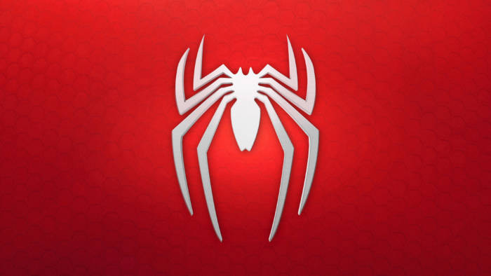
Spiderman’s suits have changed over time as the superhero has evolved. We have learned more about his back story as well as his dark side. And yet his superhero logo, the slender and iconic spider, has remained consistent. The spider motif symbolises the venom which gave our superhero his powers. The Spider superheroes logo has been used by other heroes of the Marvel world, including as a female superhero logo used by Spider Woman. Spiderman has one of the coolest superhero logos and one of the most symbolic. Spiderman is depicted by a very simple spider. The spider is black and stands out against a red background. Neutral and strong colours combine to give this classic superhero logo its visual appeal. The logo appears in simple silhouette form which gives it an easily identifiable appearance. Why did Peter Parker design his Spiderman costume in the way he did? He has a spider in the middle of a blue and green costume embossed with a webbed design. He costume is as intricate as the logo is simple. Perhaps this is why his costume has changed while his logo has been retained over time. Spiderman has one of the most easily identifiable superhero logos and has retained his popularity. Spiderman’s logo has become increasingly popular with fans. The simplicity of the logo has given it a universal appeal. Catwoman Logo Design
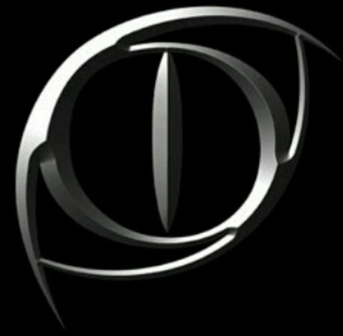
If you are looking for great female superheroes logos, Catwoman’s logo design will appeal to you. This logo combines the sleek and graceful appearance of a cat alongside simplicity of design. This superheroes logo design is black and silver and gives the appearance of a cat’s eye. The different shapes created in off centre position give this logo a great aesthetic appeal. Like many superhero logos, this one is attention grabbing. Sharp edges, a 3D appearance and sleek colours depict our heroine as graceful and unusual. Wonder Woman Logo Design
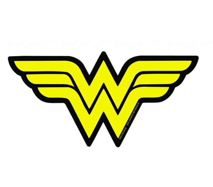
Wonder Woman uses a double W in her logo and is one of those characters where hero logos and names combine. Her logo has a double meaning however. The double W does not only represent our hero’s name but also a bird with wings spread out. This is a great example of hero’s symbols sharing the superpower behind their characters. Wonder Woman’s greatest power is her ability to fly. Wonder Woman reveals herself to be a patriotic character with the red white and blue colouring of her costume along with her stars representing her nationality. X-men Logo Design
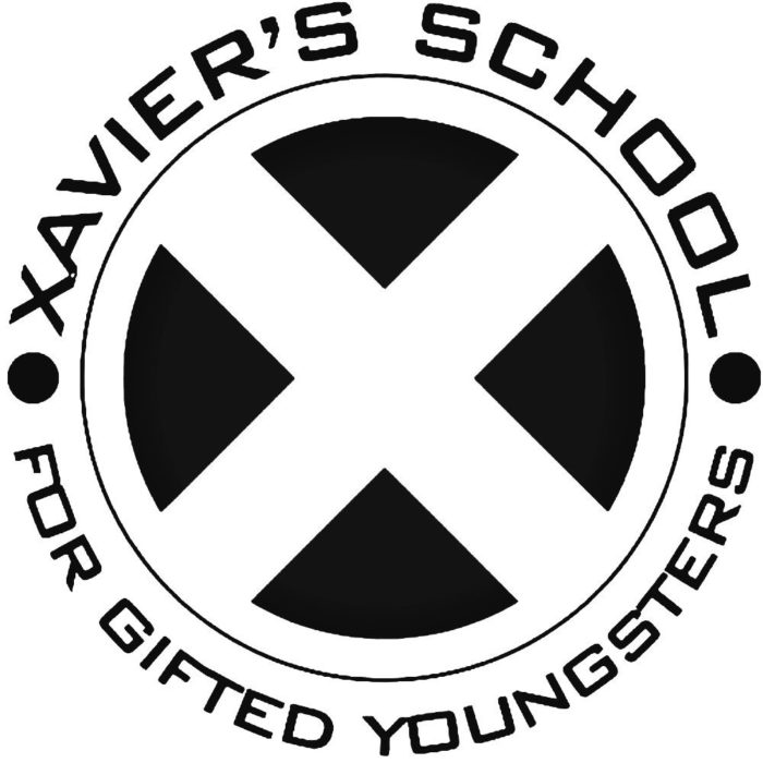
The X-Men are a group who fight crime and these superhero logos are made up of a large X which is surrounded by a circle. This X is symbolic in many ways. Firstly, a mutant X gene is what gives powers to these superheroes. Secondly, Professor Charles Xavier or Professor X is known for his humanitarianism towards mutant beings. Lastly, many mutant teams have incorporated the letter X into their names including Generation X, the Exiles, Excalibur, and X Factor and X force. Like many superhero logos, this one is highly symbolic. The light in the middle of the X men logo represents knowledge as the group has created an institute to extend humanity towards mutants. The logo is simple, memorable and easy to identify, making it one of the coolest superhero logos available. Fantastic FourThe Fantastic Four logo has been one of the most changeable of the superhero symbols. Yet even though it has been changed or updated throughout the years, it has kept the same simple core. The Fantastic Four team is dynamic, changing over the years with characters like She Hulk and Wolverine joining the family. The Fantastic Four represent one of Marvel’s first superhero families. With the death of The Human Torch, the Fantastic Four comics have gone silent. However, when all members of the fantastic four formed part of a group, they were symbolised by a 4. This 4 formed part of the group’s identity from the very first comic book. The identifiable 4 logo was important for the Fantastic Four because at one time the team wore civilian clothes. This simple and easy shared superheroes logo was shared between team members to symbolise belonging. Deadpool
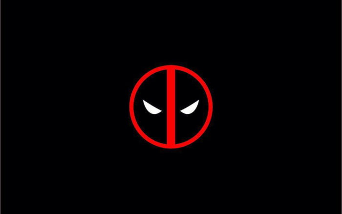
Deadpool has a superheroes logo which appears to be a road sign circled in red, with a straight red line running through the centre. The logo is filled with black and shows two evil eyes shining out from the darkness. The logo became world famous because of the Deadpool film. Deadpool is otherwise known as Wade Wilson and is considered to be an anti-hero, as shown by his logo. No list of superhero logos would be complete without Deadpool. Daredevil
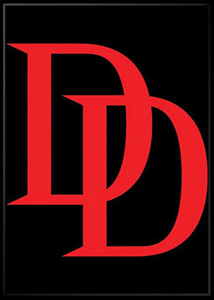
Daredevil’s superhero logo design has changed over time. When he was first introduced by Marvel, his logo contained the simple letter D. With the double D sound as a part of his name however, the logo soon increased to a double D. The Daredevil logo is an example of cool superhero symbols which make use of a character’s name. Robin
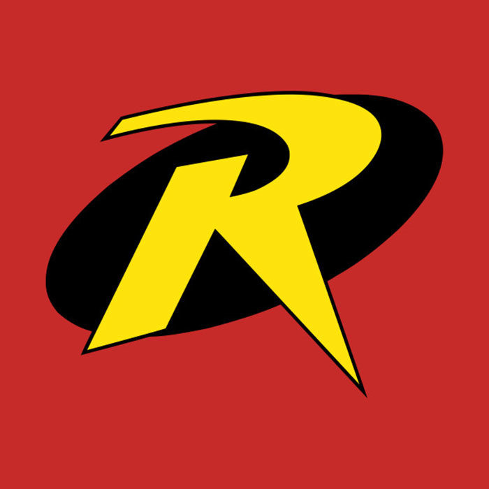
Robin is Batman’s side kick, but the superhero’s logo could not have been more different from that of the mysterious Dark Knight. Robin has always had a bright costume while Batman has lurked in the shadows. While Batman got a logo symbolising mystery and intrigue, Robin got a simple yellow R in a black circle. The most cool superhero symbols were not available to Robin. Robin’s logo is nevertheless simple and easily recognisable. While its lack of intrigue may show that Robin is the brighter and simpler of the pair, it does identify him. Robin’s logo may not look cool on the side of a car but as second place, his does stand out as a super hero symbol. Shazam
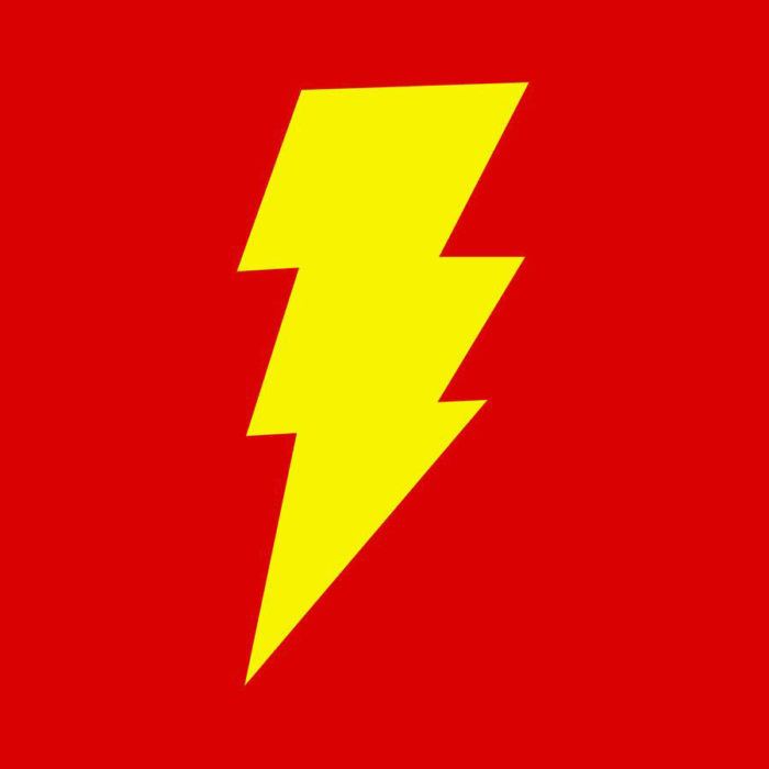
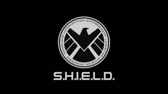
The Flash and Shazam both represent stormy weather within their superhero logos, there is a difference. While The Flash has a sleeker design that gives a rapid glimpse of a lightning bolt, Shazam has a bolder styled thunderclap for him. Shazam’s transformation process is macho and noisy, as whenever he claps his hands and shouts “Shazam!” young Billy Batson changes into Captain Marvel. At one stage, Captain Marvel was more popular than Superman. This great logo symbolises his transformation process and makes a great super hero symbol. Agents of S.H.I.E.L.D.and HydraAgents of S.H.I.E.L.D. represent Marvel’s elite crime fighting agencies. Hydra is a devious terrorist organisation which is on the other side of the law. Both rival each other and their superhero logos, like their ideals, are at complete opposites. S.H.I.E.L.D. uses an eagle as part of its logo. Eagles are associated with bravery, freedom, strength of character and with masculinity. Eagles rise above the earth as vigilant watchers and it is no wonder they represent S.H.I.E.L.D. when it comes to tracking predators. 
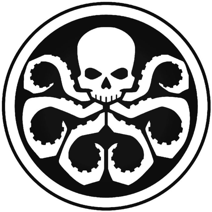
Hydra is portrayed as sinister and uses the serpentine hydra, an underwater monster from Greek mythology, to symbolise its organisation. The flexible serpentine arms symbolise the terrorism and damage Hydra is capable of, as well as the cracks it seeks out in the Agents of S.H.I.E.L.D. team. These logos and symbols give excellent representation of the values of their organisations. As superhero logos they are also easily identifiable and simple in design. The AvengersThe Avengers superhero logo is a team symbol which is also representative of excellence, or a call to action. This very cool superhero logo is easy to reproduce, colour and add texture too, depending on where it will be displayed. It is very easy to identify and popular with fans. Ending thoughts on these superhero logosIf you are passionate about superhero logos, and would love to be viewed as a superhero yourself, take inspiration. The simplicity and meaning behind these great logos makes them both aesthetic and appealing. Better yet, they are easy to identify. If you view your company as a superhero with an ability to fight on your clients’ behalf, why not design a superhero logo which represents your brand? The simplicity and beauty of the logos offered up by both Marvel and DC Comics makes them easily identifiable and popular with fans. Explore more logos for further inspiration. This list is simply the tip of the iceberg. If you enjoyed reading this article about these superhero logos, you should read these as well:
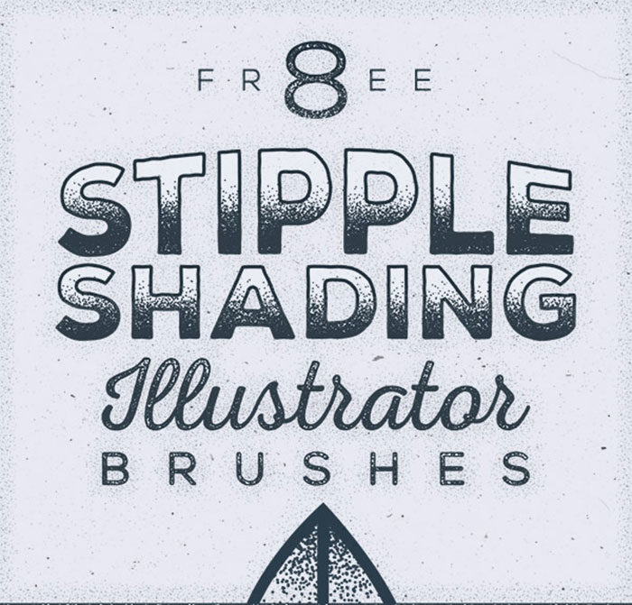
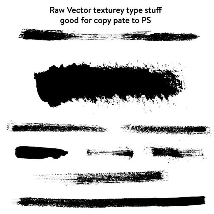
The post Superhero logos: The symbols of the comic book universe appeared first on Design your way. from https://www.designyourway.net/blog/graphic-design/superhero-logos/ Free illustrator brushes can seem hard to come by. This is because many bloggers or graphic designers focus on Photoshop brushes. So if you’re looking for Adobe Illustrator brushes which are freely available online, you’ve come to the right place. We’re here to show you where to find great illustrator brushes so that you can create an appealing vector brush stroke, adding texture to your designs. The Types of Illustrator brushesYou will be able to find three different sets of free Illustrator brushes online. You’ll get Art Brushes, Pattern Brushes and finally Scatter Brushes. You will be able to use each type with the Brush tool. However, each has a specific purpose. Illustrator brushes for art are used most frequently. You can use them as Illustrator line art brushes, or even as Illustrator ink brushes. They are there to make your art feel hand created. As the name suggests, Pattern Brushes enable you to repeat patterns for intricate designs. You can create shading, rough paint textures and grungy designs using Scatter Brushes. The best free brushes for illustratorIllustrator is a great program with many unique features. The Paintbrush tool allows you to use great Illustrator brushes to create a variety of different strokes. Vector brushes will add to your designs, taking away the flat effect and creating texture within a short time space. You can also change and adjust your brushes for Illustrator, adding new effects, weights or widths to your brush strokes. Here are some excellent Illustrator brushes free for your collection. Free Stipple Shading Brushes For Adobe IllustratorWould you like to add a stipple effect to your vector designs? Chris Spooner has created a set of eight Illustrator brushes to add instant texture to your artwork. Stippling will add a grungy effect to your work, creating dots of different densities. Your designs will appear to be shaded, adding retro appeal to your vector designs. Free Chinese Calligraphy Vector Brushes
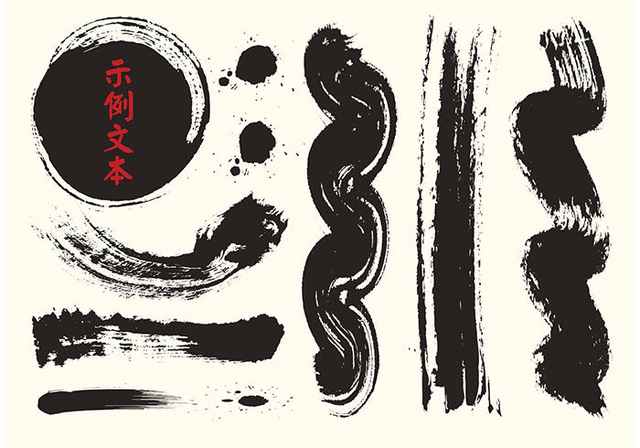
If you love calligraphy, then you will love these brushes for Illustrator. You’ll be able to create Chinese calligraphy with each of these thick Illustrator ink brushes offering a new form or texture. Free Watercolor Brushes For Illustrator
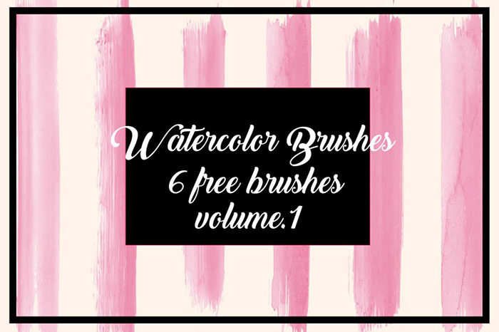
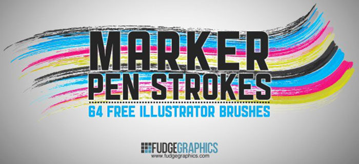
If you are looking for free Illustrator watercolor brushes, this set has six free brushes which have been inspired by traditional watercolor painting. 64 Free Marker Pen Illustrator Brushes
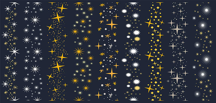
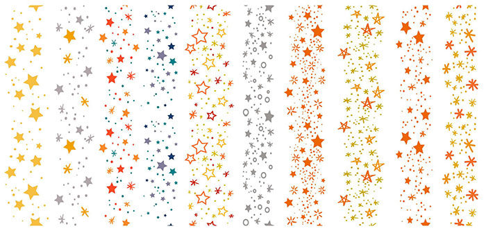
Would you like a great pack of free Illustrator brushes? This great collection from Fudgegraphics’ Franz Jeitz has been created to imitate pen marks and scribbles. You’ll be able to add a retro, hand created appeal to your vector designs using this great bumper pack. Free Sparkly Stars Brushes VectorsWould you like vector brushes which enable your designs to sparkle? This great pack of free illustrator brushes has nine sparkly star brushes which will add life to your dark designs. Free Dry Vector Brushes
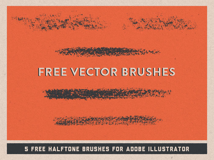
If you want to add vector brushes which will give a retro or vintage appeal to your designs, consider these brush collection by Kirk Wallace. These dry brushes make great vector brushes as they will add textures to your designs. Free Halftone Vector BrushesUI/UX designer Rob Brink has created a great set of free Illustrator brushes that you can use to create halftones in your designs. Rough up your vector brush stroke designs to create a retro style. If you find these brushes are not enough, you can also download a more complete pack from VectorTone (link above). You’ll get a large selection of brushes in different styles. Use these Vector brushes to add crosshatching or halftones to your work Rodeo: Hand Drawn Rope Brush
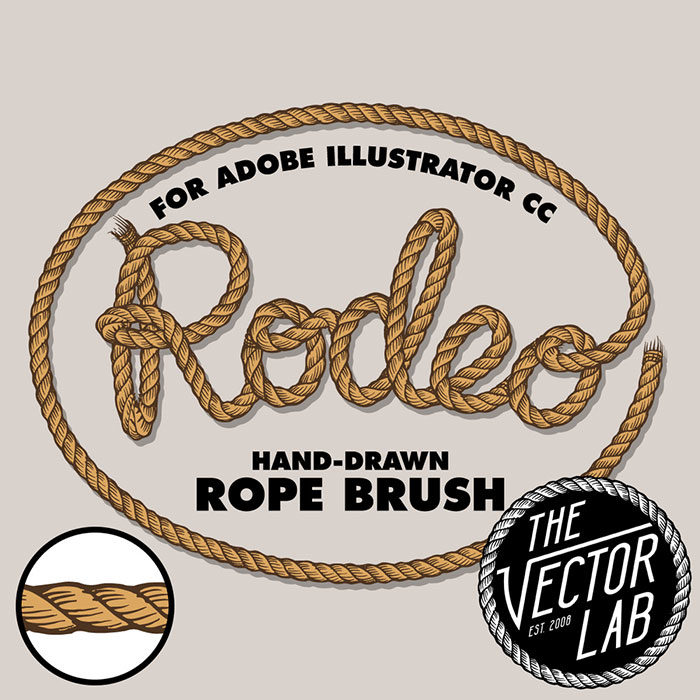
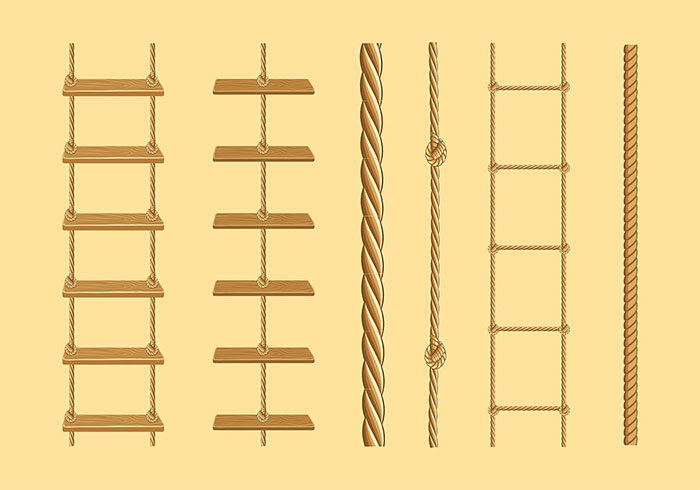
Ray Dombroski has created a great set of free brushes for Illustrator which can be used to add a rope design to your work. As an additional benefit, you can use these free rope brush Illustrator tools on any Illustrator program. Free Greek Key Brushes Vector
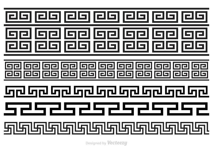
If you are a fan of Greek shapes, you will love these great free Illustrator brushes created in ornamental Greek designs. Brushes come in EPS format. Paper Tooth Line Brushes
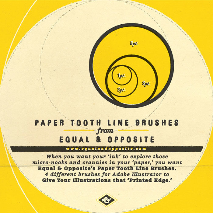
How about a free set of Illustrator brushes which will give your vector drawings a great handmade feel? You’ll get brushes for Illustrator which gives the appearance of ink which has bled into the grain of a paper drawing. Each brush has its own unique style. These free brushes for illustrator come in 1, 2, 3 and 5 points. You can also change their point size to add drama to your designs. Pastel Color Rainbow Brush Vector Pack
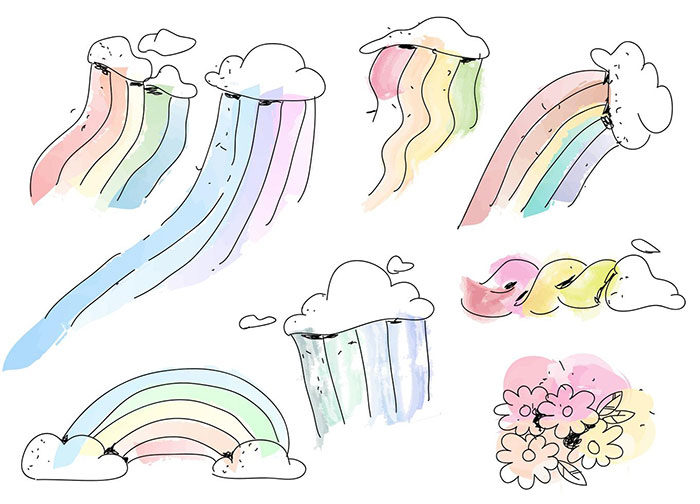
Would you like to use Illustrator brushes to add rainbows or flowers to your vector designs? This fun vector brush pack will give you a selection of pastel designs. Free Japan Brushes For Illustrator
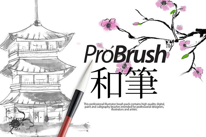
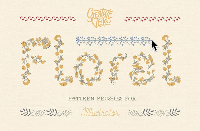
If you are a fan of Japanese designs, you will love this textured set of free Illustrator brushes. Create Japanese calligraphy with ease by adding this brush set to your collection. Free Floral Pattern Brushes For IllustratorIf you are a big fan of floral designs, you will love this brush pack which will give you 20 different free Illustrator brushes, each with its own floral design. Mycanthus Brush Pack
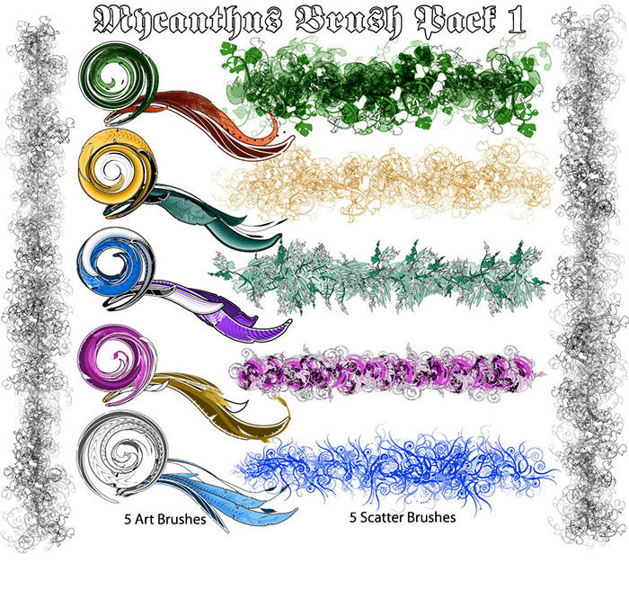
If you are looking for leaf brush Illustrator designs, this pack has swirly acanthus leaves. These free illustrator brushes will give you an ornamental design which is excellent for documents or ornamentation. Grunge Illustrator Brush Pack
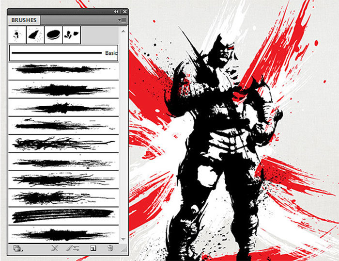
If you would like a grunge brush Illustrator set, you could benefit from downloading this free sample. This set contains eight free Illustrator brushes and comes from a larger set of 60 brushes. The pack was created by Sergey Kandakov, and will give a grungy appeal to your vectors. Fizz Brush Vector
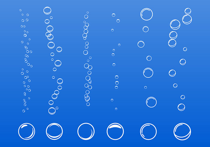
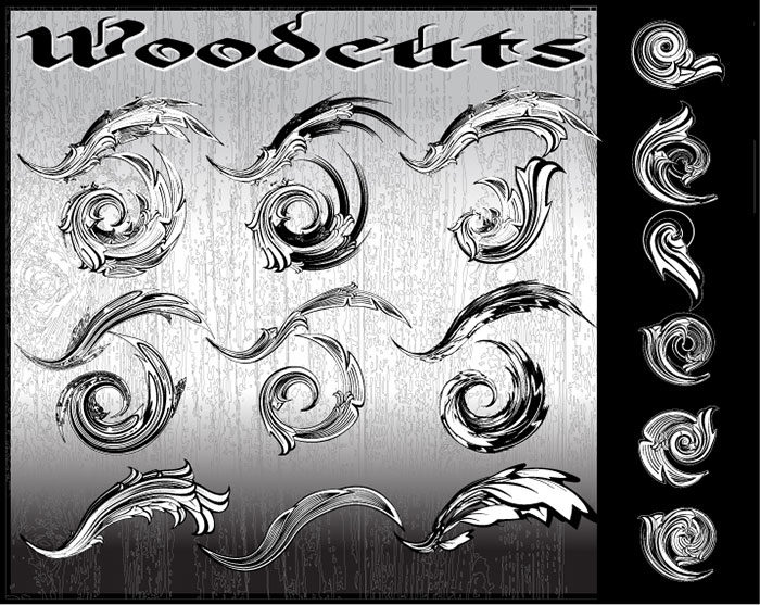
Add fizzes to your underwater vector designs with this great free Illustrator brush set. Designs come in various sizes and make a great choice for water themed designs. Woodcut: Free Illustrator BrushesDeviantArt recommends this great set of wood cut vector brushes. You will be able to add a great set of designs to your vectors as well as play with the shapes. Have fun while you design using this great set of free Illustrator brushes. Retrosupply Sample Illustrator Brushes
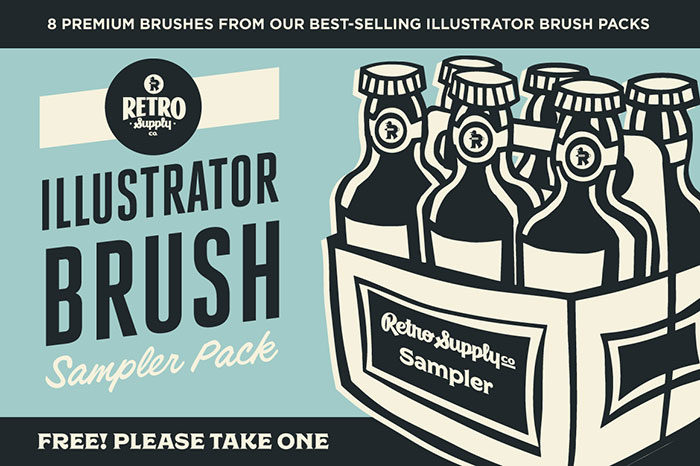
If you are absolutely mad about art brushes for Illustrator, you will love this sample pack. Von Glitschka has created this free set of Illustrator brushes and includes pen and ink brushes, a charcoal pencil brush, watercolor brushes and a wax crayon brush. You can add halftones to your designs as well as explore other free bonus items. Free Stars Brushes Vectors
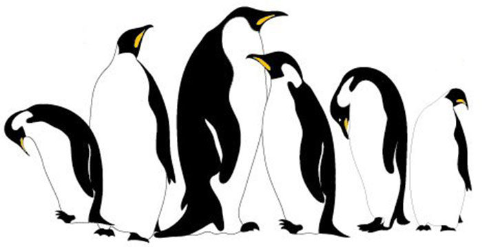
Would you like vector brushes which will add stars to your designs? This set of free Illustrator brushes will add star patterns to your designs. You can also use it to add borders or even create patterned wreaths. Emperor PenguinsDon’t you love penguins? Imagine being able to create them using a vector brush stroke? You can with this great set of brushes. One simple stroke and you will have an Emperor penguin to add to your designs! Cute Hand Drawn Style Border CollectionIf you’re a fan of heart borders and precisely created arrows, you will love this collection of Illustrator brushes. You’ll get a range of hand-drawn borders with this collection of cool Illustrator brushes. Add charm to your designs by downloading this collection for your toolkit. Rope Ladder Free VectorHow about using a free rope brush for Illustrator to create ladders on your vectors? There are six different brushes to create realistic rope ladders for your illustrations. Final thoughts on using these Illustrator brushesYou can use these Illustrator brushes to add art strokes, create texture and even add patterns or illustrations to your design. Brushes come in a range of different styles, and there are a great many free choices to add to your toolkit. You can spice up your designs, create a handmade appeal or add texture while using Illustrator brushes. You can use these Illustrator brushes to add magic to your art, or even boost your vectors by adding texture. Get creative by playing with fun-filled pattern. There is something for everybody in this collection of Illustrator brushes. As an additional benefit, these free brushes will enable you to work quickly, saving you time as you build up your design practice. Remember to take your overall design into consideration, selecting brushes which are perfect for your goals. This will help you to add interesting and creative elements to your designs. If you enjoyed reading this article about using these Illustrator brushes, you should read these as well:
The post Free illustrator brushes to download and use for vector designs appeared first on Design your way. from https://www.designyourway.net/blog/resources/illustrator-brushes/ When you use a yellow color palette, you’ll be drawing on one of the brightest of all colors. Yellow is attention-grabbing, warm and alive. Nature shows us many different shades of yellow. We are familiar with the deep orange-yellow of egg yolks, bright yellow daffodils, soft yellow lemons or the deep yellow color of bees. Yellow plays a big part in our contemporary world. It’s the color of happy faces, Brazilian football shirts, and yellow has also been used in danger signs. Using a yellow color palette and the universal meanings of yellow
The color yellow in nature and cultureUsing a yellow color will always feel warm and sunny. However, like red, yellow has two different meanings. From one perspective yellow is about sunny warmth, enjoyment and celebration. From a different perspective cowards are described as being ‘yellow’. Yellow is also the color of deceit. The color yellow is very bright and highly visible. Despite some negative connotations, it remains a very warm color. It is because yellow is so visible that it is often used to symbolize danger as well as for emergency vehicles. Throughout time, yellow has been used as a symbol of hope – a symbol that the sun will return out of the darkness. Women wore yellow ribbons in the hope that their men would return from war, and yellow ribbons are still a sign used as a welcome for loved ones who have gone away. However, although yellow is soft and welcoming, there is no doubt that it may also signal danger or caution (although yellow is not as threatening as red). Using shades of yellow in digital and print designUsing a yellow color palette can help you to create exciting designs. Although shades of yellow can be used alone in digital and print media, yellow works best when combined with other colors. Yellow will give your designs a fresh, sunny and even fruity atmosphere. If you are looking for a warm color without the intensity or darkness of red and orange, yellow makes a great substitute. You can also use a bright shade of golden yellow to substitute for a gold color palette. Yellow color combinations you can use:
How to create yellow color palettesWhen you create a yellow color palette, you’ll be able to combine the color yellow with other colors (obviously). You’ll be able to mix shades of yellow with neutrals, or shades of reds, greens and blues. The result can be earthy, sophisticated, fresh, psychedelic or rich. Here are some attractive color combinations using the color yellow:
Some familiar phrases associated with yellowPositive phrasesA yellow ribbon symbolizes the hope of a love returning, as in the song “Tie a yellow ribbon round the old oak tree.” The phrase ‘mellow yellow’ refers to feeling completely at ease and relaxed. Negative phrases:Yellow-bellied refers to cowardliness. Cowards are considered to be yellow, and are sometimes called ‘cowardly custard’ after the yellow pudding. Yellow journalism is seen to be unethical or irresponsible journalism which is used for drama or sensationalism rather than a sharing of stories or information. Using a yellow color palette in your designsWhen you use shades of yellow in your graphic design projects it’s worth noticing the subtle variations which exist. There is no single yellow color. Instead, there are shades of gold, mustard colors, ochre’s and bright yellows. There are deep yellow shades but no dark yellows. Although many colors become more intense when combined with the color black, yellow reacts badly, becoming an unappealing, sickly green color. Points to think about when you design using shades of yellow?Yellow is a bright and very eye catching color which attracts a great deal of attention. People are able to see yellow in at a glance. We are also far more likely to see yellow in our peripheral vision than any other color. Yellow offers a source of light and reflexivity, which is why rooms painted in yellow often have a vivid appearance. Used carefully, yellow can be illuminating. However, too much yellow can be overwhelming. Although yellow has been related to both sunny warmth and even associations with cowardliness, yellow can also be aggressive. Yellow is very intense and might sometimes appear too demanding or even aggressive. When yellow is used in large quantities it can become irritating. The various shades of yellowYellow shades can range from deep mustard to bright golden yellow. Paler yellow colors such as cream or lemon are very popular. Mellow Yellow Color
Hex #F8DE7E Royal Yellow ColorHex #FADA5E Gold ColorHex #F9A602 Cyber Yellow ColorHex #FFD300 Trombone ColorHex #D2B55B Khaki Color
Hex #C3B091 Goldenrod ColorHex #DAA520 Banana Color
Hex #FCF4A3 Tuscany Color
Hex #FCD12A Honey Color
Hex #FFC30B Dijon Color
Hex #C49102 Bumblebee Color
Hex #FCE205 Fire Yellow Color
Hex #FDA50F Ochre ColorHex #CC7722 Amber ColorHex #FFBF00 Flax ColorHex #EEDC82 Cream Color
Hex #FFFDD0 Beige Color
Hex #F5F5DC Peach ColorHex #FFE5B4 Lemon ColorHex #EFFD5F Laguna ColorHex #F8E473 Mustard ColorHex #FEDC56 Navajo ColorHex #FFDDAF Ecru Color
Hex #CEB180 Creating yellow color combinationsNow that you have an idea of the subtle shades of yellow available, you’ll be able to think of how to add shades of yellow into your designs. Yellow makes a sunny companion to darker colors, adding warmth as well as an eye catching appeal to your designs. As mentioned earlier, yellow and blue make an attractive color combination, with the warmth of yellow contrasting with peaceful blues. Purple contrasts highly with yellow, creating an attractive and vibrant effect. Yellow mixed with deep greens remind us of buttercups or daffodils, giving an earthy appearance. Deep moss or olive greens will add an earthy touch. Draw on lemon, orange and lime for a fresh, fruity palette. Black, when combined with a bright yellow color, can create a modern, very striking look. Think of the industrial appeal of a bumble bee. Ending thoughts on using a yellow color paletteYellow is a naturally sunny, light and vibrant color. The color yellow has therefore been associated with spring, summer sunshine, happiness, and enjoyment. Yellow remains an enchanting color which, when used carefully, will add life to your print or digital designs. From mustard yellow to a bright golden yellow color, there are shades of yellow for every design. We hope this guide assists you in creating subtle and attractive designs. If you enjoyed reading this article about using yellow color, you should read these as well:
The post Using a yellow color palette and the various shades of yellow appeared first on Design your way. from https://www.designyourway.net/blog/graphic-design/yellow-color-palette-shades/ Hotel website design offers viewers an online portfolio, showcasing a hotel and what it has to offer. When users are looking for a place to say, they jump onto the internet and search for top hotel websites at their destination place. The best hotel websites will offer guests the opportunity to peer into a hotel so that they can find out what is on offer. Alongside great reviews and favorable rates, your hotel website design will help you to attract customers. The very best hotel websites offer users a great experience (UX). UX determines how customers navigate a site and the enjoyment they get from using a hotel website. A great UX will assist a hotel to attract business. When you have a great hotel web design, you will be able to show your viewers why they should book at your hotel. This will increase your business. Here are some tips for a hotel website designThe best hotel websites tell a storyCompetition in the hospitality industry is high, and it may be hard to make your hotel website design stand out. However, when you tell a story about your hotel, you’ll create a warm and personal touch. Let people know the experiences they can have at your hotel. You can share your story through:
If your hotel appeals to tourists, don’t just limit yourself to sharing stories about the hotel. Look at the surrounding areas. Local tourist spots, cozy cafes and interesting spaces will all have appeal to your guests. You could even introduce your guests to the people who work with you, and who make your hotel feel welcoming and unique. Keep it simpleThe best hotel websites keep it simple. When you have too much clutter on your site, your viewers may feel overwhelmed or distracted. By keeping your site clean and uncluttered, you’ll invite your viewers to engage. Complicated websites can feel intimidating or just ‘too much’ and your viewers will often leave your site and look somewhere else. High conversion rates depend on a simple hotel web design. As Chanel says, less is more. A great website should look well put together, sophisticated and uncluttered. This is not only true for a luxury hotel website design. It is true for motel web design as well. Help your users focus on what is important, save them time and increase your conversion rate by keeping your hotel website design crisp, clean and easy on the eye. Keep your navigation easy to useYou can have the best hotel website in the world, but if your users don’t know how to navigate your site, they will never be able to book online. Here are some quick tips for great navigation:
Make your designs responsiveWhen your site is highly responsive and feels intuitive across all devices, this increases conversions. This is because an intuitive site means that guests will be able to book your hotel through their mobile phones or tablets. Guests will often look for a booking in their spare time, when mobile devices are used most frequently. Many guests also book at the last minute, and will search somewhere else if your site is not responsive. As a result, hotel website design should be highly responsive. Create a bold call to action buttonOne of the most important elements in hotel web design is your call to action button. This is what will encourage your guests to make a booking. It goes without saying that this button needs to be very visible. When creating your hotel web design, have a look at how your call to action button stands out. How visible is it? Are you using colour to attract attention? Is your text clear and legible? Your call to action is one of the most crucial elements when it comes to converting your viewers into clients. It needs to be given priority of place on your page. Some tips for creating a CTA button which stands out
A picture speaks a thousand wordsA hotel is all about aesthetics. Your clients will want to know what they will get when they book with you. By adding high quality images to your hotel web design you will be able to show them. Images of your hotel exterior, rooms, communal areas, restaurants and bathrooms will all show guests what your hotel offers. Create a virtual tour to include your visitorsBy adding a virtual tour, you will be able to engage your guests. Inviting your guests to an online tour allows them to experience your hotel. By including a virtual tour in your hotel website design, you’ll show your guests the atmosphere they will experience from the time they enter your hotel. This will help you to turn site visitors into clients. Create effective animationsIf you use animation on your site, remember to keep it subtle. The best hotel websites are simple rather than over – the – top. Subtle animations will appeal to your guests without overwhelming them. You can use jQuery as well as CSS3 to create sophisticated animations which are non – distracting. These animation styles are suitable for even a luxury hotel website design. Make it easy for your guests to contact you If your guests are looking to travel to your area, stay at your hotel or have even begun to settle in, you will want them to be able to contact you with ease. Not everyone may want to phone you to make a booking or send a query. The best hotel websites offer alternative ways for creating contact. Here are some suggestions to include in your hotel website design:
Make your hotel website design trustworthyIn order to make a booking, guest will have to know that it will be safe (and pleasant) to stay at your hotel. It is therefore important to show guests that your hotel is trustworthy. When creating your hotel website design, ensure you include signs that guests can trust you. These could be included on the first page. This will encourage your users to make (or complete) their reservations.
Share why your hotel is specialThe best hotel websites will always share why a hotel is special. Sometimes this means looking objectively. If you have a great cityscape, you might not always realize how appealing this will be to a new visitor. If you’re placed in a rural area, imagine how peaceful this might be to somebody seeing it for the first time. Likewise, an art gallery a block away from your hotel could be very attractive to potential visitors. Incorporate these elements into your hotel website design. Remember to focus on what is attractive inside of your hotel as well. If you offer waffles for breakfast or have a roaring fireplace in winter, you will benefit from including these elements in your site design. Attractive rooms, luxurious suites and great bathrooms are all attractive elements included in the best hotel websites. Allow visitors to make bookings from your siteAdd a bookings facility to your hotel website designs. If your visitors find you online, love your facilities but struggle to make online bookings, they may abandon your site. Online bookings spare users a great deal of administrative hassle. Calling a hotel, making a transfer and then emailing proof of payment includes many extra steps. The best hotel websites offer the opportunity to make bookings online. This is particularly important for guests who wish to book at the last minute. Boost your SEOCreate a hotel website design which will optimize your SEO. This will help your search engine rankings, drawing more traffic to your site. You can boost your SEO by adding keywords to your content as well as your title page, image and page descriptions. When you add your keywords, always include your location, as viewers will Google you according to area. If you have a specialty such as allowing pets, include this in your descriptions. This will help you to attract traffic to your site. A resort website design will also share all of the features on offer in the keywords in order to stand out from the competition. Showcase of hotel website designEnding thoughts on these hotel website designWe hope these hotel website design tips will help you to recreate an attractive site which will appeal to your viewers. We also hope you will increase the traffic to your site, helping you to grow in the hospitality industry. If you enjoyed reading this article about these hotel website design, you should read these as well:
The post Hotel website design: tips and examples of how to design hotel websites appeared first on Design your way. from https://www.designyourway.net/blog/web-design/hotel-website-design/ Art quotes inspire us to do our very best, working with renewed vigor. When you read quotes about art, you may feel uplifted and motivated to do your very best. Artists have experience in the field and understand what it takes to stimulate creativity. We’ve put together a collection of inspirational art quotes to uplift, motivate and encourage you. As an added bonus we’ve also added some funny quotes about art, simply just to make you laugh. Quotes about the arts:“For me, insanity is super sanity. The normal is psychotic. Normal means lack of imagination, lack of creativity.” Jean Dubuffet “If you hear a voice within you saying, ‘You are not a painter,’ then by all means paint, boy, and that voice will be silenced.” Vincent van Gogh “I can’t understand how anyone is able to paint without optimism. Despite the general pessimistic attitude in the world today, I am nothing but an optimist.” Hans Hofmann “A picture is a poem without words”Horace “I just decided, when someone says you can’t do something. DO MORE OF IT.” Faith Ringgold “I have no fear of making changes, destroying the image, etc., because the painting has a life of its own.” Jackson Pollock “A really good picture looks as if it’s happened at once. It’s an immediate image. For my own work, when a picture looks labored and overworked… I usually throw these out, though I think very often it takes ten of those over-labored efforts to produce one really beautiful wrist motion that is synchronized with your head and heart, and you have it, and therefore it looks as if it were born in a minute” Helen Frankenthaler “The principles of true art is not to portray, but to evoke” Jerzy Kosinski “As my artist’s statement explains, my work is utterly incomprehensible and is therefore full of deep significance”Calvin & Hobbes “If you are not skillful enough to sketch a man jumping out of a window in the time it takes him to fall from the fourth story to the ground, you will never be able to produce great works.” Eugène Delacroix “The mind loves the unknown. It loves images whose meaning is unknown, since the meaning of the mind itself is unknown.” Rene Magritte “Art is something that makes you breathe with a different kind of happiness.” Anni Albers “I am happy to be alive as long as I can paint.” Frida Kahlo “Color provokes a psychic vibration. Color hides a power still unknown but real, which acts on every part of the human body.” Wassily Kandinsky “I didn’t expect to recover from my second operation but since I did, I consider that I’m living on borrowed time. Every day that dawns is a gift to me and I take it in that way. I accept it gratefully without looking beyond it.” Henri Matisse “Painting from nature is not copying the object; it is realizing one’s sensations.” Paul Cézanne “You don’t take a photograph, you make it” Ansel Adams “If I create from the heart, nearly everything works: if from the head, almost nothing.” Marc Chagall “Every good composition is above all a work of abstraction. All good painters know this. But the painter cannot dispense with subjects altogether without his work suffering impoverishment.” Diego Rivera “The position of the artist is humble. He is essentially a channel.” Piet Mondrian “Those who do not want to imitate anything, produce nothing.” Salvador Dali “ In art, the hand can never execute anything higher than the heart can imagine.” Ralph Waldo Emerson “The job of the artist is always to deepen the mystery.” Francis Bacon “What moves men of genius, or rather what inspires their work, is not new ideas, but their obsession with the idea that what has already been said is still not enough.” – Eugene Delacroix “Art must be an expression of love or it is nothing.” Marc Chagall “Don’t be an art critic, but paint, there lies salvation.” Paul Cezanne “Life obliges me to do something, so I paint.” Rene Magritte “Life is the art of drawing without an eraser.” – John W. Gardner “The object isn’t to make art, it’s to be in that wonderful state which makes art inevitable.” – Robert Henri “Painting is easy when you don’t know how, but very difficult when you do.” Edgar Degas “To create one’s own world takes courage.” Georgia O’Keeffe “The object of art is not to reproduce reality, but to create a reality of the same intensity.” “Art is a collaboration between God and the artist, and the less the artist does the better.” – Andre Gide “I invent nothing, I rediscover.” Auguste Rodin “I would rather die of passion than of boredom.” Vincent van Gogh “Every artist dips his brush in his own soul, and paints his own nature into his pictures.” Henry Ward Beecher “It is important to express oneself…provided the feelings are real and are taken from you own experience.” Berthe Morisot “A Good artist has less time than ideas.” Martin Kippenberger “To be an artist is to believe in life.” Henry Moore “Every good painter paints what he is.” Jackson Pollock “Art is not what you see, but what you make others see.” Edgar Degas “Don’t think about making art, just get it done. Let everyone else decide if it’s good or bad, whether they love it or hate it. While they are deciding, make even more art.” Andy Warhol “I never paint dreams or nightmares. I paint my own reality.” Frida Kahlo “I paint for myself. I don’t know how to do anything else, anyway. Also I have to earn my living, and occupy myself.” Francis Bacon “I am seeking. I am striving. I am in it with all my heart.” Vincent van Gogh “Creativity takes courage.” Henri Matisse “If I could say it in words there would be no reason to paint.” Edward Hopper “They always say time changes things, but you actually have to change them yourself.” Andy Warhol “What I am seeking is not the real and not the unreal but rather the unconscious, the mystery of the instinctive in the human race.” Amadeo Modigliani “Art washes away from the soul the dust of everyday life.” Pablo Picasso “Great art picks up where nature ends.” Marc Chagall “A work of art which did not begin in emotion is not art.” Paul Cezanne “Nature is not only all that is visible to the eye.. it also includes the inner pictures of the soul.” Edvard Munch “An artist cannot fail; it is a success to be one.” Charles Horton Cooley “There’s no retirement for an artist, it’s your way of living so there’s no end to it.” Henry Moore “One can have no smaller or greater mastery than mastery of oneself.” Leonardo da Vinci “An artist never really finishes his work; he merely abandons it.” Paul Valéry “The aim of art is to represent not the outward appearance of things, but their inward significance.” Aristotle “No great artist ever sees things as they really are. If he did, he would cease to be an artist.” Oscar Wilde “Whether you succeed or not is irrelevant, there is no such thing. Making your unknown known is the important thing.” Georgia O’Keeffe “Painting is just another way of keeping a diary.” Pablo Picasso “Life beats down and crushes the soul and art reminds you that you have one.” Stella Adler “To send light into the darkness of men’s hearts – such is the duty of the artist.” Schumann “I want to touch people with my art. I want them to say ‘he feels deeply, he feels tenderly.’” Vincent Van Gogh “I found I could say things with color and shapes that I couldn’t say any other way–things I had no words for.” Georgia O’Keeffe “The artist is a receptacle for emotions that come from all over the place: from the sky, from the earth, from a scrap of paper, from a passing shape, from a spider’s web.” Pablo Picasso “The main thing is to be moved, to love, to hope, to tremble, to live.” Auguste Rodin “Painting is a means of self-enlightenment.” John Olsen “The emotions are sometimes so strong that I work without knowing it. The strokes come like speech.” Vincent Van Gogh “If I were called upon to define briefly the word Art, I should call it the reproduction of what the senses preceive in nature, seen through the veil of the soul.” Paul Cezanne “If you always do what you always did – you’ll always get what you always got.” “I don’t say everything, but I paint everything.” Pablo Picasso “The only time I feel alive is when I’m painting.” Vincent Van Gogh “The holy grail is to spend less time making the picture than it takes people to look at it.” Banksy “Art is the only way to run away without leaving home.” Twyla Tharp “Art is the stored honey of the human soul.” Theodore Dreiser “An artist is not paid for his labor but for his vision.” James McNeill Whistler “Great things are done by a series of small things brought together.” Vincent Van Gogh “Creativity is allowing yourself to make mistakes. Art is knowing which ones to keep.” Scott Adams “Inspiration does exist but it must find you working.” Pablo Picasso “The emotions are sometimes so strong that I work without knowing it. The strokes come like speech.” Vincent Van Gogh “The artist’s world is limitless. It can be found anywhere, far from where he lives or a few feet away. It is always on his doorstep.” Paul Strand “It’s not what you look at that matters, it’s what you see.” Henry David Thoreau “Be who you are and say what you feel because those who mind don’t matter and those who matter don’t mind.” DrSuess “There are painters who transform the sun into a yellow spot, but there are others who, thanks to their art and intelligence, transform a yellow spot into the sun.” Pablo Picasso “It is not the language of painters but the language of nature which one should listen to, the feeling for the things themselves, for reality, is more important than the feeling for pictures.” Vincent Van Gogh “If a man devotes himself to art, much evil is avoided that happens otherwise if one is idle.” Albrecht Durer “It took me four years to paint like Raphael, but a lifetime to paint like a child.” Pablo Picasso “I wish they would only take me as I am.” Vincent Van Gogh “Painting is the grandchild of nature. It is related to God.” Rembrandt “Art is never finished, only abandoned” Leonardo Da Vinci “To practice any art, no matter how well or badly, is a way to make your soul grow. So do it.” Kurt Vonnegut “It is a widely accepted notion among painters that it does not matter what one paints as long as it is well painted. This is the essence of academicism. There is no such thing as good painting about nothing.” Mark Rothko “Have no fear of perfection, you’ll never reach it.” Salvador Dali “The longer you look at an object, the more abstract it becomes, and, ironically, the more real.” Lucian Freud “Painting is poetry that is seen rather than felt, and poetry is painting that is felt rather than seen.” Leonardo da Vinci “Art is a lie that makes us realize truth.” Pablo Picasso “I saw the angel in the marble and carved until I set him free” Michelangelo “For me, painting is a way to forget life. It is a cry in the night, a strangled laugh.” Georges Rouault “There is no must in art because art is free.” Wassily Kandinsky “Poor is the pupil who does not surpass his master.” Leonardo da Vinci “If people knew how hard I worked to get my mastery, it wouldn’t seem so wonderful at all.” Michelangelo “Colour is my day-long obsession, joy and torment.” Claude Monet “Art, Undeniably, is conductive to happiness.” unknown “Love always brings difficulties, that is true, but the good side of it is that it gives energy.” Vincent Van Gogh “Every child is an artist. The problem is how to remain an artist once he grows up.” Pablo Picasso “Everything has its beauty, but not everyone sees it.” Andy Warhol “The greater the artist, the greater the doubt. Perfect confidence is granted to the less talented as a consolation prize.” Robert Hughes “If you ask me what I came to do in this world, I, an artist, will answer you: I am here to live out loud.” Émile Zola “I dream of painting and then I paint my dream.” Vincent Van Gogh “The world of reality has its limits; the world of imagination is boundless.” Jean-Jacques Rousseau “A painting is never finished – it simply stops in interesting places.” Paul Gardner “A great artist is always before his time or behind it.” George Moore “As practice makes perfect, I cannot but make progress; each drawing one makes, each study one paints, is a step forward.” Vincent van Gogh “Do not fear mistakes – there are none.” Miles David “A man paints with his brains and not with his hands.” Michelangelo “In our time there are many artists who do something because it is new; they see their value and their justification in this newness. They are deceiving themselves; novelty is seldom the essential. This has to do with one thing only; making a subject better from its intrinsic nature.” Henri de Toulouse Lautrec “You come to nature with all her theories, and she knocks them all flat.” Pierre Auguste Renoir Did you enjoy these art quotes?We hope you found inspiration amongst these art quotes. As Joseph Beuys explained, every human being is an artist. We hope the wise words found in these art quotes will inspire your creativity. Famous art quotes can motivate you to work from the soul, do your best and to keep trying until you reach your creative goals. These quotes about the arts are sure to inspire and motivate you to keep striving to do your best. Remember to share your favorite art quotes on social media. If you liked this article about art quotes, you should check out these as well:
The post Inspirational art quotes from artists and famous people appeared first on Design your way. from https://www.designyourway.net/blog/inspiration/art-quotes/ We all want the ability to inspire people and affect change in the world around us. In the modern digital era, the most effective way to do that is through the use of a website. Specifically, you require a website which allows you to show the world your story and your passions. Introducing the BeTop WordPress theme! This amazing theme is built specifically for people in fields such as public speaking, consulting, coaching, and fitness, so it has everything you need to convert curious visitors into paying customers who are eager to take your professional advice. Here we go over some of the best parts of the BeTop theme: Professional FeaturesStylemixThemes, the creator of the BeTop theme, has included a bunch of features which make it easy for professional consultants to showcase their industry knowledge and success. There are even industry-specific features for certain sectors, allowing you to tailor your website to your niche field. A Total of 8 Brilliant DemosThe demo themes included with BeTop allow you to see its versatility firsthand. BeTop can cover a wide range of specialisms and industries, such as therapy, yoga, life coaching, and much more. Each demo showcases unique aesthetics and layouts, and you can install your favorite variation with a single click if you want! Integrated Booking SystemBeTop comes with an integrated booking system, so you don’t need to go looking for unreliable booking plugins anymore! The integrated booking system comes complete with an appointment calendar and customer interface, allowing you to process online transactions and receive updates about your customer bookings immediately. Elementor Page BuilderComing complete with more than 20 custom modules, Elementor Page Builder helps you to create customized page layouts which are tailored to your needs. As you customize these pages, they will be displayed in front of you in real time. This way, you can harness all the relevant key features of BeTop and see exactly how your site will look if you save the changes. Custom WidgetsBeTop has a whopping 23 custom widgets, giving you even greater control over your website. You can customize the functioning of your website without ever writing a single line of code! WooCommerce CompatibilityBeTop is fully compatible with WooCommerce, although there are custom styles and features in BeTop which allow you to give WooCommerce a more professional stylish look while taking advantage of its practicality and security. Customized Headers and FootersBeTop comes complete with a header and footer builder, allowing you to create custom headers and footers which reflect your business’s brand and message. Showcase Your PersonalityBeTop is all about showcasing you, your professional experience, and your personality. At the end of the day, you’re your own best salesperson, and creating a strong positive impression with prospective clients is the key to success in professional consultation, whether you’re a yoga teacher or a therapist. Multimedia Home PageBeTop allows you to make a great first impression with your home page – the demo themes include photos, videos, lists, and copy layouts which allow you to easily introduce yourself and your business in a memorable manner. Dazzling PortfoliosBeTop comes equipped with a plethora of engaging portfolios which enable you to showcase your stories in the best light. There are tile, grid, and masonry layouts available, and visitors are directed to read your portfolio entries in a clean and intuitive format. Displaying EventsFirst of all, you can use BeTop’s weekly schedule calendar to publish time-based listings of your daily events, which is great if you have a regular schedule. Secondly, there is also a more traditional events calendar which allows customers to RSVP and view more detail about the events on each given day. Whether your schedule is predictable or not, BeTop makes it easy to plan events. Mobile and Desktop CompatibleOver 50% of web traffic comes from mobile devices and tablets, so it’s essential that you have a strong theme which is compatible across numerous devices. BeTop is completely responsive on all devices and screen sizes, producing a seamless browsing experience. GDPR CompliantBeTop is compliant with the EU’s GDPR regulations, taking every necessary precaution to ensure the safety of the data of website visitors. Make a Splash with BeTop!Why settle for a generic WordPress theme like everyone else? Instead, you need a website which perfectly encapsulates you, your business, and your brand message. BeTop is designed with consultants and coaches in mind, equipping you with all the features necessary to make a splash with prospective clients. Also, if you need any help, StylemixThemes are standing by to support you with their 24/7 support team. Just in case anything goes wrong, you’ll know that StylemixThemes are just a few seconds away! So, why not check out BeTop and give your website the breath of fresh air that it needs today? The post Introducing the BeTop WordPress Theme appeared first on Design your way. from https://www.designyourway.net/blog/wp/the-betop-wordpress-theme/ Creating bug-free software is always an admirable goal. Even though only a fraction of the bugs that go undetected will typically cause problems. The more serious problems are those that impact product usability. Usability issues are most often uncovered during a product’s initial prototyping stage. Here, the primary focus is on UX. During the final prototyping stage, user testing comes into play. Here, the focus tends to be more on resolving UI issues. An iterative approach may take longer and involve additional costs. But such an approach almost always pays for itself and saves money in the long run. The tools and resources presented here address design, prototyping, and design changes. Each of them is a time and money saver, and worth careful consideration. MasonIn the world of software design and development, the need for small change can sometimes create a big problem. Teams have to design a software change or added feature, coordinate the development, and schedule everything to fit into the next deployment cycle. Mason changes all that. This visual front-end feature-building platform helps teams work together to create immaculate features for their apps or other digital products. Teams can work swiftly, bypass any need for prototyping, wireframing, or coding, and do not have to wait for the next scheduled deployment cycle to implement the new feature. Teams benefit by being able to allow developers to spend their time on complex or priority coding projects, and clients benefit from the quicker response and faster turnaround Mason allows. With Mason, teams can maintain and efficiently manage large libraries of past and present front-end experiences. This remarkable feature-building software is easily triggered when you need it, and it won’t weight your site down. The solutions it provides are sound, reliable, extensible, and robust. UXPinThere are prototypes, and there are prototypes that are so powerful and realistic you almost believe the product you’re creating is already up and running. That’s what you can expect from UXPin – the ability to design genuinely pleasing UX that can be as close to the real thing as you want to make it. With UXPin’s library of code components, logical units, interactive states, and design systems, you or your team can create a perfect UX starting with concept-demonstrating wireframes and finishing with powerful interactive prototypes – in real time, and without ever having to leave the UXPin app. You’ll also be working with a software solution that’s a solid favorite of top companies like Microsoft and PayPal; not only because of its powerful prototype-building features, but because of its collaboration simplifying features as well. InterfacerA web designer that doesn’t have a large collection of design resources at his fingertips will end to spend a lot more time creating less than those that do. Interfacer is a collection of mockups, templates, icons, UI Kits, and more; all created by the most talented people you’ll find anywhere in the web design business. Everything offered is free and can be used on your commercial projects. WebflowIt makes little sense using several tools to design, build, and launch your responsive websites, when you can do everything with just one – and without coding. With Webflow, you have the ability to create a client-friendly CMS for every site you build and enjoy super-fast, managed hosting as well. Start a project on a blank canvas, start with a template, or with one of many UI kits. It’s up to you. Why are These Tools So Important?Having a Friendly UX Is the Best Approach to Increasing Your ConversionsThis has happened to all of us. We’re browsing the web in search of a particular product or service. We find two or three websites and check each one out. In doing so, one stands out from the others. The reason? It was not only easy to find what we were looking for, but the overall experience was a pleasant one. We almost felt like the website was built just to please us. Quite naturally, we bookmarked it for future reference. Wouldn’t it be nice if the website we ordered from and bookmarked was yours? Settle on a UX Design that Will Increase Brand LoyaltyA good UX can offer more than a pleasant journey. When done right, it can serve to build trust in your brand, your product line, or the service you offer. Seamless and enjoyable interactions can go a long way. They can create the first step toward a longstanding relationship with your customers. Your UX Design Can Promote Word of Mouth ReferralsNew customers are nice. Return customers are even better. Some businesses are the happiest when they experience a flow of referred customers. The trick here is to create a UX that provides a pleasant and rewarding journey. People should want to share their experience with others. Wouldn’t it be nice to create one that had people saying: “You should really check out this website”? ConclusionYou can save time and money and make clients happier by skipping prototyping You can do the same by building better, more powerful prototypes. You can do everything from a single platform. You can avoid reinventing the wheel by keeping a resource of free design aids handy. Pick the one you find most appealing, or select more than one. There are many paths to web design success and you’ve just been presented with 4 outstanding ones. The post You’re going to fall in love with these UX tools! Pick your favorite from these 4 examples appeared first on Design your way. from https://www.designyourway.net/blog/user-experience/ux-tools/ When you create a wine logo, you want to create a unique design which will stand out from the crowd. Wine is a sophisticated alcoholic drink which has been associated with wealth and glamour. It is considered to be a romantic drink and is associated with elegant dinners. Wine labeling is one of the most vital tools manufacturers use to place their products on the market. Some choose elegant designs while others add humor to an often elite market. No matter how a wine label has been designed, it is there to capture attention. There are many different wines which come from different parts of the world. The wine market is very competitive. As a result, wine packaging design is becoming increasingly important. This article is here to assist you to create a perfect wine logo. When you add style to a great bouquet, you will be set to please. Creating a stylish wine logoIf you are a small wine manufacturer, your wine logo will help you to stand out from the competition. Read on to find out about wine label design and how this will represent your brand. Entice your customers to buy the perfect bottle to enjoy over a delicious meal. Know your brand and your audienceWine labels don’t have a great deal of space. When you design wine labels, each aspect of your design must provide impact. Your wine logo will tell your story. Who are you, and what is the message behind your brand? While some wine labels may sell to a younger buyer looking for a unique product, others sell to a boutique market that is willing to pay large sums to a reputable brand. By telling the story in a way which engages your audience, you’ll be able to attract the right clientele to your product. Share your story while sharing the contents of your bottle. Design wine labels which appeal to your audienceOnce you know your audience, let this guide you in your wine label design. Your choices should catch the attention of your clientele. ColorWine bottle designs are fairly standard. Red wines are packaged in dark green bottles. This prevents the wine from oxidizing by keeping the light out. White wines are often sold in pale green or clear bottles. When you design your wine label, choose a design which will stand out against your bottle. This will help your wine to attract attention. Red wines often have dark or moody labels to suggest mystery and romance. Alternatively, a light label can be used. Light labels are printed using rich inks (gold, deep blues and dark reds). These colors create a crisp or light atmosphere. However, modern wine labels often break the rules, creating fresh and inviting designs which add a new element to wine packaging design. Wine label typographyOnce you’ve decided on the colours for your wine label design, it’s time to think about your lettering. If you choose to use dark colours on a red wine, make sure your lettering will be bold enough to add contrast. Your font is the perfect way to communicate with your customer. Your lettering will share what lies behind your packaging. It is a vital part of your wine labels design. Wineries often use lettering which shares a proud tradition of wine making. Authenticity is shared through traditional lettering. Wine labels often use serifs to symbolize history. Style and imagery in wine labelsWine logo designs may be elegant and sophisticated, modern and minimalist, or classical and traditionalist. Choose your overall style based on your audience as well as the personality behind your brand. Your wine logo will enable you to send a unique message to your customers. Think about what makes you special. How do you stand out from your competition? Are you a boutique brand who appeals to a select audience? Do you have a unique location or a proud family history in wine making? Is your name playful or interesting? Find the feature you want to draw on. A good graphic designer will be able to create a visual representation for your wine logo. If you want to show how clean and attractive your tasting room is, create a fresh label with a great deal of white space. A crisp font will enhance your message. Find the right graphic designer for your wine labelWhen you want to create a wine label design, you can go about it in three ways. You can do it yourself (if you have the knowledge and experience), hire a graphic designer or run a contest. DIY label designs might seem tempting. However, wine label design is so intricate, and will make such a difference to your end product, that you will need to be a skilled designer to attempt it. This means you can either hire a graphic designer or run a design competition. Before you start, have a look at some inspiring labels so that you can brief your designer. Here Are Some Fantastic Wine Label Designs That Will Inspire YouThe Localshare a drinkSixty VinesStairway WineArvinoLocal Wolves Wine markIntrovinousWinery BrandingThe Cloud FactoryThis simple wine bottle label design is simple and sophisticated. It uses only two colors. The label uses yellow and white to create a gentle appeal. Given the name of the brand, the soft design makes a perfect choice. Snake + HerringThis wine logo design uses natural elements to create a strong and raw appeal. A snake, an ocean, ship and wale combine to create a message of strength. This is an excellent wine bottle label design. Ali La BelleAli La Belle has a family tradition of winemaking. Their wine bottle designs appear friendly and approachable. Handwritten labels and soft colours create soothing appeal. This wine logo was created by a professional graphic designer. Both colour and font carefully were chosen to portray a gentle family business with a professional ethic. Mike Weir Underdog Wine Co.This wine bottle label design uses lettering to create a striking impression. The company name stands out against a white background to create one of the most stunning wine label designs. 359 Wine RangeThis great wine logo uses numbers to provide an easily identifiable label for the brand. The wine label design creates a bubbly effect, hinting at a pub style environment. Backyard Wine PackagingIf you are looking for a wine label which will inspire you, Backyard Wine Packaging has one of the best wine label designs on the market. This label uses great stems and watering cans to create a unique and very attractive appeal. The QuestThe quest uses a warrior in its wine logo to show the strength behind the brand. A white background gives a simple, crisp and clean look to this wine label design. Coma FredosaBlack and white design labels are often simple yet unique, and this is true for Coma Fredosa. The wine logo uses map elements to add an attractive appeal. The Bottle Of WitsFont, color and imagery combine in this great wine logo. The label attracts attention based on playful figures displayed using contrasting colors. Ending thoughts on wine logo designYour wine logo will provide an eye-catching tool to market your wine business. When displayed on your wine label, it will help you to communicate the message behind your brand. A great graphic designer will be able to design your wine logo to appeal to your audience. Your wine labeling will help you to attract your customer’s attention, helping to identify your brand. We hope you found this article helpful and will use these tips, as well as inspiring images of wine packaging design to create the perfect wine logo for your brand. If you enjoyed reading this article about wine logo design, you should read these as well:
The post Wine logo design: How to create stylish wine logos appeared first on Design your way. from https://www.designyourway.net/blog/graphic-design/wine-logo-design/ Low poly art is one of the coolest trends happening in the design world today. A low poly portrait has become a cool new way to design. Are you familiar with the term ‘low poly art’? If you don’t know what it means, think of the word polygon. Low poly art is simply a means of creating a mesh of polygons in order to create a famous face or portrait design. Low poly design can be awe-inspiring! It can be hard to believe that you are looking at a collection of polygons rather than a very detailed portrait. The result is highly creative. What is low poly art?You may not have heard of low poly design, but you have probably seen this style of work. Low poly images are created by placing geometric shapes side by side. The word ‘poly’ means ‘polygon’, which is a 2D geometric shape. The result is often minimalist, dramatic and very effective. Low poly art began during early days of 3D animation. Creating a low poly artwork helped to speed up the process of animation because it reduced rendering times. This technique is still used today. However, low poly art has become appreciated in its own right, growing increasingly popular as a design trend. As minimalism becomes increasingly popular, designers, illustrators and video game creators are using low poly graphics to show detail while still fitting in with a minimalist design style. The history of low poly imagesLow polygonal art dates back to the beginning of 3D animation. Low poly art saved time in creating renderings. Creating a mesh of shapes without too much detail saved a great deal of time. Images were not very detailed or complex. The low poly art style developed as a convenience but it has now become appreciated in its own right. The details of low poly designLow poly graphics can be simple or complex, depending on the number of shapes combined to create an image. Some images may use thousands of shapes to create a polygon portrait. However, the majority of low poly art is created using hundreds of images. Designers also have the option to use increased numbers of shapes in certain areas of a design, producing a gradient effect. When designers work to create a low poly art project, the aim is to give the impression of a 3D artwork. Many designers use minimal amounts of color or shapes, helping the viewer to recognize the object created while keeping their low poly images as simple as possible. The result is that a page often looks crumpled or as though it has been folded origami style. How to make low poly artPoly art can be created using an automated program, but the results cannot be guaranteed. Instead, it is better to create low poly images using Photoshop. Manually create your shapes using a grid. You can then add color, basing your choices on the most dominant colors which appear within an area. When working up close, you may find creating low poly art can feel detailed and even pedantic, but once you zoom out, the results will be stunning. The secret to creating awesome low polygon artDecide on your source materialWhen working to create low poly art, you’ll want a high-quality image to work from. Search for an image with great structure to base your designs on. This will help you to create effective results. It is difficult to create low poly art from your imagination, so do take time sourcing a great image for inspiration. Explore the shapes you’d like to useMost low poly pictures use straight lined shapes to create great images. Although you can work with curved images, this is not usual. Low poly graphics often have very geometric forms and tend not to be organic. Many designers work with simple shapes such as triangles or polygons. Your shapes won’t need to be the same size, and you can also use shapes with a different number of sides or proportions. However, the way you combine your shapes will have a big influence on your final result. Choosing carefully which shapes you would like to add to your low poly image is an important part of your design. Will you use symmetry in your designs?Would you like to use symmetry when creating a poly pic? Would you like each side to mirror the other? Low poly art doesn’t have to be symmetrical. You can work on creating abstract art, where your designs are asymmetrical and each side has a different goal or direction. What dimension will you be working in?When you create your low poly art, will you be working in 2D or 3D designs? Most low poly art uses 2D design. This is because low poly art often creates the illusion of a 3D design. However, they can work in 3D. Many low poly art designs give the impression of a 3D form. The image can be very detailed and will stand out from the page. Some designs, however, are flatter and far less 3D. What will be the context of your low poly image?Many low poly designs are inspired by illustrations. Although low poly began with early animation and moved into logos, it is now becoming an important element of graphic design. The combination of different shapes creates striking images. You can use low poly images in many different forms and for both digital and print designs. How would you like to use this trend?With low poly art becoming increasingly popular, it is up to you to find your own creative ways to use this technique. How would you like to use your designs, and what images would you like to form? Choose the color, shading, and textures which would help you to create depth to your designs. You can also play around with depths. Low poly art is great for logos, illustrations, and website designs. Examples of Low Poly ArtWe’ve put together a collection of great low poly images to inspire you while you decide how to do low poly art for your design projects. Jurassic Park Night DioramaLow Poly Jack Nicholson (Digital Art, Illustration)A great poly portrait of Jack Nicholson smoking a cigar comprised of 2520 polygons. Winter WonderlandTiny TornadoLow Poly Landscapes (Digital Art, Photography)A series of low poly art style landscapes created using Photoshop and Adobe Illustrator. Shapes! (Building Version)CapaRoja (Red Cape) (Fine Arts, Industrial Design)This low poly art project is a cardboard installation. This low poly art style focuses on memories of childhood using cardboard polygons. Quick Room Render (Night Version)Low Poly Series (Illustration, Landscape Design)Beautiful low poly art style landscapes. Low poly LighthouseLow Poly Characters (Character Design, Digital Art)A series of low poly images which create fantasy and action/adventure themes. 90s work deskLow Poly NatureLow poly art has been used to create beautiful images of the natural world, using geometric shapes. The Everywhere Project shows the gorgeous waterfalls of Diamantina in Brazil. You can also see beautiful images of animals commissioned by Greenpeace. These animals formed a part of the ‘Save the Arctic’ conference and were included on banners. See more of Timothy’s work on his website. Low Poly CityCastles
|
AuthorPleasure to introduce myself I am Jamie 27 years old living in Searcy, AR. I am web developer and have developed over 50 sites for clients. Now a days I am focused on designing as I feel I am lacking it. Archives
April 2019
Categories |