|
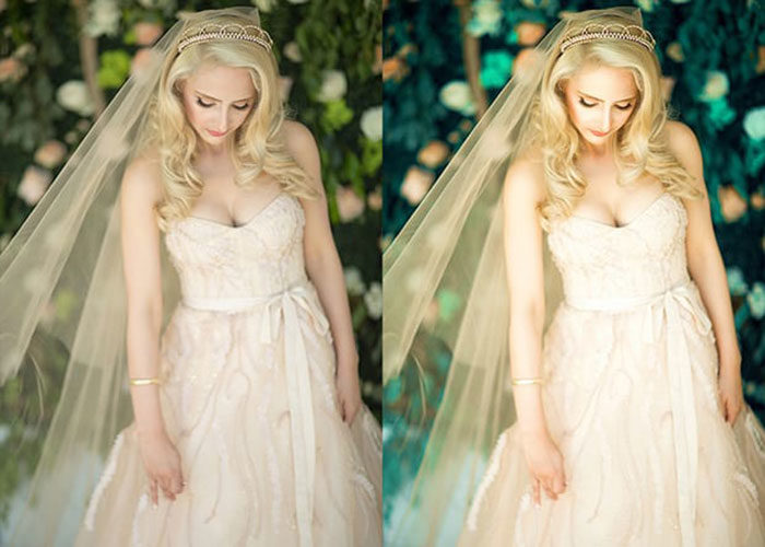
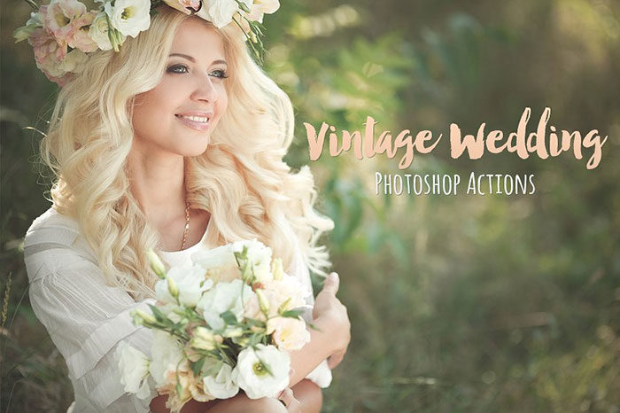
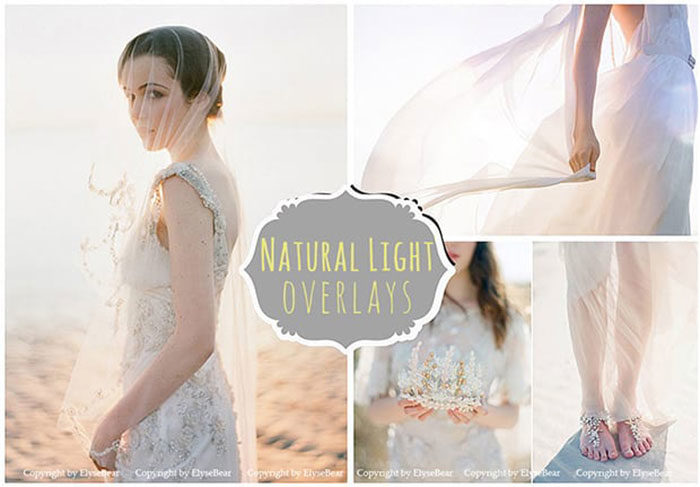
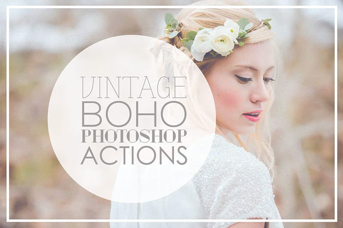
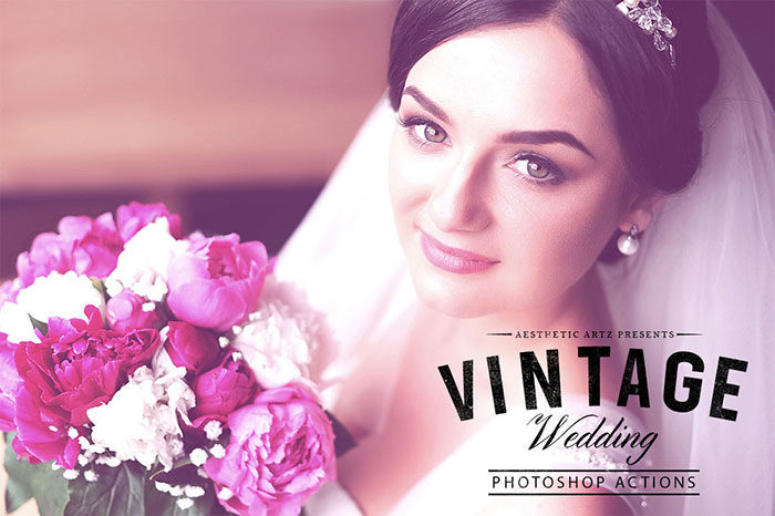
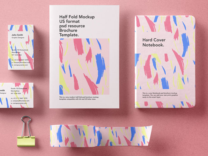
As a wedding photographer, you will be able to benefit from cool wedding Photoshop actions. Your wedding photo-shoot might involve group photos, photos of the bride, and still-life images of cakes, flowers or table settings, as well as couple photography. Many of these photos will need to be edited or touched up, and you will also need to make color adjustments. While working, you will want to make your photos appear as natural as possible. Our free Photoshop actions list will enable you to work efficiently while ensuring excellent quality. Our selection of Photoshop presets will enable you to create modern images with great settings to make your colors shine out. This selection of Photoshop actions includes both free and premium packages. By using them, you will be able to create sophisticated images by adjusting color, create stylish or classical images, and save time on touching up your images. Are you looking adding a vintage appeal to your photos? There will be great actions download for you. Adding a matte look while keeping colors clean and sophisticated? Check out our list of free Photoshop actions for a great option. By downloading free actions for Photoshop, you will be able to save time on the long and complicated job of retouching your photos while offering unique and very professional design options to your clients. Free wedding Photoshop actionsA professional Photoshop action will always give you a better product, but if your budget is low, we have some great Photoshop free actions for you to explore. Aesthetic Vintage Wedding
Certainly one of the best free Photoshop actions for creating elegant and professional wedding images, this product offers elegant colour. By using this action, you will be able to add or enhance your colour choices to create professional and very striking images. Download these Photoshop filters free for your wedding photography requirements. The Three Nails Collection
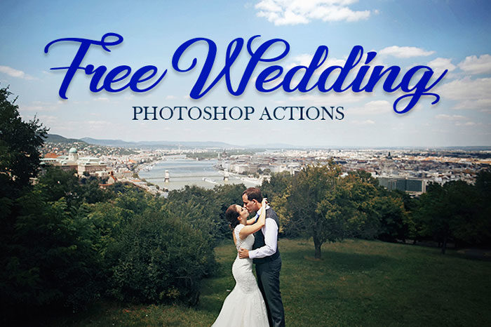
Wedding Photoshop Actions
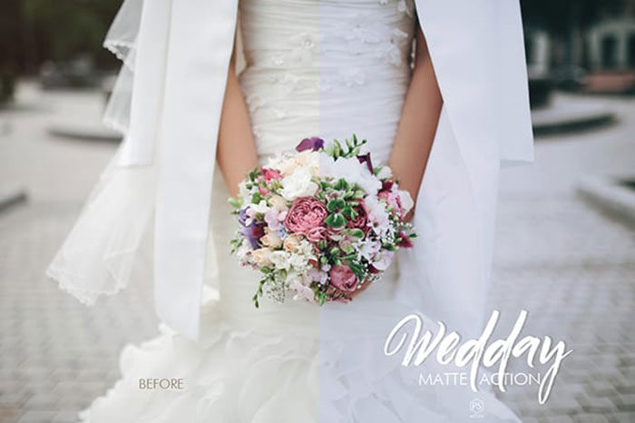
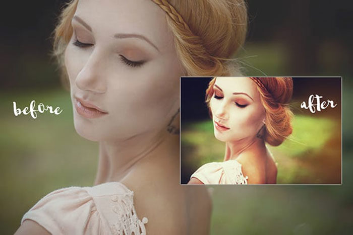
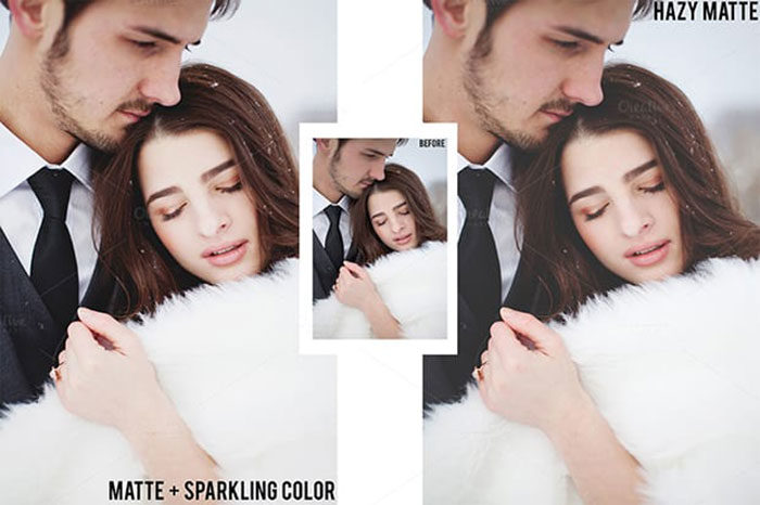
Are you looking for Photoshop actions but can’t yet afford a premium set? Try this free sample from a larger, premium collection. When you download this Photoshop action free, you’ll be getting a product which has been designed with wedding photography in mind. You’ll be able to extend the product use to your other photographs as well though. Wedday Matte Action
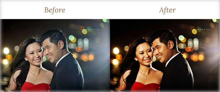
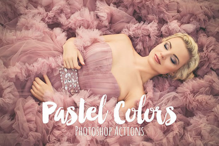
5 Beautiful Wedding Effects
If you are looking for wedding Photoshop actions which will give you the appearance of a faded film, this is a great choice. You will be able to get a sample of 5 photo effects to use with this download. However, as a SparkleStock member, you will be able to download all 12 Photoshop actions. You’ll find these psd actions easy to use for all your edits and touch ups. The Best Wedding Photoshop Actions Bundle
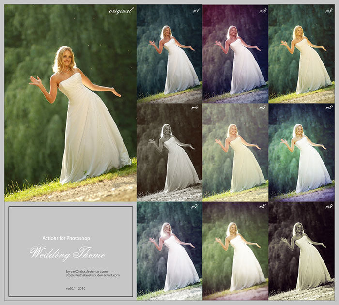
Wedding Theme Action
Are you looking for free actions which will give you a black and white effect? Would you like to use lomo effects in your designs? You can add these effects and more with this great set of 9 incredible Photoshop actions download. 175 Photoshop Wedding Actions
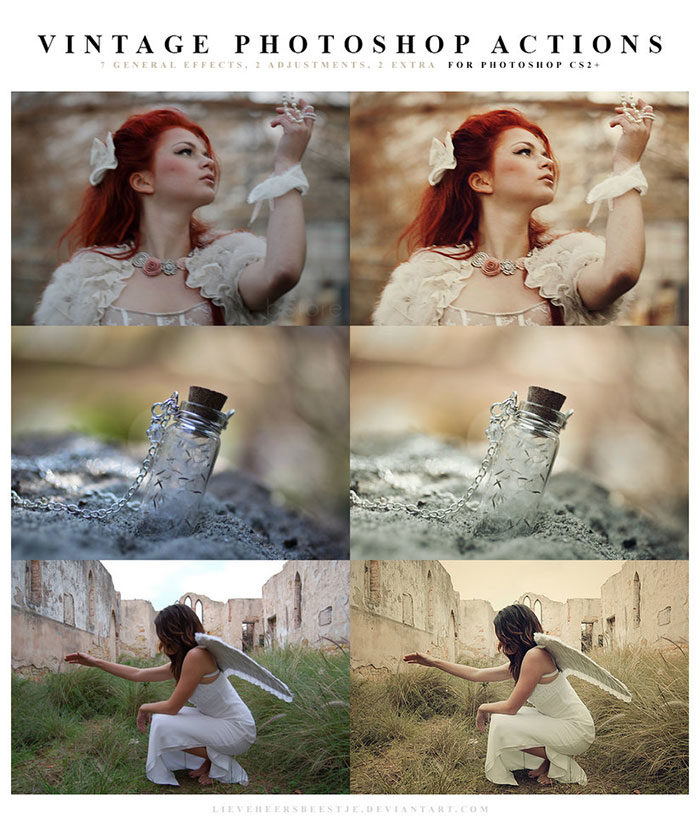
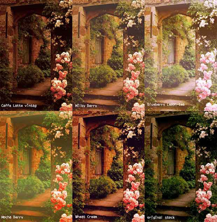
Vintage Dream Actions
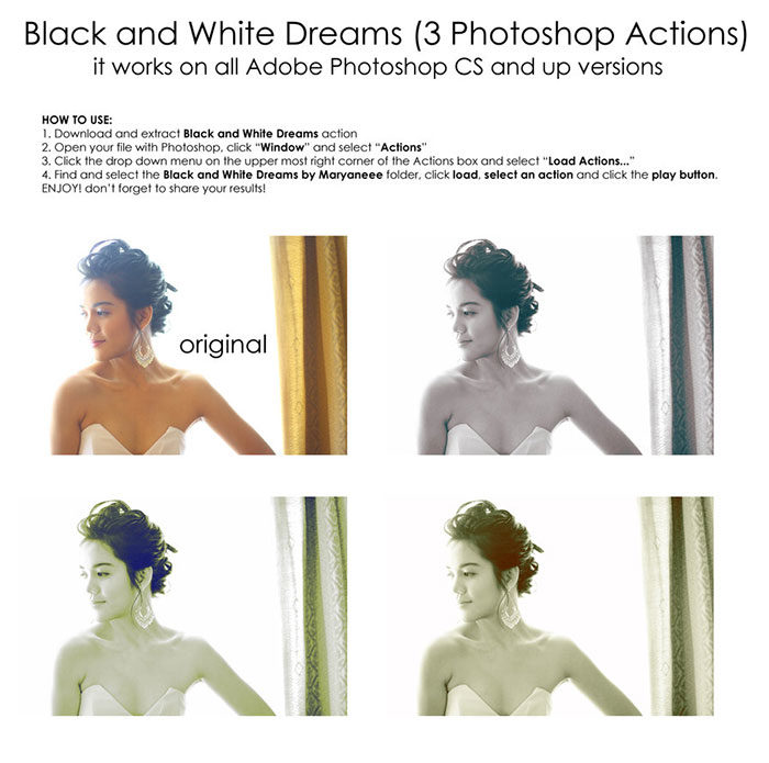
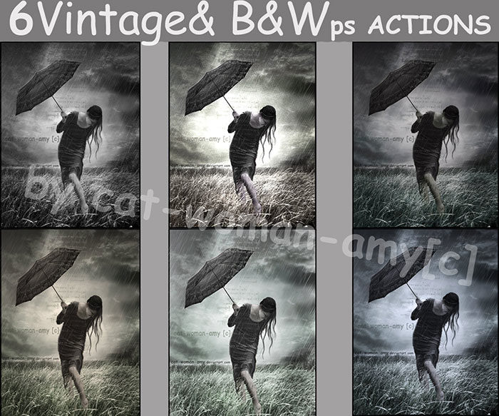
Black and White Dreams
Would you like to create a classic effect within your wedding photos? Black and White Dreams is a great set of 3 free Photoshop actions for portraits. With these Photoshop actions you’ll be able to create beautiful black and white images to your wedding photos. 12 Beautiful Wedding Effects
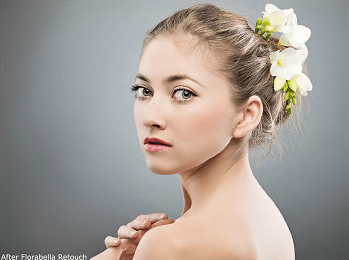
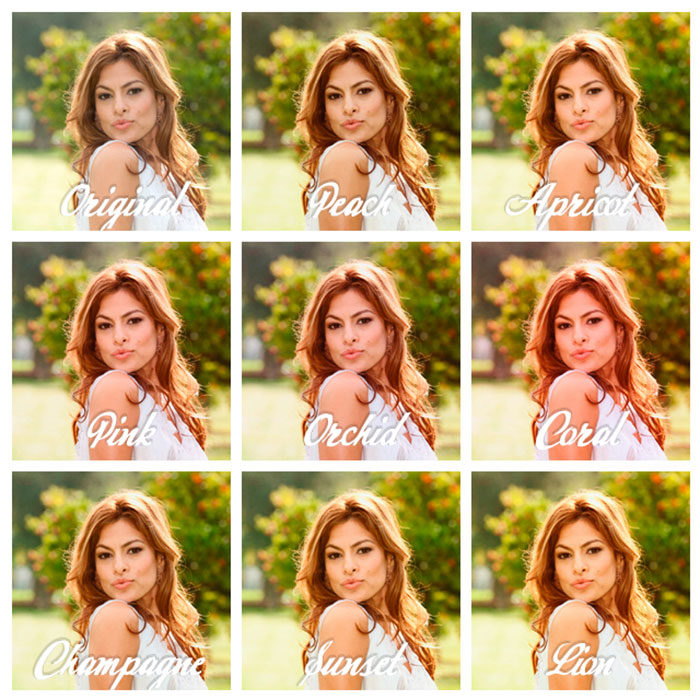
Florabella Retouch and Makeover
Wedding Enhancers Kit
Wedding Enhancers Kit is a Photoshop Actions free download which gives you 11 effects to choose from. You’ll also get an action as well as instructions and guidelines on how to use the products. You can use this kit to create striking portraits for your wedding images. Inside the Darkroom
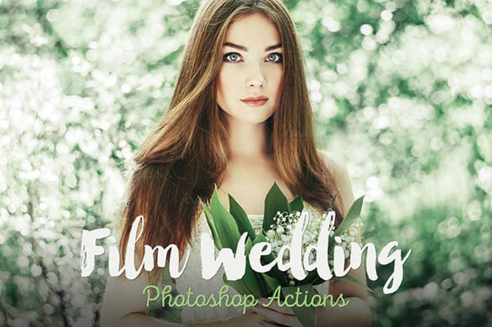
Film Wedding Actions
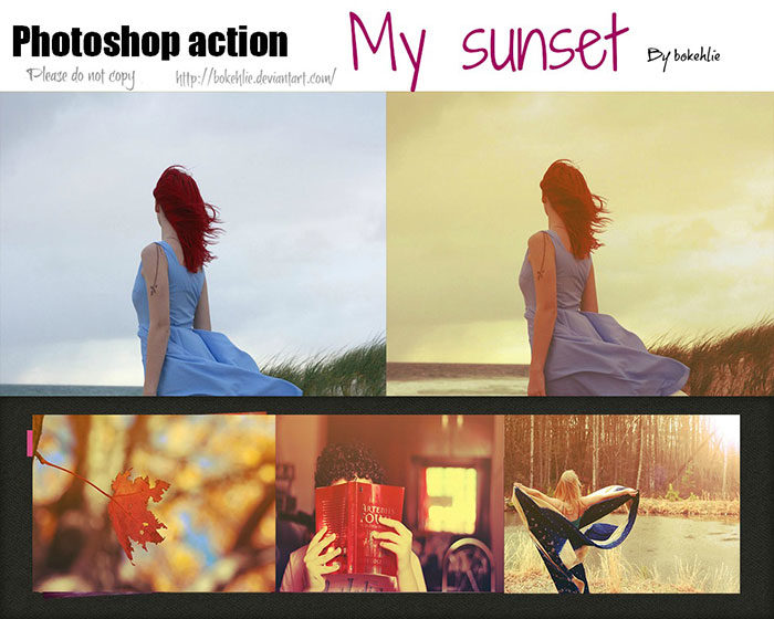
Summer Breeze |

AuthorPleasure to introduce myself I am Jamie 27 years old living in Searcy, AR. I am web developer and have developed over 50 sites for clients. Now a days I am focused on designing as I feel I am lacking it. Archives
April 2019
Categories |


 RSS Feed
