|
As a web developer, there is a high probability that you have encountered the two enemies of this article: images and deadlines. Sometimes, for some reasons, your images won’t fit the layout and you don’t want to wrap your head around this for hours. This situation has happened to me many times and I have learned from my mistakes. No more black magic hacks — here are my five favorites techniques to handle image resizing. the “OMG I NEED THIS ASAP” wayIt’s 5:00 pm on Friday, you have to finish this page, but the images won’t fit the layout. It’s time to use your magic trick!
.myImg {
  background-image: url("my-image.png");
  background-size: cover;
}
Sounds familiar? We’ve all done it once, doesn’t it feel like cheating to you? Using The way from the futureWhat if I told you this kind of magic exists also for
.myImg {
  object-fit: cover;
  width: 320px;
  height: 180px;
}
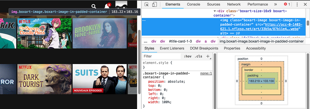
That’s all folks! See how when we retrieve the friendly value Okay what’s the trap?Unfortunately 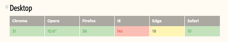 See the Pen Responsive images #2 by Adrien Zaganelli (@adri_zag) on CodePen. The “Netflix” wayYou may think “nice trick man, one more way that doesn’t work in old browsers like IE ?”. Don’t worry, this one works everywhere and it is my favorite! You’ll need to wrap your image with a relative padded parent. We will keep the image ratio with a percentage on the The code looks like this:
.wrapper {
  position: relative;
  padding-top: 56.25%; /* 16:9 Aspect Ratio */
}
img {
  position: absolute;
  left: 0;
  top: 0;
  width: 100%;
  height: auto;
}
“Hey man, it looks complicated.” Once you get the concept, the technique is simple and widely used. Netflix uses it!
A little demo: See the Pen Responsive images #3 by Adrien Zaganelli (@adri_zag) on CodePen.
The Simple way
You may already know this one:
img {
  height: auto;
  width: 100%;
/* even more control with max-width */
  max-width: 720px;
}
If your layout isn’t too complicated, it works in most cases. See the Pen Responsive images #4 by Adrien Zaganelli (@adri_zag) on CodePen. The Performance way (Advanced)By performance, I mean load times. A big hero image can ruin it and make your page feel slow, especially on mobile. Did you know that in modern browsers you can change an image source depending on your page width? That’s what You can combine them with the HTML 5
See the Pen Responsive images #5 by Adrien Zaganelli (@adri_zag) on CodePen.
To Recap
The post Time-saving CSS techniques to create responsive images appeared first on Design your way. from https://www.designyourway.net/blog/css-html/time-saving-css-techniques-to-create-responsive-images/
0 Comments
Leave a Reply. |

AuthorPleasure to introduce myself I am Jamie 27 years old living in Searcy, AR. I am web developer and have developed over 50 sites for clients. Now a days I am focused on designing as I feel I am lacking it. Archives
April 2019
Categories |
 RSS Feed
