|
If each and every color sends out a message, what does the blue color say when used in art or fashion? In this article, we will speak about shades of blue and the blue color palette. We’ll also talk about the various moods or atmospheres you can create when using blue shades. There are many different shades of blue that you can use in your designs. From the ultramarines, royal blues and green-blue colors used in a seaside painting to the blue color you use to paint your bedroom, understanding the many blue shades will assist you with making a perfect choice. By learning of the differences between a royal blue color and a navy blue color your designs will be more subtle and creative and you’ll have a larger palette of blue colors to draw from as an artist. Using the blue palette
The blue color is natural and reminds us of the sea and sky. These constants are associated with stability. Blue is often used to represent wisdom, faith, trust, heaven, spirituality, intelligence or wisdom, loyalty, and truth. We associate blue with spiritual, psychological and physical wellness. When the color blue is used in a room it provides a relaxing effect, slowing down the metabolism and calming the mind. As a result, blue is often associated with peace or calmness. It has also been used to represent sincerity and spiritual devotion. Designers have used shades of blue to represent cleanliness. Designs for household cleaning products are filtration systems often use a blue color. Companies associated with air travel use a blue color as part of their brand, as do companies related to sea travel. Water brands often use blue to represent their products. Blue has also been associated with mindfulness, consciousness or intellectual ability. High tech companies or those working with intellectual precision often use a shade of blue to represent their brand. Blue has been associated with masculinity and is a popular choice for both boys and men. The classic blue suit is often a symbol of corporate success, knowledge, depth, and stability. As a result, many corporations use a dark blue color to communicate their brand message. Using a shade of blue colors
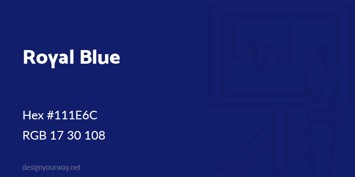
Using a blue color in design is excellent for representing wellness, stability, knowledge and purity. However, the blue color slows down appetite so avoid using blue if you are representing the food industry. Blue is an excellent choice when combined with warm colors. Blue and red or blue-yellow-red make excellent color combinations which can be combined to represent superheroes. This is because when the color blue is combined with warm colors, the result is high impact and very vibrant. Shades in the blue color chartDifferent shades have different meanings in the blue color palette. Shades of light blue are seen as clean and friendly. Dark blues such as navy are seen as strong, traditional and trustworthy. Blue has been associated with peace. As it is connected to the heavens, blue has been used to represent spirituality. In the Christian tradition, for example, the Virgin Mary is shown to be wearing blue robes. In the Jewish faith, blue is used for Hanukkah celebrations. The meanings of the color blueAs you can see, blue has different meanings depending on the shade used. Therefore the greater the selection in your blue color palette, the more versatile your designs will be. While light blues are peaceful and serene, vivid blues are seen to be alive and cleansing. Dark blues such as a navy blue color are often used in corporate designs. This is because they represent strength, trustworthiness, and reliability. Some selections from the blue color paletteRoyal Blue Color
Hex #111E6C Royal blue is a bright and vibrant blue color with a dignified appearance. If you are thinking about royal blue vs navy blue, consider how corporate or formal your client is. Space Blue Color
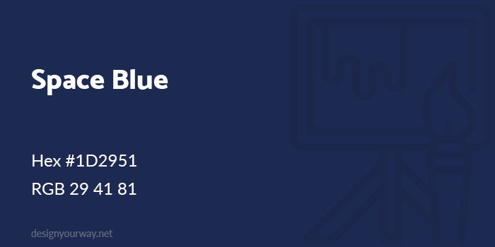
Hex #1D2951 Prussian Blue Color
Hex #003152 Navy Blue Color
Hex #000080 Navy is a blue color often used in corporate designs or formal occasions. Navy blue has a serious and trustworthy message but can be combined with lighter blues for a softer message. Yale Blue Color
Hex #0E4D92 Egyptian Blue Color
Hex #1034A6 Used a lot in ancient Egypt, this blue color is bright and vibrant. Azure Blue Color
Hex #0080FF Azure blue is a warm and vibrant shade which is associated with the Mediterranean. The colour is symbolic of striving for greatness with skill and determination. Sapphire Blue Color
Hex #0F52BA Sapphire blue is a deep navy based on a mystic and very precious gem. The colour is not quite navy, but certainly falls into the dark blue family. Olympic Blue Color
Hex #008ECC Cornflower Blue Color
Hex #6593F5 A light and very appealing shade of blue sometimes associated with eye colour. Named after a flower, this blue, when used in fashion, is meant to suit blonde haired women. Independence Blue Color
Hex #4C516D Teal Blue Color
Hex #008081 Teal is vivid but still subdued blue color and can be mixed together with different colors of blue to create interesting color combinations. Pigeon Blue Color
Hex #7285A5 Turkish Blue Color
Hex #4F97A3 Carolina Blue Color
Hex #57A0D3 Carolina is a blue color also known as Tar Heel blue. The color has academic associations because it is used by the University of North Carolina as an official color. Steel Blue Color
Hex #4682B4 Tiffany Blue Color
Hex #81D8D0 Baby Blue Color
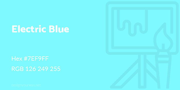
Hex #89CFF0 Electric Blue Color
Hex #7EF9FF This bright and very striking blue color is visually similar to Cyan blue. You’ll recognise this blue from lighting strikes. Sky Blue Color
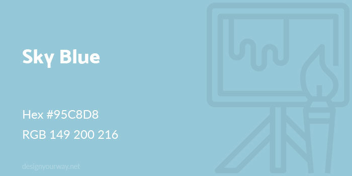
Hex #95C8D8 When you feel low, a sky blue color will uplift your mood. This cheerful blue is loved by both men and women. Powder Blue Color
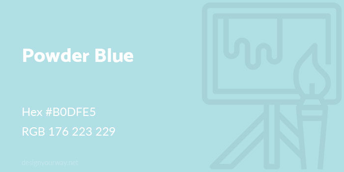
Hex #B0DFE5 Soft, powder blue is a modern version of baby blue. When used in fashion it is highly versatile and will mix with your favourite seasonal colors. Turquoise Color
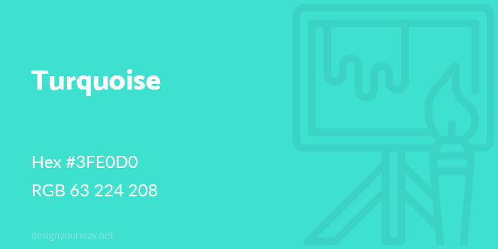
Hex #3FE0D0 Turquoise blue is blue mixed with green. Reminiscent of ocean pools it is a bright and very charming blue color. Ending thoughts on using a blue color palette in your designsWhen you use a blue color in your designs you’ll be sending a message of peace, responsibility, spirituality, wellness, honesty, clarity and loyalty. Blue is a calming color which doesn’t demand attention. When you use a blue color palette you will be communicating a message of easy independence, intelligence and integrity. We hope you found this article useful and will be able to communicate your message using the subtle shades of the blue color palette to create your designs. If you enjoyed reading this article about blue color, you should read these as well:
The post Using a blue color palette and the various shades of blue appeared first on Design your way. from https://www.designyourway.net/blog/graphic-design/blue-color-palette-shades/
0 Comments
Leave a Reply. |

AuthorPleasure to introduce myself I am Jamie 27 years old living in Searcy, AR. I am web developer and have developed over 50 sites for clients. Now a days I am focused on designing as I feel I am lacking it. Archives
April 2019
Categories |

 RSS Feed
