|
A green color palette is one of the most popular ones in website or app design. Green has been associated with nature, goodness, safety, harmony, balance, and growth. The environmental movement is represented by shades of green. Likewise, money has traditionally been a green color. Green is therefore associated with finance, Wall Street, banking, and ambition. The green color has also been associated with jealousy, ‘the green-eyed monster’ which is known to overtake us when we fear losing that which we value. Shades of green – using a green color palette
When you use a green color, you’ll be drawing on a firm favourite. Green shades are seen to be one of the most popular colors, coming second only to blue. When you use green colors in your design you’ll therefore appeal to a wide audience. Both men and women love green shades. People who are color blind may struggle to discern between shades of green and blue. By keeping this in mind when you are designing you’ll be able to work around it, placing blue and green together only when there is enough of a contrast to be able to distinguish two different shades. Shades of green make people feel positive
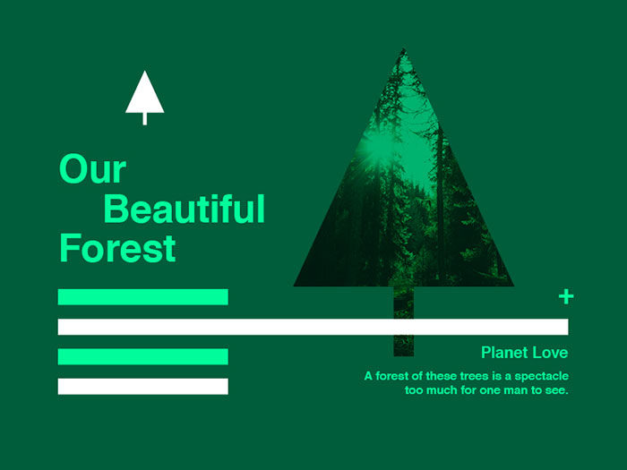
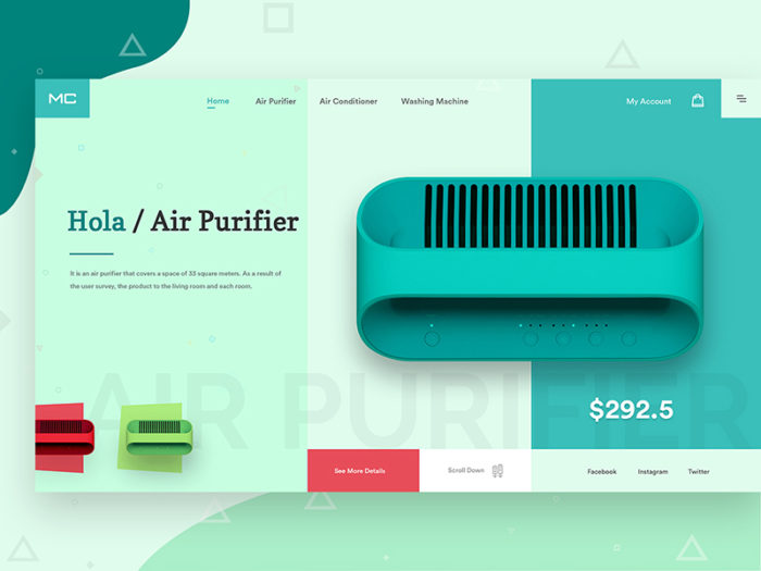
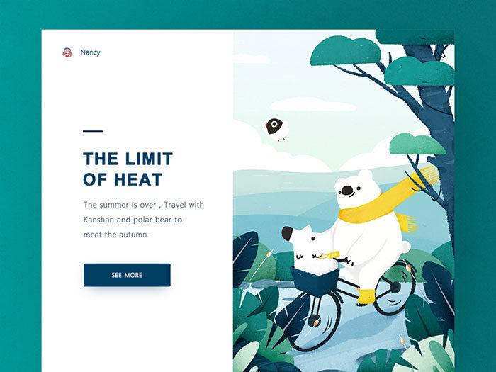
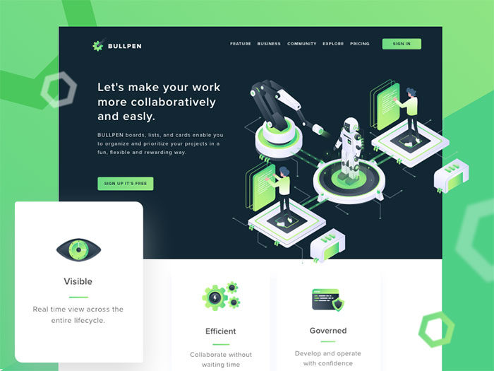
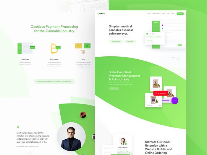
Green is generally seen to be a very soothing color, although this may depend on the shades of green used. When you use a green color you’ll evoke images of nature. Green colors remind us of summer picnics on fresh grass or the emerald green color of Christmastime. As a result, green colors generally make people feel very positive. Green represents new leaves in springtime, renewal and vitality. Although green and blue are both soothing colors, green can also balance the overall look of a page. Bright greens (with more yellow) show the freshness and vitality of youth. Darker colors of green, such as an olive green color, remind us of the stability of evergreen leaves or the elegance of the oak. Combining green shades with other colorsIt is often highly effective to combine a green color with other colors as the green of nature naturally mixes with a wide range of other colors. However, when mixing colors with shades of green, do ensure they work well together. Green is so soothing that clashing colors will feel uncomfortable for a site visitor. Draw on the different shades of green in your color palette, mixing colors which work well together. You can auto-generate the most suitable shades of green using your palette tool to ensure that your colors work well together. Green color shades help to identify your brand
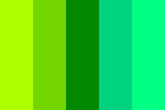
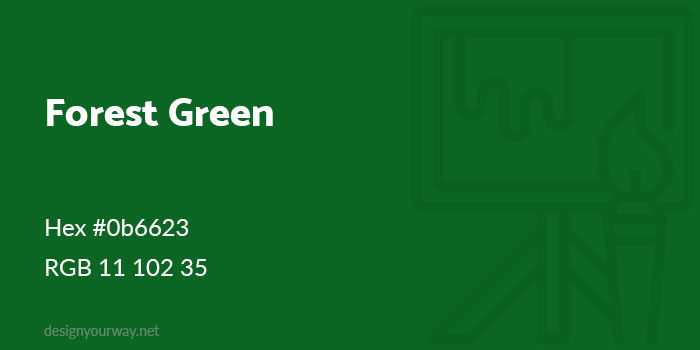
If you believe that the color green can be incorporated into your brand in order to communicate an effective message, remember to use it on all of your branding materials. Your logo, website, social media profile and print advertising will become instantly identifiable if you keep your colors consistent. Green (used alone or in combination with other colors) will send out a message attracting the right type of clients for your brand. The more consistent your color choice, the more recognizable your brand will become. Shades of green – getting to know the green color paletteYour clients may love green and you might have decided to use a green color as a part of your brand. However, with each shade of green sending out a different message, how will you know the best color combinations to use? Would you prefer to go for a youthful and vibrant yellow-green or a sophisticated and stable deep green? Different shades of green will have different meanings. Darker greens are often associated with finance, wealth, ambition and even greed. Yellow greens may relate to feelings of jealousy, illness, and even cowardliness. Do you remember the phrase ‘extending the olive branch?’ It’s no surprise that olive shades of the green color symbolize peace. Forest Green
Hex #0b6623 Sage Green
Hex #9dc183 Olive Green
Hex #708238 Lime Green
|

AuthorPleasure to introduce myself I am Jamie 27 years old living in Searcy, AR. I am web developer and have developed over 50 sites for clients. Now a days I am focused on designing as I feel I am lacking it. Archives
April 2019
Categories |


 RSS Feed
